Author: artoronto

  • RECALL / Walnut Contemporary

    Installation view of RECALL. Image courtesy of Walnut Contemporary

    At a time when Canada prepares to welcome 25,000 war-weary Syrian refugees, and as war in all of its manifestations dominates our media landscape, Walnut Contemporary has chosen to face the themes of conflict, displacement, and migration head on. Launched the week of Remembrance Day under the curatorial vision of Director/Curator Raquel Vilhena, RECALL — the gallery’s 2015 group show — explores what it means to remember, what it means to “bring back…into one’s mind, especially so as to recount it to others.” The show is, as this statement implies, a balanced exploration of memory and the visual communication of memory. More specifically, however, as Vilhena discussed in a recent interview, the exhibition “deals with heroes and survivors, displaced persons, refugees, those who are left behind, what is left behind.” In what she describes as “a very emotional show,” RECALL consists of artistic responses — some commissioned, others pre-existing — from a selected group of 25 of the gallery’s permanent and guest artists. It is an ambitious and poignant exhibition — one that not only addresses a difficult subject in an appropriately complex way, but that is also meaningfully site-specific: before it became a gallery, the building was a legion hall, traces of which — including a brass commemorative plaque once on the building’s façade — still remain.

    Installation view showing Duarte Vitoria, Heroes, oil on linen, 39.5″ x 39.5″ (left) and Miguel Barros, Flanders Field, acrylic and oil on recycled Canadian flag, 60″ x 35″. Image courtesy of Walnut Contemporary

    When gallery owner, Jason Martins, brought this history to Vilhena’s attention, she saw the themes it raised as an appropriate starting point for this year’s group show, particularly given the current state of affairs in Europe and elsewhere. Taking the legion plaque as a starting point — even mounting it on the exhibition’s title wall — Vilhena cleverly constructed the theme of RECALL as one that not only refers to the memory of the space, but that also unites many of those touched by war — those who remember loved ones fighting or lost, homelands left behind, lives affected by violence. For RECALL, Vilhena set aside her usual curatorial practice in order to accommodate a perhaps overly ambitious number of featured artists as well as emotive subject matter . Drawing inspiration from some European museums, which tend to display a greater number of works in smaller spaces, Vilhena has created a show that finely balances a somber theme with a sparkling variety of textures, colours, and materials. From Ito Laïla François’ Bellmeresque glass and clay sculpture, to Maia’s or Heidi Leverty’s photographs of distant shores, to Manuel d’Olivares’ aluminum crumpled posters, RECALL incorporates an impressive array of artistic forms and media. Painting, sculpture, photography, glasswork, and ceramics sit alongside vitrines of archival artifacts and documents — mementos of some of the artists’ personal family histories. The overall aesthetic is one of compelling heterogeneity.

    Ito Laïla François, Racines Défoliantes/Defoliant Roots, clay, glass wool and acrylic, 48″ x 72″. Photo: Catherine MacArthur Falls

    Maia, Juno, pigment on Hahnemuhle William Turner matt fine art paper, 19.6″ x 10″. Image courtesy of Walnut Contemporary

    Heidi Leverty, Tales from the Sea (The Ones that Stayed Behind), Tides, pigment on archival paper, 12″ x 12″. Image courtesy of Walnut Contemporary

    Manuel d’Olivares, Face the Future, acrylic on canvas over aluminum, 23.5″ x 39.5″. Image courtesy of Walnut Contemporary

    Conceptually, the work is also strikingly varied. Responses range from literal and representational to highly abstract. Many of the artists share deeply personal experiences of war, displacement, and commemoration; others approach the topic from the perspective of broad, even universal, forces or emotions. Djuna Day’s abstract wall sculpture, “Everything Seems Alright”, for instance, utilizes interlocking, concentric wood circles to evoke the churning forces — whether political, economic, social, or humanitarian — that mete out the realities of our society. As implied by its title, the work’s serene surface aesthetic belies a sense of suspended dynamic motion. Here, as with power structures, balance is tenuous, always on the verge of spinning apart. At the opposite end of the abstract-representational spectrum, Silvija Saplys’ work in encaustic and photography portrays her family’s experience of war in Lithuania. Incorporating personal photographs and images of the “Hill of Crosses”, Saplys’ images weave a story of both familial and national resilience. Meanwhile, Julia Harris’ hanging sculpture, “Bleached Remains”, falls somewhere between these two poles. In this work, Harris grafts an abstract, minimalist aesthetic onto highly personal subject matter. Consisting of branches recovered from a beaver dam, whitewashed with Portland cement, the pared down sculpture evokes both bleached bones and the wood structures used to reinforce trenches. Yet, it also serves to commemorate her grandfather, Lieut. Leslie Marler, who fought in WWI. A nearby vitrine of archival documents and artifacts collected by members of Harris’ family helps to reinforce this personal connection. 

    Djuna Day, Everything Seems Alright (Assemblage #8), ebonized wood tiles (fir), 36″ diameter. Image courtesy of Walnut Contemporary

    Silvija Saplys, Hill of Crosses, detail. Image courtesy of Walnut Contemporary

    Installation view showing Julia Harris, Bleached Remains, wood brushed with Portland cement, 24″ x 30″ (left) and Julia Harris, Tunnel – Trench Warfare, Portland cement, plaster of Paris, watercolour, 14″ x 10″. Image courtesy of Walnut Contemporary

    Like Harris’ work, many pieces in the show take a specifically Canadian perspective, utilizing Canadian materials or imagery. “Oh Deer”, a sculpture by artist Lumir Hladík, for instance, combines a WWII military crutch with a Canadian deer foot, drawing links between the violence of the early-twentieth century and Canadian natural resources, landscapes, peoples, and ways of life. Similarly, Miguel Barros’ “Flanders Field” connects potent Canadian symbols with the violence of war. Taking a Canadian flag as its base, the painting visually links the much-loved red poppy with a bullet wound, while Barros’ treatment of the fibre base of the flag lends this national symbol a decayed appearance. As Vilhena points out, the Canadian experience is well suited to the themes explored in RECALL. As is often discussed, the entirety of Canada’s population—except, of course, its First Peoples — comes from elsewhere, from a remembered homeland. And, indeed, many of this country’s citizens immigrated here to escape the perils of war, economic struggles, and persecution. It is this sense of migration and displacement that guest artist Carlos Delgado explores in his monumental “Travelers Under the Moon #6”. Utilizing a pared-down aesthetic new to his practice, Delgado captures both the pathos and strength of three travelers in an astounding paucity of drips and brushstrokes. One of a series of eight paintings on the theme of refugees, the work calls to mind the journey of many of Canada’s current Syrian refugees, as well as many of the refugees and asylum seekers currently en route to Canada’s shores. The work is beautiful and affecting, embracing many of the practical and universal themes of the show.

    Miguel Barros, Flanders Field, acrylic and oil on recycled Canadian flag, 60″ x 35″. Image courtesy of Walnut Contemporary

    Carlos Delgado, Travelers Under the Moon #6, acrylic and oil on canvas, 60″ x 54″. Image courtesy of Walnut Contemporary

    Through its exploration of these themes, RECALL successfully lives up to the overall mission of the gallery, which, as Vilhena describes, sees art as a powerful tool able to shed light on subjects such as multiculturalism, homelessness, environmentalism, and humanitarianism. In reaching this aim, RECALL provides an emotive experience not always available in Toronto’s contemporary galleries. True, a slight reduction in the number of works exhibited may have lent greater confidence to the show’s stronger pieces. However, RECALL is ultimately a timely, thought-provoking exploration, one that, amidst the current political climate, should be considered mandatory viewing for all Torontonians, even all Canadians.

    Catherine MacArthur Falls

    *Exhibition information: November 14 – January 23, 2016, Walnut Contemporary, 201 Niagara Street (entrance at side lane). Gallery hours: Wed – Sat, 1 – 6 p.m.

  • Mark Adair and Yael Brotman at loop

    Loop Gallery’s two current exhibitions explore themes of mortality and contemplation, creating a dichotomy between ghastly fearfulness and existential yearning. Mark Adair’s Death’s Epilogue: The Glass House Window and Yael Brotman’s We Standing by water Waiting visualize their disparate narratives and thematic preoccupations through differing artistic practices, generating a heterogeneous movement through various emotional states, mainly touching upon anxieties pertaining to death and loneliness. 

    Upon entering the gallery space, Adair’s immediately confronts the viewer with its quaint aesthetic. Two hefty slabs of glass, steel and lead appear as fragments detached from a larger window scheme, both visualizing the biblical Tree of Knowledge. However, the opacity and weightiness of the lead diminishes the vitality of its subject matter, which is further emphasized by the skeletal rendering of forms, greatly contrasting the more traditionally lively and lush representations of its source material. In contrast, “Death’s Epilogue” executes its grim subject matter in a more literal and menacing fashion. The series of miniature charcoal drawings depict a narrative of death’s superiority over humankind, featuring a gaggle of ghoulish characters engaging in acts of debauchery. Death is personified as a skeletal figure clenching a menacing scythe, performing acts of brutality towards its frightful victims. Cursive captions accompany each tableau, adding a human touch to these uncomfortable and nightmarish scenarios. In comparison to the frightening literalness of “Death’s Epilogue”, Adair’s “Glass House” appears more hopeful and acts as a serene refuge from the prevailing gloominess of his charcoal works.

    Mark Adair, Glass House Window, 2015, steel, glass with lead inserts, 1 m tall. Photo courtesy of the artist

    Mark Adair, Death’s Epilogue: Death’s Larvae, 2015, charcoal on paper, 4″ x 4″. Photo courtesy of the artist

    Yael Brotman focuses her artistic efforts on the symbolic relation between large bodies of water and longing. Presented in a series of mixed-media constructions, these sculptural forms encompass the back end of the gallery, as they are either spaciously hung against the walls or prominently placed on the floor. The use of multi-coloured theatre gels gives each piece a luminous presence, immediately contrasting the opacity of Adair’s work. Brotman ensures that every visible surface of each construction is worked in a particular manner, encouraging the viewer to walk around and observe all angles. Thematically, the pieces abstractly recall feelings of the sublime when confronting a vast body of water and all the contemplative and existential narratives applied to these experiences. Brotman references Western mythological tropes of women wishing and hoping for a particular form of personal fulfillment in front of an ocean, as its endless horizon suggests a sense of endless potential and disappointment. 

    Yael Brotman, Amphora, 2015, foamcore, theatre gels, 40″ H x 33″ W x 20″ D. Photo: Peter Legris

    Yael Brotman, Hydria, 2015, foamcore, theatre gels,29″ H x 24″ W x 13″ D. Photo: Peter Legris

    Yael Brotman, We Standing by water Waiting, 2015, installation view. Photo: Peter Legris

    Brotman takes a more metaphorical approach to visualizing the anxieties and wonders of water, contrasting the literalness of Adair’s uncompromising drawings. Both artists deal with different aspects of the human condition in their own idiosyncratic method, simultaneously unearthing and manifesting suppressed fears, desires and concerns in visual form.

    David Saric

    *Exhibition information: December 5 – 27, 2015,  loop Gallery, 1273 Dundas Street West, Toronto, (three doors west of Dovercourt). Gallery hours: Wed – Sat: 12 – 5, Sun: 1 – 4 p.m.


  • OFF THE WALL / Fundraising Gala at Propeller

    The Gala Event: December 18, 2015 / 7 – 11 p.m.
    Propeller Gallery
    30 Abell Street, Toronto

    Off the Wall is a gala event with a twist: donated works of art are hung in the gallery for a pop-up exhibition between December 16 and 18, 2015. On the final night of the exhibition – December 18th – we hold our annual ticketed gala event, Off the Wall, a fun night of food and drink. Ticket numbers are randomly drawn and the ticket-holder has sixty seconds – just one minute – to select an artwork to take Off the Wall!! December 18th will be a night of food and drink, great art and atmosphere, with the excitement of the live ticket draw, and the action of particpants as they claim their work. Come out and support the gallery, get warm, and have a great time.

    Imagine having an original work of art for the holidays for just $125.

    The TICKETS:

    One (1) Ticket for Off the Wall Gala — $125 – Take ONE (1) original piece of art home with you, “Off The Wall”.

    Get an extra 20% saving when you purchase 3 or more tickets: Three (3) Ticket for Off the Wall Gala — $300 – Take THREE (3) original pieces of art home with you, “Off The Wall”.

    Participating Artists of 2015

    Jane Murdoch Adams | Anastessia Bettas | Dean Bradley | Amanda Capisciolti | Susan Card | Bob Carnie | Simone Collins | Jacques Descoteaux | David Griffin | Philip Hare | Maria Teresa Hernandez | Thomas Hlavacek | Tatjana Hutinec | Lisa Johnson | Michelle Letarte | Irina Litinsky | Elnaz Mansouri | Nancy Newton | Frances Patella | Emanuel Pavao | Kamelia Pezeshki | Dominique Prevost | Anthony F. Saad | Keijo Tapanainen | Gwen Tooth | Maria Wall | Ross Winter |

    For more information please check:  <https://www.eventbrite.ca/e/off-the-wall-2015-tickets-19232601228>

    Gallery hours: Wed – Sat: 12 – 6, Sun: 12 – 5 p.m.

  • Dorian Fitzgerald at Clint Roenisch Gallery

    Dorian Fitzgerald, Weltverbesserungssyndrom, installation view at Clint Roenisch Gallery. Photo courtesy of Clint Roenisch Gallery.

    The title of the exhibition, Weltverbesserungssyndrom, roughly translated to World Improvement Syndrome, refers to a “kind of narcissistic personality disorder” where the person strives to improve the lives of others not out of selflessness, but out of a need to embolden themselves. For Valerian Rybar, rightfully the world’s most expensive decorator, this meant individualizing each of his clients’ spaces and parties with overwhelming extravagance. He would draw in expert artisans from around the world “who did anything from paint Medieval tapestries on blank walls to create mother-of-pearl panels for a bathroom” (The New York Times). He even spent a year organizing a party for Mr. and Ms. Patino at their 200-acre Portuguese estate, sparing absolutely no expense and working every little detail to perfection. Though the patrons and their guests were certainly more than pleased with the opulent quality of his works, Rybar himself garners a great deal of notoriety and wealth, which was even further embodied in his personal lifestyle.

    Dorian Fitzgerald, Marie-Hélène Naila Stephanie Josina de Rothschild and Oskar Dieter Alex von Rosenberg-Rédé, 3rd Baron von Rosenberg-Redé at The Surrealist Ball, Chateau de Ferrieres, 1972, 2014, acrylic paint, acrylic caulk, acrylic transfer, GAC 800 on canvas mounted on wood, 60″ x 30″. Photo courtesy of Clint Roenisch Gallery

    Dorian Fitzgerald’s show orients around this notion of Weltverbesserrungssyndrom. “Salon, Apartment of Valerian Rybar and Jean-François Daigre, Rue du Bac, Paris”, the most monumental work in the collection, delves into the luxurious domestic life of Rybar, one that equalled, if not exceeded, his lavish work for his clientele. Over a year in the making, Fitzgerald perfectly captures the scene with amazingly realistic detail: capturing every glimmer off of the golden accents, the radiance from the candles and lamps, and most impressively, the brilliant reflections in the mirrored walls and ceiling. The perspectival depth paired with the overwhelming ornateness and sheer size not only draws in the audience, but immerses them into a separate space, as if walking directly into Rybar’s home and share his perspective firsthand.

    Dorian Fitzgerald, Salon, Apartment of Valerian Rybar and Jean-François Daigre, Rue du Bac, Paris, 2015, acrylic paint, acrylic caulk, acrylic transfer, GAC 800 on canvas mounted on wood, 108″ × 132″. Photo courtesy of Clint Roenisch Gallery.

    Fitzgerald’s adjacent works are just as resonant as the first. “Greater Kudu, Army and Navy Club (“The Rag”), Pall Mall, London” depicts the head of kudu whose horns had grown around and back into its own skull, that was then shot, stuffed and mounted in a London gentleman’s club. Trophy game has long been a persisting tradition that serves to bolster a man’s prestige, particularly with such a rare, endangered creature. Although It may be the smallest and least decorative piece, it stands as a subtle yet anchored accompaniment to the central theme.

    Dorian Fitzgerald, Greater Kudu, Army and Navy Club (“The Rag”), Pall Mall, London, 2015, acrylic paint, acrylic caulk, acrylic transfer, GAC 800 on canvas, 36″ x 24″. Photo courtesy of Clint Roenisch Gallery.

    There is also the portrait of “Henry Cyril Paget, 5th Marquess of Anglesey, Earl of Uxbridge, circa 1900”, a reputable British aristocrat who, like Rybar, was accustomed to a very indulgent lifestyle. In this instance, he is portrayed in one of his exquisite robes adorned with jewels, precious metals, and rich fabrics. Ironically, his generous inheritance of £110,000 (£55 million today) was depleted because of his frivolous spending, so he was then forced to auction off his 17,000 possessions to sustain himself and his status. Aristocracies are historically viewed as consisting of societies’ best and brightest, whose entrepreneurial ventures and investments benefit everyone, therefore their wealth is a rightly-deserved measure of their virtue just as much of their success. However, Paget certainly did not pursue this ideal, instead squandering his wealth on his excesses. Fitzgerald’s representation may use a monochrome palette, as if simulating an early photograph, however the subject’s luxuriousness remains emphatic.

    Dorian Fitzgerald, Henry Cyril Paget, 5th Marquess of Anglesey, Earl of Uxbridge, circa 1900, 2015. Photo courtesy of Clint Roenisch Gallery.

    In its essence, Weltverbesserungssyndrom examines the frivolity and indulgence that stems from a narcissistic approach to success; while others from an outward perspective appreciate the degree of laboriousness and esteem, moguls like Rybar and Paget often employ this recognition to glorify their own integrity.

    Simon Termine

    *Exhibition information: Dorian Fitzgerald: Weltverbesserungssyndrom, October 23 – December 19, 2015, Clint Roenich Gallery, 190 Saint  Helens Avenue, Toronto. Gallery hours: Wed – Sat, 12 – 6 pm.


  • Jacqueline Treloar’s Christmas tree at Paul Petro Gallery

    The opening of Christmas Spice, a group show, at Paul Petro Contemporary Art on December 4th, was a wonderful experience. The opening felt as if you had walked into a friend’s house and were attending a Christmas party; the spirit was truly in the air.

    Guests at the opening reception of Christmas Spice at Paul Petro Contemporary Art. Photo: Emily Newell

    What amazed me the most were Jaqueline Treloar’s beautiful pieces covering the tree. “Baroque Ball”, a collection of tree ornaments, is something to be taken in. The care and precision of each piece comes fully through when looking at them closely. From “A Gathering of Feathered Friends”, through the chandelier or “star” on top of the tree, to “Barbie Doll Angels Tea Party”, which stands in for the tree skirt, this installation is one of sheer elegance. The baroque angels that are featured in many of the ornaments really bring out the feeling of strolling through Italy and coming across fountains and statues in the piazzas or the paintings in its many churches. The colours are vibrant. Each piece has so many intricate details, that when viewing them closely you can see the beadwork and fabrics seamlessly come together. The fabrics on most of the pieces are shear and light shines through them to enhance the image, really bringing them to life. Treloar must put an extraordinary amount of work in each piece and it shows.

    Jacqueline Treloar, ornaments on the tree with Madonna framed with glass flowers – after Van Eyk, 2015 printed silk, wire, glass, 5 1/2″ x 5 1/2″ (on top). Photo courtesy of the artist

    Jacqueline Treloar, Candelabra, 30″ x 24″. Photo courtesy of the artist

    Jacqueline Treloar, Barbie Doll Angels Tea Party, 5 ft x 5 ft x 9″, detail. Photo courtesy of the artist

    I could not help being taken with every one of them. Even the ones I thought I had looked at a couple times would keep surprising me with new details that made it such a joy to return to them. I spoke with a few guests who are familiar with Treloar’s work for years and they all agreed that these were some of her finest creations. The items were selling fast off the tree as some people purchased two or three at a time.

    Jacqueline Treloar, Angels on a beaded circle, 3.5″ x 3.5″ from the Baroque Ball series. Photo courtesy of the artist

    Jacqueline Treloar, Figurines from the Candelabra, porcelain, detail. Photo courtesy of the artist

    Jaqueline Treloar said how much the project meant to her while putting it together this past year. I also asked Paul Petro – who chooses a different artist each year to decorate the gallery’s Christmas tree – why did he decide to ask Treloar this year. He told me a funny story about how Treloar had done some work on a shirt for him so he knew her pieces would suit this show nicely. Indeed, having the chance to see her work was extraordinary as photos do not do them justice. There are so many small features that can only be appreciated up close and personal.

    Jacqueline Treloar with one of her Christmas ornaments. Photo: Emily Newell

    Emily Newell

    *Exhibition information: The Primum Mobile of the Ninth Sphere of Heaven in Dante’s Paradiso and the Abode of Angels – theme of the Christmas tree, December 4 – 19, 2015,  Paul Petro Contemporary Art, 980 Queen St West, Toronto. Gallery hours: Wed – Sat, 11 – 5 p.m.

  • Joe Hambleton: Behind the Fourth Wall at Pari Nadimi

    Usually when I watch a video installation, I wait until it ends so I can start from the beginning. Hambleton erases such possibility. By combining his videos with a computer software, he devises digital beings that create their own narrative, conclusion, and duration. He leaves it to chance of the software that eventually the constantly changing set of video and audio will create a perfect one.

    Joe Hambleton, 2015, Behind the Fourth Wall ver. 2, installation view at Pari Nadimi Gallery

    No one explains this process better than himself: “Waiting for Reset is an experimental narrative that utilizes repetition and chance to represent key elements in a character’s life. The video work runs through scripted software. After each repetition, the software gives the character a chance to break his routine. If he does, the video simply ends, if he does not, another repetition will occur with the tempo increased. With each repetition the odds of the character succeeding vary. At first his chances increase, but after a certain amount of repetitions they begin to decrease. If the character does not break his routine after a certain amount of repetitions, the odds of him doing so will be almost non-existent, potentially locking him into his routine endlessly.”

    Joe Hambleton, 2015, Behind the Fourth Wall ver. 2, installation view at Pari Nadimi Gallery

    “Waiting for Reset” shows a male character doing a series of mundane everyday activities. Making coffee, eating breakfast, having a beer, smoking, waking up, brushing teeth, and the list goes on. Then the sequence concludes by the character sitting on his couch while his phone rings from an unknown number. He sighs, and ignores the call. The screen goes blank and the sequence of activities begins again, but they are slightly different, and shorter. The phone rings again, and he ignores it again with a sigh. This is repeated with faster and shorter sequences until finally this suffocating anticipation is relieved with him picking up the phone. It is a half-relief, however, because the screen goes dark as he opens his mouth to speak. Expecting the same film to play, I watch without anticipation, but the relief does not come, and I start to second-guess my memory. The sequence continues to repeat faster and shorter but he never manages the pick up the phone, until out of anxiety I stop watching. Hambleton radically rejects normalized narrative techniques and creates a story that transforms. It’s impossible to tell whether the same story will ever happen twice. The fact that it is up to the story (or the character) to continue its own narrative is highly intriguing because the arbitrary sequencing program is totally unsympathetic to the viewer’s uneasiness.

    Joe Hambleton, 2015, Waiting for Reset 2, installation view at Pari Nadimi Gallery

    Behind the Fourth Wall ver. 2 adopts a similar program, but perhaps more complex. There is a certain set of video clips, and a certain set of audio clips. These are paired arbitrarily. Every new sequence is a brand new pairing. Effectively, this means that countless different meanings are produced with each pairing. Some of the repeated video clips are of a simple RPG with a game character walking through maps, a snail (digitally rendered) flooded with blood, fuzzy planets shifting around each other, and an abstract three-dimensional space. Some of the audio clips include ‘He went through a sacred period in his life’, ‘you always got me so much joy’, ‘sometimes I still need you’, ‘I’ve made little progress’. While the video clips are seemingly random, the audio clips resemble short journal entries, filled with self-reflections, regret, reminiscence, and observations. 

    Joe Hambleton, 2015, Behind the Fourth Wall ver. 2, installation view at Pari Nadimi Gallery

    Joe Hambleton, 2015, Behind the Fourth Wall ver. 2, installation view at Pari Nadimi Gallery

    Joe Hambleton, 2015, Behind the Fourth Wall ver. 2, installation view at Pari Nadimi Gallery

    In both video installations, Hambleton leaves the software responsible for the production of meaning. Through this process, concept of statistics and symbolization of Hambleton’s personal life comes together beautifully in Behind the Fourth Wall.

    Sunny Kim

    Images are courtesy 0f Pari Nadimi Gallery, photo by the artist.

    *Exhibition information: November 12 – December 24, 2015, Pari Nadimi Gallery, 254 Niagara Street, Toronto. Gallery hours: Wed – Sat, 12 – 5 p.m.

  • Kristopher Karklin at Barbara Edwards Contemporary

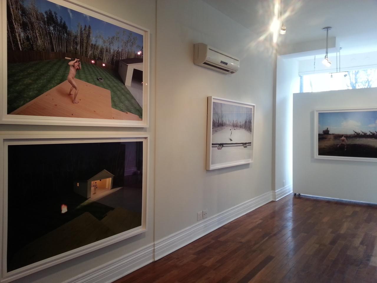
    For those who have yet to see the work of Alberta-based photographer Kristopher Karklin, you may want to pay attention. On the vast spectrum of emerging-to-mid-career artists on the Canadian contemporary scene, he is most certainly one to watch. His most recent work, the subject of a solo exhibition currently on display at Barbara Edwards Contemporary, has not only generated a considerable amount of buzz, but has also piqued the interest of a number of high profile collectors, both individual and institutional. And for good reason. His newest series, a combination of photography and sculpture, strikes with uncanny accuracy not only at the northern Alberta landscape by which it was inspired, but also at many of the confining and alienating elements of contemporary rural and suburban life.

    Installation view. Photo courtesy of Barbara Edwards Contemporary

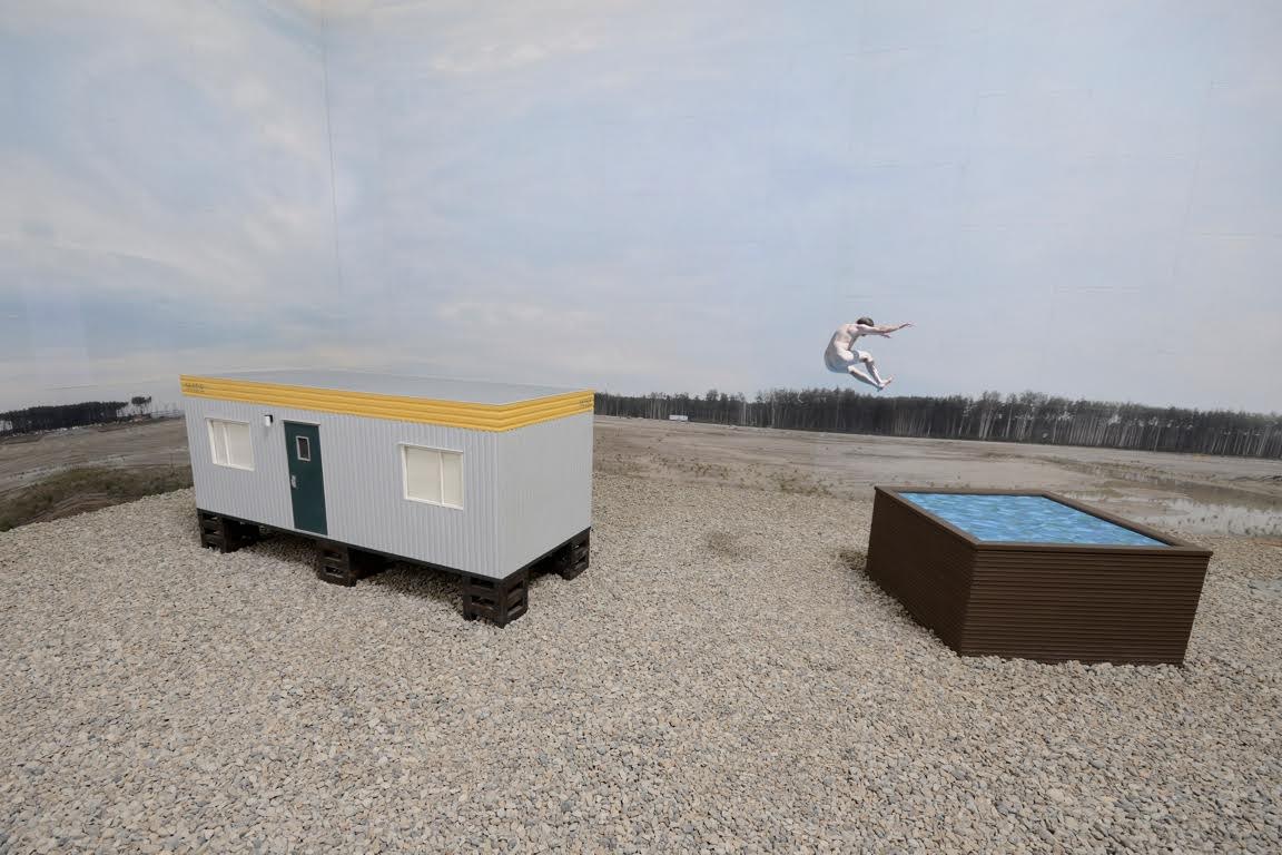
    When, years ago, Karklin began working in Fort McMurray, Alberta – a community now infamously known for its connection to the oil sands — he had no specific intention to create art from his experience. Yet, as he described in a recent interview, he was immediately captivated by what he saw there and simply started taking photographs. “It was like being on the moon or in the middle of the Arctic,” Karklin recollects. The experience was, for him, powerfully surreal. It is a feeling Karklin is remarkably effective at capturing. Building on his previous work, this newest series consists of figures set in strangely pristine, manufactured settings — an aesthetic result of an uncommon and very labour-intensive process. Like Berlin-based artist Thomas Demand, Karklin first creates his landscapes from meticulously constructed scale models — not unlike theatre or architectural maquettes — which he then photographs. Yet, in a departure from Demand, whose images tend to be uninhabited, Karklin also photographs human figures and transposes these into his scenes. The result is a thrillingly disjointed meeting of human and environment, set among layers of photographic and sculptural mediation. 

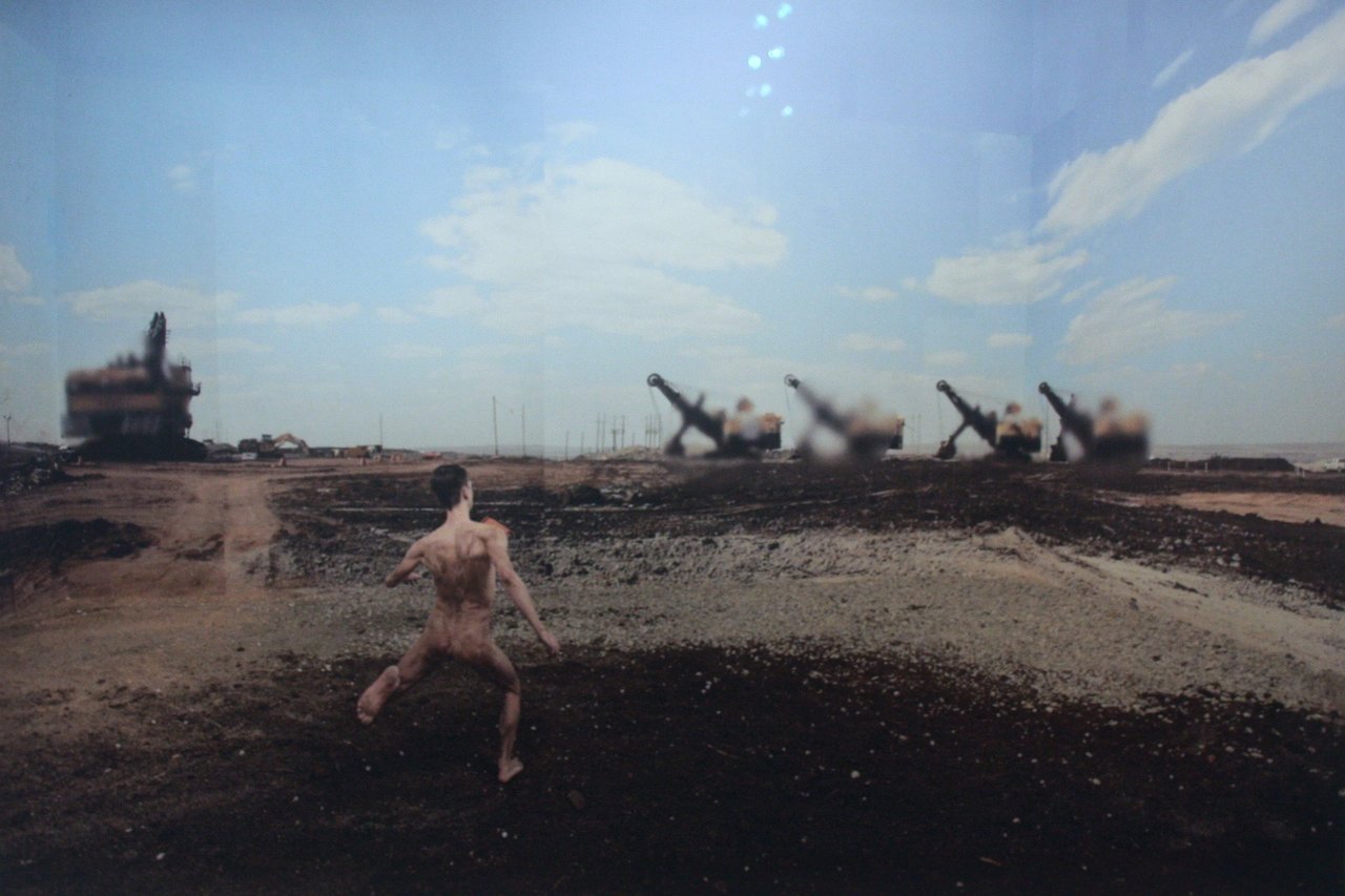
    Kristopher Karklin, Runner, 2015, inkjet print, edition of 7, 36″ x 54 “. Photo: Catherine MacArthur Falls

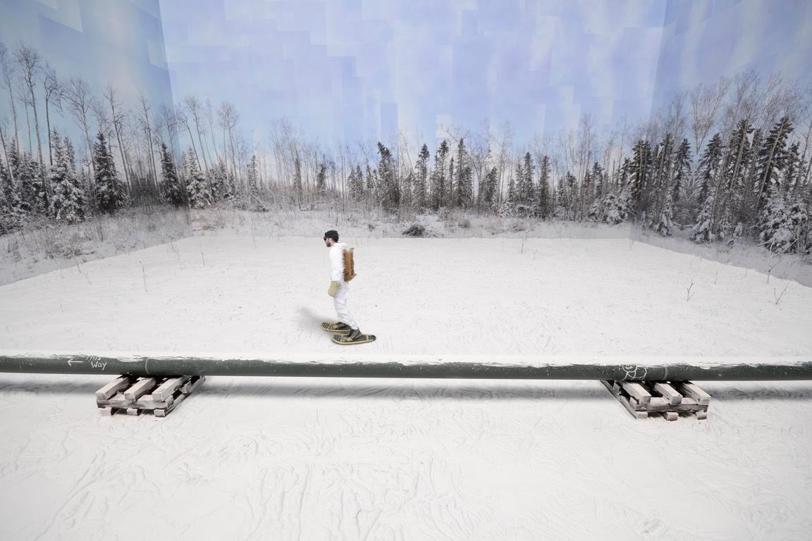
    This mediating effect stems in part from Karklin’s use of photocollage. The backdrops of sky, forest, and field we see in his images are Karklin’s original snapshots of the landscape, which he has pasted like wallpaper to the inside of his scale models and then re-photographed as part of the whole scene. The works are thus not only photographs of built environments, but also photographs of photographs. As the viewer, our distance from the ‘real’ landscape — the landscape that is up there, in northern Alberta, right now — is very far indeed. This distanciation mirrors that of the figures, who are separated from their environment in a number of ways. The most obvious of these, of course, is that the figures represent real people, while the environments are fake on almost every level. But there is also separation by process. Photographed independently, the figures and their environments never inhabit the same space or moment in time — wherever and whenever that might be — until Karklin artificially stitches them together. The snowshoer in “Pipeline” never actually snowshoed past the pipeline; the runner in “Runner” never really ran through the industrial site. The place and time captured in the image never existed. It is a disjuncture that reveals itself in the uneasy, often incongruous, positioning of each figure within his space. The awkward gait of the runner, for instance. The implausible physics of the jumper in “Reclaimed Tub”. The asynchronicity of the snowshoer, whose blurred edges suggest movement, but whose posture is rather still, wooden. It all adds up to a very clear sense of alienation between the figures and their environment, one that Karklin says was a palpable component of his experience in northern Alberta. 

    Kristopher Karklin, Pipeline, 2015, inkjet print, edition of 7, 36″ x 54″. Photo courtesy of Barbara Edwards Contemporary

    It is an effect that is somewhat complicated by Karklin’s enclosure of his environments within the interior space of the model. This seemingly small move to bring the outdoors in constitutes a shift from his previous work, which involved maquettes of solely interior spaces. Of his new work, Karklin recalls that, while working in Alberta, he spent much of his time outdoors. The result was that the landscape became more his home than any indoor space. The series, he claims, is an attempt to capture this feeling. Yet, the work also creates a startling sense of un-hominess. By bringing the outside in, Karklin curtails an Alberta landscape known for its expansiveness, rendering it finite, enclosing. This has a surprising effect: the figures are distant from, yet confined by, their surroundings. Far from appearing at home, they seem trapped, in a way, by their rural or suburban environments. It is, perhaps, a feeling many rural, small town and suburban dwellers can relate to. Having myself grown up in suburban Alberta, I can say with certainty that it is a sense I am deeply familiar with.

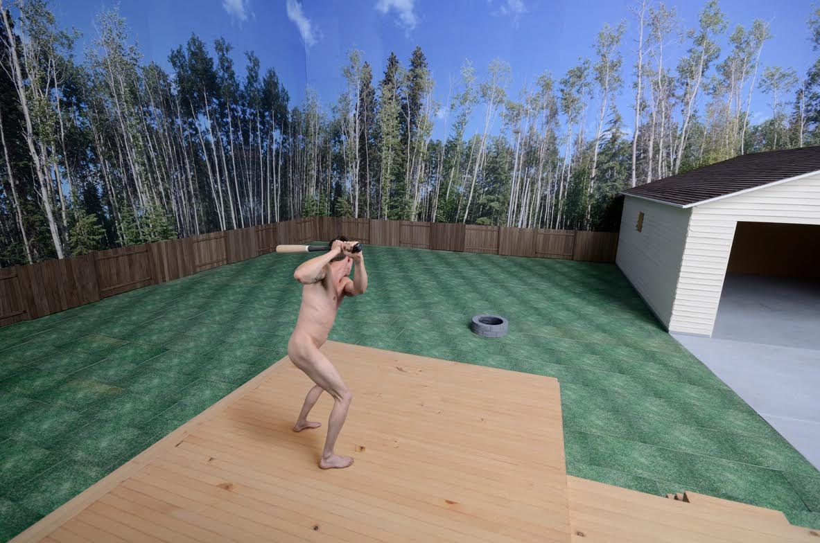
    Kristopher Karklin, Backyard (Daytime), 2014, inkjet print, edition of 7, 36″ x 54″. Photo courtesy of Barbara Edwards Contemporary

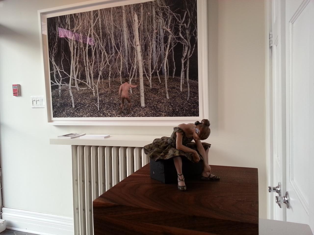
    Karklin at least partially exposes the interiority of his outdoor spaces by allowing signs of his work’s construction to remain visible. A sky will have clearly discernable corners, for example; a forest will have conspicuous seams. Shadows will appear where none should be. It is a display of artifice that also manifests in the materials and textures used—in the hard, plaster-like snow in “Pipeline”, the flat graphic water surface in “Reclaimed Tub”, or the tiled grass in “Backyard (Daytime)”. As Karklin explains, he uses such techniques to emphasize the fakeness of the environment, to bring the landscape into focus, to preclude it from blending into the background. Such details force us to consider the landscape and its relationship to its inhabitants. And, while these details are allowed to show through, many others are conspicuously erased. In all but one photo, for instance, the figures are photographed nude. Karklin thus strips them of much of the information that differentiates one individual from another. The landscape is similarly stripped. In Karklin’s backyard scenes, no toys or lawn equipment are left on the grass, no pots of flowers beautify wooden decks, no Christmas decorations, tools, or sporting goods wait patiently in the garage. There is no sense that anyone really lives in these spaces at all. These are places, persons, and lives that are eerily generic, replicable.

    Kristopher Karklin, Reclaimed Tub, 2014, inkjet print, edition of 7, 36″ x 54″. Photo courtesy of Barbara Edwards Contemporary

    The series is, all in all, full of tensions and provoking contradictions, not unlike the real landscape that inspired it. And though it is hard not to read Karklin’s work as a critique — particularly of a place that continues to receive so much negative attention — he is careful to note that he did not set out to produce political art. He was, rather, simply attempting to document the often-surreal place in which he was living, in all of its ambiguities. In this and many other respects, the work is spectacularly successful. But don’t take my word for it. Even this early in his career, Karklin’s sales history speaks for itself. Many of his pieces currently reside in the collection of Sir Elton John, for instance. Meanwhile, the entire set currently on display at BEC has been purchased by a major yet-to-be-announced Canadian museum. This means — fingers crossed — that it would be available for public viewing for many years to come. We should be so lucky.

    Installation view with Kristopher Karklin, Hunter, 2015, inkjet print, edition of 7, 36″ x 54″. Photo courtesy of Barbara Edwards Contemporary

    Catherine MacArthur Falls

    *Exhibition information: November 20, 2015 – January 9, 2016, Barbara Edwards Contemporary, 1069 Bathurst Street, Toronto. Gallery hours: Tue to Sat, 11 am – 6 pm (or by appointment).


  • STONE IT!

    On November 5th the SSC opened its annual stone show featuring a wide spectrum of works by eleven artists. Their approach to stone is as diverse as the stones of their choice: marbles from around the world, as well as limestones from Ontario, Indiana, and China . A “man-made” cast-stone installation of many elements forming a pictorial narration by Andy Berg, as well as a very precious abstract black Belgian marble from a quarry that no longer exists by Yeon-Tak Chang – elicits provocative dialogue.

    Cathy Knoespel from Artcast Inc.(left) and guests. Photo: Peter Wirün

    Through the opening reception four of the exhibiting artists talked about their work.

    Andy Berg said that her installation “Mappined Terraces” was an interactive project she did in a workshop with audience participants at the Kingston artist-run centre – Modern Fuel. The work is meant to evolve holistically and in the workshop while she was working on it  – the participants rolled up their sleeves and worked intuitively together with her. As such – continuing this collaborative method – the installation of cast-stone elements was assembled by the gallery installation team. 

    Artist, Andy Berg. Photo: Peter Wirün

    Andy Berg, Mappined Terraces. Photo: J.M. Young

    Elizabeth Merei’s sculpture, “Victoria” was shaped without using models or maquettes, as Merei carved it directly into the stone (Italian marble). Her sculptures exude a sensuality that is as prevalent in an abstract form as in a classical figure. Her torsos convey tremendous vitality and movement. Her work is recognizable with its tension between smooth and rough surfaces, highlighting the imperfections and sudden temper of the natural stone. 

    Artist, Elizabeth Merei. Photo: Peter Wirün

    Elizabeth Merei, Victoria. Photo: Peter Wirün

    Andrew Pawlowski stated that he incorporates found materials (steel elements) and stone (marble) assemblages with medieval flair. His symbolic carvings of steel and stone reflect variants of human attitudes towards self-deception. Mental visions imbued along the mysterious road between life and death sway the viewer away from the main tract – unmasking human weaknesses. The symbolic assemblages are thought-provoking evoking poignant dark humour. 

    Artist, Andrew Pawlowski. Photo: Peter Wirün

    Andrew Pawlowski, Skoron. Photo: Peter Wirün

    Dina Torrans pinpointed that the title of her work Ensō, (円相) is a Japanese word meaning “circle” and a concept strongly associated with Zen. Most broadly, Ensō represents the vast qualities of the universe, conjuring up its grandness, limitless power and natural phenomena. It is known as the circle of enlightenment. Its symbolism refers to the beginning and end of all things, the circle of life, and the connectedness of existences. This circle is incomplete, allowing for movement and development as well as the perfection of all things.

    Artist, Dina Torres.Photo: Peter Wirün

    Dina Torres, Ensō. Photo: Peter Wirün

    It was a lively opening reception when the artists and art lovers merged, talked about sculptures and exchanged their ideas and reflections.

    From left to right: J.M. Young, Richard McNeill, Marcus Knoespel from Artcast Inc. Photo: Peter Wirün

    *Exhibition information: November 5 – 27, 2015, Canadian Sculpture Centre, 500 Church Street. Gallery hours: Tue – Fri: 12 – 6, Sat: 11 – 4 p.m.

  • Bezpala Brown Gallery re-opens

    Lyudmila Bezpala-Brown in front of new work by Irma Gutteriez

    November 21, 2015 / 1 – 4 p.m.
    21 Yorkville Avenue, Toronto

    On Saturday, November 21st, artists, collectors and supporters of Bezpala Brown gathered to celebrate the opening of the internationally-focused gallery’s new Yorkville location. The space, which launches with an exhibition of new works by members of the gallery’s roster of permanent artists, may be one of the most relaxing spaces on the Toronto art scene. And not necessarily because of the art it showcases or the soothing vista it provides through its street-facing glass curtain wall. The gallery, which moved out of its Front Street location due to structural and environmental issues, now shares its space with a high-end sensory deprivation spa.

    Guests in the north gallery

    Though certainly out of the ordinary, the match may indeed make sense for the gallery’s mandate. In one sense, the combination of sensory deprivation and sensory stimulation—through the art, of course—is in some ways natural. Yet, as Director Lyudmila Bezpala-Brown described at the event, the space also matches the gallery’s forward-looking vision, which will focus on art that relates in some way to the notion of wellness, be it mental, physical or ecological. Its 2016 Contact Photography Festival exhibition, for example, will consist of photographs that document endangered northern landscapes.

    Irma Gutteriez, After the Wind, oil on canvas, 120 x 120 cm

    Christopher Ross, Dirty Lawn Bird, watercolour and spray paint on canvas, 3.5 x 5 ft

    In the meantime, Bezpala-Brown achieves her objectives by bringing Canadian and International artists into dialogue and providing a safe space for emerging artists to show their work. Promising work by young artists, including Irma Gutteriez, Alice Zilberberg, and Christopher Ross, provide evidence that this approach may be working. Meanwhile, the gallery’s welcoming and holistic philosophy permeated the atmosphere of its launch. Attendees mingled effortlessly, enjoyed a delicious spread of wine and hors-d’oeuvres, and chatted with artists eager to discuss the intricacies of their work. It was a delightful event and Bezpala-Brown is a gracious and accommodating host. May the launch be a sign of good things to come for her and for the new gallery space.

    Alice Zillberberg, Figure of Speech, inkjet on smooth pearl, 2015

    Guests in the south gallery

    Text and photo: Catherine MacArthur Falls

    *Exhibition information: New, November 21 – December 9, 2015, 21 Yorkville Avenue, Toronto. Gallery hours:  Tue – Fri,  1:30 – 4:30 p.m.

  • Interview with Nick Sweetman, a professional street artist

    Artist, Nick Sweetman at work. Photo courtesy of Joyann Reid-Thompson

    Interview with Nick Sweetman (N.S), one of Toronto’s Professional Street Artists by Ella Gorevalov (E.G)

    Toronto is becoming more colorful. More specifically, Toronto’s formerly bland constructions sites are being pioneered with a new form of public art: city-mandated art on construction hoarding. Construction hoarding is the safety fencing that lines a construction site. No longer will we zig-zag across the city to avoid new development projects, as these places are turning into outdoor gallery spaces – displaying the artwork of local artists like Nick Sweetman on their safety fencing.

    PATCH’s newest mural at Sherbourne and Gerrard, titled Pollen Nation, by Nick Sweetman. Photo courtesy of Vadim Taraskine.

    Local non-profit The PATCH  (Public Art on Construction Hoarding) Project partners up with Toronto-based artists and construction developers to transform Toronto’s streetscape in this up-and-coming platform for art. I interviewed one of the artists on PATCH’s roster, who has recently completed “Pollen Nation”, a PATCH project on Sherbourne and Gerrard.

    E.G: Can you tell me about the project, and the process of your work “Pollen Nation” (2015)?

    N.S: I’ve worked with The PATCH  Project on various different projects. They connect artists and communities through public art, starting a conversation about how to make change through art in public space. For this project, PATCH partnered with developer Oben Flats to put up a mural on pollinators as this space is going to serve as a community garden before being turned into housing units.

    I feel passionate about bringing awareness to dwindling bee populations, as science tells us that bee populations are suffering from the things that humans put in the soil. Without pollinators, we don’t have food. The idea originally was to make a Toronto-specific design inspired by local native species but I watched a documentary on pollinators and learned there are a lot more than just insects pollinating plants and I couldn’t pass up the opportunity to display a diversity of animals and color.

    Close up of Pollen Nation. Photo Courtesy of Vadim Taraskine.

    My process for this mural incorporated creating renderings in Photoshop – taking realistic images and giving them a little bit of magic and action through color and movement. After discussing the idea with my friends, we began to think that wind acts as a catalyst for pollination as well. This is when the paint splatters came about. Paint splatters, all in one direction represented pollen being carried by the wind.

    E.G: What is your background in art for the public realm, what draws you to it?

    N.S: What I love about public art is the simple fact that it is public. Meaning it is out of the normal sphere of art, not held in an exclusive space designated for art which many people don’t access in their everyday lives. Public art breaks up someone’s day and incites an aesthetic experience when they aren’t ready for it.

    I first started out in public realm through graffiti, doing illegal work, but now I am more focused on community engaged projects and collaborative mural. I ended up taking a course at MuralRoutes, which is a great organization that helped me learn the basics: budgeting, planning, funding. They helped me raise my profile.

    Through a series of projects through both MuralRoutes and The PATCH Project, I was able to work on art full time. I think my current success is based on me doing by best work, connecting with like-minded people, and following through with everything I promise to do. One of my first big projects was a collaboration with Bruno smoky, Shalak Attack , and Fiya Bruxa (Essencia Art Collective) – which serendipitously came together but subsequently led to many other projects.

    Nick Sweetman’s collaboration with Essencia Collective at Jane and Highway 400. Photo courtesy of Nick Sweetman.

    E.G: How do you draw the line between street art and graffiti?

    N.S: That depends on what you mean by those words.

    The average person might use those terms in less precise ways. But a distinction does exist between street art and graffiti, especially to those that identify as “graffiti” artists. Typically, graffiti is understood to involve lettering, the illegal tagging and ownership of city space, running in crews… I think by and large graffiti is made for other graffiti artists, or for general notoriety. It’s about getting your tag to be the biggest and in the craziest spots. People who are part of this community appreciate it.

    Street art is simply anyone making art in the street. Street art has become a very convenient term for art that is not graffiti, as graffiti artists want to distinguish themselves from street artists. The two cultures are different.

    Most people, when they use “street art”, aren’t being that specific. Is there a divide? Yes. For some people more than others. For me, if I didn’t learn to spray as a graffiti artist, I would have never gotten to paint these murals now, where I work with communities to create artwork that supports and connects them. So I don’t think that these distinctions are so productive, but I recognize that they exist. Moving forward, it’s interesting  to see collaborative pieces where artists are able to straddle both worlds.

    Nick Sweetman’s Python for Wall Expressions, a community restoration project presented in collaboration with StreetARToronto and Toronto Police Service, Mediah, and Team SPUDBomb. Photo courtesy of Nick Sweetman

    E.G: What would be your dream project to work on in the city?

    N.S: The STEPS Initiative (which is the larger organization that manages The PATCH Project) produced an amazing project in St. James Town with my friend and artist Sean Martindale. They installed the world’s tallest mural, a colorful image of a phoenix on the entire side of a 32 story condo. This kind of a project is really rare mostly for budgeting reasons. When I first decided to dedicate myself to art full time, I was picturing these types of huge walls. Since then, I’ve thought of something even cooler.

    It would be a collaboration between myself and a collection of artists in the city. The idea is giving art as a gift to the city. Step one: create art as a group that weaves together seamlessly – a piece of work where individual contributions to the project merge and become one. Step two: take it apart and install it in various parts of the city in such a way that it seems that the art is an inherent part of the city.

    In Our Hands, murals by Nick Sweetman at Valley Park Middle School, Toronto. Photo courtesy of Nick Sweetman

  • France Jodoin: Time and its Reflection at Thompson Landry

    Artist, France Jodoin. Photo courtesy of Thompson Landry Gallery

    For anyone in need of respite from the frenetic, plugged-in, rat race that is contemporary urban life, Time and its Reflection, a solo show of paintings by France Jodoin at Thompson Landry Gallery, may be just what the doctor (or therapist) ordered. The show, consisting primarily of landscapes, seascapes, and still lives in oil on linen or wood panel, is a welcome panegyric to quietude. Jodoin, a resident of Cowansville, Quebec, achieves such an effect utilizing only a palette knife, scraping and smearing her subjects onto the picture plane. The result is a sumptuously textured aesthetic and an image that hovers tenuously between abstraction and figuration. It is work that could not be more appropriate for its current home at Thompson Landry, a luxe Distillery District gallery specializing in historic and contemporary Quebec painting and sculpture. Jodoin’s is classic subject matter done well, inviting comparison with the French Impressionists and Romantics like Caspar David Friedrich and J.M.W. Turner, the latter of whose paintings are, coincidentally, on display at the Art Gallery of Ontario. These artists’ light-suffused landscapes favourably lend their associations to Jodoin’s work, which borrows their evocation of the sublime, awe-inspiring natural scenes, and phenomenological leanings. 

    France Jodoin, Le silence est un peu de ciel qui descend vers l’homme, oil on linen, 48″ x 24″. Photo courtesy of Thompson Landry Gallery.

    Jodoin welcomes such comparisons. A self-professed classicist, she is drawn to literature and art from the 17th to 19th centuries and uses these as frames of reference for her work. A painting will begin with a composition or colour palette directly inspired by an historic portrait, for example. Or Jodoin will draw a work’s title from an anthology of literature of this era; her references include writers such as Elizabeth Barrett Browning, Emily Dickinson, and Lord Byron. When asked about her fascination with the 19th century in particular, Jodoin responds, “I have an affinity for this era, for the past. It feels very natural to me.” It is a fascination, she concedes, that has much to do with the perceived pace of the past. To her, the past possesses a meditativeness that contrasts with the frenzied pace of life today. Through her work, Jodoin aims to bring the comparative stillness of the past to the present, to create an immersive experience with it. It is a plastic approach to time and an enticingly paradoxical project, as to immerse oneself in an experience would seem to imply a full inhabitation of the present moment. It is an aim she achieves partially through her heavy referencing of historic styles, but also through often quaint historic details: a penny-farthing or bustled skirt, a cityscape devoid of contemporary architecture. 

    France Jodoin, Barges, like scattered old shoes, zealously trample gothic facades, oil on linen, 30″ x 30″. Photo courtesy of Thompson Landry Gallery

    As for the immersive aspect of her work, Jodoin achieves this in ways now associated with her painterly predecessors: tranquil subject matter, a muted palette of soft blues, pinks, greys and yellows, atmospheric light, a sketchy picture plane, and an often grand use of scale. Indeed, like the work of the Impressionists, light seems to emit from within the built up layers of paint on Jodoin’s surface, and draws the viewer like a candle’s flame. Similarly, her unsettled surface—tangled paint scraped, rather than brushed, onto its ground—forces the gaze to float unmoored, in search of a hard edge, horizon line, or detail where often there is only a vague dissolving suggestion. These hints at figuration—the feathery masts of “So Fine was the Morning Except for a Streak of Wind Here and There”, for example—remind us how keenly our minds grasp onto the real, how expertly we construct narrative where it is just barely present, how quickly we recognize and fill in gaps. It is with these barely representative works that Jodoin truly excels. As viewers, we easily lose ourselves until our narrative task is complete. In many cases, the use of large scale heightens this immersive experience—light and surface come to occupy one’s entire field of vision. The works are, ultimately, elegant and engrossing. Jodoin achieves her objective of stillness and the eye cannot look away.

    France Jodoin, So Fine was the Morning Except for a Streak of Wind Here and There, oil on wood panel, 48″ x 48″. Photo courtesy of Thompson Landry Gallery

    This is not to say, however, that the work is without its darker moods. Calmness, Jodoin reminds us, is not necessarily benign. Amidst serene images of blue-grey waters hang works with slightly more sinister undertones. For a still life with flowers—”My Heart is Like a Singing Bird”, for instance—Jodoin may choose a conspicuously blood-like red. Or, an otherwise placid water scene—”My Dwelling is the Shadow of the Night”, for example—will rest uneasily over its dark under-painting, layers of disquieting red or black peaking out from under calm blue. In cases such as these, slashes of knife-smeared paint seem not only sumptuous, but also eerily foreboding. Meanwhile, such works expose the significance of layers to Jodoin’s overall project. Each painting, she describes, is a result of accumulation over time; it is a process of intuition, in which layers settle one on top of another until the work is complete. The final result is often at a distant remove from its beginnings and may incorporate many moods. As Jodoin explains, “we are a palette. I don’t want to privilege parts at the expense of the whole.”

    France Jodoin, My Heart is Like a Singing Bird, oil on linen, 48″ x 36″. Photo courtesy of Thompson Landry Gallery

    In this regard, seascapes—what she calls “the other landscape”—may be her ideal subject. The sea, she observes, contains “as many if not more moods than the land. It changes constantly; it is infinite. No wave is the same as any other.” This many-sided understanding of water extends from Jodoin’s personal experience: she admits to needing water—not only physiologically, but also artistically—and yet also admits to being afraid of it. The complexity of this relationship mirrors many of our encounters with the natural world and may explain why Jodoin’s seascapes are, in my opinion, her strongest works in the exhibition. Yet, even as a whole, Time and its Reflection showcases a body of work that is beautiful, affecting, and skillfully rendered. Though its muted palette, luxuriant textures, traditional subject matter, and luxe location means it will likely be seen primarily in tasteful Rosedale mansions once the show has concluded, for now it is open and available as a reprieve for all of us harassed city dwellers. And in this, Jodoin has succeeded in her aims. Stop on in and have a look.

    Guests at the Opening Reception

    Catherine MacArthur Falls

    *Exhibition information: November 12 – December 6, 2015; Thompson Landry Gallery Stone Distillery, 32 Distillery Lane, Toronto. Gallery hours: Tue – Sat, 11 am – 6 pm; Sun, 12 – 5 pm.

  • Robert Chandler: “Something Happened” at Yumart

    Through the title and the percussive musicality in his paintings, Robert Chandler showcases colorful abstract works that are geometrically distinct, and intuitively spontaneous.

    Opening Reception, November 7, 2015

    Most of his paintings are very recent, dated 2015, but perhaps the most accomplished painting comes from 2008. “Jump Start” has just enough space for his marks to move around freely, whereas some of his smaller works lack this advantage of space. Because of the larger space, the mark making is created with more ease and confidence. Intuition and spontaneity characterize “Jump Start” – it’s definitely one of the most resolved and satisfying painting in his collection. Compared to a similar piece painted in 2006, “Crush”, “Jump Start” is more developed in the sense that, while utilizing the same palette as two years prior, there is better interplay between each colour. The neon green in Jump Start is thoughtfully integrated into the composition, to create interesting depth and shapes. Chandler’s execution of geometric layers allows the paintings to evoke a sense of urban cityscape: not only of the aesthetic but also of the mindset of urban dwellers. Like in our busy city there is non-stop flow of stimulation in the painting, both positive and negative. 

    Robert Chandler, Crush, 2006, acrylic on canvas 52″ x 50″

    Robert Chandler, Jump Start, 2008, acrylic on canvas 48″ x 60″

    With the most recent paintings Chandler has begun experimenting with incorporating figurative forms in his paintings, as well as using a more minimal palette and smaller surfaces. “A New Deal” and “Little Heretic” effectively incorporate both abstract and figurative elements that there is just enough conversation for viewers to be intrigued. Some of his more figure-focused paintings, such as”Tomorrow’s Trophy” or “Victor’s Rag”, provide a more outlined narrative, guiding the dialogue between the work and the observer. Even though on a small surface, the 2013 abstract “Scratched Entry” manages to effectively use its negative space to create breathing room in the composition.

    Robert Chandler, A New Deal, 2015, acrylic on canvas 24″ x 18″

    Robert Chandler, Tomorrow’s Trophy, 2015, acrylic on canvas 16″ x 12″

    The success of “A New Deal” and “Little Heretic” is a reminder that a skilled painter like Chandler is able to incorporate to the new figurative works his mature mark making and composing abilities. It is always intriguing to investigate the different ways in which paintings change through time. For painters, even a few months can mean a fresh set of perspective and inspirations that drastically change the mood of the pieces. I could personally spend hours walking back and forth between Chandler’s “Jump Start” and “Crush”, comparing every little detail digging myself deeper into the layers as I explore.

    Robert Chandler, Little Heretic, 2015, acrylic on Canvas 10″ x 8″

    Robert Chandler, Jump Start, 2008, acrylic on canvas 48″ x 60″, Detail

    Text and photo: Sunny Kim

    *Exhibition information: November 7 – 28, 2015, 401 Richmond Street West, Suite B 20, Toronto. Gallery hours: Tue – Sat, 12 – 6 p.m.