Author: artoronto

  • Jesse Harris: PATHS at Cooper Cole Gallery

    On the lower level of the Cooper Cole Gallery the strobe light bleeds into the edges of the main entrance leading curious viewers down to Jesse Harris’ solo exhibition. Instantly the eye is drawn towards the mysterious room and it’s distinct sign inspired by San Francisco’s staple punk spot, 924 Gilman Street Project. 

    Jesse Harris’ poster. Photo: Rhiann Moore

    The sign, the strobe light, and the vinyl works all come together to create what the gallery owner referred to as the inclusive ethos of the punk movement. The strobe light is intense and shocks the system, but it’s also reminiscent of a time that the world has largely moved past. Jesse Harris recreates a time of unexpected diversity and severity in music. 

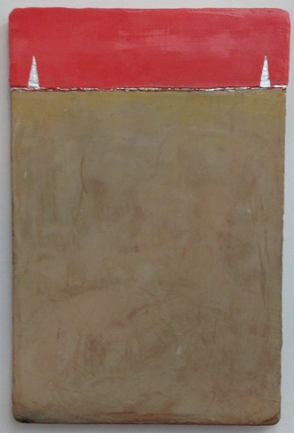
    Jesse Harris, Isocrasy Crowd, 2015, Vinyl on steel, 7″ x 5″. Courtesy of Cooper Cole Gallery

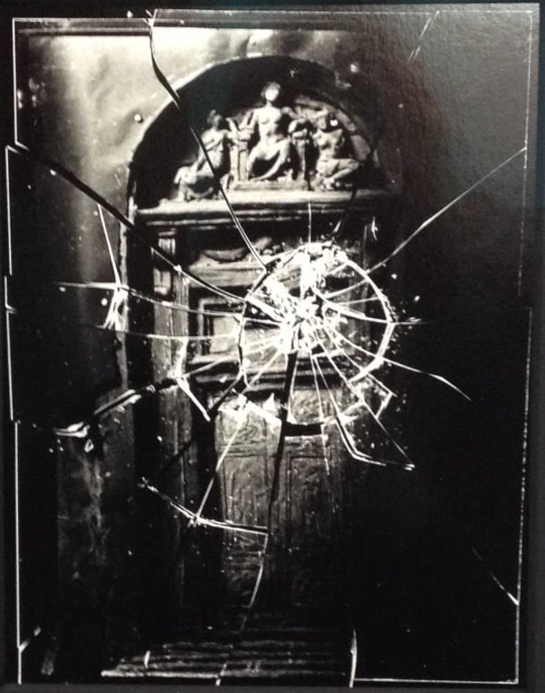
    A vinyl plotter is used in the style of an etching, rather than a knife scratching the records in order to leave impressions of 80’s photographs on the vinyls. The title PATHS harkens to the lines that are drawn on the records as their plotted paths retell the story of the punk movement. Thematically, the plotting seems to be leaving its imprint on the records, as if the punk movements influence on music has left an utterly unique mark. The photographs are part of the music as much as the music is part of the photographs.

    Jesse Harris, Isocrazy 1, 2015, Vinyl on steel, 5″ x 7″. Courtesy of Cooper Cole Gallery

    The photographic records of the punk movement printed on actual vinyl records seem to comment on the influence of the music scene on non-musical art forms. Although Jesse Harris is not a musician it’s clear how punk music fueled this specific project. The works are Jesse Harris’ way of making an album without actually producing any original music.

    Jesse Harris, selfie. Photo: Rhiann Moore

    Overall the tight space projects the intimacy and inclusion of the punk movement. Everything about the exhibition, down to Harris’ bonus bathroom selfie (picture above), works to recreate the intensity of an unforgettable time in musical history.

    Rhiann Moore

    *Exhibition information: November 6 – December 12, 2015, Cooper Cole Gallery, 1134 Dupont Street, Toronto. Gallery hours: Wed – Fri: 1 – 6 p.m., Sat: 11 a.m. – 6 p.m.

  • Rocks, Stones, and Dust at UTAC

    One might think of rocks as scary or funny or thought provoking but most people just think of them as rocks in general. Curator John G. Hampton in the exhibition, Rocks, Stones, and Dust, at UTAC has figured out a way to involve all of those aspects and more in this show. He is the curator-in-residence and has established a very unique narrative for the exhibition. According to him, this show did not start with rocks, but with his search of  “beingness”. Hampton discovered that, unintentionally, his research seemed to return to rocks – whether in indigenous folklore or the scientific beginning of life on Earth itself, all tales have their roots in rocks.

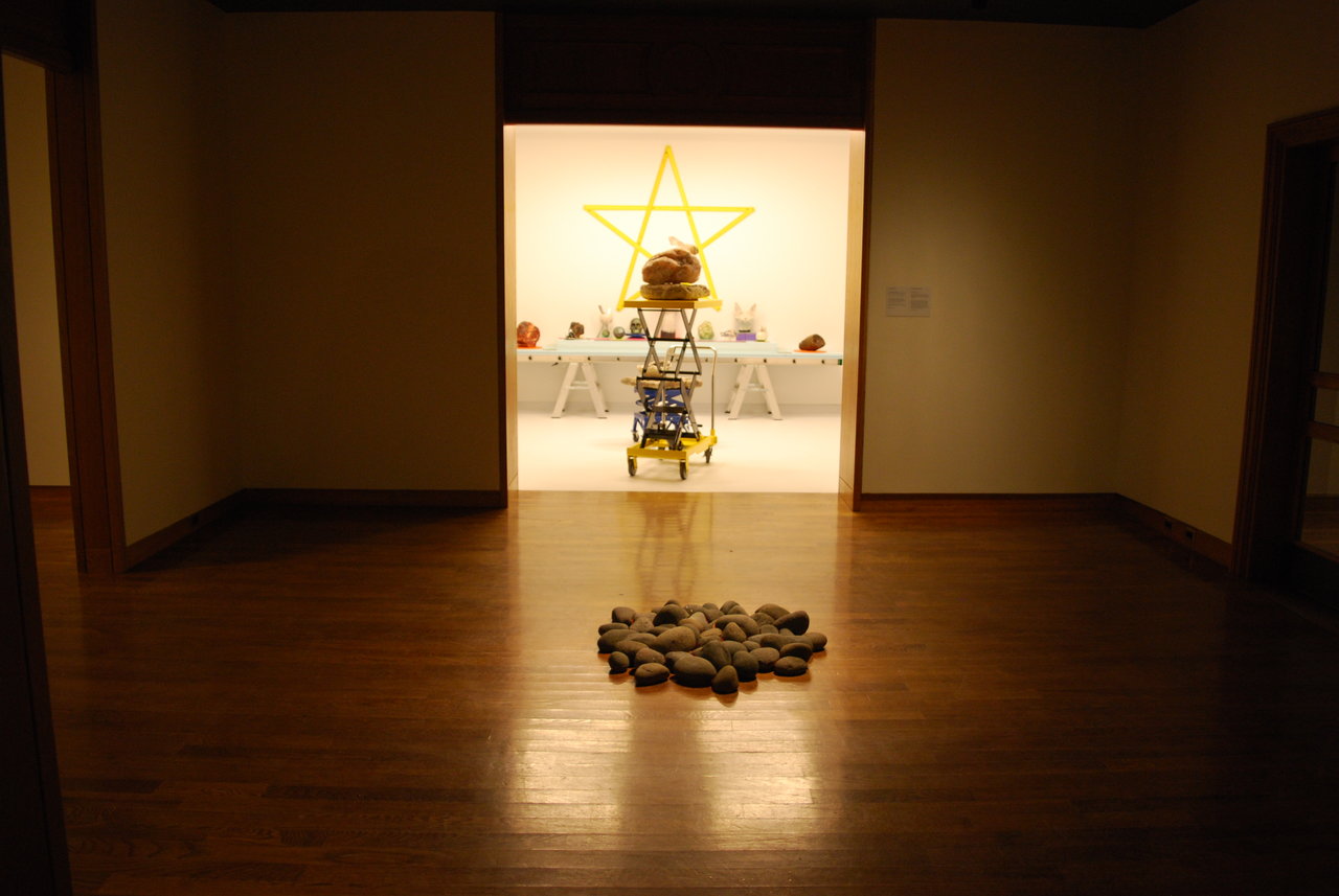
    Installation view with Michael Belmore, Smoulder (front) and FASTWÜRM, C.A.T. (back)

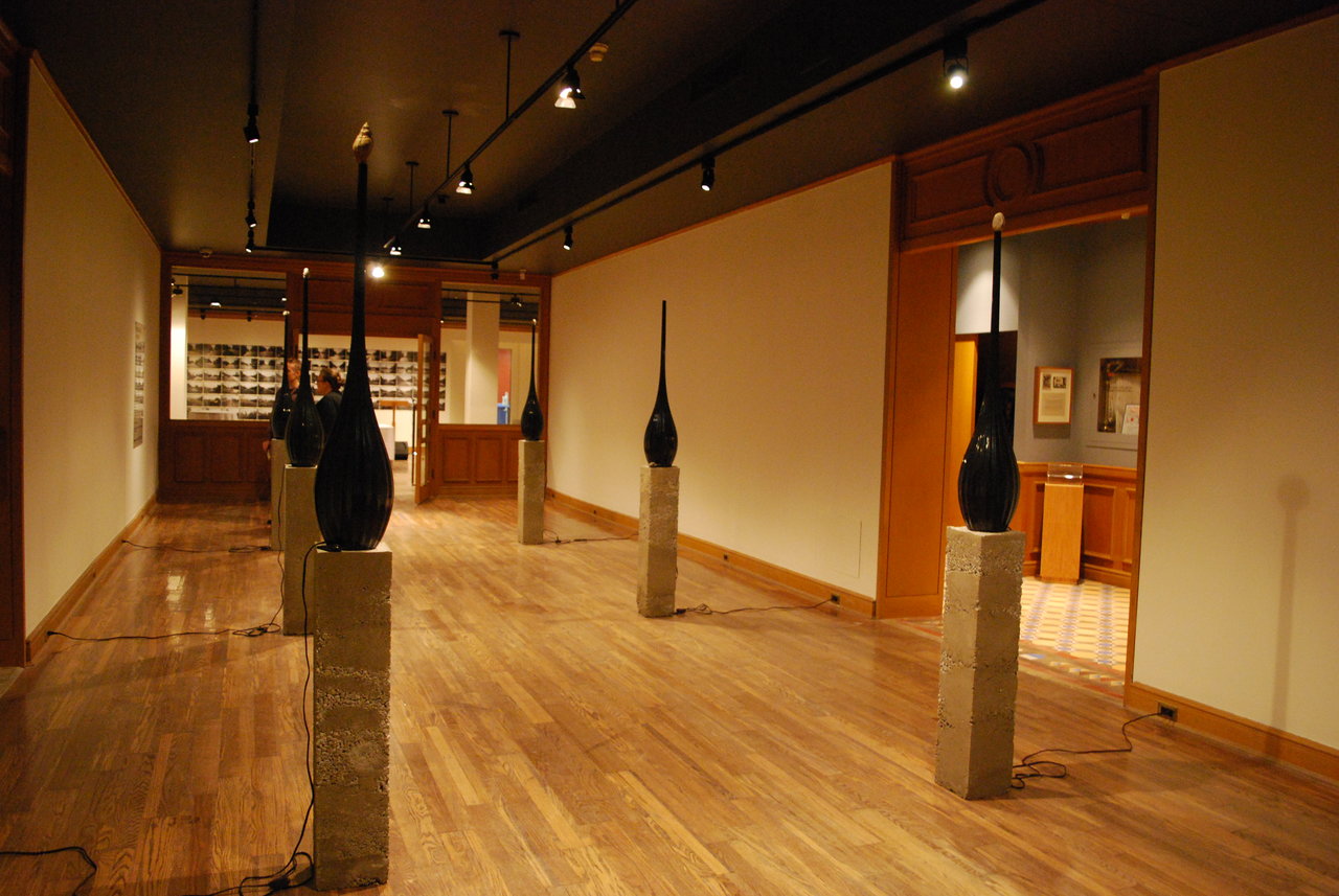
    Fitting for Halloween, there is a distant noise in the gallery. The sound is coming from the furthest room of the gallery, so while visiting this noise always plays in the background. Sounds, like whistling, grunting, mumbling, rambling, yelling are setting the atmosphere of the exhibition. The noise is actually juxtaposes the first few pieces near the entrance. As if to ease us in, the space greets its visitors with six long humidifiers making up a walkway. These very gentle pieces have a fossil placed on top of each one, and the vapour spills out through them, moistening both the fossils and the room. Speeding up the process of erosion, this piece establishes a cycle of energy. Electricity is used in the same way that energy from fossil are usually used, it powers the humidifier then the moisture ‘quickly’ erodes the fossils on top of the humidifier, turning them back into energy source. Jason de Haan’s installation has a gentle epic sense as the soft hum of the humidifiers evokes a process that takes an insurmountable time to be completed. 

    Jason de Haan, Swallow all the Brain, 2015, brachiopod, clam, and ammonite fossils, ultrasonic humidifiers, cast aggregate concrete plinths

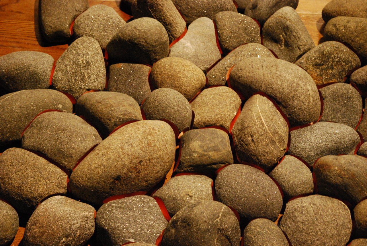
    As we pass the walkway through the doors, there is a small room with three pathways. In the centre there is a gathering of moderately sized rocks that have been carved to fit into a pattern just like pieces of a puzzle. The cut surface – where the rocks touch each other – has been painted to the colour of warm copper. Recreating a dying campfire, ”Smoulder” by Michael Belmore reminds us of the feeling of staring into the pit timelessly, as the last flames burn out and all what remains of the fire are the warm rocks.

    Michael Belmore, Smoulder, 2010-11, detail

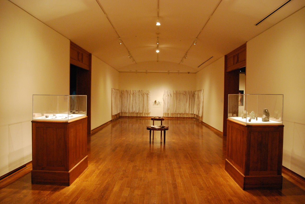
    Each of the three paths seems to be radically different from one another. There is a crowded display by both modern and ancient artifacts with bright colours created by FASTWÜRM on the right. In the front there is a minimalist display of smaller rocks by Kerri Reid, Bonnie Devine, Kelly Jazvac, and Lucy Tasseor Tutsweetok placed on glass shelves or in showcases; and the monotone photography by [name] on the right.

    FASTWÜRM, C.A.T. (Core Affect Traffic), 2015. raku, geological samples from FASTWÜRM’s collection, and C.A.T. system configuration and iconography

    From left to right: work by Kerri Reid, Bonnie Devine, Kelly Jazvac and Lucy Tasseor Tutsweetok

    There are even more rooms further down. On the right are works by Marcelo Moscheta, Lawrence Weiner, Spring Hurlbut and Nicholas Mangan’s video installation. Mangan fascinatingly recreates the aesthetic of a fast-evolving galaxy by throwing a handful of Zircon dust and filming it at a 1/100th speed. With black background and bright lights that highlight the specks, the result is a gorgeous clip with shiny ‘stars’ falling down slowly. One loses the sense of time as becoming absorbed into the film in a private, pitch black, little room.

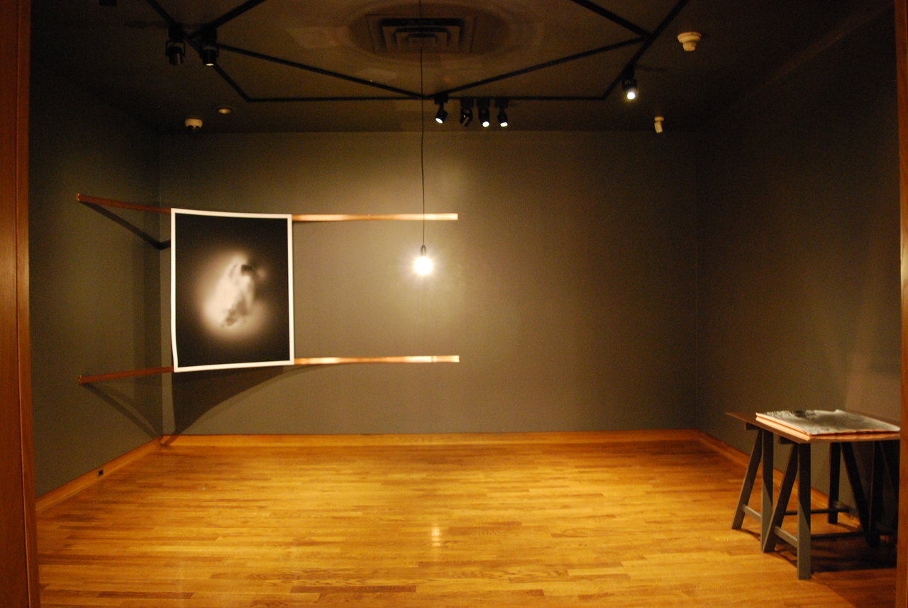
    Susanne Kriemann, Untitled (nuclear), 2013. Inkjet on Hahnemuhle Photo Rag 308 gr

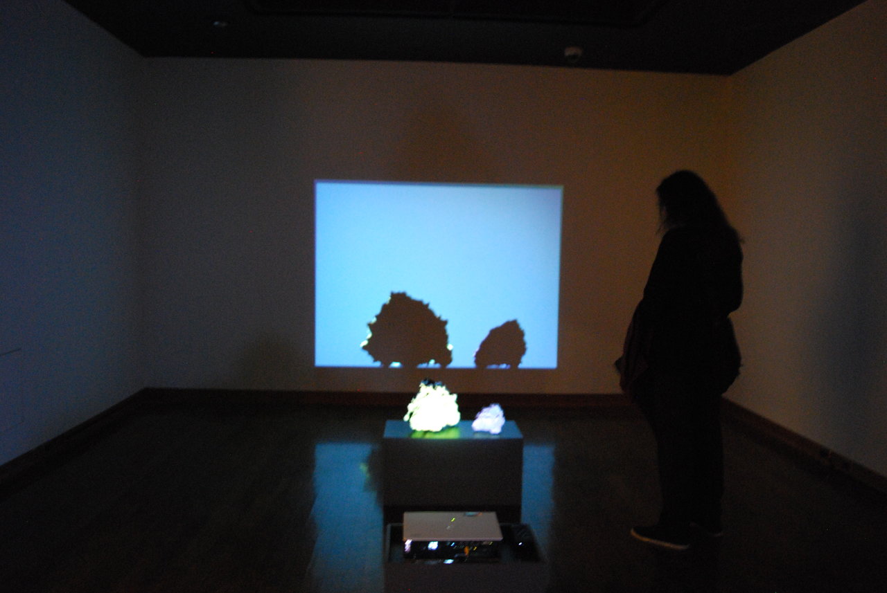
    Finally we follow the noise into the far-left room where rocks with human personalities surprise us. It is an installation with a projector and two large stones on a pedestal. The edgy stones cast a shadow onto the projection and one by one, similarly shaped stones fall from the top, grunting, whistling, and yelling. Their objective is to return to their origin, the shadow of the stone. Some have an easy time, while others have a hard time doing so, thus the easy going humming or the frustrated mumble. Didactic panels try to explain the procedure but instead many of them tend to specify too much of its intentionality, narrowing the possible subjective responses. “Pleasure Stones” by Egill Sæbjörnsson sums it up the best: “In this theatrical installation, two Icelandic lava rocks animated through light, colour, and sound. The character brought out of the rocks offers a playful meditation on the beingness of stone. In an interview with new materialist philosopher Jane Bennet, the artist asks: ‘given that everything on Earth comes out of magma, and that living creatures descend from inanimate materials, are human beings just like walking stone?’ ‘Yes [answers Bennet].” I found that it is better to look at the work first, and then skimming the didactic panels with some personal reflections already in mind, untainted by the directions given. 

    Egill Sæbjörnsson, Pleasure Stones, 2008, lava rocks with a single-channel video (7 minutes)

    Rocks, Stones, and Dust is a highly intentional exhibition that explores the theory that humans share their roots with rocks from the early period of the development of Earth – widening our perspectives of our beginning.

    Text and photo: Sunny Kim

    *Exhibition information: October 28 – December 18, 2015, University of Toronto Art Centre, 15 King’s College Circle, Toronto. Gallery hours: Tue & Thu – Sat 12 – 5, Wed 12 – 8 p.m.

  • BMO 1st Art! Exhibition at JMB

    BMO 1st Art! Exhibition displays the works of art done by emerging artists in each province in Canada. Despite all the artists coming from different places, with the exclusion of Alberta that includes both a provincial and a national winner, they all manage to connect through their themes such as identity and displacement. The competition began with 160 candidates and was eventually narrowed down to the 13 pieces shown at the Justina M. Barnicke Gallery on the University of Toronto campus.

    The National winner Tamara Himmelspach’s “Back into the Earth: Creation and Interpretation of Meaning” is a multi-media performance work commemorated by photographs and the display of her jingle dress. It is no doubt why the piece was chosen nationally as it truly explores what it means to be an Aboriginal Woman in 2015, a subject at the height of it’s importance as Canada enters a new Liberal era.

    Tamara Himmelspach (Alberta College of Art & Design), Back Into the Earth: Creation and the Interpretation of Meaning. Jingle dress, beaded purse and moccasins: cotton and polyester, unfired clay, deerhide, beads; 11 inkjet prints. Overall installation 72 x 72 in

    Some artists like Alberta’s Svea Ferguson and Nova Scotia’s Connie Lynn Higg turn to textiles in their works with vastly different results. Higg’s “(r)evolve” is a gentle consideration of abstract thought, while Ferguson’s “Future Classic” created of weaved linoleum blends a classical sculpture of a bird with an everyday material usually used to cover floors. Lindsey Wilson from Ontario also uses textile materials: wool and silk yarn; though she adds ceramics creating a sculpture, titled “Murmur I”, in order to explore the connection of body and material in her highly personal piece.

    Svea Ferguson (Alberta College of Art & Design), Future Classic, Linoleum flooring, 38 x 28 x 5 in

    Lindsey Wilson (Queen’s University), Murmur I, Stoneware, wool, silk yarn, 24 x 7 x 3 in

    British Columbia winner, Richard Heikkilä-Sawan brilliantly questions identity through the use of a buffalo hide and dye in “Freedom Flag”. Similarly, Yucen Zhou (Manitoba) pleasantly knocks the viewer off kilter in “The City Underwater (Montreal)”. Zhou turns the world upside down; what first appears as the sky is depicted under a ladder that leads to a ship’s deck. Newfoundland & Labrador’s Alex Nole pinpointed in the enlightening “Only Begetter” series that Shakespeare’s sonnets went through a Christianizing procedure by changing from pronouns that addressed them to a male lover to a female.

    Yucen Zhou (University of Manitoba), The City Underwater (Montreal), Oil on linen, 60 x 48 in

    Richard Heikkilä-Sawan (Emily Carr University of Art & Design), Freedom Flag, Buffalo hide, dye, 79 x 54 x 2.5 in

    There is also the theme of travel consistently coming back. Jasmine Keillor (New Brunswick) explores nostalgia in a blend of sculpture and drawing in “Travellers”. Saskatchewan’s Shelby Lechman and Yukon’s Jon Iñaki Etxeberria Vanneste travel back in time. Vanneste uses digitally manipulated original photographs to look into the distortion of history in “Moving Target Artifacts” while Lechman’s “Exodus”, in the classical format of oil painting, pays homage to the history of the Hungarian Uprising in an effort to warn future generations of what a loss of humanity can cause.

    Shelby Lechman (University of Saskatchewan), Exodus, Oil on canvas, 60 x 72 in

    Nunavut’s Ramona Barkhouse uses the process of making her beautiful necklace “Flight of the Peacock” as an allegory for life and pride in one’s work. P.E.I’s winner Jude Scheppele in her arresting and disturbing digital illustration, “Dysmorphia”, criticizes societies desire to label people. On the other hand Erin Skelton (Quebec)  in her sculpture “All Our Mother’s Wishes” shows the need for physical belonging we all carry within ourselves, the strong bond between mother and child. 

    Erin Skelton (Concordia University), All Our Mother’s Wishes, Steel, porcelain, pigmented encaustic, cotton cord, silicone, wood crate, 9 x 18 x 7.5 in

    Each piece displayed at BMO 1st Art! Exhibition is utterly unique, yet they all find ways to connect with each other. It is clear why each of the pieces were chosen as they all seek to ask questions about their history, their future, and the meaning of life.

    Rhiann Moore
    Images are courtesy of BMO 1st Art! Exhibition

    *Exhibition information: October 22 – December 18, 2015, Justina M. Barnicke Gallery, Hart House at the University of Toronto, 7 Hart House Circle. Gallery hours: Tue – Sat 12 – 5, Wed 12 – 8 p.m.

  • Tawlst: The History of Touches at Angell Gallery

    Art objects participate in a discourse that has been structured hierarchically around an assumed correlation between size and power or importance, privileging the grandiose work of art, with its connotations of democracy, heroism and spectacle. In opposition, small objects have been associated with intimacy, collecting and personal memory or nostalgia. Contemporary artists who work with miniatures have the opportunity to complicate historically dominant expectations about the spaces minute objects can occupy and the subjects which they can address. In the exhibition The History of Touches, currently on view at Angell Gallery, Canadian-Trinidadian artist Tawlst presents miniature dioramas in reclaimed ring boxes. In direct opposition to monumental art objects, which are considered to be democratic as they are ultimately conducive to mass public viewings, the viewing experience of miniatures demands a degree of intimacy – they are more suited to the private sphere. At Angell, this fact is heightened as the viewer enters the exhibition space by parting a set of curtains which separates Tawlst’s work from the rest of the gallery.

     TALWST, I Know Places We Could Go, 2014. Mixed media in vintage ringbox. 3″ x 3″ x 3″

    The division may also be in part due to the fact that these works are sexually explicit in nature, depicting a variety of erotic scenes. Yet while a general sense of the acts committed in each diorama can be gathered, they remain vague – complicating the distinction between public and private, they both reveal and conceal. The artist cites Japanese Shunga art as an inspiration for the central themes of eroticism, considering the ways in which this art opened new possibilities for human contact and intimacy. While conceptually this show may draw on the historical reference of Shunga, the scenes depicted are decidedly contemporary, with the often and repeated inclusion of, for example, laptop computers. As the title may suggest, the exhibition considers the development and changes in a long history of human intimacy and interaction. 

    TALWST, Nature Feels (Arancio Beret), 2015. Mixed media in vintage ringbox. 2″ x 2″ x 3″

    TALWST, She Know, 2015. Mixed media in vintage ringbox. 2″ x 2″ x 2″

    These pieces belong to a much larger body of Tawlst’s work, the “infinity series”, all connected by the use of the ring box. These reclaimed objects would have originally been used as cases to hold or protect something precious or valuable, and have been reemployed by the artist as a means of exploring a range of subject matter from pop culture and art history to racial marginalization and police brutality (“Minimized Histories” being one example). The crafted figurines inside the ring boxes may also bring to mind a toy – the physical embodiment of fiction, and the perfect device for fantasy and play, allowing for the repeated manipulation of the figures through the testing and investigation of different scenarios.

    TALWST, Self Love II, 2015. Mixed media in vintage ringbox. 2″ x 3″ x 3″

    Understandably, miniatures bring about a change in the relationship between body and object – the works require a distinct change in the bodily conduct and behaviour of the viewer. Diminutive objects require the body to contort as the curious observer changes their posture to get closer to the item, crouching down to or hunching over the objects to gather more detail and to simulate a more private viewing of the object. Tawlst’s work is without a doubt made all the more captivating through its demand for viewer engagement. The particular height of the plinths used to exhibit the work encourages practices of public voyeurism, desire to behold and scrutinize these precious objects. The act of voyeurism is heightened by the inclusion of impossibly small mirrors within a number of the dioramas. Having caught a glimpse of my own face while peering into these tiny boxes, immense in comparison, I was made aware of my assumed role of voyeur in the scene.

    Text and  photo: Katie Lawson

    *Exhibition Information: October 16 – November 14, 2015, Angell Gallery, 1444 Dupont St., Unit 15 (entrance off Campbell Ave). Gallery Hours: Wed – Sat 12 – 5 p.m.

  • Joanne Tod: Slipstream at Nicholas Metivier

    Joanne Tod, Liquidity, 2015, oil on canvas, 72 x 54 inches. Courtesy of Nicholas Metivier Gallery

    Joanne Tod’s Slipstream, on view now at the Nicholas Metivier Gallery, sees the artist visualizing institutional spaces, both barren and populated. Empty hallways, storefront window displays, and boardroom conferences are rendered in the artist’s particular mimetic aesthetic, providing a window into bleak, yet familiar interiors.

    Joanne Tod, A Lemon Entry, 2014, oil on linen, 18 x 14 inches. Courtesy of Nicholas Metivier Gallery

    Tod employs Renaissance perspectival principles when recreating her typically commonplace subject matter, injecting her images with a sense of realism and technical dexterity. Her canvases act as portals into new existences, inviting the viewer into locations of exploration and endless potential. Similarly, these desolate passages position the viewer as an urban explorer, imaginatively unlocking the possibilities that interlocking stairwells and doorways present, creating a multifaceted phenomenological experience from painting to painting.

    Joanne Tod, Serpentine Fire, 2015, oil on canvas, 72 x 54 inches. Courtesy of Nicholas Metivier Gallery

    In the images where humanly figures are present, the viewer is privileged an all-encompassing, yet distanced perspective in relation to these peculiar tableaus, randomly placed in these inhabited spaces as a curious indoor flâneur/flâneuse. Furthermore, these scenarios posit a wealth for potential interaction, whether it is passively witnessing an orchestral practice session or a willing participant in a pedagogical lecture.

    Joanne Tod, Phantom Limb, 2015, oil on canvas, 64 x 48 inches. Courtesy of Nicholas Metivier Gallery

    Throughout the exhibition, the viewer slips in and out of separate spaces, enabling peculiarly disparate experiences within each rectilinearly framed image. These interiors incite a sense of exploration, and an imagining of the endless possibilities encoded within these expertly crafted paintings.

    Joanne Tod, Gig, 2014, oil on linen, 18 x 24 inches. Courtesy of Nicholas Metivier Gallery

    David Saric

    *Exhibition information: October 15 – November 7, 2015, Nicholas Metivier Gallery, 451 King Street West, Toronto. Gallery hours: Tue–Sat, 10 am–6 pm.

  • Skawennati: AVS at ELLEPHANT

    Founded in Montréal, Québec ELLEPHANT has a first-time Toronto address for a spectacular exhibition featuring the Mohawk artist Skawennati. Having lived in both Montréal and Toronto, ELLEPHANT founder Christine Redfern decided to have a space in Toronto because she felt that there was not a strong representation of artists exchanged between the two cities. She tells me, “It seemed like a natural programming move to introduce both cities to great artists and artworks that were under the radar in both art scenes.”

    ELLEPHANT, gallery space with Skawenatti, Time Traveller

    Skawennati’s exhibition, entitled AVS, spotlights her exploration of time, history, and Aboriginal culture in the virtual game Second Life. Through this, Skawennati has created an entire world centered on the fictional characters Hunter and Karahkwenhawi. They are from different periods in time but are able to fall in love thanks to a funky pair of blue time-traveling glasses. Skawennati turned this world into nine “machinima” (a movie made in a virtual world) episodes, all of which play at the gallery, titled TimeTraveller. It is easy to find yourself quickly engrossed in this story. While some parts are obviously fictional, Hunter is from Montreal in the year 2121, Skawennati includes historical facts in her game. The depictions of how First Nations people have been treated through history are cruel but are in no way at the forefront of Canadian history. I could not hide the look of surprise on my face when a priest in 1680 refers to Aboriginals as ‘savages’.

    Raven, Baddest Motherfucker in the World, machinimagraph, 17 cm x 30 cm – photo by Skawenatti. Courtesy of the artist

    Face Off, machinimagraph, 86 cm x 152 cm – photo by Skawenatti. Courtesy of the artist

    Five Roses, machinimagraph, 35 cm x 60 cm – photo by Skawenatti. Courtesy of the artist

    To display history is not Skawennati’s main motive behind TimeTraveller however. She wanted to exemplify aboriginals in the present and future. Hunter and Karahkwenhawi show viewers that aboriginal people participate in typical activities of our world today, something that Skawennati felt was not represented. The choice to convey history as well as human emotion and interaction through an virtual world is effective. The film is enjoyable to watch and brings me back to a time when I spent many hours playing video games. Though I was not familiar with Second Life, after speaking with Skawennati about how this virtual world works, I learn that it is definitely out of the realm of games I played and is less like a video game but more of a, well, second life. As I watch more and more of TimeTraveller, I discover that even with the characters’ funny facial expressions and jerky movements that are unavoidable in video games, this aspect does not take away from the emotion I experience. Skawennati successfully moves her audience with the characters she has created.

    Skawennati, Dancing with Myself, Diptych, machinimagraph and photograph, Inkjet on cotton rag, 182 cm x 92 cm. Courtesy of the artist

    Accompanied with the video that plays in the gallery are still images, which she calls machinimagraphs, that the artist took from the game. Skawennati was an absolute delight to converse with at the opening reception. Her warmth and charm made it a busy evening for her as she was constantly surrounded by groups of people, old friends and new. Come check out Skawennati’s AVS located at gravitypope for a lovely afternoon of art and shopping. You may find yourself sucked in by Hunter’s story and stay for the entire machinima.

    Skawenatti’s Opening Reception at ELLEPHANT, October 21, 2015

    Carter Brown

    *Exhibition information: October 21 – November 21, ELLEPHANT, 1010 Queen Street West (entrance from Ossington), Toronto.

  • William Kentridge at Barbara Edwards Contemporary

    The current exhibition at Barbara Edwards Contemporary, a selection of William Kentridge’s Universal Archive, succeeds as the gallery provides  an intimate encounter with a larger-than-life figure on the contemporary art scene. The exhibition, the third showing of Kentridge’s work at BEC, marks the 6th anniversary of the gallery and it’s 45th exhibition. A show of this caliber is certainly fitting for the occasion. The gallery is known for the impressive roster of artists, Kentridge, Eric Fischl, Betty Goodwin, and Jessica Stockholder among them.

    Gallery owner, Barbara Edwards, stands before Kentridge’s Lekkerbreek, 2013. Photo: Catherine MacArthur Falls

    Perhaps even more than these latter artists, however, Kentridge’s work lends itself to intimacy. Its repetitious evocation of the familiar, of memory flickering through its stores, brings a comforting hominess to the gallery space. The ongoing series, started in 2012, consists of expressionistic linocuts printed on original 1950s dictionary pages. Its subject matter embraces the quotidian: coffee pots, typewriters, cats, trees, the glances and moments that accumulate like bric-a-brac into a life remembered. It is so familiar as to seem almost simplistic; like much of Kentridge’s work, nothing about Universal Archive is obviously or immediately troubling. Yet, its homey familiarity belies darker forces. Rendered in heavy black strokes so fluid they seem brushed onto the page, the prints recall the smudgy charcoal of Kentridge’s celebrated animated films, works like “Felix in Exile” and “History of the Main Complaint”, whose mournful perspicacity earned Kentridge his reputation as one of the most significant cultural observers in and of post-Apartheid South Africa. 
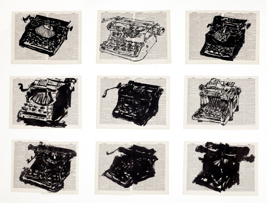
    Universal Archive (Nine Typewriters), 2013, linocut printed on non-archival pages from the Shorter Oxford English Dictionary, mounted on paper, 43″ x 57.6″, edition of 20. Courtesy of Barbara Edwards Contemporary

    In Universal Archive, Kentridge utilizes these heavy black strokes to achieve, as the project’s title suggests, an archive, a cumulative memory bank of objects and impressions. It is, in one sense, a growing collectivity of irretrievable moments. But the project is also one of distillation and dissolution: individual images border precariously on the edge of abstraction or seem under threat of breaking apart completely. The loose, gestural “brush strokes” of a tree (“Universal Archive, Ref. 45”, 2012, for instance) or the multiple pages on which a single portrait is printed (“Universal Archive, Ref. 35”, 2012) threaten to fly apart under the pressure of pent up energy, the weight of sorrow. Similarly, in a form of narrativity consistent with Kentridge’s work in animation and theatre, a tightly rendered coffee pot or typewriter dissolves in steps over the course of a series, settling into a Cubist-like minimum of identifiable visual signs. Even the heavy nest of thick black lines in “Lekkerbreek”, the most monumental, most solid work in the series, seems somehow tentative, a gathering of marks in danger of vibrating off the underlying dictionary pages. Indeed, in Afrikaans, the word Lekkerbreek, a breed of tree native to Africa, means “breaking easily.”
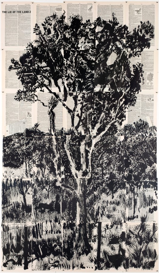
    Lekkerbreek, 2013, linocut printed 30 sheets of on non-archival pages from the Britannica World Language Dictionary, Edition of Funk and Wagnalls, 1954, 67″ x 42.5″, edition of 24. Courtesy of Barbara Edwards Contemporary

    This tension between accumulation and dissolution is characteristic of Kentridge’s larger body of work. His animated films, for instance, utilize a much-described technique of erasure, building up a moving image from a single drawing that is repeatedly dismantled and re-drawn. Likewise, his 2010 revolving sculpture, “Return”, created for Teatro La Fenice opera house in Venice, begins as a chaos of disparate parts that gathers to a two-dimensional image before breaking apart again. Speaking of this latter work, Kentridge notes the “strange utopianism in chaos finding its own order.” By this observation, we may understand Universal Archive as wavering on the border between a Utopian and dystopian view of the world and the objects within in it. As gallery owner, Barbara Edwards, observes, the work speaks to the comforts of home, but also reminds us of the fragility of the objects we love, of our memories, of our very safety. Indeed, it is this ambiguity that has characterized Kentridge’s commentary on his homeland, a society that, like the Lekkerbreek tree, is known for its intense beauty, but also for the difficulties it has endured in order to grow. As Edwards also notes, however, it is not always toward dangerous ends that Kentridge’s images threatens to dissolve: his work morphs in ways that are sometimes threatening, but also sometimes funny. The playful drama of a bristling cat, for instance. The pairing of the ominous scribbled phrase “You have brought this on yourself!” with the dictionary definition for the word ‘lucky’, or the facetious, yet pointed, coupling of a female nude with the word ‘offensive.’
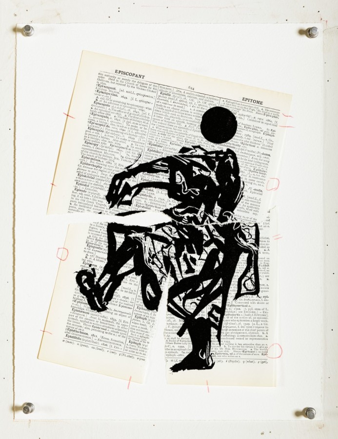
    Universal Archive, Ref. 34, 2012, linocut printed on non-archival pages from the Shorter Oxford English Dictionary, 13.7″ x 10.6″, edition of 20. Courtesy of Barbara Edwards Contemporary
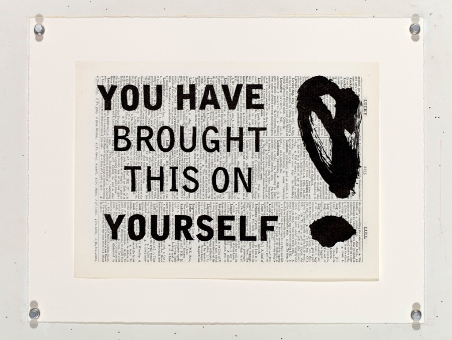
    Universal Archive, Ref. 53, 2012, linocut printed on non-archival pages from the Shorter Oxford English Dictionary, 10.6″ x 13.7″, edition of 20. Courtesy of Barbara Edwards Contemporary

    Of course, it is at this meeting of language and image that much of the work’s meaning resides, as Kentridge makes clear the slippages that exist between systems of language and the world. The dictionary’s attempt at order and precision, for instance, contrasts markedly with the sketchiness of Kentridge’s drawings, which seem to take imprecision as their aim. Perhaps more significantly, however, the general project of universality underlying the dictionary, it’s goal of capturing every word, every concept and meaning, stands at odds with the specificity of Kentridge’s visual subjects. Despite the project’s title, it is clear that, at face, his drawings do not add up to anything close to universality. Indeed, the objects he renders—the typewriters, coffee pots, and cats—constitute a continuation of select themes and symbols already present within his oeuvre rather than an attempt on his behalf to capture the world in its entirety. Perhaps, then, Kentridge’s work reminds us of the necessarily incomplete nature of memory, of archives, which are as much about what is forgotten, displaced, even intentionally wiped out, as they are about what remains. This notion is certainly not lost in South Africa, a nation whose own government was charged with destroying archival evidence of its atrocities. Yet, whether Kentridge speaks of the memory of a nation or of an individual, in the end, the power of the project may lie in its partiality, in its bittersweet admonition that nothing can ever be truly captured or remembered as a whole. Perhaps, it is this conspicuous incompleteness of Universal Archive that renders it truly universal, truly intimate.
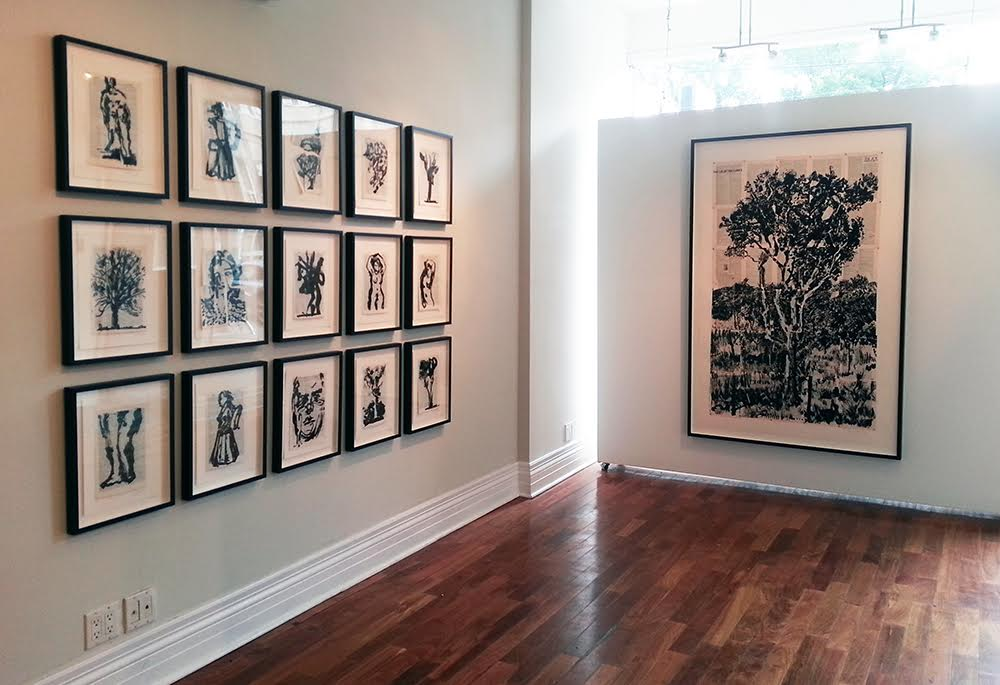
    Installation view. Courtesy of Barbara Edwards Contemporary

    Catherine MacArthur Falls

    *Exhibition information: William Kentridge: Universal Archive, September 25 – November 14, 2015, Barbara Edwards Contemporary, 1069 Bathurst Street, Toronto. Gallery hours: Tuesday to Saturday, 11am – 6pm (or by appointment).

  • Tara Cooper and Jenn Law at loop

    Loop Gallery on Dundas West is simultaneously exhibiting two shows from multi-disciplinary artists Jenn Law and Tara Cooper. The two separate shows from two seemingly unassociated artists, namely Cooper’s God Love Brigus and Law’s Means & Ends, become unified as a result of their common interest: the use of synergy.

    Despite the fact that the two shows are not directly related in terms of theme, they both possess a multi-disciplinary focus and quasi-interactive ‘diorama’ features. Cooper’s work God Love Brigus, for instance, was highly influenced by her residency at Landfall Trust in Brigus, Newfoundland, an artist in residency program. Landfall Trust is committed to preserving the passing wish of the late Bradley Jacob Folensbee Jr., in supporting the practice of the arts and humanities to benefit the heritage of Newfoundland. Cooper’s work created during her Landfall residency brings together the study of meteorology and creative non-fiction intended to enhance spectator experience and to provoke evocative memories placed in rural Canadian settings. The exhibition’s overall layout mixes pieces such as framed photographs and colourful fabric flags aboard – what is referred to as a wooden “floating raft” – of sculpture, print and photography. The raft is laden with excerpts from observational stories and personal testimonies.

    Tara Cooper, God Love Brigus, Detail

    Tara Cooper, God Love Brigus, Installation view

    Jenn Law, on the other hand, takes her synergistic approach less in the interactive storytelling direction and more towards the archival mode of documentation. Law’s multi faceted background in visual art and writing, as well as her extensive anthropological research all affect Means & Ends. Law’s display emphasizes artifacts that are key objects in print manufacturing and print culture. Her commentary is centered around “reinvention” technologies that may appear outmoded. She suggests that the modern attitude to “reinvent” oneself in the social media context – using technology to change the persona – has in fact been around for several decades. Reinvention in the form of “morphing” is rendered visually through the “melting” black mounds positioned through her exhibit. Law’s exhibit also include objects of horologic technology, the science of time keeping. In particular, Law uses the ink bottle and the pocket watch to prove that objects from the past can be brought into the future. Her use of 3D printing mixes innovations from different eras.
    Jenn Law, Means & Ends, Installation view from front and from sideway

    Jenn Law, Means & Ends, Installation view

    Both Means & Ends and God Love Brigus are eye-catching projects and I enjoyed viewing them.

    Text and photo: Katie Armstrong

    *Exhibition information: October 10 – November 1, 2015, loop Gallery, 1273 Dundas Street West, Toronto, (three doors west of Dovercourt). Gallery hours: Wed – Sat 12 – 5, Sun 1 – 4 p.m.

  • Feature After the Fact: Feature Contemporary Art Fair 2015

    This year’s Feature: Contemporary Art Fair has received varied responses from art critics. Many laud the fair’s accessibility and its representation of Canadian art. Others question its cohesion, its unusual arrangement of space. For me, the fair represented an important shift in our typical experience of the contemporary fairs that have so dominated the international art scene in the past few decades, including Feature‘s counterpoint, Art Toronto, which also took place this weekend. Namely, Feature differentiated itself through its conspicuous absence of spectacle. Where most contemporary art fairs feel dauntingly large, impersonal, and commercial, Feature brought it down to human scale. Perhaps it was the intimacy of the fair’s spaces: its irregular triangulated galleries, its winding paths of nooks and corners to peek around and hide behind. At Feature, art hanging in one gallery was not necessarily open and exposed to art in neighbouring galleries. Gallery spaces had a degree of independence from the collective and viewers were forced to amble, stroll, slow down, coffee or champagne flute in hand. The arrangement stood in stark contrast to the typical straight grid pattern of these types of fairs, in which attendees traverse long, overwhelming alleyways of booths and individual galleries are easily passed in pursuit of the end. Or perhaps it was Feature‘s historic setting that seemed distinctly human, an opera house with rambling chambers, antechambers, and alcoves, a century-old freight elevator, a courtyard pleasingly given over to creeping vines. Perhaps it was the niche-y small-scale food service, provided almost entirely by food trucks.

    Or perhaps it was the people. Feature stood out for the understated ease and grace with which fair organizers and staff welcomed their guests. For the fact that its director, Stefan Hancherow—someone with a presumably large to-do list—spent time standing at the entrance to the main gallery greeting newcomers to the space. For for its tour guides, who spoke personably and off-the-cuff with visitors, and encouraged them to do the same. For its security guards, who chatted amicably while checking tickets or opening elevator gates. For its concierges, coat check staff, and customer service reps, who accommodated special requests with kind hospitality. All of this made for a startlingly welcoming and intimate affair, bereft of the usual artworld exclusivity or posturing.

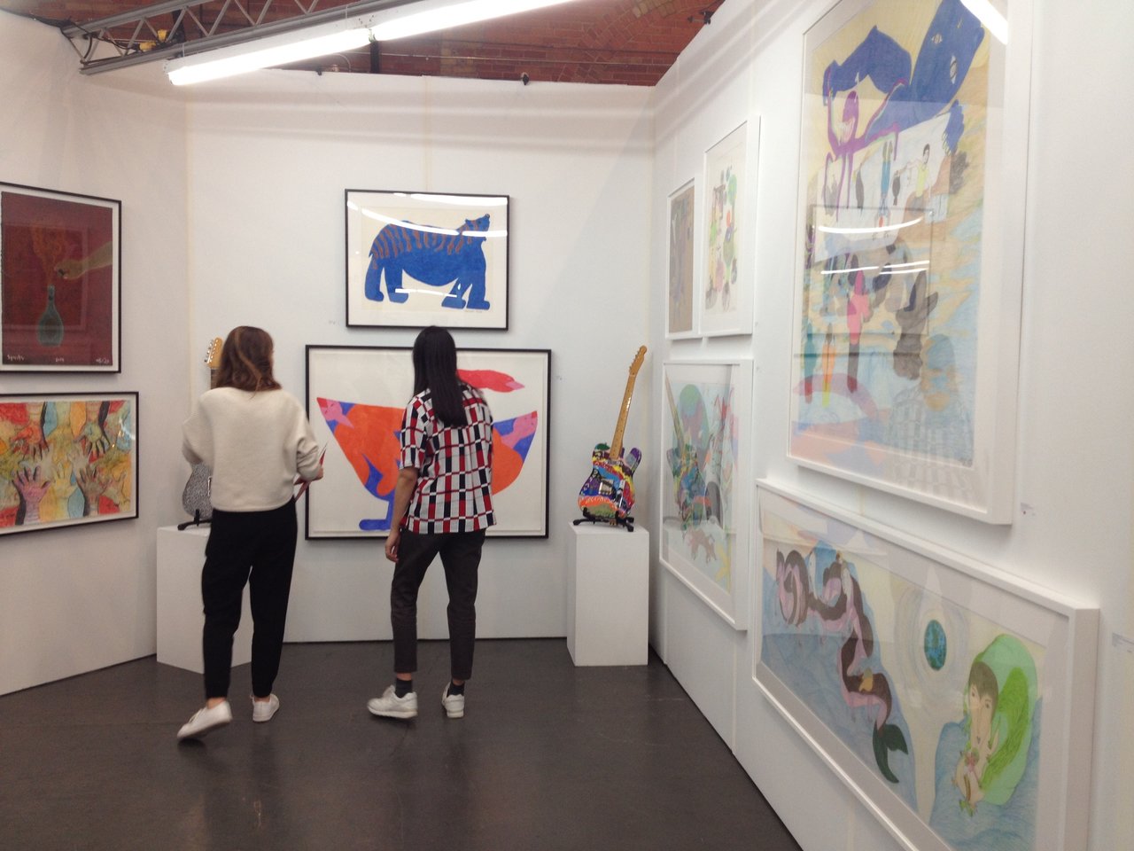
    Installation view, Feheley Fine Arts booth

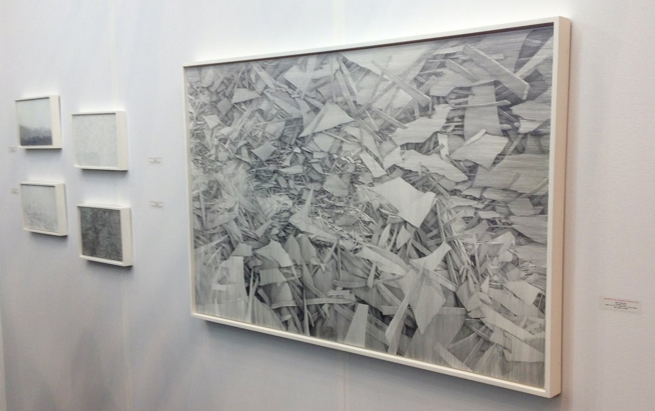
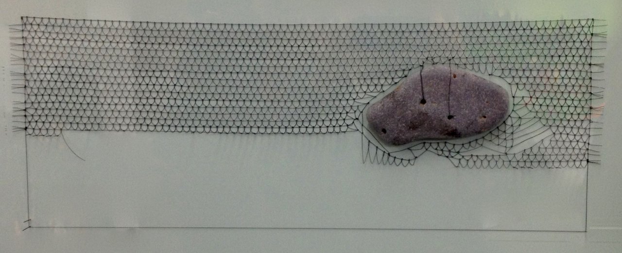
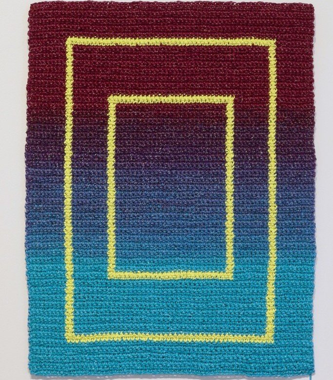
    But, there was also something about the nature of the art on display. To me, it seemed the highlights of the fair were conspicuously un-spectacular. Which is certainly not to say they were unremarkable. Rather, the best work was far more about utilizing small gestures, playing with small scale, or making small, but significant innovations, than it was about glitter, shock or spectacle. The stunning lead drawings of Kelly Wallace (from Georgia Sherman Projects, Toronto), for instance, who uses a simple program of vertical and horizontal pencil lines to render three-dimensional spaces of surprising depth and structure on paper. Or the work of Meghan Price (of Katzman Contemporary, Toronto), who stitches stones from Lake Ontario into minutely interwoven enameled copper wire. Or works like Angela Teng’s (of Equinox Gallery, Vancouver) or Beth Stuart’s (from Battat Contemporary, Montreal), which put minor twists on traditional media to surprising effect: the former incomprehensibly creates geometric patterns from crocheted acrylic paint; the latter makes what look like small-scale panel paintings, but on sculpted porcelain rather than canvas.

    Installation view, Kelly Wallace, including (on right) Cauldron, 2014, lead and paper on panel, 34″ x 55″ from Georgia Sherman Projects, Toronto

    Meghan Price, Erratic 2, 2015, enameled copper wire with stone from Lake Ontario, 12″ x 24″ from Katzman Contemporary, Toronto

    Angela Teng, Ringer, 2015, crocheted acrylic paint on aluminum panel, 22.9 x 30.5 cm. Courtesy Equinox Gallery, Vancouver

    Beth Stuart, Study for Interior (F.S.), 2014, lime plaster, casein paint and encaustic on porcelain, 2014, 18″ x 12″ from Battat Contemporary, Montreal

    For other artists, the concept or process underlying the work was quietly contemplative, more about triggering reflection on the interior processes of the mind than about dazzling viewers with extravagant visuality (which is not to say that much of the work at Feature was not beautiful). Randy Grskovic’s Memory series (also of Katzman Contemporary), for instance, utilizes found glass plate negatives to articulate the malleable nature of memories. In an iterative process, Grskovic breaks, reassembles, then prints from each glass plate and will continue to do so until much of the information in the original image is, like our memories, rearranged or lost. Such content fit into the general atmosphere of the fair, which was in many ways more calm than frenzied, more contemplative than schmoozy, more like a gallery than like a market.

    Randy Grskovic, Memory 2, 2015, selenium toned gelatin silver print, 14″ x 16″ from Katzman Contemporary

    Randy Grskovic stands before his work

    Certainly, many contemporary art fairs include the type of small, intricate, or quiet work that so dominated Feature. Even in large fairs, individual galleries still often have small spaces to contend with and bring suitably sized art to do so. However, Feature‘s smaller scale, its individualization of gallery space, its tour guides and gallery reps wiling to explain intricacies of material or content, all of these things allowed this type of quieter work to stand out where it is usually lost in the clutter. To me, this made the fair successful in ways that only it could be, in ways that are simply unavailable to larger events. For this, I think Feature deserves not only our attention and attendance, but also our warm-hearted thanks.

    Text and photo: Catherine MacArthur Falls

  • Feature 2015 – who is it for?

    Reviews on Feature emphasize its accessibility. However I don’t think that this show is for new-comers to the spectator sport of art, art-appreciators who might not know the exact definition of post-impressionism, or those who might have never stepped foot in a gallery before.

    Don’t get me wrong, Feature: Contemporary Art Fair was an interesting show in many ways: it spotlighted Canadian artists, had some stand-out pieces, and broke the traditional mould of 90-degree angle booths. Feature opted for a trapezoidal set up. These zigzagging gallery spaces contributed to the lack of cohesion, as visitors had to be led through awkwardly arranged spaces, up concrete stairwells and through art-less spaces split among two floors in the Opera House space to see the whole show.

    Photo credit: ARHphoto

    It seemed as though I was surrounded by the inner circles of the “Canadian Art World”, as I didn’t see anyone who didn’t have a proverbial paintbrush in their hand. Where were the condo dwellers that lived on the east side who wanted to see a cool art show? Where were the weekenders who wanted a cultural outing? Maybe they were all at Art Toronto.

    However, this disjoint was semi-redeemed by Art Metropole’s presence. Art Metropole, who stressed not to call themselves a book shop, told audiences that they were one of few art centres in the world that would help to publish and distribute artist-initiated publications for those who do not yet have their foot in the art-world. It was a nice to offset the high-brow art with the knowledge that an institution exists which sells art pieces for very accessible prices, some even priced below a single dollar.

    I think that one of the most interesting piece was presented in Galerie Donald Browne by Jérôme Havre who creates wonderfully intricate patchwork marionettes that touch on racial identities and narratives. His work will be shown at the Art Gallery of Ontario in January 2016.

    Galerie Donald Browne, work by Jérôme Havre. Photo credit: ARHphoto

    The highlight of the show for me was a comical piece by the Toronto-based collective VSVSVS, represented by Justina M. Barnicke Gallery at Hart House (University of Toronto) on gym culture in condominium gyms. The title “You Can(‘t) and You Should(n’t)” features workout equipment made with non traditional materials like wood and concrete, poking fun at those who don’t know what they are doing in a gym. To make their point even clearly, the group has looped a youtube-esque compilation of “questionable exercise regimens”.

    Presentation by VSVSVS. Photo credit: Justina M. Barnicke Gallery Facebook Page

    Overall it was nice to see an exclusively Canadian art gallery presence, which didn’t overwhelm viewers with a sense of Canadiana, but the venue and curating can be improved to encourage more nontraditional fair-goers to attend.

    Ella Gorevalov

  • Art Toronto 2015


    Metro Toronto Convention Centre
    October 23-26, 2015

    On Thursday morning, October 22nd, I arrived for the media preview and was welcomed by a staff member who handed me a map and sent me on my way. In the past the prior organization had a welcoming area for media and they gave an introduction to the fair. This year we were on our own and like lost sheep wandered from booth to booth looking for signs of life. People were busy with last minute preparations or were resting up for the task at hand and the evenings opening preview.

    I did stop by Mira Godard Gallery and talked briefly with Gallery Assistant and artist, John Kinsella. The gallery was excited about the fair and looking to see how some new works would fair. Senior artist Tom Forestall had joined the Gallery and now was in the company of classmates Mary Pratt and Christopher Pratt. Also they were excited to show the work of Holly Farell a self taught artist. Kinsella didn’t think there was a real competition between Art Toronto and the Feature: Contemporary Art Fair as they offered the art going public a different type of fair. Feature perhaps a little more edgy display of art while Art Toronto is offering more fine art mixed with contemporary. I talked with Kim Fullerton of Akimbo and she commented on the improved design of the fair.

    The layout is more open and it is more pedestrian friendly. There are more places to get some food, coffee or a glass of wine. I talked with Mia Nielsen who was busy hammering away hanging works from the Drakes collection. I meet some media from a new CBC Arts portal at cbc.ca arts who were finding their way around the fair. I decided to return when there were more people to talk to.

    Roberta and Robert Kananaj, Co-directors of Robert Kananaj Gallery

    Sunday afternoon I am back and start at the Verge section and talking with Roberta and Robert from the Robert Kananaj Gallery. They were pleased this year that all the Verge Galleries were together. There was also a section dedicated to video.

    I talked with Renann Isaacs from Renann Isaacs Contemporary Art in Guelph. She was especially pleased with a young artist, Brennan Stalford. As a 19 year old he went to the gallery and offered to show them his portfolio. They were busy at that moment but he returned and was offered an exhibition. The exhibit sold out. He was in his second year at OCAD U when he was offered a $100,000 scholarship to the Chicago Art School complete with a studio. The AGO bought a piece at the fair as well so everyone was happy. There regular established artists hadn’t sold as well.

    Renann Isaacs from Renann Isaacs Contemporary in Guelph with Brennan Stalford’s painting

    David Liss, Artistic Director and curator of MOCCA was enjoying the fair. The Copeland prints hadn’t sold as fast as hoped for but there was still 2 days left. Liss was thinking about all the work ahead with the new home of MOCCA. They will have 3 floors and 30,000 sq.ft compared to the former MOCCA space that had 11,000 sq.ft. A new CEO announced for MOCCA will help with all the work ahead of them. 

    David Liss, Artistic Director and curator of MOCCA

    At Read Head Gallery artist member Mathew Borrett was with his print on paper “Ancient Mars”. The large print was impressive and Borrett was happy to be part of the fair. Executive Director of Open Studio, Jennifer Bhogal was pleased with the activity of the fair and pointed out artist Spring Halbut’s work “Don’t Give Me Any of Your Lip” a lithograph . 

    Read Head Gallery artist member, Mathew Borrett, with Ancient Mars

    Executive Director of Open Studio, Jennifer Bhogal with Spring Halbut’s work Don’t Give Me Any of Your Lip

    Katharine Mulherin had a rare moment of sitting and taking a brief break from the fair’s constant activity. She told me she is taking a brief hiatus from her New York Gallery and sublet the space for 8 months to another gallery. She is keeping a more active role at her Toronto gallery. She was pleased with her booth’s spot in the fair. 

    Katharine Mulherin, Director of Mulherin Gallery

    One of the installment that caught my eye was “The Cleansing” by Tammy Salzl at dc3 Art Projects. It comments on the suburbs.

    The Cleansing by Tammy Salzl at dc3 Art Projects

    The TIAF (originally the Toronto International Art Fair, now Art Toronto) is 16 years old, has a good face-lift this year with its new design and continues to offer Toronto a great selection of work to see and to purchase. I had hoped to make it to the Feature: Contemporary Art Fair as well but ran out of time. Perhaps next year they might happen on different weekends so people wouldn’t have to rush to see it all. As I left and crossed the street I came across the Tom Gould’s statue seated  on a bench next to the CBC offices and wondered what he might of made of the TIAF/Art Toronto. I think he would have been pleased.

    Tom Gould’s statue

    Text and photo: Phil Anderson

  • Art Toronto 2015 + Latitude West

    October 23 – 26, 2015
    METRO TORONTO CONVENTION CENTRE
    North Building, Exhibit Hall A & B
    255 Front Street West
    Hours: Fri & Sat, 12 – 8 p.m., Sun & Mon, 12 – 6 p.m.

    Now in its 16th year, Art Toronto presents important artwork from leading Canadian and international galleries. The fair this year is slightly smaller than in its previous years featuring less than 100 galleries. Since this is Canada’s only international fair, there are 30 galleries from all over the world.

    Near to the entrance there is the winners’ show of RBC Painting Competition.

    RBC Painting Competition with Cindy Phenix, Montreal, QC, Hostility under a bridge, 2015

    Nikola Rukaj Gallery, Toronto

    Nicholas Metivier Gallery, Toronto

    p/m Gallery, Toronto

    General Hardware Contemporary, Toronto

    Barbara Edwards Gallery, Toronto

    Messum’s, London UK

    Pierre-Francois Ouellette art contemporain, Montreal

    It the past it was Stephen Bulger only who had a solo show for one artist. This year more galleries chose to introduce only one of their artists in their booth. Angell Gallery dedicated its booth to Gavin Lynch latest work, The Pass (2015-2016). Lynch seems to move away from his previous stylized abstract landscapes involving more figures in his compositions.

    Stephen Bulger with guests

    Gavin Lynch, Tete Jaune with HBC Blanket, 2015, from Angell Gallery

    Galerie Donald Browne, Montreal

    There is also Focus on Latin America. The project curator Abaseh Mirvali writes: “The curatorial concept envisioned is inspired by artists whose language presents a dialogue between art and architecture, a questioning of reality, expansion of the traditional languages and a demand that the viewer engage more closely with the works. The presentation is more a display of six solo artist presentations that share concerns about the artistic process and the need to go beyond the traditional artistic techniques. These artists leave behind the folklore, going beyond the stereotypes that sometimes is associated with the work by artists from Latin American and simply focus on their practice.”

    Galeria Lucia de la Puente, Lima, Peru

    Revolver Galeria, Lima, Peru

    Mauricio Contreras-Paredes

    Latitude West: Latin American Art After the Canon / Platform Speaker Series
    Saturday, October 24, 2015 / 1 p.m.

    From left to right: Beverly Adams, Gabriela Rangel and Tahia Rivero

    Presented by Americas Society and help at Art Toronto 2015, this panel discussion included curators Beverly Adams and Tahia Rivero, curator of Latin American Art at Blanton Museum of Art and curator of the Colección Mercantil de Caracas, respectively. Moderated by Gabriela Rangel (director of Visual Arts and curator at the Americas Society),  the panel explores Latin American art and its complex ties to its geography, and the consequences of geopolitics between the U.S and Latin America.

    The term ‘Latin American Art’ was a foreign one in the 19060’s, a time when only a select few schools even taught art history as a program. The focus on Latin American art was heavily due to private collectors like Barbara Duncan. National Museums in countries such as Venezuela could not match the expansive and dedicated collection of private collectors, thus depending on donations from said collectors to continue the museums. Real American interest in Latin American art began, according to Adams, under the pressure of the post-war political conditions – as political necessity. This combined with Duncan’s generous donation of her collection to the Blanton Museum of Art, the term ‘Latin American Art’ began to formulate in both national and international minds.

    The panel also discusses the term itself, and whether art can be tied together by geography. For the artists that dismantle geography, they should not be defined by location. Especially considering that approximately 1.5 million Venezuelans do not live in their own country (having fled the country since the 1990s), Venezuela-born but living abroad artists do not look at their own art as ‘heritage’. Furthermore, while pre-Chavez Venezuela creatively flourished with one of the best art industry, that unfortunately ended with Chavez. Unlike Cuba’s revolution, Venezuelan revolution never included intellectuals and artists, having mainly led by the militia. Venezuelan art industry has suffered greatly from current economic conditions, causing artists to achieve recognition internationally. This also meant that like in the 1960s, Venezuelan public stopped collecting art, transferring that responsibility onto private collection firm like Colección Mercantil de Caracas. Rivero recognizes the binarism of the nation’s artists, separated by local and abroad, and through Colección Mercantil, Rivero organizes exhibitions to show Venezuelan art both locally and globally.

    This talk is quite an influence in terms of looking at the FOCUS: LATIN AMERICA at Art Toronto, a curation of projects from Latin America. Artists featured in this section attempts to abandon the artistic stereotypes that are tied to Latin America, by geography or otherwise.

    Text and photo: Sunny Kim