Author: artoronto

  • Sara Cwynar: Baby Blue Benzo Beta at MOCA

    Sara Cwynar’s Baby Blue Benzo Beta does not create an alternate universe so much as reorganize the one we already live in. Sex, beauty, money, technology and power do not appear as abstract mechanisms operating behind contemporary life, but as blunt forces. Across Cwynar’s collaged images, screens, objects and words, the exhibition suggests that the systems governing our standards and desires have become so ordinary that we barely notice them anymore.

    Cwynar makes them visible again.
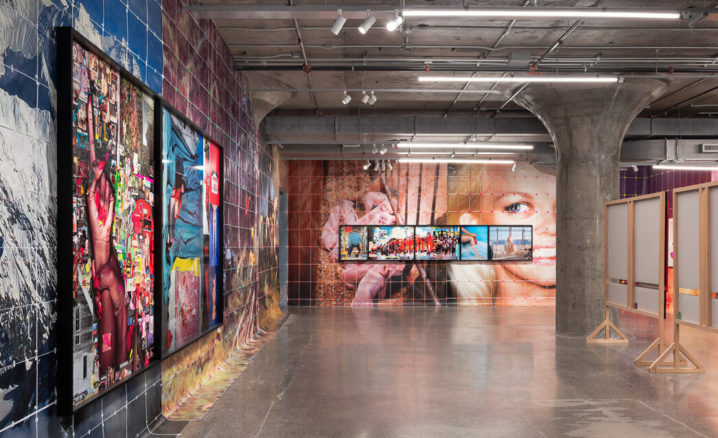
    The exhibition operates like an alphabet for contemporary life. Words and phrases drawn from popular online searches and Cwynar’s own browsing history become starting points for sprawling visual associations. Terms such as “disinformation,” “new woman,” “plastic,” “wrestle” and “youth” are translated into images, objects and cultural references. What initially appears arbitrary becomes revealing: our searches form an accidental archive of what preoccupies us, frightens us and, perhaps most importantly, what we have been taught to desire.
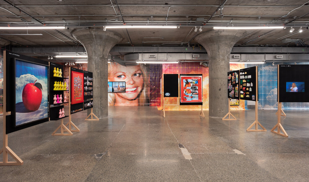
    The alphabet is an especially fitting structure because alphabets teach us how to enter the world. In Baby Blue Benzo Beta, Cwynar reverses this process. Rather than teaching the neutral “A is for apple” alphabet of childhood, she asks what an apple might mean after centuries of accumulated religion, advertising, technology and popular culture.

    “A” inevitably recalls another beginning: the apple of Adam and Eve. The reference positions Cwynar’s alphabet almost as a contemporary Genesis. The biblical apple introduces knowledge through the distinction between good and evil, establishing one of Western culture’s foundational binaries. Good makes sense because bad exists; innocence because corruption exists. Cwynar similarly builds meaning through contrast, exposing how the categories we inherit determine how we understand the world.

    But Cwynar’s Genesis belongs to the age of mass media. Alongside biblical associations are guns, tuxedos, definitions, stock images and corporate imagery. If the Tree of Knowledge once promised an understanding of good and evil, contemporary knowledge arrives through Google searches, advertisements, archives and endlessly circulating images.
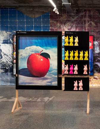
    From A for apple, Cwynar moves to B for bunny. The bunny brings with its Playboy, sexuality, femininity and money. Repeated bunny figures appear alongside images of wealth and consumption, connecting sexual desirability to economic value. Some appear wrapped, others exposed, creating associations with availability, possession and ownership. The exhibition repeatedly asks: what is the relationship between desirability and ownership?
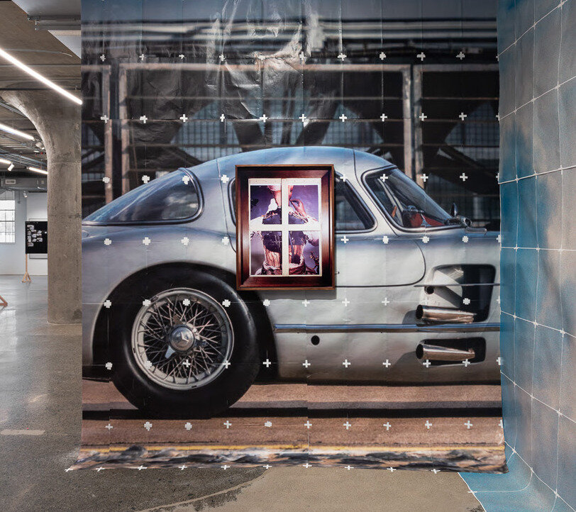
    Women occupy the centre of this visual economy. Female wrestlers, supermodels, actresses and sex symbols such as Pamela Anderson and Marilyn Monroe populate the exhibition’s visual ontology. Yet, their power rarely frees them from the gaze surrounding them. Male figures are more readily associated with politics, authority, wealth and command, while women are repeatedly defined through youth, beauty, vulnerability and sexual availability.

    The female wrestlers (who visualize “W” being for “Wrestle”) make this contradiction especially clear. Their bodies are strong, trained and capable, yet Cwynar selects images in which those same bodies become intimate spectacles: pinned down, entangled, exposed or rendered vulnerable for the viewer. Through the deliberate curation of their pictures, Cwynar demonstrates that even when a woman becomes powerful, an image can transform that power back into desirability.
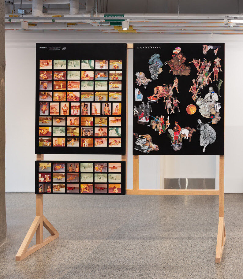
    A similar contradiction appears in Cwynar’s images of youthful femininity (ie. “Y” being for “Youth,” or “K” being for “Knowledge,” among many others). Pamela Anderson and other cultural icons exist within a world where the ideal woman must be innocent yet sexual, youthful yet mature, maternal yet childlike.
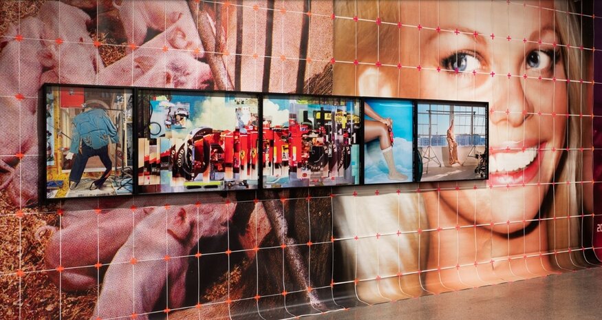
    This tension extends into “H” for home, where domesticity and the nuclear family coexist with the images of bikinis, bodies and sex symbols of the exhibition. Woman appears simultaneously as mother and girl, caretaker and object of desire.
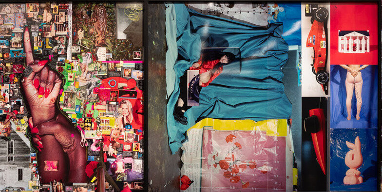
    The “T” for time “Time” sharpens this critique. Clocks and references to youth suggest that women experience time differently within this economy of images. Male power is often imagined as something accumulated: money, authority and influence grow with age. Female value, by contrast, is repeatedly represented as something that expires.
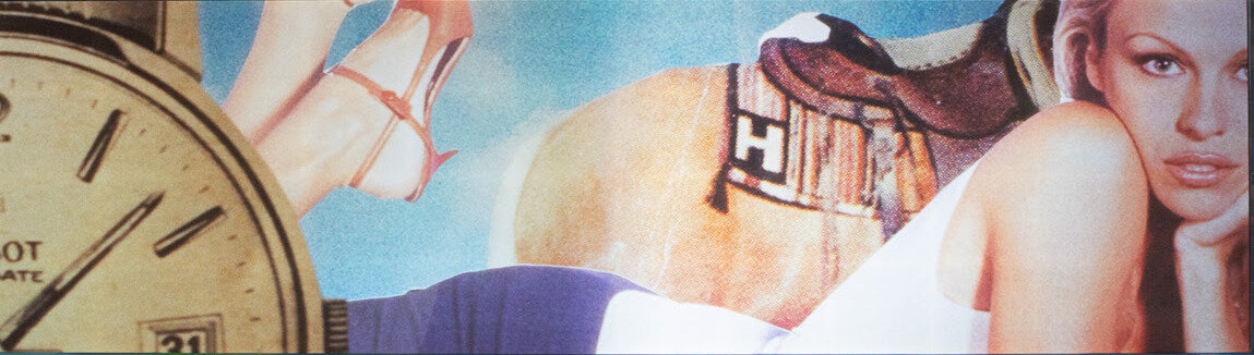
    Youth becomes capital. Beauty becomes maintenance.

    Cars, women, fashion, houses and luxury objects therefore begin to occupy the same visual vocabulary. A gleaming automobile and an idealized female body appear almost interchangeable as status symbols: desirable objects whose value extends to the person capable of possessing them.
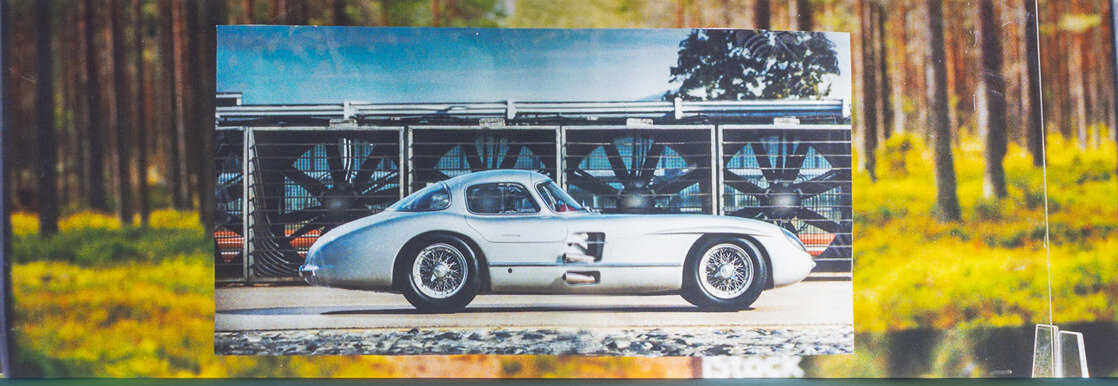
    Capitalism promises freedom through choice. You can purchase the right clothes, drive the right car, modify the right body and assemble the right identity. Baby Blue Benzo Beta pushes that promise toward an uncomfortable question: if we are free to become whatever we want, how much of what we want has already been chosen for us?

    Yet the exhibition never feels purely bleak. Its romantic soundtrack, saturated imagery and visual abundance are seductive. Cwynar understands why we want to look. Familiar celebrities, commodities and symbols dissolve into one another in a dreamlike visual puzzle, implicating viewers in the very culture they are being asked to question.

    Her collage-like logic recalls Surrealism’s ability to create meaning by bringing unrelated objects together, but Cwynar’s unconscious belongs unmistakably to the twenty-first century. It is no longer only the private psyche being mapped, but the algorithm, the search history and the digital archive.
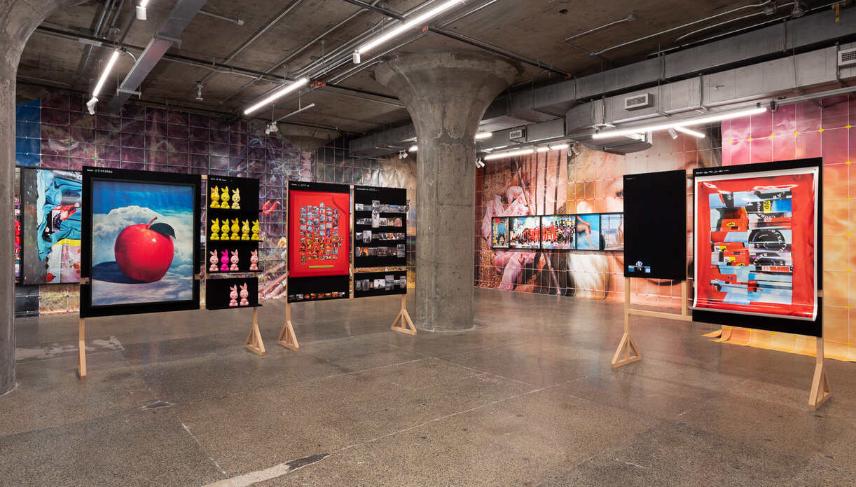
    Our subconscious now leaves data behind; and data legitimizes knowledge.

    By turning that data into an alphabet, Cwynar teaches us our ABCs again – not because we do not know the world, but because we may know it too well.

    Sex. Beauty. Money. Technology. Power. Youth. Ownership.

    These are not discoveries within Baby Blue Benzo Beta. They are the vocabulary through which contemporary life has already taught us to understand ourselves.

    Cwynar simply makes us read it out loud.

    Antonella Pecora Ruiz

    Images: Sara Cwynar, Baby Blue Benzo Beta. The Museum of Contemporary Art Toronto installation view, MOCA Toronto, 2026. Courtesy of the artist, Cooper Cole, Toronto, and The Approach, London. Photo: LF Documentation.

    *Exhibition information: Sara Cwynar, Baby Blue Benzo Beta, May 15 – August 16, 2026, MOCA Toronto, 158 Sterling Rd., Toronto. Museum hours: Wed – Thurs 11 am – 5 pm, Fri 12 – 9 pm, Sat – Sun 10 am – 5 pm.

  • Interview with Daniel Cardoso about The Artist Studio

    Interview with Daniel Nicholas Francisco Cardoso (DC) by Emese Krunak-Hajagos (EKH)

    Daniel Nicholas Francisco Cardoso

    DC: It really all began when the studio I was working out of (Open Studio at 401 Richmond) closed for renovations for a good part of the year. My colleagues and I essentially had nowhere else to go, and I soon came to realize how much studio space was needed in the city, especially space with specialized equipment and support for working artists. Additionally, the pandemic closed down several studio spaces in the city, and artists were left figuring it out on their own. I was also at a crossroads in my career. I had plans to do a Masters, but with the declining jobs and opportunities within the post-secondary world, I knew I had to pivot. This opportunity for a business came up, and with the support of my husband, Alejandro Rizzo Nervo Nieto, who is also a working artist, we decided to venture into owning a studio together, and supporting artists. Thus, The Artist Studio was born!

    DC: I am a graduate from OCADU, with a BFA specialized in Printmaking. I am also one of the last people to take part in the Florence Off-Campus program from OCADU, in which I went through a year of self-directed studio practice in Florence, Italy. It was there that I began my work in studio management, when I volunteered at SRISA (Santa Reparata International School of Art) in exchange for studio access. This exchange was invaluable to my practice and to this day, the connections I made, and lessons I learned continue to influence me. 

    After graduation, I began to work out of Open Studio – I started teaching classes on linocut and etching, as well as assisting artists in specific projects. Open Studio was instrumental in my career – their support and trust allowed me to grow as both an artist and educator. From the experience I gained there, I was able to get the job as a Teaching Assistant and later Class Assistant in the printmaking department of OCADU. Both these opportunities taught me a lot about studio management, teaching, and the kind of support artists need to grow their own careers. I now have years of experience under my belt in education and studio management and am confident I can run a studio.

    My husband, Alejandro, brings the other side of the coin. He works for an art consulting firm, as well as an Editions and Archive Specialist for an established local artist. This experience has brought him knowledge in the backside of studio management and art organization. He brings with him years of experience in documentation, cataloguing, sales, and exhibitions.

    Together, we carry all the skills and experience needed to run a space like The Artist Studio.

    Alejandro (left) and Danny (right)

    DC: Our space at 87 Wade is very accessible by transit, which was important for us. It also boasts a combined size of over 2400 square feet, which allows us to have multiple mediums and various equipment, as well as dedicated private spaces. We were able to renovate this unit into what it is now, thanks to family and community coming together. We are grateful for every single person that has had a hand in making this space possible. It truly takes a village, and we have an incredible group of friends that have supported us in this endeavour.

    In terms of supporting artistic practice, we offer three main routes:

    • First and foremost is affordable access to studio space with specialized equipment. Our goal is to provide access to multiple mediums/disciplines in one space, so artists don’t have to go to multiple studios to get their work done. We currently have access to a black and white photo darkroom (complete with two enlargers and all the equipment necessary), etching press (for printing etchings, linocuts, woodcuts, and more), an acid bath for copper plate etchings, and a washout unit and screen-printing tables. As we grow, we will be getting our own exposure unit to expand even further. 
    • Secondly, we have a gallery in which members can submit to exhibit work. Keeping our members with an ongoing practice, and activating the space with new exhibitions that bring new collectors is a big goal for us.
    • Finally, we provide professional services and professional development for artists. This includes workshops and residencies in which artists can learn new mediums within the space, as well as assisting artists in documentation, cataloguing, giclee reproductions, etc.… If there is a way to support an artist’s practice, we will make it happen!

    DC: We have different tiers of access that accommodate every stage of an artist’s career and budget. Our dedicated room memberships come with a private space in which artists can permanently work out of. Currently, our small and medium-sized dedicated memberships are sold out. We have two of our Master memberships remaining, which come with a large room and access to the entire facilities. 
    We also offer our shared memberships, in which artists have access to the main shared space and all facilities. These are our most affordable options that grant artists access to everything they’d need to create their work. In these tiers, we have an option with a year commitment, or a month-to-month basis, depending on the needs of the artist.

    The membership tiers were set out this way so artists with any range of budget could still have access to studio space and equipment.

    DC: For our inaugural exhibition, we reached out to our direct network of artists, to help activate the space and bring a wide range of people into the studio. Going forward, our members will have first access to exhibition calls, before they go to the public. We also set out a certain number of slots per exhibition specifically for our members. We will continue to make public calls for exhibitions to ensure new artists and art lovers continue to discover us!

    DC: As working artists ourselves, my husband, Alejandro, and I know what the needs of this industry are, and we are both fully committed to help build the artistic community in Toronto. We dream of international collaborations with other studios (residencies and exchanges for mutual growth). We dream of participating in art fairs and being able to showcase our members’ work. I see this business growing into other locations and expanding the mediums and facilities we provide! All in all, we want to get artists paid and create new opportunities for growth and career development. I am basing this on my experience with Open Studio, and how they have fostered my career, and we just want to provide more! There are never enough opportunities to go around for all artists that live and work in this city, and our dream and goals are to create new chances for artists to expand and thrive in their careers. I think all of us are tired of the starving artist trope – artists are some of the most hardworking people I know, and they deserve a livable and steady income!

    DC: I want to thank several artists, including Dan Olsen, Yael Brontman, and Bruce Parsons – a lot of the furniture and equipment was inherited thanks to them, and the trust they put in us to bring new life to these mediums. I also want to thank our entire network and community of artists and colleagues that have donated their time, work, advice, and guidance – without them, none of this would be possible. Finally, I want to say a big thank you to my family – they spent every weekend and even weekdays after work coming and renovating this space. Their support has been beyond generosity. We have built The Artist Studio with help from our community and network, and our mission is to give it all back to every artist in the city and beyond!

    *To contact The Artist Studio please go to their website www.theartiststudio.ca, where you can have more information about joining, using the Studio or renting a room.

  • “Looks Good on Paper…” at Propeller Art Gallery

    What the Hand Leaves Behind: Paper and the Preservation of Memory at Propeller Art Gallery

    Lea Ovčina, Stories told must face the present and see it stands differently, lithograph and intaglio prints, konnyaku paste, machine sewn, light and heavy Usu Kuchi

    In a cultural landscape increasingly shaped by digital technologies, paper has become so commonplace in memory that its material presence is often overlooked. “Looks Good on Paper…”, guest curated by Nancy Jacobi at Propeller Art Gallery, arrives at precisely this moment, inviting viewers to reconsider a medium whose significance extends far beyond its everyday utility. Featuring forty-eight works selected from more than two hundred submissions, the exhibition celebrates paper as an eternal medium of artistic invention and culture. Every work reflects a deliberate engagement with the material itself, revealing how the choice of paper can and undoubtedly does influence meaning just as profoundly as image, form, or technique.

    Nancy Jacobi’s longstanding commitment to handmade Japanese paper informs the exhibition from the outset. Her curatorial vision grows from decades spent introducing artists to washi and advocating for traditional papermaking practices whose future has become increasingly uncertain. Rather than presenting paper as an obsolete medium preserved for sentimental reasons, the gallery demonstrates its remarkable vitality through contemporary artistic practice. Washi appears alongside Korean hanji, archival drawing papers, cardboard, flax paper, cotton paper, vintage postage stamps, and commercially produced coloured papers. Each carries its own physical character, allowing viewers to recognize the importance of paper as a material that is never simply a neutral surface. Texture, translucency, absorbency, weight, and fibre become essential elements within the visual language of each work.

    Joan Burdett Ness, Arctic Glacier and Kittiwaki, molded washi paper, konnyaku, watercolour, copper wire, Japanese Oguni, snow bleached

    The exhibition showcases this sensitivity to material. Moving through the gallery, it becomes impossible to separate the artwork from the paper upon which it exists. Joan Burdett Ness’s Arctic Glacier and Kittiwaki emanates its elegance from snow-bleached kozo paper, whose delicate structure mirrors the fragility of glacial formations. The sculpture seems to inherit its character directly from the material, its lightness suggesting landscapes that appear both enduring and precarious. Sharron Corrigan Forrest’s Wakami Series #1″  reaches a similarly compelling effect through Sekishu Banshi, wrapping the paper around living branches until its flexibility becomes visible in every curve. The paper records the contours of the wood while retaining its own distinct presence, bridging interaction between natural form and handcrafted material.

    Sharron Corrigan Forrest, Wakami Series #1, natural inks & water-based pigments, Sekishu Banshi HW, Taniai Kozo Nagaban HW, Taniai Kozo Udaban & HW Washi

    Historical memory emerges as another defining thread throughout the exhibition. Loretta Faveri’s Apology recalls the internment of Italian Canadians during the Second World War through paper handmade by the artist’s aunt using local fibres. The work carries a sense of inheritance and archive, connecting personal history with a broader national narrative. The work possesses a meaningful dignity that feels inseparable from the paper upon which it is constructed.

    Loretta Faveri, Apology, handwritten text on paper, torn and stitched, paper made by my aunt with locally sourced fibres

    A similar sensitivity appears in Marjut Nousiainen’s My Political Papers, where years of notes, correspondence, and newspaper articles accumulate into an installation resembling a carefully prepared fire. The work reflects on political advocacy with remarkable restraint, suggesting both persistence and exhaustion through documents that once promised change. Paper becomes empirical, preserving the traces of conversations, struggles, and histories that resist disappearance.

    Marjut Nousiainen, My Political Papers, paper on insulation board, newsprint, printer paper

    What gives “Looks Good on Paper…” its lasting resonance is the way these individual works contribute to a broader reflection on the place of paper within contemporary culture. Jacobi raises an important question in the exhibition statement. As handwritten letters, printed newspapers, tickets, menus, and countless other paper objects continue to yield to digital alternatives, what becomes of the tactile knowledge once embedded within everyday life? The exhibition never proposes a nostalgic return to an earlier era, nor does it frame technological progress as something to resist. But instead, it seems to ask viewers to consider what forms of attention emerge through physical materials, and perhaps why we have always turned to them to represent our lives. Paper slows perception. It preserves evidence of the hand. Every fold, stitched seam, printed impression, and torn edge records an encounter between artist and material that cannot be fully translated into digital form. This emphasis on touch feels especially significant because paper has always occupied an unusual position within cultural history. It has served as the foundation for books, maps, correspondence, official records, sketches, photographs, and countless other forms of communication. Entire civilizations have preserved their histories upon its surface. Handmade papers such as washi survive through generations of accumulated knowledge, each sheet carrying techniques refined across centuries. Their continued presence within contemporary art reflects technical craftsmanship alongside a representation of the survival of cultural practices whose value becomes increasingly apparent as they grow less familiar within everyday experience.

    “Looks Good on Paper…” installation view at the Propeller Art Gallery

    The accompanying artist statements further enrich this experience by revealing the extraordinary care invested in each material decision. Reading them alongside the works deepens an appreciation for the dialogue between concept and craftsmanship that defines the exhibition. Every selection of paper carries intention, whether rooted in cultural heritage, environmental concerns, personal memory, or formal exploration— the exhibition encourages visitors to recognize these decisions as integral to the work rather than incidental details of its construction.

    “Looks Good on Paper…” ultimately succeeds because it restores visibility to a material that has quietly receded from ordinary life while demonstrating its enduring artistic relevance. The exhibition honours centuries of papermaking traditions without confining them to the past, revealing instead how deeply they continue to inform contemporary creative practice. At a time when so much of human experience is mediated through screens, Jacobi’s exhibition offers a thoughtful reminder that materials possess histories of their own. Paper remains one of the most eloquent among them, carrying our memory, craftsmanship, and imagination within every fibre.

    Yehyun Lee

    Images are courtesy of the Propeller Art Gallery.

    *Exhibition information: “Looks Good on Paper…” / group show, curated by Nancy Jacobi, July 8 – 26, 2026, Propeller Art Gallery, 30 Abell St, Toronto. Gallery hours: Wed – Sat, 1 – 5:30pm, Sun 12 – 4pm.

  • Queer Asynchronies and A Shadow Holds at United Contemporary

    Queer Asynchronies and A Shadow Holds at United Contemporary

    Queer Asynchronies exhibition view

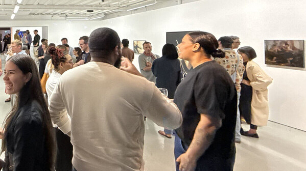
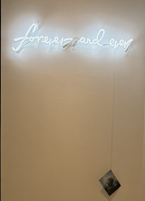
    Wandering in from the summer rain into the gallery, the understated white neon of Steven Beckly’s work greets visitors, Forever and Ever (2019). Queer Asynchronies at United Contemporary contemplates how queer and trans lives exist through plurality, the manifold ways of becoming the self: queer ancestry and culture, lived experiences balanced with futurity, and approaches to world-making. Curator Adrien Sun Hall draws upon José Esteban Muñoz’s theories around queer temporality, recognizing the deviations from “straight time” life trajectory and social dynamics. The artists in the exhibition reflect upon queer temporality with a variety of approaches: comforting the inner child in adulthood, disco as a critical part of queer subculture, speculative love in Christian spaces, modes of bodily and spiritual transformation, and more. 

    Considering the immediate encounter of Forever and Ever, Beckly’s work is an apt fixture of temporal expression. The soft neon glow emanates from the handwritten text containing the title, amplifying the cool tones of the gallery walls. There is a chain hanging from the phrase, with a photograph of a disco ball at the end. The work issubtle enough that people walk past without notice. There is beauty in a work communicating an unending duration, existing and witnessing others independent of reciprocation.

    Steven Beckley, Forever and Ever, 2019. Neon, silver chain, and colour transparency. Neon: 10 x 34 x 2.5 inches. Chain: variable

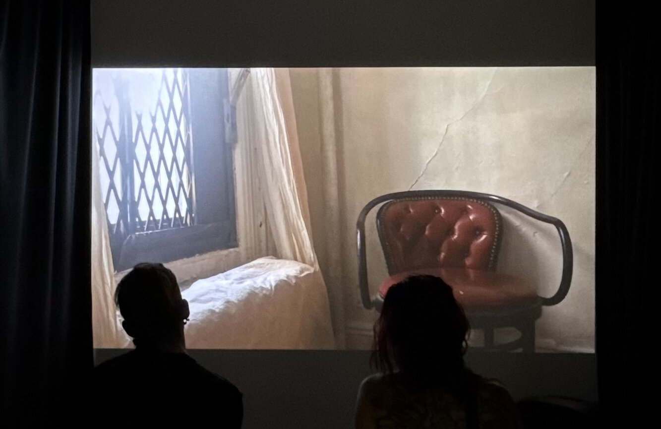
    To the immediate left of the work is a black curtain, enclosing the screen that plays Jordan King’s video installation Goodbye Clark (2024). Playing out upon the screen are scenes of a home being cared for: painting the windowsill, a moment sitting on the fire escape. Within the video, King prepares the Greenwich Village home for his departure. King had lived there with Clark Render, a major figure in the underground nightlife scene in New York. These moments of caretaking, reflection, and unbuilding a home take place after Clark’s passing in 2019. The film prompts contemplation of placemaking and how places of belonging shift with the inhabitants, whether through loss or movement.

    Jordan King, Goodbye Clark, 2024. Digital video, 9:00 minutes

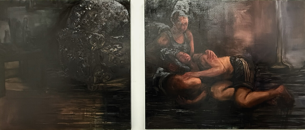
    The spirit of belonging and reflection are also found in Natia Lemay’s Held in Different Times (2026), a diptych in oil on canvas. Tones of ochre and umber are built upon the canvases; the layers appear as a soporific haze enveloping the figures in the right panel. The composition of the subjects echoes the pietà, with a seraphic face gazing downwards in devotion. The setting is indiscernible, though an upholstered seat can be identified as segmented across the diptych. Both subjects of Lemay’s pietà are clad in athletic wear, a muscle tee and oversized shorts. As they observe one another, the shared soft features and complexion is noted as a resemblance. The figures are of the same individual at different times. Beholding the self, Lemay displays the desire for comfort while simultaneously being the source.

    Natia Lemay, Held in Different Times, 2026. Diptych, oil on canvas, 48 x 48 inches, 48 x 60 inches

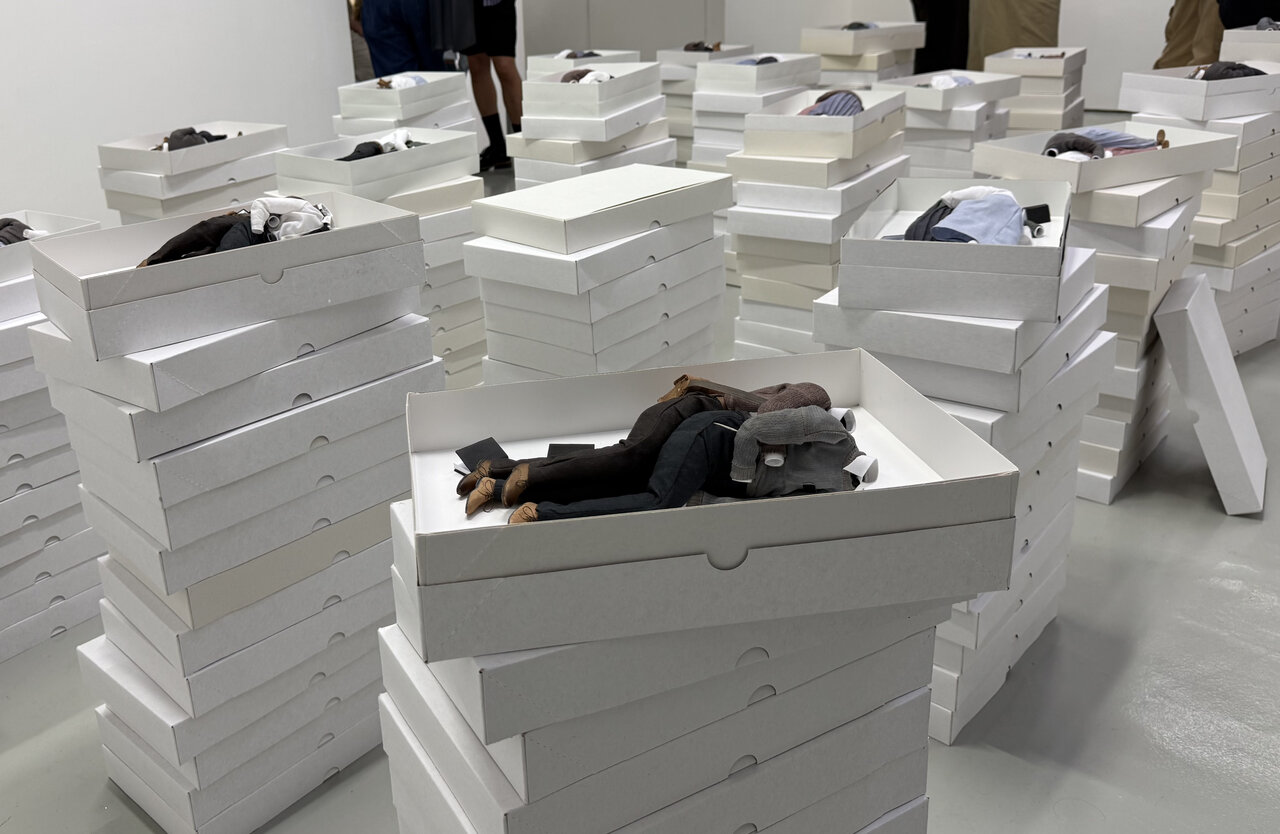
    The gesture of embrace is also found among the towers of white boxes that comprise Camille Charbonneau’s series The House Is a Large Cradle (2023-2026). Within the boxes are miniature figures, each containing a (presumed) same sex couple. The outfits are modest and austere, a palette of white, heather grey, mauve, beige, and olive green. The miniature clothing maintains the volume of the body despite being empty. As such, the boxes are devoid of bodies and brimming with tenderness. The yearning of the embrace is salient, as is the consistent incorporation of the Book of Mormon with each of the pairings. Charbonneau’s work is informed by the artist’s experience in the Mormon Church. The House is a Large Cradle considers speculative love that could form during Church missions, in which pairs of women or pairs of men were sent to spread the gospel. Looking at the couples in the box, I can’t help but think that they’ve been raptured in a divine ascension.

    Camille Charbonneau. The House Is a Large Cradle, 2023-2026. Polyester, cotton, leather, faux-leather, steel, brass, polymer clay, and paper, dimensions variable for assembled series. Each box: 14 x 9 x 2 inches. Polyester, cotton, leather, faux-leather, steel, brass, polymer clay, and paper

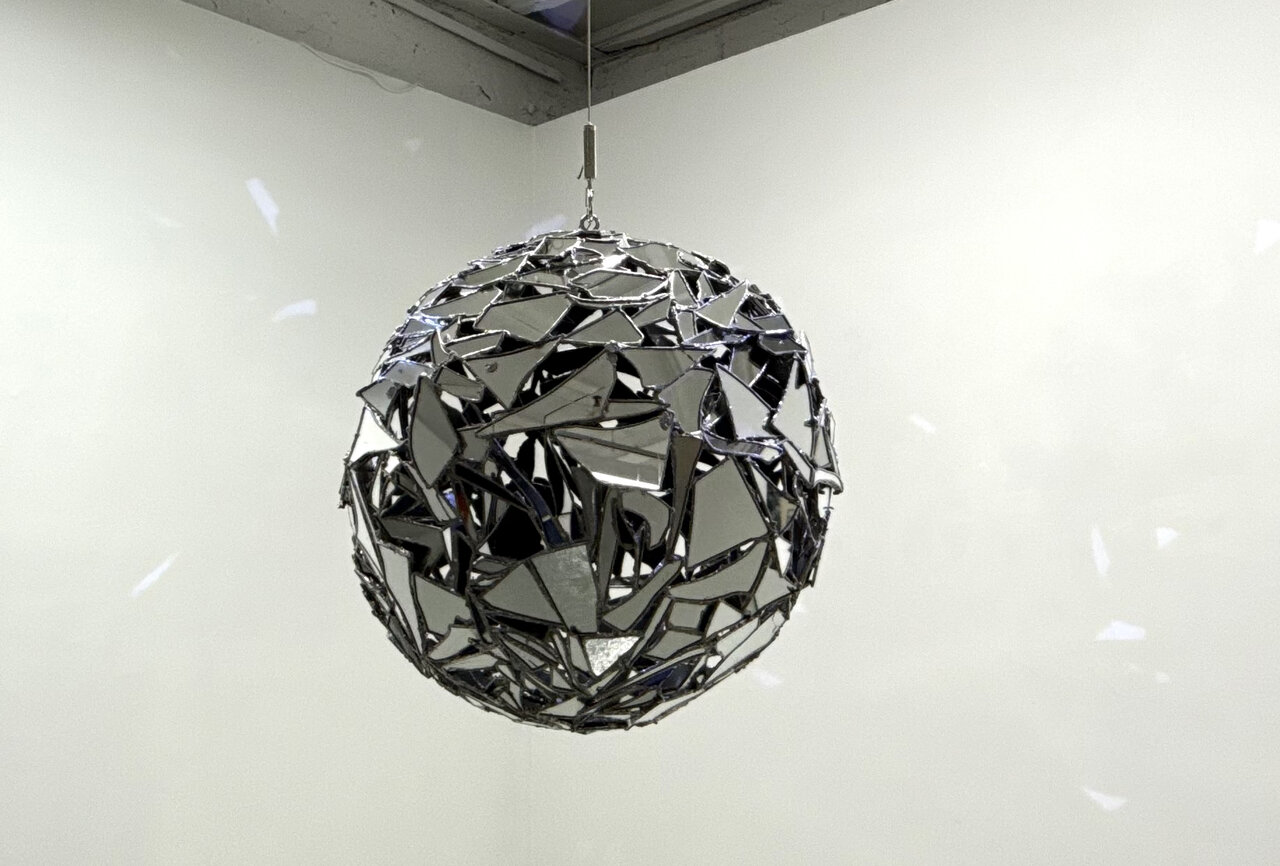
    Functioning as the transition point between the two exhibitions is Van Der Hout’s kinetic sculpture, The Shattering (2026). A mounted light shines on the structure as it steadily rotates within the gallery. The sculpture is made of mirrors, soldered together to form a polyhedron of fractures and fragments. The reflections of light trail along the walls of the gallery. As the sculpture turns, snippets of visitors, the environment, and the self are visible: a shoe of mine, a smile of yours, a hand of theirs. The Shattering is evocative of a disco ball, a critical nod to the queer subculture that was bolstered at the height of the genre’s popularity in the 1970s. This was a transformational period for self-expression and visibility, liberation, and solidarity. The structure does not have a completely spherical shape as there are black gaps between the fragments. This is an acknowledgement of the absences within queer history— spaces lost, absences in the archives, missing pieces from the community. The inclusion of such a compelling symbol within Queer Asynchronies affirms the exhibition space as a venue of transformation.

    Ry Van Der Hout. The Shattering, 2026. Steel, mirror, solder, copper, disco ball motor, 26 x 26 x 26 inches

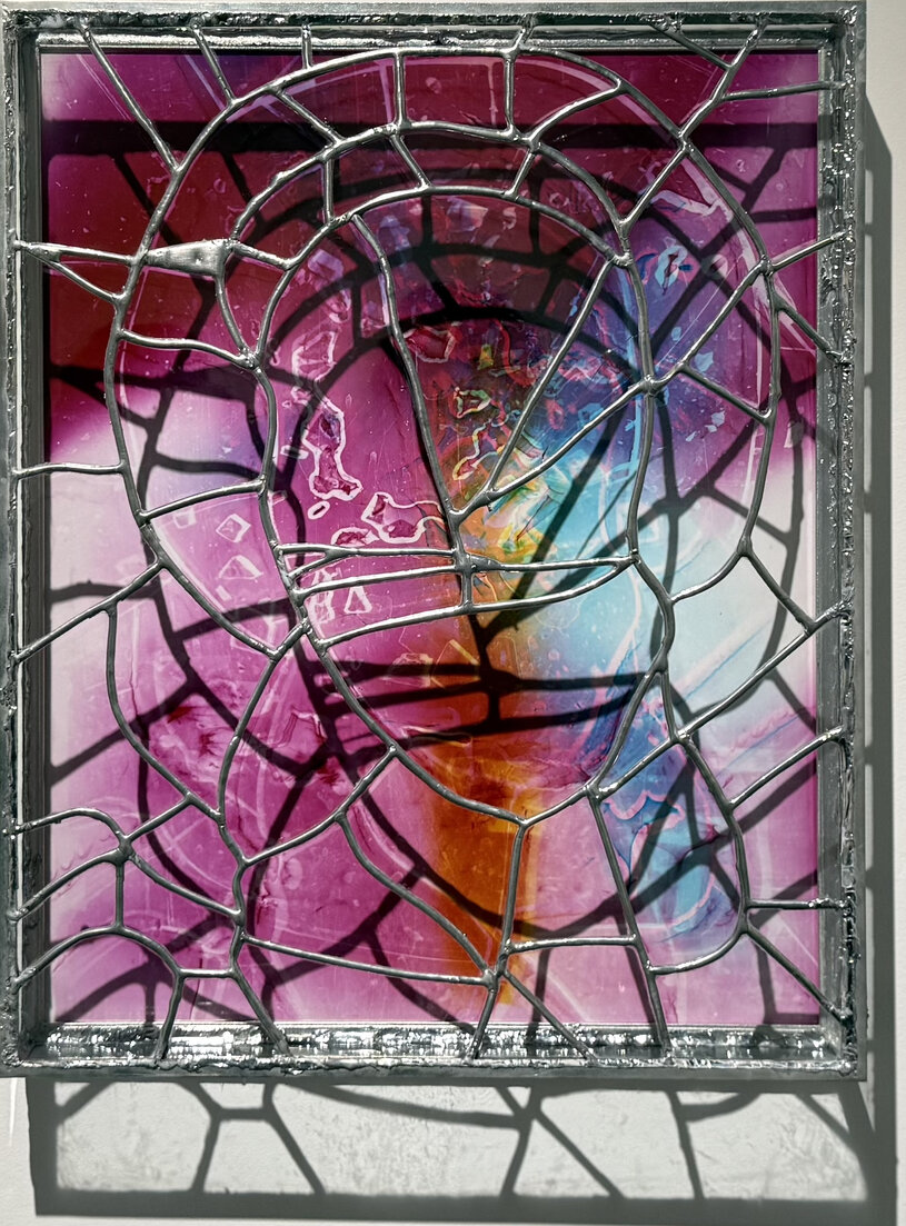
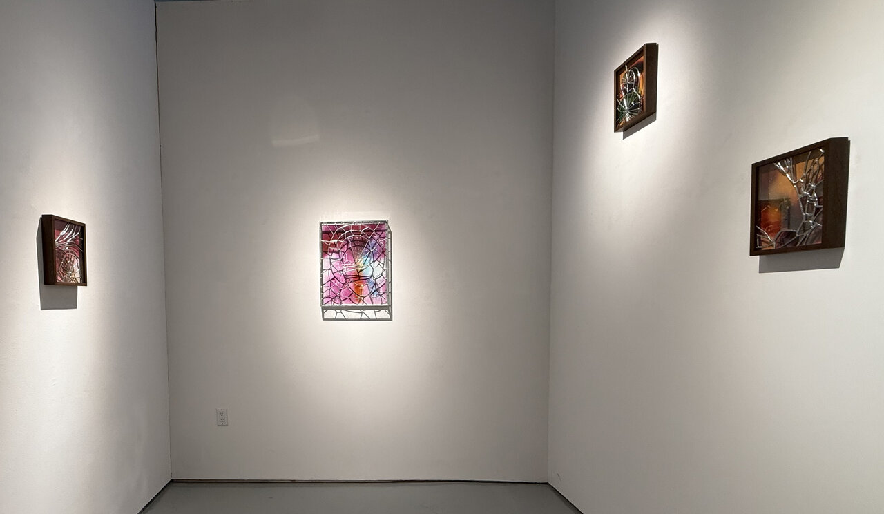
    Meanwhile, Van Der Hout’s works in the series A Shadow Holds are vibrant and lurid. The colours pool across the glass rather than using a myriad of coloured glass panels. The soldering of the works lacks steadiness of the hand, like an urgency to meld together the pieces. Witnessing the artist’s hand in this way is appealing, in that the process is readily apparent in how the vessels were crafted. The colours upon the glass are incorporated through photography, not through the traditional chemistry of ions added or colloidal particles. By photographing the fragmented glass and using that visual in the creation of a new form, Van Der Hout uses fragments as material, process, and as the conceptual framework of breaking apart to put together again. That line of thinking exists in the same vein of alternate temporalities as the way the creation process can be a non-linear method of both making and existing.

    Ry Van Der Hout, a shadow holds 1, 2026. Chromogenic Photogram mounted to dibond, Glass, Solder, Tin, Steel, 20 x 16 x 3 in.

    Adrien Sun Hall’s curation of Queer Asynchronies and Ry Van Der Hout’s series A Shadow Holds are a thoughtful display of queer temporality. It highlights the fissures and fractures, reflections and refractions, and the archives and absences within queer history and world-making.

    A shadow holds exhibition view

    Text and photo: Rashana Youtzy

    *Exhibition information: Queer Asynchronies / Group show with Steven Beckly, Camille Charbonneau, Rami George, Dylan Glynn, Jordan King, Natia Lemay, Oluseye, Ry Van Der Hout and Ry Van Der Hout: A Shadow Holds, June 18, 2026 – July 25, 2026, United Contemporary, 129 Tecumseth Street, Toronto. Gallery hours: Wed – Sat 11am – 6 pm.

  • Monty Cantsin Amen – Illegal Alien

    Nestled in between two monolithic condominium buildings lies the barely functional remnants of the Galleria, situated on the south side of Dupont Street, between Dufferin and Lansdowne Streets, in the city of Toronto. A decrepit low rise strip mall, the Galleria is destined to be demolished to make way for yet another monolithic structure. However, for the time being, one will see the recently painted, eerie images created by Istvan Kantor artistically known as Monty Cantsin on the north wall of the Galleria facing Dupont Street.

    The northern wall is entirely adorned with sections depicting Kantor’s the Wandering Jew, an image that has haunted his life and artistic endeavours since his youth. Each section illustrates the wandering Jew navigating through various scenarios that symbolize the solitude inherent in life’s journey through time. Simultaneously, he ridicules his own existence with an image pointing westward at the outset, accompanied by the text “Stop Him, there he is”.   

    The creation of the entire wall spanned two weeks, during which Kantor worked exclusively at night to avoid drawing attention to himself and his artwork. At the far end, he presents himself as Monty Cantsin, with the overarching title of the entire exhibition being “Illegal Alien,” a piece of art that is ultimately destined for destruction.

    Each image carries a unique narrative that invites viewers to engage their imagination and connect it to their own experiences. The figure of the Wandering Jew could symbolize yourself or someone familiar, facing the challenges that everyday life brings and the various obstacles encountered along the way. The image, as a whole, unconsciously symbolizes the artist’s life and the challenges he has faced from his past to the present. It encapsulates a journey through time.

    Kantor is a multidisciplinary artist. His practice includes media art, performance, installation, sound art, robotics, writing and music. As a performance artist, the favourite medium of this art-mastermind is blood. The artist demonstrates a high level of discipline in his practice, which he approaches with great seriousness. He meticulously creates images and documents his work through photographs and films, maintaining these records throughout his life with exceptional care and thorough documentation. From the time of his immigration to Canada from Hungary in 1977, Cantsin has created a vast oeuvre of work which tends to be quite subversive, challenging and sometimes quite shocking.  In the paintings on the Galleria wall, he continues to use his favourite leitmotifs of the Wandering Jew and the Wolf to carry out his message.

    The Wandering Jew is a famous motif found throughout the annals of history. It is a legendary figure of a man cursed to wander the earth until the Second Coming of Christ.  Originally, this image emerged in 13th century folklore, the myth weaponized for centuries to justify anti-Semitism by framing the Jewish diaspora as a divine punishment for rejecting Jesus.  It has occasionally been reclaimed, adapted or explored for its tragic and human elements in literature and Jewish cultural memory.

    Another favourite image to be found on this wall is the image of the wolf. This image is one of the oldest and most complex archetypes found in human history. The wolf represents a powerful duality, revered as a wise guardian, loyal protector and ancestor, while simultaneously eared as a symbol of chaos, destruction and untamed darkness.

    The unveiling of Monty Cantsin Amen “Illegal Alien” took place on June 27th, from 2:00 to 4:00pm, attracting a significant audience and highlighting his latest artistic endeavour. Kantor viewed the act of creating his work as a performance in itself, further enhanced by his presence at the unveiling event. Dressed in a long overcoat and wielding a wooden stick/cane, he embodied the figure of the Wandering Jew, captivating guests with a newly composed jingle that provided both enjoyment and entertainment.

    This mural is essential for art enthusiasts and history aficionados seeking engaging experiences that will spark conversation. The mural exhibition is expected to remain intact for several months, potentially years, until the galleria mall is demolished or it falls victim to graffiti artists. Visitors can unwind and reflect on the artwork in its entirety while enjoying a coffee at the Three Horses Café, conveniently located just across the street. This is undoubtedly an experience worth attending.

    Roy Bernardi and Jennifer Leskiw

  • Walking TOAF 2026

    The Toronto Outdoor Art Fair marks its 65th anniversary at Nathan Phillips Square with a program that extends beyond exhibition into celebration. This milestone year includes music, dance, an awards ceremony, and a birthday event for TOAF 65, alongside daily art tours and talks that offer visitors deeper engagement with the works. Organized across five distinct zones, the fair brings together artists from across Canada, creating a broad and inclusive national platform.

    As in previous years, Art Nest serves as a central curated exhibition, this year featuring Peggy Baker, Max Dean, Naomi Dodds, Micah Lexier, and Ed Pien, under the direction of Rui Pimenta. Framed as both celebration and reflection, the 65th anniversary is positioned not as an endpoint, but as a transition shaped by memory, time, and continuity.

    Max Dean’s Passing On anchors the exhibition in a deeply personal register. By distributing the artworks of his late wife, Martha Fleury, he transforms private grief into collective care, inviting the public to carry her legacy forward. This sense of intimacy extends into the surrounding installation, where domestic objects and reflective surfaces create a quiet space for contemplation. The work resonated strongly with visitors, drawing large lineups of people eager to receive and take responsibility for her artworks.

    Max Dean, Under Over, Over Under, Passing On, installation for Martha Fleury’s memory, mixed media

    Ed Pien’s Mirror, Mirror deepens this introspection through twelve antique vanities layered with text. As visitors sit and face their reflections, identity becomes unstable and shifting, shaped by time and perception. The act of writing responses further blurs the line between viewer and participant, turning reflection into an active process.

    Mirror, Mirror, installation by Ed Pien, Antique & vintage wood furniture, mirrors & upholstery.

    Micah Lexier’s One Day introduces a different form of exchange. By distributing coins representing each day of his life, he transforms time into a tangible object that circulates among visitors. This gesture creates an immediate connection, allowing the artwork to extend beyond the exhibition through everyday human interaction.

    One Day by Micah Lexier, custom made aluminium coins

    Naomi Dodds’ large-scale stainless-steel sculptures ground the space with a material exploration of identity and aging. Her work frames the self as relational and evolving, where transformation carries past and present together rather than separating them.

    Naomi Dodds, One Self Through Another

    Beyond Art Nest, other sections of the fair expand on themes of memory, materiality, and place. Tash Damjanovic’s delicate photographs, created through Polaroid emulsion lift techniques, balance texture, colour, and emotional quiet. Her images of Toronto reimagine the city as contemplative rather than demanding. Accompanied by a video documenting her intricate process, her work draws viewers not only into the image but into the act of making itself, sparking curiosity and a desire to learn her technique.

    Tash Damjanovic, Toronto City , (the centred one) A Skyline to Breath in, photography and digital media

    From the Unique Québec section, Montreal-based artist James Kennedy reinterprets photography through industrial material processes. Using acid on steel and laser-cutting techniques, he transforms photographic images into layered, three-dimensional surfaces. His series Relics of Memory evokes both recognition and nostalgia, as viewers identify familiar places while encountering them as altered, almost archaeological traces of time.

    James Kennedy, Continents, Islands & Lakes, steel work

    The exhibition The Land and the Sea Bind Us, curated by Bushra Junaid, brings together artists from across Atlantic Canada (Zone C), foregrounding Indigenous knowledge, material practices, and relationships to land and water. Lorne Julien of Millbrook First Nation presents City, an acrylic painting on deer skin, alongside a hand-crafted drum featuring abstract Mi’kmaw design. The eagle (Kitpu), symbolizing love, respect, and protection, carries teachings of the medicine wheel and honours water as a life-giving force.

    Lorne A. Julien, acrylic on handmade drum, made with deer skin

    Melissa Peter-Paul, a Mi’kmaw artist from Abegweit First Nation (Epekwitk/PEI), contributes intricate jewellery and quillwork. Using porcupine quills inserted into birchbark and edged with sweetgrass or spruce root, her pieces embody both technical precision and cultural continuity, connecting contemporary practice with ancestral knowledge.

    Jewelry by Melissa Peter-Paul

    Across these exhibitions, a shared thread emerges: art as a carrier of memory, identity, and lived experience. Whether through reflective surfaces, distributed objects, transformed materials, or Indigenous practices, the works collectively frame the 65th anniversary not as a conclusion, but as an ongoing process of connection, transformation, and passing on.

    Text and photo: Nusrat Papia

    *Fair information: July 10 – 12, 2026, Nathan Phillips Square, Friday & Saturday: 10am – 7pm, Sunday 10am – 5pm.

  • TOAF turns 65

    RETIREMENT Not in the Cards as TOAF Turns 65 …

    The Toronto Outdoor Art Fair Turns 65 and looks pretty good. Over 350 artists filling Nathan Phillips Square with another 65 online artists and over 120 first time participants. Canada’s largest and longest running fair will have over 170,000 visitors over 3 days and generate much needed income for artists (about 2 million expected).

    Talked with several first-time participants at TOAF such as Lilly Mia Black of Scarborough and Olivia Jaszczur of Guelph and they were excited to get their work out to the public.

    Lilly Mia Black

    Olivia Jaszczur

    Executive and Creative Director of TOAF, Anahita Azrahimi says “Toronto Outdoor Art Fair has always been about creating meaningful connections between artists and the public.” She was busy talking to media and visitors alike.

    Executive and Creative Director of TOAF, Anahita Azrahimi

    David Liss, independent curator, practicing artist and writer was giving art tours and curated an exhibition at the Koffler Arts Gallery Don’t Look Back celebrating the legacy of TOAF’s impact on the art community.

    David Liss (left) giving a tour at TOAF on July 10, 2026

    MOCA curator, Rui Pimenta has put together a special program for TOAF, The Art Nest with artists Peggy Baker, Max Dean, Naomi Dodds, Micah Lexier, and Ed Pien “to reflect on artistic longevity, practice, and what it means to move forward creatively. Not retirement, a retreat forward.”

    David Liss (left) and Rui Pimenta (right) at Art Nest

    Max Dean – the partner of artist Martha Fleury who passed away in 2023 – is letting the public take ownership of her art works by giving them away and cataloguing where they might go. I talked with a new art collector, Sarah, who was happy to acquire a Martha Fleury work and now wanted to know more about the artist. There were over 1200 works of art by the artist given away.

    Embracing, installation by Max Dean with Martha Fleury’s painting

    Sarah, a new collector, with one of Martha Fleury’s work

    I chatted briefly with Montreal artist Julie Desmarais. She was in the middle of an art sale of one of her colourful landscapes. I talked as well with artist Nahum Flores who has shown before at TOAF and he was enjoying talking with the public. Ash Godley, another new participant was gearing up for a busy weekend at her booth. Many artists like Godley were based in Toronto but others such as Anastasia Tiller came from Lethbridge NL and Michael Martins was from Brampton.

    Nahum Flores

    Ash Godley

    Anastasia Tiller

    Michael Martins

    TOAF had its usual mix of art practices and craft. There were some mixed media artists like Michael Xavier De Francesca who works with MDF board by carving and painting it.

    Michael Xavier De Francesca

    Once again, the organizers treated the Toronto public to a wonderful fair of artwork by many artists and enriched the cultural fabric of the city. 65 and looking good.

    Text and photo: Phil Anderson

    *Fair information: July 10 – 12, 2026, Nathan Phillips Square, Friday & Saturday: 10am – 7pm, Sunday 10am – 5pm.

  • TOAF 2026

    July 10 – 12, 2026
    Nathan Phillips Square
    Friday & Saturday: 10am – 7pm, Sunday 10am – 5pm.
    Free admission

    Toronto Outdoor Art Fair (TOAF) is the charitable non-profit organization behind Canada’s largest and longest-running annual contemporary art fair. Established in 1961 to connect Canadian artists directly to the public, TOAF showcases 400+ emerging and established visual artists from coast to coast, including painters, photographers, sculptors and artists working in ceramics, textiles, jewelry and more.

    In its 65th year, the fair has become a cherished summer ritual in the city for both locals and visitors. TOAF continues to evolve as this year’s roster includes over 400 independent artists, including 120 joining the fair for the very first time and  65 online artists. Nestled under the classic white tents, visitors will have the opportunity to peruse hundreds of unique artists and original works of art or browse online at TOAF.ca.

    The Fair offers something for everyone: talks, tours, digital studio visits, curated collections, kids workshops, dance, music, art installations and food and drink experiences.

    TOAF 2025. Photo: Nusrat Papia

  • Jason de Haan with Miruna Drăgan at Clint Roenisch

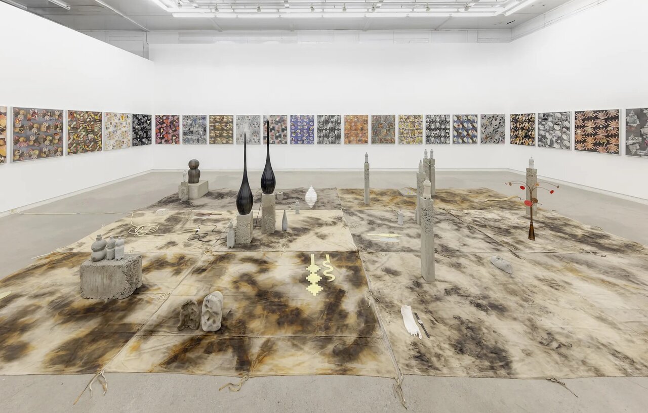
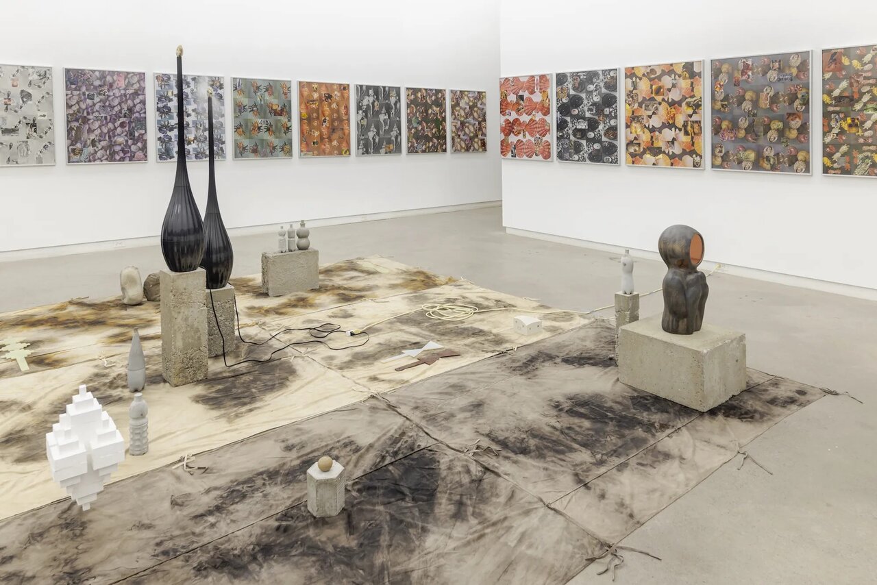
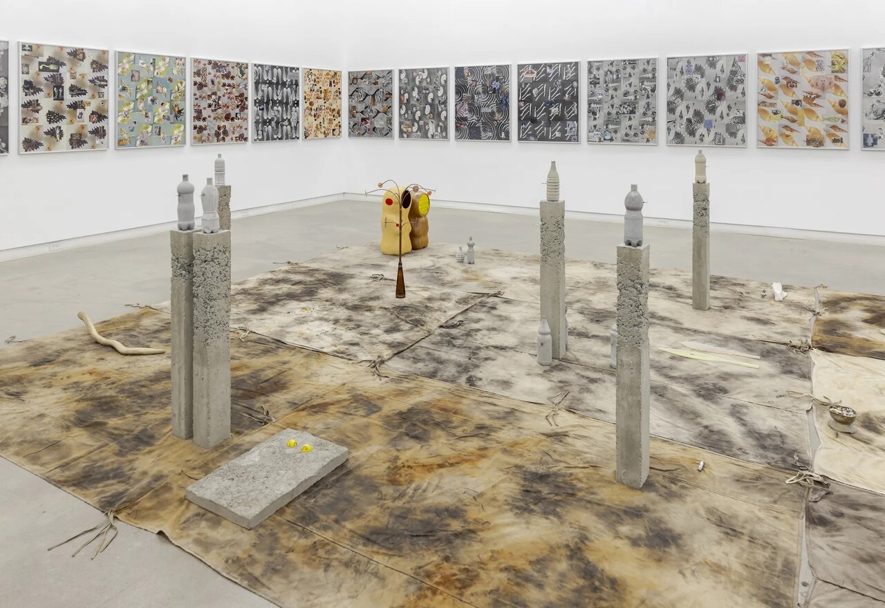
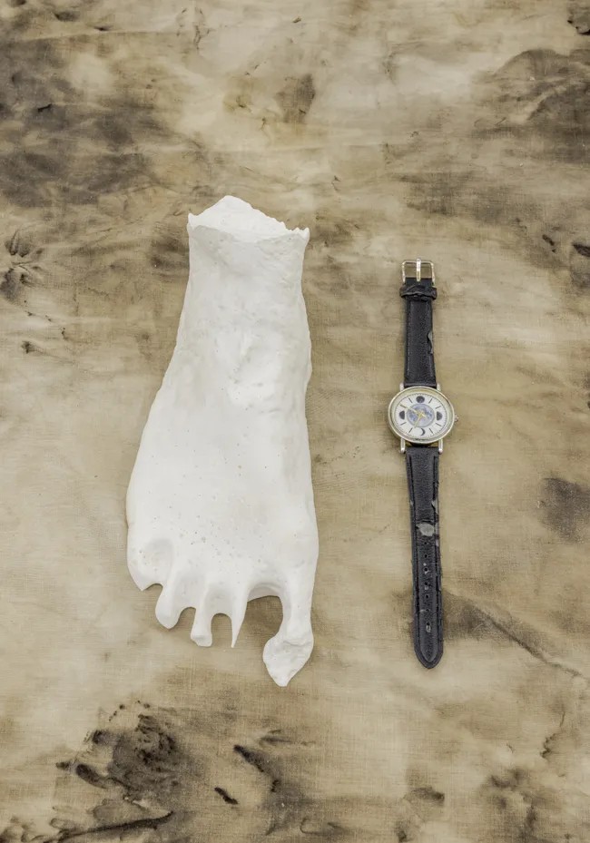
    On display on the walls of the main gallery is a series of nearly fifty identically sized collages, closely hung together, that effectively enclose the space. In the middle of the room sits an array of dyed canvas tarps, ontop of which are placed a variety of largely, though not exclusively, concrete objects. The floor installation is so spread out that visitors are left with a passage about two metres wide around the perimeter. The whole room has the atmosphere of a temple. But what is being worshipped here is difficult to determine, given that nothing in particular dominates or takes precedence among this disparate set of objects.

    Gallery owner, Clint Roenisch, rightly describes Jason de Haan’s works as heterogeneous and impossible to classify. That is an immediate challenge for viewers, who aim to make sense of what they see. Nonetheless, one thing binds the work together, namely, the concept of time. We are told that “de Haan explores the archiving of time in planetary materiality and connects this deep time to that of cultural history.”

    Installation view of Jason de Haan, In the Garden of the Dentist at Clint Roenisch Gallery

    One might, more specificially, speak of the erosion of time vis-à-vis de Haan’s work. Atop two tall thin-necked vessels in the middle of the room, for instance, sit tiny fossilised skulls that are continually sprayed by water vapour from below. These ancient fossils are in effect disappearing before our eyes. Of course, we can only registered this erosion intellectually because its rate is too incremental for us to perceive in any tangible way. But even this time scale is short compared to the geological time that de Haan is fascinated by. De Haan and his partner Drăgan have, indeed, chosen to live in the Badlands of southern Alberta because they are enthralled by its sublime geologically ancient landscape.

    Installation view of Jason de Haan, In the Garden of the Dentist at Clint Roenisch Gallery

    The imperceptibility of change at this time scale reminds me of the metaphysics of the ancient Greek philosopher Parmenides. From the very few fragments recorded of his original writings Parmenides claimed that in reality nothing changes; that is to say, according to Parmenides change and motion are an illusion, no less. The Greek philosopher encouraged us to think of the world, i.e., reality, as a unified whole rather than as a collection of disparate things. What we can know is unchanging, fixed, while the fleeting changes around us are merely apparent and are nothing we can grasp in any real sense. Likewise, de Haan emphasises the constancies across time. The Badlands and the fossils stored in them, for instance, will remain long after you and I have fallen into oblivion, so to speak.  

    Installation view of Jason de Haan, In the Garden of the Dentist at Clint Roenisch Gallery

    That said, de Haan does see things as being in flux, as constantly changing, even on a geological time-scale spanning millions or even billions of years. This contradiction, as I see it, is not irrational. It reflects the enigma underlying our very notion of change that transfixed Parmenides and his peers. Before the materialism of our scientific age the ancient Greeks were puzzled by change. They noted that when something undergoes change, e.g., a man growing a beard, we understand that we think of the same man undergoing this change. The appearance of a beard does no make him another person. But, if that is the case then, paradoxically, there seems to be no limit on how many changes he can undergo and still remain the same person. And that sounds wrong too, since were he to change so radically that he becomes a dolphin, say, we must deny that he is the same person. Parmenides essentially held that insofar as reality is fixed nothing about it changes. What is true is always true, one might say. By contrast his rival Heraclitus argued that everything is in constant flux – the man with the beard is not the same as the man a few days earlier without the beard – hence his famous dictum you can never step in the same river twice.

    Installation view of Jason de Haan, In the Garden of the Dentist at Clint Roenisch Gallery

    All this is to point out that time and its passage is a mysterious phenomenon. Indeed, many have argued that time does not objectively exist, i.e., independent of us, but rather it is something we add to construct reality. The French philosopher Henri Bergson, in the face of this thought, distinguished between mechanical time and what he called ‘duration’, that is perceived time. This notion of time as duration seems central to Drăgan’s accompanying video titled Hummingbird Guided Meditation.

    The hummingbird is one of nature’s wonders. This small creature – less than 10 cm long – can neither walk nor hop. Yet in flight its agility is unsurpassed. It wings beat at up to 80 times a second and it can reach speeds of up to 80 kph. Drăgan tries to imagine how the world seems to such a creature. Given its size and speed they appear to us to dart around at a frenetic pace. In order to navigate the world at this pace one must imagine time moves more slowly for them, that is, it has a very different ‘duration’, to borrow Bergson’s term. To illustrate how time would seem to us at this duration Drăgan used a super-8 camera to film the hummingbird’s imagined environment. Then she slowed it down considerably, using software to interpolate between the frames to create a sense of continuity. The result is scenes of a blurred slow-motion world, which Drăgan narrates at a deliberately slow tempo, molto largo one might say.

    Miruna Drăgan, Hummingbird Guided Meditation, 2021, digitized super 8 film, 54 minutes, video still

    In general de Haan has a fascination with the ephemerality of life, reflected by the objects and images he makes – hummingbirds entombed in concrete bottles, shells, bones, fossils – if you like, the residues of life. One is reminded of Shakespeare’s famous lines: “Out, out brief candle! Life’s but a walking shadow…a tale told by an idiot, full of sound and fury, signifying nothing.” Which is to say, in the long arc of time a life is but a stitch in a far larger tapestry. De Haan and Drăgan have a deep love of nature that extends to an appreciation of the miracle of life and creation more generally, beyond nature itself to the ‘supernatural’ on the edge of eternity.

    Finally, we must thank gallery owner, Clint Roenisch, for providing a platform for what is challenging art. In a society necessarily preoccupied with economics, it is refreshing to view art that arises out of a genuine need to reflect on life, and not merely to treat it as a commodity ultimately like any other. While de Haan’s show has ended, it has been followed by an exhibition of Drăgan’s own work (June 11 – July 25, 2026). It is a suitable sequel, where again the partner collaborates.

    Installation view of Miruna Drăgan’s exhibition

    Hugh Alcock

    Images are courtesy of Clint Roenisch Gallery.

    *Exhibition information: Jason de Haan, in collaboration with Miruna Drăgan, In the Garden of the Dentist, April 23 – June 6, 2026, and Miruna Drăgan’s exhibition, June 11 – July 25, 2026, Clint Roenisch Gallery, 190  St Helens Ave, Toronto. Gallery hours: Gallery hours: Wed – Sat 12 – 5pm.

  • The Military Portraiture by Gertrude Kearns at RCMI

    The Military Portraiture at the Royal Canadian Military Institute of Gertrude Kearns

    Gertrude Kearns in her studio by Joseph Hartman – showing works in the current body of work at RCMI

    If you have never been to the Royal Canadian Military Institute on University Avenue in Toronto, you must visit and take in the phenomenal exhibition by Canada’s foremost contemporary war artist, Gertrude Kearns.

    This exhibition, straight from showing at the Embassy of Canada in Washington DC, is a selection from two decades of work 2006-2025. Drawings, paintings, text/image prints as ‘propaganda-play posters’ capture the humanity and courage behind Canadian Armed Forces individuals who have commanded and form the military.

    General Wayne Eyre 2025, Chief of the Defence Staff, Feb 2021 – June 2024, acrylic on canvas, 54 x 42 inches

    Kearns’ interest in conflict work began thirty years ago. Since then, she has worked diligently, both officially and as an independent artist. What began as a curiosity about Canadian defence progressed into years of research into Canadian Armed Forces missions. As a result, valuable contacts and relationships were steadily built on trust and respect with each sitter. Her artistic skill captures the essence of these dedicated individuals. We see pride, honour, strength and sometimes weakness, even the anti-hero in these faces. How much decision-making, questions about morality, emotional conflict and physical hardship, PTSD, have these soldiers experienced? Who are these individuals that have given of themselves so selflessly? What have they seen and lived through?  What is their message? Is there one?

    Just Doing It (Major-General J Carignan), 2020, Chief of the Defence Staff, Archival pigment print on Kodak Professional Inkjet Gloss Paper with matte film, 60 x 44 inches

    The Gulf War of 1990-91 initially stirred Kearns’ interest in conflict work. From there she began to examine the Yugoslav Wars of 1991-99, considering the pressures on society and ethnic cleansing. The inability of UN peacekeepers to prevent the Rwandan Genocide in 1994 and the impact of that failure created a series of haunting work featuring Canada’s General, Romeo Dallaire in 2001-2.

    As a war/military artist, this journey led to Kearns’ admission to a training exercise at Petawawa, Ontario in 2004. Later on, she was given the opportunity of real-life experiences, embedded in Afghanistan in 2006. It was during this time, about to travel in an armoured vehicle preparing to leave Kandahar City, a suicide bomber struck the convoy ahead.  Among the ten wounded were three Canadian soldiers. A diplomat and two other civilians were killed. After the wounded soldiers were brought back to base, Kearns helped clean the infirmary. Needless to say, this experience affected Kearns profoundly.

    O URGENT SEAS (Vice-Admiral Angus Topshee), 2025, Commander, Royal Canadian Navy, Archival pigment print on Kodak Professional Inkjet Gloss Paper with matte film, 66 x 46.5 inches

    She has worked steadily and tirelessly producing work, giving us a glimpse into a world that many of us will never see or experience. Luckily, we are safe and sound. Concluding with more recent counterterrorism, sovereignty and global security works, Kearns poignantly reminds us that war is never really that far away.

    SAVED:FOR WHAT?, 2011, Unidentified coalition SOF, Afghanistan, Archival pigment print on Hahnemuhle ultra smooth paper, 60 x 40 inches

    Jennifer Leskiw

    *The Royal Canadian Military Institute is not open to the public, but Sunday afternoon tours of the exhibition led by Kearns herself, RCMI Honorary War Artist will take place on June 21st, and 28th; July 5th, 12th, 19th, and 26th. There is also a tour on Sunday, August 2, 2026, the last day of the show. Address: 426 University Avenue, just south of Dundas, and the TTC St Patrick subway station.

    Confirm tour availability: RCMI (416) 597-0286, or contact Gertrude Kearns directly at contact@gertrudekearnsartist.com.

  • Vera Frenkel at Koffler Arts

    Vera Frenkel’s As If by Chance…, on view at Koffler Arts’ 301 Gallery is a compelling multimedia installation that blends real-life interaction with fictional narrative. Known for her long-standing engagement with questions of power, perception, and truth, Frenkel turns her attention here to ageism, particularly the ways both children and older adults are often overlooked or dismissed.

    Installation view of Vera Frenkel, As If by Chance. Courtesy of Koffler Arts

    Prompted by what she describes as an “aversion to ageism at both ends of life’s arc,” Frenkel brings together two groups rarely centered in cultural discourse: children under ten and adults over seventy. Inspired in part by William Blake’s Songs of Innocence and of Experience, the project explores what emerges when these two generations meet on equal footing. The result is a series of unscripted, often tender exchanges that challenge assumptions about dependency, capability, and voice.

    Installation view with William Blake’s poetry of Vera Frenkel, As If by Chance. Photo: Nusrat Papia

    At the core of these interactions is a simple creative exercise. Participants select cards from a deck, each bearing a single word, which then becomes the basis for a collaborative artwork. The conversations that unfold are spontaneous and disarmingly honest, revealing moments of humor, curiosity, and shared imagination. Rather than reinforcing generational divides, the work emphasizes mutual recognition and presence.

    Selecting cards. Courtesy of Koffler Arts

    Yet As If by Chance does not present these encounters as purely documentaries. The installation is structured in two parts, with the second introducing a fictional narrative that complicates the first. A voiceover informs viewers that the Toronto Art Center, a community arts space where these intergenerational meetings took place, has been abruptly shut down. Its founder, Natasha, is missing, and speculation has emerged about the center being used as a cover for espionage or political activity.

    There is no evidence to support these claims, but their inclusion shifts the tone of the work. Frenkel, who also provides the voiceover as Natasha’s assistant, draws on elements of detective fiction to create a sense of uncertainty. As she suggests, absence invites projection, the less we know, the more we imagine. This narrative layer raises questions about truth, trust, and the ways stories are constructed and manipulated.

    Installation view of Vera Frenkel, As If by Chance. Courtesy of Koffler Arts

    The installation itself reflects this duality. Presented as both a two-channel video experience and a single-channel sequential screening, it allows viewers to engage with the material in different ways, either in an immersive way or reflectively. The gallery design reinforces this interplay between immediacy and mediation.

    Produced during a residency at Charles Street Video and initiated in 2017, the work includes participants such as artist Tim Whiten and critic Gary Michael Dault alongside children from the community. Their presence underscores the authenticity of the exchanges, even as the fictional framework destabilizes it.

    Installation view of Vera Frenkel, As If by Chance. Courtesy of Koffler Arts

    Ultimately, As If by Chance is both gentle and unsettling. It offers a quiet but powerful critique of age-based marginalization while inviting viewers to question how narratives, whether personal, institutional, or political, are formed. By weaving together innocence and experience, fact and fiction, Frenkel creates a space where overlooked voices are not only heard but taken seriously.

    Nusrat Papia

    *Exhibition information: Vera Frenkel, As If by Chance, May 21 – Jun 14, 2026, Koffler301, 180 Shaw St., #104 Toronto. Gallery hours: Wed & Fri – Sun 12:30 – 5pm, Thu 12:30 – 8pm.

  • Interview with Mackenzie Sinclair

    Interview with Mackenzie Sinclair (MS), the Executive Director of the ADAC by Antonella Pecora Ruiz (APR)

    Mackenzie Sinclair, the Executive Director of the ADAC

    The Art Dealers Association of Canada (ADAC) is celebrating its 60th Anniversary with an exhibition featuring 52 member galleries and roughly 100 of the finest works of Canadian visual art. This exhibition will showcase Canadian art from the 1800s to the present day. As Mackenzie Sinclair, the Executive Director of the ADAC, states, its purpose is to underline the interconnected influence, progressive trajectory and variety of creativity in Canadian art history. This exhibition is free to the public and will take place at Bau-Xi Gallery in Dufferin Street, Toronto, running from June 11 to 14, 2026.

    I spoke with Mackenzie Sinclair about the ADAC’s approach to the milestone exhibition, what this anniversary means to the ADAC and its member galleries, and the future of Canada’s cultural identity regarding the visual arts.

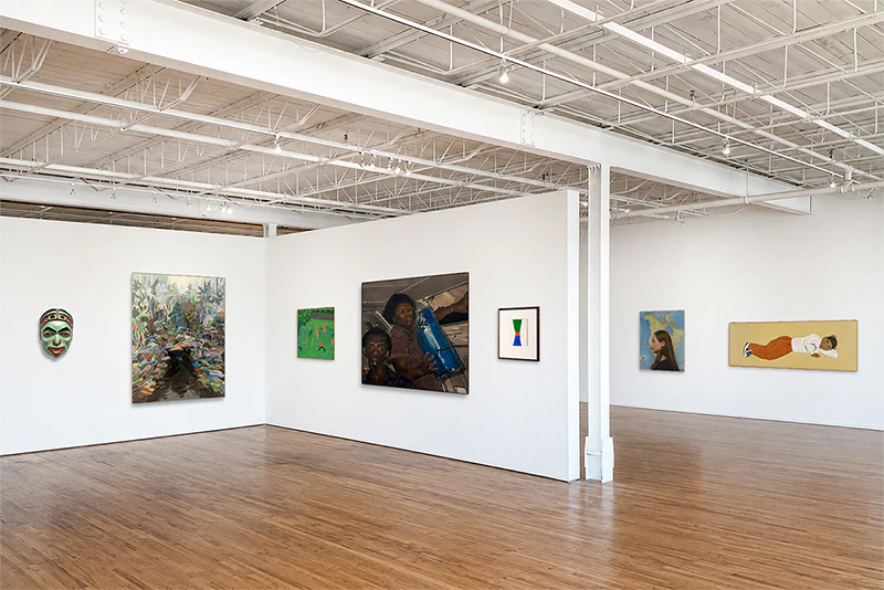
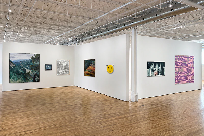
    Mock up Installation view of ADAC 60th Anniversary exhibition at Bau-Xi Gallery, Toronto

    MS: [In planning the exhibition], my colleague Gabby Marcuzzi Herie, who’s our Appraisal Manager, our incredible board, and I dreamt up this exhibition in a pop-up style. This idea came to fruition as we looked at how to celebrate 60 years of our association. And so how do you kind of encapsulate 60 years? Well, there is no better way than to showcase art from our members. The artworks span from the 1800s to the present day, simultaneously reflecting the trajectory of the Canadian art landscape and what is important to our members [regarding which works are significant to Canada’s art history]. Because every member was able to provide a certain amount of art for a jury to consider. And then the jury selected the artworks. And from there, we’ve kind of jointly curated this incredible exhibition that touches on, quite literally, every aspect of the Canadian art scene.

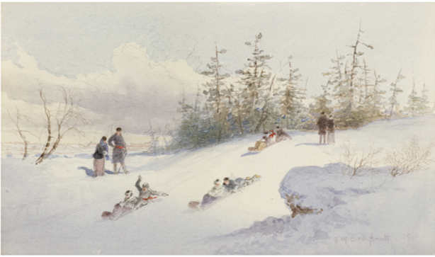
    Frederic Marlett Bell-Smith (1846-1923), Sledding, 1879, watercolour on paper, 13 3/4 x 17 1/2 inches (framed), Uno Langmann Gallery, Vancouver

    MS: For example, the Uno Langmann Gallery. They’re based in Vancouver and deal primarily with European and Canadian historical art. And so, what was selected from them was a couple of gorgeous mid-1800s paintings from some of Canada’s early settler immigrants, painters, Frederick Bell-Smith is one of them that comes to mind.

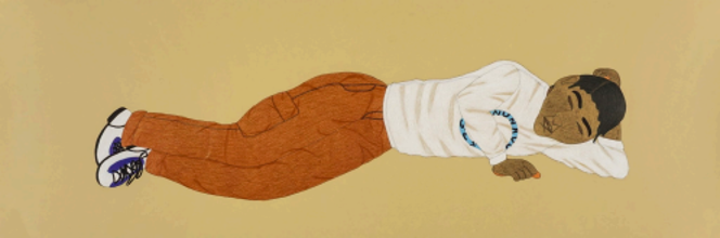
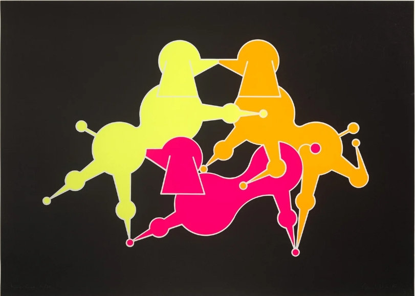
    For the 1950s, we’ve got a gorgeous Doris McCarthy from Wynick/Tuck Gallery in Toronto. A work from the 90’s; a beautiful Rita Letendre from Gallery Gevik in Toronto. We also have this incredible General Idea print from Simon Bentley Fine Art from the 80s, and an Annie Pootoogook from Feheley Fine Art from the early 2000’s.

    Annie Pootoogook (1969 – 2016), Sleeping Man, 2007, coloured pencil & ink, 15 x 44 1/4 inches, Feheley Fine Arts, Toronto

    Looking into the present day, we’ve got a remarkable James Carl sculpture from TrépanierBaer in Calgary and an amazing painting by Rhys Douglas Farrell from Herringer Kiss Gallery, Calgary and photographs from Katherine Takpannie from Olga Korper Gallery, Toronto.

    The trajectory, the expansion that people are going to see, is unprecedented. This is a never-before-seen exhibition, unlike anything ever done outside of an institution.

    General Idea, Mondo Cane, 1985, screenprint, 29 x 40 inches, Simon Bentley Fine Art, Toronto

    MS: I think that there’s something to be said about longevity. That’s 60 years of continuing our mandate every year, advancing our presence in the art world, and earning our members’ trust by doing our job of advocating, promoting, and educating not only the public but also the government, as well as helping our member galleries. For instance, when the recent tariffs imposed by the U.S. were announced, our members leaned on us for answers, for advocating to the government, and for pitching ideas to the press. And so that is 60 years of being a trusted source not only for our members but for the public. Trust is also when the public comes to us and asks, “Who’s a good art gallery that we should be going to?” And we have over 64 of those across the country that we know and trust, so we send them to them.

    The exhibition as a whole proves of trust, of expertise, and as I was saying before, the artwork that is within the exhibition is top-tier art and it’s shown because our dealers have, again, decades-long expertise as well as refined aesthetic, to bring in artists that not only sell but do really stand out within what could be argued a saturated visual landscape, especially between social media and varied ways of seeing art.

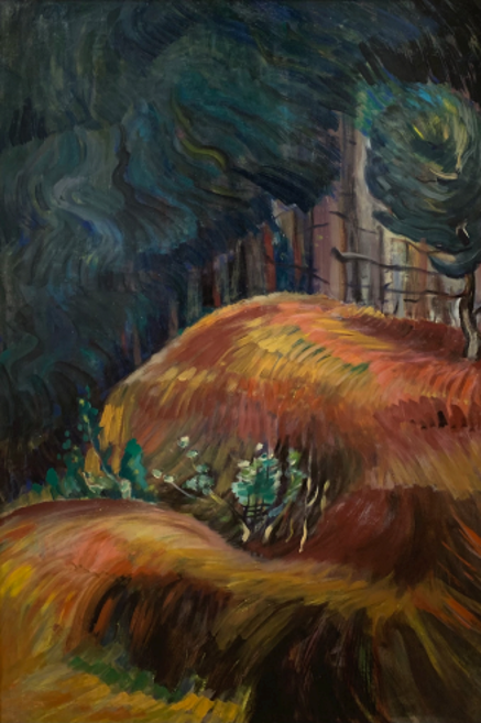
    Emily Carr (1871 – 1945), Surging Sea of Undergrowth, 1935, oil on paper on canvas, 35.875 x 23.75 inches, Madrona Gallery, Victoria

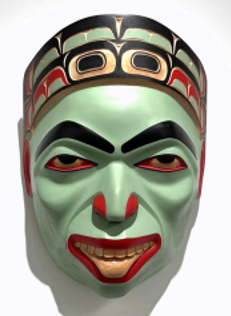
    MS: [The 60th anniversary exhibition] will highlight Indigenous and Inuit artists from the Arctic, North West Coast, as well as the rest of Canada. We have Shaman Mask by Cole Speck and a gorgeous tapestry Small Chief Blanket by Chief Janice George, both from Fazakas Gallery, Vancouver. These works are reflective of Indigenous culture, practices, and community; their art keeps these traditions alive. What will also be nice to see are these works in conversation with those by Emily Carr, who is so indebted to the Indigenous peoples of Vancouver. And so, thinking about those connections is, again, what we will communicate through the curation of this exhibition.

    We support galleries representing and working with Indigenous artists. Within our organization, we try and strive to be knowledgeable, to be respectful and to help our members in any way, shape, or form that we can.

    Cole Speck, Shaman Mask, 2025, Alder and acrylic paint, 16 1/2 x 13 x 9 inches, Fazakas Gallery, Vancouver

    MS: So, in terms of international, we’ve got a great working relationship with the Art Dealers Association of America. In years past, we were able to go to The Armory [Show] and to L.A. for a pop-up exhibition organized by the Canadian Consulate. At both, we had members able to present and support Canadian art. We have members who participate in U.S., Mexico, European and Asian art fairs. Our members are going out and advancing Canadian arts on an international stage by participating in art fairs and trade missions in the visual arts. For example, we have one member, LL Contemporary, based in Markham, [which has presented] in Paris, China, and the U.S. So, our members are always trying to advance their artists on a world stage.

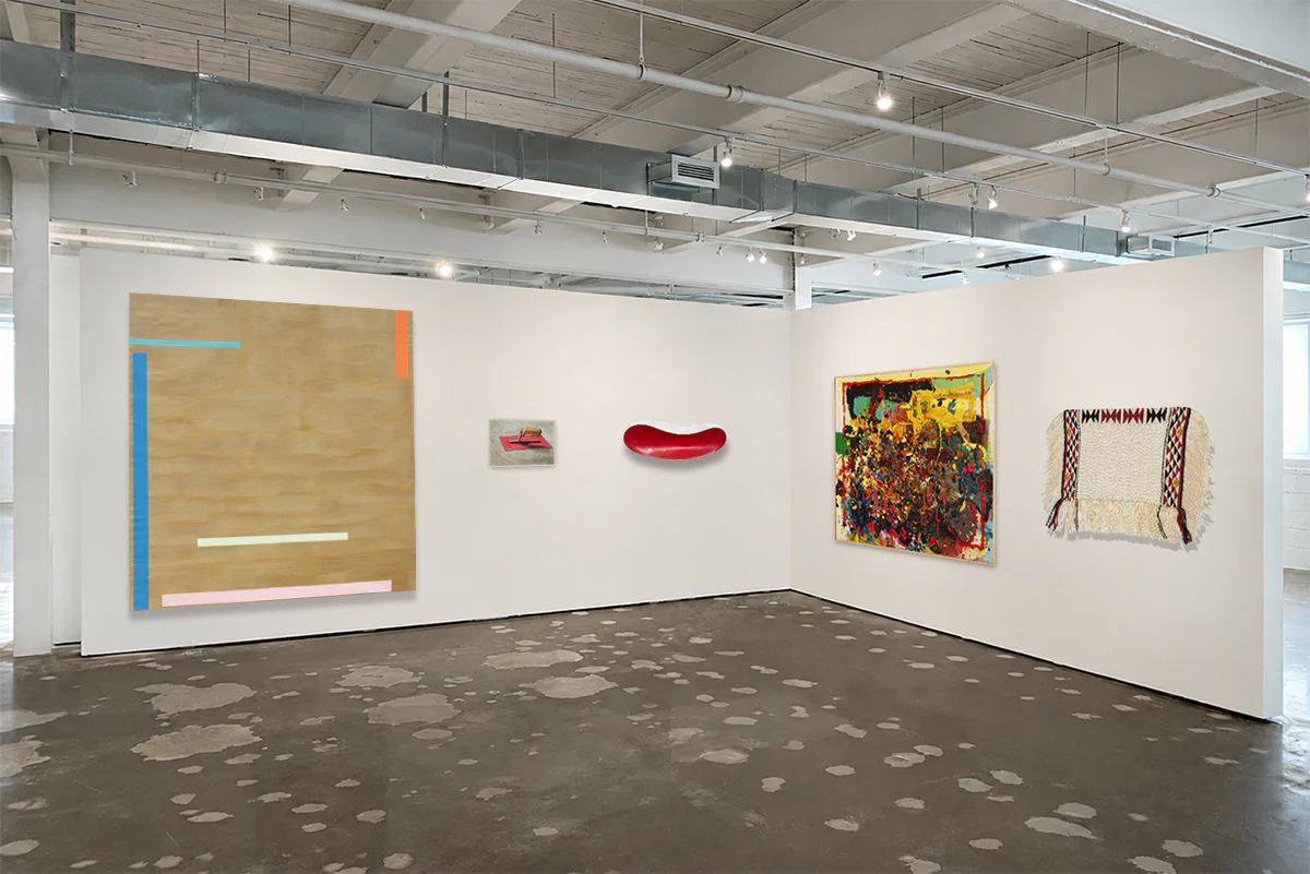
    Mock Up Installation view of ADAC 60th Anniversary exhibition at Bau-Xi Gallery, Toronto

    MS: You can probably expect us to continue outreach and bridge relationships, both internally, meaning within our own ecosystem of art dealers, and externally, by bringing more people who are not in the arts into the arts. We will aim to achieve this in a couple of ways, including engagement, tours, and panels, as well as being more present with our members at art fairs and international spaces. We are focused on expanding and helping bring more galleries into our organization. Additionally, the ADAC looks forward to fostering dialogue, creating opportunities, and collaborating with our international counterparts. Through these efforts, we strive to place our members in the best possible position to support them and, in tandem, support Canadian art and artists.

    We will continue to celebrate Canadian art, advance the Canadian art landscape, and collaborate to foster community. So, the next decade will not be so much about establishing our roots, but about branching out and growing larger.

    Mock Up Installation view of ADAC 60th Anniversary exhibition at Bau-Xi Gallery, Toronto

    Mackenzie Sinclair also told ARTORONTO.ca that the ADAC will be selling a limited-edition catalogue at the exhibition, with a print run of approximately 200 copies. This catalogue will provide a comprehensive and visually curated narrative of the Canadian art dealer’s perspective on the country’s art history. Additionally, Mary Simon, the former governor general, has written the foreword to the catalogue.

    I encourage the reader to join in the celebration of ADAC’s 60th anniversary, as free access to top-level Canadian art is an opportunity not to be missed! The show will be on display at the Bau-Xi Gallery on Dufferin, June 11 – 14, 2026, 1384 Dufferin St, Toronto. Gallery hours: Mon – Sun 10 am – 5:30 pm.