Author: artoronto

  • Feature: Contemporary Art Fair 2015

    Opening Night: Wednesday, October 21, 2015 / 4 – 6 p.m.
    Joey & Toby Tanenbaum Opera Centre
    227 Front Street East

    Despite being smaller in size and much younger, Feature Contemporary Art Fair offers an exquisitely curated group of contemporary works from leading Canadian galleries that rivals, in quality for sure, and probably will exceed in the future the volume of Art Toronto.

    Patrick Mikhail Gallery, Montreal, with Andrew Wright’s sculpture and Amy Schissel’s painting

    I had a really good time there for many reasons. There is no need to rush at Feature. Comprised by only 29 galleries, the fair allows the visitor to focus and enjoy each and every work in a very intimate way. Also, personal interaction with gallery owners and exhibiting artists is guaranteed.

    Clint Roenisch, Toronto

    Monte Clark Gallery, Vancouver

    Division Gallery, Toronto

    You don’t feel like you are in a trade show. The fair’s architecture and distribution offer a novel way to exhibit. Trapezoidal booths opening towards the public provide a more organic space, streamlining movement and allowing the works to be seen from different perspectives.

    Battat Contemporary, Montreal

    Guests at Laroche/Joncas, Montreal

    Feheley Fine Arts, Toronto, with guests

    You won’t see Picasso. Dedicated to contemporary art only, the fair offers the newest, most cutting edge work made in Canada, preventing you from an overload of Modernist landscapes or abstractions.

    Katzman Contemporary, Toronto, with work of Meryl McMaster

    Lisa Kehler Art + Projects, Winnipeg

    Stephen Bulger, director of Stephen Bulger Gallery, Toronto, with guests

    Feature’s galleries are taking chances. Bigger, bolder works are abundant, such as Nicolas Lachance violet work made of carbon paper ink, Mathieu Gaudet colossal ‘sticks’ sculpture, or Michel de Broin colourful ensambles. These gallery owners are not afraid of colour, new materials or ephemeral qualities.

    Equinox Gallery, Vancouver

    Galerie René Blouin, Montreal, with Nicholas Lachance’s work

    The “Hoard” by Dean Baldwin is built with props from the Canadian Opera Company – the art fair happens at the COC headquarters. This site-specific installation is not only beautiful and intriguing, but it is also a great spot to recharge before heading to the second floor exhibition booths.

     At the VIP lounge

    See you there.

    Text and photo: Mauricio Contreras-Paredes

    *Exhibition information: October 22 – 25, 2015, Joey & Toby Tanenbaum Opera Centre, 227 Front Street East, Toronto. Hours: Thu 12 – 6, Fri 12 – 8, Sat 11 – 7, Sun 11 – 5 p.m.

  • Interview with photographer, Chloe Norman

    Artist Chloe Norman in her exhibition. Photo: Emily Newell

    Interview with Chloe Norman (C.N) by Emily Newell (E.N)

    Walking into Graven Feather to visit Chloe Norman’s exhibition, Guard Your Heart, and talk with the artist about her new show, was an amazing experience. Standing in the center of her photographs that delve into a personal statement – that she is definitely making – was wonderful. Hung against white walls in white frames the photos become such a focal point that one can’t help but be enthralled.

    E.N: What do you intend to convey through these works?

    C.N: It’s really about my journey as I am maturing into a woman, about that intimate journey. I’m trying to navigate being sexual but with a Christian past. In my earlier works, I had touched on it but I needed more time studying it and I think I can express my sexuality more freely now. The question is always there: is it okay for me to show this kind of sexuality or not?

    Chloe Norman, Pillow Talk, 2015, Giclée print, 9″ x 12″. Courtesy of the artist

    E.N: In your work you use very soft fabrics wrapped around female forms that are bent and posed to show how sexual and delicate females can be. Who are your models?

    C.N: Myself and others. I enjoy working with family members, friends and people I know. I choose the ones who have a resemblance to me, my age, body type, skin-and hair color. Through photographing them I share an intimate experience with them. Some of the shots can be hard on those posing for long periods of time – but well worth the strain and effort for the beauty created.

    When the photo includes me, it is done to express something more personal. In that case I use my art as a way of finding a balance within being a woman and being Christian. There is real importance, too, in using other people because I can distance myself a little bit and look at my themes from the outside. I also get some ideas from their bodies about what I can do with mine.

    Chloe Norman, Fold, 2015, Giclée print, 24″ x 36″.  2015, Giclée print, 9″ x 12″. Courtesy of the artist

    E.N: Your photographs are very passionate. How do you make them? Do you feel an urge sometimes to take a photo right then and there? What inspires you?

    C.N: Inspiration comes to me in two different ways. One is that I collect things, so have a prop that I really want to use. For example, for “Cocoon”, I bought that plastic, and I just wanted to use it. The other is urgency, like in “Christen” and “Relief”. In those moments, I was like – I need to take a photograph right now and I’m going to find something that I can use to take that photo. So a sock and a stool or just a sweater that I wear on a daily basis was good enough for that purpose.

    Chloe Norman, Christen, 2015, Giclée print, 14″ x 21″. Courtesy of the artist

    E.N: I find the plastic in “Cocoon” interesting because it is a different material than you usually use in your images.

    C.N: I think when looking at the photos in front of us, that it is mostly true, but with “Fold” there is a plastic aspect too, with the exercise ball. In, “Tight” it’s nylon as well. So, you’re right, a lot of things I am working with are softer fabrics, cushy and very soft. Those are the things I have found around my home, especially in the bedroom. I saw the plastic at Value Village and thought that it would be beautiful and I just went with it and created “Cocoon”, a major piece in this show. I think it turned out perfectly.

    Chloe Norman, Cocoon, 2015, Giclée print, 24″ x 36″. Courtesy of the artist

    E.N: In “Cocoon” the woman’s hands look as they are floating and are in the focus of the photo.  What is the reason for that?

    C.N: When I am showing hands I really want to express the feeling of touching or being touched. Something like an intimate touch. It is central to the expression of the images how I, or the other person who is posing, feel those objects, touch them and interact with them.

    E.N: Looking at your artist statement your struggle between a feminist and a religious view is very obvious. It must be a great challenge to balance those two in your art and in your life.

    C.N: I read a powerful essay before the show, “Hypatia” about how difficult it can be for a woman to navigate to be both Christian and pure but also use her body. I strongly feel that is also can be a very open relationship being both a feminist and a Christian, especially in our times. I think that the best way for me to think about it is as the quest for equality and that what I addressed in Guard Your Heart.

    *Exhibition information: October 15 – 31, 2015, Graven Feather, 906 Queen Street West. Gallery hours: Thur – Sat, 12 – 7 p.m.

  • Feature: Contemporary Art Fair 2015

    Feature: Contemporary Art Fair 2014, Galerie Trois Points. Photo: Brinae Bain

    October 22 – 25, 2015
    Joey & Toby Tanenbaum Opera Centre
    227 Front Street East, Toronto
    Hours: Thu 12 – 6, Fri 12 – 8, Sat 11 – 7, Sun 11 – 5 p.m.

    Dedicated exclusively to leading contemporary art, in its second year, Feature Contemporary Art Fair brings together artists whose practices are outstanding in their ability to innovate, challenge, and inspire.

    Feature Talks presented daily at 2 p.m. by Esker Foundation, Lead Educational Partner  in the Courtyard of the Joey & Toby Tanenbaum Opera Centre.

    Feature Tours, daily at 1 p.m., departing in the Cultural Partners Lounge.

    There are also Video Programs and Satellite Activities.

    For more information and programs please check: www.featureartfair.com.

  • Art Toronto 2015

    Art Toronto 2014. Photo: Elena Iourtaeva

    October 23 – 26, 2015
    METRO TORONTO CONVENTION CENTRE
    North Building, Exhibit Hall A & B
    255 Front Street West
    Hours: Fri & Sat, 12 – 8 p.m., Sun & Mon, 12 – 6 p.m.

    Founded in 2000, Art Toronto is Canada’s international fair for modern and contemporary art, located at the Metro Toronto Convention Centre in the city’s downtown core. An annual fall event, Art Toronto serves as the galvanizing vehicle for the nation’s art world. Considered the country’s must-attend event for art collectors and industry professionals, Art Toronto is the place for galleries wishing to attract a new sophisticated market of collectors, and professionals, and the place to network with a diverse and well connected group of fellow participants.

    Now in its 16th year, Art Toronto presents important artwork from leading Canadian and international galleries combined with PLATFORM, our engaging series of lectures and panel discussions from prominent art world figures, curated projects, an extensive VIP Program, and top-tier cultural offerings throughout the city.

    FOCUS: LATIN AMERICA is a curated section of the fair highlighting galleries and projects from across Mexico, Central and South America.

    PLATFORM SPEAKER SERIES:

    Concurrent programming for FOCUS: LATIN AMERICA includes lectures and panel discussions by leading international artists and curators. Attendance at all talks is included in daily admission to Art Toronto.

    For programming and more information please go to http://arttoronto.ca/.

    *Featured image: Art Toronto 2014. Photo: Phil Anderson

  • Imre Hajagos: Cold Brew Horizon at Gallery 1313

    Strong colors and powerful compositions greet me in Gallery 1313 at Imre Hajagos’ solo show, Cold Brew Horizon. All the paintings, some oil and some acrylic, are abstract. Being familiar with Hajagos’ past work, I see this show as a departure. It’s still abstract, there are still lines and urban imagery, but these paintings are more playful and suggest stories that are more accessible. It is also a departure as natural and organic forms play an equally important role as urban motifs. The artist contemplates subjects as diverse as the universe’s passage of time (“Mystic River”, 2015) all the way to the simple pleasure of the lakeside in “Splash”.

    Hajagos’ approach toward his subject matter is always intellectual; there is nothing on the canvases that is not premeditated. He observes and thinks over his themes for a long time, reads books on topics that interest him, like quantum mechanics or microbiology, philosophy and contemporary literature. He doesn’t make sketches but has a clear idea about the painting before beginning. Then when actually painting it, through the physical act of “pushing the paint on the canvas”, the composition really takes form. The final work juxtaposes the intellectual and the physical and is full of energy.

    Installation view. Photo: Summer Sun

    Everything was born from chaos, and this biblical chaos is seen throughout Hajagos’ paintings. However his compositions are a controlled mixture of the chaotic and the orderly. He points out that physics, especially quantum mechanics, proves that everything in the universe is orderly but unfortunately our limited understanding makes it look chaotic, so both chaos and order are always present in his paintings. Time is another major element of Hajagos’ work. According to universal time, a human life is very short – a mere blink — and that’s why it’s so special. We lose it so soon. “Mystic River” depicts elements of our evolution in the form of cells, sperm-like lines, and a large rock-like image of cell mitosis that dominates the surface along with a little embryonic creature. The river of endless time flows into eternity, carrying the basic elements of life toward an unknown future. While “Mystic River” focuses on biological time, “Writing on the Other Side” explores our intellectual lives. Different forms of writing like Egyptian hieroglyphics, sticks, knots, Chinese calligraphy and modern letters are mixed with human history, some forgotten but still present in our unconscious – they are just on the “other side”. In front of squares and blocks that remind us of computer memory panels, a large, delicately painted orange shape floats. A pyramid made of paper ribbons? And another orange shape like a monumental tear drop or a solar flare. The criss-crossed lines might be writings, mixed and overwritten, but no longer readable. Hajagos’ paintings are open to rich interpretation, but all the possible narratives are speculations by the viewer.

    Imre Hajagos, Writing on the Other Side, 2014, acrylic on canvas, 36″ x 30″. Courtesy of the artist

    Time is also movement and there’s lots of movement in Hajagos’ pieces. Looking at them, I was taken with the freedom they convey. While he paints he always listens to music, both “forceful and laid back”. The music is all about movement, bringing unexpected elements into the painting and, as the rhythms freely come and go, the motifs on the canvas flow with them. The strong rhythmical movement of the bright yellow light in “Solar Wind” or the cooler, blue light of the night in “Blue Moon Rising” resonate to music. You can almost hear the water in “Splash” as someone happily jumps into a pool. The trees in the background are depicted as they are in Egyptian wall paintings, highly stylized and ornamental. Tall grass bends in the breeze, rocks shimmer in the heat. The two human-like shapes in the foreground might be onlookers or maybe just abstract forms for the sake of the composition. Hard to figure out.

    Imre Hajagos, Splash, 2015, oil on canvas, 36″ x 30″. Courtesy of the artist

    Hajagos’ entire life has been spent in cosmopolitan cities with all the bliss and mess they have to offer. Museums, galleries, bookstores, restaurants, streets where shop-windows shine, sudden gusts that blow newspapers around and exhaust that puffs out of tailpipes – all are central elements in his work. Urban life radiates from them with its busy streets, traffic lights and crowds, depicted by vivid colors, weaving everyday life into a tapestry of city living. “Yellow Accent” is a very busy composition, a true mirror to our city. Everything moves in the neon light, a saxophone plays, cars honk and drive far too fast – or painstakingly slow — and the faces of friends and strangers go by. Even the ugliness of the city becomes beautiful through this metamorphosis.

    Imre Hajagos, Yellow Accent, 2015, oil on canvas, 36″ x 30″. Courtesy of the artist

    Size matters and details are important in Hajagos’ work. The size of each canvas is perfectly suited to its theme but even smaller pieces have deep impact on the viewer. His paintings are highly structured and balanced, but what make them delightful are the many little details you can enjoy when taking a closer look. Enriching the surfaces are all the patterns you can imagine – natural, man-made and futuristic – bringing in an element of playfulness. On the textured surfaces colors overlap creating a rich, earthy deepness or airy lightness. Light shines through in the form of uncovered canvas or bright brushstrokes. In some places he uses oil paint in a more liquid form that allows him to blend the colours more finely on the canvas and the outcome is strikingly beautiful and delicate.

    Imre Hajagos, Crossroads, 2015, oil on canvas, 28″ x 22″, detail. Photo: Summer Sun

    Hajagos’ artwork is challenging. It takes time to get familiar with his imagery and decipher his motifs. In the end, it is much like poetry; you don’t have to understand every detail to enjoy it.

    Julie McNeill / Julie McNeill is a Toronto poet

    *Exhibition information: October 14 – 24, 2015, Gallery 1313, 1313 Queen Street West, Toronto. Gallery hours: Wed – Sun, 1 – 6 p.m.


  • Kent Monkman: The Rise and Fall of Civilization

    Dioramas tend to be one-sided theatrical depictions of life. Often visually overwhelming or plainly boring, these 19th century devices might seem like a dated medium for a contemporary artist. However, Kent Monkman’s installation at the Gardiner Museum is anything but dated or one-dimensional. Inspired by multiple histories told at once, and full of contemporary connotations, The Rise and Fall of Civilization is a show worth seeing. 

    Upon entering the room, we find giant walls covered in what looks like cave paintings of bison and bulls, reminiscent of ancient sites like Altamira or Chauvet. All these animals are running towards the centre of the space, converging at a structure “measuring approximately 9 feet high, simulating a natural rock formation used to hunt buffalo”, often called the buffalo jump. At the top of the jump we find Miss Chief, the artist alter ego. While her presence is hard to miss, her role in this procession seems very ambiguous. Whether she is guiding the jump or trying to stop it – we are left wondering.

    On the floor, being born from a pile of ceramics (that clearly references the build up of bones at buffalo jumps and also the bone china featured among the Gardiner’s collection) flat, geometric bulls materialize, running towards the cave paintings across the room. While at first glance the juxtaposition of mounted bulls at the top of the cliff and the Cubist bulls emerging from the ground might seem unexpected, but the artist provides a very compelling explanation. It is all about “the flow of history” and the “inevitable exchange” of cultural images and stories between Europe and the indigenous cultures, in the words of Monkman.

    The flattening of the mounted bulls references the destruction of indigenous cultures and histories by Modernity. While Modernity served the Europeans as the possibility of a new beginning, of a blank canvas, of a new era, for the first nations modernity was a point of obliteration. Their culture, their customs and their persona were flattened, made one-dimensional, until they became a (Cubist) caricature.

    However, these connotations are not only pertinent within 2oth century narratives. Without a doubt they also resonate today. Globalization and the information era might end up tearing apart that liberated blank canvas that we created from scratch during the last century. Perhaps we are just the next group of bison, slowly walking towards the cliff under the guidance of Miss Chief, without even knowing it.

    Text and photo: Mauricio  Contreras-Paredes

    *Exhibition information: October 15, 2015 – January 10, 2016, The Gardiner Museum, 111 Queen’s Park, Toronto. Gallery hours: Mon – Thu, 10 – 6, Fri, 10 – 9, Sat – Sun, 10 – 5 p.m.

  • Rhonda Weppler + Trevor Mahovsky: The Visitation

    What an odd sight it is to see worn-down fences in an established gallery, like the Pari Nadimi Gallery in Niagara Street. The fences are part of Rhonda Weppler’s and Trevor Mahovsky’s solo exhibition. While perhaps ‘solo’ is not the most fitting word, they are, in fact, a duo. The Visitation is an extension of the duo’s previous installation, Bad Neighbor. Visitation initially deceives the eye: the front reveals nothing about its actual materiality. The front is characterized by density, weight, and a sense of protection. It is two pieces of fencing situated in a V formation, with a dresser, pieces of panels, moths, and cat shaped wood placed on and around the fences.

    Visitation, 2014 – 2015, Oak, fir, pine, birch and exotic wood veneers given patina with vinegar solution, resin, 5’4” H x 9’L x 11’W. Installation view, Pari Nadimi Gallery. Courtesy of Pari Nadimi Gallery

    However, it is surprising how much Visitation changes once you walk around to the back. The density, the weight, and the nostalgic quality all disappears. From the back, the viewer sees that the sculpture is made from very thin wooden veneers. All the components from the front (dresser, moths, scratches, etc.) are revealed to be part of the fences. It is all one piece. The dresser is connected to the fence and empty in the back – same for the moths – as if they have surfaced from the fence. The entire backside is also coated with a clear resin that looks and drips disturbingly organic – similar to the goo from Ridley Scott’s “Alien”.

    Visitation 2014 – 2015, Oak, fir, pine, birch and exotic wood veneers given patina with vinegar solution, resin, 5’4” H x 9’L x 11’W (detail). Installation view, Pari Nadimi Gallery. Courtesy of Pari Nadimi Gallery

    Visitation, 2014 – 2015, Oak, fir, pine, birch and exotic wood veneers given patina with vinegar solution, resin, 5’4” H x 9’L x 11’W. Installation view, Pari Nadimi Gallery. Courtesy of Pari Nadimi Gallery

    Visitation is in a constant state of instability. This highly constructed, highly intentional structure looks like it could collapse any minute, but it never does. The relationship between Visitation and “From Whichever Side One Approaches Things” announces that the curation itself is highly intentional as well. The installation nudges the viewer to move around and interact with the space.

    From whichever side one approaches things, 2014, walnut veneer, resin, 71.5” h x 4.5” w x 1.5” (detail). Courtesy of Pari Nadimi Gallery

    Also in the exhibition are “Snug Fit” and “Island”, as well some photographs from the duo’s “Monkey’s Raincoat” Series. Weppler and Mahovsky questions materiality in this subtle installation, and tells us that if we search hard enough, we might just find the solution.

    Snug fit, 2015, infused aluminum print (proprietary commercial printing system and readymade size), 24” diameter. Courtesy of Pari Nadimi Gallery

    Sunny Kim

    *Exhibition information: September 17 – October 31, 2015, Pari Nadimi Gallery, 254 Niagara Street, Toronto. Gallery hours: Wed – Sat, 12 – 5 p.m.

  • Interview with Frances Ferdinands

    Articsók Gallery co-directors, Peter Alexander Por (left) and Csilla Csiki (right) with artist Frances Ferdinands (centre) framed by “Border Crossing”. Courtesy of Articsók Gallery

    Interview with Frances Ferdinands (F.F) by Haafiz Karim (H.K)

    Frances Ferdinands currently has a solo exhibition, titled  Lassanai (Beautiful), at Articsók Gallery.

    H.K: Frances, you mostly delve into your culture and your background for inspiration. What makes Lassanai different from your past ones?

    F.F: Lassanai is a result of  looking at a particular and important part of the Sri Lankan culture, its official religion, Buddhism. The Image Houses of Buddhist Temples tell the story of Buddha in pictographs. I visited many and learned about the Kandyan versus Southern styles of painting. Then I chose to focus on the floral motifs that were present in all of these Image Houses. My recent past work was mostly related to my own hybridity as a Sri Lankan Canadian. This show is somewhat a continuation of my earlier, 2007 exhibition, “Food for Thought”. In that I used Sri Lankan images combined with western ones, like the Buddha embracing Wonderbread, giving them social and political references. These two paintings  are also included in this exhibition. Lassanai is different from my previous shows in an experiential way: “26” and “Border Crossing” are installations, the latter is being interactive.

    The Red Buddha ( Buddha embracing Wonderbread), acrylic on canvas, 30″ x 30″. Courtesy of Articsók Gallery

    H.K: Your exhibition is a culmination of a three month stay in your homeland. What was the most important experience in this particular visit and how did you transform it to Lassanai?

    F.F: I arrived in Sri Lanka in early January, 2015 on the eve of the Presidential Election. The capital city, Colombo, was deadly quiet as everyone stayed indoors fearing a violent coup was going to erupt but the transition to a new president was peaceful. This resulted in an atmosphere of optimism by all, and a feeling that the 26 year civil war could finally be put behind them. I felt this optimism the entire time I was there and it is revealed in the title of the show and the work. The center piece of the exhibition “26” is a direct expression of this, as each pair of slippers memorializes one year of the war, and – through their beauty – they also symbolize steps into a new, positive era. The hand-painted designs of the slippers are inspired by floral motifs found in the Buddhist Temples I visited. I wanted to combine the highly spiritual motifs with something as lowly and ubiquitous as the slipper – symbolizing the aspects of human life.

    Guests looking at “26”. Courtesy of Articsók Gallery

    H.K: Vinyl has been an important medium in your recent work. Why vinyl particularly? Can you tell us more about this technique and the procedure of creating your pieces.

    F.F: I work with acrylic paint. I knew that I wanted to paint 26 pairs of slippers. When I began the process I was painting directly on the foot-bed of the slipper. The technical difficulties of matching the two feet of a pair – one the mirror image of the other – was enormous and the process slow. I came upon the idea of creating about 10 different designs and having them printed  on vinyl which adheres to the slipper remarkably well, and takes well to acrylic paint since vinyl is a plastic, as is acrylic. So I had the designs printed and then glued them onto each slipper with an acrylic gel product. I used this method in creating “Border Crossing” as well.

    One of the “26” in a glass case. Courtesy of Articsók Gallery

    H.K: Your “Atomizer” collection romanticizes quite a stark symbol. What inspired you to create these particular paintings?

    F.F: I was looking at the silhouette of a hand grenade, and the elegance of its shape was reminiscent of a vintage perfume atomizer. I also liked the ‘perfume spray’ metaphor. Again I wanted to create beauty within an object of mass destruction. I also wanted to reference the place of beauty within the intersections of war, religion, and commerce throughout history. Each atomizer has a particular reference to the history of the country, its colonization, its exploitation, and so on.

    Three of the Atomizers. Courtesy of the artist

    H.K: There is somewhat of a mystical appeal to your recent journey to Sri Lanka. During this visit you studied traditional fine art and craft with two local masters. What was your greatest lesson? How did you apply their teachings in a more contemporary interpretation?

    F.F: I studied with two mentors who practice a form of art and craft that is disappearing in the country. I was interested in learning the traditional techniques and rules of how to paint in that historic tradition. I had not worked in such minute detail in many, many years.

    The greatest lesson was: a striving for perfection all the while knowing it was unattainable. The process was in many ways a meditative activity. In creating the work for the show, my intention was to use  those techniques and designs I had learned and re-contextualize and re-vitalize them. Many of these floral motifs were simply decorative ornamentation around the perimeters of ceilings, doors, walls of temples. I have, in a very contemporary way, given them a new meaning.

    Installation view with “Border Crossing”. Courtesy of Articsók Gallery

    Given the current world situation, the installation, “Border Crossing” is very germane. Again I took two border patterns and transformed them into a portal, a crossing, in which one carries an object (in this case a round stone) over a threshold. I wanted the viewer to experience the microcosm of a journey; one that combines the spiritual with the physical. This particular piece is the beginning of a larger work in which I’ll take border patterns from the spiritual houses of various cultures and create multiple crossings.

    *Exhibition information: Frances Ferdinands: Lassanai (Beautiful), September 24 – October 24, 2015, Articsók Gallery, 1697 St. Clair Avenue West, Toronto. Gallery hours: Wed – Sat, 12 – 6 p.m.

  • Joseph Hartman: Artist Studios / Stephen Bulger Gallery

    Joseph Hartman’s photographs at the Stephen Bulger Gallery do what all good photographs do. They draw you closer and, in so doing, expose much more of their subject than can be seen with the unaided eye. The series, part of an ongoing project culminating in a 2017 sesquicentennial solo show at the Art Gallery of Hamilton and a monograph by Black Dog Publishing, consists of ten large-scale colour photographs of the interior of artists’ studios. Using a large format camera and a deep depth of field, Hartman has captured his subject in the type of razor sharp detail characteristic of photographers like Edward Burtynsky, under whom Hartman apprenticed after opting out of a medical career to pursue photography in the early 2000s. And while Hartman’s subject matter is often also similar to Burtynsky’s—think industrial landscapes, processes of decay, and nature meets built environment—for this project, Hartman has turned his omniscient, outward-looking eye to the private, often elusive, interiority of the artist’s space. The result is a deceivingly subtle questioning of both the truth-telling capacity of photography and of the ability of artists’ studios and other details of artists’ lives to provide insight into their artistic processes or the meaning of their art.
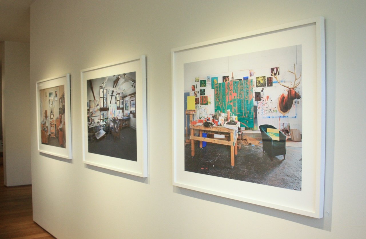
    Installation view with Josph Hartman, Kim Dorland (right). Photo: Catherine  MacArthur Falls

    To create Artist Studios, Hartman selected his artists very carefully. His primary criterion, that each of the studios belong to an active Canadian artist, follows from his previous photographic work, which tends to take a specifically Canadian, primarily Ontarian, focus. Yet, as Hartman stated in email correspondence, he also chose artists whose work he finds personally interesting, for whom “something about their artwork will create an interesting studio space,” and in which “the creation and ‘fabrication’ of the artwork…happen[s] in the studio.” These criteria led Hartman to an eclectic mix of some of Canada’s leading painters and sculptors: Kent Monkman, John Scott, Kim Dorland, Douglas Walker, and Katharine Harvey, to name just a few. Once selected for the project, each studio was photographed without the artist or other inhabitants. As much as possible, Hartman aims to capture the studios in what he calls their “‘natural’ working state,” absent of any preparatory cleaning or manipulation. He also attempts to photograph works in progress, and asks participating artists to be working on a piece when he is there, if possible. “I try to avoid the posed photo at all costs as I find them fairly boring,” Hartman relates. “I really want to represent a realistic scenario and not something posed simply for the photo.” Indeed, in the few cases where Hartman arrived to find what he thought to be an unrealistic setting—a situation he said was more common in the early stages of the project—he would ask the artist if he could come back when the studio had not been clean or otherwise staged.
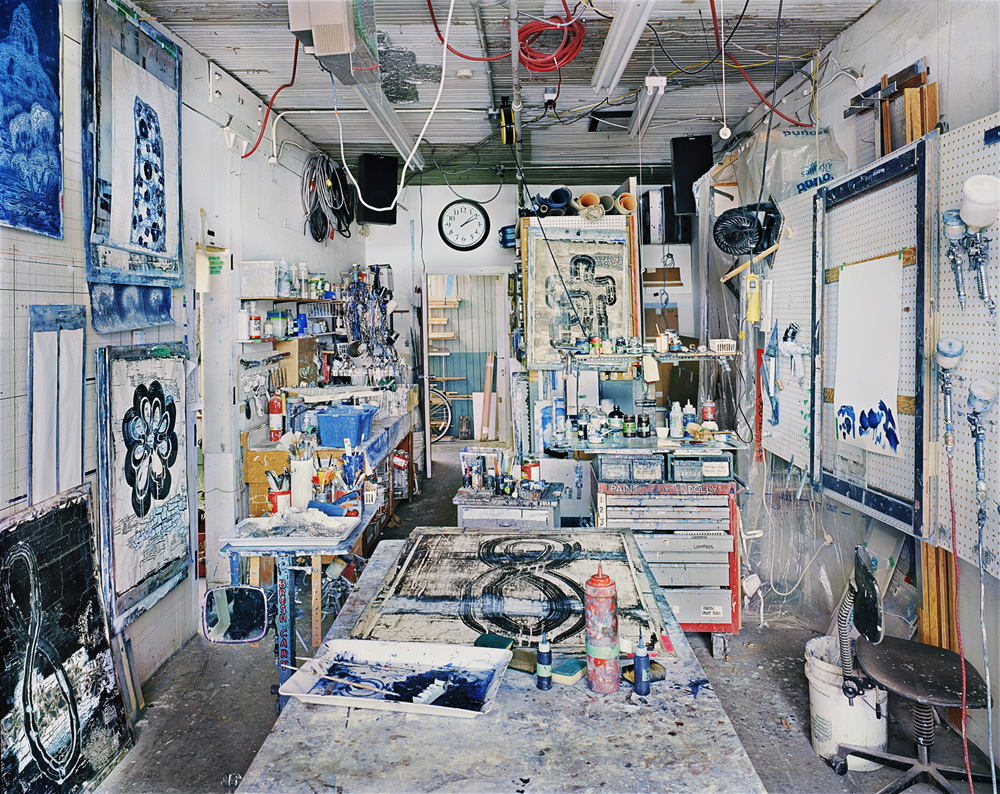
    Douglas Walker, 2013 © Joseph Hartman, Courtesy of Stephen Bulger Gallery

    The resulting photographs—sparkling with visual multeity—reflect the eclecticism of their owners, allowing viewers a glimpse into studios that range from sparse and meticulous (William Fisk, for example) to frenziedly cluttered (John Scott and Douglas Walker, for instance). One can expect to see industrial lofts stacked with oversized canvases and paint-splattered surfaces, as well as perhaps less anticipated minimalist, meditative spaces and homey, even quaint, furnishings. The effect of these images on the viewer is powerfully seductive. By excluding the artist or any other inhabitant from the image, Hartman creates the feeling of a privileged all-access pass to a coveted intimate space. Captured in crisp detail, on such a large scale, the studios are ripe for prolonged, unencumbered looking. The eye is free to linger over artists’ works in progress, influences and ideas, even hints of a life beyond the studio—an unfinished painting in Monkman, for instance, books scattered on tables in James Lahey, notes, doodles and sketches, abandoned or unfinished ideas, a pair of hockey skates. By capturing the studios, as much as is possible, in the middle of the artistic process, Hartman’s photographs also give the sense that the artist was just there, that she is just beyond the frame, having put down brush or pencil to step back for a better look, get some air, or grab something in another room. Details like the brushes left in paint cans in John Scott, or a sketchbook left open on a chair in Shelley Adler help create this feeling of suspension.
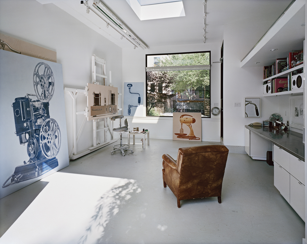
    William Fisk, 2014 © Joseph Hartman, Courtesy of Stephen Bulger Gallery
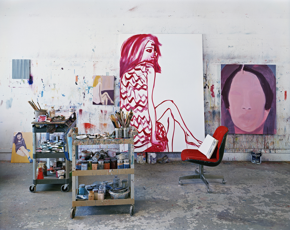
    Shelley Adler, 2013 © Joseph Hartman, Courtesy of Stephen Bulger Gallery

    This detailed, suspended aesthetic works on the viewer in a number of ways. At the surface level, it both indulges and exposes our fascination with the minutiae of artists’ lives, a fascination also evident in the countless artists’ biographies, studio tours, interviews, and portraits that attempt to understand a figure granted an auratic and genius-laden place in Western society. Yet, by capturing works-in-progress, it also creates an illusion of access to the mysterious methods, manners of thinking, and processes from which the artist turns nothing into something, to the creative spaces—physically and mentally—in which artmaking occurs. According to Hartman, this is the space he set out to access when he began shooting the series. And in some cases, this is exactly what we see. In Charles Bierk, as Hartman points out, you do gain significant insight into the artist’s process: the gridded photograph taped to his easel hints at how Bierk creates large-scale hyperrealistic portraits one minute square at a time. Similarly, Hartman notes, the corkboard in Michael Thompson’s studio tells us something of his visual influences and inspirations. 
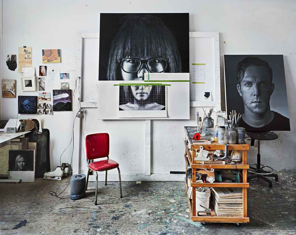
    Charles Bierk, 2013 © Joseph Hartman, Courtesy of Stephen Bulger Gallery
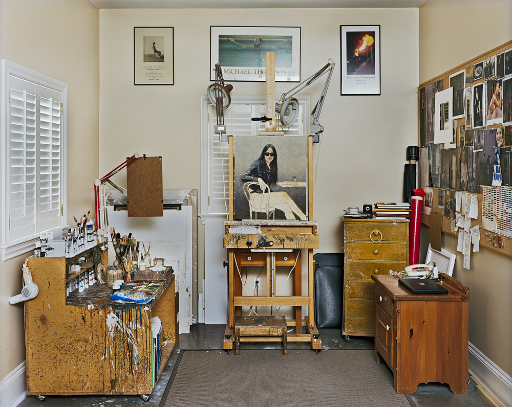
    Michael Thompson, 2013 © Joseph Hartman, Courtesy of Stephen Bulger Gallery

    This feeling of an unencumbered glimpse into the artist’s life and process is aided, of course, by our belief in the ‘truthfulness’ of photography, a belief that, though debunked for several decades now, continues to hold visceral sway. When looking at one of Hartman’s photographs—in all its hyperrealistic detail—we do feel that we are glimpsing the reality of the artist’s life, that even though the artist is absent, the work constitutes a portrait of the artist and her creative process. And yet, it is here—at the intersection of photography as a medium and the studio as a subject—that the subtler meanings of the work come into play. Because, when really looking at Hartman’s photographs, it is difficult to lose oneself completely to the ‘reality’ of the studios shown. It is simply too difficult to ignore the unnatural cleanliness of William Fisk’s space, the conspicuous visibility of one of Kent Monkman’s most readily identifiable works (Expelling the Vices, 2014) and, most disquietingly, the gun on the central table in James Lahey’s studio. Such details hint at a process of self-editing or control that bars the access we truly desire. Indeed, in even the most seemingly untouched or disheveled studios, we can never know how much the space diverges from its everyday aesthetic, how much the inhabiting artist, or Hartman himself, has framed or staged it—not necessarily maliciously or even consciously—to align with a persona or aesthetic or simply to play with the viewer. 
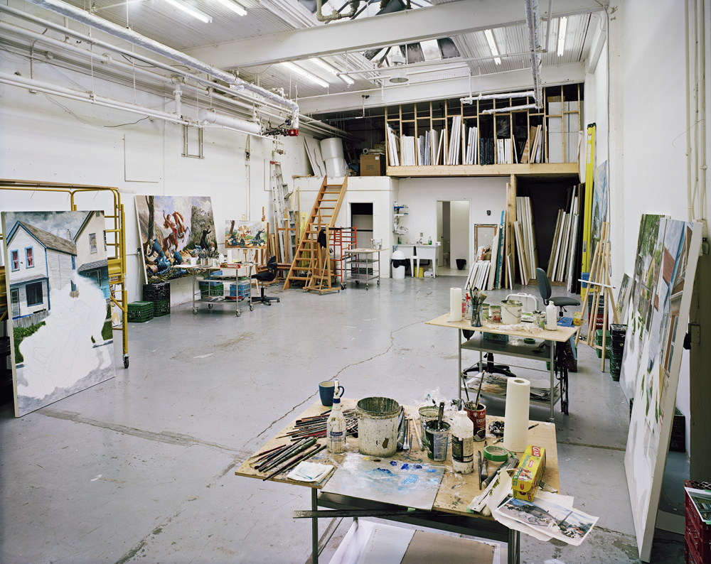
    Kent Monkman, 2014 © Joseph Hartman, Courtesy of Stephen Bulger Gallery
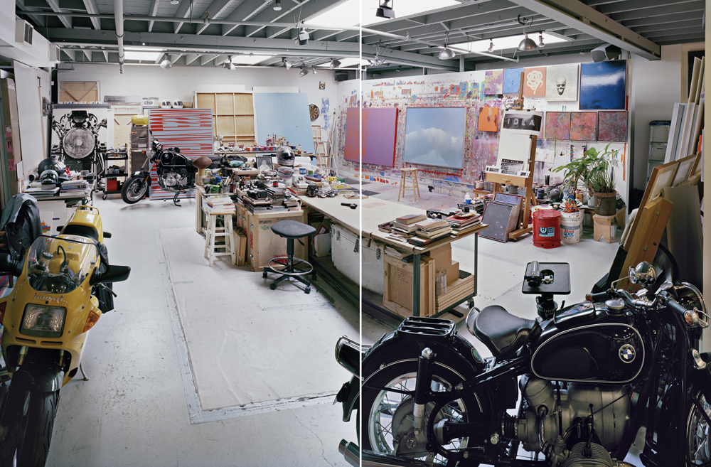
    James Lahey, 2014 © Joseph Hartman, Courtesy of Stephen Bulger Gallery

    Throughout the history of art, the studio has been a place where real artistic work is performed. Yet, it has also acted as a signifier of a specific type of identity, mental process, and labour. This signifying potential of the studio is certainly not lost on artists, perhaps accounting for some of the artists’ impulse to clean up before letting Hartman in to photograph. In one or two cases, Hartman describes, artists he pursued even felt the space was, “too private and too personal to be photographed.” The truth is that studios are too meaning-laden to ever be truthful. The ‘real’ studio is simply too slippery to pin down. And in this way, the studio as a subject parallels photography as a medium. In one of his many successes with the series, Hartman has cleverly married photography, whose veracity we are used to questioning, with a subject we often do not, but whose ability to convey truth about artistic processes and meaning is, in the series, rendered dubious through the capturing of careful details. Subject and medium mutually reinforce one another—the studio, with all of its tricks, reminds us of the potential dishonesty of photography and vice versa. And in this process of mutual questioning, Joseph Hartman has created a beautiful and technically masterful series of photographs, one that not only reminds us of our near-obsession with artists and their creative processes, but that also raises questions, as all interesting art does, about how much we can actually uncover by peering—through a photograph or otherwise—into artists’ lives.

    Catherine MacArthur Falls

    *Exhibition information: September 19 – October 17, 2015, Stephen Bulger Gallery, 1026 Queen Street West, Toronto. Gallery hours: Tue – Sat, 11 – 6 p.m.

     

  • Erin Loree: GRIT/SHEEN at Project Gallery

    Erin Loree, Good Intensions, oil on canvas. Courtesy of Project Gallery

    As I made my way through the impressive crowd present at Erin Loree’s: GRIT/SHEEN opening night, I immediately fell in love with the luminescent swirls of light, the exquisite gradients of colour and the quasi sculptural impasto of oil that characterizes her innovative abstractions.

    The uniqueness of Erin Loree’s style can be explained, in part, by her particular technique. She initiates her creative process by brushing delicate gradient of colour on the background of each canvass. Then, she spreads a thick layer of oil all over the support and steers it with homemade squeegees! By this means, she is able to produce astonishingly bright swirls of paint intertwined with imposing multicoloured masses without ever compromising the harmony of her palette. Even if Loree’s pieces vary a lot in sizes (from 6”x 8” to a majestic 60” x 84”), the emotional charge transmitted by her art works remains the same. Each canvas conveys a vivid expression of energy and movement grasped in time, where radiant light seems to emerge from within.


    Camila Jourdain

    *Exhibition information: Erin Loree Solo: GRIT /SHEEN, October 1- 14, 2015, Project Gallery, 1109 Queen Street East, Toronto. Gallery hours: Wed – Sun 12 – 5 p.m.

  • Isabel Rocamora: Troubled Histories, Ecstatic Solitudes

    Artscape Youngplace is more than just a gallery space for Koffler. It is a place to cultivate the artistic mind, share ideas, develop a sense of community, and grab some morning coffee. Equivalently, Isabel Rocamora’s Troubled Histories, Ecstatic Solitudes is more than just an art exhibition. It’s a complex exploration into contemporary existence and its overlap with religions and violent pasts.

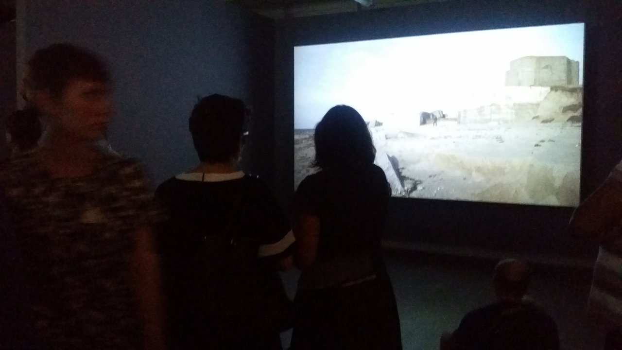
    Guest watching Body of War, a film by Isabel Rocamora, UK, 2010. Photo: Sunny Kim

    Written on the North wall of the entrance hallway are two questions: “What do you know about yourself?” and “What do you know about others?”. Markers were laid out and people soon began writing their answers on the wall. It was an interesting way to encourage self-reflection before even looking at the works in the exhibition. After looking at these questions, the audience enters with these two questions in mind, and automatically relates it to the videos being played.

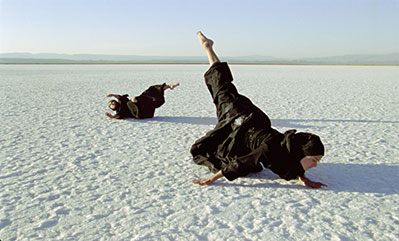
    The largest and the most recent work by Rocamora is Faith, a triptych film. Each screen contains praying rituals for the three dominant religions in Jerusalem: Orthodox Judaism, Greek Orthodox Christianity, and Sunni Muslim. All set in a desert landscape, it features a man in each screen. Interestingly, the first man is wearing half black and half white attire, the second all black, and the third all white. They all take their time to perform. Perform is probably not a correct word. What follows on camera is too genuine and too mundane to be labelled a ‘performance’. There is an air of respect in this presentation; every time one man performs, the others seem to stay silent, although there are slight overlap at times. What could initially be seen as a radical conflict of interest is instead portrayed as a space for tolerance, and surprising similarities. All three man share a connection: through the soil, the landscape, their bodies become extensions of the land.

    Film stills of Faith, a three channel film by Isabel Rocamora, 22 mins, UK, 2 K to HD, 2015. Courtesy of the artist and Galeria SENDA.

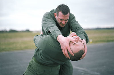
    On the side is Body of War, which features soldiers reenacting physical combat. It does not seem to be a real fight; it is slowed down, and intentionally paused in the moments that resemble emotional embrace rather than violence. There’s a focus on their faces as they become distorted with extreme emotions. They embrace, then they fight, then repeat. All we hear is sombre music, and the rough breaths of soldiers.

    Film Still of Body of War, a film by Isabel Rocamora, U.K, 2010. Courtesy of Galeria SENDA.

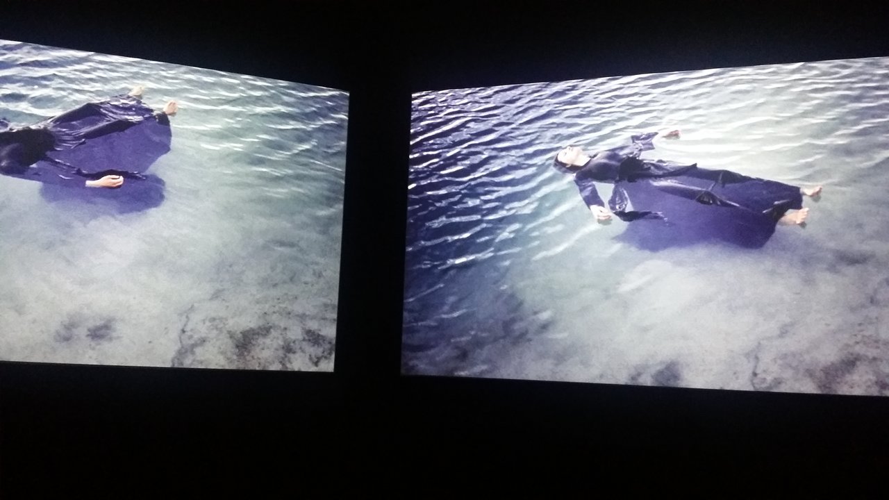
    Across that is Horizon of Exile. This diptych presents two women. Two older women are seen cooking, then cuts to landscape. The two screens are balanced by having one slow panoramic shot while the other a more dynamic POV shot. We are gradually introduced to two young women wearing long black cloths in the style of chadors. The two women wake up, then starts performing rituals or dances. It features breathtaking editing, where, during moments of sharp movements, the angle for both shots instantly change, for greater dramatic impact. Eventually they are seen in a snowy landscape, performing agonizing choreography that forces them to contort their bodies. Almost as if being moved by outside forces rather than by themselves, these women maintain a face of distance and indifference, which only makes their movements more powerful. The ending features the two women, still in the same attire, floating in a clear body of water, and it’s one of the most gorgeous shots in the show. The blackness becomes shapes that creates dynamic compositions for the screen, and the stillness quite literally takes your breath away.

    Film still of Horizon of exile, dual channel installation film by Isabel Rocamora. © The artist, 2007. Courtesy of Galeria SENDA.

    Installation view with Film still of Horizon of exile, dual channel installation film by Isabel Rocamora. Photo: Sunny Kim

    Troubled Histories, Ecstatic Solitude definitely requires repeated viewings. While the sombre music from the headphones is not a necessity, muting outside noises helps the viewer exist in isolation, and become absorbed into the films. Rocamora has created deeply reflexive films that makes viewers question identity, religion, and the past in highly personal terms.

    Sunny Kim

    *Exhibition information: September 17 – November 29, 2015, Koffler Gallery, Artscape Youngplace, 180 Shaw Street, Toronto.

  • Jean-Pierre Lafrance: Juxtapositions

    It was such a pleasure to enter the Thomson Landry Gallery, on the opening night of Jean-Pierre Lafrance’s new series: Juxtapositions. Located in the Distillery District, the gallery’s exquisite industrial and modern décor is an ideal environment to experience the art of  Lafrance’s.

    I have admired his abstract expressionism for many years, as he is one of Quebec’s most established active painters and sculptor. In Juxtapositions, I encountered the artist’s renewed aesthetic. The canvases were a bit smaller than usual, however the intensity of the gesture and of the palette seemed reinforced. Instead of using his usual technique of laying down large canvases on the floor and working all around them, Lafrance decided to paint on smaller supports. Then, he combined two or more canvasses into a single tableau, so most of the art works on display are diptychs.

    The multiplicity of textures and colours in Jean-Pierre Lafrance’s abstractions speaks a language of their own. Each of his creations invites us to stare deeply into the thick coats of paint and uncover the emotions behind every single colorful brushstroke.

    Camila Jourdain

    * Exhibition information: September 24 – October 11, 2015, Thompson Landry Gallery, 32 Distillery Lane, Toronto. Gallery hours: Tues– Sat 11– 6 p.m, Sun 12 – 5 p.m.