Author: artoronto

  • Stephen Morris & Ron Wild at Red Head Gallery

    Scientific Art and Artistic Science: Stephen Morris and Ron Wild at Red Head Gallery 

    Torontonian art-lovers have many reasons to drop by the cultural hub that is 401 Richmond, including now until January 30th a visit to The Map and the Territory. The exhibition produced in collaboration with Red Head Gallery was conceived by smART Mapper Ron Wild and University of Toronto Professor in physics Stephen Morris. Together they offer insights into the artistic potential of scientific images and objects by rendering the divisions between creative processes and scientific study as illogical and outdated.

    Installation view of The Map and the Territory, 2016, Red Head Gallery

    Stephen Morris told me that many of the physical experiments he has conducted over the years resulted in “beautiful phenomena” that both he and Ron wanted to share with others in a gallery setting. Morris then brought my attention to the piece “Icicle time lapse” explaining that, surprisingly, there is no current way of predicting the exact growth of an icicle. “Icicle time lapse” utilizes the Icicle Atlas, an online collection of images, time-lapse movies, 3D printable files, and time-series data made at the University of Toronto. Morris had mentioned that through his studies on Pattern Formation, the process of “self-organization” in many different living things is often spontaneous and visually alluring, inspiring him to display these qualities through images and videos. His resulting work is informed by a “mathematical aesthetic” or “nonlinear physics.”

    Stephen Morris, Ripply Icicle Time Lapse, Images from the Icicle Atlas. 2015, Inkjet Print, 60 x 90 cm each

    Morris constitutes only half of The Map and the Territory, with his images serving as a kind of “territory,” while Ron Wild assembles them into a kind of “map.” Wild is primarily known for his digital “smART Map” montages which are essentially mash-ups of what can be up to hundreds of layers of detailed mathematical and scientific imagery. “Nonlinear Map” is an example of this technique. The piece also mimics the layout of the scientific poster, a “format” invented many years ago to present scientific research in a time-conserving fashion during various meetings and conferences.

    Ron Wild, Nonlinear Map, 2015, Digital Print on canvas, 44″ x 66″

    Since Wild often collaborates with mathematicians, scientists, and medical researchers, it seems a natural progression that he would assemble Morris’ photographs and video contents into collages that explore the study of “emergent nonlinear patterns.” Upon viewing Morris’ “Brussels sprout, bisected” for example, it can be noted that the innards of the vegetable form swirling patterns, in an almost chaotic manner. Spontaneity like this is mirrored in the kinetic and vibrant nature of Wild’s montages.

    Stephen Morris, Brussels sprout, bisected, 2015, Inkjet Print, 50 x 60 cm each

    Morris is one of many “Salonistas” belonging to the Art/Science Salon, a series of semi-formal gatherings facilitated in collaboration with the Fields Institute for Research in Mathematical Sciences. The gatherings focus on discussions and cross-pollinations between science, technology and the arts. The next Art/Sci Salon meeting – titled “Of maps, territories and emergent patterns” – will be held at Red Head Gallery on January 29th at 7 pm. For any cross-pollinators who are interested in the re-purposing of scientific content into artistic production, this event is highly recommended.

    Installation view of The Map and the Territory, 2016, Red Head Gallery

    Text and photo: Katie Armstrong

    *Exhibition information: January 17 – 30, 2016, The Red Head Gallery, 401 Richmond Street West, Toronto. Gallery hours: Wed – Sat, 12 – 5 p.m.

  • Kudos II / Canadian Sculpture Centre

    Each creation at the Canadian Sculpture Centre’s Kudos II stood out in their own unique way. Each artist present spoke about how their pieces developed both as individual work and as part of their oeuvres. Many artists delved into the process in which their work came into life, feeling strongly that their original thoughts went through stages of changes.

    Artist J. Mac’s “The Last Dryad” displays the last dryad – on a base of metal rather than the typical depiction in front of wood. She discussed how dryads exist to protect forest and trees but in our time less and less trees are left. That’s why the rope figure is against a metal rather than a wood backdrop. J. Mac chose this piece to represent a larger collection of her work that focuses on the dryads.

    J. Mac, The Last Dryad, sisal rope, mixed-media. Courtesy of Canadian Sculpture Centre

    Thematically similar is Peter Shoebridge’s piece, “Run”. The terracotta figure in “Run” appears to almost fly off the wood. He did not  know at first what material the figure would run out off. He decided on wood because he thought it represented the native woman’s world the best. His other piece also uses a woman figure, though it is a semi-3D sculpture, entitled “Listen”. Shoebridge talked about how the piece developed from a painting of a woman, titled “Touch” as well as his continued interest in exploring the human senses in the future.

    Richard McNeill is interested in the use of the spiral. His large scale, mixed media sculpture, “Beacon of the Stream Passage”, represents the passages of life-cycle. It is the incorporation of many different series he has worked on earlier and brought together in this singular piece. It acts as a beacon, stream, portal pathway and regeneration sculpture all in one. The bronze elements depict the three streams, which lead to the guardian at the top as well as to the cosmic egg in the center. Whilst the guardian searches the skies the bronze eggs sits calmly against the rougher material and acts as a cosmic centerpiece.

    Peter Shoebridge, Run, terracotta, wood (left) and Richard McNeill, Beacon of the Stream Passage, alumina cement aggregate, bronze, sandstone (right). Courtesy of Canadian Sculpture Centre

    The exploration of the natural world moved thematically through the entire exhibition. Many of the artists have a unique sense of nature and interested in their own fundamental placement in it. Judy Raymer Ivkoff work concerns the physical world as well as rhythm, time, regeneration and fertility. “Origin”, evokes a sense of natural forces as well as the mysterious ways they act.

    Judy Raymer Ivkoff, Origin. Courtesy of Canadian Sculpture Centre

    “Musicienne” by Saulius Jackus presents the allusion of a crouching woman based on a spiral figure. The placement of the figure allows it to be approachable and compelling from all angles. Typically Jackus works on realistic portraiture, however, for this occasion he chose abstraction as it allows for a more throughout  exploration of contours. Karen Stoskopf-Harding’s “The Dissection of Lee-Ann” also addresses the creative process. She discussed how the piece began as a straightforward realistic portrait bust, but partway through she felt inspired to cut gouges out of it and see what would happen. As Stoskopf-Harding allowed herself to not worry about perfection she was able to create a far more interesting bust than she would have with a more traditional approach.

    Saulius Jaskus, Musicienne, terracotta, pigment (left) and Karen Stoskopf-Harding, The Dissection of Lee-Ann (right). Courtesy of Canadian Sculpture Centre.

    Peter Wirün explores history in his sculpture, “Gordian Knot”. It was inspired from a discussion he had about Greece’s present financial situation and the history of Alexander the Great. He explores the use of the Gordian knot, which represents all of the conquered nations’ troubles that were brought to a largely uninterested Alexander the Great. The country was crippled then and could be seen as financially broken as it is now. Part of  Wirün’s sculpture is a pair of broken legs that act as a metaphor for this condition. There is also the addition of a plumb bob that hangs from the ceiling above the structure speaking of the artist’s need for truth and balance. Viewers can also see the Gordian knot as an embodiment of their own problems. Despite the analogous nature of the piece it does not necessarily need an explanation to be understood and appreciated. Judi Michelle Young’s sculpture, “Stop the Pain”, also turns to history by representing her family’s long history as one of the earliest Asian families in Canada. She recounted stories about how they came to build the railroad in the 19th century. The pins that shape the hands on the sculpture stand for the hands that built the road and the pain that resulted in it. She also works a great deal with numbers as the piece is done using segments of 9, symbolizing  longevity and prosperity.

    Peter Wirün, Gordian Knot – The Greek Dilemma, mixed-media (left) and Judi Michelle Young, Stop the Pain, latex, stainless steel (right). Courtesy of Canadian Sculpture Centre

    The interpretation of the past occupied many of the artistic pieces. In “Twilight” Marlene Kawalez explores the concept of historical tombs. The crouching woman comes from a place of loss as a result of aging. Kawalez spoke about how the darkest times can bring forth the richest creative energy. She described how in this work she really allowed herself to let go and embrace the artistry found in inner darkness. The artist’s involvement in this piece is obvious as it evokes strong emotions and – even without any interpretation – has an inherent sadness to it.

    Marlene Kawalez , Twilight, clay, mixed-media. Courtesy of Canadian Sculpture Centre

    The exhibition featured many other artists who were not present to speak, but whose pieces were equally enjoyable. The show will be open to the public until February 5th – a must-see for anyone interested in sculpture.

    Rhiann Moore

    *Exhibition information: January 14 – February 5, 2015, Canadian Sculpture Centre, 500 Church Street. Gallery hours: Tue – Fri: 12 – 6, Sat: 11 – 4 p.m.

  • 2116: Art of Leverage / Gallery 1313

    The night of January 15th was bustling with energy as people crowded Gallery 1313 to see Emerging Young Artist‘s new show, 2116: Art of Leverage – a show highlighting young artists who are beginning their artistic careers. Gallery 1313 was filled with various works from painting, photography, video, and sculpture. 

    Artists, curators and guest at the Opening Reception, January 15, 2016. Photo: Sunny Kim

    Most of the works were predominantly paintings, and with good reason, too. Paintings by Luis Figueroa, and Fernando Pendas Fernandez exemplify a sophisticated set of paintings impressive for young artists. “Induction to Aggression” is a minimal art painting with spray paint. With great use of negative space, Figueroa produces an abstract work that utilizes simple colours (blue, green, and red) and repeated gestures that by no means produces a simple work. 

    Luis Figueroa, Induction to Aggression, 2015, spray paint on plastic panel, 26″ x 29″. Photo: Sunny Kim

    Fernandez’s “Beginning” is another minimalist painting that has a great use of negative space – a pattern perhaps – and a colorful palette. Like “Induction to Aggression”, “Beginning” is gestural. However Fernandez establishes a deeper dimension and atmosphere with his gradation of blue in the background, and the overlaps of his marks. 

    Fernando Pendas Fernandez, Beginning, 2015, mixed media on canvas, 34.5″ x 68″. Photo: Sunny Kim

    Near the paintings there is Yong Zhang’s “Yang Zhi”, a small figurative sculpture. There was an initial confusion as the didactic panel stated that this was a bronze sculpture. However it looked more like a plaster-type with branch material as well. Furthermore, what is more confusing is the curation of this piece. It is situated in between two paintings up against a wall. It is difficult to look at the piece dimensionally, from the plain fact that one cannot walk around it. Whether this was artistically intentional I do not know. Nevertheless, “Yang Zhi” is a powerful work that generates a great amount of emotion and the branch piece on top contributes a lot to the sculpture in terms of its composition. 

    Yong Zhang, Yang Zhi, 2013, sculpture, 17″ x 18″ x 48″. Photo: Sunny Kim

    Vineetha Savathasan’s “Per-Formation” is another highly successful artwork. Presented in the video are intriguing uses of overlapping, editing, and opacity. Textures are constantly moving geographically while a figure (solid black)  moves organically. 

    Vineetha Savathasan’s video work, Per-Formation. Image courtesy of the curator

    Works presented in this ambitious exhibition clearly carries an overall sense of successful artistic endeavours. However, there is also a disconnection between the works and the written statements. Emerging Young Artist‘s press release promises a certain rebellion and revolution from these art works. Hence their title ‘2116‘. They are trying to present works that, in a hundred years, will prompt art historians to “draw parallels between the unprecedented social restructuring of our century and the French Revolution’s impact on the development of European Culture.” This suggestion, while could be true for some works in the current art scene, fails to meet its promise in this specific exhibition. Partly because most of these works – while highly successful – still remain quite traditional in terms of medium, subject matter, and curation. Furthermore, the press release only manages to tunnel-vision these pieces, by fitting them into generic themes such as, “technology is actually pulling people farther away from each other, despite its promises of a closer connection”. These visually and thematically complex works are washed down by these narrow observations, simplifying both the pieces and contemporary society.

    Curator Anne Tom Wong adresses the audience at the Opening Reception. Image courtesy of the curator

    On the positive side, these written statements are not present in the didactic panels or as large writings on a wall. Disconnected statements will only put the artists in a disadvantage; sometimes it is better to say nothing at all.

    Image courtesy of the curator

    Sunny Kim

    *Exhibition information: January 15 – 31, 2016, Gallery 1313, 1313 Queen Street West, Toronto. Gallery hours: Wed – Sun, 1 – 6 p.m.

  • Interview with Erin Loree

    Interview with painter Erin Loree (E.L) by Simon Termine (S.T)

    Erin Loree in her studio. Image courtesy of Angell Gallery

    This interview took place on the occasion of Erin Loree’s first solo show at Angell Gallery, titled Midnight Bloom.

    S.T: You undertook a residency in the Peruvian Amazon where you witnessed “inner states and transformation” through the natural world.  How has that influenced you?

    E.L: Before I left for the Amazon, I went on a silent meditation retreat where we learned and practiced Vipassana meditation: to see things as they really are. It is a way of self-transformation through self-observation and focuses on the deep interconnection between mind and body. We learned to quiet and sharpen the mind so that we could feel the most subtle of sensations arising and passing in the body while openly observing our reactions and sensations. This helps you to understand, experientially, that everything in life arises and passes – that everything is impermanent. But in order for this understanding to be beneficial, one has to also have the wisdom of how to apply to his or her life.

    Erin Loree, Mirroring, 2015, oil on panel, 30″ x 24″. Image courtesy of Angell Gallery

    It wasn’t until I was immersed in the natural world that I began to gain some wisdom and insight into the nature of impermanence. For the first time in my life I watched plants, insects, and animals come into being, expand and contract, die and decay. I had to surrender and begin to flow with life instead of pushing up against it. I saw that everything begins with a thought and our body responds, consciously or unconsciously. If you really observe its reactions, you’ll see that the body responds with fear, aversion, or clinging. This understanding that everything is always changing really alters a person’s fundamental view of life, dissolving the anxiety and skepticism.

    Erin Loree, Cactus, oil on panel, 30″ x 24″. Image courtesy of Angell Gallery

    S.T: What was the transition from figurative to abstract aesthetics like for you?

    It’s an unusual story, but I’m so grateful for what happened. A couple of days before I began my thesis year at OCAD U, I broke the third metatarsal in my foot. I had crutches for four months – the entire first semester of thesis. I wanted to explore and create grand paintings, but this physical limitation really determined the kind of work I could make. I couldn’t stretch my own canvas, stand up to paint, or even carry a coffee around.

    I found this very difficult to swallow at first. I had always valued my independence, but I was required to seek out help for the most mundane tasks. I really had to open up to other people in a way that I had never done before. I also started to really see the limitations in others that I had previously been unaware of. This temporary handicap revealed to me how much I had taken for granted in my life and just how lucky I was: a blessing in disguise.

    Erin Loree, Midnight Bloom, oil on canvas over panel, 18″ x 24″. Image courtesy of Angell Gallery

    I began with small self-portraits and the work was slowly starting to become less photo-realistic and more expressive. I was looking a lot at Goya, Bacon and Cecily Brown at the time, and I felt a looseness developing in the work. Closer to the end of the four months with crutches, frustration was building up because of not being able to adequately express myself through painting. As soon as I could walk on my foot again, I felt a tremendous and indescribable sense of liberation. I needed an organic, immediate form of expression, so I gave up using references and decided to paint from my imagination. The works filled with color and life, becoming more about the material and the process. For the first time, I truly enjoyed painting.

    Erin Loree, Tug-O-War, oil on canvas, 100″ x 120″. Image courtesy of Angell Gallery

    S.T: What are your major artistic or ideological influences?

    E.L: In 2009, I studied in Florence for a year with 20 other students and our lives were saturated with Italian sculpture, painting, and architecture. I stood before the works of Bernini, Michelangelo, Caravaggio, and Masaccio to name a few. The beauty was heartbreaking! Only now am I beginning to see how they’ve played into my work. I studied these contorting figures and that dynamism is something I’ve never forgotten. This, coupled with Caravaggio’s use of chiaroscuro – as if the light is emerging out of the darkness – is something that I strive to maintain in my work. Although my work is no longer realistic or necessarily figurative, I still think about the thrashing lines, the curvature of the classic contrapposto pose, and the relationships between figures and forms in the work I’m making now.

    Erin Loree, Entanglement, oil on canvas, 80″ x 67″. Image courtesy of Angell Gallery

    Other artists that have had influence on my work include Goya (particularly his Black Paintings – the idea that those works weren’t made to be shown gives us a real sense of the raw honesty in the work – Francis Bacon, William Blake (paintings and poetry), Rumi, Lawren Harris, Emily Carr, Harold Klunder, Cecily Brown, Inka Essenhigh, Tomory Dodge, and Gerhard Richter.

    My process also been particularly influenced by Zen Buddhist philosophy and Taoism. In the work I try to cultivate “mindfulness” and what is known in Zen as the “beginner’s mind”. This promotes a deep awareness, an openness and receptiveness, which makes room for spontaneity and discovery within each moment of the painting process.

    Opening Reception of Erin Loree’s exhibition at Angell Gallery, January 8, 2016. Photo courtesy of the artist

    Simon Termine

    Exhibition information: Erin Loree: Midnight Bloom, January 8 – 30, 2016, Angell Gallery, 1444 Dupont St., Unit 15 (entrance off Campbell Ave). Gallery Hours: Wed – Sat 12 – 5 p.m.

  • About Face / Nicholas Metivier Gallery

    The cultural currency of portraiture has stood the test of time, as emerging social media platforms and sophisticated portable cameras, most accessible in the medium of cellular devices or tablets, have injected a sense of immediacy and spontaneity to the practice. The zeitgeist-defining selfie, in all its filtered and ubiquitous glory, has actively reshaped how individuals represent their image and likeness in pictorial form, by providing the most unskilled individual the ability to aesthetically alter and enhance their photographic creations. About Face, the current exhibition at the Nicholas Metivier Gallery, presents a series of paintings and photographs that contrast the extemporaneity and ordinariness of contemporary modes of portraiture. The exhibition effectively visualizes an era where capturing an individual in pictorial form required extensive and exhaustive sit-ins with an artist, or a photographer meticulously modifying a setting to create the ideal lighting for an image.

    Sebastião Salgado, Brazil, 1981, gelatin silver print, Photograph by Sebastião Salgado/Amazonas Images. Image courtesy of Nicholas Metivier Gallery

    About Face offers a variety of artistic endeavors that creates a compellingly varied synthesis of modes of execution. The clarity and focus of Sebastião Salgado’s black-and-white photographs greatly contrasts John Hartman’s thick impasto and partial abstraction. Keita Morimoto’s “Green Girl” explicitly recalls the painterly naturalism of the Baroque, while Shelley Adler’s “Zoe one Evening” invokes a more expressive and less anatomically correct rendering of forms. Furthermore, a painting from Stephen Appleby Barr’s recent solo exhibition within the same gallery space effectively resurfaces under a newer context within this latest curatorial effort, enabling his idiosyncratic work to speak in a different perspective.

    Keita Morimoto, Green Girl, 2015, oil on linen, 48 x 36 inches. Image courtesy of Nicholas Metivier Gallery

    Shelley Adler, Zoe one Evening, 2015, oil on canvas, 56 x 50 inches. Image courtesy of Nicholas Metivier Gallery

    A thoughtfully heterogeneous mix of media is displayed throughout the venue, from the transcendent oil and canvas of Charles Bierk’s paintings, to the more obsolete daguerreotype process of Chuck Close’s self-portrait series. Coupled alongside an eclectic range of subject matter, About Face showcases an artful mix of the quotidian and the surreal, the monumental and the modest. The viewer is encouraged to contemplate the various narratives presented throughout the gallery, as the diverse physiognomies offer a wealth of potential psychological states and perspectives. In the words of Ludwig Wittgenstein, “meaning is a physiognomy,” a statement About Face enlivens.

    Charles Bierk, Taylor, 2015, oil on canvas, 70 x 60 inches. Image courtesy of Nicholas Metivier Gallery

    David Saric

    *Exhibition information: January 7 – 30, 2016, Nicholas Metivier Gallery, 451 King Street West, Toronto. Gallery hours: Tue–Sat, 10 am–6 pm.

  • Sadko Hadzihasanovic: Centre of Gravity at Paul Petro

    Sadko Hadzihasanovic brought out a crowd of excited friends and guests to his opening at Paul Petro Contemporary Art Gallery. Though the room was small it was full of people itching to talk to the artist about his most recent collection of drypoint prints. Each piece was made from a photograph of Romano people taken by Sadko Hadzihasanovic during his travels in North Serbia. Although printmaking has never been seen as the highest form of art, Hadzihasanovic’s pieces show a reinvigorated interest as the artist himself describes how the delicate lines of the drypoint drew him to reconsider the medium. 

    Sadko Hadzihasanovic at his Opening Reception in Paul Petro Gallery, January, 2016. Photo: Jelica Jovin

    Although at first it may seem that the drawings are overly simplistic, Hadzihasanovic manages to successfully portray the briefest of moments in each one. It is fitting that his prints are based on photographs, as everything about each image appears brief and fleeting; whether it is the mischief of the young girl in, “Girl With Sunflower” or the joy of the boy in “Rose”. The drypoints manage to capture moments that are unlike those portrayed in more elaborately planned paintings as they explore Hadzihasanovic’s creative energy and his intuitive connection to the world around him.

    Sadko Hadzihasanovic, Girl with Sunflower, 2015, drypoint, 11″ x 15″. Photo: Rhiann Moore

    Sadko Hadzihasanovic, Rose, 2015, drypoint, 11″ x 15″. Photo: Rhiann Moore

    Hadzihasanovic left Sarajevo, the capital of Bosnia, with his wife in 1993. The impact of his perceived status as an outsider is blatant in his prints as he captures figures that are alienated and unexpected. He spoke about the connection between outsiders and printmaking, as each needs to be treated with a certain delicacy; the outsider must be approached as lightly as the drypoint in order to be properly comprehended.

    An image of the same young girl is seen twice, in the large scale “Young Frida” and the much smaller “Frida Girl”. Although both prints appear to capture the same young woman at similar times there is uniqueness to each as a result of the scale. In “Young Frida” the viewer is able to see the melancholia of the girl. While in the smaller drawing she appears more youthful and lost. The comparison of these two drypoints shows how the medium allows for similar images to appear both united and separated from each other. In the larger images Hadzihasanovic is able to show more emotion, however in the small images his central idea of the delicacy of the outsider and the lines depicting them is clearer.

    Sadko Hadzihasanovic, Young Frida, 2014, drypoint with watercolour handwork, 22″ x 30″. Image courtesy of the artist

    In the artist’s other prints, namely “Punk on Beach” and “The King” the viewer is once again confronted with the inherent rawness of the imagery. As they show young men who stand out from the world; the punk who is an outsider by nature and the king who appears isolated yet regal. Hadzihasanovic allows for the figures detachment to become a source of powerful confrontation. Although they are less obviously delicate than the Frida figure or the young boy holding a rose, they are treated with the same lightness in approach. Hadzihasanovic seeks to show that the need for delicacy can be unanticipated, but still necessary. 

    Sadko Hadzihasanovic, Punk on Beach, drypoint, 2014, 15″ x 11″. Image courtesy of the artist

    Sadko Hadzihasanovic, The King, 2014, drypoint, 15″ x 11″.  Image courtesy of the artist

    Hadzihasanovic’s Centre of Gravity is a step outside the norm for the painter. He said that he thinks it is vital to break from one’s particular practice in order for the work to remain fresh for both the viewer and the artist. Although he said, as a student, he was not partial to printmaking but it appears completely natural that later in life he has found a connection to the medium. The history of printmaking and photography are inherently connected as each has been used in the past as a way to allow for art to reach more people than large-scale paintings naturally can. Though these photography based prints Hadzihasanovic successfully captures fleeting, emotional moments.

    Sadko Hadzihasanovic, Selfpotrait as Clown, drypoint with watercolour handwork, 2014, 15″ x 11″. Image courtesy of the artist

    The exhibition will run at Paul Petro gallery until February 13th and is undoubtedly worth seeing as Hadzihasanovic’s prints are unique not only to his own canon of work, but also to the art world itself.

    Rhiann Moore

    *Exhibition information: Sadko Hadzihasanovic: Centre of Gravity, January 8 – February 13, 2016,  Paul Petro Contemporary Art, 980 Queen St West, Toronto. Gallery hours: Wed – Sat, 11 – 5 p.m.

  • Charles Matton: A Photographic Survey

    “Is the beauty of everything a truth that we don’t see most of the time, or is it a truth we invent?” Charles Matton

    The above epigraph was taken from a personal note made by the French artist Charles Matton on a telephone pad on January 29, 1992. This quotation represents the forces at play in the current exhibition of Matton’s work at Stephen Bulger Gallery. This solo show marks the artist’s Canadian premiere and presents nine contemplative photographs from his oeuvre.

    The N.Y. Bow Window N.Y. with Urbain, the Bull-terrier, 1987 © Photography Charles Matton, credit: Estate Charles Matton

    The images themselves are painterly, depicting various minimal yet decidedly domestic interiors. The palette is largely muted and there is a stark absence of humans in the images. However subtle inclusions of objects of everyday life make the suggestion of a lived in space: newspapers, worn armchairs, a lone dog, a piano. While the absence of human activity within the frame is not unusual in itself, there are certain details which also imply that the spaces may have been abandoned. A couch draped with a cloth for protection, or in “The Green Living Room with Two Armchairs”, a faded patch of paint to the right of the door which would have been left after the removal of a framed image.

    The Green Living Room With Two Armchairs, 1987 © Photography Charles Matton, credit: Estate Charles Matton

    It is only upon closer inspection that these photographs reveal themselves as fabrications instead of real spaces. There are, for example, broad brush strokes across the walls and other surfaces in the interiors which stand out given their unusual scale in relation to the scene. In fact, Matton is a self described “manufacturer of images” and was responsible for first designing, building, sculpting and painting numerous interiors in the form of miniaturized sets (at a scale of one seventh their original size) for the purpose of photographing them. This is a process the artist began in 1985, and the works on view represent a small fraction of the models crafted by Matton, which have been displayed internationally along with his photographic images.

    The Grand Piano Tail in the Whitened Windows Living Room, 1986 © Photography Charles Matton, credit: Estate Charles Matton

    Aside from the detail and expert craftsmanship in the models, what makes these images so believable at first glance is the artist’s astounding understanding of light, with an emphasis on not only how to illuminate interior spaces but on how shadow and light give a sense of atmosphere. What we experience through these images feels somewhat theatrical, with the reconstitution of both familiar and foreign domestic scenes. With his mastery of illusionary space and engagement with constructed reality, it is unsurprising that Matton worked in stage design and as a screenwriter for many years. The meticulous construction of the “Boxes” (as the artist calls them), allow the images to negotiate the relationship between reality and fiction. Regardless, each image demands that the viewer recognize the simplistic beauty which surrounds us in our everyday lives, true or invented.

    A White Draped Couch in a White Space, 1987 © Photography Charles Matton, credit: Estate Charles Matton

    Katie Lawson

    *Exhibition information: November 28, 2015 – January 16, 2016, Stephen Bulger Gallery, 1026 Queen Street West, Toronto. Gallery hours: Tue – Sat, 11 – 6 p.m.

  • Randall Okita: Things I Can’t Tell You

    Throughout my career as an art critic, the choice of medium artists make has always been a central issue. In the 1970s photography was questioned. Was it an artistic medium or only a craft? Then came performance and installation art followed by video art. Luckily it seems that these days anything can be considered an artistic medium. So it didn’t surprise me much when Robert Kananaj put up a show in his gallery for short-filmmaker, Randall Okita, involving three pieces: two of them installation art and one video.

    At first I thought that this was another TIFF event spreading out across Toronto and filling every art venue. It is, but it is much more — a breathtaking exhibition that could stand proudly in any Kunsthalle in the world.

    All the pieces are metaphorical but if I wanted to be literal I would say Portrait as a Random Act of Violence feels like swearing, Things I Can’t Tell You is a poem and Be Here Now is a prayer.

    Randall Okita, Portrait as a Random Act of Violence, 2012, wood, glass, wire (detail). Photo: Dustin Rabin

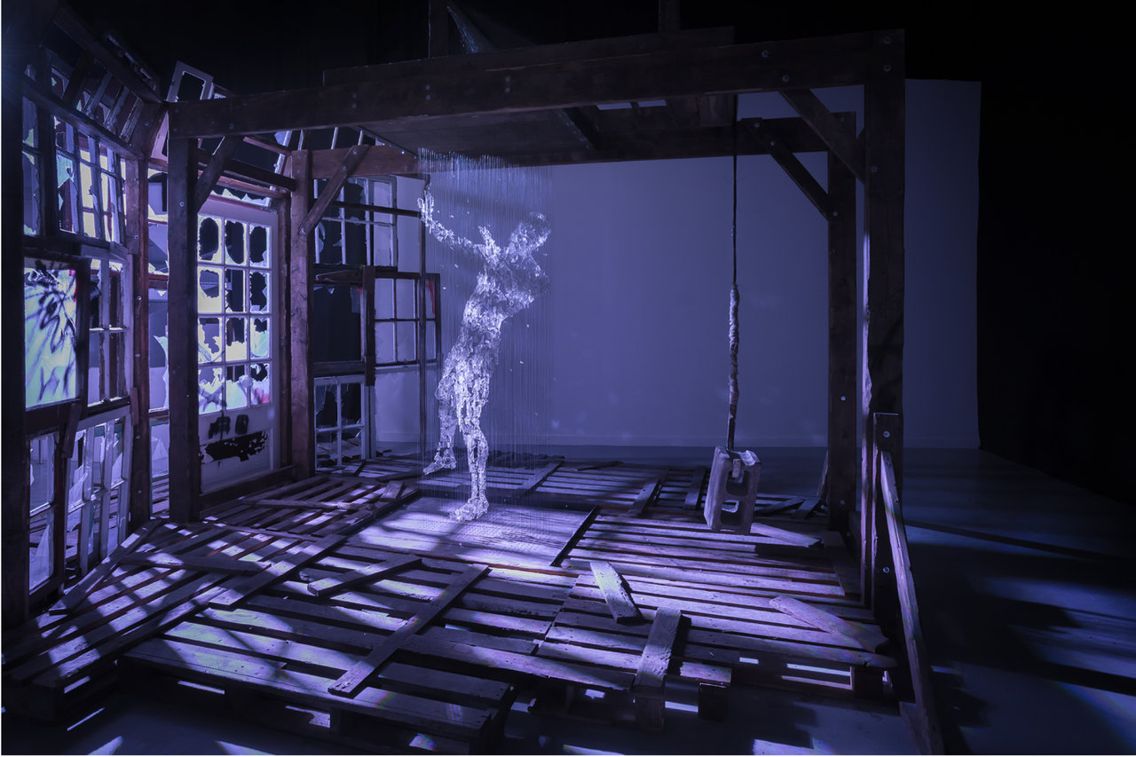
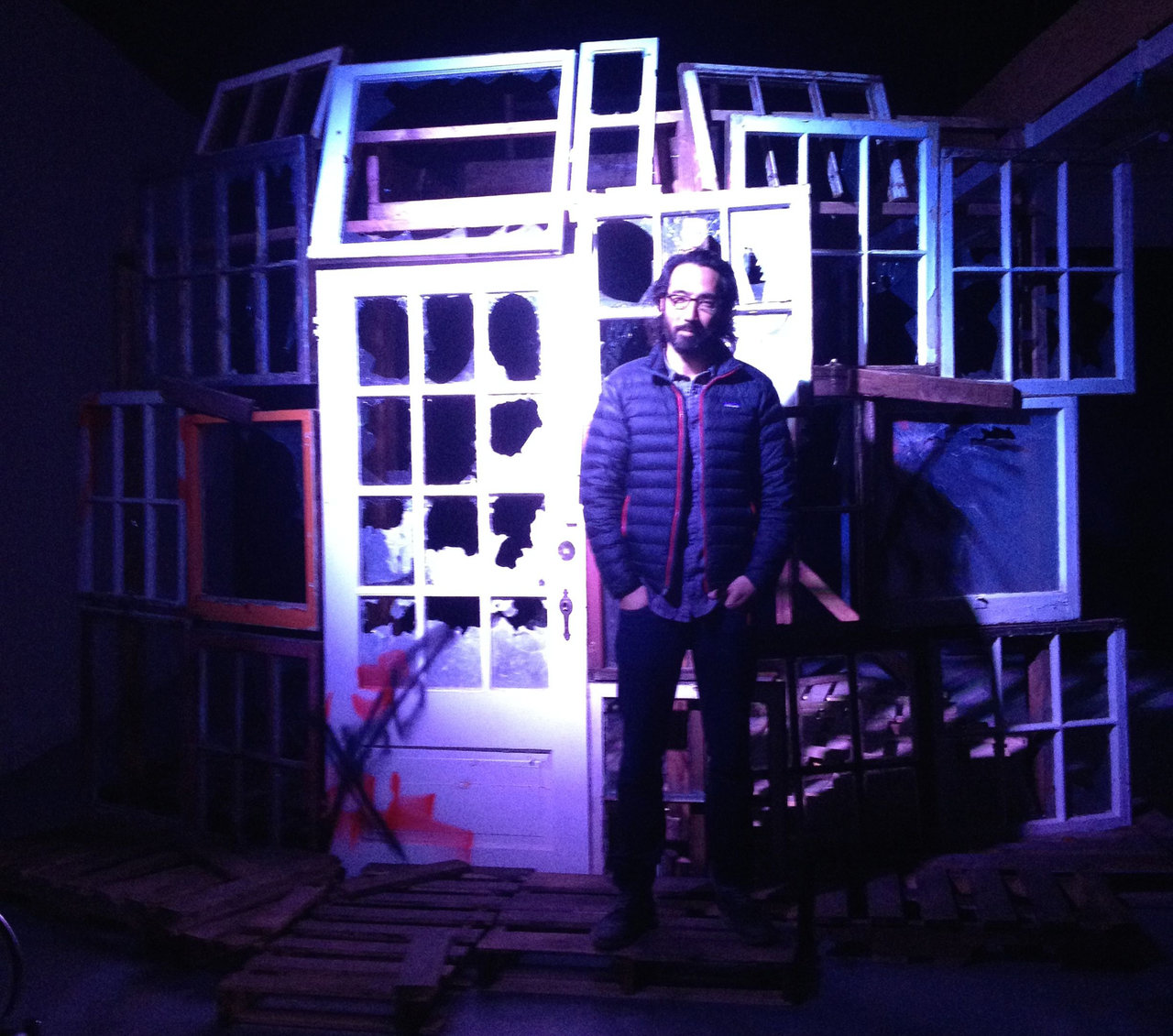
    Portrait as a Random Act of Violence (2012) is the installation that we encounter when entering the gallery. Originally it was built for the short film Portrait as a Random Act of Violence. As the gallery’s introduction says, “Okita often employs complicated and intricately built artworks as key characters in his films, exposing their construction as a metaphor for the complexity of how conflict and struggles build within us.” The installation in the exhibition is the final scene of the film, when both the vandalized building and the glass sculpture are present at the same time, showing both the violence and its possible aftermath. This exhibition is meant to be a departure from performance art by removing the installation and sculpture from their original video screens and putting them in the gallery so they can stand by themselves, for themselves. And indeed Portrait as a Random Act of Violence is an outstanding installation in its own right, with a deep and intricate meaning that has many possible layers of understanding.

    Randall Okita with Portrait as a Random Act of Violence. Photo courtesy of Robert Kananaj Gallery

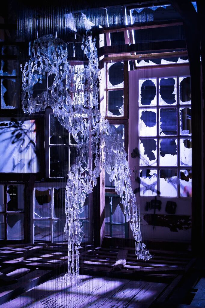
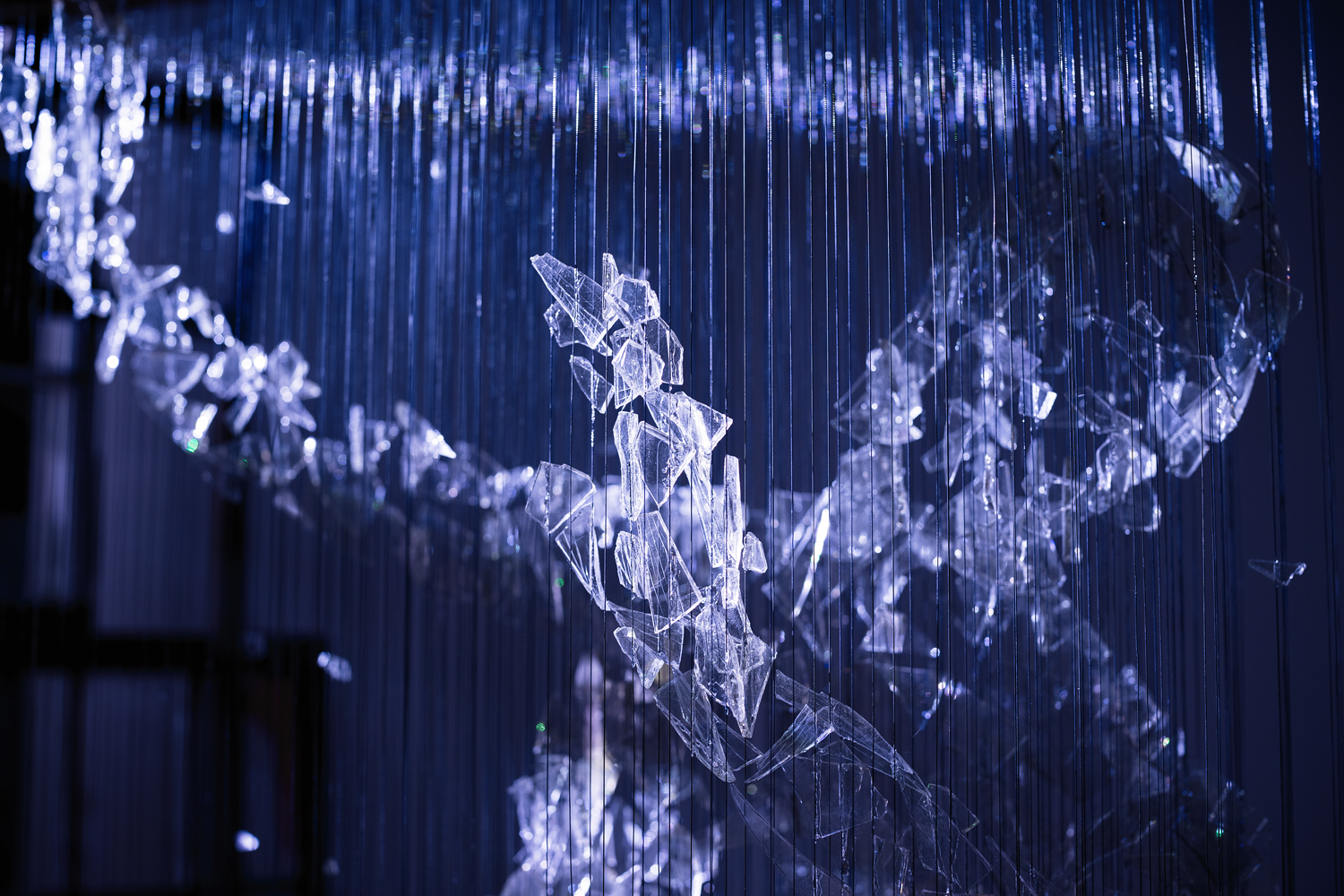
    Entering, I step into a dark, gloomy place, facing a seemingly abandoned building that might have been a greenhouse but it is so badly vandalized that I take two steps back right away, not sure if I want to continue or if I even want to know more. All the windows are broken and the sizes and edges of the holes suggest that the damage was done with a large axe or stone block. It is definitely a dangerous place where violence took place. It is truly scary. When brave enough to walk around the building, I look inside – and see a miracle. A man made of the fallen, broken glass pieces stands in the middle. It is more than broken pieces of glass put together – it seems like crystallized humanity. It shines in the dark. It is in the void created by the violence but instead of falling into the abyss, it fills it with light. While the vandalized building stands as a metaphor for violence and the darkness within us, the figure brings in hope.

    Randall Okita, Portrait as a Random Act of Violence, 2012, wood, glass, wire (detail). Photo: Dustin Rabin

    I understood this work better after watching the short film with the same title. The film is very fast and very loud at the beginning: a man stands in front of a building then smashes it ruthlessly, effectively, quickly. The destruction is drastic and dramatic. Then the same man steps into the building, hangs the cinder block he used to destroy it on a hook that starts a machine that pulls up the glass shards and gradually builds the figure. Could the perpetrator and the victim be the same person? Could it be different sides of the same character? Being made of glass suggests a fragile structure but this figure is more like crystal, strong and sharp. It is ambiguous in appearance, a disturbing mixture of vulnerability and strength. The posture — hands in front of the face, head turned away — is also ambiguous; is it trying to protect itself from another attack or is it in a martial arts pose, ready to fight fearlessly this time. The longer I looked at it the more I became enchanted by its inner light. Can violence be turned around and create something ethereal like this sculpture? I just hope that the cruelty of this building will not imprison it, that the humanity represented by it is uncontainable and that a resurrection will follow.

    Randall Okita, Portrait as a Random Act of Violence, 2012, wood, glass, wire (detail). Photo: Dustin Rabin

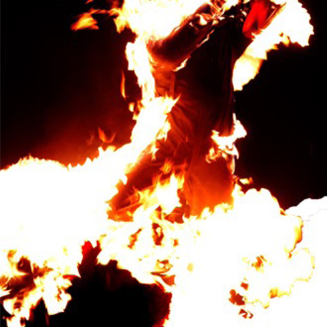
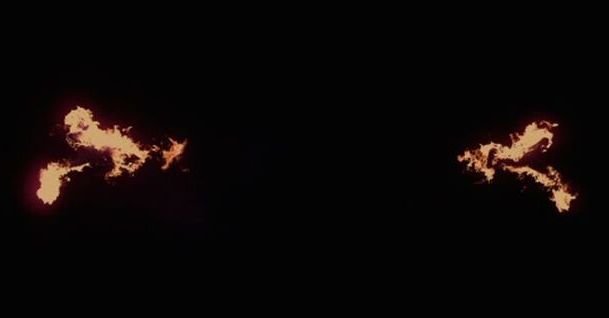
    Things I Can’t Tell You (2011), a 25 minute video loop, is a visual poem of fire. Two figures wearing special clothes and lit on fire are engaged in a choreographed air ballet. Okita is one of them. The human shapes — that are not recognizable, but abstract — swim in the air towards each other. They start as little flames on opposite sides of the screen and begin their journey toward the centre. The intensity of the flames changes as well as the shape of the figures. Sometimes we can grasp a human form — a head, a body part, arms stroking in swimming motions, legs kicking — always surrounded and swallowed by fire. As they burn they feed your imagination with images. They look like calligraphy created by bleeding brushstrokes, dancing dragons breathing fire, shapes that might be associated with known forms and ones that can’t be recognized or even guessed. The shapes are like words that are better understood unspoken or impossible to say. The two figures move towards each other and appear to be going to meet. They get very close, almost there, when at the sound of a drum and after a moment’s hesitation, they turn away, or are pulled away, from each other. Then the distance between them widens, the fire weakens, and dies. Darkness takes over for a short time until two little flames reappear, getting stronger as they move towards each other again in their burning desire to meet, to touch – forever unfulfilled.

    Randall Okita, Things I Can’t Tell You, 2011, video still. Photo: Dustin Rabin

    The flames fly like veils and remind me of the white draperies in Okita’s earlier film, Fish in the Barrel. Red or white, they both represent danger, and create high tension. They are disturbing. Strangely enough, fire feels less scary — Things I Can’t Tell You is more melancholy than dramatic. The dancing flames are so beautiful and mesmerizing that we forget to worry about the two people on fire. It feels that they are no longer people, and, through the metamorphosis of fire, their bodies have become spirits.

    Randall Okita, Things I Can’t Tell You, 2011, video still. Photo: Dustin Rabin

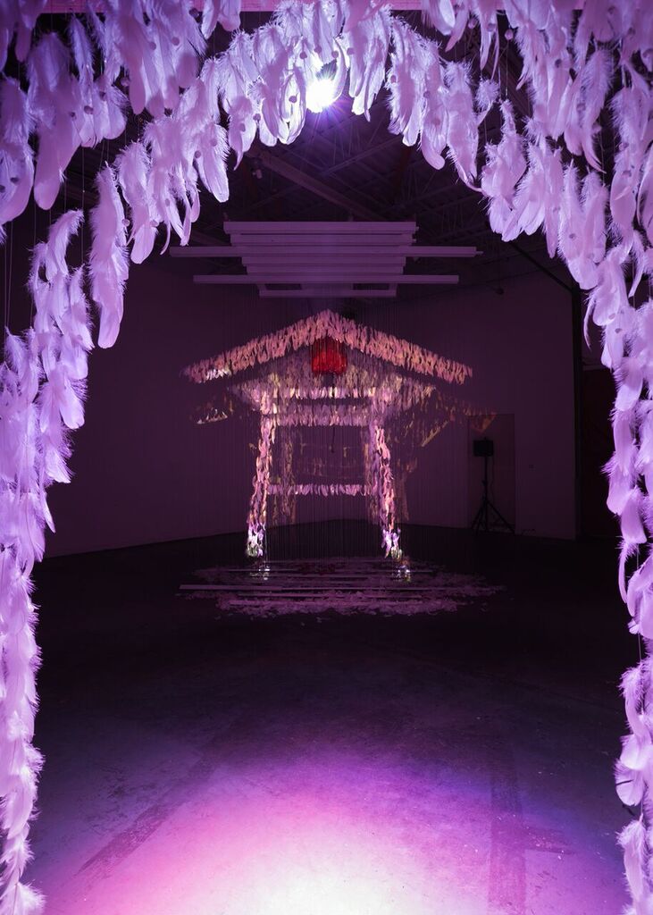
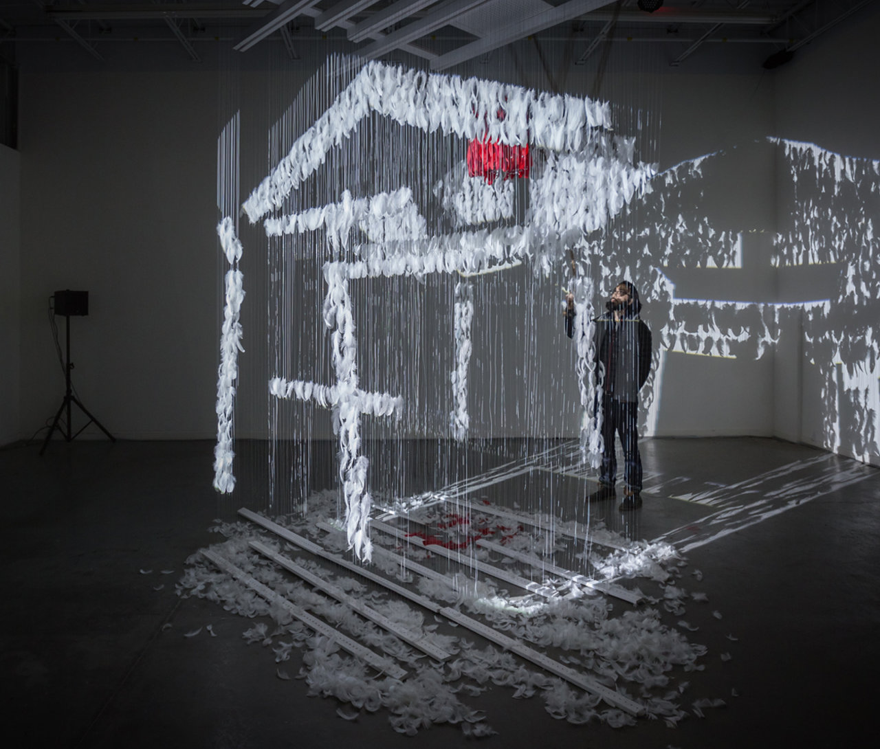
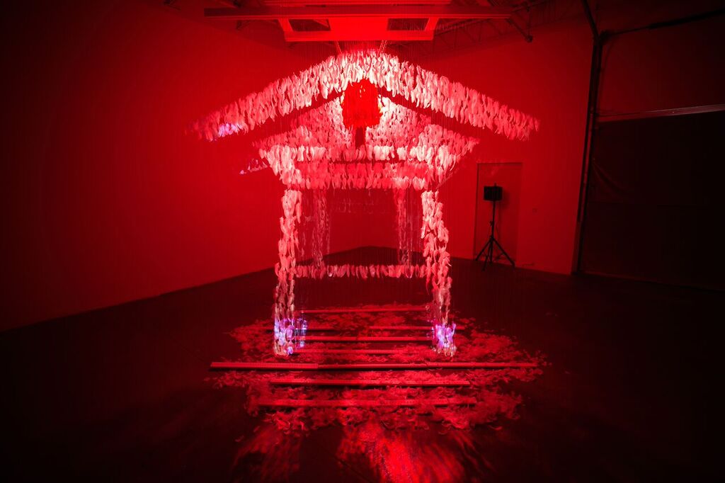
    Through a spirit gate we walk into the next room into a realm of spirits and prayer. Be Here Now (2015) is like a Shinto temple or a cloud pavilion. At first the “building” seems to stand solidly on the ground, a large letter character painted by a wide brush, all lines. At a gong’s sound the color changes into imperial yellow, then as the clear outlines blur, the “temple” seems to move slightly, like breathing in and out. After another sound it turns into burning red, like the rising sun, and I can no longer see what is what but get lost in this mirage that feels highly spiritual.

    Randall Okita, Be Here Now, 2015, multi-media installation. Photo: Dustin Rabin

    Randall Okita with Be Here Now, 2015, multi-media installation. Photo: Dustin Rabin

    Shinto temples are final only in their form but not in their material. They are usually built of wood but that doesn’t last for long, so people have to rebuild them again and again, using the same design. In this installation, I stand in a temple created out of thousands and thousands of feathers. The feathers move, like the little paper prayer strips the Japanese put up around windows. It also reminds me of old shamans’ clothes and religions that worship tribal animals, birds among them. There is also an owl here somewhere up close to the ceiling. You can associate the moving feathers and the shadows they cast on the gallery’s walls with mythical animals, shape-shifters and other floating spirits. The projection of the different coloured lights alternates the outline and atmosphere of the temple and doesn’t really give you time to analyze its real nature. Finally, when alone in the room and the projection stops, I can walk around and see the hanging mallet. Each strike of the bell triggers a transformation: changing the light and sound, altering the disposition of the space and the viewers’ experience – making it all unique. Some say it is all illusion, just an optical trick. But what is illusion and what is spiritual vision and where is the borderline between them? It is up to the viewer to decide.

    Randall Okita, Be Here Now, 2015, multi-media installation, detail. Photo: Dustin Rabin

    Randall Okita, Be Here Now, 2015, multi-media installation, detail. Photo: Dustin Rabin

    Okita said in one of his interviews that he aims to find a balance between reality and the internal metaphors that he wants to represent. As the works in this exhibition prove, that balance is hard to find and very sensitive. The visual concept in which Okita creates his characters and their environment is striking. As his friend, the writer Brendan McLeod wrote, Okita’s works are “hyper imaginative, dramatically potent, and visually arresting.”

    Emese Krunák-Hajagos

    *Exhibition information: November 7, 2015 – January 23, 2016, Robert Kananaj Gallery, 172 St Helens Avenue, Toronto. Gallery hours: Tue – Sat 11 a.m. – 6 p.m.

  • Sexish at Birch Contemporary

    At a time when feminism continues to increase in complexity, nuance, and often contention, Sexish, a group exhibition at Birch Contemporary, explores women’s sexuality in a way that is as personal and subtle as women’s individual experience. The exhibition, an in-house curatorial collaboration between gallery owner Robert Birch and assistant director Rebecca Travis, brings together works by Maryanne Casasanta, Orly Cogan, Cathy Daley, Ilona Szalay, Julie Moon, Dara Vandor, and Janet Werner. In doing so, it carries on an artistic project evolving since at least the 1960s, in which artists like Carolee Schneemann, Yoko Ono, Lynda Benglis and many others have worked to subvert a domineering male gaze and bring female sexuality into the realm of female representation. Aiming to complicate our understanding of female eroticism, the show counters a visual culture dominated by a male perspective and successfully opens a space in which women are free to look at and for themselves. 

    Installation view showing Julie Moon, Ballerina, 2010, porcelain, glaze, ballet slipper, 39″ x 16″ x 13,” (in front), Janet Werner, Jo, 2014, oil on canvas, 31″ x 24″ (left), and Orly Cogan, Women’s Work, stretched, hand-stitched embroidery and paint on vintage table linen, 38″ x 33″ (right)

    As Birch described in a recent interview, the idea for the show began two years ago when he saw and was intrigued by a work by Maryanne Casasanta at auction, drawn to the subtlety of its approach to female sex- and sensuality. After attending art fairs like Scope LA in the mid-2000s, where he met artist Orly Cogan (also included in Sexish), Birch began viewing work like Casasanta’s as a counterpoint to the increasingly graphic, hypersexualized representations of women he was seeing. In many cases, he observes, the work at these fairs was essentially Hustler-style pornography dressed up as watercolour, almost always created by male artists. With Casasanta’s work in mind, Birch began looking for similarly nuanced representations of women’s sexuality that might counter this type of work. The aim was to create a show that would contain a personal voice on the subject of sex from women working in a range of media. With Sexish, he and Travis have achieved just that. The show brings together painting, drawing, photography, ceramics, and needlepoint and represents a spectrum of women’s erotic experience. Pretty, coy, sexy, raw, aggressive, menacing, whimsical, funny — Sexish is all of these. Yet, it maintains impressive cohesion and reminds us that sexuality is never as straightforward as stereotypes suggest. Like the equivocal-ish of the show’s title, sex exists in the realm of ambiguities and greys. 

    Maryanne Casasanta, Knees, 2011, digital photograph, edition of 5, 16″ x 12.” Photo courtesy of Birch Contemporary

    Much of the show’s cohesion stems from the strand of sensuality woven throughout its individual works. This sensuality is often achieved through a subtle appeal to our tactility and imagination rather than through a direct appeal to vision. In Sexish, texture dominates and the body —erotic or otherwise — is often implied only through its absence. Julie Moon’s ceramic billows of icing-like flesh, Dara Vandor’s obsidian black satin, Ilona Szalay’s smeary waxen scenes — these works crave touch. Meanwhile, the show’s consistent nod to textiles and fashion — in Orly Cogan’s found vintage linens or Cathy Daley’s dresses, for instance — concedes the sensuality and suppleness of fibre-based materials while also referencing the idea of women’s work and the feminine sphere.

    Orly Cogan, Mirror Mirror, 2006, hand stitched embroidery, paint and crochet on vintage linen, 19″ × 24.” Photo courtesy of Birch Contemporary

    Dara Vandor, Black Silk II, 2015, ink on canvas, 10″ x 18.” Photo courtesy of Birch Contemporary

    Indeed, this particular link between fashion, sexuality and female identity is well explored in Sexish. Daley’s drawings are perhaps the prime example. Working within the narrow conceptual confines of the little black dress, Daley reveals the range of expressivity, identity, and femininity that may be brought to a single article of clothing. Similarly, the bloomers, ballet shoe, and ponytail that Julie Moon incorporates into her ceramic works add specificity, feminity, humour, and even pathos to otherwise amorphous forms. Works such as these reveal the degree to which we fill in information when given even the slightest sartorial cue. Yet, they also add complexity to our notions of fashion and the erotic, proving that fashion is as much a space of fantasy, play and pleasure as it is one of oppression and identity politics. 

    Cathy Daley, Untitled, 2009, pastel on vellum, 42″ × 24.” Photo courtesy of Birch Contemporary

    The show’s subtle and insightful exploration of fashion is largely what allows it to enter the realm of the sexual and sensual without being overly graphic. Indeed, within Sexish, clothing is often a stand-in for an absent body. This is certainly the case with Dara Vandor’s decontextualized lingerie. Yet, this titillating absence is also achieved in other ways. In her Tender and Perverse series, for instance, Maryanne Casasanta utilizes the negative space between two legs to create images that initially appear as simple abstract forms. Such works appeal to the power of our erotic imagination, conjuring the body through implication rather than through graphic portrayal. This is indeed a far cry from the in-your-face sexuality Birch and Travis were attempting to counter. 

    Maryanne Casasanta, Tender and Perverse 3, 2015, digital photograph, edition of 3, 11″ × 8 ½.” Photo courtesy of Birch Contemporary

    Dara Vandor, Her Dirty Underwear, 2015, ink on canvas, 24″ × 48.”

    Yet, even in works where images of women or the body are present, they showcase individuality and disarming directness, rather than idealization, passivity, or stereotypes. Orly Cogan’s brilliant needlepoint self-portraits provide perhaps the best instance of this. Sewn onto vintage and found tablecloths, napkins, and other linens, her figures reference the airbrushed pin-ups of the 1950s and 60s. Yet, in spite of this reference, Cogan’s women unapologetically perform not-so-idealized tasks alongside stereotypical ones: they talk on the phone, comb their hair, and vacuum nude, but also check for cellulite and snort cocaine. Her works bring gritty realism, derision, even aggression to a typically passive genre of imagery and to the realm of the domestic and the girlish. In similar defiance of passivity, Janet Werner’s female figure in “Abby and Snow” and Ilona Szalay’s menacing femme fatales confront the viewer head on. In each of these images, women very much control a scene rife with conjecture and ambiguity. 

    Orly Cogan, Pinch an Inch, 2005, framed, hand-stitched embroidery, crochet and paint on vintage linen, 42″ x 22.”

    Janet Werner, Abby and Snow, 2014, oil on canvas, 67″ x 55.”

    Ilona Szalay, Girl and Graffiti, 2015, oil and resin on canvas, 31 ½” × 23 ½” (left), and Ilona Szalay, Girl and Painting, 2015, oil and resin on canvas, 31 ½” × 31 ½” (right)

    It is this ambiguity that Sexish ultimately turns on. It successfully complicates accepted stereotypes of femininity and sexuality, playing with them while also defying them. Whether it’s through Dara Vandor’s boldly smeared black lace underwear, or Julie Moon’s far-from-thin ceramic bodies, the show combines sex, realism and individuality in a way that is appropriately complex. If one criticism can be leveled against the show — and perhaps it is a significant one — it is that the exhibition might have represented an even broader range of female experience, one that includes more non-white artists as well as a lesbian and trans perspective. The work in the show is fantastic. It simply would have been great to see more. Birch himself is not unaware of and even raised these criticisms, also expressing concern that his own status as a heterosexual white male co-curator might undermine the show’s message. Whether this is true remains up for debate. In the meantime, Sexish is a thought-provoking and nuanced exhibition, one that stands as a welcome interjection into a conversation that is as necessary today as it was 50 years ago. I suggest you join in.

    Catherine MacArthur Falls

    *Exhibition information: December 10, 2015 – January 23, 2016, Birch Contemporary, 129 Tecumseth Street, Toronto. Gallery hours: Wed – Fri, 10 am – 6 pm; Sat 11 – 5 pm.

     

  • Propeller’s 4th Annual Off The Wall Fundraiser and Gala

    The Gala Event: December 18, 2015 / 7 – 11 p.m.
    Propeller Gallery
    30 Abell Street, Toronto

    Propeller Gallery is an artist-run gallery, which moved to Abell Street in the Queen West area about a year ago. Although the gallery has been unfortunately blocked by construction since it’s relocation the event still happily brought out many guests who did not seem to mind the slight detour needed to get there. 

    Installation view with guests

    Everyone in the gallery appeared to know each other and the rooms buzzed with chatter and laughter as they moved through the galleries two rooms. The Off The Wall Fundraiser and Gala is an annual gathering in which the attendee’s who purchased tickets wait for their number to be drawn and when it is – they have sixty seconds to chose the piece of art off the wall they want to take home with them. 

    Installation view

    Joseph Muscat, Partnerships Chair of the gallery said that although the interest in Off The Wall has dropped a bit since the first year, the turnout was still great. Though perhaps in the galleries coming years they might switch up the idea and try something new. Whether or not they do, it is clear the gallery has many friends who will attend regardless to the event they chose in the future. 

    Installation view

    Many of the works that were up for grab were provided from members of the gallery such as Frances Patella who had multiple works on display including “High Park Burn” and “Area 7 High Park”. She mentioned that she has happily participated since the events inception in 2011. Patella is the Co-chair of the gallery and was heavily involved in the evening’s festivities.

    Frances Patella, Area 7 High Park

    Although Joseph Muscat expressed that perhaps the idea was a little old now, everyone in attendance was clearly excited to be there. As him and gallery director Nathan Heuvingh drew the tickets people let out excited gasps as their numbers were called and they rushed to grab their choices. Even as the options quickly dwindled everyone remained in high spirits, as really any of the 50 options were great to take home for the $125 a ticket needed to participate.

    Joseph Muscat and Nathan Heuvingh draw tickets

    Winner, and member since 2007, Dominique Prevost was incredibly happy with her piece. She came in late and had a selection of options that she would be thrilled to take home. She said this was her first year choosing a piece done by someone outside the gallery’s membership: Sharon Dembo’s striking monotype, entitled “Great Big Dancer”.

    Dominique Provost with Sharon Dembo’s “Great Big Dancer”

    Although it is unknown if Off the Wall will occur again next year, the event brought out a wonderful crowd and provided a great atmosphere. Off the Wall is a one night only event, however, the gallery is worth a visit at any other time.

    Text and photo: Rhiann Moore


  • Red Head Gallery 25th anniversary

    OPENING RECEPTION: Friday, December 11, 2015 / 6 – 9 p.m.

    The Red Head Gallery celebrated their 25th anniversary on December 11th, with a group exhibition of former and current members showing their work side-by-side.

    On the left wall: Margie Kelk (current member), Johannes Zits (former member) paired with Jack Butler (current member). In the corner: Millie Chen (former member) paired with Gillian Iles’ sculpture (current member). Back wall: Ed Pien (former member) paired with Elaine Whittaker (current member). Photo: Teri Donovan

    That’s a number deserved of a big celebration whether it’s in age or marriage but especially for something that marks Red Head as the longest standing artists’ collective in Toronto. A well-deserved feat for a gallery that continues to bring artists, both established and emerging, together to produce work that starts a dialogue among artists and the community. Since the gallery’s founding in 1990, more than 150 artists have contributed over 200 exhibitions by members as well as non-members.

    Current members from left to right: Nancy Anne McPhee, Tonia Di Risio, Peggy Taylor Reid, Mathew Borrett, Margie Kelk, Ian Mackay, Elaine Whittaker, Jack Butler, Teri Donovan, Gillian Iles, Ido Govrin, Christina Sealey, Sally Thurlow, Lynn Kelly. Photo: David Williams

    The exhibition that the members came up with to commemorate the gallery’s 25th birthday is spectacular. Artistic collaboration, an enduring principle of Red Head’s collective, is the theme that connected current members with founding and early members. Current members were paired with prints either from a fundraiser in 1990 or from Red Head’s 10th anniversary in 2000, of which they had to create a response. This intriguing discourse was given even more depth by some of the current member’s work that was responded further to, from another founding member, making for a third speaker in this visual conversation. The works are exhibited in pairs and triplets, in fusion and tension between past and present. As a viewer I loved trying to understand the connection between old and new works.

    Top: Lisa Neighbour (former member), bottom: Tonia Di Risio (current member). Photo: Teri Donovan

    Left: Lorna Mills (former member), right: Gabrielle de Montmollin (current member). Photo: Teri Donovan

    Top left: Sharon Switzer (former member), bottom left: Teri Donovan (current member), right: Sharon Switzer, a piece made in response to Teri Donovan’s piece. Photo: Teri Donovan

    This project unites individuals that similarly have been a part of the Red Head family but are separated by time. I can imagine it being a gratifying and humbling exercise for the creators of both the old and new pieces to see how the collective has developed. Though the pieces in the exhibition are made by numerous talented individuals, looking at them made me feel like I was watching the growth of the gallery. I was moved by the three generations of Red Head that came together to make this exhibition, looking fondly at each other’s work. It is a celebration of how far the gallery and its many members have come.

    On the wall: Undoing by Sandra Gregson 1990 (former number), paired with Sally Thurlow’s sculpture. Photo: Carter Brown

    In front: Lynn Kelly’s (current member) response to Janice Carbert’s print (former member). Photo: Teri Donovan

    What do the next 25 years look like? Teri Donovan, current member and  the previous co-chair of the Red Head Gallery, tells me that the gallery’s heritage of rigorously executed and critically engaged exhibitions within a supportive and collaborative environment will continue. As well, the collective plans on creating more opportunities for exchange between members and non-members to broaden and diversify their audience.

    Guests with  Millie Chen (former member) paired with Gillian Iles’ sculpture (current member). Photo: Carter Brown

    The anniversary reception was my second visit to the gallery and I loved the space just as much this time as the first. It feels intimate with low white walls that break up the space, though the exposed ceiling is quite high, and there is a charming and warm quality about the floorboards. It is not square in shape, which makes it enjoyable to follow the works around the walls as I made a few rounds during my stay. While the gallery of the founding members had a different location, Red Head’s current home at 401 Richmond is a treat. Wander around the restored industrial building that is crawling with all people and things creative after your stop to check out how Red Head has been nurturing creativity for 25 years.

    Guests at the opening reception. Photo: Carter Brown

    Carter Brown

    *Exhibition information: December 2, 2015 – January 16, 2016, The Red Head Gallery, 401 Richmond Street West, Toronto. Gallery hours: Wed – Sat, 12 – 5 p.m.

  • Derek Liddington at Daniel Faria Gallery

    Installation view at Daniel Faria Gallery from Derek Liddington: Reclining Nude, Sitting Fruit. Image courtesy of Daniel Faria Gallery

    Reclining Nude, Sitting Fruit, a body of work by Derek Liddington, deals with the documentation of the passing time. His abstract renderings of graphite on canvas manage to seamlessly bind drawing with performance creating dynamic works. While Liddington references the artistic past through the portrayal of the traditional still life and nude, his works demonstrate less concern with the literal depiction of subject, but rather with the flux of the subject’s physical qualities. Each live model or arrangement of fruit is draped with a sheet of canvas that folds into the curves of the body or over the shape of the object. Then the artist proceeds to transcribe its form with abrupt hatching on the canvas, trying to go over their forms however impossible it seems since they shift their positions. Revisiting each composition again and again over a prolonged time-span Liddington makes adjustments in the position and details of the subject matter in an effort to expose the inevitability of change.

    It seemed as though she would never make the decision to eat the apple or read the book., 2015, from Derek Liddington: Reclining Nude, Sitting Fruit, graphite on canvas, hand painted watercolour on oak, 44 ½” x 52 ½”. Image courtesy of Daniel Faria Gallery
    It seemed as though she would never make the decision to eat the apple or read the book., 2015 (detail), from Derek Liddington: Reclining Nude, Sitting Fruit, graphite on canvas, hand painted watercolour on oak, 44 ½” x 52 ½”. Image courtesy of Daniel Faria Gallery
    The work entitled “Osiris’ arm reaching for the sun”, serves to illuminate the artist’s process. Here, a potted plant is cloaked in canvas on which a series of marks have been made. It seems this work is incomplete compared to the others that hang on the walls, separated from their original subjects. It could be perceived as a performance:  slowly, the plant is growing upward and outward, changing with every passing moment, awaiting the next artistic documentation.
    Osiris’ arm reaching for the sun., 2015 from Derek Liddington: Reclining Nude, Sitting Fruit, graphite on canvas, plant. Image courtesy of Daniel Faria Gallery
    In a similar way, this process is expounded by the rendering of an arrangement of bananas at two distinct moments in time, the first work a visitor encounters upon entering the gallery. Over time the bananas rot but the bowl remains still, untouched by the passing of time. While both pictures depict the same subject, their resulting aesthetic qualities contrast, particularly with regard to tonal variation. Together they demonstrate the effects of time and flux on a ripening banana.

    I looked at the pineapple, pencil in hand, and wondered who was lying to who graphite on canvas (detail), 2015, from Derek Liddington: Reclining Nude, Sitting Fruit, graphite on canvas, hand painted watercolour on oak, 44 ½” x 28 ½”. Image courtesy of Daniel Faria Gallery

    “A man, not unlike me, sitting where I sit, leaning how I lean, drinking from my mug” employs the process on a male model. The autobiographical work appears more dynamic than the others, likely a result of more jarring adjustments in the human form than that of an inanimate object. It is not difficult to recognize a likeness to Duchamp’s “Nude Descending a Staircase.”  Using the simultaneous representation of different views, the work also evokes a certain velocity and sense of direction.

    A man, not unlike me, sitting where I sit, leaning how I lean, drinking from my mug., 2015, from Derek Liddington: Reclining Nude, Sitting Fruit, graphite on canvas, hand painted watercolour on maple, 124 ½” x 110 ½”. Image courtesy of Daniel Faria Gallery

    What may not be initially apparent is the baseboard that runs along the gallery’s longest wall. Hand-painted watercolour on poplar comprises this work, entitled “There we were looking at the most beautiful sunset ever painted; yet all I could focus on is a sea of red”. A similar style echoes on the handmade oak and poplar frames. These accents give the exhibition a sense of warmth and stability, reminding me of the concept of home and its shelter despite the passing of time. The representation of process within the home — growing plants, rotting fruit, and shifting human form — offers an enlightening juxtaposition. The body of work calls for the spectators to be conscious of the time-flux relationship which exists around and even within us all.

    There we were looking at the most beautiful sunset ever painted; yet all I could focus on was a sea of red., 2015 (detail) from Derek Liddington: Reclining Nude, Sitting Fruit, hand painted watercolour on poplar. Image courtesy of Daniel Faria Gallery

    Vanessa Zeoli

    *Exhibition information: November 12, 2015 – January 9, 2016, Daniel Faria Gallery, 188 St Helens Avenue, Toronto. Gallery hours: Tue–Fri 11 am –6 pm; Sat, 10 am – 6 pm.