Author: artoronto

  • Artist Project 2016

    Toronto’s most diverse and engaging art fair, Artist Project, is a great opportunity to meet contemporary Canadian and international artists and hear them speak about their work. The fair also boasts a thrilling number of events, parties, performances and talks including Art Battle – Live Competitive Painting. Be sure to take advantage of the free re-admission slip to return any of the days for free.

    Happy Sleepy, “crystal kings blazing” at the entrance

    It can be overwhelming to take in the works of over 300 artists even over the whole weekend, so these are a few artists whose diverse practices are eye catching. Amy Lin’s layered paper works represent systems and constellations of community. Layered and sometimes not visible at all beneath the delicate hand-cut lattice, the swirling patters are both micro and macrocosms of our individuality and interconnectedness. Some of the stylized layers that define the surfaces reappear in deeper layers of other works as if each one held a wormhole to another. Sneakily, Lin also has works in which the layered cutouts only imply the presence of underlying systems from her other works inspiring curiosity while hiding nothing. This beautiful, intricate, cohesive body of drawings not only catches our gaze, it is also hypnotic.

    Amy Lin in front of her works

    Blending photography, abstract acrylic paint, found materials and sculpture, Paul Brandejs’ works draw us into their beauty and the serenity of natural landscapes. Brandejs begins with an immersive natural experience, taking his photographs on camping trips and hikes and then applying paint to capture a more soulful documentation. In his works of the night sky and the moon, the angular frames on which the canvas is stretched create shifting shadows and vertical tree shapes. At Brandejs’ booth, I saw my first corner painting showing the curatorial potential of his multi-paneled compositions.

    Works by Paul Brandejs

    Selections from several photographic series represent the mystical oeuvre of Alice Zilberberg. In one collection, stoic representations of Mother Nature, and natural goddesses allude to Renaissance and Baroque Madonna and Child iconography. In another series, childhood fairy tales are taken back to their dark roots including a black-haired Rapunzel who hangs her hair through three portals to nowhere. In a similarly surreal style, some of her work alludes to the disjointed paintings of surrealist Magritte. In a collaborative series of poetry and self-portraiture, Zilberberg plays on the trope of body language. All the subjects of her photographs are luminous women, emphasizing female power, a connection with nature, pronouncing the leaders of narrative, and re-writing iconography of femininity.

    Alice Zilberberg with her photographs

    The glossy paintings of Marcelo Suaznabar are evidence of a surreal dream state in which we attend an apocalyptic wasteland of nomadic aquatic circus performers. The comical, fishy characters that – like the strange composite creatures of Hieronymus Bosch – are the only subjects of his works glide across endless, drab spaces like the desert scenes by Salvador Dali. The complete emptiness of his landscape express his consistent theme of biblical apocalypse and weaving in themes of current environmental catastrophe. The creatures might be seen as allegorical figures of temptation in limbo, or the mutation of the Earth’s chemical annihilation.

    Marcelo Suaznabar in his booth

    Untapped is a section awarded to twenty emerging artist to support their development and engage them in a professional level art fair. Toronto based painter Mauricio Contreras-Paredes paints the intangible spaces of dreams, the Internet or deep space. The two paintings he has chosen to present are composed of blue and off white geometric shapes, so hard-edged and plastic in their perfection that they look like architectural renderings of the light at dusk. His works are not intended to represent or recall a specific space, they are meant only to evoke a vague sense of dimension.

    Paintings by Mauricio Contreras-Paredes

    In addition to the booths, Artist Project also presents a series of installations. Weeping Willow is a sculpture taking the form of a tree made of colorful faces, with tears of ribbon. Philip Hare puts himself in the shoes of women’s history dating all the way back to Eve. His expression of tearful frustration with the patriarchal world is an incredibly labour intensive work of art.

    Weeping Willow (detail) by Philip Hare

    Alongside the sculptural installations is a performance work by Adam Filek. Walking and Talking Stones is a conversation between the bodies of the performers and the large rocks on a wide plinth. It aims to represent  the time and place where Earth brings life to their being and they provide care through expressive movement for the Earth. The stamina required of this work – as it is presented everyday of the fair – is impressive.

    Walking and Talking Stones, a performance work by Adam Filek

    Art Fairs can often feel like places of commerce or business, but Artist Project successfully engages non-profit projects as well and provides a platform to the public for conversations about artistic practices.

    Text and photo: Alice Pelot

    Veronique Sunatori presents several pieces that allow for playful interaction at the Artist Project this year. In an art fair that is dominated by canvas paintings, her sculpture series titled “Maybe The Light Will Save Us” was a refreshing change of scenery.

    Veronique Sunatori, from Maybe The Light Will Save Us series. Photo courtesy of the artist

    Upon seeing her work, you will be cautiously tempted to put your eye into the peephole of a small black box and crank a dial attached to it, not knowing what to expect. Sunatori told me that many visitors that evening were hesitant to be engage with her artwork, so fear not – as I will reveal to you that a delicate image of sparking electricity greets you on the other end of this peephole. Sunatori was able to repurpose a hand-cranked flashlight in order to give the illusion of captured lighting. In this series, she also showcases slightly tweaked apparatuses that touch on themes of mystical perception. You can find her work in the untapped emerging artists section, booth U-3.

    Tony Taylor, Time To Take Out The Garbage, oil, 2015. Photo courtesy of the artist

    At first glance, Tony Taylor’s work seems to be another series of commonly anthropomorphic animal illustrations, but upon closer inspection his paintings seem to hit a cord in your subconscious – one of recognition. It is only then you realize that he has recreated stills of iconic political moments, frozen in oil paint, and carefully matched the mannerisms of politicians and media moguls to those of well suited animals. Many of his pieces represent local municipal and federal political snapshots. This one nods to Canadiana and is more than appreciated in an exclusively Canadian fair. One of my favorite pieces is shown above, where the Ford brothers shake hands during the heydays of a Ford-led Toronto. Taylor’s representations of the Fords as racoons was a sly choice, as Torontonians are known to be guarded against the resilience of these nocturnal animals. You can find Tony Taylor’s clever illustrations in Booth 309.

    Ella Gorevalov

    *Exhibition information: February 18 – 21, 2016, Better Living Centre, 195 Princes’ Boulevard, Exhibition Place. Exhibition hours: Friday: 11 – 10, Saturday: 11 – 8, Sunday: 11 – 6 p.m.


  • ARTIST PROJECT 2016 / Opening Night Party

    Opening Night Party: Thursday, February 18, 2016 / 7 – 10 p.m.
    Better Living Centre
    195 Princes’ Boulevard, Exhibition Place

    An Art Fair best seen between the lines.

    After braving the chill of February in Toronto, hundreds of art lovers, collectors, curators, gallery owners and above all artists, descended upon the Better Living Centre of the Exhibition last night for the 9th annual Artist Project. The vast warehouse space was filled with seemingly endless rows of white cubes, showcasing the diverse work of over 300 contemporary artists.

    Ruth Mora & Rachel Delph, Our Critique of Everyday Life, in the Installation Zone

    Strangely enough, the most memorable works of the night were those that existed outside the specified booths, mainly large-scale installation pieces that broke the constraints of the art fair cubicle.

    As visitors poured into the space, people were immediately attracted to the far left featuring the rare spectacle of the artist at work.

    Most striking was muralist Mike Parsons, climbing up and down his ladder to add improvised, black brush strokes to a complex work regarding modern society’s daily apathy. The artist would intermittently pause to mingle with his audience, who offered inspiration for his on-going work. Such interaction made it clear that this event offered something unique, the artist unbarred.

    Artist Mike Parsons at work in the Art Lounge & Installation Zone

    Instead of an art fair comprised of galleries and art dealers, who act as the intermediary between the visitor and artist, The Artist Project presents both the work and artist side by side. An inevitable dialogue ensues as guests clamber into the tight space of each booth; the presence of the artist is made known. Questions and observations are welcomed and answered with the honesty and sometimes, helpful insight of the creator.

    Turning up the centre aisle or causeway of the fair, viewers sidestep stations offering edible treats, libations and sculptural installations. Notable among them, were Rushdi Anwar’s jarring entanglement of charred chairs, a comment on the refugee crisis in the Middle East, followed further down by Philip Hare’s brightly coloured tree of weeping masks. Hare’s work offers an aesthetic contrast to Anwar’s solemn configuration, but nonetheless explores a serious issue, specifically that of female identity within our mostly patriarchal world.

    Rushdie Anwar, Irhal (Expel), Hope and Sorrow of Displacement, 2015

    Philip Hare, Weeping Willow

    Branching off from the main artery of the show, the visitor weaves through the rows of booths, featuring anything from typical Canadian landscapes, to the whimsical ceramics of Lana Filippone or the haunting charcoal canvases of Carlos Delgado.

    Lana Filippone’s booth

    Artist Carlos Delgado with his series of works titled Being Human in the System

    Truly the Artist Project offers something for everyone and is not to be missed.

    Text and photo: Meghan O’Callaghan

    The Artist Project Contemporary Art Fair kicked off the four day event yesterday evening  with a fabulous party at the Better Living Centre, in the Exhibition Place.  In its ninth consecutive year, the annual show brings together over 300 artists from near and far, offering visitors the rare opportunity to discuss and purchase work directly from artists.  From traditional media to living and performance art, the fair offers something sure to peak everyone’s interest.

    Jeannie Pappas, Unknown, ceramics

    Helen Liene Dreifelds’ textiles

    It was a full house last night and, as typical for the attendees of such a large art fair, there were both people highly engrossed in the art and others mainly engrossed in the party. Either way, it is a great way for many artists to put their work out for all to see. With such a large number of participants, it can feel overwhelming and exhausting for those roaming the many aisles of art booths. But thanks to the various food and drink stands (provided by sponsors of the event) that are scattered throughout to fuel guests, it was easy to really relax and enjoy the evening. The art throughout varies so greatly that it is not going to be love at first sight with each booth, but there are so many artists present that it is exciting and all worth it when you find those few artists’ works that make you stop and stay a while. The artists were all lovely to interact with and all unanimously excited about the evening, whether first timers or Artist Project veterans.

    Installation view

    Installation view with Becky Lauzon, Social Roots

    Text: Carter Brown & Vanessa Zeoli / Photo: Vanessa Zeoli

    *Exhibition information: February 18 – 21, 2016, Better Living Centre, 195 Princes’ Boulevard, Exhibition Place. Exhibition hours: Friday: 11 – 10, Saturday: 11 – 8, Sunday: 11 – 6 p.m.


  • Ryan Wallace: Dragnalus at Cooper Cole

    Imagine that every bit of detritus on which you stepped throughout the day stuck to the bottom of your shoes. What would you produce from the dredges? Ryan Wallace’s tiles and collages are blue-collar fossils of everyday materials found in his studio including jeans, work gloves, mirrors, gold foil, spray paint, glue and tape residue, shoe prints and canvas strips.

    The collection of tiles titles “Pitch” (2016) covering the main floor of Cooper Cole gallery – reminiscent of the metal tiles by minimalist artist Carl Andre – are calculated residue from Wallace’s sculptural process. The Plexiglas tiles were originally used as molds to fill with rubbish and plaster producing white plinth-like cubes with only a hint of their dirty contents. The cubes are not exhibited with the tiles in this specific manifestation. The accidentally visually appealing squares are not displayed as residue of Wallace’s cubes, they are artworks in their own right and their mosaic installation across the floor implicates the visitors into direct participation in the space. The pieces of debris are well stuck to the tiles, but the effect is that of a dirty linoleum floor in much need of a sweep. 

    Ryan Wallace, Pitch, 2016, detail. Image courtesy of Cooper Cole Gallery

    Wallace’s works on canvas “Dragnalus I” (2015) and “Dragnalus II” (2014) are collages of left over materials and cut offs. The strips of paint and fabric in shades of grey, brown and red are set side by side producing a pattern of hardwood floor, plywood board, aerial views of farm land, or painterly abstractions of birch trees. But unlike pallets of leftover paint accumulating layers of colour that would never become works, the recycled strips of polyester and vinyl covered in rubber, oil, acrylic, wax and various metals are again validated artworks.  It leaves one to wonder from what process Wallace produces these cut-offs if the only evidence of his work is constructed purely from leftovers. A possible creative answer is inspired by his “Untitled” sculpture (2016) a pair of shoes covered in red gunk.

    Installation view with Ryan Wallace, Dragnalus I, 2015, enamel, acrylic, fabric, vinyl, steel aluminum, rubber, linen on canvas (on the wall) and Pitch, 2016, Plexiglas, oil, enamel, acrylic, vinyl, rubber, aluminum, tape, Masonite, polyester, canvas (on the floor). Image courtesy of Cooper Cole Gallery

    Hung on the wall of the upstairs space, the soles of the shoes face out displaying scrap bits of metal and fabric like the pieces in his larger works insinuating a performative process. If we imagine these shoes were worn by Wallace at work in his studio, we can also imagine that his artistic practice is one of secret active performance in which the work constitutes the act of producing crusty artistic dredges, and the works displayed might be considered documentation of his performance. Regardless of the method by which Wallace procures the cast off materials, the exhibition Dragnalus provides much for the eye to explore. New-York based Ryan Wallace’s first Canadian solo exhibition provides a glimpse into the work and process of an accomplished recycler of industrial, utilitarian materials.

    Installation view with Ryan Wallace, Dragnalus II, 2014, oil, enamel, lead, aluminum, canvas, polyester, vinyl, silicone, rubber,pigment, wax on canvas (left) and Untitled, 2016, mixed media (right). Image courtesy of Cooper Cole Gallery

    Alice Pelot

    *Exhibition information: January 22 – February 20, 2016, Cooper Cole Gallery, 1134 Dupont Street, Toronto. Gallery hours: Wed – Fri: 1 – 6 p.m., Sat: 11 a.m. – 6 p.m.

  • Tim Noonan: Slipping into Abstract at Yumart

    Tim Noonan, City Light and Colour, 2012, acrylic on masonite, 40” x 56”. Image courtesy of Yumart

    Stepping into Yumart’s space at 401 Richmond you are drawn immediately to the far end of the gallery, where two large paintings hang both featuring a national icon, the Canadian goose, in mid flight. It is a fitting beginning. This exhibition aptly titled “Slipping into Abstract”, strives to demonstrate Tim Noonan’s movement away from figurative imagery into the realm of the non-representational. The rest of the gallery is dedicated to this slippage, gone are the hard edges and precision of his soaring geese. Instead, we are presented with the swirling, loose brushstrokes of bright, bold landscapes that effectively toe the line between total abstraction and hints of the familiar. The climax of the show is undoubtedly, the imposing “City Light and Colour” where references to Canada’s flora and fauna have all but disappeared. Noonan’s urban landscape features acidic colours like pink, turquoise, neon yellow, where fine lines and the thick impasto blend adding a sense of urgency and chaos to the work. Noonan’s entrance into abstraction is successful as he captures the consciousness of city life, depicting its claustrophobia and dynamism with a cavalcade of overlapping colours and lines.

    Meghan O’Callaghan

    *Exhibition information: , Feb 6 – 27, 2016, Yumart Gallery, 401 Richmond St. West, Suite B20, Toronto. Gallery hours: Tues – Sat, 12 – 6 p.m.

  • ARTIST PROJECT 2016

    The Artist Project, 2015. Photo: Elena Iourtaeva

    February 18 – 21, 2016
    Better Living Centre
    195 Princes’ Boulevard, Exhibition Place

    Exhibition hours: Early Access Preview: Thursday 5 – 10 pm; Opening Night Party: Thursday: 7 – 10 p.m.
    Friday: 11 – 10, Saturday: 11 – 8, Sunday: 11 – 6 p.m.

    From seasoned collectors and first-time art buyers, to gallery dealers and interior designers, visitors can explore and discover works of art from over 250 top contemporary artists from Canada and abroad. This is a unique opportunity to meet and buy art directly from artists at Toronto’s most celebrated contemporary art fair.

    The Artist Project celebrates its 9th year with another exciting show from February 18 to 21, 2016 at the Better Living Centre, Exhibition Place, Toronto.

    Opening Night Party: Thursday, February 18, 2016 / 7 – 10 p.m.

    Celebrate the launch of our 9th show and be among the first to see 5,000+ works of art from over 250 top contemporary artists.

    Art Battle #362

    Art Battle Canada and Artist Project team up!
    On the evening of Friday, February 19 from 7 – 10 pm, AB#362 will be held on the show floor.

    There will be Art Chats Seminar Series, Art Walks Guided Tours and other programs.

    For more information pleace check http://www.theartistproject.com.

  • Keita Morimoto: Strange Guild at Nicholas Metivier Gallery

    Held at a high-end King West gallery, Morimoto’s solo exhibition is a great success. A master painter only 4 years after his graduation, he showcases mostly traditional oil portraiture. Who knew there are still such a high demand for traditional portraits? Perhaps Torontonians are too used to and getting bored of the experimental 3D video and abstract installations. The show attracted a variety of social and demographic groups, from established collectors to young art students. Morimoto’s painting subjects are coming from different ages as well. While his technique and painting style go back as far as the Renaissance or Baroque, there are also some attempts at mixing contemporary subjects with traditional landscapes. 

    Keita Morimoto, Self Portrait as Bacchus, 2015, oil on linen, 48 x 36 inches. Image courtesy of Nicholas Metivier Gallery

    “Europa” shows a group of young people relaxing in a typical European painting landscape. Although separately, the landscape and the subjects are painted amazingly well, there is a bit of disconnection between the two because the landscape and people are treated differently. The background, that reminds us of Gainsborough’s landscapes, is paired with ultra-realist depiction of youths of our time, and there is a tiny bit of ‘aura’ from having painted the set around the subjects.  

    Keita Morimoto, Europa, 2016, oil on canvas, 72 x 96 inches. Image courtesy of Nicholas Metivier Gallery

    Other works like the “Aristocrats”, while not as contemporary in its outcome as some others in the show, features the internet icon  – a giant cat – and is incorporated into the composition effectively. In this case the ‘aura’ shows the under-painting: the soft lights tie the lady and the cat to the background, and both components are painted with the same treatment for more coherent portrayal.

    Keita Morimoto, Aristocrats, 2015, oil on linen, 72 x 48 inches. Image courtesy of Nicholas Metivier Gallery

    However intriguing his mixed styled canvases, I think that Morimoto’s most successful paintings are the ones where he chose a modern subject in a modern setting. “Aya in Tokyo” is deliciously ambiguous. Set in some kind of bar/karaoke restaurant, a young girl in a white coat stands on a chair and looks off to the left. Her dead-center positioning is made dynamic with her gaze, and every components in the picture work together to move your eyes around the space. The strong geometric components in the background are juxtaposed effectively with her soft coat and hair. It creates such depth in the pictorial space, that it extends onto the gallery space as well. Similarly to mirror images – which make us believe that there is another world on the other side and not just an illusion –  “Aya in Tokyo” creates a universe within the canvas.

    Keita Morimoto, Aya in Tokyo, 2015, oil on canvas, 72 x 48 inches. Image courtesy of Nicholas Metivier Gallery

    Patrons must feel this enticing and atmospheric ambiguity in all Morimoto’s works, as the show was almost sold out on the opening reception. I expected nothing less than continued stardom for his pleasing paintings. Large or small, Morimoto’s paintings have the ability to seduce our vision.

    Sunny Kim

    *Exhibition information: February 4 – 27, 2016, Nicholas Metivier Gallery, 451 King Street West, Toronto. Gallery hours: Tue–Sat, 10 am–6 pm.

  • Black and White Ball VI at Propeller

    Photo: Vanessa Zeoli

    Opening Reception: Thursday, February 4, 2016 / 6:30 – 9:30 p.m.
    Propeller Gallery
    30 Abell Street

    The Black and White Ball exhibition currently resides at Propeller Gallery. The reception held on February 4, last Thursday evening, was a delightful event with lots of excitement for its guests. The exhibition, in its sixth year running, is showing works that were composed entirely in black and white. I was thrilled about the posh-sounding theme and was certainly not disappointed. Upon entering the gallery, I was met by intense splattering of black and white. The white walls served as perfect canvas to enhance the exhibition’s theme, hidden beneath layers of more white and black interlaced. It felt edgy and mysterious. The stark coherence present in the gallery almost made it seem like each piece was a component of one large work, The Black and White Ball. The theme unites each artist with one another’s unique work.

    Roxann Tochor, Black and white 1. Photo: Vanessa Zeoli

    Installation view. Photo: Carter Brown

    From top to bottom: Joseph Muscat, Out of my Mind; Philip Hare, For Crying Out Loud and David Cumming, Ancestral Head. Photo: Vanessa Zeoli

    The black and white vision is the brainchild of Propeller chair member Heather Gentleman. Truman Capote’s “Black and White Ball”, held at New York City’s Plaza Hotel in 1966, inspired the inception of the annual juried exhibition. Crowd members became extensions of the artwork in their decked out ensembles of black and white. Who doesn’t love a themed party, especially one that looks to an exemplar of the chicest variety? I guessed there would be a dress code but couldn’t believe I missed the gallery’s encouragement to wear a mask. Heather Gentleman herself was in a stylish black top hat, adorably placing her back in time with Capote and the gang. She tells me the artists who submit enjoy the explicitly black and white requirements and the exhibition is very successful each year. Such a timeless theme that all will look forward to year after year.

    Propeller chair member Heather Gentleman (left) and guest. Photo: Carter Brown

    Installation view with guests. Photo: Carter Brown

    Frances Patella, another member on the board of directors, says how much the event has grown in its six years. This year brought the greatest number of submissions, which is easy to believe from the large number of artwork displayed throughout the space. Applicants are not only from Ontario but all over Canada and even some from overseas. One application was sent all the way from Italy! The great mass of artworks that occupy each wall – hung in salon style – adds drama to the already enigmatic theme. Though the majority of works hang along the walls, a few beautiful sculptural pieces are scattered throughout. As you move through the gallery you are constantly engrossed by highly contrasting black and white visuals. The effect perfectly captures the adjectives Propeller gave to inspire their artists: iconic, bitchy, mysterious, and elegant.

    Wilfred Wong, Sumo. Photo: Vanessa Zeoli

    Nikola Wojewoda, Patti. Photo: Vanessa Zeoli

    Installation view. Photo: Carter Brown

    Carter Brown

    *Exhibition information: February 3 – 14, 2016, Propeller Gallery, 30 Abell Street, Toronto. Gallery hours: Wed – Sat: 12 – 6, Sun: 12 – 5 p.m.

  • The Circle Game at Lonsdale Gallery

    The Circle Game presents works that take a modern approach on artworks or techniques from the past. Robert Davidovitz uses autoCAD on his acrylic canvases to create randomized wave patterns as an exploration of today’s technology. These works co-exist with Keith W. Bentley’s deconstructions of classic sculptures. Both artists’ different renderings of contemporary pieces blend together seamlessly throughout the gallery as Davidovitz confronts the new ways in which art can be created while Bentley’s works raise questions of the influence of the past on the present.

    Installation view with Keith W. Bentley’s sculptures

    Pieces like Bentley’s “Castrating David” stand out immensely. It is the largest sculpture in the exhibition and seems to act as a centerpiece. There is no way to look at the work without being confronted with the original David statue by Michelangelo. However, the artist has adjusted the work enough to allow it to stand on its own. Bentley captures the essence of the original David but turns it around. It shows how art recycles itself through time and can regenerate into a figure that is no longer the idealized man, but rather a human captured by a mythology that is impossible to fulfill.

    Keith W. Bentley, Castrating David, 2014, resin figure, paint, steel and silicone, castration rings, 59 x 23 x 16 inches

    He similarly rethinks the myth of Eve in “Dissecting Eve”. He uses a special material, a delicate flocking, like in a number of his other sculptures. This material cannot be touched without an imprint being left behind. He rediscovers the figure of Eve in the context of a real woman, rather than an icon. She becomes a female who can not be touched without being changed forever. As the gallery’s website states, “By altering their form, Bentley also questions the messages behind these figures. The artist’s personal dialogue with religion, sexuality and the canon of art, find confluence through this exposition. Icons, which have stood for the ideals of masculinity, femininity, and morality, are put into question, making new space for new identities.”

    Keith W. Bentley, Dissecting Eve, 2015, resin figure, wood, steel, nylon flocking, 13 x 5.5 x 10 inches

    Davidovitz explores the process of regeneration in a different way. All of his works are made with the same program and while they appear similar, they are all still unique. He uses fibre-art techniques of waving, a typical female occupation. However the final product reminds us more of an op-art painting. The colors themselves rather simple but the way they are woven together give them a sophisticated, still playful pattern. “Wave 12” is the largest canvas in the exhibition. The repetition of colors striped in different directions against each other invites the viewer’s eyes to look all over in order to take the whole piece in. The result is an artwork that encourages the viewer to get lost in the lines of the pattern.

    Robert Davidovitz, Wave 12, 2015, acrylic mounted on panel, 49.5 x 36 inches

    Even looking at the more technical appearing “Wave 7” it is clear that Davidovitz’ works all have their own unique strength despite the same technology they were created with. While Bentley uses directly historical works to inspire his sculptures, Davidovitz uses a technique that is historical – Gunta Stoltz, a member of the Bauhaus established it – to compose his pieces. He mixes the traditions of waving and op-art creating a new, intriguing way of painting.

    Robert Davidovitz, Wave 7, 2015, acrylic mounted on panel, 36 x 24 inches

    The sculptures of Bentley and the waves of Davidovitz come together in The Circle Game successfully as each artist takes the viewer on a journey of thoughts about how the past and present are able to come together and create a significant moment of cohesion. While all the works are individually interesting, as an exhibition they become even stronger, showing how influences of the past can be regenerated into new artwork, creating new meaning.

    Installation wiew

    Text and photo: Rhiann Moore

    *Exhibition information: The Circle Game by Keith W. Bentley & Robert Davidovitz, January 16 – February 21, 2016,  Lonsdale Gallery, 410 Spadina Road, Toronto. Gallery hours: Wed – Sun, 11 – 5 pm.

  • LONG WINTER Galleria Show

    LONG WINTER Galleria Show
    January 30, 2016 / 8 pm – 2 am
    1245 Dupont St.

    The art community seemed to breath some new life into the staid seventies style Galleria Mall on Dupont and Dufferin. Organizers of Long Winter, Mike Haliechuk and Brian Wong, pulled off a successful event with some cool installations, good bands and performance art. The mall – that has been sold to developers: Freed Developers  and ELAD Canada for $80 million – awaits its fate. The developers have been doing some community consultations to see what the local residents would like to see on the 12 acre site.

    The crowd with one of Fastwurms’ banners (right)

    Long Winter paid homage to malls like the Galleria, that have faded or lacked décor to start with. It is always fun exploring alternative venues but it is surely not easy to stage large events at such sites. The place was packed with several thousand people who came out to the event. Works like Andrew Lamb’s “In the Hall of the Mountain King” – a sculptural piece depicting a large colorful pigeon head – helped to add some colors to the mall’s otherwise plain interior. Artist, Shari Kasman, cleverly matched photos of the dreary mall interior with Pantone patches. Media artist Jeremy Bailey – represented by Pari Nadimi Gallery in Toronto – invited viewers to participate in his interactive video work “Penis Paint”. Participants were reluctant at first but then jumped into the humorous interactive performance. Fastwurms (formed in 1979) used colorful banners hung from the ceiling, trying to lift the dull atmosphere of the mall – not an easy task to accomplish.

    Andrew Lamb, In the Hall of the King Mountain, made from Galleria shopping bags

    Jeremy Bailey and audience member

    Artist, William Andrew Finley Stewart, used his “Arcade Project” to remind us of the arcade games found in most malls of this vintage. There were some of these games sitting in the hallway and a few people parted with their change. Visitors to Long Winter seemed just as happy going into the Photo Booth or trying the Love Meter. Others ventured into snacks from the El Amigo food kiosk. Specials were hot dogs and pop for $5 or pop corn but no burritos on the menu. 

    William Andrew Finlay Stewart, The Arcade Project

    El Amigo

    Artist, Carolyn Tripp, offered to help people to discover the color of their aura and many of the visitors were interested in it.

    Carolyn Tripp’s Performance, Colouring Your Aura

    Lines ups formed to get drink tickets and then to get into the two licensed rooms including the Shoppers Dance Mart. The outside lineup for people who didn’t have tickets was pretty long. If you didn’t really come to drink you didn’t have to line up, just go inside and catch the bands and see the art.The music line up was pretty fine and started with Teenanger. New Fries put on a good performance as well. It seemed like a good line up of bands worth the $20 cover alone.

    TEENANGER

    NEW FRIES, the audience and hanging  Fastwurms’ banners

    Both the Ontario Arts Council and the Toronto Arts Council had supported the event. Most of the art installations worked – some better than others.

    Jonathan Carrol & Ben Macarthy, Installation, THE Environment

    Residents living in the area no doubt appreciated the general necessities that the Galleria provided despite its dreary reputation. It has a post office, bank, drugstore, LCBO, grocery, dry cleaners and Café. Now it also has a 24 Hour Fitness Club plus a gymnastics club for toddlers. The area is booming with galleries on the move such as PM Gallery, Neubacher Shor Contemporary, Angell Gallery, Cooper Cole and others. Patience will prevail as we wait to see what new designs for the site would emerge later this summer. 

    The Long Winter Galleria event reminds us all the malls of our past and make us to recognize that even now, in its bleak design, it can still provide some entertainment. Perhaps the developers and new owners of the Galleria will be inspired to include some art as decoration, after seeing the success of the Long Winter Event. Thanks to Wong, Haliechuk and their team for pulling off a bold event.

    Text and photo: Phil Anderson

  • BLACK & WHITE BALL VI at Propeller

    Opening Reception: Thursday, February 4, 2016 / 6:30 – 9:30 p.m.
    Propeller Gallery
    30 Abell Street

    Propeller’s sixth annual juried exhibition comprised entirely of artworks in black and white.

    The exhibit is inspired by Truman Capote’s 1966 “Black and White Ball”, held at the Grand Ballroom of New York City’s Plaza Hotel. It was considered to be “the most posh event, not just of the year, but also of the decade, and maybe even the century.”

    Iconic, bitchy, mysterious, elegant… just some of the many adjectives used to describe the event, and the guests. Let these inspire and engage you…

    In conjunction Propeller will be hosting a Black and White reception, on Thursday, February 4th from 6:30 – 9:30 p.m. Dress in black, white, or both! Masks encouraged!

    *Exhibition information: February 3 – 14, 2016, Propeller Gallery, 30 Abell Street, Toronto. Gallery hours: Wed – Sat: 12 – 6, Sun: 12 – 5 p.m.

  • FORECAST I at Project Gallery

    FORECAST I is a collection of Toronto-based artists with upcoming solo and duo exhibitions at Project Gallery, each bringing with them their own unique styles, themes, and subjects that together create a rich and intriguing experience.

    Image courtesy of Project Gallery

    Delving into the realm of the illusory, Peter Chan’s body of works entitled “Mirage” incorporates subtle and clever distortions in time and space with his memories and journeys in Quebec. These pieces immerse the audience into these moments while donning the ethereality of a past recollection. For example, “Study for Ste. Julianne”, conveys the story of a local butcher shop where a St. Bernard would periodically travel to the shop, interacting and playing with customers as they came. A year later, he returned to that butcher shop yet the dog never visited, and sadly never would. “Study for Ste. Julienne” demonstrates Chan’s ability to fully capture these personal narratives, in all of its sentimentality.

    Peter Chan, Study for Ste. Julianne, oil on board, 8″ x 10″. Photo: Simon Termine

    Colin Davis reimagines natural settings and arrangements into surrealistic still-lifes, elevating the natural beauty by imbuing it with vibrancy and intrigue. These dreams are representations of Davis’ childhood as viewed through the fragments of memories. As an artist now living in an urban jungle, he conveys the lingering sense of nostalgia that strives to return to this natural world.

    Colin Davis, Sundial, oil on linen, 16″ x 20″. Image courtesy of Project Gallery

    Following the prevailing phenomenon of memory and nature, Ki Sung Koh integrates his reverence of animals into dream-like sanctuaries, where the residents remain separate and secure from human intervention. His works appeal to the sense of respect that everyone should have for the natural world, a virtue that has wavered since our embrace of technology and the presumed predominance of mankind. He urges the deserved eminence of nature and encourages our interaction with it, which can simultaneously reveal more about the self.

    Ki Sung Koh, Soaring, mixed media on paper, 22″ x 30″. Image courtesy of Project Gallery

    Dominique Fung, addressing the themes of personal and cultural identity, focuses on the tensions between her Canadian upbringing and her Chinese heritage. She utilizes the imagery of indigenous fauna – historically a popular theme in Canadian art – in conjunction with traditional symbolism to depict the hegemony of Western ideology dominating her own origins. Her work, entitled “Golden toad”, shows the encroaching overgrowth, with its warm autumn palette, overtaking her visage and the golden toad, a folk symbol, whose appearance usually indicates good news and fortune.

    Dominique Fung, Golden Toad, oil on panel, 48″ x 36″. Image courtesy of Project Gallery

    Ted Zourntos’ paintings spiritedly transforms artificial materials, such as streamers, toys, and police tapes, into flower-like forms in order to imitate natural elements using mundane items – a sort of integration of the two fields into one, just as we strive to reconstruct and dominate our earthly domain. Though his earlier works have simultaneously depicted the natural alongside the manufactured, this particular piece abandons any direct representations and instead alludes to them through an accumulation of superfluous materials, perhaps as a recollection of past festivities.

    Ted Zourntos, Spolia Opima #4, oil on canvas, 30″ x 36″. Image courtesy of Project Gallery

    Straying away from realism in favor of a more child-like, almost satirical style, Tessar Lo’s works are reminiscent of the “doodles” from the school days when simple drawings covered desks, walls, and notebooks. His works depict dream-like scenes of frivolity, as if a surreal playground imagined and manipulated through a child’s daydreams. Though initially enigmatic, the simplicity of the characters and the simultaneous complexity of the entire setting soon manifests into a realm of vibrant imagination.

    Tessar Lo, Untitled, mixed media on canvas. Photo: Simon Termine

    Last but certainly not least are the portraits of Sarah Letovsky, which expertly use gestural brushstrokes and negative space to create powerful, resonating figures. They emerge as ghostly apparitions: features faded of color and definition with piercing eyes gazing back at the viewer, as if they were both within and beyond our reality.

    Sarah Letovsky, Waiting for Merlot, oil on panel, 42″ x 36″. Image courtesy of Project Gallery

    FORECAST I is an enriching assemblage of talent upcoming to the Toronto local art scene. Project Gallery has had a keen eye for promising artists, and this show is certainly no exception.

    Simon Termine

    *Exhibition information: January 22 – February 7, 2016, Project Gallery Studios, 184 Munro Street, unit 6 (accessible through the back entrance). Gallery hours: by appointment only – contact Callen Schaub cal@projectgallerytoronto.com 0r 647.377.1677.


  • Steve Rockwell’s Colour Match Game at Christopher Cutts

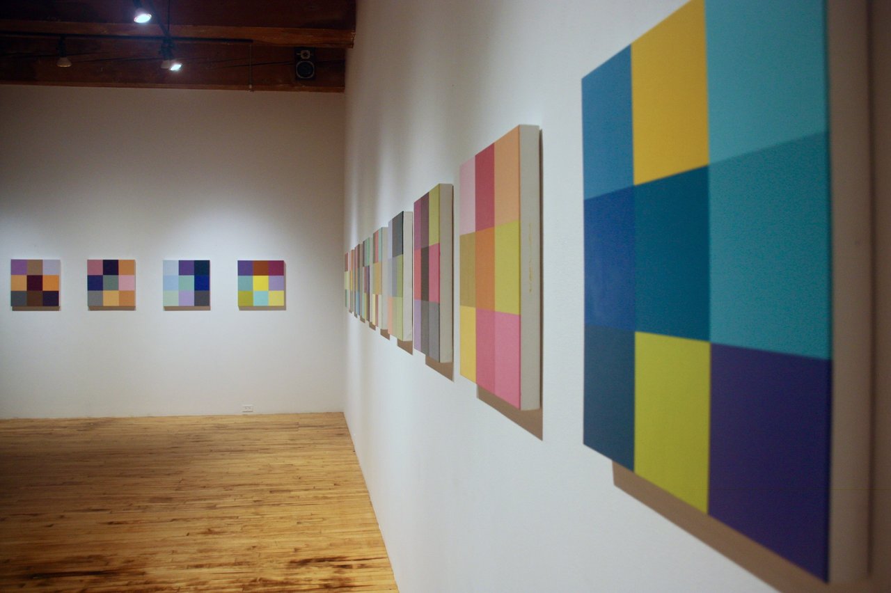
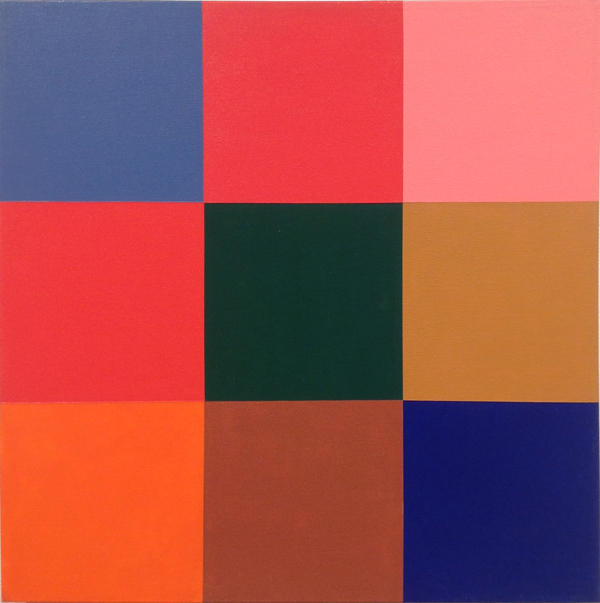
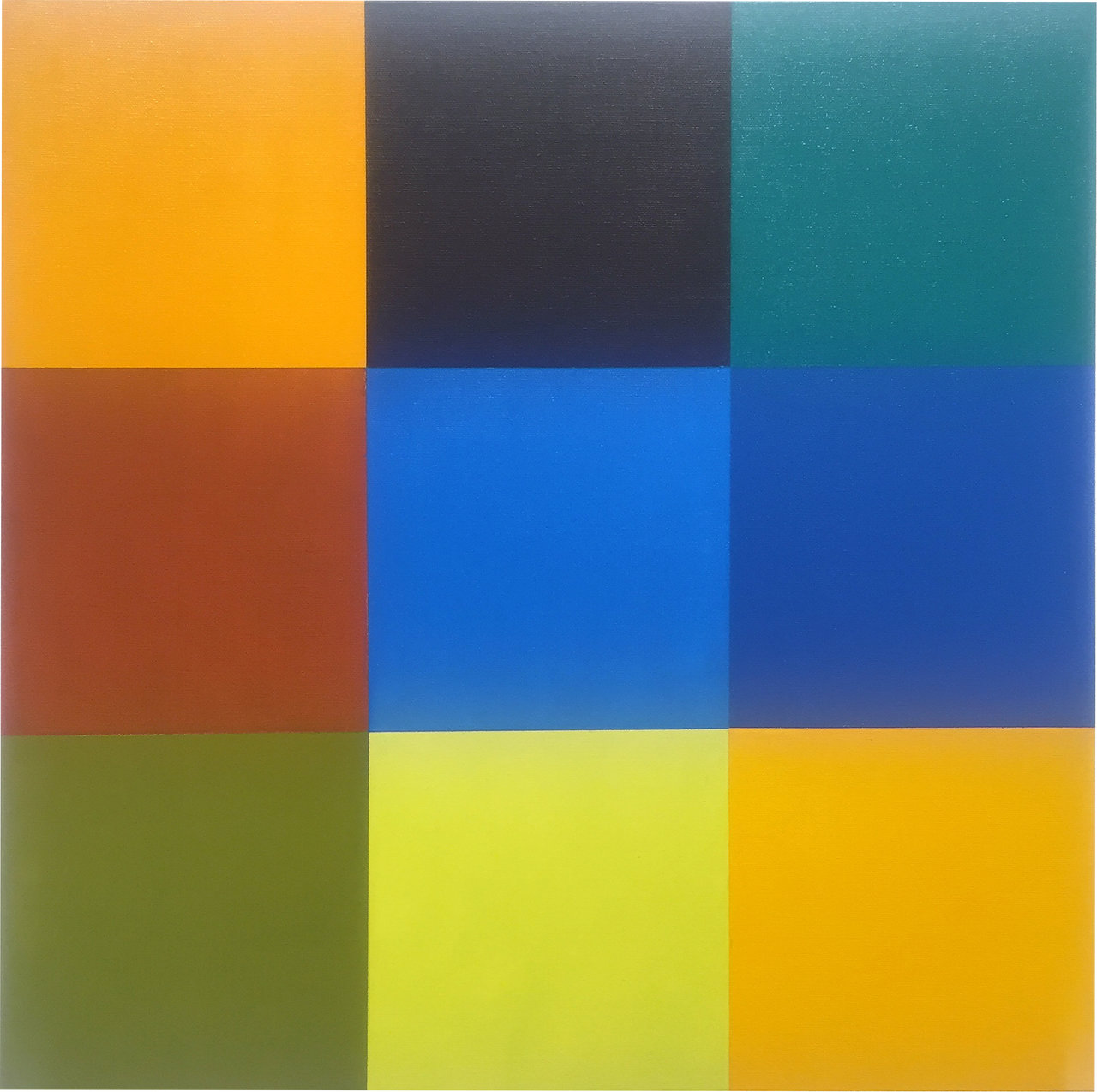
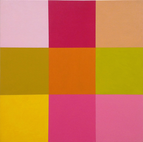
    In 1987, Steve Rockwell invented a game. The rules were simple: two players select seven coloured square tiles from 100 available, then take turns laying them onto a 3 x 3 grid until all empty spaces have been filled. Each player’s move is recorded and the ‘winner’ is decided by vote. It is a remarkably simple concept. But don’t let that fool you. Drawing on art historical movements as complex as Cubism, Surrealism and Conceptual Art, the Colour Match Game, as it is formally referred to, has outcomes and references both frivolous and profound. A selection of its aesthetic results, in the form of gridded acrylic-on-canvas paintings, is currently on display at Christopher Cutts Gallery as part of its Starry Night exhibition. 

    Installation view. Photo: Catherine MacArthur Falls

    The game in its present manifestation has been refined over many years, with small and large elements—including an official game board, printed tiles, and colour names—added over time. At the moment of its invention, Rockwell was working at the Toronto-based Beaver Press and used the leftover colour swatches from the printing process to create the game’s first iteration. Twelve years later, in 1999, the game was played competitively for the first time. Since then, it has seen hundreds of match-ups. Among its players are well-known artists, writers, and other cultural producers, including art historian Linda Nochlin, artist Inka Essenhigh, Drake Hotel owner Jeff Stober, and many others.

    Steve Rockwell, First colour match game, 1987: Beatrice Egolf vs. Steve Rockwell, 2015 acrylic on canvas, 20″ x 20″. Image courtesy of the artist

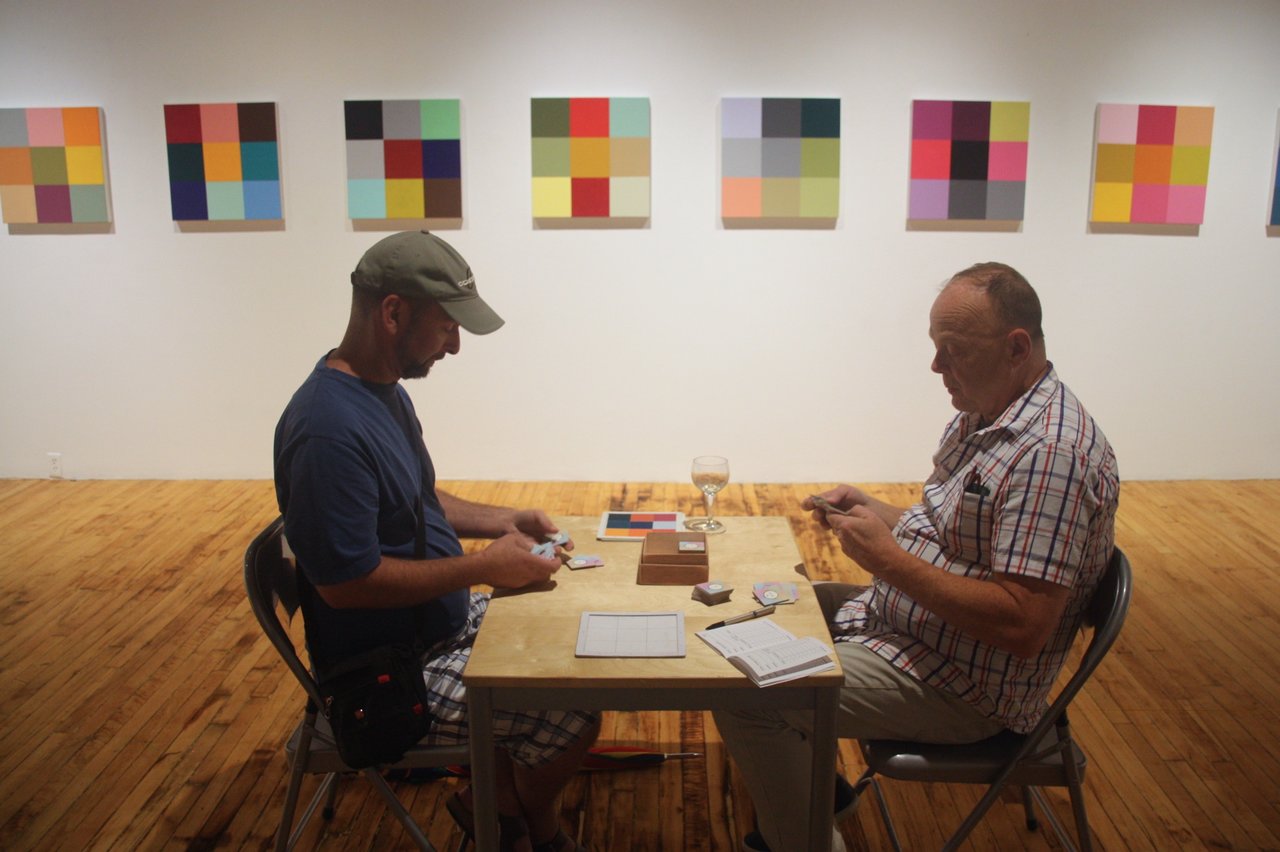
    At the more frivolous ends of things, the game is simply and delightfully lighthearted, a welcome interjection into an often cliquey and intimidating artworld. At the Colour Match Game opening reception held at Christopher Cutts last September, the continuously occupied game table in the centre of the gallery was a genial shared focus for attendees, who crowded around to watch, comment, and speculate on winners and losers, good and bad moves. The game creates an atmosphere both playful and refreshing, aided by Rockwell himself, an artist as warm and convivial as his game is deceivingly subtle. Of course, adding to this playfulness is the game’s absurdist element. Players ‘compete’ but it is unclear exactly what a ‘good’ or ‘bad’ move is, what makes a ‘winner’ or ‘loser’. How exactly do you beat someone with colour, anyway? Even Rockwell himself admits to not knowing or trying to predict what makes a winner or loser in the final vote.

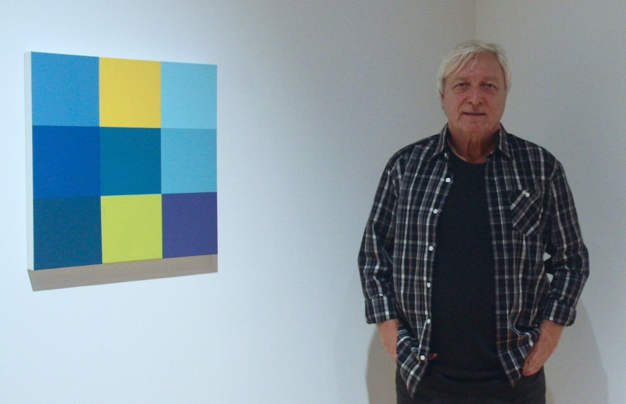
    Steve Rockwell. Photo: Catherine MacArthur Falls

    Nevertheless, it is in this absurdity that the game quietly nods to its Surrealist predecessors. But it is also here that the game reveals its performative nature. Without the cause-and-effect rationality and measurability inherent to most games, the Colour Match Game relies to a large extent on the fact that its participants and spectators effectively play at playing: they ‘ooh’ and ‘aah’ over well-placed tiles, jeer good-naturedly at bad ones, and collectively generate the sense of competition. In many ways, it is this performativity that makes the Colour Match Game a game at all. It is also what forces us to ask Wittgenstein-like what exactly a game is, what its essential elements are.

    Two guests play Colour Match Game, Christopher Cutts Gallery, September 2015. Photo: Catherine MacArthur Falls

    The game’s absurdity is not the only way it reaches out to Surrealism, however. As with all games, chance—an element used extensively by Surrealists, like Max Ernst — plays a significant role. Though Rockwell made the rules, the final gridded aesthetic — like those currently on display on the walls at Christopher Cutts Gallery — is the result of numerous factors well beyond his control. Which tiles the players would select, when they place them down and where — none of these can be pre-determined. Following Conceptual Artists like Carl Andre and Lawrence Weiner, Rockwell has created a set of instructions for making a work that is then executed by others. Yet, unlike these artists, whose instructions could be used (or not) to create a prescribed aesthetic outcome, in Rockwell’s game the outcome is far more open-ended, the colour arrangements seemingly endless.

    Steve Rockwell, Los Angeles, 1999, Richard Heller vs Steve Rockwell, 2015, acrylic on canvas, 20″ x 20″. Image courtesy of the artist

    Rockwell, however, is quick to point out that this sense of endlessness is actually misleading, that the game does in fact have quite rigid limitations. Through a process of distillation that he accredits to Cubism, Rockwell has limited the overall palette to just 100 colours, the playable tiles to just seven, and the strategic moves to nine in total. Within the confines of the rules, players have surprisingly few choices to make. The game is thus, in effect, a confined universe of possible permutations. As such, it follows perhaps most closely the Conceptual Art of Sol LeWitt, whose open-grid structures and other works create space for complete sets of prescribed permutations to be methodically carried out or at least imagined. 

    Steve Rockwell, SCOPE Los Angeles, The Standard 2004, Mars Bar vs. Steve Rockwell, 2015 acrylic on canvas, 20″ x 20″. Image courtesy of the artist

    Where Rockwell’s work differs, however, is in the process by which it achieves these eventual possibilities. Each permutation is arrived at by way of an encounter between two players, what Rockwell calls a “conversation in colour.” With the placement of each coloured tile on the game board, players communicate choices at a very abstract, aesthetic level. Each move involves the non-verbal transmission of a complex message that contains a number of elements: the cultural meanings attached to colour, strategies of collaboration or opposition, aesthetic preferences, and much more. The result is an aesthetic document that records a specific interaction between two people at a specific moment in history—an interaction, moreover, that would be very difficult to capture in words. Like the Cubists before him, Rockwell has thus managed to capture a network of complex meaning within a latticework of simple visual symbols. And through a web of art historical references, has managed to create something novel, enduring, and even fun.

    Catherine MacArthur Falls

    *Exhibition information: Starry Night, January 16 – February 3, 2016, Christopher Cutts Gallery, 21 Morrow Avenue. Gallery hours: Tue – Sat, 10 am – 6 pm.