Author: artoronto

  • Daniel Hutchinson: Mirror, Mirror / Angell Gallery

    The early twentieth century avant-garde sought to radically alter the subject matter and aesthetic preoccupations of art history past. Radicals such as Kandinsky, Malevich, the Delaunays and Kupka regularly rejected Western artistic tropes, forgoing perspectival compositions containing recognizable figures and natural phenomena in favour of geometric or pure abstraction. The picture plane was reduced and flattened to its inherent two-dimensionality, an artistic decision that influential critic and formalist Clement Greenberg enthusiastically argued for in the plastic arts. Subject matter became less literal and historical, allowing a platform for more philosophical and existential concerns to proliferate and take precedence. Content was harder to pin down, as purely abstract images and compositions denied any easy associations to the empirical world. This dismissal of tradition inevitably foreshadowed the cultural ubiquity of movements such as Abstract Expressionism and Minimalism, producing an expanded visual vocabulary that opened up the scope of art beyond mimesis and naturalism. Daniel Hutchinson: Mirror Mirror, Angell Gallery’s latest solo exhibition, finds the Hamiltonian artist continuing the iconoclastic lineage of early twentieth century painting both figuratively and literally throughout the selection of contemporaneously produced works.

    Daniel Hutchinson, Mirror, Mirror, 2015, oil on canvas, 48″ x 60″. Image courtesy of Angell Gallery

    The title piece within the exhibition sets up Hutchinson’s pictorial intentions rather nicely. Rendered in a mostly monochromatic colour palette with subtle tonal highlights, the painting alludes to Malevich’s “Black Square” of 1915, but is more visually dynamic in the subtle, undulating wave-like movement that is created on the canvas. Similarly, the “Day 1 (from the series, 16 Days at Sea, March 2013)” reduces the image of an aquatic landscape, and its sublime associations to a series of thin, indexical brushstrokes that abstractly recreate the impression and contours of the sea. Throughout the selection of paintings created within 2016, Hutchinson idiosyncratically embodies the subversive tendencies of his modern forebears. Floral decorative prints become invaded by a black abstract mass that destabilizes their particularly coherent pattern, brazenly downplaying the appearance of conventional representation within the exhibition.

    Daniel Hutchinson, Day 1 (from the series, 16 Days at Sea, March 2013), 2015/2016, oil on rescue blanket, 8″ x 10″. Image courtesy of Angell Gallery

    Daniel Hutchinson, Hand Painted Pictures, 2016, oil on canvas, 42″ x 36″. Image courtesy of Angell Gallery

    Hutchinson provides an aesthetic and formal divergence from his earlier works with these new series of paintings. Gone are the fluorescent lights that were cleverly installed above and beneath his seemingly monochromatic canvases that revealed complex geometric patterns that appeared three-dimensional when illuminated. Instead, the artworks within Mirror Mirror appear as traditionally autonomous paintings, rather than an element within a complex and beautiful installation piece. Hutchinson’s Flavinesque preoccupation with heightened opticality and synthetic luminosity is substituted for a more theoretically based analysis of painting and its iconoclastic tendencies. The artist goes to the root of early twentieth century concerns with traditional and proper decorum in his own unique manner, simultaneously referencing his subversive forebears while nuancing his own distinct presence within the plastic arts. 

    Daniel Hutchinson, It Could Be You. It Could Be Me., 2015, oil on canvas, 48″ x 60″. Image courtesy of Angell Gallery

    Aside from their aesthetic splendor and rigor, these paintings require a thorough and contemplative viewing experience. Hutchinson’s work moves beyond easy categorization to embody an essence of painting, one that looks beyond customary art-historical practices to something less definable, and immediately beautiful.

    David Saric

    *Exhibition information: March 4 – April 2, 2016, Angell Gallery, 1444 Dupont St., Unit 15 (Entrance off Campbell Ave.). Gallery hours: Wed – Sat: 12 – 6 p.m.

  • Baleful at Pari Nadimi Gallery

    Sixteen years ago in Toronto, contemporary artist Jennifer Stillwell methodically disassembled furniture in a staged living room at YYZ Artists’ Outlet, wrapped it all up into a massive roll of carpet, and titled the ball of debris Bale. This memorable performance installation was curator Ben Portis’s inspiration for Baleful: an object-centric show currently on view at Pari Nadimi Gallery. Featuring works by five contemporary Canadian artists — Stillwell included — the exhibition shines a spotlight on the life, death, and reincarnation of inanimate objects, materials, and stuff of various kinds. 

    Jennifer Stillwell, Packs, 2002, reconfigured armchairs (detail of two from a series of seven), dimensions variable, Collection of Oakville Galleries

    The star of the show is a seven-piece installation by Stillwell called “Packs.” This work not only looks like the reborn spawn of her art circa 2000, but also sets the mood for the exhibition; one of eerie undertones, due to the solemn and abandoned nature of the sculptural debris. Each pack is compiled of materials like un-stuffed cushions, box springs, dismantled wood panels, etc., then tied tightly together into backpack-shaped sculptures. In Bale­-like fashion, Stillwell once again gives old objects a new life through the process of dismantling and re-purposing; i.e., the reincarnation for inanimate objects. 

    Jennifer Stillwell, Packs, 2002, reconfigured armchairs (series of seven), dimensions variable, Collection of Oakville Galleries

    But “Packs” also looks like a furniture graveyard. Each sculpture lies lifelessly on the gallery floor exhibiting anthropomorphic qualities — I identify a couch cushion torso with one-quarter of an arm and a cropped wooden leg (violently broken by owners’ past?). Jimmy Limit’s framed photograph “Last Studio Stack (actual size)” hangs above the “Packs” graveyard, a seeming memorial portrait in honour of the objects (an apple, a lemon, a roll of orange masking tape) whose physical bodies didn’t make it. Likewise, Nikki Woolsey’s “Unslung Ripple Night” displays a hand-broom in a darkly abstracted metal sign box; the deceased on view in its casket, an ode to the little hand-broom that once swept.

    Jimmy Limit, Last Studio Stack (actual size), 2016, digital c-print, 32” x 12”, collection of the artist

    Jennifer Stillwell, Packs, 2002, reconfigured armchairs (series of seven), dimensions variable, Collection of Oakville Galleries

     The narrative continues: Rhonda Weppler + Trevor Mahovsky’s multi-media collage “Don’t be sad that it’s over, be happy that it ever began” is a monumental shrine of sorts. Recreating ephemera from an abandoned dorm room wall (including numerous posters, a foam finger, paper lanterns on a string, and a deflated heart balloon) the collage is a reminder of a past life — when the stuff actually elevated the living experience of some eager university freshman. Now covered up with black enamel and stripped from its original home, the wall monument simply hangs like the lifeless detritus that it is. But at least now it’s among friends.

    Rhonda Weppler + Trevor Mahovsky, Don’t be sad that it’s over, be happy that it ever began, 2015, polymerized gypsum, enamel and spray paint on metal and cheesecloth armature, 96” x 114” x 9”, collection of the artists

    Baleful may evoke heavy themes, but the idea that inanimate objects can live, die, and experience reincarnation (or in this case, get repurposed into works of art) is a thoughtful and optimistic concept. The show also proves what Stillwell exemplified with Bale sixteen years ago: objects that live, die, and then live again make for great art.

    Text and photo: Emily Lawrence

    *Exhibition information: February 4 – April 2, 2016. Pari Nadimi Gallery, 254 Niagara Street, Toronto. Gallery hours: Wed – Sat, 12 – 5 pm.


  • Marco Bertuzzo: Hidden

    Marco Bertuzzo, Allegories – Ambition, Watercolour, Archival ink on Archival Paper Mounted to Panel, 25” x 25”. Image courtesy of the artist

    One can not ignore the irony of Marco Bertuzzo’s new exhibition, Hidden, as reaching the space at Coldstream Fine Art involves navigating the elevator and zigzagging hallway of 80 Spadina. Anticipation is built and rightfully so, Bertuzzo’s first ever-solo exhibition beguiles and excites. The young artist delivers a show that undoubtedly hides his inexperience, as bright colours and unbridled creativity pour through this series of surreal watercolours. The artist poignantly states that this body of work is an expression of how “we as society derive meaning from and imbue images with power”. The most eloquent examples are Bertuzzo’s three “Allegories,” whose roundel format and decided symbolism reflect the artist’s classical training. In particular, the “Allegory-Ambition” presents a powerful reimagining of the renaissance prototype, as a spacecraft and rocket collude with an antique spyglass and sailboat to remind one of the technological advances and ambition of human history. Inevitably, the modern viewer is forced to pause in attempts to unpack Bertuzzo’s implications; a rare occurrence in today’s world where the over consumption of media and imagery tend to reduce attention spans to mere seconds. Marco Bertuzzo has poignantly reminded us that art should be slowly digested, a process that allows one to absorb all it’s veiled meaning.

    Meghan O’Callaghan

    *Exhibition information: March 19 – April 20, 2016, Coldstream Fine Art, 80 Spadina Avenue Suite 208, Toronto. Gallery hours: Tue – Thurs, 12 pm – 7 pm, Fri – Sat, 12 pm – 5 pm.

  • Scott Everingham: Mires at General Hardware Contemporary

    Scott Everingham with his painting, The Slower Lawnchair at the Opening Reception, March 10, 2016. Photo: Alice Pelot

    Mires, an exhibition of Scott Everingham’s oil paintings at General Hardware Contemporary, includes twelve vibrant scenes of rickety structures constructed from painterly cuneiform strokes. Everingham’s practice is a successfully productive paradox in which he is both a storyteller and an abstract painter. Of his abstract marks and techniques, there is balance between rigid abstraction filled with deliberate action and spontaneous expression – the former evidenced by calculated, repeated symbols and the latter by luxurious swatches of paint. The repeated symbols appearing across many of the works are like a language. One of these common symbols in Everingham’s practice is a two-pronged branch, brought to our attention in the title “Two Copper Branches”. Another is a series of parallel lines, described by Everingham as ‘steps’ appear across the bottoms of each large work as a visual invitation, a point of reference from which we can enter the scene. The loose, luxurious curtains of bold colors are used more scarcely as framing devices and tools for depth like the thick, blue stripe down the right side of “Beacons” or the swirling sheaths of texture in “To The Dregs!.” Their more limited appearance avoids the Modernist temptations of paint. It is not Everingham’s goal to draw attention to his materials through the materials; instead his narrations limited by the semiotics of paint, the weight and space, bringing awareness to his painterly language.

    Scott Everingham, Two Copper Branches, 2016, oil on canvas, 60″ x 66″. Image courtesy of the artist

    Scott Everingham, Beacons, 2016, oil on canvas, 77″ x 70″. Image courtesy of the artist

    Outside of the painted realms, Everingham also offers us enticing titles as points of entry to his work. For instance, “Barn Photograph” is not based on a photographic reference, but the composition implies that it may belong to the genre/theme of photographed dilapidated barns across Southern Ontario (including the classic tree framing device). “Deer/Chair/Pendulum” and “Beacons” point out the structures in the painting; while “Foam Stacks” and “Two Copper Branches” call attention directly to his painted symbols. Finally, “The Slower Lawnchair” includes a lawn chair set on a lawn, next to a home, but refers to the time in which it slowly makes itself known to us. Time is an important component in Everingham’s work. It is not only a measure of the connection between viewer and painted subject, it is also present in each painting measuring the environments in decades or even in seconds. The presence of time in Everingham’s paintings also further enable the dynamics of his narrative.

    Scott Everingham, Barn Photograph, 2016, oil on canvas, 57″ x 51″. Image courtesy of the artist

    Scott Everingham, Deer/Chair/Pendulum, 2016, oil on canvas, 29″ x 26″. Image courtesy of the artist

    Scott Everingham, The Slower Lawnchair, 2016, oil on canvas, 60″ x 66″. Image courtesy of the artist

    Just as Everingham has no favored method for abstraction, his balance between abstraction and story telling is a complimentary process. This process always begins with painting while the narrative emerges afterward, but nevertheless one drives the other. Despite the sense of narrative and the passing of time there are no characters, only structures that populate the landscapes, which are implied through depth and the horizontal orientation of the background. Each of the scenes have their own stories and timelines, they are not multiverses with overlapping story-lines. Beyond the enjoyment of seeking out the structures in Everingham’s paintings and engaging in their narratives, their surfaces provide captivating surfaces with painterly values. The colors are only surpassed by the textures produced with knives and brooms, many of the marks made by gouging through the thick paint. Photographs do no justice to Everingham’s expressive marks that exist somewhere between abstraction and story-telling. Their scale and timelines are better received in person at General Hardware Contemporary. 

    Scott Everingham, Fixed Perch (detail) 2016, oil on canvas, 17″ x 15″. Photo: Alice Pelot

    Alice Pelot

    *Exhibition information: March 10 – April 23, 2016, General Hardware Contemporary, 1520 Queen Street West, Toronto. Gallery hours: Wed – Sat 12 – 6 pm.

  • York University’s Juried BFA Exhibition

    Installation view with Nicole Mulder’s sculptural piece (in the middle)

    Opening Reception: March 19, 2016 /  2 – 6 pm.
    Gallery 1313
    1313 Queen Street West, Toronto

    Gallery 1313 was pleased to host 19 Graduating Students from the Visual Art stream of the School of the Arts, Media, Performance and Design at York University. Fellow students, faculty and gallery visitors were treated to a eclectic mix of graduate work. It was curated and hung by faculty and represented a mix of the best work coming out of the art program. Associate Professors Michel Daigneault and David Scott Armstrong installed the exhibition. 

    York University Associate  Professors, Michel  Daigneault (left) & David Scott Armstrong (right) in front of  Kayleigh Allen’s work

    There was a variety of media used to create a diverse collection of works including sculpture such as Nicole Mulder’s centre towering work of clear coffee cups filled with pills and Denise Chan’s “Untitled” portrait paintings including one of her sister. The large, colourful painting of Claire Scott  drew visitors into the gallery exhibition. Esra Tortumlu’s digital prints titled “500” – mounted on the south wall of the Gallery – also held a commanding presence. All the works seemed to have pleasing merits that held the exhibition together.

    Denise Chan with her painting, Untitled

    Claire Scott and her painting

    Esra Tortumlu and her digital print, 500

    Student works were from Kayleigh Allen, Nedda Baba, Esther Buzaglo, Denise Chan, Claudia Cimini, Sarah Di Paola, Benjamin Gallego, Susan Hadjor, Anna Ho, Margaret Kalejta, Karen Luk, Rebecca McGlashan, Nicole Mulder, Jakub Plewa, Claire Scott, Rena Silver, Esra Tortumlu, Maxine Veneracion and Shiyi Zang.

    Susan Hadjor and her Digital Photos, Inconspicuous Corners

    Text and photo: Phil Anderson

    *Exhibition information: March 16 – 27, 2016, Gallery 1313, 1313 Queen Street West, Toronto. Gallery hours: Wed – Sun: 1 – 6 pm.

  • Max Dean: I’m Late, I’m Late at Stephen Bulger Gallery

    Traditionally, art has associated with the address of serious themes, depicting macroscopic or personal perceptions surrounding emotional, psychological, social, economic, historical, literary, spiritual or even aesthetic issues. In effect, this conveys the sense of art’s legitimacy as an intellectual discipline, as it is commonly considered. However, there have been many exceptions where art avoids solemn content, or approaches it with joviality and amusement. There are the playful elegance of the Rococo era, the blunt sarcasm of the Dadaists, the colorful vitality of the Fauvists (otherwise known as the wild beasts), and today, the visual playfulness of Max Dean with their resonant sense of wonderment. I’m Late, I’m Late is a collection of photographic images that tell a sequential narrative, however the individual pieces can work both independently or cooperatively and still attract the viewers’ curiosity.

    Installation view of Max Dean,  I’m Late, I’m Late, Stephen Bulger Gallery, 2016. Photo: Simon Termine

    Dean’s photographs demonstrate a considerable deal of planning and intricacy, however it is presented in such a humorous or immersive manner that alleviates the tension of the unknown. Essentially, the narrative orients around the journey through a miniature realm separate yet still imbedded within reality. Like an Alice in Wonderland story, it encourages you to traverse “further down the rabbit hole” alongside his own experience, though the sublime fairy-tale elements are replaced with something more familiar. The first half of Dean’s narrative manipulates banal objects into seemingly expansive environments that transition from one to the next: mountains made of books, bridges made of rulers, and the protagonist, within his toy car, voyaging to his destination. The final panel depicts a small man parachuting from a cliff, cleverly transitioning between dimensions.

    Jungle Studio, 2014 © Max Dean, Courtesy of Stephen Bulger Gallery

    The second half begins with Dean’s landing into the world, where the subject manner converts from miniature objects to human-sized environments: from an illusionistic atmospheric perspective to a close introspective one. Here, he traverses and interacts with the synthetic landscape as a pioneer in a new world. Each scene – whether he is struggling through a hostile swamp, moving stones into a structural garden, or catching insects with his travelling companion – invites you to share in his whimsical discoveries and engage it with the same naïve open-mindedness.

    Dropping In, 2014 © Max Dean, Courtesy of Stephen Bulger Gallery

    Swamp, 2014 © Max Dean, Courtesy of Stephen Bulger Gallery

    Aside from this continuous narrative, his other photographs feature storage spaces crowded with climbing ladders. However, their real context stems from the finalizing piece: a composite image depicting dualism between an upper and lower realm, almost like the medium between earth and sky with high-rises or monuments peering through. The ladders clamber towards the clouds, either lingering just below the barrier or elevating above it. Dean himself is in the midst of his own ascension, resting right between the two dimensions to show his foothold in both. It suggests a sort of man-made heaven and earth with apparent human attempts to try and cross the divide. However, the general sense of ambiguity, stemming from the practicality and simplicity of the entire scene, allows for a wondrous degree of personable subjectivity.

    Perplexed, 2014 © Max Dean, Courtesy of Stephen Bulger Gallery

    Dean’s exhibition is an incredible assemblage of his fun-loving journeys, rife with oddity, creativity, and immersive curiosity. He effectively assembles industrial and mundane objects to depict convincingly fantastical settings and crafty transitions, blurring the distinction between the realistic and the imaginary.

    Simon Termine

    *Exhibition information: March 5 – 26, 2016, Stephen Bulger Gallery, 1026 Queen Street West, Toronto. Gallery hours: Tue – Sat, 11 am – 6 pm.


  • Bodyworks at the Canadian Sculpture Centre

    Canadian Sculpture Centre consistently brings out familiar friendly faces to every exhibition. They showcase a community filled with support and respect for fellow artists as well as their artistic patrons. Richard McNeill, long time member and host of the Bodyworks Reception, took a moment in introducing the artists to pay respects to Al Green who was a long time supporter of the gallery before he passed earlier this year. The family’s continued support of the gallery clearly touched all members of the Sculptors Society of Canada.

    Bodyworks is a yearly event at the Sculptors Society as the artists are called on to explore contemporary representations of the human form. Each artist’s unique voice was present in his or her works as everything from the true realism of Saulius Jaskus to the abstraction of Richard McNeill filled the gallery. Figurative representation as a theme allowed many artists to explore new forms for their sculpture. Barbara Fletcher specifically stepped far outside her known zone in “Portrait of an Artist”. Although she began as an artist with figures she quickly moved to abstract, non-figurative, highly geometric works. This piece shows the full circle growth she has come to in her career as an artist, as while the figure still is somewhat guarded she exudes vulnerability to the viewer as she communicates her emotions of being more exposed than ever before.

    Barbara Fletcher, Portrait of an Artist, terra cotta

    Peter Shoebridge also took the opportunity to display a new flatter format for his works. The three sculptures he presented were all so new he was unsure what to think of them personally aside from the desire to explore this new format in a forthcoming series. The terra cotta figure, “Bather”, depicts a woman in a moment of quiet contemplation that rests almost flattened to the wall. His other two pieces, “Orbit” and “Dreamer” explore the further abstraction of the human figure and seem in constant communication with one another as each piece seems to float in their abstract worlds.

    Peter Shoebridge, Orbit,  acrylic reinforced hydrocal

    Unlike Fletcher and Shoebridge, Richard McNeill used the opportunity to continue his Streams and Gazer series. McNeill has displayed a consistent interest in the theme of regeneration and rebirth and continues to do so in, “Podflow – Tanya” and “Stream Gazer 6”. The woman figure, Tanya, is an earth goddess-like slightly realistic figure, elongated into a guidepost. The head is a stylized model from life that projects calmness despite the knot that rests at the bottom of the post, which represents a barrier in her stream. “Stream Gazer 6” is a much more abstracted male figure who observes both the internal and external worlds as he attempts to grasp what is and is not in the world. Both exude connections to the earthly and bodily world.

    Richard McNeill, Podflow 17 – Tanya, alumina cement aggregate, resin colour encaustic finish

    Saulius Jaskus explored the realism of the male and female figures in his works, “Dream Float” and “Offering”. “Dream Float” shows a female figure lying on her side in a floating and Classical manner. Jaskus discussed how the model figure in “Offering” provided an interesting challenge through his odd and complex pose, which allowed him to further explore clay use as it was difficult to balance the weight of the sturdy figure. Both offer a necessarily truthful take on the human form and allow Jaskus to showcase his immense skill as a figurative sculptor.
    Saulius Jaskus, Offering, plaster

    Gordon Becker provided a detailed and standout sculpture, which included multiple figures and managed to both explore serious themes of journeys and historical art, while finding it’s own humorous and ironic perspective. “Three in a Boat” uses the historical figures of Da Vinci’s “Mona Lisa” and Boticelli’s “Primavera” along with an unspecified, but pointedly unlikable male figure in an effort to portray a trip across the mythological River Styx. The sea is sterile and black as the figures journey on the souls of destruction and are driven by the exposed male figure who Gordon stated is a representative of bankers or men in general with too much power who are leading the world astray.

    Gordon Becker, Three in a Boat

    Elizabeth Merei’s alabaster sculptures were particular standouts in the gallery. John Clinton, Eamon, Camie Geary-Martin, Marlene Kawalez  and Elaine Jacques all presented incredible works that are absolutely worth seeing along with the others.

    Marlene Kawalez, Night, wood, clay on quartz base

    John Clinton, Sitting on the Dock, bronze

    Rhiann Moore

    Images are courtesy of the Canadian Sculpture Centre

    *Exhibition information: March 10 – April 1, 2016, Canadian Sculpture Centre, 500 Church Street. Gallery hours: Tue – Fri: 12 – 6, Sat: 11 – 4 p.m.

  • Giancarlo Scaglia and Miles Gertler at Corkin Gallery

    The Corkin Gallery in the Distillery District is a historical, industrial structure with exposed brick, high ceilings and abundant natural light. With two project spaces, and multiple floors, each work has space and welcomes our full attention. Jane Corkin has chosen two undeniably topically and aesthetically compatible artists Giancarlo Scaglia and Miles Gertler.

    Scaglia’s four large works thematically based on his three-year investigation into the history of El Fronton. El Fronton is an island off the coast of Peru that housed a maximum-security prison for political prisoners (built in 1917) but only reached a level of infamy after a violent confrontation in 1986, that left behind only ruins. Three of Scaglia’s works are diptychs of black ink on white Japanese paper and mounted on fine stretched linen resembling the cover of a Mead Composition notebook in pattern, or Modernist painting in scale. The series titled Stellar directly connects the black and white speckled works to constellations, however the white does not shine through the black background, instead the black seems to have flaked off leaving holes behind.

    Giancarlo Scaglia, Stellar Aereo 27 and 28, 2015, ink on Japanese paper mounted on canvas, 118 1/16″ x 125 15/16″

    The works are disconcerting due to the disconnection between title and aesthetic. The artist widens the meaning by adding his fingerprints, and there are also feathers stuck to the surface recalling the messy environmental business of oil spills. The reason for this cognitive dissonance was an intentional connection made by Scaglia during his research on El Fronton. The massacre – for which the island is known – left behind bullet holes in the walls of the cells in random patterns from which Scaglia forms symbols of this history like the patterns we call constellations. Scaglia’s fourth work, titled “Golden II,” is an installation including an unstretched painting of the island painted entirely in shades of gold with a selection of rocks from the island placed on the floor with feathers. The rocks relate to the Land Art practice of the non-site in which elements are taken directly from the works location to act as off-site documentation. The rocks and feathers in Scaglia’s works are appropriate punctuation for the research he did on El Fronton. 

    Giancarlo Scaglia, Golden II, 2015, acrylic on canvas (78 11/16″ x 110 3/16″) with rocks from the island of El Fronton

    On the upper floor of Corkin Gallery, Miles Gertler’s installation Superlith is displayed in the project space. His works of black and white paper architecture explore the power of architectural revisionist history. Gertler uses architectural renderings and archival photography to produce empty landscapes punctuated by structures to establish a political iconography of oppressive buildings. Architectural revisionist history has a history of its own driven by political leaders. For example, prior to WWII, Hitler employed architect Karl Friedrich Schinkel to redesign Germany’s history through classical Grecian architectural iconography to produce an image of the nation as powerful and lasting. The buildings in Gertler’s “Speculative Fiction” series are marble monoliths appearing in his scenes like the one in “2001 a Space Odyssey.” Some of the buildings resemble the concrete, cube structures of Le Corbusier, set atop thin columns to allow for movement beneath, some echo the forms of Russian Constructivist maquettes, as well as Classical sculptures and architectural forms.

     Miles Gertler, Seven Temple (top left); Seven, Pyramid (top right); Superlith, Superlith (bottom left); Superlith, Mothership (bottom right), 2015, each: digital collage on cotton paper, 22.9″ x 22.9″

    In most of the prints, the buildings express no particular function and do not relate to the surrounding landscape; they are like foreign spaceships or sculptures of omnipotence. A scale model of one such structure titled “Superlith, Supralith” (resembling his other work “Seven, Hanging Gardens”) is installed in the project space populated with fiberglass molds in front of three panels including fields and distant monoliths. His largest work is a geological composite printed on wheat paste and gypsum panel.  The study’s title “No. 1, Zoom” is textured like marble, but the abstraction also presents like a pixelated photograph zoomed in too close.

    Miles Gertler, Seven, Hanging Garden, 2015, digital collage on canvas, 40.8″ x 40.8″

    Miles Gertler, Walls, Untitled Study, No.1, Zoom, triptych, 2016, digital geological composite, prototype for installation, wheat paste on gypsum panel, 8 x 12 ft

    In the movie “Blow Up,” the protagonist believes he has photographed evidence of a murder, but the closer he zooms into the body, the further obscured it becomes, and he is only able to form vague symbols. It is this postmodern dilemma that for me is the most interesting connection between Gertler and Scaglia. Gertler implies classical material and vaguely oppressive iconography to construct symbols of power, and Scaglia refers to the most ancient system of symbols to provide a metaphor and historical value for the remnants of a disastrous event.

    Text and photo: Alice Pelot

    *Exhibition information: Giancarlo Scaglia, Stellar and Miles Gertler, Superlith, January 28 – March 20, 2016, Corkin Gallery, 7 Tank House Lane, Distillery District, Toronto. Gallery hours: Tue -Sat: 10 am – 6 pm; Sun: 12 – 5 pm.


  • Histories of Art at Daniel Faria Gallery

    Histories of Art, a group exhibition currently on display at Daniel Faria Gallery, offers visitors an incredibly considered, delightfully irreverent, and often sassy take on art history. Comprised of work by four of the gallery’s artists — Shannon Bool, Chris Curreri, Mark Lewis, and Elizabeth Zvonar — the show confronts some of the prominent figures, discourses, and systems of representation that have crystallized over several hundred years into the art historical canon we all know and love (or at least love to hate). And through this confrontation, the show provides a scrutinizing and often very human slant on a discipline that can often be rather dusty, privileged, and overly academic.
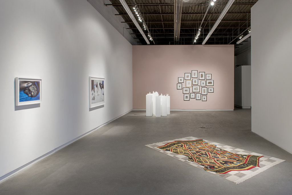
    Installation view at Daniel Faria Gallery, 2016, Histories of Art

    Approaching the subject from the sassier angle, Chris Curreri’s photographs portray revered sculptural subjects in states of indelicate discomposure. Taken by Curreri during a tour of the Art Gallery of Ontario’s conservation lab, the images show two statues — Gian Lorenzo Bernini’s Corpus and Jacobus Agnesius’ St. Sebastian — in the midst of conservation work. As a result, the sacral plinths and mounts on which we ordinarily see these works displayed have been traded for conservator’s equipment. The statues lie prostrate, their finely carved limbs spread across roughly hewn fabrics, bent over triangular slabs of inert polyethylene, legs bound by unbleached cotton twill tape. By exposing the statues thus indisposed, Curreri reveals moments in the lives of artworks that are ordinarily conducted behind closed doors. He also underscores the permeability of these objects, which, though made of seemingly stable bronze or ivory are, like all material things, subject to the laws of change and decay. The effect is one of peering into the secret lives of these figures, which require cleaning and maintenance like all matter, indeed like humans.
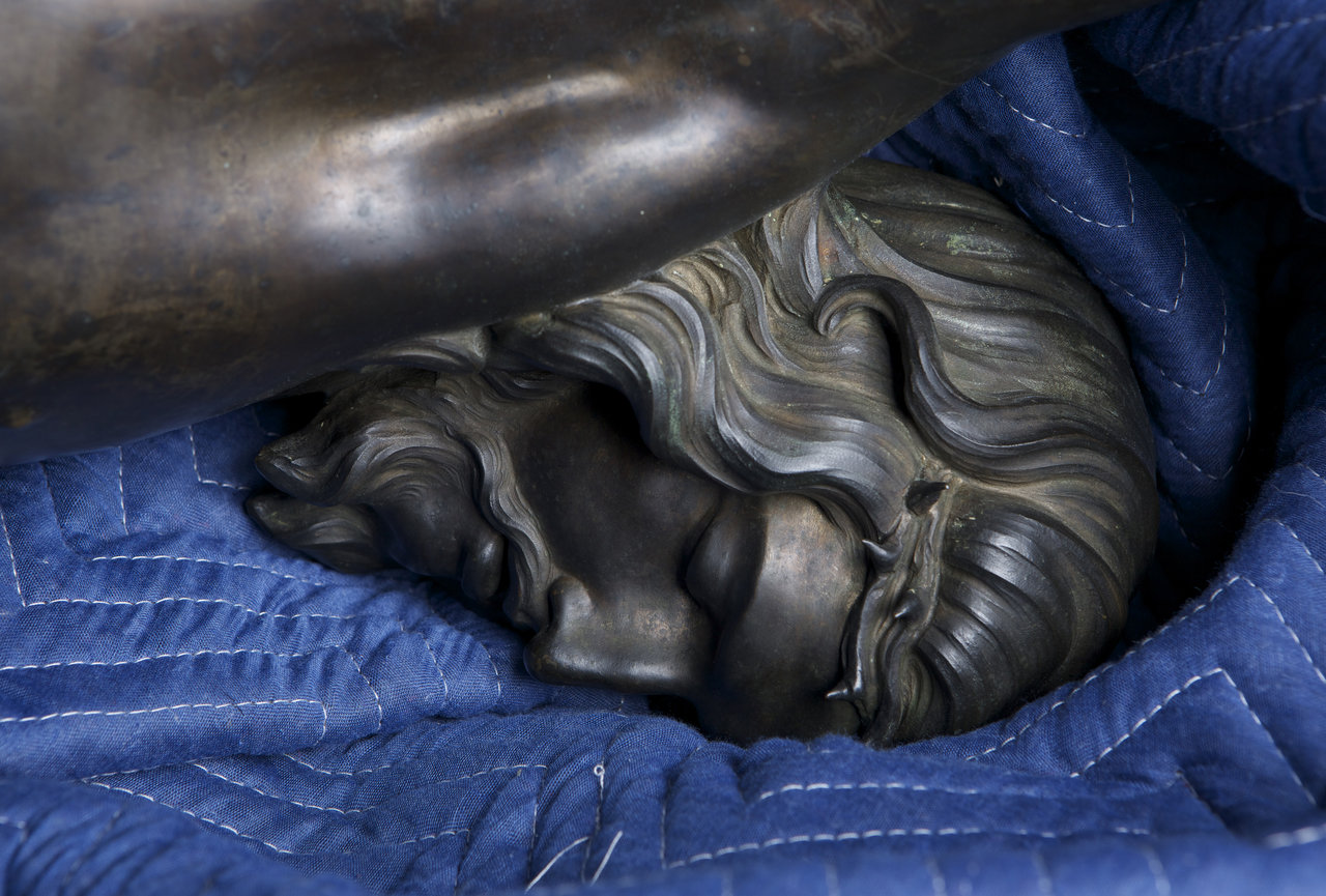
    Chris Curreri, Corpus (face), 2015, chromogenic print, 20″ x 27″

    Of course, this voyeuristic sense is heightened by the titillatingly immodest poses Curreri captures his figures in—poses which emphasize the erotic, even sado-masochistic tendencies of these and similar works. Through Curreri’s lens, the figures’ states of agony and sorrow transform into those of pain/pleasure. And such a treatment is not inappropriate to either figure: the eroticization of St. Sebastian bears its own history in art and literature, aided by writers like Thomas Mann and T.S. Eliot, while the erotic lineage of depictions of Christ has been explored by art historians like Leo Steinberg since at least the 1980s. At Daniel Faria, Curreri takes up both of these dialogues, addressing the sexually ecstatic undercurrents of much early Modern religious art. Yet, as in the rest of his practice, he also proves that the truths of objects lie in their broader contexts and their interactions with ideas, bodies and other objects. Whether situating the figures in their museological context or in their cultural one, in Curreri’s photographs, the two statues are very much part of and defined by the world they inhabit.
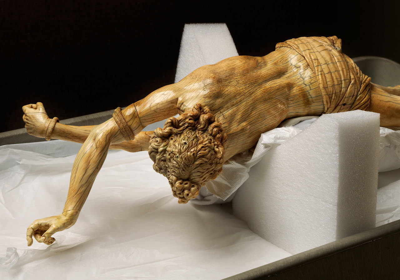
    Chris Curreri, St. Sebastian, 2015, chromogenic print, 26.25″ x 34.5″

    Elizabeth Zvonar’s “History of Art” (2009) also engages the contexts of artworks, though in her case, the context is of a more discursive nature. Through a series of collages and small-scale ceramic sculptures, Zvonar takes on H.W. Janson’s iconic History of Art, a text used for decades as the go-to survey of art history and one also instrumental in constructing the art historical canon. In an irreverent act of reappropriation, Zvonar cuts up and collages the text’s pages into often ironic, often cheeky, and always poignant new images. Artistic subjects from vastly different art historical periods and in varying styles meet and interact, spotlighting historical consistencies and disjunctures. Matisse’s bathers meet Fragonard’s, for example. Or Rodin’s’ “Thinker” coddles an earlier version of a similar subject.
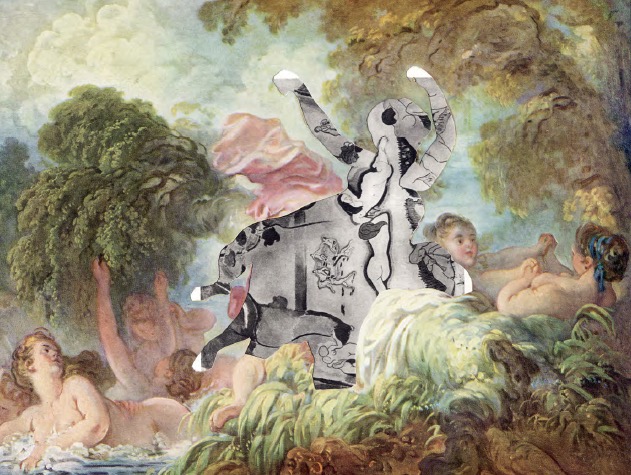
    Elizabeth Zvonar, Dancing Bathers French, 2009, collage, 9.25″ x 7.5″

    In all instances, Zvonar adds new meaning to the originals. Like Curreri, Zvonar underscores erotic currents within iconic works, for instance, as in her combination of Donatello’s bronze David with one of Michelangelo’s Slaves. Or, she uses visual layering to comment on acts of violence and war, as in “The Blind Leading the Third of May.” At her most serious, Zvonar’s visual juxtapositions call attention to the gaps, hypocrisies, and misogynies within art’s historicization. The most blatant example is her collaging of Janson’s title page with Giambologna’s “Rape of the Sabine Women” in her not-so-subtly titled “History of Art/Women Get Raped.” This scathing visual critique builds on much of the criticism the text has received since its first edition, which noticeably excluded women artists but was unsparing in its inclusion of the female nude.
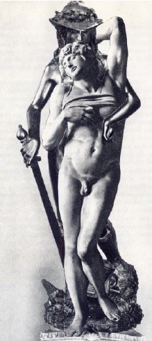
    Elizabeth Zvonar, Undying Love, 2009, collage, 3.5″ x 7.5″
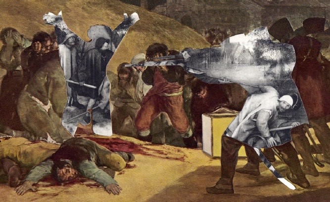
    Elizabeth Zvonar, The Blind Leading the Third of May, 2009, collage, 9.5″ x 6″

    Zvonar’s porcelain works also draw on Janson’s text in a way that is perhaps even more playful — though certainly still as irreverent—as these collage works. Each sculpture reenacts one of the book’s most iconic paintings — with one catch. In place of figures, Zvonar has rendered the scenes using white slip casts of her own index finger. The results are whimsical and delightfully bizarre: groups of fingers coalesce into the sea-weary figures of Gericault’s “Raft of the Medusa,” for instance, or congregate like partygoers at Titian’s “Bacchanal of the Andrians.”

    As the curatorial text for the show notes, Zvonar’s choice of the index finger is a nod toward its significance — and the significance of the gesture of pointing — within the visual canon of art history. Think Michelangelo’s Sistine Chapel ceiling or Plato’s gesture skyward in Raphael’s The School of Athens. Yet, it also serves to eroticize these iconic works, bringing them into the realm of touch and the body. Indeed, taken as a collective, it’s hard to ignore the sculptures’ writhing sexuality. As in her collage works, this serves to expose the blatant eroticism — with its often-misogynistic undertones — of much of the artistic canon. But the fingers also brings the original works into the realm of the surreal, perhaps calling to mind Eugène Atget’s dismantled mannequins or Georges Bataille’s 1929 photograph “Big Toe.” The effect is to render the original images as more than slightly ridiculous — Zvonar literally gives the finger to some of art history’s most famous (male-generated) works.
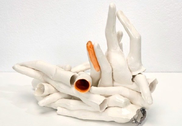
    Elizabeth Zvonar, Raft of the Medusa (After Gericault), 2009, porcelain, 9″ x 7″ x 5″

    In a similar act of cooptation, Shannon Bool’s “MEC V” (2015), part of her ongoing “Madonna Extraction” series, similarly appropriates and manipulates historic works — in this case Jan van Eyck’s “Madonna and Child Enthroned,” circa 1436, and Petrus Christus’ “Virgin and Child Enthroned” from 1458. Yet, more than Curreri and Zvonar, Bool uses this cooptation to directly address historical and contemporary systems and processes of visual representation. To do so, Bool extracts from the original paintings the strikingly similar carpets each artist laid beneath his figures’ feet—carpets utilized by Agnesius and Christus to aide in the creation of visual perspective and display technical mastery. Bool then isolates these carpets and brings them together, replacing their surrounding scenes with a grey-and-white Photoshop grid. This new image is then fixed as an actual carpet woven by Anatolian weavers and displayed flat on the gallery floor.
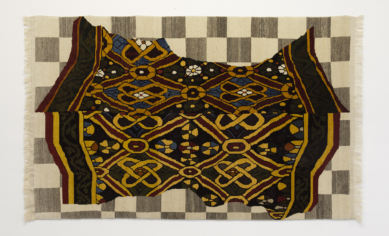
    Shannon Bool, MEC V, 2015, wool, 106″ x 66.5″

    The result of this process is a layering of ontologies, visual effects, states of refinement, and artistic processes into one object. What were once representations of carpets are now an actual carpet, for instance. And this carpet’s flatness—along with the flat grey-and-white grid—contrasts markedly with the original images, whose visual depths are partially nullified by their display on a flat ground. Further, Bool has taken what is ordinarily a temporary state—a moment of digital editing—and fixed it into a state of permanence, converting highly refined objects (the original paintings) into a sort of rough edit, and then into another highly refined object (the finished carpet). And all the while, she contrasts modern techniques of digital representation and manipulation with an early visual system requiring very different artistic processes and forms of technical mastery. It is a dizzyingly complex and impressive maneuver—one that looks head on at the ways we see and have seen works of visual art today and almost 600 years ago. 

    In a similar move, Mark Lewis also looks at systems of representation and viewing, contrasting the depiction of movement in early Modern painting with its depiction on film. In “Boy with a Spinning Top (Auguste Gabriel Godefroy)” (2014), Lewis films Chardin’s painting of the same name, capturing in moving images a still work that seeks to demonstrate motion within a single frame. Lewis thus calls attention to the varying learned and culturally embedded visual cues that we as viewers use to read movement within different types of media—cues like Chardin’s impossibly suspended top, for instance; or the changing size of objects on film, which read as changes in distance to the camera. Comprised of one long shot taken mostly at close range to the painting, the film also encourages the type of prolonged, intimate looking that we so rarely do in the gallery setting. Yet, in moving from this extended close-up to a broader angle, Lewis also connects Chardin’s work to its museological context within the Louvre. He situates the painting first within its frame, and then on the wall beside its accompanying curatorial label, and finally as part of a row of neighbouring works. In this way, the film parallels the works of the other artists within the show, who play with context in order to make statements about the shifting meanings of historic works of art or, indeed, objects in general.
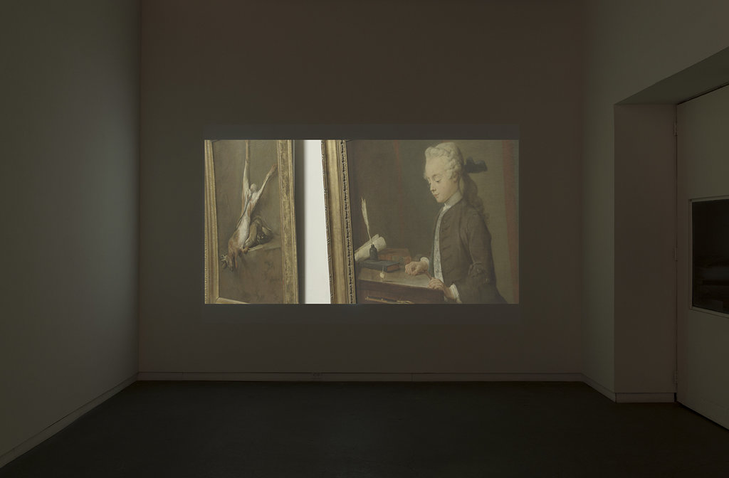
    Mark Lewis, Boy With a Spinning Top (Auguste Gabriel Godefroy), 2014, 5K transferred to 2K, 4 min., 39 sec.
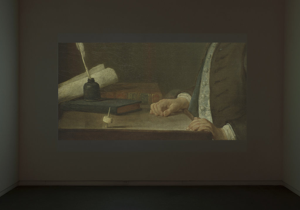
    Mark Lewis, Boy With a Spinning Top (Auguste Gabriel Godefroy), 2014, 5K transferred to 2K, 4 min., 39 sec.

    This latter parallel hints at what is strongest about the show: each work is unique, approaching the history of art from a drastically individualized perspective. Yet, the common threads are incredibly strong and run deeper than a simple shared interest. Each of the four artists engages deeply and subtly with art historical conversations: they confront injustices, point out erasures, and probe entire modes of seeing. And all of it is done intelligently and often with a sense of humour. For a discipline often accused of taking itself too seriously, this seems to me the best we could ask for.

    Catherine MacArthur Falls
    Images are courtesy of Daniel Faria Gallery.

    *Exhibition information: Histories of Art – a group show by Shannon Bool, Chris Curreri, Mark Lewis, and Elizabeth Zvonar, February 11 – March 26, 2016. 188 St. Helen’s Avenue, Toronto, M6H 4A1. Gallery Hours: Tue – Fri, 11 – 6; Sat, 10 – 6 pm.

     

  • Decoding the Tides at loop

    Walking into the narrow space of the loop gallery, the visitor is confronted with Tara Cooper’s Contre vents et marées. The viewer is breezily welcomed into the space as the gentle whir of a stationary fan fills the ready-made sails of Cooper’s self-described “floating platforms”. The show is comprised of three large installation pieces, a combination of found objects, sculpture and ceramics related to the life of a mariner, or one who charts the ever-changing winds. Fully entering into the space means coming face to face with the central work and namesake of the exhibition, Contre vents et marées. 

    Tara Cooper, Contre vents et Marées (against winds and tides), steel towers, sewn banner with screen-print, metal weather vanes, mirror, wooden platform, woodcut print, screen printed arrows, steel “North” weather balloon instruments, 2015

    The main component of the installation is a large metal tower, seeming to echo the lifeguard stands of days gone by. Standing atop the tower is a rusty weather vane pointing to Cooper’s hanging sail whose quilted block letters detail the title and flap carelessly in the artificial wind. Our eye is then lead to the base of the work, where two teal arrows appear on a dark blue base pointing to a paper cloud cut out. Words have a great presence in the exhibition, specifically in this work whose translation ‘against wind and tide’ is a French idiom expressing the ability to continue against all obstacles. Here Cooper’s sculptural installation reflects a certain folksy boldness.

    Tara Cooper, The Beaufort Wind Scale, ink drawings on paper

    The opposing wall offers a respite to the artist’s more dynamic ‘floating platforms’. Instead, we are offered a series of ink drawings revolving around the Beaufort wind scale. A meteorological measurement system that correlates wind speed to observed physical conditions. These monochromatic drawings explore each of the twelve levels in Sir Francis Beaufort’s scale, detailing sea conditions at the varying stages. Tara Cooper has spent a residency in Brigus, Newfoundland with the Landfall Trust. Her stay in the Maritimes allowed Cooper to see first hand the importance of meteorology on this society’s way of life. In particular, the artist was interested in how mythology and storytelling became inescapably intertwined with the weather.

    Richard Sewell, Untitled

    The changing tides of the gallery bring us to the second exhibition, Richard Sewell’s Compression. Comprised of three large hanging tarps, each with a series of relief elements created with duct tape and plastic objects procured from the local hardware store. Sewell, a retired professor of the visual arts, has created a complex glyphic language. The legend for each element in the composition is a meditation on how we notate and deconstruct a work of art. The catalyst for this project was the system of notation for dance, an intricate language used prior to the days of video technology to expound the details of a choreography. In a similar fashion, Sewell breaks down each component of his work, with a title and almost impenetrable description. 

    Richard Sewell, stor*emRe*ox*ar*chy (storage + Rembrandt + box + hierarchy) a straight*ti*cal occurrence, polyethylene and vinyl tubing, cable-ties, screws, straight pins. Coroplast sheet: opaque, cut, braced, and/or laminated, Rubbermaid Snap Case Storage box, and wall-clip, 1994-2016

    The most eye catching component, is the “stor*emRe*ox*ar*chy (storage + Rembrandt + box + hierarchy),” where a print of Rembrandt’s self-portrait is framed and covered by a Rubbermaid plastic container. Sewell’s notation system and his decoding of art is not always easy to decipher.

    Text and photo: Meghan O’Callaghan

    *Exhibition information: February 27 – March 20, 2016, Loop Gallery, 1273 Dundas Street West, Toronto, (three doors west of Dovercourt). Gallery hours: Wed – Sat 12 – 5, Sun 1 – 4 p.m.

  • Once is Nothing: A Drone Art Exhibition at Inter/Access

    Inter/Access is an artist-run center dedicated to exhibiting artists who push the boundaries of technology in their practices. The theme of drones allows artists to specifically explore accessibility of technology, warfare, mapping and surveillance. Most of the artworks refer to the military development and use of drones for mass surveillance and warfare. Morgan Skinner’s video work titled “Gorgon Stare” is titled after the US military’s Reaper Drone used for surveillance of large areas. On one screen, nine windows present aerial footage of drone attacks and bombings alongside video game footage of war from Battlefield 4. Not only is drone footage troublingly familiar and difficult to discern from the virtual experience, the juxtaposition of the real with the virtual demonstrates how iconic scenes of horrific warfare pervade our comfortable popular culture.

    Morgan Skinner, Gorgon Stare, 2016

    Mona Kamal’s carpet titled “Drones in Waziristan” also confronts the sad reality of war, and our privilege that through technology we may remain far away. Kamal removes the fabric from carpet to document the dates of drone attacks while also emulating the loss of these events through the process of removal. We are invited to take off our shoes and walk on the work to feel our distance from the actual events.

    Mona Kamal, Drones in Waziristan (detail), 2015, Synthetic Carpet

    IOCOSE imagines the lives of drones dispatched from military and surveillance work during times of peace. In one scenario, the drones are athletes of the 100 m race – an activity being developed in reality for recreational drone owners. In another scenario, drones are portrayed in moments of vain boredom, turning their surveillance technology onto themselves to take domestic selfies. Exploring drones as a means of surveillance, Lawrence Bird’s video of Google satellite images simulate a tour of the US-Canada border, a man-made mark on the natural landscape.

    IOCOSE, Drone Selfies, 2014

    Lawrence Bird, Parallel 3, 2016

    Rather than political patrol, David Bowen’s acrylic sculptures demonstrate how surveillance technology can be used to document landscape at the mercy of tumultuous weather. His five sculptures, carved from a CNC router and set atop a plinth are models of the same co-ordinates over lake Superior during different weather conditions. Bowen’s work, next to Joe Ford’s sculptures, creates an incredible dynamic between man-made privacy and the vulnerability of nature. Ford’s geometric plywood and grip tape sculptures, titled “Dead Pixels,” arranged on the floor present an aerial experience of a suburban neighborhood. 

    Installation shot with Joe Ford, Dead Pixels (on the floor) and David Bowen’s sculptures

    The theme of pixelization used to communicate distance and also to communicate a means for privacy and censorship brings to mind essays and video works by the artist and writer Hito Steyerl. Pixelization is a means to escape the mutual mass surveillance and Google gaze, but to run away from video is not the most productive answer. The work “DIY (Drone it Yourself) v1.0” by Jasper van Loenen, presents an alternative proactive position. The democratizing effort of van Loenen includes 3D printable STL files, readily available electronic parts, and open source controller to make drone technology accessible to everyone.

    Jasper van Loenen, DIY (Drone it Yourself) v1.0, 2013, 3D printed components, bill of materials, documentation

    The works at Inter/Access are politically charged appropriations of tools used widely for warfare and surveillance, and also playful interpretations of their potential everyday use.

    Text and photo: Alice Pelot

    *Exhibition information: Once is Nothing: A Drone Art Exhibition – a group show by Lawrence Bird, David Bowen, IOCOSE, Joe Ford, Mona Kamal, Morgan Skinner, Jasper van Loenen, February 17 – April 2, 2016, Inter/Access, 9 Ossington Avenue, Toronto. Gallery hours: Tue – Sat: 11 am – 6 pm.

    Featured image: Installation view with IOCOSE, In Times of Peace, 2014

  • Claude Breeze at Yumart

    Well known Canadian artist Claude Breeze put together a show of small works for Yumart Gallery. Attendees were clearly excited by the artist’s presence, as this is the first time Breeze has chosen to showcase his work to the public in a long time.

    Each piece stands by itself, as the artist himself noted that this exhibition did not present a cohesive series, but rather a collection of what he has worked on in his highly productive retirement. Despite the independence of each piece, they all possess a story behind them that can be garnered from the analysis of the mixed-media images. All seek to present commentaries on social issues, fading beauty among them. “Don’t Forget Me” takes an image of a young woman and merges her body with patterns of wood, that has been damaged and faded through time. Through this work Breeze explores the social presence of young models in the media.

    Claude Breeze, Don’t Forget Me, 2015, crayon, charcoal on printed image on canvas, 27″ x 19″. Image courtesy of Yumart Gallery

    The commentary on the position of women ran throughout the exhibition. “Don’t Take My Skin” shows an advertisement that went awry. Although the distorted woman already is seen presenting her body to the viewer, Breeze takes the photographer a step further with his manipulations and makes it less about the female’s body as a commodity, but rather a woman who has been damaged and adjusted consistently to a point when she became unrecognizable.

    Claude Breeze, Don’t Take My Skin, 2015, crayon, charcoal on printed image on canvas, 27″ x 19″. Image courtesy of Yumart Gallery

    Breeze also explored images that are paired in two while also approachable as singular pieces like “Junk Window: Family Photo”. The parts of the abstract diptych display a continuous image that the viewer might not recognize until they are placed side by side. The artist explained how the images work independently, placed in corners or together, hanging next to one another.

    Claude Breeze, Junk Window: Family Photo 2012, diptych, each canvas; crayon, on printed image on canvas, 19″ x 15″ each. Image courtesy of Yumart Gallery

    While most of the smaller artworks where produced in 2014-2015 Breeze also included older works which had not yet been exhibited such as the graffiti style, “Beyond Signs: Captain Was Here” from 2001-2002. It stands out by its immense size and style. While the other pieces play with line usage and photograph distortion, this one is done in acrylic paint and represents the ghouls that lurk over authoritative presences. Despite its differences it still seeks to comment on social issues as the others do, however, it also shows how Breeze’s work has changed over the past decade.

    Claude Breeze, Beyond Signs: Captain Was Here, 2001-02, acrylic on mylar, 27″ x 39″. Image courtesy of Yumart Gallery

    Overall all the works serve as great examples of the immense artistic talent of Claude Breeze. Although he has not publicly presented his works for a number of years it is clear that in the art world he is always a welcome presence whether at smaller intimate galleries like Yumart or larger spaces like Canada’s National Gallery.

    Rhiann Moore

    *Exhibition information: March 5 – April 2, 2016, Yumart Gallery, 401 Richmond St. West, Suite B20, Toronto. Gallery hours: Tues – Sat, 12 – 6 p.m.





