
Author: artoronto

  • Fran Williams at Franz Kaka

    Desire is defined by audacious neon tones and graceful feminine figures in Fran Williams’s exhibition, Heartbreaks, at Franz Kaka. Williams portrays desire as a fluid, ever-changing force that flows and reforms. We naturally possess and frequently utilize desire, and it can take many forms as it materializes itself in our aspirations, and in turn, affirms our existence. Desire is presented as a malleable extension of ourselves, shaping itself into our work, emotions, and actions. Therefore, Williams’s concept of desire is a self-reflective will to action.
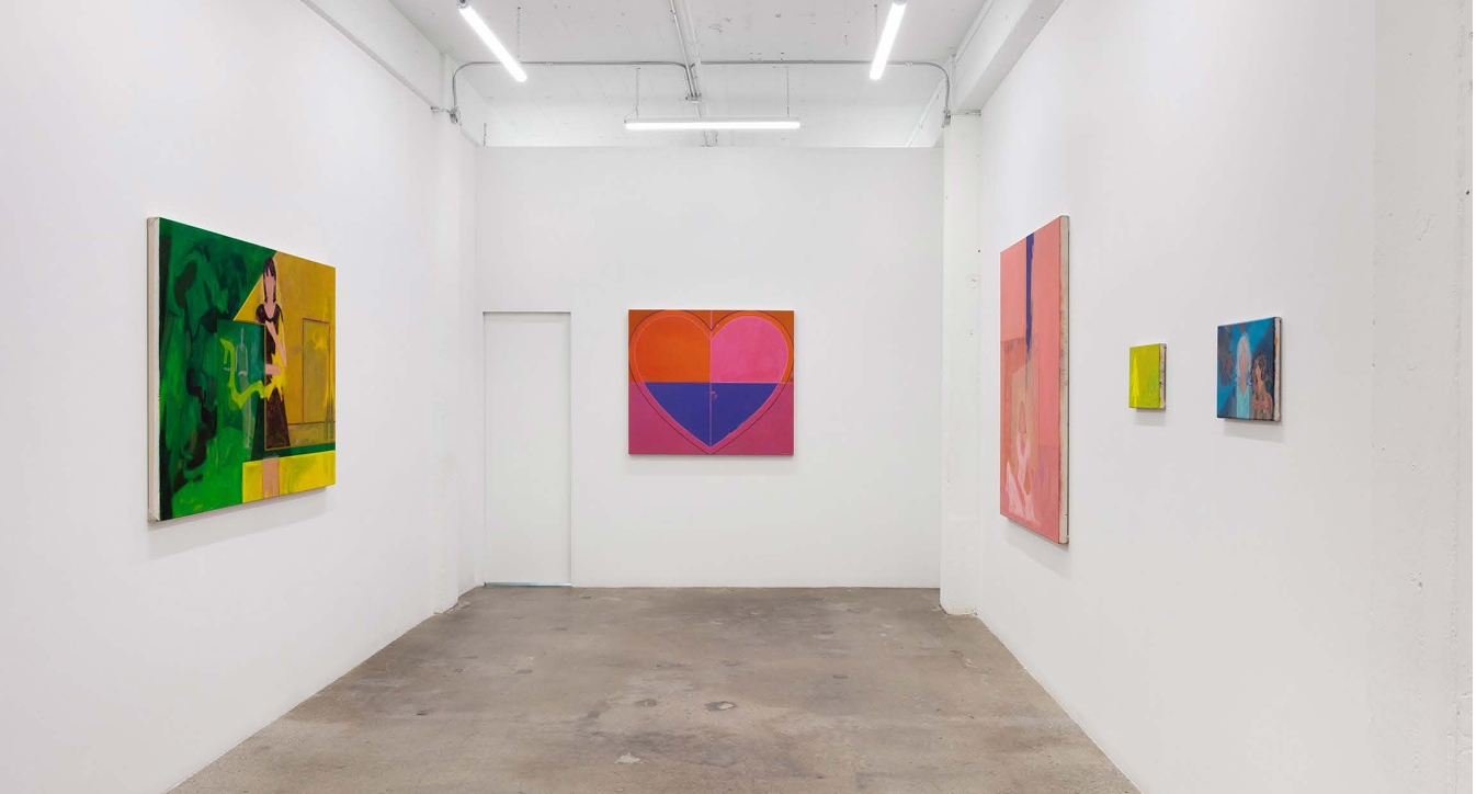
    Installation view of Fran Williams, Heartbreaks at Franz Kaka, 2025.

    Williams’s contrasting composition portrays the spectrum of femininity. The opposition created by the artist’s use of bold colours and delicate subjects ultimately culminates in the “eternal girl,” an ideal of femininity that lies at the centre of Williams’s paintings. The “eternal girl” serves as a point of recognition and tension; the juxtaposition of her petite and vulnerably positioned physique against a large canvas, along with short yet conservative dresses and stylized hair that frames an impersonal face, underscores abstract ideas and characteristics that embody the stereotypical ideal of femininity that the world continues to uphold.

    At the opening night, I had various conversations throughout the evening where viewers contended with their own reading of the exhibition, sparking various interpretations of the concept of the “eternal girl.” Art critic Tatum Dooley made a clever comparison to the complex, yet deeply relatable women in Sofia Coppola’s films, likening the “eternal girl” to the Lisbon sisters in The Virgin Suicides and Marie Antoinette. On the other hand, Sam Alkan, a fellow student and writer, compared the character to the artist herself, sensing that the “eternal girl” must be a reflective outlet for her own experiences with femininity.
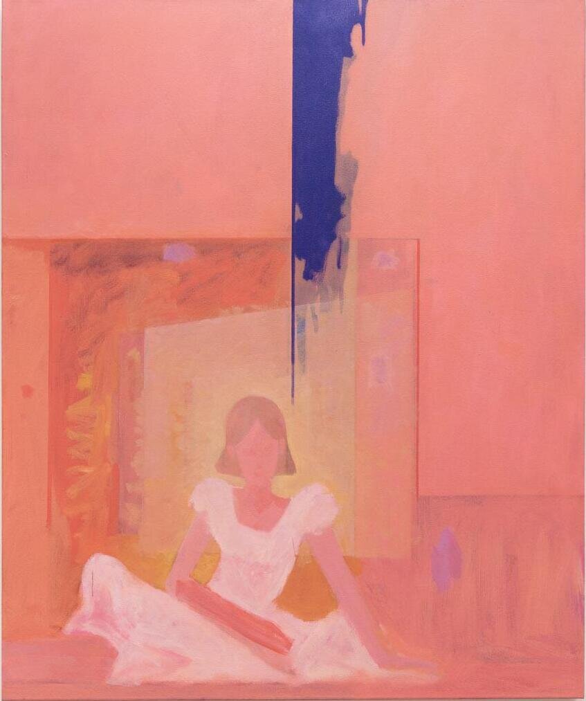
    Fran Williams, Pftjschute!, 2025, oil on canvas, 59.25 x 49 in.

    From my perspective, the “eternal girl” may be understood as a Platonic concept, as her balanced stance on the spectrum embodies the highest form of femininity in the realm of ideals. The rest of us in the material world, that is, on earth, hold a smaller aspect of this ideal within ourselves, as we ourselves are extensions of the ideal by our relation and experience to femininity. This allows us to gain some understanding of this abstract form. Still, we differentiate from this ideal and its world through our own individual characteristics, making the “eternal girl” a transcendental and visceral abstract of womanhood.
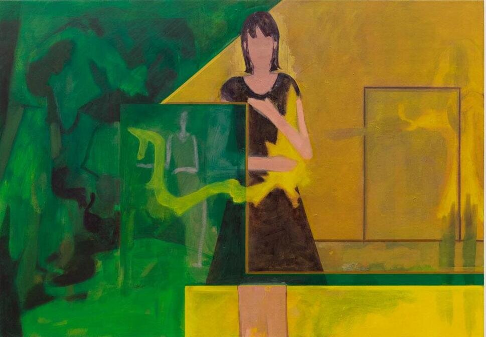
    Fran Williams, crave&home / retrieval, 2025, oil on canvas, 42 x 60 in.

    In cave&home / retrieval, the concept of desire is depicted through an “eternal girl” who is depicted alongside her artistic work, illustrating the direct connection between herself and her desire to create. That connection is represented by the yellow energy extending from her heart, binding her and her work as one. This piece embodies Williams’s literal definition of a “heartbreak” as a heart that breaks solely to release one’s will to act to fulfill one’s desires. Thus, for the artist, a “heartbreak” serves as the starting point of our desire’s extension into the world. We carry desire in our hearts only for them to break, liquefy, and ultimately reshape into an expression of ourselves in whatever way we choose to materialize it in the world.

    cave&home / retrieval captures the process of creating art, making a meta-reference to the artist’s own process. The process is documented in what may be interpreted as a timeline, moving from left to right. It begins on the green-tinted portion of the canvas, where a woman sits diligently at work, bent over a desk, possibly creating the painting that the “eternal girl” in the center of the work holds. On the right, a faint figure, possibly in the yet unset future, faces a wall. Following in the story, she may be hanging the artwork, marking the end of her desire-driven process of creation. The scene is illuminated by a cheerful, yellow light that acknowledges its radical difference to the bold, dark green; this contrast represents the extreme ends of the feminine spectrum as angst and delicacy.
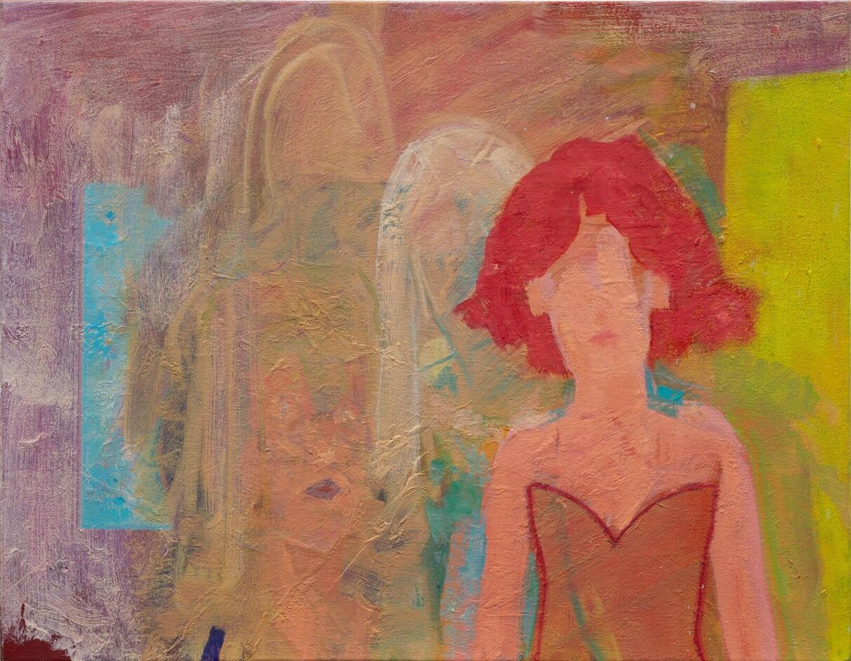
    Fran Williams, Em, 2025, oil on canvas, 14 x 18 in.

    Desire and femininity differ in definition and concept; however, Williams underscores how both align in their elements of contrast and abstraction. Desire is an abstraction of our will, a force of energy; it is unseen but felt. Its contrast lies in its materialization in the real world, through which we act as the medium, as the painting cave&home / retrieval demonstrates. Femininity, as the “eternal girl” embodies, has an abstract yet visceral connection to women. Its contrast lies in its ends of bold angst and sweet grace, as Williams’s use of colour also illustrates.
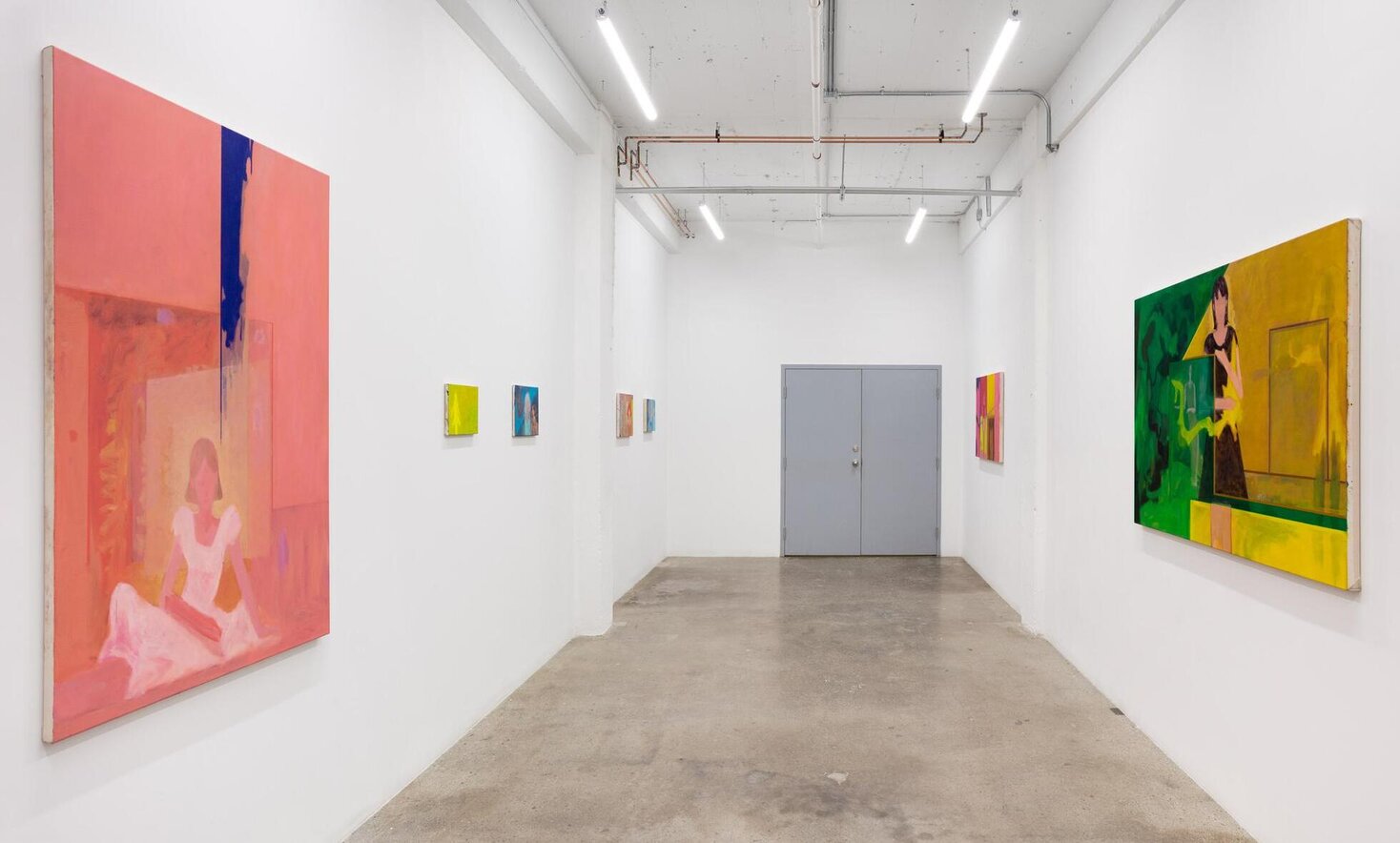
    Installation view of Fran Williams, Heartbreaks at Franz Kaka, 2025.

    I invite the reader to attend Fran Williams’s Heartbreaks at the Franz Kaka Gallery to personally engage with these thought-provoking pieces.

    Antonella Pecora Ruiz

    Images are courtesy of Franz Kaka.

    *Exhibition information: Fran Williams, Heartbreaks, May 30 – June 28, 2025, Franz Kaka, 1485 Dupont St. #208, Toronto (access at 300 Campbell Ave). Gallery hours: Thursday – Saturday 12 – 5 pm.

  • Portraits Inc. at Gallery 1313

    Portraiture is one of the oldest art forms. In the past it had the function of ‘remembrance,’ but with new technology, like photography, there are more productive methods to preserve those we want to remember. So, what might we be able to learn from contemporary portraiture? I’ve always thought that making a portrait, whether it be of oneself or of another person is one of the most vulnerable and intimate activities one can partake in. The Portraits show at Gallery 1313, although diverse in styles, still manages to create a sense of intimacy and closeness with each piece.

    Installation view of Portraits Inc. at Gallery 1313

    Portrait Inc. in the Process Gallery is an exhibition made up of 16 artworks by 10 different artists. A show about introspection and reflection, perhaps even connection and empathy for others, expressed in numerous mediums, forms, colours, and sizes.

    The moment viewers enter the room; they are faced with the intense glare of an elderly man. Aging Textures (Old Man) is a large black and white piece. The title suggests that the highlight of the work should be the thick textured paint strokes that decorate the man’s face. In the debate of photography vs. painting, this work offers a three-dimensionality and character that photography would not be able to convey. It celebrates the texture of aging skin which seems to be important in a society that praises a forever young appearance, even as one approaches seniority.

    Anika Becker, Aging Textures (Old Man), acrylic, 24 x 30 in.

    Other pieces in the show incorporate three-dimensionality, like the works by Michaela Lucio who chose to add embroidered elements to her ethereal, vibrant pieces. The woven elements paired with the homely scenes create a soft and gentle family picture. 

    Michaela Lucio, You Tie Me in Knots, waxed watercolour on frosted mylar mounted on canvas with hand-stitched embroidery, 12 x 12 in.

    There are also some incredibly colourful and lively pieces such as those by Kelly Rose Adams or Nicole Banton. They both feature a woman avoiding eye contact with the viewer. These self portraits show a cold and distant persona depicted with saturated colours. The stories the artists are trying to tell through these contrasting elements is intriguing and a vivacious visual experience.

    Kelly Rose Adams, Self Portrait at 27, oil on canvas, 16 x 20 in. (left) and Nicole Banton, Self Portrait Digital, print on oil silkscreen (right)

    Another piece with a vibrant palette and a convoluted narrative is titled Vomit in my Tub, which is adorned with bold, strong colours but represents a sorrowful and vulnerable scene. I find portraits where the person shown is not directly engaging with the public, to be disturbing. Did the person know they were being seen or are we, as the viewer, prying into something that they would have preferred to remain private. 

    Brina Taneja, Vomit in my Tub, acrylic, 42 x 36 in.

    Michael Bedford painting depicts a vulnerable dark and gloomy scene where a man covers his face although he stands almost naked. Is he ashamed of his body?

    Michael Bedford, Untitled, oil on cotton, 16 x 20 in

    Kaeli Stein’s two charcoal portraits with beautiful technique and intricate detailing are stellar pieces in the exhibit.

    Kaeli Stein, Lulu (left) and Vogue (right) both charcoal, 16 x 12 in

    The exhibit is a thoughtful, dynamic show that fills the room with different intimate stories for the public to explore.

    Sofia Diaz Aguilar

    Images are courtesy of Gallery 1313.

    *Exhibition information: Portrait Inc. / Group show, June 11 – 22, 2025, Gallery 1313, 1313 Queen Street West, Toronto. Gallery hours: Wed – Sat 1 – 5 pm, Sun 1 – 4 pm.

  • Pierre Dorion: CDMX at Blouin Division Gallery

    Corridors suffused in light, petal pink portals, a grid with colours shining through – are the visions encountered in Pierre Dorion’s CDMX at Blouin Division Gallery, Toronto. The Canadian painter’s works are in conversation with the works of Mexican architects such as Luis Barragán and Ricardo Legorreta. CDMX concentrates on the richness of colour, clean lines, and transforming modern architecture into a canvas.

    Exhibition view of Pierre Dorion, CDMX at Blouin Division Gallery

    Depicted on a landing between white stairwells, there is a magenta door. The pink is saturated so deeply that the surrounding walls take on a pale cotton candy hue. Within the doorway is a coral glow, a source of brightness and warmth forming the focal point of the painting. Dorion’s Casa Gilardi IX (2024) maintains the meditative yet stimulating quality of Barragán’s use of space and colour. The vision of the door is a fitting way to commence CDMX, entering a space of architecture, painting, and sculptural uses of light and colour.

    Pierre Dorion, Casa Gilardi IX, 2024, oil on linen canvas, 33 x 25 in.

    Vivid colours are constant throughout the exhibition, such as the amber and saffron hues suffusing the light in the Casa Gilardi series. Dorion manages to create an otherworldly light emanating behind columns and upon doorways.

    Pierre Dorion, Casa Gilardi XIII, 2025, oil on linen, 60 x 45 in.

    Pierre Dorion, Casa Gilardi X, 2024 and Casa Gilardi X-b, 2025, both oil on linen canvas, 60 x 45 in.

    In contrast, several of Dorion’s works contain vibrant blues: sapphire, azure, cornflower, and cobalt. The various shades come together in layers, showcasing the light falling into space. Within the details of Camino Real VIII, the layers are especially apparent, recreating the shifting movement of sunlight from a window. Dorion’s Camino Real series depict the elements of the architectural and interior design of Legorreta’s Camino Real Hotel in Mexico City.

    Pierre Dorion,  Camino Real VIII, 2025, oil on linen, 84 x 60 in.

    In Camino Real V (2024) there is a grid rendered with a sense of perspective. The blue or yellow background radiating through the grid creates an especially captivating visuality. One might expect that the scarlet or carmine will dominate, but the structure of the grid holds all the colours – creating a conversation between light and architecture.

    Pierre Dorion, Camino Real V, 2024, oil on linen, 72 x 54 in.

    In a smaller gallery there are three works balanced between warm and cool tones, Pedregal (2024), Pedregal II (2024), and Casa Barragan III (2024). In Pedregal, there is a closed door with frosted glass panels. The remaining space includes shallow steps leading away from the door towards a cooler area. There is a soft glow coming from the right, beyond the door and illuminating the partitioned section, presenting two different directions. The gallery also contains two more works with imagery of doorways and staircases, reinforcing that this is a transitional space.

    Pierre Dorion, Pedregal, 2024, oil on cotton canvas, 60 x 45 in.

    The third gallery contains pieces that contrast the warmth and vibrancy of the other artworks in CDMX. While the Casa Gilardi series contains vivid and bold colours, Bichromes (Grande grille) (2025) and La ferme des frères Thibault (2025) are muted and subtle. The subdued palette of La ferme des frères Thibault captures the isolation of rural winter life. Within the scene there is a farm situated among trees, the crispness of the snow is palpable. Beside the painting there are five small panels, each containing colour samples from the landscape. The adjacent wall holds a large collection of similar panels, like Bichrome. This vision of cool tones is inspired by the Québec landscape.

    Pierre Dorion, La ferme des frères Thibault, 2025, oil on linen, 6 elements, 5 (on the left) 10 x 8 in, 1 (on the right) 33 x 22 in.

    Dorion’s contemplation of Barragán’s and Legorretta’s oeuvre highlights the fundamental aspects of their architecture: sculptural use of light, space, and vivacity of colour. Dorion also recognizes the value of soft and muted tones, inspired by the landscape around his home in Québec. His use of cropped perspectives of architectural elements gives focus to the minute details that bring life and a dynamic quality to the depicted spaces. The paintings are mysterious – given what is not pictured: where do these doors lead? What lies beyond them? What is being seen? In CDMX Dorion depicts the sights with rapt attention, merging minimalist, abstract, and realistic approaches.

    Exhibition view of Pierre Dorion, CDMX at Blouin Division Gallery

    Rashana Youtzy

    Images are courtesy of Blouin Division Gallery.

    *Exhibition information: Pierre Dorion, CDMX , May 8 – June 21, 2025, Blouin Division  Gallery, 45 Ernest Avenue, Toronto. Gallery hours:  Wed – Sat 11am – 6pm.

  • Steve Rockwell / Opening Reception

    Steve Rockwell: Meditations in Space Opening Reception

    June 5, 2025, 6 – 8pm / Sheff Contemporary, 1276 Danforth Ave, Toronto

    Steve Rockwell holding the d’Art burger issue of d’Art magazine

    Steve Rockwell, artist, publisher of d’Art International magazine and co-publisher of Artoronto.ca and I could possibly add archivist to his list of roles in the Toronto art scene. In 1988 Rockwell pounded the pavement visiting as many galleries as he could and had them all listed in tiny cubes in a box like frame. The black shoes that took him on this journey were encased in an acrylic glass case. All the galleries he visited are listed on the sides of the glass case.

    Gallery Space (Shoes), 1988, acrylic, wood floor, shoes, 14 x 14 x 15 inches (left) and Gallery Space, 1988, house paint on mahogony panel and card, laser transfer text, 14 x 14 x 2 inches (right)

    Rockwell painted his portrait on several canvases sporting a goutee.

    Meditations on Space, 1996, acrylic on masonite, 32 x 32 inches (Inspired by the September 20, 1995 visit to Galerie Jamile Weber in Zurich, Switzerland)

    Delicious d’Art burgers were served by Saeed Muhamed, now the owner of Sheff Contemporary. The walls in the back were covered with oil and collaged works derived from d’Art magazine pages.

    Steve Rockwell introduces d’Art magazine pages to visitors

    A video in the back room screened the making of the d’Art burger with several artists portrayed as part of that issue. Several colleagues took time out to catch Rockwell’s exhibit. Curator, artist and art educator Janet Bellotto was present with her husband as was co publisher of Artoronto.ca, Emese Krunak-Hajagos. Together Steve, Emese and I started Artoronto.ca over 14 years ago.

    Chantel Blicker (left) and Roy Bernardi (right)

    Dick Van Wyck (left) with Steve Rockwell (right)

    (L-R) Steve Rockwell, Janet Bellotto and Sumi Ghose

    Rockwell had recently gone on a similar journey to document the current roster of art galleries in Toronto, so it was of interest to compare the 1988 compilation with the present. Meditations in Space is a clever and engaging exhibit presented by Steve Rockwell capturing the past and bringing us to the present. The exhibit continues for the month of June; you can visit by appointment only (416-792-7792).

    Text and photo: Phil Anderson

  • An Impossible Address at Mercer Union

    An Impossible Address by Suneil Sanzgiri at Mercer Union is a powerful and intimate film that narrates the struggles of colonial liberation in Goa, Angola and Mozambique. It is an extremely touching and brooding film that was designed in such a way that visitors become truly entranced by it. This, in turn results in a dramatic, emotional experience that sends chills through one’s spine.

    The film is composed as a series of letters to Sita Valles, a doctor and revolutionary, a woman of Goan origin who fought for the liberation of the Angolan people and was later killed by the post-independent Angolan government in 1977. Through these ‘letters,’ visitors learn of the turbulent times revolutionaries faced to gain freedom and what happened after they had achieved it.

    Subtitles reads ‘After independence what happened?’

    As one approaches the show room, the film’s audio grows stronger and stronger, until the moment visitors step into the dark, crisp room where they become enveloped in the environment Sanzgiri has created. In front of the projected film stands a wooden table with red chairs to seat while watching the movie. As the video approaches its apogee, a series of images start to become familiar to viewers, even if they have no prior knowledge of Mozambique, Goa or Angola. The very chairs on which the public is seated are featured on the screen as well. Revealed to the viewer with a beautiful and staggering animation of red chairs free falling from the sky, and a scene from a political conference in which the table and chairs reappeared. Perhaps having the public be seated in these chairs is a way to encourage a sense of solidarity and empathy, not just with the individuals met on screen but with every person they encounter moving forth; it encourages kindness and compassion.

    The audio was the most staggering and impactful experience for me; one could close their eyes and still feel the same level of emotion from the dialogue, music, the drumming, and the whole audio curation. The language the artist employs throughout the film is familiar and personal, but still, there is pain embedded into the piece that is palpable in the room. Framing the projection of the video, there are 29 acoustic felt sound blankets that are representative of the 29 flags that were present at the Bandung Conference in 1955. The absence of any iconography of the flags gives the floating fabrics a phantom essence. It is hard to ignore the presence of ghost-like figures in the room, from the ghostly flags to the conversations with those who were taken from us, and the phantoms of a hope for freedom.

    Finally, as the credits start to roll in, one may appreciate that this striking work is the result of the collaboration of many, in a winsome way resembling the revolutionary movements that were represented. The words of the Chilean song for revolution “El pueblo unido jamás será vencido” (The people united will never be defeated) is one of the reverberating messages that I was left with as the show came to an end. What does it mean for pieces like this to be created in our modern world? Pieces that talk about revolutions that happened around 50 years ago, what can we learn from these memoirs? In a walkthrough of the exhibition the artist mentions of the process of working with film, he says that “there is no guarantee when working with film that the image you are seeking to create ends up being the image that results.” Sanzgiri relates this artistic process to that of political struggle, “how one fights for a world that they may never see.” In the context of An Impossible Address, I find it is crucial to not let the memory of those who fought before us die, and to not allow those freedom fighters to have died and worked in vain. Films like Sanzgiri’s become essential because with conscience and reflection we may avoid making the same mistakes that were made in the past.

    Text and photo: Sofia Diaz Aguilar

    Images are stills from An Impossible Address a film by Suneil Sanzgiri.

    *Exhibition information: Suneil Sanzgiri, An Impossible Address, April 12 – June 14, 2025, Mercer Union, 1286 Bloor Street West, Toronto. Gallery hours: Tuesday – Saturday, 11am – 6 pm.

  • Three exhibitions at Gallery 1313

    Gary Blundell and Victoria Ward: Rural Living at the Main Gallery

    The exhibition by Gary Blundell and Victoria Ward displays works they’ve created over the last seven years. In the show, they explore the theory “that the wilderness is a construct and that humans re-invent it every time they visit.” It involves a series of textured abstract paintings in red, orange, black and white hues and another series of ghostly dwellings in front of chaotic backgrounds. The artists are addressing the relationship between the wilderness and humans.

    Installation view of Rural Living

    Gary Blundell large works appear to be random and abstract compositions of animated amoebic forms. The soft curving shapes dance along the canvas and fill it with textures, colours and energy. At first sight, it reminded me of the images seen when looking into a microscope. Blundell wrote in his artist statement that he was inspired by the topography of Lake Huron. He has a lyrical relationship with the lakeshore as he depicts them through the aerial views, colours, shapes and movement. It is important to remember that we are all interconnected and form a part of a larger, older system that keeps us, our environment and our land in order.

    Gary Blundell, Red Polls, 2024, oil and pencil on canvas, 48 x 30 inches

    The powerful reflection evoked by Blundell’s artwork is accompanied by Victoria Ward’s pieces. They bring up themes of isolation, solitude, and abandonment. Rainbow Shack depicts a phantom-like house but there are no human figures near it. Instead, the house is surrounded by rough brushstrokes, bright colours, and a sort of aggressiveness that envelopes the small house. I understand this as a visual representation of the wild taking back what has always been rightfully its.

    Victoria Ward, Rainbow Shack, 2014, acrylic on wood, 24 x 24 inches

    Rural Living is a wonderfully rich and radiant exhibition and is deeply thoughtful. I found the show to be a pensive and exciting journey through the unseen rural landscapes of Ontario.

    Eco Art / Group Show in the Process Gallery

    The Eco Art exhibit is a group show curated by Phil Anderson that includes paintings, collages, photographs, sculptures, and more mixed media pieces. While the mediums and styles are wide-ranging, the theme manages to stay straightforward and cohesive. It is amusing to observe and appreciate how different artists take the same subject and interpret, represent, and express them in varied and creative ways.

    My favourite is Bound in Reverence, a striking piece by Sophia Poland Noetzel. The artwork is composed from a set of antlers that hang from the wall, and right below them, a deer skin has an imprint of two deer fighting. I gravitated towards this work because I was intrigued; why an artwork made from animal remains would be included in a show about creating conscience and opening a conversation about environmental issues. The artist explains in her statement that coming from a hunting family and having been surrounded by taxidermy in her childhood, she developed an interesting, complex, and at times conflicting relationship to the life and death of the deer. She is seeing the taxidermized bodies as objectified beings that only gain value through death as well as a monument or memorial to honour the life lost. The conversation regarding the life and death of deer in this artwork is haunting and creates a captivating piece to include in an exhibition about environmental issues.

    Sophia Poland Noetzel, Bound in Reverence, mixed media, 27 x 38 inches

    Fester + Bloom by Maddie Wilmink and Ode to the Fallen by Kate Greenway pay homage to animals. They are trying to tell the viewers that “what you are expecting to see is not what is represented”. Th colours employed in Ode to the Fallen is reminiscent of landscape watercolour images, where the attractiveness of the environment is celebrated. However, Kate Greenway’s painting is more meditative and poetic, as she is paying tribute to those birds, who have fallen. Comparably, the delicateness explored in Fester + Bloom is at odds with the two larvae drawn, since larvae are usually seen as unattractive subjects. The two images are juxtaposing each other. Greenway depicts the death of a bird while Wilmink focuses on the beginning of life, as a larvae will turn into a beautiful butterfly.

    Kate Greenway, Ode to the Fallen, watercolour, 13 x 26 inches

    Maddie Wilmink, Fester + Bloom, mixed media, 12 x 25 inches

    Neoliberal Shipping Containers by Gregory Brown is more conceptual, with a background full on shipping boats and a bright pink piece of fabric. There is a writing on it, “a gay guy once told me speedos are single use” that brings attention to the consumerism in our society that demands so much of our environment.

    Gregory Brown, Neoliberal Shipping Containers, acrylic on board and speedo, 18 x 24 inches

    The two works by Paul Brandejs that placed to mirror each other are sculptural, 3D paintings. They look like images from a dream or a hazy memory. Characterized by the blue hues depicting lake or forest scenes at night, these works symbolize fragmentation, while the reddish clouds suggest air-pollution. When closely inspecting them, viewers can admire the entanglement of strings of acrylic paint and other 3-D aspects, an interesting use of acrylic.

    Paul Brandejs, The Lone Sentry, 2014, acrylic on shaped canvas, 39 x 34 inches

    The Eco Art show is a perfect, straight-forward culmination to the environmentally conscious exhibitions that currently flood Gallery 1313. In diverse and creative ways, each artist calls attention to the wounds our environment is facing and makes it impossible to ignore the discussions that must be held regarding the current environmental precariousness.

    Michelle Montague: Highlights from Memory at the Cell Gallery

    Entering the room we see eight beautiful landscape paintings. The airy brushstrokes give them a flow, a movement. Looking at Autumn Sky I imagine the sound of the rustling leaves and the crisp air that whispers through the greenery. I picture birds chirping and flying over me as the sun prepares to set, and as I walk further into pathway, I notice the crunchy leaves beneath my feet. Montague captured the forest so well, reminding us that these genuine moments in nature are essential for all.

    Michelle Montague, Autumn Sky, oil on canvas, 43 x 40 inches

    I particularly appreciate the winter scenes like Under the Moonlight and The Stillness of Night, where the details of the landscape immerse the viewers into the chilly images: the swooshing waves, the wet sand being illuminated by the moonlight, or the naked tree branches and the footsteps imprinted into the snow.

    Michelle Montague, Under the Moonlight, oil on canvas, 40 x 24 inches

    Sitting among the artworks, I reflect on the importance of capturing these ephemeral moments among the ruffled trees, the green pastures, the flowing stream, and the snowy trails. I ponder on the words the artist wrote, reminding of the vitalities of nature, its rejuvenating power and the essential and intrinsic connection that exists between humankind and nature. The artist was interested in a moment of quiet contemplation, and I think she depicted it wonderfully.

    Sofia Diaz Aguilar

    Images are courtesy of Gallery 1313. Photo: Phil Anderson

    *Exhibition information: Rural Living; Eco Art 2025 and Highlights from Memory, May 28 – June 8, 2025, Gallery 1313, 1313 Queen Street West, Toronto. Gallery hours: Wed – Sat 1 – 5 pm, Sun 1 – 4 pm.

  • Muqarnas at the Aga Khan Museum

    The rain is ill-timed but not unwelcome as this year’s CONTACT Photography Festival takes me to the park of the formidably designed Aga Khan Museum. Winding around the building’s perimeter, along the park’s path, are double-sided panels, each with their own unique story to tell. While overcast, the clouds do nothing to hinder the work of Glenn McArthur’s outdoor installation. His contribution to this year’s festival is Muqarnas: Form and Light, a collection of images illustrating and appreciating what is the pinnacle of Islamic architectural design.

    Used primarily in the Islamic world, muqarnas are a hallmark of architectural ornamentation, most found in domes, half-domes, vaults, and entrances of palaces, mosques, and other structures. Their designs are notable for their intricate, three-dimensional geometric and stalactite-like forms. Originating in the 10th century, the design gained popularity and rapidly spread throughout the Islamic empires. Their function is to serve as a transition between shifts in architectural structures, such as from a square base to a circular dome. However aesthetically, they dissolve solid surfaces into complex, visually faceted networks of cellular niches. Their designs reflect the Islamic artistic preference for abstraction, repetition, and the infinite – all core principles aligned with spiritual and metaphysical themes.

    Glenn McArthur, Abd al-Aziz Khan Madrasa, Bukhara, Uzbekistan, from the series Muqarnas: Form and Light, 2021-ongoing. Courtesy of the artist

    Having visited nine countries and over three hundred sites for his research and photography, McArthur conveys the opulence of these muqarnas by expertly capturing the light in a way to amplify their depth and dimension. Assistant Professor at OCAD U, McArthur has won several awards for his books on architecture and design and was recently presented with the Certificate of Recognition by the head of the Islamic Arts Festival at the Lahore Museum in Pakistan for this very exhibit.

    The first panel features the muqarnas above a domed portal to the Al-Rifa’i Mosque in Cairo, Egypt. Completed in 1912, this stone muqarnas is designed in a Neo-Mamluk style, characterized by its tall portals, minarets, and domes, its creative floor plans, and its elaborate use of ablaq, a technique of alternating different colours of stones for visual effect.

    Glenn McArthur, Muqarnas: Light and Form, 2024. Al-Rifa’s Mosque, Cairo Egypt, 1912, from the series Muqarnas: Form and Light, 2021-ongoing. Courtesy of Aga Khan Museum. Photo: Aly Manji

    The design pulls the viewer in, and one cannot help but wonder if the stones are rotating like the heavens. It is believed by some that these architectural delineations are meant to represent the universe, its vacillating nature, and its relationship with God. And, indeed, it is not difficult to see why: the photograph conveys the vastness of the structure, almost as though the mosque were stretching before the viewer. To instill such awe through art and architecture truly speaks to the quality of the craftsmanship behind these muqarnas and the skill of McArthur’s photography. 

    Another panel is of the Capella Palatina in Palermo, Sicily, Italy. Completed in 1140, this wooden and painted muqarnas was commissioned by Norman Christian monarch Roger II. The intricately designed cells depict scenes of mythical creatures, gardens, animals, and court life. It is a rich blend of Fatimid, Byzantine, and North African influences and serves as a representation of Roger II’s multicultural ambitions. Around the cells are script in Kufic, an acknowledgement of the monarch’s power and prosperity.

    Glenn McArthur, Muqarnas: Light and Form, 2024. Capella Palatina in Palermo, Sicily, Italy, 1140, from the series Muqarnas: Form and Light, 2021-ongoing. Courtesy of the Aga Khan Museum. Photo: Aly Manji

    The photographs are so large one can step in close and view the detailed scenes. This detail features eight petals in an octa gram. Four men are painted in the top, bottom, left, and right petals with nuanced designs separating them in the interim petals. They are painted in an Arabic style.

    Glenn McArthur, Muqarnas: Light and Form, 2024. Capella Palatina in Palermo, Sicily, Italy, 1140, detail, from the series Muqarnas: Form and Light, 2021-ongoing. Courtesy of the Aga Khan Museum. Photo: Aly Manji

    The scenes do not depict any narrative; it is a random assortment of images with multicultural influences. But the muqarnas is an excellent synthesis of numerous artistic traditions that reflect the monarch’s governance and ambition.

    What is striking about this exhibit that is no muqarnas are alike: each have their own characteristics and quality, yet they elicit awe and instill reflection in equal measures. An example would be the singular Amber Fort in Jaipur, India, created in the 17th century. The Shish Mahal, or the Hall of Mirrors, is embellished with a mosaic of convex mirrors and coloured foil, the intention for which was to coruscate in the candlelight at night. Or the Çoban Mustafa Paşa Complex, which features a strong Mamluk influence in the muqarnas carvings of black and gold.

    Glenn McArthur, Muqarnas: Light and Form, 2024, Çoban Mustafa Paşa Complex, Gebze, Turkey, 1512-1520, from the series Muqarnas: Form and Light, 2021-ongoing. Courtesy of the Aga Khan Museum. Photo: Aly Manji

    Further along the path, the project shifts into a photographic reconstruction of great ambition and intention. Entitled Endangered Monuments, this panel calls attention to the threatened and destroyed Islamic buildings, either at the hands of extremist iconoclasts or war. To truly emphasize their significance and fragility, the Aga Khan Museum partnered with the Aga Khan Documentation Centre at the Massachusetts Institute of Technology (MIT) to retrieve documented archival photographs of razed muqarnas structures. This panel honours and preserves their architectural splendor.

    Documentation panel of the Great Mosque of Aleppo, Syria. Courtesy of the Aga Khan Museum. Photo: Aly Manji.

    Crafted across centuries and regions, muqarnas not only adorned sacred and monumental spaces but also embodied the synthesis of artistic aesthetic, scientific knowledge, and spiritual symbolism that defines much of Islamic art. These intricate architectural features showcase a remarkable blend of mathematical precision, skilled craftsmanship, and visually stunning complexity that is truly worth admiring. Glenn McArthur’s expert eye captures their dimensionality and architectural distinction with the respect and reverence these structures deserve. 

    Elin MacRae

    *Exhibition information: Glenn McArthur, Muqarnas: Light and Form, September 14, 2024 – September 14, 2025, Aga Khan Museum, 77 Wynford Drive, Toronto. Museum hours: Tue & Thu – Sun 10:30 am – 5:30 pm, Wed 10 am – 8 pm.

    Part of CONTACT Photography Festival.

  • Margaux Williamson at MOCA

    If you were asked to provide a glimpse into your life, what would you show? What traces of your persona would be included? Margaux Williamson presents her version in her exhibition Shoes, books, hands, buildings, and cars currently on view at MOCA.

    Installation view of Margaux Williamson, Shoes, books, hands, buildings, and cars, 2025. Courtesy of the artist.

    The exhibition space was bustling, filled with people in pairs and families with children. The images are substantial in size, like doorways, leading into the scenes depicted. The main space of the gallery, showing three large paintings, was buzzing with the energy of the visitors. Particularly captivating is Books and Pictures (2023). Like several of the pieces in the exhibition, it contains domestic elements. These often include chairs, mirrors, stoneware, or blankets and, in this case, stacks upon stacks of books. They seem as familiar as haphazard merchandise displays in used bookstores. The glow from a lamp carefully illuminates the space. The light is weak but still enough to distinguish the subjects in full. Shadow falls upon various books towards the base of the painting.

    Margaux Williamson, Books and Pictures, 2023, oil on canvas, 60 x 60 inches. Photo: Rashana Youtzy

    Williamson’s deft use of light is evident throughout her work; be it naturally mottled sunlight or the blue tint from a screen as seen in Living Room with Red Carpet (2024). This interior contains an upholstered chair on an ornate crimson rug with the glow of a laptop. In the background, there are several framed artworks along the wall. The sense of perspective is slightly muddled, showing how we register visuals at the periphery. The cool tones of the navy-striped armchair and the grey hue of the wooden cabinet are balanced by an otherwise warm palette. Most of the work in the exhibition maintain a warm palette, often using yellow undertones as opposed to blue.

    Margaux Williamson, Living Room with Red Carpet, 2024, oil on canvas, 70 x 100 inches. Photo: Rashana Youtzy

    The yellow undertones are also apparent in streaks of abalone-grey within Museum (2025). Structures like the columns at MOCA are replicated along with the sheen of the concrete floor. Situated at the approximate center of the exhibition, it functions as its core. Viewers sitting on the bench near the painting are taking a moment looking at the work—appreciating ‘the museum within the museum.’ Another aspect to note is the vacancy depicted in the image. I witness a family contemplating this piece, and in this way the painting becomes a collective encounter.

    Margaux Williamson, Museum, 2025 oil on canvas, 70 x 100 inches. Photo: Rashana Youtzy

    Williamson brings the same value of detail to the smaller images, like Flowers and Cup (2024). A paper cup is discarded in a green area where it holds its rigidity, seemingly about to roll further along the sidewalk. As the petals of the flowers wilt and fall, the biodegradable cup, too, will lose its form—possibly taking on the folds of a flower in a crumpled state.

    Margaux Williamson, Flowers and Cup, 2024. oil on canvas, 18 x 18 inches. Photo: Rashana Youtzy

    This realistic display of the minute details of life contrasts with the more surreal compositions as seen in River and Alleyway (2025). Here we move away from the domestic, approaching more commercial and urban spaces. Williamson complicates the setting by incorporating the natural spaces we so often seek amid concrete. Sweeping across the canvas is a river flowing, boardered by rocks and stones that appear to blend into the grey of the background building. The river is superimposed over the shadow of street signs and an industrial door, a fragment of a dream dappled with sunlight. While this depiction is not something we see in our daily life, perhaps it is a representation of our desire to combine the natural and urban settings of our world.

    Margaux Williamson, River and Alleyway, 2025. oil on canvas, 63 x 90 inches. Photo: Rashana Youtzy

    Williamson’s Shoes, books, hands, buildings, and cars holds a mirror up to our lives. The exhibition can very much remind visitors of the little moments in life: rolling out of bed, popping into a bookstore, a visit to the museum followed by a walk by streetlight on the way home. An unmade bed, a chair just pulled away from a table, the sight of a pepper mill sitting on a kitchen shelf. Are these details that make a home? A life? Having these moments painted and, in a way, romanticized, prompts appreciation for the experiences one might otherwise overlook.

    Rashana Youtzy

    *Exhibition information: Margaux Williamson, Shoes, books, hands, buildings, and cars, April 17 – August 3, 2025, Museum of Contemporary Art, 158 Sterling Rd, Toronto. Museum hours: Wed – Thu & Sat – Sun 11 am – 6 pm; Fri 11 am – 9 pm.

  • EXAUCÉ: Ballet Studies by Édouard Lock

    Exaucé. The transitive verb used to describe the actions “to fulfill,” “to grant,” “to answer,” or “to satisfy”. Pronounced ɛɡzose, the word seems to dance around the forms of movement captured by renowned choreographer, filmmaker, photographer, and founder of LaLaLa Human Steps, Édouard Lock. It’s on a journey to discover what facet of action is transient in each study. Is it looking “to grant” or “to fulfill”? Is it looking “to answer,” “to satisfy,” or to satisfy by providing an answer? There are moments of pause, moments of flight, and moments of reaction followed through by the dancers’ bodily motion laminated in black and white halo. Are they trying to fulfill the full extent of a pose or an emotion, grant a desire, or satisfy the present?

    Installation view with (L-R:) Édouard Lock, EXAUCÉ 26, 27 and 28 (1998/printed in 2025), digital giclee print on Hannemuhl photo rag paper, 17 x 22 inches

    The transient quality of each study perseveres in the blur of motions and the approach to the distortive logic of the photographic lens. Unable to have multiple takes, the preparatory work for each photo involved lengthy set ups such as making sure the distortions, or the blur effect were zoned in on the right body parts and verifying that the dancer was at the right distance from the camera. Despite the work done before each shot, there were still constraints that induced mistakes but were welcomed for its fresh take on approaches and options. In response, these photographs capture fleeting moments in the transition of movements, accentuated by the singular spotlight against the dark background and the blurred focus on the elongated legs of the dancers. This process reflects the soul of a combined contemporary dance and ballet pointe technique where structured dance inspires interpretation and improvisation.

    Édouard Lock, EXAUCÉ 22, (1998/printed in 2025)

    Battling the traditional ballet lines that emphasize an idealized construct, these photos prioritize other types of “distortions”. From the lens’ perspective, these distortions counteract the ineffectiveness of traditional ballet lines that are responsible for making a high leg extension approaching 90 degrees to look like a shortening of the limb. The ballet pointe, a technique that imbues resting the dancers’ entire body weight on the tip of their toes, amplifies the muscle tone and length of their legs. In that split second from par terre to en pointe, the spotlight moves from the dancer’s body to their legs, made prominent by the pointe technique and gaining authority as each pointe touches new ground. It is the focus of ballet movement and the focus of Édouard Lock’s distortions. Through this series of studies, the artist reimagines dance and movement through the lens by focusing on the complexity of movement patterns, the speed at which the dancers are moving, and the shadows that highlight muscle tone or conceal certain body parts. These qualities make up the vision of boundless movement, elegance, and beauty, not measured by idealized standards of proportions, gender, size, and age.

    Édouard Lock, EXAUCÉ 2, (1998/printed in 2025)

    As LaLaLa Human Steps enters a new era, lingering memories of the past are confronted with a desire to inquire about the gaps left by the absence of formal dance documentation. A mirage of snapshots capturing the fluidity of ballet movements and its elegance, the dark areas spilling into the negative space invite viewers to insert their own participation in the evolution of dance. The shadows aren’t only spaces of ambiguity and incompleteness, but an opposing force that works together with the light to direct the viewer’s eyes to the central elements of each study such as facial expressions and leg lines. It also works as a muting function on legs in par terre position in individual snapshots or when situated against legs in en pointe position, centering the gravity in each photo and the entire exhibit around the future in en pointe and the par terre past melted into the shadows.

    Édouard Lock, EXAUCÉ 24 (left) and 13 (right), (1998/printed in 2025)

    An analytical take on the dichotomy of deliberate and impartial photographs, these works express intention through setting up dynamic movement usually captured without any interference. In these repeating conjunctures of balance and imbalance, Édouard Lock uncovers an interspace image of soft lines and visionary construct of the company’s future. Drawn by natural influences, dancers captured as duets react to the imaginary forces surrounding their movements by either mirroring each other in opposing directions to create balance or imposing an imbalance by moving in the same direction. Solo posers are encouraged to engage with the fragmentary shadows, in search of forming a whole, whether it be working side-by-side or as a supporting role.

    Édouard Lock, EXAUCÉ 34 (left), (1998/printed in 2025) and entrance (right)

    Shown for the first time, this study series is a tribute and commemoration to the LaLaLa Human Steps’ transition from contemporary dance to ballet pointe technique, a culmination of the past and future focused on this pivotal moment.

    Text and photo: Sherry Qin

    *Exhibition information: Èxaucé: Ballet Studies by Édouard Lock, May 15 – June 7, 2025, Atelier Next Door (AND1357, 1357 Dundas St W, Toronto. Opening hours: Wed – Sat 11am – 7pm.

  • Sylvia Galbraith at Abbozzo Gallery

    Seeing Sylvia Galbraith’s Loretta’s Place in the catalogue for CONTACT 2025 I was hooked right away. Then I received an email from Abbozzo Gallery promoting Galbraith’s exhibition and the image looked as though it was in 3D—projected on the walls of the gallery. But when I finally visited the gallery, I saw the actual artwork—a large photograph on the main wall. I stood rooted in front of it, forgetting about the place and time— I just floated into its magic world.

    There are two different worlds combined into that one image of a rather abandoned looking room with a bedframe, as though someone had just departed or the room was waiting for a new occupant. There is a rug on the floor and wood we expect to see on the floor now on the ceiling. But what makes this image unique is the upside-down landscape on the walls. Galbraith used a camera obscura when photographing the landscapes in Newfoundland, so the images are inverted. But it is much more than that. Neither the room nor the rural landscape is interesting in its own. However, through combining them in this way, they undergo a metamorphosis. The interior opens and the landscape becomes part of the room, but not like a picture on the wall. Grass grows, buildings emerge, and we no longer know when the inside ends and the outside begins. Inside and outside become one, a mesmerizing symbiosis.

    Sylvia Galbraith, Loretta’s Place, 2019, archival pigment print, 60 x 90 inches. ©Sylvia Galbraith, courtesy of Abbozzo Gallery

    The Exhibition Statement mentions that the artist was “particularly interested in relationships between buildings and people”. However, none the photographs include people. Galbraith talks about people in their absence, like poetry does. The objects and landscapes resemble history, social status and there are real landscapes in their physicality. But what is physical? Can it be modified by our perception or even by the technique of the camera obscura? When does reality end and our dreams and memories start filling the place? In these photographs you can no longer separate them, they merge, creating an illusion that overshadows any possible reality. Looking at them you find yourself in a very different world, where interior and exterior no longer exist; an ethereal place has been created.

    Sylvia Galbraith, Afternoon Light, Bird Island, 2022, archival pigment print, 40 x 60 inches. ©Sylvia Galbraith, courtesy of Abbozzo Gallery

    The title of the exhibition What Time Is This Place?, is very important. The photographs depict the rural landscape of Newfoundland in reality, as an outpost with common buildings. How do those people get here? Why? Is it an escape or a conscientious choice? Do they fit in or misplaced? We can guess their history, past and present and their social status. In Loretta’s Place the bottom of the walls in the room are sky-blue, the landscape is green, the buildings are yellow and white while the floor, the bed and the ceiling are dark, creating a dramatic contrast. The bed made me think of possible interactions between objects and people. It is just the frame, hinting at the absence of a person. But what does an absence really mean? Years ago, when I moved into my apartment, there was abandoned furniture in it that an old person left behind. For some time, I felt the presence of him, like a imprint of his memory was still there. The same is true for Galbraith photographs. Loretta might be a poor person, in a small, rural place, who still needs to buy a mattrass and bed clothes. Very little else can fit into that tiny place. I think she is somewhat misplaced. This room can’t be the place she dreamed about.

    Gary’s Place, Living Room (2019) is a comfortable space with a couch and framed pictures on the wall, that are overlapped with the landscape. A piano at the wall suggests that he is a music lover. His story is very different from Loretta’s. I am aware that I am creating my own narrative here, and I am sure everyone else will do the same. It is a good thing to be so deeply involved in the image.

    Sylvia Galbraith, Gary’s Place, Living Room, 2019, archival pigment print on Hahnemuhle Gloss paper, 24 x 36 inches. ©Sylvia Galbraith, courtesy of Abbozzo Gallery

    Some of the photographs give away their locations, like Main Road with Boats and Butterflies (2022), where the landscape is dominant. It is a nicely painted room with an antique lamp and books on a dresser, suggesting that the person who lives in it can afford beautiful, expensive things. The landscape depicts a harbor and a more populated area, a village or a small town. Butterflies fly out of the landscape, further confusing the viewer about where the landscapes ends and the interior takes over. The ceiling is another photograph that looks like a rock with some grass. It is not easy to decipher what we see or where we are.

    Sylvia Galbraith, Main Road With Boats and Butterflies, 2022, archival pigment print on Hahnemuhle Gloss paper, 24 x 36 inches. ©Sylvia Galbraith, courtesy of Abbozzo Gallery

    Morning in the Red Cliffe Kitchen (2024), located in a town, where the only thing you can see is the wall and windows of the neighboring building, giving me the feeling of a suffocating, little space. Everything is old—almost grandmotherly—the stove, the couch, covered with a blanket, a chair with a pillow, the lace curtain. As in all Galbraith’s photographs, the colors are important. The vibrant reddish brown on the left contrasts the white stove, the shining kettle and the white fence, creating a quiet interior.

    Sylvia Galbraith, Morning in the Red Cliffe Kitchen, 2024, archival pigment print, 40 x 60 inches. ©Sylvia Galbraith, courtesy of Abbozzo Gallery

    Each photograph combines the inside of a living area with the surrounding landscape, focusing on the interaction between them. Every place has a strong impact on the people occupying them. Our personality is formed by our surroundings, whether it’s a busy city with noisy traffic or the countryside with a lake or ocean. According to that we become busy, hurried or eccentric, peaceful.

    Our influence on the landscape can be positive or hurtful. I also believe that we may influence the buildings we live in. Whatever we do—work, cook or play the piano—our happiness or sadness leave a print on the walls and our memories live on in them. These photographs capture these ideas beautifully. As gallery manager, Blake Zigrossi said, they are more than photographs, they are “meta-photographs”, metaphors of our life.

    Emese Krunak-Hajagos

    *Exhibition information: Sylvia Galbraith, What Time Is This Place?, May 9 – June 7, 2025, Abbozzo Gallery, 401 Richmond Street West, Suite 128, Toronto. Gallery hours: Tue – Fri 11am – 6pm, Sat 11am – 5pm.

  • Step Into My Shoes at the Clark Centre for the Arts

    Is it possible to experience someone else’s life? To understand their perspective and the way they navigate the world. Step Into My Shoes at the Clark Centre for the Arts is a photographic series that brings these questions into focus. The works by Anahita Kalilian and Riley Stewart showcase a range of footwear in captivating scenes. The subjects vary from metallic loafers and embroidered boot heels to bedazzled pumps and more. Also found within the compositions are mobility devices, including automated stair lift machines and wheelchairs.

    Installation view of Step Into My Shoes

    One of the first objects we encounter in Step Into My Shoes is a pair of black heeled boots embroidered with red, white, pink, and green floral patterns enclosed in a glass case. The exhibition is on three floors. Each floor presents three to four photographs in addition to actual footwear presented in a glass case that appears in the photography, such as the pair of pink Jacquemus block-heels in Its An Extension of Her Body (2019). This work is uncanny in its depiction of shoes and the tattoo of the woman’s arm, highlighted by multiple ring lights. Like tattoos, shoes and other adornments are expressions of style and taste and tell a lot about the person wearing them.

    Anahita Kalilian and Riley Stewart, Its An Extension of Her Body, 2019, UV cured vinyl print

    It is interesting how mobility devices are depicted in this show. Are they also an ‘extension’ of the body? Due to the shadowed settings that form the background, these mobility devices are inconspicuous. Viewers often see the footwear prior to the equipment. However, within works such as Turtle Or Rabbit Speed (2019), the footwear and the wheelchair both appear clearly to the viewer. The photograph is a winter scene, the snow creating a stark contrast between the background and the objects. There is a pair of lined Hunter boots at one end of the pathway leading to a home. In the middle of the shoveled path is a wheelchair. The Hunter branding of white, red, and black is recognizable for its popularity within Wellington boots, seemingly popping out of the photograph. Both the boots and the wheelchair represent a mode of travelling. In the boots you can move fast, while in the wheelchair your movement is somewhat limited. Or they might belong to the same person. 

    Anahita Kalilian and Riley Stewart, Turtle Or Rabbit Speed, 2019, UV cured vinyl print

    The shoe-subjects resurface in settings such as piers or beaches, the latter forming the background in Pop A Wheelie (2017). This photograph shows the wheel of the chair in profile, almost as though it is contemplating the water. On the sand in front of it is a tie-dyed blanket along with a pair of wedge sandals with wicker details. The smaller adornments of beads and flowers are also visible, emphasizing the coastal vibe. Where is the person who came here in the wheelchair? Does she still have some mobility to walk around, or even swim? Or is that person photographing this scene for future memories?

    Anahita Kalilian and Riley Stewart, Pop A Wheelie, 2017, UV cured vinyl print

    The warm tones of the interior are very inviting in Inspiring (2017). The shoe-subject in this work is a pair of metallic loafers, with a second pair in the background. It seems like it is applying gentle pressure to the pedals of the piano as if an invisible figure is sitting down to play. Signs of home are found in the scene: a family portrait atop a mantle, a stand of four guitars, an ornate rug with dust motes suspended in the air. There is also a wheelchair and a comfy armchair nearby. This room must belong to a disabled person with good taste, who is also a music lover and a player – showing that disability doesn’t always make a person unable to fulfill their dreams.

    Anahita Kalilian and Riley Stewart, Inspiring, 2017, UV cured vinyl print

    Upon leaving the exhibition I noticed a wheelchair at the end of the hallway behind a rope barrier. It took a moment to remember the photographs in which the wheelchair was found: home, beach, theatre, forest, and in that instant, a gallery. To whom does this wheelchair belong? Even is it a young or an old person, a man or a woman? After this exhibition we feel more connected to their lives as we have learned about their passions for music and beach outings. We are also invited to have a glance at Kalilian’s chic closet with all those fashionable shoes.

    Installation view of Step Into My Shoes

    Text and photo: Rashana Youtzy

    *Exhibition information: Anahita Kalilian and Riley Stewart, Step Into My Shoes, May 2 – May 31, 2025, Clark Centre for the Arts, 191 Guildwood Pkwy, Scarborough. Gallery hours: Mon – Wed, Fri – Sun 9am – 4pm, Thu 9am – 8pm.

    The exhibition is part of CONTACT Photography Festival.

  • Edward Musungu at CONTACT

    Edward Musungu: Celebrating the Heritage of Lake Turkana

    This year at the CONTACT Photography Festival, Edward Musungu’s photographic series is on display at Regis College. It offers a vibrant look into the Lake Turkana Cultural Festival 2024, held from June 7–9 in Loiyangalani, northern Kenya. Through his lens, Musungu brings to life the richness, resilience, and beauty of over fourteen ethnic communities that gather annually to celebrate their heritage.

    The Lake Turkana Cultural Festival is more than a cultural event, it’s a dynamic celebration of identity, history, and unity. Communities such as the Turkana, Samburu, El Molo, and Rendille showcase their unique traditions through music, dance, visual art, crafts, and ceremonial rituals. Musungu captures these moments with precision, providing an intimate look at traditions that are often overlooked in mainstream narratives.

    At Regis College, four striking photographs are mounted on a concrete wall, each filled with bold colors, raw emotion, and genuine joy. Accompanying them is a digital slideshow of additional photographs: women layered in intricate beadwork, elders wrapped in woven garments, children proudly draped in the Kenyan flag, and dancers caught mid-movement, their energy and pride leaping off the screen.

    In Musungu’s work, attire speaks volumes. Beads are carefully layered around necks, framing faces and cascading in vibrant patterns. These designs are not only visually striking but also deeply symbolic, reflecting communal identity, ancestral lineage, and cultural pride. Some color palettes echo the Kenyan flag, while others express individual and tribal identity.

    What shines through most is the spirit behind each image. Confidence radiates from women, men, elders, and children, each asserting their place within a legacy of resilience and belonging. These are not simply portraits; they offer an immersive invitation to celebrate the unity of the Lake Turkana Festival.

    Musungu’s series serves as a cultural archive and a contribution to the global art conversation. By spotlighting the histories, traditions, and joy of the Lake Turkana communities, Musungu reclaims space for African narratives and ensures that these voices continue to resonate far beyond the festival itself.

    Abuk Lual

    All images: Edward Musungu, Celebrating the Heritage of Lake Turkana, 2024. Photographs by Edward Musungu, courtesy of CONTACT Photography Festival.

    *Exhibition information: Edward Musungu, Celebrating the Heritage of Lake Turkana, May 1 – May 31, 2025, Regis College, 100 Wellesley St W Toronto. Gallery hours: Mon – Fri 8:30am – 4:30 pm.





