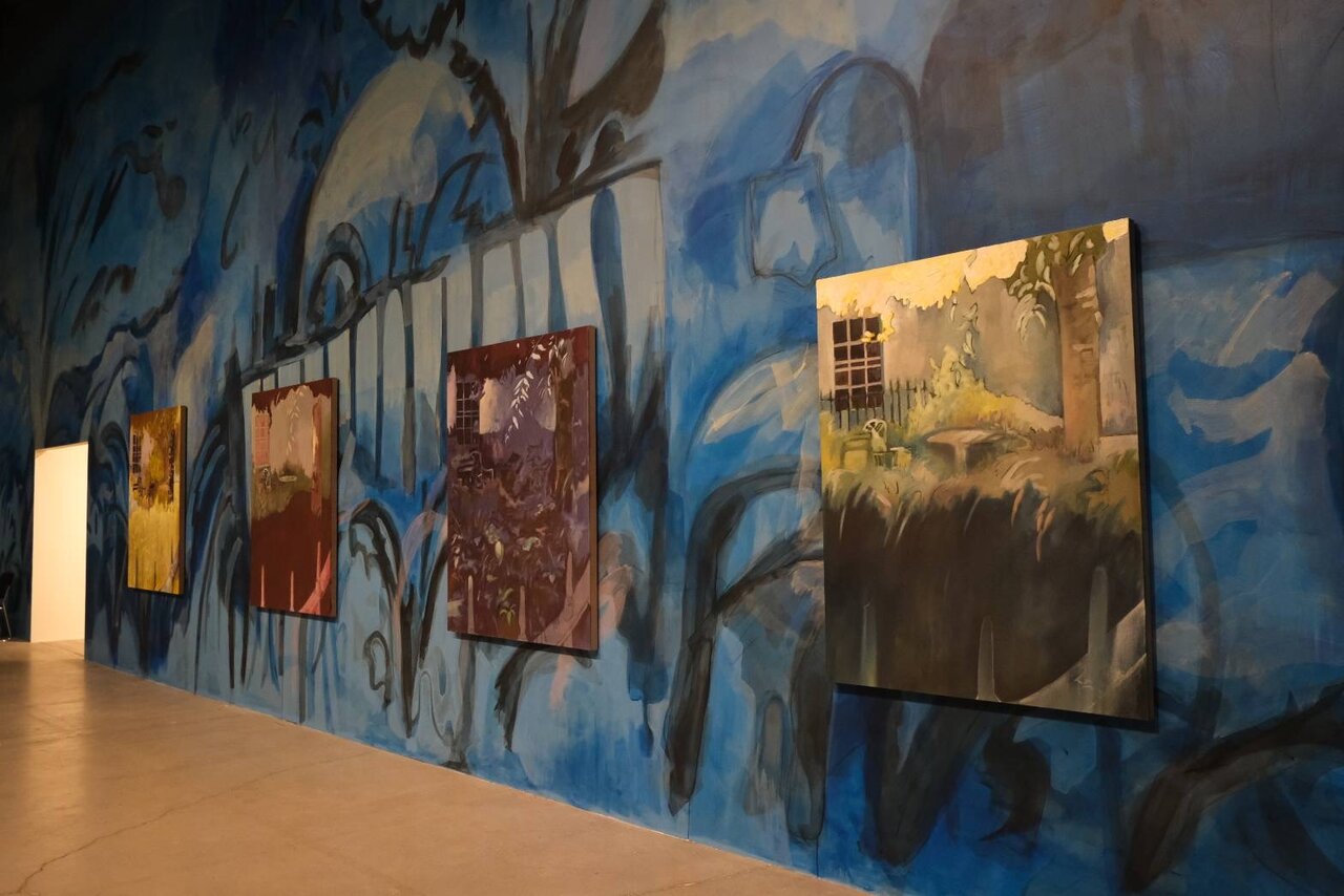
Author: artoronto

  • Peter Templeman at Christopher Cutts Gallery

    Peter Templeman: Into the Void

    Peter Templeman, Petroglyphs, 2024, acrylic on panel, 16 x 20 inches

    In his exhibition at the Christopher Cutts Gallery, Peter Templeman, having gone Into the Void returns here with the painted evidence of his journey. Big Phase No. 5 (1997), an oil on canvas measures 72 x 84 inches, and the appropriately named acrylic on canvas Wheel (2022), at a mere eight inches square, serve as bookends to Templeman’s odyssey. The 2024 acrylic on panel, Petroglyphs have the qualities of an Egyptian cartouche, its “hieroglyphs” enclosed within their customary oval. Cryptic, yet conversely transparent, the panel amounts to an artist signature or seal, somehow punctuating his work as official – as if carved in stone.

    Peter Templeman, Phase No. 2, 1997, oil on canvas, 72 x 60 inches

    Centrepieces of the Into the Void works are four major paintings that Christoper Cutts acquired subsequent to a late 1990s visit to the artist’s studio. After decades in storage, these artworks were combined and displayed here with contemporary pieces from Templeman’s studio. A visit by the artist to the Cutts Gallery this past winter tweaked a reminder of the stored works, thereby kicking its exhibition wheel into full gear. The Phase Series (No. 2, No. 3, No. 4, and Big Phase No. 5)” are significant paintings in Templeman’s oeuvre. Besides their relative scale to the rest of the exhibition, they exemplify a successful synthesis of control and abandonment. Templeman’s painterly forays into his “void” divide variously into the more or less ordered. His Paintings 1 – 9 as a group, paints the abyss as roiled chaos. His 2014 Rocking on the High Seas has the artist steering directly into the eye of the storm.

    Peter Templeman, Rocking on the High Seas, 2014, oil on canvas, 24 x 18 inches

    An unflinching resolve to go to the “wall” with each painterly outing is typical fare with Templeman. Relatively early in the artist’s career, the French Symbolist literature of Gide, Rimbaud and Beaudelaire, had primed the young artist to a receptivity of the unconscious realm. The “wall,” seemingly without exception here, is the dark unknown, against which every scumbled brush stroke gleams. In geologic terms, Big Phase No. 5 may be seen as a motherlode, the artist’s repository of countless layers of paint. Their formation amounts to the congeal of phantasms into ever-shifting tectonic plates of pigment. Through a kind of alchemy, the deposit of everyday sight and sound minutiae is made precious in the act of having been made visible.

    Peter Templeman, Big Phase No. 5, 1997, oil on canvas, 72 x 84 inches

    Templeman’s 2014 oil on panel, The Void, features a window or portal. The viewer, once entered, is drawn into a vortex where tumult is the price of admission. The effect is one of tunnelling, amplifying a sense of dimension within dimensions. Here the artist is possibly throwing us the key to his creative “tripping,” with some of the GPS signposts along the way. Its loosely brushed “O” shape around the window hub might suggest the Greek last letter omega. Regardless, a sense of the cosmic is inferred with the artist stretching his craft to the limit. The 2015 canvasses such as Top Knot and Physual read as an interlacing of enigmatic glyphs. As syllabic utterances that coalesce, they exemplify the body of works where Templeman has tamed his tempests.

    Peter Templeman, The Void, 2014, oil on panel, 42 x 36 inches

    With a 50-year-long career and many artists of note that Templeman has rubbed shoulders with, a consistency of development and vision predominates. While Graham Coughtry had impacted the artist as a student, Toronto’s Three Schools of Art introduced him to the art of John MacGregor, who’s improvisational surrealist method provided a significant building block. Templeman’s now distinct brushed iconography is part of a connective abstract tradition that threads generations.

    Steve Rockwell

    Images are courtesy of Christopher Cutts Gallery.

    *Exhibition information: Peter Templeman, Into the Void, June 21 – July 12, 2025, 21 Morrow Ave, Toronto. Gallery hours: Tue to Sat 10am – 6pm.

  • Joon Hee Kim at the Harbourfront Centre

    The Colours’ Colour at the Harbourfront Centre: Joon Hee Kim and the Ceramics of Becoming

    Installation view of Joon Hee Kim, The Colours’ Colour (L-R): Percipi, Wonderous II, Something Divine III at the Harbourfront Centre, 2025  

    There are moments in art when form becomes voice—when the curve of a vessel, the stroke of colour, or the rhythm of a pattern seems to speak not only of the artist’s hand, but of something deeper: of memory, of resilience, of the luminous multiplicity of being. In The Colours’ Colour at the Harbourfront Centre, ceramic artist Joon Hee Kim invites us into such a space, one where colour sings, not in abstraction, but in direct communion with the human soul.

    Originally scheduled as a short-term presentation, the exhibition has been extended twice due to overwhelming public response. It now runs as a full-length exhibition through September 7, 2025, marking a moment of profound resonance for both the artist and her growing community of viewers. Each work within this show feels like both a declaration and an offering—a celebration of the human instinct to express, to reveal, and to belong.

    Installation view of Joon Hee Kim, The Colours’ Colour (L-R): Colourful Existence I, To Discover, To Uncover, To Witness, both glazed ceramic, gold luster, at the Harbourfront Centre, 2025.

    Kim’s sculptural language draws from the long-standing metaphor of the vessel as body, but she pushes this relationship further, infusing each form with the textures of memory, language, and ancestral knowledge. Her ceramics not only resemble humanity in its likeness but manages to somehow contain it. Her work communicates a pulse of lived experience, the weight of what is carried and the brightness of what insists on being seen. Colour, for Kim, becomes more than mere ornament; it is the material of selfhood.

    The exhibition unfolds as a kind of chromatic revelation. Sweeping patterns and painterly glazes cover her ceramic figures with an intuitive exploration that resists categorization. There is graphic boldness, yes, but also gentleness, an undercurrent of vulnerability that imbues each object with its inner breath. Through this interplay of form and palette, Kim makes visible the many dimensions of what she calls “our colourful vitality,” the inner landscapes we too often suppress or overlook in our daily performance.

    Joon Hee Kim, Something Divine III. glazed ceramic, gold luster, Mother of Pearl, 57 x 33 x 30 cm

    Yet I found that The Colours’ Colour is not an exhibition about surface; it is about truth. And truth, for Kim, emerges only through the courage to confront what is fragmented, uncertain, or hidden. Her work embraces the brokenness of denial as a passage; she states: “Perhaps noticing that brightness and colour can exist in the dark, could allow us to discover how the colours of our humanity will always remain inseparable from what it means to live truly.” This insistence on complexity, on joy and pain, wholeness and fracture, expression and silence, shapes a practice that is both deeply personal and universal.

    Born in South Korea and initially trained as an art director in graphic design, Kim’s shift to ceramics marked not only a change in medium but a reclamation of self. Her practice took root across continents and residencies, from the Banff Clay Revival to Japan’s Shigaraki Cultural Park, Berlin’s Centre for Ceramics, and the Archie Bray Foundation in Montana. Along the way, she has cultivated a vocabulary all her own: one that merges precision and intuition, design and earth, tradition and experimentation.

    Joon Hee Kim, Something Divine III, glazed ceramic, gold luster, Mother of Pearl, Detail

    This cross-cultural sensibility has garnered international acclaim for Kim. Yet despite her accolades, Kim’s work returns us to something quieter, more essential. Her sculptures hum with the knowledge that identity is not fixed but always unfolding, an infinite expansion, like colour itself. “Formation,” she writes, “is the pursuit of revealing oneself entirely.” This act of unveiling, of standing bare in the shifting light of one’s own becoming, is the heartbeat of her work.

    Joon Hee Kim, Adoration & Colourful Existences, both glazed ceramic, gold luster, Mother of Pearl

    The Colours’ Colour is a space of intimate resonance, a place where differences bloom rather than divide, where the fragmented becomes whole through recognition. Each vessel, each stroke of pigment, extends an invitation: to see ourselves, to see each other, and to honour the unrepeatable beauty of being alive.

    Text and photo: Yehyun Lee

    *Exhibition information: Joon Hee Kim, The Colours’ Colour, till September 7, 2025, The Harbourfront Centre, 235 Queens Quay West, Toronto. Gallery hours: Wed & Thurs 12 – 6pm, Fri 12 – 8pm, Sat 10am – 8pm, Sun 10am – 6pm.

  • It Starts with a Photograph at Gladstone House

    For those who don’t know, Gladstone House’s primary function is not to be an art gallery, but rather, it is a hotel. In fact, it is Toronto’s longest continuously operating hotel, even older than the Queen Street streetcar that operates in front of the building. Since 2003, and especially since its reopening in 2021 after an extensive renovation, the hotel has been committed to supporting local artists with permanent and rotating exhibitions in the guest rooms and the communal spaces in the lobby, stairway, and the lounge on the second floor, which are open to the public. Tourists boarding at Gladstone House as well as locals can enjoy and engage with Toronto’s vibrant art scene while exploring a landmark hotel steeped with history.

    Visitors at Gladstone House

    In this year’s CONTACT Photography Festival, the unusual gallery spaces of Gladstone House fittingly showcase photographic artworks that expertly and diversely deviate from what we typically understand as photography. It Starts with a Photograph features work from six artists, some in collaboration with another, that uses photograph as the starting point like the exhibition’s title implicates. They reinterpret the medium into something more akin to a material that is part of a greater whole. Through painting, textile, collage, and manual and digital manipulations, these artists reveal the endless experimentative and imaginative possibilities of photography beyond its typical use of documentation.

    Curator Lee Petrie’s idea for the exhibition was sparked by Gladstone House’s resident artist Laura Butler. During her residency from October to December 2024, Butler began creating a crochet tapestry based on a childhood photograph. Much like the pixels of a digital photograph, the tapestry is made up of individual small, crocheted pieces called granny squares that are arranged and assembled in a grid to produce the complete picture. This labor-intensive method of handmaking 805 individual squares diverges from the spontaneity of traditional photography where a moment can be captured almost immediately. Butler adds another layer of intimacy and nostalgia to a precious family memory by recreating it by hand, one stitch at a time.

    Laura Butler, Family Photograph, textile

    In the hotel’s lobby, opulently placed above the fireplace, is Heather Haynes’s vibrant and impressive mixed media painting Immaculate Mother made in collaboration with photographer Virginia MacDonald. This artwork was inspired by MacDonald’s portrait series of women of diverse backgrounds styled in the likeness of Frida Kahlo as a tribute to Kahlo’s legacy and continuous inspiration for women. Haynes layers of paint, thread, and rug hooked into MacDonald’s photograph, filling the artwork with images of colourful vines, leaves, and birds, intertwined around the woman. Not only do Haynes and MacDonald pay homage to an emblematic cultural icon, but also to female wisdom and resilience.

    Heather Haynes and Virgina MacDonald, Immaculate Mother, mixed media on canvas, 36 x 48 inches

    Through the stairway there are Nika Belianina’s and Laura Key Keeling’s unique interpretations of landscape photography. Both artists use a motif of portals, a means of transitioning from one place to another, just like the stairway the artworks are displayed in. While their approach to landscape photography differs from each other, they both invite viewers to reflect on our place within the natural environment.

    Belianina’s hypnotic photographs of the tropics were achieved using only available light and subtle in-camera adjustments. The simple mirroring and repetition of the images, not only create an aesthetically pleasing composition, but transform an ordinary tropical forest into magical arches, corridors, and gateways, exploring the relationship between organic forms and architectural symmetry.

    Nika Belianina, Golden Gates, archival paper print, 12 x 18 inches

    On the other hand, Keeling’s work employs both digital and analog collage methods, incorporating elements from her personal ephemera and photographs of the natural environment in Hamilton where she currently lives. Her compositions often feature frames within frames, symmetry, and an interplay between nature and man-made objects. Belianina’s and Keeling’s works transport us, or rather reveal to us, the magic and beauty of nature.

    Laura Kay Keeling, Untitled Portal 01, archival inkjet print, 24 x 20 inches

    Lastly, Jessica Thalmann’s urban photography is exhibited in the hotel’s second floor lounge. Thalmann takes a great interest in brutalist architecture of the 60s and 70s, buildings characterized by austere and geometric concrete forms. She photographs those buildings and streetscapes in greyscale, then manually modifies them by cutting, folding, and rearranging the very paper the photos are printed on. Within the cuts and folds are overlayed stripes of red, blue, or yellow, accentuating the hard angles and starkness of modern architecture and creating optical illusions that blur the line between the object depicted in the image, and the image as an object itself.

    Jessica Thalmann, Such Memories as Places (Seattle III), folded archival pigment print

    It Starts with a Photograph showcases both the boundless potential of photography as a medium, as well as the diversity of our local artists. Just from a single exhibition, visitors can experience nostalgia from Butler’s tapestry, awe from Haynes and MacDonald’s collaborative piece, supernatural wonder from Belianina’s and Keeling’s landscapes, and delight from Thalmann’s photo-objects.

    Rebekah Barona

    Images are courtesy of Gladstone House

    *Exhibition information: It Starts with a Photograph / Group exhibition, May 1 – September 2, 2025, Gladstone House, 1214 Queen St. West, Toronto. Open to the public through the day.

  • Emmanuel Osahor at The Power Plant

    To Dream of Other Places / Emmanuel Osahor’s Nocturne of Beauty

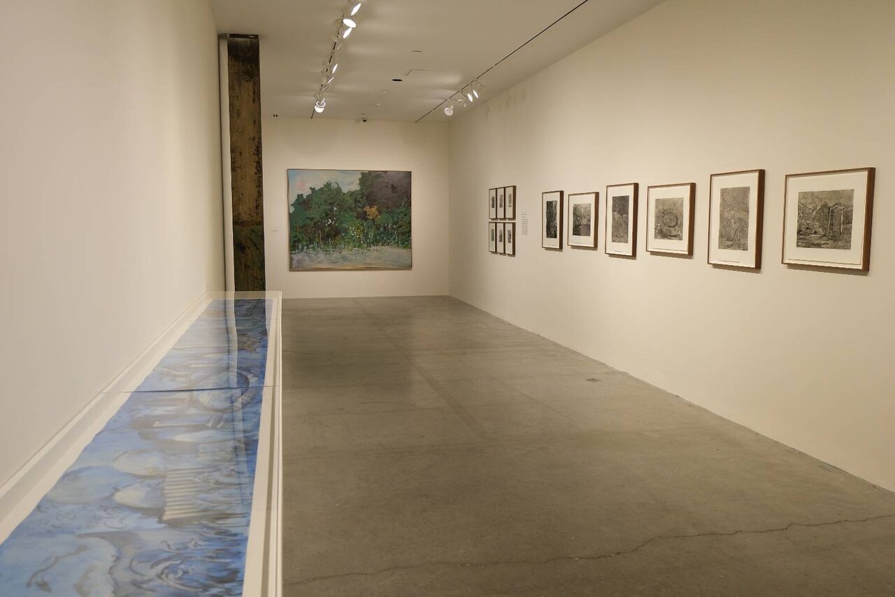
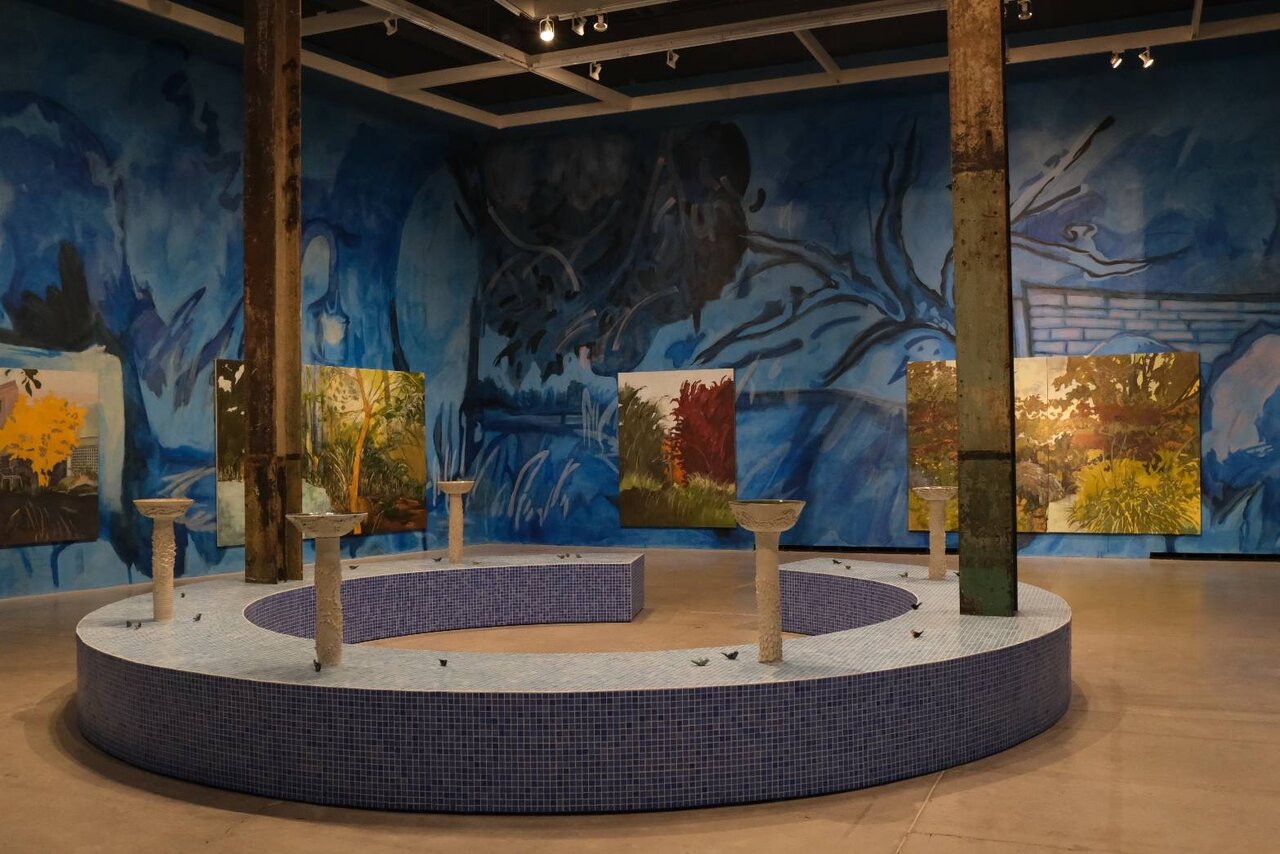
    In the quiet hush of The Power Plant’s Fleck Clerestory Gallery, a garden blooms against the dark. To Dream of Other Places is the first major solo exhibition of Emmanuel Osahor in his home city of Toronto. He invites us into this imagined night garden, where beauty is not a luxury but a lifeline, and where sanctuary and sorrow live side by side.

    Installation view of Emmanuel Osahor, To Dream of Other Places, The Power Plant, 2025.

    Long attuned to the politics and poetics of space, Osahor has developed a practice rooted in the belief that beauty matters, especially in a world marked by dislocation, erasure, and unrest. His landscapes, lush and layered, are sites of emotional, cultural, and ecological entanglement, far past aesthetic reveries. Whether rendered in paint, charcoal, ceramic, or photographic print, these gardens do not promise escape. Instead, they insist on presence, on slowing down, looking closely, and reminding us the possibilities of both flourishing and withering.

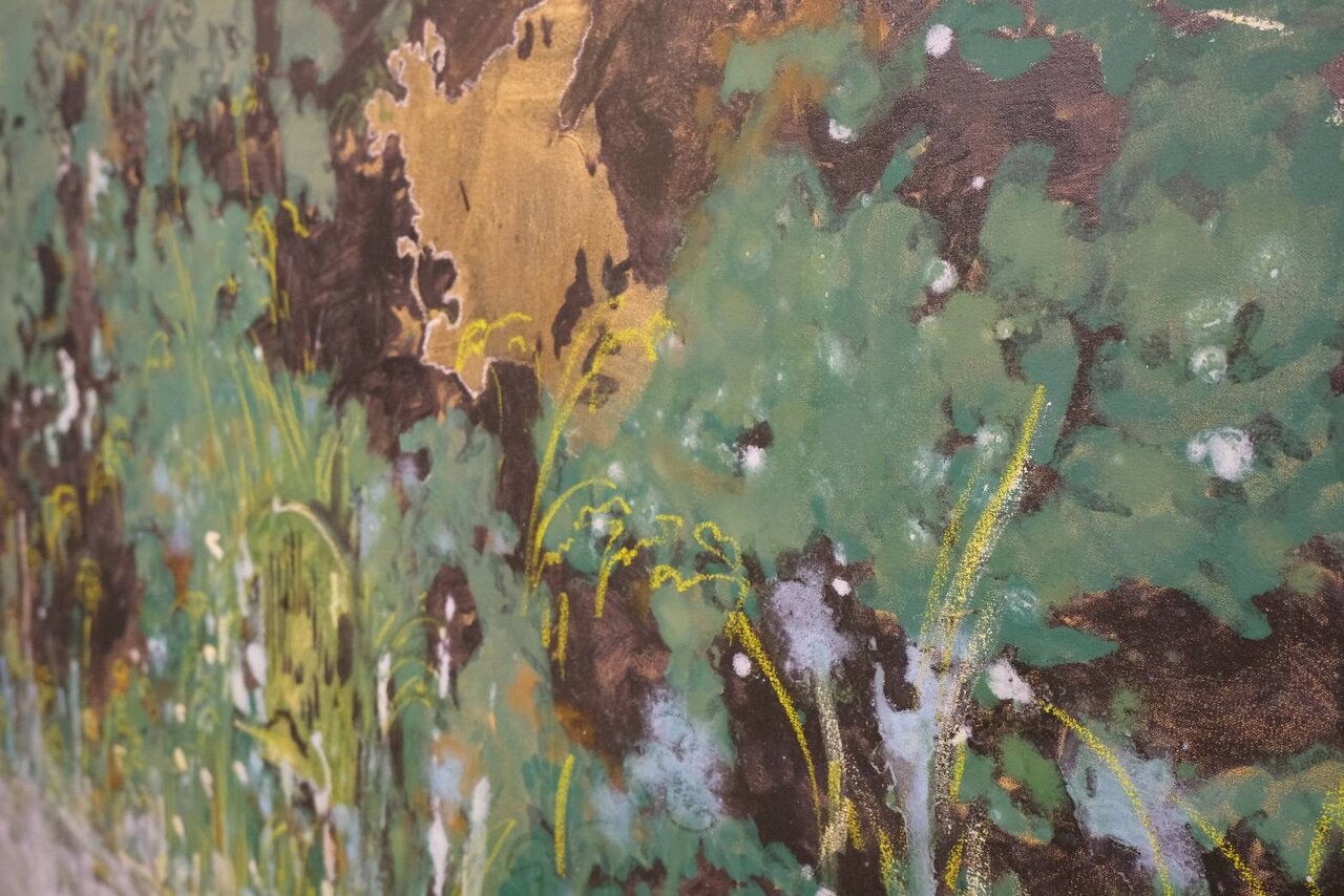
    At the heart of the exhibition is the garden as metaphor: a cultivated space shaped by human desire and control, yet always tending toward unruliness. Osahor’s canvases, teeming with tangled greens and unexpected textures, evoke a sense of abundance tinged with unease. Brushstrokes shift between delicate and assertive, as if mimicking the push and pull between care and conquest. Edenic qualities give way to more complicated terrains, gardens shaped by the sediment of history, migration, labour, and longing, where beauty is inseparable from the forces that have marked the land.

    Installation view of Emmanuel Osahor, To Dream of Other Places, The Power Plant, 2025

    In works that blur the line between real and imagined, Osahor conjures spaces that recall specific geographies while refusing strict definition. They are gardens remembered, projected, and mourned. Some draw from Toronto’s own urban ecology, where community gardens, parks, and neglected lots exist in uneasy proximity to gentrification and displacement. Others emerge from a more interior topography, emotional maps formed by the artist’s diasporic identity and lived experience. As viewers, we are invited not only to witness these spaces but to dwell within them, to feel their pulse.

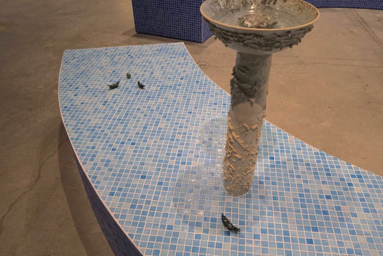
    Installation view of Emmanuel Osahor, To Dream of Other Places, The Power Plant, 2025. Close-up shot on the ceramic base

    The gallery itself becomes part of this immersive ecology. A site-specific photographic wallpaper transforms the Clerestory into a liminal zone of reflection, enveloping visitors in a rhythmic interplay of foliage, shadow, and ambient light. Osahor’s ceramic sculptures, hand-formed, organic, and quietly expressive, act as tactile counterpoints, grounding the exhibition. Together, these elements create a space that is not quite natural and not quite artificial, but something in between: a threshold where memory and matter meet.

    Yet To Dream of Other Places is not only about aesthetics—it is about survival. In a time when global crises render beauty suspect or superfluous, Osahor insists on its necessity. His gardens offer no easy solace, but they do offer room—room to breathe, to grieve, to hope. They suggest that beauty can be both balm and provocation, both retreat and resistance. As the artist notes, nature’s regenerative power is not metaphorical but material: it teaches us how to begin again, how to make space for what has been uprooted.

    Emmanuel Osahor, For a moment, 2020, oil and acrylic on canvas, detail.

    The exhibition’s title, with its gentle invocation of dreaming, suggests yearning for elsewhere, for otherwise, for a future not yet realized. But dreaming, in Osahor’s world, is not passive. It is a mode of consciousness, a way of paying attention. To dream of other places is also to reckon with the present: to ask what has been lost, what can be recovered, and what it means to cultivate care in the face of rupture.

    Installation view of Emmanuel Osahor, To Dream of Other Places, The Power Plant, 2025.

    Osahor’s practice resonates not only within the lineage of landscape painting but within broader conversations about place, justice, and the role of the artist in times of fragmentation. His work does not offer closure but opens questions. What does it mean to make a garden in a world that burns? What forms of beauty emerge when survival is the ground from which we grow? How do we learn to live in the ruins while still dreaming of bloom?

    Acting as a quiet, generative proposition, To Dream of Other Places invites us to consider the politics of beauty not as surface, but as sustenance. It asks us to enter the garden to listen, to be attentive to what the land remembers, to what the plants endure, and to what the quiet, persistent act of dreaming might yet restore.

    Text and photo: Yehyun Lee

    *Exhibition information: Emmanuel Osahor, To Dream of Other Places, April 11 – September 21, 2025, The Power Plant, 231 Queens Quay West, Toronto. Gallery hours: Wed – Sun 11 am – 6 pm, Fri 11 am – 8 pm.

  • Toronto Outdoor Art Fair 2025

    July 11 – 13, 2025
    Nathan Phillips Square
    Friday & Saturday: 10am – 7pm, Sunday 10am – 5pm.

    Get ready for a vibrant summer at Nathan Phillips Square, where the Toronto Outdoor Art Fair (TOAF) is celebrating its 64th edition! This charitable non-profit organization, Canada’s largest and longest-running juried contemporary outdoor art fair, showcases over 400+ independent visual artists from across the country. This year’s edition boasts a province-led Artists Zone uniting the country, featuring Atlantic Canada, Northwest Territories, and Unique Quebec for the first time. With a common thread running through the programming, Art Nest curated by Myta Sayo, a Students Zone, and more, the fair promises to be an exciting experience.

    The art tour, led by curator David Liss, kicked off with Tracy-Mae Chambers’ striking installation featuring yarn and netting that waves around trees and the square. Her piece explores connections between Indigenous and settler communities, with red threads symbolizing both the struggles and injustices faced by Indigenous peoples, as well as the courage and love that guide humans toward healing.

    Tracey-Mae Chambers, Hope and Healing Canada, installation art

    Nearby, Jess Young’s flock of porcelain pigeons reflected her own experiences of displacement during COVID, as a metaphor of resilience.

    Jass Young, Pigeons, installation

    Freshly graduated student Neltje Green’s vibrant paintings capture her memories of walking around the city and invite viewers to reflect on the personal and collective meaning of place.

    Neltje Green, booth A6, 2d work. Introducing herself and her art

    Meanwhile, Frédéric Belleau’s “Nostalgic” series brings childhood cartoon characters to life through prints and paintings, tapping into shared moments of pop culture that resonate with everyone.

    Frédéric Belleau, booth 538, “Nostalgic”

    Two newcomers to the exhibition are Luanne Dominix, a self-taught water-based painter from Newfoundland, and Clothilde Allen, a photographer from Montreal. Dominix’s work explores the beauty of rural life through food, land, and tradition, while Allen’s photographs focus on nature’s presence in the city.

    Luanne Dominix, booth 310, with her proud parents

    Clothilde Allen, booth 359, photography and digital media

    The fair features a diverse range of artists, including queer artist Saif Al-abedi from Iraq, who blends Arabic calligraphy, Middle Eastern roots, and queer identity in vibrant works. Kyla Yager, a queer ADHD artist, is back for her second time at the fair, creating dynamic compositions that capture her environment’s energy through live painting, speed painting, and murals.

    Saif Al-abedi, booth 512, photography and digital media

    Kyla Yager, Booth 410, paintings

    Nearby, Harry Kooy, a retired auto mechanic turned artist, showcases intricate mechanical pieces crafted from steel, copper, brass, stone, and wood, including a notable work featuring a deer skull that adds an unexpected element to its mechanism.

    Harry Kooy, booth 29, 3D works, Stirling engine, kinetic sculpture

    Beyond paintings and photographs, the fair features a diverse range of artists, including jewelry makers and ceramic artists creating beautiful home accessories like vases and bowls. The event also offers fun activities for kids, live music, and dance performances. Mark your calendars for the 11th to 13th, when you can enjoy it all, along with delicious food and drinks.  

    Text and photo: Nusrat Papia

  • Toronto Outdoor Art Fair 2025

    July 11 – 13, 2025
    Nathan Phillips Square
    Friday & Saturday: 10am – 7pm, Sunday 10am – 5pm.
    Free admission

    Toronto Outdoor Art Fair (TOAF) is the charitable non-profit organization behind Canada’s largest and longest-running annual contemporary art fair. Established in 1961 to connect Canadian artists directly to the public, TOAF showcases 400+ emerging and established visual artists, including painters, photographers, sculptors and artists working in ceramics, textiles, jewelry and more.

    In its 64th year, the fair has become a cherished summer ritual in the city for both locals and visitors. TOAF continues to evolve as this year’s roster includes over 400 independent artists, including 70 from across the country and 155 joining the fair for the very first time. Nestled under the classic white tents, visitors will have the opportunity to peruse hundreds of unique artists and original works of art or browse online at TOAF.ca.

    The Fair offers something for everyone: talks, tours, digital studio visits, curated collections, kids workshops, live painting, dance, music, art installations and food and drink experiences.

    Toronto Outdoor Art Fair, 2024. Photo: Phil Anderson

    For more information please visit their website https://torontooutdoor.art/.

  • John McEwen at Olga Korper Gallery

    Canadian sculptor John McEwen displays beautifully rugged sculptural pieces at the Olga Korper Gallery in his exhibition Field Notes.

    Installation view of John McEwen, Field Notes at Olga Korper Gallery

    The works invite the public to reflect on the relationship between the environment in which the artworks reside in and with the sculptures themselves. This is not a new theme in McEwen’s work. Perhaps you remember the standing wolf sculptures placed sporadically throughout woodlands or other large sculptures that reside in city centers of the Canadian metropolises. However, in the large, lofty, illuminated space of Olga Korper Gallery the pieces take on a different meaning.

    John McEwen, Privy Paw Two, 2020, flame cut steel, limestone, 30 x 61 x 19 inches

    Before even entering the gallery, one is welcomed by a large, sculpted skull made of rusted steel. The astonishing size of the piece paired with the miniscule star fragments that make up the ghostly figure is a wonderfully shocking preface to what awaits inside.

    John McEwen, Skull, 2015, corten steel, 73 x 24 x 42 inches

    Upon entering the industrial space, tens of sculptures are representing our natural world. The contrast between the soft white walls and the rugged appearance of the steel sculptures makes the works outstanding. Many of the sculptures feature wolf figures, a recurring motif in the artist’s work. The pieces remind us of the often-forgotten connection between humans and animals.

    John McEwen, Wolf Stream, 2013, flame cut steel, 57 x 74 inches

    Another recurring motif is the star, a gesture to the universe that envelops our life. It is also an extremely important reminder that humans, fauna, and flora all share one world beneath one starry sky canopy.

    John McEwen, Supernova, 2024, laser cut corten steel, 57 x 66 x 31 inches

    The texture of the rusted steel gives each piece an originality that cannot be recreated. Exploring solid and porous bodies and vessels, examining and investigating wolves, crows, horses, and camels — each sculpture tells its own story through the starry pores that shape the natural subjects.

    John McEwen (L-R): Diana (Horse Head), 2024, laser cut steel, 60 x 25 x 12 inches; Camel Ring, 2025, flame cut steel and iron ring, 59 x 46 x 12 inches and Crow Control, 2025, laser cut corten steel, bronze, 46 x 28 x 28 inches

    It is a beautiful, intricate, delicate show, through which visitors are not only surprised by the mere artistry of the works but will also be invited into a conversation on the importance of preservation, balance, and connection to our natural environment.

    Sofia Diaz Aguilar

    Images are courtesy of Olga Korper Gallery

    *Exhibition information: John McEwen, Field Notes, June 5 – July 5, 2025, Olga Korper Gallery, 17 Morrow Ave, Toronto. Gallery hours: Tue – Sat 10am – 5pm.

  • Interview with Doris Purchase

    Interview with Doris Purchase (DF) on the occasion of her show, Dim the Lights at Propeller Art Gallery by Emese Krunak-Hajagos EK-H)

    Doris Purchase in front of her work. Photo: Joseph Muskat

    DP: I have been exploring and working with frames, wire, and what is normally hidden in paintings for several years now. I had been collecting frames that were shaped, oval or round for several years knowing that one day I would use them for an exhibition. When I decided that I would use these for Dim the Lights, I knew what the title would be before finishing the pieces, just as I had visualized the exhibition in my mind. The rounded frames became the theatre, and the cassetta frames became the stage.

    Doris Purchase, Memoirs – Belleville, mixed medium, 16 x 16 inches

    Doris Purchase, Memoirs – Pablo, mixed medium, 17 x 30 inches

    DP: Yes, dreams did inspire me to create these pieces as well as personal memories. I like the idea that when someone is standing in front of these pieces, they will invite a dreamy state of mind. All the pieces are memoirs and are inspired by a memory of my first time being behind the stage in a theatre.

    Doris Purchase, Memoirs – Gold, mixed medium, 20 x 26.5 inches

    DP: What is hanging in the pieces are little canvas bags (filled with framing nails) representing the theatre curtain mechanisms. The rose hook is my emblem. It’s the initial item that inspired me to expose the “behind the scenes” in my work.

    Doris Purchase, Memoirs – Mini, mixed medium, 8 x 10.5 x 3 inches

    The symbolism for me is the weight of the canvas. I was a classically trained oil glaze painter and the weight I feel is due to my transition from painting to creating assemblage work.

    DP: A dimming light for me is a time to let others take the stage. It could also allow one to see one’s own dream.

    DP: The act of dimming the lights has many meanings in this exhibition. Just as in a theatre, before the movie or show begins the lights on the side walls dim to darkness. That is when dreaming and imagining happens. I wanted these pieces to act as conch lights to the installation, projection, collage performance piece by Jim Kroesen who performed during the West Queen West Art Crawl on the evening of June 19th.

    Doris Purchase, Memoirs – Anton, mixed medium, 13 x 23 inches

    Personally, they dim for a dear artist friend who passed away. The lights are doll house lights which I wired so that they could dim. Inviting people to dim the light, if they choose, was my way of letting go, while opening the curtains to allow others in to interpret as they wish.

     DP: Surprisingly many visitors have taken the time to write longer than usual responses, thoughtful and quite poetic such as: “they speak to me of the most profound enigmas of our human condition metaphorically nuancing archetypes such as shrine, light and dark, the proscenium arch of theatre where all human life can be played out.” Another shorter comment was simply: “They make me dream”

    I love the exhibition in the north gallery and I’m so proud that my exhibition with Jim Kroesen’s installation can be amongst these artworks. Peter Shoebridge & Keijo Tapanainen are top notch! It feels like my pieces are conch lights down the hall to the sculptures and carbon cutout figures.

    Installation view of Dim the Lights | Doris Purchase and POSE/ CUT/FORM | Peter Shoebridge & Keijo Tapanainen at Propeller Art Gallery

    Images are courtesy of the artist and Propeller Art Gallery.

    *Exhibition information: Doris Purchase, Dim the Lights, June 18 – July 6, 2025, Propeller Art Gallery, 30 Abell St, Toronto. Gallery hours: Wed – Sat, 1 – 5:30pm, Sun 12 – 4pm.

  • Jessica Stockholder at MOCA

    This spring, the Museum of Contemporary Arts Toronto (MOCA) invites visitors to embark on a captivating journey through a new large-scale, site-specific artwork by renowned artist Jessica Stockholder. Known for her innovative “paintings in space,” Stockholder has long been a pioneer in blurring the boundaries between painting and sculpture. By masterfully merging colors with architecture and everyday objects, she creates immersive environments that redefine the way we interact with art.

    Jessica Stockholder, The Squared Circle: Ringing, installation view, MOCA Toronto, 2025. © Jessica Stockholder. Photo: LF Documentation.

    As visitors step into the museum, the vibrant colors envelop them, setting the tone for an immersive tour. Upon entering the reception, it’s striking to see the bold, youthful palette that Jessica Stockholder has used to transform the space. The walls, floor, including the one behind the desk, which she designed and built, are painted in a dynamic array of vibrant colors. Green, yellow, orange – these whimsical hues, combined with geometric shapes and patterns, create a unique intersection of pictorial and physical experiences. The artwork grows organically from the realm of painting yet transcends traditional boundaries. The colors are tangible, almost palpable, and the shapes seem to be in conversation with the space. The colors and forms appear to be calling out, inviting engagement and interaction.

    Jessica Stockholder, The Squared Circle: Ringing, installation view, MOCA Toronto, 2025. © Jessica Stockholder. Photo: LF Documentation.

    The installation, The Squared Circle: Ringing, is a site-specific commission that transforms the space with a unique blend of architecture and experience. Featuring a box ring and marionettes suspended from the roof, attached to tables made from old, cut-up furniture sourced from thrift stores, the artwork explores the interplay between objects and physical action. The furniture pieces repeat patterns with bold colors, mirroring the marionettes’ movements.

    Jessica Stockholder, The Squared Circle: Ringing, installation view, MOCA Toronto, 2025. © Jessica Stockholder. Photo: LF Documentation.

    This installation is more archival than ephemeral, valuing life and relationships. Stockholder’s work shifts and changes, reflecting the push and pull of competing forces. The title references a wrestling ring, a stage of confrontation and spectacle where struggle unfolds, and human and animal instincts collide. Through her chosen materials, Stockholder channels feelings of determination, opposition, disappointment, and pride, creating a dynamic experience that explores transformation and the intersection of form and choreography.

    Jessica Stockholder, The Squared Circle: Ringing, installation view, MOCA Toronto, 2025. © Jessica Stockholder. Photo: LF Documentation.

    The Jessica Stockholder exhibition features a striking installation near the door, where a poetic text is printed on the wall, evoking the idea of a stage or platform where different worlds converge. The text reads like a meditation on public spaces, listing terms like stage, bullring, rink, town square, and podium. The wall itself becomes a dynamic element, framing the work without a physical frame, with Stockholder’s words inviting the viewer to ponder the relationship between space and experience.

    Jessica Stockholder, The Squared Circle: Ringing, installation view, MOCA Toronto, 2025. © Jessica Stockholder. Photo: Nusrat Papia

    The juxtaposition of these two installations creates an intriguing dynamic, highlighting the tension between the constructed, performative spaces and the organic, natural world. Two video installations bring the natural world indoors, one near the back door flooding the space with light and evoking a forest, and another beside a ventilator suggesting a garden with blooming flowers swaying in the breeze. The videos create a sense of depth, drawing the viewer in, yet also disrupt the illusion, leaving a sense of pause. Stockholder’s idiosyncratic arrangement of the installations transforms the space, making it beautiful, interesting, and fascinating.

    Jessica Stockholder, The Squared Circle: Ringing, installation view with video installation in the back (right) MOCA Toronto, 2025. © Jessica Stockholder. Photo: Nusrat Papia

    Located on Floor 1, the installation promises to transform the space into an immersive experience, blurring the lines between art and environment. Stockholder’s work is ultimately about the quality of space, inviting visitors to move around and accumulate different perspectives, each one revealing a new picture. Through this process, the boundaries between art and environment dissolve, creating a truly immersive experience.

    Jessica Stockholder, The Squared Circle: Ringing, installation view, MOCA Toronto, 2025. © Jessica Stockholder. Photo: LF Documentation.

    Nusrat Papia

    *Exhibition information: Jessica Stockholder, The Squared Circle: Ringing, April 17 – August 3, 2025, Museum of Contemporary Art, 158 Sterling Rd, Toronto. Museum hours: Wed – Thu & Sat – Sun 11am – 6pm; Fri 11am – 9pm.

  • Paul Orenstein: Stranger on a Train

    Orenstein gives urban dwellers new ways of enjoying a city abroad by encouraging them to walk the same street twice, because there is always a chance they’ll see something interesting. Cities are no longer a bore, where every train ride feels like routine, but rather a chance to get lost in urban spaces like no traveler has done before. Urban fatigue of graffiti wired fences, and train stations have been captured in a new type of documentation in photography for some time now, giving the familiar spaces a fresh look. Stranger on a Train by Paul Orenstein takes us to Vienna back in 2024.

    City natives and urban dwellers will always appreciate the fresh perspective of a foreigner. As for a local, not much is absorbed, especially when one becomes accustomed to such things as the line at a coffee shop, or passing the time on the ride to work to decipher tags on the walls or identify the themes of graffiti tattooed on out-of-service trains. Nothing like a tourist, especially a photographer, can change their perspective on how they can explore their own city spaces.

    Installation view of Paul Orenstein, Stranger on a Train “Gang of 60”

    The exhibition presents 74 colour photographs taken in Vienna, in both in printed forms, including large formats, and on digital monitors mounted on the other side of the gallery hall. The pieces depict Vienna’s modern and historical elements, sometimes side by side, in unexpected parts of the city. One can’t help but wonder what stories were told under the bridge in a partly renovated neighborhood.

    Even the colours at the entrance of this exhibition match the colours of vibrantly painted residential buildings and tagged warehouses. Orenstein describes how quickly the excitement shifts when visiting a new country without knowing the language yet somehow managing to move around by looking at street signs, stores, office buildings, etc. The shapes and colours are so different from what you used to it at home, that you feel like an alien on another planet. Even the electrical wires seem to create a picture if you squint your eyes.

    Installation view of Paul Orenstein, Stranger on a Train

    Some of the prints displayed in Stranger on the Train might be shocking to see yet not surprising how much graffiti and tags are covering the surfaces, showing the rapid changes with so much construction going on even in a historic European city like Vienna. This fact reminds us that we must pay more attention to our own space, that may change in a blink, so, we might never see the same city again.

    Installation view of Paul Orenstein, Stranger on a Train with Sot T, cacophony (left) and Sot T, red E (right)

    Text and photo: Polyna Alexseev

    All images are installation views of Paul Orenstein: Stranger on a Train.

    *Exhibition information: Paul Orenstein: Stranger on a Train, May 18 – June 30, 2025, The Hall, 166 Clinton St, rear building, Toronto. Opening hours: Sat – Sun 11am – 6pm. Part of CONTACT Photography Festival.

  • Christina Leslie at Stephen Bulger Gallery

    Christina Leslie at Stephen Bulger Gallery

    Christina Leslie: Pinhole Portraits and Places

    Canadian-Jamaican artist Christina Leslie presents Pinhole Portraits and Places, a solo exhibition that explores identity, culture, and personal heritage through the lens of pinhole photography. The exhibition is composed of three series: Portraits, Places, and Parishes, each offering a different perspective based on Leslie’s cultural background and experiences.

    Christina Leslie began developing Pinhole Portraits and Places in 2016, experimenting with early photographic practices such as the pinhole technique. Through this approach, she challenges the lack of Black representation in art institutions. From 2017 to 2025, Leslie created a collection of photographs where the first series of portraits features Black men and women posed against deep black backdrops. These softly blurred images, tinted in a warm orange tone, complement well with the gold accessories like the hoop earrings and hair beads, highlighting the richness of Black skin and emotional expression.

    Christina Leslie, (L-R) Monique; Caleb and Carol, each from the series “Pinhole Remix”, 2020, printed in 2021, pigment print on archival paper flush mounted to Aluminum Composite Panel

    The exhibition opens with the Pinhole Portraits series, offering an intimate introduction to Leslie’s exploration of identity and representation. Leslie was inspired by the Renaissance and Rembrandt-style, capturing her subjects with intimacy, reverence, and historical depth. Historically, photography has been used to document individuals of high social status, often reinforcing colonial and elitist narratives. Christina Leslie challenges this by using the medium to center and celebrate Black identity. Her work reframes photography as a tool for honoring Black lives, placing her subjects within a lens of dignity, beauty, and emotional depth. In doing so, she creates space for reflection on representation, cultural memory, and belonging.

    Christina Leslie, (L-R) Stephanie, 2020, printed 2021; Andre, 2020, printed 2025 and Melissa, 2020, printed 2021, each from the series “Pinhole Remix”, pigment print on archival paper flush mounted to Aluminum Composite Panel

    The second series is centered around Places, capturing environments that depict a sense of “home.” These photographs offer subtle insights into Leslie’s Caribbean heritage and the lives of those featured in her portraits. Through bold colours, elements like water and seashells, and familiar yet abstract settings, Leslie reflects on spaces shaped by personal history and memory.

    This series highlights people and places that hold deep cultural and emotional significance, formed through lived experience and passed-down stories. The images appear blurred or distant, representing the nature of memory, especially within diasporic contexts. Leslie’s work consistently centers family and community, asserting their rightful place in contemporary art. Places underscore themes of cultural displacement and the struggle for recognition, addressing how society overlooks Black experiences.

    Christina Leslie, Max, Shabazz, and the BK steps, 2023, from the series of “Pinhole Places”, pigment print on archival paper

    Pinhole Places (2022–2025) portrays elements of street photography to explore a variety of spaces, some are familiar, others are more abstract. Through this contrast, the series reflects on the complex relationship between connection and disconnection that often defines diasporic experiences.

    Christina Leslie, Galang, 2025 from the series of “Pinhole Places”, pigment print on archival paper

    The third series, Pinhole Parishes (2023–2025), centers on several parishes in Jamaica, drawing inspiration from stories passed down through Leslie’s family. She successfully blends storytelling with photography, and she preserves these memories while engaging with Jamaica’s post-colonial landscape. Her visits to the island deepen her connection to place and ancestry, grounding the work in personal discovery and cultural affirmation.

    Christina Leslie, (L-R) Pinhole #6, 2024; Pinhole #10, 2024 and Pinhole #4, 2023, each from the series “Pinhole Parishes”, pigment print on archival paper flush mounted to Aluminum Composite Panel

    Across all three series, Leslie presents her work in an engaging and intimate manner. Through textured imagery, warm tones, and visual references to classical art, viewers are invited to piece together a narrative that speaks to heritage, identity, and the power of the Black stories and voices.

    Abuk Lual

    Images are courtesy of the artist and Stephen Bulger Gallery.

    *Exhibition information: Christina Leslie, Pinhole Portraits and Places, May 10 – July 5, 2025, Stephen Bulger Gallery, 1356 Dundas Street West, Toronto. Gallery hours: Tue – Sat 11am – 6pm.

  • Steve Rockwell at Sheff Contemporary

    A new gallery has opened in Toronto – Sheff Contemporary – located in a surprisingly airy basement on Danforth Ave. Given the number of commercial galleries that have closed in recent years, its opening is in itself something to celebrate. Its inaugural show highlights the work of Steve Rockwell. The gallery’s owner, Saeed Mohamed has known Rockwell many years, and has always been greatly impressed by his work.

    The space, Mohamed explains, is important in the sense that he understands how art is ineluctably an in-person experience. Indeed, it the experiencing of art in the gallery setting that is a central idea of Rockwell’s work. At the same time, Mohamed is not committed to keeping the gallery in one location. Rather, he appreciates that it is the people – artists, audience, buyers etc. – who together are the essential elements of this experience. Art, he feels, is often elitist and he is keen, instead, to promote art in a way that makes it more relatable to the public, who like himself, may not be connoisseurs in the traditional sense. His hope is to foster an inclusive crowd of art enthusiasts who will facilitate this aim. He sees his role as providing the space and the opportunity to experience art. Certainly judging from the crowd who showed up for the opening reception, he’s off to a good start.

    Installation view of Steve Rockwell Meditation on Space at Sheff Contemporary, 2025. Photo: Hugh Alcock

    Rockwell’s show is about art. It is, one might say, second order art. Moreover it is a breed of conceptual art, based on performance of a peculiarly inconspicuous kind. Rockwell’s work invariably has some story behind it. For instance, in one of his black and white paintings, one confronts an image of the artist himself, arms fully spread, with bright light radiating from his torso, titled My Spirit Lives Here! (1996). Nearby is another image of him, titled Blackout, which in contrast to his effulgent self, has him shrouded in darkness – his features barely discernible.  

    My Spirit Lives Here! 1996, acrylic on masonite, 32 x 32 inches (Inspired by the January 2, 1996 visit to the Ernie Wolfe Gallery in Santa Monica, California). Courtesy of the artist

    These two paintings are part of a series of five, on the theme of meditating on various spaces in galleries, that is ostensibly based on a story akin to that in the Bible of the conversion of Paul on the road to Damascus. A journey from the infidel’s blindness to the light of faith. But any such story line surmised by the viewer, it turns out, is post hoc. The order of the paintings was chosen long afterwards. Each is a record of some event he experienced while executing a performance he titled Meditations on Space. It involved him showing up in some reputable gallery in Switzerland, France, Toronto, Los Angeles or New York, announcing to its custodians that he was there to meditate on the gallery space. Most acquiesced and let him be. But part of the performance concerned his interactions with people and with the space itself. While in the Ernie Wolfe Gallery, Los Angeles, for instance, its owner shouted out to Rockwell ‘This is where I live. My spirit lives here!’, hence the title of the painting mentioned above.

    Meditations on Space, 1996, acrylic on masonite, 32 x 32 inches (Inspired by the September 20, 1995 visit to Galerie Jamile Weber in Zurich, Switzerland). Courtesy of the artist

    While these works are not literally biblical in derivation, they do touch on big questions – on life and death specifically. In Blackout we see a grainy barely discernible image of Rockwell’s face. It inspired by an episode while visiting and meditating on a gallery space when he was suddenly plunged into darkness, due to a power outage of course. In his depiction of this event Rockwell chose to render himself, despite the almost total darkness, as a comment on our perception of darkness. As Rockwell points out, normally – at night, closing our eyes etc., – we do not in fact experience total black. Instead we ‘see’ what are sometimes called phosphenes, namely internally generated patterns. The image of his face that we see imitates this experience. Only death leads to true blackness in this sense. Likewise, light is obviously associated with life. Hence Rockwell’s choice of painting in black and white – emblematic of pure light and darkness, i.e., life and death.

    Blackout, 1996, acrylic on masonite, 32 x 32 inches (Inspired by the October 3, 1995 visit to Galerie Lahumiere in Paris, France). Courtesy of the artist

    Rockwell’s performances on the theme of galleries goes back to about a decade earlier. In 1988 he decided to drop by at 64 of Toronto’s galleries, and ask their owners or administrators to fill out a form indicating in which direction their main entrance faces – north, east, south or west. Using the information he received he built a model, displayed on the wall, representing each gallery as a compartment on a square grid. A small aperture on the respective wall of each indicates the direction of the entrance. Here one is reminded of Sol Le Witt’s work, e.g., his permutations of the edges of a cube. The appearance of the material art object is entirely determined by the rules underwriting its construction. Indeed, Le Witt has been a major influence on Rockwell. This year Rockwell repeated the performance. In the updated version he struggled, sadly, to find 64 galleries in the city.

    Gallery Space, 1988 (left) and Gallery Space 2025 (right) both house paint on mahogony panel and card, laser transfer text, 14 x 14 x 2 inches. Photo: Hugh Alcock

    Rockwell’s original motive for this earlier gallery performance was to find a way to introduce himself to the various galleries, and learn how they operate. This kernel of an idea became an abiding theme for him. As well, it is illustrative of Rockwell’s entrepreneurship, his willingness to go out and introduce himself and his ideas, more importantly, to people. As testament to the footwork this performance demanded, he has chosen to encase, and thus preserve, the very pair of shoes he wore walking around the city.

    Gallery Space (Shoes), 1988, acrylic, wood floor, shoes, 14 x 14 x 15 inches. Courtesy of the artist

    Here we see Rockwell’s wit – humour and sharp intelligence – shining through. Although physically the work occupies a modest amount of space, it brims over with ideas and reflections on the nature of art itself. Clearly Rockwell loves art, both the making of it and as its cultural wealth. Not to be missed as well is an array of collages he has meticulously produced – small works on paper – that investigate the margins of pictures and images. Beautiful work altogether.

    Installation view with collages, each 2025, dArt pages with oil, 7 x 8.5 inches. Photo: Hugh Alcock

    Hugh Alcock

    *Exhibition information: Steve Rockwell, Meditations on Space, June 5 – July 31, 2025, Sheff Contemporary, 1276 Danforth Ave, Toronto. By appointment only (416-792-7792).