Author: artoronto

  • Art Toronto 2016

    Art Toronto 2016

    On the last day of the Art Fair crowds have dwindled, gallerists were mostly exhausted and took tally of the event. Gisella Giacalone, owner and director of Mira Godard Gallery felt very encouraged to so see many new collectors coming to her booth. Sales had been good for her this year.

    Mira Godard Gallery’s booth

    There were individual artist booths this year, a new addition to the Fair. Artist, Angela Leach from the Heringer Kiss Gallery of Calgary was enjoying the Fair.  

    Angela Leach from the Heringer Kiss Gallery of Calgary

    I talked with Yael Rosenblut of the Yael Rosenblut Gallery in Santiago, Peru. She was a little discouraged that sales had been slow. In fact, she said, that most of the galleries in the FOCUS: LATIN AMERICA section – some 16 galleries –were also disappointed in their sales, that had been small. She said her gallery would return but she will reconsider what kinds of work they would bring. Shipping work from Peru is expensive and you  need the sales to cover your costs and make it worthwhile. The buyers were a little conservative about buying works from artists they were not familiar with. In New York, she said, buyers would not hesitate.

    Yael Rosenblut  of the Yael Rosenblut Gallery in Santiago, Peru

    Art Toronto Director, Susannah Rosenstock, said that the Fair is an expensive event to run with its 180,000 sq. ft. Her major challenge is to get collectors to the Fair as well as cultivate new collectors to buy. Rosenstock, a former New Yorker, still has been acclimatizing herself to Toronto.

    This year marked the absence of the Feature Fair which branded itself as a more curated alternative fair. Some of the galleries who cultivated it through the previous years, like Clint Roenisch, returned to Art Toronto this year.

    Besides the solo shows of selected artists, there were another new additions to the Fair this year. Edition, the first international art book fair on the ground floor seemed to be bustling with activity while The West-end Gallery  Hop – with 11 galleries on Friday, October 28th – gave a chance to visitors to walk around and get familiar with some of the best galleries in the city.

    There were indeed many great works to see at the fair and no doubt galleries both local and international did well enough to return. Perhaps like TIFF, Art Toronto needs to look at having ongoing events to cultivate the collectors and not just wait till its 4 days in October of each year.

    Text and photo: Phil Anderson

    The Inclusivity of Art Toronto 2016

    This year’s edition of Art Toronto broadened the fair’s scope by offering more than just works for sale. Showcasing work from commercial galleries as well as the 2016 RBC Painting Competition finalists, solo galleries, Camp Ooch paddles and the Edition Toronto International Book Fair, Art Toronto 2016 meant that you didn’t need to bring your chequebook to have a good time. This year’s fair managed to successfully integrate the often-disparate factions of the art world for a unique overview of creative expression.

    Robert Longo, Untitled (Tiger) – The Mysteries, Archival Pigment Print, 2012. Edition of 25 + Printer Proofs. 115 x 85 cm. Available at Galerie Raphael

    Located next to Galerie Raphael, which showcased an immense Robert Longo Untitled (Tiger) on its outer walls, the finalists of the RBC Painting Competition had an opportunity to exhibit amidst local and international art world giants. Assessing emerging Canadian painters according to various aesthetic, technical and conceptual criteria since 1999, the RBC Painting Competition supports artists at the earliest stage of their careers. This year’s $25,000 winner was Brian Hunter, a Winnipeg artist whose work was chosen due to its effortless mediation between abstraction and representation. In this booth, Hunter’s work was exhibited alongside the other finalists: Nika Fontaine, Cameron Forbes, Angela Teng, Alex Fischer, Stephanie Hier, Hanna Hur, Brian Kokoska, Andrew Maize, Justine Skahan, M.E. Sparks, Geetha Thurairajah, Amerba Wellmann, and my personal favourite, Keita Morimoto. 

    RBC Painting Competition Booth at Art Toronto

    Keita Morimoto was lucky enough to be represented by the RBC Painting Competition as well as by his Toronto-based gallery, Nicholas Metivier. As I came full circle around the perimeter of the fair, I gravitated towards a luminescent green and yellow painting whose execution, aesthetic and subject matter mesmerized me. Greenwood by Morimoto is a photorealistic portrait of two women bathed in yellow light. With little written context, the juxtaposition between the woman on the right, dressed in a floral printed dress, and the woman on the left, dressed in shorts and a sleeveless button up shirt, created a striking narrative about femininity and gendered attire. Whether or not this was the artist’s intention, this work was a standout for me at this years fair.

    Keita Morimoto, Greenwood, Acrylic and Oil on Linen, 2016. 60 x 48 in. Available at Nicholas Metivier Gallery

    A standout artwork or presentation for fairgoers will depend entirely on their aesthetic tastes. According to my criterion, which necessitates excellent technique, a communicable concept, and an overall aesthetic harmony to be successful, there were few works that made the cut. This, alongside the fact that a highly saturated visual environment can make a visitor fastidious in their assessments, may explain why so few works stood out. One of the sections that failed in this respect was Focus: Latin America. With the same focus as the previous year, showcasing sixteen galleries from Buenos Aires, Mexico City, Madrid, among many others, the works on display failed to make a lasting impression. With the presumption that art fairs are supposed to showcase works that push the boundaries of artistic production in either concept, technique or aesthetic, only Hector Falcon, an artist with Galeria Enrique Guerrero, was able to hit the mark for me.

    Hector Falcon, Extracción Modular Constructiva “B”, 2016. Available at Galeria Enrique Guerrero

    The exhibitions presented by Solo galleries were truly exceptional, and where I spent most of my time. One of the most poignant presentations was Ruth Cuthand’s work with DC3 Projects in Edmonton. Exploring contamination and community, Cuthand presented Don’t Breathe, Don’t Drink, a mixed-media meditation on how contaminated water impacts Indigenous communities. Cuthand’s glass beaded portraits of infectious agents were juxtaposed alongside glass vessels containing beaded viruses: Giardia, Helicobacter, E.Coli, among others. As one among twelve other individual showcases of artists’ work, this particular body of work was not only aesthetically striking, but particularly relevant given the contamination of water being protested in North Dakota. 

    Ruth Cuthand, Don’t Breathe, Don’t Drink, 94 vessels with glass beads and resin, hand-beaded blue tarpaulin tablecloth and gas board, 2016. Available at DC3 Projects

    While art for art’s sake is fine within it’s own right, it is truly refreshing when it creates awareness and supports a greater cause. The Camp Ooch paddles, individually designed and painted by notable Canadian artists and celebrities, were exhibited around the Art Toronto grounds. These paddles will be auctioned off on November 2nd to support Camp Ooch, a summer camp that provide enriching, challenging and fun experiences for children with cancer. Beyond the primary money-making function of Art Toronto, this initiative illustrated one of the many ways that art is extending itself to enrich the lives of others. 

    Camp Ooch Paddles displayed at Art Toronto

    Last, but certainly not least, is the newest addition to Art Toronto: Edition, Toronto’s first International Art Book Fair. As a completely free appendage to Art Toronto’s paid programming, visitors are able to view a broad range of work by exhibitors including publishers, commercial galleries, artist-run centres, independent artists, collectives, book-makers and dealers from around the globe. The selection of prints, multiples, pins, books, editions, stickers and more was a welcome addition to this year’s fair. While the upper level’s artworks are unattainable for less affluent visitors, the main level offered a glimpse into alternative collecting, and how young and enthusiastic collectors can build a limited edition collection without breaking the bank. 

    Edition Toronto

    Text and photo: Megan Kee

    Art Toronto 2016

    This year’s Art Toronto created a somewhat different space at the Metro Toronto Convention Centre than in the previous years. The colossal space still was broken into sub units, in which an impressive variety of contemporary galleries showcased their works. It seems more compressed this year, takes up a smaller area but feels airier. It reminds me a of World’s Fair or Crystal Palace (complete with a similar glass ceiling of Joseph Paxton’s from 1851).

    The most complementary aspect of the space is the abundance of plants. While seemingly insignificant, the carefully-placed foliage within the aisles, and by the main escalator, creates a comfortable space for the viewer. The plants softened what could have been a harsh or empty repetition of white cubes, in which galleries entice the viewer with their displays. Art exhibitions are often plagued by a perceived sense of inaccessibility and elitism; however, this could not be further from the experience of Art Toronto. All gallery staff are delighted to answer questions about exhibited works, as well as to greet those who appeared deeply engaged with the art. Art Toronto feels communal and open to everyone. 

    I was instantly captivated by Michael Burges’s gold work, “Self-Emergent Painting No. 1”, presented by Odon Wagner Contemporary Gallery. It reminded me of Andy Warhol’s “Gold Marilyn” (1962) which memorializes the starlet in a similar canvas of gold work that recalls Byzantine influences. Burges’s painting evoked both. Eager to learn more, I asked one of the gallery’s attendants about how the work was made. She informed me that it was a type of reverse glass work in which the artist adhered gold leaf directly to the glass, while leaving certain areas uncovered. After applying the gold, Bruges painted over the gold leaf with acrylic paint — which accounts for the spots of colour coming through from behind in places. Burges, who works primarily out of Germany, also works in silver and platinum leaf. This work was mesmerizing at first glance; however, after having learned of its creation, it became even more unique.

    Michael Burges, acrylic, 23.75CT gold & plexiglass on aluminum, 59 x 47 in /150 x 120 cm, Odon Wagner Contemporary, Toronto

    Zhuang Hong Yi’s rice paper piece is visually delightful. “Blue to Orange” appeared to be a large square of folded rice paper flowers. The work was painted in orange and blue, such that, when viewing the work from one direction, it appeares orange, and when viewing the work from the opposite direction, it appeares blue. The gradation of colour is astonishing, and Zhuang Hong Yi’s mastery of his craft is manifest.

    Zhuang Hong Yi, Blue to Orange, Rice paper on canvas, 135 x 135 cm / 53. 1 x 53. 1 in, Modus Art Gallery, Paris

    Chris Millar’s “4E7” was evocative of sixteenth century Netherlander “enclosed gardens.” The mixed media work, unlike any I had ever seen, resembled a sort of miniature fairy world. The work was both visually overwhelming in its ‘horror vacui’ as well as its small scale. It is easy to get  lost meandering through the crannies of this miniature work.

    Chris Millar, 4E7, mixed media, 13.75” x 109.2 cm x 25.4 cm & 35 x 43 x 10 cm, Galerie Nicolas Robert, Montreal

    You can just as easily get lost in this fair but it would be a pleasurable experience since wherever you go, you find new treasures.

    Text and photo: Laura Hutchingame

    *Exhibition information: : October 28 – 31, 2016, METRO TORONTO CONVENTION CENTRE, North Building, Exhibit Hall A & B, 255 Front Street West. Hours: Fri & Sat, 12 – 8 pm., Sun & Mon, 12 – 6 pm.


  • Art Toronto 2016 / Preview

    Nothing – not the sound of drills, constant beeping of lift trucks backing up, or the awkward presence of yellow ladders everywhere – nothing could distract me from admiring the art pieces at Art Toronto 2016. The opening preview is tonight and as part of the press preview, I was able to have a look at the fair in the morning of the backstage chaos of finishing, exhibitors hanging works and gluing on wall texts. “The fair features 106 galleries from 14 countries and 12 solo shows of distinguished artist,” is what your guide will tell you – but there are no words to describe the colossal beauty of this much art. 

    I roamed around the empty booths and got a sneak peak of contemporary art that will be available at the Metro Toronto Convention Centre this weekend. The first thing to see upon entering is an installation of hammocks and plants almost 3 meters in height. It reminded me of a Rashid Johnson piece, who also uses plants, steel frames, and daily objects like books and movies to examine the issues of nation and race. I was surprised to find out that this piece belongs to Focus: Latin America, that showcases works from emerging contemporary art galleries around Central and South America. The large plant and hammock structure was created by Buró de Intervenciones Públicas. Revolving around urban planning, “Hammock Jungle” is part of an effort to build playgrounds and parks around Guatemala. There is an abundance of empty parking lots there and artists are trying to put good use to those areas. 

    Hammock Jungle, Buró de Intervenciones Públicas

    Every booth has something interesting to offer, and as I delve more and more into it, I am able to make more and more connections. David Ainsley, of the Sandra Ainsley Gallery in Toronto, was busy hanging his glass pieces up on the wall. They are an almost minimalistic and modern spin on Chihuly’s famous glass works, also on display.

    David Ainsley setting up his display at Sandra Ainsley Gallery, Toronto

    Other Criteria: New York/London has a beautiful unicorn sculpture which was unfortunately unnamed when I stumbled upon it. On one side it is white with a golden horn, but on the other, the muscles of the horse are drawn in blood red on top of the base white. It somewhat resembled Damien Hirst’s “Mother and Child Divided”, because it shows the inside and the outside of the creature. 

    Other Criteria, New York, USA/London, UK

    Mersuka Dopazo and Teresa Calderon, Bebiendo Cafe Metan, I Walk, Rebecca Hossack Art Gallery, London, UK/New York, USA

    Another artist that caught my eye was David Drebin. I initially saw his piece when chatting with Ainsley, who explained that “David used to be a photographer and is currently experimenting with sculpture.” It is a beautiful gold glitter piece of a falling girl – reminiscent of the feeling you get when waking up from a falling sensation. On my way out, I saw a similar sculpture at the Galerie De Bellefeuille –  three red female figures encased in the shape of a heart rather than a tear drop. These pieces are playful and may very well be a big hit with this year’s viewers. 

    David Drebin, Tear Drop, Sandra Ainsley Gallery, Toronto

    David Drebin, Falling in Love, Galerie de Bellefuille, Montreal

    Art Toronto 2016 will amaze the art lovers with its innovative forms, bright colors, and entertaining atmosphere. Be sure to check it out.

    Text and photo: Elizaveta Mironova

    *Exhibition information: October 28 – 31, 2016, METRO TORONTO CONVENTION CENTRE, North Building, Exhibit Hall A & B, 255 Front Street West. Hours: Fri & Sat, 12 – 8 pm., Sun & Mon, 12 – 6 pm.

  • P. Roch Smith & Jane LowBeer at loop

    Jane LowBeer expresses the visual continuity and layered depth of the rural landscape with a series of impressionistic horizontal assemblages. She experiments with ephemeral moments in nature that are created by the atmospheric conditions of changing weather and light. P. Roch Smith addresses themes of nature and play in material and theme. He demonstrates childlike inventiveness and imagination by unconventionally combining toys with extractions from nature. Both LowBeer’s and Smith’s collections distill the notion of memory in scenarios by thematically removing elements from their original context, combining components and exaggerating scale.

    Installation view of P. Roch Smith, Fields of Play. Courtesy of loop Gallery

    P. Roch Smith’s Fields of Play freezes moments by casting toys and natural elements in bronze, intertwining them and isolating the final compositions on white platforms of varying heights. The result is a series of moments of multiplicity where nature, toys and the audience interact and exchange. Tree branches replace the weapons and sports equipment of action figurines – so the new interactions become more grounded. The eminence of bronze sculpture is made pint-sized and playful. The materiality of nature and plastic become dissolved.

    P. Roch Smith, slackline (detail), bronze and LEGO blocks, 36” (l) x 60” (w) x 24” (h). Courtesy of loop Gallery

    The interaction and exchange of the figurines with their environment exist at multiple scales. The tree branches behave like trees themselves when placed relative to the figures, thereby enabling a real world interaction. Conversely, other compositions create more fantastical circumstances, for example a small character interacts with a massive pinecone. This multiplicity situates the viewer in a immersive but also speculative position. The enlarged shadows created from the small characters and natures add another dimension to this interchange. Smith fixes the toys and natural elements in specific positions with bronze castings and orients them in a permanent direction. While the art is permanent in its situation, the audience has a the freedom to imagine the narratives.

    Installation view of Jane LowBeer, Land Lines. Courtesy of loop Gallery

    Jane LowBeer’s Land Lines float on the white wall of the gallery. Approached from a distance and at an angle the arranged composition appears like rugged planks of wood. Face-on a soft impression of clouds appears. Upon approaching the artwork, details of nature become revealed. The multiple layers of the landscape and the chaotic intricacies of nature become prominent. Dominant horizontal stitches imply a horizon line. Layered compositions of different transparencies convey forested areas or the texture of grass covered rolling hills. Each composition reflects a specific moment in the variable landscape of southern Ontario. Multiple textures of varying directions reveal the multiple underlying directions present in the seemingly horizontal landscape. However, the dominant horizontal shapes do connect each composition. The rough edges of the asymmetrical compositions imply extraction and therefore, possible continuity in the real world. Works tilted “Murmur in the Trees”, “There came a Wind”, “Unsuspecting Trees” implicate the collages with additional sonic, haptic, atmospheric and animated layers.

    Jane LowBeer, Murmur in the Trees, drypoint collage and mixed media. Courtesy of loop Gallery

    Seen in tandem these works together illustrate the various possibilities in illuminating interaction. While Smith physically manipulates the subjects of his work to speak about memory and play, LowBeer creates composite impressions of Ontario’s multifaceted landscapes. Collectively their work imparts ideas about the possible modes of engagement.

    Nika Teper

    *Exhibition information: October 8 – 30, 2016,  loop Gallery, 1273 Dundas Street West, Toronto. Gallery hours: Wed – Thur 12 – 5, Fri -Sat 12 – 6, Sun 1 – 4 pm.

  • Art Toronto 2016

    Art Toronto, 2015. Photo: Phil Anderson

    October 28 – 31, 2016
    METRO TORONTO CONVENTION CENTRE
    North Building, Exhibit Hall A & B
    255 Front Street West
    Hours: Fri & Sat, 12 – 8 pm., Sun & Mon, 12 – 6 pm.

    Founded in 2000, Art Toronto is Canada’s international contemporary and modern art fair, located at the Metro Toronto Convention Centre in the city’s downtown core. Providing unique access to the Canadian art market, the fair is one of the most important annual art events in Canada. Now in its 17th year, Art Toronto presents important artwork from leading Canadian and international galleries combined with PLATFORM, our engaging series of lectures and panel discussions from prominent art world figures, curated projects, an extensive VIP Program, and top-tier cultural offerings throughout the city.

    FOCUS: LATIN AMERICA is a curated section of the fair highlighting galleries and projects from across Mexico, Central and South America.

    Art Toronto will continue its exploration of art from Latin America with a second installment of FOCUS: Latin America this October 28-31 at the Metro Toronto Convention Centre. In collaboration with curator Isabela Villanueva, FOCUS: LATIN AMERICA will investigate the urban culture and theme of the ever-changing city. In addition to the curated program, leading galleries from across Latin America will present work for sale.

    PLATFORM SPEAKER SERIES:

    PLATFORM is Art Toronto’s original series of lectures and panel discussions from prominent art world figures. Included within PLATFORM are POWER TALKS, a series of lectures organized in partnership with the Power Plant Contemporary Art Gallery.

    Hear from leading art professionals about modern and contemporary art. Learn from some of Canada’s top collectors about what they buy and how they got started. Discover what’s happening on the international scene from artists, writers and curators. Get inspired to build or start your own collection of original art.

    SOLO SALON:

    Join a selection of Art Toronto’s SOLO artists as they discuss their work through the lens of shared themes. Each talk will feature four artists and analyze works exhibited within the context of the fair in conversations moderated by art professionals. SOLO Salon talks take place at 5 PM in the SOLO space. Talks are approximately 45 minutes long and are complimentary with admission.

    EDITION ART BOOK FAIR:

    Edition Toronto, is dedicated to the promotion of art book publishing, in all forms, while building an appreciation for artworks produced in editions of more than one.

    For programming and more information please go to http://arttoronto.ca/.

  • WEST-END GALLERY HOP

    Art Toronto invites you to gallery hop across 11 of the top contemporary galleries in Toronto’s west-end. The following galleries will be welcoming all art enthusiasts for a night of refreshments, cocktails and incredible art! This event is open to the public and free of charge.

    Friday, October 28, 2016 / 6 – 8 pm – Late
    11 Galleries + 1 After-Party

    1. COOPER COLE
    Sara Cwynar
    6:00 – 8:00PM at 1134 Dupont Street

    2. Stephen Bulger Gallery
    Sara Angelucci: Arboretum
    6:00 – 9:00PM at 1026 Queen Street West

    3. Gallery TPW
    Sharon Lockhart
    6:00 – 9:00PM at 170 St. Helens Avenue

    4. Angell Gallery
    Kim Dorland
    8:00 – 10:00PM at 1444 Dupont Street, Unit 15

    5. Christopher Cutts Gallery
    An Whitlock
    8:00 – 10:00PM at 21 Morrow Avenue

    6. CLINT ROENISCH
    David Armstrong Six
    8:00 – 10:00PM at 190 St. Helens Avenue

    7. Daniel Faria Gallery
    Douglas Coupland: Polychrome
    8:00 – 10:00PM at 188 St. Helens Avenue

    8. Division Gallery
    Graham Gillmore and Michel de Broin
    8:00 – 10:00PM at 45 Ernest Aveune

    9. MKG127
    Monica Tap: Green Thumb
    8:00 – 10:00PM at 1445 Dundas Street West

    10. Olga Korper Gallery
    Barbara Steinman
    8:00 – 10:00PM at 17 Morrow Avenue

    11. Scrap Metal Gallery
    The Sophie La Rosière Project
    8:00 – 10:00PM at 11 Dublin Street, Unit E

    12. The Gladstone Hotel
    Fameless Karaoke Night
    10:00PM at 1214 Queen Street Wes

  • Michael Antkowiak at Wil Kucey Gallery

    Installation view of Michael Antkowiak, What Right Has My Head to Call Itself Me

    Social networking has proliferated in our modern society, drastically changing how we communicate with and view each other. As more images and information are circulated, ideas of creativity, originality, and ownership are changed. To quote an excerpt from the movie, “The Tenant” by Roman Polanski:

                    “At what precise moment…
                    …does an individual stop being who he thinks he is?
                    You know, I don’t like complication.
                    Cut off my arm. I say, ‘Me and my arm.’
                    You cut off my other arm, I say, ‘Me and my two arms.’
                    You…take out…
                    …take out my stomach, my kidneys,
                    assuming that were possible…
                    And I say, ‘Me and my intestines.’
                    Follow me?
                    And now if you cut off my head…
                    …would I say, ‘Me and my head’ or ‘me and my body’?
                    What right has my head to call itself me?
                    What right?”

    This quote means to address the extent to which we are able to claim ideas and objects as our own, directly or indirectly. When we create something, such as a photograph, and post it on our Facebook page or Twitter feeds, is it still considered ours? Likewise, do the sentiments that we associate with those captured moments remain individual or are they too disseminated as part of the collective of images? Michael Antkowiak’s exhibition, aptly named What Right Has My Head to Call Itself Me, strives to visualize this dilemma, encouraging the viewer to consider ideas of individuality and society and how the two become intersected through the acquirement of new tech.

    Michael Antkowiak, oil on canvas, 12″ x 16″

    Antkowiak’s collection of works consists of still-lifes drawn from his own photographs as well as those from social media. They represent intimate and serene candid moments from a domestic setting, with all of them placed on a uniform 12” x 16” canvas; it is as much a photo album, invoked with personal significance, as it is a collection of paintings.  Though no clear identities are depicted, each work does incorporate a more reflective human presence, whether the subjects are examining a photograph, inspecting a piece of fruit, or even just staring at their own sneakers.

    Michael Antkowiak, Swan (left) and Daffodils (right) each: oil on canvas, 12″ x 16″

    Michael Antkowiak, Sneakers, oil on canvas, 12″ x 16″

    The style, although representational, appears ephemeral and nondescript, though not as sporadic and dynamic as an Impressionistic style.  There is solemnity and a certain sense of nostalgia evoked here, as if the memory is beginning to fade along with the photograph.  The figure’s identities diminish into obscurity and generalizations.

    Michael Antkowiak, Blue robe, oil on canvas, 12″ x 16″

    What Right Has My Head to Call Itself Me is a personal and simultaneously broadening exhibition that examines the impact of societal factors in shaping individual experiences. Antkowiak provides a comprehensive look into how concepts of identity and ownership – not physical ownership, but rather emotional and ontological ownership of an event or memory – are influenced by technologies like social media. What is increasingly evident is that as new innovations start permeating through pre-conceived limits of communication into a more collective entity, it becomes ever more difficult to distinguish what is self and what is separate. Just as head cannot justifiably claim itself when it is removed from its body, how is it possible that we can claim what moments are ours when we are so socially interdependent?

    Text and photo: Simon Termine

    *Exhibition information: October 7 – 29, 2016, Wil Kucey Gallery, 1183 Dundas Street West, Toronto, Wed – Sat, 11 am – 6 pm.
  • Y.M. Whelan: Landscape, Portrait, Landscape at Yumart

    Landscape, Portrait, Landscape at Yumart is an interesting title for an exhibition that displays neither landscapes nor portraits – not in the conventional way per se. It refers to the orientation of the paintings themselves: some painted in portrait, and others in landscape. Y.M. Whelan’s paintings are commemorating her ten week trip to the coast of Ireland. The title gives the viewer a hint of the theme: how strongly the landscape can influence a person and how we can mirror ourselves in it.

    Y.M. Whelan in her studio, 2016. Courtesy of the artist

    The paintings are indeed landscapes – thoughtfully created as aerial views of routes that Whelan took during her days in Ireland. There is no exact combination of color to object – the green may be a house, a group of houses, farmland or trees, just as the purple may be a road, a group of people, or a fence. One piece that catches the eye is “Beyond the Albert Walk” because of its varying color combination of blue and orange, rather than purple and green. Whelan explained that it was the walk she took every single day, which led her from her place to the sea, the harbor wall, and the promenade. It is perhaps the most memorable of the routes she took and is in a subtle way, it is distinguished from the rest of the collection.

    Y.M. Whelan, Beyond the Albert Walk, 2016, acrylic on canvas, 30″ x 45″. Courtesy of Yumart

    The reduction of the landscapes into geometric forms is reminiscent of Piet Mondrian’s style in the early 1900s. “Meet You at the Wall” has similar, distinct, vertical and horizontal lines which almost seem to stretch outwards of the canvas. Nature is always sought to be portrayed as infinite, and Whelan’s compositions are constructed in such a way, that in time, they do seem to look “infinite.” 

    Y.M. Whelan, Meet You at the Wall, 2016, acrylic on canvas, 30″ x 45″. Courtesy of Yumart

    Just as there is “landscape,” in the exhibition, there is “portrait.” In a way, you can think about the acrylic paintings as “portraits of places”. At first glance, it is surprising that the portrayal of Ireland is depicted by pastel yellow and purple, rather than the iconic green. Yet, the color palette is certainly inspired by the scenery, in a gentle way. The purple is the color underneath the foliage of the Irish cliffs, and the yellow – which when you look closely is actually a jaded green – is the color of the misty, Irish dawn. The feathery brushstrokes not only mimic the constant haziness of the air, but also illustrate Whelan’s technique of layering almost watery paint to show the underlying orange hue of sunrise.

    Y.M. Whelan, Promenade, 2016, acrylic on canvas, 40″ x 35″. Courtesy of Yumart

    The complementary colors – purple and yellowish green – work is an emotional way. The purple looks like an almost hollow stratosphere while the green evokes a sense of warmth, similar to the feeling at the touch of a familiar hand. The viewer is able to associate personal memories with the colors – an experience created by Whelan through brushstroke and palette, but also a characteristic of abstract painting in general. The singular plane in which the geometric shapes are painted allow for long and thoughtful contemplation of what is in the background, what is in the foreground, and what lays beneath.

    Elizaveta Mironova

    *Exhibition information: October 8 – 29, 2016, Yumart Gallery, 401 Richmond St. West, Suite B20, Toronto. Gallery hours: Tues – Sat, 12 – 6 p.m.

  • Rona Ngahuia Osborne and Dan Mace: Wairua at A Space

    Welcome to A Space’s Wananga – meaning traditional Maori learning space – where three video works by Rona Ngahuia Osborne and Dan Mace bring together elemental personifications and traditional cosmology in a technological medium. Framed by the doorway, the work “Te Taki” (2016) is both confrontational and welcoming. The video begins with a powhiri ritual. A man in traditional garb, spear in hand, with tribal tattoos and wide eyes challenges viewers to face their intentions in the space. Another figure appears on the screen to call the visitor into the exhibition.

    Te Taki. Film Still, 2016.

    “Te Taki” is a safe gateway into the two video installations “Elemental” (2016) and “Wheturangi” (2015). It was commissioned to serve the same purpose for the permanent collection of the Waitangi Museum in New Zealand.

    Installation view of Elemental, Fire (left), Earth (middle) and Water (right)

    “Elemental” includes four large independently looped video projections of personified fire, earth, air and water, each on one wall. The ‘motion portraits’ are female faces, blinking slowly with their hair splayed across the top of the composition, and surrounded by costumes built of natural materials. “Fire” expresses rage, “Earth” a rumbling sadness, “Air” bears mischief on the corners of her mouth, and “Water” a still stoicism. The first element visible from the gallery entrance is strategically placed “Earth”, the grounding element and signifier of home. Osborne and Mace each come from a transcontinental ancestry respectively including: Clan Fyfe, Clan Caduggan and Kai Tahu; and Ngati Maru, Ngati Tamatera, Clan O’Boyle and Ngai Te Rangi. Being able to call the earth you stand on a home would certainly alleviate homesickness for a nomad.

    Elemental: Fire, detail, 2016, video still

    Elemental: Earth, 2016, video still

    Elemental: Air, 2016, video still

    Elemental: Water, 2016, video still

    Capturing a more cosmological, spiritual home is the video installation “Whetūrangi.” Behind a curtain in a dark room, seven screens independently on loop are placed in the formation of the Matariki (Pleiades) constellation that appears on the horizon in June marking the Maori New Year. A mystical woman appears on each of the seven screens embodying one of the constellation’s qualities, narrative oral traditions or Osborne’s own imagination. As the looped videos are not synchronized, the natural sounds and harmonic humming as well as the interplay between figures are technically proficient. The notes are constantly in harmony, the rhythms a soothing pulse, the space vibrates with energy and the darkness is womblike. The portraits and constellation are unmoving but the experience is ever changing. 

    Installation view of Whetūrangi, 2015

    Narratives and rituals communicated through oral traditions are often lost when culture moves into a written mode of storytelling, but technology allows for oral, written and visual modes of communication to re-mediate otherwise inaccessible cultural encounters. Sadly the video technology that makes these narratives and histories more accessible also lends itself as a medium for cultural appropriation. Rather than focus on the loss of their cultures, Osborne and Mace celebrate what survives, and a celebratory intention is how I invite you to visit the space.

    Text and photo: Alice Pelot

    *Exhibition information: September 27 – October 29, 2016, A Space Gallery, 401 Richmond Street West, #110, Toronto. Gallery hours: Tue – Fri, 11 am – 5 pm, Sat, 12 – 5 pm.

  • Edward Burtynsky at Nicholas Metivier Gallery

    Writing about Edward Byrtynsky’s 2005 China project, philosopher and critic Mark Kingwell notes the contrast between the photographs of that period and Burtynsky’s earlier works, such as the 1999 Oxford Tire Pile #1, Westley, California (“The Truth in Photographs: Edward Burtynsky’s Revelations of Excess”, in Opening Gambits: Essays on Art and Philosophy). Although similar in subject matter to the later works, Burtynsky’s earlier photographs are picturesque, “painterly” in their traditional approach to composition; even when depicting landfills heaped with industrial waste, they seem to teeter “between pure aesthetic formalism” and the “informative realistic end of photojournalism.” This wavering, Kingwell notes, inevitably prompts a question of artistic responsibility: is it permissible to present ethically problematic things as aesthetically attractive? The question, formulated in this way, is misguided, argues Kingwell rightly; the work’s responsibility lies to the world it creates, not to the world in purportedly depicts. But repetition opens doors; so, brought up time and again, the question of responsibility begins affecting the artist’s further choices. The emphasis of the 2005 China is clearly titled towards the ethical side of its subject matter: industrial development, rapid, violent, and oblivious to its ruinous impact on human life and nature. In adopting this emphasis, Burtynsky, in Kingwell’s words, “throws his environmental-activist cards on the table,” perhaps, as Kingwell thinks, intensifying the viewer’s experience, perhaps, as it seems to your correspondent, blowing up the delicate balance so carefully constructed and maintained in his previous works.

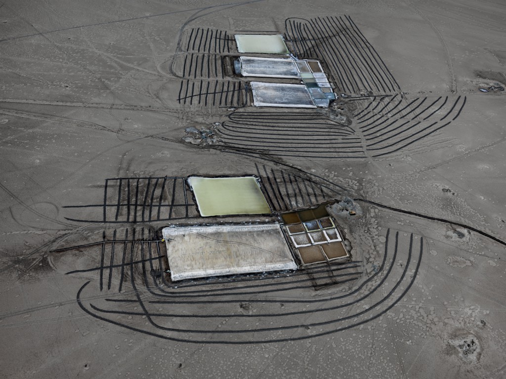
    Edward Burtynsky, Salt Pan #29, Little Rann of Kutch, Gujarat, India, 2016, chromogenic print. Courtesy of Nicholas Metivier Gallery

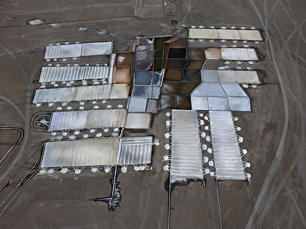
    Well, all you aesthetes and art-lovers concerned with moralization of contemporary art, you may sigh with relief now, as Byrtynsky’s new exhibition puts him back on track to the paradise of beauty and artistry. With reservations, of course; thematically, Salt Pans is continuous with works of the previous decades, although the disorderly, coarsely drawn polygonal salt pans of the Little Rann of Kutch in Gujarat, India hardly convey the mood of environmental apocalypse or disregard for humanity to the same extent as, for example, the tires of the 1999 Oxford Pile or the rows of uniformed factory workers in 2005’s Manufacturing #17. There might be some other, less salient, story of decay or neglect behind these shapes, lacklustre yet neither gloomy nor sullen; the salt pans, the exhibition catalogue says, are under threat for reasons both environmental and economic, and so is the workers’ traditional way of life, undetectable as it is from the images’ topographical perspective.

    Edward Burtynsky, Salt Pan #15, Little Rann of Kutch, Gujarat, India, 2016, chromogenic print. Courtesy of Nicholas Metivier Gallery

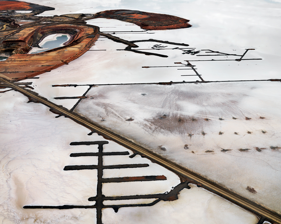
    But to focus on that would be to ignore what makes this exhibition so artistically successful. Salt Pans are almost unabashedly non-ethical, but in ways more interesting than Burtynsky’s 1990s phase. If the earlier workers secured the viewer’s appreciation by the tried and true (not to say hackneyed) methods such as golden section or disappearing perspective, these ones speak to those with background in modernist and contemporary art, suggesting references to classical Futurist and Abstractionist paintings. Kernels of that meta-artistic referentiality are already found in Burtynsky’s earlier works, shown today as part of the sister retrospective exhibition, Essential Elements. For example, circles and lines of Silver Lake Operations #16, Lake Lefroy, Western Australia, bear resemblance to Wassily Kandinsky’s Red Circle, 1939. Salt Pans develop tendency by presenting what often resembles the abstract, dada-informed painting such as Paul Klee’s the 1919’s Falling Bird or the 1930’s North German City. Irony, not activist indignation, permeates Salt Pans, are they look like belated, and self-consciously superfluous, justifications of the representational capacities of abstract art. The photographs’ ethical background literally disappears into the background, indeed gray and gloomy, in contrast to the foregrounded forms, with their casual lines and comical splashes.

    Edward Burtynsky, Silver Lake Operations #16, Lake Lefroy, Western Australia, 2007, chromogenic print. Courtesy of Nicholas Metivier Gallery

    The result of the ambiguity of Burtynsky’s 1990s works, notes Kingwell, is that they seem to maintain a delicate balance between the beautiful and the troubling only when showcased in a gallery; when placed on the wall in a commercial setting (as, apparently, they are in Pearson Airport’s business class lounge), they come dangerously close to celebrating the devastation they depict. I suspect that nothing of the sort would happen to the ethically charged 2000s works; a Shanghai airport would not put them on its walls. But the solution was more troubling than the problem itself; China and other works of that period would not be wrongly interpreted outside of the gallery context because no one would dare take them out of it. One may say that Salt Pans finds a way to bring Burtynsky’s photographs back into the world. In a gallery, these images look almost too artistic, their reference directed inside the art world, not outside of it. But, taken outside, they would, perhaps, introduce both artistry and ethics into a lay location, even if they end up decorating another airport lounge, hanging by the rows of complimentary tablets, reminding a chance traveller (laptop, suit and tie, bloodshot eyes) of a long forgotten visit to a painting gallery while conveying a vague sense of there being something wrong in the world of disappearing panting-like salt pans.

    by Andriy Bilenkyy

    *Exhibition information: September 29 – October 22, 2016, Nicholas Metivier Gallery, 451 King Street West, Toronto. Gallery hours: Tue – Sat, 10 am – 6 pm.


  • Gilles Morin: Mystification at Gallery 1313

    Gilles Morin’s artistic toolbox consists of four different paintbrushes:Photoshop, ArtRage, Painter, and Studio Artist – all of which are unconventional for the creation of an ‘academic’ painting but very modern taking into account the trends of the 21st century.Equipped with an infinite array of color choice and the ability to produce shocking and cerebral works – Morin creates artwork as a commentary to the daily events of our life.

    Gilles Morin in front of his work. Photo: Phil Anderson

    Located in the Cell Gallery at Gallery 1313, the show, Mystification: Digital Paintings, seems to challenge the viewer at first sight. Challenge them in the terms of strong colors – magenta pink, blood red and royal blue – that seem to jump out of the unframed prints bewildering the onlooker. It is so much that catches the eye that we don’t know what to focus on at first: what wall, what painting, what layer of the work. All the works have multiple layers of objects that together make up the final composition. For instance, lips from one face, eyes from another, a suit and a tie, rainbow halo, and bloody eyes are grouped together to create the portrait of an astrologer. It is the artist’s intention to make the audience think about the theme and subject of each piece. Highly personal, each piece evokes a feeling of familiarity because of its juxtaposition of layered objects.

    Gilles Morin, Astrologer, what is seen, digital, inkjet print. Photo: Elizaveta Mironova

    Before talking to Morin himself, I decided to sit down and analyze the painting that had caught my eye, in the corner of the wall, that seemed to mix portraits of different beings. The forehead of a tiger, the chin of a man, glasses, minute numbers of the clock – I started making up my own narrative. It reminded me of our origin and double nature. As time went on, animals evolved into men, but the inherent nature of man still can be aggressive. There is a beast in a man and a man in the beast. The dual personality of a human being is baffling as a continuous repression of the animal is still there, still trying to fit into society as ‘normal’ and ‘appropriate’.

    Gilles Morin, Father time, digital, inkjet print. Photo: Elizaveta Mironova

    Morin watched as I sat and stared at the print for over 20 minutes, scribbling in my journal. He waited eagerly for me to finish interpreting the piece and took up conversation. One thing I had missed he explained, is that facing death for some people is harder than for others. Animals on the other hand don’t have that dichotomy – they live in a ‘better time’, the time of youth. There is an important juxtaposition between the way humans and animals see time, he said. Death is something I failed to infer from the painting, but that is the beauty of the multi-layered works; each viewer picks up on different objects, different hints and reaches his own conclusion.

    Perplexity and the complexity of human nature are the main themes of the show. Beautifully contrasted, one wall contains three portraits of religious subjects:an Archangel, Jesus, and Mary, facing four pieces illustrating the assault on the female body. One of those women is crucified, with her genitalia ‘crowned’ by a thorn crown and an inflamed head of hair.

    Installation view with Gilles Morin, Archangel (left), Garden of Pain-Gethsemane (top right) and Sorrowful Madonna (bottom right), digital, inkjet prints. Photo: Elizaveta Mironova

    Installation view with Gilles Morin, (from left to right) Crucifixion, agony; Deshabille; Stop Judging Me!; Nude, colorful friend, digital, inkjet print. Photo: Elizaveta Mironova

    “Crucifixion, agony,” is Morin’s angry response to the kidnapping of 276 schoolgirls by the Islamic group Boko Haram in Nigeria.  He explained he had heard the news on the radio and became absolutely enraged.“What does it say about men?” – he contemplated through our conversation – “The portrayal of the woman evokes a sense of anger and pain, but there is also hope represented by the leaves at the bottom.”  Indeed, there is a contrast to the main theme as the pastel green, yellow and red leaves sporadically covering the ground bring nature into the composition and attempting to give the hope of survival.

    Gilles Morin, Crucifixion, agony (left) and detail (right), digital, inkjet print. Photo: Elizaveta Mironova

    The complex and highly emotional nature of human beings is spotlighted by the layering of low resolution photographs, allowing Morin to create “experimental and spontaneous works.”  At first glance the juxtaposition of elements seems chaotic and unnecessary, but as you spend more time looking at them in the small gallery, you come to understand the different references in the artwork and their aim to challenge your perceptions.

    Elizaveta Mironova

    *Exhibition information:October 12 – 23, 2016, Gallery 1313, 1313 Queen Street West, Toronto. Gallery hours: Wed – Sun:1 – 6 pm.


  • Clive Holden: Internet Mountains at Stephen Bulger Gallery

    Referencing the fervor of early cinematic experimentation and adapting to new technological possibilities, Holden’s artistic constructions blend nostalgia and futurism in what he defines as a “post” cinematic experience of vigorous creativity. His process of manipulating and overlaying sourced internet mountain images with abstract pseudo natural-digital dream forms, introduces an interesting narrative about intersection of place, time and people. The desaturated, tinted mountain images evoke heaviness and permanence while the bold, translucent sunspots and orbs implicate the work with ideas of motion and transience.

    INTERNET MOUNTAINS 21, Variant 2, 2016 © Clive Holden / Courtesy Stephen Bulger Gallery

    Printed on Kodak metallic paper, the consecutive screen-like still images are read as a moving story board. These stills, in materiality and content, converse with the video pieces, where the same forms float or speed, passing by the still mountainous scene according to randomized algorithms. Holden both harnesses and breaks methods of story telling by merging cinematic operations and artistic techniques of layering, colouring, repeating, sourcing and collaging. The viewer then traverses between an arrangement of still and moving image works. He adds randomness and chance to his intentional compositions to create dynamic, live art.

    INTERNET MOUNTAINS 18, 2014 © Clive Holden / Courtesy Stephen Bulger Gallery

    INTERNET MOUNTAINS 28, 2014 © Clive Holden / Courtesy Stephen Bulger Gallery

    Fluidity is achieved between the related mediums and modes of representation, thematically engaging the notion of time. Holden demonstrates the dichotomy of permanence and ephemerality in the sky, the mountains and the internet. Each, a separate entity, defined within a collage composition and varying in light intensities. The spatial interaction between the sky, mountain and the internet evokes a juxtaposition between the mediated and natural, heavy and weightless. In the images there are similarities and disparities between technology, the natural world and the physical place of humans. The evocation of history and anticipation, memory and reality enables animation, where these found mountains become implicated with multiplicity.

    INTERNET MOUNTAINS Video 5, Still Frame, 2016 © Clive Holden / Courtesy Stephen Bulger Gallery

    INTERNET MOUNTAINS 32, Variant 2, 2016 © Clive Holden / Courtesy Stephen Bulger Gallery

    Collectively, the presentation of prints and digital constructions convey a contemporary human situation in this world – between the natutal mountains and the internet. Holden thematically and technically experiments with our sensory capacity. The final impact is one where the viewers ponder where exactly to situate themselves within the work; between the polarized web and natural elements.

    Nika Teper

    *Exhibition information: September 12 – October 15, 2016, Stephen Bulger Gallery, 1026 Queen Street West, Toronto. Gallery hours: Tue – Sat, 11 am – 6 pm.

  • Jennifer Stillwell: New Work at Pari Nadimi

    While taking in Jennifer Stillwell’s new exhibit at the Pari Nadimi Gallery, the viewer is constantly engaging in a dialogue that makes them question their own sensibilities. The exhibition, titled New Work: Smokestacks, Spills and Figures, is comprised of a series of doors upon which bright paint has been spilled from paint cans that have been attached to them. Some of the doors line the walls of the gallery space, while others lie on the floor in the form of a pile of collapsed dominoes. And, curiously enough, there are also some paint cans without a door, as if the spilled paint is a statement in and of itself. In fact, while this exhibition is certainly playful in some senses, it also puts forth some much more serious implications. We, as the viewer, are then left to make our own decisions on whether we choose to see the lighter or the darker side of things.

    New Work: Smokestacks, Spills and Figures, 2016, Installation view at Pari Nadimi Gallery. Courtesy of Pari Nadimi Gallery

    At first glance, it is very evident that this exhibit is one that attempts to reflect on the history of art in a number of ways. When looking at the pieces that are contained within it, a list of past artist’s springs to mind; Duchamp, Pollock and Smithson, amongst a number of others. It is clear that Stillwell is echoing these artists through her use of everyday objects, and also through the use of gravity in her artistic process. Still, she is also subverting these past traditions through the fact that her work remains somewhat light or comical. Perhaps she is also echoing Duchamp through her desire to be somewhat amusing. 

    New Work: Smokestacks, Spills and Figures, 2016, Figures (detail), Installation view at Pari Nadimi Gallery. Courtesy of Pari Nadimi Gallery

    The playful aspect of this exhibition comes from the fact that it is a sort of spin of the age-old prank of putting a paint can or a bucket on top of a door until someone opens it, thus spilling its contents onto themselves. It is also produced by the use of very bright paint, which makes the gallery space look like some kind of funhouse. However, in the works where doors are stacked on top of one another like dominoes, the paint transitions from bright tones at the top to darker shades on the bottom, underlining the transformative nature of temporal progression. Time is quite obviously an important part of this exhibition, as the state in which these doors are suspended allows the viewer to think both of how the process began, and how it might end. As one passes by these doors and paint cans, it is difficult to believe that this is where the process ends. It is almost as if the paint continues to spill and spread as we move around it.

     New Work: Smokestacks, Spills and Figures, 2016, Smokestacks 2 (detail), Installation view at Pari Nadimi Gallery. Courtesy of Pari Nadimi Gallery

    Perspective is in fact a key part of this exhibition. We are evidently supposed to move around these painted sculptures, observing them at various distances and from a variety of angles. The domino-like pieces in particular are the most interesting to look at, as they seem to change form depending on the angle at which they are viewed. When looked at from above, the viewer sees a set of doors that have paint spilled on them. However when the viewer looks at these pieces at eye level with the paint cans facing away from them, then the work begins to look more and more like a smokestack. Therefore, the title of this exhibition is by no means non-representative; as we move around these sculptures and contemplate their meaning, they begin to morph from spills to smokestacks, thus taking away some of the playfulness that they at first exude.

    Since this exhibition is based primarily on a prank, we are forced to ask ourselves this question: who is pranking who? Are we as viewers in on the joke, or are we at the butt end of it? When looking at the spills, it is easy to think that they come from a very lighthearted place. However, as they begin to take on the appearance of smokestacks, the works begin to take on a much more sinister tone. Suddenly, it is evident that we are the ones who opened these doors, and that the joke is really on us. By mixing the domestic space with the industrial, Stillwell forces us to question our own implication in the environmental crisis. Even the spill works that are included in the exhibition are eerily reminiscent of the various oil spills that have plagued out oceans for a number of years. Therefore, our engagement with Stillwell’s works ranges from amusing to unnerving, all depending on the perspective that we take. 

    New Work: Smokestacks, Spills and Figures, 2016, Spill 2 (detail), Installation view at Pari Nadimi Gallery. Courtesy of Pari Nadimi Gallery

    New Work: Smokestacks, Spills and Figures should not be missed by anyone who is interested in process art, or in the ways in which artists attempt to enter into an ecological dialogue with their viewers.

    Jordan Fee

    *Exhibition information: September 15 – October 29, 2016, Pari Nadimi Gallery, 254 Niagara Street, Toronto. Gallery hours: Wed – Sat, 12 – 5 pm.