Author: artoronto

  • Nuit Blanche Toronto 2016

    Inside Out : Face to Face by JR at the City Hall, 2015. Photo: Phil Anderson

    Saturday, October 1, 2016, sunset to sunrise
    Various locations in Toronto
    Free all-night contemporary art event

    For one sleepless night, from sunset to sunrise, the familiar is discarded and Toronto is transformed into an artistic playground for a series of exhilarating contemporary art experiences in unexpected public spaces.

    Exhibition Projects produced by the City of Toronto

    Under the direction of four curators, Nuit Blanche Toronto features more than 30 public art projects by local, national and international artists.

    OBLIVION

    Curated by Janine Marchessault and Michael Prokopow, you’ll find three exhibition projects at Nathan Phillips Square and City Hall. OBLIVION is about destruction and forgetting. It is about drowning in the pitch-blackness of pure and final absence. And it is about the possibilities of adaptation and unprecedented renewal.

    Militant Nostalgia

    Curated by Paco Barragán, this exhibition features 10 projects along John Street between Dundas Street and Front Street. Militant Nostalgia is a meditation on history and time.

    And the Transformation Reveals

    Join curator Camille Hong Xin with 10 projects along Bay Street betwen Dundas Street and Front Street.

    Facing the Sky

    Curated by Louise Déry, this exhibition features 10 projects along the waterfront. As ‘night-walkers’, we enter into the vertigo of the nocturnal sky.

    Independent Projects produced by Toronto’s art community

    Toronto artists, cultural and educational institutions, museums, galleries and neighbourhoods participate in Nuit Blanche Toronto each year by producing their own one-of-a-kind projects that transform the city.

    For locations and more information please go to https://nbto.com/

  • Wando Koop: In Absentia at Division/Arsenal Gallery

    Installation view of Wanda Koop, In Absentia, Division/Arsenal Gallery, 2016

    Squinting my eyes as you might do in great effort to make out the details of a sunset, until I can see that the sharp lines and saturated colours of Wanda Koop’s paintings reveal the repeated patterns of a high-rise skyline. Filling both the adjoined spaces of Division and Arsenal Galleries, Koop’s large body of work includes views from her Brooklyn Studio. Stalactites form the sky while stalagmites form the towering buildings. Some of the scenes are so closely cropped that the two components become further abstracted, undeniably resembling the horizontal stripes painted by the Abstract Expressionist Barnett Newman. Where the sky and scraper (‘tite’ and ‘mite’) meet, there is no delineating line, only hard, purposeful edges to the planes of colour. The acrylic paint within each space has a cloudy quality composed of translucent layers applied either by wide brush strokes or poured in a sort of Helen Frankenthaler style to bleed the hues together. The effect is dreamlike, a space defined not by symbolism, but by colour and light. 

    Installation view with Wanda Koop, In Absentia, (Horizon Orange – Ash Blue), 2015, acrylic on canvas on stretcher, 54″ x 78″

    In each of the paintings’ titles Koop lists a new name for the colours produced by her style of application.  Some of these descriptive names include ‘mysterious rose grey’, ‘deep sepia – luminous white’, ‘red glow – copper’, and ‘deep grey – mist’. The colour combinations with paint chip names evoke specific times of day or seasonal weather. If we are to appreciate each of these colour combinations and repeated motifs as studies of light or colour, then it is difficult not to draw parallels to Claude Monet’s Rouen Cathedral series (1894). In this series of paintings, as he did with haystacks, Monet painted the cathedral in different lights to explore the expressive capacities of the Impressionist style: to capture a fleeting feeling instead of an exact object. Instead of painting pointed Gothic arches and spires, Koop has chosen a skyward symbol for the nearly religious Capitalism. In Koop’s sky-scape titled “In Absentia (Opalecent Grey Blue)” (2015) the sky and the buildings are nearly the same shade of grey and as the buildings so clearly reflect their surroundings so they become a part of the sky; making it hard to know which way is up or down.casetify phone caseslook at more info

    Installation view with Wanda Koop, In Absentia, (Blue – Transparent White), 2016, acrylic on canvas on stretcher, 20″ x 24″

    The exhibition title In Absentia named after this body of work means ‘In Absence’, but this absence seems not to be the artist’s or mine. Her paintings seem instead to represent an uninhabitable or rare space where the beauty of New York’s architectural reality is valued above its economic symbolism – or perhaps an ode to ephemeral moments in the mega city’s skyline.

    Wanda Koop, In Absentia, (Luminous Red – Rose – Deep Magenta), 2015, acrylic on canvas on stretcher, 54″ x 78″

    Text and photo: Alice Pelot

    *Exhibition information: August 27 – October 8, 2016, Division / Arsenal Gallery, 45 Ernest Avenue, Toronto. Gallery hours: Tue – Sat 10 – 6 pm.

  • Jim Reid: Field of Vision at Lonsdale Gallery

    Interview with Jim Reid (JR) by Nika Teper (NT)

    Jim Reid’s chaotic brush strokes enable atmospheric renderings that are especially provocative when slowly approached from a distance. His representations aim to convey the tensions of space in time. The contentious theme of land use becomes a conversation about conservation and development. To communicate the interaction of natural and human histories, he employs the method of onsite work derived from late 19th/early 20th century Plein Air painting. Peel Plain Farms, a locale northwest of Toronto, is a historic agricultural area facing development. This series presents the transience of nature, the uncontrollability of space; nature’s fragility and resilience, order and chaos. Up close his work appears to be energetic, chaotic, magnetic brushstrokes that interact and exchange. From afar his work becomes cohesive representations that recede in space.

    Jim Reid, Peel Plain 7-4-16: north from King Street west of Sloan Road, 2016, acrylic on canvas, 76″ x 114″

    NT: How does changing atmosphere and weather influence your work? Can you expand upon your process of Plein Air painting? Are the artworks in their entirety completed in the outdoors? How does this method influence the outcome?

    JR: For centuries, Western culture and science have sought to demystify and control nature. Today, no corner of the earth is unaltered by technology, yet nature remains beyond our control, infinitely complex and enigmatic. The fragility and resilience of nature, its order and chaos fascinate me. As a plein-air painter, I seek a complete involvement with the site. Working outdoors on the land, I am immersed in the vagaries of wind, rain, snow and sun. Depending on the site, I may also be buffeted by passing transport trucks or tormented by black flies. Plein-air painters believe that these various sensations of experience can be translated through paint. Many of my paintings are small-scale studies, which are easily transported and depict the landscape with immediacy. I also work on a monumental scale, which presents different challenges. Earlier work from my “Terraforms” series was based on fibreglass casts of the forest floor or Canadian Shield granite. These panels could be constructed on-site and left outside for many months during the process of work. Paintings from the “Forest” series were painted within hiking-distance of my studio, and plywood panels or stretched canvases were portaged to the sites and remained there during the painting process. The “Peel Plain” sites are more public, on roadsides or the edges of fields, and so must be more mobile. I may carry sectional panels tied to the roof of my car, or just unroll a large canvas directly onto the ground.

    2016, site #1, Peel Plain

    NT: Your work is rooted in real landscapes. Do you aim to convey a layered composition of different moments in time simultaneously? How long does it take to complete a piece?

    JR: The large paintings may take many months to complete. I often have several works in progress, and may move them to different sites during their development. The final stages of work are completed on a single site and day, and the works are titled by their completion date and location. The completed work is layered with place and time, be that from dusk until darkness, or through seasons. I use watercolour or acrylic paint, both of which are affected by temperature and humidity. Random “paint events” are allowed to occur, influenced by both the climate and the nature of the materials.

    NT: Your work thematically deals with the collision of nature and mankind and the result reveals many dichotomies. What is your personal opinion about urban expansion and humans’ lack of knowledge about nature?

    JR: On a trip to the south of France a few years ago I was struck by the respect shown to the history of landuse. Ancient towns were continuing to expand, but within boundaries and with architectural consistency. The agricultural land between them remained intact, revealing topography dating back to the Middle Ages. In North America we have held to an expansionist mentality, and we are spiritually poorer because of that.

    Jim Reid, Peel Plain 3-7-16, 2016, acrylic on canvas, 72″ x 108″

    NT: Will your future work also deal with the consequences of urban expansion?

    JR: The work is part of an ongoing observation of the Peel Plain. The Peel Plain is a historic agricultural area north-west of Toronto, defined by Brampton to the south and the Niagara Escarpment to the north. It’s farms reveal a time-layered working of the land, many going back 5 generations. Small sections of woodland date back to the pre-colonial era, when the land was part of the Mississauga First Nation. I have a long familiarity with the area, having frequently travelled through it since the 1960’s. My present studio is just north of the Peel Plain. From 1999 to 2002, at a time when I was working in Toronto and making a daily commute from rural Caledon to the GO station in Brampton, I created a photographic archive of over 2,000 images of the Peel Plain. These were panoramic photos taken from a moving car using a low-tech camera. They documented the transition from rural to suburban land-use at a time when the recent expansion of Brampton was just beginning. A selection from the series, titled “Marginal Lands” was shown at Lonsdale Gallery, and is now in the collection of the Peel Art Gallery. The work in “Field of Vision” revisits many of the sites photographed in “Marginal Lands”. Many other sites have since been built-over. I plan to continue painting and drawing in the Peel Plain in the years to come.

    *Exhibition information: August 24 – October 7, 2016, Lonsdale Gallery, 410 Spadina Road, Toronto. Gallery hours: Wed – Sun, 11 – 5 pm.

  • Sarah Letovsky: Girls Girls Girls at Project Gallery

    Girls Girls Girls – the name hooked me in before I saw any of the works. A neon sign flashing this word thrice repeated in the window of Project Gallery lures me in to its quaint space. The opening was a sweltering night at the end of Toronto’s summer but I think it was all the Girls that were bringing in the heat.

    Sarah Letovsky at the Opening Reception in front of her painting, Bernadette, 2016, oil on canvas, 60″ x 72″. Photo: Carter Brown

    Sarah Letovsky, just two years after her graduation from OCAD, brings a bevy of painted ladies to the Queen East space for her very first solo exhibition. Upon entering the gallery I was greeted by bold and vivid canvases on the walls. As a person who is drawn to the boldest and brightest of patterns and colours, my eyes were in heaven. Paintings on various sizes of canvas are scattered throughout the gallery along with a wall of smaller watercolours. Before even focusing in on one work at a time, the exhibition as a whole is absolutely striking. I know there’s no way I could have passed by without stopping in if I looked in from the street. There’s intensity in each painting, from the brilliant colours and solo female girls staring out at the viewers.

    Installation view with Sarah Letovsky, Untitled, 2016, oil on canvas, 24″ x 24″ (left) and Red Striped Shirt, 2016, oil on canvas, 30″ x 30″(right). Photo: Carter Brown

    Letovsky’s pieces are beautiful and complex; I was drawn in instantly. The artist told me that female portraits have been something she has always loved, they even were the subject of her thesis. As I talked to Sarah Letovsky, she also explained to me how her Girls in the exhibition are abstract characters, compared to her earlier works, which were more representational. These women may start from just a gesture or colour, which the artist then builds into a face and personality. Even if one of Sarah’s faces has a story that she has created, the creator does not wish to impose this on the viewer; so we, the viewers, are able to create our own narrative. Letovsky told me, “We are always looking at faces. We are trained to pick up the smallest gestures or nuances, so even just the tiny little movement of the mouth or eye can totally change the expression and feel of the piece so I like to let them do their own thing.” And do their own thing they do.

    Sarah Letovsky, 2016, Salome, oil on canvas, 30″ x 36″. Courtesy of Project Gallery

    As I moved through the exhibition and slowly got to know the Girls, it hits me just how much an expression can…express. These faces are nonrepresentational; but even if a real acquaintance or recognizable public figure was the origin of these characters, there is so much information transmitted through their faces that is based on the viewer’s personal understanding. When I sit and stare at the face staring back at me, a story comes to life based on my experiences. I am reminded of my younger sister, that shy girl from a university lecture, and I also see traits of myself. Certain elements of expressions really resonate with emotions I have felt; and those emotions transferred to the narrative I created. I discovered how much the human face can communicate.

    Sarah Letovsky, Virgo, 2016, oil on canvas, 48″ x 60″. Photo: Carter Brown

    But faces also conceal. Are these Girls trying to hide something by displaying a certain expression to the watching world? Are these expressions a glimpse into raw emotions that are not veiled as a reaction to onlookers? Or do they wear these expressions to protect themselves? I wonder if there are aspects of the narrative that I created in my imagination, which are intentionally conveyed through the painted face by the artist, in order to shield something. Am I fooled by them in believing I understand the particular expression of the face before me? Perhaps I am getting way too Inception-like with the artworks…

    Sarah Letovsky, Still life with Fruit, 2016, oil on canvas, 30″ x 40″. Courtesy of Project Gallery

    Letovsky’s ’s stunning first solo exhibition made me reflect on myself, my emotions, and my interactions with other human beings; specifically on the act of viewing and being viewed by others. I was amazed by her brushstrokes even before I was mesmerized by her Girls and the characters that came to life through them. One thing is for sure: this girl can paint.

    Carter Brown

    *Exhibition information: September 8 – 25, 2016, Project Gallery, 1109 Queen Street East, Toronto. Gallery hours: Wed – Sun 12 – 5 pm.

  • Roald Nasgaard: Ric Evans at Nicholas Metivier Gallery

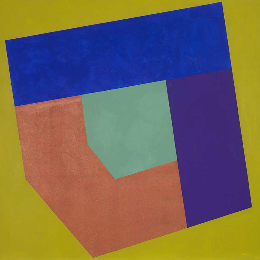
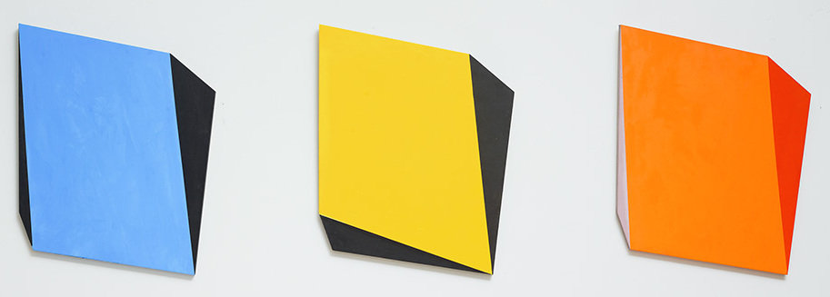
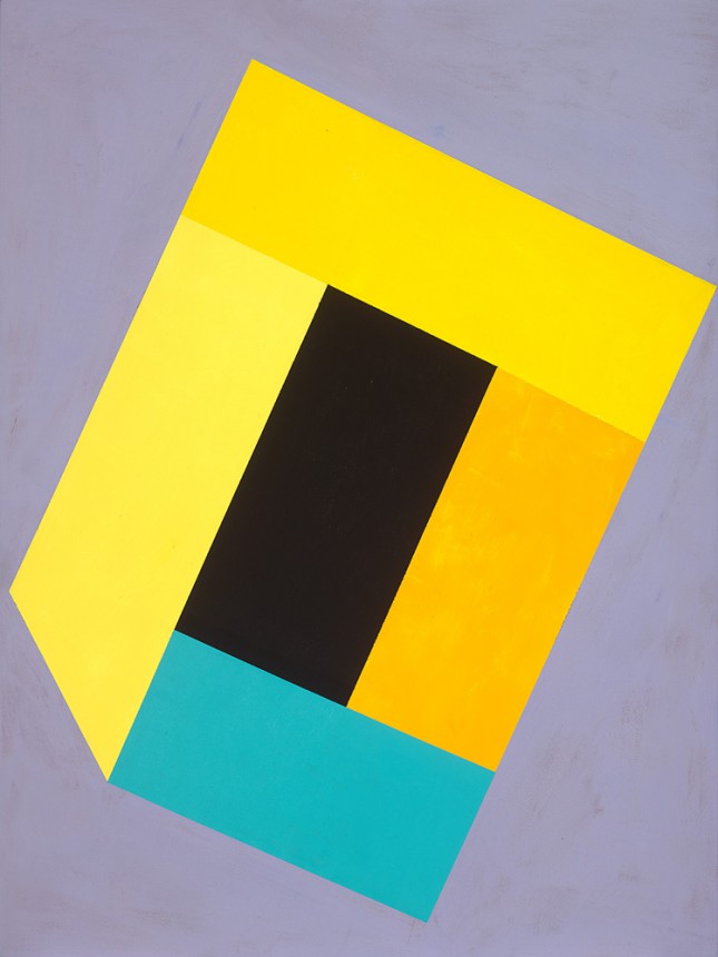
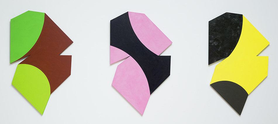
    Abstract painting is alive and well, and Ric Evans is in top form. His new paintings are youthfully bold – or is it old-masterly confident? – tightly bound geometric compositions with quirky colours, contrasting paint surfaces and unstable locations. These are the larger rectangular paintings. Then there are the smaller diptychs and triptychs, whose external shapes are more idiosyncratic. At first sight it takes more than a moment to realize that the panels in each set are indeed identical. Their unpredictable internal subdivisions and their eccentric colours cast even that certainty in continual doubt. Instability is the constant state of Ric’s paintings. They are compositionally whole, but the eye can’t hold them still. Encounter, with its mustard-coloured ground against which three sturdy rectilinear planes churn around a center core like the arms of some big industrial mixing machine. An angular, glistening, copper shape in the bottom left pushes up at a luminous cobalt blue rectangle above, which in turn must weigh down on a dark purple, irregular rhomboid on the right, which then shoves along the original copper shape. So it goes, round and round – working both clockwise and counter-clockwise – in a concatenation of muscular actions that fire up our own internal mirror neurons, inundating our bodies with emphatic emotional responses.

    Ric Evans, Encounter, 2016, acrylic on canvas on board, 68″ x 68″. Courtesy of  Nicholas Metivier Gallery

    If geometry implies measure and system, while colour stokes the sensual and the intuitive, what is Ric’s system? A decade or so ago his rules were more upfront, but in this exhibition, his workings are freer, more instinctual and improvised. Ric is a consummate colourist, he declares his colours individually, each independently holding its own. When he juxtaposes them, adjacent colours learn provisionally to co-exist, but not without border tensions. As important to these paintings is their material body. Paint is variously applied, smooth or brushed onto solid supports, the larger canvases stretched over wood panels. To make the smaller diptychs and triptychs, Ric has applied his paint with a palette knife in some cases, directly onto birch panels.

    Ric Evans, Changing Location, 2016, set of 3, oil on panel, 21″ x 19″ each. Courtesy of  Nicholas Metivier Gallery

    Ric’s work emerged in the mid-1970s, when painting faced two important challenges, one from outside the discipline and another from inside it. This was when the serious art world was turning hostile to painting altogether, and when its future was not altogether certain. Painting had come to pose a number of problems. From a post-modern perspective, modernist painting’s claims to timelessness and universality were bankrupt because, as we now learned, all artistic utterances were merely contingent outcomes of specific temporal social and political conditions. Geometric abstraction was doubly suspect because its underlying geometric structures were concomitantly revealed – whatever a Mondrian or a Newman may have believed – to signify neither utopian nor transcendental values, but were rather abstract codifications of oppressive political or bureaucratic systems of power. In any case, with the availability of a range of new technologies, painting’s craft-based practice had apparently outlived its usefulness.

    Ric Evans, Still Form, 2016, acrylic on canvas on board, 40″ x 30″. Courtesy of  Nicholas Metivier Gallery

    Painting, of course, survived and proved to be indispensable to art’s toolbox, but not without a changed sense of itself. Ric also came into his own in a climate of Minimalist art in which painting sought to forefront its status as a material object. This was in the mid-1960s and into the 1970s, when stretchers thickened and frames disappeared. Eugene Goosens, in his text for the MoMA exhibition, The Art of the Real in 1967, described how each work in the show was literally ‘real’ because it offered “itself for whatever its uniqueness is worth in the form of a simple irrefutable object.” In this situation one found oneself physically on equal footing with the painting, co-existing with it in a shared space, another independent piece of reality with a certain height, width, depth, colour and texture.

    Ric Evans, The Flow of Surprise (Double Green, Magenta and Yellow), 2016, set of 3, oil on panel, 37 1/2″ x 23″. Courtesy of  Nicholas Metivier Gallery

    Thus when Ric made his museum debut in 1975 in an Art Gallery of Ontario group show simply entitled Four Painters, and was asked by the curator to describe his work for the catalogue, he simply gave the facts: “Ric Evans paints 6 in. vertical bands of artist’s oil colour on a ground of latex interior house paints, on canvases 3 ft. by 6 ft.” Along with his colleagues in the exhibition, he defined the “most obviously common aspects” of their work as “reduced means, serial format, denial of illusion and illustration.”

    The particularity of Ric’s paintings has been how he constructs, using coloured and textured shapes, a succession of relationships that are always in tension. We can seize them only piecemeal, and then strive to put them wholly together. The experience of painting has never been a passive one, as its distractors have claimed, but Ric’s painting thrives on immersing its viewers in experiences of change, dislocation and decenteredness. Their world remains in flux, imagined orders emerging, dissolving and remerging.

    Ric Evans, Appearances of Certainty, 2016, acrylic and oil on canvas on board, 60″ x 60″. Courtesy of  Nicholas Metivier Gallery

    If there is existential meaningfulness to staging perceptual performances of mutating instability as if they were surrogates for the vagaries of everyday human experience, in Ric’s work it presupposes neither despair nor melancholy. It is on the contrary both exciting and celebratory. As I have said before, in Abstract Painting in Canada: “Up-front, quirkily so, as Evans’ compositional structures often are, it is nevertheless when he pits structure against destabilizing contraries that his more recent painting delivers its aesthetic pizzazz.”

    Roald Nasgaard

    *Note: The article was originally written for Nicholas Metivier Gallery and published on its website. We thank the gallery for their permission of posting it in artoronto.ca.

    **Exhibition information: September 8 – 24, 2016,  Nicholas Metivier Gallery, 451 King Street West, Toronto. Gallery hours: Tue – Sat, 10 am – 6 pm.

  • DRAFT / A monthly night for new writing

    DRAFT

    A monthly night for new writing

    Thursday, September 15, 2016,  8 pm

    The Belljar Cafe,  2072 Dundas St W, Toronto

    Draft is a platform for discovering and sharing new, high quality writing. Our writing nights are an open invitation for writers and readers to share and hear new writing. With Beer.

    There’s no criticism, no questions. Just an audience in a friendly space. All you have to do to read is turn up and speak to one of the Draft team.  If you prefer to sit and listen, that’s fine too.

    Founded in 2015, Draft has a three-part structure: a monthly night, open to all; a monthly podcast and illustrated publication that feature a selection of the best work of that night; and an annual periodical celebrating the year’s most outstanding writing and the conversations around it.

    To contact the Draft team, email draftwriting@gmail.com, and for more information or to hear our podcast visit draftlondon.co.uk. Find us on Instagram @draft_london; on Facebook www.facebook.com/draftlondon and on Twitter @draftlondon.

  • The Idea of North: The Paintings of Lawren Harris at the AGO

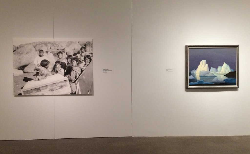
    How do you reintroduce Canada’s most famous artist to a Canadian audience? If that artist is Lawren Harris, and the show is titled The Idea of North, then the groundwork seems already laid—reframe Harris’s paintings of the great white north as idealized yet problematic, taking into consideration factors of race, class, gender, and privilege that informed his work. After all, a basic hanging of Harris’s landscape paintings is nothing new. So with this potential its fingertips, did the show get as critical as it could have? 

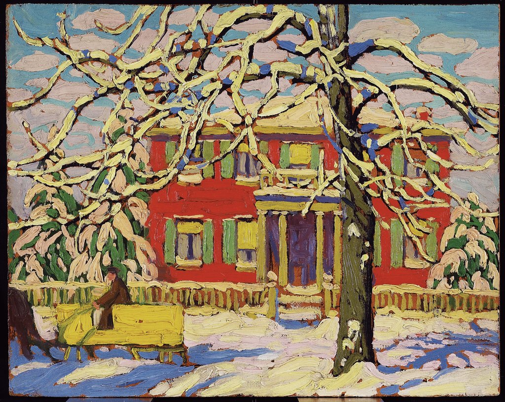
    Lawren S. Harris, Red House and Yellow Sleigh, 1919, oil on pulpboard, 26.7 x 33.7 cm. Courtesy of Art Gallery of Ontario

    With help from co-curator Andrew Hunter—who, for the AGO’s iteration of the show, added two new sections on old Toronto’s Ward neighbourhood, a source of inspiration for Harris—the show lightly addresses these critical issues, but is perhaps too polite in its approach. In the exhibition’s core where iconic mountain peaks and icebergs hang, didactic panels softly explain that “Harris did not usually include [in his paintings] the people he met—either Inuit or southerners working in the Arctic,” because this was his “highly personal response to place.” These panels acknowledge that Harris left people out of his paintings on purpose, but they avoid talking critically about the artist’s privileged background as, for lack of a nuanced term, a wealthy white male, and how this erasure—notably of Indigenous communities—brings up questions of power relations at play. 

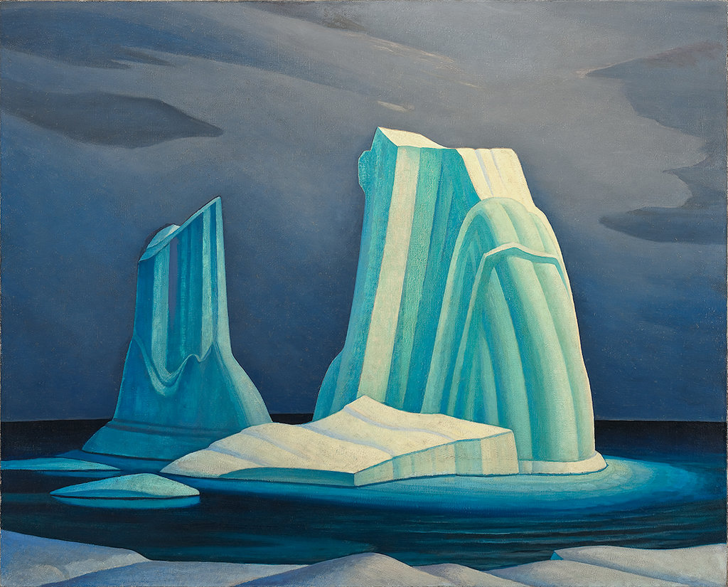
    Lawren S. Harris, Icebergs, Davis Strait, 1930, oil on canvas, 121.9 x 152.4 cm. Courtesy of McMichael Canadian Art Collection

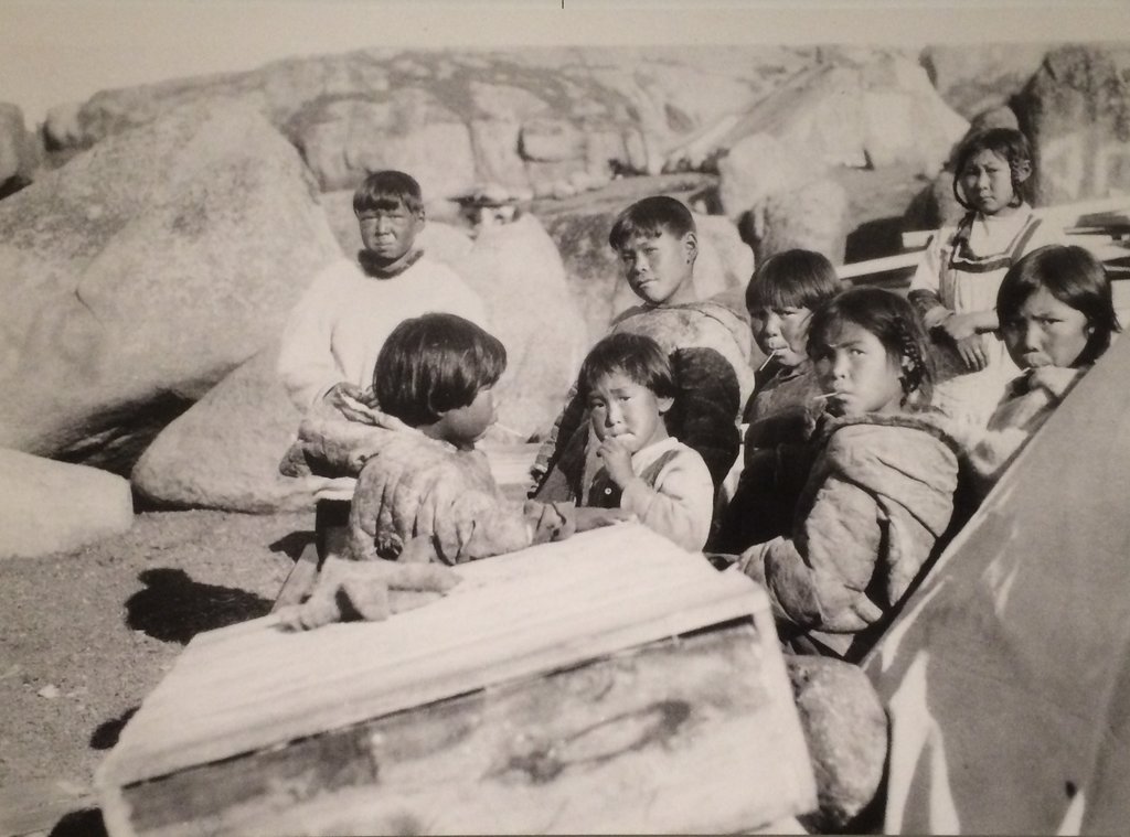
    Honourably, the curators try to rectify Harris’s dismissal of the Inuit specifically by including two large-scale photographic reproductions of Inuit families, taken by Harris himself in 1930. They hang amongst barren iceberg paintings and depictions of Baffin Island’s empty North Shore, and the juxtaposition is certainly charged: not only is it proof that Harris encountered these communities, but also blatant evidence of his conscious painterly disregard.

    Lawren S. Harris, Inuit Children, Pangnirtung, Baffin Island, 1930, reproduction from original photograph. Courtesy of the Estate of Lawren S. Harris

    However, without including an Indigenous voice in this section of the show, the curators’ attempt at rectification falls short. A didactic panel admits that “Unfortunately, the power of Harris’s vision has led many to imagine the Arctic as an empty and unpopulated land,” so why not incorporate an Indigenous voice or narrative in response to this point? 

    Installation view from The Idea of North. Photo: Emily Lawrence

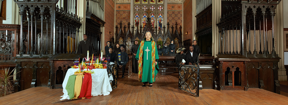
    Elsewhere in the show, contemporary artist Anique Jordan was commissioned to create two photographic works in response to Harris, wherein she addresses the Black communities active in The Ward in the early 1900s—a community unsurprisingly absent from Harris’s paintings of the neighbourhood. Jordan’s works are probably the most powerful in the show: featuring the voice of a young black female juxtaposed alongside Harris’s expresses a point about erasure that didactic panels simply can’t. Incorporating something similar by an Indigenous artist into the core section of the show had the potential to cultivate further critical dialogue.

    Anique Jordan, Mas’ at 94 Chestnut, 2016, chromogenic print. Courtesy of the artist

    Thus, The Idea of North merely scratches the critical surface. The show seems aware of the problematic aspects of Harris, but is overly polite in its explanations and is seemingly too timid to push further—perhaps in fear of appearing blasphemous against one of Canada’s most famous artists.

    Emily Lawrence

    *Exhibition information: July 1 – September 18, 2016,  Art Gallery of Ontario, 317 Dundas Street West, Toronto. Gallery hours: Tue & Thur, 10 am – 5 pm; Wed &  Fri, 10 am – 9 pm; Sat & Sun, 10:30 am – 5:30 pm.

  • Interview with James Maxwell

    James Maxwell

    Interview with James Maxwell (JM) by Nika Teper (NT)

    NT: Evocative negative space is present in your work. In the “Inversion Series” the specific removal of material enables spatial depth. In the “Mechanical Drawing Series” the manipulation of the round steel rod identifies empty space. Can you speak to the interplay between subtraction and addition in creating emphasis? How do you decide what details to include and exclude when creating a iconographic renderings?

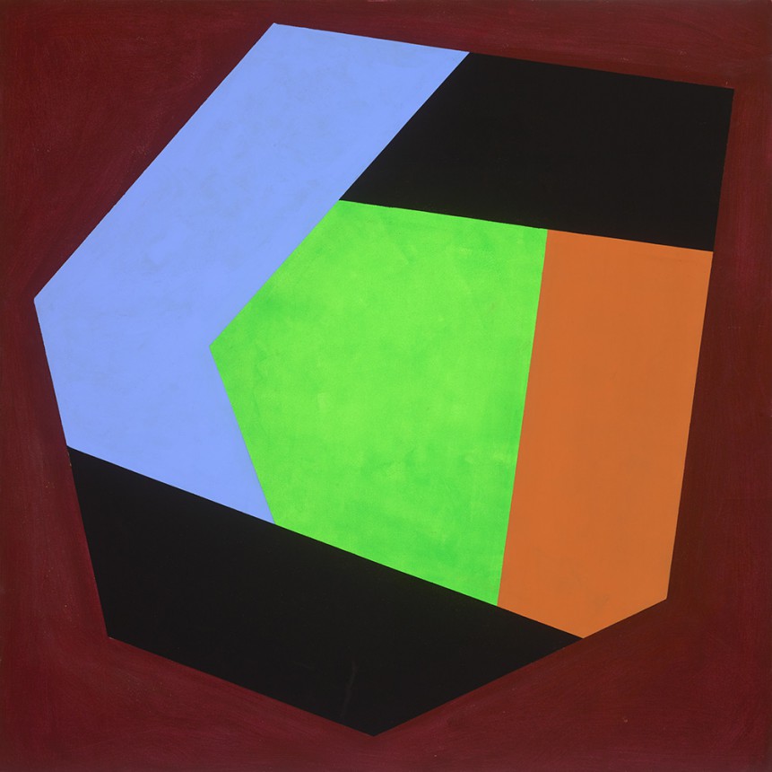
    JM: Both “Mechanical Drawing” and “Inversions” are born of line drawing. They approach the same problem from different angles. In the “Inversion” series the areas of removal are determined by the isometric hexagonal portrayal of a cube. This system leads to an expansion of space by removing layers of cardboard whereas in “Mechanical Drawings” there is a flattening of the object. There is a constant struggle between object and representation. Subtracting from the cardboard plane and creating pathways with the steel rod take me to the same place. The drawing is the object and the object is the drawing. In regards to the decision making process, I devise a system that allows me to lose myself to an other self that embraces instinct and rejects rationalizations. Sometimes I feel that my best work occurs during lulls between bouts of thinking. It’s exciting when the system begins to collapse. I wanted to initiate the process to see what I could see.

    James Maxwell, M-79, steel and aluminum, 43″ x 43″ x 3″. Courtesy of Elaine Fleck Gallery

    NT: While engaging with substantial materials, your work suggests the drawing processes of illustration and isometric technique. Do you aim to highlight the translation of two dimensional drawing modes into three dimensional objects or is it art as a hybrid?

    JM: I see it as a hybrid. Both series are constantly vacillating between 2 and 3 dimensional portrayal. It becomes difficult to see the “object” in “Mechanical Drawing” and it becomes difficult to see the “drawing” in “Inversions.” It’s interesting to see what is constructed in the viewers mind and how, after perceiving one thing, another thing competes for supremacy to the point where we’re not sure what we’re seeing.

    NT: In this collection, you present two series of work, one sculptural illustrations of familiar mechanisms and the other allusions to objects and space. Is there a specific dialogue between the two?

    JM: There is, in that the cardboard pieces allude to the arena in which the objects in steel compete for our affections. 

    James Maxwell, from the Inversion series: C53 (left) and C64 (right), both corrugated cardboard, 19.5″ x 19.5″ x 3″. Courtesy of Elaine Fleck Gallery

    NT: The term plasticity as a transformation of material, directly applies to your work. The ability for corrugated cardboard to acquire the qualities of steel and aluminum is most evident upon their comparison. How do you manipulate more ephemeral substances such as shadow and light to transform the material?

    JM: The shadows are created by the stripping away of the cardboard; those areas of removal are dictated by the system. The shadows shade the object, creating the inversion space that is portrayed. This inversion is both physical, through the removal of material to the point where the box is turned inside out, and mental, as the object inverts from negative to positive in our minds. I use isometric drawing as a system to accurately represent a single object that will be constructed. Transposing this 2 dimensional method into 3 dimensions creates many things as opposed to one single thing.

    With the objects in the “Mechanical Drawing” the shadows create a fuzzy image that makes them appear out of focus. This is somewhat unsettling and invites the viewer to take a closer look. However not everyone enjoys this. A friend of mine who suffers from vertigo couldn’t look at them as it makes him dizzy.

    James Maxwell, Band Saw from the Mechanical Drawing series, round steel rod, H 36″ x W 27″ x D1/8″. Courtesy of Elaine Fleck Gallery

    NT: Your work, in subject and material, prompts an interesting dynamic between process and product as you thematically and technically address both while the final art form does not function as either. How does your approach to art theoretically fit with your metal design and fabrication business?

    JM: Both art and design shape physical and emotional space. Both have their specific fabrication requirements and processes. I’m often confused by the difference between objects, what they are and what they do. Sometimes when working in my studio I find it difficult to tell which is which.

    James Maxwell, from the Inversion series: C83 (left) and C104 (right), both corrugated cardboard, 19.5″ x 19.5″ x 3″. Courtesy of Elaine Fleck Gallery

    NT: How do you see yourself experimenting with material, process, product and the resulting artform in future work? Specifically, have you begun engaging with new technical innovations?

    JM: Not as yet. I’ve been consumed by the work for my September show at the Elaine Fleck Gallery. Once I come out of my cave and look around I’ll have a better idea of what’s going on.

    *Exhibition information: September, 2016, 1351 Queen St. West,  Toronto. Gallery hours: Mon, Wed, Thur & Fri: 12 – 6 pm, Sat: 11 am – 6 pm.

  • Tattoos: Ritual. Identity. Obsession. Art. at the ROM

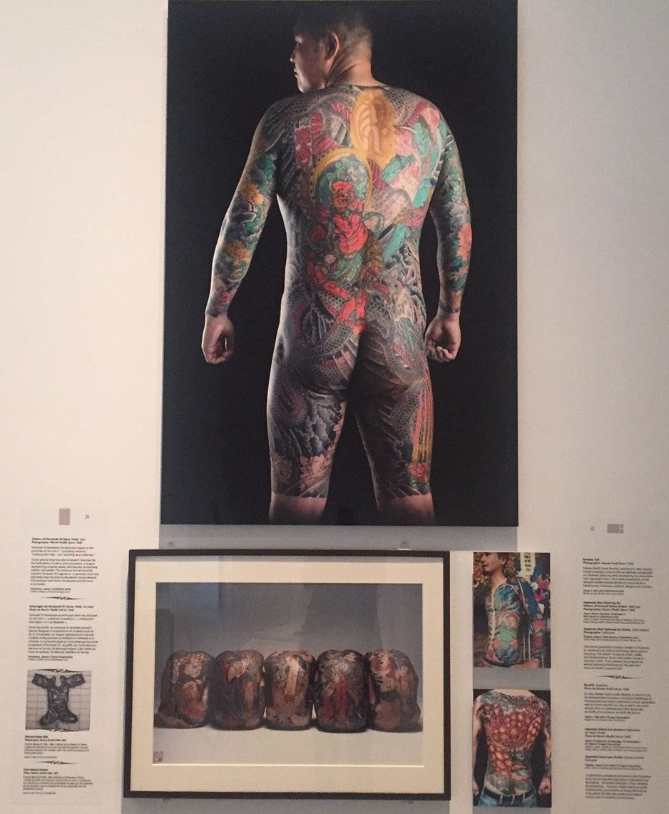
    The tagline for the Tattoos exhibition at the Royal Ontario Museum (ROM) Ritual Identity Obsession Art is a perfectly succinct outline for the cross-examination of tattoo practices across continents and through history. Most of the objects are treated like artifacts and documentation, but all seem included for the purpose of elevating contemporary tattoo practices and styles to an art form. In addition to the various two and three-dimensional documents, thirty-three master tattoo artists were commissioned to produce large Japanese bodysuit style drawings or works on silicone manikins. Each featured artist is accompanied by a narrative including where they apprenticed, when they began, where they’ve worked or traveled, what their style is called, and whether or not they have other practices. In this exhibition, tattoos are treated as a new branch of art history. 

    Japanese bodysuit style tattoos

    Most of the exhibition is laid out by country or region including North America, Europe, New Zealand, Samoa, Japan, Eastern Polynesia, Philippines, Borneo, Indonesia, Thailand, China and several Latino cultures. In each section, the historical narrative builds towards the eventual acceptance of contemporary tattoo culture. In other sections unassigned to a country, historical cross-cultural stigmas are explored. Some of these stigmas include gang symbols, prison rank markings, initiation rights, marks of punishment or ownership by pimps or Nazis, signs of marital status or motherhood, and membership to a side show act or team of sailors. Other, more contemporary reasons for having tattoos are expressed as the need for individualism and to re-establish traditional culture and symbols. In the early 20th century the Western world developed another vague stigma against the tattoo as a practice only worn by wild, ‘uncultured’ tribes. Adolf Loos perpetuated this through even the development of unadorned architecture. And again a force from the Western world, missionary and other religious activity nearly eradicated tattooing practices until recent contemporary resurgence. 

    Silicone Manikines with ‘Tribal’ tattoos

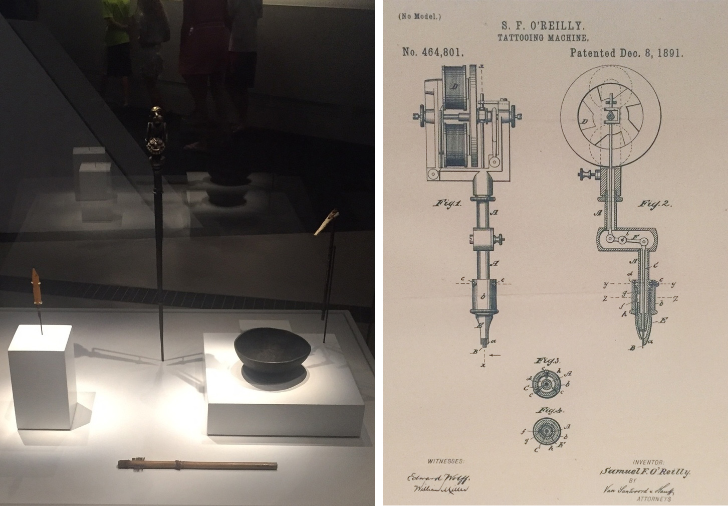
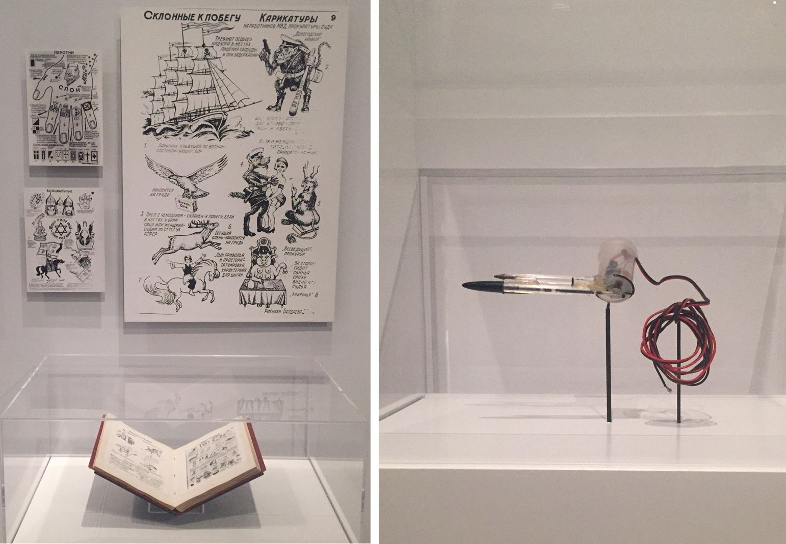
    Some of the symbols and styles evolved due to the technology available. Technological tattoo history included in the ROM’s display begins with wooden rods and combs from the 19th century, ink bowls from the early 20th century, and manuscripts with drawings of symbols. Most of these tools were used to make ‘tribal’ tattoos with larger, thicker lines and dots. The advent of the electric tattoo machine by Milton Zeis was an evolution of Thomas Edison’s Electric Stencil Pen, which produced 3000 punctures per minute. Finer or more accurate lines and more saturated colours that are quintessential to contemporary tattoo styles have developed from the electric gun. Another, even more ingenious tattoo gun on display is made of wire, spool and a ballpoint pen, conceived of and used in prison. 

    Late 19th Century Tattoo kits (left) and Diagram for electric tattoo gun (right)

    Prison Tattoo symbolic guide (left) and Prison Tattoo Gun (right)

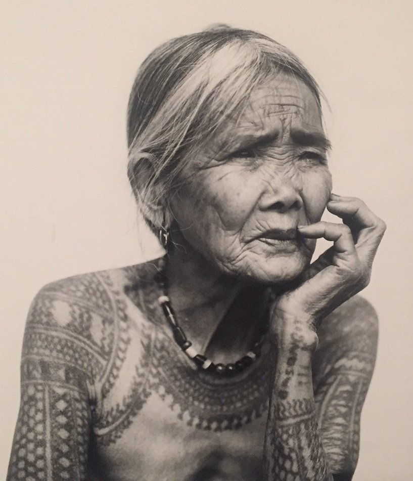
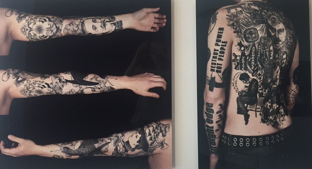
    Among the dozens of artists mentioned, some stood out for their dedication and style. One of the last Kalinga master tattooists from the Philippines, Fang-od Oggay (born 1920) is featured as an artist using traditional tools and styles. The contemporary British artist Xed LeHead, on the other hand, submitted a silicone arm covered entirely in ultraviolet light sensitive ink forming thick, geometric patterns. With each photograph, a photographer who specializes in tattoos is listed alongside the featured tattoo artist. Tattooed people have long been the subjects of the photographic, voyeuristic gaze as representative of native or sub-cultures.

    Tattoo by Fang-od Oggay

    Photographer Zoe Forget, tattoos by Guy Le Tatooer (left), and Jean-Luc Navette (right)

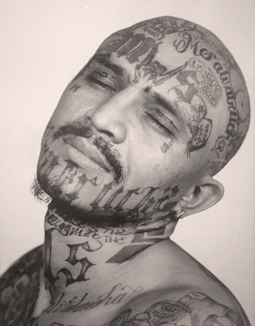
    More recently, the acceptance of tattoos has made photographs of tattoos artworks like the tattooed bodies that are their subjects – as opposed to documentation. One beautiful series of portraits titled “Series Maras” by Isabel Muñoz is large-scale black and white documentation of the three weeks she spent in El Salvador prisons. The gang members she chose to photograph have offensive tattoos that perpetuate violent and anti-social behavior while their postures and facial expressions communicate vulnerability. 

    Isabel Muñoz, Portrait from Series Maras

    There are many artworks in the Tattoo exhibition, however, displayed alongside artifacts, they serve more as supportive documentation. Portraits of tattooed people validate tattoos as an artistic medium and elevate the body of the subject to that of art, but tattoos as a medium also have the potential to reveal stigmas related to their permanence and subcultures.

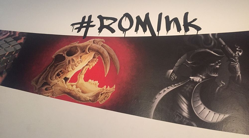
    In addition to the incredible number of historical documents, and commissioned paper and sculptural works, the ROM has organized a hashtag #ROMINK for virtual public interaction. Featured next to a video of Contemporary Canadian tattoo artists, people are invited to upload images of their own tattoos, producing widespread documentation to be entered into the tattoo cannon.

    Text and photo: Alice Pelot

    *Exhibition information: April 2 – September 5, 2016, Royal Ontario Museum, 100 Queens Park, Toronto. Gallery hours: Mon – Thurs & Sat – Sun, 10 a.m. – 5:30 p.m. Fri 10 a.m. – 8:30 p.m.


  • 16th Annual Juried EMERGING SCULPTORS EXHIBITION

    Opening Reception and Awards Presentation
    Thursday, August 11, 2016 6:30 p.m.
    Canadian Sculpture Centre

    Adhering to its educational mandate, the Sculptors Society of Canada (SSC) organizes and sponsors this exhibition each year. The SSC invites submissions from across Canada.

    This year the jurors have selected 13 works by 6 artists from Ontario. This takes place in a 2-step jurying process. The first involves viewing of submitted images; then the second jurying for awards takes place after the works are set-up in the gallery. Both jurying processes are completed “anonymously”. No names or gender are given to the jurors….only the images / titles / media / dimensions / artist statement about the works. This is all presented via “numbers” in order to facilitate the fairest process. Winning recipients of the 3 awards were announced & presented during the opening event – not before.

    The jurors: Kimberley Lillywhite, Director of Red Head Gallery, Kelly McCray, Curator and Peter Por, Sculptor selected the following artists:

    Gary Augustynek, Toronto
    Leah Boyd, Guelph
    Susan Kachor Conlon, Thunder Bay
    Glen Farley, Toronto / Norway
    Katie Lemieux, Thunder Bay
    Jonathan Simpson, Toronto

    Glen Farley winner of A & M Charitable Foundation Award accepts the award from Flavio Bell

    Glen Farley, Surveillance, kinetic mixed media

    Leah Boyd, winner of the Artcast Inc Sculpture Award in front of her work, -Ve+Ve, steel

    Katie Lemieux winner of the MST Bronze Ltd Sculpture Award with her work, Just Enough, mixed media

    Jonathan Simpson, Dream Log, cherry wood on steel base

    Susan Kachor Conlon with her sculpture, Am I Empty, steel rivets

    Gary Augustynek, Layers, wood, clay, stone

    The participants and jurors were in attendance….neither having met one another previously.

    Image courtesy of Canadian Sculpture Centre

    *Exhibition information: Augustus 11 – 31, 2016, Canadian Sculpture Centre, 500 Church Street. Gallery hours: Tue – Fri: 12 – 6, Sat: 11 – 4 p.m.

  • Le Baptême de la Solitude: Alexander Jowett at Alison Milne Gallery

    Alexander Jowett’s collection of horizons impart a laborious yet meditative process in the expression of sublime views and a global narrative. In the act of perceiving a series of carefully articulated lines, Le Baptême de la Solitude induces introspection about time and place. His title, specifically extracted from an essay by expatriate author Paul Bowles, alludes to the uncontrolled experience of mesmerization provoked by a sublime place, where memory disappears specifically denoting the experience of the Sahara desert.

    Installation view of Alexander Jowett, Le Baptême de la Solitude, at Alison Milne Gallery. Image courtesy of The Antelucan Hourglass

    In Le Baptême de la Solitude, Jowett introduces raw linen and indigo cloth from Mali and Japan, evoking notions of trade and travel as well as increasing texture and depth. The inevitable inconsistencies in cloth, enable a more accurate abstraction of the details in the desert. In his previous series “Horizon Lines,” he expressed seascapes using ink and paper, articulating repeating modular lines that increased in proximity towards the center. In his recent work he instead paints and stitches these repeated lines. The onerous process and simple outcome reflects the deception of nature, a seemingly pure element, but in reality composed of intricate complex systems. There is a direct connection between the artist’s processes and the viewers act of processing.

    Alexander Jowett, Saharan Song, acrylic, ink, stitching and indigo cloth on raw linen, 72″ x 60″. Image courtesy of Alison Milne Gallery

    Jowett evokes isolated atmospheric conditions and spatial vastness using horizontal, parallel lines. He expresses qualities of reflection, the division between land and sky, sea and sky, by accentuating the natural geometries. Lines exist as both physical scenarios, a street or a shoreline and abstract methods of measurement, markers of time, of contrast, of division. Lines become expressions of continuity and termination, engaging concentration and creating depth. Ordinarily the act of repetition evokes movement, however, the subtle repeated lines impart stillness and silence with the recognition of inevitable change. The mesmerized viewer interpolates upon dreamlike infinities and reallife temporal atmospheres.

    Alexander Jowett, Mediterranean Midnight, acrylic, oil and stitching on raw denim, 48″ x 48″. Image courtesy of Alison Milne Gallery

    Nika Teper

    *Exhibition information: July 20 – September 10, 2016, Alison Milne Gallery, 134 Osler Street, Suite 3, Toronto. Gallery hours: Wed – Sat, 12 – 6 pm.

  • Interview with Robert Kananaj

    Robert and Roberta Kananaj in front of their gallery, summer, 2016

    Interview with Robert Kananaj by Emese Krunák-Hajagos

    EKH: You opened your gallery on Bloor Street West close to Lansdowne five years ago, in July 2011. What have you learned during these 5 years? What would you do differently now?

    RK: After five years, Roberta and I know that the gallery has a life of its own; we are still learning to serve it. We have learned many things that we had anticipated, and some things that we had not. The concept of the gallery as resembling the artist’s studio remains one of our lessons.

    The virtual on-line experience is still far apart from the experience of being physically in the gallery, and we still have room to improve in documentation of the gallery’s activities.

    Garbage Heaven,  May9 – June 29, 2014. Courtesy of Robert Kananaj Gallery

    EKH: Then you moved down to St. Helens Avenue right beside to the galleries of Clint Roenish and Daniel Faria. I remember how optimistic you were. Now there is TPW too and MOCCA is moving just two streets from you. It seems like the area is becoming an artistic hub. Does that benefit you in any way?

    RK: In the two years since we moved, St. Helens has developed into a destination for people who want to explore Toronto’s artistic potential. We still get plenty of casual walk-in traffic, moreover the gallery benefits when visitors, whether local or international, are less random and more targeted. In return, visitors benefit from one location with a number of diverse galleries offering a wide range of experiences.

    Opening Reception of the Fourth Anniversary exhibition, July 16 – Augustus 29, 2015. Courtesy of Robert Kananaj Gallery

    EKH: You are a risk taker in selecting your artists. I understand that the Istvan Kantor mural greatly irritated your neighbours but you stand your ground. Most of your artists are young, with unique – sometimes challenging – agendas. They also come from all over the world. How do you find them?

    RK: Art is not always for comfort. Artists who work and show with us are meeting the challenge of the gallery’s discomforting side. We started from scratch, but from the outset were open to a broad spectrum of artists – young and emerging to senior and established. The gallery-artist relationship appears to both as a dialogue between people; the artist and the gallery select each other.

    Istvan Kantor in his show, Etude to Asylum, May 5 – June 6, 2015. Courtesy of Robert Kananaj Gallery

    EKH: You mentioned in an earlier interview that “opening a gallery is like an extension of the studio of artists” – meaning mainly your studio at that time. Lately the gallery has literally became a studio for Francesco Albano, while he worked on creating his sculptural installation, After Grunewald using a makeshift studio inside the gallery. How did that happen?

    RK: To call it “gallery-studio” feels right, at least in this case. My project “State Of Being” ran for two months. In each month a different invitation was extended. The first month, some social tension was injected with the month-long storage of “Istvan Kantor’s Archive – State Of Being” within the project. The safety of the archive of Istvan, who was evicted from his studioapartment, was to be achieved. This act stands as a signal of the hardships artists are facing nowadays with the gentrification of the area, also as a gesture of community resolve.

    The second month, within my project, I provided Francesco Albano with the conditions to create: a time and a place for conceiving and producing artwork for his upcoming exhibition. “After Grunewald” took form in a makeshift studio in the gallery during the run of my show “State Of Being”, and was revealed to the public only afterwards.

    EKH: You seem to be cultivating installation art pieces lately, including your own show “State of Being.” All of your exhibitions are “projects”, as you mentioned earlier, and they are also projects in progress as they flow into each other. How did you develop this method?

    RK: After five years, the time has come to show the potential of the gallery as it evolves. This past year we decided to give longer exhibition time for the projects. Building strength step by step and project by project, starting with a solo show and powerful performances by Istvan Kantor, followed by a daring Silvia Argiolas exhibition, creating the environment for a place of wonder with Lula Motra, then the disturbing and contemplative installations of Randall Okita.

    Randall Okita, Portrait as a Random Act of Violence, 2012, wood, glass, wire (detail) from the exhibition, Things I Can’t Tell You, November 7, 2015 – January 23, 2016. Photo: Dustin Rabin

    By this time, the gallery’s journey was concluding a stage, making it possible to step in with my project “State of Being”, four years in the making. It had also been four years since my first contact with Francesco Albano; the time had finally come for the “After Grunewald” exhibition, which emphasizes the hitherto uncharted potential of the gallery with sculpture.

    The relevance of life to the act of creating reflects the unpredictable quality of life or of the individual embedded within the artistic expression.

    Robert Kananaj, State of Being, installation view, March 24 – May 19, 2016. Image courtesy of Robert Kananaj Gallery

    Installation view of RKG Fifth Anniversary exhibition with Francesco Albano’s work, July 21 – September 3, 2016. Image courtesy of Robert Kananaj Gallery

    EKH: What are your plans for the next five years?

    RK: Our plans for the next five years are to adapt ourselves to the gallery’s growth. Art as life, one project at a time, and to be open as we always have been to the outsider within.