Author: artoronto

  • Frida Kahlo: An Illustrated Life by Franco De Simone

    From left to right: Franco De Simone, Frida With Bonita & Fulang-Chang and Frida both Giclée print on canvas, 20″ x 24″; Portrait with Monkey, Giclée print mounted on woden panel, 18″ x 24″; Necklace of Thorns, Giclée print on canvas mounted on woden panel, 24″ x 30″.

    Frida Kahlo is one of the most notable artists of the twentieth century, with her iconic self-portraits and highly-symbolic works being recognized worldwide. Her works range from the deceptively simple to the eerily intricate, offering her critique on a wide variety of issues. In Mexico, she is praised for her proliferation and celebration of a distinct national identity emphasized through European-indigenous heritage. Her works combine contemporaneous European art styles, particularly those of the Realists, Symbolists and Surrealists, with aesthetic influences of the Mexican Aboriginals that stress vibrant colors and simplified figures.

    Franco De Simone, Love of country, Giclée print on canvas, 38″ x 25″

    Feminists acknowledge Kahlo’s uncompromising attitude towards sexuality and feminine experiences as an inspiration for the movement. Her tumultuous and stubborn marriage to famed muralist Diego Rivera, which was filled with promiscuous affairs on both sides, further demonstrated the fortitude and passion that often characterized her and her works. Moreover, she was a staunch Marxist, believing that Communism could remedy the vast inequality and exploitation that plagued Mexican society. Both her and her husband were strong advocates, incorporating Communist symbols and depictions of Marx and Lenin in their pieces; they even offered Leon Trotsky and his wife asylum during their exile from Russia. She was both admirable and notorious for her controversial views of identity, some as aforementioned celebrating her fearlessness and others attacking her rebelliousness. However, it is precisely this conflictual perception and her equally conflictual themes that elevate Kahlo’s work to global recognition.

    Franco De Simone, Frida with parrots, Giclée print mounted on woden panel, 24″ x 32″

    Franco De Simone’s collection uses modern photography and modelling to recreate the intensity and passion resounding from Kahlo’s works. Similar to his homage to Caravaggio, De Simone photographs live models and combines it with photo-editing and photo-manipulative techniques in order to mimic Kahlo’s colorful, painterly style. As a result, the works become almost realized. Photography is often considered the indisputable measure of realism, perfectly capturing the subject as it truly is. Therefore, the mesmerizing, often dreamlike works of Kahlo are made believable. Simultaneously, through the use of giclee print on canvas, Simone then takes these photographic representations and applies them back to the medium they were originally drawn from.

    Franco De Simone, Belladonna, Giclée print on canvas,  22″ x 32″

    As one looks at the pieces, the meticulous work behind the artworks becomes increasingly evident. Every detail in these prints faithfully mirrors its original. For example, “The Two Frida’s” – based on one of Kahlo’s most recognizable works that explicitly shows the tension between her European and Aboriginal heritage – expertly uses parts from multiple photographic sources to match the original work almost exactly, from the positioning of the two models to the intensity of the gaze to the arrangement of the blood spatter on the gown. Thus the works successfully embody both the depiction and the emotional resonance of Kahlo. The culmination of all of her works, which approach themes of personal identity, nationalism, femininity, and political discourse, can be seen here as a sort of visual biography.

    Franco De Simone, The Two Frida’s, Giclée print on canvas, 38″ x 38″

    Franco De Simone’s Frida Kahlo: An Illustrated Life is a faithful reimagining of the complex yet interesting life of the famed Mexican artist. It is an homage to Kahlo’s unique aesthetics and thematic diversity which, when viewed concurrently, serves as the artistic depiction of her history and experiences.

    Text and photo: Simon Termine

    *Exhibition information: July 7 – September 6, 2016, Joseph D. Carrier Art Gallery at Columbus Centre, 901 Lawrence Avenue West, Toronto. Gallery hours: Mon – Fri 10 am – 5:30 pm.

  • Staying in the loop: Sweet Summer Sixteen

    Sweet Summer Sixteen, Opening Reception at loop, July 16, 2016

    Turning sixteen is a big deal. Each year you get bigger, smarter, and stronger—and achievements like that are worth celebrating. Sweet Summer Sixteen, a group exhibition showcasing the work of thirty-one loop Gallery members, is a coming-of-age tale. A reminder of loop’s growth from humble beginnings in Queen West to its exciting formative years in Dundas West, this exhibition demonstrates the power of an arts based community.

    Displaying a diversity of conceptual and aesthetic works, from P. Roch Smith’s “Branch Rifle” to Rochelle Rubenstein’s “Welcome Skirt”, Sweet Summer Sixteen kept you on your toes. Transformed into a tasting sampler for two weeks, the exhibition served as a visual narrative for the gallery’s unique history. Tracing their roots to the beginning of the millennia, loop has had an active role in shaping artist-run culture in Toronto. Speaking with the founders of loop Gallery, Catherine Beaudette and Richard Mongiat, this article chronicles their ingenuity and perseverance in shifting power back into the hands of artists, redefining artist-gallery relationships in the city.

    P. Roch Smith, Branch Rifle, 2016, branch on wood shelf, 16″ x 6″ x 5″. Photo: Megan Kee

    Rochelle Rubenstein, Welcome Skirt, 2014, block printed, painted, and embroidered, 21” x 21”. Photo: Megan Kee

    The Early Years

    Coming off the heels of the late 80s early 90s recession, cheap display space in Toronto became abundant, giving rise to “an explosion of collectives during that decade” (Mongiat). Before opening loop, Beaudette and Mongiat organized collective shows throughout the city, which involved weeks, if not months, of planning for only a three-week show. Rent had become normalized by the beginning of the millennia, but since Queen West was still “stigmatized by the mental health centre, drugs and prostitution” (Mongiat), rent in the area was relatively inexpensive. Beaudette proposed the notion of a membership operated gallery, which would allow flexibility and freedom for artists looking to manage as well as produce content.

    Richard Mongiat and Catherine Beaudette, stills from the documentary film about loop. Courtesy of Richard Mongiat.

    loop on Queen Street West. Courtesy of loop Gallery

    Extending invitations to practicing artists, who were each in-turn asked to invite two peers, the gallery collective of twenty professional artists was born. Contributing to the three-decade long history of artist-run culture in North America, loop Gallery opened in 2000 in the burgeoning neighbourhood of Queen West. Allowing artists to run their own shows, unencumbered by policy, rules, and regulations, loop provided an alternative to the dominant commercial and major institutional structures of the past century. loop Gallery’s inaugural exhibition was a group show featuring the founding members, which introduced the breadth of talent under loop’s umbrella. It was this strength and diversity that initially attracted professional artist David Holt. He has been a member of the gallery since 2005. Organizing—and exhibiting in—Sweet Summer Sixteen, Holt considers loop “a serious peer-reviewed venue with a solid reputation for exhibiting work, as well as a platform for artist talks, discussions, and other activities.” While loop does not provide the active promotion of a commercial gallery, it is the collaboration, agency and sense of community that draw artists to its doors.

    David Holt, Fifteen Ancient Buildings, 2014, Acrylic on canvas/wood, varied dimensions from his show, Arcadia, April 25 – May 17, 2015. Photo: Simon Termine

    The biggest challenge for the gallery came in 2008, when the membership began noticing the rapid gentrification of Queen West. Recognizing that they could no longer afford to stay where they were, loop had to be proactive and look for alternative spaces. Their migration north to Dundas West in 2009 had an unexpectedly positive outcome in light of the move, which was that renovating and managing a new space gave the constantly evolving membership a renewed sense of community.

    Jenn Law, Means & Ends, Installation view from front of the gallery and from sideway, October 10 – November 15, 2015. Photo: Katie Armstrong

    Creating a Legacy

    As a self-sustaining, collectively run space, loop Gallery differentiates itself from other artist-run centres in Toronto by financially supporting themselves through the monthly membership of their artists. By only charging a $65 monthly membership fee when the gallery first opened (now $130), as well as giving seventy-percent of profits from sold artworks to artists (as opposed to the usual 50/50 agreement in most commercial galleries), Loop redefined the artist-gallery relationship. 

    Installation view of Libby Hague, Alone Together, December 6 – 28, 2014. Courtesy of the artist.

    While Sweet Summer Sixteen is a group exhibition, a key differentiating factor that has allowed loop to run economically—setting them apart from their predecessors—is the two-person solo show. Dual solo exhibitions allow loop to maintain higher membership numbers while concurrently showcasing their artists work on a frequent basis. Exhibiting artists side-by-side can lead to random and sometimes delightfully unexpected juxtapositions: “Sometimes they work together, sometimes they don’t” (Mongiat). 

    Sung Ja Kim-Chisholm’s textile composition (left) and paintings by Charles Hackbarth (right) in their dual show, October 11 – November 2, 2014. Photo: Carter Brown

    The membership-based artist collective has been a major success. Several founding members—John Abrams, Gary Clement and Candida Girling—are still with the gallery to this day (two of which exhibited in Sweet Summer Sixteen). Having collaborated with one another for sixteen years, the work of John Abrams and Gary Clement could not be more different. For this exhibition, Abrams displayed a work aptly titled “Netflix”, depicting a red Netflix logo printed on a white background, with a winding black line moving through the centre. Clement, who has an illustrative-cartoon style, exhibited a work depicting five different classifications of song birds with German titles, and was reminiscent of a page in a sketchbook. While Abrams explores new media through old media in his body of work, Clement comes from a diverse editorial background, having written and illustrated two children’s books. It is these unexpected juxtapositions that make loop so intriguing.

    Installation view at the Opening Reception with John Abrams, Netflix, 2016, oil on panel, 18” x 24” (right). Photo: Megan Kee

    Gary Clement, Singvogel, 2016, watercolour, pen, and ink, 15.25” x 12.25″. Photo: Megan Kee

    Half of the excitement is never knowing exactly what you are going to see. Through submission reviews every 18 months, the membership reflects the criteria of the committee at the time. While loop Gallery could have structured itself around more consistent content, Beaudette explained that that is by no means a disadvantage: “It shows the heterogeneous nature of art practice today. The goal is not to have a look but a premise.” An inherent part of that premise is to let members have agency over the production of their work. While most artist-run centres rely predominantly on government grants, qualifying often means adhering to certain programming guidelines, which can feel limiting for artists. loop’s platform for innovation is what makes it so attractive to artists.

    Installation view of Kim Stanford, Dirtier, March 1 – 23, 2014 with the artist on the left. Photo: Duke Ringrose

    Gareth Bate has been a member of loop Gallery since 2010. Highlighted in the new video series Collective City, which chronicles the history of Toronto’s artist-run culture since the 70s, Bate explained: “I wanted a place to show where I didn’t have any pressure to be any particular kind of artist, I can just do whatever I want in that show.” It is that kind of atmosphere that privileges art for arts sake.

    Sweet Summer Sixteen was an alteration in perspective. Not since the formation of the Salon des Refuses has a movement so strongly impacted the structural identity of the art world quite like artist run culture. Constantly evolving and taking on the identity of the current membership, loop Gallery acts as a blatant reminder that the hierarchical system by which art has adhered for centuries is only one among dozens of strategies for managing visual art. Revealing thought-provoking juxtapositions and unexpected parallels between artists’ work, loop’s collective-gallery structure has shifted power back into the hands of the artists. Redefining the archetypal gallery model, loop still stands to this day because of the memberships vision, dedication and because “artists still need a sense of community” (Mongiat).

    Megan Kee

    * loop Gallery, 1273 Dundas Street West, Toronto. Gallery hours: Wed – Sat 12 – 5, Sun 1 – 4 p.m.

  • Carole Freeman’s Selections 2012-2016 at Walnut Contemporary

    Installation view of Carole Freeman, Selections, 2012-2016 with Sleep Of No Reason (right) at Walnut Contemporary. Courtesy of the artist and Walnut Contemporary

    History, as an immaterial concept and tangible phenomenon, routinely informs and excites curious minds. Studied intellectually and lived in situ, history provides a thoroughly malleable backbone for deciphering and decrypting the various milestones and misfortunes of past civilizations. History is constantly in flux and almost always at odds with the lifestyles and societal zeitgeist of proceeding eras, acting as a reference point for knowledge and change, for better or for worse. Selections 2012-2016, Walnut Contemporary’s newest exhibition profiling Canadian artist Carole Freeman, sees the noted painter whimsically subverting the history of her homeland and chosen profession with the zeal of a transgressive visual polyglot.

    Installation view of Carole Freeman, Selections, 2012-2016 with Something About Winnipeg (right) at Walnut Contemporary. Courtesy of the artist and Walnut Contemporary

    The exhibition is pulled from three disparate yet thematically sound series, with each collection of works enthusiastically dealing with history in one form or another. The first, and most pertinent to the artist’s practice, “Dear Art World,” series sees Freeman dressing up quotidian subject matter in the guise of legendary portraiture. The painterly efforts of Vigee Le Brun and other courtly artists, as well as the illustrious reputations of their historic sitters, is effectively debased when recontextualized with less-than-noble contemporary subjects. Collectively, Freeman breathes new life into her museological inspirations.

    Carole Freeman, After Vigee Le Brun: Russian Businesswoman as Marie Antoinette, 2013, acrylic and graphite on mylar, 11″ x 8.5″. Courtesy of the artist and Walnut Contemporary

    Carole Freeman, Man With A Blue Scarf II, 2014, acrylic and graphite on mylar, 11″ x 8.5″.  Courtesy of the artist and Walnut Contemporary

    “The Green Couch,” series, the second in curator Ibérina Raquel Vilhena’s excursion through Freeman’s oeuvre, sees the artist illustrating the downtime of her art school pupils. Reclining and resting on this peculiar piece of furniture, Freeman captures a more arbitrary sense of time with these ordinary images of youthful hijinks. However, the artist finds a clever way to complicate these seemingly slice-of-life compositions by consciously appropriating historical paintings in the background, as if these recumbent students will amass to similar notoriety.

    Carole Freeman, Sleep Of No Reason, 2015, acrylic on archival paper, 50″ x 70″.  Courtesy of the artist and Walnut Contemporary

    Carole Freeman, Sitter, Sloucher, Hopper, 2014, acrylic on archival paper, 22″ x 30″. Courtesy of the artist and Walnut Contemporary

    Where “The Green Couch” sees an introduction into the more personal history of Freeman, “Something About Winnipeg” solidifies it. A monumental painting portrays the artist’s imagined retelling of the Manitoba capital’s formation by creating a bevy of miniature tableaus that depict an exciting, yet abstract narrative. Bears mingling with humans and explorers uncovering new terrain are just two of the various chronicles visualized in this playful painting. Moreover, a large triptych and focal point to the exhibition, portrays the legacy of her respective lineage. Freeman dedicates a larger canvas to her father, a working dental surgeon during World War II, and his inventive use of accessible airplane parts as dental appendages. Here, the artist brings light to a particularly compelling historical contraption that personally resonates with her own immediate ancestry.

    Carole Freeman, Something About Winnipeg, 2015-16, oil on canvas, 60″ x 110″.  Courtesy of the artist and Walnut Contemporary

    Carole Freeman, 48 Portraits (a preview of 12), 2016, acrylic on mylar on panel, 7″ x 5.5″ each. Left to right: Etienne Gaboury, Rachel Brown, Guy Maddin, Mira Spivak, Marcel Dzama, Deanna Durbin (from the Something About Winnipeg series).Courtesy of the artist and Walnut Contemporary

    Selections 2012-2016 provides an amusing and mischievous history lesson that mostly evades factual truths. Instead, Freeman uses her highly developed visual skills in order to entice a viewer unlike any textbook or documentary before her, providing an engrossing antidote to clinical factuality.

    Installation view of Carole Freeman, Selections, 2012-2016 with Critic in His Words, 2013, acrylic and graphite on mylar, 36″ x 82″ (left) and Father of Invention, 2012-16, acrylic on mylar,3 panels 42″ x 82″ each (right) at Walnut Contemporary. Courtesy of the artist and Walnut Contemporary

    David Saric

    *Exhibition information: Augustus 4 – 27, 2016, Walnut Contemporary, 201 Niagara Street (entrance at side lane). Gallery hours: Wed – Sat, 1 – 6 p.m.

  • TenderPixels.CorruptedFiles at Birch Contemporary

    What is the potential of a pixel as a conceptually and virtually malleable form?. As early as 1966 in Michelangelo Antonioni’s film “Blow Up,” we see the photographer protagonist lose his mind over a cluster of pixels revealing a potential murder. The further he zooms in on/blows up these pixels, the more unclear they become and the less he can put faith in his medium of photography as a form of documentation. In our contemporary cloud of images, we have more faith in their probable manipulation than in their truthful documentation.

    Could a pixel actually be used to hide something such as the form of a body? Taking as her inspiration meta tagging and computational photography and well beyond the acceptance of photography’s documentarian failures, artist and writer Hito Steyerl suggests a way around surveillance and permanent cloud footage. In Steyerl’s video “How Not to Be Seen: A Fucking Didactic Educational MOV. File” (2013), she cheekily suggests that short of dropping off the grid we become smaller than the size of a pixel. More realistically, a pixel may be worn by or applied to the subject of an image as a mask or used to distort private information even as it travels at high digital velocity.

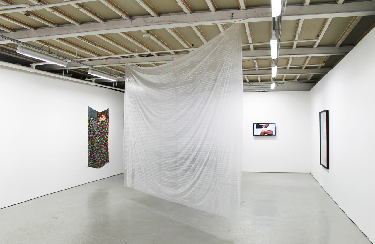
    Installation view of TenderPixels.CorruptedFiles , including Terms and Conditions by Fabienne Hess (in the middle). Courtesy of Birch Contemporary

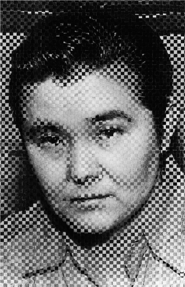
    The four artists in the group exhibition TenderPixels.CorruptedFiles at Birch Contemporary adopt the versatile pixel as both a visual and material form to express the fluidity of low-grade mass media content. Louise Noguchi’s four works from the series “Compilation Portraits” (1995) are labour intensive, hand woven, black and white silverprint portraits. Each work contains the pixelated image of a criminal culled from mass media archives or B-rated crime novels, as well as the artist’s mimetic portrait. Her high definition self-portraits (effectively pixelated by the woven pattern) serve to clarify the portraits that were otherwise so distorted, they could hardly be called menacing, and conversely, the clarified guilty portrait obscures the innocence of Noguchi as the subject. 

    Louise Noguchi, Compilation Portrait #2, 1995, two woven silver prints,  64″ × 43 ¼”. Courtesy of Birch Contemporary

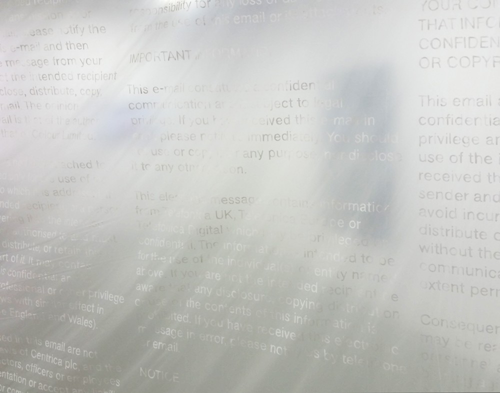
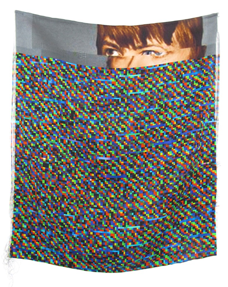
    A similar blur between guilty and innocent appears in Fabienne Hess’ work “Terms and Conditions (Email Notices)” (2016), using instead the terms protected and complicit. “Email Notices” includes the ‘fine print’, disclaimers and confidentiality notices that appear at the bottom of corporate/public correspondence. Other works in the series use texts from contracted online agreements, web terms and conditions, and cookie notices. The text is documented in metallic paint on a large translucent dustsheet. Most of the prose is vague and applies not to the protection of the user or their devices; instead it protects the sender and the contract itself.  None of this work is pixelated, although the difficulty had in reading the content suggests how the law-full jargon often goes unread. The “Corrupted” series (2013) includes portraits resurrected from supposedly erased archives, half-overwritten with pixelated noise. The rainbow of tiny squares masking all but the foreheads of celebrities are printed on silk as a material metaphor for the slippery cracks through which unwanted images fall.

    Fabienne Hess, Terms and Conditions (Email Notices), 2016, acrylic on dust sheet (detail), 108″ × 144″.  Photo: Alice Pelot

    Fabienne Hess, Bowie, 2013, Digital print on silk, 67″ × 49″.  Courtesy of Birch Contemporary

    The works of Hess and Noguchi explore the analogue potential of pixels, while Lorna Mills uses pixels in their natural habitat: low-fi GIF files. GIF files are short loops of static images strung together, used as a tool for expression or communication on social media pages. The images used in “Hand Job” (2014) and “Knee Slapper” (2014) include isolated, heavily pixelated appendages waving back and forth against white backgrounds. Their repetitive animation – hand moving to knee and away from hand – includes subtle allusions to power and gender politics, while the smooth transitions between static images becomes the central aesthetic focus of the medium. Mills’ GIFs are short loops of a length standard to this digital format.

    Lorna Mills, Hand Job, 2014, Animated GIF, edition of 3. Courtesy of Birch Contemporary

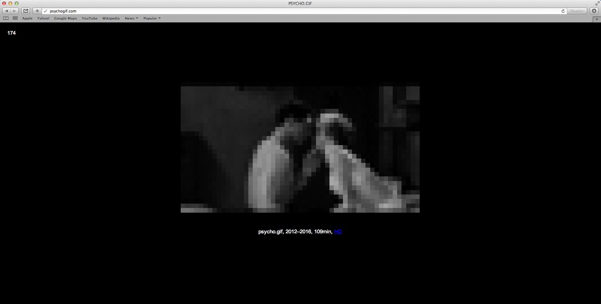
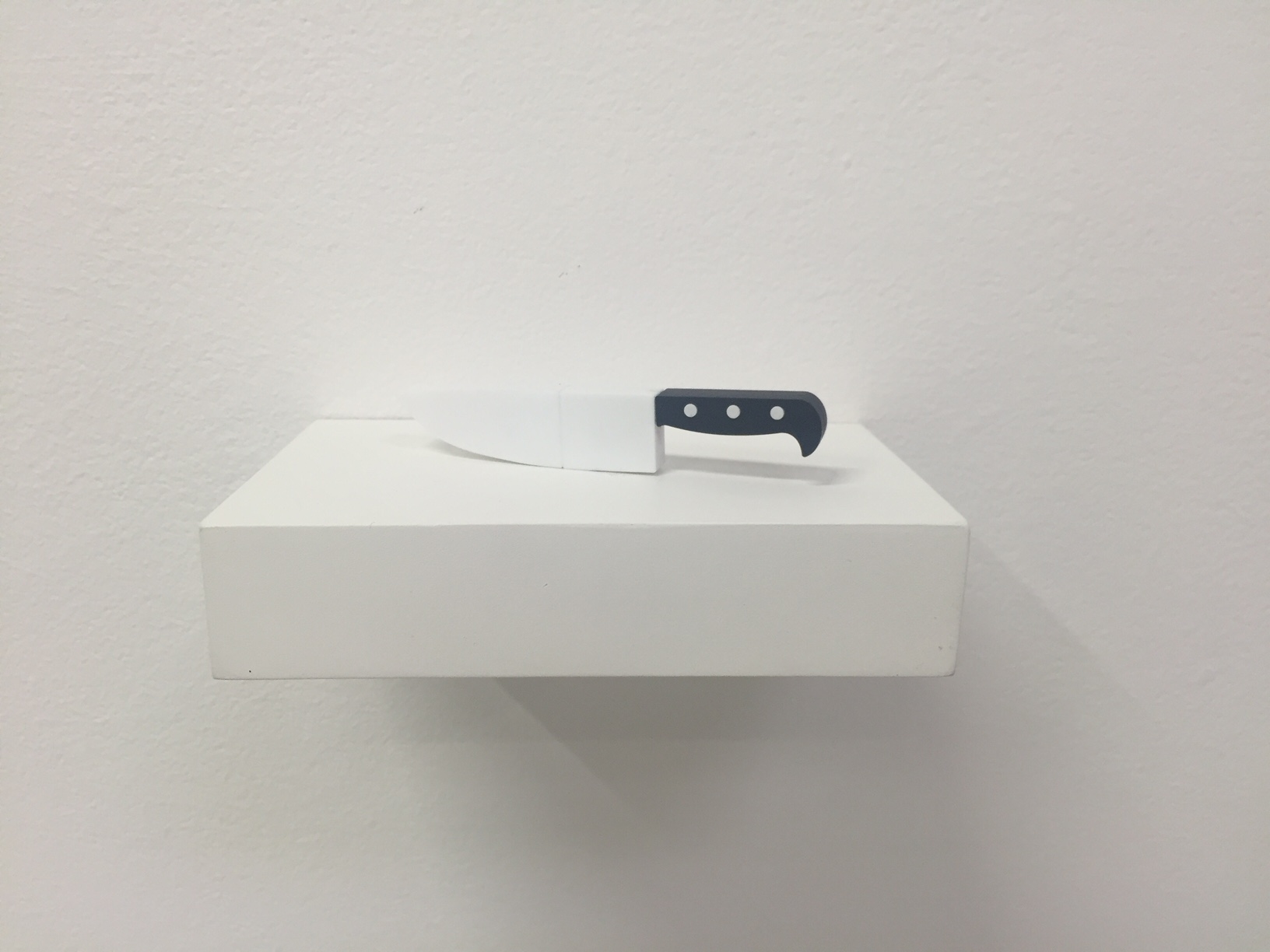
    David Hanes’ work “Psycho.gif” (2012-16) on the other hand, is 109 minutes long and composed of over 6000 images. Hanes’ work is not only exploitative of the averagely fleeting GIF sequence; it also exploits our expectations and our attention, playing on Douglas Gordon’s “24 Psycho” (1993). In Hanes’ work (which can be streamed online with an image counter) the low-fi, pixelated format of the fully rendered 1960 Hitchcock horror film lends itself as a metaphor for the blurry truth that carries the plot forward. In addition to the webpage, a USB in the shape of a knife is also for sale containing the entire pixelated GIF file paradoxically in a high-quality version that is too large to be played. Even so, given the choice between paying for a high-quality copy and a free low-quality, over-circulated version, the hunt for the low-fi seems to win out. The USB is more of a conceptual object – the ultimate dematerialization of the image – a high quality, un-viewable copy displayed next to the easily accessible pixelated stream.

    David Hanes, Psycho.gif, 2012-2016, animated GIF, 109 minutes. Unique whole work available on custom USB. Also available one minute segments on custom USB, each unique 1 of 109. Courtesy of Birch Contemporary

    David Hanes, Psycho.gif, 2012-2016, USB. Photo: Alive Pelot

    In Hito Steyerl’s essay “In Defense of the Poor Image” (e-flux, issue 10, 2009) she describes one hierarchy of images in relation to their quality. The low-fi image is pixelated, a specter, a thumbnail, a reproduction, often compressed, overwritten and remixed in its circulation. Despite the ‘proletariat’ qualities of these images, it is our own 99% proletariat who consume and circulate them en-masse. The high-tech files remain stored on disks or un-downloadable, unseen, unconsumed and unpopular. In another hierarchy defined by the ‘democratization’ of the image (potential for circulation and viewership), the poor image is desirable. These images contain the rare and forgotten content of our digital rubbish. How can a ‘poor’ or pixelated image continue on its path to dematerialized fame if printed on paper (or silk) and hung in a gallery?

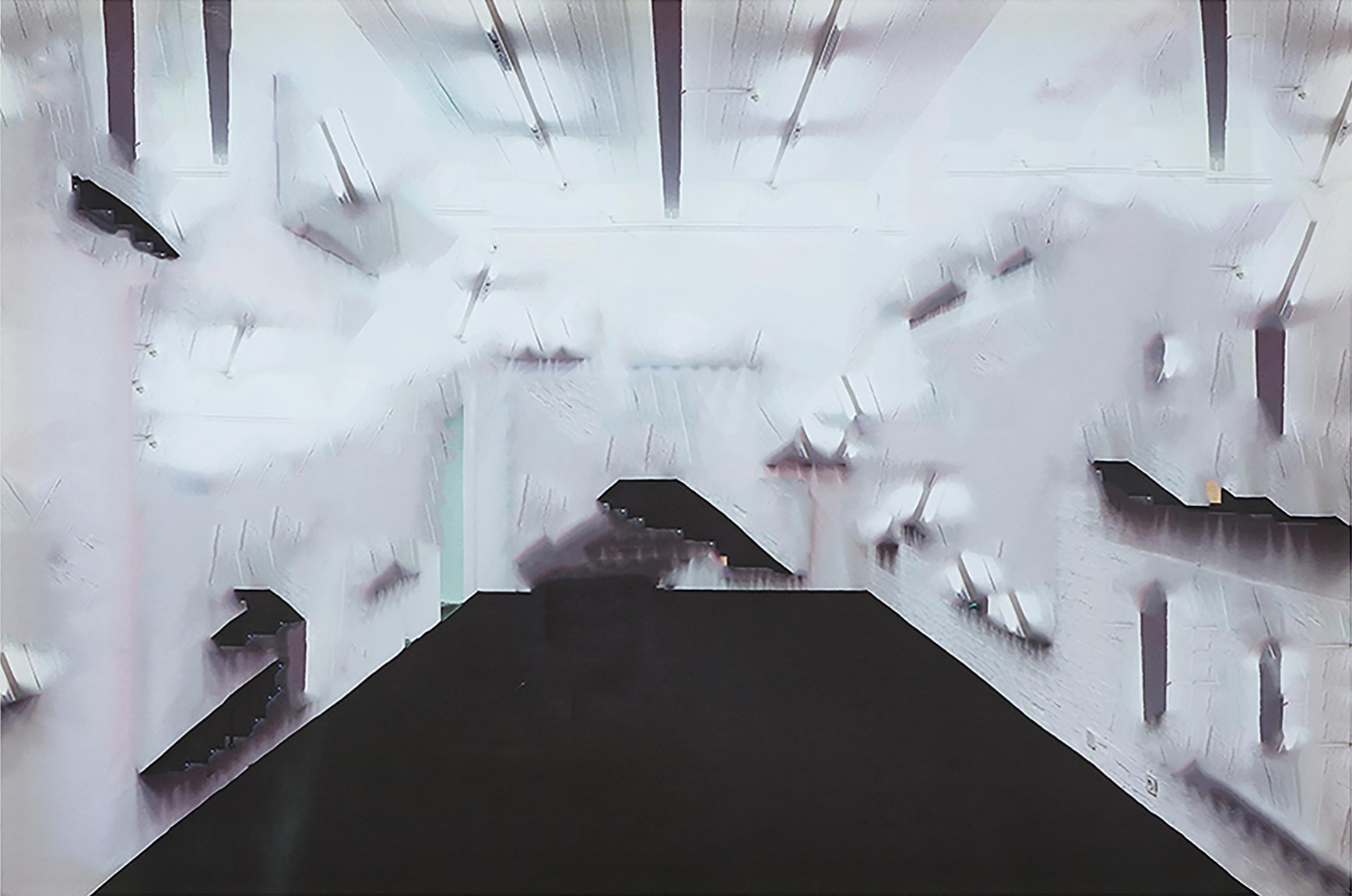
    In addition to Hanes’ “Psycho.gif” he has also produced a series titled “Aware” (2013-14) in which gallery documentation and installation shots are Photoshopped and rendered via dye-sublimation printing. The cultural content is void, only a suggestion of white cube is visible. Mostly these prints are a blur. The two works from this series along with the other material works will appear online in the installation shots for TenderPixels.CorruptedFiles in reviews and on Instagram feeds. In their digital format they will already look pixelated, primed for over-circulation, joining again the ranks from which they were copied. Pixels in this exhibition bring to life the familiar habits of prosumers who simultaneously consume and circulate.

    David Hanes, Aware No. 266 (scatter brain), 2013, dye-sublimation print on polyester nylon, wood, 39″ × 59″. Courtesy of Birch Contemporary

    Alice Pelot

    * Exhition information: TenderPixels.CorruptedFiles, a group show featuring works by David Hanes, Fabienne Hess, Lorna Mills, Louise Noguchi, July 21 – August 27, 2016, Birch Contemporary, 129 Tecumseth Street, Toronto. Gallery hours: Wed–Fri 10 am – 6 pm, Sat 11 am – 5 pm.


  • Tom Forrestall’s Recent Works at Mira Godard Gallery

    Maritime artist Tom Forrestall expresses distinct moments of stillness and movement in quiet, discreet places; in nature, in home and in human consciousness. This collection of his recent artwork presents a series of landscapes and interiors, representing the intermingling of nature and human perception. The interiors of the forest are depicted where gaps between trees reveal the water behind or frame the sky above, creating spatial depth. The glimpse becomes further activated with fleeting activity; above intertwining trees a plane closely passes followed by its contrail, a swimmer floats in the water or a kayak passes by.

    Tom Forrestall, The Lake, June, July 2014, egg tempera on board,32 1/2″ x 45 1/2″ (left) and November Landing, Nov 2011, egg tempera on board, 20 1/2″ x 20 1/2″ (right). Image courtesy of Mira Godard Gallery

    Placid home interiors of multiple spaces are abruptly pierced with the shattering of a glass window. The proximity of a man and a distant landscape creates instant parallels between a person and a place, alluding to the state of mind where human and nature merge.

    Tom Forrestall, Painter At Tide Head, egg tempera, 18″ x 48″. Photo: Nika Teper

    Forrestall’s egg temperas combine the method of realism and pointillism to create layered, distorted scenarios in sublime spaces. Delicate articulations of shadows and light illuminate details and provide realistic texture and depth. Intricate brush strokes and wisps of colour create a pointillist response to atmospheric conditions. “Two Trees,” a round painting, reinforces centripetal movement with circular identical strokes and a uniform colour palette.

    Tom Forrestall, Two Trees, 2016, acrylic on board, 36″ in diameter. Image courtesy of Mira Godard Gallery

    In “The Dramatic Entrance,” there is a waveform artwork hanging on the back wall of a simple room; a painting in a painting. Most of Forrestall’s works are non uniform shaped paintings. The provocative shape prompts a reevaluation of artwork, it’s presentation and reception. The specific relationship between painting and frame becomes prominent. Geometrical and asymmetrical frames create interesting crops that direct the viewer’s attention. Trapezoid, circle, oval and other uniquely cut  frames produce warped visual dynamics. The unconventional spatial distribution enables the depiction of isolated, concentrated moments within a broader context. The unusual shapes spark mystery as the imposing geometries interrupt the serene moments.

    Tom Forrestall, The Dramatic Entrance, 1985-Aug 2011, egg tempera on board, 24″ x 32″. Image courtesy of Mira Godard Gallery

     Installation view of Tom Forrestall, Recent works at Mira Godard Gallery. Image courtesy of Mira Godard Gallery

    Each individual artwork creates a sense of juxtaposition, between clarity and ambiguity, near and far, interior and exterior, order and irregularity, geometric and organic; a dynamism that alludes to the perception of a place or a state of mind.

    Nika Teper

    *Exhibition information: June 25 – Sept 10, 2016, Mira Godard Gallery, 22 Hazelton Avenue, Toronto. Gallery hours: Tue – Sat 10 am – 5 pm.


  • AIMIA / AGO Photography Prize Winner 2016

    Four outstanding international artists have been shortlisted for the 2016 Aimia | AGO Photography Prize, Canada’s most significant award for photography. Co-presented by Aimia, a Canadian-based global leader in data-driven marketing and loyalty analytics company, and the Art Gallery of Ontario (AGO), the Prize awards C$50,000 to one winner, who is chosen by public vote. The four finalists will present their work in an exhibition opening September 7, 2016 at the AGO in Toronto. Voting begins in person at the AGO upon the exhibition’s opening and on the Prize’s website on September 14, 2016.

    The 2016 Winner is: 

    Ursula Schulz-Dornburg was born in 1938 in Berlin and lives and works in Dusseldorf. Since the end of the 1960s, the house as a fundamental fact of human existence has been central to her work. She has travelled from the secret village of Kurchatov, Kazakhstan to the Hejaz railway in Saudi Arabia, from Kronstadt, Russia to Armenia and the border of Georgia and Azerbaijan to Iraq and Syria, in order to photograph the intertwining relationship between industrial and architectural structures, land and humans. Her work captures the historical and political importance of architecture and its destruction within the last century. Schulz-Dornburg’s work is a critical exploration of the construction of power and its impermanence, and has recently been included in exhibitions at the Tate Modern in London and Giorgio Mastinu Gallery in Venice.

    Ursula Schulz-Dornburg, Bus stops. Aemania. 2004. Erevan-Parakar, 2004, Gelatin silver print, 45 x 35 cm. Courtesy of the artist

    The 2016 Finalists are:

    • Talia Chetrit (USA)
    • Jimmy Robert (France)
    • Elizabeth Zvonarl (Canada)

    Fourteen international nominators selected a long list of 23 artists. From that list, a jury of three experts named the four finalists, who each showed extraordinary potential. The jury was headed by Kitty Scott, the AGO’s Carol & Morton Rapp Curator of Modern and Contemporary Art, and included artist Stan Douglas and art scholar Russell Ferguson. The exhibition will be curated by Adelina Vlas, the AGO’s Associate Curator of Contemporary Art.

    “The four nominated artists for this year’s Aimia | AGO Photography Prize all work with photography in singular ways, each of which embodies a current mode in contemporary art,” Vlas said. “The strength of their work and the diversity of their approaches will make for a unique exhibition inviting visitors to appreciate, reflect on, and participate in the visual culture of our time.”

    Talia Chetrit was born in Washington, DC in 1982, and lives and works in New York. Chetrit’s work focuses on the human body—often her own—as a starting point to examine how images are constructed to support different agendas and interpretations of reality. After beginning her practice with an exploration of the manipulative nature of photography, Chetrit is increasingly interested in the relationship the camera has with the subject matter it documents. Her work has recently been featured in group exhibitions at the Whitney Museum of American Art and Sculpture Center in New York, Palais de Tokyo in Paris, Studio Voltaire in London and LACMA in Los Angeles.

    Thalia Chetrit, Parents/Glasses, 2014, Silver gelatin print, 43 x 56 cm. Courtesy of the artist

    Jimmy Robert was born in Guadeloupe in 1975 and currently lives and works in Bucharest. His multidisciplinary practice encompasses performance, photography, film, video and drawing. Robert typically uses photography as a starting point for his works on paper, breaking down the divisions between two and three dimensions, as well as image and object. In some works Robert uses found photographs that he tears, collages, tapes and crumples before digitally scanning them and pinning them to the wall. In other works, Robert takes new photographs in his studio and crams them into wooden boxes or arranges them on the gallery floor. His sculptures similarly give the illusion of paper forms and often play with notions of value and durability. Integrated within his photographic and sculpture practice, performance remains a central part of Robert’s work. His dance and performance works also oscillate between image and objecthood as well as the personal and the political.

    Jimmy Robert, Metallica, 2007, Painted aluminium sheets, 110 x 171 x 120 cm. Courtesy of the artist and Tanya Leighton, Berlin


    Elizabeth Zvonar works in a variety of mediums, including collage, sculpture and photography. Her collages are created from a variety of sources, from fashion magazines to art history and science textbooks, they are then scanned and reproduced as glossy photographs while keeping the rips and cuts of the original collage. Zvonar’s images explore the conflicting meanings that exist within Western media, playing with inherent hypocrisies in the media’s depictions of women, consumerism and history. In her sculpture, she uses a variety of materials including porcelain, cement and bronze to cast body parts and pieces of clothing. These body parts are then assembled and re-contextualized with a similarly collage-like approach. The materials and forms suggest luxury objects but the strange juxtapositions are designed to unsettle the viewer and offer alternate possibilities of purpose and interpretation. She is represented by Daniel Faria Gallery in Toronto.

    Elizabeth Zvonar, Join the Resistance, 2015, collage print on photo-rag mounted on dibond, 71 x 127 cm. Courtesy of the artist

    The Aimia | AGO Photography Prize recognizes and develops the best in Canadian and international contemporary photography and helps to foster the next generation of artists. The Prize has a total annual prize value of C$90,000, and is composed of an annual exhibition at the Art Gallery of Ontario, an online exhibition at AimiaAGOPhotographyPrize.com, a range of public programming and a national scholarship program. It includes awards of $50,000 to the winner, $5,000 to each of the three runners-up, $7,000 to each of three scholarship winners and $1,000 to each of their respective schools. This year, the Prize also expanded to include an award of $1,000 for honorable mention in the scholarship category.

    For more information please check 2016 Aimia | AGO Photography Prize.

  • The Gardiner Museum’s Ceramic Sculpture Competition

    The Gardiner Museum’s Ceramic Sculpture Competition is challenging artists from across the country working in all mediums to create a new Toronto landmark using clay. The monumental sculpture will be installed in front of the Museum on Queen’s Park, along the busy Bloor and Avenue Road Corridor, joining the Jun Kaneko “head” as a focal point of the Museum’s plaza.

    The work will be unveiled on Queen’s Park next summer, coinciding with Canada’s 150th.

    The winning sculpture will be selected by a five-person jury made up of artist and novelist, Douglas Coupland; Director of the Power Plant Contemporary Art Gallery, Gaëtane Verna; Associate Dean of OCAD University, Michael Prokopow; Gardiner CEO and Executive Director, Kelvin Browne; and Gardiner Chief Curator, Meredith Chilton.

    The competition will promote the benefits of public art, and demonstrate both the versatility of clay and its potential for outdoor art. It will also build appreciation for artists who work in the ceramic medium and encourage artists to experiment with it for the first time.

    The Museum will announce the winner in September, 2016.

    THE FINALISTS:

    Shary Boyle

    Shary Boyle works across diverse media, including sculpture, painting, installation, and performance. Boyle represented Canada with her project Music for Silence at the 55th Venice Biennale in 2013. Her work is exhibited and collected internationally, and is currently on display in Ceramix: Art and Ceramics from Rodin to Schütte, at Cité de la ceramique, Sèvres, and la Maison Rouge in Paris. She lives in Toronto.

    Cracked by Shary Boyle

    Christopher Reid Flock and Sin-Ying Ho

    Christopher Reid Flock majored in English literature and violin at the University of Western Ontario before discovering clay. After mentoring with Canadian ceramist Kayo O’Young in 1998 and studying at the Sheridan College School of Ceramic Design, Reid moved to Ibaraki, Japan where he lived and studied ceramics for nine years. He returned to Canada in 2009 and established his studio practice in Hamilton.

    Sin-Ying Ho holds an Honors Diploma from the Sheridan College Institute of Technology and Advanced Learning, a BFA from the Nova Scotia College of Art and Design, and an MFA from Louisiana State University. Ho has lectured and exhibited across Canada and the USA. Many of her pieces are in permanent collections of museums. She is currently an Assistant Professor at Queens College, City University of New York.

    Link by Christopher Reid Flock and Sin-Ying Ho

    Linda Swanson and Paul Holmquist

    Linda Swanson is an artist whose interests are grounded in the metamorphic nature of ceramic materials and processes. Her raw and kiln fired ceramic works have been exhibited internationally. She currently teaches Studio Arts at Concordia University.

    Paul Holmquist is a designer, teacher, architectural historian, and theorist. His research concerns architecture as constitutive of the public realm through the engagement of the senses, emotions, imagination, and conscience, as well as the political implications of technological and poetic modes of architectural practice. He currently teaches Architectural Design and Theory at Carleton University.

    Grotta by Linda Swanson and Paul Holmquist

    Brendan Tang 

    Brendan Tang was born in Dublin, Ireland of Trinidadian parents and is a naturalized citizen of Canada. Tang has lectured at conferences and academic institutions across North America, and his professional practice has also taken him to India, Europe, and Japan. He dedicates his full attention to his professional art practice in Vancouver, where he explores the interface between culture and material.

    Re:Solve by Brendan Lee Satish Tang

    The Gardiner is grateful to La Fondation Emmanuelle Gattuso for commissioning the artwork and to the City of Toronto for their support of the Ceramic Sculpture Competition, and would like to recognize Councillor Kristyn Wong-Tam and Emmanuelle Gattuso, in particular, for their leadership in helping this important civic initiative to proceed.

  • Rodney Graham’s Jack of All Trades at Prefix

    As a part of the Scotiabank Contact Photography Festival, Rodney Graham’s Jack of All Trades sees the distinguished Canadian artist waxing satirical on the notion of identity and performance. Presented in three pairs of monumental light box displays (reminiscent of promotional movie posters adorning the walls of a local multiplex), Graham’s photographs are presented in a very modern and cinematic high definition format; yet their two-paneled constructions recall the art historical tradition of diptychs. Ironically, in “Actor/Director, 1954” (2013) Graham creates an imagined film set, where the artist assumes the role as both a director and actor, dressed in eighteenth century aristocratic garb, uncannily blending current and bygone epochs to a humorous yet perplexing effect. Similarly, in “Basement Camera Shop, Circa 1937” (2011), Graham disguises himself as a meek sales associate surrounded by a bevy of camera paraphernalia, as the artist assumes the role of a seasoned performer, inhabiting disparate personalities with the gusto of a professional.

    Rodney Graham, Actor/Director, 1954, 2013, two painted aluminium light boxes with transmounted chromogenic transparencies, 106 x 145 x 7”. Courtesy of the artist and 303 Gallery, New York; Lisson Gallery, London and Hauser & Wirth, Zürich

    Throughout the exhibition, Graham readily portrays himself in the guise of readymade stock characters, paradoxically reverting his image and likeness as a well-known artist to that of a lifeless representation of generic tropes and surface appearances: eighteenth century courtly gentleman, perfectionist, humble salesman, packrat, etc. Graham’s method of choice in Jack of All Trades recalls the ironically iconic works of Cindy Sherman, who appropriated televisual and cinematic recreations of femininity and sexuality by modifying her appearance to recreate these flaccid characterizations. While Sherman’s work remains a hallmark in feminist-driven art of the latter twentieth century, Graham images are not geared towards a specific greater cause or disrupting any cultural norm. 

    Rodney Graham, Basement Camera Shop, Circa 1937, 2011, painted aluminium light box with transmounted chromogenic transparency  71 x 71 x 7”. Courtesy of the artist and 303 Gallery, New York; Lisson Gallery, London and Hauser & Wirth, Zürich

    In a time of political upheaval and social injustices, Jack of All Trades provides a welcomed, visually stunning and humorous diversion from the perils of contemporary global issues.

    Rodney Graham, Pipe Cleaner Artist, Amalfi ’61, 2013, two painted aluminium light boxes with transmounted chromogenic transparencies  90 x 146 x 7”. Courtesy of the artist and 303 Gallery, New York; Lisson Gallery, London and Hauser & Wirth, Zürich

    David Saric

    *Exhibition information: May 12 – July 30, 2016, Prefix Institute of Contemporary Art, 401 Richmond Street West Ste 124, Toronto. Gallery hours: Wed – Sat, 12 – 5 p.m.

  • Hua Jin: Don’t Look You Will See at Lonsdale Gallery

    Viewed through the lens of transience, Hua Jin’s Don’t Look You Will See at Lonsdale Gallery invites you to slow down and meditate on a succession of ephemeral ‘moments in time’. The show is Hua Jin’s second appearance with the gallery since being featured in their 20th anniversary exhibition. Through photography, Hua Jin explores the notion of death, loss, and trauma in relation to Oriental aesthetics and philosophy. Hua Jin’s interest in visual meditation takes a refreshing look at the complexity, and subtleties, of the natural environment.

    Installation view of Hua Jin: Don’t Look You Will See at Lonsdale Gallery. Photo: Megan Kee

    Turning right at the top of the stairs, the first thing that strikes you about Hua Jin’s work is the immense scale. These prints are monumental. Using a 4 x 5 large format camera to shoot her images, Hua Jin is able to capture a sharp, grain-free image with overall better tonality than a standard DSLR. The result? Images with so much depth and detail it would take hours to appreciate them fully.

    Installation view of Hua Jin: Don’t Look You Will See at Lonsdale Gallery. Photo: Megan Kee

    Setting the tone for the exhibition are two prints from Jin’s “Double Landscape” series. Mutually contrasting and complimenting one another, the black and white tree branches on the left, and the bold fuchsia of the flowers on the right, read as a narrative relationship between life and death. It takes a few minutes of thoughtful contemplation to identify all of the subtle details in these images, reiterating the artist’s intent. While the use of season and saturation as tools for demonstrating the transience of life can be construed as simplistic, Hua Jin’s thoughtful execution of the subject matter—which creates an overwhelming sense of continuity—is enough to have a major impact.

    Hua Jin, Double Landscape – Vine #1, 2015, inkjet print, 46 x 70 inches, edition of 5 (left); Hua Jin, Double Landscape – Vine #2, 2015, inkjet print, 46 x 61 inches, edition of 5 (right). Image courtesy of Lonsdale Gallery

    The focus of the exhibition, double landscapes aside, are the works from the “Don’t Look You Will See” series. As an exploration in visual meditation, these works are influenced by Hua Jin’s study of Buddhism, with a specific focus on the concept of ‘bare attention’. As described by Nyanaponika Thera in The Heart of Buddhist Meditation, “Bare attention is the clear and single-minded awareness of what actually happens to us and in us, at the successive moments of perception.” ‘Bare attention’, or mindful looking, is a fundamental component to the production, and, presumably, intended reception, of Hua Jin’s work.

    Exemplary of the parallel between process and interpretation, “Flowers” is one of the most visually exciting works on display. Depicting a sea of endless white flowers, this print is as beautiful as it is well-executed. But while the work’s quality, composition and subject matter are striking, any allusion to meditative contemplation is lost without a written appendage. Unable to speak without context, this work, among a few others in the series, are beautiful but silent.

    Hua Jin, Don’t Look You Will See – Flowers, 2015, inkjet print, 84 x 58 inches, edition of 5 (left); and detail (right). Image courtesy of Lonsdale Gallery

    Hua Jin’s process is an extension of her conceptual practice. Large format photography is often a slow and laborious process, and so, composing, focusing and exposing an image forces the photographer to meditate on a single moment. In many instances, this creates a parallel between the method by which the artist creates and the manner in which the viewer sees.

    Megan Kee

    *Exhibition information: June 22 – July 29, 2016,  Lonsdale Gallery, 410 Spadina Road, Toronto. Gallery hours: Wed – Sun, 11 – 5 pm.


  • Oliver Tiura: Eternal Bronze Meets 3D Printing

    Walking through the glass door of the Canadian Sculpture Centre, artist Oliver Tiura’s show, Eternal Bronze Meets 3D Printing, would quickly intrigue your curiosity.

    Installation view. Photo: Serri Shao

    Oliver Tiura is a senior Canadian sculptor, a former professor, with more than 75 solo and group exhibitions to his credit in a variety of countries. Tiura gets excited by certain streams of outsider arts. Here in this show they reflect lines of mythologies from ancient Egyptian times [animal heads on human bodies], to fantastical creatures of the Greek mythologies, even to the fascinating “animals” described by explorers 500 years ago with visual interpretations of unbelievable, surreal, chimeric combinations seen in the works of Hieronymus Bosch.

    Oliver Tiura, SHEDU, multiplanar cast bronze with patina, 34.5″. Image courtesy of Canadian Sculpture Centre

    The abstract configuration presented in each sculpture gave the viewer infinite space for perusal and imagination. Whether or not it could be a fusion with skulls, bones, or even a single magnified cell molecule, the monstrous compositions provide us with ambiguous interpretations when explaining the matter behind each work. Walking around each piece, through the changing perspective, a different impression is perceived each time. It is amazing to learn that each piece is able to stand with varying shape and formation. The lines are keen and the structures are intricate within each piece, yet – able to steadily stand on itself in several other ways, as the artist demonstrated. Details of the numerous junctions within each work are delicate and sleek and can be further defined as approached with a closer view. Viewing from a distance – density and weight resemble living creatures standing with vigor and firmness. All the different elements and parts are indicating contrasting directions with resilience that might resemble an active cell molecule in a certain way.

    Oliver Tiura, ANIMA v. 2, multiplanar 3D print, epoxy acrylite resin with silver nitrate, 27.5″. Image courtesy of Canadian Sculpture Centre

    Most of the works were produced in traditional bronze while several other large pieces introduced creations using the 3D printing technique, finishing with a patina on resin. The majority of the larger pieces were cast in bronze. The artist initially came up with a prototype, then this original work was sent to the foundry for casting in bronze – finishing with a final patina to bring out the variation of colours coating on each work. The pieces were proficiently made flawless; each has a particular and surreal pattern. The others are produced with the 3D printing technique, a new process that required tedious detailed scanning and also lengthy and arduous. “I wanted to ensure my pieces reflect the two main principles of additive manufacturing: reliability and archival, large-print size,” said Tiura. With the knowledge that artists in Europe have been experimenting with large-scale 3D printing, he researched his local options, only to realize that many were cost-prohibitive and focused in industrial use. Tiura came across Sheridan’s CAMDT, home to a Fortus 900, capable of printing with bronze in his desired size. The staff of CAMDT assisted Tiura with materials selection, file enlargement, structural support design and the finishing process. It was a learning exercise in innovation and experimentation for all parties involved, creating ground-breaking sculptures.

    Oliver Tiura, GALAXY STAR, multiplanar 3D print, polycarbonate with metallic polychrome, 43″. Image courtesy of Canadian Sculpture Centre

    One of Tiura’s work, “AMISTAD v. 2”, a bronze, is slightly more distinctive than the others, consisting of cubist elements, with rectangular and curvy parts, having a more acute and linear outline. It somehow resembles a standing reptile, with wide open wings, a dropping head with two giant antennas and legs like a pair of tongs. It is eye-catching at first glance and stands out with its lighter opaque finish and resemblance of mechanical forms. In contrast with the other sculptures in the show, this is a heavier configuration, enhanced with a lighter pale green patina, that makes it noticeable and different, rather than fuse with the other works.

    Oliver Tiura, AMISTAD v. 2, 3 planes cast bronze with patina, 29″. Image courtesy of Canadian Sculpture Centre

    Another intriguing piece is “CHIMERA”, a 3D-printed piece, with one part sticking out and pointing upward. It reminds me of a wild animal that is crawling somewhere decisively, its neck is stretching forward and its four legs spreading out in order to hold its lengthy upper body. This piece seems to be easier to read and is less complex compared to the others. The polished exterior adds an imagery of a serpent, if one is looking for another perspective.

    Oliver Tiura, CHIMERA, multiplanar 3D print, epoxy acrylite resin with metallic polychrome, 25″. Image courtesy of Canadian Sculpture Centre

    As the famous Mexican sculpture Federico Silva wrote: “Tiura’s sculptures are like reptiles that gasp on earth, moving about at the same time within their molecular space endeavoring to expand, rise up and breathe, as if they were a synthesis of a conflict between earthy and aerial forces, between solid rigidity and elasticity. They seem to rise up heavily, almost painfully, the weight of their arms struggling against gravity, their erect posture a triumph of will, since they have emerged from the earth in order to be free.”

    The exhibition is worth a trek to Church Street to view Toronto’s first large 3D-printed sculptures! A changed version of this exhibition will begin at noon on Friday, July 22, where the sculptures of the exhibition will be manipulated into radically different configurations, viewed from three different planes, thereby archiving changed views with each turn, offering new insights and viewpoints each time. Its a wonderful opportunity to go there, meet the artist and witness those changes.

    Serri Shao

    *Exhibition information: July 14 – August 5, 2016, Canadian Sculpture Centre, 500 Church Street. Gallery hours: Tue – Fri: 12 – 6, Sat: 11 – 4 p.m.

    **Please join Oliver Tiura for a personal tour of his work and Artist Talk: Saturday, July 23, 2 p.m.

  • Interview with Lee Lamothe

    Lee Lamothe. Photo: Lucy White

    Interview with Lee Lamothe (LL) by Nika Teper (NT)

    Lee Lamothe’s photomontages at Yumart Gallery allude to place, scenario/circumstance and action/reaction. His collection and composition of found and photographed images, once extracted, are then peeled, layered, repeated and rephotographed. The cinematics of space and person recall a broader narrative.

    Lee Lamothe, We are the Mad Collages of Each Other #1, 2016, photomontage, 17 x 13 1/4 inches. Image courtesy of Yumart Gallery

    NT: It seems that each work exists within a context. When creating these compositions do you conceive of a hypothetical space and time or are they each rooted in a real place and circumstance?

    LL: I believe in the lucky accident, a blessing as the folks in China once told me. Doing collages and photomontages is, to me, an adventure in falling down the stairs. My difficulty is knowing when to start and when to stop. My studio is filled with works that might be finished or they might not be. They’ll let me know.

    NT: How do you decide upon the size of each print? Since there is so much content, what do you think a larger scale would do to the work? Do you aim to maintain consistency throughout the collection?

    LL: I’d love to print everything to what I refer to as Rauschenbergian scale – but that is very difficult to do. I like real big or real small, perhaps down to a postcard size. Likely this year I’ll posterize an image and hire some Kensington Market entrepreneurs to paper the town with it – no name or title or gallery, just a picture on a construction hardboard. I think this is a democratic and non-capitalist way to get the image out there. Many people don’t go to galleries.

    Lee Lamothe, #18 Pen, 2016, photomontage, 8 x 6 inches. Image courtesy of Yumart Gallery

    NT: Where do you look for found images? How do you manipulate them? How does colour factor into your work?

    LL: On found images: steal everything. Once something becomes public – in a magazine or on a poster – it is mine. Colour is very new to me – I am colour deficient or minorly colour blind; I rely on Susana Reisman, my ace printer, to bring the depth of the blacks or the mood of the colours to the prints. Strangely, the only time colour, in this case yellow, popped out and punched me between the eyes – was seeing the yellows of van Gogh in Paris. I still get some yellows and oranges confused, but not with van Gogh.

    Lee Lamothe, #12 Found #4 , 2016, photomontage, 7 x 5 inches. Image courtesy of Yumart Gallery

    NT: The decision to photograph your photomontages enables the evocation of texture and depth, as well as smoothness and continuity. Why did you decide to emphasize this dichotomy? Is it a method to link the diverse artworks?

    LL: I started out to do collage but as I got older I found my small motor skills were not as I’d like them. So I did arrangements on the floor of my studio and photographed them. I’ve recently calmed myself down and have several collages, although not to the quality of the famous French, German and Swiss collage artists. But hopefully soon, very soon…

    NT: In “#15 Metro #1” one of the apparent skyscrapers, upon closer examination, is revealed to be an object. What object is it?

    LL: “Metro #1” and “Metro #2” are very simple – I did them in my Chinatown studio and looked at them for a very long time before photographing them. The problem with this kind of stuff is knowing when to stop. They are essentially the fore-work of my next project on author, William Burroughs. When I thought there was more to do I slapped myself in the face and said: “Enough, this is where it stands”. The syringe is from the William Burroughs project. I think, too, that cities are gray for a lot of people, a nuclear gray, a hopelessness of gray, a gray of desolation. I hoped to capture that bleakness.

    Lee Lamothe, #16 Metro #2, 2016, photomontage, 7 x 8 1/2 inches. Image courtesy of Yumart Gallery

    NT: In the pair of Metro compositions there are familiar but non-distinctive buildings, each evocative of something more well-known. Was this intentionional?

    LL: I am an Urbanist – whether I am here or in France, in Sicily, in Rome, in New York or in San Francisco. There are cities where you might think you are visiting but actually, they’re visiting you. You just have to go there. I spend a lot of time in the remote up north and get a lot of thinking done there, but the real work is done among dizzying skyscrapers, concrete adventures and peeling storefronts.

    NT: How much would you like your titles to reveal about your artwork?

    LL: Titles are irrelevant to me. I’ve written a lot of novels and the titles are actually a game I play with myself. They mean nothing. Often I come up with titles for pictures when I’m picking up the prints at the framer. I just jot down whatever seems appropriate. Currently I’m finishing a novel called The Beautiful Policeman – but the policeman isn’t a man and she isn’t beautiful.

    NT: What influences your artwork and your methods? Your work seems convey surrealist notions of multiple realities, including the subconscious, as well as the fervor of DADA collages.

    LL: My method is organic. The last few times I was in Paris I was as a ‘Novelist’. My wife and I visited a lot of galleries and that sharpened my eye. But in the evening when she’d gone to sleep I went out with a notebook and wrote – like a cliche – in a cafe. The day’s gallery-wandering affected my writing, I realized – we saw a lot of surrealism about which I knew nothing then. Now working The Beautiful Policeman, I find myself dissatisfied with the A-B-C-D formula of mystery novels. Looking at the artwork of Hannah Hoch or Rodchenko or Haussman anyone in their right mind would go: Let’s try B-C-D-A and see what happens. Linear thinking is a bullet through the creative brain. Surrealism is to art what Jazz is to music. Bust it up, make it work.

    Lee Lamothe, #7 Hurry, 2016, photomontage, 8 1/2 x 7 inches. Image courtesy of Yumart Gallery

    NT: How has your practice of photography evolved over the years? And how does photography, to you, communicate differently than writing?

    LL: I started out as a freelance photographer specializing in demonstrations and riots for a Toronto newspaper. I found my excitement and discovery went out the window when I was being paid for it – it became work. For several years afterwards, I neglected non-professional photography but when I stopped being a newspaperman I found the love of images gradually coming back.

    The transition to digital from film was very difficult for me – I missed the intimate time in the darkroom where, I think, you have to be alone with yourself. One of my daughters found an old enlarger I gave her twenty-five years ago and gave it back to me. I’m going to use it to project backgrounds for future work.

    I used to think the pure reality of photojournalism and conflict photography was the only truth – but it isn’t my truth any longer. My truth is an out-of-focus picture of my niece jumping off a diving board with sun flare in my lens and a crooked horizon. If I have to choose between a once-in-a-lifetime picture of a newsworthy item or a photo on the floor of my studio, after the cat walked through and disturbs the set-up – well give me that sloppy cat.

    Lee Lamothe,  #5 Horns, 2016, photomontage, 8 1/2 x 7 inches. Image courtesy of Yumart Gallery

    *Exhibition information: Lee Lamothe, We are the Mad Collages of Each Other, Yumart Gallery, 401 Richmond St. West, Suite B20, Toronto. Gallery hours: Tues – Sat, 12 – 6 p.m.


  • Alain Norman Amar abstract paintings at Gallery 1313

    Installation view. Photo: Nika Teper

    In the exhibition, Abstractions in Nature: Imagination is Everything, vibrant, painterly representations of natural phenomena engage with human perception. Artistic mediation encourages the internalization of the uncanny views of the unmediated. Artist, Alain Norman Amar, creates allusions to the physical features, environmental qualities and ephemerality of nature. Applying oil paint and beeswax onto wood panels, he texturally creates atmospheric renderings that convey the luminosity, reflectivity and movement of nature. In memory of his departed brother Joseph David Amar, this exhibition becomes further embedded with ideas about the transitory and transcendent.

    Artist, Alain Norman Amar in front of his painting. Photo: Phil Anderson

    Luminosity is conveyed with dark and contrasting light moments as his blunt colour variation is contrasted with a discrete layering technique that only becomes revealed when the work is approached. Natural phenomena is abstracted yet approachable. The manipulation of light demonstrates contingency to time of day and year, a thread that unites each piece.

    Alain Norman Amar, Untitled, oil and beeswax, on wood panel, 48″ x 48″. Image courtesy of Gallery 1313

    A visual emphasis on the reflective quality of nature situates the viewer within a simultaneously recognizable and allusive outdoor space. The distinct divisions of the panel, repetitive motifs, layered translucent material and extreme colouration leave an emotional impression individual to each visitor. Most often the eye is drawn to a horizontal ground plane, either outlined or implied. On either side of this plane qualities of reflection are expressed with mirrored images of diminishing forms. Distortions, missing elements, elongated figures and an increased blur are present in the lower portions of the work and contrast the more distinct upwards impressions. The symmetries and singularities in nature are expressed. The heightened focus on reflectivity evokes water’s ability to frame a transient perception of the vertical of trees and the intensities of the sky. The obvious reflective quality situates the viewer and emphasises natural experiences contingent to time.

    Alain Norman Amar, Untitled, oil and beeswax, on wood panel, 110″ x 86″. Image courtesy of Gallery 1313

    Gestural brush strokes and pencil marks provoke directional movement and further distort the natural figurations. Excluding the ground plane, the horizontal brushstrokes suggest the wind and weather. Prominent vertical brushstrokes become more confusing, as they are both atmospheric and figural, resembling trees and their movements. The intense depth created with texture and repetition enables the simultaneous multi-directional movement of all natural forces. Simplified motifs align physical nature with its natural process.

    Alain Norman Amar, Untitled, oil and beeswax, on wood panel, 48″ x 36″. Image courtesy of Gallery 1313

    Evocations of the natural world dominate the abstract paintings of Alain Amar. Referential abstract elements situate the viewer in a natural setting demonstrating an artistic engagement with nature and human emotion. Multisensorial stimulations are achieved in his paintings with the addition and subtraction of colours. The patterns and materials convey distinctly natural qualities of luminosity and reflectivity. They create movement that invoke auditory and visual, fragrant and tactile memories. His work exists as a non-projective lens aiming to inspire the personal evaluation of  human emotions relative to the physical world. Amar believes that nature softens the human perspective and elevates the human condition. 

    Nika Teper

    *Exhibition information: July 6 – 17, 2016, Gallery 1313, 1313 Queen Street West, Toronto. Gallery hours: Wed – Sun: 1 – 6 pm.