Author: artoronto

  • Spring Hurlbut: A Fine Line at Georgia Scherman Projects

    “Death is nothing to us,” said Roman poet and philosopher Lucretius, meaning, among other things, that there’s nothing frightful in being dead, since death by definition involves complete annihilation of the subject of experience. This argument, and its ability to comfort in passing and bereavement, has sat better with some generations than others. And treatment of death in visual art tracked these varying attitudes towards mortality. Michael Wolgemut’s Danse Macabre, produced amidst the horrors of post-plague Medieval Europe, cries out with disconsolate tanatophobia. Pierfrancesco Cittadini’s Vanitas, representative of the Early Modern overthrowing of Medieval conventions, goes to another extreme, making death conspicuously fashionable. Somewhere in between on this attitudinal scale lies Arnold Böcklin’s Isle of the Dead, where, expressive of the fin-de-siècle anxious fascination with the otherworldly, an ominous trip to the underworld is surrounded with objects of décor befitting a picnic at a Mediterranean coast.
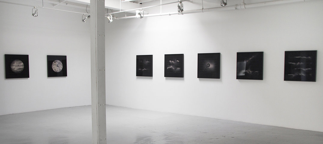
    Installation view of Spring Hurlbut’s A Fine Line, Georgia Scherman Projects, 2016. Courtesy of Georgia Scherman Projects

    Spring Hurlbut’s A Fine Line, exhibited at the Georgia Scherman Projects, includes a 2005 photograph (Deuil I: James # 2) which features a composition highly reminiscent of vanitas paintings in their numerous variations. A bag of human ashes on a dial scale – a contemporary analogue of the Early Modern scull next to an hourglasses, – aside from establishing a departure point of Hurlbut’s engagement with her morbid medium, provides a welcome interpretative key to her approach to artistic depictions of death. A Fine Line makes death acceptable and even fashionable in an aesthetically pleasing, technically sophisticated, and meta-artistically rich way.
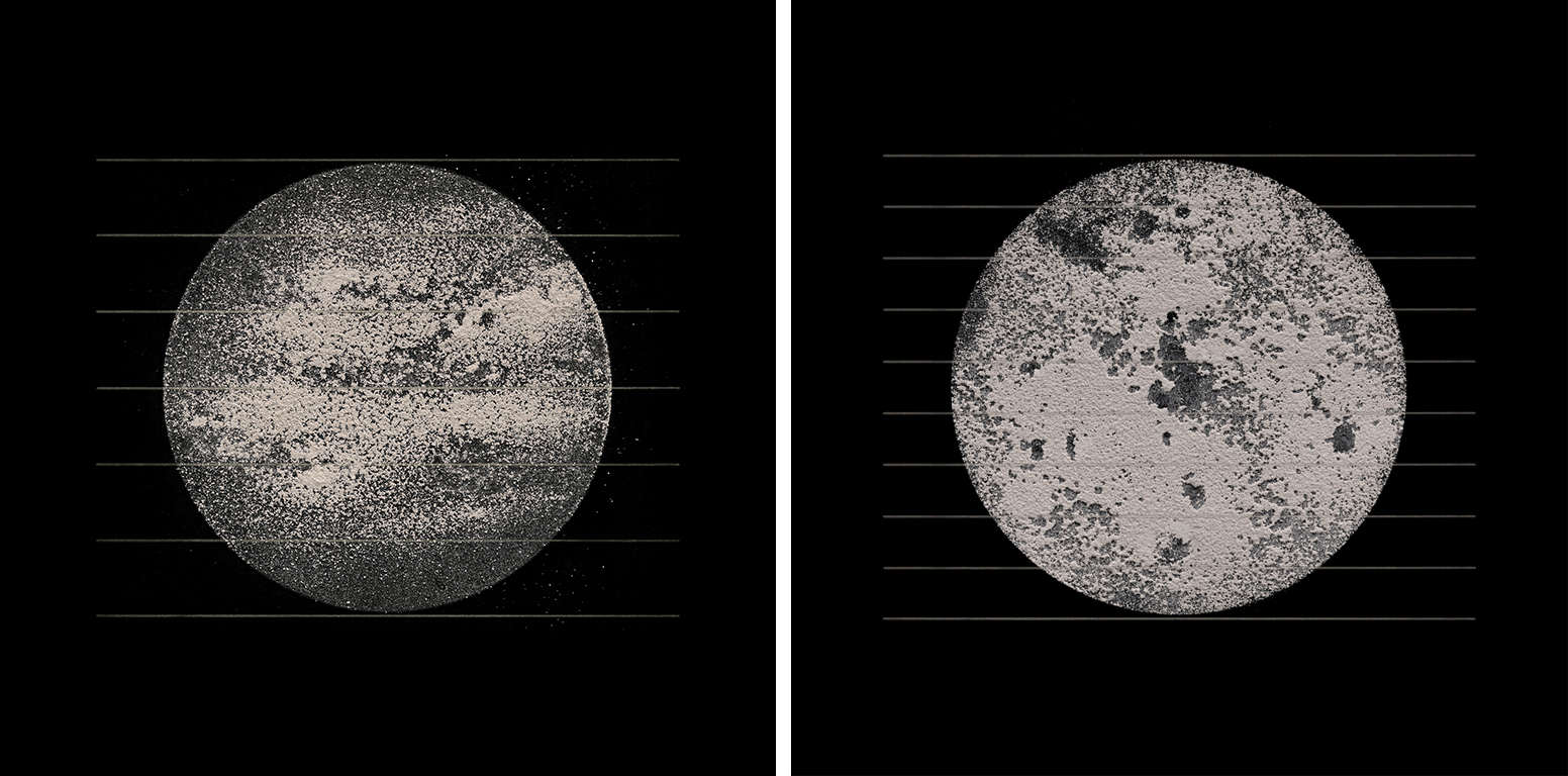
    Spring Hurlbut, Arnaud #4 (left), and #5 (right), both 2016, 27 7/8 x 27 7/8 inches framed, archival pigment print, edition of 3. Courtesy of Georgia Scherman Projects

    There is no fault in rendering death as fashionable, when it is done overtly; in Hurlbut’s works, such conspicuousness protects against pathos and heavy-handed symbolism, extinguishes the viewer’s desire to read too much into these celestial bodies, puffs of smoke or geometrical figures made of human and animal ashes. The gallery’s setup, minimalistic but hardly sombre, and certainly not morose, is conducive to interpretative restraint. Explaining the exhibition’s background, Georgia Scherman, the gallery’s friendly owner, does not press on symbolism, but emphasizes the meta-artistic connections to vanitas and memento mori, to abstract icons of Kazimir Malevich, but also to purely formal experiments of Agnes Martin.
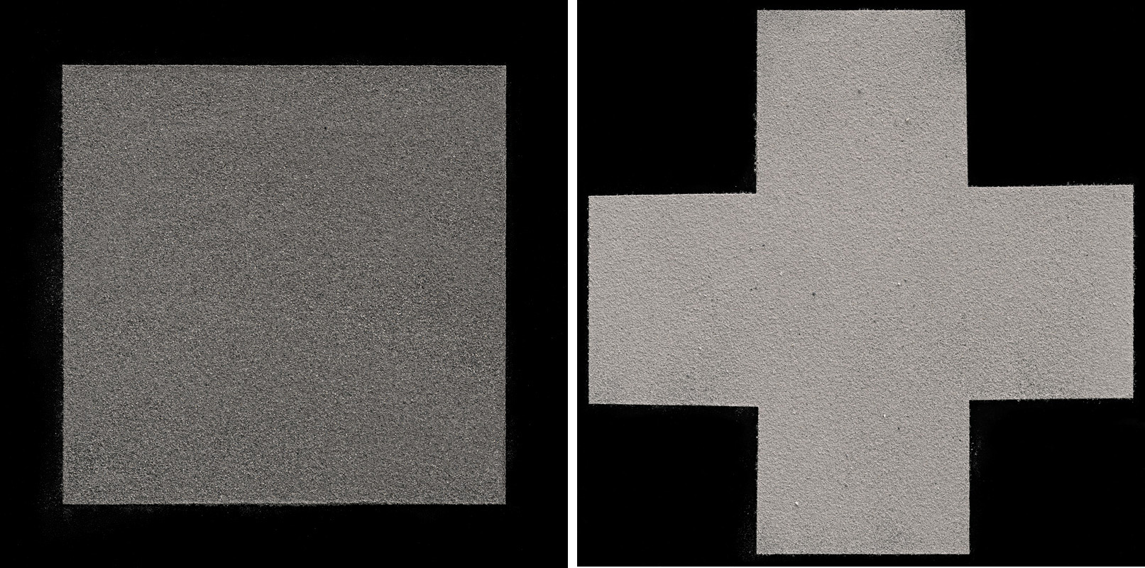
    Spring Hurlbut, The Malevich Suite: Nutmeg #3 (left) and #2 (right), 2013, archival pigment print, 18.5 x 18.5 inches, edition of 3.  Courtesy of Georgia Scherman Projects

    And once the temptation of the symbolic is done away with, and the curiosity regarding the meta-artistic is satisfied, one begins to notice peculiar artistic challenges arising from Hurlbut’s choice of medium. There is nothing stylized about her photographs; ashes, despite being arranged in various ways, are easily identifiable as ashes. Historically, some of the most realistic death-related artworks and works of design, from the bone chandelier in Sedlec Ossuary to the contemporary Body Worlds exhibition, used real human remains. However, human and animal ashes, loaned to Hurlbut, had to be returned to grieving families and owners. Moreover, unlike bones and soft tissues, ash is a capricious and delicate material that it hard to paste onto a collage, and nearly impossible to preserve intact. How does one render theme in photography as realistically as possible?
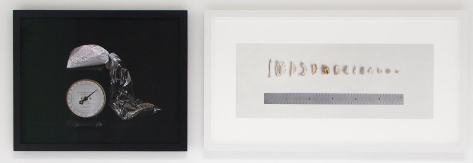
    Spring Hurlbut, Deuil I: James # 2 (part of), 2005, archival pigment print, 24 3/8 x 30 inches (left); and Deuil II: Grania and Robert #2 (ruler), 2006, archival pigment print, 24 1/2 x 45 inches (right). Courtesy of Georgia Scherman Projects

    This is where Hurlbut’s artistic ingenuity comes into play. Some of her newest photographs depict ash placed over thin, soft parallel lines somewhat reminiscent of musical scores; these lines are clearly referred to in the exhibition’s title. Their visual function, apparently, is to emphasize texture, and they do so to the point where, at least from a distance, these photographs look like collages made with real ash. There is a mild geometrical-optical depth perception illusion at work here, something akin to the Orbison or Ponzo effect. Technical nuances of this sort keep the fashionability of death in Hurlbut’s works safely away from moribund New-Agey kitsch; but even here the viewer must be aware of unexpected traps. As we contemplate the effect of this illusion on our depth perception, we might find it hard to refrain from symbolic attributions, to forbid ourselves from interpreting photographs as allegories regarding an illusory nature of life, death, or all of the above. But there are no allegories among ashes – only media for art.

    Spring Hurlbut, Bert #1, 2016, 27 7/8 x 27 7/8 inches framed, archival pigment print, edition of 3. Courtesy of Georgia Scherman Projects

    Andriy Bilenkyy

    *Exhibition information: October 20 – November 26, 2016, Georgia Scherman Projects, 133 Tecumseth Street, Toronto. Gallery hours: Gallery hours: Wed – Fri 10 am – 5 pm, Sat 11 am – 5 pm.

  • Mark Stebbins: Among the Jaggies, Aong the Seams at Wil Kucey Gallery

    Mark Stebbins’ artwork evokes intrigue in it’s material plasticity, subject amalgamation and small scale. The series Among the Jaggies, Along the Seams visually depicts the dynamic relationship between computer and craft. The audience oscillates between notions of hand-made and digitized. The uncertainty of medium and method demonstrates an underlying reciprocal interconnection between digital and textile and the processes of making.

    Mark Stebbins, Dissolution, 2015, acrylic and ink on panel, 14 x 11 inches. Courtesy of Wil Kucey Gallery

    Stebbins’ intricate acrylic compositions deceptively transforms from the painted medium to material and computer collage. His method consists of taping off unique segments and applying different details to each defined area. In this way he achieves a layered effect, with sharp distinctions where some areas become more raised. He details each segment using a varying set of application tools in order to further evoke the amalgamation of multiple materials. Rough textured areas convey a cut and paste effect, while the more seamless variations align with computer renders. The sharp edges and uncomfortable curves created by the tape, recall the trimming mechanisms of computer apparatuses but also handheld scissors, which then become correlated. The rigorous painted application method demonstrates a seriousness between the reciprocity of computer and craft.

    Mark Stebbins, Spatial Complex, 2016, acrylic and ink on panel, 18 x 18 inches. Courtesy of Wil Kucey Gallery

    The viewers uncertainty in materiality traverses familiar and abstract realms. Some segments overtly demonstrate the painted medium, revealing the residue of a brush stroke. However, the painted fragments are too magnified to depict a real scene. Pixelated areas evoke computer graphics but not a particular image, also due to the miniscule viewable area. In some works familiar atmospheres or objects become more obvious; the natural sky, a pixelated mug. The artworks evoke both screen and fabric texture. The work can be read as a series of pixels with an arrangement of individual squares or as weaved fabric. In approaching these pieces as textile the work inherits more depth such as interweaving invokes layered materials. Other works simulate material quality with reflection, shadows and color from more natural and muted to bright and neon. This apparent malleability evokes motion from axial to centripetal.

    Mark Stebbins, Dissolution, 2015, acrylic and ink on panel, 14 x 11 inches. Courtesy of Wil Kucey Gallery

    The collaged works’ haphazard amalgamations also evoke the phenomena of computer spasm, where the screen becomes pixelated and distorted. The work becomes situated between the thresholds of intentional and random, crafted and computed, programmed and erratic. Notions of fragments are positioned beside allusions to continuity. Asymmetrical collages compete with perfect squares. The digital world is revealed to be derived from real techniques. In the process of fabrication the physical and digital have become intertwined.

    The detailed artwork invites the viewer to approach with a sharp eye. With the largest painting measuring 18 x 18 inches, Stebbins articulates the intricacies that compose the visual world. The viewer must decipher the deceptively clear material representation and ambiguity of the amalgamation.

    Nika Teper

    *Exhibition information: November 4 – December 3, 2016, Wil Kucey Gallery, 1183 Dundas Street West, Toronto, Wed – Sat, 11 am – 6 pm.

  • Howard Lonn: Khrome at Birch Contemporary

    Today we tend to think of ourselves as existing in an infinitely postmodern society, but sometimes we are able to step back and see a space untouched by our ever-changing sensibilities. This is exactly the case in Howard Lonn’s solo exhibition titled Khrome, which is currently being shown at Birch Contemporary. In this exhibition the viewer is presented with bold fields of bright color, constructed from a series of intersecting planes that split the canvas into various stages of relief. However, these layers come together to form a series of paintings that are extremely solid in their composition, and engaging in their representation. The life-sized scale of these canvases helps to bring a sense of vitality to the forms and shapes that have been painted onto their surfaces. 

    Howard Lonn, Khrome, installation view at Birch Contemporary. Courtesy of the artist and Birch Contemporary

    When first walking into the exhibition, the word “structure” springs to mind immediately. The colors on the canvases – greens, pinks, blues, and yellows – are extremely vibrant but yet, they do not denote any sense of levity. The forms within these paintings are neither boundless nor ethereal; some are almost industrial in nature, and they all seem to extend from a foundation that lies at the bottom of the canvas. The bases help to ground these forms, thus partially effacing the idea that they might represent things that are otherworldly in nature. The figures and forms contained within these paintings are certainly ambiguous, but they do not seem foreign at all; some even hearken back to early industrialist paintings of the twentieth century.

    For instance, in “D(1)”, we are presented with a quasi-mechanical form that almost resembles a table lamp with a wide base. Nevertheless, the representational value of the painting remains in question; we are thus left in a series of contemplative moments that may or may not provide us with sufficient answers to our questions.

    Howard Lonn, D(1), 2016, oil on canvas, 84″ x 66″. Courtesy of the artist and Birch Contemporary

    The viewing experience in this exhibition is like entering into a dialogue with the surface of the canvas; one bounces an idea off of the canvas only to have another idea rush into their head a moment afterwards. The forms themselves have a definitive structure, but their general abstraction allows them to evade being put into a single box.

    Nevertheless, while these paintings are decidedly modern, they also serve to exude some long-lost qualities of art. Painterly techniques characterize them completely, and forms that seem to recall the mechanical turn of the century dominate them. Even the title of the exhibition is linked to the past – Khrome is colour in Greek. Even some of the forms themselves seem to echo past artistic motifs; in “The Good Form” we are presented with a rounded form that hearkens back to the golden section and in “Portrait Head”, the artist puts forth a shape that recalls the portrait busts so popular during the eras dominated by Greek and Roman culture.

    Howard Lonn, The Good Form, 2016, oil on canvas 84″ x 66″. Photo: Joseph Hartman

    In the essay that accompanies this exhibition, Lonn describes these paintings as “fragments of someone else’s last century modernity.” However, one must be careful not to reduce these paintings to their art-historical implications; while Lonn does certainly hearken back to the gestural painters of the past, he does not simply adopt past techniques or sensibilities. In these paintings, Lonn evades the purely abstract and places an emphasis on the notion of meaning making. The paintings in Khrome seem to suggest a possible truth; however, it is the viewer that is given the choice to decide just what this truth might be. In this way, they can be somewhat understood as architectural blueprints for an open viewing experience.

    Howard Lonn, Khrome, installation view at Birch Contemporary. Courtesy of the artist and Birch Contemporary

    Jordan Fee

    *Exhibition information: October 20 – November 26, 2016, Birch Contemporary, 129 Tecumseth Street, Toronto. Gallery hours: Wed–Fri 10 am – 6 pm, Sat 11 am – 5 pm.


  • Paul Brandejs: 49 Years Later at Gallery 1313

    Paul Bandejs in front of his work. Photo: Phil Anderson

    Walking into the small space of Cell Gallery at Gallery 1313 vibrant canvases greet the visitor in Paul Brandejs show, 49 Years Later. Each work consists of photographs that is painted on top; certainly not a novel idea, but it is the canvas itself that sculpted into various forms that make this exhibition stand out. The scenes portrayed are both in natural and city environments mainly in the Czech Republic, the artist’s birthplace, where he visited for the first time this year since immigrating with his family 49 years earlier.

    Installation view of Paul Bandejs, 49 Years Later at Gallery 1313, 2016. Courtesy of the artist

    It is a unique experience interacting with these works. I find my focus bouncing between the work’s three components: photograph, paint, and three-dimensional canvas. At first I am really just enthralled by these unique canvases. I stand staring just inches away from the piece in front of me, moving over the curves and edges to follow the scene across its mountain-like foundation. The central point of the canvas where your eye is first drawn is the photograph; showing what the eye truly sees in real life. But as my eyes search the canvas towards the outer edges where Brandejs adds the vibrant acrylic paint; another layer opens up. Brandejs’ abstract compositions encapsulate the physical and emotional beauty of the world around him and they evoke memories and feelings.

    Paul Bandejs, Red Roofs, 2016, acrylic, photography and found material on shaped canvas, 36 x 46 x 4 inches. Courtesy of the artist

    Bandejs captures the atmosphere of both the landscape and city settings. When the artist sees me completely lost in a city-scape, he tells me that it is the depiction of an old city in the Czech Republic. I tell him how strong is the feeling that I have been there before. Though I have never actually traveled to the Czech Republic, his work transports me to the streets of another European city that I have explored. The motion on the canvas carries the viewer’s eyes upwards to the sky. I am reminded of times I have walked on old cobblestones through narrow streets with my head tilted up so I can follow the maze of buildings above me where towers and rooftops are slowly revealed. Since it is so beautiful and inviting I develop a desire to be in this scene in front of me.

    Paul Bandejs, Here they come, 42 x 26 x 4.5 inches (left) and  5 after 6, 45 x 20 x 4 inches (right); both 2016, acrylic, photography and found material on shaped canvas. Courtesy of the artist

    Visiting the places of his childhood after such a long time, seeing them through an adult’s eyes who spend his life far away is an interesting but also challenging experience both visually and emotionally. 49 Years Later successfully combine Bandejs’ memories of his native city Prague with his new reflections.

    Carter Brown

    *Exhibition information: November 9 – 20, 2016, Gallery 1313, 1313 Queen Street West, Toronto. Gallery hours: Wed – Sun:1 – 6 pm.


  • Ydessa Hendeles: Death to Pigs at Barbara Edwards Contemporary

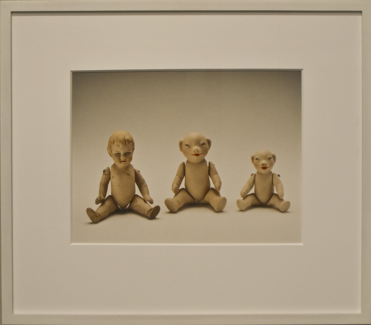
    It is believed that society is intrinsically progressive and prospective. From our experiences as “civilized” beings, society – or at least its idealistic perception – is guiltless and without fault. However, as Ydessa Hendeles strives to explain through her curated exhibition, there are often ironic undertones behind many existing practices. As she describes, her selected works addresses “our social and political capacity to put constructive, sometimes Utopian, forces to destructive ends.” This duality is embodied by Hendeles’ encompassing metaphor of pigs, their societal role, and their cultural allusions. Despite their relative intelligence and behaviour compared to other domesticated animals, they are often synonymous with vulgarity and filth. This mentality is why certain cultures, such as the Judaic and Islamic, avoid its consumption while others use this perspective to justify their maltreatment. Likewise, their image has been equated with the most negative human qualities, describing the bourgeoisie and the peasantry; the establishment and the revolutionaries; the exploited and the exploiters alike.

    Ydessa Hendeles, Family, 2015, pigment print on archival paper, framed in hand-painted white poplar frame of 16 3/4” x 19 1/8” x 1 1/2″. Photo: Robert Keziere. Courtesy of Barbara Edwards Contemporary

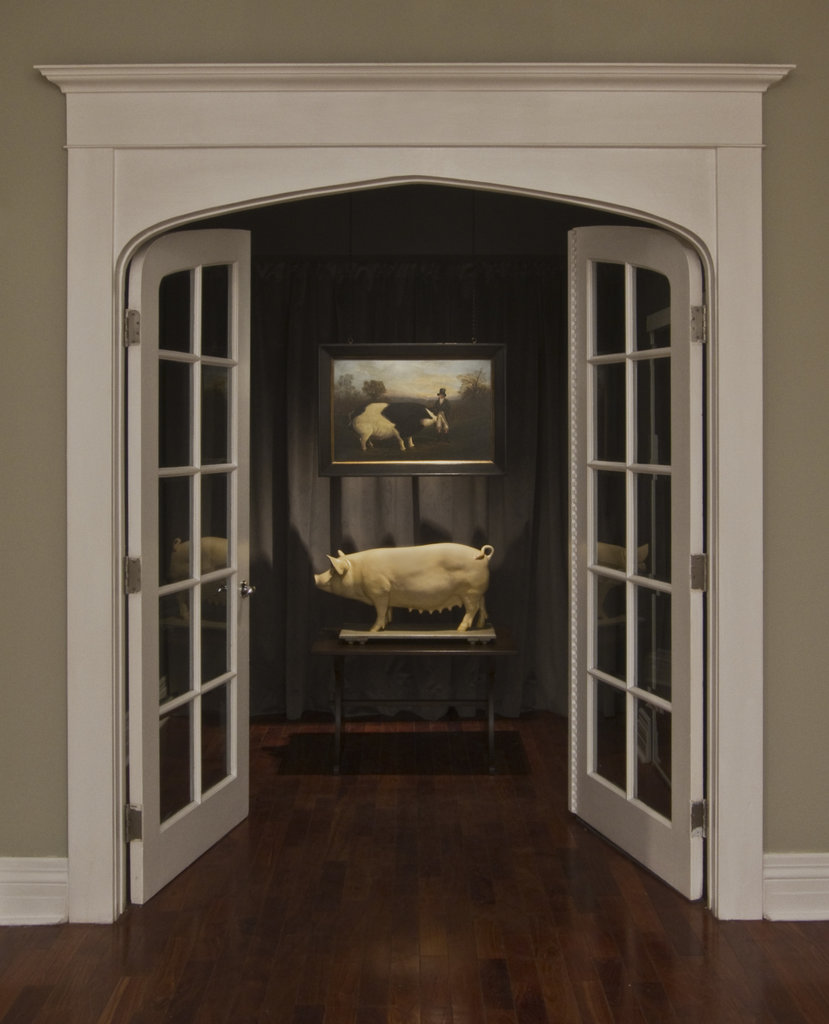
    The largest of the installations, Prize, consists of an anatomical model of a pig atop a child’s table and an English Naïve School oil painting suspended from steel chains. One of the school’s most popular subjects during the 19th century was the prize-winning livestock of fairs, estates, and markets and their owners. Compared to other animals such as cattle, sheep, and horses, pigs were rarely depicted because of their relative lack of appeal. By contrast, evolutionary and biological studies have shown pigs to demonstrate considerable intellect compared to cats and dogs in addition to close genetic ties they have to humans. The pairing of these works seem to allude to the contrasting scientific and socio-economic perceptions surrounding pigs.

    Ydessa Hendeles, Prize, 2015, oil painting suspended from painted steel chains, anatomical model, child’s table, installation dimensions: 116” x 36″ x 24″. Photo: Robert Keziere. Courtesy of Barbara Edward Contemporary

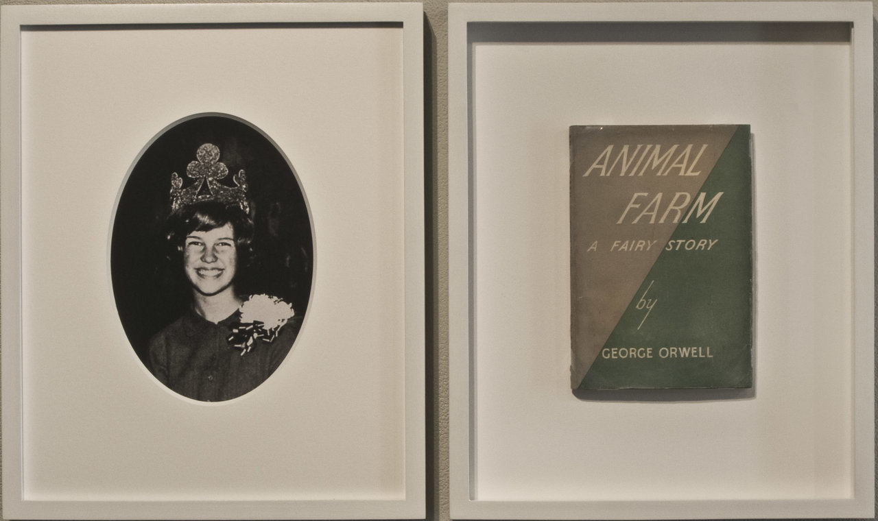
    The title Death to Pigs is a reference to the Manson family murders in the summer of 1969, which were infamously inspired by the Beatles’ song Piggies. Emerging during the break of the Vietnam War and the surmounting paranoia of the Cold War, the song was intended to incite popular protest against the people who perpetuate the conflict (commonly recognized as the “establishment”). Therefore, Hendeles’ photograph entitled Princess, depicts a young Leslie Van Houten, who eagerly becomes a member of the family’s perverse ideal. Its original prospect of peacefulness and happiness became warped by the misinterpretation, or perhaps the over-interpretation, of this activist message, leading Van Houten to participate in the brutal murder of Leno and Rosemary LaBianca.

    Ydessa Hendeles, Princess (1964), 2015, pigment print on archival paper and first edition copy of Animal Farm (1945) by George Orwell, both framed in hand painted white poplar frames, installation dimensions: 14 1/2” x 24 9/16″ x 1 3/8″. Photo: Robert Keziere. Courtesy of Barbara Edwards Contemporary

    Accompanying her photograph is a first edition copy (printed and bound in 1945 following the Second World War) of George Orwell’s Animal Farm: A Fairy Story, in which he masterfully recreates the progression of Russian history following the rise of the Communists. What began as an inspirational rebellion against the oppressive rule of the bourgeoisie eventually devolved into the highly-bureaucratized, ruthless Stalinist regime, despite claiming to have followed those original principles of equality and fairness. Following the course of history, in the book, Napoleon (the leading pig) assumes the role of the ideological pedagogue, transforming the idealistic egalitarianism into an autocratic hierarchy: according to Orwell, “everyone is equal, but some are more equal than others.”

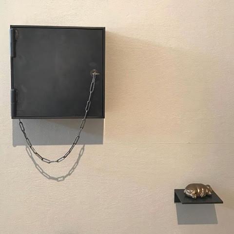
    Ydessa Hendeles, Three Little Pigs, 2015, sound video housed in custom-made, wall-mounted 1/4 inch steel plate box with key-lock door and antique chain; cast-bronze sculpture on wall-mounted steel shelf, installation dimensions: 22 3/8” x 35” x 4 3/4″. Photo: Robert Keziere. Courtesy of Barbara Edwards Contemporary

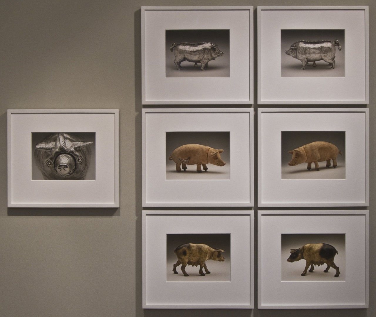
    Death to Pigs is a multimedia collection of images and artifacts that explore some of the societal allegories and allusions associated with the imagery of pigs. It is intrinsically diverse and interdisciplinary, venturing through history and across cultures to deliver a rich yet still comprehensive view into the multiple iterations. In doing so, Hendeles not only offers a glimpse into the complex development of the “pig” in human civilization; she exposes much of the controversial, characteristically “vulgar” underbelly of the human condition, or rather the potential it has to descend to the begotten level.

    Ydessa Hendeles, Nose, 2015, seven pigment prints on archival paper, framed in hand-painted white poplar frames, installation dimensions: 46 5/8” x 55 5/8″ x 1 1/2″. Photo: Robert Keziere. Courtesy of Barbara Edwards Contemporary

    Simon Termine

    *Exhibition information: October 7 – December 10, 2016,  Barbara Edwards Contemporary, 1069 Bathurst Street, Toronto. Gallery hours: Tue to Sat, 11 am – 6 pm (or by appointment).

  • BMO 1st Art! Invitational Student Art Competition Winners, 2016

    BMO Financial Group’s 1st Art! Invitational Student Art Competition celebrates the creativity of art students from post-secondary institutions across Canada. Deans and instructors of undergraduate certificate, diploma, and degree programs in visual art are invited to select from their graduating classes three students, whose ability and imagination place them 1st among their peers. A distinguished selection committee chooses a national winner and one winner from each eligible province and territory.

    The national winner receives $10,000 and the regional winners each receive $5,000 for his or her artwork. BMO’s corporate art collection includes historical and contemporary Canadian masters such as Kenojuak Ashevak, Emily Carr, Paterson Ewen, Tom Forestall, Marc-Aurèle Fortin, Lawren Harris, Thaddeus Holownia, David Milne, Margaret Priest, Denyse Thomasos, Ian Wallace and others. All winning entries will be on display at the 1st Art! 2016 exhibition, held at the Justina M. Barnicke Gallery in November 2016.

    2016 Winners

    The winners for 2016 vividly demonstrate the excellence and promise of Canada’s newest generation of artists.

    NATIONAL WINNER:

    Nathan Levasseur / University of Alberta 

    Everyone Changes, Digital drawing; digitally printed on metallic gloss paper, Edition 1 of 1, 91.44 x 91.44 cm; 36 x 36 in

    For the provincial winners and more information please go to: http://www.bmo.com/bmo/files/images/7/1/BMOfirstArt.html.

    *Exhibition information: November 17 – December 17, 2016. Opening Reception: November 16, 2016, 7-9 pm, Justina M. Barnicke Gallery,  Hart House at the University of Toronto, 7 Hart House Circle. Gallery hours: Tue – Sat 12 – 5, Wed 12 – 8 p.m.

  • Yonder at Koffler Gallery

    In international cities driven by Capitalism, technological advancement, ease of global travel and high-speed wireless connectivity, cultural homogenization is synonymous with homesickness and anxiety. Each of the artists in the exhibition Yonder at Koffler Gallery confronts homelessness or homesickness in the immigrant experience or the struggle with identity faced with global anxiety. Larger installations, sculptures and video works are featured in the main gallery space, a sound installation crosses into the stairwell, photography series are featured on the upper floors of Artscape Yongplace and a flag flies in the sphere of public sculpture.

    The works of Julius Poncelet Manapul and Brendan Fernandes in the main gallery express a very personal struggle with cultural and community integration. In Fernandes’ video Standing Leg (2014), he attempts to stand up with his foot in a wooden ballet foot stretcher. His reason for leaving dance as a profession was due to an injury, however, the video is meant to symbolize how his body – of Kenyan and Indian descent – could not physically conform to the posture of the medium. The foot stretcher may further be interpreted as a metaphor for the pain and violence of post-colonial adaptation, and the rigorous structure of Ballet’s aesthetic ideals. Ultimately, Fernandes is unable to stand on his leg as his foot will not conform to the shape of the prop – his is a personal struggle.

    Bredan Fernandes, Standing Leg, 2014, video still

    Julius Poncelet Manapul’s sculpture Balikbayan Babia Maya (2016) is also wrought with symbolism for personal struggle deriving from the Filipino and immigrant communities. His piece begins on a short plinth where a white Balikbayan box – used to send care packages from the Filipines – is filled with cut offs and phalluses from pornographic online sources. Emerging from the box are sixty-nine castrated native birds with Manapul’s fingernails for talons made from the more figural pornographic images. Above the delicate birds, a birdcage is hung filled with twenty-six sexy butterflies, one for each year he emigrated. Among the complex, detailed innuendos is a personal crisis. As a gay man he might not feel a sense of belonging to a Catholic country, and as an Asian man, in the gay community he might be perceived as an object. The personal stories expressed in the works by Manapul and Fernandes only confirm that the multitudes of effects cultural homogenization can have are as diverse as the individuals in a global “melting pot.”

    Installation view with Julius Poncelet Manapul, Balikbayan Babia Maya, 2016 (in front)

    The global scale of the cultural belonging to the homesick nomad takes the form of an installation in four parts by Jerome Havre. Poetics of Geopolitics (2016) has four clear stanzas. On the right side one red, jagged, neon light traces the oceanic fault line connecting South America to Africa, as a reminder that geological borders become political ones –  it also reminds me of the abstract neon graphs by Theaster Gates. On the left side, two wooden sculptures of TV ‘set’ to the color test channel imply TV as a medium for defining ‘normalcy’. Using color as a mean to do so suggests that it vaguely defines racial ‘normalcy’. The third section is personal. Havre’s two active passports representing two active citizenship are framed.  Passports are internationally recognized forms of personal identification, and as such they qualify individuality, but unfortunately they also enforced our identities, homes and futures as defined by political borders. Finally, a Mylar sheet is hung behind the other three pieces. It reflects the other works in the gallery and incorporates the visitor into the work. Like the Sainsbury Wing of the National Gallery in London is postmodern for fitting in by reflecting the surrounding architecture while incorporating a new medium. Mylar in Havre’s work is a technique of assimilation while also establishing the elements that compose the original installation.

    Jerome Havre, Poetics of Geopolitics, 2016

    The artists in Yonder have each found a diverse medium to express personal experience, but there are also less political matters involved in the immigrant experience that are relatable to everyone, including weather and homesickness. Covering the length of the gallery’s back wall is Sarindar Dhaliwal’s chromira print, Weather: An Immigrant Perspective (2016). The print is part of a series titled The Cartographer’s Mistake formed by a custom-made marigold alphabet. The story of a fictional mapmaker who is punished and reincarnated as a migratory bird allows Sarindar to be nostalgic for the weather between Punjab and Bengal where the cartographer worked. The mosquitoes are romanticized and the monsoons preferable. As weather is a universal experience, it is easy to sympathize with this particular type of homesickness.

    Sarindar Dhaliwal, Weather, an Immigrant Perspective, 2016

    On the third floor, photographer Esmond Lee captures most literally the emptiness of the homesick nomad in his series Between Us (2014-2015). Lee’s images depict the inside of the classic suburban home, with its empty rooms and white, unpainted walls on which unframed family pictures are tapped. The lack of bodies is palpable and the effects of the homeowners are of the least permanence, implying a sad discomfort. Anyone who has lived in more than one city will understand a constant homesickness for the place you are not in for a while, for the left behind family and friends who helped to shape your identity.

    Esmond Lee, Between us, 2014-2015

    Every artist in the exhibition expresses vulnerability about widely felt anxiety, each filled with pain or humor and each worth engaging with.

    Text and photo: Alice Pelot

    *Exhibition information: Yonder, a Group Exhibition / Sarindar Dhaliwal, Brendan Fernandes, Rafael Goldchain, Jerome Havre, Luis Jacob, Esmond Lee, Julius Poncelet Manapul, Sanaz and Mani Mazinani, Divya Mehra, Zinnia Naqui, Jose Luis Torres, 2fik, Blue Republic, Diana Yoo, Jinny Yu, Z’otz* Collective. Curated by Matthew Brower and Mona Filip, September 21 – November 27, 2016, Koffler Gallery, Artscape Youngplace, 180 Shaw Street. Gallery hours: Tues – Fri 12 – 6 pm, Sat & Sun 11 am – 5 pm.

  • Osheen Harruthoonyan & Katherine Tzu-Lan Mann at Lonsdale Gallery

    Lonsdale Gallery takes the visitors on an interesting tour with its two November shows: A Circle of Bluebirds by Osheen Harruthoonyan and Overabundance by Katherine Tzu-Lan Mann. In the main gallery there is a dream like atmosphere created by Harruthoonyan’s black and white photographs that combine elements of the unexplored galaxy with common grass fields.

    Installation view of A Circle of Bluebirds by Osheen Harruthoonyan at Lonsdale Gallery, 2016. Courtesy of Lonsdale Gallery

    Harruthoonyan creates an interesting framework, in which he juxtaposes the infinite universe with the insubstantial size of a human being – analyzing nature through the human eye. In Black Mountain, there is a familiar natural formation, a mountain, paired with voluminous clouds and a densely charged starry sky, a magnificent view that somehow is also disturbing. All the photographs from the Circle of Bluebirds series make the viewer reconsider the peaceful but also powerful nature.

    Osheen Harruthoonyan, Black Mountain, 2016,  toned gelatin silver print, 14.5 x 14.5 inches framed. Courtesy of Lonsdale Gallery

    In This Dream She is Terrified by the Pacific Ocean is another spectacular depiction of the colossal beauty of nature. The foreground looks like a field of grass calmly bending in a wind and merging into the middle ground of huge waves and a spherical body of water. It is not what you see but the feeling that it creates that clears your mind – like a powerful meditation. Harruthoonyan based his photographs on observations of the cosmos and sky in different parts of the world, including Europe, the Middle East, and Canada, and used a layered technique to construct intricate narratives of time and history.

    Osheen Harruthoonyan, In This Dream She is Terrified by the Pacific Ocean, 2016, split toned gelatin silver print, 18.5 x 21. 25 inches framed. Courtesy of Lonsdale Gallery

    Walking up the stairs, leaving the romantic, layered photographs behind an explosion of color greets the visitor. Kathrine Tzu-Lan Mann’s multi-layered abstract paintings use organic motives in chaotic compositions. Her electric works were inspired by decorative forms around her, from Beijing opera costumes to sequin patterns.

    Installation view of Katherine Tzu-Lan Mann, Overabundance at Lonsdale Gallery, 2016. Courtesy of Lonsdale Gallery

    Fallow combines black and white leaf elements with large spurs of yellow, blue and green paint. Taking chances and allowing accidents to happen seems to be a central element of her works. She lets the viewer imagine the narratives and think about what each color could represent. Her technique is interesting and unique; she starts with underlining ink drawings then combines watery and thick paint – the outcome is very eye catching. It is hard to recognize a specific object, as Mann mainly reflects on the emotional discoveries that prompted by various decorative items.

    Katherine Tzu-Lan Mann, Alloy 2, 2016, acrylic and sumi ink on paper, 50.5 x 57.5 inches. Courtesy of Lonsdale Gallery

    Katherine Tzu-Lan Mann, Fallow, 2013, acrylic and sumi ink on paper, 60 x 139.5 inches. Courtesy of Lonsdale Gallery

    Visiting these shows at Lonsdale was an amazing and rich experience. Harruthoonyan takes the visitor to a world of dream, surrounded by the cosmos, relaxing the mind. Then upstairs Mann’s exhibition greets the viewer with a world of ecstatic colors that energizes and activates the imagination. The two exhibitions greatly complement each other.

    Elizaveta Mironova

    *Exhibition information: Osheen Harruthoonyan: A Circle of Birds / Katherine Tzu-Lan Mann: Overabundance, October 15 – November 13, 2016,  Lonsdale Gallery, 410 Spadina Road, Toronto. Gallery hours: Wed – Sun, 11 – 5 pm.

  • Sara Angelucci: Arboretum at Stephen Bulger Gallery

    Arboretum: Fusing of man and nature

    Environmental issues dominate Angelucci’s Inkjet photography series entitled Arboretum. Expanding on Aviary, Angelucci’s previous series concerning extinct birds, Arboretum addresses the current state of deforestation. Befitting the exhibition’s concept, arboretum, Latin in origin, refers to a place grown with rare trees. By thematically linking the title, the photographs and her environmental philosophy, Angelucci’s Arboretum dissolves the polarity of man and nature, and decisively subordinates humans to trees.

    Man/Woman/Pines, 2016 © Sara Angelucci / Courtesy Stephen Bulger Gallery

    Most pieces in Arboretum challenges the traditional notion of man taming nature, instead nature dominates the composition of the photographic pieces as seen in Boy/Double Ash. The man on the ephemera is faintly visible, with his two hands grabbing and leaning on a wooden post and lintel. His face and legs are almost unrecognizable. The nature –trees, leaves, branches –overshadow the human, who, in fact, functions as if a backdrop or a landscape. Interestingly nature’s subordinated role on carte-de-visite or even Leonardo da Vinci’s Mona Lisa is reversed by Angelucci; now nature is the main subject matter.

    Boy/Double Ash, 2016 © Sara Angelucci / Courtesy Stephen Bulger Gallery

    In Man/Poplar, there is only an indistinct silhouette of a human superimposed by overgrown trees. The entire piece is filled with greenery, making it difficult to discern the human. This, too, concentrates on bringing nature into the fore, it is no longer a mere decorative backdrop or a random image of trees. In fact, all the nature seen in the exhibition is the author’s own photographs of indigenous trees of Ontario. Angelucci treats nature as the centre of her environmental pieces. 

    Man/Poplar, 2016 © Sara Angelucci / Courtesy Stephen Bulger Gallery

    What is all the more interesting is not only Angelucci’s concentration on nature, but also the concept of superimposing old nineteenth–century cabinet cards to current photographs of Ontarian trees. She integrates the old and the new to produce works that address issues of deforestation. Ironically, the dead seen in these photographs as if they are the trees themselves, awaiting to be chopped and killed for human benefit. This is clearly visible in Sister Elms, which shows presumably two sisters, integrated with the trees in the foreground. The integration of trees and humans inexplicitly foretells the issues and harmful effects of deforestation not only on nature but also on humans. 

    Sister Elms, 2016 © Sara Angelucci / Courtesy Stephen Bulger Gallery

    In Arboretum, Angelucci captures nature with humans and integrates the old and the new. She raises awareness and informs the viewers of deforestation, all the while creating a new way of photographing and printing, and combining them to manufacture a creative series of photographs.

    Katerina Bong

    *Exhibition information: October 22 – November 19, 2016, Stephen Bulger Gallery, 1026 Queen Street West, Toronto. Gallery hours: Tue – Sat, 11 am – 6 pm.

  • John Massey: Black on White at Diaz Contemporary

    Photographic manipulation has always played a large part in John Massey’s work, and his new exhibition at the Diaz Contemporary is no exception to this rule. Black on White is a mesmerizing display of artistic prowess that both engages and disarms the viewer through its use of allegory. The exhibition is composed of a series of ten digital prints that have been combined with a collage technique to create dense visual fields of linguistic characters. However, this emphasis on language does not produce static imagery; instead we are presented with a series of explosively dramatic prints that seem to emphasize the intensity and fervor that characterize our modern surroundings.

    Installation view of John Massey, Black on White (from left to right) One, Auto and Now, 2016 Courtesy of Diaz Contemporary

    This can be seen immediately after one walks through the doors of the gallery, as each of the first three prints – One, Auto and Now – all contain explosive motifs constructed from a series of exclamation points, which all radiate from a central node. In One, these are also combined with a series of exclamation points that cascade downwards like raindrops. In the book that accompanies this exhibition, Massey describes One as such: “As it rains exclamation points, the promise of fertility and Jerry Lewis’s secret potion hovers over a cruciform jumble of letters and words.” Each of these cryptic decisions implies a strong sense of tension that hints at our inability to understand a now that we have been violently thrust into.

    John Massey, One, 2012-14, archival digital print mounted on dibond, 65” x 65”, edition of 3. Courtesy of Diaz Contemporary

    In Cross we are presented with a tragic series of images, phrases and words that seem to represent a love that has been lost. These are the only full phrases that appear in the entire exhibition and so their force is felt twofold; phrases like “I know I don’t love you anymore” and “Listen, I have to talk to you”, take on a new level of seriousness and candor. The word “take” is also repeated a numerous amount of times, thus suggesting the toll that relationships can take on an individual.

    John Massey, Cross, 2015, archival digital print mounted on dibond, 32.625” x 32.625”, unlimited edition. Courtesy of Diaz Contemporary

    In Tarot, the base print is made up of a series of colorful tarot cards, which have been obscured and concealed by a thick layer of letters. The colors contained within this piece make it stand out from the others, which are much more faithful to the title of the exhibition. Nevertheless, it is again the letters that contain the most significance; in this piece, the letters serve to construe any sort of meaning that we would be able to draw form the cards themselves. Therefore, some of these prints serve to show how language and expression can in fact obscure, rather than simply convey information. While observing these prints, the viewer longs to understand a truth that seems to be ultimately ungraspable.

    John Massey, Tarot, 2016, archival digital print mounted on dibond, 65” x 65”, edition of 3. Courtesy of Diaz Contemporary

    This sense of longing is in fact present throughout the exhibition; we as viewers are driven by a desire to understand these prints fully while the artist, through a series of references to the past, seems to be longing for something that has been lost, or that has yet to present itself. In Black on White, and in Phantoms of the Modern, we are presented with an aching desire for understanding, which is then underlined by our inability to really see what we are being presented with. In his book on the exhibition, Massey describes one of the prints with the phrase: “The explosion of the now is an inescapable cacophony.” In a way, this statement could be used to describe the entire exhibition; the chaotic, and sometimes hypnotic nature of these prints draws us in and locks us into a constant battle for understanding, from which escape can be difficult.

    Installation view of John Massey, Black on White, 2016. Courtesy of Diaz Contemporary

    Jordan Fee

    *Exhibition information: October 14 – November 12, 2016, Diaz Contemporary, 100 Niagara Street, Toronto. Gallery hours: Tue- Sat 11 am – 6 pm.

  • Rock About at the Canadian Sculpture Centre

    Rock About: Rocks that Transform

    With natural materials, fourteen sculptors produce an enticing exhibition: Rock About. Whether it is carving or assembling found stones, the exhibition is thematically intertwined: transformation of otherwise static and lifeless stone into meaningful artworks.

    Elizabeth Merei with her sculptures Truth, Italian agate  marble and Opus I, alabaster, acrylic base. Courtesy of Canadian Sculpture Centre

    Mary Ellen Farrow completely transforms a piece of Indiana limestone into a witty piece entitled “why knot”. Two bands wrap around the lower and upper parts of the sculpture forming a knot, hence, the name. While conforming to the original qualities of the stone, Farrow produces an abstract sculpture with rhythm and movement. As the body of the sculpture moves upward like a flickering flame, the bands counteract creating X-shapes. Completely polished and refined, the sculpture appears artificial and man-made. Yet, Farrow’s goal is just that. She transforms a motionless and static rock into a tactile and rhythmic piece, which in turn, elicits the viewers to react and ponder on the meaning behind the work. 

    Mary Ellen Farrow, why knot, Indiana limestone. Photo: Katerina Bong

    Mary Cartmel sculpts two tangoing birds from a green Brazilian soapstone. Unlike Farrow’s abstracted works, “Tango” depicts the natural wildlife. Two birds adjoin the tip of their wings to tango. Their heads lean backward to create an elongated and dramatic gestures. The image of birds tangoing is an artifice – it is a human invention and imagination. This man-made transformation captures the sculptor’s intention. She wanted to capture a moment in which a stone isn’t or cannot be. Birds are light and always moving contrary to a static and inanimate rock. She wanted to depict such a profound dichotomy in her works. In order to create her works, she does not create preliminary sketches, rather bases the design on her spontaneity and intuition. Due to the soft nature of the soapstone, she can work with hand tools in close proximity with the rock. By pushing the limits of stone, the final product is light and playful.

    Mary Cartmel, Tango, green Brazilian soapstone. Photo: Katerina Bong

    This sneak peek at these two sculptures from the exhibition offers an insight to the idea of transformation. They use insignificant and static stones to give them new meaning. Like Farrow and Cartmel, the other sculptors are not mere artists, they are inventors.

    Andy Berg with Aqua, cast stone, mixed-media. Courtesy of Canadian Sculpture Centre

    Fred Hummel and his work: With the Flow, installation, marble, steel, found stones. Courtesy of Canadian Sculpture Centre

    Katerina Bong

    *Exhibition information: October 13 – November 4, 2016, Canadian Sculpture Centre, 500 Church Street. Gallery hours: Tue – Fri: 12 – 6, Sat: 11 – 4 p.m.

  • FOCUS: LATIN AMERICA

    As you walk through the maze of galleries participating to the 2016 edition of Art Toronto, the presence of some truly ingenious works by Latin American artists will not fail to catch your attention. Presenting the second chapter of FOCUS: LATIN AMERICA, Art Toronto is host to sixteen galleries that feature the work of contemporary Latin American artists. From Madrid to New York, and from Mexico City to Buenos Aires, it is a unique chance to see the contemporary production of these artists who still shine by their absence in our Toronto galleries.

    Abel Bentin, S/T, marble dust and resin, 2016, edition of 7, Ginsberg Galeria, Peru

    In conjunction with these galleries, Venezuela born and New York-based cultural producer Isabela Villanueva also curated a remarkable selection of installation projects that explore the social and political issues within the context of urban architecture and the build environment. Featuring the works of Stefan Benchoam and Christian Ochaita from Guatemala, Vivian Caccuri from Brazil, Carlos Garaicoa from Cuba, Luciana Lamothe, from Argentina, Mario Navarro from Mexico, Frederico Ovalles-Ar from Venezuela, and Ishmael Randall Weeks from Peru, all eight installations will challenge the way your view seemingly banal materials and how they are featured in our daily urban lives.

    I had the chance to speak with Villanueva who explained to me the motivation behind her curatorial choices; from the artists she chose to the themes she wanted to put forward. An important part of Latin America’s history is marked by fluctuating economies, political upheavals and instabilities. This reality has heavily impacted Latin America’s urbanism and the relationship of Latin Americans with their cities.

    Stefan Benchoam and Christian Ochaita (Guatemala), Buró de Intervenciones Públicas, Mixed media site-specific installation

    Luciana Lamothe (Argentina), Mixed media site-specific installation

    Going all the way back to the 1920s where, in conjunction with modernity, the first metropolises were starting to emerge in Latin America, Constructivism, whose mandate to view art as a practice for social purposes, heavily resonated with Latin American artists. The heritage of the movement is still felt today and for Villanueva, it was important to show that theses themes continue to spark the creativity of Latin American artists.

    While they all come from different countries, the eight artists she chose for the art fair all have something in common: their works serve as indexes to the changing face of Latin America’s urban landscapes. Whether they are using plants or cement, their works educate the public by raising their awareness to the consequences of modernization and globalization. Each of them can be seen as social interventions that are critical of the construction and deconstruction cycles of Latin American cities. 

    Frederico Ovalles-Ar (Venezuela), Constructivismo precario: Geometria Blanda, wood, cement, net, woven fabric

    I also had the chance to speak with Frederico Ovalles-Ar from Venezuela who is the author of the work Constructivismo precario: Geometria Blanda. The imposing work, which Ovalles-Ar realized in less than a week after arriving to Toronto, is installed only a few meters away from the entrance and instantly draws in the viewers. The artist was heavily influenced by the architectural and political history of his country and the ways in which that history continues to impact the lives of Venezuelans, especially those living in Caracas, the country’s capital. As he tells me, starting in the 1950s until the early 1980s, Venezuela went through an economical boom and it is during that time that Caracas expanded to a modern metropolis. When the economy drastically crashed at the beginning of the 1980s, so did the nation’s capital. Buildings fell into ruins, new ones were built very precariously, favelas emerged, etc. With his work, Ovalles-Ar wants to show the failure of modernism, its erasure from the urban landscape.

    He works mainly with found material, or street material and has been doing so for the last 15 years. For example, Constructivismo precario: Geometria Blanda is made with wood, cement, net, and woven fabric. He wants to show society’s ruins, using what he calls a precarious aesthetic that focuses on the unfinished. What will happen with his creation once Art Toronto comes to a close? He doesn’t know, but that is part of his art. Incidentally that is the case for the majority of the works of  Villanueva’s eight artists. The ball is in our court to keep them here!

    Carolina Simonelli (Argentina), On your own darling, Mixed Media, Studio 488, Argentina

    Hernan Paganini, Quimera Gallery, Argentina

    FOCUS: LATIN AMERICA is a great opportunity to see the works of incredible artists and discover some wonderful galleries. It will delight art lovers looking to expand their horizons and give art collectors the chance to add stunning contemporary Latin American works to their collections. It is a not-to-be missed event!

    Text and photo: Marina Dumont

    *Exhibition information: October 28 – 31, 2016, Section F, METRO TORONTO CONVENTION CENTRE, North Building, Exhibit Hall A & B, 255 Front Street West. Hours: Fri & Sat, 12 – 8 pm., Sun & Mon, 12 – 6 pm.