Author: artoronto

  • Jesse Colin Jackson: Marching Cubes at Pari Nadimi

    Jesse Colin Jackson’s Marching Cubes, exhibited at Pari Nadimi Gallery, showcases 3D-printed forms, assembled as cubes, arranged in relation to the gallery space. As Pari Nadimi, the gallery Director, revealed, the configuration of Jackson’s Cubes is unique to the setting as Jackson adds or subtracts cubes based on the installation space. While Marching Cubes provides substantial material for viewer contemplation, the presence of the medium within the work is paramount to the exhibit’s meaning.

    Jesse Colin Jackson, Marching Cubes, 2016, fused-deposition polylactic acid, neodymium magnets, commercial shelving units. Installation view at Pari Nadimi Gallery. Courtesy of Pari Nadimi Gallery

    It is impossible to ignore the texture of Jackson’s cubes. Through the translucent cubes, the viewer can discern the underlying blue and pink colours of the cube components. Evoking the glass triangles of the National Gallery of Canada in places, Jackson’s cubes at once resemble both a delicate house of cards and a stable geometric structure. Most intriguing, however, is the imprint of the 3D printer on the surface of the cubes. They display a series of lines, either horizontal or vertical depending on the orientation of the cube components. Studying the surface even more closely, the viewer can detect that it is not polished and smooth; rather, the surface betrays the printing process. In addition to the uniformly-spaced horizontal or vertical lines, the surface of the cubes displays the almost-speckled texture of the polylactic acid, the medium of the 3D printer.

    Jesse Colin Jackson, Marching Cubes, 2016, fused-deposition polylactic acid, neodymium magnets, commercial shelving units. Installation view at Pari Nadimi Gallery. Courtesy of Pari Nadimi Gallery

    Jesse Colin Jackson, Marching Cubes, detail, 2016, fused-deposition polylactic acid, neodymium magnets, commercial shelving units. Installation view at Pari Nadimi Gallery. Courtesy of Pari Nadimi Gallery

    The printer’s texture on the cubes is most significant. By featuring the texture, the presence of the medium is amplified. Just as one observes the presence of the painter more in an impasto Van Gogh than in a varnished Ingres, so too is one aware of the printer from which Jackson’s cubes were created. The 3D printing medium, a contemporary embodiment of scientific and creative achievement, determines the viewer’s experience. When discussing the texture of the cubes, Nadimi pointed out that the exhibit “would be too virtual” without it. Nadimi’s characterization is integral to the meaning of Jackson’s Cubes – indeed, without the texture of the printer, the cubes would lack a tactile grounding. Technology, the new medium, and the way in which Jackson and his students learned to assemble the cubes, are the two major elements of this installation.

    Jesse Colin Jackson, Marching Cubes, 2016, fused-deposition polylactic acid, neodymium magnets, commercial shelving units. Installation view at Pari Nadimi Gallery. Courtesy of Pari Nadimi Gallery

    Jesse Colin Jackson, Marching Cubes, 2016, fused-deposition polylactic acid, neodymium magnets, commercial shelving units. Installation view at Pari Nadimi Gallery. Courtesy of Pari Nadimi Gallery

    The sculptures composed of translucent square tiles fill the gallery’s space while the video loop on the wall screens show Jackson and his students assembling the cubes into various installations. Jackson’s use of this new 3D printing method and the collective creation of the final installation strikes the viewer as particularly resonant in 2017.

    Laura Hutchingame

    *Exhibition information: November 17, 2016 – January 12, 2017, Pari Nadimi Gallery, 254 Niagara Street, Toronto. Gallery hours: Wed – Sat, 12 – 5 pm.

  • Interview with Lloyd Arbour

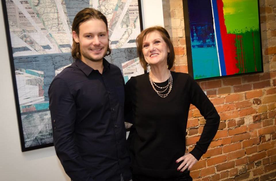
    Lloyd Arbour and Elaine Fleck, owner of Elaine Fleck Gallery. Photo courtesy of Elaine Fleck Gallery

    Interview with Lloyd Arbour (LA) by Nika Teper (NT)

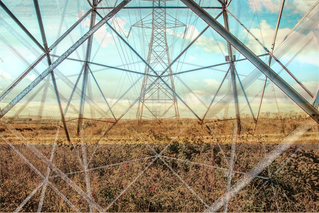
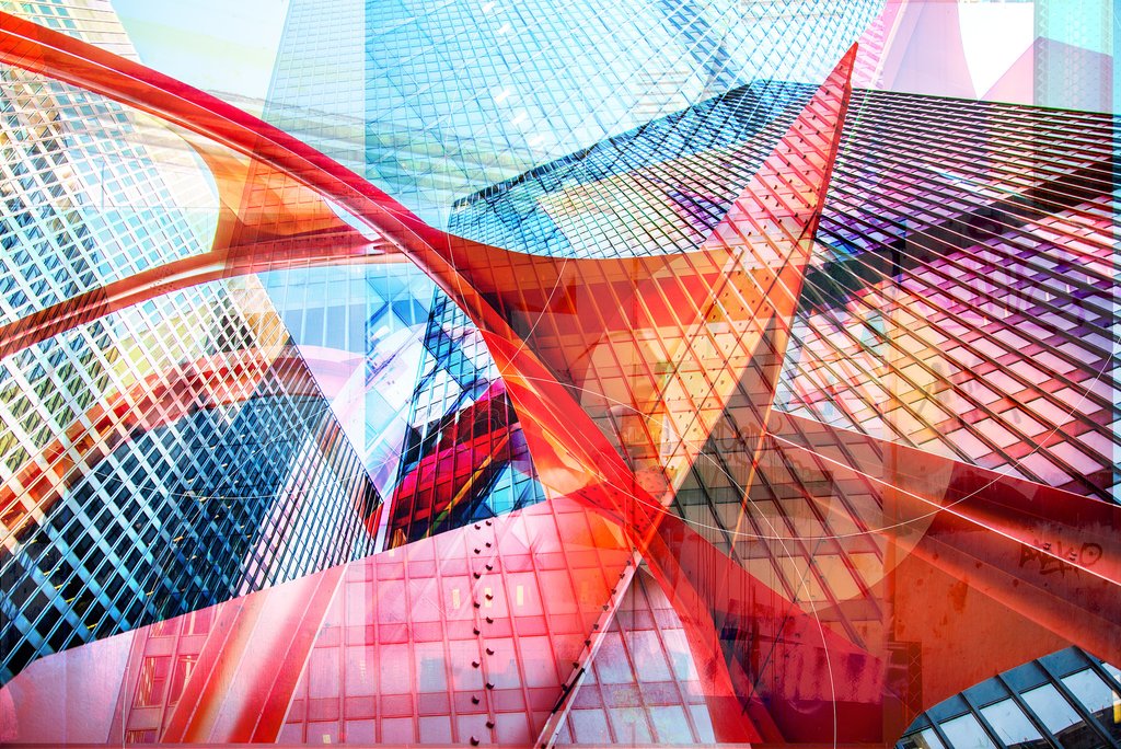
    Arbour’s new series Power, exhibited at the Elaine Fleck Gallery, focuses on the juxtaposition of architectural shapes created by power lines viewed in their natural settings. In the depth of these pieces you will find sacred geometry overlaying landscapes — forcing the viewer to have a deeper understanding of their surroundings.

    NT: Your work is reminiscent of architectural renderings, atmospheric paintings and artistic collages. The results are compositions that are both familiar and dreamlike. How do you incorporate the recognizable with more imagined elements, playing with transparency colour saturation, photography and illustration? How do you decide upon what information to heighten or subdue?

    LA: By picking apart and dissecting segments of my photography as it allows me to keep and incorporate the most important elements. By collaging these pieces together new scenes and landscapes emerge. To create a high level of contrast I essentially subdue areas of less importance putting more emphasis on where I would like the observer to focus.

    Lloyd Arbour, Power I, 2016, Photography, Digital Composite, Archival Print, 40 x 60 inches. Courtesy of Elaine Fleck Gallery

    NT: Your work evokes the constant flux of the urban environment. How does motion play a role in your art and your conception of the city?

    LA: I find it effective to combine different overlaying angles of the same setting or objects to create the illusion of movement. Creating a sense of depth allows the viewers eye to be drawn into a deeper perspective. The isolated nature of my work doesn’t include all the elements found in a busy urban atmosphere. However I achieve this feeling by combining intersecting lines and juxtaposed colours and shapes to express the sense of movement.

    NT: As a trained and practicing graphic designer who engages with the contemporary urban landscape, how do you understand the role of graphic design in the field of architecture? Do you see a potential for a greater reciprocity between the practice of graphic design, art and architecture?

    LA: Yes, I feel that the connection between architecture, art and graphic design will only continue to become stronger. I find that simplified communication is the root to solid design as a whole. I feel there are similar traits such as balance, white-space and visual communication that are apparent in both practices.

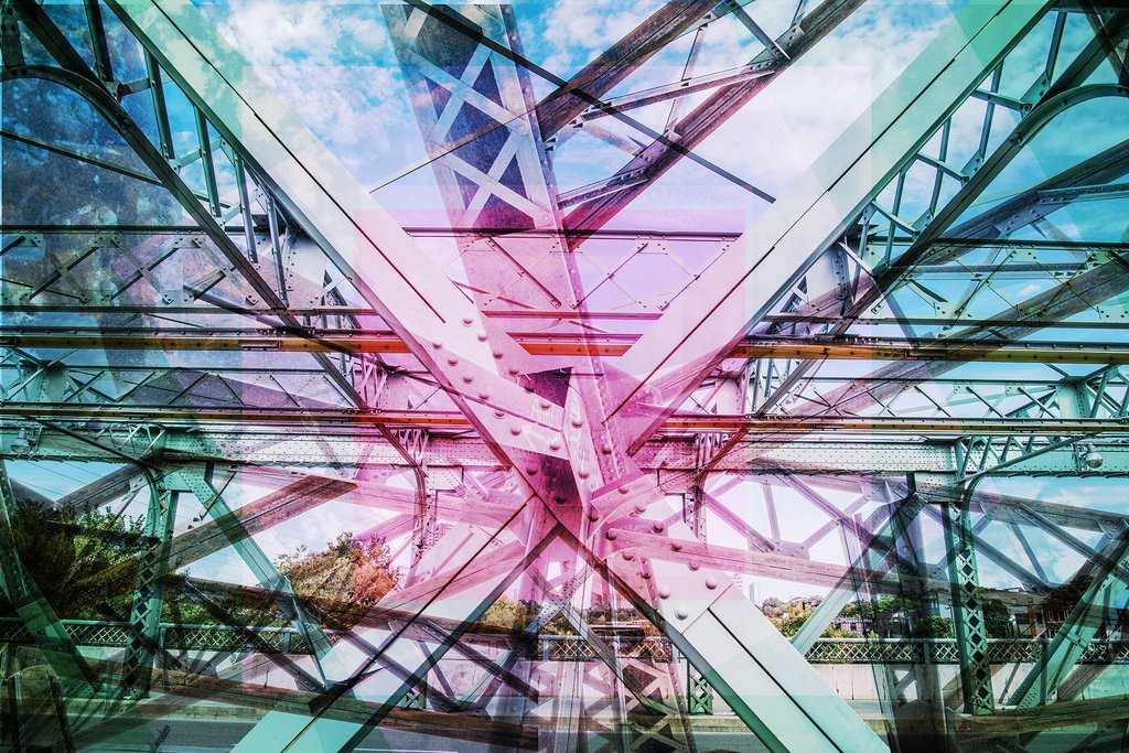
    Lloyd Arbour, Blueprint I, 2016, Photography, Digital Composite, Archival Print, 40 x 60 inches. Courtesy of Elaine Fleck Gallery

    NT: Your work is rooted in different cities. When placed side by side, overarching infrastructures are revealed. Simultaneously, the aggregation and colour schemes demonstrate each city’s unique nuances. What would you define as the similarities and differences between your examined cities?

    LA: The main similarities found in my work would include architectural elements such bridges and beams, among others. I create perspectives using infrastructure. It is difficult to briefly describe the differences between each city but rather I focus on the emotions inspired by a city when I am creating the work. I’ll let the artwork tell the story.

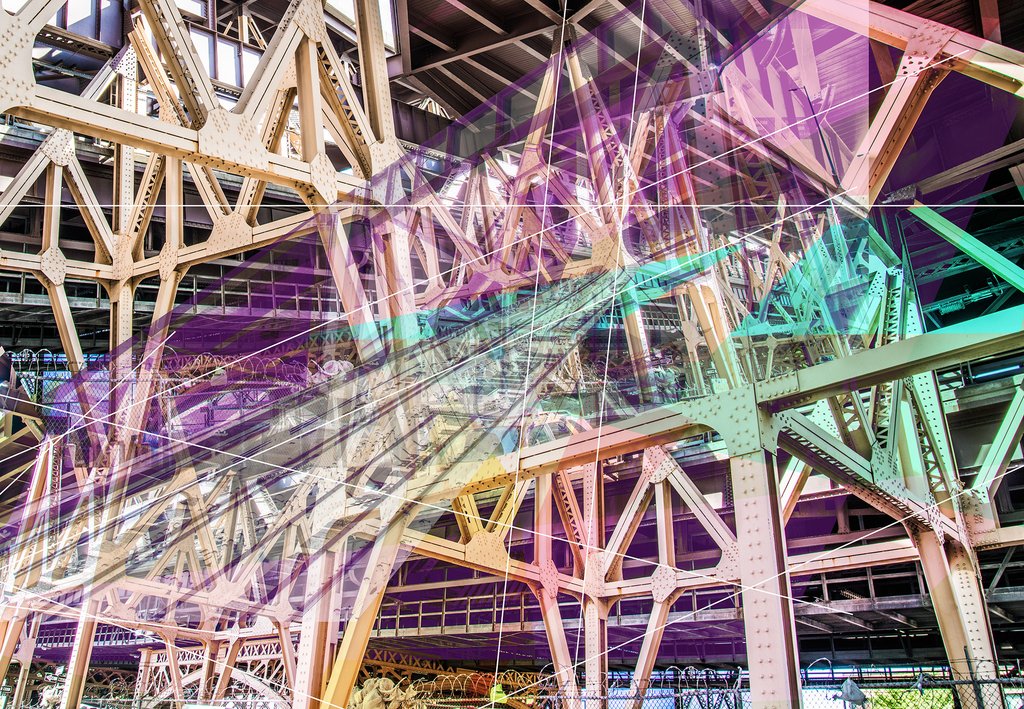
    Lloyd Arbour, Blueprint V, 2016, Photography, Digital Composite, Archival Print, 40 x 60 inches. Courtesy of Elaine Fleck Gallery

    NT: Can you expand upon your process of creating these digital illustrations. How do you construct, warp, add?

    LA: The process of creating my digital composites first start as ideas and much of the planning and conceptualizing of the work is all constructed on my computer. I often start with a photograph that has the strongest perspective and then layer a series of additional photos in the foreground, I tend to stray away from using any destructive effects or filters. In addition I include an array of textures, architectural elements and colours to add further detail. In my current work I’ve been finishing off the pieces with the inclusion of thoughtfully placed geometric lines which add a further sense of depth or dimension.

    Lloyd Arbour, Blueprint III, 2016, Photography, Digital Composite, Archival Print, 40 x 60 inches. Courtesy of Elaine Fleck Gallery

    NT: In future work, how do you plan to continue to address this important idea of highlighting possibility and creativity in the built world of the everyday?

    LA: Inspiration for creating new work comes to me naturally. By continuing to travel to new cities and always pursuing new experiences I continue to expand my outlook on life. I find beauty and creatively in many of the basic elements that surround me on a day-to-day basis — one day it might come from architecture and the next a gradient of colour.

    *Exhibition information: Lloyd Arbour & Kristyn Watterworth: Landshapes, January 2017, Opening Reception: January 7, 2017, 2 – 4 pm, Elaine Fleck Gallery, 1351 Queen St. West, Toronto. Gallery hours: Mon, Wed, Thur & Fri: 12 – 6 pm, Sat: 11 am – 6 pm.

  • Mitchell Chan: Art & Inactivism at Angell Gallery

    Art & Inactivism is a poignant time based exhibition by artist Mitchell Chan that questions the interconnected roles of art and political narrative. With impeccable timing, the works on display nuance the dismay and polarized views evident in today’s poignant news headlines. The pre-eminence of technology’s ability to rapidly drive opinions forward gives way to diluted mass information and an increasingly divergent discourse among civil society. The thoughtful exhibition presents a paradox between the audacity of today’s political climate and the futility of its repercussions, all while providing a space of serenity within the Angell Gallery.

    Mitchell Chan.  Courtesy of Angell Gallery

    Mitchell Chan’s Something Something National Conversation (In 2 Characters Or Less) is a large-scale installation that embodies the duality of spectacle and nothingness. Two rectangular pillars positioned at opposite sides of the main gallery generate over 3000 liters of water vapour per hour to create a perpetual show. Two ethereal clouds are formed, only to collide and dissipate through a ring of mist. An illuminated ring positioned under the point of contact presents a metaphorical stage for the participants of political discourse, and those who interact with the artwork. The clouds are created with such force but clash with a sense of grace. The repetitive phenomenon is ephemeral, drawing attention to the exhaustive shifts between periods of normalcy and moments of puzzlement.

    Mitchell Chan, Something Something National Conversation (In 2 Characters or Less), 2016, site-specific installation. Courtesy of Angell Gallery

    Infinite News Feed adds an intangible and multisensory component to the physical works. Throughout the exhibition run, the algorithmically generated musical and lyrical scores add a heightened sense of vogue to the experience. As designed by the artist, headlines from The New York Times online U.S. section are dissected and paired with a musical track to create a real time audio piece accompanying the installation Something Something. The all-encapsulating experience becomes a performance infinite in duration that prompts visitors to question the methods by which we digest and interact with digressive political rhetoric.

    JMW Turner’s The Slave Ship is a site-specific installation that alludes to the 19th century painter and his great political artworks. Chan’s kinetic sculpture exemplifies the continuity of politics as a powerful theme throughout art history. The undulating velvet ropes represent Turner’s choppy waves reaching the shores 175 years after they were painted, entering a new cycle of political perpetuity. Accompanying the piece is a curated soundtrack varied in genre that places a subtle emphasis on the timelessness of global issues.

    Mitchell Chan, JMW Turner’s The Slave Ship, 2016, site-specific installation.  Courtesy of Angell Gallery

    Art & Inactivism – An exhibition about why it feels like this doesn’t really matter right now, is a felicitous title for the works created by Mitchell Chan for this show. This curated exhibition denotes feelings of both ambivalence and absurdity towards disparaging political discourse and the modern news feed. The Orwellian atmosphere however provides a window for visitors to explore the exhibit in whimsy, allowing the subtext of Chan’s thoughtful mediums to be understood through their elegant outcomes.

    Allison Ing

    *Exhibition information: Art & Inactivism – An exhibition about why it feels like this doesn’t really matter right now, December 2, 2016 – January 7, 2017, Angell Gallery, 1444 Dupont St., Unit 15, Toronto. Gallery hours: Wednesday – Saturday, 12 – 5 pm.

  • Jordan Broadworth: The Adjacent Possible at General Hardware

    Jordan Broadworth’s rigorous repetition and layering of ambiguous forms and lattice patterns recall the complex city. With no certainty of orientation, scale or place, each painting can be understood from multiple perspectives. The series can be regarded as set of aerial urban schemes capturing the order and disorder of the city as well as the constant motion and concentrated light of the urban metropolitan. Or this group of paintings can be understood as a series of face-on images capturing interactions between objects and atmospheres in receding space. Regardless of the viewpoint, the impressive textured representations demonstrate the visual complexities and sonic cacophonies of the urban environment. The multifaceted interactions between object, nature, human, sound and space in time implicate the work.

    Jordan Broadworth, Magnetic nowhere, 2016, oil on canvas, 70 x 75 inches. Courtesy of General Hardware Contemporary

    The painted series is composed and manipulated before the paint dries, increasing the interrelation between layers. By experimenting with different application tools Broadworth maintains differentiation between layers, with larger patterns overlaying more intricate repetitions. Permitting the unexpected, colour becomes affected by the opacity of it’s application. Each layer is an individual colour representing a single layer of information. The layers of information further parallels the layering of city systems.

    Jordan Broadworth , Vital-binary, 2016, oil on canvas, 72 x 48 inches. Courtesy of General Hardware Contemporary

    In viewing the work it is interesting to compartmentalize the entire composition. By examining a singular interrelation, moments in a larger network become clear and a narrative begins to unfold. More intricate patterning evokes movement and directionality. Increased repetition creates blurred moments. Geometrical articulations appear infrastructural, more permanent, controlling views with framing portals. Tactile qualities add dimensionality, further diversifying the entire composition.

    Jordan Broadworth, Smooth-tamper, 2016, oil on Mylar, 14 x 17 inches (left) and Spike, 2016, oil on Mylar, 9 x 12 inches (right). Courtesy of General Hardware Contemporary

    The urban experience is made up of a collection of permanent and temporary occurrences. In representing spatial complexity in time, increased noise appears. Appearing like a time-lapse, these works present a variety in solidity and transience. Broadworth’s artwork evokes multiple possibilities of urban narratives with various natural and artificial, haptic and digital motifs and patterns. Dispersed elements become dispersed typologies, a network of light, nature, personal object and infrastructure. The vibrant collection is united by it’s layered complexity and variation. Urbanity is both mediated and unmediated. These complex compositions, in their process and final form evoke the determinability and uncontrollability that arise in the city.

    Jordan Broadworth , 2015, Eclipse oil on mylar, 14 x 17 inches. Courtesy of General Hardware Contemporary

    Nika Teper

    *Exhibition information: November 12 – December 23, 2016, General Hardware Contemporary, 1520 Queen Street West, Toronto. Gallery hours: Wed – Sat, 12 – 6 pm.

  • Iris Häussler: Sophie La Rosière Project at Scrap Metal

    Installation view of Iris Häussler, Sophie La Rosière Project, 2016 at Scrap Metal

    Iris Häussler identifies her Sophie La Rosière Project as a ‘Gesamtkunstwerk’, using a term that goes back to the nineteenth century German art theory, where it denoted a total work of art in which elements belonging to various art forms – visual, musical, narrative, – coalesce into a unity. Sophie La Rosière, like  Häussler’s previous projects, The Legacy of Joseph Wagenbach (2006) and He Named Her Amber (2008-2010), falls under this term, as it brings together objects produced by means of craft-work, painting, restoration techniques, book art, video and audio recording, and binds them into a coherent whole through an overarching narrative: a fictional biography of an artist to whom these objects are attributed.

    Installation view of Iris Häussler, Sophie La Rosière Project, 2016 at Scrap Metal

    Installation view of Iris Häussler, Sophie La Rosière Project, 2016 at Scrap Metal

    Häussler’s projects, when exhibited, often look like hoarder’s paradise, overflowing with objects and occupying vast spaces. The Legacy of Joseph Wagenbach (2006) took up an entire house in Toronto’s Trinity Bellwoods neighbourhood; He Named Her Amber (2008-2010) required the scope of AGO’s Grange mansion. Sophie La Rosière Project is divided into two parts; one of them, exhibited at The Art Gallery of York University, showcases the entire oeuvre of the fictional artist Sophie La Rosière, and, characteristically, abounds in exhibits; while the other, shown at the Scrap Metal, focuses on the conception, recovery, and interpretation of La Rosière’s work, and is surprisingly minimalistic. It comprises two wax-covered wooden panels, attributed to the fictional French artist; numerous X-Rays, which display the multi-layered paintings hidden behind the wax; a video overview of the restoration process; various printed and video sources that can be used to place the paintings within a greater artistic context and make sense of the psychology of their author; and, finally, what appears to be Häussler’s own workstation, whence Sophie La Rosière’s emerged into the artworld. 

    Iris Häussler, Sophie La Rosière Project, SLR_260, 2016 at Scrap Metal

    Iris Häussler, Sophie La Rosière Project, X-RAY SLR_262, 2016 at Scrap Metal

    The bare minimalism of the Scrap Metal exhibition and its use of technology may appear to be both uncharacteristic of Häussler’s style and anachronistic in regards to the fictional biography of Sophie La Rosière, who is said to be active around the turn of the century. However, both minimalism and technological sophistication are justified, if one considers the place of this project in Häussler’s own artistic development. Many of her previous works engaged actively with complications of fictionality and verisimilitude, occasionally suffering from noisy but shallow publicity; once exposed, the elaborate artistic deceit of The Legacy of Joseph Wagenbach was branded as a “hoax” by Toronto’s National Post newspaper. Perhaps in view of such prosaic responses, Häussler is now exploring what happens to the total art once its artistic status is laid bare, as the public shifts its focus from the deceitfully realistic parts of the artworld to its often inconspicuous creators: real-life artists, restorers, experts, and art critics. And, interestingly, the emphasis on artists, experts, and their techniques and devices, can be taken as consistent with at least some art theory of La Rosière’s time. “Art is device,” proclaimed early twentieth century Formalist and Structuralist theoreticians; and Häussler’s exploration of the artistic value of fictionality, simultaneously dissimulated and exposed, sits well with the theoretical concerns that could motivate her character, Sophie La Rosière, – if she was more than an artworld entity, of course.

    Installation view of Iris Häussler, Sophie La Rosière Project, 2016 at Scrap Metal

    Text and photo: Andriy Bilenkyy

    *Exhibition information: September 21 – December 17, 2016, Scrap Metal, 11 Dublin Street, Unit E, Toronto. Gallery hours: Fri Sat, 12 – 5 pm.

  • Interview with Lumír Hladík at Walnut Contemporary

    Interview with Lumír Hladík (LH) by Jordan Fee (JF)

    On Saturday November 19th, I spoke with artist Lumír Hladík about his Gargoyles exhibition, which is currently being shown at Walnut Contemporary. Situated in a reimagined church space, this multimedia installation serves to define some of the arbitrary lines that we, as humans, have drawn out for ourselves.

    JF: First of all, I would like to ask you about these gargoyles. Themes from the Gothic and Baroque periods have pervaded some of your past works, but these are obviously not the same gargoyles that we might see on the side of a cathedral; what gave you the inspiration for creating these new types of gargoyles?

    LH: Well, its like I said in my artist statement: this exhibition is meant to be a frenzy of biology, history, philosophy and religion. Historically, gargoyles were seen as evil, beastly creatures that represented the opposite of the human ideal. Religious scholars then extended this argument, deeming all animals as lesser beings that do not posses a soul like humans do. However, scientists have now proven that we do in fact share some DNA with animals; there are even certain genes that we share with the housefly. But, when you try to tell someone this – that they share some of their DNA with houseflies – they deny it completely, instead telling you why it is that humans could never share DNA with a creature like that. By calling an animal dirty or beastly, they are creating these arbitrary boundaries that help to support their irrational way of thinking. 

    Installation view, courtesy of Lumír Hladík and Walnut Contemporary Gallery

    The same goes for the doves and pigeons that I have included in this work: in the video installation, there are two doves that have entered into a fight with one another. We normally think of doves as symbols of peace but here, they are engaging in an act of violence. This may put off some people but in reality, what they are doing is entirely natural. This shows that the way we think about things is entirely arbitrary – on one hand, we have these beliefs that fit neatly into our understanding of the world but on the other, there is a reality that directly confronts that understanding. Many people choose to ignore that reality and instead try to justify their way of thinking through their own irrationality. The gargoyles serve as examples of the fact that this irrational thinking has been embedded into our culture, our religion and our language. 

    Installation view, courtesy of Lumír Hladík and Walnut Contemporary Gallery

    JF: Your artist statement touches on a variety of disciplines; is that why you chose to engage with such a wide range of mediums in this exhibition?

    LH: I wanted to show how these things are all connected. By using all of these materials at once, I am able to make a statement that touches on many different subjects. Everything that went into this show, including the music and the curatorial essays, helps to strengthen this interdisciplinary approach.

    On the opening night we played music by Jacob Soma of the Toronto-based alternative group Programm, and also had award winning soprano Alessandra Paonessa singing over this music. This is what I like to do; bring things together that people may not always associate with one another.

    JF: How does this irrationality that you seek to represent fit into the world of science, where everything is based entirely on “being rational?”

    LH: Do you know Ken Wilber, the American philosopher? He uses the term “Flatland” to describe how this works. Basically, what this term means is that science can only explain what it is given at a certain point in time. For example, in the 13th century people believed that the Earth was flat and that was a completely legitimate belief, because that is where science was at that time. But today, everybody believes that science has actually conquered the Earth and most of the universe, so we see ourselves as having a totally rational view of the real truth. But this is absurd, because many of us do not actually understand much of the science that exists today; we simply tend to accept things blindly, which doesn’t make us any better than the people who lived in the 13th century.

    The point of the Flatland is that somehow, this renaissance of rationalism that we have lived in has brought us backwards instead of forwards. In a short period of time, such huge leaps were made in our understanding of the universe that it became so complicated that nobody could understand it. I remember an article that I read just after they discovered the Higgs-Boson particle; about a third of the way into this journalist’s explanation of how it worked, I began to swoon. I simply could not understand it. Things have become so complicated that nobody can understand them and so people just cut them off, which in turn makes them go from rationality to beliefs, and to myth.

    Installation view, courtesy of Lumír Hladík and Walnut Contemporary Gallery

    It’s a very strange world that we live in; we have more science than ever and yet at the same time, nobody can understand it. This is the irrational world that I am trying to demonstrate here.

    (Hladík then ushers me towards the altar that he has constructed as one of the centerpieces of the exhibition, pointing towards two small glass domes that each contain a cross and a dragonfly.)

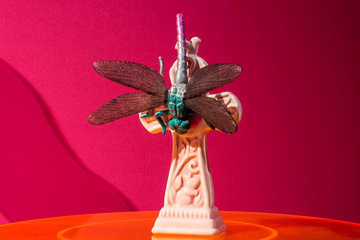
    You see these glass containers? They are perfect examples of this irrationality. Those porcelain crosses are used in the baptism of children; and after the baby is baptized, they receive them in commemoration. However what nobody remembers is that the cross, which is one of the world’s symbols that universally recognized, is in fact a symbol of torture. Some people that I speak to will try to justify this and place it into a different context, but the fact remains that it was invented to make people die very slowly and in pain.

    JP: Many people don’t even tend to think about the fact that crucifixion was a common punishment long before Christ came into the picture.

    LH: Exactly. People forget these things in the same manner as the citizens depicted in George Orwell’s 1984; after being told so many times that their enemies are their friends and that their friends are really their enemies, people tend to forget the underlying truth. People have now forgotten so much that these crosses have become mass-produced objects meant for babies, when in reality what we are doing is rewarding these children with a symbol of death and torture. Another layer of irony comes from the dragonflies that are mounted onto these crosses – the dragonfly, which has been a very successful creature for over 300 million years, is also shaped like a cross. Yet they have crucified no one! That is a true innocence, not a cross.

    JF: You mentioned before this interview that during your childhood, you found some sort of solace in the churches of Prague. Why did you choose the setting of a church for this piece in particular?

    LH: Well, the influence that it had on me, and on a lot of other people I’m sure, came from the beautiful art that is contained within these churches – the altarpieces, the ornaments, everything. To me, churches are buildings that celebrate the universe. And usually, the art contained within them is so great because the artists were pressured by the elevated purpose of it all. Therefore the church to me is the ultimate place to celebrate life, even when it is removed from the context of religion. The life force present within these churches is a non-manifest, spiritual god rather than the manifestation of the one that we normally think of.

    Installation view, courtesy of Lumír Hladík and Walnut Contemporary Gallery

    And actually when you think about Gothic, everything is nature. Gothic is basically barbaric German art, which is based on the forest. The canopies, the tree trunks; they all have counterparts within the church. The Italians called it barbaric because they thought that the divine country was in a garden, whereas the German’s recognized this divine force as existing everywhere in nature. Baroque is the same – branches, leaves, fruits – its all focused on nature. So it’s really just full circle; the church serves to represent this sort of life force that exists everywhere in nature.

    I was in Temagami this year doing a very intense canoe trip; we even had a float-plane drop us off in the middle of nowhere. And in all honesty, it was simply divine. I could feel and smell god in there, among the rocks and the trees. To me, it is the same impact that I feel when I stand in St. Jacob’s Cathedral in Prague.

    JF: Would you say that the unknown excites you? It seems as if you are making a general statement on the arbitrary nature of truth and knowledge, and so I would assume that the unknown might intrigue you.

    LH: Yes absolutely, I love that we do not know everything. In fact in my early work, I tried to create new ways of not knowing – new mysteries. I didn’t want to discover it all; instead, I would just open the door and not look inside.

    JF: Why, in this work, did you choose to bring nature inside as opposed to going out into nature like you do in your work with the black bears?

    LH: I think they both serve different purposes, and so I like to do a combination of those things. These installations, which I call vanitas, contain some of work that I do with black bears. In fact, some of the tubular pieces in this exhibition even contain some black bear fur. Therefore I do not really see these two practices as separate; I can use both to convey my ideas.

    To me, all great art has a lot of layers, which you don’t necessarily see on the first go. Today I see a lot of art that I would call “Aha! Art” – pieces that can be immediately digested and understood by the viewer. You see it, and you’re done. But having layers in your art is like reading Hemingway, or Kafka, or Mark Twain or even go back to Jonathan Swift’s Gulliver’s Travels. Some of these books are hundreds of years old and yet today when you read them, they do not seem any less relevant or applicable. That is great art, and it is the reason why I try to put so many layers into works like this. You may only get two or three of them the first time, but it only goes deeper and deeper.

    Installation view, courtesy of Lumír Hladík and Walnut Contemporary Gallery

    *Exhibition information: October 22 – December 17, Walnut Contemporary Gallery, 201 Niagara Street (side lane entrance) Toronto. Gallery hours: Wed to Sat, 1 – 6 pm.

  • Photorama 2016 at Gallery TPW

    Installation view with guests at the Opening Reception. Photo: Jessie Lau

    This year marks the 30th anniversary of Gallery TPW’s annual Photorama fundraising exhibition, featuring over 100 artists exhibiting contemporary photography and lens-based work. Photorama features work by some of Canada’s most accomplished artists and promising young photographers. Photorama offers seasoned collectors and first-time buyers alike the opportunity to buy limited edition photographs and artwork. Each sale from Photorama directly assists with the operations and programming at Gallery TPW, while also supporting local artists and culture in Toronto. 

    Edward Burtynsky, Saltpan #4, Little Rann of Kutch, Gujarat, India, 2016

    Morris Lum, Dr Sun Yat Sen Classical Chinese Garden, Exterior, 2013

    Kelly Jazvac, Schweppervescent

    Colin Miner, blue eye, 2014

    Randy Grskovic, Soleil Levant, 2016

    Alvin Luong, Baby Richard Serra (Right Angle Prop)

    Camille Rojas, Free Stacking

    Brendan George Ko, The Everyday at Kapukaulua, Maui

    Installation view with guests at the Opening Reception. Photo: Jessie Lau

    For more images and information please go to gallerytpw.ca

    All images are courtesy of Gallery TPW.

    *Exhibition information: November 24 – December 3, 2016, Gallery TPW, 170 St. Helens Avenue, Toronto. Gallery hours: Tue – Sat 12 – 5 pm.

  • Climate Change at Ryerson Image Centre

    Installation view of Paul Walde’s Listen to the Landscape, as part of The Edge of the Earth: Climate Change in Photography and Video,2016 © Riley Snelling, Ryerson Image Centre

    Ryerson Image Centre’s latest curatorial effort, simply titled Climate Change, confronts many ecological concerns head on, displaying its socially conscious inclinations for all to witness.

    The Edge of the Earth: Climate Change in Photography and Video (installation view), Listen to the Landscape, 2016 © Riley Snelling, Ryerson Image Centre

    This multi-media affair is comprised mainly of photographic images, both still and moving. Owing itself to practices in new-media, which is heavily influenced by advancements in technological processes and image viewing, Climate Change reveals itself in a contemporary visual vernacular. The exhibition is experienced in two succinct halves; the mausoleum-like stillness of its photographic components, and the more mobile, yet hauntingly bare video efforts. Photography is mainly comprised of still frames capturing recent environmental traumas, and the effects their wreckage have left on civilians globally. When shown, the human physiognomy is solemn and bodies appear defeated, bringing a more localized and identifiable element to national news stories and scientific statistics. Photography is used as a slice-of-life form of portraiture, aiming to authentically capture experiences of distress. On the other hand, the video contributions reveal how certain technologies interact, or interfere, with nature, as an oilrig is endlessly looped to demonstrate its ecological interruption.

    Installation view of work by Joel Sternfeld, from the series When It Changed, as part of The Edge of the Earth: Climate Change in Photography and Video, 2016 © Riley Snelling, Ryerson Image Centre

    The Edge of the Earth: Climate Change in Photography and Video (installation view), 2016 © Riley Snelling, Ryerson Image Centre

    While this exhibition is full of more current anxieties towards the fearful reality of climate change, at times its curatorial reach harkens back to mid-century modernism as a thematic precursor. A photographic inclusion from Robert Rauschenberg sits neatly within the selection of present-day artistic efforts that dominates Climate Change, displaying a more in-depth and thoughtful analysis of historical trends in environmentally motivated art even in its unintentional infancy. However, as history progressed, and artistic practice moved to more direct contact between creator and subject matter, land art has seen its early entropic associations expand and prevail into newer, more alarming territory. Activism has now helped nuance images of natural phenomena into indexes of greater universal trepidations.

    Hicham Berrada, Celeste, 2014. Still image from HD Video. Courtesy of the artist and kamel mennour, Paris. The Edge of the Earth: Climate Change in Photography and Video, 2016, Ryerson Image Centre

    Installation view of Adrien Missika’s Darvaza, as part of The Edge of the Earth: Climate Change in Photography and Video, 2016 © Riley Snelling, Ryerson Image Centre

    With Climate Change, the art world is responding to its subject matter in a sincere and bleak manner, relying less on visual metaphor in place of staunch realism, acting as a sort of National Geographic for an apprehensive age.

    David Saric

    *Exhibition information: September 14 – December 4, 2016, Ryerson Image Centre, 33 Gould Street Toronto. Gallery hours: Tue – Fri, 11 – 6, Wed, 11 – 8, Sat – Sun, 12 – 5 p.m.

  • The paintings of Kim Dorland

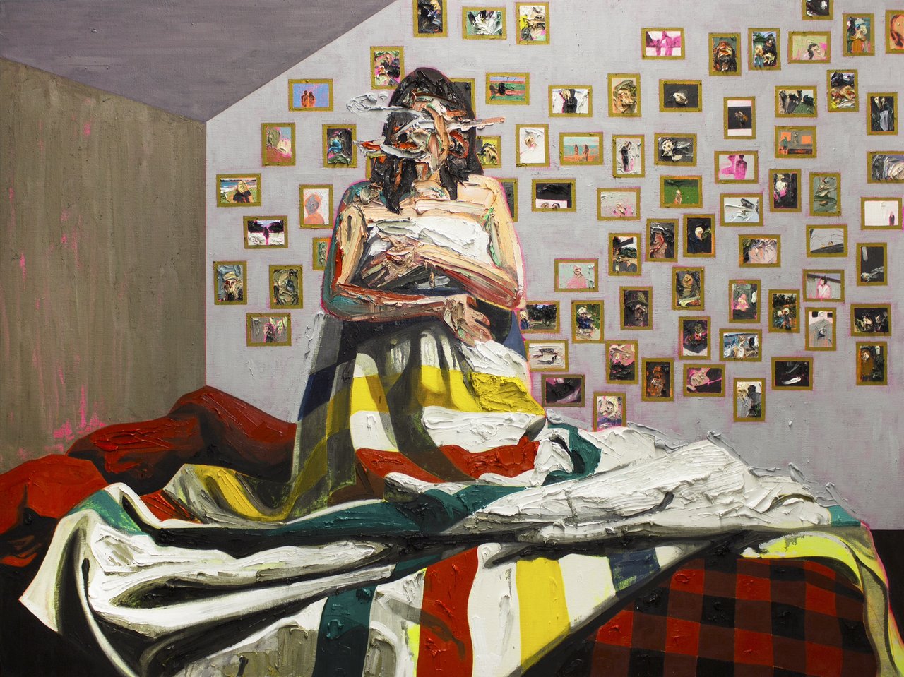
    The first Kim Dorland painting I really liked was Bay Blanket #3 in his 2014 exhibition at Angell Gallery. In this work, a young woman—the artist’s wife Lori—kneels on a bed in front of a wall covered with family paraphernalia, holding a Bay blanket to cover her nakedness. Her face and arms are created from thick paint that the artist has partly removed, so it looks cratered. There are heavy patches of paint on the blanket as well as the images on the wall. It is very physical, very energetic, and you can see the movements of the artist’s hand throughout as he layered and manipulated the paint. Somehow it is still able to capture that intimate moment, as the figure hugs her body and looks out from her surroundings. The Bay blanket is emblematic of the North and the other walls are bare, like in a cabin.

    Kim Dorland, Bay Blanket 3, 2014, oil and acrylic on linen over wood panel, 72 x 96 inches. Courtesy of Angell Gallery.

    Another, a smaller Bay Blanket, hung in a corner of the Angell Gallery with a cordon around it, warning viewers not to touch it because of wet paint. I’ve seen that kind of sign before for another artist but learned that it was often used for Dorland’s work as he uses an lot of paint, in many layers, so much so that sometimes the work becomes almost sculptural.

    Dorland is considered a landscape painter. Landscape is big in Canada since the Group of Seven, and many collectors here focus on them. It is not a surprise that Dorland, like many other contemporary Canadian artists, started as a landscapist, but he is more of a city boy. Coming from a tough background in east-central Alberta, he left his mother at the age of 16 and moved into his girlfriend’s (now his wife) Lori Seymour’s home. He described himself then as a “going nowhere teen.” He had no vision of the future, not even a single idea, until he opened a book about Tom Thomson and the Group of Seven. Thumbing through the book he felt enlightened. He found what he wanted. He found art. After that discovery he went to Emily Carr University of Art + Design and York University.

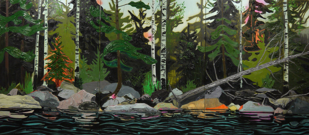
    Tom Thomson is still one of his favourites. They share the same hermit-like attitude and Dorland is mostly in his studio “lab” in Toronto. Their painterly roads crossed, when McMichael’s chief curator, Katerina Atanassova invited Dorland to become artist-in-residence and to visit the places Thomson did, as well as look at his work in the museum. Dorland was hesitant at first, as he said, “If you through me in a canoe, handed me an axe and told me to survive, I’d be dead pretty quickly.” But he agreed, and paddled into Algonquin Park where he felt the spirit of the land, a “supernatural air.” The result was the exhibition titled You Are Here: Kim Dorland and the Return of Painting. 90 freshly painted canvases of Kim Dorland were exhibited with 38 Thomson sketches as well as works by Emily Carr, David Milne and members of the Group of Seven. Dorland’s paintings were mainly landscapes, some of them even rethinking Thomson sketches, like Woodland Waterfall (After Tom Thomson). The star of the show was French River, a very large triptych, showing Dorland at his best as a traditional landscape painter.

    Kim Dorland, French River, 2013, acrylic on jule on wood panels, 96 x 216 inches. Courtesy of Angell Gallery

    People compared him to Tom Thomson, Atanassova called him a “Tom Thomson on acid” because of his vibrant, neon-like colors. It doesn’t matter how much Dorland admires Thomson, there are more differences than similarities in their work. First and foremost, Dorland is not an outdoor man like Thomson, but a city dweller. He might paint forests, lakes, hills, trees, sky, campsites and animals – but he is an outsider in nature. “My identity as an outdoor man is not part of my practice.” – he said to James Adams of The Globe and Mail – “My work is really about the perfect psychological moment. Sometimes that moment is in nature. Sometimes it’s in my living room.” He may paint landscapes, but he’s painted them in his own way. Thomson found drama in nature; Dorland brought drama into nature. His vision of a forest, or other parts of nature, is very different from any realistic or idealistic view. Even in his landscapes he wants “to tell his own story.”

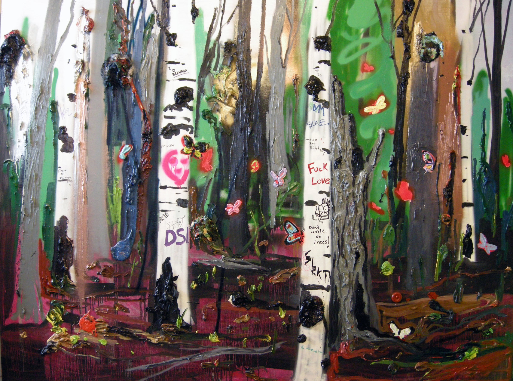
    There are some returning motifs in Dorland’s oeuvre. The first painting he sees as his “own”, a turning point in his career, is The Loner, from 2005. It depicts a young guy, half hiding behind a tree, holding a plastic bag. He looks like a teenager escaping from the nearby city for some quietness or who knows what mischief. The trees are stylized, showing their outlines only and with a few patchy details, like falling off bark – almost abstract, like all the other trees in his paintings. The trees on Fuck Love (2008) are truly hurt; their trunks are covered with carvings of letters and messages, with spray paint and something that looks like asphalt. These images of the city’s cat-piss-smelling, graffiti-covered alleyways are creeping into the forest. All the supposedly happy butterflies seem fake here and the dirt dominates. Then, in his latest show, I Know that I Know Nothing (Angell Gallery, 2016 October), All Work and No Play …2 (2016) the dead tree trunks in a pine forest are covered with skulls and images that might be left behind by a zombie-walk of sick-minded teenagers.

    Kim Dorland, Fuck Love, 2008, oil, acrylic and spraypaint on wood, 72 x 96inches. Courtesy of Angell Gallery.

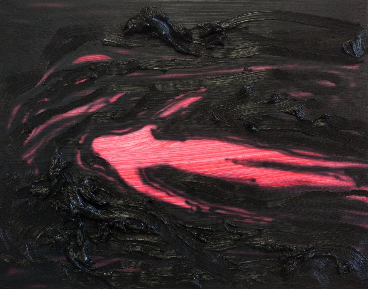
    We associate landscapes with nature, beauty and the freedom of the outdoors. Landscapes represent creation as well and are supposed to be welcoming. Not so in most of Dorland’s paintings. Here You Are, (2013) a self-portrait of the artist, depicts him standing in front of his easel, surrounded by dark trees. It looks like a nightscape but the light coming through between the trees suggests otherwise. Most of the surface is covered with heavily textured black paint, only the canvas and easel shines with pink. This is not a welcoming forest, but a forest like Hansel and Gretel’s from the Brothers Grimm tale—a forest of nightmares that threatens to swallow the intruder. Darkness surrounds the artist and he might easily disappear into it. Only the creation of the painting, a canvas-within-a-canvas, give us some hope. It makes you wonder if the artist is aware of the dangers or totally absorbed in his activity or maybe doesn’t care at all.

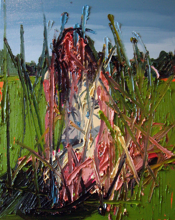
    Kim Dorland, Unitled , 2013, oill on just over wood panel, 20 x 16 inches. Courtesy of Angell Gallery.

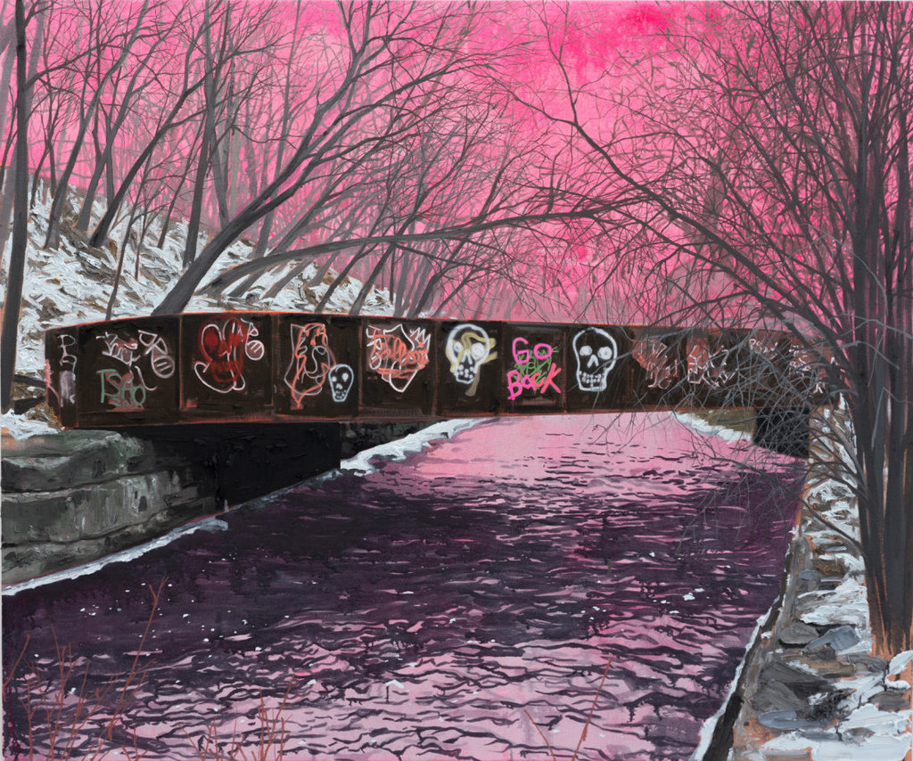
    In most of Dorland’s landscapes the trees are bare, the sky is purple, the sun is blinding or darkness covers everything. The trunks of trees are covered with ugly carvings of skulls and zombie heads. Even the small bridge over a spring is spray-painted with graffiti. As in Dorland’s 2015 show, I’ve seen the future, Brother, the city with its aggressive decoration seems to invade nature. Will this be the future? I hope not, and note his message on the bridge: Go Back.

    Kim Dorland, Go Back, 2015, oil and acrylic on linen over panel, 60 x 72 inches. Courtesy of Angell Gallery.

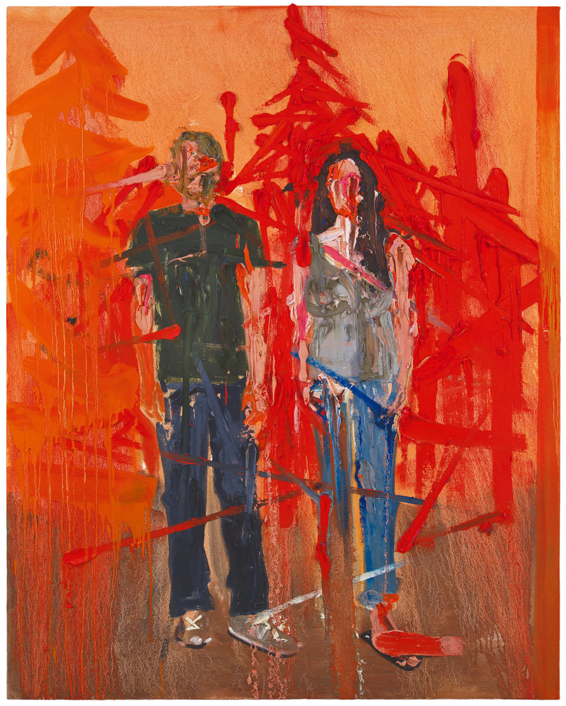
    Dorland is also considered a portraitist, including self-portraits, double portraits with his wife Lori and his painting series of Lori. All his portraits are faceless. In the age of a hundred selfies a day this seems strange. Why is that? “I literally just started piling on the paint because I wanted to remind the viewer that they are not photographs; they’re paintings.”, he explained. In Here You Are, his back is to us, and in Self-portrait at 38, (2012) his blood-red face is scratched until it’s unrecognizable. In the double portrait, Grown-ups, (2012) red dominates again and only the posture of the couple suggests what being an adult means. The brightness doesn’t mean happiness; a sense of loneliness and melancholia radiates from the painting.

    Kim Dorland, Grown-ups, 2012, oil on linen, 60 x 48inches. Courtesy of Angell Gallery

    Dorland has painted his wife and muse Lori throughout his entire career, even dedicating some exhibitions completely to her: For Lori, (2011 at Mike Weiss Gallery, New York) and his latest show I Know that I Know Nothing (2016 at Angell Gallery, Toronto) where the larger room was filled with images of her. Dorland painted these images more from memory than for creating memories. They are not traditional “love” paintings. There is certainly some intimacy in them. Sometimes Lori looks vulnerable in her posture, as in Yellow Dress, (2007) when she kneels in a nice summer landscape. She is all over Dorland’s canvases; enjoying the cool water at Emma Lake, in a dark forest, walking and disappearing into the night sky (The Girl Disappears, 2010), a ghost, a vision—real and imagined.

    Kim Dorland, Yellow Dress, 2007, oil and acrylic on canvas, 44 x 36 inches. Courtesy of Angell Gallery

    But Dorland does “not shy away from the brutality of love” either, as Allison Meier stated in her review in Hyperallergic (For Lori, Mike Weiss Gallery, 2010). Lori swims in a night lake where her body is blood red, surrounded with black and deep purple rivulets, like dried blood, seemingly swimming in dangerous waters (Night Swimming, 2013). In some other, darker, portraits her face appears like a skull and even the paper is ripped.

    Kim Dorland, Night Swimming, 2013, oil and acrylic on wood panel, 11 x 14 inches. Courtesy of Angell Gallery

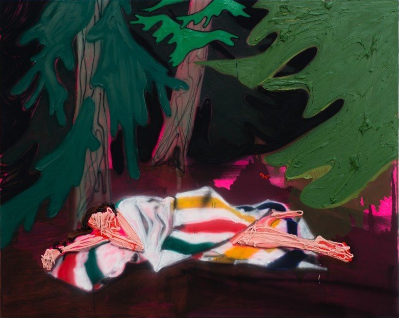
    Still, Dorland’s vision of Lori is not always that dark. Last visit, (2013) or After the Party, (2014) depict some nice moments from his family life. Lori’s beauty shines in his 2016 show, as she relaxes under trees on that Bay blanket (Rest) or while admiring her image in a peaceful lake (Untitled, Lori on purple, 2016). It seems that some harmony has been found.

    Kim Dorland, Rest, 2016, oil on polyester, 48 x 60 inches. Courtesy of Angell Gallery

    Dorland pushes the limits of his media. He paints very physically. His strokes are sometimes even brutal and he uses an abundance of paint, layers upon layers, until it’s so heavy and textural that it looks like colored clay and might fall away from the canvas. To prevent that he uses screws to keep it in place. Within the layers of oil and acrylic paint he incorporates different materials such as wood, strings, fur, feathers, glitter and enhances the outcome with glow-in-the-dark pigments. His paintings are impossible to dismiss. When the surprise of his technique fades away, a deeper meaning emerges as Dorland wants to engage in a psychological dialog with the viewer.

    Emese Krunák-Hajagos

  • Dina Torrans: ARTEFACTS at Canadian Sculpture Centre

    Dina Torrans at the Opening Reception with her latest stonework, Time Capsule, Champlain Black/Danby imperial marble, 24 x 78 x 40 cm. Courtesy of the Canadian Sculpture Centre

    In this solo exhibition, Dina Torrans presents her most recent collection of heirlooms, botanicals and artefacts. She has employed stone, bronze and her usual array of mixed media to create these new works. Her motifs are coming from many sources but always have a connection with her personal life. As she writes in her Artist Statement, “My work reflects ideas about myself, our times, and thoughts about the state of our world. Often I do not consciously realize all the ideas that are being communicated until either the work is complete, or I reflect back on it after some time.” 

    Dina Torrans, Hanging Out, bronze, stone, 10 x 20 x 24 cm. Courtesy of the Canadian Sculpture Centre

    Many of her work use symbols from mythologies. She exhibits two sculptures, one marble, one wood, dedicated to Japanese word Ensō, meaning ‘circle’. They represent the universe, its grandness and its limitless power that circulate inside. It symbolizes the circle of life and the connectedness of all leaving things. On the marble sculpture the circle is open, one edge is reaching out, while the wood piece depicts a closed circle, where the edges are overlapping. The marble creates a light feeling while the wood is more heavier, even rustic – depicting two different views of the universe.

    Dina Torrans, Ensō, Vermont marble, 53 x 51 x 21 cm. Courtesy of the Canadian Sculpture Centre

    Heirloom I is an item of adornment, born from a childhood memory. The turtle is also a famous symbol in many mythologies, the Native American culture among them, when it represents ‘Mother Earth’, that support as all. The piece is also playful with its hanging out chains and the way it was put together from many pieces of copper. Talking Peace also uses inspiration from an American Indian artifact, the talking stick, that was used at peace negotiation between the tribes. Torrans combines original elements like feathers and shells with her own imagery like adding a dragonfly and what seems like a metal box.

    Dina Torrans, Heirloom I, copper, 71 x 38 x 8 cm. Courtesy of the Canadian Sculpture Centre

    Another pieces are inspired by nature and make small things like a pod or pomegranate slices monumental in bronze, putting these things, that are often overlooked as not important, on pedestal.

    Dina Torrans, Treasure in the Wildwoods, bronze, 24 x 40 x 16 cm. Courtesy of the Canadian Sculpture Centre

    Torrans’ exhibition successfully represents the artist’s work, its many directions and mediums.

    *Exhibition information: ARTEFACTS: Ecofacts and Geolife / Solo Exhibition by Dina Torrans, November 10 – December 2, 2016,  Canadian Sculpture Centre, 500 Church Street. Gallery hours: Tue – Fri: 12 – 6, Sat: 11 – 4 pm.


  • The Multiple Narratives in ‘Form Follows Fiction’

    The Multiple Narratives in ‘Form Follows Fiction’

    Prior to seeing Form Follows Fiction: Art and Artists in Toronto at the University of Toronto Art Museum, I was extremely skeptical. With a scope as large as ‘Art and Artists of Toronto’ and a showcase of work by 86 artists, I wondered how someone could thematically arrange such a broad spectrum of work into a cohesive exhibition. But after seeing it three times, hearing the curator’s talk, and reimagining the diversity of work to be a direct reflection of the diversity of Toronto, my skepticism was put to bed.

    The theme of identity and the desire to define a sense of place is universal. I’ve had the privilege of discovering that after a brief period of separation, a weekend in Montreal or a year in London, the cultural and environmental characteristics of a city become much more distinct. Whether you’ve been here your whole life or migrated recently, everyone defines their sense of self through their similarities and differences to others—and the artists in Form Follows Fiction do just this. Using performative and allegorical processes, described as such by curator Luis Jacob, the work explores how the artists’ conditions have shaped their sense of place.

    Form Follows Fiction is not historical, chronological, or a history of art in Toronto. Instead, over 100 works are thematically arranged under four outlined gestures: mapping, modelling, performing, and congregating. While the works span a period of about 50 years of artistic production, with historical documents dating as far back as the eighteenth century, Jacob’s exhibition was an honest and exciting exploration of artists in Toronto.

    The exhibition was split between Justina M. Barnicke Gallery and the University of Toronto Art Centre. I luckily started at Justina M. Barnicke Gallery, where the works played a major introductory role. Through extremely diverse subject matter and materials, the work loosely dealt with how history informs our cultural environment. Whether asking more complex conceptual questions surrounding the formation of space or directly referencing legislative frameworks, the allegorical subtleties of the works create a powerful narrative about the ‘vacant lot’—a term used by Jacob as a metaphorical tool to consider how space is mapped both literally and figuratively.

    The first work that strikes you upon entering the gallery is Premises for Self-Rule by Saulteaux First Nations Canadian artist Robert Houle. The work is comprised of four canvases visualizing four legislative acts in Canadian history. The middle canvas on the far right wall refers to the ‘Indian Act’ of 1876, a legislative act that became the initial basis for aboriginal assimilation by disallowing the practice of aboriginal ceremony, determining the land base of aboriginals in the form of reserves, and defining who qualified as an ‘Indian’ through Indian status. Despite undergoing numerous amendments, the act is still in place today (which is difficult to imagine considering that Canada was the first country in the world to adopt multiculturalism as an official policy in 1971). Houle’s works act as a ‘panorama’ of a legislative framework that contributed to the cultural upheaval of Indigenous people. Mediated between tradition and an imposed assimilation into Canadian culture, many natives still experience the ramifications of these highly controversial acts today.
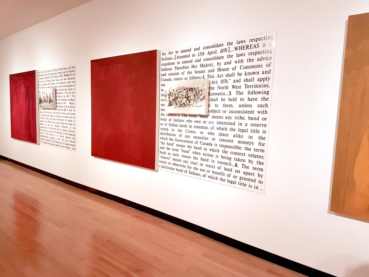
    Robert Houle, Premises For Self-Rule, 1994, oil on canvas, photo emulsion on canvas, vinyl

    Other notable, and slightly less politically charged, works in this gallery were Lisa Steele’s Birthday Suit—with scars and defects, Gordon Lebredt’s Get Hold of This Space, and Carole Conde & Karl Beveridge’s Work in Progress. Steele, born in Kansas City now living and working in Canada, created this video on the occasion of her 26th birthday, showcasing a history of the artist’s life through various injuries and scars and revealing another method of mapping. Winnipeg-born Gordon Lebredt presents a giant black box outlined on the wall with the words ‘GET HOLD OF THIS SPACE’ nestled inside, which articulates our relationship with space using the metaphorical notion of the ‘vacant lot’.
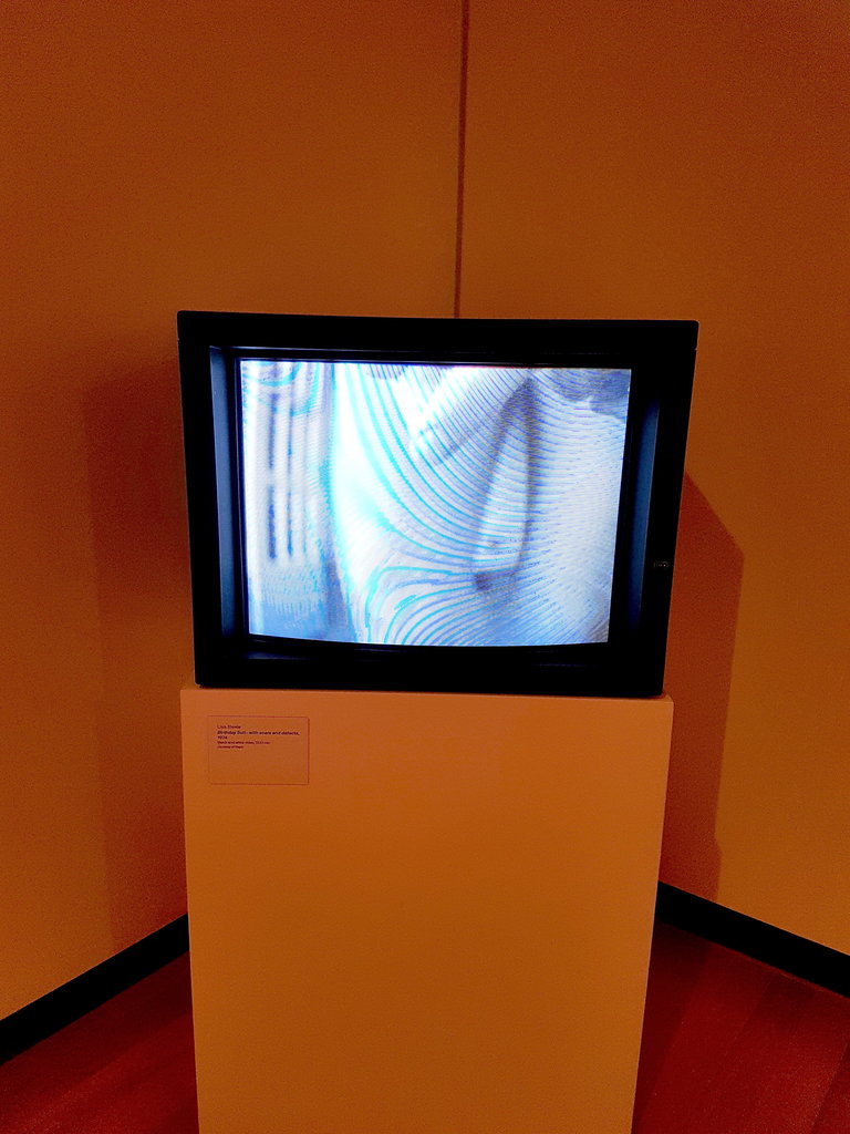
    Lisa Steele, Birthday Suit—with scars and defects, 1974, black and white video, 13:23 min
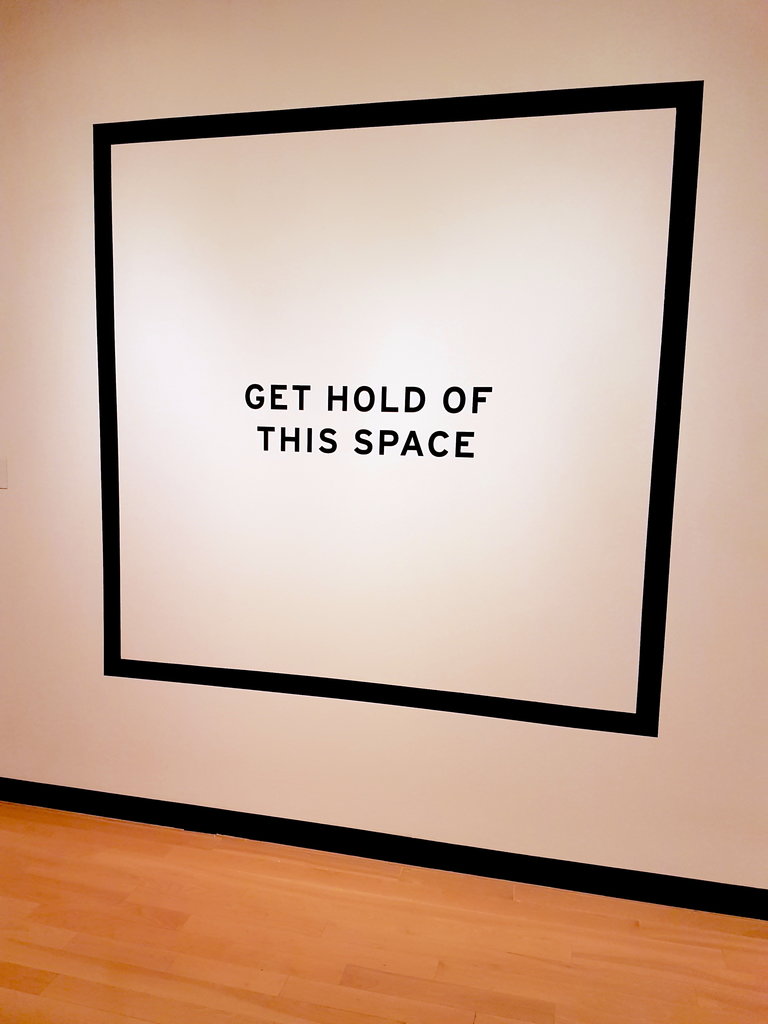
    Gordon Lebredt, Get Hold of This Space, 1974/2010, latex paint and vinyl lettering

    Canadian artists Conde and Beveridge present photographic panoramas that demonstrate a view of working women over twelve decades. Each woman is posed in a kitchen, where objects have been thoughtfully staged and the windows frame a documentary photograph relating to the politics of the period.
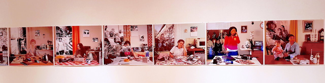
    Carole Conde & Karl Beveridge, Work In Progress, 1980-2006, archival pigment print

    Thus far, the exhibition was winning me over, but as an important aside, the curator’s talk played a major role in my reception of the work. Without it, I didn’t fully appreciate the relevance of certain works or their subtle relationships to one another. Now, to be clear, I am not calling for text panels about the thematic arrangement (which were also not provided), but individual explanations of specific works. For fear of sounding old fashioned: an exhibition of this scale needed some explanatory text panels. For contemporary art exhibitions outside of a major institutional setting, this practice is generally unheard of, but explanatory texts are not just for museums or posthumous shows.

    Before listening to the curators talk, I felt that some of the works were misplaced, but after it I had those “A-ha!” and “Ohh” moments, where I thought, “NOW I get it!” For those unable to attend, explanatory texts could have filled in the gaps and brought the exhibition together. As someone in the arts, there is always that initial fear of embarrassment when you can’t make the leap between artwork and concept, but in many ways this gap is reflective of the exhibition and not a fault in an audiences viewing methodology—especially in a show with over 100 works.

    Moving across to UTAC, which is markedly larger, I braced myself for an abundance of work. The first piece that captured my attention was Lifestyle Series by Ojibway artist Keesic Douglas. Four photographs feature an Anishinaabe couple surrounded by stereotypical features of their culture. Each photograph is a scene, staged and lit like a movie set. The couple are surrounded by dream catchers, stereotypical ‘Indian’ statuettes, deer skin drums, a Pocahontas mug, and many other ‘Indigenous’ objects. Living in these tableaus, the couple are surrounded literally, and figuratively, by the Indigenous stereotypes persisting in contemporary Canada. As Douglas once said in an interview: “I see photography as a reflection of the things around us.”
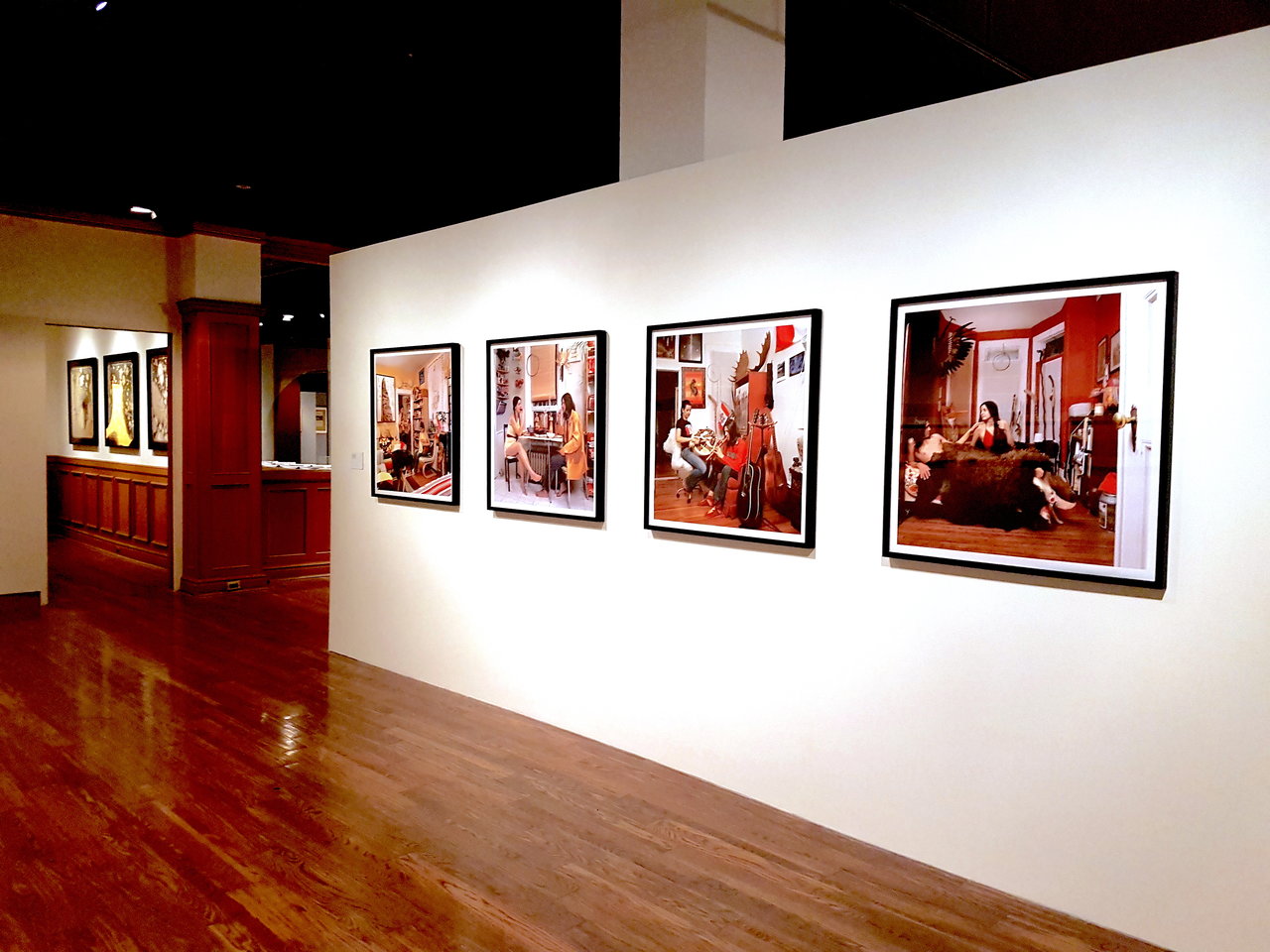
    Keesic Douglas, Lifestyles, 2007

    At this point I realized something: native and migrant groups likely experience a ‘sense of place’ quite differently. Indigenous people have dealt with a (forcible) shift towards assimilation against their established customs and traditions, while many migrants assimilate through choice. The experiences of these two groups created an interesting dialogue between how they are defined in relation to one another and how they mediate the space in-between. This is one of the exhibitions greatest successes, the representation of a diverse spectrum of artists from Indigenous, Canadian and migrant perspectives.

    Despite outlining four thematic gestures at the beginning of the exhibition, there is no signage to designate which one was which, and no attempt to simplify the works into categories. This approach allowed the art and artists to escape restrictive definitions under thematic titles, and reiterated the diversity reflective of every major city. One of the greatest disservices an exhibition of this scale can do is to presume that 86 artists can be organized into neat categories.

    As you delve deeper into the exhibition you are greeted by two crocheted banners stating “WE CAN’T COMPETE” and “WE WON’T COMPETE”. Created by Canadian artists Deirdre Logue and Allyson Mitchell, founders of FAG (Feminist Art Gallery), the works seek to reject the patriarchal art system, calling the biased structures that continue to govern contemporary artistic practice into question. FAG opens up spaces and creates opportunities for queer, feminist and local communities to converge and overlap. Negating existing structures and proposing a new trajectory, this work dealt with the same metaphoric themes as the work around it.
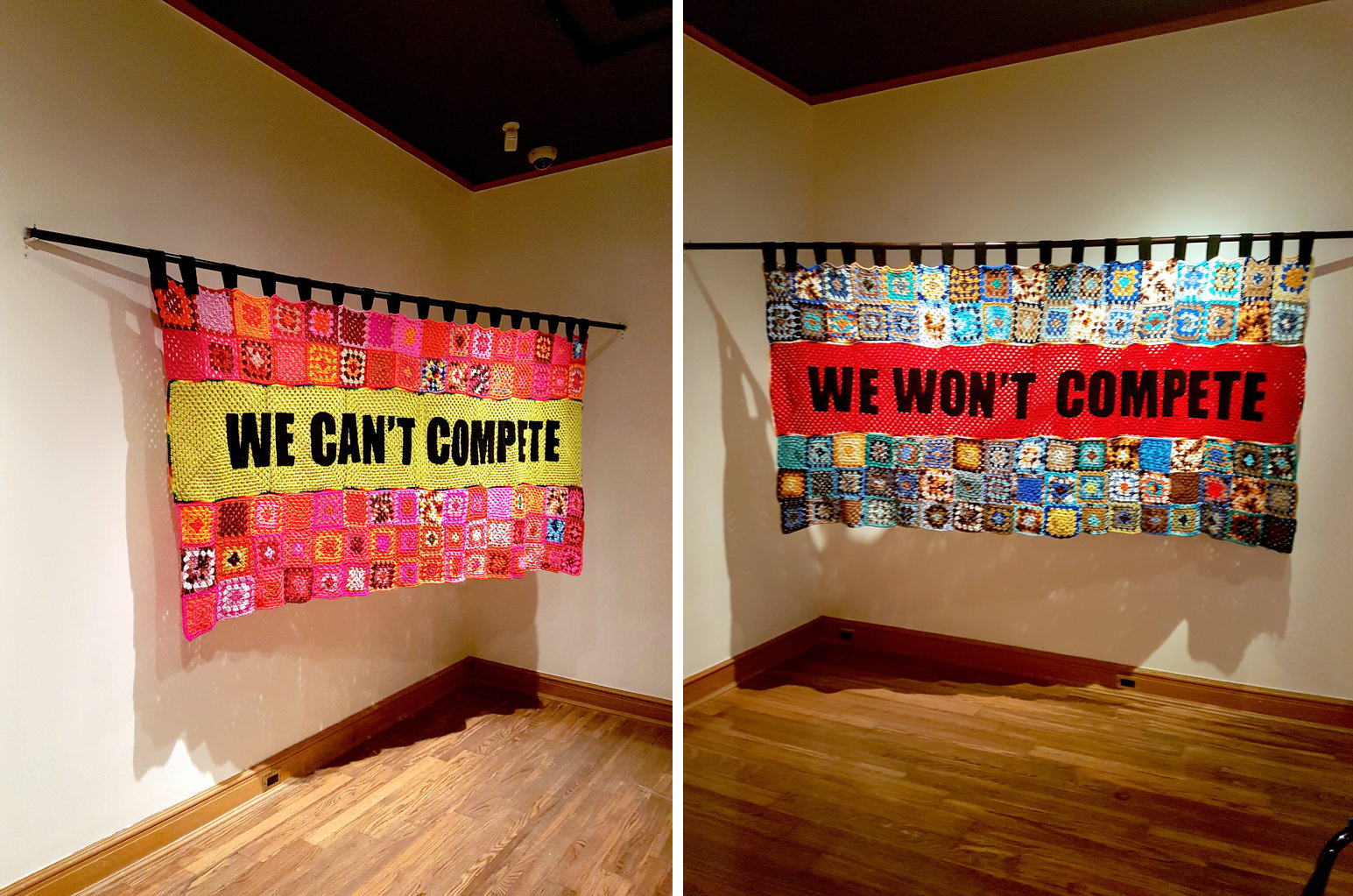
    Deirdre Logue and Allyson Mitchell, CAN’T/WON’T, 2012, crocheted squares

    In his talk, Jacob described this area through the allegorical notion of ‘modelling’. In society there exists a series of models—systems used as an example to follow or imitate. In almost every instance, we either reject them, do not measure up to them, or feel that we are much more than them. This whole room, from Suzy Lake’s A Genuine Simulation of… to Nobuo Kubota’s Reflections I, aims to define an individual sense of self. Suzy Lake, an American-born artist living and working in Toronto, created a series of photographs depicting the artist with varying amounts of makeup on her face. She is recognizable in some photographs while in others the makeup sits on her face like a mask. Lake raises key questions about authenticity, and how conforming to societal ‘models’ can turn you into an artificial version of yourself. Kubota’s work, on the other hand, is a matter-of-fact kind of work. The Canadian artist created a unified mirror that looks like two mirrors intersecting one another. This work, in the centre of the space, ties the artworks together. It is an invitation to look at oneself directly.
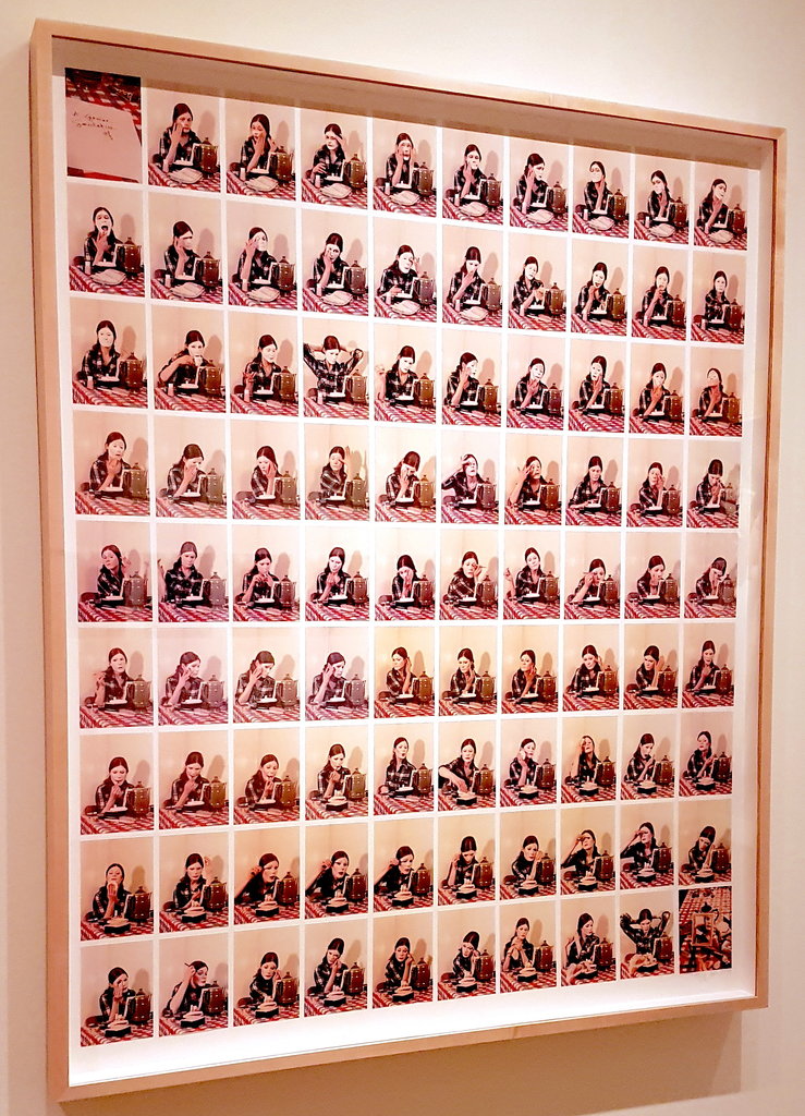
    Suzy Lake, A Genuine Simulation of…, 1973-74, chromogenic prints drymounted
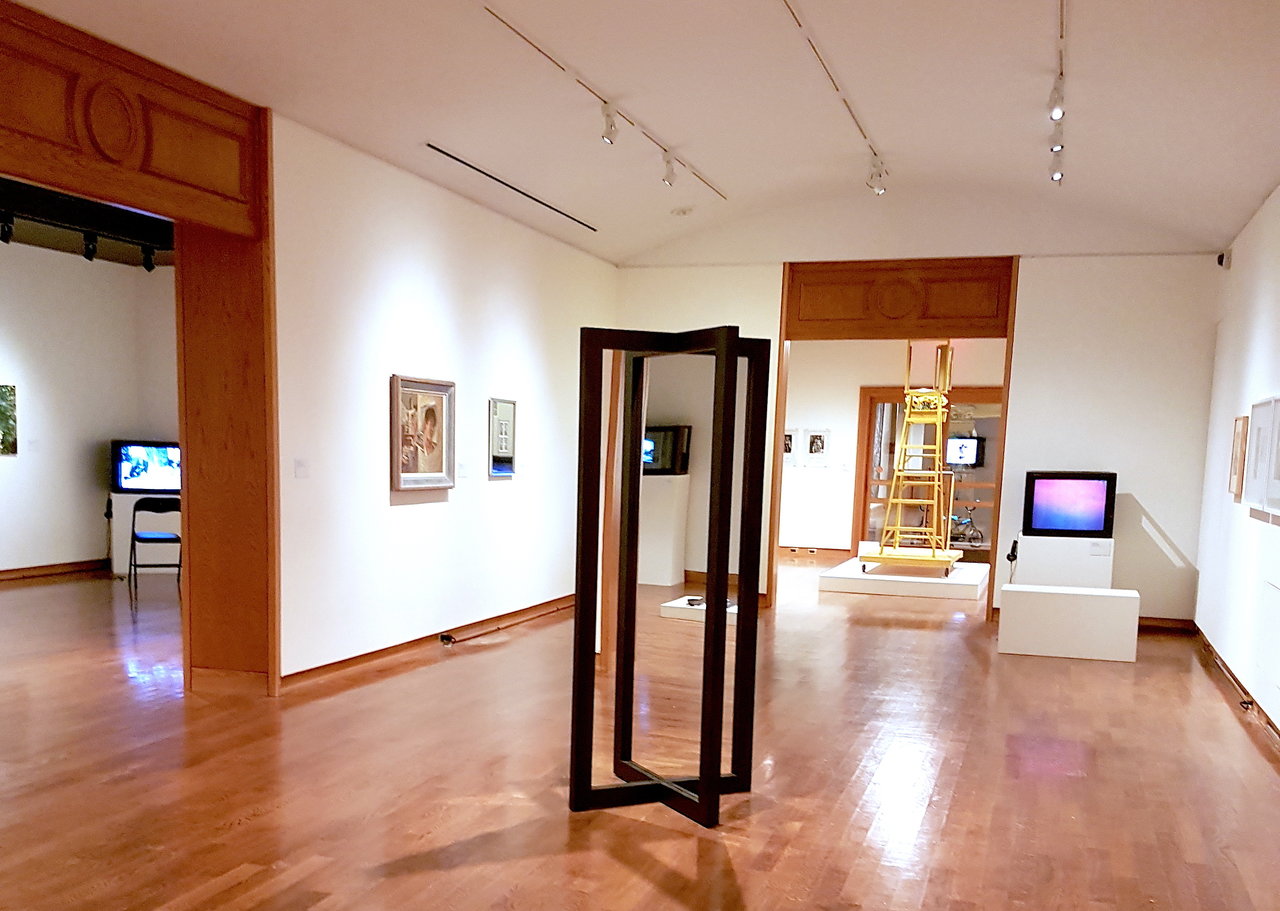
    Nobuo Kubota, Reflections I, 1969, wood and mirror

    Having only spoken about eight works, I could have easily written about every piece in Form Follows Fiction. Other major artists in this exhibition worth noting are Michael Snow, General Idea, Joanne Tod, Joyce Wieland, and many others; all of which are featured in the Art Gallery of Ontario’s Toronto: Tributes and Tributaries, 1971-1989. I initially wanted to review Form Follows Fiction in isolation of the AGO’s showcase, but there were too many comparisons to not give it a passing nod.

    Toronto: Tributes and Tributaries, 1971-1989 brings together more than 100 works by 65 artists and collectives. It explores art in Toronto in the 70s and 80s, a time of economic prosperity as well as social and political upheaval. The AGO structured the exhibition as you would expect; the text panels and thematic organization were definitive of an institutional exhibition. The sections dealt broadly with ‘Performance’, ‘Self/Portrait’, ‘The Body’, ‘The Image’, ‘Representation’, etc. Overall, it was a fantastic exhibition. However, its greatest failure was Form Follows Fiction greatest success: it simplified a vast body of work into neat categories.

    In Form Follows Fiction, every work deserved the time spent, which perhaps amounted to the exhibitions greatest shortcoming. With too many works to provide explanatory texts, and not enough time to appreciate them all, only a proportion of the show could be absorbed by any one visitor.

    Text and photo: Megan Kee

    *Exhibition information: Form Follows Fiction: Art and Artists in Toronto, September 6 – December 10, 2016, Justina M. Barnicke Gallery and University of Toronto Art Centre, under its new name: Art Museum University of Toronto, 7 Hart House Circle and 15 King’s College Circle, Toronto. Gallery hours: Tue & Thu – Sat 12 – 5 pm, Wed 12- 8 pm.

  • Bradley Wood and Natalka Husar at Angell Gallery

    Impressionism and the Der Blaue Reiter movements stand out in art history for radical painting technique and use of color in combination with a critique of a newly developing society. Walking into Angell Gallery has a certain deja-vu, nostalgia feeling where you can’t pinpoint exactly what you are looking at. It is neither a Matisse studio painting, yet there are references to it in the spatial dimension of the painting, nor is it a Kirchner masterpiece with lengthy women in a crowded city, however the long legs of the ladies portrayed mimic the former. 

    Installation view of Bradley Wood, Scenes from a Soap Opera at Angell Gallery, 2016. Courtesy of the artist

    This uncanny imagery is part of the series called Scenes from a Soap Opera by Bradley Wood. Narrating scenes of the super rich in lavish interiors, Wood plays on the dichotomy between seduction and ignorance. His characters are placed in social situations, for instance in “Silver Fox,” a mysterious man in a suit, smokes a cigarette in the foreground, while being surrounded by a group of beautiful young women in the background. The face of the main figure is uninterested in whatever is happening around him and that emotion transfers to the viewer himself, who becomes almost indifferent to the work. The bright colors on the paintings behind him and the vivid dresses of the women revamp the viewer’s attention and make him examine each and every detail. Similar to soap operas – there are characters you love and characters you hate, and you have to pay attention to understand and overcome the dramatic climax of the plot.

    Bradley Wood, Silver Fox, oil on canvas, 40 x 40 inches. Courtesy of Angell Gallery

    The viewer is thrown into discourse by Wood’s works: whether to praise and covet the expensive lifestyle or to condemn it. With the emergence of “big money” from technology, finance, and entrepreneurship – there is a subtle critique of ignorant and wasteful spending. The parallel with Der Blaue Reiter is not only seen in the subject matter of Wood’s work, but also in the form and color of the objects. The large areas of vibrant color – as the yellow in “Lounging on Mies van der Rohe” and the pastel blue of “Silver Fox” – are what create the nostalgic Impressionist (and partly Fauvist) feeling. The viewer recognizes an iconic technique and is quickly drawn in by the overwhelming tones to examine the content. 

    Bradley Wood, Shark, oil on canvas, 68 x 100 inches. Courtesy of Angell Gallery

    Seductive female figures featured in almost every painting play a huge role in Bradley Wood’s painting. In “Shark,” you have a fashionista girl in a short, leopard-printed dress, sitting next to what looks like her marine collection. Fierce and determined, she is a shark in the world, yet remains feminine and gentle. A more radical depiction of the seductive woman appears in “Casa,” where three women are lounging around nude near the fireplace. Sex and money are popular themes in pop culture and almost any Hollywood industry – noticeably areas which Wood draws inspiration from.

    Bradley Wood, Casa, oil on canvas, 48 x 48 inches. Courtesy of Angell Gallery

    The “projects room” of the gallery has a small surprise that leaves the viewer a little bit hungry for more – it houses Galley, a sneak peak of Natalka Husar’s exhibition to come. The structure of the show is very interesting in. The titles and captions of the works are hand written in pencil on the walls, and the representational paintings are pasted into books entitled “Burden Innocence.” Husar takes a comedic angle on the themes of history and social hypocrisy, using her family experiences and Ukrainian roots as the basis.

    Natalka Husar, Firing the Muse, 2011 (left); Endless, 2012 (middle) and Trespasser, 2012, detail (right), each acrylic on medical linen bound artist book, 9 x 10 inches. Photo: Elizaveta Mironova

    Just as in Wood’s show, women play a crucial role in Husar’s works. Each depiction of a woman – in a conventional role such as a nurse or a flight attendant – is mesmerizingly relatable. The body language and facial expression revealing the vulnerability of the character. In combination with a very small canvas size, the experience becomes profoundly personal as the viewer comes to relate with each character. “Poetic Justice,” mirrors the biblical compositions of Judith with Holofernes’ head but with a comical tone – depicting a flight attendant with the head of a man on a silver platter. Each one of us knows how irritating and maddening some passengers can be, and it is easy to relate to the stewardess who has an evil yet pleased smile on her face. 

    Natalka Husar, Poetic Justice, 2012, acrylic on medical linen bound artist book, 9 x 10 inches. Courtesy of Angell Gallery

    Wood’s two-meter-tall works and Husar’s tiny book paintings provide a beautiful and variant representation of women in the 21st century. The former brings out the dramatic and almost shallow aspects of society while the latter pulls on engrained historic elements of womanhood. Both Wood and Husar are excellent colorists and mesmerizing painters.

    Elizaveta Mironova

    *Exhibition information: Bradley Wood, Scenes from a Soap Opera and Natalka Husar, Galley, November 4 – 26, 2016, Angell Gallery, 1444 Dupont St., Unit 15, Toronto. Gallery hours: Wednesday – Saturday, 12 – 5 pm.