Author: artoronto

  • Steve Driscoll + Finn O’Hara: Size Matters

    The McMichael Gallery – home to the acclaimed Group of Seven collection – bridges the stark boundary between the natural and man-made worlds. It was the Group’s mandate to establish a distinct Canadian cultural identity by bringing the wonders of the country’s landscapes to the galleries. Many Canadian artists have used this for their own inspiration, and Steve Driscoll and Finn O’Hara advance it even further through Size Matters: a collaborative exhibition combining Driscoll’s unique “alchemist” paintings and the magnificent atmospheric photography of O’Hara. Although technology progresses society towards urbanization, Millennials are increasingly allured back to nature. Driscoll and O’Hara strive to insert vibrant and naturalistic scenes back into the concrete jungles. Brilliant images of lakes, rivers, and forests are planted into impromptu cityscapes and outdoor areas.

    Finn O’Hara in collaboration with Steve Driscoll, For a Moment, 2014, Digital Chromogenic Print, 45″ x 60″. Courtesy of the Artists

    Driscoll’s painting is unique; they are by no means paintings in traditional understanding. Rather than resort to classic oil, acrylic, or watercolor mediums on ordinary canvas, he blends colored pigments with urethane chemicals, which gives the works a luminous sheen. His style is much more animated and dynamic, with explosions and streams of color flooding the styrene surface (a material commonly used for credit cards).

    Steve Driscoll, Snow Covered Morning, 2016, Urethane on plastic panel, 80″ x 108″. Private collection

    Moreover, the pieces are sizably large, often dividing into multiple panels. In doing so, this establishes a monumental sense of scale that surrounds the viewer. As only example, What Myth consists of three huge panels, covering an entire corner of the gallery space. It depicts the aurora borealis with mixture of vibrant colors that is then illuminated with gallery lights. Standing between the panels gives the feeling of being surrounded by the Northern Lights, and the harmony of colors leaves much for the viewer to explore. Appropriate to the gallery setting, Driscoll owes much of his inspiration to the Group of Seven, having traveled out into the Canadian wilderness himself, seeking original ways in bringing its awe and wonder to urban galleries.

    Installation view with Steve Driscoll, What Myth, 2016, Urethane on three plastic panels, 102″ x 240″. Courtesy of Angell Gallery, Toronto and Peter Robertson Gallery, Edmonton. Photo: Simon Termine

    With these landscapes, O’Hara then introduces them to settings “foreign to the production and even subject matter of the paintings themselves.” His history of photography strives for cinematic effect and strong visual storytelling.

    Finn O’Hara & Steve Driscoll, Some roads were not made For such journeys, 2017, Digital Cromogenic Print, 59″ x 79″. Courtesy of the Artists

    The depiction of the aurora borealis now appears on a busy Toronto intersection; an image of a rising sun peering through towering trees stands in contrast to a darkened forest shrouded in fog; and a painting of a sun-bathed shoreline is now being playfully held by an exuberant Steve Driscoll standing in a river.

    Finn O’Hara & Steve Driscoll, A River Can Grant You Visions, 2014, Digital Cromogenic Print, 45” x 60″. Courtesy of the Artists

    O’Hara’s photographs range from dramatic and deeply contemplative moments to ones that are more witty and candid. Like Driscoll, he offers plenty to explore, even beyond the inserted paintings. The sheer detail and quality of these works encourage viewers to study the scenes closely and absorb as much of the laden stories as possible.

    Finn O’Hara & Steve Driscoll, Safely Through the World of Dreams, 2016, Digital Cromogenic Print, 45″ x 60″. Courtesy of the Artists

    Size Matters delivers on its promise of scale. Aside from the works themselves being large in size, the landscapes they represent are sprawling and bustling with activity. The combination of Driscoll’s vivacious colors and sheer energy with O’Hara’s astute attention to detail and captivating narratives offers a strong visual experience with plenty to see and explore.

    Simon Termine

    Note: The images are reproduced with the permission of the artists and McMichael Canadian Art Collection

    *Exhibition information: March 11 – August 20, 2017, part of Scotiabank CONTACT Photography Festival, A Primary Exhibition organized by the McMichael Canadian Art Collection, 10365 Islington Ave, Kleinburg, ON. Gallery hours: Mon – Sun, 10 am – 5 pm.

  • Chris Curreri: Unruly Matter / Daniel Faria Gallery

    Chris Curreri’s recent exhibition, Unruly Matter, at Daniel Faria Gallery embraces the symbiosis between image making and clay sculpting. As the title suggests, chaos reigns supreme as dark indeterminate clay forms bend and coil, creating an almost orgiastic first impression. The show centers around Sixes and Sevens, a series of twisted ceramics that, at first glance, appear wet and “fresh”. Standing on five plinths at hip height, it becomes quickly evident that these warped structures are not freshly wet at all, but rather glazed and fired in a desire to embrace the clay’s inherent unpredictabilities. Speaking to the material’s intrinsic malleability, the clay sculptures resemble deflated bowls or vessels that appear undone as if frozen in motion – a constant state of stasis. The series is also reminiscent of the satisfaction of post-coital rest, of exhausted penises and spent nights. Deflated and unrealized, these suggestive and intimate forms build on the idea that things in the world are not defined by essential properties, but rather by our relationships and interactions with them.

    Chris Curreri, Unruly Matter, Installation view, 2017. Courtesy of Daniel Faria Gallery

    Chris Curreri, Unruly Matter, 2017, ceramic, sizes variable. Courtesy of Daniel Faria Gallery

    Kiss Portfolio, a series of eight framed black-and-white extreme close-up photographs are dispersed around the perimeter of the exhibition space – capturing the act of two men kissing in time. The images, intended to disorient, tempt the viewer to see “an asshole” or the spreading of labia, ultimately unhinging photography’s inherent connection to the real. Both confusing and arousing, the series leaves the viewer to encounter the work through varying lens, emotional associations and lived experiences. Kiss Portfolio is followed by Seem, an inverted photograph of a couple’s face. Eyes peering out in a strong mutual gaze, the shadow of the brows and the concavity of the lovers intertwined produce the shape of a heart that speaks to contemporary theories of love and desire.

    Chris Curreri, Kiss Portfolio, 2016, Gelatin silver print, 4” x 5”, from a portfolio of 8 images. Courtesy of Daniel Faria Gallery

    Chris Curreri, Seem, 2016, Gelatin silver print, 12” x 12”. Courtesy of Daniel Faria Gallery

    Tucked away in the back gallery is Curreri’s final photograph, Lifecast – a lone image of a plaster cast of a young boy with a large neck tumor cradled by two white-gloved clad hands. This image is striking, and you are at once confronted with conflicting pain and pleasure. You are acutely aware of the swell of emotions running deep within you as you gaze onto the young boy and his pained expression. The tumor almost acts as a well, a repository for your conflicting feelings as you move through the final exhibition space. Perhaps the most heartbreaking is the gentle touch of the gloved hands as it cradles the young boy’s head. Eyes closed, the pained figure leans into the embrace of the supporting palm revealing a tender moment that is both peaceful and ominous.

    Chris Curreri, Lifecast, 2017, Gelatin silver print, 13.5” x 15”. Courtesy of Daniel Faria Gallery

    Chris Curreri’s Unruly Matter excites and delivers through the artist’s poetic investigation of form and material. Strange abstract visual forms assume an unexpected autonomy and form a fluid space where meaning becomes contingent on encounters and relationships. Dislocated from their original contexts, Curreri forms a deeply erotic aesthetic system, making explicit questions of material control and instability; of sexed bodies and the unbinding potential of queer sexualities to produce new ways of looking and seeing.

    Kate Benedict

    *Exhibition information: May 5 – June 10, 2017,  Daniel Faria Gallery, 188 St. Helen’s Avenue, Toronto. Gallery Hours: Tue – Fri, 11 – 6; Sat, 10 – 6 pm.

  • Lanny Shereck: Almost Human at loop

    Shereck’s exhibition at loop Gallery features larger than life-size portraits of fictional characters. They come along with their own stories. Looking at them one is quickly drawn to the pieces through their bright, mainly primary colours, and the unique, almost grotesque faces they depict. The exhibition also incorporates three three-dimensional sculptural objects, made of wood.

    Installation view of Lanny Shereck, Almost Human at loop Gallery, 2017. Photo: Victoria De Chellis

    When observing the painted works, twenty-seven in total, they bring back a nostalgic feeling of childhood: playfulness. At a closer, analyzing look, it appears that the faces are composed of pieces of wooden playing blocks. Each one of them have their own stories, that were developed by Professor Gerald Cupchik and his students from his Psychology of Emotion course, at the University of Toronto. This psychological background becomes apparent when reading through the stories in the book that accompanies the exhibition, telling us everything about each fictional character.

    Installation view of Lanny Shereck, Almost Human at loop Gallery, 2017. Courtesy of loop Gallery

    “Justin the Plastic” is a representation of the consumerist society we live in and the constant desire and effort we put into perfecting the human body. Some of the other topics that are addressed include the struggle with drug addiction from an underlying cause of depression. Another portrait focuses on the problem of a released prisoner and the difficulties between being confined within a prison, and then facing freedom.

    Installation view of Lanny Shereck, Almost Human at loop Gallery, 2017. Photo: Victoria De Chellis

    These narratives behind the artworks allow the viewer to think more critically. When the pieces are first observed, they seem easy and playful. However, once one explores and understands the stories behind, then these portraits provide a deeper meaning with a unique perspective.

    Victoria De Chellis

    *Exhibition information: May 20 – June 11, 2017, loop Gallery, 1273 Dundas Street West, Toronto. Gallery hours: Wed – Thur 12 – 5, Fri -Sat 12 – 6, Sun 1 – 4 pm.

  • Pacifier – Petra Collins

    Petra Collins’s rise to fame has been followed by many admiring Torontonians. Therefore, it was not surprising that the Artist’s Talk accompanying her show Pacifier, on now as part of the Scotiabank CONTACT Photography Festival, was completely full. However, even in a crowded gallery amongst strangers, the intimacy of Collins’s personal photographs, produced from her life both in Toronto and in Budapest, was still extremely present.

    Artist Talk with Petra Collins, April 29, 2017 at CONTACT Gallery. Photo: Carolyn Peralta

    In a unique way, this exhibition showcases the artist’s creative process, as well as the individuals who the artist focuses her photographic gaze upon. She describes the result by what it is not: “They seemed very posed and they seem very constructed, but that wasn’t [the case] at all…” During her talk, Collins discussed the connection between herself and her cousin depicted in “Little Prince” (2016). She describes the product, “It was his first time in front of my lens, and my first time being behind the lens shooting him.” The calm young man in his elaborate jacket seems comfortable in her gaze. His simple ambient manner communicates the way the presence of family can make us feel, unconditionally at ease.

    Petra Collins, Little Prince (Palko), 2016. Courtesy of the artist

    In many photographs, physical closeness also signifies the intimate moments of familial love. The embrace between her mother and sister in “Anna and Anya” (2016) is akin to the soft touching of heads in “Anna and Kathleen (Rainbow)” (2016), and the photograph of her father’s hand resting in on her leg in “Daddy and Me” (2016).

    Petra Collins, Daddy and Me, 2016. Courtesy of the artist

    Collins’s most famous muse, her sister Anna, is subject of many of the photos, reflecting their relationship both as sisters and as friends. Collins discussed how she experienced much of her life not only with, but also through her sister. The closeness of the two sisters is evident through Collins framing of Anna in various settings.

    Petra Collins, Anna and Anya (Hungary), 2016. Courtesy of the artist

    Other photographs in the show continue to demonstrate the capturing of moments, such as her grandmother’s wave off of the balcony in Budapest, in “Vaci Utca (Nagymama Wave)” (2016), and the capture of her companions playing the trust fall game in “Trust Fall” (2016). The result of this playful act is a powerful black and white photograph taken with divine timing.

    Petra Collins, Trust Fall, 2016. Courtesy of the artist

    This show also coincides with Collins’s first public art piece on King Street West, Toronto, “Jackie and Anna (rainbow tear)”. It is part of the 24 Hour Psycho Series that Collins describes as “cathartic images.” Collins captures the sad experience of her subject and, therefore, subjecting the viewer to the emotions which surround mental illness, anxiety and depression as well. Sadness is an emotion Collins describes as being familiar with throughout her youth, and shares this vulnerability with us through this series.

    Petra Collins, Jackie and Anna (rainbow tear), public installation, April 26 – August 30, 2017

    Petra Collins says that she has a nostalgia for a past that is not her own. In Pacifier, photographs of people, places and overall reminders of home warmly invite the viewer into the intimate moments of Collins’s life in similar nostalgic manner.

    Carolyn Peralta

    *Exhibition information: April 29 – June 24, 2017, CONTACT Gallery, 80 Spadina Ave, Ste 205, Toronto. Gallery hours: Tue – Fri, 11 am – 6 pm; Sat, 12 – 5 pm.

    Featured image: Petra Collins, Anna and Kathleen (Rainbow), 2016, detail. Courtesy of the artist

  • Claude Tousignant: A Selection / Christopher Cutts Gallery

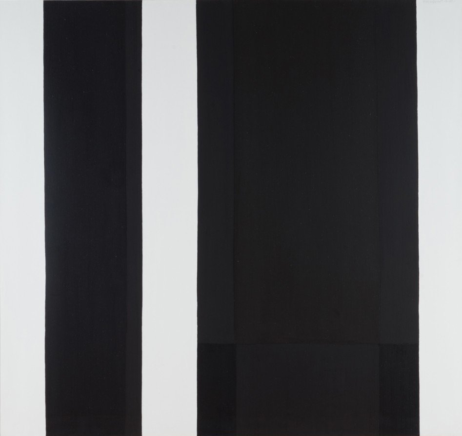
    The presence of phenomenological thought in artistic practice dates back to the 1960s, at a time when creative individuals were finding newer methods to fracture Abstract Expressionism’s global omnipotence. Fashioned in a post-war American society, AbEx was the nation’s cultural response to Europe’s sepulchral sociopolitical climate; one steeped in deeply rooted desolation. The rambunctious and apolitical work of de Kooning and Pollock enlivened the global consciousness to the power of painterly exposition, wherein the brush became an honest portrayal of man’s psychological impulses and were manifested in a highly gestural means of articulation. In turn, a heroic image of phallocentrism became an emblem of cultural salvation, as the candid male painter brought forth a new dawn to a fraught global artworld. However, as society progressed, and newer methods of art dispersed throughout creative circles, philosophical inquiries such as phenomenology illustrated a shift in perception away from autobiography into the realm of the viewer.

    Claude Tousignant, Verticales blanches et noires, 1962, acrylic on canvas, 64″ x 68”

    Phenomenological art, best demonstrated in the stark minimalist canon, eviscerated the confessional nature of Abstract Expressionism, reducing the presence of the artist’s brushstroke to a series of geometries devoid of subjectivity. Painting and sculpture, to artists such as Frank Stella, Donald Judd, and Sol le Wit, became a conceptual means to confront the often-rigid barriers between institution and display, audience and maker. Minimalism became a pointed reflection of a viewer’s essential and psychosomatic relationship to the plastic arts, and how these spaces for exhibition (or an artist’s subversion of it) can engender a peculiar experience for each individual. As an aesthetic manifestation of such concerns, uncomplicated shapes such as squares, rectangles, and triangles become the formalistic infrastructure for the minimalists, easily their most recognizable calling card in the visual lexicon of art history. The latest profile of Canadian painter and sculptor Claude Tousignant, on view now at Christopher Cutts Gallery, traces the artist’s lineage within the minimalist practice of autobiographical abandon.

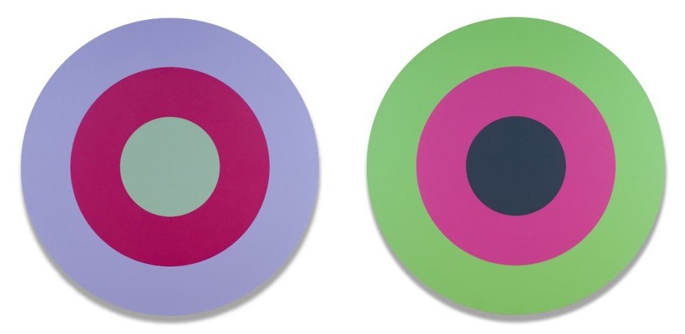
    Claude Tousignant, Double cercle 66 – Cadmium chinacridone, 1975, acrylic on canvas, 66.0” each.

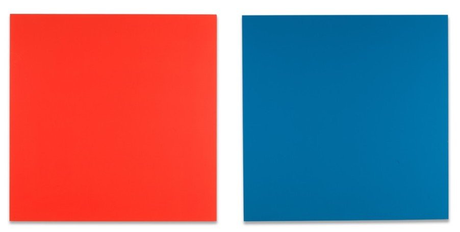
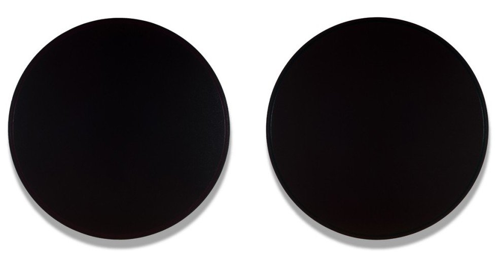
    Claude Tousignant: A Selection presents a highly refined selection of his work, ranging from the glory years of the 1960s modernist movement, through to more contemporary times. What immediately becomes evident in this microcosmic exhibition is a strict aesthetic and contextual cohesiveness, illustrated by the highly ordered works on display. Five of the eight paintings are presented as diptychs, but bereft of the traditionally sacred subject matter. Each canvas is similarly monumental, scaling anywhere between seventy to well over one hundred inches in dimension, and are finished in a smooth veneer that frees Tousignant’s work from any distinct authorship into something more pure.

    Claude Tousignant, Double écran chromatique en rouge et bleu, 1988, acrylic on aluminum, 48″ x 48” each

    While Tousignant’s formal rigor may recall the likes of Frank Stella and Ellsworth Kelly, the artist’s thematic fixations remain similarly beyond any historical epoch. These contemplative and phenomenological expressions exist beyond sociopolitical benefactors, as they aim to tackle concerns that are distinct to human existence and the confluence of art and objects within that. This exhibition is an affirmation of Tousignant’s dedication to his practice, and how untethered from time and situation his work remains.

    Claude Tousignant, Bleu-rouge / Vert-violet or #7-80-84, 1980, acrylic on canvas, 84” each

    David Saric

    Images are courtesy of Christopher Cutts Gallery

    *Exhibition information: April 29 – June 10, 2017, Christopher Cutts Gallery, 21 Morrow Avenue, Toronto. Gallery hours: Tue – Sat 10 am – 6 pm.

  • Fantasy Fashion Show 2017 / Gallery 1313

    Gallery 1313 presented the 15th Annual Fantasy Fashion Show fundraiser, showcasing young, emergent Canadian talent in fashion. These artists imbue their tailoring with the abstract and imaginative qualities of fine art, creating a myriad of clever and impactful designs. Ranging from the whimsical to the sombre, from the modern- to classic-inspired, the show was voluminous and captivating. It caught the attention of multiple media outlets, such as CBC Toronto Arts, Forward Fashion, and the Parkdale Villager, as well as Parkdale’s own Federal MP, Arif Virani. Ultimately, it was able to raise $1300.00 for Gallery 1313’s operating budget.

    Fantasy Fashion Show 2017, May 23 at Gallery 1313. Photo: Phil Anderson

    Among the featured designers was local Theresa Ibbetson and her label IBOTEE, whose current line focused on (de)constructed realities. Her run included a musical accompaniment of Parkdale guitarist Fabian and the renowned international model, Paul Mason (formerly- and colloquially-known as the Fashion Santa). There was also Ana Graovac, Busk and Bone, INTROBANG and the Defective Collective, who displayed a variety of amazing works.

    IBOTEE Theresa Ibbeton (de) constructed realities. Photo: Simon Termine

    Ceremony Line by Busk & Bone. Photo: Simon Termine

    Ceremony by Busk & Bone. Photo: Simon Termine

    INTRROBANG – DECHETS. Photo: Simon Termine

    Defective Collective. Photo: Simon Termine

    This year’s Fantasy Fashion Show has been a true spectacle, and we are certainly looking forward to the talent that next year brings.

    Simon Termine

  • LIFE DISRUPTED / Gallery 1313

    From left to right: Elham Hazfi, Irit Epstein and Lina Faroussi in their exhibition in Gallery 1313. Photo: Phil Anderson

    Interview with Elham Hazfi (EH), Irit Epstein (IE) and Lina Faroussi (LF) by Phil Anderson (PA)

    The three artists from three countries (Iran, Israel and Syria) now living in Toronto, explore in their work the humanitarian crisis in our contemporary world, a result of man-made destruction.

    PA: How did the three of you meet? 

    LF: I initiated the idea of a group of artists that would have an annual exhibition. I knew Elham and Irit separately, and introduced them to each other.

    EH: Last March, when I had a catch-up coffee with Lina, she initiated the idea of creating an art critique session with other artists (mostly in painting). The purpose was to get other professional ideas about our works, exchange news about the art world, and eventually have group exhibitions together.

    IE: Once the three of us met, we found that we had a lot in common as artists and women, as well as being immigrants who came to Canada from the Middle East.

    PA: Did you find you had common themes in your art works? 

    IE: The most recent series that Lina and I were working on both were dealing with man-made disasters. Lina was portraying the Syrian War, and I was working on portraying the experiences of refugees, migration and loss of home and homeland. Lina thought of doing a joint exhibition, and Elham joined in with a related theme, centered around what is left behind: hopes, expectations and the feelings that are evoked when one migrates.

    Irit Epstein, The Map and the Territory, oil and mixed media on canvas, 24″x 24″. Courtesy of the artist

    LF: In the beginning, Irit and I were working on our separate series, mine titled ‘The Obvious and the Obscure’, and hers ‘The Map and the Territory’. I thought the two series coincidentally complemented each other. They had a similar vision and theme that I thought would fit well in a group exhibition. Elham joined in, beginning with her work ‘Bad Dude Land’, followed by other paintings and an installation.

    Lina Faroussi, Beyond Boundaries, acrylic on wood panel, 20″ x 16″. Courtesy of the artist

    EH: We shared a similar vision. We are all interested in painting figures and human emotions in different circumstances. It was fascinating to see how Lina and Irit were diving into the deepest layers of their life experiences. My work is usually about people’s emotions and interactions, so I guess my works covered the individual aspect of the subject.

    Elham Hazfi, Bad Dude Land, mixed media on wood panel, 36″ x 72″. Courtesy of the artist

    PA: Why do you think it was necessary to show your work together? 

    IE: Our work shows three points of view that portray the results of what is and has been happening in the world. They cover different topics and aspects of immigration, but together they create a theme that is much broader and more meaningful, and can promote insight and conversation.

    PA: What do you hope people take from this exhibition? 

    EH: I would like people to see themselves in my paintings. Alienation and not fitting in is not only for immigrants, as it could be experienced by anyone with any background. This exhibition may lead to a conversation about the subject, which is valuable in itself.

    Elham Hazfi, Untitled 2, acrylic on canvas, 24″x 30″. Courtesy of the artist

    IE: I am hoping that this exhibition will offer another way to look at what is happening in the world today. Art can provide an aesthetic dimension to sensitive subjects, and enable an ongoing observation that can promote dialogue, raise awareness and inspire change.

    Irit Epstein, Reality Extract, oil and mixed media on canvas, 24″ x 24″. Courtesy of the artist

    LF: I hope people can see beyond politics, can open dialogues with us and with each other, and think in open minded ways, out of the boxes of countries or politics. Then I hope some solution might follow. As Bertrand Russell wrote, “war is not about who is right but who is left.”

    Lina Faroussi, Over Their Shoulders, acrylic on canvas, 48″ x 48″. Courtesy of the artist

    PA: What is the strongest message you want to covey?

    IE: Art can build bridges.

    LF: Art has no identity

    EH: Conveying feelings is what an artist does, not sending a message.

    PA: Do you see yourself doing any future exhibition together?

    IE: Since we have a lot in common, there is a lot of potential to continue to collaborate.

    *Exhibition information: May 25 – June 4, 2017,  Gallery 1313, 1313 Queen Street West, Toronto. Gallery hours: Wed – Sun, 1 – 6 pm.

  • Yuri Dojc: American Dreams at Darren Gallery

    In American Dreams Yuri Dojc recalls his fantasies about America from when he was growing up and living in Czechoslovakia. His vibrant photographs, created after his arrival in Canada, are combinations of found and purchased objects that both recollect and release his longings for North American culture.

    Yuri Dojc, Good Morning, Ink Jet Print on Aluminum, 40″ x 30″. Courtesy of the artist and Darren Gallery

    Eye-catching compositions demonstrate how Dojc’s advertising background enabled him to create visually appealing compositions, while also generating a method of release for his childhood visions of a different, far away land and culture. Dojc manipulates space in an interesting way in “The Kingdom,” where all components come together between palm trees and women on the left (a representation of the west coast), and taxi cabs on the right (as visual cues of the east coast). Throughout the composition, tiny plastic objects stand beside, hang above, and rest on a large Elvis Presley statue, which Dojc adored. Dojc was deeply surprised when he realized, upon his arrival in North America, that many of the Czech pop songs on Radio Luxemburg copied Elvis Presley’s.

    Yuri Dojc, The Kingdom, 1988-89, Archival pigment print, 36″ x 24″. Courtesy of the artist and Darren Gallery

    Dojc takes the “kitsch” of the American pop culture and familiar plastic objects and transforms them into images that represent both his memories and personal life. He describes the former Czechoslovakia as “a very restrictive society,” as pictured in “Globalization” – depicting a “society swallowed by the communist system.”

    Yuri Dojc, Globalization, 1988-89, Archival pigment print, 24″ x 36″ . Courtesy of the artist and Darren Gallery

    Dojc stated that his compositions came into existence from an inner guidance of “what feels right.” The method of creating his works by staging objects, already hints at the idea of material culture. In combination with visual cues of popular culture, Dojc’s works provide an interesting perspective on American culture and the idea of freedom and abundance that accompanies the “American dream.”

    Yuri Dojc, Ascending to Heaven, Ink Jet Print on Aluminum, 30″ x 40″. Courtesy of the artist and Darren Gallery

    However, the “American dream” theme, demonstrated in this show, is shared by many new comers to Canada, and similarly recalled by many first-generation Canadians in their stories. Dojc’s work is representative of contemporary Canadian art that is inspired by the interaction between diverse cultures that exist simultaneously.

    American Dreams is a part of Scotiabank CONTACT Photography Festival and on display until May 28th. Darren Gallery was opened in 2014 to provide a platform for “experimental and daring” work produced by “bright and innovative contemporary artists” in Canada. Although the gallery is focused in providing a space in Toronto to exhibit creative and enticing shows, Darren Gallery also aims to foster relationships with artists and galleries internationally to expand opportunities for Canadian artists.

    Carolyn Peralta

    *Exhibition information: May 5 – 28, 2017, Darren Gallery, 346 Margueretta Street, Toronto. Gallery hours: Thur – Sun 12 – 6 pm.

  • David Rokeby: Between Motion and Stillness at Pari Nadimi

    Over the decades, film and video recording have become commonplace aspects of modern culture as the technology became more portable and popular. Yet what is a film but a sequence of still images; what is suggesting motion is actually a series of motionless representations of the actual scene. A moving object appears in one frame, while each of the subsequent frames display its blur, struggling to transfix the same object in two separate places and two different states: motion and stillness. In his aptly-named exhibition Between Motion and Stillness, David Rokeby explores and documents urban landscapes rife with boundless activity through a variety of mediums that cleverly capture the abundant sense of mobility and temporality. Rather than relegate these subjects directly to film, Rokeby instead uses still images that are manipulated to convey motion while still being stationary. Despite film’s potential for accuracy and convenience, the constant transitioning between scenes may distort or undermine the more emphatic details. The use of traditionally “fixed” mediums retains these elements that are otherwise overlooked.

    David Rokeby, Circle Trafalgar Square, C-print, 20 1/4″ x 72″. Courtesy of Pari Nadimi Gallery

    The largest theme present in Rokeby’s collection is the exploration of city squares, which are usually bustling hubs of activity. Here, he represents four: “San Marco Quartet (San Marco Square)” in Venice, “Trafalgar Square” in London, “Dundas Square” in downtown Toronto, and the Suburban Suite (Square One) in Mississauga. While Rokeby begins with the same recurring concept for these explorations, he then chooses different means of representing each square in particular. “Dundas Square” is a lenticular image (known informally as a “ripple image”) where two images of the same subject taken at different points of time are placed on a corrugated plastic sheet: the first image is placed on one side of the corrugations and the second on the other side. As viewers change their perspective, the lenticular innately elicits an optical illusion where the eyes try to ameliorate between the still images, thus conveying the sense of motion. A dynamic scene changes as the viewer moves within the gallery space: a streetcar passes along its rails, people scour the sidewalks, and cars fill the streets.

    David Rokeby, Dundas Square, 2017, lenticular, 26″ x 46″. Courtesy of Pari Nadimi Gallery

    “Suburban Suite” envisions another familiar, relatively quiet setting within the Greater Toronto Area. Square One, although the heart to Mississauga, is portrayed in Rokeby’s works more solemnly and desolate in comparison to the traffic of San Marco or Trafalgar. Here he presents eight canvas paintings and each focus on only those objects that are moving within the scene. Buildings and scenery are muted into the gray undercoating and are distinguished only by a subtle layering of paint that creates shallow models of the space. Simultaneously, Rokeby paints the intricate details of the people and cars so that against the monotone background, these objects burst with life and anticipate.

    David Rokeby, Suburban Suite, 2017, printed on canvas, 72″ x 42,5″. Courtesy of Pari Nadimi Gallery

    By comparison, “San Marco Quartet” delves into another means of perception: the movement of light. In this set of combined lightbox pictures, luminescent strands flood and illuminate the square. Though they are meant to represent the blur of the bustling crowd, Rokeby strays from the representational and concrete to convey something more abstract, fluid, and vibrant.

    David Rokeby, San Marco Quartet, 2017, lightbox, 22″x 96″. Courtesy of Pari Nadimi Gallery

    Between Motion and Stillness is an awe-inspiring and thought-provoking exploration of the concept of motion and the different means of dissecting and describing it through visual media. This only describes a portion of the full collection; the rest must be experienced and enjoyed personally.

    Simon Termine

    *Exhibition information: April 13 – May 27, 2017, Pari Nadimi Gallery, 254 Niagara Street, Toronto. Gallery hours: Wed – Sat, 12 – 5 pm.

  • Interview with John Ferri

    John Ferri at the 20th Anniversary Celebration of Gallery 1313, January 2017. Photo: Simon Termine

    Interview with John Ferri (JF) by Emese Krunák-Hajagos (EKH)

    John Ferri’s latest exhibition Walking on Glass is currently on display at Elaine Fleck Gallery.

    EKH: The first work I saw from you was from the series: Next to You (2014) at Gallery 1313. It was in a group show but made me stop right on the spot. I had to have a closer look at those people and try to figure out their relationships. It also brought up questions about the making of if it: was it a spontaneous shot, staged or montaged. How did you get the idea for these images and how did you make them?

    JF: I live in Toronto and my building overlooks a bench. I watched people on that bench almost daily and became fascinated by the interplay between them. I began to notice patterns. For instance, women when they sat together would often cluster inward in semi-circles to face each other. Men generally would gaze into the distance, even while talking to the person next to them. People, even when by themselves, would sit at the furthest end of the bench, making room for missing souls. I realized that they used public space to both congregate and insulate. And, that either way, multiple narratives emerged. So there’s certainly a spontaneity to their actions but the images themselves are constructions. The benches are stretched across a panoramic space to make room for these narratives.

    John Ferri, from the series Next to You, 2014. Courtesy of the artist

    EKH: People are always present on your photographs – maybe that’s why I like them. It seems that you are interested in their relationships, and in social issues. Could you please tell us more about your thoughts and your artistic philosophy?

    JF: I spent many years as a journalist whose duty – by obligation and inclination – has been to look at life in the biggest city in this country.  But I’m also from a small town, which means that like everyone else who was not born here, I’m an outsider. And, as a journalist, you are best to be an outsider. The most effective stories are told from the outside looking in. But, as a journalist, you are also aware that stories are not abstract – they have human beings at their heart. How we get along in the city is the centre of all our narratives. The people in my work are us – we are dwarfed and dazzled, and often we are alone, even when we’re with others – but we make our way in the world as everyone always does. I think it’s kind of heroic. It’s our human scale that gives dimension to the glass towers that surround us – not the other way around. My work is a way of saying we are here, we have assembled this life, and this is what ‘here’ looks like. We may be strangers, and we may be alone, but it is a glory that we thrive and survive.

    EKH: In Circles, another series (2016), images are crowded with people who are moving around until they create layered circles. Movement is another key element in your work. Why is that and how do you construct it?

    JF: I shot those images from the same vantage point over a period of about two years. My initial impulse – as in all my work – was observational. I’m fascinated by movement, in the subtle choreography of an act as simple as walking. I photographed each person individually but, if seen in the aggregate and over time, they moved in unison. I wanted to capture that. So I timed my shoots so that the angle of the shadows began to match. There’s some manipulation – tilting and density – to create a consistency that’s pleasing to the eye and to bring together the aesthetic and narrative elements.

    John Ferri, Circle In Blue Square, from the Circles series, Archival Inkjet Print Facemounted To Plexiglass. 36 x 36 “. Courtesy of the artist

    EKH: I saw your Air Show, yet another series at Gallery 1313, in 2015. A surprise again, since these compositions are almost empty with an overwhelming blue sky, some occasional clouds and a solitary figure. They are real and surreal at the same time. The figures all have shadows but it still feels like that they are in the air. What inspired you and how were they realized?

    JF: I became concerned about the aloneness you see in public places. So these solitary figures floating in space expressed that. Their vulnerability in the circumstance is a thing of beauty. I think it also works as a counterpoint to the fact that, increasingly, most images taken of us in public spaces are the result of the darker motivations of the surveillance culture – which promises protection but implies a threat. In stripping away all but essentials – leaving only a familiar object against a gradient sky – I was seeking to sharpen the focus on human narratives, not institutional ones.

    John Ferri, from the Air Show 2, 2015  Archival Inkjet Print Facemounted To Plexiglass, 24 x 31. 25″. Courtesy of the artist

    EKH: Walking on Glass, your current show is amazing. Broken glass, not to mention walking on them, can hurt. But not in your photographs. They become beautiful crystals that reflect the light, group into flower-like structures creating an enchanting design. Where did all this magic comes from?

    JF: We live in a city increasingly defined, at least visually, by glass. It plays with the light which can be mesmerizing.  It’s both fragile and hard at the same time. It reflects and shapes our daily lives. I wanted to explore these attributes. I liked the idea of taking apart the familiar and reassembling it, anchoring everyday realities and concerns in pure abstraction.

    John Ferri, Bridge, from the Walking on Glass series, 2017, Inkjet print on Archival paper, 48 x 36″. Courtesy of the artist

    EKH: There are two categories on your website: Composites and Photographs. They both seem to be collages and combined images – why the two categories, what’s the difference between them?

    JF: In the context of what else I do, I can see how the work in the photographs category might look constructed. But it’s not. Those photos are absolutely as shot. I think what’s interesting is that they are consistent with those that are pure manipulation. The only difference, at least in terms of the Giant Humans series, is that they are at street level. In a way, they’re kind of a proof of concept by asking the same essential question:  how do we maintain our sense of place and dignity as human beings when juxtaposed against forces larger than ourselves?

    John Ferri, from the Giant Humans series, 2014. Courtesy of the artist

    EKH: Lately you are getting more recognition: the Elaine Fleck Gallery, and being invited to SNAP auction etc. What comes next for you?

    JF: I had my first solo show last fall at Akasha Art Projects. I’m now represented by the Elaine Fleck Gallery. I feel very fortunate about the here and now. My goal in the near term is to continue exploring the concepts that interest me, in particular walking on glass. I’m definitely not done with that.

    *Exhibition information: May 4 – 28, 2017, Elaine Fleck Gallery, 1351 Queen St. West, Toronto. Gallery hours: Mon, Wed, Thur & Fri: 12 – 6 pm, Sat: 11 am – 6 pm.

  • Culture in Steel and Concrete Canyons

    Culture in Steel and Concrete Canyons: A Conversation with Pasi J. Paltanen

    I am walking down McCaul Street in Toronto on a dark and rainy Thursday. Around me people walk under umbrellas, their faces glued to the ever-present cellphones. Weaving through them are students of OCAD University, some of them lugging giant canvasses draped in tarps or garbage bags to protect them from the rain. They look excited, others worried, all move purposely and quickly. For today is the day when they will have their final critiques and evaluations (I will hear the term “crits” muttered many times today).

    When I enter the university, I am hit by several smells: saw dust, paint, sweat. I move through crowded corridors searching for the Finnish born painter Pasi J. Paltanen. With the help of an admin, a teacher pushing an art dolly, and a student lugging a painting, I finally find Pasi having a conversation with two other students. He stands out amidst his fellow students. At forty-eight years, he is older than most of them. His stocky frame, tattoos, bald head and long beard make him look like he should be atop a motorcycle or sailing with Vikings, not graduating from an esteemed art institution. Pasi tells me he had his own crit just that morning, and after collecting coffee, we head up to his workspace in room 430 (the 4 Year Drawing and Painting Thesis Studio).

    Pasi J. Paltanen. Photo: Todd H. C. Fischer

    Room 430 is large, with workspaces set up for several students. The ceiling is high, and covered in windows. On a sunny day, I am told, the natural light is amazing. Pasi takes me to his spot, crowded with easels and framed illustrations. A quick scan of the space shows me streetscapes, portraits, images of bears and—dominating the space—a large painting of humpback whales swimming through the sky among high rises, titled, “Whale Road”.

    We speak at first about his past and what caused him to pursue a career in art while approaching middle age. He was, he says, always artistic, and had actually attended OCAD before (in the 1990s). However, he said that his interests were not nurtured, he was told that art was not a real carrier, only a hobby. This led him to waste his time, not really doing anything, working as a bouncer, a doorman, a bodyguard, a chef and a computer animator.

    A chance visit to the Ontario Gallery of Art led Pasi and his wife Jaclyn (a fibre artist) to walk past OCAD University (located next door). Jaclyn mentioned that she wanted to go back to school but didn’t know if they could ever afford it. Pasi encouraged her to apply, saying they would do whatever it took to make her dream come true. When she applied to OCAD U, so did he. He felt a great desire to finish what he had abandoned years ago.

    Pasi J. Paltanen, Front and Bay, Looking North, oil on wood panel, 4 x 3 feet. Courtesy of the artist

    In 2016 Pasi and Jaclyn went on their honeymoon to Finland. He and his family had emigrated to Canada in 1978 for his father’s work (selling hockey sticks). It had been thirty years since Pasi had seen the land of his birth. Being there, he said, opened an awareness in him, he did not know existed. While he stressed that he is a Canadian, he found that being exposed to his roots filled the empty spaces within his identity.

    Pasi J. Paltanen, The Lady of Bearhall, oil on wood panel, 2 x 3 feet. Courtesy of the artist

    Visiting the Finnish National Art Gallery (the Ateneum) had a profound effect on his creativity. He thought that the Finnish folk tales and mythology, that he relearned on that trip, would dominate his art. What he found, however, was that it has combined with his experiences and inspiration of Toronto, creating its own mythology. This process, he says, is ongoing.

    Pasi J. Paltanen, The Bear (a self portrait), oil on wood panel, 2 x 3 feet. Courtesy of the artist

    When asked about the juxtaposition of nature and the urban landscape, Pasi talked about his work in security. Working in this field means that he finds himself in the city very early in the morning, and very late at night. It is at these times, he says, when the clouds and light, the mist take on otherworldly proportions and truly fire his imagination. In fact, it was such a morning of heavy mist that inspired “Whale Road”, made him picture behemoths swimming through the air. He admits he always sees nature, even when it is not present.

    Pasi J. Paltanen, Whale Road, oil on wood panel, 4 x 4 feet. Courtesy of the artist

    Pasi finds beauty everywhere. He tells me that a lot of people don’t like the city and don’t recognize its unique beauty, good vibration, a rich and blooming society and culture among the steel and concrete canyons. He feels fortunate that he can peel away the negativity, see and paint that beauty.

    Pasi J. Paltanen, King West Streetcar, oil on wood panel, 4 x 3 feet. Courtesy of the artist

    Todd H. C. Fischer

    *Pasi J. Paltanen is part of OCAD University’s annual Graduate Exhibition, May 3 –  May 7, 2017, OCAD UNIVERSITY, 100, 113, 115 McCaul Street, Toronto. Hours: Thur – Fri, 9:30 a.m. – 8 p.m. Sat – Sun, 11 a.m. – 5 p.m.

  • All This Time – Jackman Humanities Building

    Time has become irrevocable to the human experience, with humanity finding more and more means of quantifying, recording, and understanding it. Aside from the standard measures of clocks and calendars, there are natural measures that have been discovered through the advent of technology: carbon dating, geological study, and several other scientific methods. There are also the more mundane methods that we give our own personal significance or are impacted by human practices. All This Time is a collection of different temporal accounts stemming from the Anthropocene era, where human activity has had a profound influence on the environment.

    Situated on the 10th floor of the Jackman Humanities Building at the University of Toronto, the exhibition consists of various artwork scattered throughout. The first set contains an impressive assortment of fossils and ore samples from the Royal Ontario Museum and from the collection of Jaclyn Quaresma and Kelly Jacvac. In addition to prehistoric Brachiopods, Trilobites, and plant material, samples of fordite and plastiglomerate – sedimentary rocks made from coalesced manmade substances. Automotive paint and plastic debris from factories spill into rivers and lakes, undergo the natural process of deposition and compaction, and create entirely new geologic materials. The fordite samples are attributed to Kelly Jazvac but they not at all related to her (apart from being of similar subject matter). Kelly Jazvac is the artist who uses the beautiful plastiglomerate rocks as readymades. She was actually involved in their discovery and naming. The presence of both natural and manmade artifacts represent both the past and present and the juxtaposing and yet interconnected relationship between them.

    Fordite sample

    Following the theme of human intervention in temporal processes, Eric Cameron’s “Apple” intervenes the intrinsic process of decomposition. Over thirty years ago, he took an apple and coated it with layer upon layer of acrylic and gesso, enveloping the fruit in an airtight chrysalis. Because the coating is opaque and fully sealed, it is unclear as to the whether the apple has fully rotted or been preserved over all of these decades. Although it may seem that the intent was for conservation, there is a dilemma as to what is actually occurring – has nature prevailed or has humanity’s efforts to defy it?

    Eric Cameron,  Apple, 1989. Acrylic and acrylic gesso on apple

    “Water Lily Invasion” by Tamiko Thiel deviates from the physical into the realm of the digital. Through augmented reality, Thiel is able to flood the small space with floating lily pads and water lilies, surrounding the viewer with a moving, waterless pond. Using either the provided tablet or the Layar app available in iOS and Android app stores, you are able to see the green sprouts slowly waver around them and flowers bloom before your eyes.

    Tamiko Thiel, Water Lily Invasion, 2014. Augmented reality

    The exhibition also delves into historical records of time, ranging from the documentary to the rudimentary. Faith La Rocque’s “chisel to carve light thoughts” centers around colonialism, where European settlers, believing in the existence of gold in Georgia, eliminated or subjugated the native tribes, only to learn that the land was rich in marble. A Georgian marble slab rests on a pedestal as a feather rotates to gently graze it edge. It is assumed that eventually the rock shall degrade through repeated contact, yet there is no way to determine how long that process will take, or if it will happen at all.

    Faith La Rocque, chisel to carve light thoughts, 2014, Georgian marble, feather, rotator, steel tube, plinth. 168 x 31cm

    From there, the exhibition moves to Ken Nicol’s “100 cups of coffee.” Whereas La Rocque commemorates a crucial historical moments Nicol represents more personable, banal happenings. He would order cups of coffee and record how many uses he could get from a single cup before the barista offers another one, documenting the dates that each one is refilled until it reaches one hundred. Not only does it represent another form of temporal records, it also questions the notion of recycling.

    Ken Nicol, 100 cups of coffee, 2014, 14 x 111.7 x 10.1 cm

    All This Time is an extensive and diverse array of time measurements and the impact that mankind has on many of the natural processes. It is about the constructs we create in order to quantify our own activities and that of nature, as well as nature’s means of quantifying the human experience.

    Text and photo: Simon Termine

    *Exhibition information: September 15, 2016 – June 15, 2017, Jackman Humanities Institute, St. George Street, Tenth Floor, Toronto. Gallery hours: Mon – Fri, 9 – 5 pm.