Author: artoronto

  • Phil Irish and Pedie Wolfond / Lonsdale Gallery

    A Tale of Two Exhibitions

    As Phil Irish’s exhibition Peak Velocity winds down in anticipation for the solo show of fellow Ontarian artist, Pedie Wolfond, I had the pleasure of visiting the Lonsdale Gallery in that liminal gallery time when exhibitions are coming and going. The first floor of the gallery was the calm collected space of Phil Irish’s Peak Velocity – painted aluminum collages gracefully twist and coil throughout. Meanwhile, the second floor offered up a rarer sight to the gallery goer, the unwrapping of Wolfond’s new exhibition complete with the inimitable presence of the artist between folds of bubble wrap as she lovingly adjusted and assessed her latest series.

    With any good narrative, it is important to return to the beginning at Peak Velocity. Pushing open the impossibly large front doors of Lonsdale, I was confronted the immensity of Irish’s unyielding paper installation blazing and engulfing the space underneath the stairs, a work that required a fuller understanding of the show before being digested. Instead, I looked to the left wall as the soft afternoon light bounced playfully onto Irish’s Fault line.

    Phil Irish, Fault Line, 2015, Oil on Aluminum, 43 x 66 inches

    Here, the traditional rectangular painting plane has been wrenched in half. The calm of the upper register belies a painterly grey mountain rising in the distance quieted by a monochromatic black background, which is eagerly disrupted as the work erupts with fire and brimstone. The artist captures the ferocity of nature as he slices the picture plane and allows the jagged edge of the aluminum to capture the harsh reality of a fault line, characteristically ushering a forth a torrent of the earth’s innards. The hot shades of red, one has to assume represent virile magma, invade the viewer’s field of vision. What unites the composition against nihilist oblivion are the waves of soft yellow light that emanate from the chaos, we become aware that black splattering of paint marks, but not corrupts the optimism of Irish’s Fault Line.

    Phil Irish, Peak Velocity Installation, 2017, Acrylic on paper

    The unmistakable key to this series are the hidden black “rain drops” that intermittently peak out from beneath tortured layers of aluminum. In Fault Line they fall on an orange background and are given even more prominence in the exhibition’s namesake, Peak Velocity. In 2014, Phil Irish found himself at the Banff Centre, completing an Artist residency amongst Alberta’s rugged Rocky Mountains. To the auteur, this series reflects “a need for transformation, mountain peaks meet explosive patterns of colour that reflect our hunger for speed and fossil fuelled dynamism.”

    In a decidedly political manner Irish confronts Canada’s destructive dependence on Alberta’s oil sands, one if not the largest source of air pollutants in North America. This staggering statement does not take into account the inevitable oil spills and fires that plague this industry. However, Irish does not lend himself to abject cynicism, works like Peak Velocity portray the stain of this reality as the black splattering now comes to mimic oil spills and the added dark rain drops reference atmospheric pollution, yet in each compisition harmony exists with the prismic colour that Irish uses to bring both actual and metaphoric light.

    Phil Irish, Peak Velocity, 2015, Oil on aluminum, 38 x 65 x 6 inches

    Ruminating over Irish’s conscience provoking exhibition, I drifted up the stairs welcoming a surprise meeting with the artist, Pedie Wolfond, whose solo show opens this week at the gallery. Before my introductions were made, Wolfond’s 60-year legacy in painting was expanded on by the passionate gallerist, who in hushed tones regaled me with the artist’s friendship with art history legend Clement Greenberg and her engagement with and education in the Colour Field and Abstract Expressionist movements.

    Pedie Wolfond, Passio, 2017, Acrylic on raw canvas, 66 x 66 inches

    However, it wasn’t the art world name dropping that struck me, but rather the nurture and passion Wolfond exuded when showing me her paintings, propped against the walls or even still in boxes. Her canvases blend the emotions of Abstract expressionism and the tactility of colour field theory. In Passio, the work moves beyond the aggression of Pollock’s action painting and the morbidity of Rothko’s stagnant pools, here Wolfond achieves a depth and richness of colour through the application of over 20 washes of oil paint, creating a mystical redness that adds an unparalled depth to her abstraction. This repetition is so intense that when showing me the canvas I almost mistook the verso for the actual composition as the oil paint, which Wolfond blends with water, had bled through demonstrating the tonality of reds, blues and greens pulsating between layers. I left the gallery excited to return and see her series when they will be mounted on the walls in all their levelled glory.

    Meghan O’Callaghan

    *Exhibition information: Pedie Wolfond, Solo Exhibition, Lonsdale Gallery, 410 Spadina Road, Toronto. Gallery hours: Wed–Sun 11 am – 5 pm.

  • Far and Near: The Distance(s) Between Us

    Chinese Canadians have had a tumultuous history throughout the country’s development, from migrant workers being exploited to construct the Canadian Pacific Railway to the blatantly discriminatory legislations such as the Head Tax from 1885 to 1923 and the Chinese Immigration Act whose policies persisted until 1967. Efforts at trying to remedy these injustices, like the 1988 Multiculturalism Act, often failed to acknowledge and address the institutionalized xenophobia that plagued these populations. Though Canada praises its embrace of diversity, the truth is that Cultural Essentialism – a view that cultural entities require a set of characteristics to define their identity – has and continues to pervade many aspects of our society. Our laws and our people may not explicitly say it, but racism and segregation towards the Chinese community endures to this day. In the wake of Canada’s Sesquicentennial, along with the rise of political polarization, it is an opportunity to examine the roots of these inequities and how they translate to recent and current generations.

    Installation view of Far and Near: The Distance(s) Between Us at the Art Museum University of Toronto

    Therefore, the purpose of Far and Near: The Distance(s) Between Us is meant to illuminate this divide and how this community is perceived, treated, and often overlooked. This group exhibition draws from the experiences of eleven Canadian artists of Chinese heritage to examine historical and societal narratives that shape their identities. Distance here describes both the geographical distances associated with immigration and the country’s own expanse as well as the cultural distances that externally and internally isolate an otherwise diverse group of ethnicities and traditions.

    Karen Tam, Gold Mountain Restaurant or Montagne d’Or

    The works on display explore many facets of their cultural identity: language, education, modern domestic life, faith, tradition, and cuisine among many others. Moreover, the exhibition cumulatively demonstrates the under-representation of Asian-Canadian artists within the sphere of contemporary, and by consolation historical, art. With a combination of photographs, videos, painting, printed and written works, and installations, this exhibition emphasizes the array of issues and complexities challenging them. As only one example, half of the gallery space has been converted into the Gold Mountain Restaurant or Montagne d’Or. Karen Tam recreated the interior of a Chinese restaurant with intricate and meticulous detail. The ornate dividing screens, the hanging lantern lighting, the sales counter, and even the dinner menus are carefully considered to emulate her memories of living in French Canada. It further incorporates video footage of the daily inner workings of the restaurant and its infusions of personality.

    Chun Hua Catherine Dong, Skin Deep

    The series of photographs by Chun Hua Catherine Dong, titled, Skin Deep examines shame in relations to the body, associated with vulnerability in its personal and socio-political dimensions. In these images the artist examines the word shame (to cover) as a cultural symbol. She wraps her face with beautiful Chinese silk, giving the images the mixed meaning of beauty and danger, since it is suffocating under the fabric as we can see in the accompanying video. She emphasizes the notion of shame, or “losing face”, that is deeply rooted in Chinese culture, meaning to let down yourself, your family or culture. Under the silk the artist literally and metaphorically loses her face and with it her Chinese identity as well.

    Installation view of Chun Hua Catherine Dong, Skin Deep

    Chih-Chien Wang in Jelly Project #1 – A Collective body, combines architecture, body and machine by using jelly, a popular Chinese dessert. As the jelly goes through the process of congealing it preserves the time, light, sound, smell; everything that surrounds it, creating a one-of-a-kind documentation, one that can not be decoded. Ken Lum, is known worldwide for his conceptual and representational art that often deals with social and individual identity. Untitled (Language Painting) addresses the difference between cultures through the words they use, giving a historical hint as well through their typological appearance.

    Chih-Chien Wang in Jelly Project #1 – A Collective bodyKen Lum, Untitled (Language Painting)

    Far and Near: The Distance(s) Between Us is an elaborate, multi-faceted delve into the entrenched divisions and cultural constraints affecting the lives of Chinese Canadians. The group of artists – Alvis Choi (aka. Alvis Parsley), Chun Hua Catherine Dong, Gu Xiong, Will Kwan, Ho Tam, Ken Lum, Morris Lum, Karen Tam, Chih-Chien Wang, Paul Wong, Winnie Wu, and curator Henry Heng Lu – draw out their own experiences to best encapsulate the diaspora.

    Text and photo: Simon Termine

    *Exhibition information: September 6 – October 29, 2017, Art Museum University of Toronto, Justina M. Barnicke Gallery, 7 Hart House Circle, Toronto. Gallery hours: Mon – Fri, 12 – 5; Sat, 1 –5 pm.


  • Ellen Bleiwas: Passage No. 170424 / Angell Gallery

    Ellen Bleiwas’ exhibition Passage No. 170424 in Angell Gallery’s project space defies the clichés historically associated with “fibre art”. It is true that the work serves as a “softer” counterpart to Greg Haberny’s Rise Then Shine in the main gallery space, which also explores the psychological impact of materials and spaces. However, nothing about Bleiwas’ treatment of her material particularly suggests femininity, domesticity or craft. The installation, entitled Passage No. 170424, consists of thick strips of dark grey industrial wool felt hung in layers from a cube-shaped cedar frame, appears massive, heavy and austere. When viewed from the hallway outside the project space, it seems as if the room can barely contain it.

    Installation view of Ellen Bleiwas, Passage No.170424 at Angell Gallery. Photo: Alex Fischer

    As you move closer, the formalist elements fall away as the more organic qualities of the material become evident: the strips of felt are not perfectly uniform in size, shape or in the way they hang. They shed fibres and give off a vaguely animal smell. The work invites visitors to feel the material, which is pliable and slightly itchy, and move through the layers to reach the open space in the center, just big enough for one person to stand. Once inside the work, the woolly smell is heightened, but the sounds from outside are dampened significantly. Vision is impaired beyond the light streaming in from above and the obscure forms of bodies moving around the work, which can be seen through the cracks between the felt. The curtains become slightly agitated from other visitors brushing past and touching them.

    Ellen Bleiwas, Passage No.170424 at Angell Gallery. Photo: Eva Kolcze

    What makes Passage No. 170424 so compelling is these dual experiences; one as a viewer and one as a participant. Involving the onlookers from the outside, the strength of its material, its form and the possible occupation of its space can engage multiple viewers collectively. Once inside, the seclusion and sensorial manipulation at play subtly encourages self-awareness and reflection in a way that is completely unique for each participant. If given the opportunity to go inside and come back out of the work multiple times, visitors may find that their external experience informs their internal one and vise-versa. What initially evoked comfort, anxiety or reticence, has developed into an entirely different sensation by their second or third time entering.

    Installation view of Ellen Bleiwas, Passage No.170424 at Angell Gallery. Photo: Eva Kolcze

    Accompanying the exhibition’s eponymous installation are several smaller works, including some worn by the gallery staff, offering a localized sensory experience where the installation offers an immersive one. Spirals of felt, dipped in beeswax to hold their shape, are worn as cuffs on the wrists and ears. This provides a peculiar haptic sensation that is both comfortable and slightly abrasive against these sensitive areas of skin. Olfactory and auditory sensations are also present, due to the beeswax and the noise dampening quality of the felt. The cylindrical felt head piece functions similarly, but with the added limitation of vision. Relational work has a tendency to induce feelings of self-consciousness in participants, but among all the works in Bleiwas’ exhibition, the head piece is the one that has the best chance of evoking a strong feeling of vulnerability in its wearers.

    Artist, Ellen Bleiwas (left), Bill Clarke, Associate Director (centre) wearing wrist cuffs and Noah Gano, Gallery Associate (right) wearing the head piece at the Artist Talk, September 23, 2017. Photo: Eva Kolcze

    In the backroom of the gallery, visitors will find a series of works that provide some context for Bleiwas’ practice. Passage No. 140102 and Spiral No. 141129 are the two oldest works in the show and could be viewed as maquettes for larger installations such as the one in Angell’s project space. Drawing on her background in architecture, Bleiwas has long been interested in creating spaces that are psychologically powerful, rather than utilitarian. Even on their small scale, you can anticipate how moving through these imaginary passages might affect you. The more recent work Spiral no. 170826, evidently produced in the same method as the wrist cuffs, takes a step back from the idea of space to focus on another architectural element that is evident across all Bleiwas’ work: the integrity of materials, process and form. The winding, dipping and pulling of the felt is a delicate manipulation that allows the material to still be very much what it is. The work still draws viewers inside though, as spirals tend to do, through a hole at the top of its conical form. As you lower your eye to the hole, you are met by a mirror reflection of it. The confrontation with yourself has the same type of infinite potential emotional responses as the main installation.

    Ellen Bleiwas, Spiral No 170826. Courtesy of the artist

    Moving away from spaces for human occupation entirely, the work Sphere No. 170406, a ball of felt strips wrapped around themselves, allows the material to take up mass and just be an object in and of itself. The artist’s latest series of works, Protrusions, is a continuation of this idea, consisting of solid, carved hunks of felt dipped in beeswax that resemble mini monoliths. This comparison resonates and connects many of the ideas throughout Bleiwas’ body of work. Both naturally occurring and man-made monoliths have an awe-inspiring quality and felt, like stone, has a utilitarian aesthetic based on the way it was produced, which cannot be removed even when carved or built with. In this way, the material, sensorial and psychological elements present throughout Passage No. 170424 are beautifully and intelligently consolidated.

    Ellen Bleiwas, Protrusions No 170825. Courtesy of the artist

    Emily Austin

    *Exhibition information: September 8 – October 7, 2017, Angell Gallery, 1444 Dupont St., Unit 15, Toronto. Gallery hours: Wednesday – Saturday, 12 – 5 pm.

    **Note: Industrial felt sourced from The Felt Store.

  • Sandra Gregson and Carolyn Dinsmore at loop

    Loop Gallery’s current exhibit displays two artists, Sandra Gregson and Carolyn Dinsmore. Both artists’ work not only stand by itself, but when displayed together they exemplify their similarities and unique differences. They both paint on wood, but in diverse ways.

    Gregson paints whit oil on small wooden panels, around 20 x 20 cm. She does not use the wood as a canvas, that meant to be covered, but rather let it be the central focus, as she incorporates it into her composition. Each of the panels displayed at loop Gallery are depicting a different scene of the natural world.

    Installation view of Sandra Gregson, troubling, September 2017, loop Gallery. Courtesy of the artist and loop Gallery

    During the summer of 2016 Gregson participated in a Parks Canada residency at Mount Revelstoke in British Columbia. As she wrote, “The physical landscape offered magnificent views; my beliefs and knowledge presented others. I began representing land from different viewpoints: observational, aerial, mapped, details, perspective, fragments, historical, in an attempt to embrace what I was seeing with what I was noticing and researching about environmental concerns.” Gregson’ paintings depict the land that no longer wild but heavily modified and changed by human needs, making it fertile (grid, 2017) but in other times depleted (land divide, 2016). The artist’s use of colour reflects those changes in nature, such as vibrant beautiful blues of summers skies, and blues that are dirty and darkened turning into black, fresh greens of growing plants, golden browns of autumn and dried up browns of used up lands.

    Sandra Gregson, grid, 2017, oil on wood panel, 15 x 15 cm. Courtesy of the artist and loop Gallery

    Sandra Gregson, spin, 2017, oil on wood panel 20 x 20 cm. Courtesy of the artist and loop Gallery

    Dinsmore’s works are located towards the back of loop Gallery and as we walk further into the place we see less and less of wood as she gives less emphasis to the wood panel in her paintings. Her procedure begins with acrylic paint on wood, and progresses to mix mediums (possibly incorporating plaster) on wood. Like Gregson, Dinsmore draws inspiration from nature, as she paints in Georgian Bay. Some of her pieces are representative of water, while others depict rocks, following nature’s procedure; when the water clears from a lake or small pond, what’s left behind is the bedrock.

    Installation view of Carolyn Dinsmore, Rock Water Time, loop, September 2017

    Dinsmore’s paintings are close-ups, reminding us of a camera zooming closer and closer to its subject until the image becomes almost abstract, just recognizable. The water surfaces, caught in motion, are dark, leaving us guessing what mind be under the surface. Her works that inspired by rocks are hard, rough surfaces, resulting from years in formation, surfaces carved, scarred, polished, and lichened.

    Carolyn Dinsmore, As of September 16, 2016, 2017, mixed media on wood, 20” x 18”. Courtesy of loop Gallery

    Carolyn Dinsmore, October 19th, 2016 at 083452, 2016, acrylic on wood, 12” x 18”. Courtesy of loop Gallery

    Both artists’ works are representative of the natural world, and the ever-changing environment and ecological factors influencing today’s climate. Dinsmore’s works are showing the surface of water and the build up, and erosion of rocks at Georgian Bay. Gregson’s works display the effects of human intervention through our environment. This exhibition is not only about artistic expression, but also a demonstration of the need of environmental change and awareness.

    Victoria De Chellis

    *Exhibition information: Sandra Gregson, troubling & Carolyn Dinsmore, Rock Water Time, September 9 – October 1, 2017, loop gallery, 1273 Dundas Street West, Toronto, (three doors west of Dovercourt). Gallery hours: Wed – Sat 12 – 5, Sun 1 – 4 p.m.

  • Queen West Art Crawl 2017

    QUEEN WEST ART CRAWL (QWAC)
    September, 23-24, 2017 / 11 am – 6 pm
    Trinity Bellwoods Park

    This years QWAC was blessed with good weather, perhaps too good, where in other years it was cursed with rain, as artist photographer, Lorie Slater remised. The crowds were out in full force in the morning and as the heat increased they thinned out at least, as I was told on my visit on Sunday afternoon. The Park was full of people stretched out under a tree or in the sun enjoying the day. I found a dozen or so artist booths deserted, as artists took a break from the sun.

    After 15 years the QWAC has remained a constant on Queen West. About 200 artists were set up in the park with a wide range of works including painting, photography, printmaking, jewelry and much more. There was also a Kid Zone set up. This year the QWAC celebrated diversity with an event called Art Around the World. Live music helped make the QWAC seem like a rock festival and the beer tent sponsored by SteamWhistle Brewery was a draw. One of the new sponsors TD had a visible presence. Each year the QWAC attracts about 60,000 people.

    As I entered the QWAC I talked to artist Grace Kim who studied in New Hampsire, USA where she did her Masters. She had sold three works on Saturday and one at that time Sunday. She enjoyed having some engaging conversations with visitors interested in her work. Next I talked with Cindy Esteves who was participating in the QWAC for the first time. She was braving the heat. I liked her nature studies.

    Artist, Grace Kim

    Artist, Cindy Esteves

    Montreal print maker, Todd Stewart had some great works of urban settings. It was his first time at the QWAC and he had sales and was pleased. Artist Bill Philipovich had been in the QWAC back in 2010 & 2011 and, although he hadn’t sold anything yet, he thought he had some interest in future sales. Photographer, Dean Bradley was a QWAC veteran, having participated for four years, and he was satisfied with his sales and interest in his work.

    Montreal print maker, Todd Stewart

    Artist, Bill Philipovich

    Photographer, Dean Bradley

    Photographer, Elizabeth Stanton told me about a project she was working on: exploring the relationship between former industrial cities of Liverpool and Hamilton, and how they are experiencing regeneration after decline. I had noticed her photograph of the Hamilton Skyway Bridge. Realist painter, Mary Ann Slater was enjoying her second year at the QWAC and said sales were good.

    Photographer, Elizabeth Stanton

    Realist painter, Mary Ann Slater

    Painter, Ally Rom Colthoff had studied at NSCAD in Halifax and then gone to Sheridan where she studied animation. Her paintings were set in the Karawathas and she created great landscapes of that area. Two artists who formed a collective called PH1 had a process of making encaustic works with photo transfers. Their subject matter was iconic Toronto buildings and deserted urban sites. Their work was appealing and getting interest from visitors. Artist, Shannon Dickie had some large works where she tried to capture moments of lighting and the feeling of blur. This was her 5th or 6th time in the QWAC.

    Painter, Ally Rom Colthoff

    Artist Collective PH1

    Artist, Shannon Dickie

    Artist, Mikael Sandblom was coping well with the heat when not explaining the technique behind his works which used photography and painting on metal. Painter, Beverly Rosenberg had participated in the QWAC for the first time and was excited. Her paintings were created from captured moments of energy.

    Artist, Mikael Sandblom

    Painter, Beverly Rosenberg

    Artist, Ramona Nordal used imagery to create futuristic art works. Abstract painter, Rachel Albano explained her technique to me in her artistic process. Her layering and use of texture are used to express emotions in her works.

    Artist, Ramona Nordal

    Abstract painter, Rachel Albano

    I had managed to talk to many artists in a short period and see how important the Queen West Art Crawl was to them. It  wasn’t always about sales, but it seemed more about the process of sharing their work with an interested public, that was to be even more important.

    Text and photo: Phil Anderson

  • Cesar Forero at the Canadian Sculpture Centre

    Opening Reception: September 14, 2017 / 2 pm

    Stepping into the Sculpture Gallery on a recent hot Saturday afternoon seemed like going into a different world where our dimensions no longer existed. That was exactly Cesar Forero’s intentions as he created an underwater world for us, guided us into it with his performance and then left us there to play.

    Budding Water is an amazing installation that not only pleases the eye but has a deeper, more universal meaning. The gallery was packed to capacity with people patiently waiting for the promised performance. They stood under umbrella-like formations that reminded us of Japanese umbrellas, wedding parapets with twisted white silk and soft coloured strings coming out of them. People couldn’t help but touch and pull on those strings, playing with them, so the structure moved above them. Looking up you could see a beautiful jellyfish floating above — and many of them, made more realistic by coloured lights. Forero has created an amazing underwater world, further emphasized by plastic waves and coins mimicking water droplets on the walls.

    Then a sudden cry pierced the buzz of the guests, a white sack started to pulse and a white being exited it, like a creature emerging from a cocoon — the singer Amanda Scott. Wearing a white dress and strange face paint, she moved singing in a tune that a mermaid might — otherworldly, beautiful and terrifying at the same time. Slowly she moved across the room and hugged a ceramic creature, a bud or a shell, lovingly. Still singing in an etherial way, she picked up three strings of glass pearls and started to create sounds by clicking them against the ceramic. This was a mesmerizing sound effect.

    Three dancers came out, one male, the artist himself, and two females (Alison Parle, Brenna Mosser), wearing costumes that represented underwater beings. Forero was reciting his own lyrics about the environment and how we mistreat it and destroy its balance, emphasizing the words with dance and gestures. Steven Whalley’s music, composed for Forero’s lyrics, made the presentation wonderfully complex. Everything supported the sadness the artist felt for the loss of the cleanliness of our waters: visual elements as waves, floating jellyfish and shells, music & sound effects as well as dance. Sculpture, music, performance, dance and poetry are all incorporated in the realization of this immersive installation. It was a unique, one-of-a-kind presentation that was a pleasure to see. The audience was spellbound. Performers and visitors came from all over Canada and abroad to be part of this project.

    Budding Water addresses the environmental issue of water contamination. The large number of jellyfish in our waters, the central motif of this exhibition, is the outcome of low oxygen level in seas. Thanks to over-fishing, pollution and other factors, jellyfish populations are exploding and exploiting these changes in ways that could never have been imagined. As the artist said, there’s nothing is wrong with jellyfish, they have even been used for painkillers for centuries. The intricate balance and interconnectedness of ocean life has kept jellyfish in check but since that harmony has been interrupted their numbers are out of control.

    This installation includes ceramic sculptures representing polyps on the ocean floor. Ceramics also depict the jellyfish at the beginning of its life circle when it looks like a plate, slowly moving up in the water, then turning around into its floating shape just like the many mixed-media jellyfish suspended above.

    In Budding Water, human and mythological creatures share the gallery space of this underwater ecosystem, guiding us through a magical journey.

    Victoria Rainoff

    *Exhibition information: September 14 – October 6, 2017, Canadian Sculpture Centre, 500 Church Street. Gallery hours: Tue – Fri: 12 – 6, Sat: 11 – 4 pm.

  • Queen West Art Crawl

    Queen West Art Crawl, 2016

    QUEEN WEST ART CRAWL
    September, 23-24, 2017 / 11 am – 6 pm
    Trinity Bellwoods Park

    Happening on this weekend at the heart of Trinity Bellwoods Park, The Queen West Art Crawl (QWAC) highlights the best cultural and art experiences Toronto has to offer. The Art and Culture Festival features a juried selection of the province’s best artists and artisans, and also has a Kids Zone, Performance Zone and Toronto’s best food vendors.

    This includes over 200 artists and artisans…a beer garden sponsored by Steam Whistle…
    interactive art for adults and children alike…a wide array of musical performances and lots of great eats.

    For more information please check: http://www.queenwestartcrawl.com/.

  • Larry Towell at the new Stephen Bulger Gallery

    More is More at the new Stephen Bulger Gallery

    A crowd of friends, family, artists, curators, and photography enthusiasts filed into the opening of Stephen Bulger’s new gallery at 1356 Dundas West on September 9th. Bulger, himself, has been a torch bearer for photography in Toronto and abroad for the past 25 years, co-founding CONTACT, which recently celebrated its twentieth anniversary in 2016, and and opening the first version of his gallery some 23 years earlier in a Toronto that would have been unrecognizable from today’s condo-filled, cosmopolitan counterpart.

    Installation view of Larry Towell, Union Station, Stephen Bulger Gallery, September 2017. Photo: Robyn Zolnai and Sarah Burtscher. Courtesy of Stephen Bulger Gallery

    So as I made my way past the raucous mingling in the gallery’s foyer cum library, I descended upon Larry Towell’s exhibition Union Station, a project that began for the artist in 2013. He relays his fortuitous meeting with an investor in the goliath construction project, asking quite indifferently “who’s documenting this incredible thing?”. Towell recounts that the reply “well nobody is, do you wanna do it?” lead to him taking on the project, very much on his own terms, specifying that “I can go on a whim when I want to and shoot it editorially”, emphasizing that this was “not a corporate job.” And so began Towell’s documentation of Canada’s busiest transportation hub, returning every two or three months to record the phases of construction and reconstruction of, as the photographer asserts, an “incredibly important historical building for the city of Toronto and country of Canada.”

    Larry Towell, Union Station, Toronto, Canada, [Commuters and construction workers], 2013 © Larry Towell Magnum Photos

    Entering into the exhibition space, which has been clearly divided from the more practical areas of the gallery with a partitioned wall, provides a liminal reverie to the exhibition more in line with a public museum than commercial gallery, the phone and assistant are not to be heard or seen. Littering the walls of the first room, Towell’s photographs, both black-and- white and colour, demonstrate his ability to seamlessly meld photojournalism with art. The most striking example, is his coloured photograph of two construction workers standing in the wreckage of an underground site somewhere within the labyrinthine expanse of Union station. The layered depths of machinery, refuse, cement columns and fluorescent lights in the image draw both eye and imagination into the reality and complexity of Towell’s practice and the physical construction process itself.

    Larry Towell, Union Station, Toronto, Canada, [Underground construction site (Dig Down) bracing earth], 2013 © Larry Towell Magnum Photos

    Meandering further, the second, much more intimate room, opens with a decidedly different perspective; Towell’s years of experience as a photojournalist are palpable in his images of the 2014 Ukrainian revolution. According to Towell, he arrived in Kiev “just days before President Yanukovych fled, the photos were taken at a very tense period, the next day 30 protesters were shot.” Among his images, a young girl holds her hand against the impenetrable metal shields of the armed forces, she along with the invisible lens of the photographer have personified courage. When asked why these two projects were put together for this exhibition, Towell responded, “in terms of the Ukraine, it is just a few images to remind people that this is also what I do, a working photojournalist at home and internationally.” The choice of Union station was also deliberate, honouring the rebuilding and opening of Stephen Bulger’s new gallery and the owner himself, whom Towell referred to as his “dealer and a very dear friend.”

    Larry Towell, Kiev, Ukraine, February 2014 © Larry Towell Magnum Photos

    The previous Queen street location of the Stephen Bulger Gallery, was a beacon for photographers, aficionados and everything in between for over two decades. So when pressed on the reason for the move, Bulger fittingly responded: “in most instances I live by the Miesian axiom ‘Less is More’; for my new gallery I thought “More is More”. For the past few years, I have been looking to replicate my gallery to a larger location in order to better serve our clients. We work with a large number of talented artists, and a diverse group of clients, so as our program expanded, we needed to expand the gallery accordingly. This location gives us the flexibility to show large and intimate exhibitions, as well as better integrate moving image works. We will also be able to better house our growing inventory of photographs and books. Currently, people seem to have less time for visiting commercial art galleries, so our design of this space is intended to offer a more fulsome experience for people who have been able to devote some time for a gallery visit.”

    Installation view of Larry Towell, Union Station, Stephen Bulger Gallery, September 2017. Photo: Robyn Zolnai and Sarah Burtscher. Courtesy of Stephen Bulger Gallery

    It would seem that Miesian axiom has proved wrong, as the opening proved more is most certainly more at the Stephen Bulger Gallery.

    Meghan O’Callaghan

    *Exhibition information: September 9 – October 14, 2017, Stephen Bulger Gallery, 1356 Dundas Street West, Toronto. Gallery hours: Tues–Sat 11 am – 6 pm.

  • Rey Saem: FIVE at Gallery 1313

    Installation view of Rey Saem, Five, from left to right: Touching the Moon, Water Your Flower, Manitoba Buffalo and Red Rocket Car

    Rey Saem: FIVE
    Opening Reception: September 14, 2017 / 6:30 pm
    Gallery 1313

    ICELAND seemed to come to Gallery 1313 as artist Rey Saem exhibited his works titled FIVE at Gallery 1313. Saem originally from Iceland has recently settled in Canada. A former architect, this was Saem’s first art exhibit. His mother and two daughters came from Iceland to see the exhibition and his partner Gail helped with all the arrangements for the exhibit. One of the more dramatic moments was when the six foot moon rose from the floor with the help of two friends raising it via a pulley system. Saem told us that as a five year old he had dreamed of escaping to the moon in a rocket car – so he put together this piece inspired by that old dream. Friends and other artists joined Saem in those magic moments of the “rising moon”, lighting it up with flashlights.

    Rey Saem, FIVE, raising the moon
    Rey Saem, FIVE, raising the moon
    Rey Saem, FIVE, raising the moon at the opening reception

    Icelandic acting head of the Mission, Embassy in Ottawa, Olof Sigvaldadottir made a gracious opening speech. Another series of art works by Rey highlighted his passion for film.

    Icelandic acting head of the Mission, Embassy in Ottawa, Olof Sigvaldadottir with Rey Saem

    Other Galleries @ Gallery 1313: the Process and Cell Galleries with artists Shawn Postoff and Jane Theodore had their receptions as well with plenty of enthusiastic visitors. Postoff, a new member to Gallery 1313, presented an installation with mosaic works and some historical context while Jane Theodore exhibited wonderfully appealing abstract works.

    Shawn Postoff with his works,Thoughtful Antinous (left) and He Flew Over The Nile (right)
    Jane Theodore next to her painting, Floating Out of Your Sky

    Everyone was happy at the end of the night. A few curious visitors were attracted by the Canadian and Icelandic flags outside the gallery.

    Phil Anderson

    *Exhibition information: Rey Saem, FIVE; Shawn Postoff, Praise The Gods!; Jane Theodore, I’ve no need to wonder why, September 13 – 24, 2017, Gallery 1313, 1313 Queen Street West, Toronto. Gallery hours: Wed – Sun, 1 – 6 pm.

  • Soon Comes Night / Birch Contemporary

    The materiality of images, objects and forms has been a locus for artistic contemplation for centuries, which can be traced back to when the Mannerists of yore contorted the human anatomy to produce an illusive sense of pictorial elegance. Since then, Robert Morris has injected a slowly enveloping sense of process into the minimalist sculpture canon, while performance artists such as Chris Burden took extreme measures to emphasize the corporeality of the human body through the consequences of affliction. While not as severe as Burden’s conceptual engagements, Birch Contemporary’s latest exhibition, Soon Comes Night, sees Steven Beckly, Martin Bennett and Sarah Sands Phillips conceptually re-imagining the potential of their media.

    Installation view of Soon Comes Night at Birch Contemporary, 2017. Courtesy of Birch Contemporary

    Martin Bennett’s painterly works, uniquely placed in niches along the walls of the gallery, directly address curator Rebecca Travis’s particular concerns through this group show. The monochromatic images are quaint in showmanship and do not dominate a viewer’s consciousness individually; rather, when viewed in succession or as a collective, each painting acts as a distinct piece within an abstracted whole. Bennett’s images, which undergo rigorous treatments, locate themselves around the fringes of perception, teetering on a purely liminal viewing experience that moves further away from quotidian referent.

    Martin Bennett,Timed Expanse Painting (7), 2014, 48″ × 36″, oil and acrylic on canvas (left) and Timed Expanse Painting (8), 2014, 48″ × 36″, oil and acrylic on canvas (right). Courtesy of the artist and Birch Contemporary

    Sarah Sands Phillips’ oeuvre is represented through a more multi-media approach, as her creations on paper and video help diversify the formal preoccupations within the space. Akin to Bennett’s works, Sands Phillips presents her efforts monochromatically, albeit in a more pensive manner. Her images rely less on empirical associations and a construction of concrete images, but instead, lend themselves to a practice in manipulation and plasticity; what is left are slightly unhinged compositions of geometries presented with a deconstructionist’s touch. There is an inherent tactility within the artist’s work, as if her hands and mind have equally labored over the formal possibilities of her chosen medium. Furthermore, the video companion piece within the exhibition invokes a Brakhagian transmutation of film reels, but at a more meditative pace.

    Sarah Sands Phillips, Untitled No. 12 (Photographs of Canada), 2015, 15″ × 12″, manipulated found photographic print on paper. Courtesy of the artist, Birch Contemporary and General Hardware Contemporary

    Sarah Sands Phillips, Under Sun, 2015, 8mm film transferred to digital, dimensions variable. Courtesy of the artist, Birch Contemporary and General Hardware Contemporary

    Removed from the unicolor contributions of his peers, Steven Beckly’s brightly hued images fiddle with perception. “Tree of Hearts” (2017) dominates its designated space of viewing with a haziness that never quite congeals into a succinct photograph. It remains removed from time and place, which allows its formal trickery to dominate a viewer’s senses, as if Beckly was replicating a sunbathed eye straining for clarity. On the other hand, “Curling Horizon” (2016) utilizes the power of installation to render an oceanic view indecipherable, literally folding the image onto itself as if to disguise its wholeness. There is an inherent irony in Beckly’s use of colour transparencies as a vessel to showcase photographs that are depraved of clarity.

    Steven Beckly, Curling Horizon, 2016, 28″ × 19″ × 13″, colour transparency (left) and Tree of Hearts, 2017, 56″ × 40″, colour transparency (right). Courtesy of Courtesy of the artist and Birch Contemporary

    Installation view of Soon Comes Night at Birch Contemporary, 2017. Courtesy of Birch Contemporary

    David Saric

    *Exhibition information: Soon Comes Night: Steven Beckly, Martin Bennett, Sarah Sands Phillips, July 27 – August 26, 2017, Birch Contemporary, 129 Tecumseth Street, Toronto. Gallery hours: Wed–Fri 10 am – 6 pm, Sat 11 am – 5 pm.

  • O Canada! / BEERS Gallery

    When faced with the question about Canadian identity, I always have a tough time. What is Canada?, people ask. Coming from a small European nation, identity is an easy question. The answer has been there for hundreds and hundreds of years, born in bloody wars, proven by sacrifices. Canada, on the other hand, is a new nation, a happy one, one that has never had to face a war on its own ground. First Nations people might be able to answer the question about identity better but Canadians at large have a more challenging time. Canada is also a country where people have settled down from all over the world, bringing their own culture. So what are we, Canadians, and who are we? I look at this question as a poetical, open one, with no ready answer. Canada celebrates its 150th anniversary this year and there are many events that aim to outline our national uniqueness, exhibitions among them.

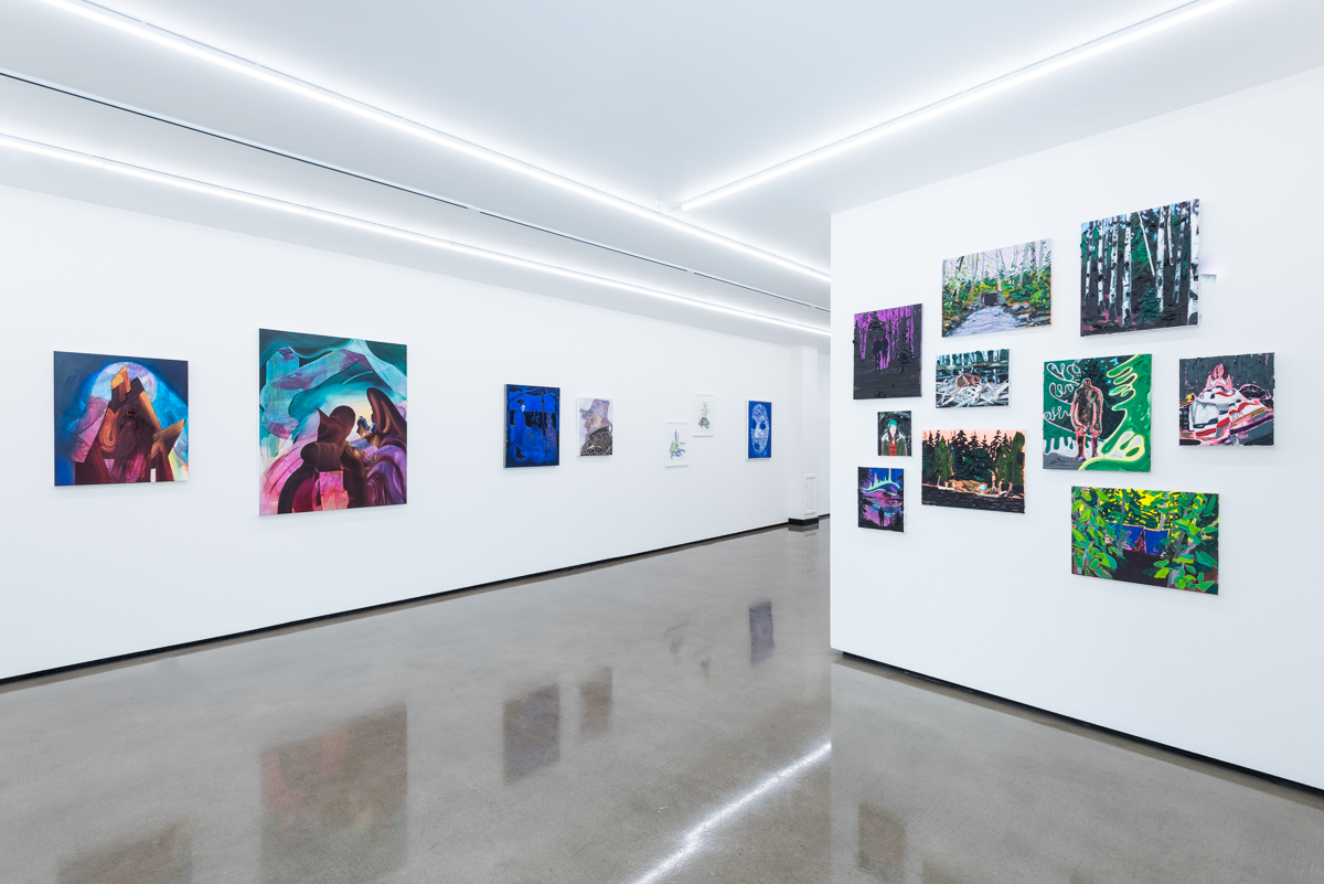
    O Canada!, an exhibition in London, UK, includes 11 artists (emerging, mid-career, and established) hailing from across the country, working across a breadth of styles, technical approaches, and mediums. Intentionally circumventing any overriding theme, O Canada! finds commonalities between these artists based solely on their heritage, raising questions as to whether there truly is some sort of collective, cultural consciousness or aesthetic tradition.

    Installation view of O Canada! at BEERS Gallery, London, 2017

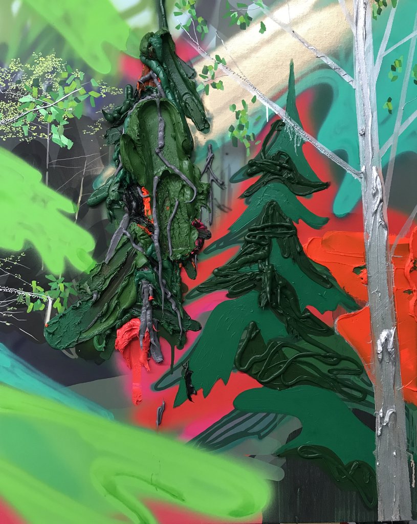
    Landscape is big in Canada ever since the Group of Seven, so it is not a surprise that so many contemporary Canadian artists, start as a landscapist or depicting images from nature. Canada is a beautiful land with wilderness largely present. Kim Dorland is one of those artists who is considered a landscapist and compared to Tom Thomson. He might paint landscapes but he is more like a city-boy, who brings the drama of a city into the otherwise peaceful landscape. The McMichael’s curator, Katarina Atanassova, called him a “Tom Thomson on acid” because of his vibrant, neon-like colors. His Painting method is very physical as he uses a lot of paint, in many layers, so much so that sometimes the work becomes almost sculptural (Portrait of a Landscape, Two Trees, 2017).

    Kim Dorland, Portrait of a Landscape (Two Trees), 2017, oil and Inkjet on canvas, 75 x 60 cm

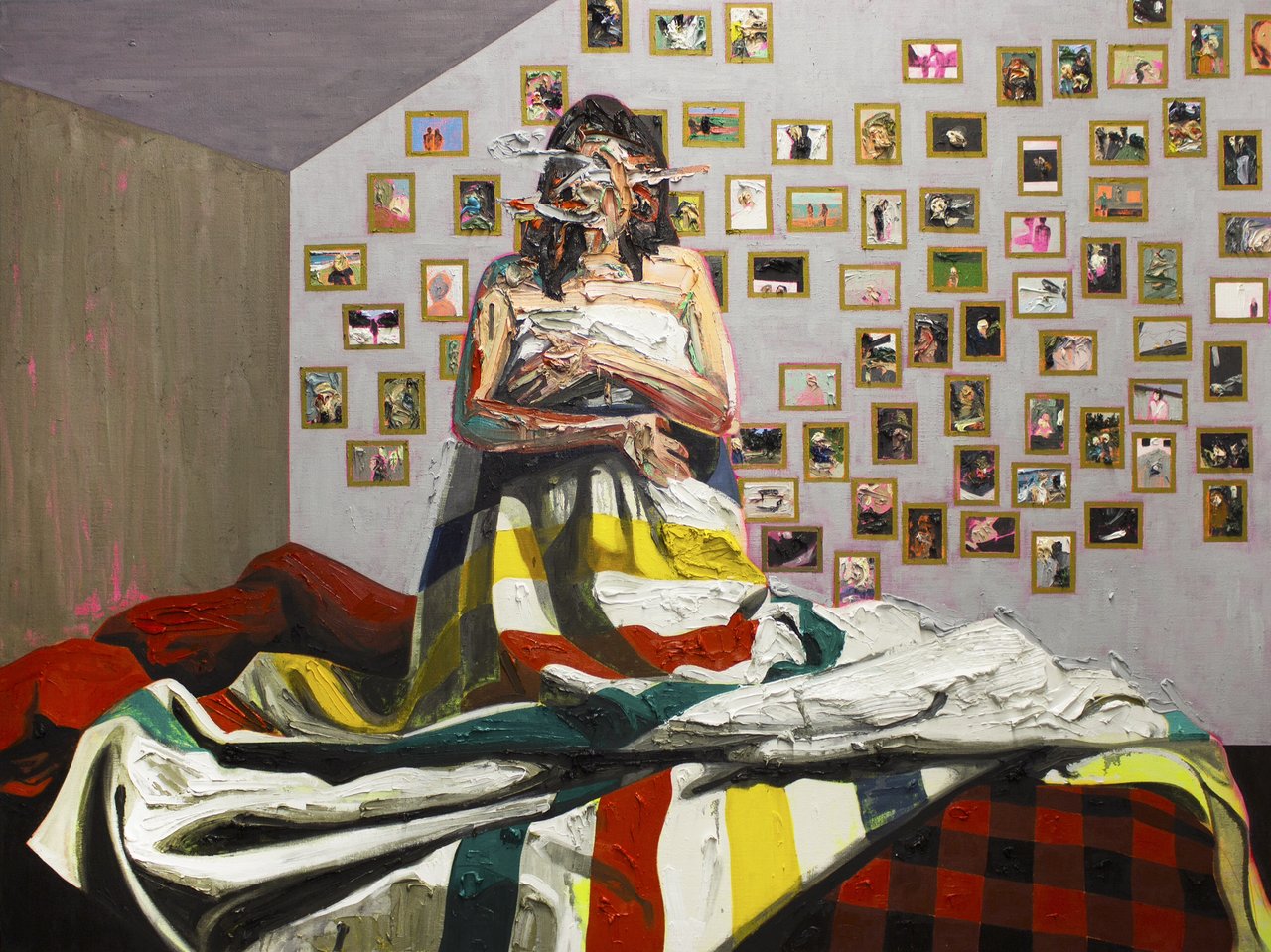
    The gallery chose his painting, Bay Blanket #3 (2014) as its poster image for the exhibition. In this work, a young woman—the artist’s wife Lori—kneels on a bed in front of a wall covered with family paraphernalia, holding a Bay blanket to cover her nakedness. Her face and arms are created from thick paint that the artist has partly removed, so it looks cratered, to erase any photographic likeness. The Bay blanket is emblematic of the North and the other walls are bare, like in a cabin. Dorland’s vision of a forest, or other parts of nature, is very different from any realistic or idealistic view. He doesn’t want to be photorealistic, as he said, even in his landscapes he wants “to tell his own story.”

    Kim Dorland, Bay Blanket # 3, 2014, oil and acrylic on linen over wood panel, 183 x 244 cm.

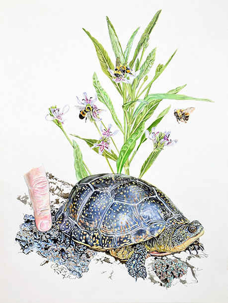
    In her watercolor composition, Livable Collaborations I (2017), Andrea Williamson depicts a turtle carrying flowers on his back that are a habitat for bees, as well as corals on its legs – showing how nature’s creatures are interrelated and dependent on each other. A human finger, on the left side of the picture, is touching the creature with loving care, bringing us, humans, into the circle of nature.

    Andrea Williamson, Livable Collaborations I, 2017, watercolour on paper, 50 x 40 cm

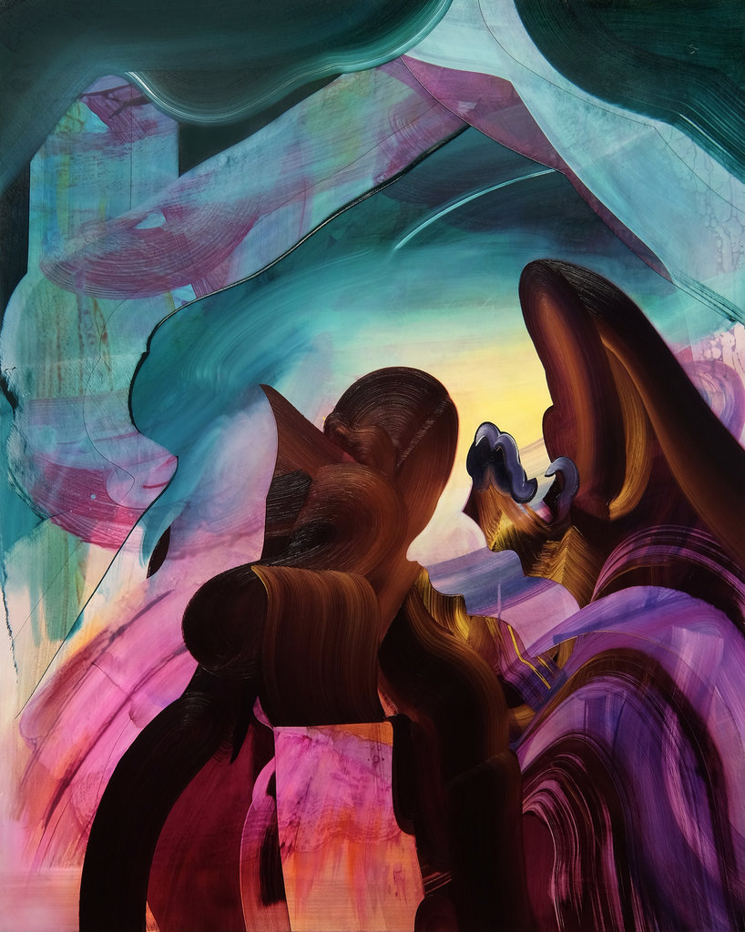
    Many of the paintings in the exhibition focus on human nature or our interactions in society. The contrasting contours and radiating lights of Erin Loree’s paintings catch our attention immediately. Her mystical compositions are abstract and somewhat realistic at the same time; I would call her method magical realism. The two figures in Sacred Time are painted with wide, energetic brushstrokes, with their earthy color rooting them into the ground. The purple stoles they wear, as well as the ribbons at the top, bridge them into mystical spheres. Together they create a temple in nature where people look toward and unite with the elements of higher realities. Loree’s pieces are charged with emotional energy and the movements grasped in time radiate light that seems to emerge from within.

    Erin Loree, Sacred Time, 2017, oil and acrylic on panel, 125 x 100 cm

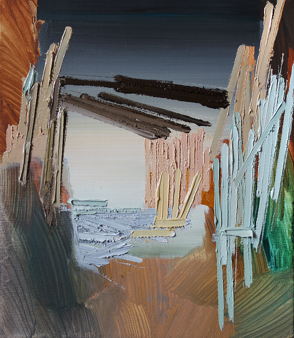
    At first sight Scott Everingham’s paintings are rigidly abstract. We focus on their captivating surfaces: the strong, textured strokes or light curtains of paint, their directions and colors, the harmony and the contrast they create. It is hard to tell what we are looking at in Laid Eyes 15; a lakeside landscape where we can enter the water through reeds, a house, a temple that is open to the sky or both. Behind the abstraction is a spontaneous but strong expression that guides us into fabricating narratives that fit the images.

    Scott Everingham, Laid Eyes 15, 2017, oil on canvas, 41 x 36 cm

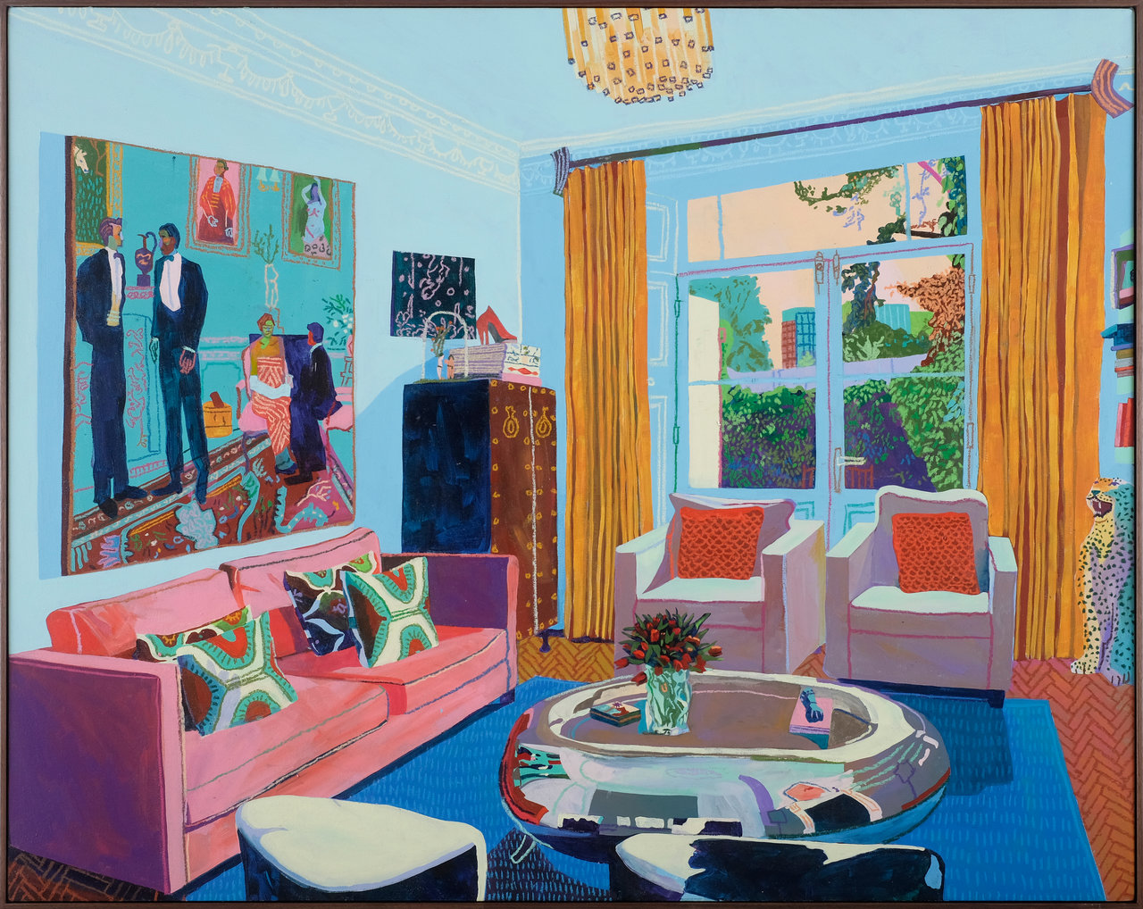
    Narrative is unmistakably the strongest element of Andy Dixon’s work. His central theme is the world of luxury and leisure. His canvases are filled with motifs of wealth: richly decorated rooms occupied by elegant lords and ladies, beauties and nudes. With those depictions, the artist could give voice to a political or social critique of the wealthy but Dixon doesn’t. He seems to enjoy that world and lately his canvases of upper class social scenes seem to feature his own previous paintings hanging on the walls in the background. He obviously borrows subject matter and stylistic elements from Matisse and Picasso, among others, creating an eclectic composition accentuated by with his use of bright colors.

    Andy Dixon, Patron’s Home (London), 2017, oil and acrylic on canvas, 135 x 105 cm

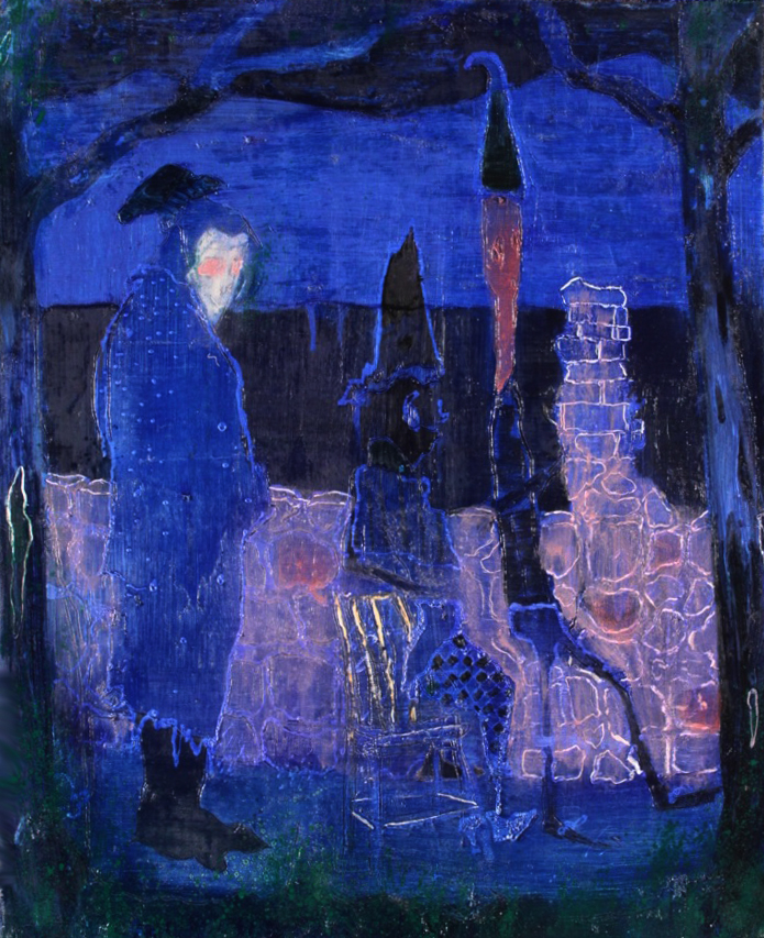
    In stark contrast with Dixon’s social butterflies, Justin Ogilvie’s canvases focus on the inner self. He tries to depict the metaphysical nature of the self in relation to others, their influences and interactions. Through the human figure, he addresses themes of intimacy between the bodies of lovers, strangers, and what he calls “the myriad of others within the self”. Ogilvie mixes realism and abstraction, and creates, through various mediums of painting and drawing, a magical, often metaphysical world.

    Justin Ogilvie, A View for a Trip’s End, 2017, oil on linen, 91 x 76 cm

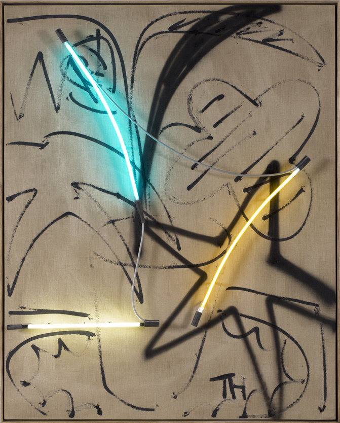
    Thrush Holmes’ pieces are very different from the others in the show. His work has been described as loud, showy, playful, vulgar, larger-than-life, and yet, simultaneously delicate, detailed and subtle. Untitled 1 is a vibrant piece of the combined motifs of a feather and a star in front of a sketchy background lighted up with yellow and blue neon tubes.

    Thrush Holmes, Untitled 1, 2017, oil and neon on linen, 150 x 120 cm

    As stated by the gallery, this exhibition is “a celebration of Canadian contemporary art internationally: asking us to consider their varied approaches and styles while offering insight into larger concepts such as land, identity, culture, and politics.” Even though the answer to Canadian identity might not be there in the gallery – it is still a wonderful way to investigate it through art.

    Emese Krunák-Hajagos

    Images are courtesy of BEERS Gallery

    *Exhibition information: O Canada! a group show including works by Fiona Ackerman | Andy Dixon | Kim Dorland | Scott Everingham | Thrush Holmes | Erin Loree | Erik Olson | Justin Ogilvie | Andrew Salgado | Andrea Williamson | Etienne Zack, July 7 – August 19, 2017, BEERS Gallery, 1 Baldwin Street, London, UK. Gallery hours: Tue – Fri, 10 – 6, Sat – Sun, 11 – 5 pm.

  • Toronto Outdoor Art Exhibition, 2017

    July 14 – 16, 2017
    Nathan Pillips Square

    Visiting the Outdoor Art Exhibition in Toronto, on Nathan Pillips Square in July, is part of my summers for the last 28 years, since I live in the city. It is almost always too hot and sometimes hard to walk because of the crowd – and this year was no exception. It’s occurred to me at first sight this Saturday that the exhibition was smaller than a few years ago. On the other hand there are new things such as the present of artists run galleries and dance performances.

    The exhibition is more balanced according to mediums this year as there are more 3D and art & craft work on display, breaking the dominance of painting. James Wardhaugh’s glass sculptures rethinking the motives of animal horns. As he said, his inspiration is coming from nature but he doesn’t want to be trapped by reality, so he is moving a step further into abstraction.

    Artist James Wardhaugh

    Kerry L. Ross, a Canadian artist who was born in Zimbabwe, focuses on the human body. Her portraits are analyzing the human existence within its psychological and social dimensions and in turn open windows into the private self. This is her third time in the outdoor exhibition, she really enjoys being part of it, talking to visitors and also sold a few pieces. Daniela Rojze moved to Canada 14 years ago from Argentina. As a child she loved to draw and was surprised that drawing is not that popular here. She started creating her sensitive, well detailed, sometimes grotesque work two years ago. This is her first time in the show, loves it and sold many pieces.

    Artist Kerry L. Ross in her booth

    Artist Daniela Rojze with her works

    You have one look at Allen Egan’s work and you are hooked. He willingly talks about his technique that uses photography as a base and Photoshop in composing his pieces before he touches them up with paint. However when it comes to their themes he is hesitant to say anything. His compositions have a strong emotional expression, filled with mystery and a suggestion of a storybook narrative – all left to the viewer to figure it out. Not a surprise that these works are very popular.

    Artist Allen Egan and his paintings

    Most of the artists are returning exhibitors. Christopher Reid Flock, who calls himself “Burnt Dirt Manipulator” on his card, is a veteran here, this is his 7th year. He is surrounded by visitors who are asking questions about his unique method that he explains enthusiastically. This is the 3rd year for Nicole Moss and she won awards with her collages both in 2015 and 2016.

    Artist Christopher Reid Flock

    Artist Nicole Moss

    White balloons turn our attention to award winner artists like Julia Hepburn (Honorable Mention 3D works) whose small sculptures, placed in glass cabinets, seem very vulnerable. Moira Ness, the winner of Emerging Artist by Emerging Curator Award, is a first time exhibitor: she applied, she got in, she won an award. Ness makes photographs in the GTA area and then, with Photoshop, she takes away the background and the light search, making them look isolated.

    Sculpture by Julia Hepburn

    Artist Moira Ness

    The presence of many young, emerging artists makes the exhibition more exiting. Helen Liene Dreifeld is currently pursuing the Artist-in-Residence program at Harbourfront Centre’s Craft & Design Studios. As a textile artist she is interested in the relations of time and space and the future of textile art. Her piece is sculpture-like but see-through, seemed to be staged in a theater setting, and further modified by spray paint. The Student Zone is back this year, now in the front, west side of the exhibition with educational institutions and young artists.

    Artist Helen Liene Dreifeld

    Sheridan College, Bachelor of Craft and Design

    Artist Heejung Shin in front of her large canvas that depicts human bodies in motion

    In the middle of the exhibition there are sculptures belonging to the Brain Project. Artists from around the world transform blank brain sculptures into beautiful, energetic and thought-provoking pieces of art.

    Sculptures form the Brain Project with Gina Goldfrey’s sculpture, Luminescent

    There is a lot to see in the exhibition, all the artists are very friendly and willing to talk about their work. It is an excellent opportunity to buy an original piece from the artist and many of the visitors were living with an artwork.

    Visitor with Michele Crockett diptych, Then and There, image transfer on birch panels

    Layne Verbeek Glass

    Lucie Kovarova’s booth

    Text and photo: Emese Krunák-Hajagos