Author: artoronto

  • The Sex Show 2018 / Gallery 1313

    The definition of sex and sexuality has always been up for discussion. Gallery 1313 is currently presenting its annual installation of The Sex Show; a display of pieces exploring the theme of sex and sexuality, curated by Phil Anderson, the director of the gallery. Artworks are presented in various forms and mediums, including photography, collage, painting, textile and mixed media.
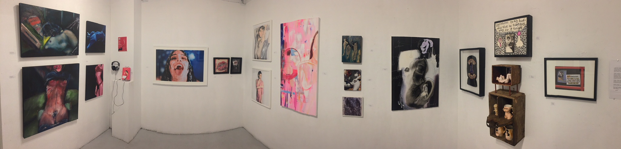
    Installation view of The Sex Show at Gallery 1313, 2018. Photo: Nathan Flint

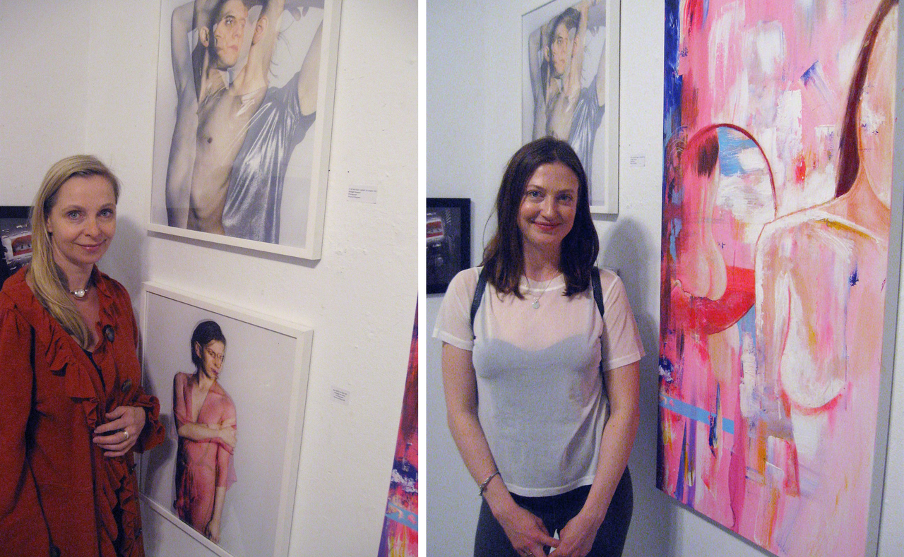
    At the opening event, Andrea Werhun, the writer of Modern Whore, read from the book, along with the display of an original photographic print from its illustrations, titled The End. An audio installation of the reading is placed in the exhibition so visitors can listen to it later on, using headphones. Modern Whore is a memoir of the time Werhun spent as a sex worker in Toronto, containing 27 short stories about sexuality, empowerment, freedom and whoredom, accompanied by 60 portraits taken by filmmaker Nicole Bazuin.
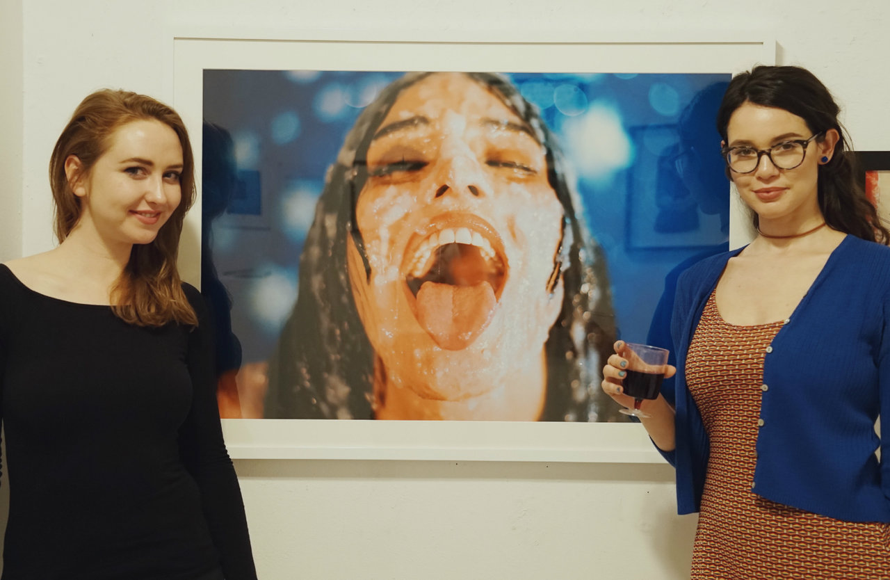
    Writer Andrea Werhun (right) and photographer Nicole Bazuin (left) in front of The End. Photo: Iris Wu

    What defines as sexual and erotic? The art pieces of The Sex Show approach the topic of sex and sexuality in many ways. Luna and Passion are two acrylic paintings composed by Zabrina Szymanski portraying a female body in a poetic and anonymous way. Inspired by Pop Art and Street Art, this contemporary series capture the insights of sexuality through highly stylized female bodies. Szymanski intentionally depicted these figures with no faces, allowing the viewers to indulge in the beauty of bodies without feeling the guilt of a voyeur. Hooley McLaughlin also portrays a headless woman torso in the process of undressing, that makes it look even more erotic.
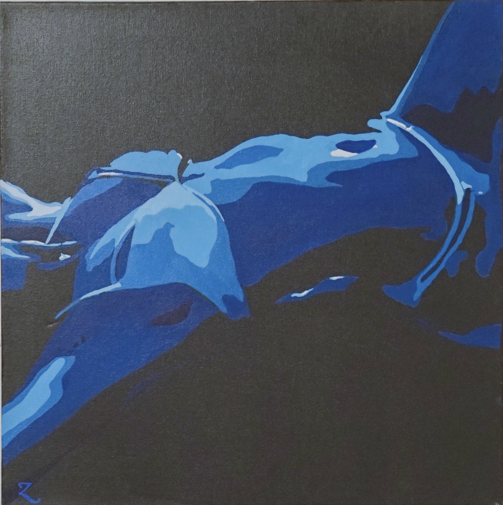
    Zabrina Szymanski, Luna. Photo: Iris Wu
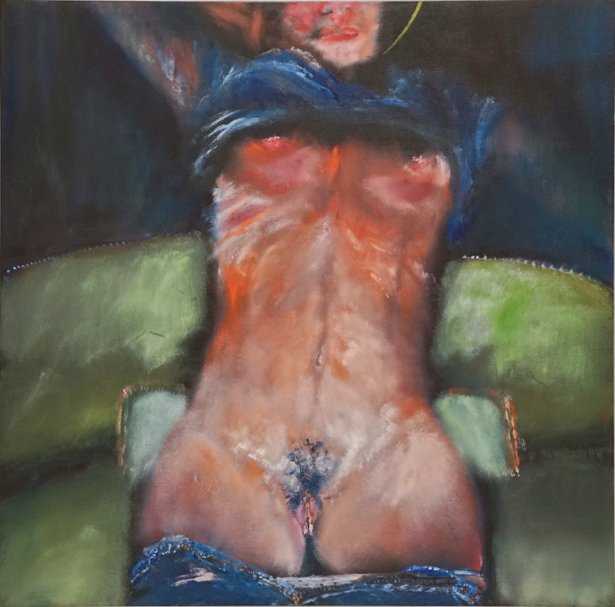
    Painting by Hooley McLaughlin. Photo: Iris Wu

    Many more works depict the beauty of the human body: male, female or both: Phillipa Hajdu, Nora House, Shelagh Howard, some by using a sense of humor like Norm Barney or a little surrealistic touch such as Mona Hedayati. Sara Arasteh’s work, Swallowing my Femininity is outstanding by its semi-abstract approach.
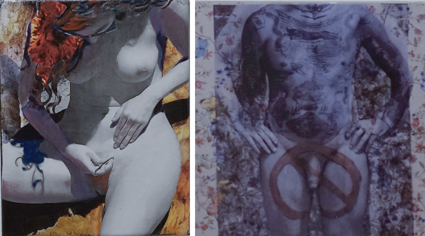
    Works by Phillipa Hajdu. Photo: Iris Wu
    Shelagh Howard with her paintings and Nora House in front of her work, Selfie. Photo: Phil Anderson
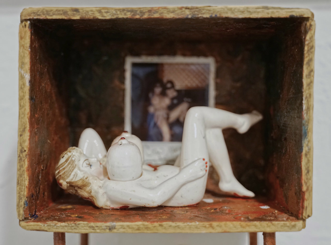
    Norm Barney, Babes. Photo: Iris Wu
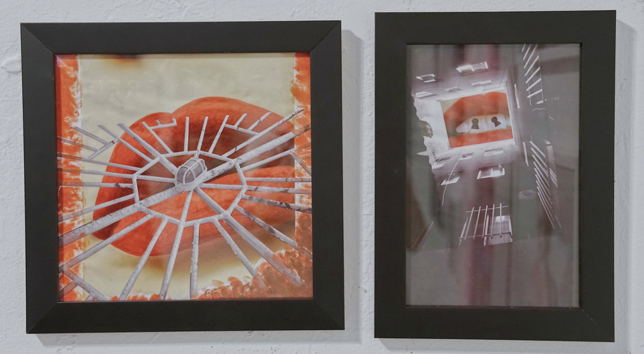
    Mona Hedayati, Fellatio and Locked up. Photo: Iris Wu
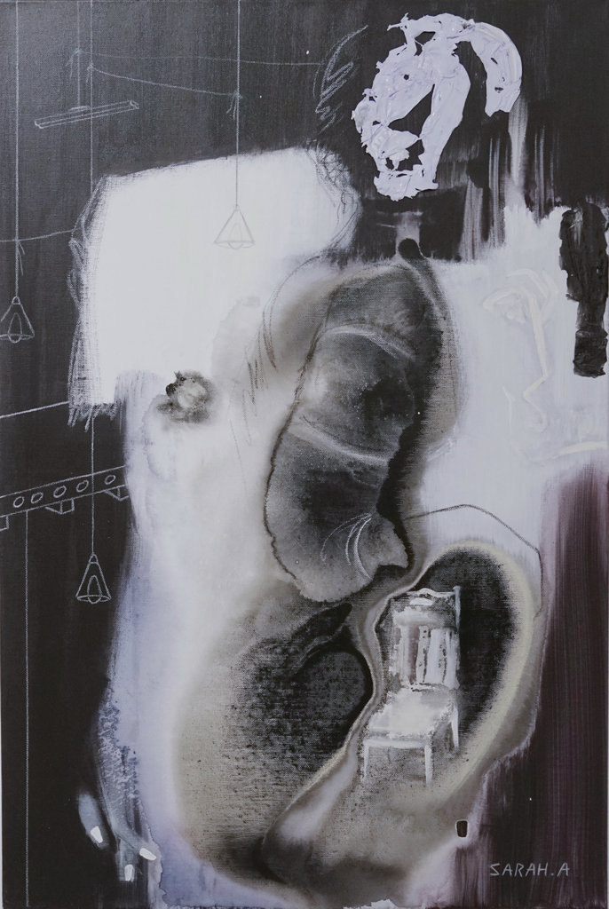
    Sara Arasteh, Swallowing my Femininity. Photo: Iris Wu

    Emma Chadwick, who has been working on digital collage for 15 years, has her newly finished piece Love Letters to My Husband on display. Her work is a series of simple texted animation line drawings that she sent to her partner to convey messages without using photos or the usual love icons. As she says, “There was the challenge of the medium, because you can’t erase, so you have to get the image right at the first time.” It supposed to present the “erotic moment” in a long-term relationship and also comments on the distance that can happen – and how to close the gap by texting.
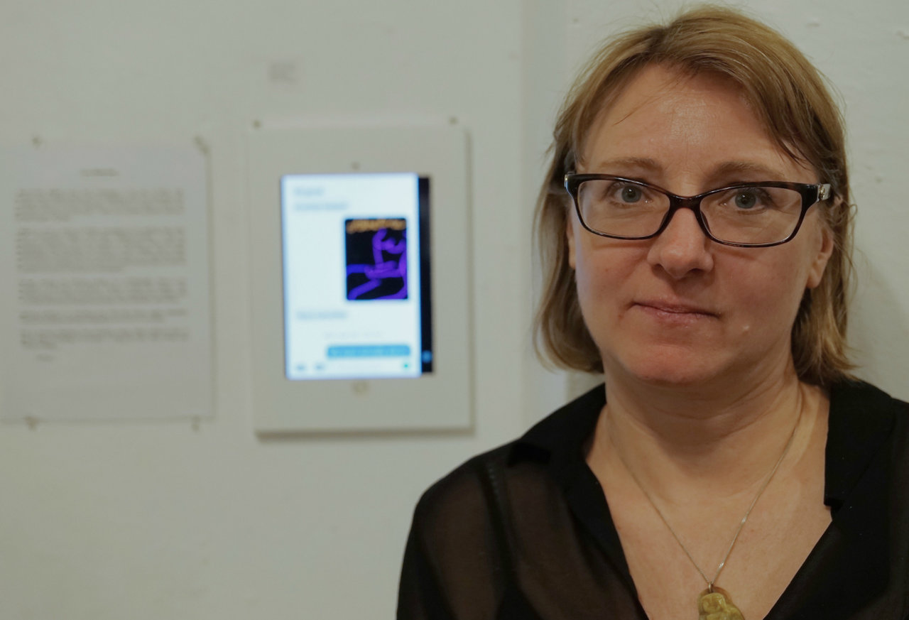
    Emma Chadwick, Love Letters to My Husband. Photo: Iris Wu
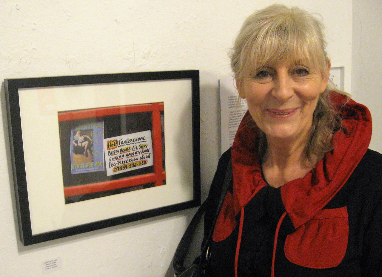
    Pauline Dalby with her work. Photo: Phil Anderson

    This Sex Show in Gallery 1313’s Project Gallery is an “exciting” one, and as attendees said at the opening reception, stronger than the previous one, definitely worthy of a visit.

    Iris Wu

    *Exhibition information: February 14 -25, 2018, Gallery 1313 Project Gallery, 1313 Queen Street West, Toronto. Gallery hours: Wed – Sun 1 – 6 pm.
  • Kathryn Bemrose / A Manner of Speaking

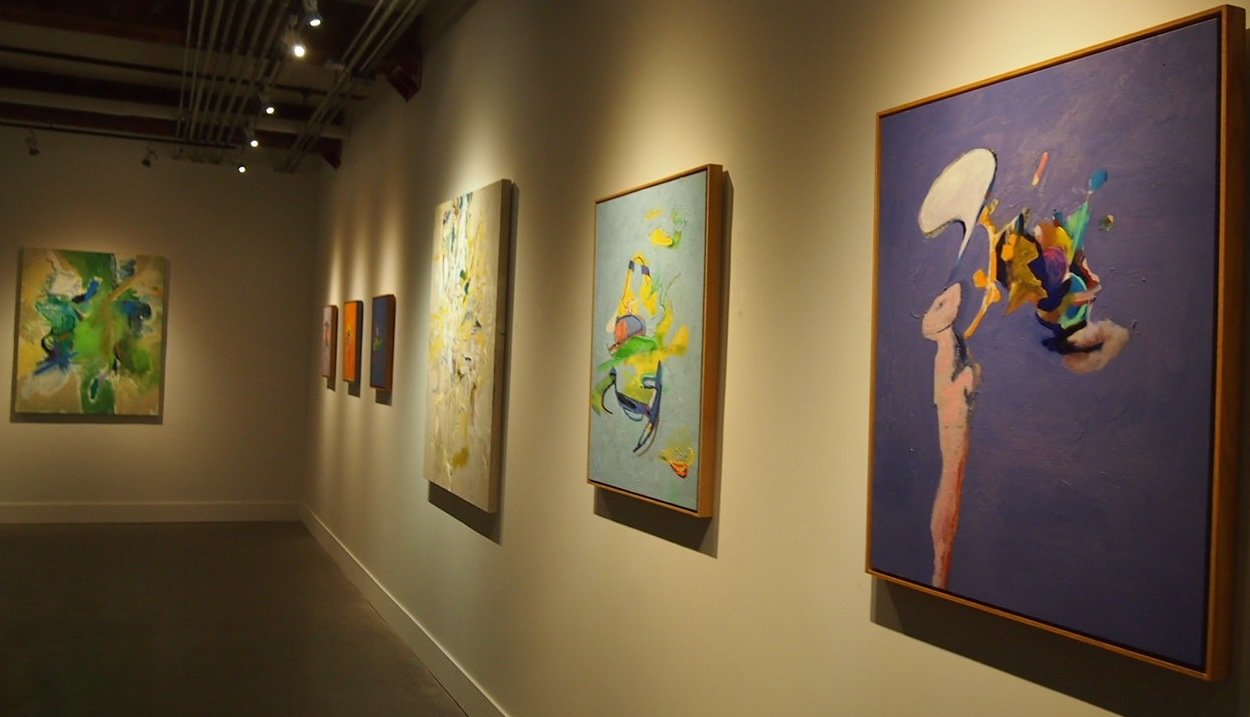
    Kathryn Bemrose is a Toronto based artist, previously represented by Christopher Cutts and De Luca Galleries. In her recent solo show at Yumart Gallery she continues to display her love to play with colors and make them complement each other. Looking at Bemrose’s canvases is a great pleasure; they are vibrant when studied separately, yet harmonious together. She loves to explore and experiment the technicalities of painting, the color choices, the brushwork. She states on the gallery’s website, “A completed composition always leaves a question. And so I go to the next painting in answering the last one however it inevitably comes up with a new question. Before you know it, there is a body of work asking and answering ad infinitum. The last painting always leaves an unanswered question.”

    Installation view of Kathryn Bemrose, A Manner of Speaking at Yumart, 2017. Photo: Summer Sun

    Bemrose says that her works are not about emotions, emotions just come into the picture with the creation. China Doll is the only exception. She once watched a documentary about animal fur production in China and the scene of ripping fur off a live animal has stayed with her for a very long time – so she painted that moment. Without her explanation, I could not have guessed the story. After Bemrose realized how much people liked the painting because of its colors, she said, it still kept its political message, but only for her.

    Kathryn Bemrose, China Doll, 2017 oil on panel, 32 x 26 in. Courtesy of Yumart

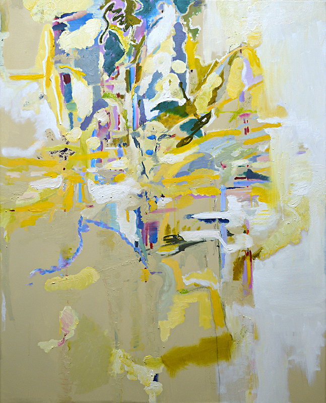
    On one of the larger pieces, titled Promise, hues of light blue and stronger yellow are moving in all directions, creating spatial depth with colors. It is a very warm piece to look at, also a beautiful one that complement the other, more darker ones, with the lightness radiating from it. The artist said that she likes the way the show is curated since it balances the darker and lighter paintings very well.

    Kathryn Bemrose, Promise, 2014 oil on canvas, 50 x 40 in. Courtesy of Yumart

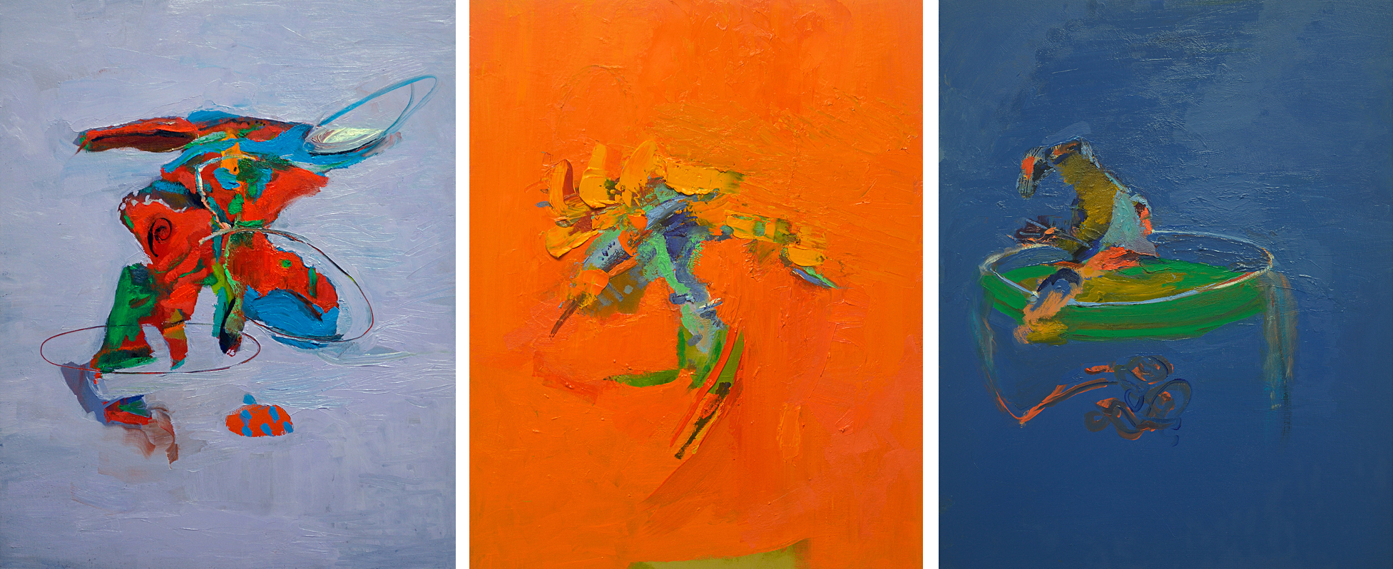
    The smaller purple, orange and blue paintings in the corner of the gallery are separate pieces and as Bemrose said, each piece has its own voice. Yet, to me, they look surprisingly well when placed next to each other. It seems as if the artist has purposely chosen complementary colors to form a series. As she said, she never paints with a plan, the colors just happen. Since her thinking is never linear, she wouldn’t be able to tell how a painting would look when finished. The result sometimes is surprising even for her. The colors she uses are often very distinctive, and she leaves white spaces in between them that allows her to create a line without actually drawing a line.

    Kathryn Bemrose, Kennikins, 2018 oil on panel, 20 x 16 in (left), Ode to Coughtry, 2018 oil on panel, 20 x 16 in (middle) and A Turn of Phrase, 2018 oil on panel, 20 x 16 in (right). Courtesy of Yumart

    In the show, A Manner of Speaking, Bemrose is the one who speaks, letting us know her passion of painting. I found her compositions and colors delightful and felt light and happy after leaving the gallery.

    Summer Sun

    *Exhibition information: February 3 – 24, 2018, Yumart Gallery, 401 Richmond Street West Suite B20, Toronto. Gallery Hours: Tue -Sat, 12 – 6 pm.

  • Steven Beckly: Meirenyu at Daniel Faria

    Ocean; body; delicate; glistening. These are the words I wrote down as I walked through Meirenyu. I am seduced by the shine and the stillness of Meirenyu’s poiesis. Can one create a real being out of a fictional myth? Steven Beckly’s poetic investigation contemplates this question.

    Just like the mermaid, Beckly’s works are elusive and hauntingly stunning. One way to summarize the works would be to say it is a didactic representation of the legendary aquatic creature. However it is much more than that. I opt to evade simple interpretation, but the complexity of this collection is one that is hard for words. One simply has to experience.

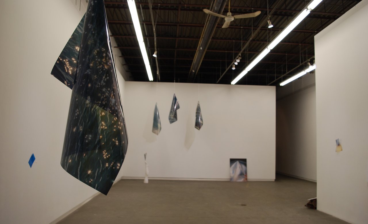
    Installation view of Steven Beckly: Meirenyu at Daniel Faria. Photo: Sunny Kim

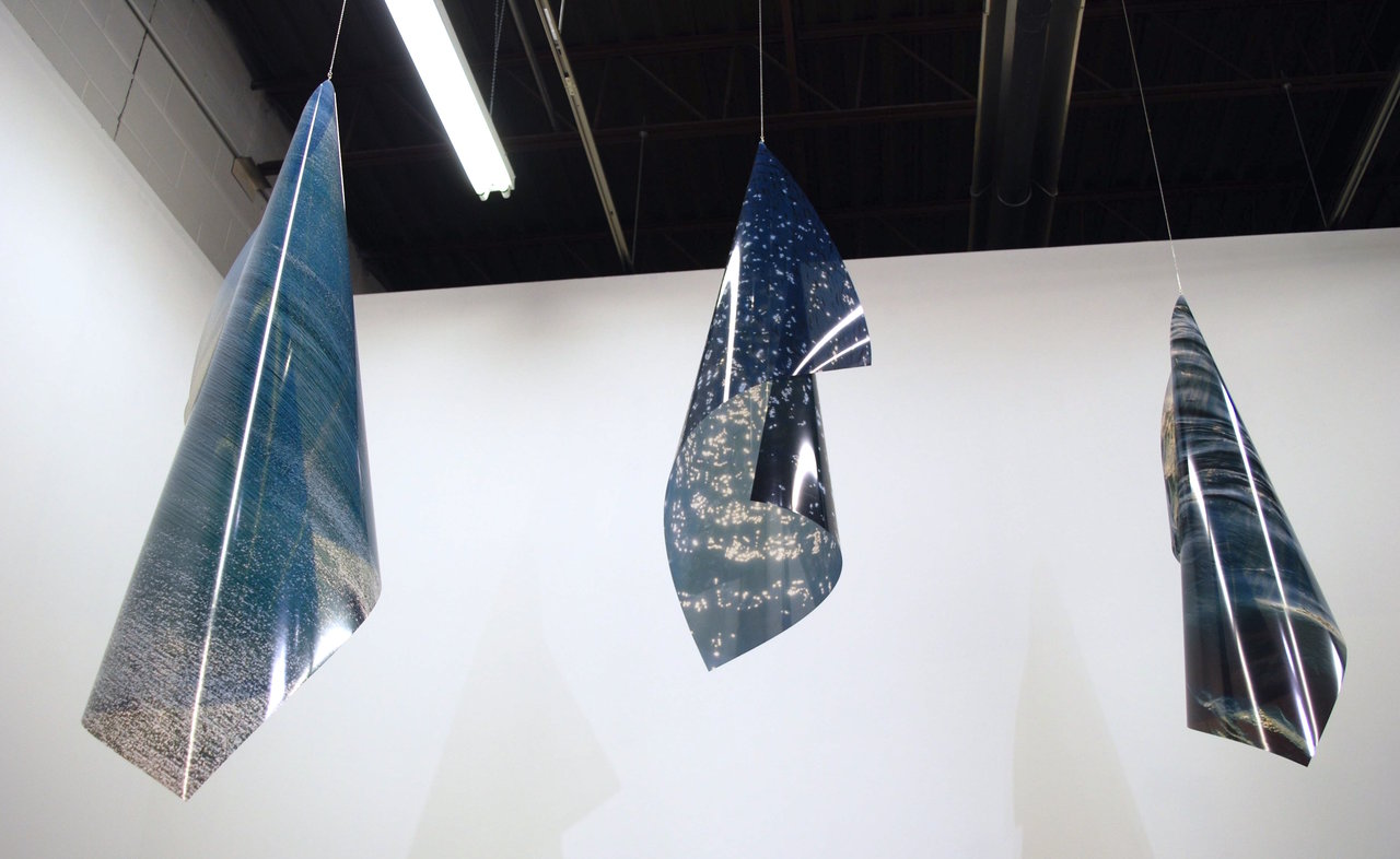
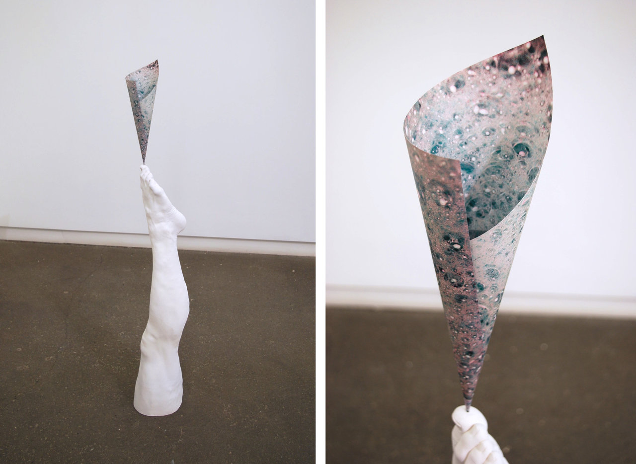
    Curation is dynamic. There are pieces hanging from the ceiling, placed on the floor, very low on the wall, leaning against the wall, etc. The transparency and tissue papers Beckly uses transform from two-dimensional to three. Transparencies in Blue Dancers are left to take on their own shapes as it hangs attached to a thin chain on one corner. They curl over naturally and mimics the ocean wave imagery printed on the surfaces. The natural cone-like shape they take on is replicated in Sea Elegy, a plaster cast leg jutting out of the floor. On the tip of the big toe is a small transparency rolled into a cone. The transparency and the leg attempt to fuse together, transforming the human leg into a new creature. Part human and part ocean.

    Blue Dancers, 2017-18, colour Transparency and silver chain. Photo: Sunny Kim

    Sea Elegy, 2017-18, folded photograph and plaster leg, dimensions variable (left) and detail (right). Photo: Sunny Kim

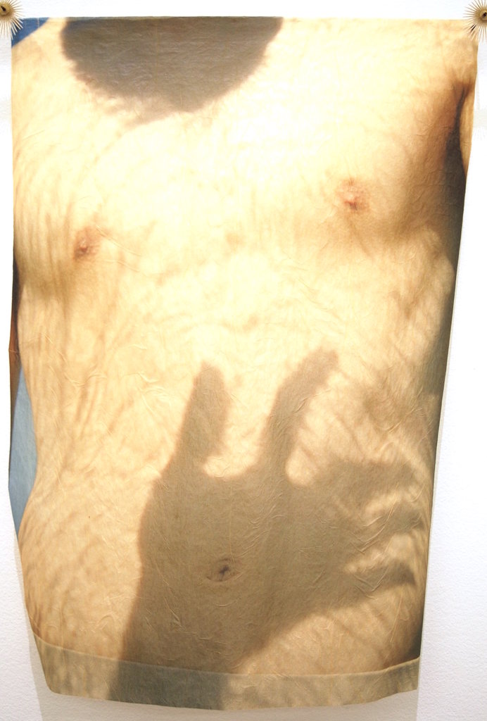
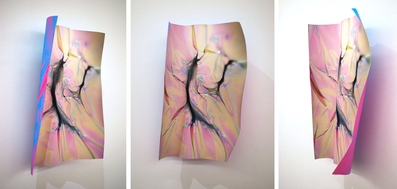
    Trans Form and Soft Tissue is another attempt at this transfusion. In Trans Form, the photograph is crumpled, becoming a piece of a shiny mermaid scale. Beside it is Soft Tissue, a masculine torso printed on a gentle tissue paper. Soft Tissue is also sculptural, but softer and ‘fleshier’. Presented side by side, indexicalities of both pieces intermingle and produce a cohesive symbol; of the poetic, fluidity, and longing.

    Soft Tissue, 2017, inkjet on tissue, sea urchin spines and plastic sequins, 22 x 16 inches. Photo: Sunny Kim

    Trans Form, 2017, folded photograph, approx 21 x 14.5 x 2.5 inches. 3 views: left, front and right. Photo: Sunny Kim

    In the back room, light is added as an extra effect. Light passes through the curved transparency and projects the image onto the wall behind it. Like a hologram, Untitled (O) creates a doubling effect and mediates the relationship between the physical and its imitation.

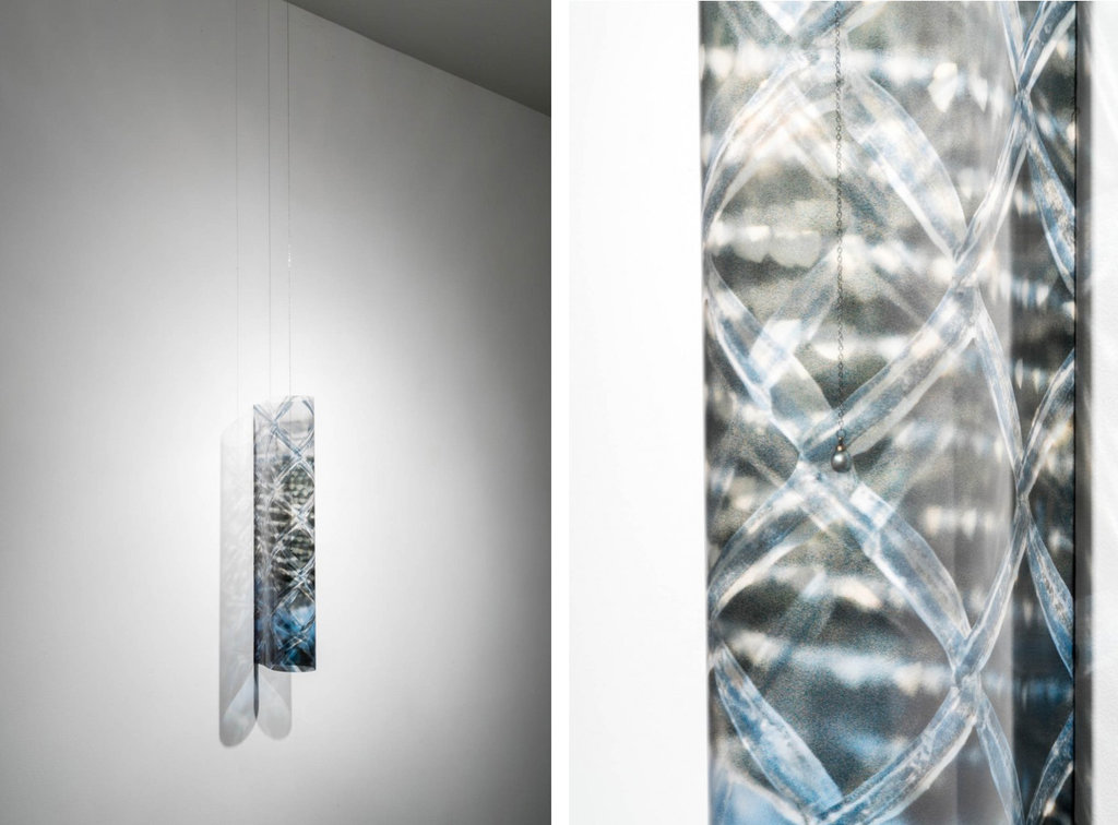
    Pearl Harvest, 2017, folded transparency, silver chain and pearl, dimensions variable (left) and detail (right). Courtesy of Daniel Faria Gallery

    Beyond the back room is the project room, where Pearl Harvest exists quietly and peacefully. It is alone in the room, meditating. It is a transparency with fishing net imagery, almost curved into a cylinder. The transparency hangs at eye level vertically on the wall, with two light sources making two shadows on each side of the piece. From the ceiling hangs a long thin chain with a pearl hanging at the end of it, and this pearl floats in the centre of the curved transparency. The stillness, the verticality, and the interweaved lights make Pearl Harvest breathtaking. It is a stunning contemplation of Beckly’s thesis.

    Meirenyu closes on February 24th and it is a must-see exhibition of the season. The imagery this exhibition provokes will stay within you, illuminating inside like the pearl in Pearl Harvest.

    Sunny Kim

    *Exhibition information: January 18 – March 10, 2018, Daniel Faria Gallery, 188 St. Helen’s Avenue, Toronto. Gallery Hours: Tue – Fri, 11 – 6; Sat, 10 – 6 pm.

  • Sarah Cale: Potpourri / Clint Roenisch Gallery

    Even veteran painters will admit that there are better smelling things than paint. Or worse – old paint. In her solo show, Potpourri, however, Sarah Cale embraces ‘mold’ and the scrapes of paint that gets left over on the palette. Paired beautifully with a Sylvia Plath poem, Cale re-imagines the concept of still life and traditional paint application.

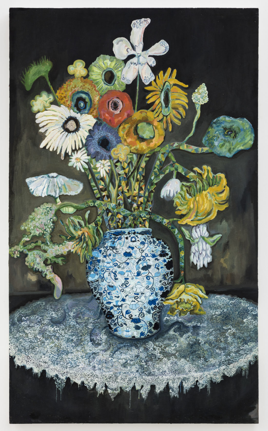
    Cut Flowers That Weep, 2009, adhered acrylic and oil on linen, 5 x 3 feet

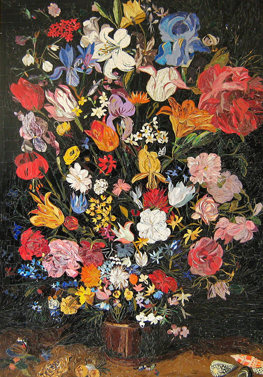
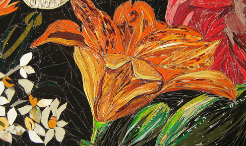
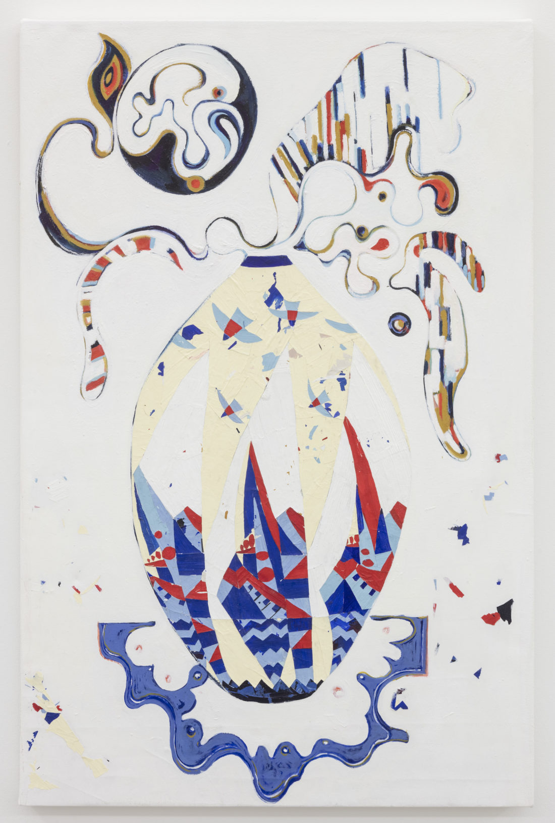
    Works in Potpourri reminds one of an obsessive artist. Paintings and collages are overworked, meticulous, layered, and tedious. There is a departure from Cale’s older works, two of which are featured along with her new pieces. Older pieces are more traditional still life paintings, with an excessive attention to detail. In Cut Flowers that Weep, every single detail of the decorative lace and the vase are painstakingly rendered. My Vertigo, Cale’s piece from 2010, is an awe-inspiring collage. Commercial papers are cut into million long shard-like shapes and assembled. Flowers pop off the surface, the long shards creating waves and strokes of vibrant colours that engulf the viewers.

    My Vertigo, 2010, commercial packaging on board, 59 x 40 inches (top) and detail (bottom)

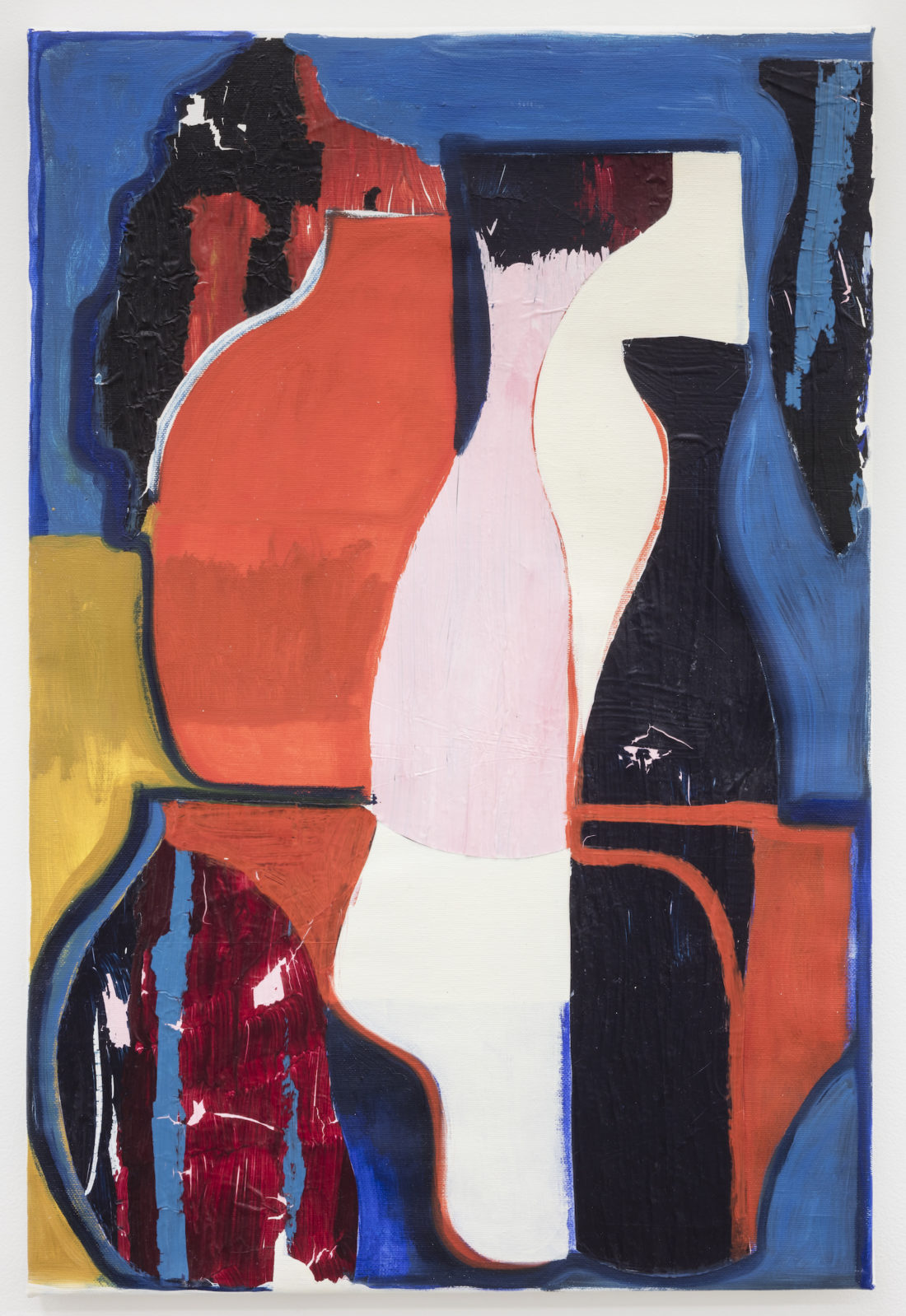
    Her 2017 pieces, like Amorphous Time 3, have grown into abstraction. Using shapes of vases as the basis, organic forms curve over and into each other on the canvas. Paint is applied more fluidly, and strokes are larger – more confident.

    Amorphous Time 3,  2017, adhered acrylic and oil on linen, 22.5 x 17 inches

    Cale’s paint application start to get very experimental with Sphinx. Paint is used wet for the organic shapes coming out of the vase, but dry paint flakes are used for the rest of the painting. These flakes are used in many different ways: to create birds, patterns, as well as free-floating shapes in the background. Bits of paint flies in the background, sharply edged just like the collage pieces from My Vertigo. It is as if those collage pieces – each of which used to have its own place – finally broke free and exploded onto the new canvases. It is heavily worked over, with many layers of both wet and dry paint. Nonetheless, there is a sense of liberation, as flowers flow over and paint flies around with its own will.

    Sphinx, 2017, adhered acrylic and oil on linen, 40.5 x 26.5 inches

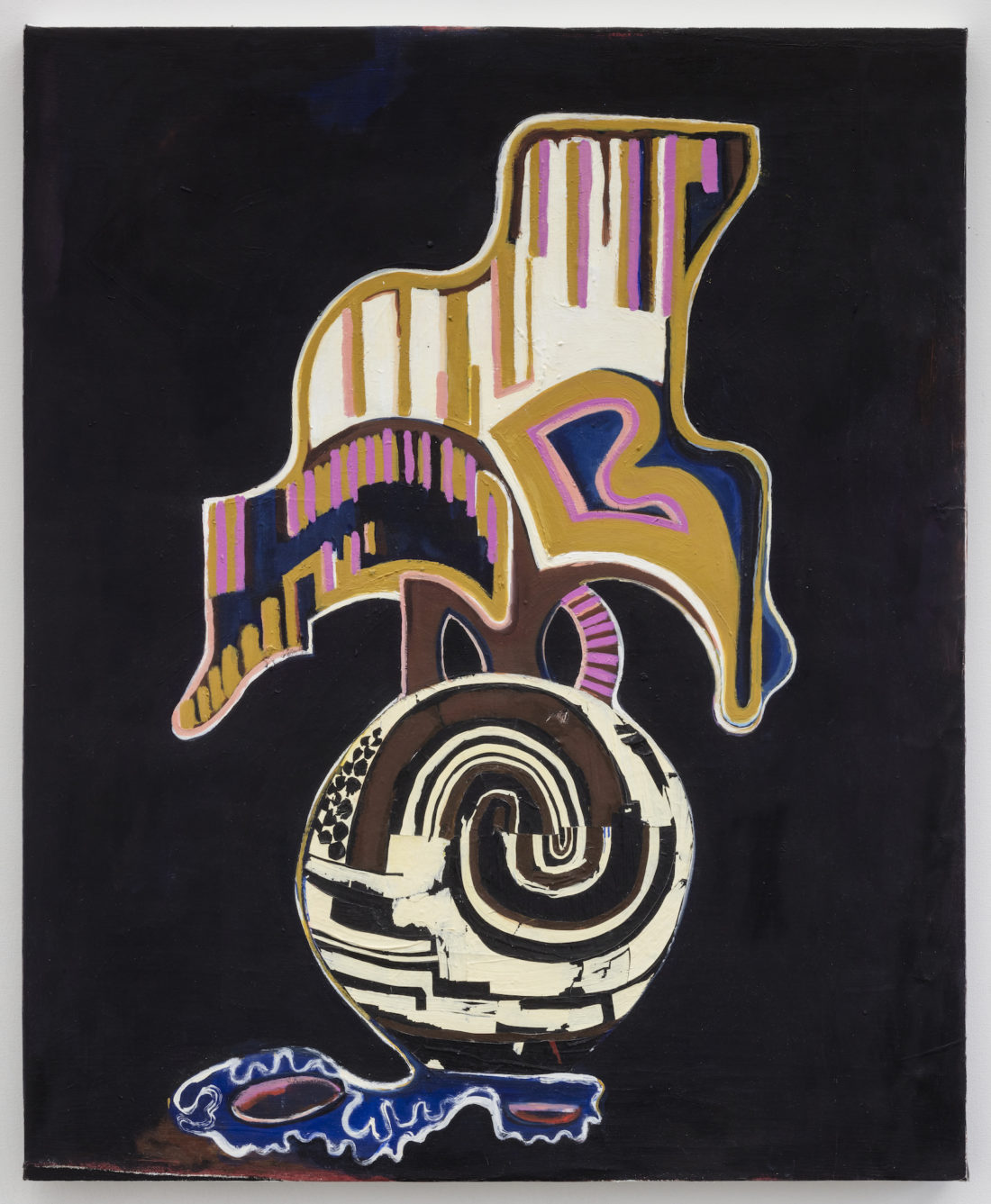
    Endora, which is the first painting of the show, is the biggest departure from Cale’s old works. It has minimal colours, black background, and abstraction. Polar opposite from Cut Flowers that Weep on the other side of the wall. Looking at this pairing, visitors are directed through the space with intentionality.

    Endora, 2017, adhered acrylic and oil on linen, 30 x 24 inches

    From cozy still life to contemporary abstraction: how more abstract and more experimental will Cale’s pieces become in another seven years?

    Sunny Kim

    Images are courtesy of Clint Roenisch Gallery, photo credit: Toni Hafkenscheid

    *Exhibition information: January 11 – February, 24, 2018, Clint Roenisch Gallery, 190 St Helens Avenue, Toronto. Gallery hours: Wed – Sat, 12 – 6 p.m.

  • Asma Sultana: Constellationscape / Gallery 1313

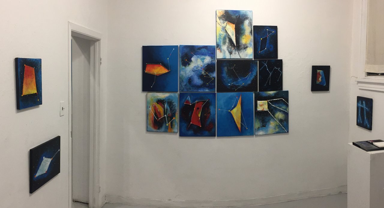
    Constellationscape: A Star-Odyssey in Asma Sultana’s paintings

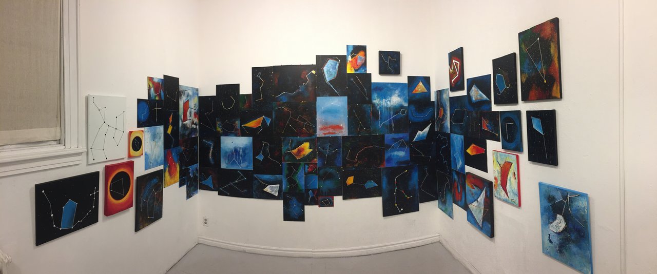
    Inspired by astronomers, astrologists and the very stars they study, Asma Sultana takes a voyage into space to explore the numerous constellations in our night sky using craft rather than spacecraft. Like entering into a planetarium, Sultana’s solo exhibition is a mesmerizing experience of cosmic sublime.

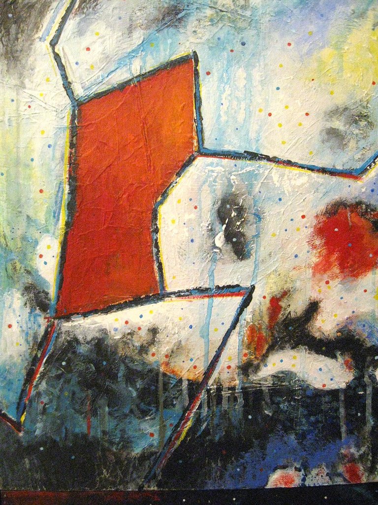
    Utilizing a salon style hanging arrangement, dozens of colourful acrylic paintings in an assortment of sizes evoke the impression of a celestial star map wrapped around the gallery walls. Panels range in dimension and material, some painted flat on canvas while others protrude on wood block. The high-saturated primary colours painted and splattered on the dark atmospheric backgrounds create vibrant bursts against the ominous depth of infinite space.

    The viewer is immediately transported to nostalgic memories of grade school science class, stargazing on childhood camping trips and bedtime stories from Greek mythology to Galileo and first glances through a telescope. While you may have learned a handful of star patterns growing up, Sultana has taken on the daunting task to learn and paint all 88 constellations. This collection of work is a departure from Sultana’s usual art practice. Derived purely from a passion for the stars and the histories of storytelling bound to them, the artist has taken up painting once again as both means of production and expressive, therapeutic release.

    Like in any great myth or folk tale, there is a moral behind Sultana’s body of work: just as the great celestial bodies are slowly putting more distance between them – we too are drifting away from nature and each other. Instead of belonging to our local community we embrace individual grandeur, favouring self-absorbed activities and creating barriers in order to be excluded. Entering the gallery one can’t help to feel minuscule in the vastness of space, that reminds us that everyone in our lives, regardless of who or what they are, connected, as we all share the tiny pale blue dot called Earth, our home.

    Text and photo: Nathan Flint

    *Exhibition information: February 14 – 25, 2018, Gallery 1313 Cell Gallery, 1313 Queen Street West, Toronto. Gallery hours: Wed – Sun 1 – 6 pm.
     

  • Polari at Robert Kananaj Gallery

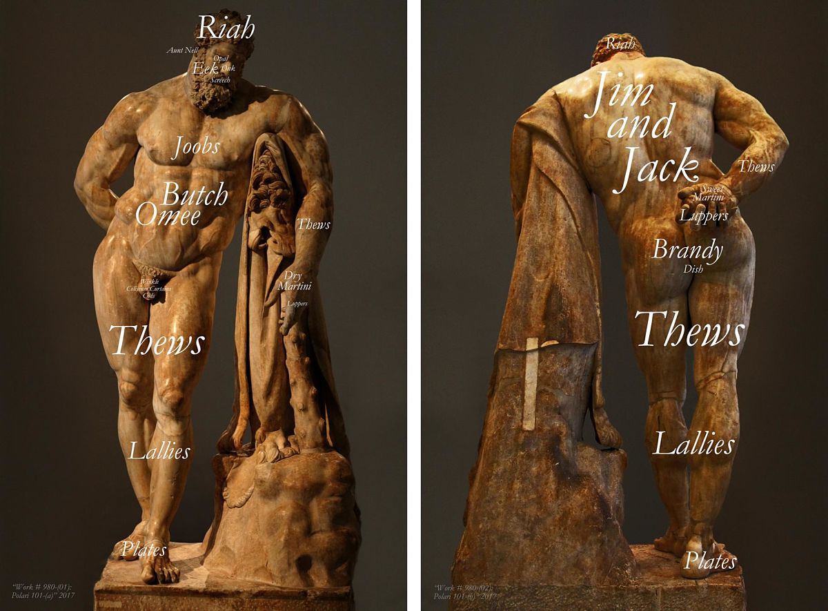
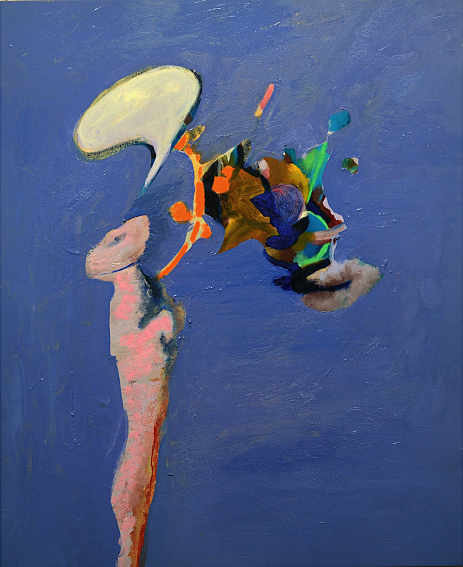
    Recognized by the United Nations as a language threatened with extinction, Polari was a secret form of communication created in the 1930s by a certain class of gay men in Lon-don at a time when concentration camps were being set up elsewhere. Quentin Crisp was perhaps the most famous speaker of this amalgam of lingua franca, Italian, Romany, rhym-ing slang, and back-slang, and it allowed initiates the protection to speak freely in an envi-ronment fraught with danger. And like Art-speak, Polari was both a weapon and a shield. At its height in 1950s and 1960s, Polari was a shield because it protected the speaker from real danger by being unintelligible (in the similar way that art-speak is about saving-face by talking bullshit to cover-up a lack of ideas); and it’s a weapon in its very audacity and ag-gression. To quote Paul Butler, author of Polari: The Lost Language of Gay Men, this argot al-lowed “people of a shared identity to recognize and communicate with each other [and] created both an identity and the alternative society that housed them; but by the 1970s it had come be viewed as trivializing. However, in the 1990s there was a revival of interest in Polari. It still served to create an alternative view of reality, but it is an alternative view of historical reality – history from the point of view of gay men.” At present, there is an inter-national effort the assemble (and expand) a complete lexicon of Polari, and given there are storm clouds on the horizon, there is something subversive and potentially revolutionary in the act of possessing a secret form of communication. Its knowledge becomes a form of power – the power to speak (and plot) openly in the face of shifting political winds . . . If our collective gay history has taught us anything, it is that our present state of grace can, and probably will at some point, abruptly come to an end. It is a work that is both funny and frightening; both sexy and serene; and one that wallows in both its superficiality and deeply subversive intellectualism that at the same time pays tribute to those forbears with nerves of steel so tough that their confrontational stance demanded a grudging respect. In “Work # 980: Polari 101 (a & b)” the Polari-speak words for various body parts are splayed across the Farnese Hercules – art history’s all-time he-man. The provocation is identical to the strategy employed for L.H.O.O.Q. (colloquially “she’s so horny”) – neutralizing our admiration for the Mona Lisa’s aura of greatness by directing our attention toward her base, corporeal desire. As employed here, the aura surrounding the statue is stripped away, reducing him to nothing more than the object of our lustful glances . . .

    Bruce Eves

    *Exhibition information: Bruce Eves, Polari is on display at Robert Kananaj Gallery,172 St Helens Avenue, Toronto. Gallery hours: Tue – Sat, 11 – 6 p.m.

  • Kudos IV

    Opening Reception / Artist Talks: January 20, 2018, 2 – 4 pm.

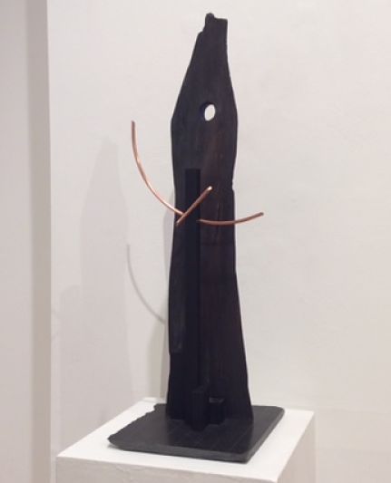
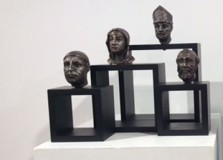
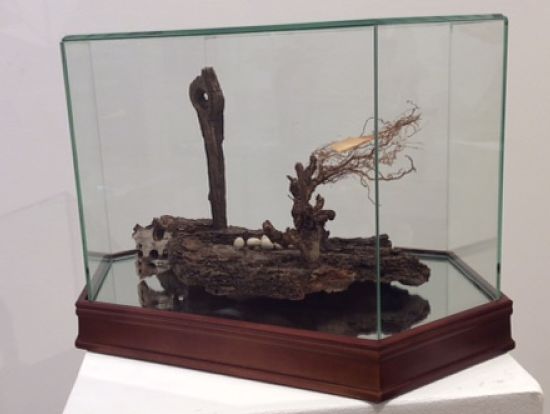
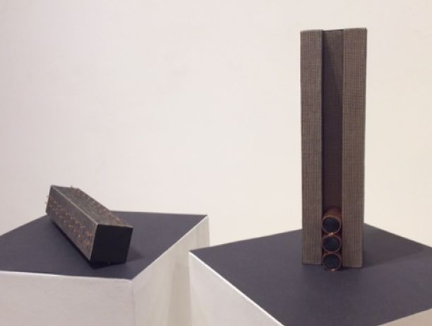
    The Canadian Sculpture Centre kicked off the New Year with launching of their Kudos IV exhibition on January 18. The show was organized primarily as an expression of gratitude to the patrons, volunteers and artists of the Sculptors Society of Canada; hence the title ‘kudos’ which according to the Oxford Dictionary is the Greek term for ‘praise.’

    Each creation at the Canadian Sculpture Centre’s Kudos IV stood out in their own unique way. Each artist present spoke about how their pieces developed both as individual work and as part of their oeuvres. Many artists delved into the process in which their work came into life, feeling strongly that their original thoughts went through stages of changes.The attendees of the opening got to hear about the sources of inspirations and be able to converse with the artists about their thought while processing those pieces.

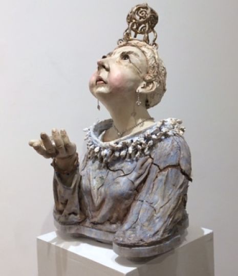
    Marlene Kawalez,  Queen V, clay, mixed-media

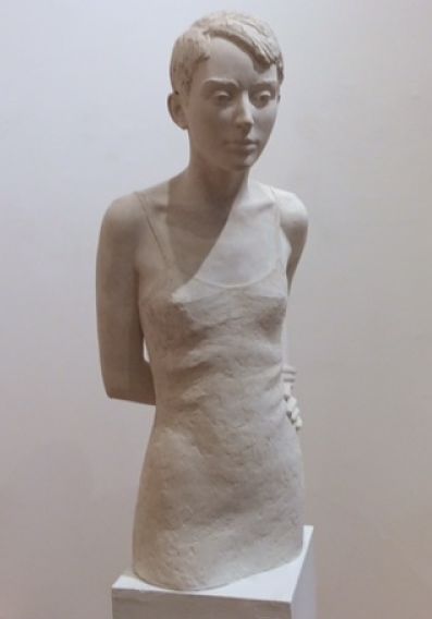
    Peter Shoebridge, Pause, ceramic

    Edward Falkenberg, The Plaza at 2 am, mixed-media

    Camie Geary-Martin, St. Thomas Aquinas, St. Clare of Assisi, St. Peter, St. Giovenale, bronze, wood

    Dina Torrans, Take Another Look, mixed-media

    Judi Michelle Young, Copper Tips & Copper / Tower, wood, anodized aluminum, copper

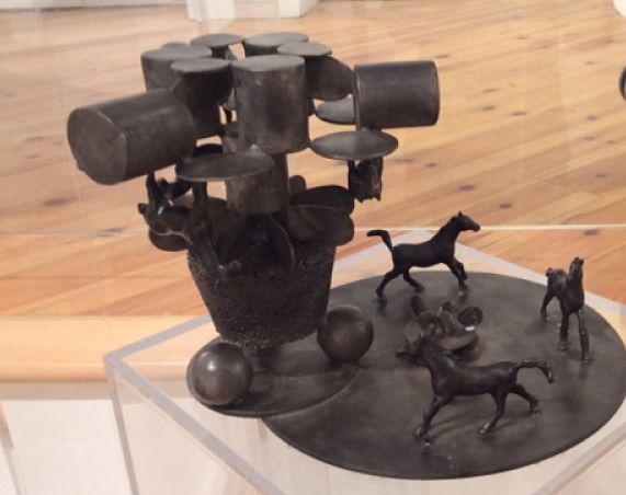
    Cesar Forero, Horses, bronze

    *Exhibition information: January 18 – February 9, 2018, Canadian Sculpture Centre, 500 Church Street. Gallery hours: Tue – Fri: 12 – 6, Sat: 11 – 4 pm

  • Holly Briesmaster, Waterscroll

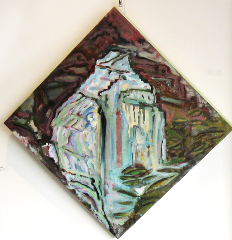
    Inglis Falls Diamond, acrylic on birch panel, 24 x 24 inches

    Holly Briesmaster’s show, Waterscroll, contains abstract landscapes that fill the room with the visual sound of rushing, falling water. Largely based on vistas the artist enjoyed seeing in British Columbia, Alberta and Ontario, there’s a range of emotion in these works most of which are painted on long, narrow fabric scrolls. Some are bold in line and colour with blues and greens, while others show a more delicate experience in tans and pinks of distant mountains. In particular some pieces presented several mountains stacked — or were they ranges in the distance? Or large rocks in the nearby? No matter. I enjoyed having the option to interpret the imagery in many different ways.

    Julie McNeill

    *Exhibition information: January 13 – 27, 2018, Galleria 814, 814 St. Clair Ave. W, Toronto. Gallery hours: Tue – Fri 12 – 6 pm, Sat 12 – 4 pm.

  • Interview with Neil Polson

    Interview with Neil Polson (NP) by Phil Anderson (PA)

    PA: What was your artistic background?

    NP: I first studied at the Toronto School of Art back when it was at Dovercourt and Queen. I then attended the 3-year program at Central Tech before enrolling at OCADU where I started in 2nd year. I only completed first year … financial problems stopped me from continuing.

    PA: What does the title of our current exhibit “Promise Land” refer to?

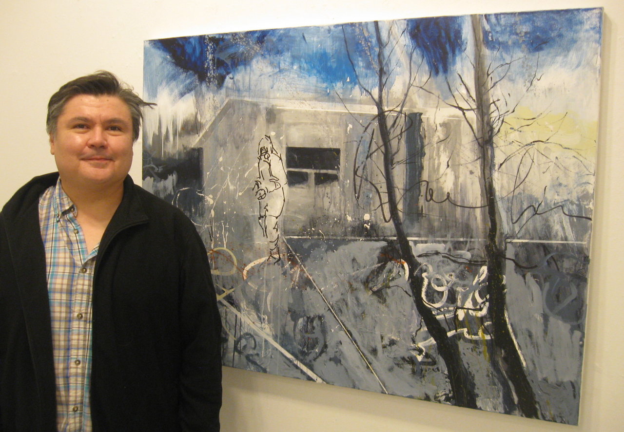
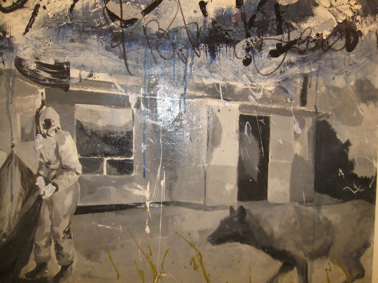
    NP: It is about the loss of land on the reserve …the title work features a reserve house. I am Ojibwe and my family still lives on the reserve.

    Promised Land, acrylic and marker on canvas, 28 x 24 inches

    PA: What message are you conveying with this body of work?

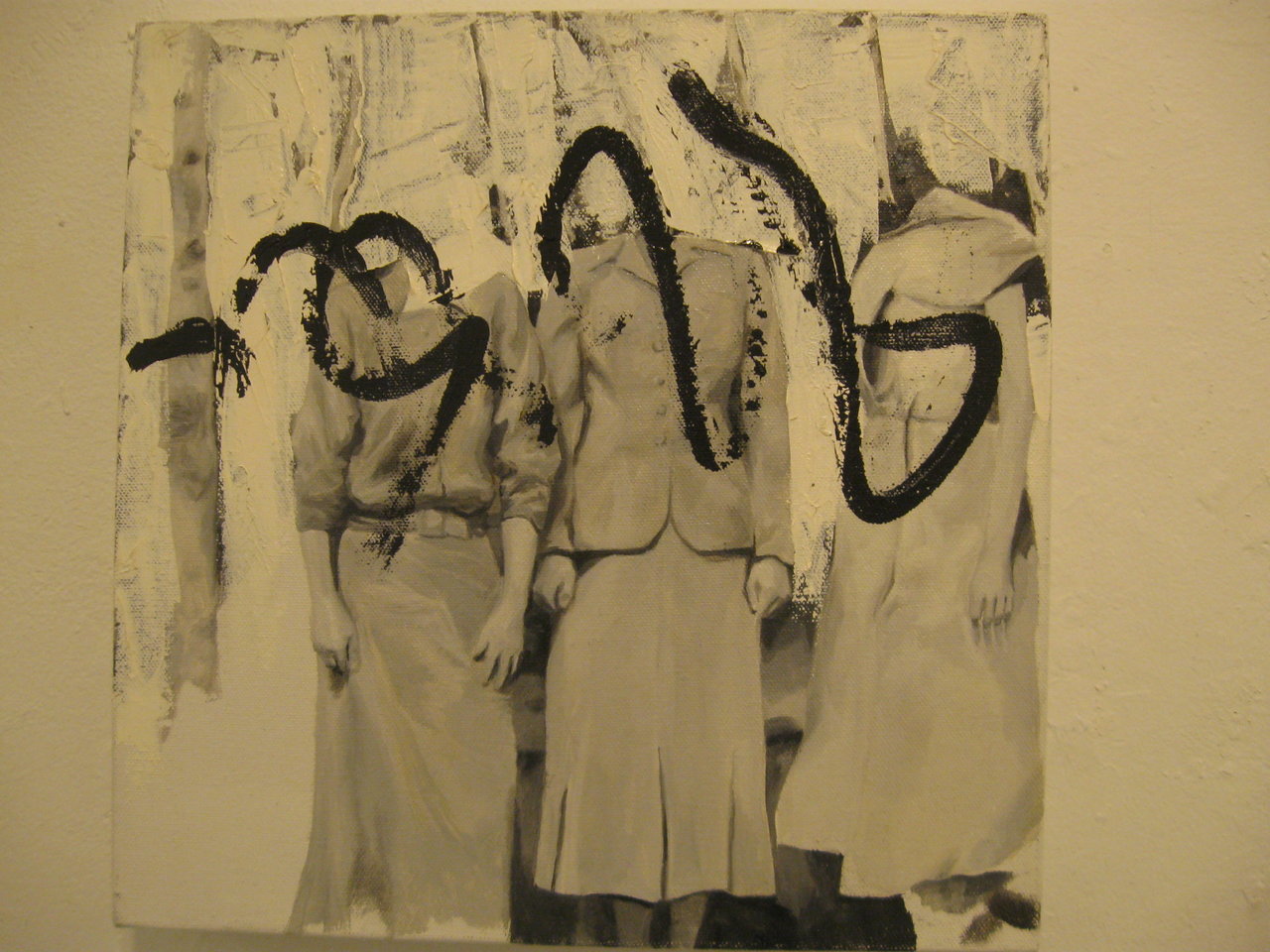
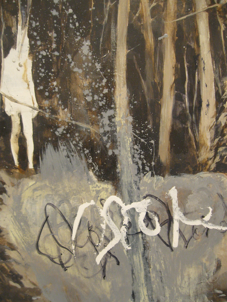
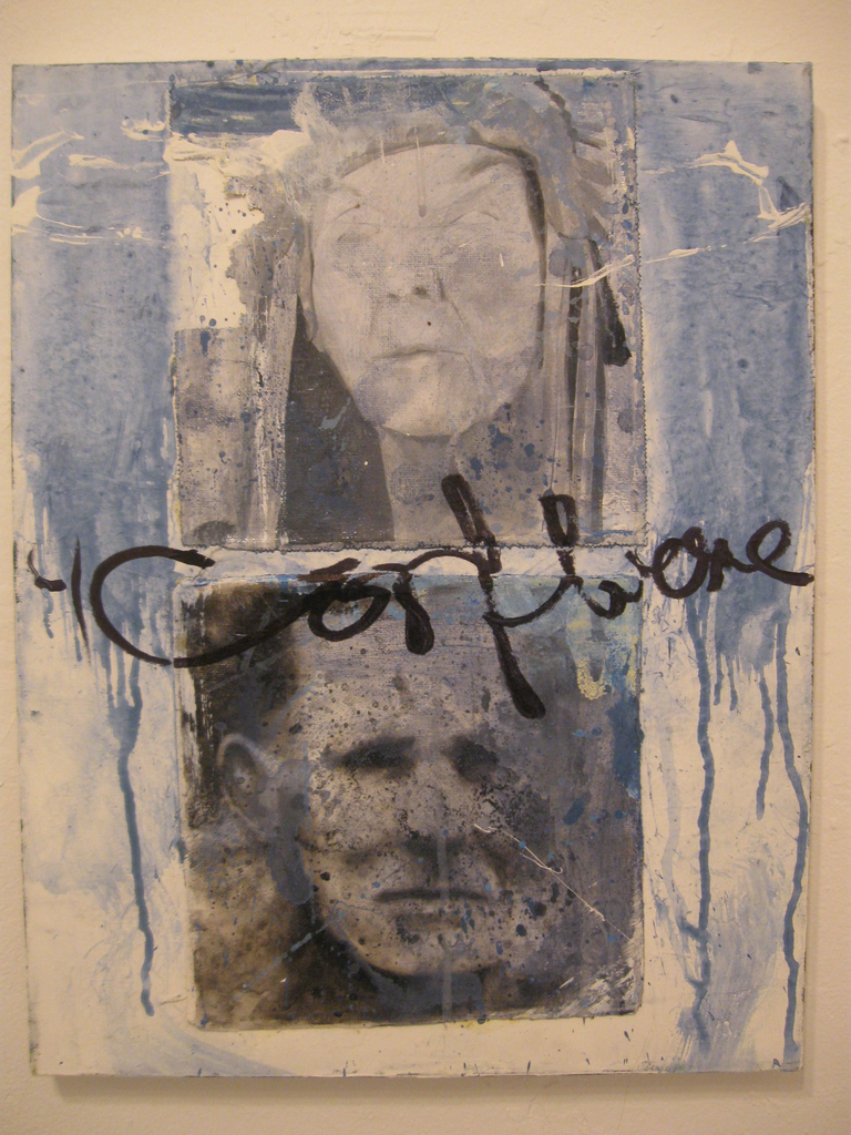
    NP: The work speaks to the loss of land on the reserve but also speaks about the ecology of the land and there is a cautionary message in the works. Thus the use of the men in hazmat suits that are looking for something on the reserve and in the woods. They seem to want to contain something. In one work, the wolf veers away from the men in hazmat suits and goes his own way sensing trouble perhaps. There is a sense of dread that perhaps it is too late to save the land. In Confluence the man from Bear Island (my Mother is from there). He was perhaps a deal maker and the other figure is an elder. It is perhaps the meeting of ideas. Virgin Forest shows the young girl in the forest … there is even tagging and graffiti in this forest. Indigenous youth use tagging in their culture. Three Women refers to the Trinity using the number 3.

    Confluence, acrylic and marker on canvas, 14 x 18 inches

    PA: I asked whether there is perhaps a reference to indigenous youth taken to Residential Schools as the women could have been teachers?

    NP: Perhaps that’s it.

    Three women, oil and acrylic on canvas, 12 x 18 inches

    PA: Why use the text in your work … the tagging and graffiti?

    NP: the use of graffiti and tagging might seem unusual it’s use is not restricted to just urban settings. I incorporated the graffiti and tagging in my paintings to make a link between the urban setting and the forest.

    PA: How is your art work changing or evolving?

    NP: The Man in Hazmat Suits are probably not going to reappear in the next works. I am looking at other urban subject matter, perhaps looking at addictions and how indigenous youth might be effected in an urban setting. My process is a continuous starting and restarting journey. Sometimes I turn my paintings facing the wall to give the work time to become a little unfamiliar to me again. The work tells me when it is finished. After inspiration, words and images get reinstated. I know a work is finished when it surprises me or is going well during the painting process.

    The Virgin Forest, acrylic on canvas, 20 x 24 inches

    PA: What is next?

    NP: Perhaps more cautionary tales told through paintings.

    *Exhibition information: Neil Polson, Promised Land, January 17 – 28, 2018, Gallery 1313 Cell Gallery, 1313 Queen St. West, Toronto. Gallery hours: Wed – Sun, 1 – 6 pm.
  • Andrew Rucklidge at Christopher Cutts Gallery

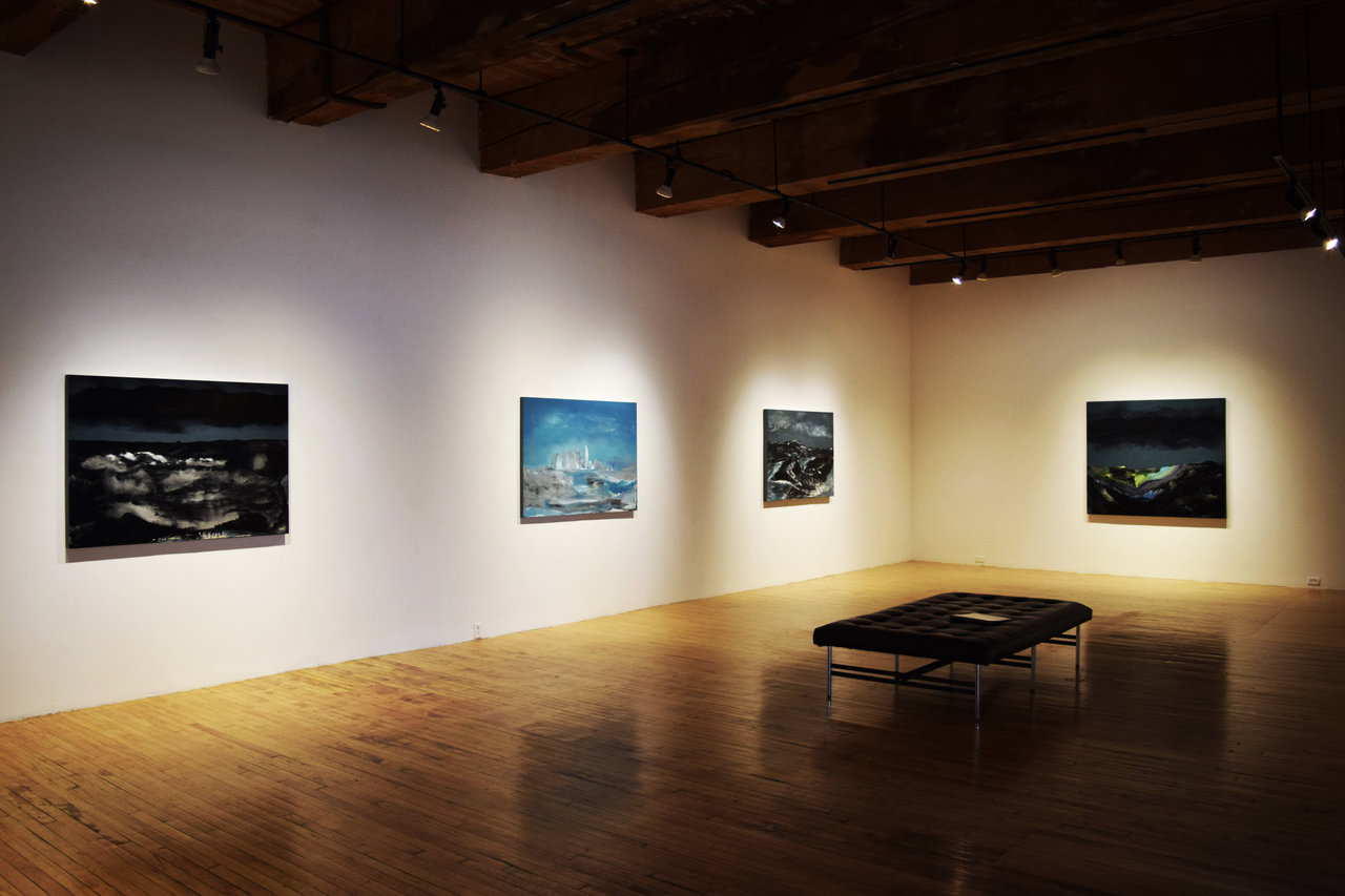
    Installation view of Andrew Rucklidge, A Bright Room Scanned Darkly at Christopher Cutts Gallery, 2017. Photo: Simon Termine

    The Canadian landscape has been thoroughly explored by artists for its august sense of presence, wonderment, and purity. The North in particular, characterized by its sparseness and frigidity, represents a land virtually untouched by human civilization. A variety of groups ranging from the residing Aboriginal cultures to the historically-renowned Group of Seven have conveyed its lingering spirituality, acknowledging the serenity beneath the otherwise desolate frontier. In his one-man exhibition, Andrew Rucklidge presents his collection of paintings that capture the subtle complexities of these iconic sceneries with an amalgam of mediums and techniques. Using encaustic, egg tempera, distemper, photographic print, and oil on wooden and canvased surfaces, his works utilize fantasy and abstraction to recognize the natural resonance these landscapes emit.

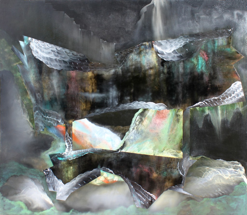
    Andrew Rucklidge, A Bright Room Scanned Darkly, 2017, oil on canvas on toned gesso, 52 x 60 inches. Courtesy of Christopher Cutts Gallery

    A Bright Room Scanned Darkly is inspired by Rucklidge’s pictorial studies of northern Canada – picturesque locations such as Baffin Island and Hudson Bay – that were scanned as moving images. Expanses become exaggerated through the motion blur; some details are diminished and other enhanced; what is ultimately illustrated are distortions of light and space that occupy the voids embedded throughout these landscapes. Rocky shorelines, blackened mountain ranges, glacial waters, frost-touched tundra, and open skies can all be distinguished amidst the abstractive figures.

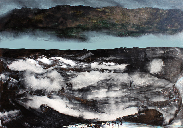
    Andrew Rucklidge, The wasting of a Pingo, 2017, oil and egg tempera on toned gessoed panel, 38 x 54 inches. Courtesy of Christopher Cutts Gallery

    One of the most emphatic elements seen in Rucklidge’s works are the structured, geological forms, which are often seen in contrast to the dynamic light effects. Bubblin Crude, for example, depicts the coarse, reflective stone that exposes the colors peeking from the light originating from both the natural and photographic sources. Ohers such as Ground Subsidence, Flow Without Sideslip, and Lost in the Barrens depict the black cliffs and islands that flourish in the northern coasts. Streams of brightened snow can be seen trailing across the dark stone or lightly breezing in the wind and water currents. Complimented with skylines that are either clear or stormy, likewise brightening or darkening the ambience, the collection evokes both serenity and omnipotence. Not only does Rucklidge strive to emulate the structural aspect that construct these northern settings, but he also succeeds to communicate its invisible qualities.

    Andrew Rucklidge, Bubblin Crude, 2017, oil on toned gessoed canvas, 60 x 52 inches. Courtesy of Christopher Cutts Gallery

    Rucklidge combines the fantastical and abstractive with the realistic to depict the northern landscapes that have become emblematic of Canada’s natural aesthetic. Though they suggest the distinctive features that characterize the tundra, the photographic manipulations of light and form distort these preconceived understandings. The solitary expanse is reconceptualised with adages of color and embellishments of the image to convey a unique, otherworldly element that is unlike anything seen in other environments. Simply because the arctic is expansive and wild does not mean that it does not possess a life of its own; it just requires a different perspective that appreciates the quality of that emptiness and what it actually holds.

    Andrew Rucklidge, Slope retreat, 2017, oil and egg tempera on toned gessoed panel, 44 x 46 inches. Courtesy of Christopher Cutts Gallery

    Simon Termine

    *Exhibition information: Andrew Rucklidge, A Bright Room Scanned Darkly, November 24 – December 23, 2017,  Christopher Cutts Gallery, 21 Morrow Avenue, Toronto. Gallery hours: Tue – Sat 10 am – 6 pm.

  • Monochromatic Landscape / Walnut Contemporary

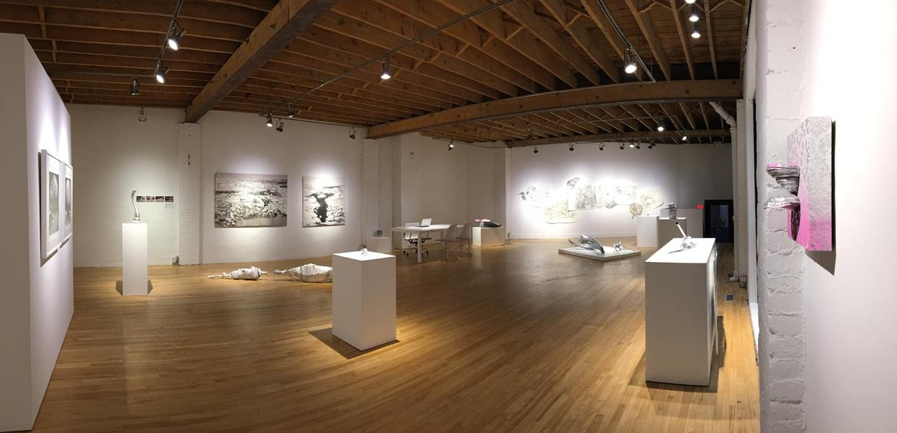
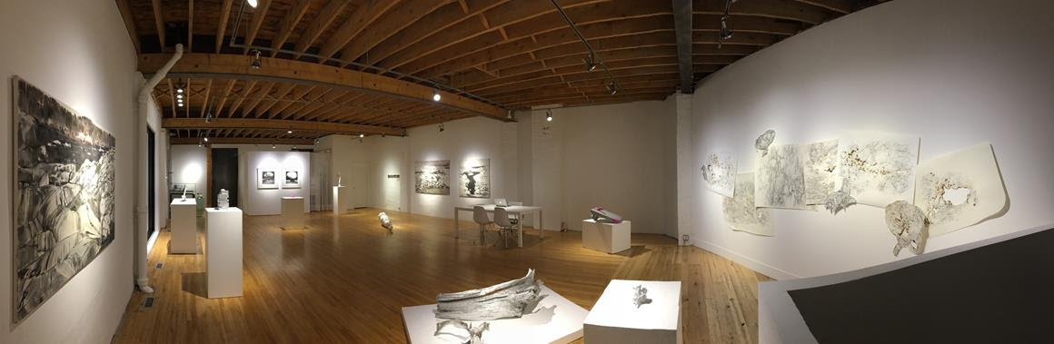
    Solitude embraces you in this winter wonderland. All the artworks use a limited palette of white, grey, the occasional burnt brown – created by actually burning the paper in Hladik’s work – and beautiful shining silver. This is a very special exhibition, silent with an underlining sound of violin concertos. Meditative and beautiful.

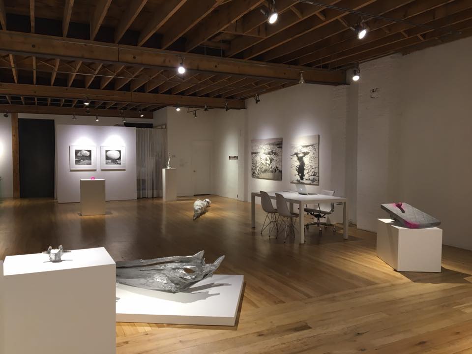
    Installation view of Monochromatic Landscape at Walnut Contemporary, 2017

    Curator Ibérina Raquel Vilhena involved three artists: Julia Harris, Gonzalo Bénard and Lumír Hladík. Vilhena wrote, “Three artists, three views: different directions and myriads of experiences. Artists, tossed and shaken by a turbulent world, who are living out the arbitrary divisive gap of inorganic versus organic, natural versus man made. However, the aim of our exhibit was to go deep, to reach way below the surface. We have morphed the gallery itself into a landscape. Here, we ignited a benign alchemy, offering you a journey through spaces and places, uncovering beauty in oddity and discovering wisdom in the mundane. Opening a world of curiosity, charming ambiguity and unexpected unity: resonating thousands of strings, each different in tune, but forming one gargantuan monochromatic chord.”

    Installation view of Monochromatic Landscape at Walnut Contemporary, 2017

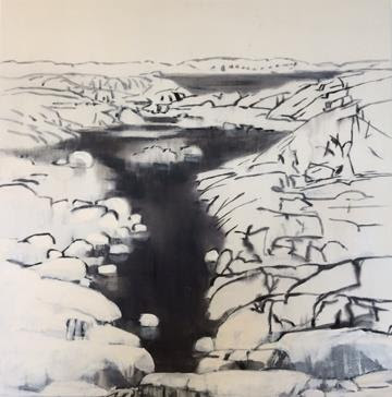
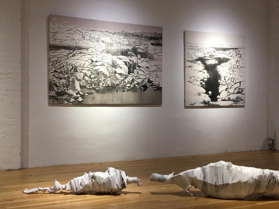
    The three artists’ works are really different but they also compliment each other in their unique dramatic appearance and poetic underlining. Two of the walls are covered with Harris’ winter landscapes. Large compositions depicting ice and snow dunes with water running between them or their white shields interrupted by dark grey mud, some even with the ice turning into that much-hated black ice. These landscapes are out there somewhere in undisturbed nature absent any human present, just winter, ice, cold water that looks dark grey in the absence of sunshine and a far off forest with leafless trees. They create a very cold feeling but still somewhat peaceful.

    Julia Harris, The pool in winter, 2017, acrylic on canvas, 48 x 48 inches

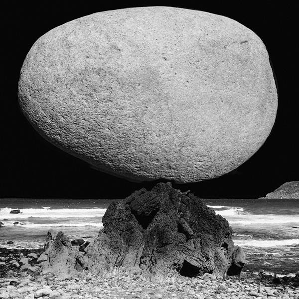
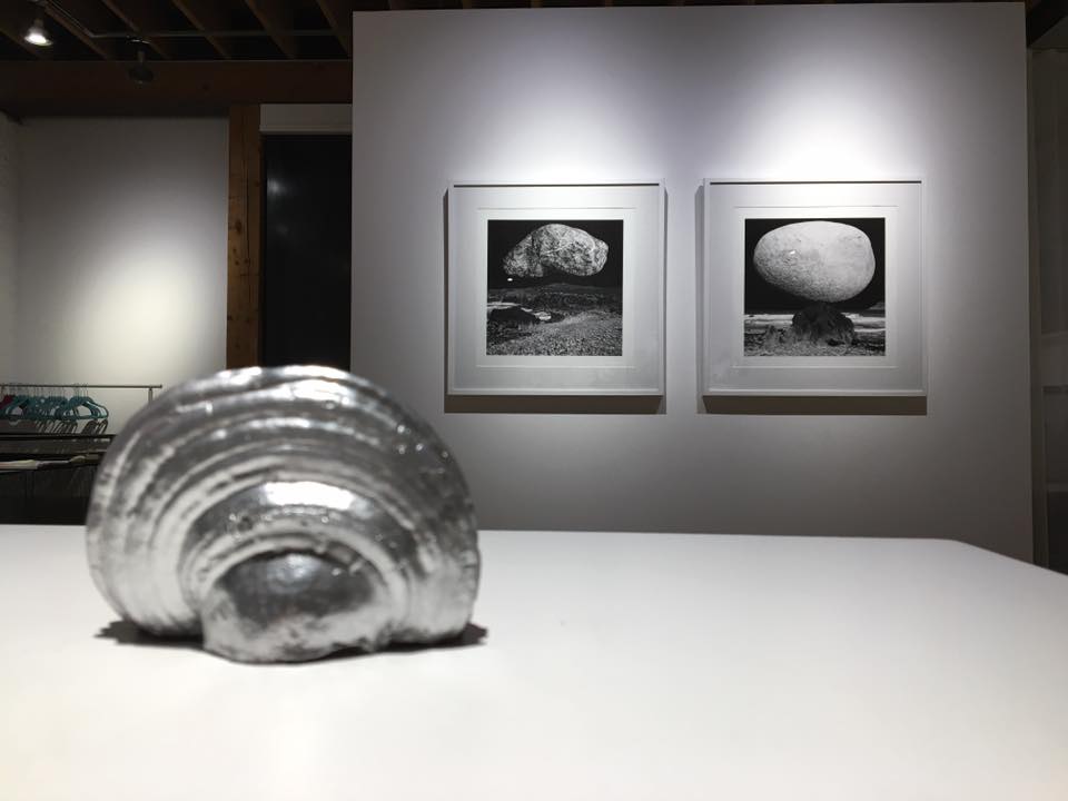
    Juxtaposed against the amorphous, half abstract shapes of Harris’ work is Bénard stone-stolid forms. He is a multitalented artist with outstanding and challenging photographs. I first recognized him from his Mutantspace series, the man/woman/animal combinations, their dialogues between conscious and subconscious are hard to forget. The Stone Landscapes he exhibits here are equally interesting, especially if you know his other works. In one of them a large, granite stone that seems to be polished into an egg shape that has the illusion of softness, maybe smoothed by human hands or by water. The latest seems more like a found object instead of human made and more symbolic. It stands on a stone needle, hardly touching it, in an alien landscape, ancient or moonlike. Another Stone Landscape depicts a levitating object, that strongly reminds me of the human brain with its veins above a stone crater. It seems to be floating in the air however heavy it might be. Is it emerging from the ground or falling into it? What is it? Is there a living thing underneath the rough surface? Looking at these images I believe that these stones are pulsing with life, as some of the ancient nations believe, that they are alive, feel and communicate with us – as they definitely do in Bénard’s view.

    Gonzalo Bénard, Stoned Landscapes, 2017, Photography on 240grs cotton smooth matte archival paper, 19″7 x 19″7

    Installation view with Gonzalo Bénard, Stoned Landscapes, 2017, Photography on 240grs cotton smooth matte archival paper, 19″7 x 19″7 (on the wall) and Lumír Hladík’s sculpture (in front)

    The mystery continues in Lumír Hladík sculptural piece, Needles. The tree-mummy, as I call it, captures time through life and death, prolonged afterlife in a “mummified state” and memories of the original event, Christmas, as well as the long period of becoming needleless. The artist picked up a Christmas tree from the street after someone discarded it after the holidays. It was still a Christmas tree, heavy with the memories of a family holiday. Then he took it into his studio and the long wait for it to become completely dead started. It took more than 900 days until all the needles fell off. Who would think it take that long for a cut tree to die? Then Hladík wrapped it lovingly in a burial gauze, creating a tree-mummy. His other trees are painted silver, making them happier-looking, so viewers can lose themselves in the beauty of their natural carvings and knots.

    Installation view with works by Julia Harris (on the wall) and Lumír Hladík, Needles (in front)

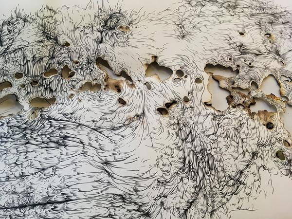
    The largest wall of the gallery is covered with Arboreal Gothic by Hladík, a rather organic composition created from many pieces of beautiful drawings. Magic is hidden in the sensitive curving lines, the magic of trees, animals and even humans who might be hidden or buried in them. Some old Celtic legends tell stories of wild men living in trees, being put into a young tree that slowly surrounded them still alive. Some of the curving lines remind us of hairy heads of all kind of creatures who look at us through the burned wholes of paper. A white night heavy with mystical air and a distant smoke of bonfire.

    Lumír Hladík, Arboreal Gothic, 2010 – 2016

    The show as a whole vision is a piece of art, a garden of magic and solitude. A sensitive balance seems to be the guiding idea of this exhibition where art works are placed in harmony, like music notes.

    Installation view of Monochromatic Landscape at Walnut Contemporary, 2017

    Less is indeed more.

    Emese Krunák-Hajagos

    Images are courtesy of Walnut Contemporary

    *Exhibition information: October 12 – November 25, 2017, Walnut Contemporary, 201 Niagara Street (side lane entrance) Toronto. Gallery hours: Wed to Sat, 1 – 6 pm.
  • Toni Hafkenscheid & Andy Patton at Birch Contemporary

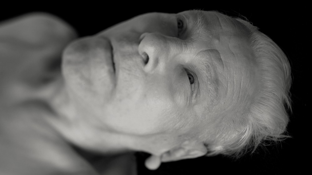
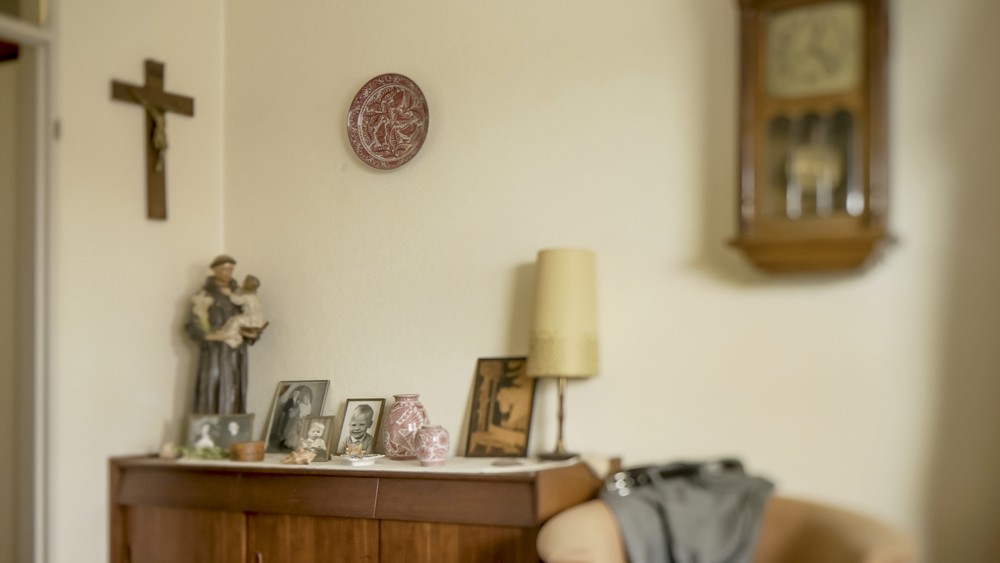
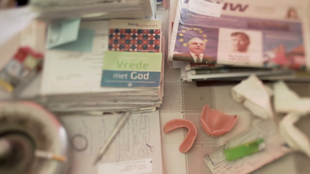
    Toni Hafkenscheid’s 3rd Act, the artist’s latest exhibition at Birch Contemporary, presents a filmic dirge on his exiled and aging father. While biographical evaluations of art have become less prevalent in modern critical and scholarly circles, such a reading is crucial to debunking the slow-burning mysticism of Hafkenscheid’s work. Presented in segments, which slowly unwind from their grainy beginnings into a more confrontational clarity, the artist uses his camera to paint a desolate portrait of a man on the brink of death, as well as highlight his own feelings of guilt.

    Toni Hafkenscheid, 3rd Act, 2017, still from 2-channel 4K video installation with sound

    Hafkenscheid, a Rotterdam born artist, relocated to Canada in 2002 to begin his visual arts career, a decision that inevitably left his widowed father companionless. Throughout these pensive and static compositions, whether depicting his father’s somber and aged physiognomy, or his bantam accommodations in a nearby nursing home, a sense of remorse pervades. The accompanying exhibition text, written in first person prose by the artist himself, directly addresses the sorrow in abandoning his father during this particular point in his life, as they both live knowing that any passing day could be his last. Capturing these final moments in video form in turn solemnly commemorates his father, while looping each clip allows his image and likeness to feel as if they continue into infinity.

    Toni Hafkenscheid, 3rd Act, 2017, still from 2-channel 4K video installation with sound

    Hafkenscheid manifests a more universal emotional palette, allowing his personal project to resonate with a diverse group of individuals dealing with similar forms of unsettling liability over a particular situation. For those patient viewers willing to allow these gradually unfolding slices of cinéma vérité to infiltrate their psyche, a poignant portrayal of solitude and heartache lingers.

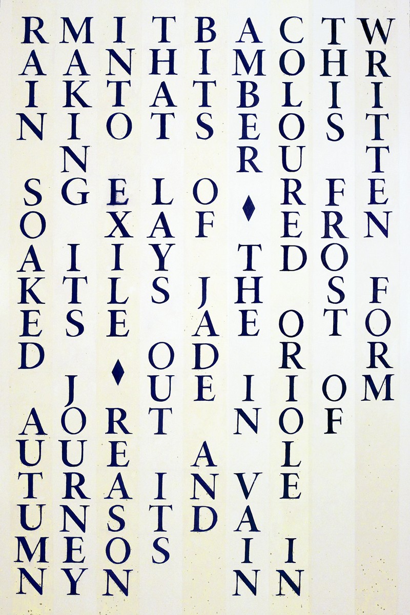
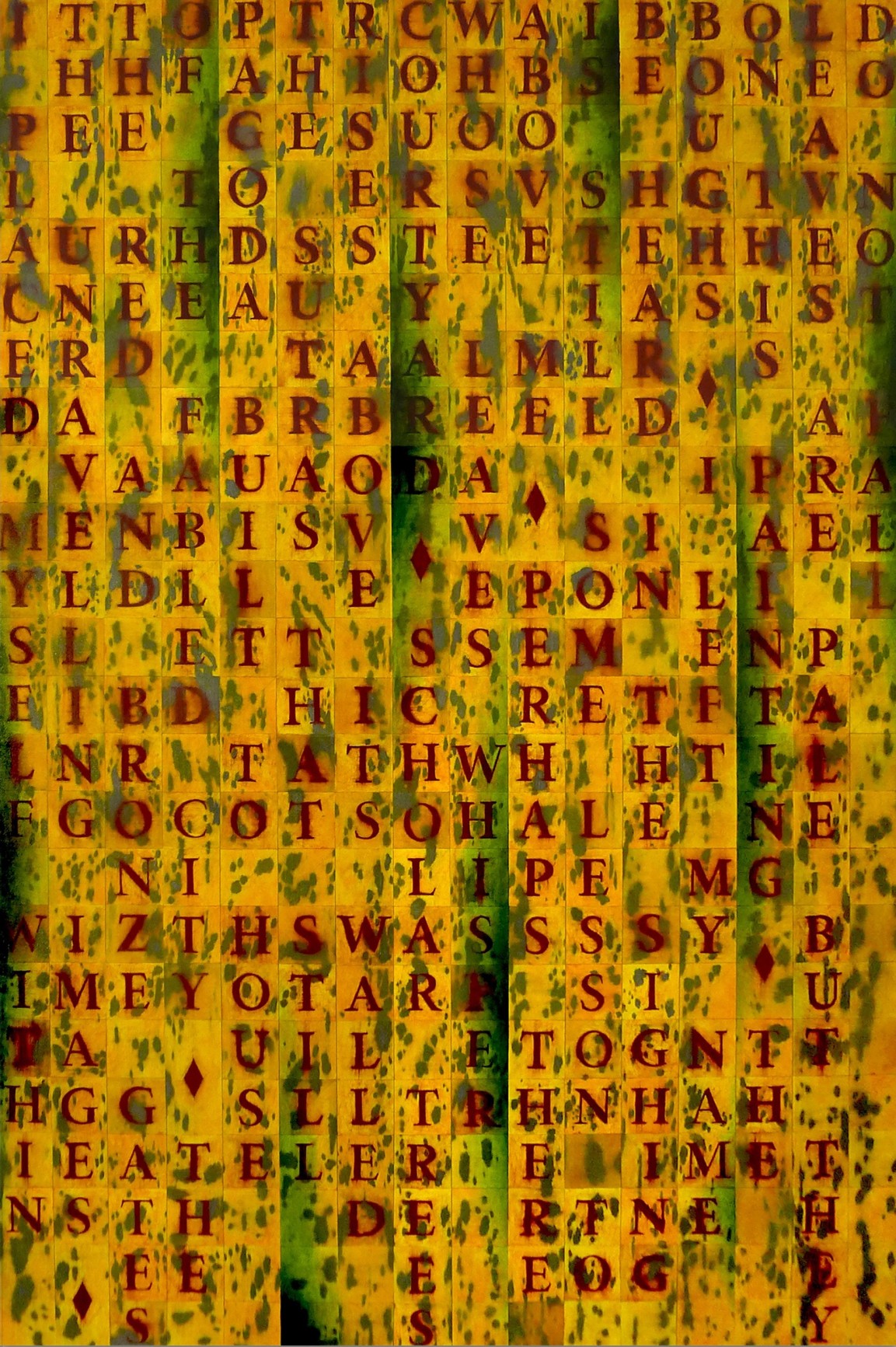
    Concurrently shown alongside Hafkenscheid’s video installation is Andy Patton’s The In Vain Coloured Oriole and Other Paintings, a collection of large-scale paintings dripping with poeticism. Informed by ancient Chinese practices in calligraphy, these textual compositions read from top to bottom (akin to Classical Chinese) and from right to left (which is rooted in English linguistics). These compositions are drawn from re-contextualized snippets of poetry written by the artist in conjunction with Roo Borson and Kim Maltman. The artist anticipates that combining and reconfiguring stanzas from his previously published work will engender newly formed perspectives, opinions, and feelings to emerge throughout each canvas. The language used is often vague, which helps a viewer cast their own peculiar web of meaning between the cubic spaces separating each carefully considered word.
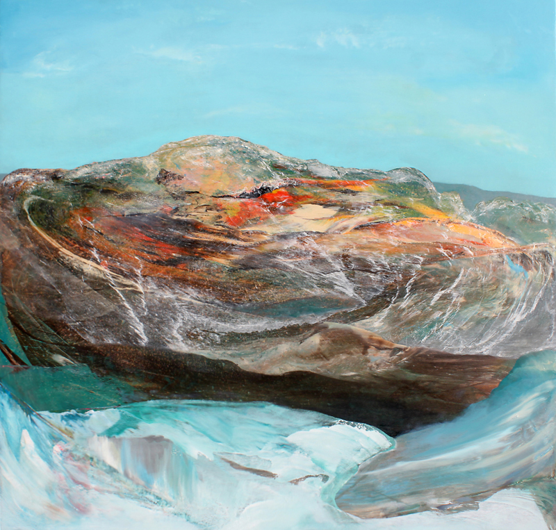
    Andy Patton, The In Vain Coloured Oriole, 2017, oil on canvas, 72 x 48 inches

    Andy Patton, Temple Ruins Park, 2014-15, oil on canvas, 72 × 48 inches

    Patton’s work visually resembles the legendary oeuvre of Ed Ruscha, as well as the pithy aestheticism of Bob and Roberta Hansel; however, the originality of his own poetic musings singularizes his artistic endeavours amongst others informed by semiotics and the unending playfulness of language.

    David Saric

    Images are courtesy of Birch Contemporary

    *Exhibition information: Toni Hafkenscheid, 3rd Act & Andy Patton, The In Vain Coloured Oriole and Other Paintings, November 30, 2017 – January 20, 2018, Birch Contemporary, 129 Tecumseth Street, Toronto. Gallery hours: Wed–Fri 10 am – 6 pm, Sat 11 am – 5 pm.