Author: artoronto

  • Meaghan Hyckie at Olga Korper Gallery

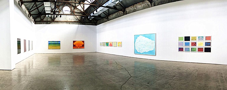
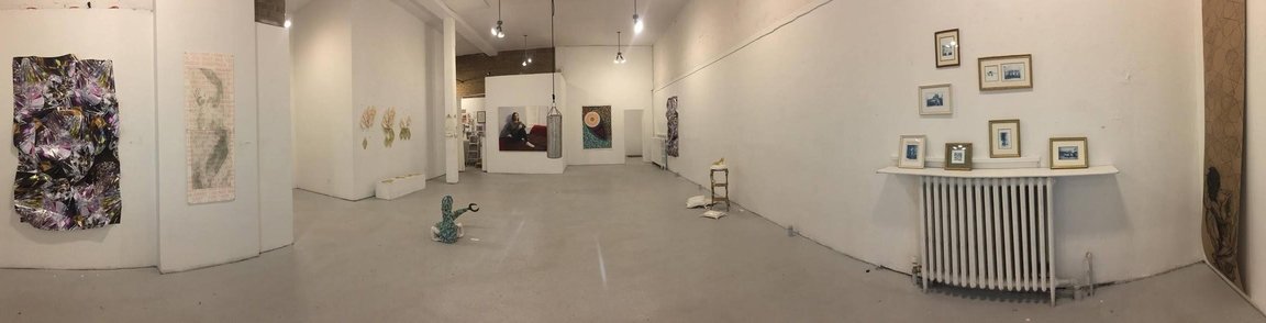
    Meaghan Hyckie is a Toronto based artist whose work has gained significant recognition in recent years. The Intelligent Woman’s Guide to Atomic Radiation is her third solo exhibition in Toronto, consisting over 10 individual pieces and her UFOs series. ­­When entering the gallery space, it is hard not to notice that the entire exhibition is formed with vibrant colours. At the same time, the colours are balanced harmoniously with some monochrome drawings in between them, so that the audience do not experience visual frustration when exposed to this overwhelming colour range. Moreover, the monochromatic compositions balance the entire exhibition in a decorative way.

     Meaghan Hyckie, The Intelligent Woman’s Guide to Atomic Radiation, full installation view. Photo: Sophie Wang

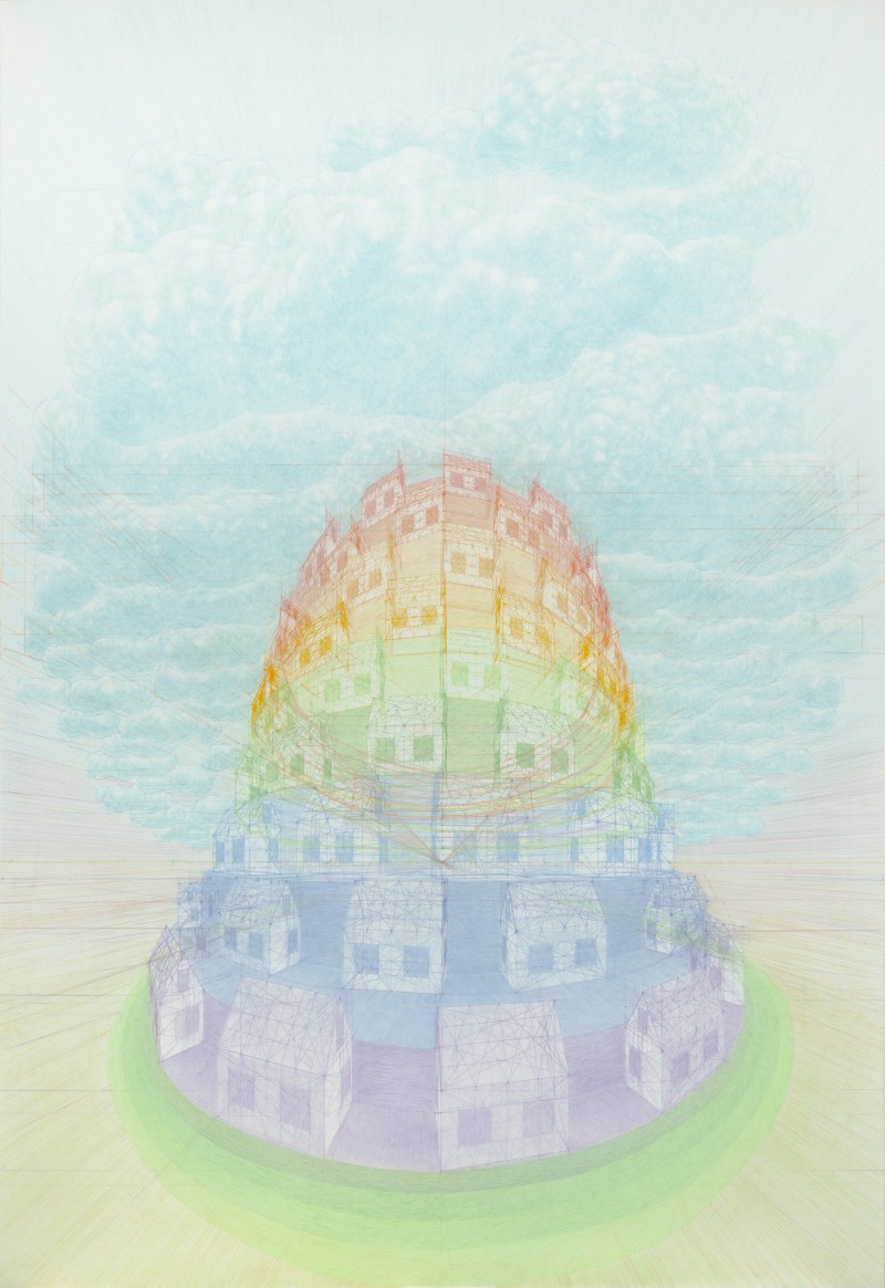
    Humans make drawings from the beginning of times in order to make their marks – Hyckie does it for the same reason. She has a rich, highly charged palette and uses the colors in a way that their contrast and the relationship between them has a maximal effect. In “New Build” she applies one-point perspective with a noticeable vanishing point in the center of the work. The suburban block, that builds like the tower of Babel, is depicted with dreamy, rainbow colours, in front of a wall that seemingly created by waves. The waves have a tsunami like movement that can destroy this almost illusionist neighborhood, but suburbia is sheltered – as it should be – by a globe, not unlike a snow globe, and surrounded by a green, protecting aura.

     New Build, 2013, coloured pencil crayon on paper, 70.75″ x 49″. Courtesy of Olga Korper Gallery

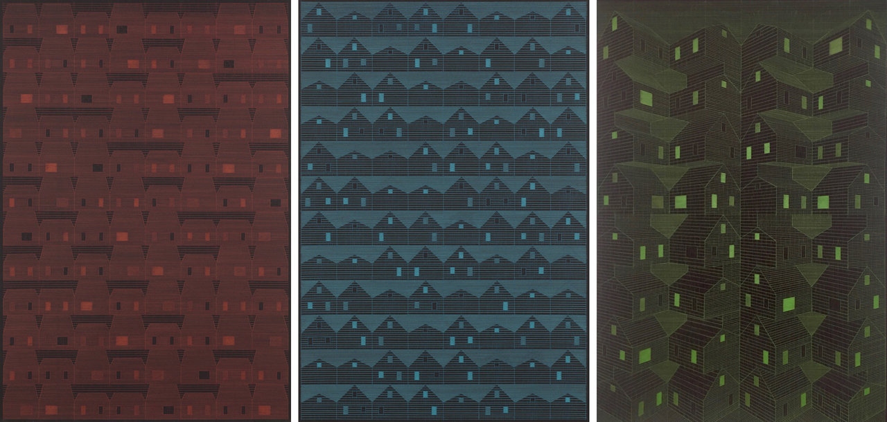
    Hyckie aims to investigate the perception of space, the scales of its composing elements in order to define and articulate the environment she portrays. The series of monochromatic works in the show depict architectural structures. The houses and blocks represent more than simple geometric shapes, as Hyckie pictures her childhood memories of Canadian post-war buildings, honouring Canadian history and culture. The minimal use of lines and dark colours create a futuristic sense.

    Left to right: Block-1, 2016; Block-2, 2016 & Endless Access to Everything you Desire, 2016, each: colored pencil crayon on paper, 45″ x 31″. Courtesy of Olga Korper Gallery

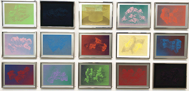
    Another important part of the exhibition is the UFO series, consisting of 18 small equal sized drawings; that of 15 is displayed here. These compositions follow Hyckie’s artistic style and theme in recent years, combining sensitive drawings of cloud-like motifs and dynamic colours to create abstract forms that remind us of modern technology. Some of the compositions look like photo negatives, and the positive-negative contrast makes them even more scientific looking and challenging.

    UFO-59, 2018, coloured pencil crayon on paper, 12.75″ x 16.75″. Courtesy of Olga Korper Gallery

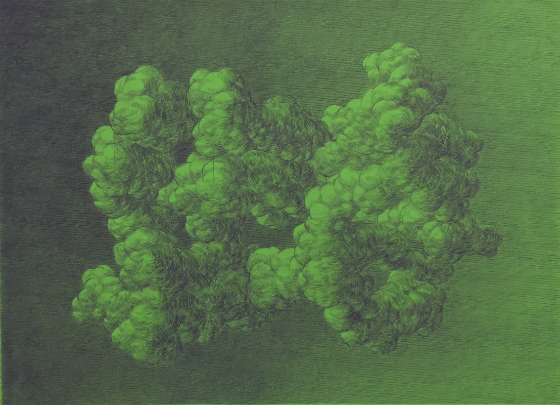
    As the title hints these clouds could be easily caused by an atomic bomb, so their elastic beauty deteriorates in front of our eyes and becomes utterly dangerous. Their ambiguity makes the viewer look at them longer and more carefully trying to decipher the soft forms until a deeper, more layered meaning surfaces. It was a good idea to install them into a tableau; the viewers can lose themselves into images of clear lightness of greens and blues disrupted by heavier oranges and reds, finishing with a foreboding dark cloud. As the artist wrote: “In my drawings of clouds, houses and landscapes I deconstruct and visualize space as a way to reflect on environmental, political and personal ideals and anxieties.”

    Installation view with UFO series, 2017-2018, each: coloured pencil crayon on paper, 12.75″ x 16.75″. Photo: Sophie Wang

    However, in this exhibition, danger is overruled by beauty.

    Sophie Wang

    Featured image: UFO-62, 2018, coloured pencil crayon on paper, 12.75″ x 16.75″. Courtesy of Olga Korper Gallery

    *Exhibition information: Meaghan Hyckie, The Intelligent Woman’s Guide to Atomic Radiation, March 23 – April 21, 2018, Olga Korper Gallery, 17 Morrow Avenue, Toronto. Gallery hours: Tue – Sat, 10 am – 6 pm.

  • Sophia Al Maria: Black Friday / Mercer Union

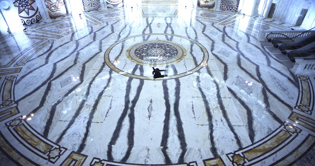
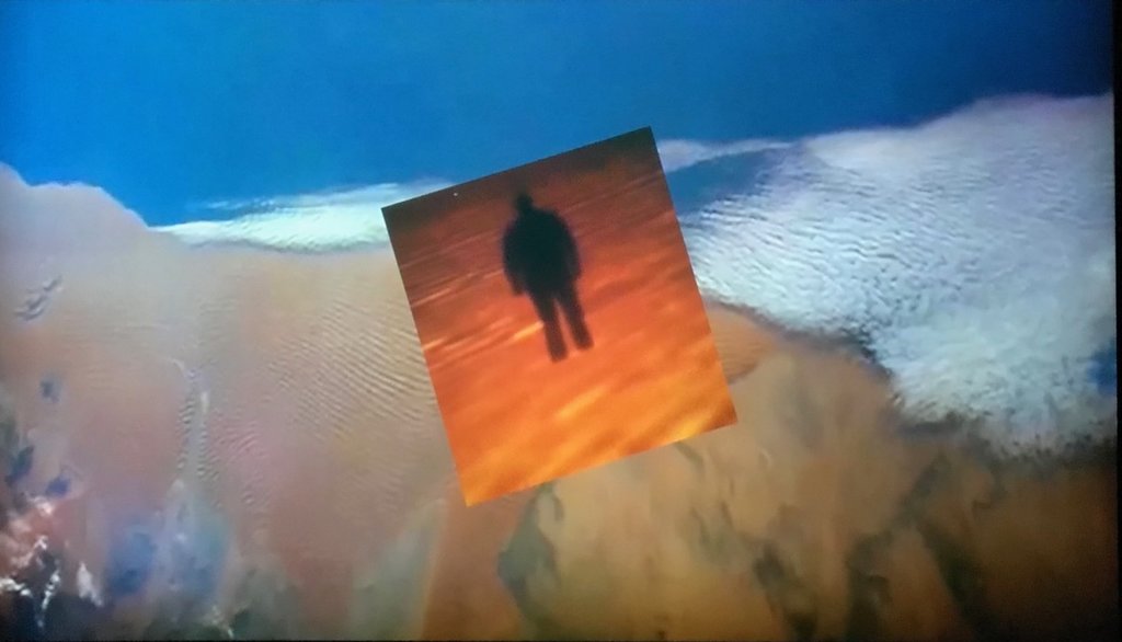
    Black Friday tells a story in a dreamlike state, of the gulf’s relationship with western capitalism and religious conservatism. With images of a temple-like interior meshed with scenes that one would come across in shopping malls, it shows a vision of the limbo state that is created between them. Western ideals that are usually condemned in Islamic culture are forgotten in shopping malls where the two worlds come together under a more powerful structure – Capitalism. The exhibition highlights the artists exploration into the concept of Gulf Futurism.

    Sophia Al Maria, Black Friday, 2016, video still. Courtesy of the artist and Third Line, Dubai

    Walking into the completely dark gallery, it takes time for your eyes to adjust, and the way forward is guided by the blaring sound and flashing light coming from behind the curtain of the first room. Inside, the video plays on a single long screen, towering over and intimidating the viewer. Reminiscent of religious paintings, the long narrow screen commands the room. The effect is heightened if there is no one else there and the screen holds your stare as you stand vulnerable in the dark

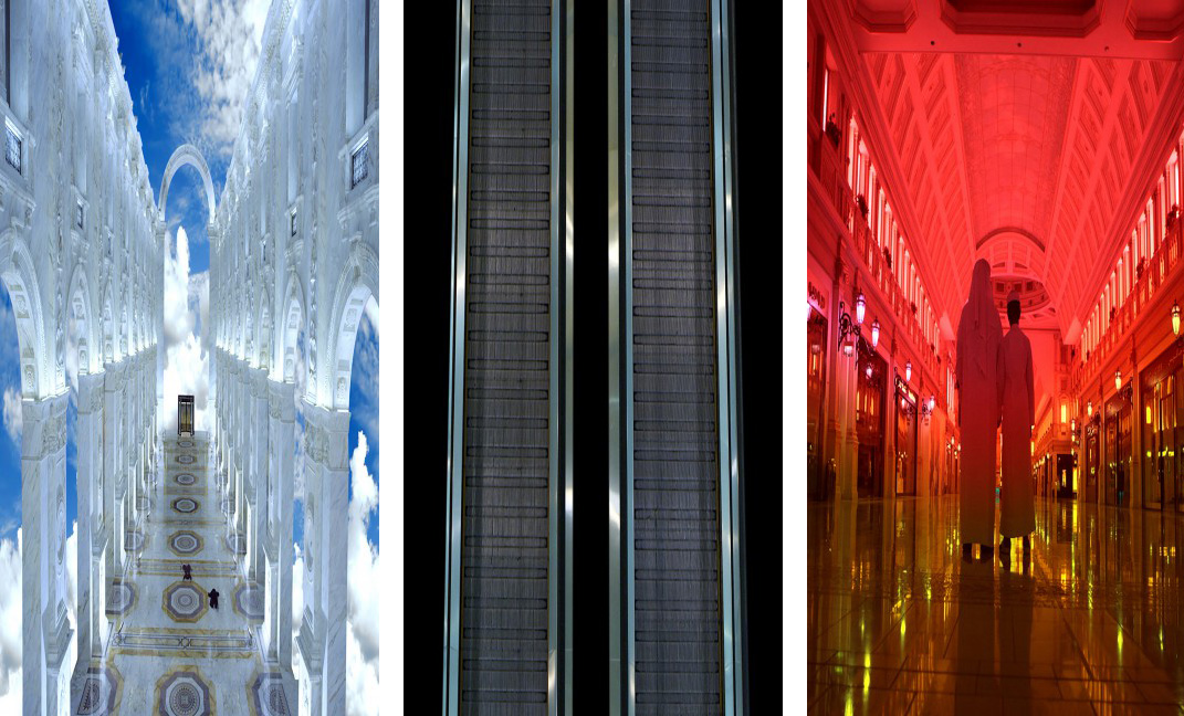
    Sophia Al Maria, Black Friday, 2016, video still. Courtesy of the artist and Third Line, Dubai

    Separate images are cut and pasted together in a way that is disorienting, at times with kaleidoscope movements and spinning floors that melt and distort. It comes together to create a vision of this space with no exit and no entrance, with escalators leading to higher floors and escalators rotating endlessly like a lucid dream that one is stuck in, unable to find an end to the loop. Certain tropes are referenced, and at some points it feels as though one is stuck in a program in the Matrix. Altogether, the created space does not resemble a mall or mosque, but a surreal space between the two that is eerie and cold. The capitalist machine is visible in the endless loop of escalators which are mostly empty, sometimes with one or two passengers and shopping carts. Shots of these halls and lobbies show a space that oozes money and power, with floor to ceiling marble – empty, desolate, and monolithic in its feeling.

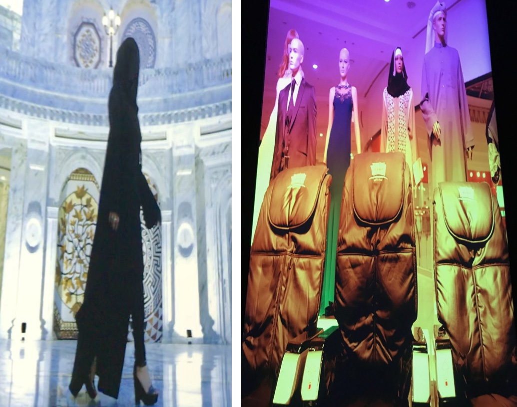
    Sophia Al Maria, Black Friday, 2016, video still. Photo: Nazli Nahidi

    Figures appear at times walking away, and at times moving in and out of the scenes. One scene features a woman in a black abaya cloak, with her face covered, high heels and jewelry adorned, walking across the desolate halls she harkens to a truth that cannot be avoided. Later she lies unmoving on the floor. Another scene has mannequins standing, staring down with merchandise placed at their feet. Recognizable are some images of the Villagio Mall in Doha, Qatar with the serene blue-sky ceiling and canal cutting through the space. Meanwhile the sound is booming through the room and engulfing the space with an eerie alarm tone that matches the grandeur of the marble halls.

    Sophia Al Maria, The Future Was Desert, 2016, video still. Photo: Nazli Nahidi

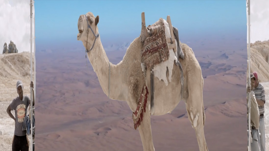
    There is a second video in the exhibition called The Future Was Desert, which creates a narrative of a future after the end of human civilization. The voice in the background is reminiscent of a highly intelligent AI and seems to summarize the fate of humanity for the viewer. The desert is relevant in various ways to the narrative, described as being essentially free from the passage of time, it foreshadows the fate of humanity but also the state that it is currently in. The narrator goes back thousands of years, before any kind of civilization when the gulf area was lush, referring to it as the oasis of Eden. The area, which is of course now barren, was sucked dry to feed idols also barren of any meaning, and the future was then turned into desert. The video can be summarized with the one of the opening lines in Part One: “…the keys to your deep future, are kept in your deep past.”

    Sophia Al Maria, The Future Was Desert, 2016, video still.  Courtesy of the artist and Third Line, Dubai

    Nazli Nahidi

    *Exhibition information: April 13 – June 2, Mercer Union, 1286 Bloor Street West, Toronto. Gallery hours: Tue – Sat, 11 – 6 p.m. The exhibition is part of Scotiabank Contact Photography Festival, 2018


  • Jacob Robert Whibley at Zalucky Contemporary


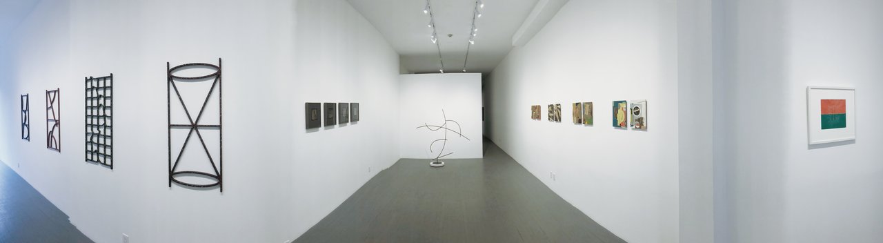
    Installation view of Jacob Robert Whibley, to kiss the lip of the horizon, 2018. Photo: Iris Wu

    to kiss the lip of the horizon, a solo exhibition by Toronto-based artist, Jacob Robert Whibley, displays works with multiple mediums, including sculpture and collage. Largely influenced by Hito Steyerl’s theory outlined in the essay “In Free Fall: A Thought Experiment on Vertical Perspective”, this show challenges the traditional perspective of art (known as the linear perspective) and attempts to provide an irregular and innovative understanding of “perspective” through the disorientation of the horizon. With the introduction of high technologies, such as 3D cinema and Google Maps, people start to embrace different feelings of orientation, and simultaneously, disorientation.

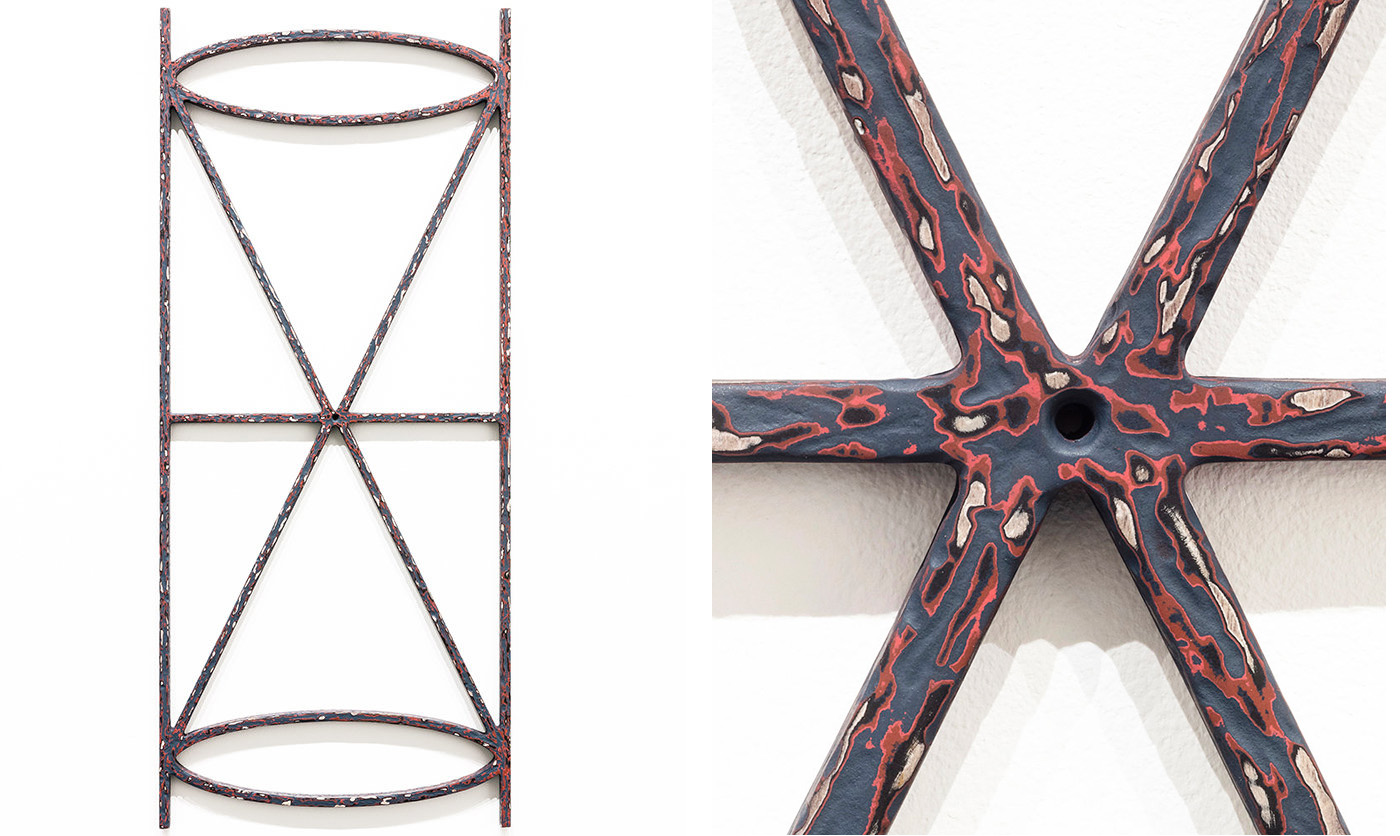
    taking a slight, 2018, baltic birch and acrylic paint, 38.5 x 16.5 inches (left) and detail (right). Courtesy of Zalucky Contemporary

    Belonging to a series of four metal installations, “taking a slight” represents an hourglass. Looking at it, one may wonder: how can it be associated with the object since nothing seems to be pouring downwards. However, at closer examination, you will be surprised to find a tiny round opening between the two connected triangles, a see-through, modifying our perspective even more. This kindly reminds us of the theme of the exhibition: distorted sense of orientation. Considering the duality of perspective endowed in this work, the linear structure of the hourglass might be just the bare outline of the object, symbolizing the flow of time while the hole in the middle could take us into a different dimension.

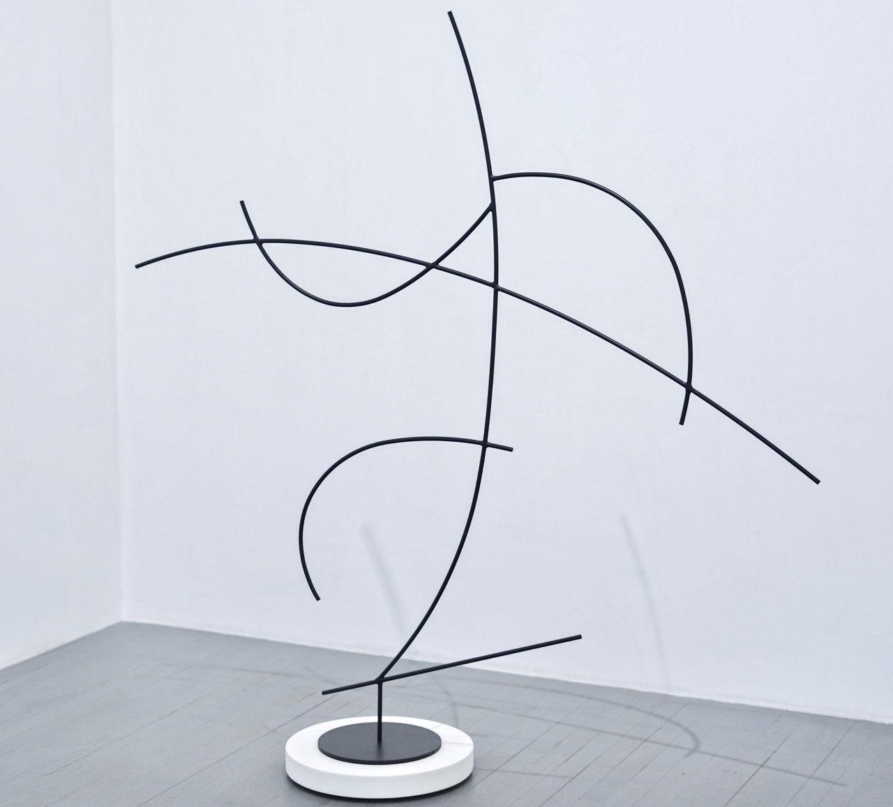
    tightrope walker, 2018, 38″ steel rod and enamel paint, 60 x 60 x 10.5 inches. Courtesy of Zalucky Contemporary

    As you explore further in, at the end of the gallery there is a semi-abstract sculpture composed of steel rod and enamel paint. Titled, “tightrope walker”, this piece recalls the famous movie, The Walk, directed by Robert Zemeckis. The figure, as depicted by Whibley, is holding a pole while trying to balance himself in the midair walking on a tightrope. A moment of suspense is captured, as the figure is just about to lose his balance. The potential failure of his tightrope walking will again result in disorientation. At the same time, the work conveys a sense of humor through its exaggerated gesture and reductive lines.

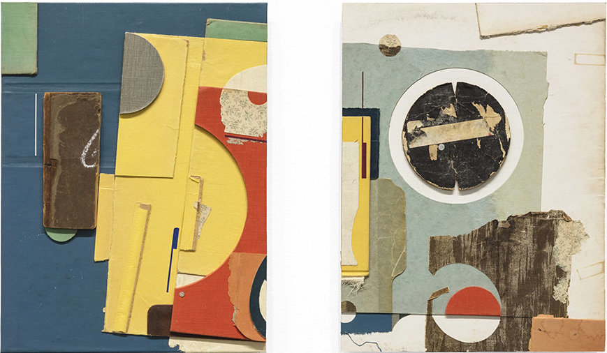
    fughetta, 2018, paper ephemera and flattened pennies on panel, 12 x 9 inches (left)
    the orchestra collapses, 2018, paper ephemera and rusted staples on panel, 12 x 9 inches (right). Courtesy of Zalucky Contemporary

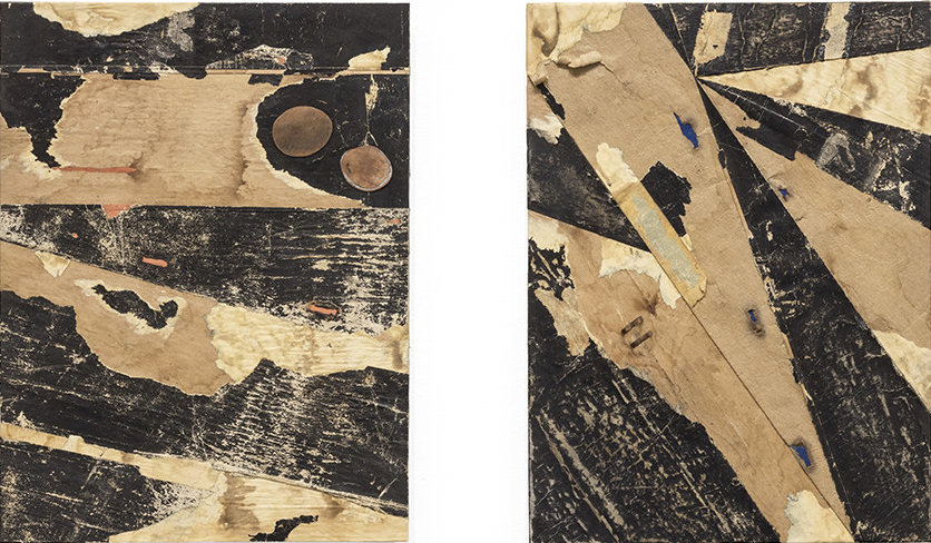
    In Whibley’s collages the contrast of colors, or the absence of them, carry an appearing visual effect. As proclaimed by modern art historians, collage is a form of art that reflects the disorientation resulted from the pace of modern life, which surprisingly echoes with the theme of the show. Composed of paper ephemera, flattened pennies and rusted staples on panel, “fughetta” and “the orchestra collapses” disintegrate the structure of an orchestra to provide a fresh perspective for viewers to look at the subject. “fughetta” is almost “realistic,” showing the usual setting of an orchestra. It uses a complementary color to emphasize the main motif: the stage is blue, the empty space in front of it is yellow while the musicians’ block is orange. “the orchestra collapses” depicts the chaos of the collapse. How can an orchestra collapse? Is it real or hallucinatory? There is no indication for an answer in the monochromatic abstract forms, besides a stop sign on the top.

    secret breaths / shifting graves, 2018, paper ephemera and rusted staples on panel, 12 x 9 inches (left) & pick pocket / smooth quotidian, 2018, paper ephemera and flattened pennies on panel, 12 x 9 inches (right). Courtesy of Zalucky Contemporary

    The exhibition seems to play with the idea of distortion, as the works imply the potential disorientation of traditional views by mixing them with the ones that exist in modern society – asking the viewer to contemplate the unpredictable and unexpected that appears on this new horizon.

    Iris Wu

    *Exhibition information: March 24 – April 21, 2018, Zalucky Contemporary, 3044 Dundas Street West, Toronto. Gallery hours: Wed – Sat 11 – 6 pm.

  • Seriously Stoned / Canadian Sculpture Centre

    Seriously Stoned is exploring contemporary stone approach by eight members of the Sculptors Society of Canada. As the title suggests the exhibition is all about stones and becoming ecstatic through the procedure of transforming the otherwise static and lifeless medium into meaningful artworks. The artists investigate all the possibilities hidden in stones, from classical marble through limestone to steatite. The works materialize all imaginable styles from figurative to abstract, depicting real objects as well as magical imagery.

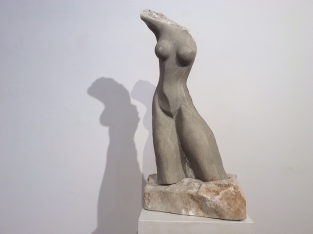
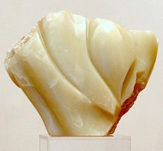
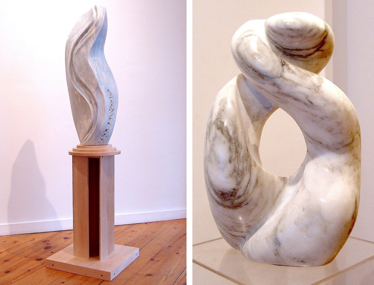
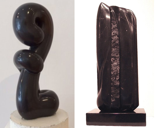
    Elizabeth Merei’s alabaster sculpture Windswept, a female figure, a torso indeed, conveys vitality and movement mixing a classical motive with a semi-abstract form. There is a tension between the smoothness of the body and the rough surface of the base, showing the double nature of the stone. Also made of alabaster, Irene Sirko’s Awakening seems to radiate light from the inside. Many believe that stones have spirits and in this piece we can witness as a spirit comes into life through pulsation of light and the movement of the curved surface. Angela Verlaeckt-Clark, Stone Clouds and Mary Ellen Farrow, Essence beautifully capture the elements of nature in grateful movements while also treasure the marble, bringing out the stone’s inner beauty.

    Elizabeth Merei, Windswept, Colorada alabaster

    Irene Sirko, Awakening, alabaster

    Angela Verlaeckt-Clark, Stone Clouds, omega blue marble, maple (left) & Mary Ellen Farrow, Essence, marble (right)

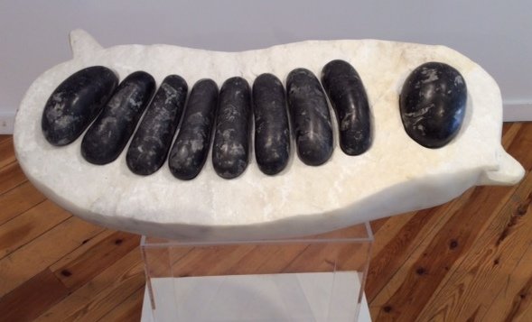
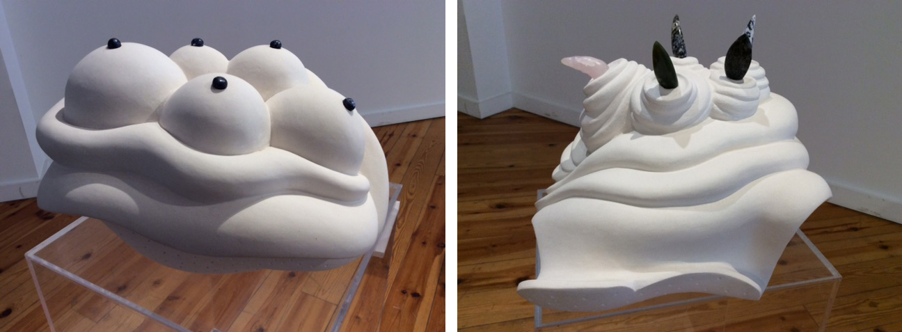
    There is magical reality in this show as well, sculptures that challenge our perception. Dina Torran’s work at first sight reminded me of a BBQ, then a quash-like plant with unusually large seeds. When I finally read the title, Time Capsule, I was surprised, but not that much. What is a time capsule and what it contains? The most important things we want to survive us and our times. Torran likes to use natural elements as a base and write them over with her personal history – so I think this sculpture can depict many different things at the same time. The receiver would be pleased with the beautiful black marble. Fred Hummel’s pieces lead us farther away from reality into a clearly magical world. Just as the objects we know from real life go through a metamorphosis the white stone also loses its solid quality and becomes light as whipped crème on a cake. Catharsis reminds us of a birthday cake with candles on the top. However those spikes are arrow heads, sharp and able to hurt. In Anticipation expectancy creates multiply breasts presented here in a truly strange way.

    Dina Torran, Time Capsule, champlain black marble, danby imperial marble

    Fred Hummel, Anticipation (left) & Catharsis (right), both Turkish limestone, various stone

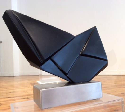
    Playfulness is a major element of creativity. Irene Blogg’s Exploration in steatite – combines an origami piece with a totem bird’s head that becomes monumental in its stone form; while the dark polished works by Daniel Yu and Yeon-Tak Chang reveal an impeccable inner beauty of carrara marble and African wonderstone.

    Irene Blogg, Exploration, black steatite

    Daniel Yu, Principle Fundamentals, African wonderstone (left) and  Yeon-Tak Chang, Waterfall, black carrara marble (right)

    Victoria Rainoff

    Images are courtesy of Canadian Sculpture Centre

    *Exhibition information: March 15 – April 6, 2018, Canadian Sculpture Centre, 500 Church Street. Gallery hours: Tue – Fri: 12 – 6, Sat: 11 – 4 pm.


  • Bradley Wood and John Holland at Angell Gallery

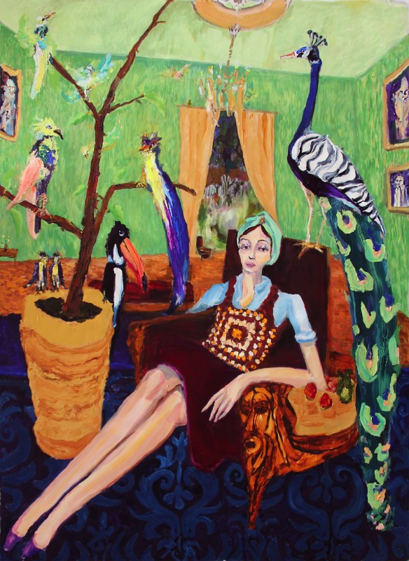
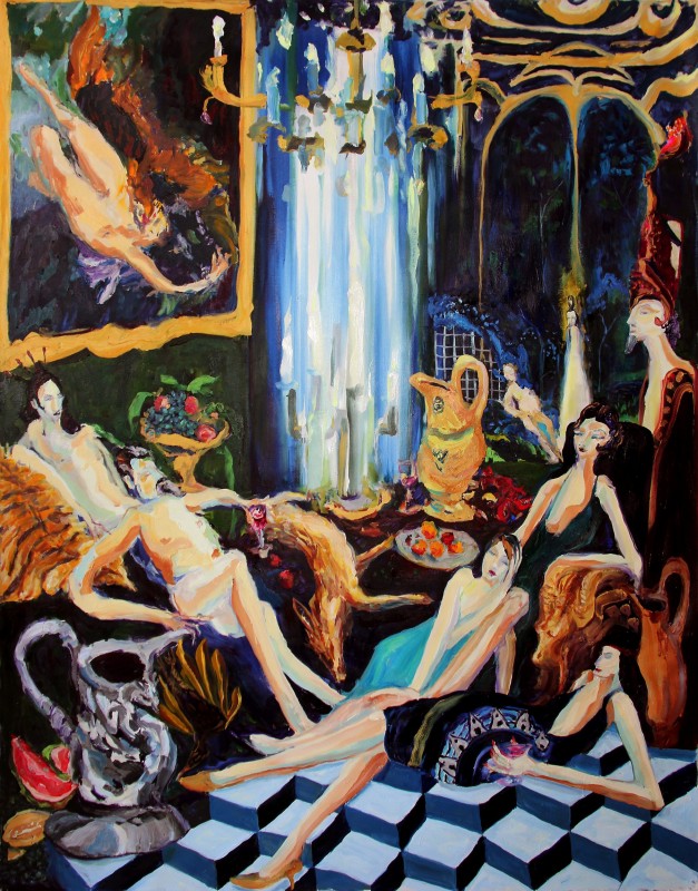
    In the first exhibition after his residency in Ireland, Bradley Wood continues to explore ideas of wealth and abundance in his large scale, vibrant paintings. The works are captivating; dramatic brush strokes are not shy of bright colours, fantastical imagery and bold scenery. All of Wood’s paintings exude a similar feeling of luxury, where his subjects lounge in elaborate environments composed of rich colour, texture and imagery.

    Bradley Wood, The Gardens, 2018, oil on canvas, 89″ x 65″

    In the exhibition, titled The Spoils, it is apparent that Wood’s has ambivalent feelings about the grandiose environments he creates. In The Gardens, many exotic birds perch in a bright green room, while in Wisteria Manor, the extensive use of embellishments and dramatic lighting goes over the top. People always wish for abundance, but Wood poses the question if there is such thing as too much. However, as a viewer, one does not complain as the plenitude of animals, patterns, colour, furniture and more, allow the artist to demonstrate his talent many times over.

    Bradley Wood, Wisteria Manor, 2018, oil on canvas, 84″ x 65″

    Littered in Wood’s paintings are lounging, blasé figures. Their elongated limbs accentuate their leisure, while their plain facial expressions suggest an indifference to the grandeur around them. The facial expression found on Wood’s figures can be compared to the “public, outward, blasé,” found in Edouard Manet’s 1882, A Bar at the Folies-Bergere. Identified by British Art Historian and writer, T.J. Clark, similar expressions of boredom and indifference were explored in various art forms at the turn of modernity, when ideas such as mass consumerism began. The blasé attitude seems appropriate for Wood’s subjects who are underwhelmed by affluence.

    Bradley Wood, St. Tropez, 2018, oil on canvas, 66″ x 110″

    Wood’s attention to social environment could be easily related to important 20th Century German Expressionists like Ludwig Kirschner and George Grosz who depicted the social milieu of their time. Wood, however, doesn’t openly criticize the lifestyle of his models but focuses more on the use of colour and form in order to create beautiful paintings, inviting the viewers to immerse themselves in.

    John Holland, Vivid Warm, 2018, acrylic and plexiglass on panel, 24 ” x 24″

    John Holland’s exhibition, The Mirror of the Machine is on view in Angell Gallery’s project space. Holland obscures images of individuals by placing the photographs between wet paint and plexiglass, to explore the construction of online identities. In this show, Holland uses physical layers (paint and plexi) as an analogy for the fabrication of digital personas. Holland uses his materials in a similar way as online users filter their presence, commenting on another kind of social environment.

    Carolyn Peralta

    Images are courtesy of Angell Gallery.

    *Exhibition information: March 2 – 31, 2018, Angell Gallery, 1444 Dupont St., Unit 15, Toronto. Gallery hours: Wednesday – Saturday, 12 – 5 pm.

  • Petrija Dos Santos: A Labour of Love

    A Labour of Love, the first solo show of Petrija Dos Santos, a Canadian photo-based artist with a Serbian background, is currently on display at the Ryerson Image Centre. Graduated from Ryerson University, Dos Santos is presently living and working between Canada, Serbia, and Kosovo. As a photographer, she always stays close to her heritage, and went back to Serbia several times.

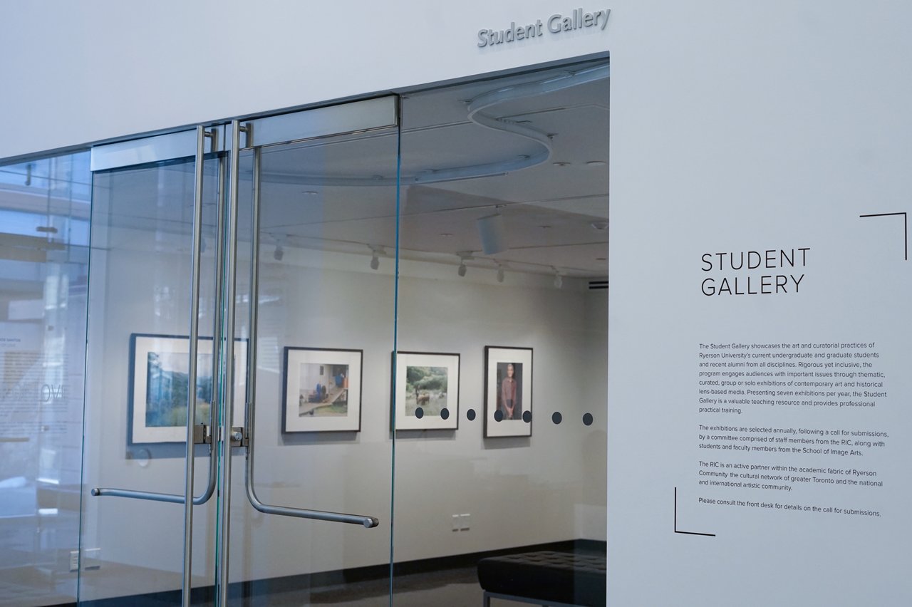
    The entrance to the Student Gallery at Petrija Dos Santos exhibition. Photo: Iris Wu

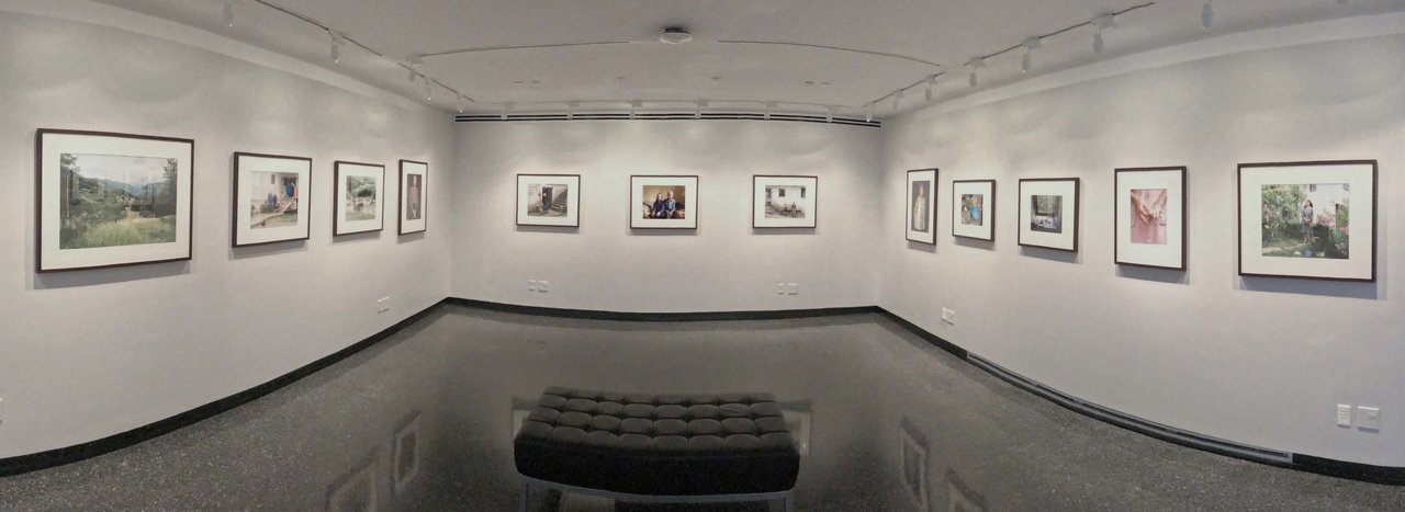
    A Labour of Love is a series of photographs depicting landscapes and people Dos Santos encountered in the rural area when she visited Serbia. The entire series contain 12 photographs placed in a horizontal line, directing spectators to view the collection from left to right. As captured by her camera, these poor people in small villages or in the mountains continue making their living in the old ways in tending to their lands and animals. Dos Santos wrote, “Labour is deeply connected to the traditional Serbian way of life, and is particularly evident in rural communities. Often sustained by only a handful of people, these communities are bound together by their love of the land, foregoing the conveniences of urban life and staying connected to rural and cultural traditions.”

    Installation view of Petrija Dos Santos, A Labour of Love at Ryerson Image Centre, 2018. Photo: Iris Wu

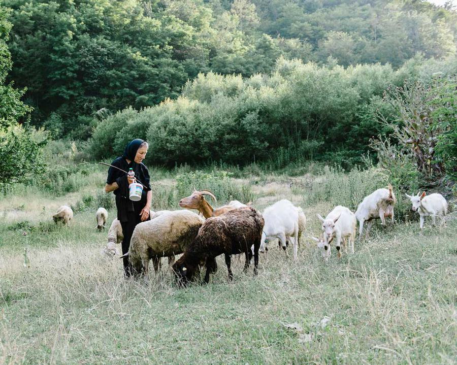
    Just by looking at these pictures, it is obvious that the artist has spent a lot of time with the people she photographed. She talked to them, listened to their stories, and gained their trust. That’s why they look so casual, suggesting a sense of intimacy between the photographer and her subjects. Dos Santos has successfully captured the moments of their everyday life; the ordinary and the poetic at the same time. In Branka and her Goats, the shepherdess is surrounded by her goats in a mountain pasture. She is an older woman, very thin with a hunched back, evidences of a hard life. Still we can see in her gesture that she loves her goats. However poor she is, she still radiates dignity and pride of a decent labour.

    Petrija Dos Santos, Branka and her Goats, Nadrlje, Serbia, 2014, chromogenic print. Courtesy of the artist and Ryerson Image Centre

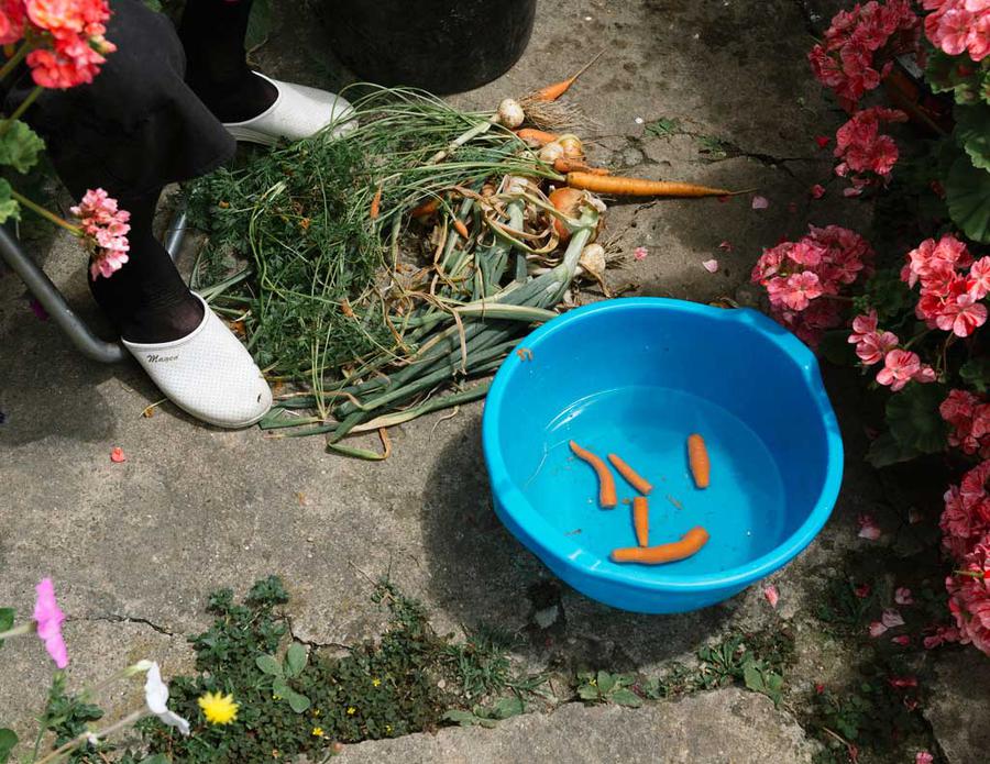
    In Untitled (Carrots), we only see the woman’s feet and a blue basin with washed carrots. There are some other vegetables waiting to be cleaned, surely meant for the same dish. They don’t look great but they are, for sure, organic and taste better that any you can buy in a city. Beside the basin there is a beautiful, blooming geranium, somehow poor areas have the most beautiful flowers.

    Petrija Dos Santos, Untitled (Carrots), Topola, Serbia. 2014, inkjet print. Courtesy of the artist and Ryerson Image Centre

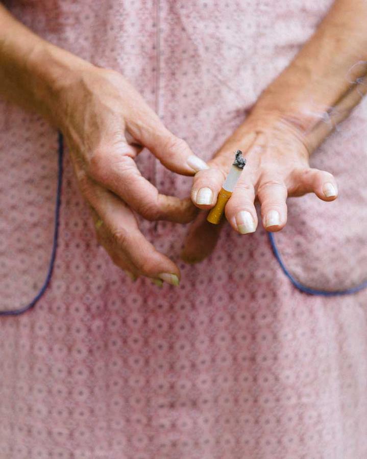
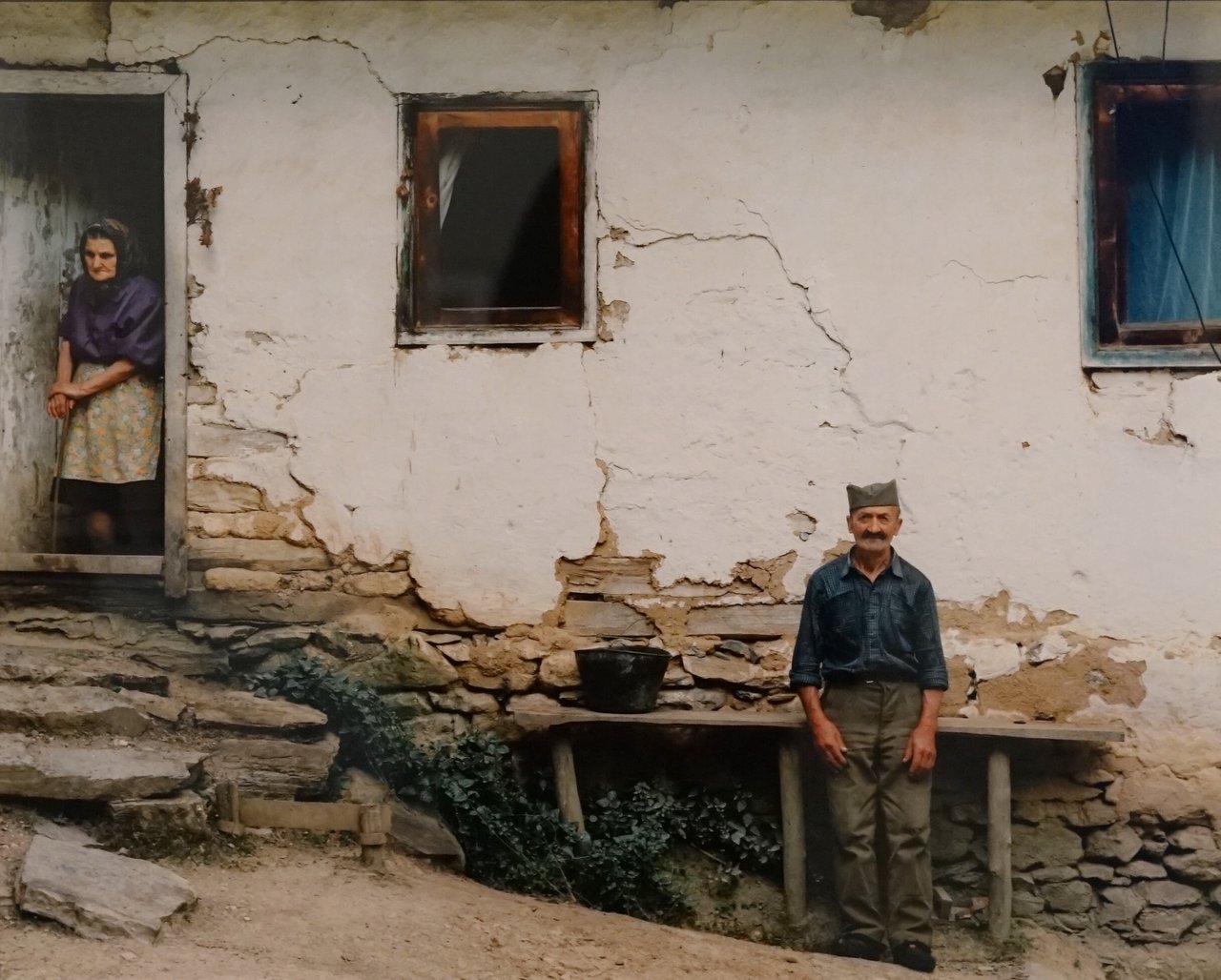
    History is ever present, as the life of the people in these photographs was dramatically altered by it. You can clearly see a soldier’s stand in the old man’s posture who most likely witnessed the civil war that ended the former Yugoslavia. He still wears his hat in the same way. Vera has seen much better days as her hands hint (Vera’s Hands), still fashioning a French manicure but with broken nails now.

    Petrija Dos Santos, Vera’s Hands, Topola, Serbia, 2014, inkjet print. Courtesy of the artist and Ryerson Image Centre

    Petrija Dos Santos, Untitled, Serbia, 2014, inkjet print. Photo: Iris Wu

    Through her images Dos Santos provides a glimpse into the bittersweet life of these rural residents. By catching this “everydayness” she is able to document – and “preserve” in a certain way – the simple and undisturbed society that still exists, before disappearing forever.

    Iris Wu

    *Exhibition information: March 7 – April 8, 2018, Ryerson Image Centre, Student Gallery, 33 Gould Street, Toronto. Gallery hours: Tue, Thurs, Fri 11 – 6 pm, Wed 11 – 8 pm, Sat – Sun 12 – 5 pm.

    **Note: Exhibition tours daily at 2.30 pm.

  • Mountain Paintings at General Hardware

    Caroline Larsen is a Canadian born artist based in Brooklyn, New York. Her collaboration with General Hardware Contemporary is definitely worth a visit if you are wandering on Queen West and have some time to spare. The show, curated by Caroline Larsen, involves works by three other artists as well: Leah James, Maria Calandra and Brian Willmont. The artists are friends, belonging to the same art circle in Brooklyn.

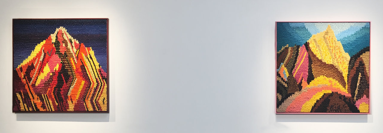
    Installation view with Caroline Larsen, Cross Stitch Mountain (left) and Ideas from the North (right), 2017, oil on canvas, 34″ x 34″

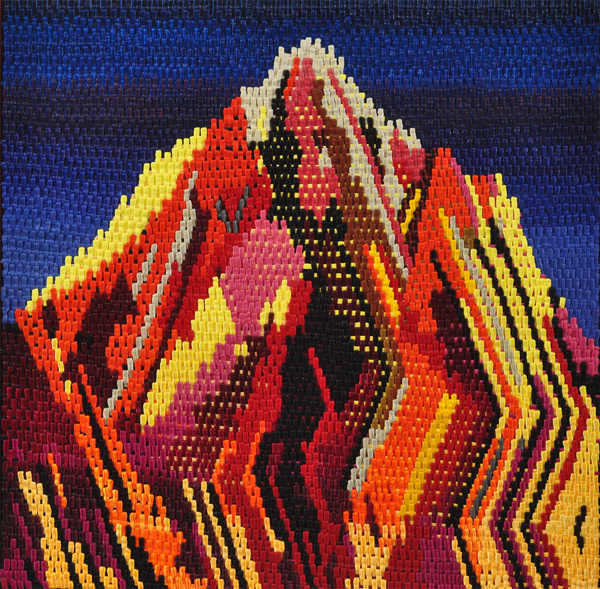
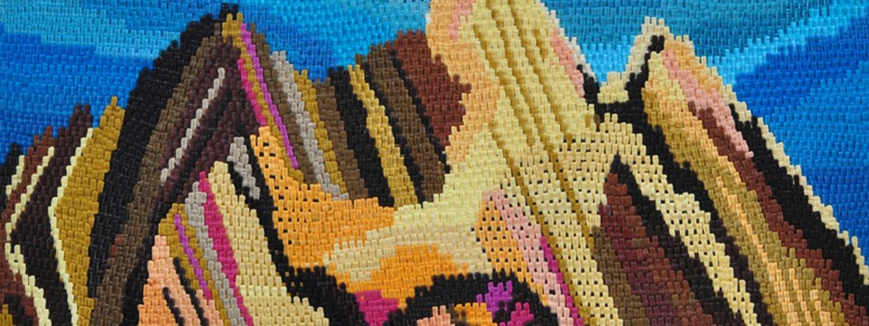
    Larsen’s works occupy the majority of the gallery’s space. Her depictions of the Canadian Rocky Mountains and scenes of southern California are inspired by familiar landscapes and places where she has spent some time, either as a resident or as a visitor. She takes the most significant elements from the landscapes and then simplify them into abstract ornaments dominated by shape and color. The pieces look like textiles but at closer examination the illusion of woven fabric disappears and an intricately painted pattern emerges. She loads the paint into piping bags and squeezes it onto the canvas; instead of using a paint brush, the paint comes directly from the pipe and leaves thick, three-dimensional marks on the surface. For me, the process of squeezing paint onto the canvas resembles a baker putting icing on cupcakes. It is hard to figure out something new in abstract painting since so much has been experimented with already, still, Larsen found a way to be unique with her special method of paint application.

    Caroline Larsen, Cross Stitch Mountain, 2017, oil on canvas, 34″ x 34″

    Caroline Larsen, Magic Mountain, 2017,oil on canvas on panel, 39″ x 50″, detail

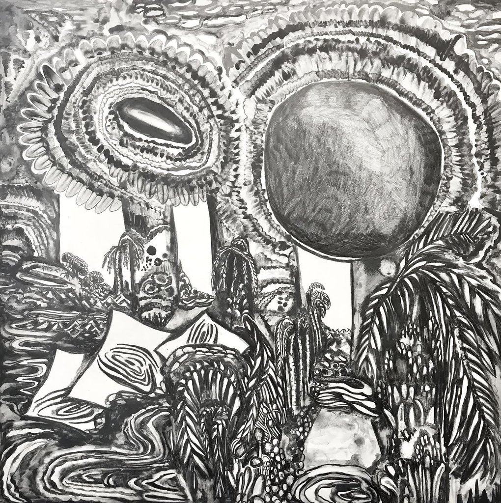
    Maria Calandra is the artist and writer of the blog Pencil in the Studio. As part of the project Calandra visits the studios of other artists for an entire day and makes drawings of their places and art works while there. Then she posts her work accompanied by a writing of her experience. In her other drawings, Calandra takes inspiration from automatism, drawing whatever comes to her mind, using a mix of graphite and liquid graphite on panel.

    Maria Calandra, Crystal River, 2017, Graphite and liquid Graphite on Claybord Panel, 12″ x 12″

    Brian Willmont uses airbrush to create his floral themed piece. The painting looks very digital due to his method of color application while it also resembles the flatness of stencil works.

    Brian Willmont, Untitled, 2017, acrylic on canvas, 30″ x 24″

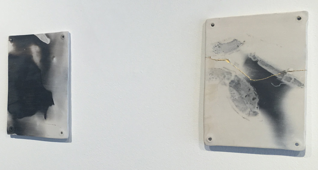
    Leah James created a group of ceramic pieces for the show, that imitate marble. The pit firing process is where the chemicals oxidize and leave marks on the clay that resemble the visual impact of a painting.

    Leah James, Mineral Vocabulary: Firing Performance V, 2017, pit fired stoneware, 5.75″ x 8.75″

    This is an unique exhibition. If you are looking for something different in the abstract painting genre, General Hardware Contemporary is your best choice!

    Ailin Qi

    Images are courtesy of General Hardware Contemporary

    *Exhibition information: Caroline Larsen: Mountain Paintings, March 4 – April 14, 2018, General Hardware Contemporary, 1520 Queen Street West, Toronto. Gallery hours: Wed – Sat, 12 – 6 pm.

  • Bruno Barbey: Witness of Things Past

    The Moroccan-born French photographer, Bruno Barbey, is one of the most internationally renowned artists, with works in museum collections and about 50 books to his name. The exhibition held in Stephen Bulger Gallery is a sophisticated collection of Barbey’s selected photographs, under the title, Witness of Things Past. As the theme suggests, the exhibition exploits the moments captured by Barbey to remind the audience of the past that used to be vividly alive.

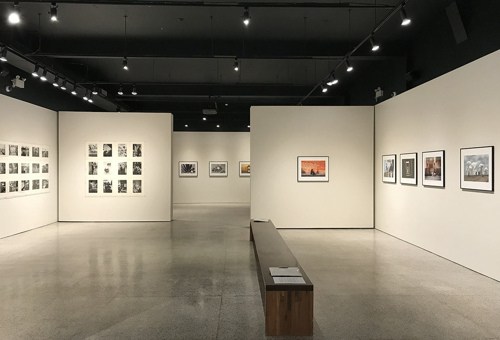
    Installation view. Photo: Robyn Zolnai

    The Stephen Bulger Gallery is a wonderful place to display these photographs. The large gallery is intricately divided into smaller sections. On the left side there is the collection of black and white photographs mostly shot in the 1960s while the rest of the place is dedicated to framed color photographs from the artist’s oeuvre of later years.

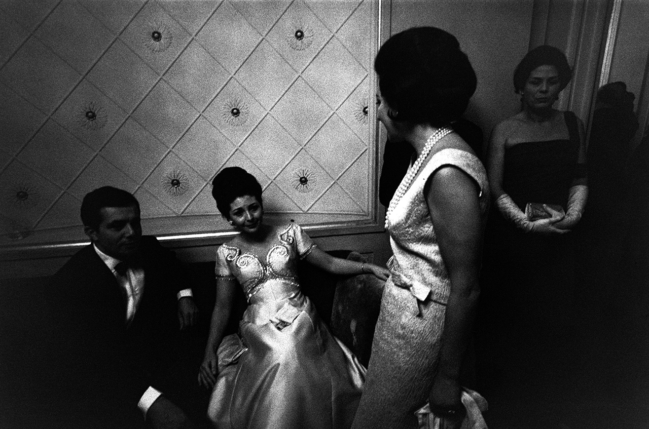
    Milan, Opéra, 1964 © Bruno Barbey / Magnum Photo

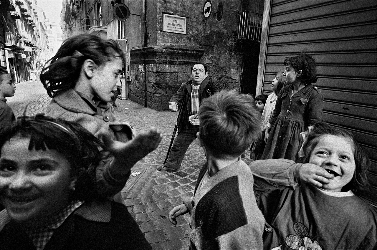
    In the early 1960s, Barbey’s professional career begun with his series “The Italians”. The black and white works feature popular themes: families sitting on a motorcycle, laughing happily; leaders making their speeches to the crowd; fashionable dressed ladies and gentlemen in the opera or dancing in ballrooms. As Barbey said he believed in spontaneity, never asked for permission from his “models” to photograph them, since it would change the atmosphere, make people to pose and it would steal the image. He dislikes large, complicated cameras and makes his images in daylight. Most of the black and white photographs are depicting small details and unimportant subject matters, like the little things in life we might have overlooked but Barbey picked them up for us, just to memorize that particular moment. The narrow street is packed with laughing children in Naples, showing their poor surroundings and the beggar in the background, as it really is. Barbey creates a modern Commedia dell’arte, involving the rich and the poor, radiating life and energy.

    Naples, Italy, 1962 © Bruno Barbey / Magnum Photo

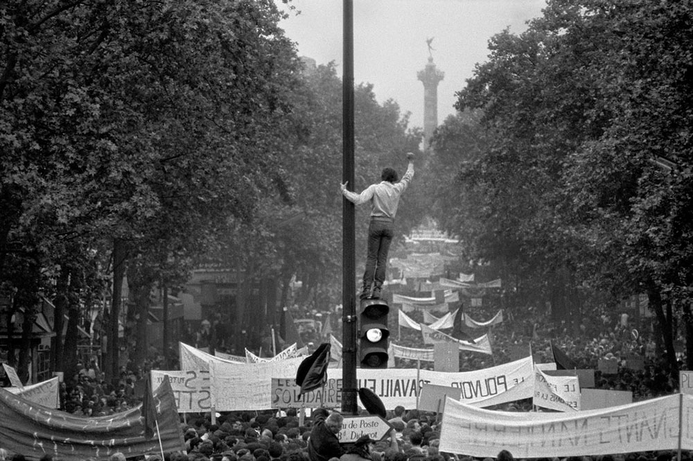
    One of his early eminent, award winning photograph is One million demonstrators walking towards the Place de la Bastille, May 13th, 1968. The unrest in Paris, in May 1968, began with university student’s occupation protests against capitalism, consumerism and American imperialism. Very soon it spread into factories, strikes broke out all over France and the French government was afraid of a revolution. The photograph depicts one of the best moments of the movement, when it is strong, the people are united, brave and determined. It shows how peaceful the crowd is, marching with their banners, wanting a better future. Even the government brutally broke up the uprising, its historical importance as a “social revolution” remained. Of course, Barbey didn’t know all of this at the time he took the photo, he, like the young man on the top of the traffic light, observed it – and that’s all a photographer can do. 2018 is the 50th anniversary of the May protest in France and Barbey is editing a book to commemorate it.

    One million demonstrators walking towards the Place de la Bastille, May 13th, 1968
    © Bruno Barbey / Magnum Photos

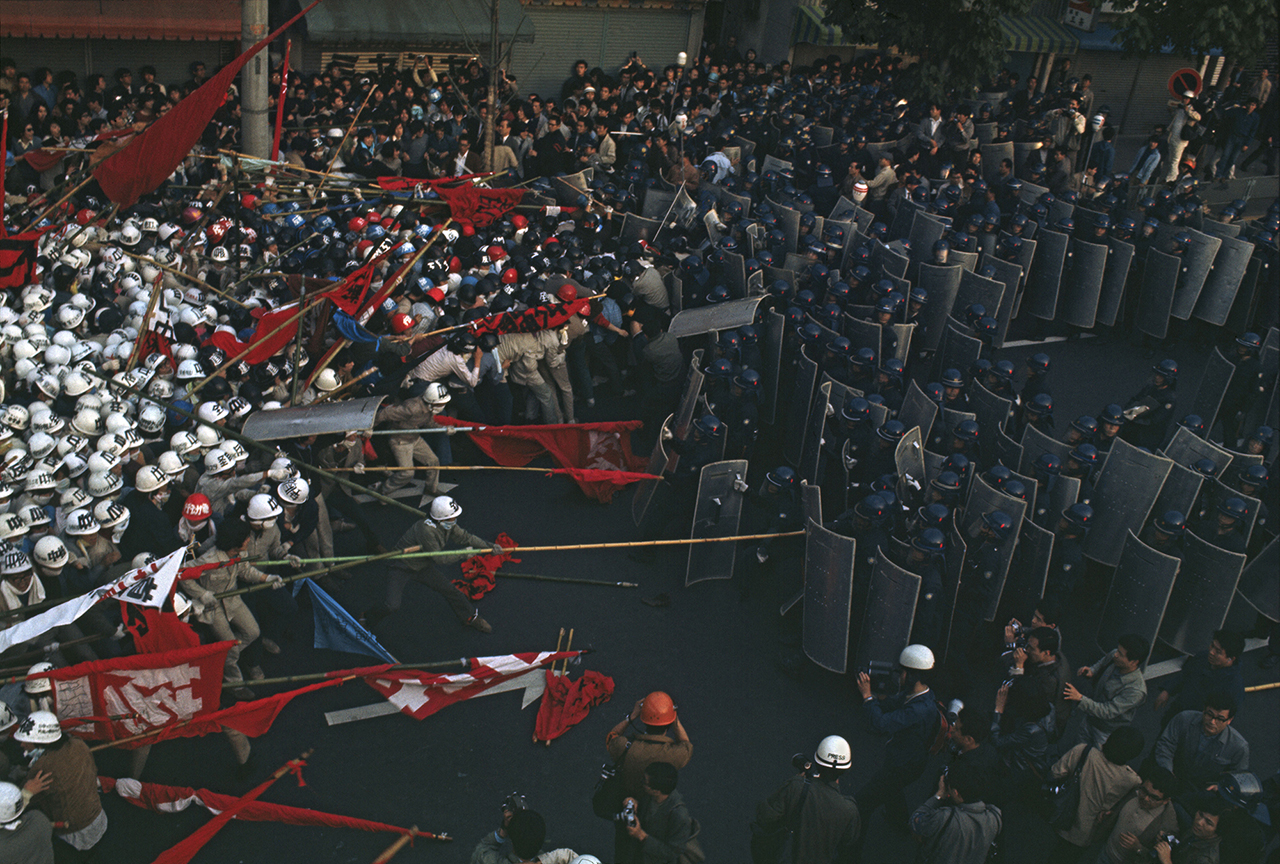
    Not all of the demonstrations were as peaceful as that one in Paris. Demonstration against the construction of Narita Airport and the Vietnam War, Tokyo, Japan, 1971 shows the opposing powers in the very moment they are attacking each other. The block of people in the protesting crowd – wearing white helmets and carrying red flags – is strongly juxtaposed by the police force’s dark square. The fighting has already started in the background, the photographer picks the moment when everything is possible, we don’t know that it would be a bloody fight or just a confrontation with a few broken bones.

    Demonstration against the construction of Narita Airport and the Vietnam War, Tokyo, Japan, 1971 © Bruno Barbey / Magnum Photos

    The framed works are the highlights of this exhibition. In those, mainly for Magnum, Barbey addresses more political and military issues as a war photographer. He has been traveling to hundreds of countries in five continents such as China, Vietnam, Korea, Morocco, India, Kuwait, Japan, France, Brazil and so on, to document their affairs and happenings. This is a tough journey, that the artist has found challenging in many ways, not just the physical danger itself but the mental burden as well. The works he has created in war zones are very dramatic and astonishing. The photographs are documentaries of the events of war but Barbey’s main focus is always the people who live through it. War photographs in our times are different from the ones we saw in history textbooks about WWII. The main battles are usually happened in the background in the past or just ready to start.

    Burgan oil fields, Kuwait, 1991 © Bruno Barbey / Magnum Photos

    Burgan oil fields, Kuwait, 1991 records the scene when 500 oil wells were on fire when Iraq occupied Kuwait. The burning oil wells and the GIs driving in their truck away from it seems like a scene from the movie Apocalypse Now, a very dangerous place to be. The real danger in war photographing, as Barbey pointed out in Photographer Spotlight, that it has no dimensions, the situation is very cruel and death occurs almost natural, so the viewer easily becomes cynical. Barbey doesn’t want to turn into one of those people and quotes a fellow photographer, Cornell Capa, to outline his own philosophy: “The Concerned Photographer produces images in which genuine human feeling predominates over commercial cynicism or disinterested formalism.” As Barbey said he makes his living as a photographer but first of all he focuses on and feels great compassion for the people involved in the situations he documents.

    Barbey’s favourite themes are peaceful scenes, especially historical places where people follow traditional practices while, at the same time, apply themselves to our modern times. He is photographing extensively in China today where those transformations are very visible now and a book soon will be published with his images.

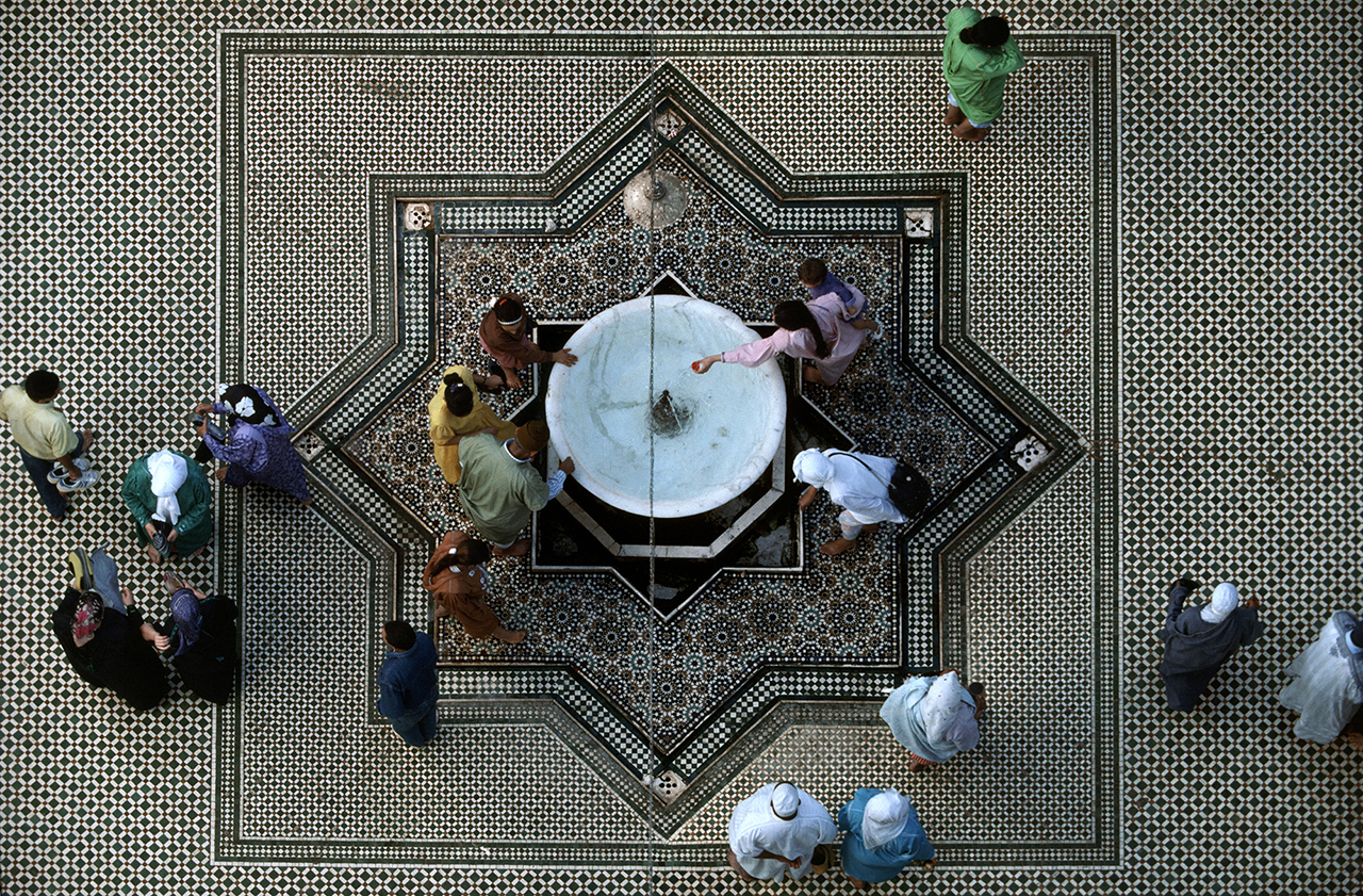
    Courtyard of Moulay Idriss’ Zaouia, Fes, Morocco, 1983 © Bruno Barbey / Magnum Photos

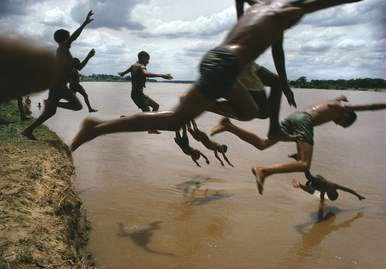
    Barbey loves to depict people in ordinary moments, but the way he does it is everything but usual. The boys in Leticia, Colombian Border (The Amazon River), Brazil, 1966 are shown in different stages of their jump, so we can feel their speed and joy without focusing on any of them. Rivière des Galets, Reunion Island, France, 1991 shows a bicyclist in a very tricky composition when it is hard to decide when the water ends and the human body begins.

    Leticia, Colombian Border (The Amazon River), Brazil, 1966 © Bruno Barbey / Magnum Photos

    What makes Barbey a great photographer is not only his technical perfection, sense of beauty but his humanitarian attitude, his love toward his subjects and the stories he tells about them. Like he said, photography is the only subject that people could understand without a single word.

    Xiaotong Cao and Emese Krunák-Hajagos

    Images are courtesy of Stephen Bulger Gallery

    *Exhibition information: March 10 – April 14, 2018, Stephen Bulger Gallery, 1356 Dundas Street West, Toronto. Gallery hours: Tues–Sat 11 am – 6 pm.

  • The Sunshine Eaters / Onsite Gallery

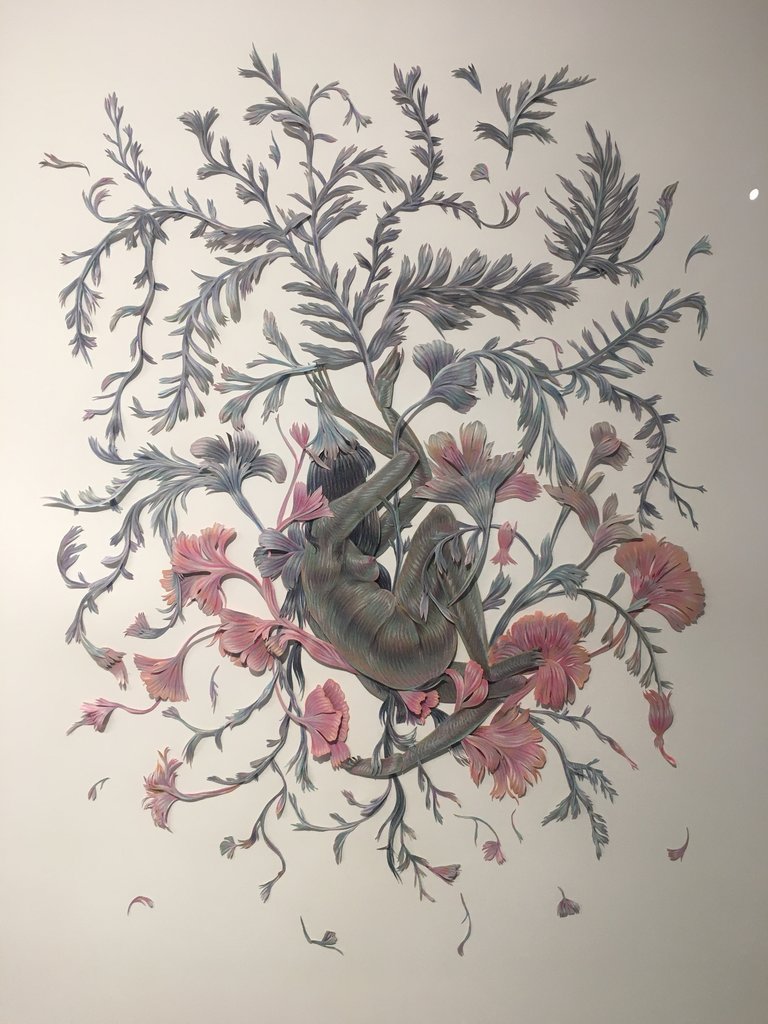
    Winnie Truong, Parasympathetic, 2017

    The Sunshine Eaters at Onsite Gallery encapsulates how artists look to nature as a way to ignite hope in the face of crises. Currently on display is ​Parasympathetic (2017) by Toronto artist, Winnie Truong.

    Truong has a total of eight spellbinding papercut works in the exhibition, each delivering their own sense of play in the form of collage-like entanglements. Secluded within plants, flowers and trees – ​Parasympathetic draws attention to feminine forms and celebrates whimsical exaggerations. Within the scenes of marsh and myth masked nymph characters are enveloped in their own fantasies and enchantment. Troung’s attention to details give a phantasmagoric​ visual experience, which transcends the viewer into colourful spirals of beguilement​. Her work is delicately curious, and creates a moment of personal intimacy when hope is understood as a self-reflective moment between the individual and the land.

    Nikole Turrer

    *​Exhibition information: January 10 – April 15, 2018, Onsite Gallery, 199 Richmond Street West, Toronto. Gallery hours: Wed 12 – 8 pm, Thurs – Fri 12 – 7pm, Sat – Sun 12 – 5pm.

  • York University’s Exhibition at Gallery 1313

    You never forget the students who consistently stood out in your fine arts undergraduate program. Within the context of the university, they were the superstars of your peers and contributed to the standard of excellence that became required of the whole class. This show titled York University Juried BFA Exhibition is a collection of these outstanding graduating students.

    Upon entering the gallery, you are greeted by three considerably different sculptures. The first is Faceless, my Imaginary Friend by Malina Sintnicolaas, a ceramic sculpture of a long blue feathered beast with human arms and a forked tail. The creature is faceless, yet its body is directed towards the entrance as if looking from unseen eyes and ready to crawl towards the visitor. It doesn’t appear menacing, but instead curious or apprehensive. The work is rendered beautifully with its soft ombre colour pattern, the soft skin palettes, sculptural depictions of tendons and fingernails, as well as the use of glazes.

    Malina Sintnicolaas, Faceless, my Imaginary Friend, 2017, ceramics

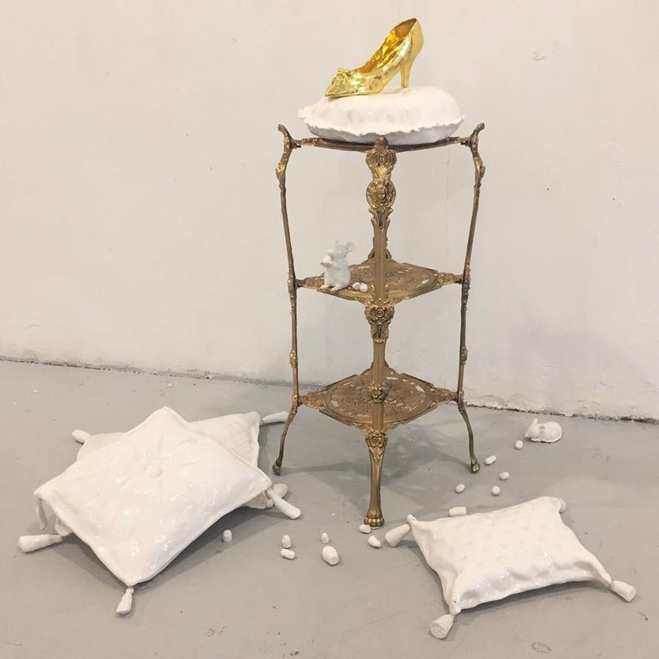
    Not a Happy Ending by Alissa Leung is a mix of ceramics and found object to create a diorama depicting a scene from the Grimm Brothers’ classic fairy tale Cinderella. The first impression of the work is one of pure beauty, elegance and luxury. At a closer look we can see that the ceramic mice are not eating crumbs or cheese but severed toes. The classic juxtaposition of lavishness and the macabre within this fairy tale can easily be read as the violent nature of the bourgeois, when the slipper becomes a symbol for ascension into high society and no cost can be too steep to achieve it, even in this case, body mutilation. From a contemporary perspective, the symbol may take on as a representation of unrealistic beauty standards created by the media and the severed toes are the self-destructive actions people take to try to achieve them.

    Alissa Leung, Not a Happy Ending, 2017, ceramics

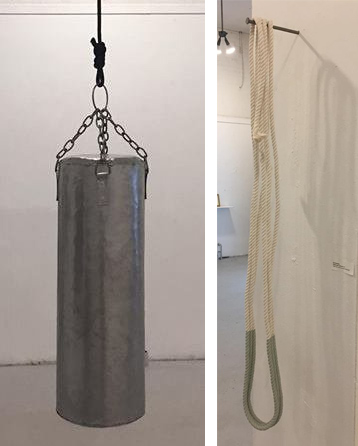
    Punching Bag by Robert Warner is constructed out of steel and suspended by a thick black rope. While floating and harmless, there is an immediate visceral reaction evoked by the piece, where the understanding of the object is staunchly juxtaposed with its materiality, leaving viewers with an imagined pain in their knuckles. Ana Ghookassian’s Nothing-Again-Continued is a cotton rope dipped in a soft green latex paint and hung from a large roofing nail. An abstract and poetic work that seems to be inspired, as the title suggests, by a nihilistic ethos of perpetuation. Beautiful and industrial, the work seems precarious but also immensely strong and precise.

    Robert Warner, Punching Bag, 2018, steel (left) and Ana Ghookassian, Nothing-Again-Continued, 2017 (right)

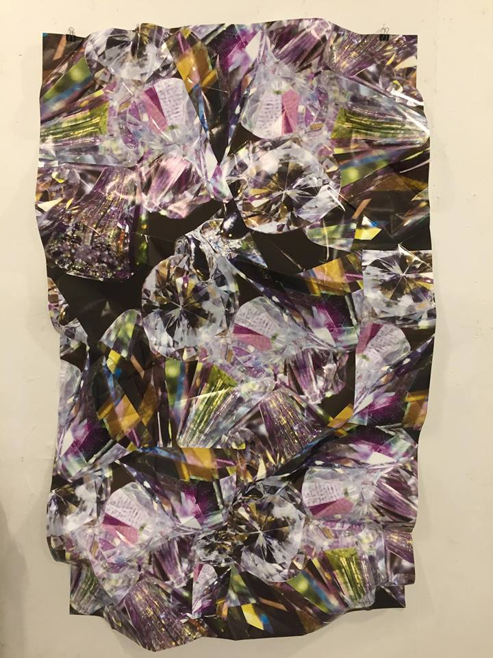
    Looking at the pieces that hang from the walls Haley Cobran’s works, Prismatic, catch our eyes with their intense visual appeal. They are large scale inkjet printed photos of diamond gemstones intentionally crumpled, creating dimensions and ridges to imitate edges of cut and natural crystals. There is tension between the flatness of photography, the forms depicted within the photograph and the sculptural formation. Similarly, the refraction of light is emphasized, since the bends and folds of the work confuse the paths of light within the image while also catching the light within the gallery, casting a new set of shadows and reflections.

    Haley Cobran, Prismatic, 2018, inkjet print

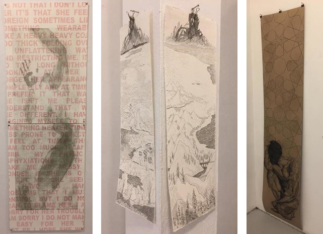
    Laura Sbrizzi’s It’s Not That I Don’t Love Her is a soft-ground etching print of a body that seemingly pressed against an invisible wall overlaid with pink text. Even redacted through cropping, the text seems to be describing why the writer breaks up with his female partner. Combined with the impression of a woman’s body, the work evokes feeling of victimhood and the subjugation of women, since the text is the male ideal archetype of a 1950’s housewife. Outlook is four graphite drawings of a fantasy landscape by Sophia Goshulak. Each piece is on a different side of a square column in the gallery and their edges are a continuation of the adjacent work. A wonderful use of the gallery’s architecture, the work expands the scale of a small feature by juxtaposing it with immense and deep world building. Identity Crisis by Nima Arabi, a long vertical charcoal drawing on brown paper, depicts a figure crouched, nearly in a fetal position, and a fractal like design as a background, possibly emerging out of the figure itself. The work seems like a representation of the fractalization of the self that occurs in a state of identity crisis.

    Laura Sbrizzi, It’s Not That I Don’t Love Her, 2018 (left) ; Sophia Goshulak, Outlook, 2018 (middle) and Nima Arabi, Identity Crisis, 2018 (right)

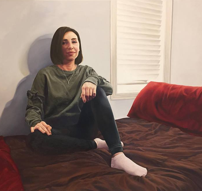
    Ness by Danielle Clarke is a realistic oil painting of a girl. The story behind the work is that the artist wanted to help the subject, Vanessa, and the audience to appreciate her beauty. Vanessa grew up with a facial deformity and has been plagued with harsh and cruel negative reactions, as well as a general stigma of being different. Through portraiture the artist hopes that representing otherness can lead us as a society towards openness.

    Danielle Clarke, Ness, 2018, oil on canvas

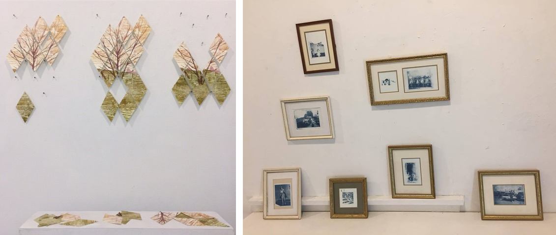
    Rhizome by Catherine Orav is a triptych of woodcut prints on interchangeable rhombus shaped rag paper. Each work depict the same scene of a landscape centered on a single tree. A variety of clever elements are at play in this work. Rhizome refers to the botanical process of plants creating genetically identical versions of themselves through stemming root-structures, such as the Trembling Aspen in North America. This ability to multiply is parallel to the printing process to create multiples. Tyler Matheson’s Inheritance is a salon style display of vintage photographs from the artist’s personal archive. The framing and the snap shot photos all contribute to a feeling of home, yet the stark blue colour from the cyanotype process shows a clear intervention as well establishes a distinct aesthetic.

    Catherine Orav, Rhizome, 2018, woodcut and screen-prints and Tyler Matheson, Inheritance, 2018, cyanotype

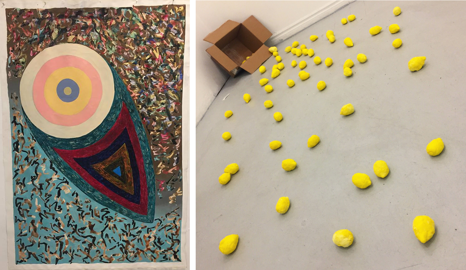
    Guilin (Gloria) Li’s The Real is an abstract diagram expressing the artist’s inner and external self. The central pastel circles represent the artist’s persona of a sweet, kind and soft girl while a much darker set of colours show her true, inner nature, which can be aggressive and dark. The scribbled Chinese characters depict the broader context of society, friends and family. Hyatali’s When Life Gives You Lemons is a sculptural installation that spreads across the majority of the room with clay lemons. The work is simple, seemingly lacks strong technical execution and trite, but it is one of my favourite works in the show because of its gestural display and how people respond to the title.

    Guilin (Gloria) Li, Real, acrylic, ink and oil on canvas (left) and Shannon Hyatali, When Life Gives You Lemons, 2017

    In the Cell Gallery there is Study II by Camden Wallenwein. Exploring chance and reclaiming the detritus of the printmaking process, the artist takes dirty rags and runs them back through a press. A fascinating study that really takes printmaking to a meta and self-reflecting realm.

    Study II by Camden Wallenwein

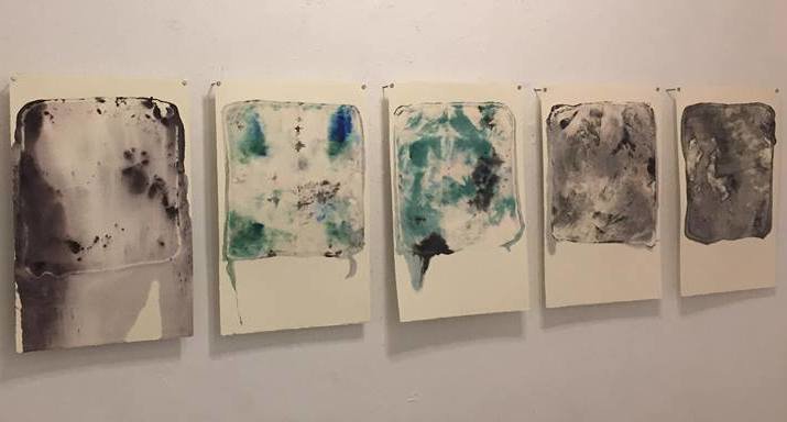
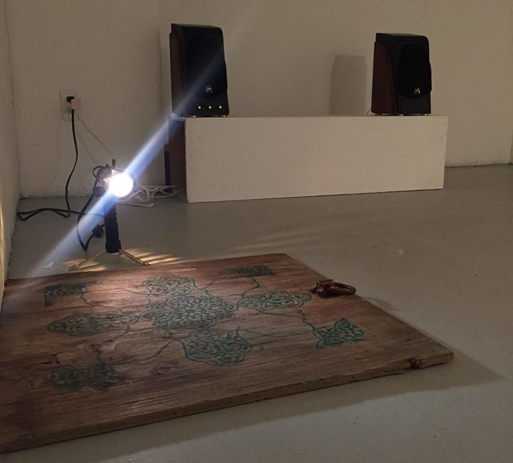
    Lastly, in the Process Gallery, we have three distinct sequential audio works on loop and two sculptures by Elham Fatapour. Fatapour’s Trapdoor are found pieces of wood with decorative designs painted on them. The overhead lighting in the room has been turned off, only the trapdoors are spotlighted. The first audio piece Untitled by Danjing Lin is an eclectic mix of noises from highly textured soundscapes to scroll through pop radio stations. Carlie Mackrell’s Whale in the Studio provides the space with the sounds of a whale’s call juxtaposed by the grinding sounds of a construction site. Christina Chiarelli’s Premonition, Paranormal Activity, Ascension, Malaise, Transcending is an series of ethereal sounds. The ominous sounds combined with the notion to lift the trap door by its clasp, changes the atmosphere from gallery to horror movie.

    Elham Fatapour, Trapdoor 2017, found wood and acrylic

    The show tackles concepts from personal concerns to broad cultural issues, abstraction to realism and many more varied styles and various ideas.

    Nathan Flint

    *Exhibition information: March 14 – 25, 2018, Gallery 1313, 1313 Queen Street West, Toronto. Gallery hours: Tue – Sun, 1 – 6 pm.


  • Decadence / Pari Nadimi Gallery

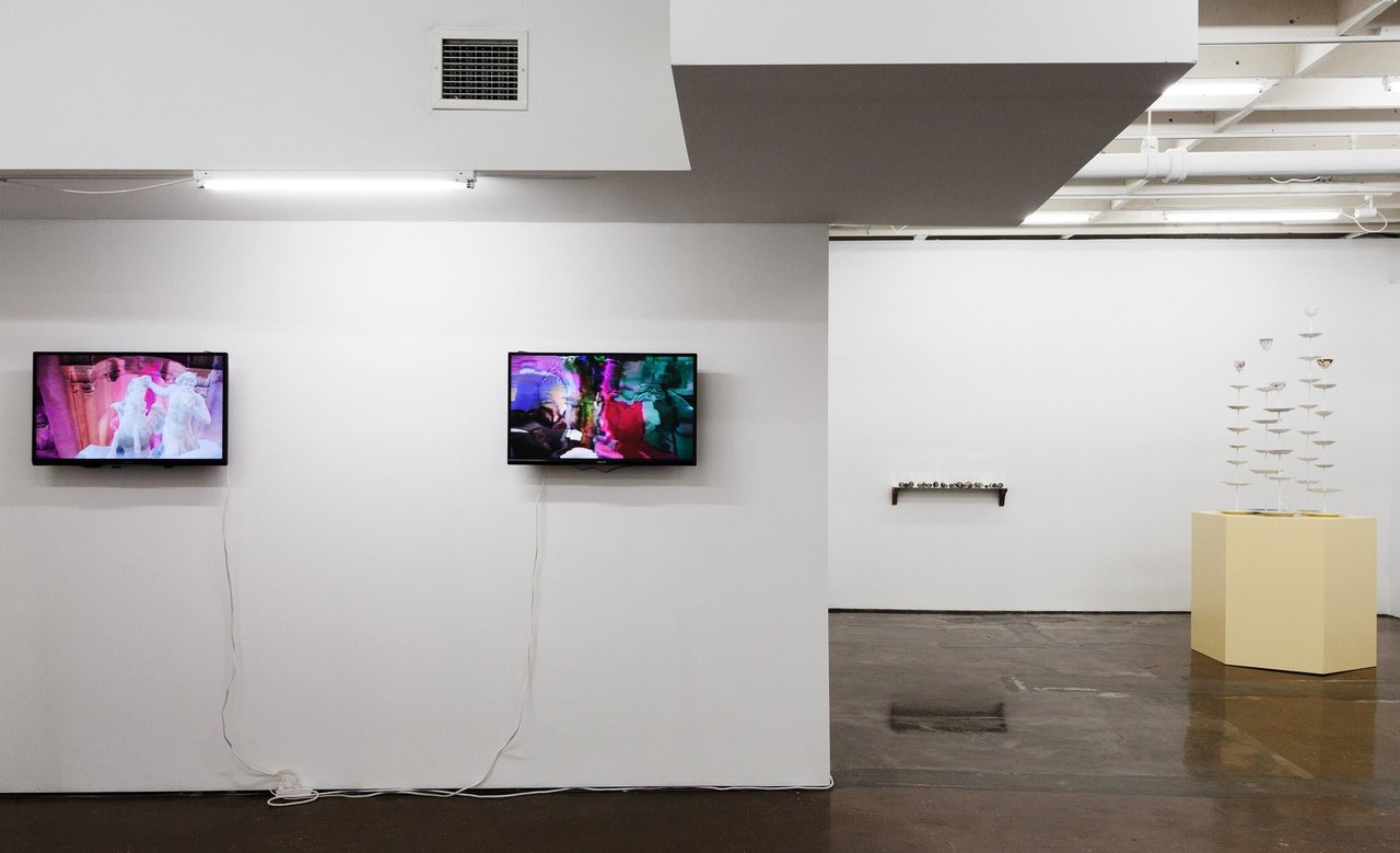
    Curator Tak Pham offers sweet indulgences and sour truths in Decadence at Pari Nadimi Gallery. The works in the exhibition play off one another as they confront the viewer with an ontological framing of what it is to exist in a state of decline, as Pham states “the politics of the world are distilled into flavourful displays of desire as the subjects have gone past satisfaction and head towards deprecation.” Take for instance Adrienne Crossman’s videos Trevi (2016) and David (2016) installed on separate monitors facing the entrance. The works display the distinct patterns of “datamoshing” a term for the visual effect of when digital signals essentially get mashed together due to an incorrect compression rate. The end result in this case has given a liquid like appearance to the video causing forms morph into one another. The content for Crossman’s videos feature short clips of Michelangelo’s David and Rome’s historic Trevi Fountain on loop; the famous white marble sculptures of a bygone era become merged and cast into low-res rainbow-strewn GIF-like loops where the virtue of classical art is at odds with that of our constantly fluctuating post-internet society.

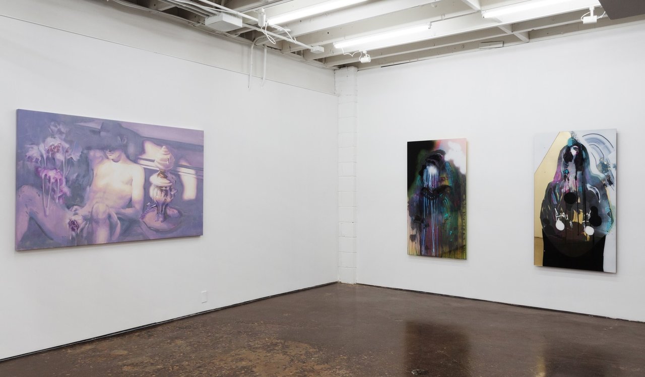
    Installation view with Adrienne Crossman, Trevi, 2016 and David, 2016 (left); Anna Kovler, Plum Figurines (2018) and Fantasy Cake Set, 2018 (right). Photo: Laura Findlay

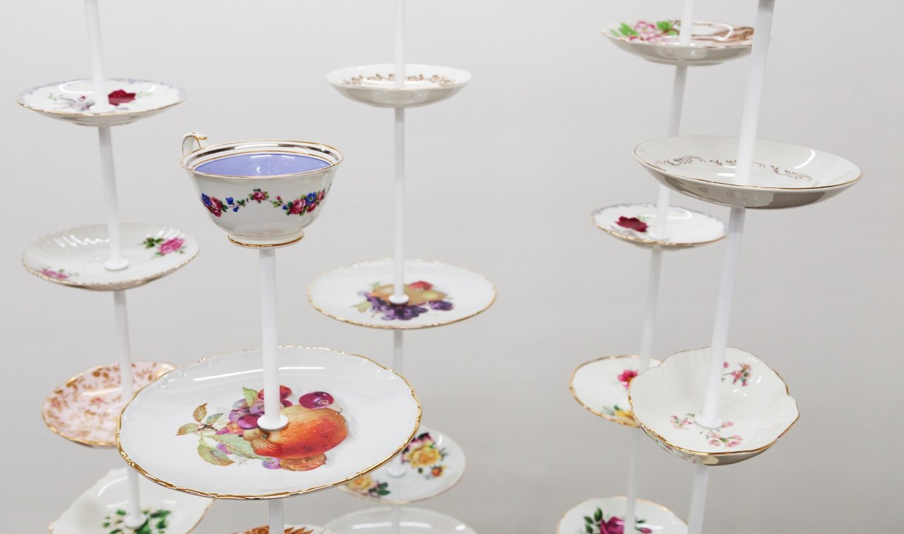
    Anna Kovler on the other hand offers the exhibition a gesture in the form of porcelain collections. In one of her two sculptures for the exhibition, Fantasy Cake Stand (2018), mixed dessert plates are stacked above one another like a tall multi-level dessert platter. In the centre, surrounded by the plate-towers sits a crystal dinner bell, an impractical object that would easily break if ever put to any use. The plates are reminiscent of what one might find at a grandmother’s house, a mix-match of plates and tea cups, collected from thrift stores perhaps, once part of a potentially valuable china collection as a full set but now drastically devalued as single units, a tea party detritus.

    Anna Kovler, Fantasy Cake Stand, 2018, detail. Photo: Laura Findlay

    Ivan Alifan contributes to the exhibition with Infusion (2018), a figurative oil painting with a complex pallet of hazy violet and purple hues. The work depicts a naked body slouched in a dark room illuminated by yellow sunlight cast through an unseen window. A foamy substance surrounds the figure in creamy globs. Between these globs and the drenched dripping rose placed between the open legs the viewer becomes voyeur to the figure’s post-climatic exhaustion. Perhaps a bit of a sexual hang-over? The orgasm has ended, the figure slouches back and a black cloud shrouds the face. The painting seems conceivably encountering a moment of indignity after being so consumed by sexual urge.

    Installation view with Ivan Alifan, Infusion, 2018 (left), John Holland, Lo-Fi, 2016 and Valencia, 2018 (right). Photo: Laura Findlay

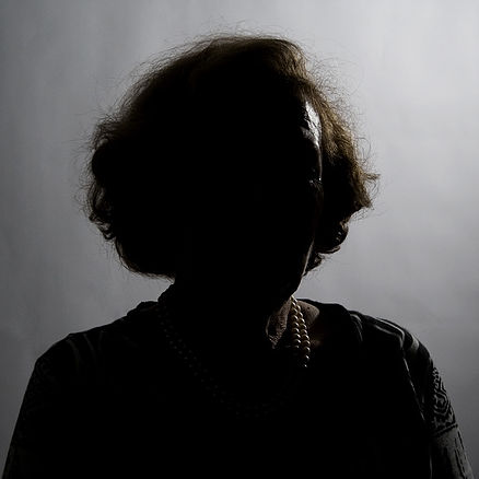
    Likewise to Alifan’s method, other works in the exhibition that feature figures have also had their subject’s identities hidden or obscured. John Holland’s painting’s Lo-Fi (2016) and Valencia (2018) started as photographs of his friends that were altered though digital filters, printed and then put through the process of applying paint sandwiched through sheets of plexiglass. As the outcome of this procedure the figures become lost in an abstraction of haunting depth, colour and form. In Matilda Aslizadeh’s photograph, Portrait 1 (2011), we are confronted by a back-lit figure. All we can tell that she is possibly a wealthy elderly woman, given away by her hair and pearls, but her features are completely hidden in shadow, like the artist wanted to protect her identity and wished her to remain anonymous. The density of the black in the photograph is consuming, she is faceless, she has become enigmatic, could be a victim or a perpetrator.

    Matilda Aslizadeh, Portrait 1, 2011. Courtesy of Pari Nadimi Gallery

    As Pham talks to me about his ideas surrounding what decadence means to him, he tells me “Too much candy gonna rot your soul”, a lyric from the song Lollipop by MIKA he says. It’s an apt aphorism for what Pham has brought to the table for this exhibition, the corrosion and breaking down of structure, the cavities have already been formed. The high has worn off and what was once extravagant is now fantastically grotesque.

    Daniel Joyce

    *Exhibition information: DECADENCE / group show featuring works by Ivan Alifan, Matilda Aslizadeh, Adrienne Crossman, John Holland and Anna Kovler, curated by Tak Pham, February 15 – April 14, 2018, Pari Nadimi Gallery, 254 Niagara Street, Toronto. Gallery hours: Wed – Sat, 12 – 5 pm.


  • BELIEVE at the new MOCA

    BELIEVE
    May 25 – August 12, 2018
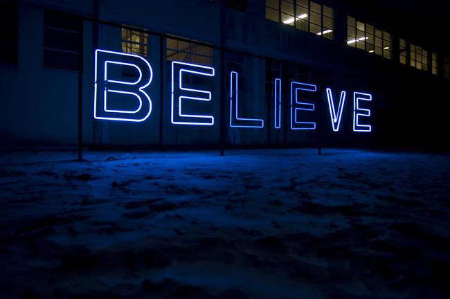
    Kendell Geers, BE:LIE:VIE, 2002. Courtesy Stephen Friedman Gallery, London, UK.

    BELIEVE curated by David Liss
    Can Altay / Matilda Aslizadeh / Carl Beam / Dineo Seshee Bopape / Awol Erizku / Meschac Gaba / Kendell Geers / Barbara Kruger / Nicolaj Bendix Skyum Larsen Tuan / Andrew Nguyen / Jeneen Frei Njootli / Rajni Perera / Jeremy Shaw / Nep Sidhu / Maya Stovall / Tim White

    Interview with David Liss (DL) Curator @ MOCA on the inaugural exhibition of the new centre and Phil Anderson (PA)

    PA: Congratulations, first of all, on your upcoming exhibition, BELIEVE. It has been a long journey for you and you have had to believe.

    DL: Thanks Phil. Yes, it has been a long journey from North York to Queen West to Sterling Rd. And yes, the very reason that Toronto now has a permanent home for a contemporary art museum is because so many people believed it could happen.

    PA: Why did you feel it important to address this first theme in your exhibit BELIEVE in the inaugural exhibit for MOCA?

    DL: It took quite a while and a lot of research and looking and thinking to come up with the exhibition theme. It’s the opening of a new and expanded facility so I wanted something that was powerful and positive and celebratory that as many people as possible could relate to. So in that brainstorming process of thinking of a title I went back to the very reason and motivation of why I moved from Montreal to take this job in the first place, was because I believed in the idea of establishing a contemporary art museum in Canada’s largest city. Despite the odds – starting with a minimal budget, no staff and a disadvantageous location – I believed that I could make this happen. And of course the reason it was able to evolve and happen is because of all of the people along the way that also believed in a contemporary art museum for Toronto – people within the City; the advisory board that hired me; the many staff and board members that have contributed along the way; a small army of volunteers and members, the art community here in Toronto – and in fact across the country – and of course the artists that believed. So on one level the exhibition is a tribute to all of those who believed in the MOC(C)A project.
    But with all of my exhibition titles, especially for thematic group exhibitions, I want the titles to be broad, poetic and layered with possible meanings and understandings, so it’s also about belief in general. It occurred to me that almost everything we do as humans is driven by belief – in ourselves, in others, in systems and processes. And there’s a paradox in that, as much as we demand physical and material evidence of something – “seeing is believing” – we equally rely upon ephemeral beliefs; beliefs that are uncertain or that cannot be verified. And often we believe in things – in systems, structures, rules and regulations – even when they seem arbitrary or irrational. One of the most fundamental characteristics of being human is that we seem to need to believe in something or anything to get us through a day or get us through our lives. And just as much as we’re driven by the need to believe, it is equally necessary for us to question our beliefs. What happens when belief systems clash? Our beliefs can bind us together or they can drive us apart. We all hold beliefs and doubts so it’s a concept that everyone can relate to.

    PA: In a world of fake news, scandal and uncertainty how does BELIEVE fit in reflecting the times?

    DL: Well, another thing that occurred to me as I was playing around with ideas and words and language was that the three middle letters of ‘believe’ spell ‘lie’, so the word and the idea itself embody a duality. Of course given the importance of this as an inaugural show, once I decided to go with the title, naturally I started second-guessing its relevancy but suddenly some of the things that were happening in the world began to reinforce the importance of belief; of lies and doubt, which of course are also related to the theme. And so things like ‘fake news’ and ‘alternative facts’ came along that – much to my horror about the world that we live in – but much to my selfish delight about my exhibition theme, it seemed that notions around belief were possibly more relevant than ever. Ha, ha!

    PA: What were the challenges and hurtles in putting together such an exhibition?

    DL: Well, first there’s the challenge of finding thematically relevant work but as a curator you learn so much, even if the research ends up following ideas that turn out to be dead ends. And with the Internet of course you can waste a lot of time getting lost down a rabbit hole. As much as I do enjoy the process – going to galleries, studios, travelling, and surfing the ‘Net’- I admit that it can be frustrating if you end up spending a lot of time looking and thinking and researching and writing about something that turns out to be irrelevant to the project. But that’s inevitable and to me it’s an interesting challenge and an enjoyable aspect of the gig. Less “interesting” are some of the practical challenges and obstacles, especially with a project that’s global in scope. Limitations of space and human and financial resources, of course, but these exist with any project. Also not unusual is that some works that I wanted for the show were unavailable for various reasons or the artist was unavailable to participate. Somewhat interesting with this project is that some of artists have become really ‘hot’ since I initially contacted them and suddenly they’re busy and overwhelmed with projects and opportunities, so it can be a challenge to keep them focussed on our project, which is now only one of many that they’re trying to juggle. But it’s exciting for MOCA to be presenting them within the context of an inaugural exhibition, and in some cases showing their work in Toronto for the first time.

    PA: Can you describe your selection of artists for this exhibition and why you felt their work addressed the theme of the exhibition?

    DL: I’d rather not get too detailed or specific here about each of the artists but I will say that whether the works are addressing something very personal, or culturally specific, or referring to specific mythologies or historical events, or speculating upon the future, ‘belief’ is a lens to view some of the fundamental issues of our times. Some of the works relate to ‘belief’ or belief systems directly and with others notions of belief are more deeply embedded or maybe less direct. A theme like ‘believe’ can be pretty wide open, and it’s intended to be more poetic than didactic, so that approach requires pretty intensive and extensive research because I don’t know what I’m looking for until I discover something. But my approach to curating group exhibitions is to identify a theme or an idea or a set of ideas that I think relate to important or interesting human issues and to find artists whose works might relate to or embody those issues, and then try and create a multi-faceted conversation amongst works that will hopefully examine different aspects or contribute to the conversation. So for me – and hopefully for those who experience the show – it’s about discovery or insight into some new idea or looking at something in new and different ways. I don’t establish a theory and then look for artworks to illustrate my theory. I try not to lock down or have it too pre-determined. I want the exhibition to be a living form. The exhibition itself is where the juice is. I’m more fascinated by art and artists and exhibitions than I am by my own theories or opinions. Of course as curator it’s my job to set the conversation in motion but I want to learn or discover things through the experience of the exhibition. I have a lot of confidence in the ability of artists and art works to speak for themselves.
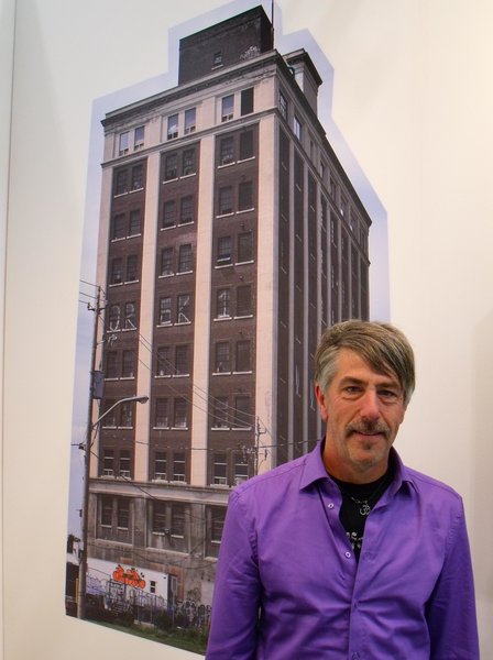
    David Liss (DL) Curator @ MOCA

    PA: How do you feel the art works will fit in the new exhibition space? How does it differ, say, from the former space on Queen St. West?

    DL: Good question! Ha, ha! I don’t know. I haven’t worked in the space yet and the renovation still isn’t finished. And so I guess this is another challenge. Of course I’ve been in the space many, many times over the last three or four years, and there are drawings and renderings, but those can only take you so far, or at least for me. I really need to “feel” a space to understand it properly. At the risk of sounding all ‘new-age-y’, the space and the architecture need to speak to me. Architects might understand this or I guess we can all relate to relationships between people and space. And this space has lots of character. The space on Queen was fairly straightforward: a lobby entrance, a main space and a project space. The space on Sterling is more interesting than that. Its 5 floors, and about 5 times the space that we had on Queen, and it has these wide columns, which I think are quite beautiful and are historically reflective of the industrial architecture of Toronto at the time. But they will potentially interfere with sightlines and obviously they have to be taken into account when thinking about exhibitions and display in ways that you might not have to if they weren’t there. But this forces your thinking to be more imaginative about the way art works function in space and in relation to viewers. I like that the space is not a generic white cube. It’s a charged space already and it offers opportunities to think beyond the Modernist white cube. And of course never underestimate the power of artists to see opportunities where others see obstacles or challenges.
    Another point is that there are exhibition and display opportunities across five floors so it’s really ‘apples and oranges’ if you’re comparing to the Queen St. space. So it’s a complex space and for sure it’ll take time for us to fully understand the opportunities and limitations.

    PA: Is there any one artist that you are particularly excited about including in BELIEVE, and if so, why?

    DL: You trying to get me in trouble with this one? Ha, ha! I’m damn excited about each and every artist and work in the show! But I will say that I almost jumped out of my chair in excitement when, after months of research, and convinced that I had identified every art work in the world possibly related to the theme, I stumbled upon Kendell Geer’s neon work from 2002, titled, BE:LIE:VE. Like I was saying earlier about the three middle letters of ‘believe’ – lie – being an important aspect of the title and the theme, I actually found a work that does exactly that. The circuitry of the neon is designed for the LIE to flicker, calling attention to the lie, and of course, by extension, introducing the notion of doubt and scepticism, cautioning against some of the potentially negative aspects of believing without evidence. It succinctly nails the dualistic essence of the show. Belief is a potent human force; it can be used or abused. It’s a permanently installed outdoor work but he’s making an indoor version especially for our show, so that’s pretty exciting.

    PA: You have 16 artists from 8 countries including Canada. How important do you think it is to showcase international artists with Canadian artists? Is it to reflect a global point of view?

    DL: This goes back to my initial negotiations when I was hired for the job. The Art Gallery of North York and then the Museum of Contemporary Canadian Art were originally intended to showcase Canadian art primarily to theatre-goers in the Toronto Centre for the Arts, which was fine within that context. But if the intention was to create an important local and national institution, it makes no sense to me to limit the program to any one nationality in the global world of the 21st Century. What’s most interesting to me about Canadian art is where it fits into global or international discourse. Furthermore, coming into the job my experience as a curator was international and although I’m most familiar with art in Canada, it wasn’t my area of expertise. Nevertheless, I did respect the name of the institution. I didn’t think it should be ignored. Names have meaning. And I didn’t think that the time was right for a name change so soon after it had already been re-named, before my time, from Art Gallery of North York to Museum of Contemporary Canadian Art. But I insisted from the outset that the mandate be shifted to include Canadian art within an international or global context, and that notion was readily accepted by the advisory board. And I’ve always been conscious to refer to ‘Canadian and other international artists.’ Canadian artists are international artists. That’s why we had group exhibitions that included Canadian and other international artists. But with all of that said, our focus was on artists from Canada and Toronto because that’s where we live, and its common knowledge that contemporary art here is on par with anyplace else. To me, under the conditions of the 21st Century, the local and the global are intrinsically connected. I really don’t like the attitude that somehow we need validation from somewhere else to bestow global relevancy or prestige upon us. Not in Toronto, especially the way this city has evolved over the last 20 years. To me an art or cultural institution with global aspirations needs to be connected to the local community in meaningful ways. This is absolutely not a parochial attitude. To me what’s parochial is the insecurity of thinking that we need outside attention or validation to be considered global.

    We occasionally discussed changing the name over the years but decided that we’d leave it for the 10 years that we had the lease on Queen St. and re-visit the conversation once we had a permanent home. So we did re-visit the discussion after we signed onto the building on Sterling and felt that there was too much of a misunderstanding that MOCCA only showed Canadian art, which was never the case since I became director in 2001.

    I think a global exhibition reflecting global issues is appropriate for the launch of a cultural institution in Toronto and in Canada, in 2018, and of course artists from Toronto and Canada reflect a global point of view.

    PA: How does BELIEVE fit within the general direction of the programming for MOCA?

    DL: Maybe not unrelated to the previous question, I think the fact that BELIEVE includes artists from Toronto; from other parts of Canada; Canadian artists not currently living in Canada, and other international artists should give some indication of the direction of the program.
    Of course exhibitions are just one part of the program. What we’re hoping to do in an expanded, multi-storey facility is develop other types of programming that we were unable to within the confines of our two rooms on Queen St. We delved into other activities, as I’m sure you know. Live music, performance, dance, screenings, talks and panel discussions, readings, fashion shows, learning and education, parties, etc., but for the most part we had to work all of that around our core exhibitions program, which wasn’t always easy with such limited space. Of course it’ll remain to be seen how this will all play out and how the building will function until we occupy it for a while, but the vision and plans are quite ambitious and dynamic. I can’t really provide too many details now but aside from two main exhibition floors, the ground floor will be a ‘live’ space with a café and bar and performances, talks, screenings and programs on a regular basis. We’re hoping to create an active and inviting space that people will want to visit frequently, even just to hang out. The 4th floor will have artist studios and programs related to that, and there’ll be space on the 5th floor for events and other types of programs. Some of this will be revealed in more detail once we open and some of how it functions will take time to really find a groove. I guess it goes back to what I was saying earlier about relationships between people and space and function. Understanding the space will take a bit of time, and maybe even like on Queen St., some trial and error. But I can guarantee you: boring it won’t be!

    PA: How will MOCA elevate the profile of Canadian artists on the world stage? Does MOCA have any plans to travel exhibitions outside of Canada?

    DL: This goes back to one of your previous questions, and something that MOCA and MOCCA has aspired to all along, and that is to elevate the profile of art, artists and culture – Canadians and otherwise – to as wide an audience as possible, within and outside of Toronto and Canada. There are any number of ways and strategies and challenges related to this. Between 2002 and around 2008, MOCCA travelled exhibitions and produced projects, mostly with Toronto and Canadian artists, in New York, Taiwan, Shanghai, Spain, Italy, France and Germany. Interestingly though, despite the attention some of these projects garnered in those places, I was never able to get Canadian media interested, which kind of confounded me. Anytime I did international projects in Montreal the media was all over it. I know at least part of it was because we didn’t really have the proper marketing and communication resources but what I do know is that there are many challenges to ‘elevating the profile’ of artists on the world stage. First, we have to be excited about those artists ourselves. If artists don’t have opportunities here, or nobody is writing about them or profiling them here or collecting or investing in them here, why should anyone from outside care? And I think you’d have to work within the industry to understand just how much time, money and labour it takes to produce projects or travel exhibitions internationally. If it was easier, more people would be doing it. Some of those travelling shows that we sent to Shanghai, Germany and France, almost killed us. But we’re a different organization now and also there are different and smarter and even more exciting and imaginative ways and strategies to engage nationally and internationally beyond the standard resource-heavy travelling exhibition format. Certainly we’ll be exploring these as part of our dynamic engagement and working relationships with artists as we go forward but, as you might imagine, our focus since our lease on Queen St. started running down; since at least 2012 or 2013, has been about finding the next location, and since leaving Queen, in getting the operation up and running on Sterling. Elevating profile and participation of Canadian art and culture is definitely one of our objectives – as it always been – but I think we’ll be in a better position to be more effective in doing so.
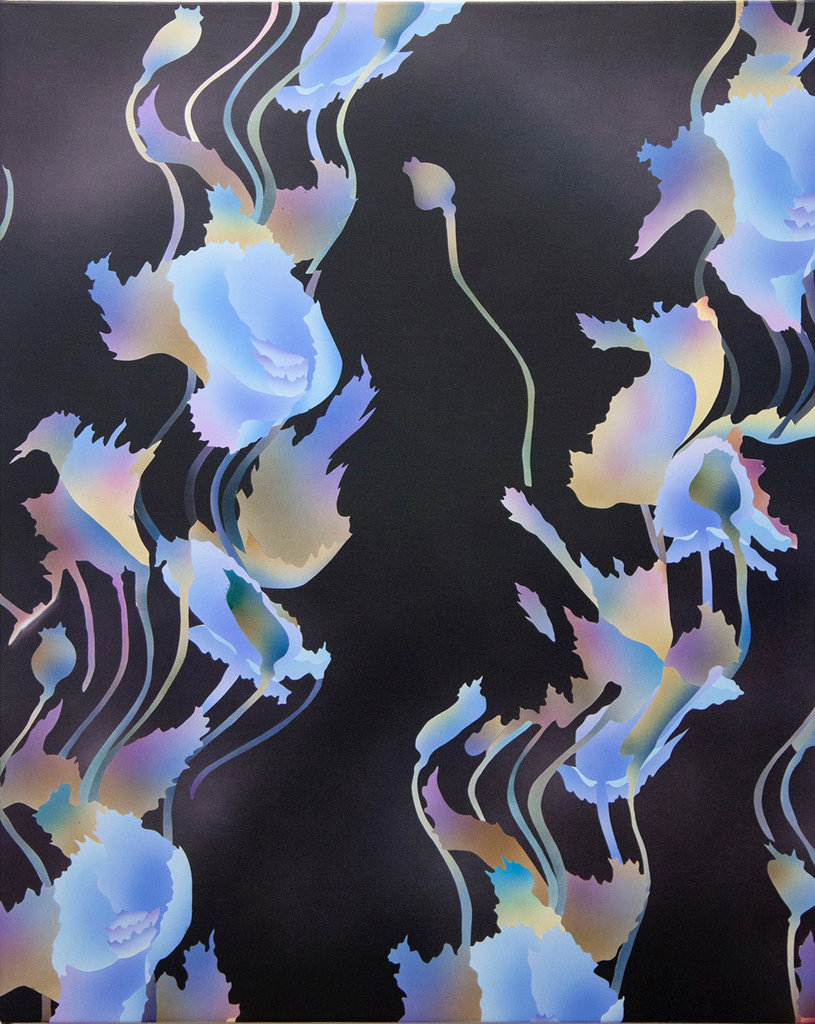
    PA: What other exhibitions can we expect from MOCA following believe?

    DL: You can expect some of the most interesting and exciting exhibitions and projects from MOCA that Toronto has ever seen! But I can’t give all of that away here Phil. We’ll be announcing more details at some point soon and we want it to be a surprise.
    *Exhibition information: BELIEVE, May 25 – August 12, 2018, MOCA, 158 Sterling Road, Toronto.