Author: artoronto

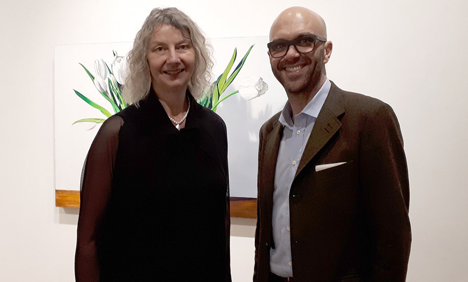
  • Sarah Sands Phillips: Idyll at GHC

    The Wall is a Body.

    “Natural materials express their age and history, as well as the story of their origins and their history of human use. All matter exists in the continuum of time; the patina of wear adds the enriching experience of time to the materials of construction.” – Juhani Pallasmaa

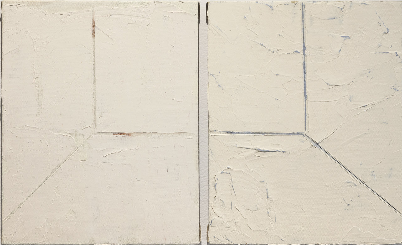
    Sarah Sands Phillips, Idyll 1 and 2, 2018, oil on linen, 10 x 8 inches each

    In 2013, Sarah Sands Phillips returned to the family home where she had grown up, and took a number of photographs of light entering spaces. Beams licking corners, throwing shadows, flickering across thresholds and highlighting bowed walls. The resulting images are not a recording of space in the traditional sense; rather they capture fleeting moments of luminescent abstraction, glimmers of present action in rooms connected to past memories. The photographs, as with much of the work in Sands Phillips multi-faceted practice, became subtle documents and expressions of time. For the exhibition Idyll Sands Phillips returns to these photographs as a source material for paintings. Rather than focusing on their ethereal light forms, the Idyll paintings respond to a material element evident in the imagery – the physical make-up of the building’s aging interior walls.

    Sarah Sands Phillips, Idyll 15, 2018 oil on linen, 12 x 9 inches

    The walls in question were constructed using lath and plaster, a technique seen predominantly in pre-war homes, in which plaster is layered over a structural framework of closely fitted, lateral wooden slats. As the plaster is squeezed through the negative space between the slats, it forms overhanging ‘keys’ on the structure’s reverse that allow it to cling to its wooden armature. Lath and plaster has long been discontinued to make way for more efficient construction methods, and as such, is a technique set in time.

    Sarah Sands Phillips, Idyll 3, 2018, oil on linen 10 x 8 inches

    Sands Phillips employs a similar process of material layering to create the surfaces present throughout Idyll. Strata of oil paint are built up on stretched linen and canvas supports, with its gently smoothed application akin to that of a lath and plaster wall. Her chosen colour palette recalls a light and shadow spectrum, but is also reminiscent of the body – grey matter and peachy flesh tones, vein-like blue. Into these carefully prepared surfaces, Sands Phillips carves linear suggestions of rooms that reveal subtle colourations from underlying layers, continuing a process of mark making through erasure present throughout her practice. The resulting minimal compositions appear as spaces etched at the peripheries of memory, perhaps something dreamt. They are non-places without a sense of time, a setting with the potential for future action to occur, whilst also seeming as though somewhere remembered from long ago.

    Sarah Sands Phillips, Idyll 8, 2018, oil on linen, 10 x 8 inches

    In his book Eyes of the Skin, Architecture and the Senses, the Finnish architect Juhani Pallasmaa (Eyes of the Skin, Architecture and the Senses, Materiality and Time, P.3) makes a case for the physical and sensory pull of organic building materials, as opposed to the cold plasticity of manmade constructions. The simultaneous attraction and fallibility of these natural materials is that they visibly age and change, and in this they relate to the body. The walls in Sands Phillips’ original photographs had billowed and bulged, bloated over time. The lath and plaster process is laborious and physical, corporeally composed of a skeletal frame and soft, porous materials. Look up the etymology of ‘idyll’ and you will find that it originates from the Greek for ‘form’ or ‘shape’. In definition, it denotes a picturesque scene, but one – like our bodies, memories, and those walls – that is ultimately temporary.

    Rebecca Travis

    Note: The article was originally written for General Hardware Contemporary and first posted on their site

    Images are courtesy of General Hardware Contemporary

    *Exhibition information: June 14 – July 15, 2018, General Hardware Contemporary, 1520 Queen Street West, Toronto. Gallery hours: Wed – Sat, 12 – 6 pm.

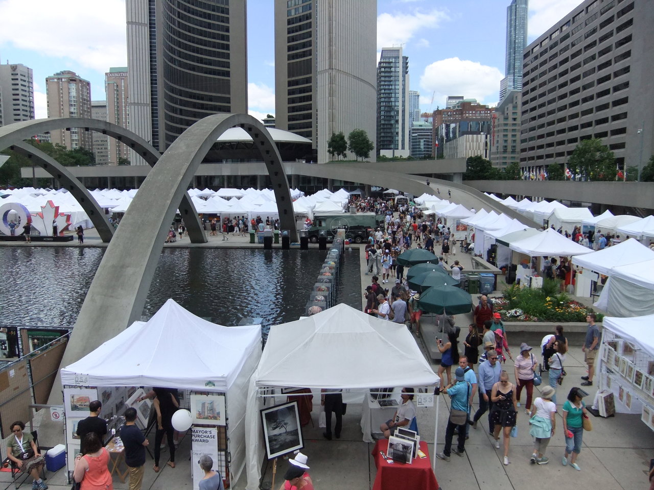
  • Toronto Outdoor Art Fair 2018

    July 6 – 8, 2018
    Nathan Phillips Square
    Friday & Saturday: 10 am – 7 pm, Sunday 10 am – 5 pm.
    Free admission

    Toronto Outdoor Art Fair is Canada’s largest, longest running juried contemporary outdoor art fair. Founded in 1961, Toronto Outdoor Art Fair was established to put contemporary visual artists and makers at the front and centre of their works, in direct contact with the public, to nurture artistic excellence and artists’ entrepreneurial spirit. This free public event showcases works by over 340 contemporary visual artists and makers, ranging in medium from painting, photography, and mixed media to jewelry and ceramics, and attracts 115,000 visitors each year to Nathan Phillips Square.

    There are a lot of special programs planned for you. Over the three days of the Fair, discover the fresh talents in the student zone and delve into the accomplished works of returning seasoned artists. Circle back to the centre of the square and rest your feet at the Partial Lounge and then catch the exuberant Tiffany Pratt, one of Toronto’s most recognizable design figures, as she shares her love of art in Art Before Dishes. Enjoy a custom craft beer at our third annual Henderson Brewing Co.’s Beer Garden while watching the premiere of Calibrate, a contemporary dance piece by Karen Kaeja from Kaeja D’dance.

    There are art tours, nested exhibitions, adventures in photo darkrooms as well as exciting Power Kids workshops and a special collecting program for young art lovers to keep you inspired and stimulated.

    Toronto Outdoor Art Exhibition, 2017

    For more information please go to: http://www.torontooutdoorart.org

  • Incidental Narratives / A Space Gallery

    Incidental Narratives from Basel Abbas and Ruanne Abou-Rahme is a humanistic approach to advocacy on a serious human rights issue. The show features two videos from the established artists, each engulfing the two rooms of A Space gallery.

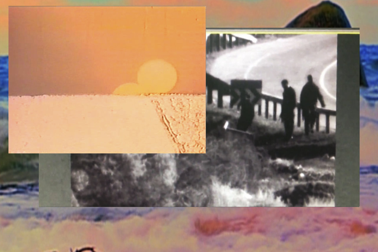
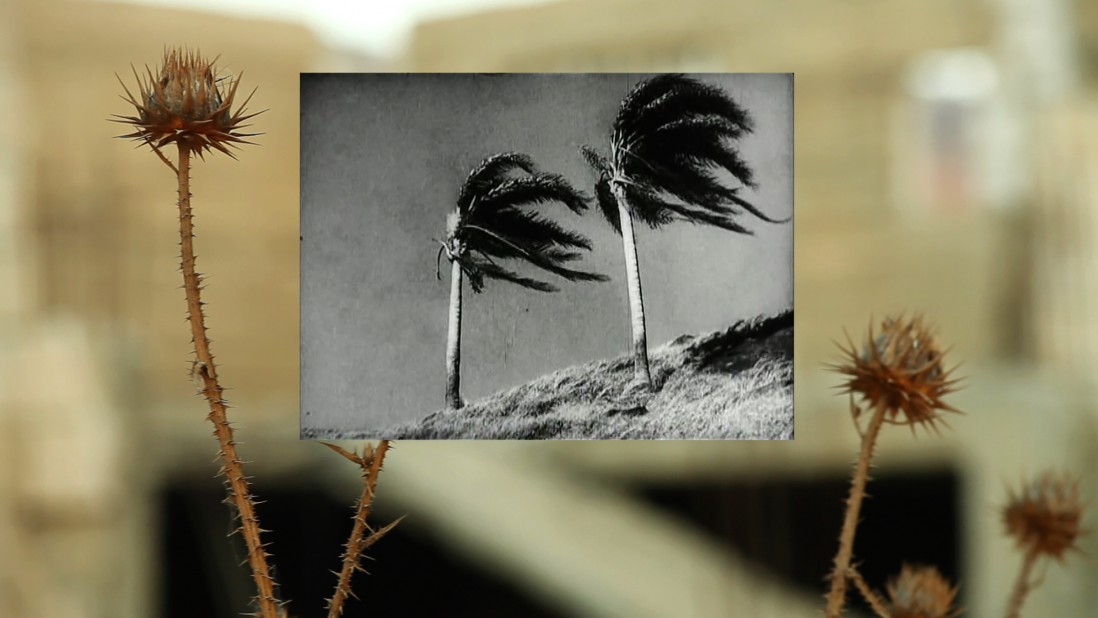
    Basel Abbas and Ruanne Abou-Rahme, Only the Beloved Keeps Our Secrets, 2016. Video still

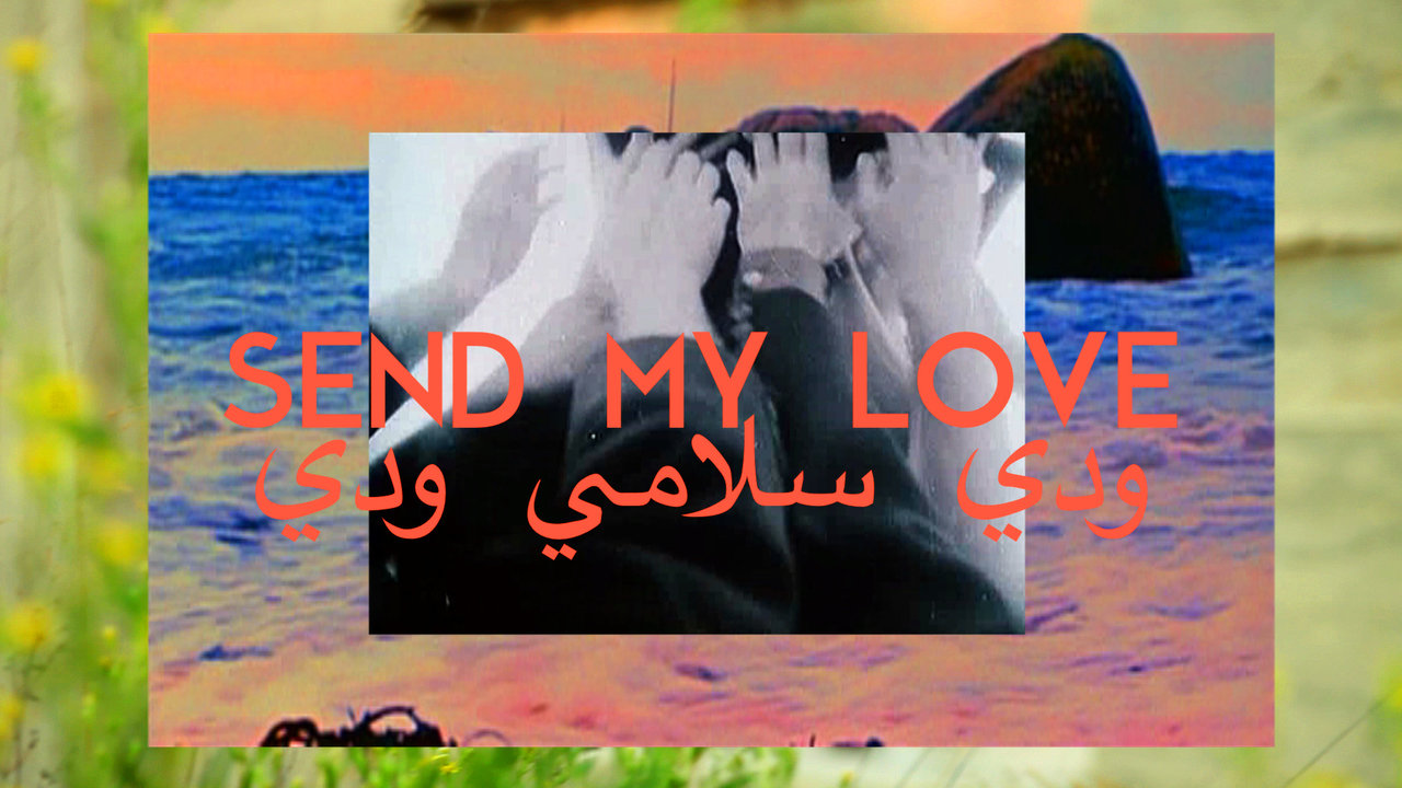
    Only the beloved keeps our secrets (2016) is a single-channel video that is made up of different videos and images often layered together in what looks much like a collage. There is text throughout the piece which is written in both English and Arabic. In terms of pure aesthetics, the piece is clearly well crafted with good relationships between the hues such as those in the fragmented video clips and the text written on top. The ‘collage’ style that the artists have adopted to layer the images not only attracts the eye but also allows the viewer to consume both images simultaneously. There is inevitably a lot going on, though it does not feel chaotic or confused with itself.

    Basel Abbas and Ruanne Abou-Rahme, Only the Beloved Keeps Our Secrets, 2016. Video still

    The Incidental Insurgents (2012-2015) is a video that seats the viewer in the backseat of a car, driving through what is assumed to be Palestinian landscapes in the sunset. Inevitably political a piece but definitely poetic and emotional. The message is direct, it is a literal search for new answers.

    Basel Abbas and Ruanne Abou-Rahme, The Incidental Insurgents, 2012 – 2015. Video still

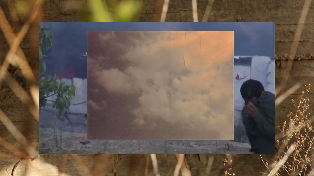
    It’s vital to be knowledgeable on the background of these pieces and to read the statements prior to seeing them for the first time. The nature of this work while poetic, uses fragmented clips and images which are taken out of their original context and narrative, often changing quickly from one to another with cropped views, cut and pasted together. Deconstruction breaks down a subject and, in a video, it takes away layers of story and context. Some of these images, of men and women dancing, of the video footage of Israeli forces killing a 14-year-old boy, of the edible plant that he was crossing the fence to pick – are brought together with poetic prose. The problem with fragmentation is that it discards layers of meaning and because of this, some of these images are forced to be seen superficially, and since one may not know the very specific context of what these images are showing, the viewer is forced to look at these images on a surface level. In an issue like this where erasure is rampant, layers that are paramount in understanding the seriousness of the subject are lost in favour of media exploration and one wonders if such an already normalized human rights issue can afford this type of quiet advocacy.

    Basel Abbas and Ruanne Abou-Rahme, Only the Beloved Keeps Our Secrets, 2016. Video still

    Slightly tangential to mention but noteworthy is that while this piece showed at A Space as part of Contact Photography Festival, NASSIM played at the Berkley Theatre concurrently as part of Luminato Festival. The two have few but important similarities – both are new work by artists coming from the middle east, and both are speaking about a deep longing for home. It almost feels refreshing to see this type of work that is so simply humanistic. Direct political activism not to be downgraded by any means, but to see it in terms of cause and effect, the resulting emotional response of melancholy and longing is itself a serious advocate for changing perspectives.

    Basel Abbas and Ruanne Abou-Rahme, Only the Beloved Keeps Our Secrets, 2016. Video still

    Nazli Nahidi

    Images are courtesy of the artists and Abraaj Art Prize

    *Exhibition information: May 4 – June 30, 2018, A Space Gallery, 401 Richmond Street West, #110, Toronto. Gallery hours: Tue – Fri, 11 am – 5 pm, Sat, 12 – 5 pm.

    ** Part of Scotiabank CONTACT Photography Festival

  • RED LIGHT / Lonsdale Gallery

    RED LIGHT, installation view, Lonsdale Gallery, Main Floor, 2018

    RED LIGHT is a very ambitious exhibition displaying 300 photographic pieces, covering the walls of Lonsdale Gallery, salon style, from floor to ceiling. It is a museum size and quality exhibition that would be worth keeping up for a longer time as a showcase for viewers to study the wide range of techniques and enjoy the various thematic approaches in the images. Loosing myself in the richness of this show, having a closer look at the individual pieces, creating narratives for myself and trying to figure out the method used, took a long time and I quickly realized that it would be impossible for me to write a review of this show. I turned to the gallery manager and curator Simone Rojas-Pick for a tour. This is the first time we’ve post a curator’s talk, but I believe this is the best way for us to approach this amazing exhibition. Please enjoy her guided tour, as I did.
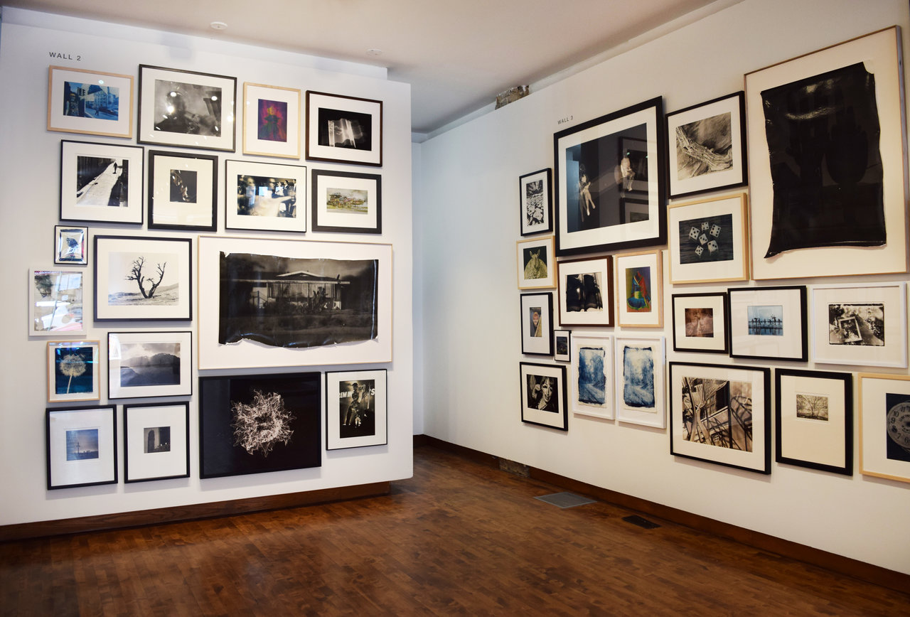
    RED LIGHT, installation view, Lonsdale Gallery, Main Floor, 2018

    The Making of Red Light

    Lonsdale Gallery has been around for over 25 years and has often mounted exhibitions dedicated to contemporary photography – specifically focusing on experimental and traditional darkroom processes, including projects with the World Wide Pinhole Association, Alternative Process Photography Symposium.

    Last fall when we started to plan for CONTACT 2018, Chad Wolfond, the director of the gallery said that he would love to do a big salon installation in the entire space. As we began to conceptualize the exhibition, we decided to focus on traditional hand-printed darkroom processes. We wanted to not only take people back to this method of image making, but to show how it is being done now in the 21st century.

    We reached out to the network of photographers we were already working with. We asked them to introduce us to other artists they know, who were also using these techniques, whose photographs they admired and respected. We also co-operated with Bob Carnie and Carissa Ainslie from Alternative Photo Services and Connections Gallery in Toronto, to tap into other networks of image-makers. In this way we were able to reach out to artists in Canada and all around the world, so the exhibition includes many international artists.
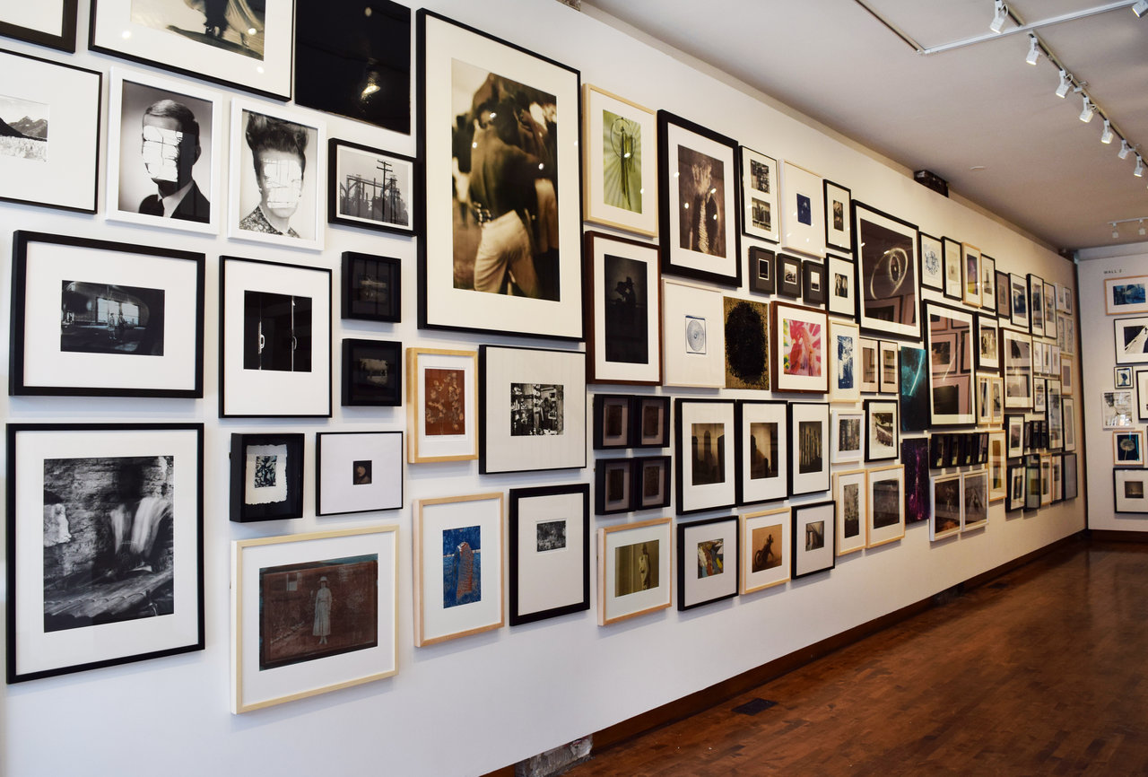
    RED LIGHT, installation view, Lonsdale Gallery, Main Floor, 2018

    During the development of this project we didn’t want just to focus on what was happening locally in Toronto or within Canada. We were witnessing an exciting movement taking place within the art world: a return to the darkroom and analogue hand printing. The works assembled in this exhibition are only a small snapshot of that larger movement taking place among contemporary artists and recognized by collectors.

    We wanted to have a good representation of both young and established photographers and expand the conversation beyond simply presenting historical works. Our focus was to show contemporary photographs that are engaging with, and/or experimenting with, historical processes in distinctively modern ways. So, for me, it was important to include young emerging artists that are doing innovative work with these processes.

    We have an incredible team here at the gallery that worked tirelessly for three weeks to mount this huge exhibition. We shared a lot of behind the scenes footage of the installation process on Instagram, and the gallery’s other social media channels.
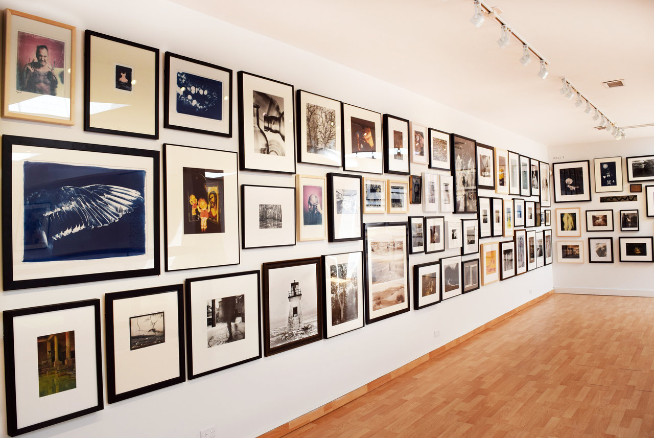
    RED LIGHT, installation view, Lonsdale Gallery, Upper Gallery, 2018

    Exhibition Highlights

    I like to start my tour with Addison Brown’s (Alabama, US) “Portrait of Eddy Perkins”. Brown is a young photographer from Hunstville, Alabama who is actively working with 19th century processes but doing so in a fresh and exciting way. I find it to be a great entry point for viewers into the concept behind the exhibition. Here, we see a self-portrait of the artist as his ‘alter ego’ Eddy Perkins. In front of the image is a tintype of puzzle pieces that have been painstakingly cut out in the center. Between these layers are individual puzzle pieces that cover and obscure the subject’s face.
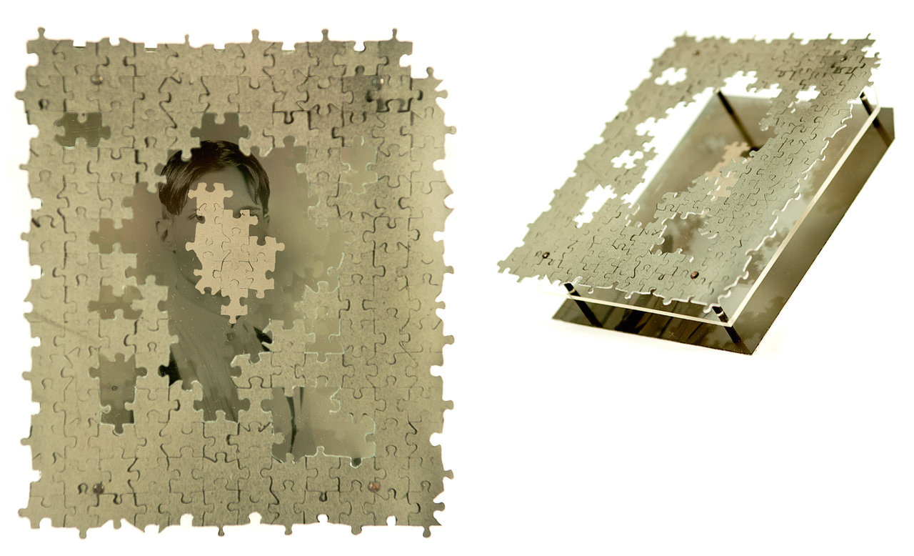
    Addison J Brown, Portrait of Eddie Perkins, 2016, collodion positives on aluminum, acrylic, and copper, 4.75 x 4  x 1.25 inches

    Another great example of young artists using historical processes in exciting and innovative ways, are the works by Heather Fulton (Toronto, Can). She often uses unconventional and inherently destructive materials and processes to explore the vulnerability of memory and the fragility of nostalgia. The exhibition includes ambrotypes, cyanotypes, and silver gelatin prints by Fulton. Her ambrotypes are particularly striking because of the rich material quality of being on black glass. Fulton’s “Be Born, My Dear” is part of a body of work that the artist is currently developing. She uses the wet plate collodion process and an archive of found familial imagery to explore the process of stitching together the roots of familial history, identity and origin.
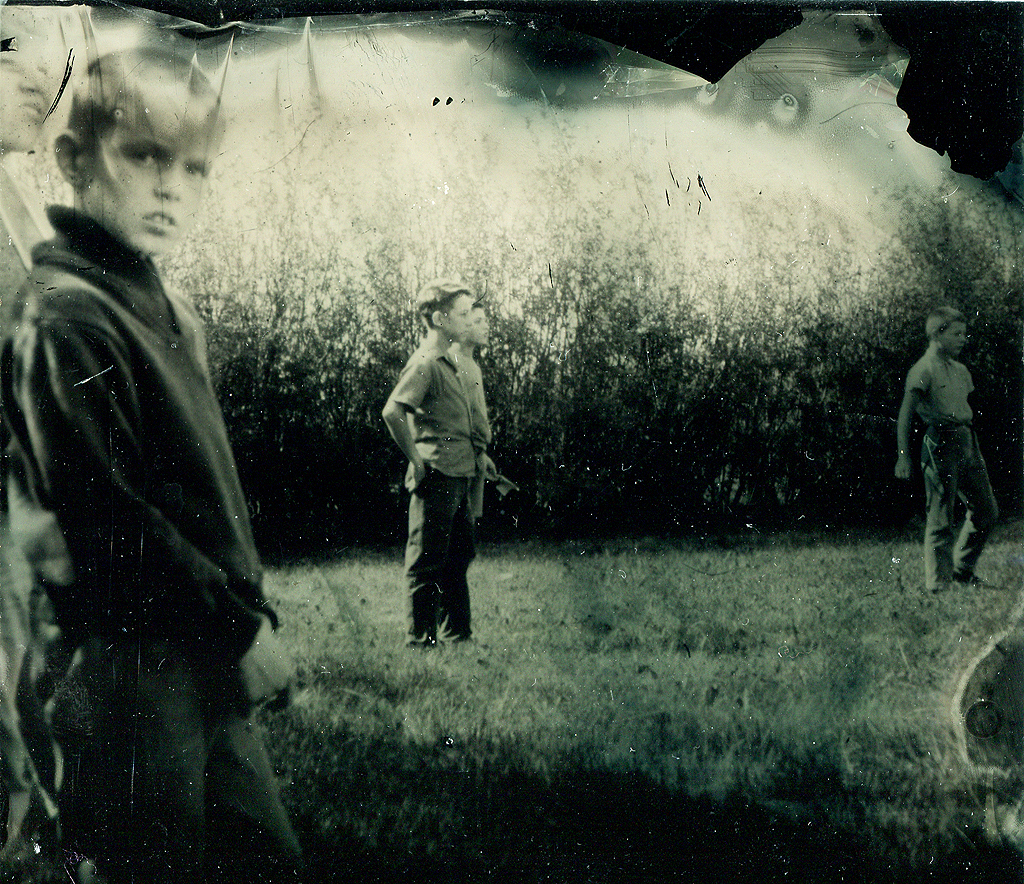
    Heather Fulton, Be Born, My Dear, 2017, ambrotype, wet plate collodion, 8 x 8 inches

    Osheen Harruthoonyan (New York, US, Montreal, Can), is a photography-based artist, known for his experimental wet darkroom photographs. Harruthoonyan draws on his rich experience growing up in such diverse countries as Iran, Greece and Canada by employing a multi-faceted approach towards his artistic practice. He works exclusively in black and white film, hand printing fibre-based silver gelatin prints. Using the darkroom as his laboratory, Harruthoonyan manipulates and collages his negatives to construct his multifaceted photo-based compositions that explore the intersection between memory, history, and the deconstructive process of time. For him, photography is not about documentation, but a mode of personal expression.
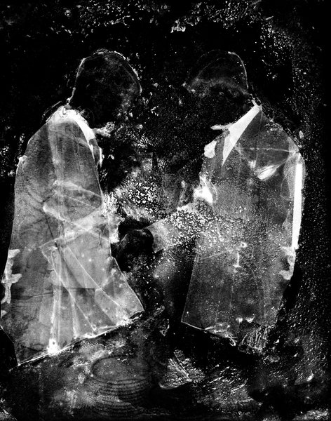
    Osheen Harruthoonyan, Transference, 2008, sepia selenium split toned gelatin silver print,  36.75 x 29.5 inches

    Brian Culbertson (North Carolina, US) fuses historical processes with experiential techniques, creating haunting portraits. Subjects are depicted through multiple exposures to create a surreal effect. Culbertson uses the historic salted paper technique but replaces the salts with medication used to treat anxiety, which produce unpredictable shifts in color and tonal range. The incorporation of medications used to alter the chemistry of the mind into the salted paper print process produces images that are unsettling and, in some cases, unstable. The pieces in this exhibition are from Culbertson MFA thesis work that focused on the prevalence of prescription medications in the treatment of mental illness and the history of photography’s role in the representation of those living with it.
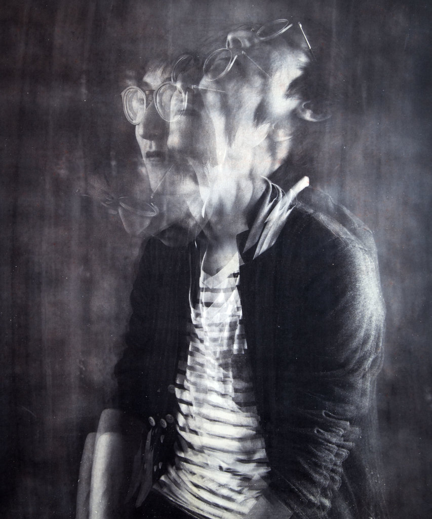
    Brian James Culbertson, Lightheaded, 2017, salted paper print, 30 x 33 inches

    In 2010, Bella Klein (New York, US) and Daniel Paterson (Toronto, Can) converted a utility trailer into a mobile pinhole camera obscura. The duo took their Trailer Obscura on the road throughout the Unites States and Canada. Their Kerouac-ian inspired adventure simultaneously engages with the photographic road trip tradition, the North American landscape, and the history of the medium. Klein and Paterson go inside the lens-less camera together and fix the ephemeral light projection onto the paper, transforming the fleeting image into a photographic object. These images visually reveal their process through rips, scratches, blurring, colour casts, light leaks, and distortion. The paper negatives are shown as final mono prints.
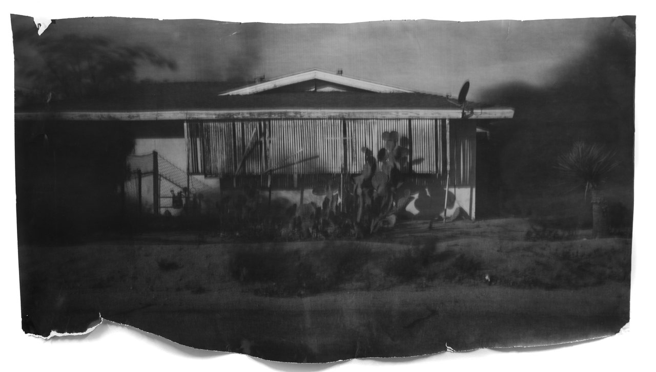
    Daniel Paterson & Bella Klein, House Joshua Tree, CA, 2016, silver gelatin monoprint, 38 x 60 inches

    Nicole Cudzilo’s (New York, US) “Pines” is a double exposure cyanotype. Here the artist overlays a self-portrait with the image of pine trees in a very painterly and rich way. She often places figures within a landscape, using their relationship with the environment to create a narrative.

    Nicole Cudzilo, Pines, 2015, cyanotype, 8 x 10 inches

    Anne Campbell (Aberdeenshire, Scotland) teaches analog photography at Gray’s School of Art. Her practice is rooted in alternative darkroom techniques. Campbell’s “Within Reach” is an exciting example of some of the hybrid experimental processes included in the exhibition. She uses infrared film, double negatives, mordançage, and lith printing. The combination of these processes creates highly unique images that are very textural and remind us of film stills.
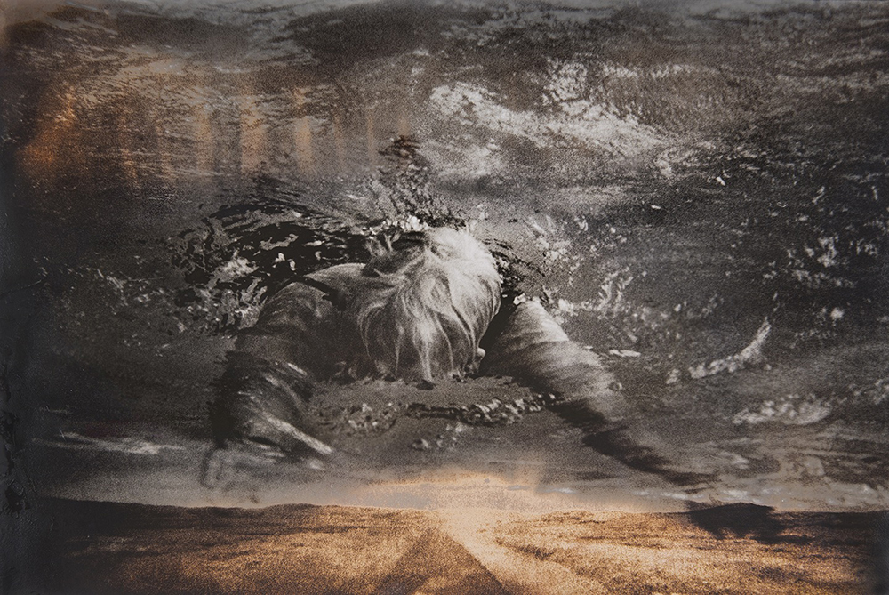
    Anne Campbell, Within Reach, 2017, infrared film, double negatives, mordancage lith print, 19.75 x 26 inches

    William Mokrynski (London, England) is interested in seemingly obsolete photographic negatives culled from vernacular and professional archives from the 1950/60’s – during the height of the Cold War. The identity of the sitters, and context of the portraits has been lost. While printing, the surface of the photographic paper is masked, clouding the visual identity of the sitters. The final works are not clear views of figures from the past, but a visually striking and almost haunting cast of characters plucked from the pages of fiction. Conflating fiction with reality, Mokrynski deliberately makes a connection between the Cold War and our current climate of political paranoia, geopolitical unrest, and surveillance to communicate a general sense of unease about the current world order.

    William Mokrynski, Cousin and Neighbours Series, 2015, fiber-based gelatin silver prints, 16 x 12 inches each

    Jerry Spagnoli (New York, US) is one of the world’s most renown contemporary daguerreotypists. He has been attributed with reinventing this 19th century technique, the first photographic process invented in 1839, using a distinctively contemporary sensibility. Spanoli’s still lifes of glasses play with the highly reflective surface of the daguerreotypes. As a viewer, you are not sure if what you are seeing is a reflection of the glasses above or below. The only visual anchor is the distinctive blue tone that is produced by deliberately overexposing the photographs during the development process. For the artist, the precision of the daguerreotype becomes a vehicle for questioning photography’s intrinsic objectivity and the way in which the mind analyzes the world as a surface.
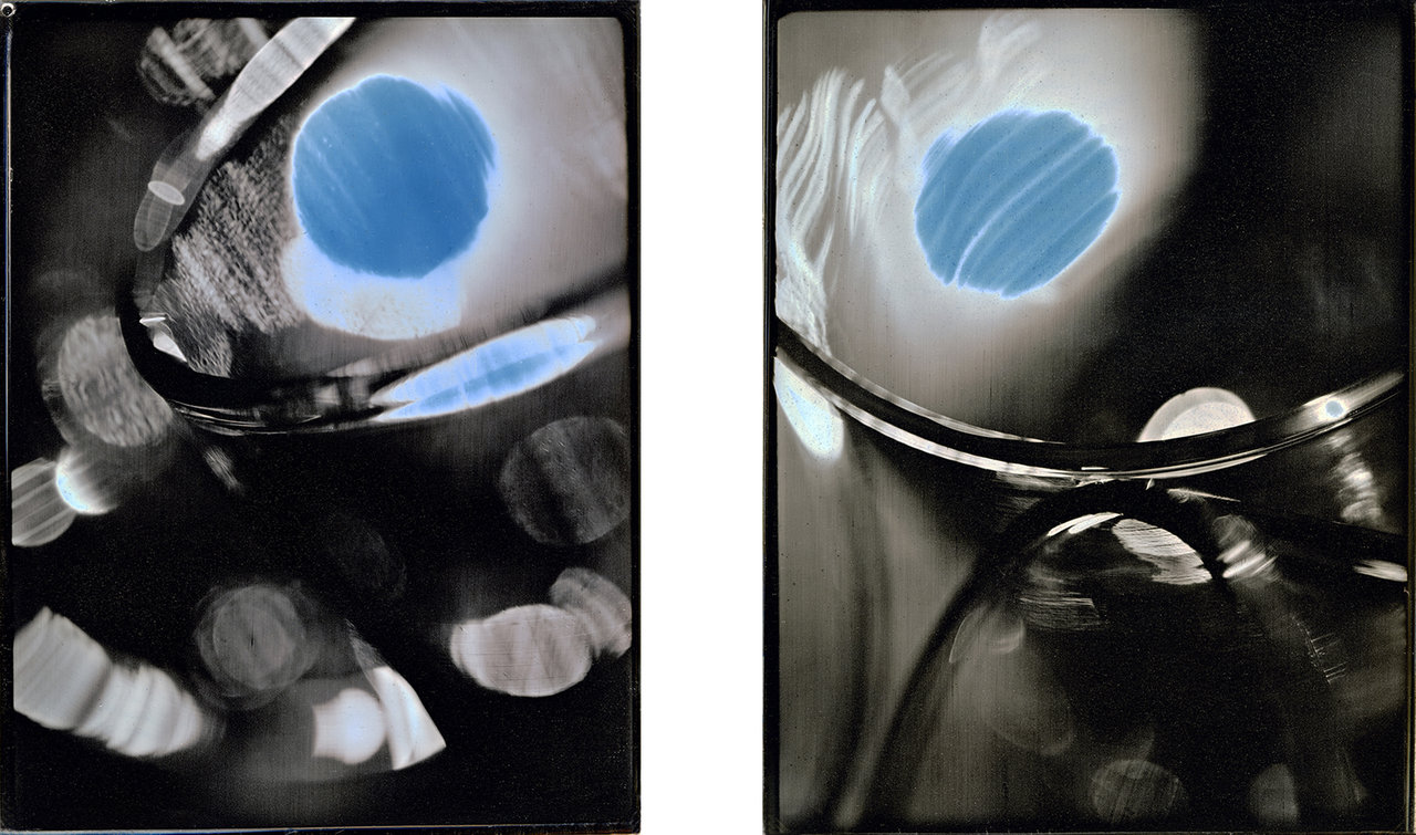
    Jerry Spagnoli, Glass Series, 2017, daguerreotypes, 4.25 x 5.5 inches each

    Kevin Kelly (Toronto, Canada) solarized photographs, an experimental technique made famous by Man Ray, give a distinctively contemporary flavour to the tradition of portraiture. The images on view are part of his Gender series, depicting drag kings and queens. In “Super Chris” and “Candice in Jewels” the subjects are powerful figures with no attempt to fetishize them. What makes Kelly’s pieces so exciting is the use of solarization to draw the viewer’s eye in, a process that naturally demands looking closer at the image because the values of light and dark are inverted – underscoring the idea that gender and identity is not fixed, but fluid.
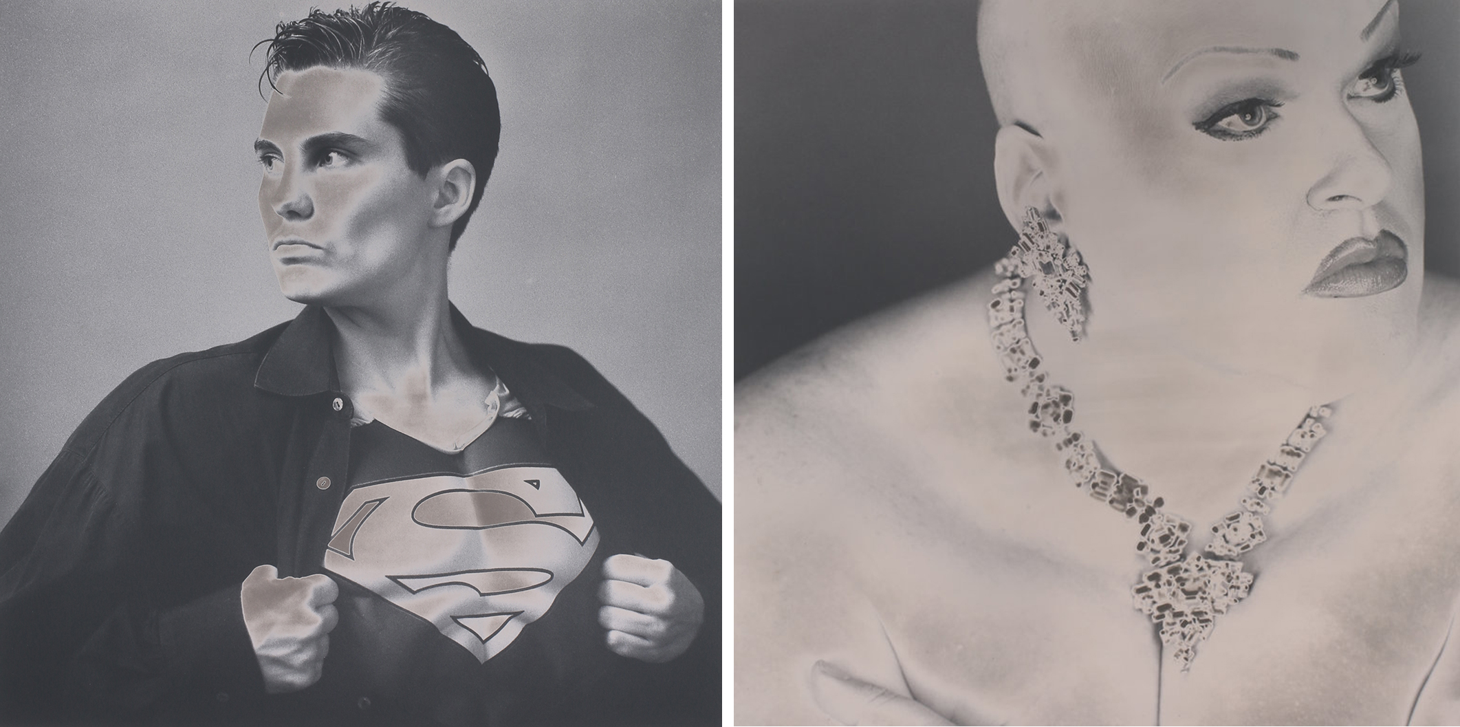
    Kevin Kelly, Super Chris (left) and Candice in Jewels (right), 2015, toned gelatin silver print, 25.25  x 26.5 inches each

    When visiting this exhibition viewers usually spent one or two hours, finding their own favourites. They often come back with friends to share this unique experience. The gallery has also organized additional programming for the weekends, the last one of them on Saturday June 23, is a talk, titled Experimental Photography: Alchemy & the Darkroom.

    Images are courtesy of Lonsdale Gallery

    *Exhibition Information: Group show, May 2 – June 29, 2018, Lonsdale Gallery, 410 Spadina Road, Toronto. Gallery hours: Wed–Sun 11 am – 5 pm.

    ** Part of Scotiabank CONTACT Photography Festival

     

  • Let There Be Light / Interview with Bill Clarke

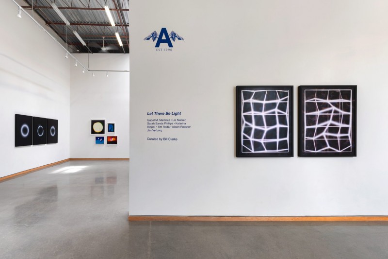
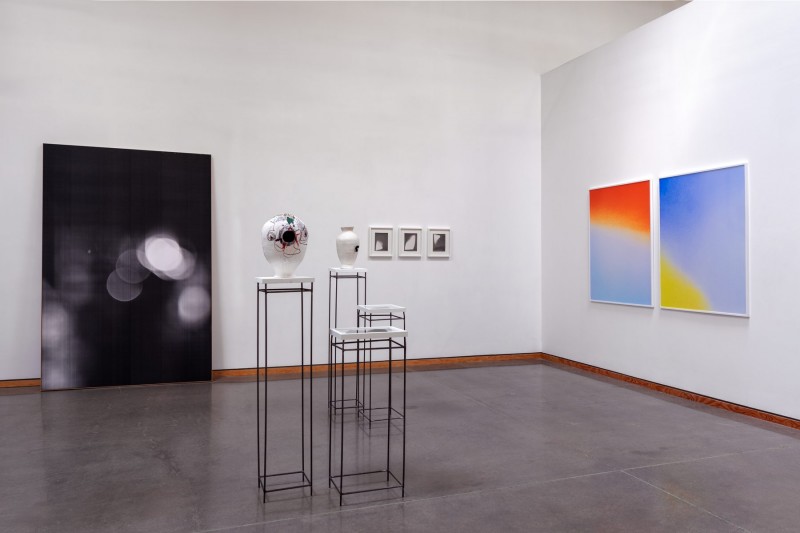
    Installation view of Let There Be Light at Angell Gallery, 2018

    Interview with Bill Clarke, Associate Director of Angell Gallery (B.C) by Emese Krunák-Hajagos (E.K-H)

    E.K-H: Light is always mesmerizing. It is also the base of photography. When I visited Angell Gallery the exhibition curated by you, Let There Be Light, was being installed. How did you get the idea to organize this show?

    B.C: There are a couple of reasons. First, I am really interested in artists’ processes, and analog work is very much about process. I also thought it would be interesting to do a show about the mechanics and techniques of photography because it seems that most Contact shows aren’t about that… they tend to be more documentary or topical in other ways. I also think that photo-based artists are turning to analog processes in response to the proliferation of digital images that we are bombarded with every day. They are returning the skill and knowledge of how photography works to the image-making process.

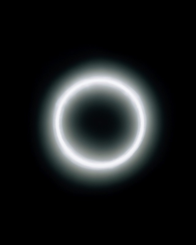
    Isabel M. Martinez, Local Void #2 (Darkness is the Light That Has Not Yet Reached Us), 2016, Chromogenic print, framed, Edition 2 of 3, 40″ x 32″

    E.K-H: There are many different artworks in the show depicting blinding white light, deep darkness and showing how light can be born out of it. How did you select the artists?

    B.C: Selecting the artists was pretty simple. I’d known of all of these artists’ work for several years, and knew how they made their work, so I knew they’d go well together in a show with a focus in the analog. The only ‘new discovery’ in the show was Katarina Riopel, whose work I came across on Instagram. She was a last minute addition.

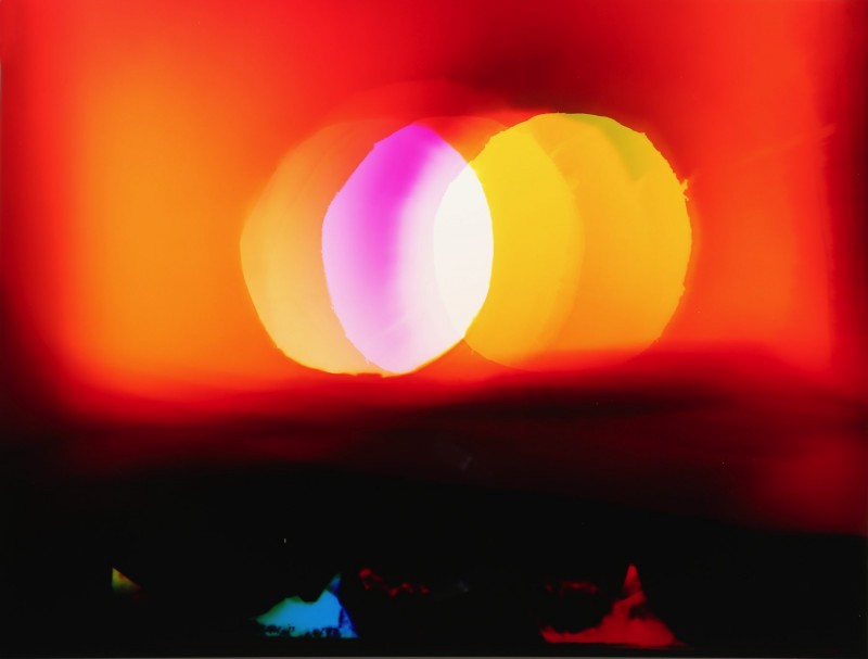
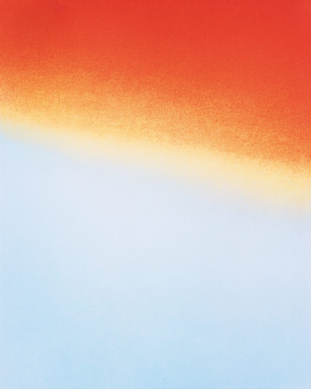
    Liz Nielsen, Venn Sunset over Dark Forest, 2016, Analog chromogenic photogram on Fujiflex, unique, 12″ x 22″

    E.K-H: We can see colored light as well, almost painting-like compositions, some of them just depicting a small detail in such a way that it becomes monumental. Please tell us more about those works.

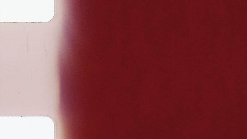
    B.C: That work is Katarina’s. The images start as digital photos on her iPhone. She downloads them, isolates interesting light elements she sees in them, and then creates a negative that she blows up and prints in the darkroom. So, her work and Sarah Sands Phillips’s video of stitched together light leaks from old 8 mm films kind of bookend the show. Katarina starts in digital and migrates to analog and Sarah starts with analog and migrates to digital. Through this migration, they emphasize the qualities and limitations of the source media (i.e., we see the graininess/pixelation of the low res digital image; we see the scratches and marks in the film.) They are example of how photo-based artist migrate between formats.

    Katarina Riopel, Untitled IV, 2017, Archival inkjet print on lustre paper, unique, 50″ x 40″

    Sarah Sands Phillips, Under Sun, 2016, 8 mm transferred to digital video; edition of 5; 9 mins, 42 sec

    E.K-H: It seems that many different media are represented in the show; some pieces look like drawings made with fine pencils or charcoal – even though they are all photographs. Was this “multimedia” outlook intentional?

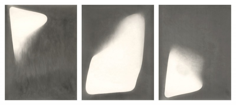
    B.C: I wanted a variety and range in the look of the work, so that was intentional. It was a bit of luck, really, that I was able to get a piece by Alison Rossiter that sort of looks like graphite on paper and it is in a way similar to Jim Verburg’s photocopy piece. They do emphasize the meaning of the word photography: “drawing with light.”

    Alison Rossiter, Eastman Kodak Bromesko (London), expiration date unknown, circa 1940’s, 2010, 8.5 x 6.5 inches x 3, Triptych of unique silver gelatin prints, framed

    Jim Verburg, Untitled, 2003, Archival inkjet print, framed, 29″ x 45″

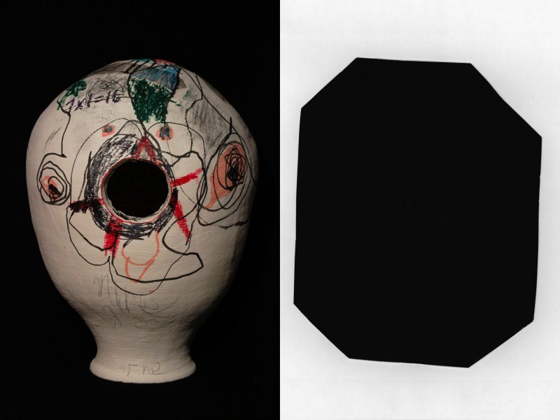
    E.K-H: Making the exhibition even more eclectic there are “sculptural” pieces in the centre of the space, actually ceramics, made into pin-hole cameras, surrounded by the images they made. Where did the idea to include them come from?

    B.C: Pinhole cameras are probably the most familiar and oldest form of analog photography, so it made sense to include them. It’s also more exciting for gallery visitors to see interesting objects instead of just seeing everything on the walls. Also, these ceramic objects make the photographic process tangible.

    Tim Roda, aNARCHY pOT (ceramic pin-hole camera), 2018, Clay, slip, crayon, marker, pencil, newspaper, Camera 14.5 x 11 x 11 inches; Silver gelatin photograph, unique 9.5 x 7.5 inches

    E.K-H: In the late 1960s and early 1970s critics were arguing about photography. Should we consider photography an art form at all? Is it worthy of being called “art.” In this exhibition it seems that it envelopes all the other art forms and is still growing and surprising us. What do you think of the future of photography?

    B.C: I think you answered your own question when you say that the photos in the exhibition seem to envelop all the other art forms (painting, drawing, sculpture). Yes, photography, especially in the hands of artists such as these, is most definitely an art form. Photography, whether it be analog or digital, will always be with us because we are visual beings. So, I don’t think it’s a question of whether photography will ever disappear… I think the bigger question around most photography today is whether it can be trusted to depict any sort of impartial view of reality anymore. We’ve always had ways of manipulating photographic images, but today it is so easy with things like Photoshop and, of course, photographs (whether they be art, personal or news photographs) can be readily circulated, appropriated, reworked and then recirculated online.

    Installation view of Let There Be Light at Angell Gallery, 2018

    Images are courtesy of Angell Gallery

    *Exhibition information: Let There Be Light / Isabel M. Martinez, Liz Nielsen, Katarina Riopel, Tim Roda, Alison Rossiter, Sarah Sands Phillips, Jim Verburg, May 11 – June 16, 2018, Angell Gallery, 1444 Dupont St., Unit 15, Toronto. Gallery hours: Wed – Sat, 12 – 5 pm.

    ** Part of Scotiabank CONTACT Photography Festival
  • Mahmoud Meraji – Bound & Redemption

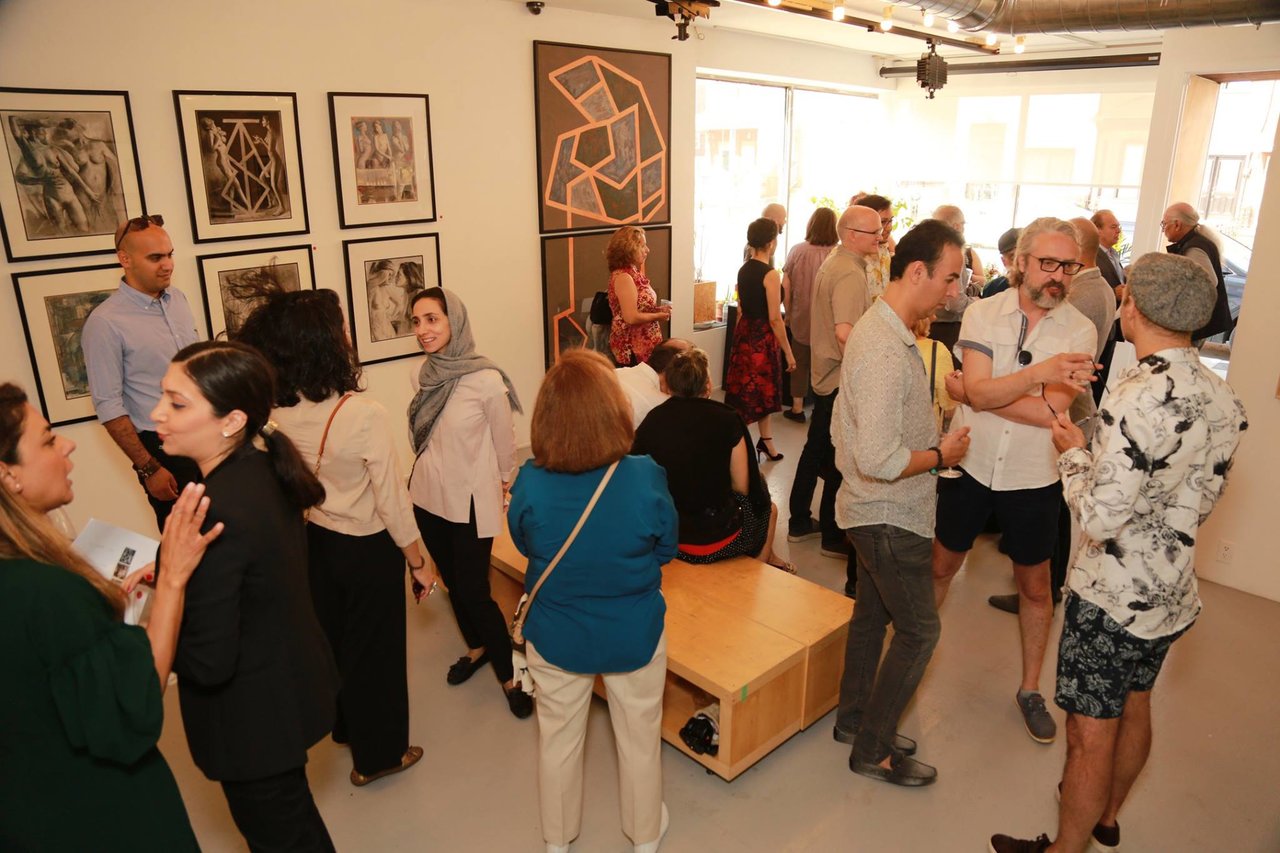
    Gentle curves trace across forbidden terrains, evoking a universal essence that is beyond our puny imagination. Veils are stripped back to unmask malevolent fear of the emotional infinity that is woman. Sahar Khan-Boluki, an Iranian curator, mounted this exhibition with extraordinary aplomb. She has a history of curating in Tehran and this is her first exhibition in Canada. Judging by the enthusiasm, it has been a resounding success!!

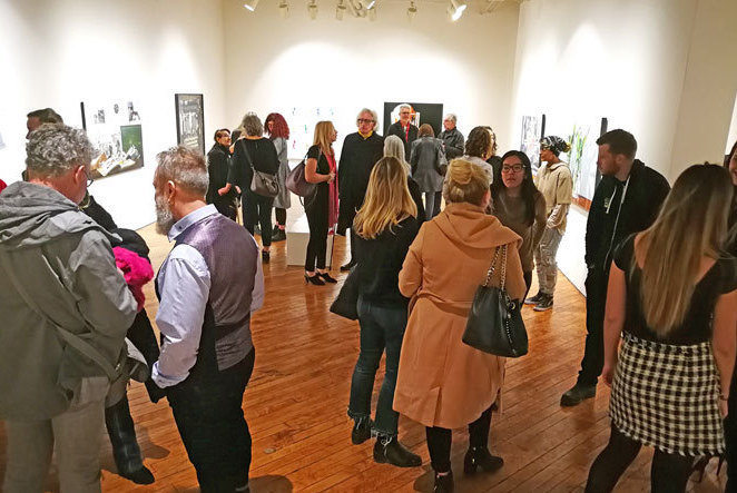
    Opening Reception of Mahmoud Meraji, Bound & Redemption at Gallery 50. Photo: Erfan Ebrahimi

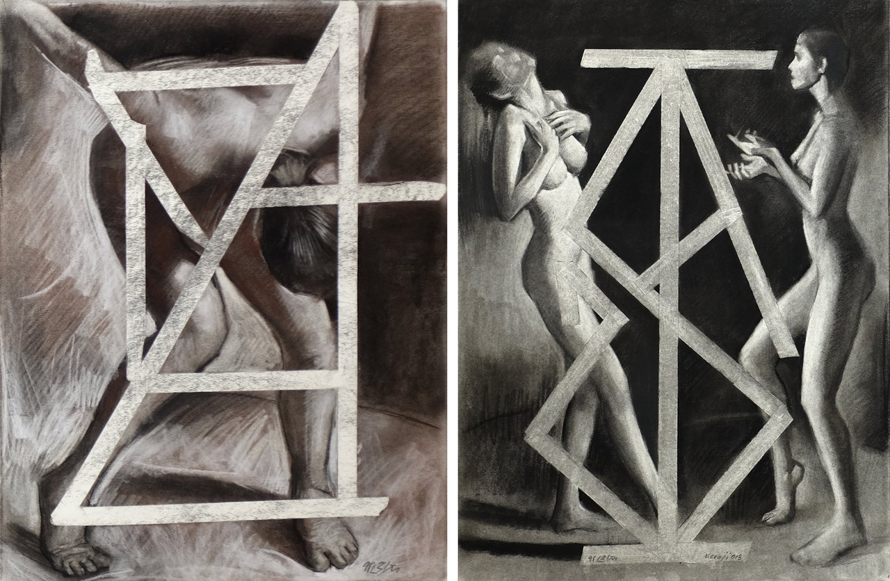
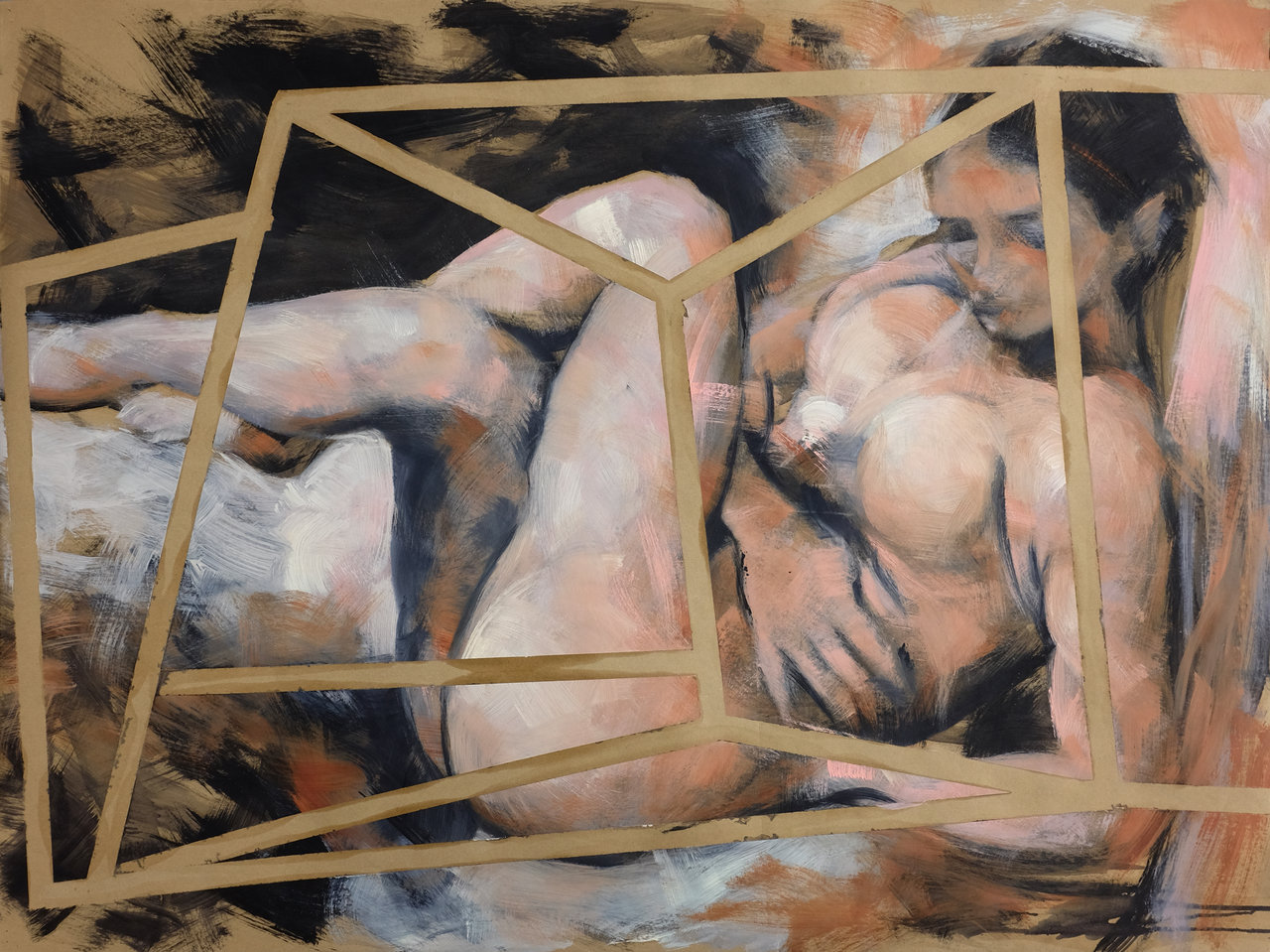
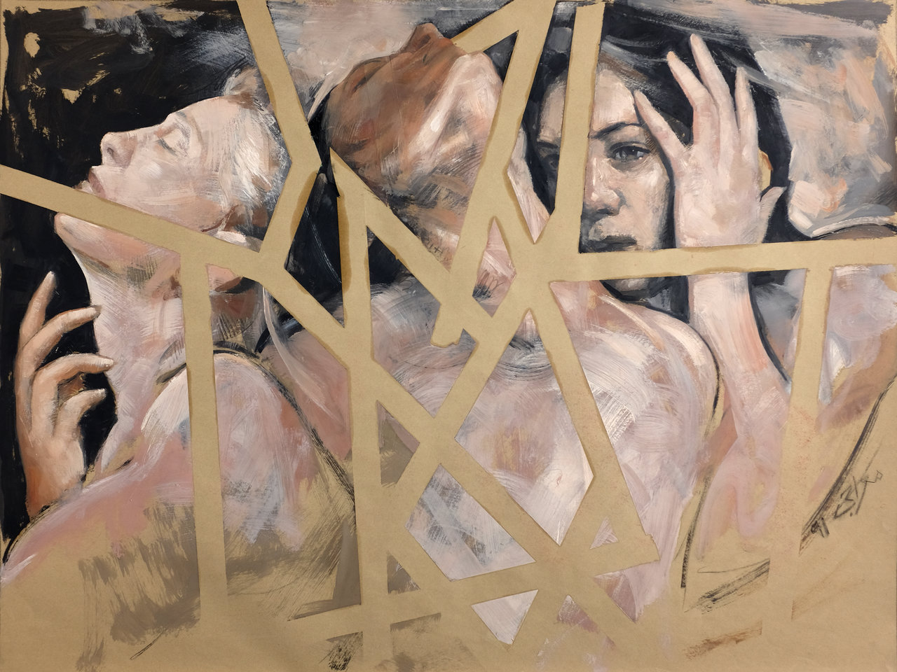
    Bound & Redemption is an exhibition by Iranian master, Mahmoud Meraji, who makes a brave assault on the taboos in Iranian culture concerning female nudity. Meraji has a reverence and love for the female form that translates into flowing nudes shuttered with jarring linear constructions that set up visual tensions.

    A battle rages across the world to dominate women. The irony of this is we are all birthed by women, so why the oppression? In Western countries there is institutional discrimination, born originally through religious strictures now embedded in the culture. In the East the discrimination is far more pronounced, although it stems from the same source.

    Mahmoud Meraji, Nude 16 (left) & Nude 14 (right), 2017, pastel and charcoal on paper, 22″ x 17″

    Reality is elusive, and human perception is quite retarded. We project interpretation on what we ‘see’ and assert our own absolute ‘truth’, relying on reinforcement and compulsion to ensure compliance with the particular ‘vision of reality’. Religious miscalculation compounds the burden of natural incomprehension into a failure to love. All ‘thought’ courses through the veins of emotion and is infused with a lack of clarity. In this case the dominant emotion is ‘fear’ of the unknown.

    Mahmoud Meraji, Nude 21, 2016, acrylic and oil on paper, 35″ x 47″

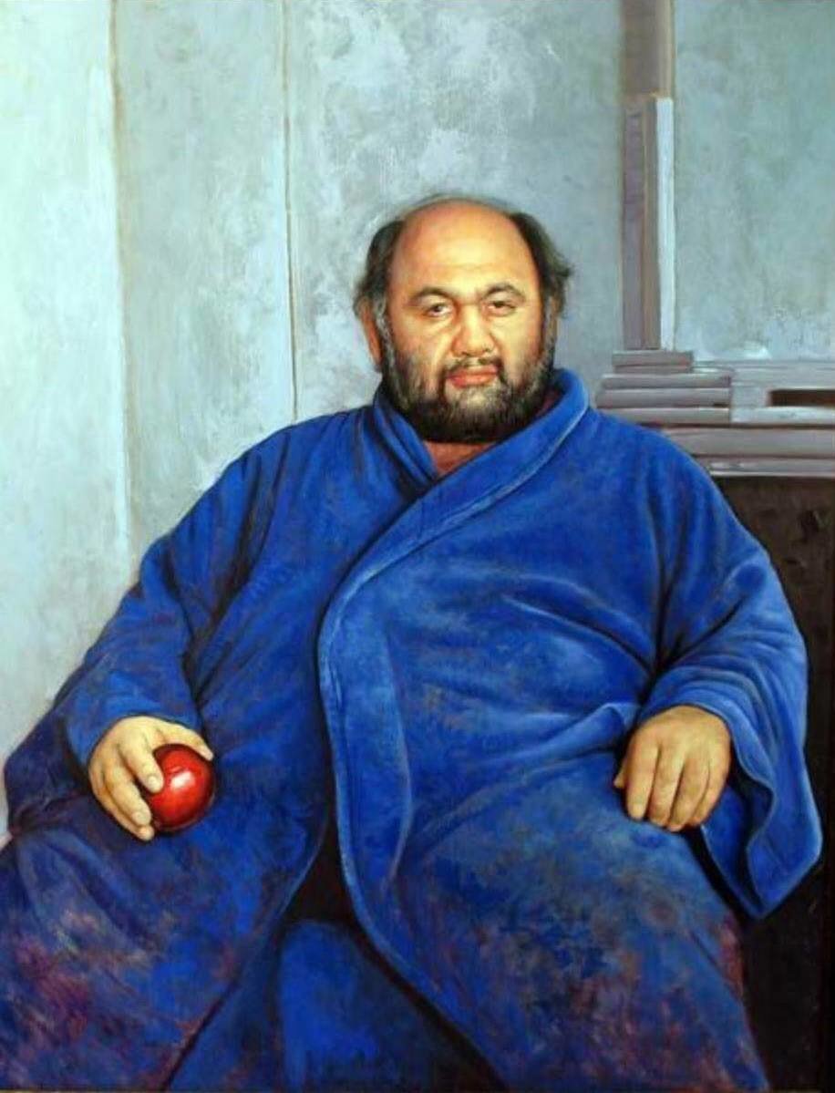
    Mahmoud Meraji has experienced the sharp cut of recrimination. In Tehran he was awarded first prize in a painting competition only to have his painting slashed. On another occasion he again received first prize but a viewer complained about his painting. He never received his prize of seven gold coins because nobody informed him he had won the prize and so it was given to the runner-up. It was impossible to show nudes because of censorship. He moved to Toronto in 1998 and in 2008 won Grand Prize in the Portrait Society of Canada’s “Miracle of the Portrait” competition. His training has been in the classical tradition and he uses his skills to explore the contemporary art idiom, embracing surrealism. He is a master draughtsman and trains his students at the Meraji Art Academy.

    Mahmoud Meraji, Levon, 2008, oil on panel, 48″ x 36″

    Many years back Meraji saw a painting by an Iranian artist who interpreted Cubism naively by drawing a cube over the image. Meraji thinks the artist could not bring himself to let go of the figure despite the desire to explore contemporary art. Meraji engages the same artifice with sophistication to create this body of contemporary work.

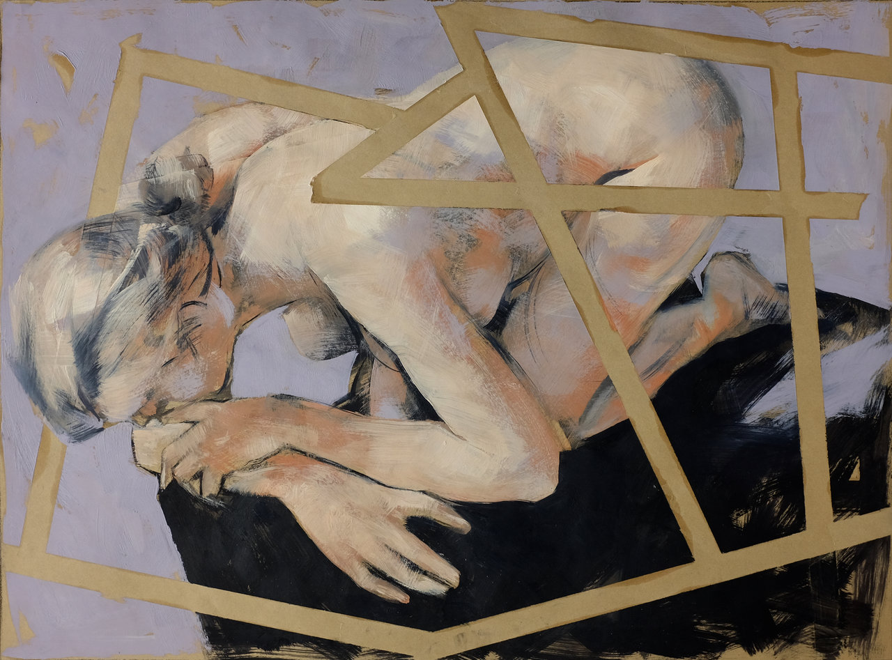
    The nudes are sourced from the Internet and he feels drawn to poses that suggest the fetal position or a dramatic moment that correlates to struggle. On some occasions a couple of figures seem to communicate with one another but for the most part these women are alienated and in torsion.

    Mahmoud Meraji, Nude 22, 2016, acrylic and oil on paper, 35″ x 47″

    Meraji applies straight lines with tape that intersects the forms. Sometimes these lines emphasize the 2-dimensional plane that is in dialogue with his rendition of the nude. The lines are established in the initial stages of the painting and the figure is ‘bound’ within their matrices. Due to our predilection for seeing form and depth in these linear constructions, they create a state of tension, which plays out with the figure. We see the figure first but are obliged to revisit our interpretation over time as we absorb the more complex visual dynamics. In a sense, these lines are symbolic of the male need to bind and control women.

    Mahmoud Meraji, Nude 23, 2016, acrylic and oil on paper, 35″ x 47″

    Meraji draws and paints his nudes but without excessive detail. He concentrates instead on the overall dialogue of lines, forms and tones and refers to these nudes as being ‘in the academic style’ which developed in the 18th Century.

    In our Western experience, nudes are commonplace, but Meraji is using the ‘academic’ style to address Eastern perceptions of the body. This exhibition could not take place in Tehran and Toronto becomes a neutral ground where it is permitted. He will not be banned or bloodied here and can give voice to the need to embrace women as a whole. Redemption!

    Ashley Johnson

    Images are courtesy of the artist

    *Exhibition information: May 25 – 27, 2018, Gallery 50, 50 Gladstone Ave, Toronto. Gallery hours: Wed – Sun 1 – 5 pm.

  • Power Ball XX: Carousal

    The Power Plant Contemporary Art Gallery hosted its annual fundraiser on Thursday May 31st. Power Ball XX marked the 20th anniversary of the event and to celebrate this year’s theme was Carousal, a word meaning “drunken social gathering”. The party lived up to its theme by providing its patrons with ample artisanal cocktails, champagne and craft beers, while surrounded by contemporary and interactive exhibitions. Additionally, the event seemed to be inspired by its theme’s near/quasi-homonym “carousel” since many circus and carnival themed attractions were seen throughout the gallery.

    The Pre-Party entrance by Proprint Services Inc.

    Prior to media attendance was the pre-party, an exclusive perk that consisted of several unique attractions such as a vegan crossbow shooting, adult sized slide and a hotdog eating contest.

    Still from a video by Superfish Design Firm

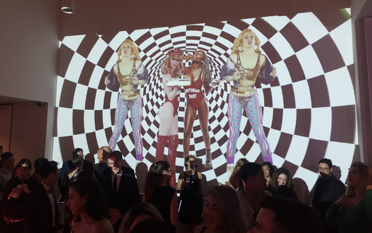
    Upon entering the main entrance to the gallery, guests are bombarded with a visual feast of mesmerizing video projections, filled with high fashion looks posed against backgrounds of hypnotic optical illusions, and a literal feast of a counter filled with stacks upon stacks of Krispy Kreme doughnuts, all for the taking.

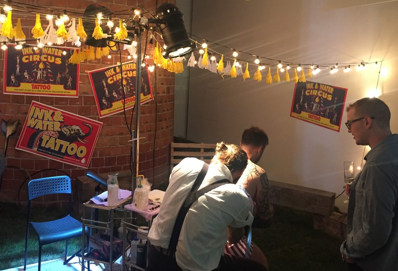
    The more courageous and daring of patrons are tempted by the offer of free tattoos. The tattoo company Ink and Water were providing complimentary tattoos from within their circus themed setup that was decorated with customized poster reminiscent of traditional vaudeville designs. Guests could choose from a flash sheet of all black designs, such as clowns and other similar themed items, then put on a waitlist so they could go about enjoying the party (with the condition that alcohol is not consumed to the point of intoxication).

    Ink & Water

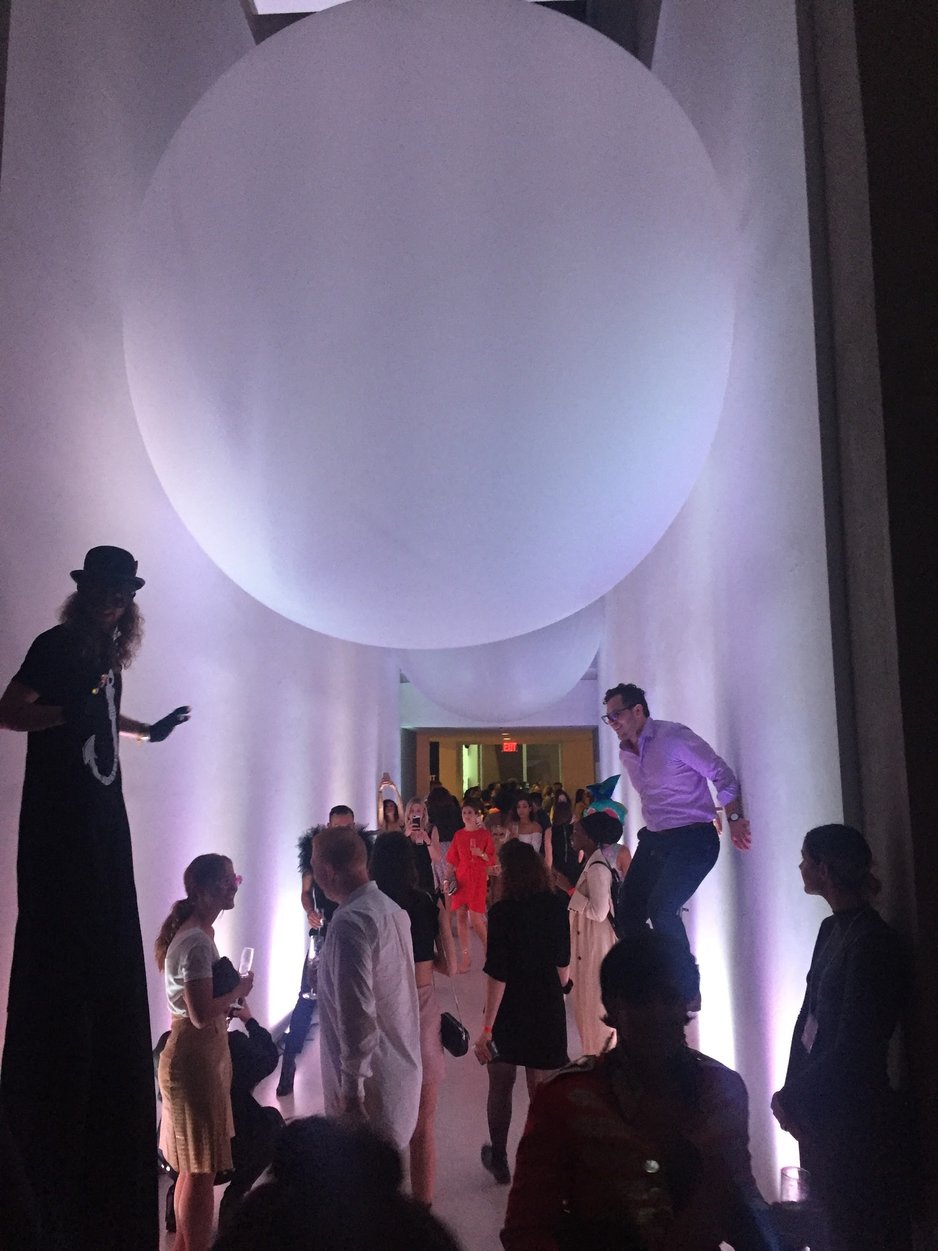
    Entering into the next area, the large scale awe-striking sculptures of Ana Rewakowicz illuminated the space, floating above guests in the Power Plant’s iconic high ceiling corridor. Beautifully coupled with this work was the nearby preparation and handing out of edible helium balloon candy. These treats came with instruction on how to eat these delicate confectioneries without them bursting into your face or getting into your hair, which at such a high profile gala, could easily provoke outrage amongst the well-groomed and decorated. Cutting through the gallery to the outdoor back terrace, you find another of Rewakowicz work titled The Occupants. This participatory work is a giant transparent sphere pumped with air and require a maximum of five audience members to wiggle their way through its long, constricting opening to have just your head emerge inside the sculpture. The work is extremely intimate since within the orb, the sound of the party is immediately cut off and you are face-to-face with strangers whom you inherently expected to share your thoughts on the experience or engage in small talk. The piece is not accessible to anyone with claustrophobia or people who may face challenges with the physical barriers of entrance to the piece.

    Artwork by Ana Rewakowicz

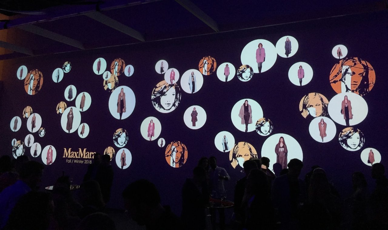
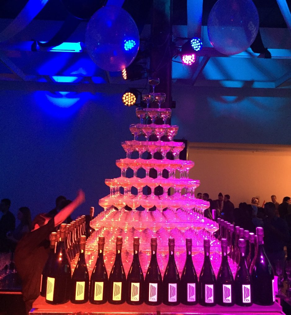
    Back inside, the largest gallery space there is a video projection by the Max Mara company featuring models and portrait illustrations inside moving circles. DJ Willa was situated in this space, providing the party with its fantastic music. Featured most prominently though was the central champagne pyramid and accompany bar, as well as some other food vendors, supplying oysters and CXBO Chocolate in various unique carnival sideshow games.

    Video installations by Max Mara

    Champagne pyramid by Max Mara

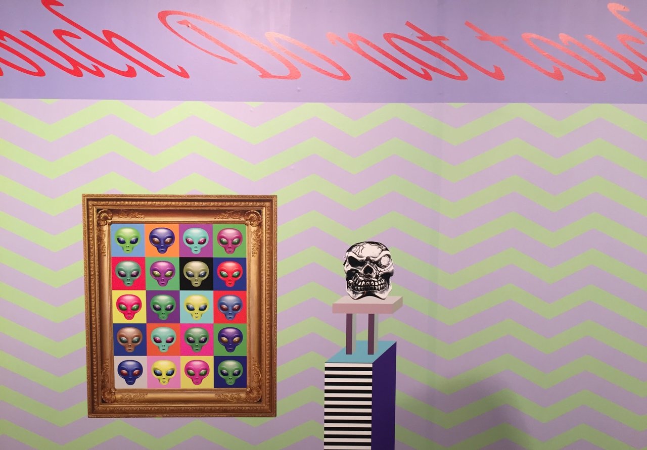
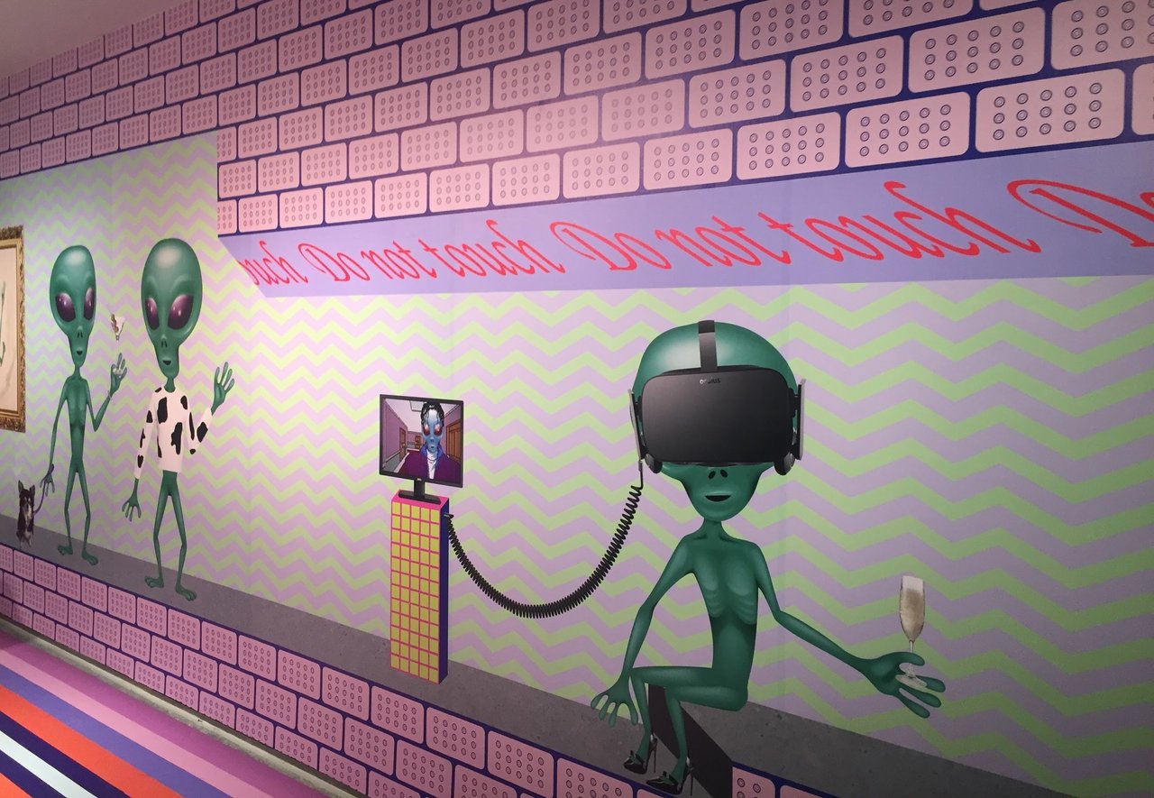
    The gallery space dedicated to the artist Dominique Petrin had one of the strongest visual appeals of the exhibition. Her installation I heard they didn’t serve cocktail sausages this year has because the curator thought it would be too alpha was a bright, highly stimulating, digital printed vinyl wrapped room filled with images of aliens, designer products, disco balls, VR headsets and selfie sticks surrounded by colourful patterns reminiscent of early Internet or Tumblr aesthetics. The work contained references to Marina Abramovic’s The Artist is Present, other famous artists such as Andy Warhol, Jeff Koons and Keith Haring, as well as our Canadian Prime Minister Justin Trudeau.

    Installations by Dominique Petrin

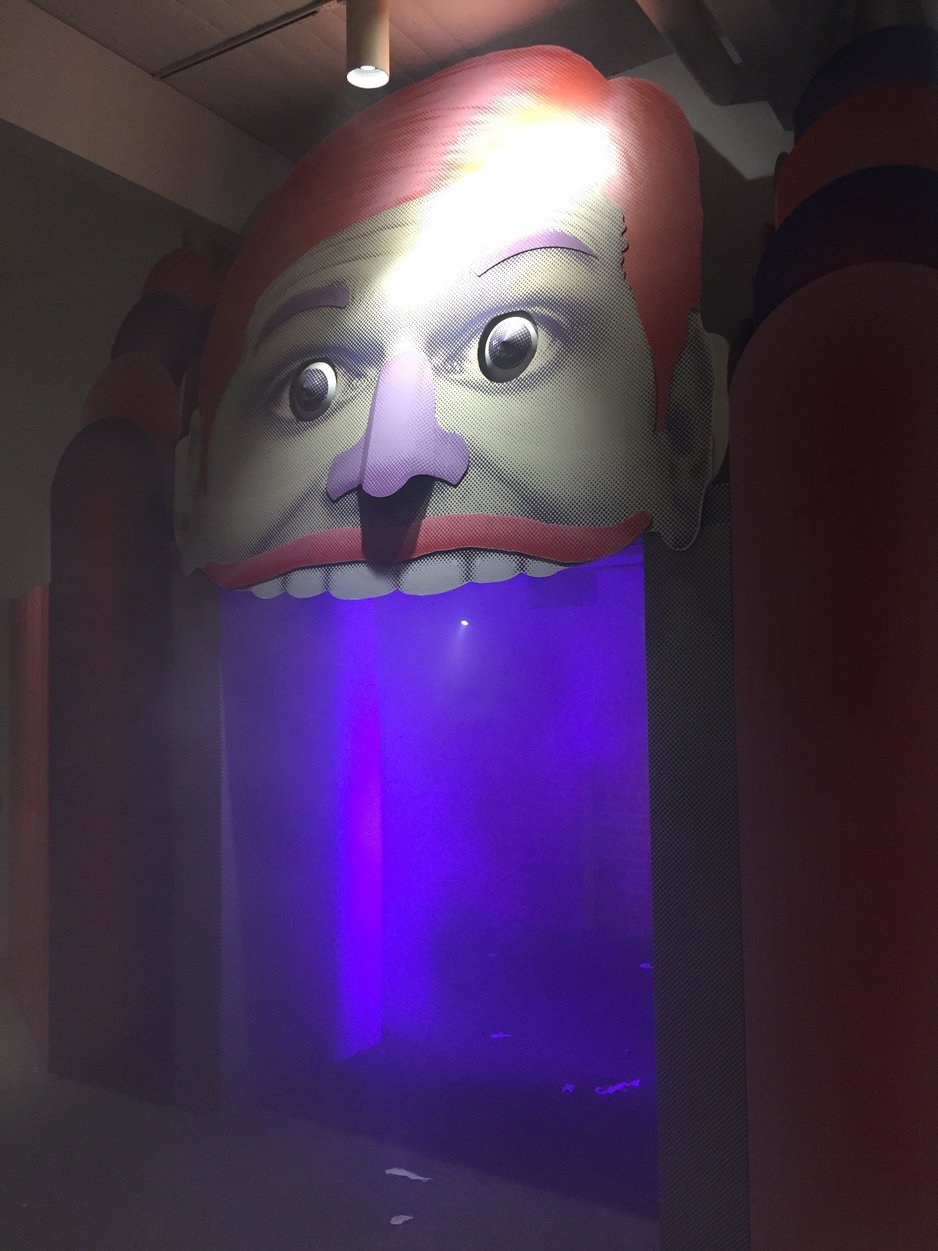
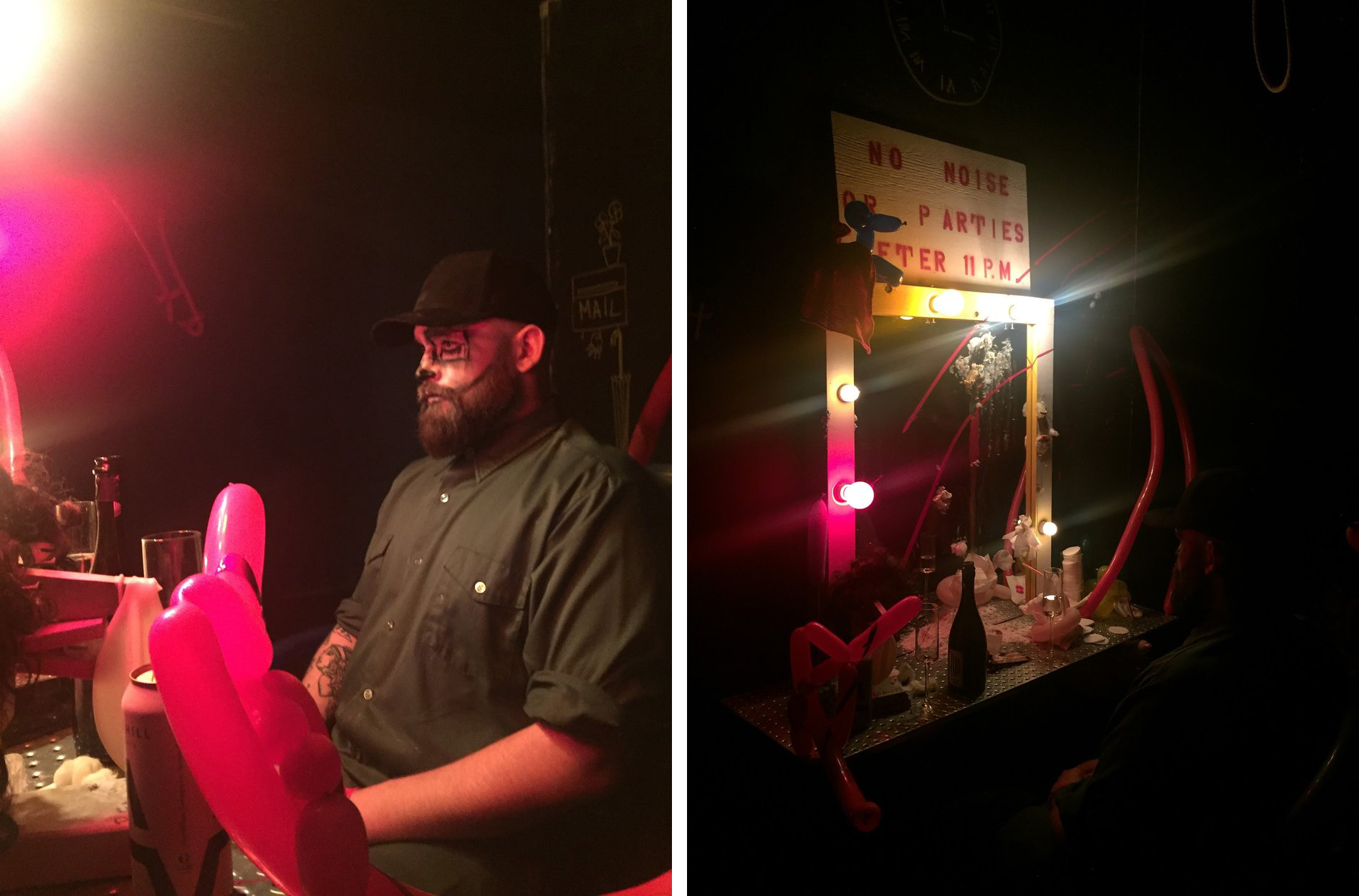
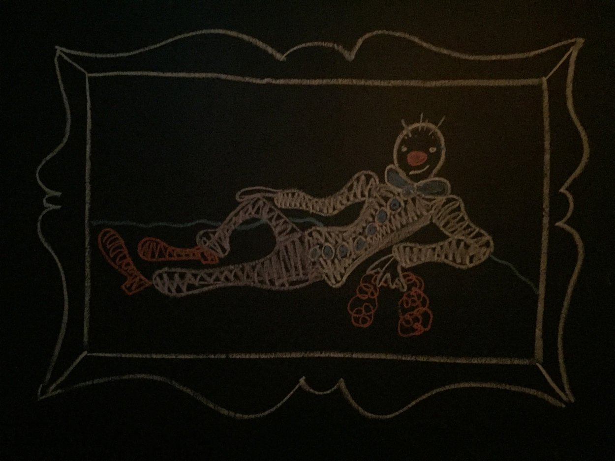
    In an adjacent room, we are met with stark juxtaposition of Petrin’s installation. The room is darkly lit, painted entirely matte black and contains extremely macabre imagery. A sad male clown performed in a seating position, steering at himself in a Hollywood-style vanity mirror, splattered with red paint and above his head is a noose made of coated electrical wire appearing to have been torn directly from the wall. Throughout this space are chalk drawings of picture frames containing child-like drawings of clowns, and littering the floor are hundreds of red balloon animals and balloon swords. The space is eerie, yet the positive and fun-loving vibes from most of the party still manages to penetrate the room, with patrons finding photo opportunities on antique lounge chairs and playfully posing with the balloon swords and animals.

    Installation views from The Secret Clown Lair, designed by Paul Zingrone and his team

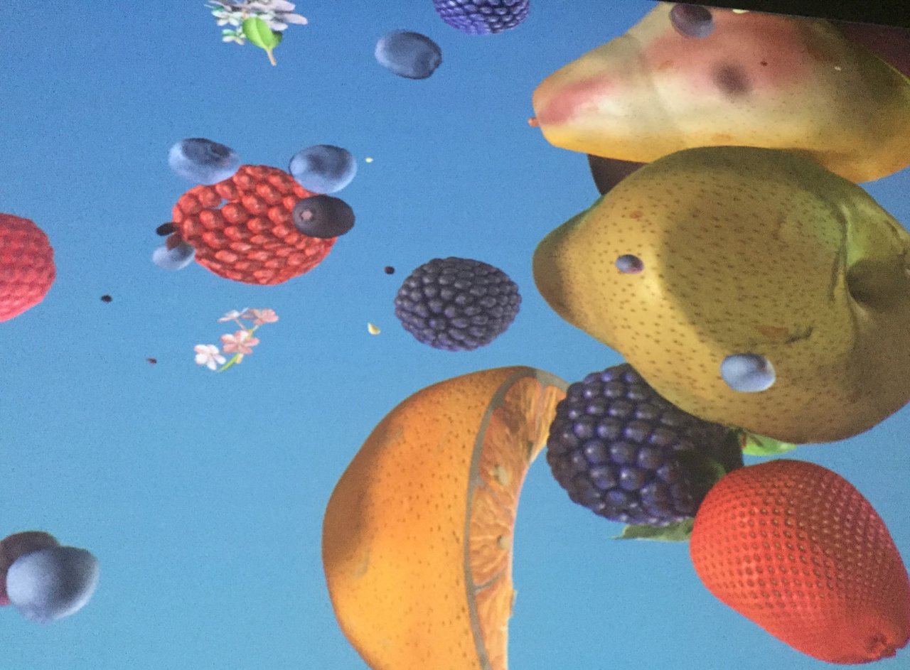
    The last major work in the exhibition is by artist Jennifer Steinkamp. Her work titled, Ovaries, is the largest-scale projection of the night and features 3D renderings of various fruits falling, bouncing and floating around in a bright blue space. The fruit collide with each other and with an invisible fourth wall. The work is beautiful and draws parallels between the female reproductive organs and the seed-bearing tree fruits that are being depicted.

    Still from Ovaries by Jennifer Steinkamp

    Overall, the night was a huge success and all the Power Plant staff, sponsors and volunteers who made it possible deserve ample praise for creating this celebration of contemporary art and fashion! From box office to departure and around every corner, there was always some new treat to try, a new drink to taste, a new outfit to admire, a new song to dance to or most importantly new and fascinating artworks to see. It’s with high hopes that the Power Plant Contemporary Art Gallery continues to celebrate for another 20 years!

    Text and photo: Nathan Flint

    May 31 – June 1, 2018, The Power Plant, 231 Queens Quay West, Toronto.

  • BAD STARS by Christina Battle

    For an exhibition titled after the etymological roots of the word “disaster” the newest work by artist Christina Battle is an absolute success! The exhibition is a highly intelligent and emotionally evocative conversation depicted with beautiful imagery about a topic that is so important to today’s uncertain climate.

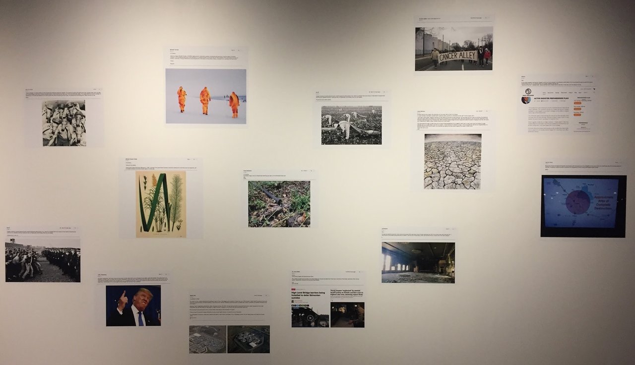
    Installation view of Christina Battle, BAD STARS

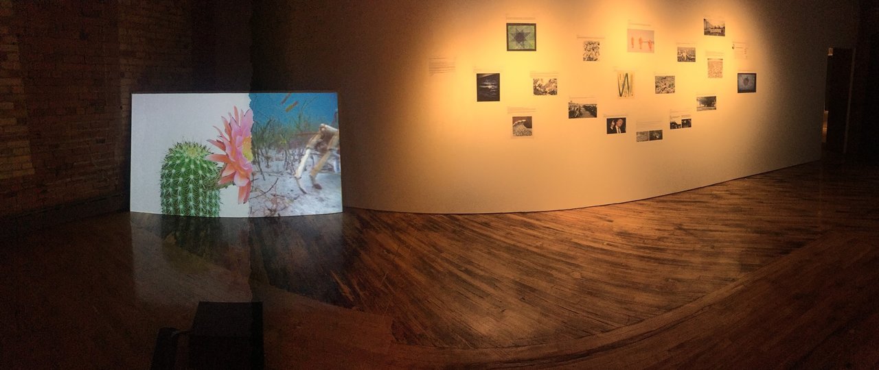
    BAD STARS is a multi-channel video installation featuring video work displayed via television monitors and projection. The exhibition also contains the printed documentation of original emails from Battle’s call for submissions, that asked participants to find imagery that they felt represented their interpretation of what a disaster is. These emails contain a wide range of interpretations, such as ecological, medical and political disasters.

    Installation view of Christina Battle, BAD STARS

    As an extension of the exhibition, Battle and Trinity Square Video have included a series of interdisciplinary programming that features an astrophysicist speaking about mass extinction by meteorites, an Indigenous group dealing with environmental and cultural impacts and a screening of work dealing with migration and immigration followed by a live Skype conversation with the artists.

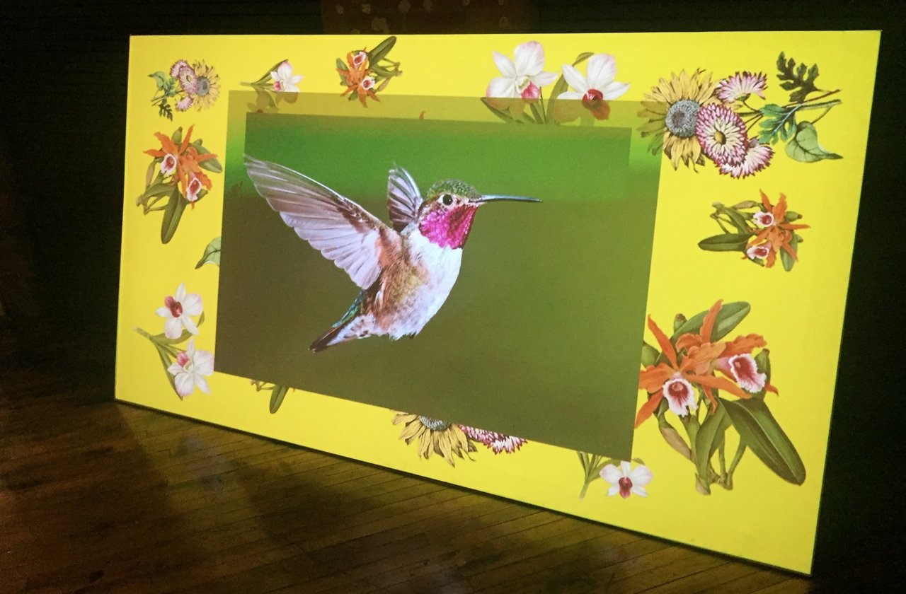
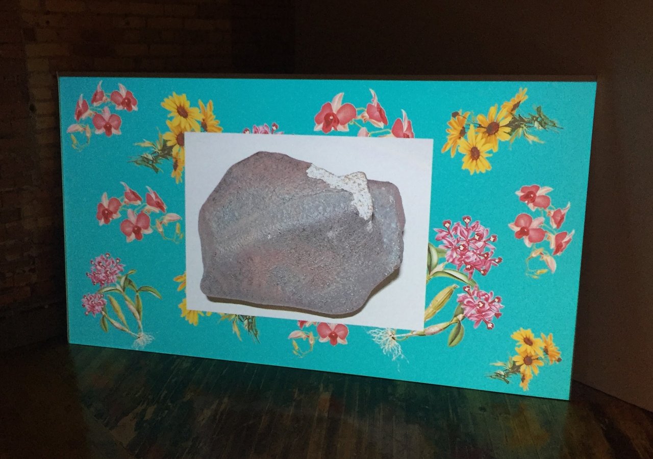
    Parts of the video works in the show are a series of images sourced from Internet databases presented in a slideshow-style manner against a yellow or turquoise background featuring botanical samples. The photos are made of various collections of meteorites, volcanoes and natural disasters, as well as pollinator animals such as hummingbirds.

    Installation view of Christina Battle, BAD STARS

    The background images that frame the photographs extend beyond the screen and enter the gallery space in the form of colourful wallpaper decorating the pillars where the television monitors have been installed. This feature helps to establish the post-Internet aesthetic that supports many of the works within the exhibition. Additionally, these backgrounds contain pictures of flowers that have a biological significance, like orchids, the largest and most diverse of the plant families. The beauty of these flowers is in strong contrast to the death of biodiversity and the disasters that are projected on the central area of the panels. Intercut with these slideshows are appropriated content from nature documentaries and YouTube videos with overlaid text that discuss perilous and catastrophic events, such as digging through rubble of a collapsed building to find survivors.

    Installation view of Christina Battle, BAD STARS

    One of the projections contains a unique project that deals with similar concepts as the others but tackles the issues from a very specific place and perspective, rather than speaking of generalized disasters. The work is addressing the pollution problems of Sarnia, Ontario. The video itself is a recording of Google Earth’s Street View with the 3D Building renderings turned on and with white text overlaid above. The text contains information about the Ontario town, which according to the video, is one of the most polluted cities in Canada due to its toxic chemical plant facilities. The poor quality of the 3D rendering of the map is a found glitch that the artist came upon by happenstance while researching the environmental disasters taking place in this area. The glitch creates an uncomfortable and distorted landscape that seems unlivable and broken. This virtual aesthetic is meant to symbolically parallel the real-life toxicity that is occurring in the town, or as the artist jokes, it could potentially even be a result of its corruption of the environment.

    Installation view of Christina Battle, BAD STARS

    Text and photo: Nathan Flint

    *Exhibition information: May 4 – June 9, 2018, Trinity Square Video, 401 Richmond St. W. Ste 121, Toronto. Gallery hours: Tue – Sat 12 – 6 pm.

    ** Part of Scotiabank CONTACT Photography Festival

  • Angela Grauerholz at Olga Korper Gallery

    Scotiabank CONTACT Photography Festival has landed in the GTA for almost a month. As a featured artist, Angela Grauerholz – who won the Scotiabank Photography Award in 2015 – currently has her new series exhibited at the Olga Korper Gallery. Angela Grauerholz is an influential Canadian photographer, who was born and raised in Germany, and, since her arrival to Canada in 1976, has resided mainly in Montreal. Her work has gained significant international recognition as well. The nine photographs in this exhibition were mostly shot in Paris Musees and the Musee Carnavalet-Histoire de Paris in 2017-2018.

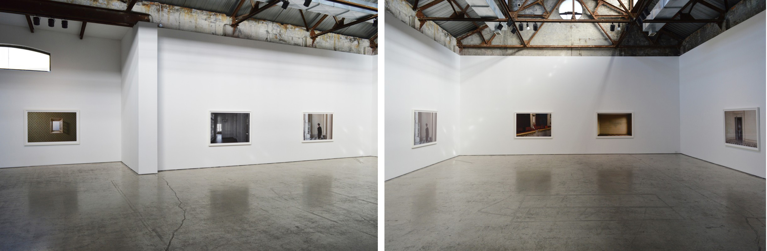
    Istallation views of Angela Grauerholz’s exhibition at Olga Korper Gallery, 2018

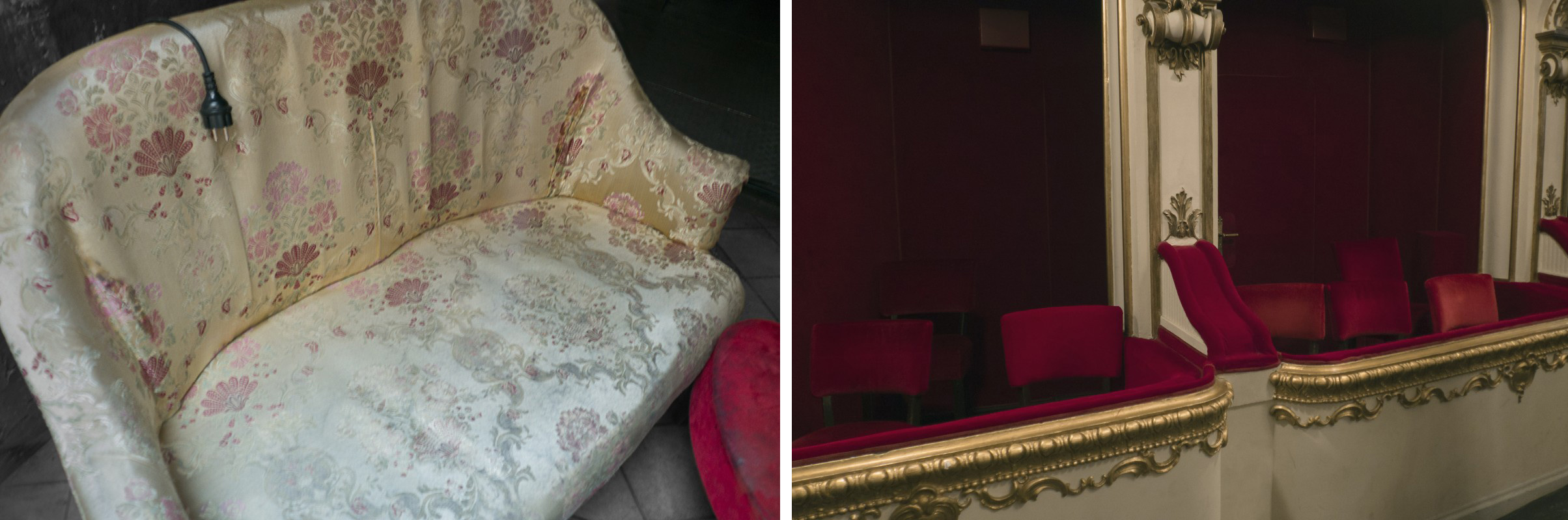
    Setting the stage with objects from different scenarios to depict empty places after people have left them, or maybe before they enter them, makes the images feel experimental, breaking the conventional compositional schemes. Analyzing how memory exist in between space and time is the key philosophical element in Grauerholz’s work. Memory can fade over time, and only the part of it that is associated with strong emotions can become more vivid as time passes. Gauerholz addresses the idea that people can reconnect to their memories, – even long forgotten ones – or at least to the sentiment of them, when seeing the objects that were part of them. In the narrative of some images like “Small Sofa” and “Theaterlogen” we feel the strong presence of the artist, as though she had just vacated those seats.

    Angela Grauerholz, Small Sofa, Inkjet print on Arches paper, edition of 5, 48″ x 68″ (left) and Theaterlogen, Inkjet print on Arches paper, edition of 5, 40″ x 60″ (right)

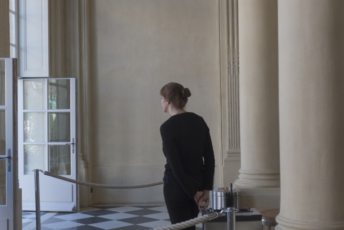
    Among the photographs, only one captured a person as the object of the image, which makes this particular piece stand out. The female figure, maybe a museum attendant, stands still in a relaxed posture, in a cool toned, empty museum corridor, waiting. She might be looking into a crowded room where masterpieces are admired by visitors or just into another vacant place. However, she is not part of the action. She is outside, quiet and motionless. The composition and the neutral colouring makes this photo fresh and serene.

    Angela Grauerholz, La Compteuse, Musée Rodin (Paris), Inkjet print on Arches paper, edition of 5, 48″ x 68″

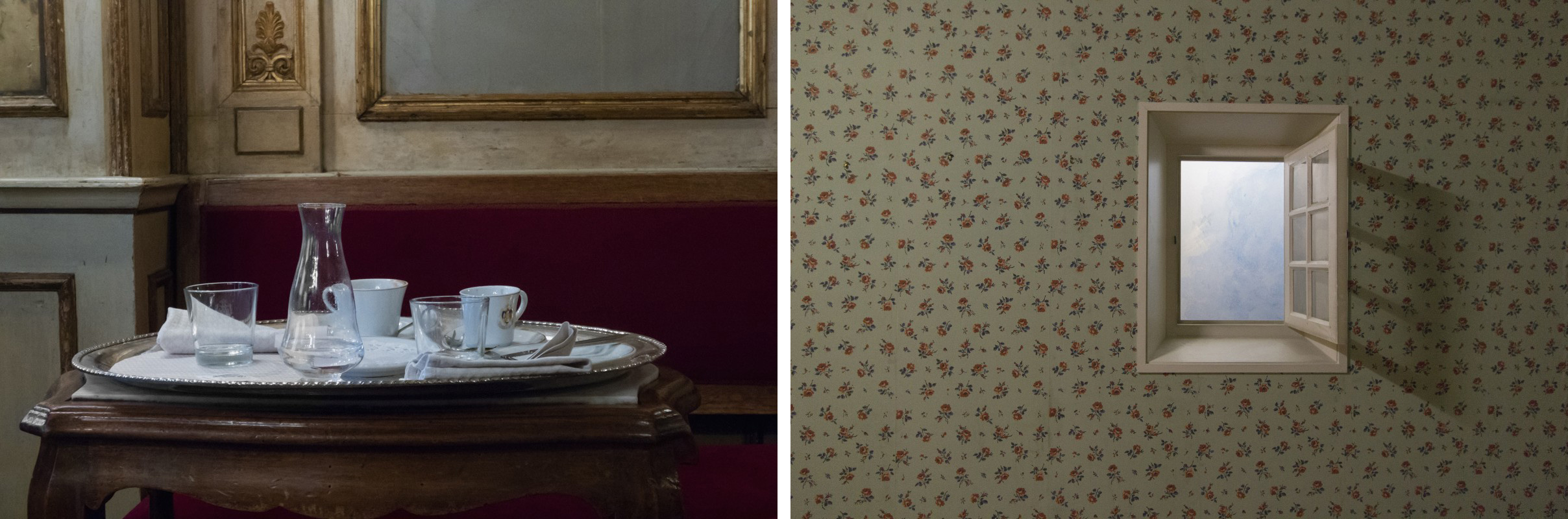
    In some of the works, like “Venice Café” and “Musée Carnavalet – Salle n°106 Chambre du temple (Paris),” Grauerholz has created images that almost have the same texture and quality as oil paintings, reminding me of Mary Pratt’s work. Mary Pratt’s realistic paintings depict ordinary objects and scenes, using fine brush strokes to recreate every small detail, resulting in works that are very photographic. Some of Grauerholz’s photogrpahs achieve the reverse effect. This ambiguity is especially strong in “Venice Café” when observed from a distance. “Musée Carnavalet— Salle n°106 Chambre du temple (Paris)” also has similar textural values to a painting, but what makes it unique is the bit of sky glanced through the open window; creating a contrast with the vintage wall paper. The view we can see – and the view we can’t see because of the smallness of the window – provokes the viewer’s curiosity about the scenery outside the camera’s frame.

    Angela Grauerholz, Venice Cafe (left) and Musée Carnavalet – Salle n°106 Chambre du temple (Paris) (right), each Inkjet print on Arches paper, edition of 5, 48″ x 68″

    This exbition has a message for everyone. It might be different for each individual because, as the gallery’s website suggest, “Memory is subjective, manipulated and changed every time we recall a moment in our past. Angela’s approach is from a philosophical standpoint, working intentionally with sentimentality and nostalgia to confuse and enchant.”

    Sophie Wang

    Images are courtesy of Olga Korper Gallery

    *Exhibition information: April 28 – June 2, 2018, Olga Korper Gallery, 17 Morrow Avenue, Toronto. Gallery hours: Tue – Sat, 10 am – 6 pm.

    **Part of Scotiabank Contact Photography Festival 2018
  • The Abbozzo Gallery and Richard Jacobson’s Hyperrealism

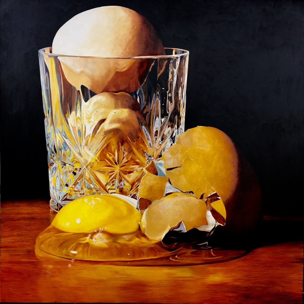
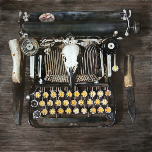
    I attended the opening of Richard Jacobson’s exhibition of oils on panel paintings in April at the Abbozzo Gallery in the heritage-designated 401 Richmond Street arts building. The gallery is on the main floor, with much of its exhibited art visible from the corridor thanks to the glassy exterior of the show space. I’m safe in describing the structure as an arts building, since more than 140 of its tenants are artists, not to mention its housing of “cultural producers” of many stripes – the gallery itself, of course, being one of several.

    Installation view at the Opening Reception. Photo: Marco Rosada

    Arriving early enough at the vernissage to talk the artist, allowed me to get to the bottom of what Jacobson meant by “hyperrealism,” and how it differed from his definition of “photorealism.” The artist admits to using photographs as a reference, but ultimately doesn’t like his paintings to resemble photographs. A typical photorealist lick is to employ soft focus to blur details. Jacobson has learned that our eyes continue to refocus as we scan the subject at hand, whether its background or foreground. From this I speculated that the artist either has 20/20 vision or uses bifocals.

    Richard Jacobson, That kind of morning, oil on panel, 48″ x 48″. Courtesy of Abbozzo Gallery

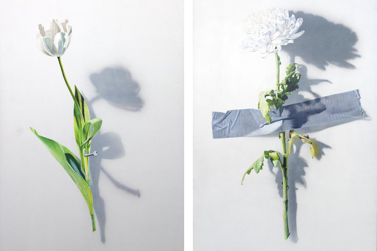
    The works “Nailed Offering” and “Another Offering” intrigued me. The first work depicted a tulip with its stem affixed to the surface by a sturdy nail. The second painting displayed a chrysanthemum crudely taped to its background by duct tape, much as one would cross a T. The symbolism to any student of Renaissance or religious art would necessarily connect the works to the centuries-old tradition of depictions of Christ’s crucifixion. It surprised and intrigued me to learn that, to Jacobson the works alluded instead to something closer to home, domestic abuse.

    Richard Jacobson, Nailed Offering (left) and Another Offering (right), each oil on panel 36″ x 60″

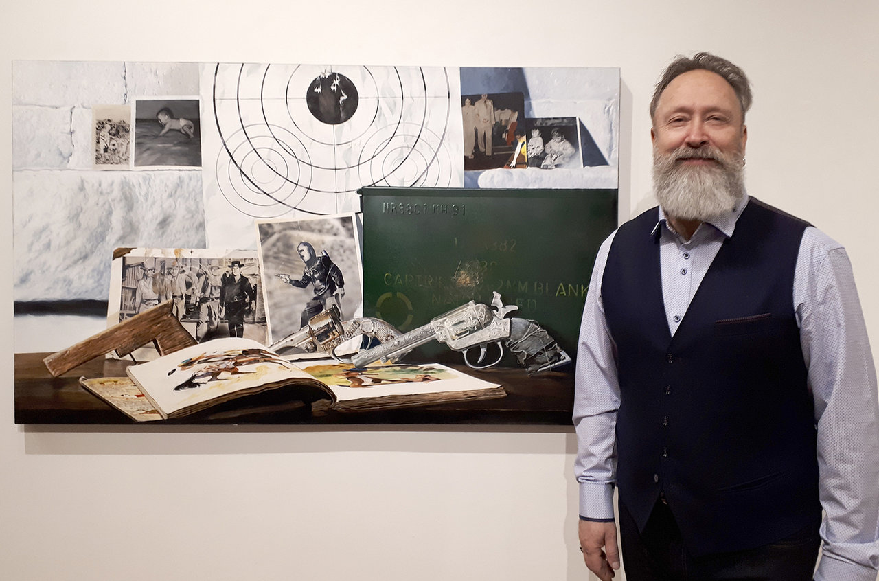
    The panel, “Learning to Walk” clearly points to a childhood steeped in gunslinger lore and other pop culture references. Through the loving honing of details of family photos, book illustrations, toy guns, and assorted memorabilia, the artist captures and deepfreezes his subject. Through the act of painting, the objects and the memories associated with them, are fixed and immortalized into a kind of painterly afterlife.

    Artist Richard Jacobson and his Learning to Walk, oil on panel 36″ x 60″. Photo: Steve Rockwell

    It is some of these qualities in the artist’s work that resonated with gallery owner Ineke Zigrossi. This being the artist’s first exhibition with the Abbozzo Gallery, she said, “Richard Jacobson’s high realism art and the notion, that there is always something more personal behind the subject matter, inspired us to offer him a full gallery exhibition.”

    Richard Jacobson, The Witness, oil on panel, 48″ x 48″. Courtesy of Abbozzo Gallery

    In response to my question of how she got into the gallery business, Zigrossi stated, “After Corporate life gave me the ‘Golden handshake,’ I was inspired to open a gallery from a friend who ran another gallery in Waterdown. I loved the environment of being surrounded by art, meeting the artists, the openings, the marketing, and talking to customers. My background is not at all in the practicing arts, it became a love acquired through travel. A mentor encouraged me to open my own gallery that focused on original and contemporary art and in turn, I opened Abbozzo Gallery in Oakville in 1993. We celebrated 25 years in business this spring. We will hold an official exhibition in the fall focusing on these past years.”

    Abbozzo Gallery Director Ineke Zigrossi and Associate Director Marco Rosada. Photo: Steve Rockwell

    Zigrossi feels that her decision to move here from Oakville has been altogether positive: “We moved to Toronto five years ago after my four children went away to University and felt Toronto would be a great next move for our gallery. We have been welcomed and supported by UrbanSpace, the property management group for the 401 Richmond Building and love the feeling of community that has been fostered in this space. Since our move to 401 and the hiring of Marco Rosada, our Associate Director, we are moving towards a more International and Contemporary representation. Marco’s background has been shaped by growing up in his family’s Art Gallery business in Trieste, Italy.”

    Steve Rockwell

    *Exhibition information: April 12 – 28, 2018, Abbozzo Gallery, 401 Richmond Street West, Suite 128 Toronto. Gallery hours: Tue – Sat 11 am – 6 pm.

  • Felicity Hammond / Arcades at CONTACT Gallery

    Felicity Hammond, Installation view of Arcades at CONTACT Gallery

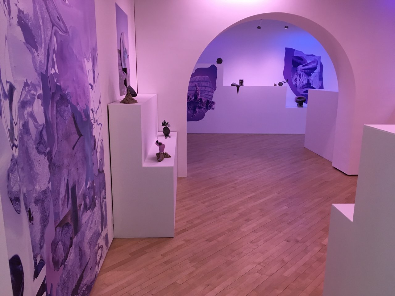
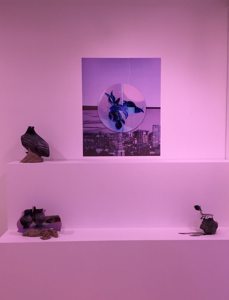
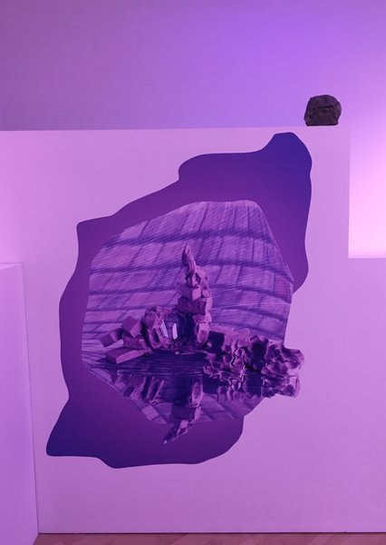
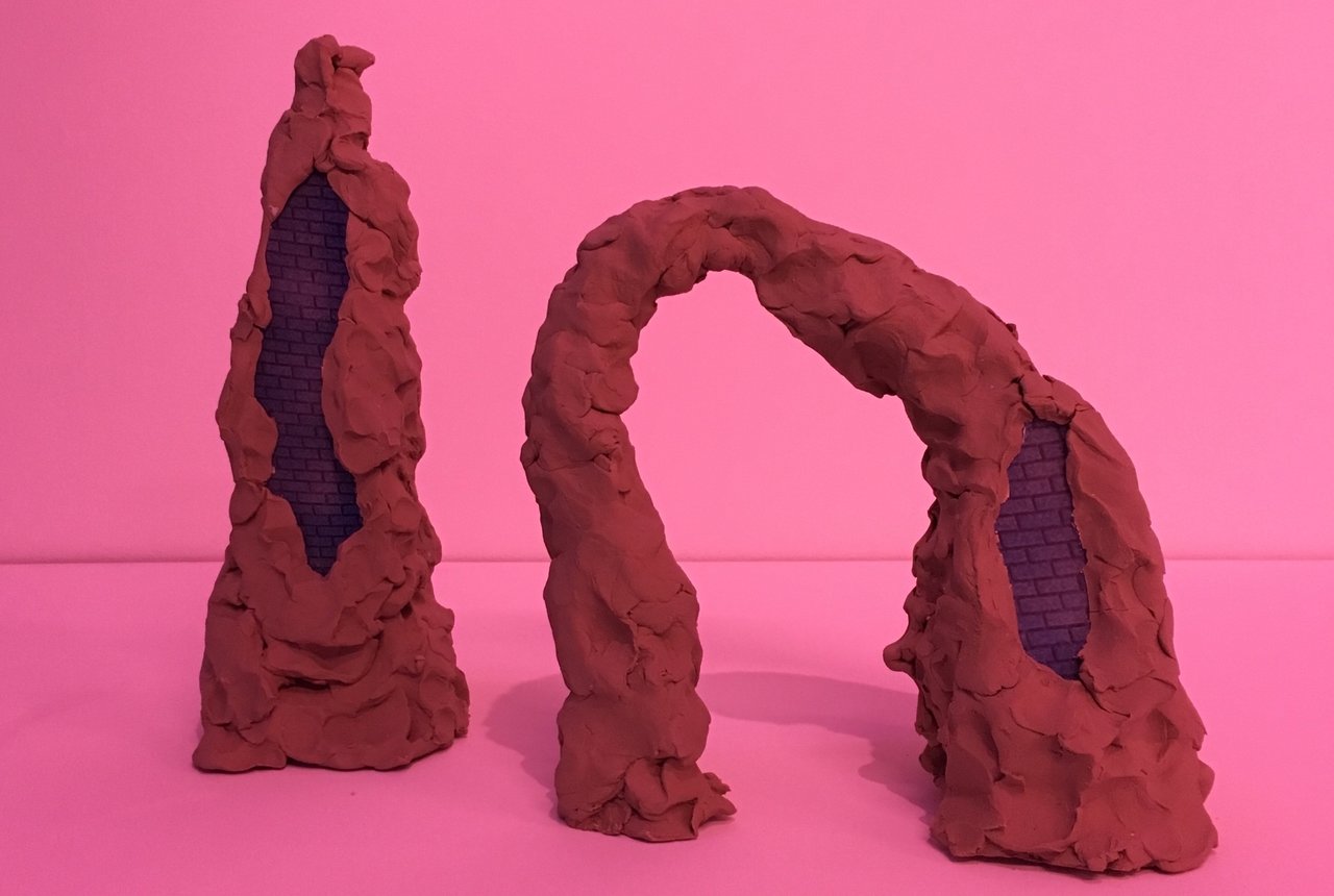
    Felicity Hammond re-imagines Toronto’s built-environment of architectural forms and condo culture in the site-specific project Arcades at CONTACT Gallery. Using a combination of sculpture and photography, the work displayed investigates motifs found in the promotion of condo development and the ever-changing landscape of the city – presented in an otherworldly fusion of clay, concrete, wood and digital imagery merged into mutated vases, planters, and into amorphous masses under coloured lights.

    Installation view with Felicity Hammond, Untitled, from Arcades, 2018 at CONTACT Gallery

    Curator Bonnie Rubenstein describes in the exhibition’s text how “(Hammond’s) project considers the timescale at play, where capitol is held in the virtual depiction of space rather than the physical structure itself, and where property is bought and sold based solely on their digital representations.” Rubenstein continues, “Vistas of new cityscapes appear to excavate the past in order to renew the present, and our experience of architecture in the physical realm becomes shadowed by such images.” Hammond’s Arcades merge the real and virtual alluding to how one may perceive their city in terms of its history, its present state, and its future.

    Installation view with Felicity Hammond, Fragment 08, from Arcades, 2018 at CONTACT Gallery

    Hammond has created an ethereal environment for the gallery, photos appear morphed and liquified, many of the objects are familiar yet formless. In the gallery individual objects are presented to the viewer as imagined archaeological findings, the works are titled numerically (Fragment 01, Fragment 02, etc.) The flat glossiness of the digital representations of architectural forms (such as windows and building exteriors) are directly at odds with the hands-on physicality of the lumpy brown clay. The effect of these amorphous objects is amplified by the coloured lights used throughout the gallery: blues, pinks, and purples that immerse the viewer in a celestial environment.

    Felicity Hammond, Fragment 11, from Arcades, 2018 at CONTACT Gallery

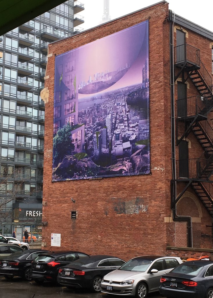
    The second half of the exhibition can be found outside the gallery at 460 King St. West on the facade of the neighbouring red brick building and is titled, “Post Production” (2018). It is a large-format mural made up of photographs that Hammond has taken of Toronto’s skyline and collaged together into a purple dreamlike CGI cityscape looking neither post-apocalyptic or utopic. Like the exhibition the (un)familiar city we see depicted is flush with purple light from the planet’s atmosphere, green growths are clinging to the architecture like moss on a tree and floating above is a gigantic bubble showing a translucent cityscape inside as if it were a crystal ball.

    Felicity Hammond, Post-Production, 2018

    For someone that grew up in the 80’s and 90’s, the title, Arcades, quickly evokes memories of video game arcades that once flourished in some of the strip-malls in my hometown. The dim spaces lit up by the flashing video monitors of as many arcade units as could be crammed into one space. They were a place where fantasy and science fiction saturated the minds of youth. The youthful “radical” aesthetic of the arcade clashed with that of the generic decorative motifs of its harbouring strip-mall; fake plants, sand-filled ashtrays, marble tiles and all. Historically though, the arcade refers to the Arcades of Paris, the glass-covered alleyways built in the nineteenth century, that allowed Parisians to turn the alleyways of shops into fashionable hangouts and a place to escape the elements. The subject of the Arcades of Paris became a focal point for Walter Benjamin in his incomplete Arcades Project published posthumously, linking them to the city’s street-life and the habitat of the flaneur. In that writing Benjamin describes the arcades as fluid places, “like realities in the dream”, “dissolved in a constant flux”. The Arcades of Paris were a place where opposites merged, the old met the new, the outdoor the indoor.

    Felicity Hammond, Untitled, from Arcades, 2018 at CONTACT Gallery.

    This relationship of transformation within space and through time is visible in the way modern cities continue to develop and redevelop as industry changes. The structures that one industry used to occupy become the recycled remains on which the next is constructed; a brick façade becomes the foundation to accommodate a mirrored skyscraper. The city is in constant flux. Properties are bought and sold before they even get constructed. These are some of the conundrums Hammond brings to light in her Arcades.

    Text and photo: Daniel Joyce

    *Exhibition information: April 28 – June 29, 2018, CONTACT Gallery, 80 Spadina Ave Ste 205, Toronto. Gallery hours: Tue – Fri 11 am – 6 pm, Sat 12 – 5 pm.

    **Part of Scotiabank Contact Photography Festival 2018
  • Pat McDermott at Christopher Cutts Gallery

    The Sonnet Paintings series is Pat McDermott’s third solo exhibition at the Christopher Cutts Gallery, containing 20 similar sized paintings.

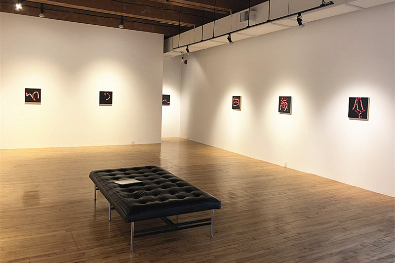
    Installation view of Pat McDermott, Sonnet Paintings, Christopher Cutts south gallery. Photo: Sophie Wang

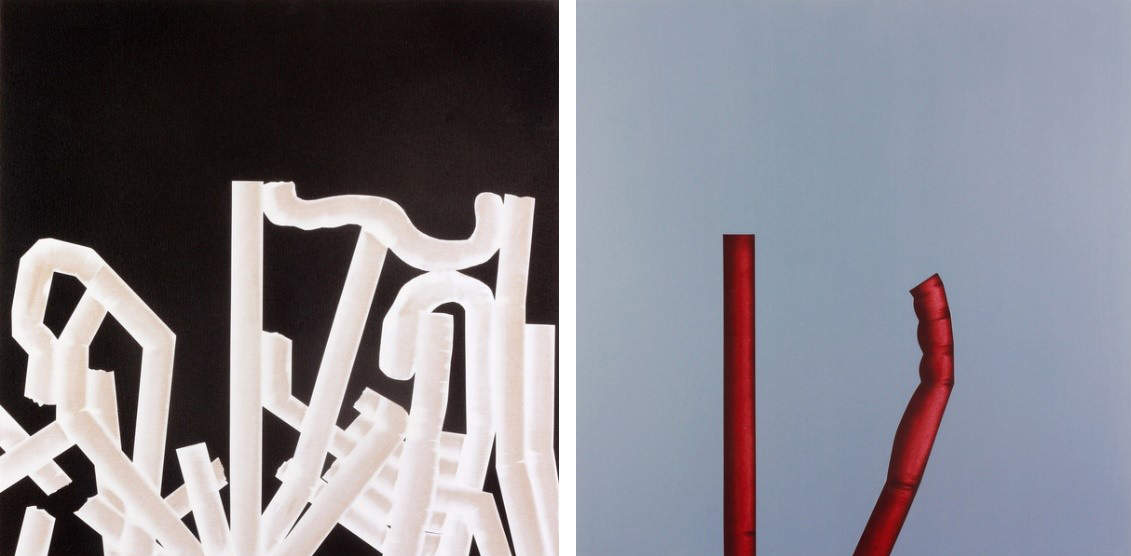
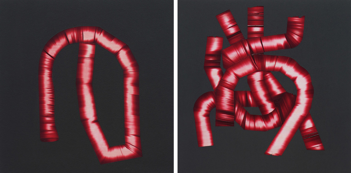
    McDermott uses a minimal palette and simplified shapes to depict unfamiliar objects. His unique abstraction of tube-like structures can be difficult to interpret for viewers at first sight. His works are not meant to be seen individually, but rather as a series of pieces that interconnect. Audiences can comprehend the Sonnet paintings more easily by knowing McDermott’s previous works. The Properties of Language series (2016) applied the same motifs as the Sonnet paintings. The two series show many similarities in their artistic forms; both built upon bold colour contrast to draw clear distinction between the tube-like structures and the monochrome backgrounds. While The Properties of Language use white objects on black backgrounds or red objects on blue backgrounds. The Sonnet paintings combine red colored objects on black backgrounds with a strong highlight at the center of the tubular design which makes them stand out three dimensionally on the two dimensional surface.
    Pat McDermott, The properties of language No.9 (left) and The properties of language No.12 (right), both 2016, acrylic on MDF board, 24″ x 24″. Courtesy of Christopher Cutts Gallery

    By depicting unfamiliar, non-existing objects, McDermott’s works refuse any possible categorization and invite the viewers to become active spectators. As he states, “Because I have depicted a world that the viewer does not know, the viewer is free to really look. The observer feels the relationships, tensions, quandaries, dilemmas, support and warmth that exist within the work and themselves.” The challenge for audiences is trying to make sense of the objects in the paintings. What do these objects stand for and what does the artist intend to express with them? Do the intertwining tube-like objects represent the metal structure of buildings and through it our modern world, maybe even a futuristic view? Could it be possible that the red columns stand as metaphors for human organs or arteries and veins?

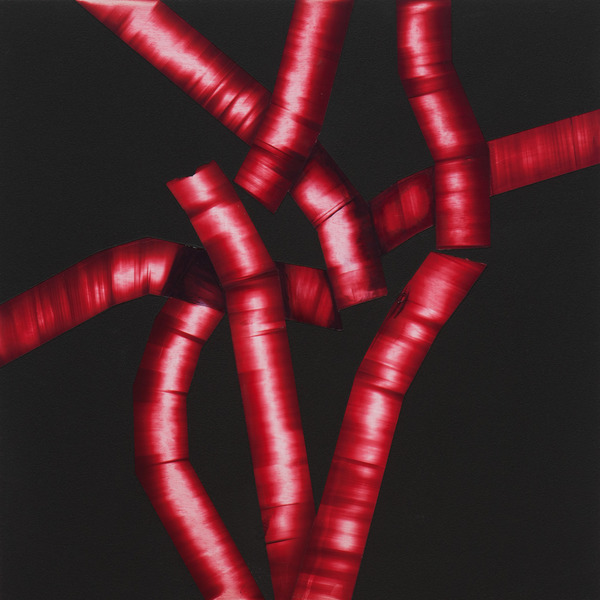
    There is an uncertainty in these works that leave them open to interpretations. One of the possible narratives is related to language. “up against” and “seeing through making,” resonates with my cultural background. They remind me of rearranged Japanese characters. It makes me wonder, if this was an intentional design, or only a coincidence from the artist’s unconscious associations.

    Pat McDermott, up against (left) and seeing through making (right), both 2017-18, acrylic on plywood, 15″ x 15″. Courtesy of Christopher Cutts Gallery

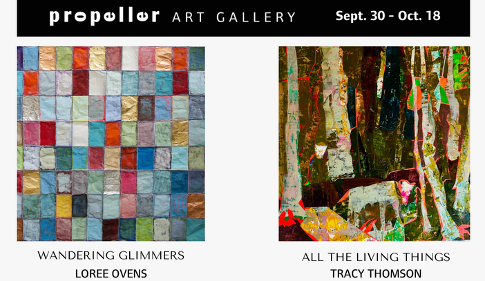
    The amazing labyrinths of tubular forms could easily represent something as complicated and beautiful as a sonnet. Sonnets are hard to write, since they are short and must be clear to be understood – they are the essence of language. These tubes sing about mysteries to us. That is exactly what McDermott wants, as he wrote, “In the Sonnet Paintings, I have tried to depict the abstract with clarity…The paintings possess a photographic quality but what they depict is not ever obvious.”

    Pat McDermott, so lightly here, 2017-18, acrylic on plywood, 15″ x 15″. Courtesy of Christopher Cutts Gallery

    The ambiguity and abstraction created in the Sonnet paintings require active thinking from the audience, which can be challenging, but also amusing at the same time.

    Sophie Wang

    *Exhibition information: Pat McDermott, Sonnet Paintings, April 28 – May 26, 2018, Christopher Cutts Gallery, 21 Morrow Avenue, Toronto. Gallery hours: Tue – Sat 10 am – 6 pm.