Author: artoronto

  • Bill Jones – Waking Dream

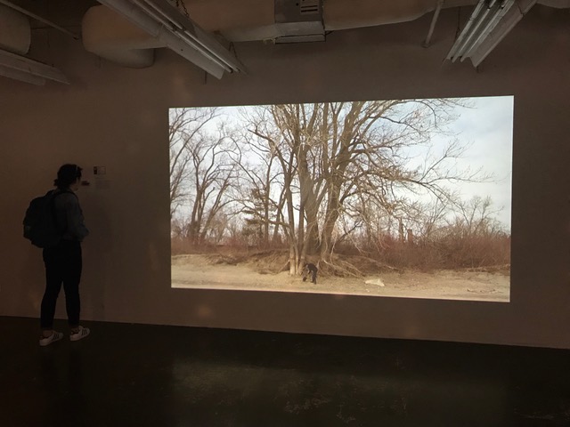
    Given our current technological advances, it is often easy to neglect the past and take many early discoveries for granted. Photography, which gave enthusiasts and artists the capacity to precisely mirror reality, became a defining invention of the Industrial Revolution that subsequently progressed to our present day. In its most primitive forms, light was rendered onto photo-sensitive surfaces, such as silver-coated paper, to produce a negative image. The addition of film strips, chemical processing, and digital rendering made this process more widely-accessible, effective, and immediate. However, throughout this history, photographers have sought to test the boundaries of this technology, pushing to instead create their own reality by employing photomanipulation and imaging techniques. Bill Jones’ Waking Dream traces the history of documentary and artistic photography through his own works, striving to simulate the same haunting effects through digital reproduction.

    Installation view of Bill Jones, Waking Dream. Photo: Simon Termine

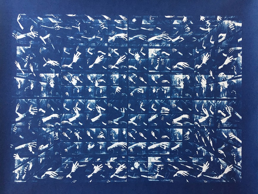
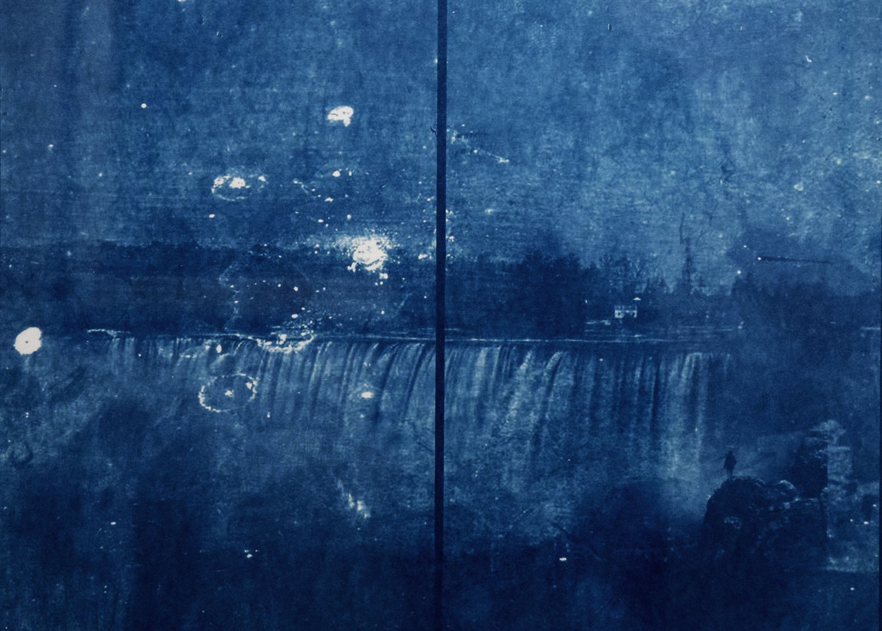
    Waking Dream, which is the namesake of both the exhibition and the focal piece, references a 1993 exhibition held at the Metropolitan Museum of Art named “The Waking Dream: Photography’s First Century.” Its premise was to demonstrate, through a collection of historical photographs by industry pioneers, the medium’s capabilities at coalescing the past and present within a single moment that perfectly captured the artists’ experience. Taking this inspiration, Jones presents a video installation that commemorates these 19th-century advancements and their innovators. Among these, he emphasizes the contributions of photographers Eadweard Muybridge and Henry Peach Robinson. Muybridge was responsible for the notable Horse in Motion series that pioneered motion capture techniques, while Robinson made use of overlapping image stills to portray complex scenes, popularizing composite photography.

    Bill Jones, After Eadweard Muybridge, 2017. Cyanotype. Courtesy of the artist.

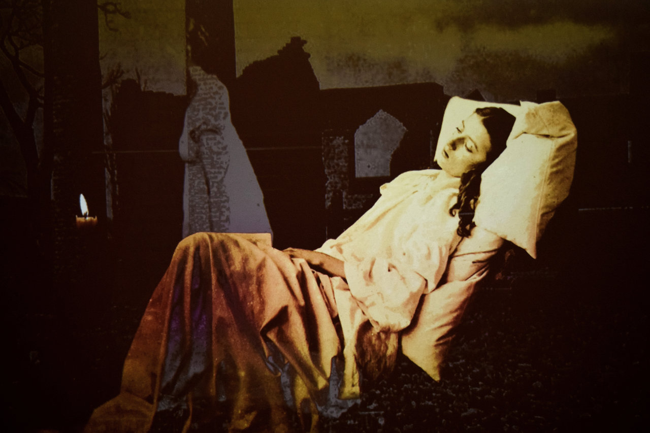
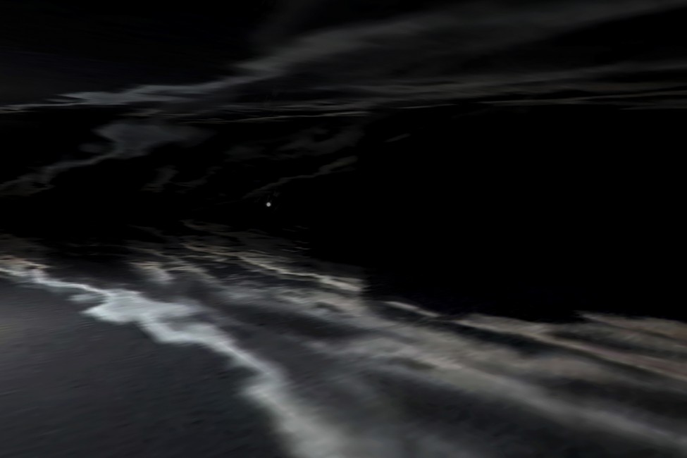
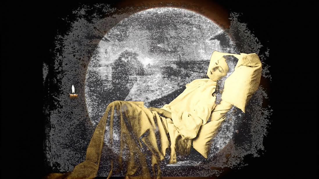
    In Jones’ Waking Dream, various elements inspired by these artists, most prominently Robinson’s controversial depiction of a supposedly dying woman within a fabricated scene, are digitally layered. Ghostly images of other photographs history are seen superimposing one another into a visual history of the medium, accompanied by Jones’ own musical score inspired by the 1893 folk song “Kathleen Mavourneen.” Using specialized video editing, both the visual and auditory components of this piece are seamlessly interwoven perfectly synchronized to deliver a captivating sensory experience.

    Bill Jones, Waking Dream, 2017. Film still. Photo: Simon Termine

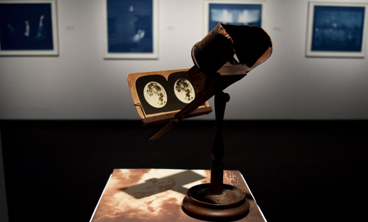
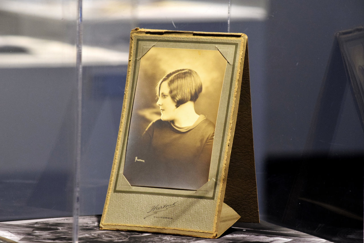
    Apart from video installation, Jones goes on to include a collection of accompanying photographs and artifacts that further replicate the history of photography. Cyanotypes, stereoscopic viewfinders, carte-de-visites, personalized portraits, and black-and-white images scour the space. Ranging from the abstract to the naturalistic, the sheer variety of the medium and its seemingly-limitless possibilities are resonant.

    Installation view with stereoscopic viewfinder. Photo: Simon Termine

    Installation view with Bill Jones, Portrait of my mother. Photo: Simon Termine

    Bill Jones, The Photographer, Cyanotype. Photo: Simon Termine

    Bill Jones, Equivalent 4, 2016. Giclee print. Courtey of the artist.

    Jones not only offers works that draw upon early photographic techniques and are mediated through modern techniques, but also a visual journey through the discoveries that contributed to our contemporary society.

    Simon Termine

    Featured image: Bill Jones, Waking Dream, 2017. Film still. Courtesy of the artist.

    *Exhibition information: May 8 – June 8, 2018, John B. Aird Gallery, Macdonald Block, 900 Bay St (at Wellesley). Gallery hours: Mon – Friday 10 am – 6 pm, Sat 12 – 5 pm.

    **Part of Scotiabank Contact Photography Festival 2018

  • Tony Calzetta at Yumart

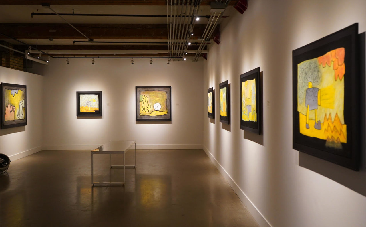
    Tony Calzetta’s series, Sophisticated Scribbles and Stories, Grim and Grin is currently on display at the Yumart Gallery. As a trademark, the artist drew a black frame with pastels around the edges of the paper and used bright and flamboyant colors to paint the main theme, creating a visual contrast. This effect constitutes a brisk and lively theme, with added nursery rhymes as titles, reminding us of happy times of our childhood.

    Installation view of Tony Calzetta, Sophisticated Scribbles and Stories, Grim and Grin. Photo: Xiaotong Cao

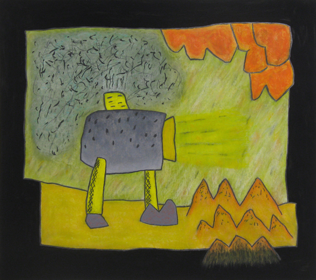
    Calzetta’s characters and objects go through a metamorphosis until they become semi-abstract shapes, but their expression remains straightforward and easy to perceive. His works are unique; now it is rare to see artistic styles and approaches as his. Throughout his career Calzetta has been recognized by his cartoon-like style.

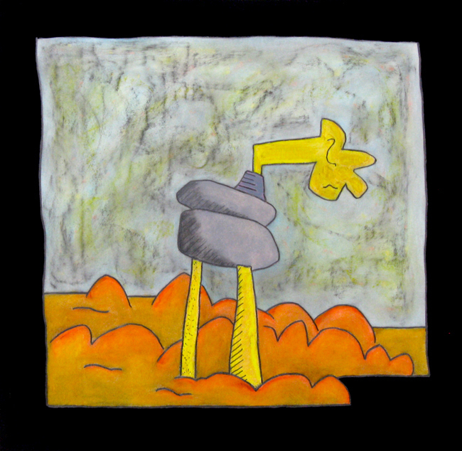
    Tony Calzetta, Grim and Grin Story #970, 2018, oil pastel and graphite on paper, 29” x 33”. Courtesy of Yumart

    Calzetta titled this exhibition: Sophisticated Scribbles and Stories, Grim and Grin, misleading the viewers who might expect straightforward storytelling, trying to match the titles with the images. However, the artist stated that he did not name his works intentionally; meaning there is no relation between the title and the work. He picked some nursery rhythms and rewrote them into artsy poems, just for the fun of it, like Grim & Grin Story #971: “Little Jack Horner / Sat in a corner / Reading his art mag / And thought / What a drag.” The accompanying painting shows a long-legged figure walking in a landscape of sand dunes, looking down, maybe trying to maneuver his way through them. Maybe ‘drag’ could be used as a connection – intentional or not.

    Tony Calzetta, Grim and Grin Story #971, 2018, oil pastel and graphite on paper, 28” x 29”. Courtesy of Yumart

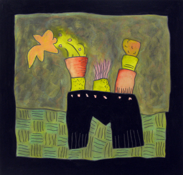
    In Calzetta’s works the figures and the machinery he depicts become beautiful and charming, making them popular. Calzetta receives his inspiration from his subconscious and automatic doodling. Later he follows up with drawings based upon what he saw, transferred onto paper and turned into a visual reflection – but all the way he follows the free-flow of his original visions. What are those colorful and fantastical pieces he creates and what are they supposed to mean? Representations of industrial vehicles, animalized with legs and arms, in front of cloudy skies lead us into landscapes we never saw before. Other canvases depict cartoonish figures with body parts borrowed from machines, like chimneys for arms or a muffler for body.

    Tony Calzetta, Grim and Grin Story #962, 2017, oil pastel and graphite on paper, 31” x 32”. Courtesy of Yumart

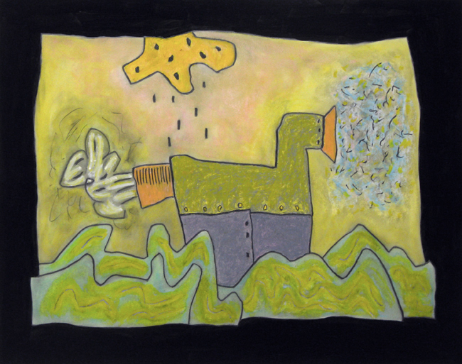
    Sometimes they just create a mutant in Calzetta’s fictional world like in Grim & Grin Story #960, where a human figure jumps into deep water, his middle section turns into a muffler, his legs into pipes that breath poisonous gas into the air. Where is the human ends and the machine begins? It also seems odd how happy-looking are these paintings. However, much fog and poisonous gas appears in their surface, the main outcome is still happy and playful – maybe because of the extensive use of oranges and yellows and the simplification of the object into toy-like shapes.

    Tony Calzetta, Grim and Grin Story #960, 2017, oil pastel and graphite on paper, 27” x 35”. Courtesy of Yumart

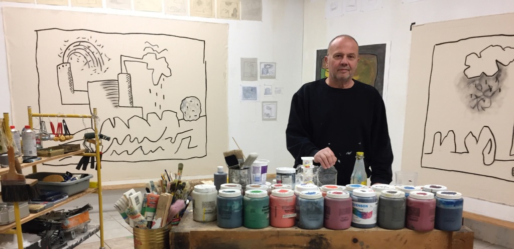
    About his artistic method Calzetta stated, that he is ‘Visually ambiguous to perspective and composition as a result of total disinterest to formal rules,’ so his works can be viewed and appreciated as ‘abstract funnies’ or ‘surreal cartoons’. Cartoons and doodling are forms of popular culture that would grasp most people’s attention, sometimes even more than traditional art forms. Indeed, I did not see much traditional craftsmanship in his work, but a rather great creativity and playfulness.

    Tony Calzetta in his studio, 2018. Courtesy of Yumart

    Xiaotong Cao

    *Exhibition information: Tony Calzetta, Sophisticated Scribbles and Stories, Grim and Grin, May 5 – 26, 2018, Yumart Gallery, 401 Richmond Street West Suite B20, Toronto. Gallery Hours: Tue – Sat, 12 – 6 pm.

  • Marleen Sleeuwits: Not The Actual Site / Brookfield Place

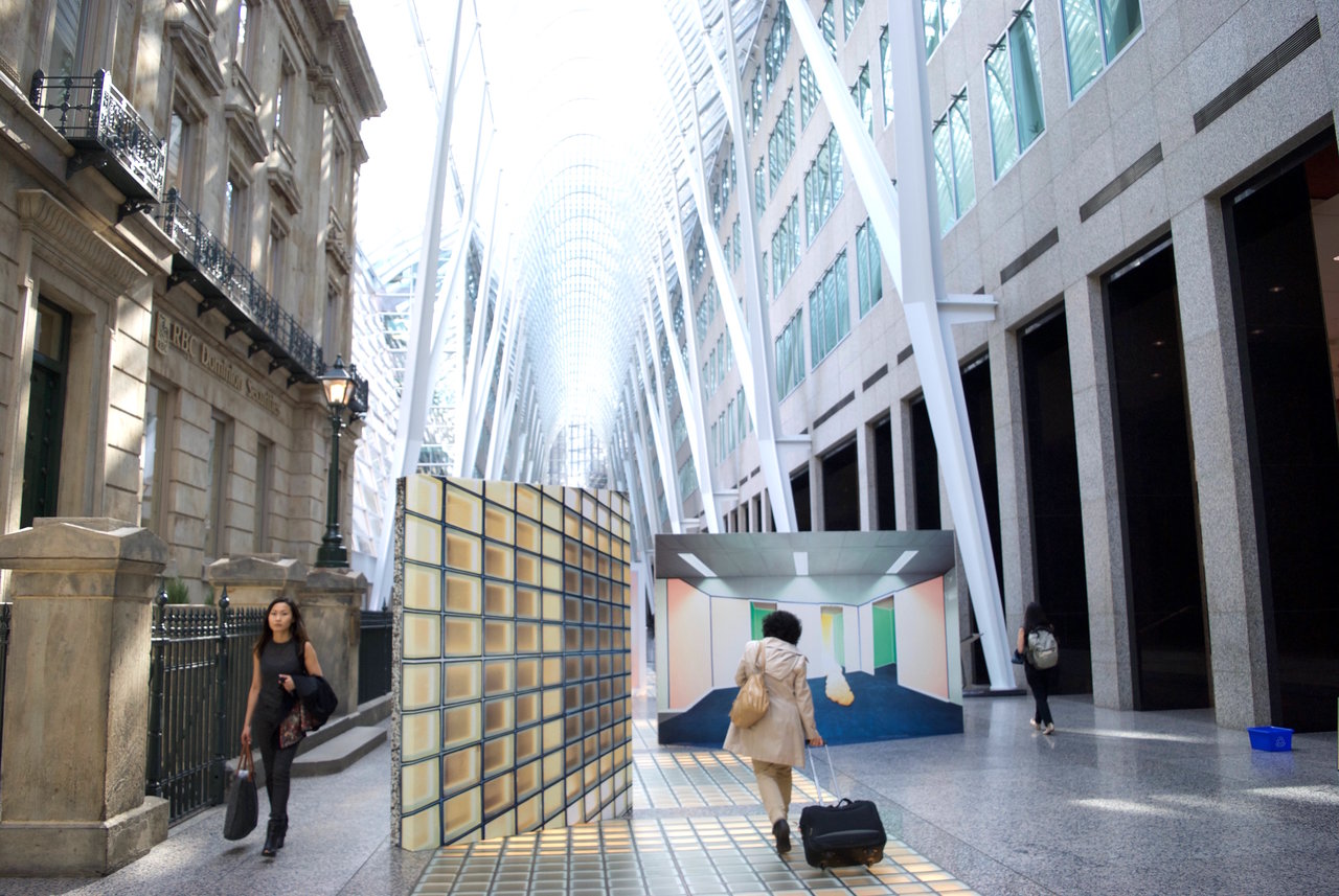
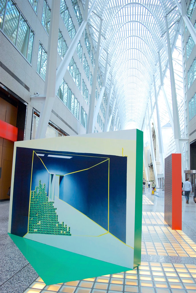
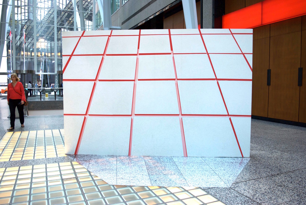
    The combination of Marleen Sleeuwits’ spatial photographs with the architecture of Allen Lambert Galleria dynamically challenges and re-orients linear perspective. Transforming the Galleria both visually and physically, Not The Actual Site utilizes ‘generic spaces’ and brings to our attention how we navigate ourselves through a space we pass by everyday.

    Installation view of Marleen Sleeuwits, Not The Actual Site

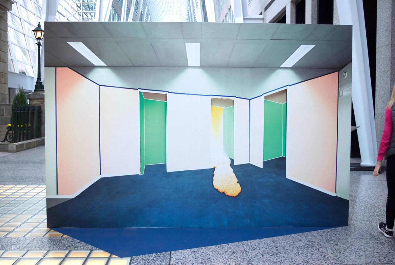
    Not The Actual Site disorients yet heightens awareness at the same time. The image is not limited to the free standing walls. “Interior no. 50’s” blue floor bleeds onto the ground in the form of an angled sleek vinyl. The image blurs the line between photograph and painting, mixing recognizable office backdrops with colourful graphic interventions.

    Installation view with Marleen Sleeuwits, Interior no. 50, 2017

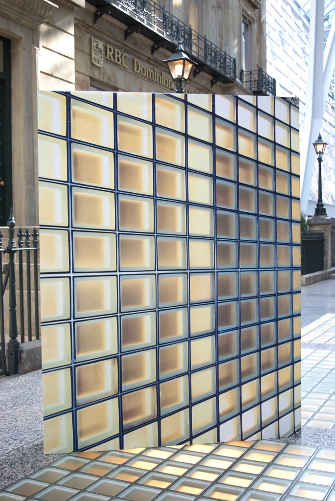
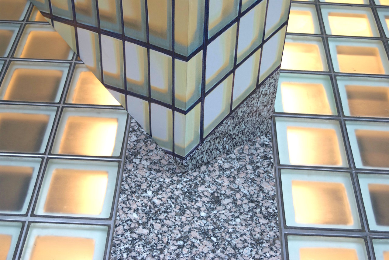
    Amongst the free-standing walls of photographs, also included are photographs taken from the Galleria itself. The lit glass floor envelops one of the panels. Shot at an angle and positioned diagonally on the very glass floor it’s showing, the image turns the grounding upright. Because the image wraps around to the sides of the wall, it almost looks as if the image has spontaneously sprouted from the ground. The speckled marble floor is included in the bottom corner of the image and furthers the disorienting of perspective and space.

    Installation view of Marleen Sleeuwits, Not The Actual Site

    Installation view of Marleen Sleeuwits, Not The Actual Site, detail

    “Interior no. 51” is a deep blue and green photograph of a strange hallway. The green of the squares on the image is extended on to the floor and the square glass lights shines through the vinyl. The deep hallway with entrance at the end invites the viewers in. In this galleria where majority of the viewers are commuting passersby, the introduction of these panels cause spatial transformations. Its position along the middle of the Galleria redirects the flow of pedestrians and compels them to weave in and out through Sleeuwits’ ‘non-spaces’.

    Installation view with Marleen Sleeuwits, Interior no. 51, 2017

    These commuters, used to walking through Brookfield Place everyday, are dramatically introduced to this change in space and perspective. Panels are placed in front of entrances and escalators, confronting visitors immediately. Through these panels, the way walkers situate themselves in the surrounding has effectively been changed. Further, the way we identify ourselves through our location has also been changed.

    Installation view of Marleen Sleeuwits, Not The Actual Site

    Not the Actual Site is not your traditional photography exhibit. It is a site-specific architectural intervention. These spaces we are so familiar with – the Galleria and generic office spaces – are reintroduced in a way that redirects the human flow while heightening our awareness of the everyday sites we absent-mindedly shuffle through.

    Text and photo: Sunny Kim

    *Exhibition information: Marleen Sleeuwits, Not The Actual Site, April 30 – June 1, 2018, Brookfield Place, Allen Lambert Galleria, 181 Bay Street, Toronto.

    **Part of Scotiabank Contact Photography Festival 2018 / PUBLIC INSTALLATION

  • Nadia Myre – Acts That Fade Away

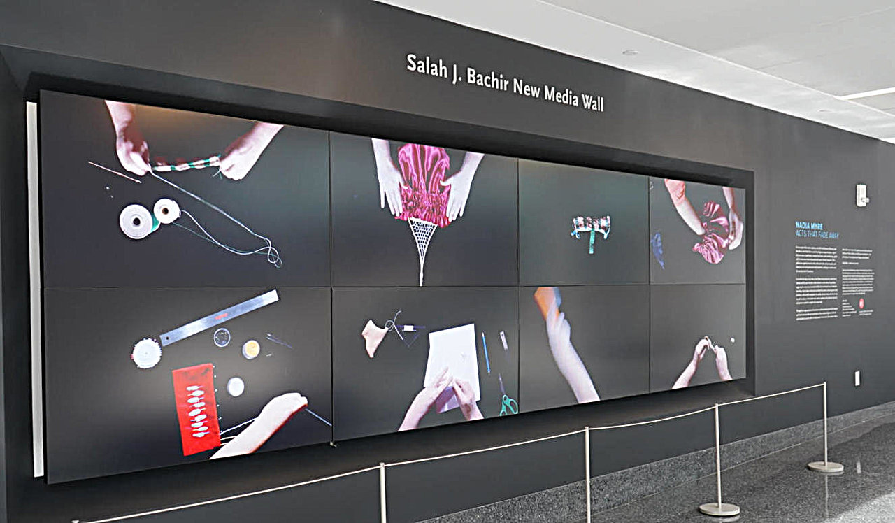
    Nadia Myre is a Montreal-based artist from the Anishnabeg Kitigan Zibi Nation, an Algonquin First Nation in Quebec. As an indigenous artist, she has devoted her artistic practice to the preservation and presentation of her first nation heritage. Acts That Fade Away was first exhibited in 2016 at the McCord Museum in Montreal, under the title ‘Decolonial Gestures or Doing it Wrong? Refaire Le Chemin’, and now as part of Scotiabank Contact Photography Festival at Ryerson Image Centre.

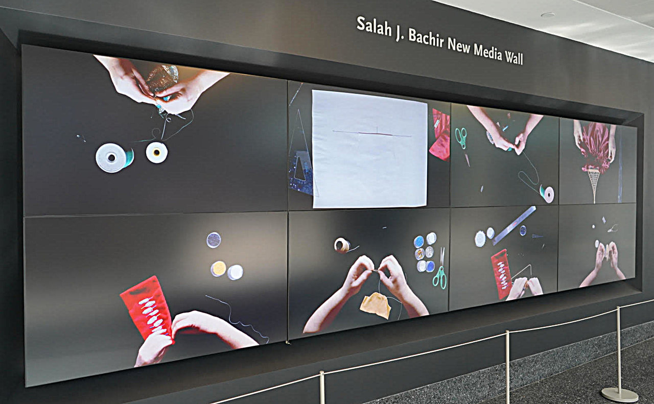
    Installation view of Nadia Myre, Acts That Fade Away at Ryerson Image Centre. Photo: Xiaotong Cao

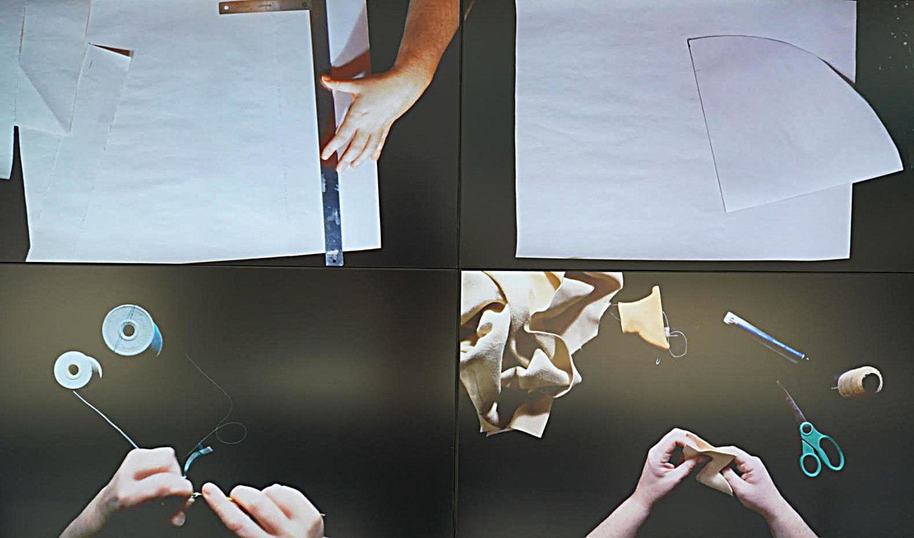
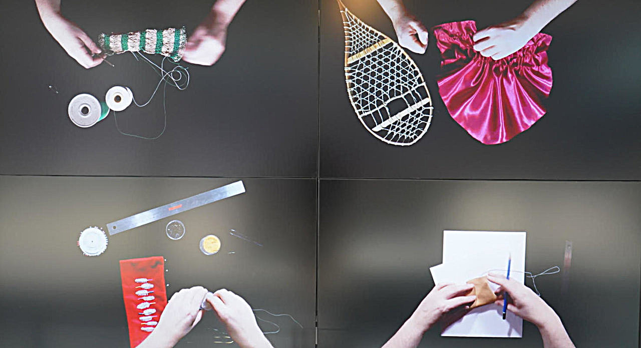
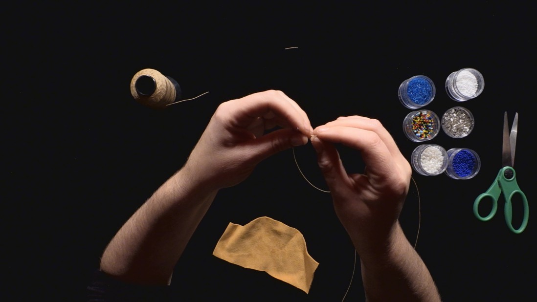
    The exhibition is a multimedia installation, presented in a LED screen divided into eight sections in two rows. An hour-long video is played via the eight screens at the same time. It is a short documentary showing Nadia Myre working. The camera is positioned above her head, only the artist’s hands and forearms are filmed. She is making four pieces of Indigenous-inspired objects in front of a black background and there is no sound or instructions in this video to be heard. The four items are: a pair of baby moccasins, a small basket, a women’s bonnet and a bandolier bag; all being made by following the instructions of nineteenth century women magazines that guided its readers through the process of creating beading products and other handiworks, such as drawing patterns, needling, beading, cutting clothes, hand-stitching and so on.

    Nadia Myre, Acts that Fade Away, 2016. Still from Decolonial Gestures or Doing it Wrong? Refaire le chemin. Courtesy of the artist, Art Mûr, and the McCord Museum

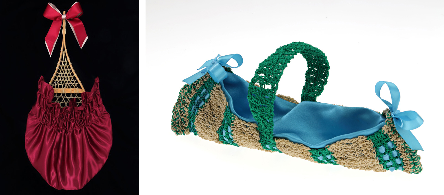
    In the film all of this work is done by the artist herself. Moccasins are a type of leather shoes mainly worn by babies and toddlers in Indigenous groups, given them as best wishes gifts at their birth. Bandolier bags are special shoulder bags for cartridges, considered as an intimate decorating object. Bonnet are special caps worn by females, while the basket is a functional handicraft – both require highly skillful weaving and stitching techniques.

    Nadia Myre, Porte-cheveux Hair-receiver (left) & Panier basket (right) from Decolonial Gestures or Doing it Wrong? Refaire le chemin. Courtesy of the artist, Art Mûr, and the McCord Museum

    There are time lags between the screening of the video, therefore, the audiences can watch the parts they are interested in and do not have to pay attention to the entire procedure. Myre is doing her work slowly and meticulously. She selects her materials carefully and assembles them piece by piece until the item is finished. Since all the objects she is making are small, it requires more energy and skill to ensure that there is no mistake in measuring. In this video, Myre demonstrates her patience, dexterity and diligence in creating those articles. The video clearly shows her ability in handcrafting and her passion for it. She might follow instructions, but the way her hands work tell us a lot about her previous experiences and skills in this task.

    Installation views of Nadia Myre, Acts That Fade Away at Ryerson Image Centre. Photo: Xiaotong Cao

    Myre identifies herself as an Indigenous artist. This video for her is not only the screening of a project but also a demonstration of traditions that should become part of the present and the future. She aims to urge the new generation not only to try to save their heritage but to prevent losing any part of it. Although the video is silent, it is noteworthy to notice that the guidelines the artist is following are coming from nineteenth century European and American magazines. Before that there were no written records or documents to preserve the indigenous handcrafting skills. As Myre wrote, “First Nations collection have lost their cultural function as a result of ‘being collected’ and removed from their communities, and, in turn, many communities have lost the cultural knowledge of these objects. The production of these reimagined pieces epitomizes personal learning, reskilling, as well as a system of knowledge transmission. Their creation allows me to restore the cognitive processes that have been the backbone of Native cultures; in revitalizing a material practice, I am performing a decolonial gesture and forging a cultural identity.”

    Installation view of Nadia Myre, Acts That Fade Away at Ryerson Image Centre. Photo: Xiaotong Cao

    Xiaotong Cao

    *Exhibition information: April 28 – August 5, 2018, Ryerson Image Centre, Slah J. Bachir New Media Wall, 33 Gould Street Toronto. Gallery hours: Tue – Fri, 11 – 6, Wed, 11 – 8, Sat – Sun, 12 – 5 pm.


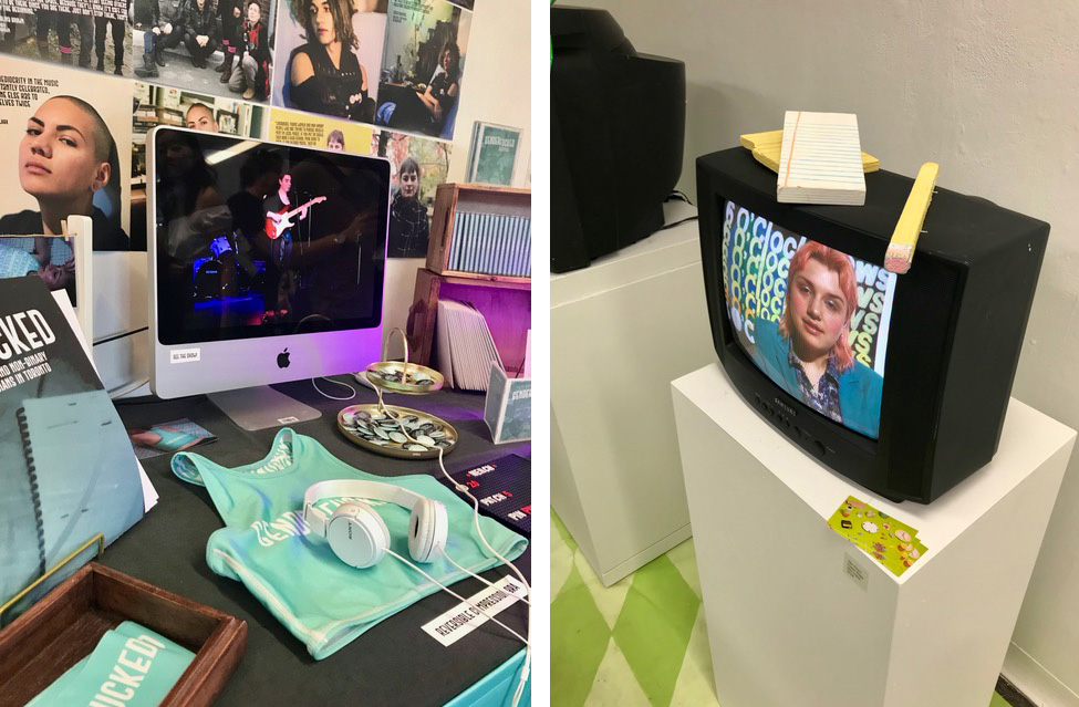
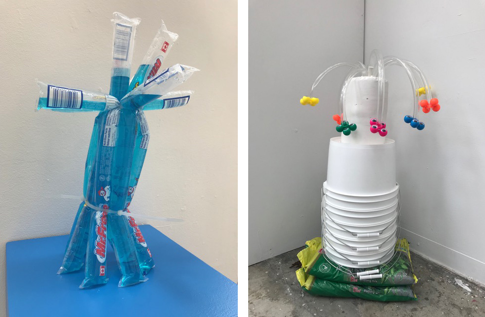
  • OCAD University’s Graduate Exhibition

    Jessie Grigg

    The 103rd year of GradEx seemed to be its busiest, and most dynamic show to date. The annual four-day exhibition featured works by over 900 students in both art and design across several buildings on campus. The school has been expanding its programs in recent years, aiming to combine studio practice with emerging technologies as well as newly recognised communities. Notable examples of these new majors include, Indigenous Visual Culture, Digital Futures, and Design for Health. With 19 undergraduate programs, and 7 graduate programs represented, the show looked drastically more bustling than what would have been seen even three years ago.

    Josi Smit (front) and Oliver Roberts (back)

    D.J. Stewart

    Adam Lew

    Cassie Paine

    Works among visual art students coagulate into several trends which can be seen throughout the show. The first one has to be the combination of painting and digital technologies. Several programs specifically focus on creating work with this emerging media, while other work seems to observe it as currently expands into an environment onto itself. Digital influence can be felt throughout most programs in the exhibition.

    Rebecca Rose Vaughan

    Raphael Sanches

    Kevin Yue

    Charlotte Cloutier

    Other rising trends in art include the integration of 3D elements in painting, including creating paintings as installations. This cross-disciplinary approach blends several disciplines into works that invite the viewer to see the work beyond its discipline. Much of the work invites the viewer into its space, an environment where tactile objects and found objects are manipulated to create the feeling of being inside a painting rather than looking from outside. This trend inevitably comes out of the internet, carried forward by the plethora of dayglow colours and neon. Plenty of online games and virtual spaces that simulate life, or other created environments are commonplace and feel like home. Works like these combine line, dimension and space, and respond personally to material culture as well as digital identities.


    Alena Pychtina and Alison Mittertreiner

    Becca Brewit

    Arshia Salesi

    Allana Cooper (back) and Jonathan J. Fong (front)

    Nanna MBS

    Rebekah Bowen

    Cleo Halfpenny

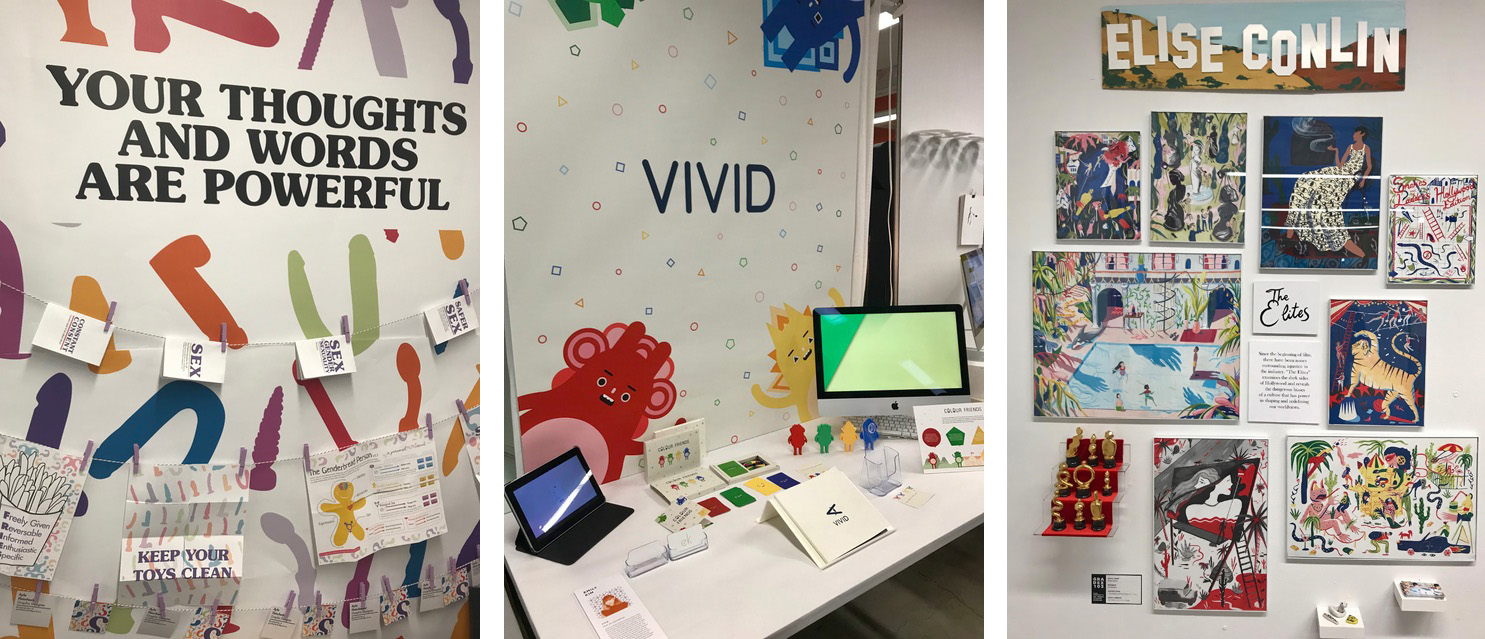
    Work by design students similarly responds to current cultural trends through various lenses. Creating work that is politically charged and responds to consumers’ needs through concepts which aim to further inclusiveness in society.

    Xingyu-Yan. Courtesy of the artist

    Ryan Mason

    Becca Howes (left) and Cotey Pope (right)

    Court Gee

    From left to right: Alya Fleischacker, Emily Kim and Elise Conlin

    Text and photo: Nazli Nahidi

    *Exhibition information: May 3 – May 6, 2018, OCAD University, Toronto.

  • Erik Madigan Heck at Nicholas Metivier Gallery

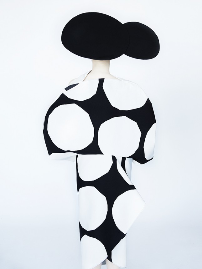
    The model stands very straight, facing away from the viewer. The structure of her asymmetrical black hat mirrors the black and white polka-dotted pattern of her dress. The white background coupled with the sharp, triangular fold on the back of her dress lends a three-dimensional appearance to the image. Strikingly, this picture is not an oil painting, but a photograph.

    Erik Madigan Heck, Junya Watanabe, 2018, chromogenic print

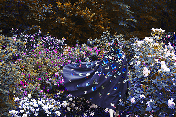
    The unimportance of the human subject, the focus on the garments and the unique ability to transform his lens into a paintbrush are the hallmarks of Erik Madigan Heck’s art. In his show, Old Future, sixteen of his large-scale photographs are on display at the upper and main level of the Nicholas Metivier Gallery.

    Erik Madigan Heck, Valentino, 2015, chromogenic print

    As one of the word’s most esteemed fashion photographers, Heck looks to impressionist painters, as well as 16th century Flemish portraiture for inspiration. To create the effect that allows him to mirror those paintings, Heck designs the stages for his shots, combines natural light and in-camera effects with the post-production modifications of saturating his images.

    Erik Madigan Heck, Without a Face (Dior), 2018, chromogenic print

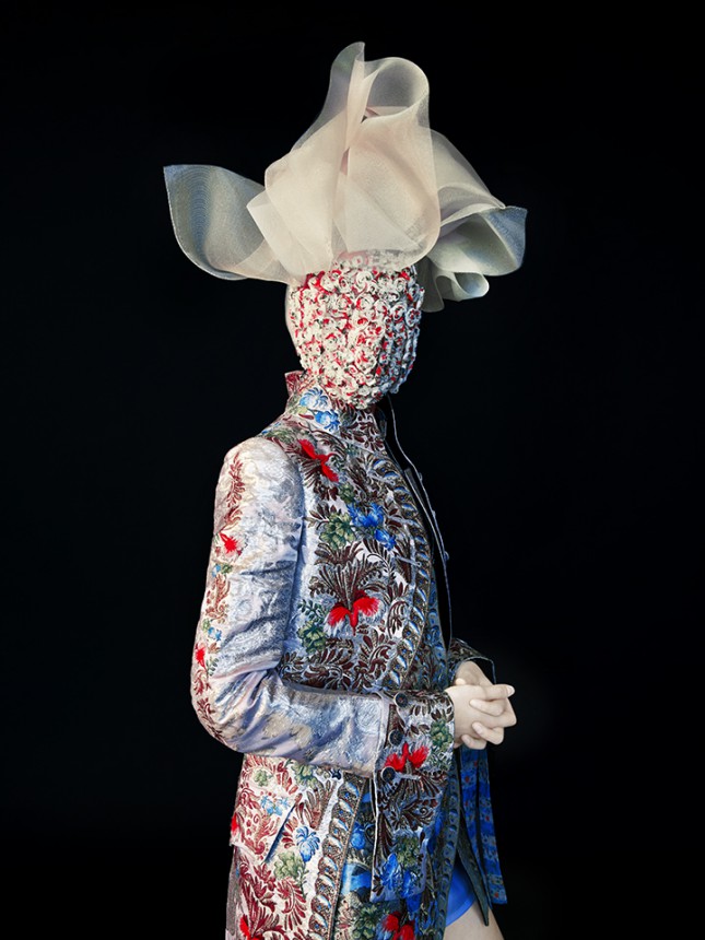
    There is no stylistic, thematic or chronological flow in this exhibition, nor is there information on the artist or details of the images beyond their basics (their title, date, medium and which designer’s garments are featured). This minimalist approach in exhibiting Heck’s photographs allows the viewer to wholly focus on and get lost in the details of each composition, such as the rich embroidery, the exquisitely patterned fabrics of the garments and the extraordinary hats.

    Erik Madigan Heck, Napoleon Vuitton, 2018, chromogenic print

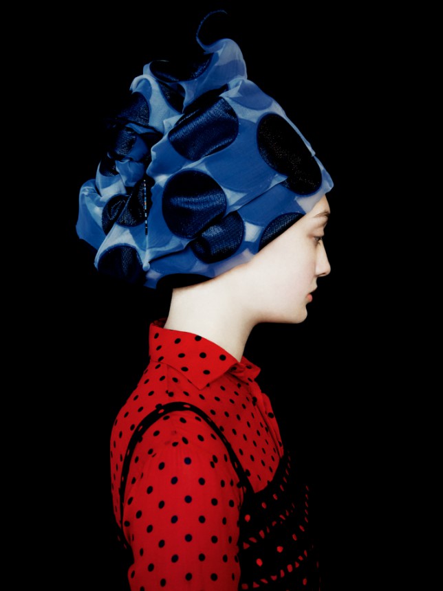
    What makes Heck’s works outstanding, besides their painterly values, is his employment of monochrome backgrounds and the way he contrasts it with the bright hues of the clothes he photographs. While the selected garments are remarkable works of art in their own right, it is Heck’s method of depicting them in his unique compositions – his vision – that is most captivating.

    Erik Madigan Heck, Without a Face (Maison Margiela), 2018, chromogenic print

    Old Future provides the viewer with much to contemplate on and a chance to admire Heck’s ability in blending three art forms: photography, textiles and painting into one harmonious image – not unlike to the making of the garments themselves.

    Patricia Tabascio

    Images are courtesy of Nicholas Metivier Gallery

    *Exhibition information: Erik Madigan Heck, Old Future, April 12 – May 5, 2018, Nicholas Metivier Gallery, 451 King Street West, Toronto. Gallery hours: Tue – Sat, 10 am – 6 pm.

  • CONTACT 2018 / Artoronto picks

    This the 22nd Scotiabank Contact Photography Festival, the largest photography festival in the world. With so much choices, with well over 1500 Canadian and international artists and photographers exhibiting at more than 200 exhibitions throughout the Greater Toronto Area, it isn’t easy picking exhibits to see.

    We all look forward to seeing much more than the ones listed but these caught our interest and everyone is sure to have their own list as well.

    PHIL ANDERSON, publisher/writer:

    Arcades / Felicity Hammond
    April 28–June 16
    CONTACT Gallery
    80 Spadina Ave. Ste 20

    Felicity Hammond, Fragment 06, from Arcades, 2018. Courtesy of the artist

    Cutting a Figure: Black Style Through the Lens of Charles “Teenie” Harris
    April 26–June 7
    BAND Gallery
    19 Brock Ave

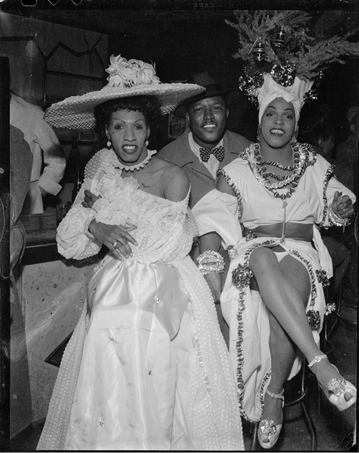
    Charles “Teenie” Harris, Man seated between drag performers “Gilda,” and “Junie” Turner wearing Caribbean-style costume, 1945 – 1955. Silver Gelatin print. Courtesy of Carnegie Museum of Art, Pittsburgh

    Views from Generation Z / GTA Photography Classes Students
    May 5–18
    GTA Photography Classes
    25 Toronto St. Ste 20

    EMESE KRUNÁK-HAJAGOS, publisher/writer:

    Moly and Kassandra / Matilda Aslizadeh
    May 10–June 30
    Pari Nadimi Gallery
    254 Niagara St

    Matilda Aslizadeh, Moly and Kassandra: Production, 2018. Archival pigment print and metal leaf, 8 × 10″. Courtesy of Pari Nadimi Gallery

    Valkyrie Ink / Reka Nyari
    May 3–June 9
    Coldstream Fine Art
    80 Spadina Ave Ste 208

    Reka Nyari, Freydis

    Outside of Time / Sylvia Galbraith
    May 5–June 2
    Abbozzo Gallery
    401 Richmond St W Ste 128

    STEVE ROCKWELL, publisher/writer

    Reflections of Hope / Aida Muluneh
    April 27–June 29
    Aga Khan Park
    77 Wynford Drive

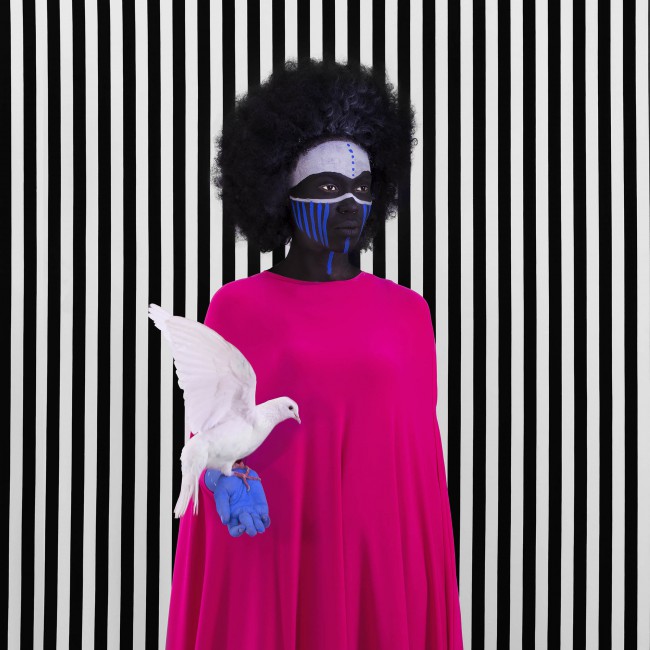
    Aida Muluneh, Compromise, 2017. Courtesy of Jenkins-Johnson Gallery

    Flatland by Aydin Büyüktas
    May 2–June 24
    Matter Gallery
    104a-344 Westmoreland Ave N

    Aydin Büyüktas, Hierapolis Necrapol, 2017. Chromogenic print, 47″ × 63″

    XIAOTONG CAO, writer/photographer:

    Acts That Fade Away / Nadia Myre
    April 28–August 5
    Ryerson Image Centre, Salah J. Bachir New Media Wall
    33 Gould St.

    Nadia Myre, Acts that Fade Away, 2016. Still from Decolonial Gestures or Doing it Wrong? Refaire le chemin. Courtesy of the artist, Art Mûr, and the McCord Museum

    NATHAN FLINT, writer/photographer:

    Bad Stars / Christina Battle
    May 4–June 9
    Trinity Square Video
    401 Richmond St W Ste 12

    Incidental Narratives / Basel Abbas, Ruanne Abou-Rahme
    May 4–June 30
    A Space Gallery
    401 Richmond St W Ste 110

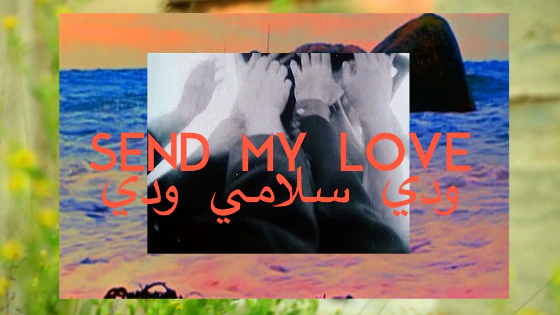
    Basel Abbas and Ruanne Abou-Rahme, Only the beloved keep our secrets, 2016. Video Still. Courtesy of the artists and Abraaj Art Priz

    DANIEL JOYCE, writer/photographer

    Bárbara Wagner and Benjamin de Burca
    April 18–June 24
    Art Gallery of York University
    8 Accolade East Building, York University, 4700 Keele St

    Barbara Wagner and Benjamin de Burca, SET TO GO, 2016, Film Still (Part I). Courtesy Fortes D’Aloia & Gabriel; Sao Paulo

    Façades / Brittany Shepherd
    May 10–June 3
    Bunker 2 Contemporary Art Container
    346 Campbell Ave

    A Forest of Canoes / Dana Claxton
    April 24–August 31
    The Bentway
    250 Fort York Blvd

    TEHNIAT KHAN, writer/photographer:

    The Empire, The City / Lori Nix, Kathleen Gerber
    May 1–31
    Bau-Xi Gallery
    350 Dundas St W

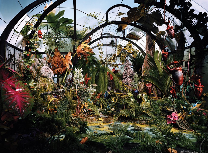
    Lori Nix and Kathleen Gerber, Botanic Gardens, 2008. Chromogenic Print, 48 x 65”. Courtesy of Bau-Xi Photo

    Dear Ayeeyo / Yasin Osman
    May 3–June 16
    Daniels Spectrum
    585 Dundas St E

    Uprooted and Dispossessed: Portraits of Women Caught in Conflict and Colonialism / Samer Muscati
    May 2–31
    Hart House – “Talking Walls” Exhibit Space
    7 Hart House Circle, University of Toronto

    SUNNY KIM, writer/photographer:

    Not The Actual Site / Marleen Sleeuwits
    April 30–June 1
    Brookfield Place, Allen Lambert Galleria
    181 Bay St.

    Marleen Sleeuwits, Interior no. 41, 2013. © Marleen Sleeuwits

    A Brief History of Me / Ho Tam
    May 4–June 2
    Paul Petro Contemporary Art
    980 Queen St W

    NAZLI NAHIDI, writer/photographer:

    Black Friday / Sophia Al Maria
    April 13 – June 2
    Mercer Union – a centre for contemporary art
    1286 Bloor St. W.

    Sophia Al Maria, Black Friday, 2016, video still. Courtesy of the artist and Third Line, Dubai

    CAROLYN PERALTA, writer/photographer:

    Evidence / Andrew Drown
    May 5–30
    Saudade Toronto
    1191 Dundas St

    Alone Together / Jason Brown
    May 1–31
    Skylight Gallery, Toronto Public Library
    40 Orchard View Blv

    The Cohesive Project / Joseph Wyciszkiewicz aka Lavarius, Reynaldo Garcia
    May 3–30
    The Show Gallery
    978 Queen St W

    Joseph Wyciszkiewicz AKA Lavarius, A Good Luck

    AILEEN QI, writer/photographer: 

    newlandia: debaabaminaagwad / Scott Benesiinaabandan
    April 25–August 5
    Ryerson University – Gould and Bond St / Ryerson University – Devonian Square

    Scott Benesiinaabandan, newlandia: debaabaminaagwad, Rock no. 2, (detail), 2018. Courtesy of the artist.

    DAVID SARIC, writer/photographer

    Surveillance States / Trevor Paglen
    May 4–June 16
    Prefix Institute of Contemporary Art
    401 Richmond St W Ste 124

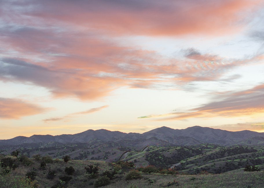
    Trevor Paglen, Near Nogales, 2017. Digital pigment print, Courtesy the artist and Metro Pictures (New York)

    PATRICIA TABASCIO, writer/photographer:

    Confluence II / Tina Berning, Michelangelo Di Battista
    April 26–June 9
    Alison Milne Gallery
    134 Osler St

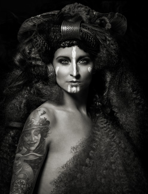
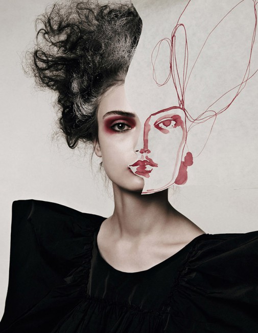
    Tina Berning/Michelangelo Di Battista, Face Project IV, 2007. Archival pigment print, 47.25” x 40”, edition 1 of 7

    SIMON TERMINE, writer/photographer

    Waking Dream / Bill Jones
    May 8 – June 8
    John B. Aird Gallery
    900 Bay St. The Macdonald Block

    Bill Jones, Waking Dream, 2017. Film still. Courtesy of the artist.

    For more information please go to http://scotiabankcontactphoto.com/

  • Mitchell/Riopelle: Nothing in Moderation

    On my way to this exhibition I was thinking of Joan Mitchell and Jean-Paul Riopelle as a Golden Couple of a Golden Age. The Golden Age is true. Paris still had its charm and New York was rising into its future glory. Riopelle was a golden boy, irresistible and charming with his expensive race cars — including Bugattis — boats, properties and artistic success. Mitchell was a very confident person, athletic and not shy about her body at all. Looking at photographs with her lovers we can’t miss seeing the sexual magnetism radiating from her. It was a good match in many ways, but they were everything but a golden couple.
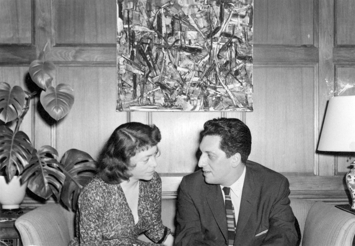
    Anonymous photographer, Joan Mitchell and Jean Paul Riopelle in Chicago, about 1957. Yseult Riopelle Archives. Work shown: Jean Paul Riopelle, Untitled, about 1957. Oil on canvas, 60 × 73 cm. Private collection © Estate of Jean Paul Riopelle / SODRAC (2017)

    Both Riopelle and Mitchell came from middle-class backgrounds, with Mitchell from Chicago, Riopelle from Montreal. Riopelle exhibited with Les Automatistes in Montreal in 1946 and signed the manifesto Refus global, written by Borduas in August 1948, gathering a group of abstract painters who wanted to break free from the strict Catholicism of Quebecois life. After WWII artists came to Paris longing for a bohemian life and Andre Breton ruled like a pope, surrounded by a large group of painters and writers. Riopelle met him in 1947 but remained independent, never associating himself with any group. His circle of friends in Paris included Sam Francis, Samuel Beckett and many more of the geniuses of that era.

    The artists of the first generation of Abstract Expressionism in New York, like Willem de Kooning, Hans Hofman, Franz Kline, Jackson Pollock and the poet Frank O’Hara among others, created an important movement and a new centre of visual art started to build up around them. The New York art world in the early 1950s was dominated by men but Mitchell, who spoke frankly, aggressively and emphasized that her gender was not important, but being a painter was, established her significance among them.
    When Mitchell and Riopelle met in Paris in 1954, he was already a well-known and successful artist, while Mitchell was just exploring Paris on a grant. They remembered differently about the place they first met but their 25-year relationship started with Riopelle showing up at Mitchell’s studio with “a huge bouquet of rolled canvases” as curator Michel Martin writes. Mitchell divided her time between New York and Paris from then on.

    When she was gone, Riopelle missed her. When he lacked inspiration in oil, he turned to gouache and tried to follow the transparency and unique textural effect of Mitchell’s work. In a letter in 1956, he confesses to adopting her materials and technique: “I’m happier because ultimately (my work) resemble(s) your painting, my love.” Sans titre (La Fontaine) (1957) also reveals the complex bonds between them. Mitchell discreetly wrote in the upper left-hand margin of the painting “Le Laboureur et ses enfants, La Fontaine!!” referring to the well-known fable but also to Labours sous la neige, a work that Riopelle had recently produced. Mitchell kept the painting for a long time, as a message of affection for Riopelle. Riopelle stated, “Friendship is a special kind of solitude, a solitude split in two.” Their lifestyle was anything but lonely. They socialized a lot, people visited and stayed in their studios and they went out dining and drinking all night with friends.

    The AGO’s exhibition follows a dual chronology focusing on points of mutual influence. As Martin says, “these two sensitive and extremely powerful personalities could not have evolved without being affected by the singular context of their relationship as it developed over the years.” Sometimes the artistic influence is unmistakable as in the pair of small-scale gouache on paper works (Mitchell: Untitled, 1958 and Riopelle: Gitksan, 1959) that share the same palette and gestural approach.
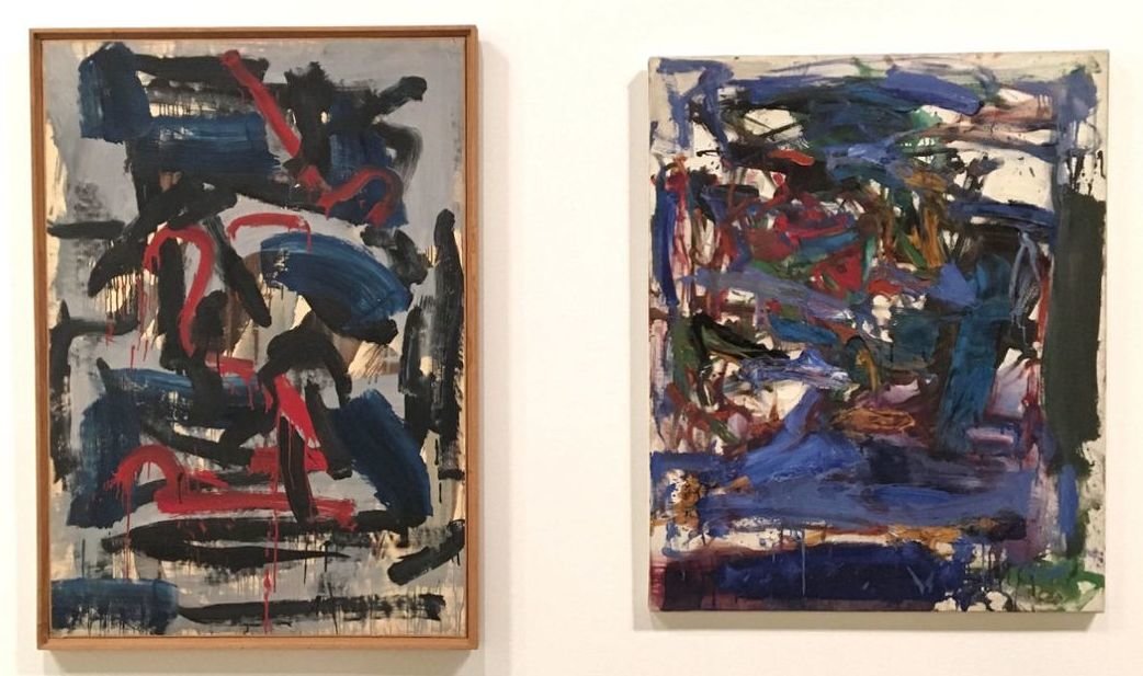
    Jean-Paul Riopelle: Gitksan, 1959 (left) and Joan Mitchell: Untitled, 1958 (right). Courtesy of AGO

    They were abstract painters but critics claim that both Mitchell and Riopelle got their inspiration from nature. Mitchell disagreed. She said: “I paint from remembered landscapes that I carry with me, and remembered feelings of them, which of course become transformed. I prefer to leave nature where it is, it is beautiful enough, I wish not to improve nature, I could certainly never mirror nature. I would more likely to paint what it leaves with me.” She was not interested in reproducing nature but in “painting the feeling of the space.” Riopelle stated in an interview, “Nothing abstract, nothing figurative. My most abstract paintings, according to some, are for me the most figurative, in the true sense of the word. Abstract: “abstraction,” “to abstract” “to derive from” … My approach is the exact opposite. I don’t take anything from Nature I move into Nature.” Mitchell and Riopelle shared the same vision, and their works were both infused by the powerful evocation of nature.

    In 1954-55 Riopelle painted a series inspired by the Austrian Alps. Saint-Anthon (1954) is a bird’s eye view of the snow-covered peaks. The abstract landscape is built upon a large white background, unusual in Riopelle’s palette, interrupted by dark knife painting directly from the tube to give texture, and modified by occasional red and blue calligraphy. Mitchell’s Untitled (1955) uses similar colors. She catches a memory image and depicts it in fluid translucent strokes, with the presence of color at its center: a patch of dripping light-rinsed and storm-tossed blues skimming across viscous grey whites. It seems to be coalescing into the shape of a tree — Mitchell talked about mentally losing herself in trees — as the painter subverts the traditional relationship between figure and ground, never allowing the image to come together as a tree. Throughout her career, this tension remains inherent in ambiguous figure-ground relationships.
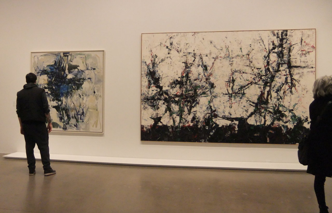
    Installation view with Joan Mitchell, Untitled, 1955 (left) and Jean Paul Riopelle, Saint-Anthon, 1954 (right). Photo: Emese Krunák-Hajagos

    Energy and power radiates from Mitchell’s brushstrokes in Piano mechanique (1958). While the white background is present, bright colored lines and marks move in every direction, instead of a centralized composition, following the energy of the artist’s hand. She also changes her vertical canvas for a horizontal one, Riopelle’s preferred format. Riopelle also physically engaged in his works, as we can see in Landing (1958). He covers the entire surface with layers upon layers of strong colored paint, as he throws himself into the painting, sculpting the surface of the canvas until the paint seems to overflow — then he uses a knife to give texture to the paint and finishes it with a gloss to direct the light. He prefers to finish a canvas in one stretch, sometimes working 12 hours straight; as he said, “when I hesitate I do not paint, when I paint I do not hesitate.” Mitchell, on the other hand, made many sketches before painting.
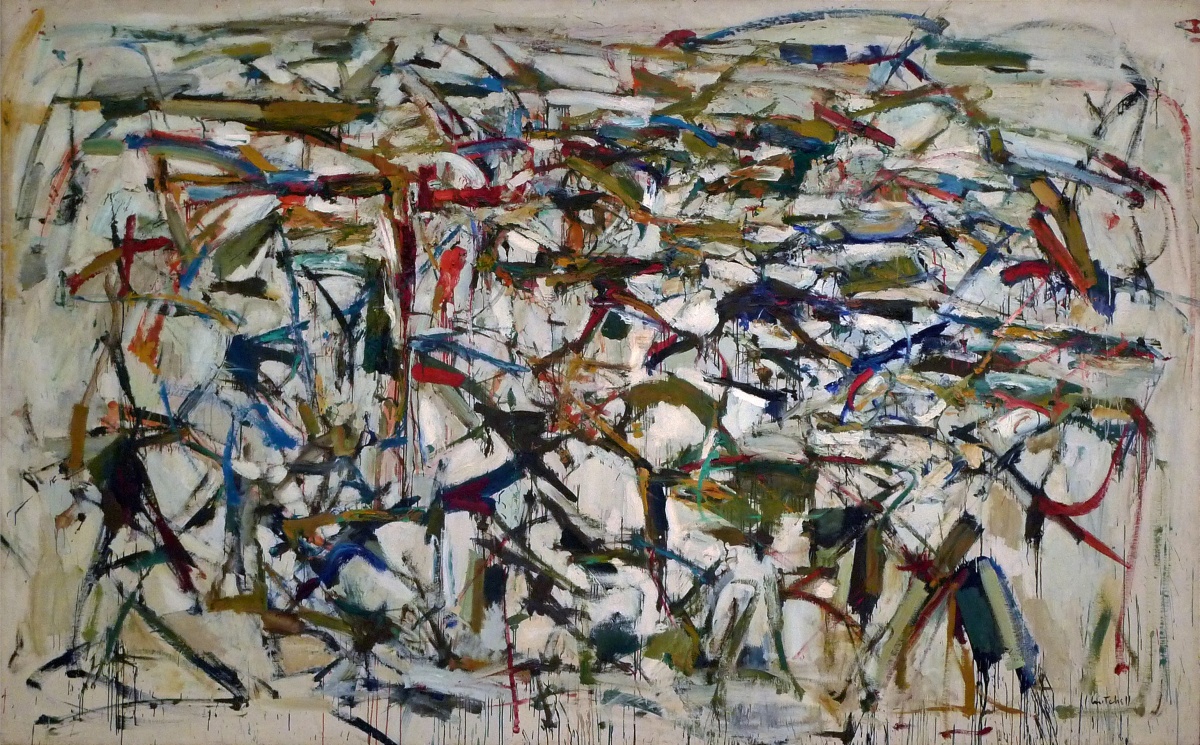
    Joan Mitchell, Piano mécanique, 1958. Oil on canvas, 198.1 × 325.1 cm. National Gallery of Art, Washington, DC. Gift of Addie and Sidney Yates (1996.142.1) © Estate of Joan Mitchell Photo: National Gallery of Art
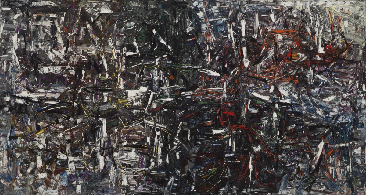
    Jean Paul Riopelle, Landing, 1958. Oil on canvas, 200 × 375 cm. Musée d’art contemporain de Montréal. Purchase (A 68 56 P 1) © Estate of Jean Paul Riopelle / SODRAC (2018) Photo: Richard-Max Tremblay

    In the late 1950s Mitchell’s style and palette changed. The composition of Untitled (1961) is more tumultuous and now she allows gravity and paint to assert themselves from a loaded brush and create ghost-like patches. The paint is left to run till a certain point when the artist will regain control with overpainting of some parts. In vigorous, fleshy fists of paints she uses a rich palette of charged colors: greens, yellows, blues and blacks enriched with mustard yellows, blue-blacks, tangerines and the most beautiful violet, against a white background. As critic, Pierre Schneider wrote of this period, “The moments when everything falls into place is incredible. Panic, chaos, and anguish overcome.” Opaque and transparent at the same time, the composition seems to push into its white corners and grow in front of our eyes. Through her rhythmic strokes Mitchell wanted her paintings to have the feeling of poetry rather than a story. Poetry played an important role in her life; her mother, Marion Strobel Mitchell, was a well-known poet in Chicago. As a painter she often read poetry for inspiration before painting and titled her work after poems. In Mitchell’s pieces painterly intelligence goes hand in hand with passion and dedication.
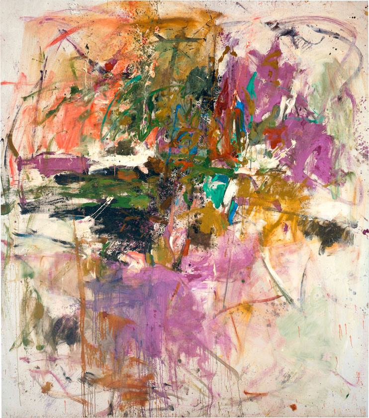
    Joan Mitchell, Untitled, 1961, oil on canvas, 228.9 x 206.1 cm, Joan Mitchell Foundation, New York

    The relationship between Mitchell and Riopelle was very rich, combining all the elements of life and art. They talked about art, their experiments, accomplishments and successes, their struggles and their ecstasy – their state of mind and their artistic practise. That must have been a wonderful journey for two such great artists. There was love too, both physical and intellectual. Throughout their journey together they crossed into each other’s territory, friendly, gently and lovingly but also screaming with anger. They were annoyed by unfulfilled promises, and not getting what they desired out of the relationship. Mitchell’s hope for a fully shared life seemed to be close to realization when they moved into a studio in Frénicourt, Paris in 1958 but it didn’t work out. Even after Riopelle’s divorce from his wife in 1962, the relationship between Mitchell and him remained turbulent and they both had many lovers on the side. Mitchell put her unhappiness into a few violent and angry paintings throughout these years.

    The early 1960s was a relatively happy period in their life and their styles visibly intertwined. Riopelle got a boat, Serica, as payment from his New York dealer, Pierre Matisse, and they went sailing in the Mediterranean. Their large triptychs, both from 1964, show many similarities. They both build on the color of white, using a symmetrical structure, such that the painting on the left is mirroring the one on the right, so the panels seem to communicate with each other. The left and the right panel of Riopelle’s Large Triptych depict the rocks of the seaside in their whitish greyness with the buildings of the small villages in earthy browns, greens and reds, surrounded by the blue sky and sea as the colors shine in the strong sunlight. The middle panel departs from all reality and abandons strong colors, showing something like a map. Riopelle uses this signature technique so the different layers create a strong texture in which he literally carves the edges of the rocks. Mitchell’s favourite multi-panel format was the horizontal triptych composed of vertical modules. She liked the way the vertical divisions undermined the continued effects of a landscape. Girolata is a good example of this. In front of an atmospheric whitish background patches of mossy greens, dusty silver greens, cerulean blues, violets and all imaginable shades of grey cover the panels in a soft, dance-like movement. Here too, the central piece seems to unify the others into one, more balanced, composition. It feels like the metamorphosis of a landscape but Mitchell said she didn’t want to portray the landscape but to transpose to the canvas the effect of the complex sensation of her memories of the time she spent with Riopelle. When placed face to face on the walls in the AGO, these works illustrate the dialogue that developed between the two artists and compare Mitchell’s poetic and sensual gestures to Riopelle’s more virtuous spatial strokes. It seems that a sense of harmony had been archived.
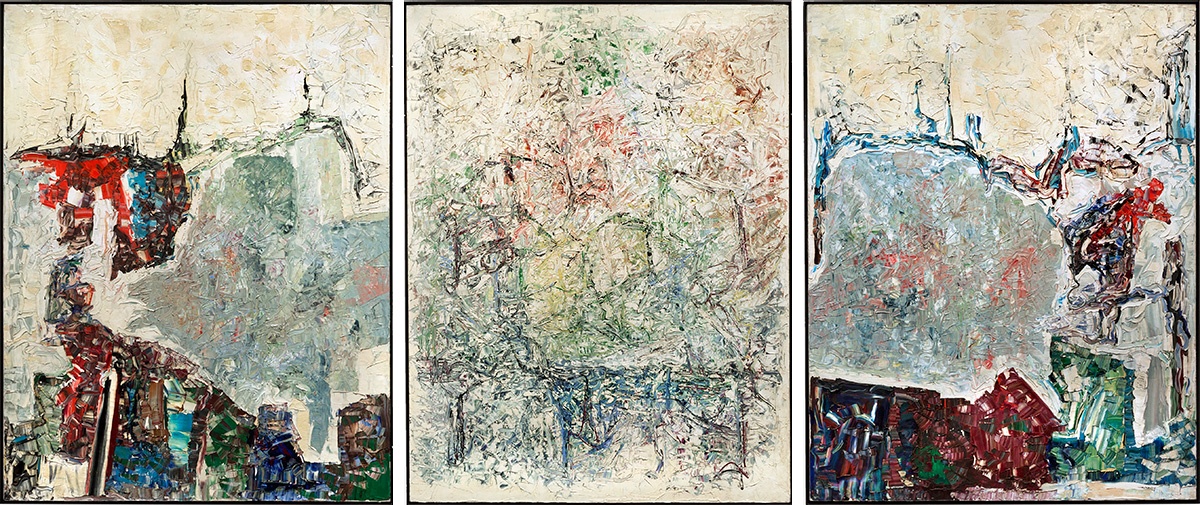
    Jean Paul Riopelle, Large Triptych, 1964. Oil on canvas, 276.4 × 643.7 cm. Hirshhorn Museum and Sculpture Garden, Smithsonian Institution, Washington, DC. Gift of Joseph H. Hirshhorn, 1966 (66.4268) © Estate of Jean Paul Riopelle / SODRAC (2018). Photo: HMSG, Smithsonian Institution, Washington, DC, Cathy Carver
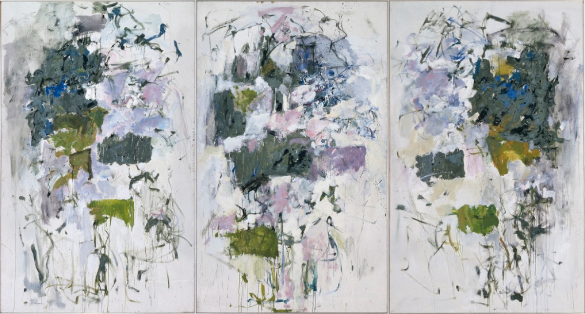
    Joan Mitchell, Girolata, 1964. Oil on canvas, 258.4 × 481.7 cm (triptych). Hirshhorn Museum and Sculpture Garden, Smithsonian Institution, Washington, DC. Gift of Joseph H. Hirshhorn, 1966 (66.3581) © Estate of Joan Mitchell. Photo: HMSG, Smithsonian

    But it was more likely an illusion. While their careers skyrocketed — Mitchell had her first retrospective in the Whitney Museum (1974), Riopelle became an international artist whose paintings sold for high amounts — the distance between them deepened. Mitchell, using her inheritance after her parents’ death (1969), bought Monet’s property La Tour in Vétheuil, where she settled for the rest of her life. Riopelle built a studio in the Laurentians (1974) and divided his time between France and Quebec where he fished and hunted. They still spent time together but less and less often and their styles no longer show the similarities of the 1950s and 1960s. Mitchell, accompanied by her dogs, enjoyed the solitude of her gardens. She dedicated the diptych, Un jardin pour Audrey, (1974) to her friend Aubrey Hess, who recently passed away. In the left panel, we are guided into a beautiful garden with light pouring in, flurries of blazing gold against a radiant white – a composition that reminds us of Monet, without becoming a still life or a landscape. The right panel juxtaposes the lightness of the left with a heavier composition and a darker palette. Together they seem to depict paradise lost and found, radiant with the love of nature.
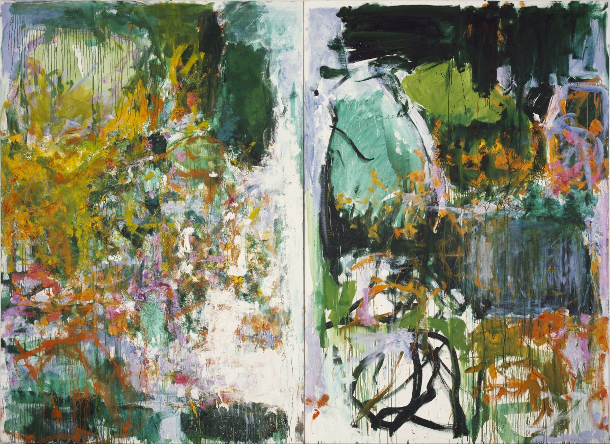
    Joan Mitchell, Un jardin pour Audrey, 1974. Oil on canvas. 260 x 360.5 cm (diptych). Private collection, Paris. © Estate of Joan Mitchell.

    The tension between the couple grew and Riopelle called Mitchell “Rosa Malheur” – Rosa Unhappiness. He started to spend more and more time in Canada. Mitchell painted Chasse interdite (Hunting is forbidden) (1973) to let Riopelle know that she doesn’t approve of his hunting trips because it takes him away from her and she misses him. Riopelle embraced Quebec’s vast landscapes with its wildlife, fishing and hunting, depicting First Nations cultures that resonated with him. The title of the painting Micmac (1975) or Mi’kmaq comes from the Indigenous peoples in the Gaspé Peninsula, but in French the word means confusion or disorder. It is a very intriguing work. As the story goes, the artist painted one of the panels then transferred it into a blank canvas. Then he extensively reworked both until they seemed to be different. The left panel has a shining dark area at the top contrasted with a matt white on the right. Darker, warmer colors on the left seemingly oppose the lighter, colder palette of the right. Both panels have hidden crosses (a reminder of Riopelle’s struggle with the Catholic religion) and the elements of the paintings are organized around them. Chaos rules the surfaces with a little bit hope in white light of nothingness at the bottom of the right panel.
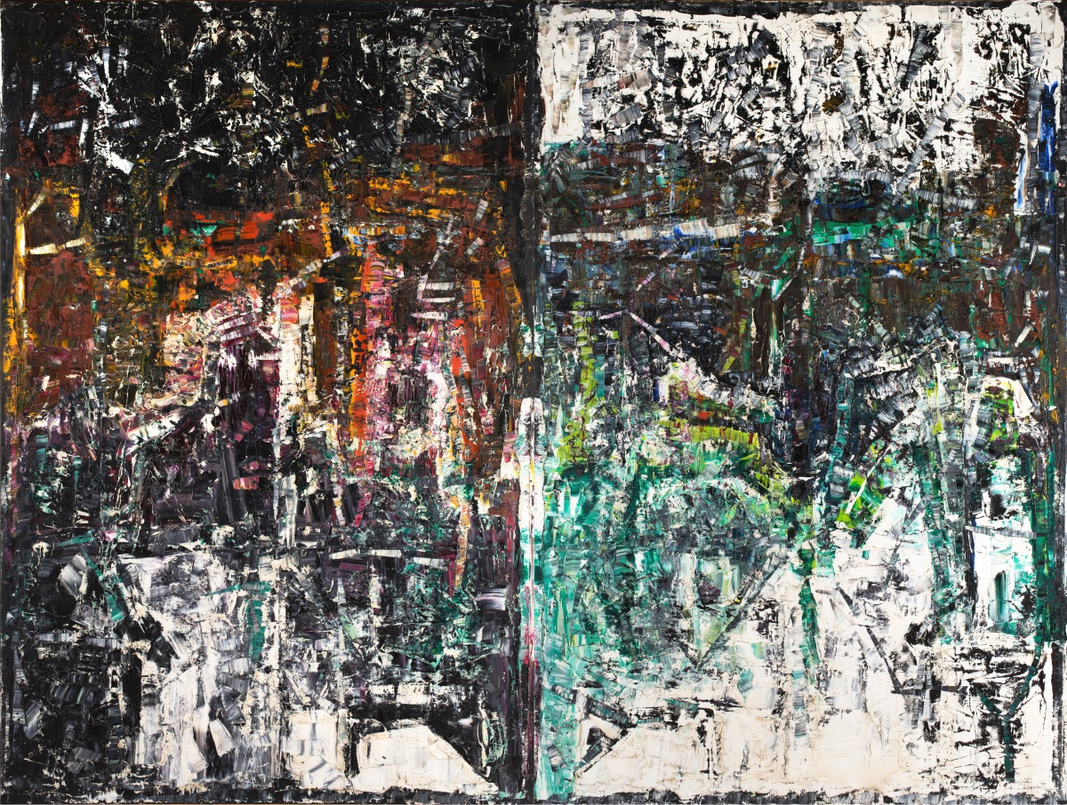
    Jean Paul Riopelle, Micmac, 1975, Oil on canvas. 300 × 400 cm (diptych). Collection Sylvie Blatazart-Eon, Paris. © Estate of Jean Paul Riopelle / SODRAC (2018).

    In late 1974, when Riopelle stayed longer than usual in Canada, Mitchell visited him and created her Canada series, dominated by disorderly shapes of browns and greys. In Returned (1975) she reduced her palette and used almost geometrical shapes, echoing Riopelle’s tendency for structure.
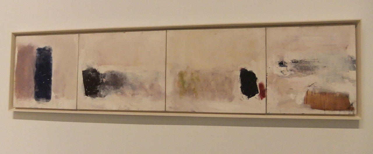
    Installation view with Joan Mitchell, Returned, 1975, oil on canvas. Photo: Emese Krunák-Hajagos

    Riopelle in his Iceberg paintings also abandoned his rich color range, until only black and white prevailed (Iceberg No.3, 1977). As he said, “If I dared to paint my series of icebergs in the 1970s, it’s because the color white doesn’t exist in nature. If snow were white, no painter would be able to render it.” As later added, “In the arctic nothing is clear cut, all is not black and white. The sky, though, seems black, really black, and on the ground is not even white snow, there it is ice that is grey and transparent.” The paintings don’t give us any direction in these strange landscapes where white ice rules, distracted by the black calligraphy of cracks and trees under an overwhelmingly black sky. Meanwhile Mitchell, enchanted by nature in her garden, painted single sunflowers, weeds, rain and her favourite linden tree Tilleul (1978) with dramatic intensity.
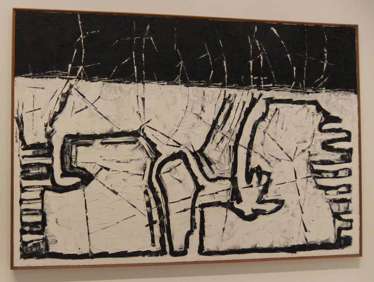
    Jean-Paul Riopelle, Iceberg No.3, oil on canvas. Photo: Emese Krunák-Hajagos

    They saw each other less and less often and when they did, they argued more, until their final separation in 1979. It was a stormy relationship by all accounts. They were both heavy drinkers, Mitchell was an alcoholic and often depressed. When drunk they became abusive, as many of their friends wrote: they were violent, crazy and scary. They were a perfect match, both in the strength of their characters and the quality of their paintings and above all theirs was a great love. The chemistry between them was strong, creating a shining glow of happiness sometimes and deep craters of anger on other occasions. Meanwhile their lives went on, and they both became icons of the art world in their own right. Their interaction can be compared to two stars shining at each other until, at some point, they parted ways, still rising, without outshining each other.

    Together and separately, they lived an extraordinary life of extremities – nothing in moderation.

    Emese Krunák-Hajagos

    *Exhibition information: Art Gallery Ontario, Toronto, Ontario, February 18 – May 6, 2018, Art Gallery of Ontario, AGO, 317 Dundas St. W, Toronto. Gallery hours: Tue & Thur 10:30 – 5 pm; Wed & Fri 10:30 – 9 pm; Sat & Sun 10:30 – 5:30 pm.

  • Peter Alexander Por / Canadian Sculpture Centre

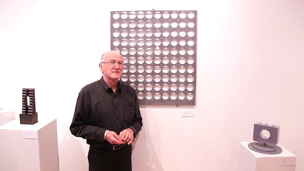
    Artist Peter Alexander Por at the opening reception, April 21, 2018. Photo: David Waldman

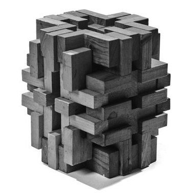
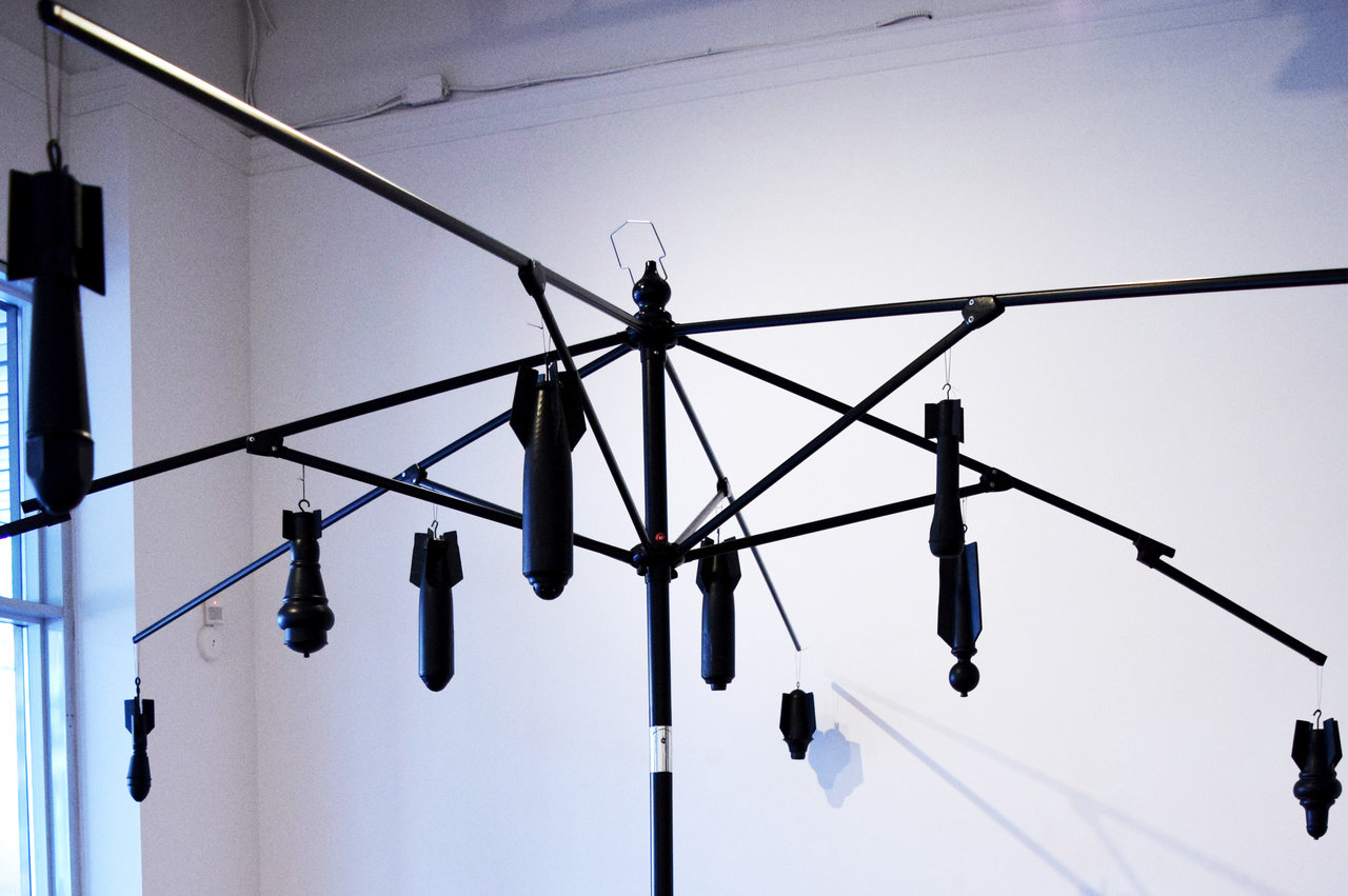
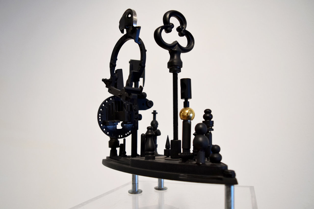
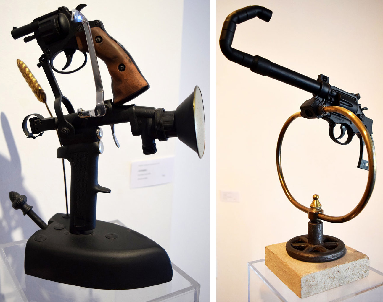
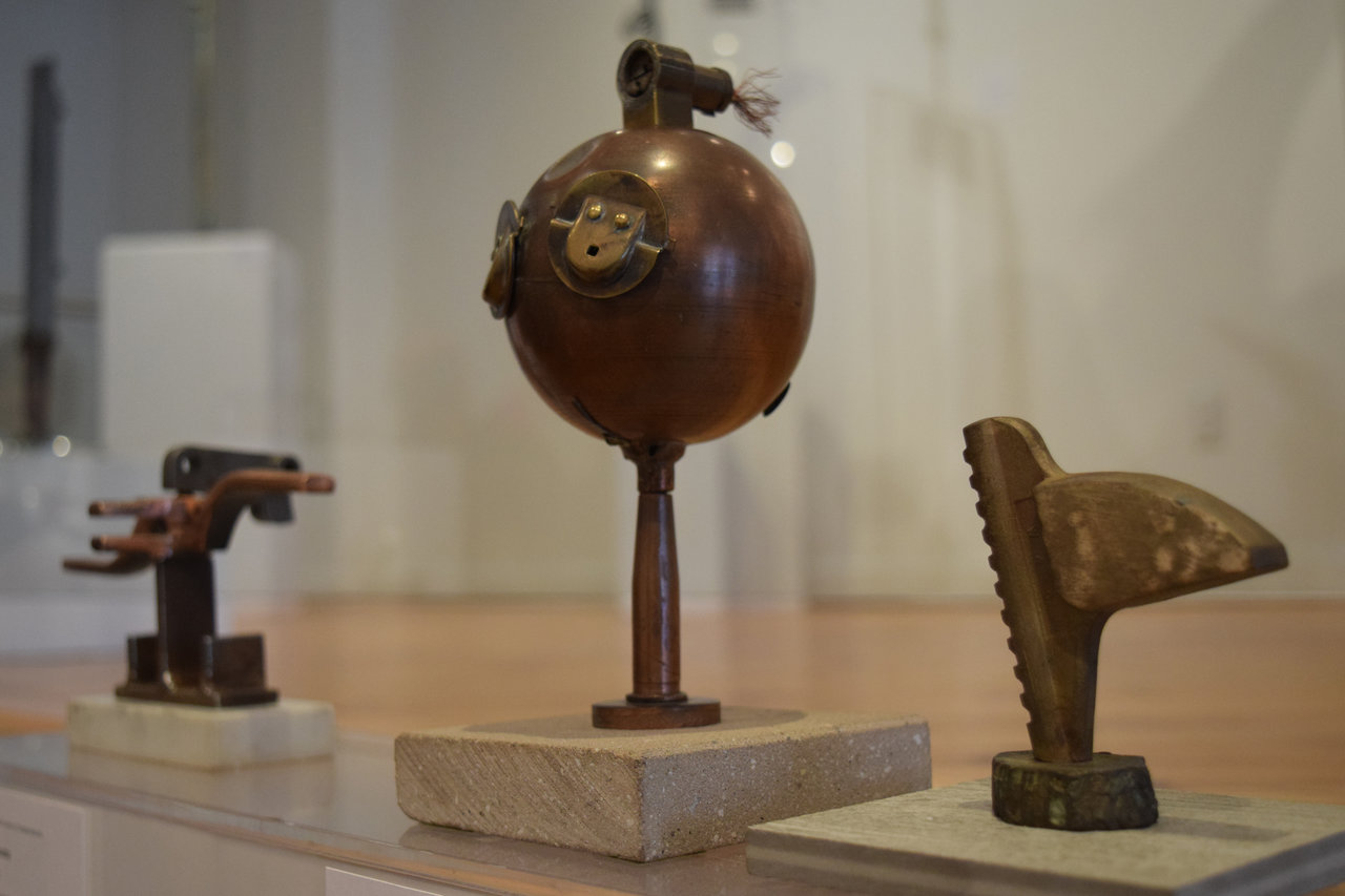
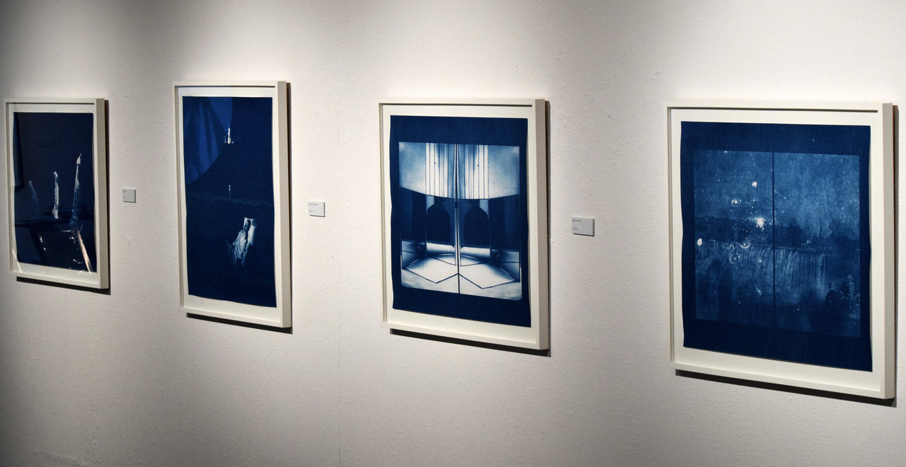
    Hosted at the Canadian Sculpture Centre by the Sculptors’ Society of Canada is Peter Alexander Por’s Catharsis. This solo exhibition features a multitude of original pieces constructed with varying combinations of ready-made and fabricated materials, illiciting fine and crude aesthetic qualities harmoniously. The use of various metals and woods further create unique visual aspects that distinguish each work from another. Por’s works range from the small and intricate, such as is seen in “Conundrum 2,” to the sizable and impressive, as in “Bombrella.” Some are more representative of existing objects, if only marginally to allow immediate recognition, while others strive to be more obscure and nondescript by incorporating unfamiliar components and assuming abstract forms. All of the works’ complexities and features are evoked in both their aesthetics and imbedded meanings.

    Peter Alexander Por, Conundrum, mixed media. Photo: David Waldman

    Peter Alexander Por, Bombrella, mixed media, detail. Photo: Simon Termine

    Por’s works does not circle around a singular theme nor does it explicitly compel the audience to assume a particular stance. He encourages open discourse and interpretation on a variety of topics, political and apolitical. As suggested by the exhibition’s title, the collection as a whole, as well as it separate components, is intended to provide relief from otherwise difficult thoughts and issues stemming from societal anxieties. Por wishes to ask the audience: “What do these sculptures remind you of? Do they recollect visceral experiences? Do they convey strong emotions? Do they remind you of a person or place?” The emphasis here is subjectivity, appealing to people’s own memories, experiences, and emotions in order to derive their personal meanings from the works and examine Por’s artistic decisions in each sculpture.

    Peter Alexander Por, Earthly Delight, mixed-media. Photo: Simon Termine

    Peter Alexander Por, Golden Shower (left) and Karma #7, (right) both mixed media. Photo: Simon Termine

    According to Por, “sculpting for me is the most direct and powerful means of relating to and coping with the complexities of life. Our culture, dreams, world events, family issues, and found objects often find resonance in my eclectic projects and become participants in my cathartic experience!” In essence, the works serve as a shared connection between the artist and the audience, offering both an opportunity to express themselves on personally and publicly controversial matters without imposition. Just as the works can represent Por’s own ideas and communicate them, they can likewise draw the same effects from the viewers. When coupled with their aesthetic variety, the exhibition’s appeal seems limitless.

    Installation view with Peter Alexander Por, (from left to right) Nene, Fertility Fetish and Winged Victory. Photo: Simon Termine

    When perusing Catharsis, the sheer variety of works – each with their own sense of individuality yet still unified under a common ambiguity behind their laden meanings as the artist intended – continuously offers something new and interesting to explore.

    Simon Termine

    *Exhibition information: Peter Alexander Por, Catharsis, April 12 – May 4, 2018, Canadian Sculpture Centre, 500 Church Street. Gallery hours: Tue – Fri: 12 – 6, Sat: 11 – 4 pm.
  • The Future is in the Land / Julie Nagam

    The Future is in the Land – a significant exhibition by Julie Nagam – was recently displayed at A Space Gallery. Nagam, a history of art professor at Winnipeg University, is a leading figure in the North American Indigenous Arts Studies, as she has devoted her life to explore and promote Indigenous culture. Her practice is inspired by her observation and interaction with the land of her people. She aims to find the possibilities of establishing a balance between a healthy environment and social development. The Future is in the Land is curated around this dilemma.

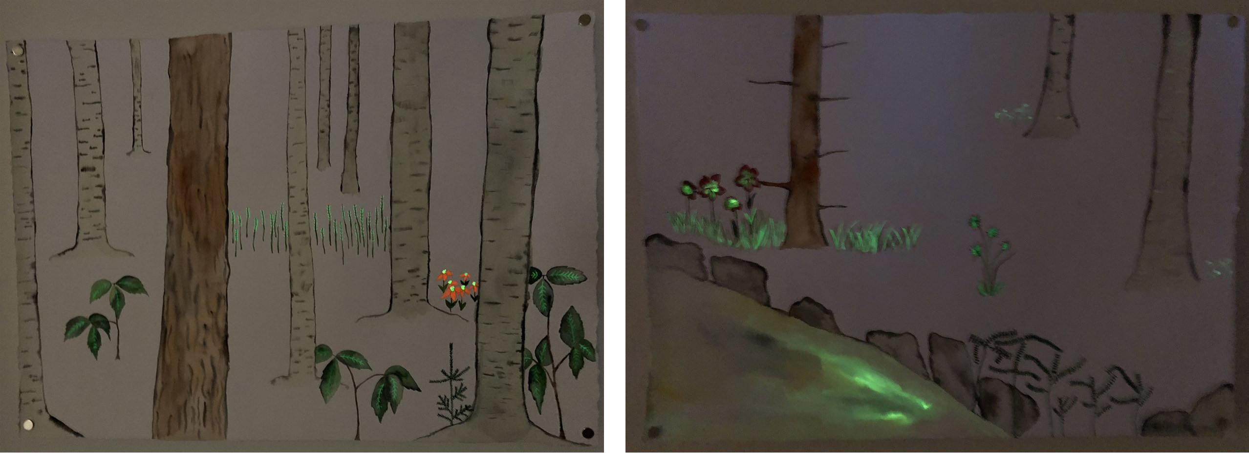
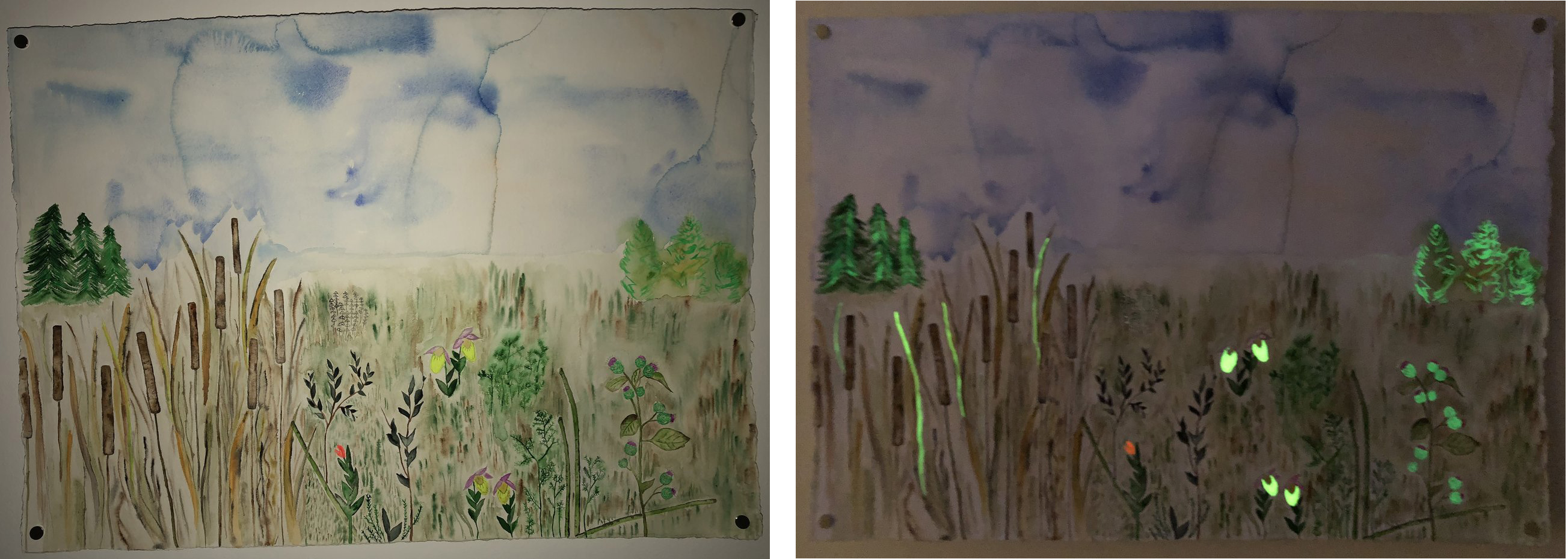
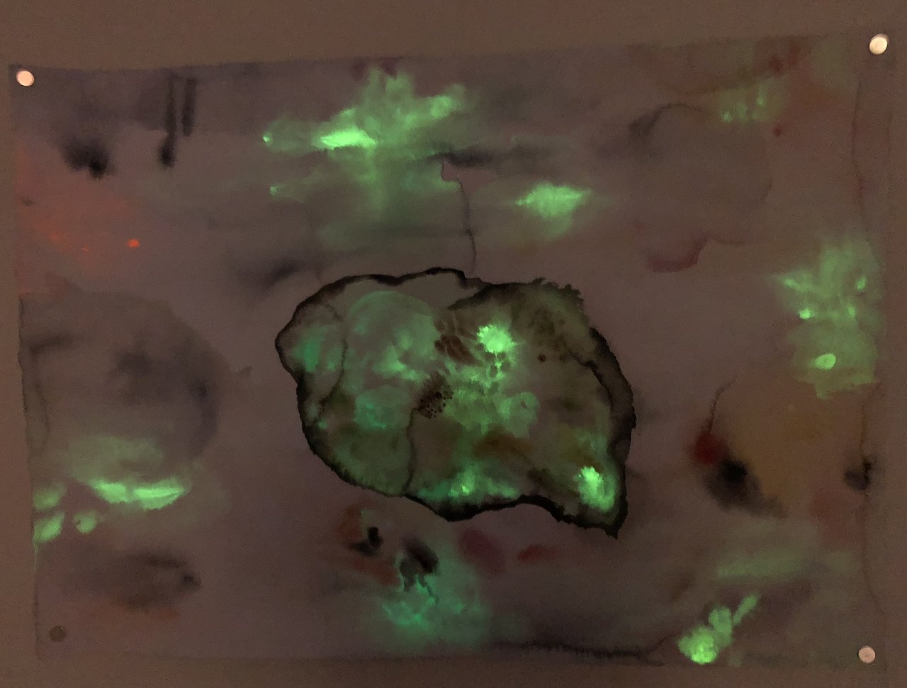
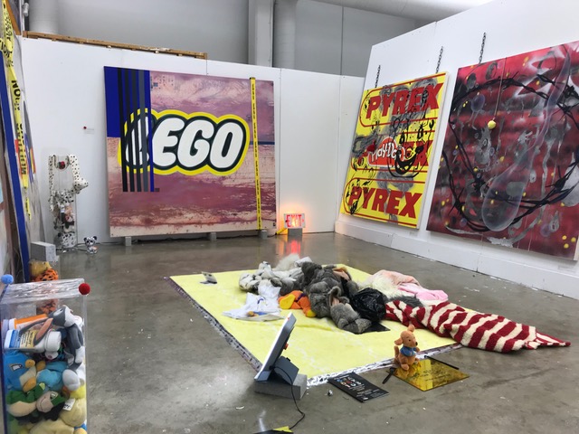
    The exhibition contains paintings and a multimedia installation. The two sections are interconnected, so the works can communicate with each other. Nagam takes us to a forest, using the perspective of a person walking in them, showing everything at eye level. We see only the trunks of the trees, then, looking down, the undergrowth with beautiful flowers among small rocks. Another water color shows a meadow where reeds and wild wheat grows, so a lake or river must be nearby, under a huge sky. Some parts of the compositions are purposely touched up with fluorescence paints. There is very little, almost no light in the room and the details, that the artist intended to emphasize, has fluorescence paint on, glittering in the dark. The fragments highlighted in this way are petty things, such as small flowers, grasses and leaves and the visual effect is best when the work is observed from a distance.

    The same composition looking at from closer (left) and from a distance (right)

    Many of these landscapes appear in a mystical semi-darkness, where little creatures move and the light has its own power – making the viewer feel like walking into a folk tale. Nagam believes, that “there is a particular ability to view the landscape allowing one to ‘see’ the layers of knowledge buried in the land and to hear the environment, which sings the song of the transformation of time, space and memory.”

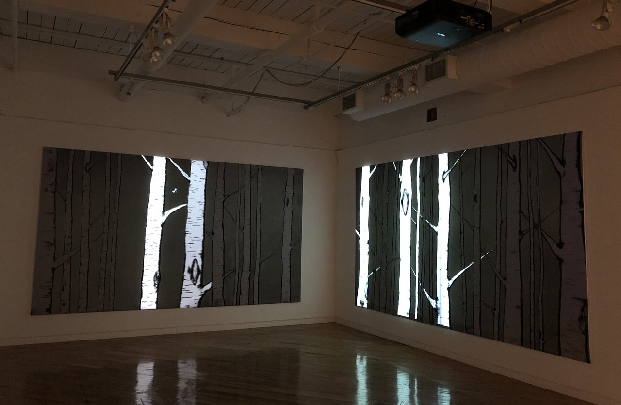
    The multimedia installation combines paintings and projection. Tree brunches and trunks are projected on two large walls with assembled rays from top to bottom or in an inversed manner. The projection is enriched with the sound effect of birds twittering, further deepening the illusion of being in the woods. This realm is also inhabited by forest creatures that appear periodically within the projection, as well as in the room accentuated by the fluorescent paint. The highlights on the trees are dramatic, the forest becomes immersive. It has a strong effect on the audiences, as it alerts and urges them to face and solve the problems addressed in this exhibition.

    The show exploits the elements and the atmosphere of the forest in a sophisticated way. It sends a clear message about the environmental issues we have to face and our anxiety connected to them. Nagam approaches her theme by combining traditional watercolor with the use of chemicals in the fluorescent paint, electronic projection and multimedia installation; mixing old and new. In her artistic practice she does the same by turning our attention to the old ways of living on a land, from a land, without destroying it with polluting chemicals; trying to teach us to love and respect it in the present. She concludes, “Our survival and our continuation as a people are tied to Indigenous knowledge of the land and a return or an extension of these land-based practices is what will bring us into the future.”

    Text and photo: Xiaotong Cao

    *Exhibition information: March 15 – April 20, 2018, A Space Gallery, 401 Richmond Street West, #110, Toronto. Gallery hours: Tue – Fri, 11 am – 5 pm, Sat, 12 – 5 pm.
     

  • Michael Landy / Demonstration at Power Plant

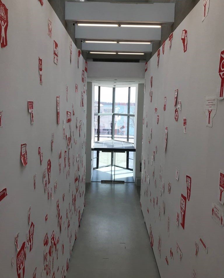
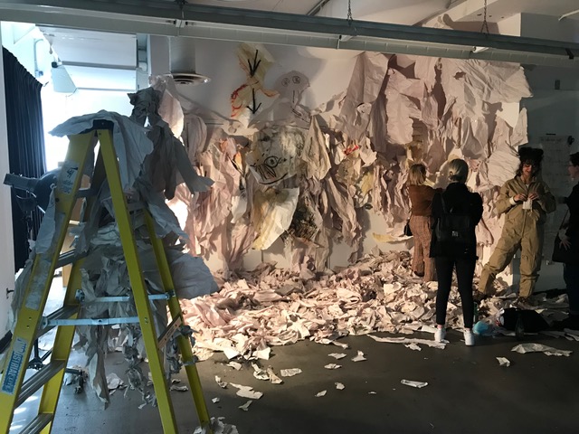
     Installation view from the second floor of the gallery

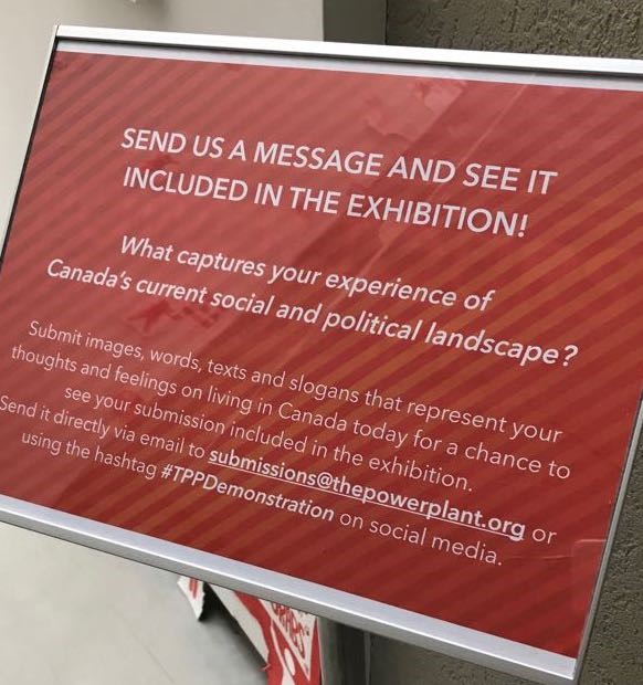
    Michael Landy is a London-based artist, whose work has been exhibited all over the world and this is his first exhibition in Canada. Curated by Nabila Abdel Nabi, Demonstration, the third edition of the Fleck Clerestory Commission Program, is a process-based installation that requires the public to actively engage in the story-telling.

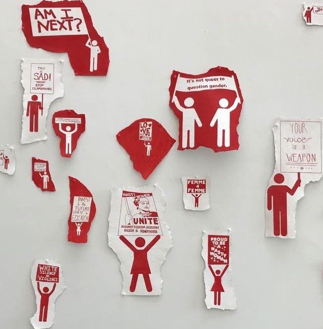
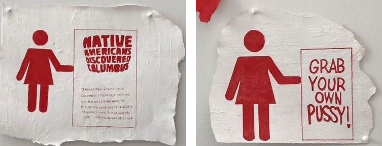
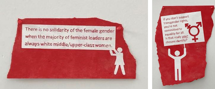
    This exhibit consists of red and white drawings of stick figures and words on two opposing walls. The positioning of the walls provides the already provocative pictures with an even more confrontational setting. Landy invited the public to collaborate by submitting images and texts that express their thoughts and feelings on living in Canada. The messages sent in by the Canadians were interpreted into drawings by Landy and his team. The drawings comment on the social and political atmosphere and, some of them, on personal battles that people are facing.
    Most of the pieces convey concerns about our society. The drawings address issues like racial problems, minority, sexism, privilege, misogyny, queer identity with politically-charged statements such as: “Your voice is a weapon.” or “Proud to be a nasty woman.” or “It’s not queer to question gender.” The viewers are bombarded with questions, thoughts and feelings that meant to engage them on an intellectual and emotional level, until they become participants, so each depicted battle would challenge them. They, hopefully and potentially, would go as far as to question their own privileged lives in the larger perspective of others’ problems.

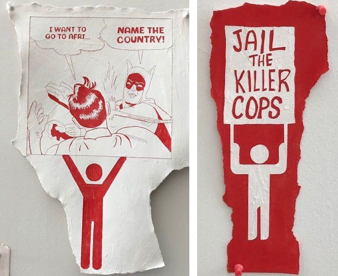
    The composition, that depicts Batman and Robin, is not only striking but also relatable to all audiences. It utilizes the original drawings of Batman and Robin, composed in a 21st-century stylized meme. A meme is a cultural element of the present-times; that is meant to be humorous and has motifs of pop culture, conveying a statement of common sense which spreads across the internet like wildfire. Such as in this image, the viewer sees Batman smacking Robin (which is currently a common meme across the internet) because he is referring to Africa as a country rather than as a continent; therefore, challenging this common postcolonial phenomenon.

    Surprisingly, yet expectantly, many of the drawings are based upon personal fears or fears of the minorities. Police brutality towards people of colour has inspired widespread movements, such as the Civil Rights Movement, and more recently the Black Lives Matter Movement. Some police are expected to use force in order to “serve and protect the people” but sometimes they overstep their legal rules. The misuse of gunfire has often led to people of colour being racially targeted and killed. This image expresses the anger against police officers who killed people on the spot instead of allow them a fair chance in court.

    Overall, this exhibition is an excellent opportunity to engage with issues that need to be spoken about more often. Landy’s notion of bringing in the public’s concern into a ‘wall of protest’ is very insightful. In the pasts, walls have been built to separate classes, and to create a barrier not only physically, but also ideologically; such as the Berlin Wall, or the Israel-Gaza Barrier. Here the use of walls is not to separate the privileged from the under-privileged, but to confront them with the concerns of the minority.

    Text and photo: Tehniat Khan

    *Exhibition information: September 29, 2017 – May 13, 2018, The Power Plant, 231 Queens Quay West, Toronto. Gallery hours: Tue – Sun, 10 am – 5 pm & Thu 10 am – 8 pm.
  • Gillian Iles: Towards Eternal Glory / Red Head Gallery

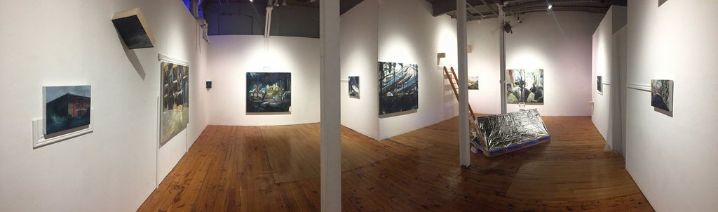
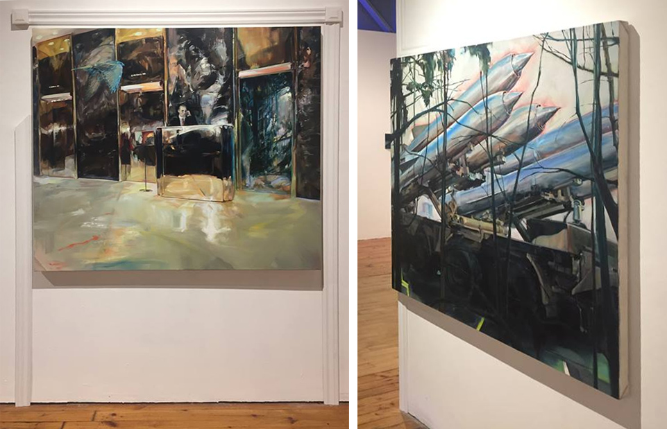
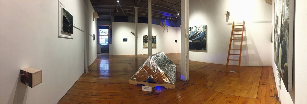
    From what perspective does power become beautiful? The exhibition, Towards Eternal Glory, at The Red Head Gallery by Gillian Iles, has masterfully explored this question through the multidisciplinary mediums and thoughtful curatorship demonstrated throughout the interactive and immersive installation. Four large scale paintings are accompanied by five smaller works, which are then further accompanied by a number of small pieces dispersed throughout the space in almost a hide-and-seek fashion.

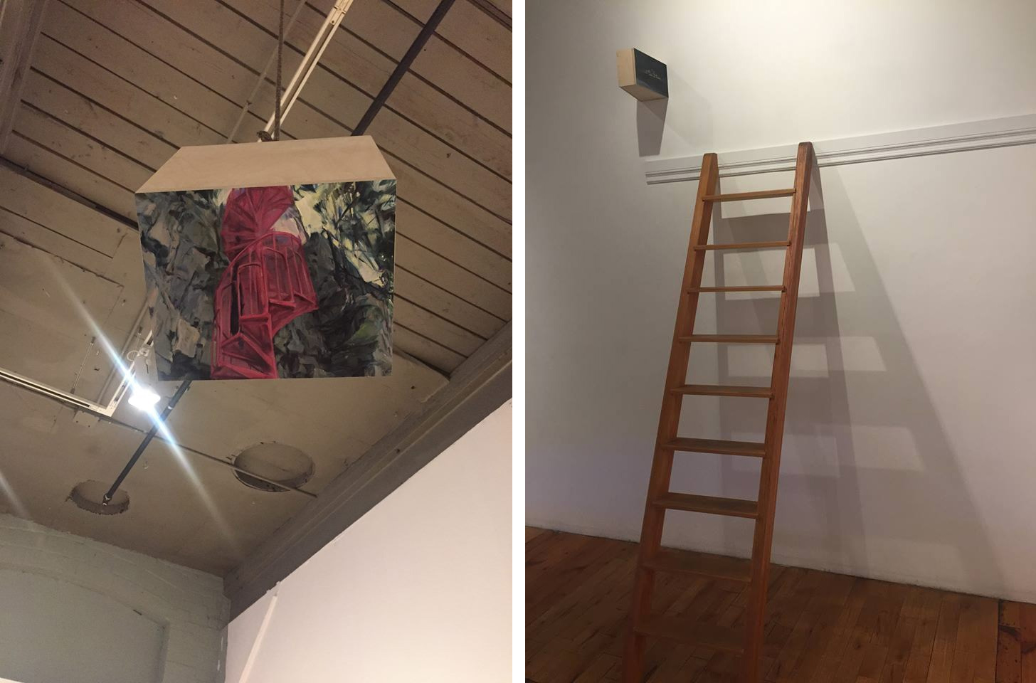
    Audiences are often challenged by artwork to shift their perspective on sociopolitical or aesthetic matters. Towards Eternal Glory has embraced this notion, but taken it much further by thoroughly applying it to nearly every component of the exhibition, on both a conceptual and a physical level. The physical and the simulated space is interconnected here. The painted imagery is often shifted away from a normal standing gaze, as the placement of some paintings in the gallery are atypical, often requiring bending, looking awry or even climbing a ladder!

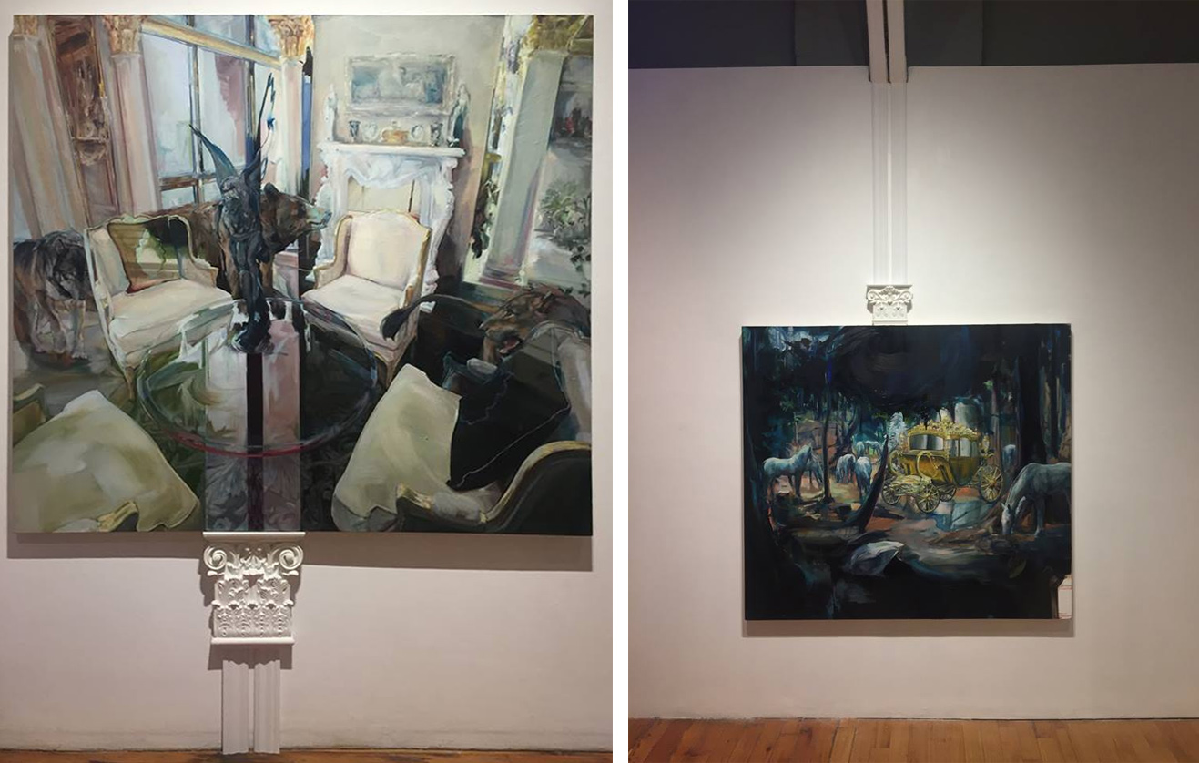
    Upon entering the gallery, the traditionally displayed works are the first to draw the viewer’s attention. Audiences are drawn to familiarity, and this is an intentionally good starting point for the exhibition. The paintings range in scale and contain disparate imagery from romantic scenes of aristocracy to depictions of the sleek technology of an industrial military complex. Each of these works contain natural elements of flora and fauna, sometimes in fantastic, surreal ways.

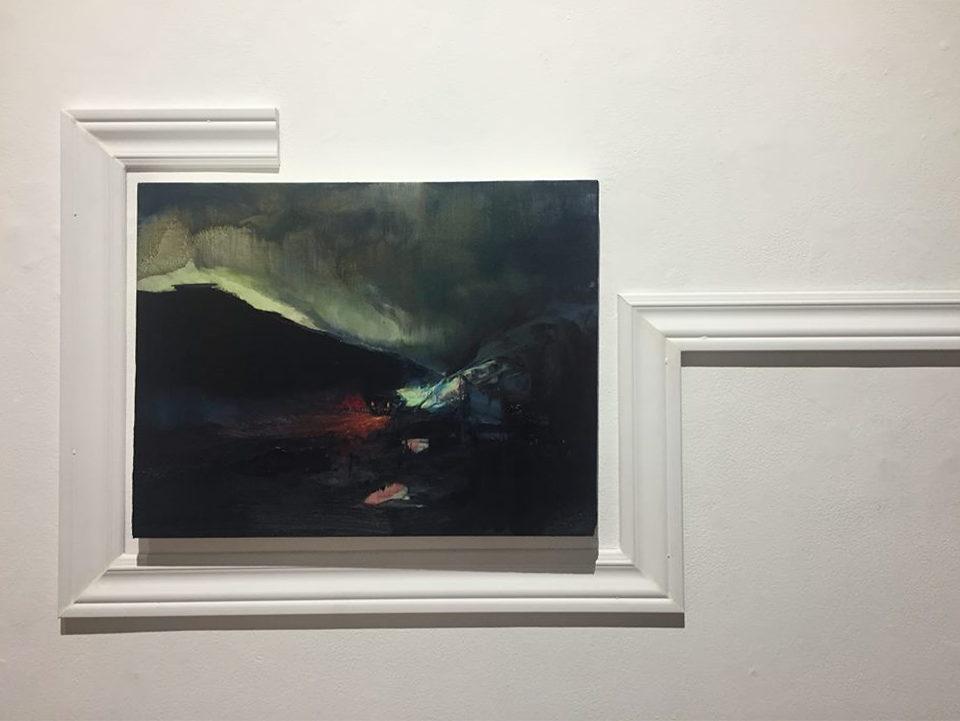
    These canvases are mostly unframed. Frame, on the other hand, has its own glory in this exhibition. The fragmented pieces of frame and architectural moulding are both hold their aesthetic values, but also stand for a conceptual deconstruction of frameworks and perspectives as a whole. Lines of moulding displayed around some paintings have been intervened with, to challenge our expectations and to lead us through space instead of fixating us in place.

    Entry ways are a primary theme throughout the gallery, as many of the paintings are being positioned at doorways or looking within a space from a vantage point. Doors and openings are important as a signage to let us know what pieces of art are allowed or not allowed to be entered into. This addresses our tendency to follow rules and routines but that doesn’t mean that we have to, and as critical thinkers we need to question them and take back the power of control they have in our lives.

    North Korean missiles and a concierge in the lobby of a corporate building are examples of ways that are used to protect the interests of the elite and reject the outsider. Iles, in her statement, suggests that these grandiose forms of intimidation contain an unintentional feeling of sublime and beauty, which arguably contributes further to their power, but also has the potential of undoing it. If we can look at these from new perspectives, we can dissolute the dominance and power they hold over the public. Further beauty comes from plants and animals that permeate the works and, as the artist suggests, will reclaim their territories.

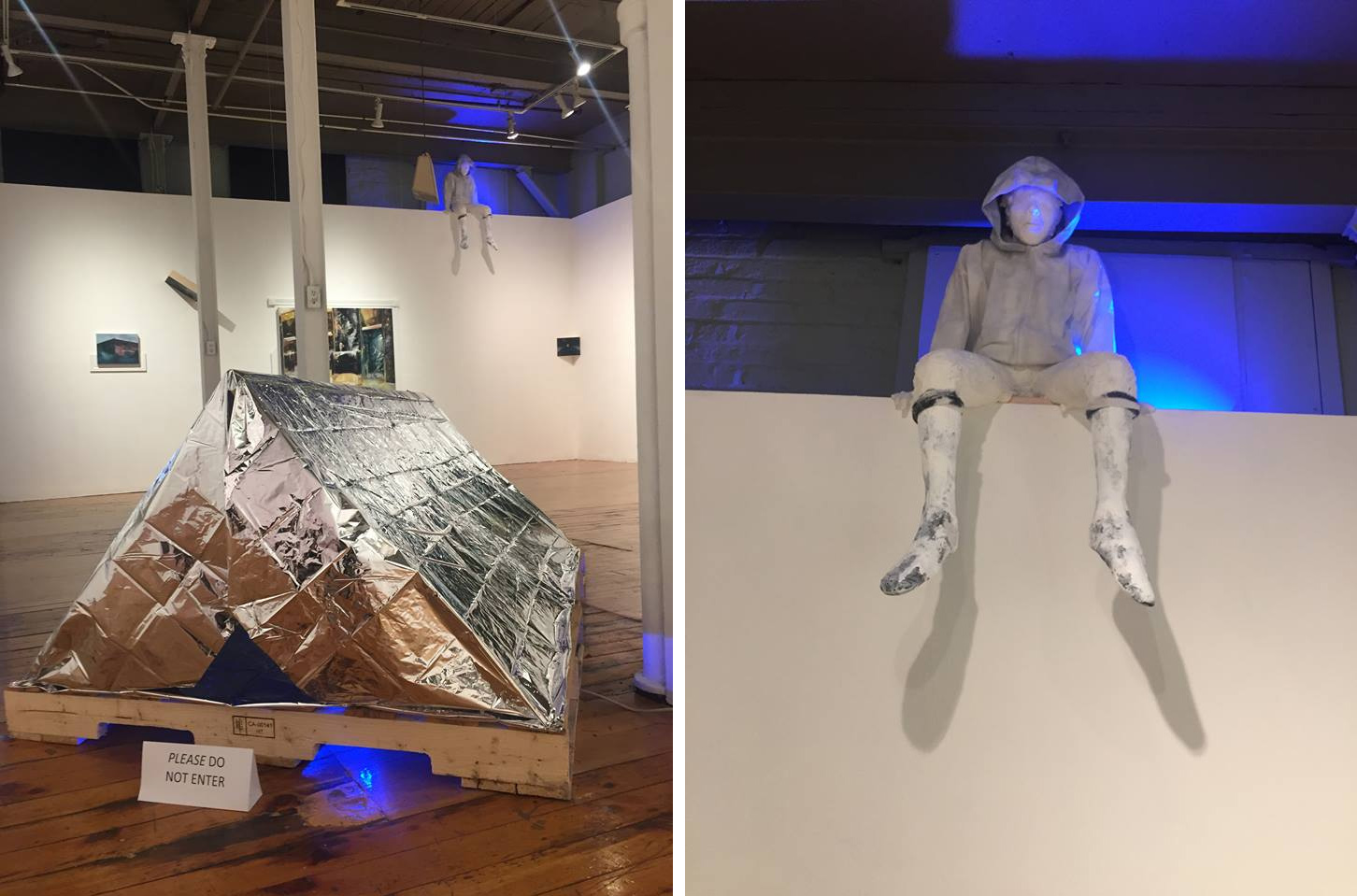
    The installation also contains a basic ridge tent on a wooden skid made of metallic mylar, the material of  fire or thermal blankets. At both openings there are signs indicating that you are not allowed to enter. A stark-white, shoeless figure wearing a hoodie is sitting high above the gallery wall, looking down on the viewers. The tent and the boy have a distinct relationship to the audience compared to the rest of the work in the space, as they seem to represent a more real, accessible and relatable disposition. Ironically, they are the only works that are physically removed from the audience’s grasp. The ordinary tent and the use of signage at its entry seems to mirror the denial of access, but from an impoverished perspective instead of an elite one. The figure looking down on the gallery, a presumably youth-like model, has the highest and arguably most objective perspective in the gallery.

    Iles, using an array of well executed mediums and creative curatorial decisions, has created an engaging installation that has a strong critical message immersed in beautiful and interesting imagery and design.

    Nathan Flint

    *Exhibition information: March 29 – April 21, The Red Head Gallery, 401 Richmond Street West, Suite 115, Toronto. Gallery hours: Wed – Sat, 11 – 5 pm.