Author: artoronto

  • Niall McClelland at Clint Roenisch Gallery

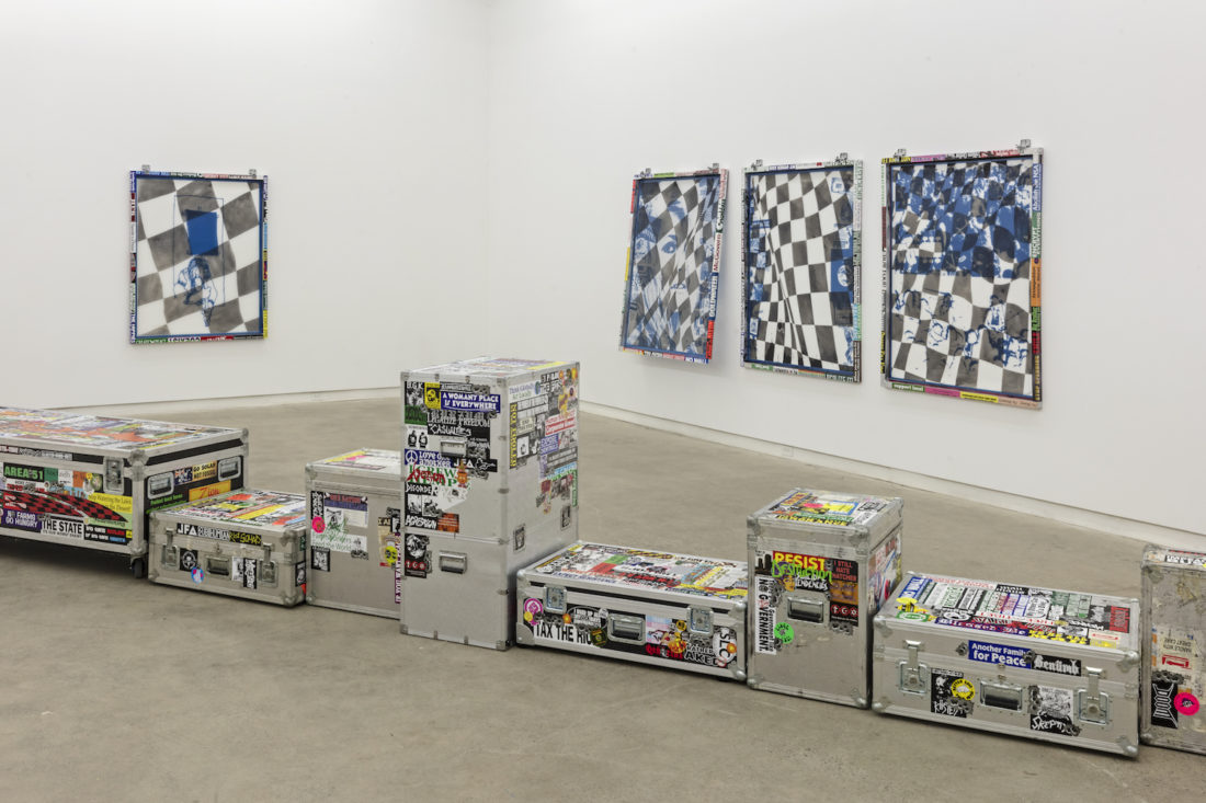
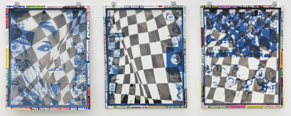
    Hot Takes, No Sax doesn’t want your devil’s advocate argument. The show greets you with a piece by McClelland that is unlike the rest. A stained canvas loosely coated with what seems like stucco resembling a crumbling wall taken on by an angsty teenager with spray paint. It reads, ‘TOURIST GO HOME.’

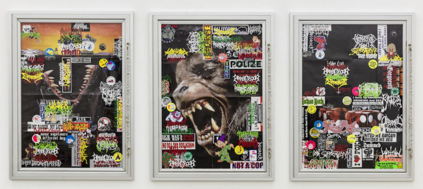
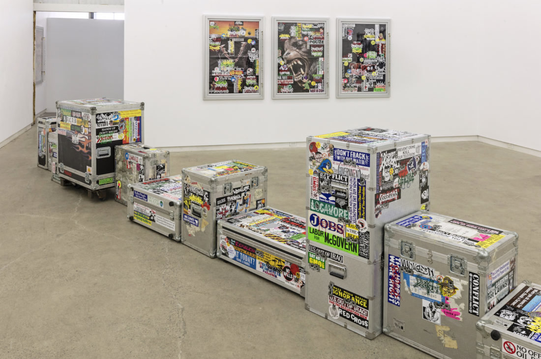
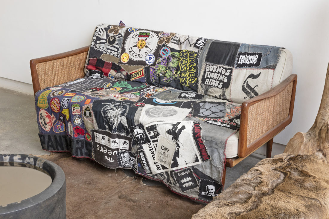
    The works further into the show are quite aesthetically different but absolutely related. Pieces that feature metal poster frames like the ones seen in movie theatres are especially nostalgic, each with the key attached and hanging from it, a metal chain reminiscent of one worn by a teenager working part-time at the movie theatre. Retro horror movies like ‘Chucky’ and ‘An American Werewolf in London’ are covered with Metal and Rock n’ Roll band stickers. Nowadays, you learn more about a person through their internet history than you do through talking to them, and this is no different. This is not just pop art, these stickers are worn like a badge, collected and curated to distinguish and connect. How else were you to find your tribe?

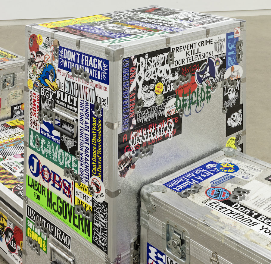
    These stickers permeate the exhibit, reminiscent of long road trips through the American mid-west and rural country, it reads like a biography of an adolescent growing up and through their beliefs and ideologies. The yearning to resolve the various deep issues that influence towns of people, solutions discussed in bars, living rooms and studios. There is a relic aspect attached here, at first everything seems very 90’s but the show is relatable through at least three recent generations. Pop culture reflecting dissatisfaction and angst with the capitalist machine leaves deep-rooted populations sort of powerless. Certain pieces remind one of protests that have come and passed, juxtaposed with references to issues and conversations happening today and although at first it comes off subtle and fun, these issues are realities for people.

    Driving through canyon country, red dirt, static on the radio, bumper stickers on the backs of trucks and family cars connecting people through statements that signal a certain hometown pride and rock n’ roll mentality.

    The gallery space is broken in two by the line-up of aluminum touring crates running down the middle like a single highway cutting down the rural country, hundreds of miles long. All are covered with band and bumper stickers seemingly collected along the way. Standing on ether end of this line-up will give you a familiar one-point perspective of this single highway. Especially exciting, considering this would be the perfect road for drag racing the 60s/70s American muscle car represented in the screen frames on the wall.

    One screen shows Sharon Tate, with references to the Manson Family and ‘Healter Skelter’ is especially touching. The screen is propped away from the wall by a single red apple. The bumper stickers on the side quietly read, ‘Eve was Framed’ and ‘Women’s equality is economic equality.’ Fights lost to corruption, a yearning for political change that did not come as promised. That’s the thing about hot takes, they disappear; they’re catchy but superficial.

    With references to racing culture, Sharon Tate, band touring, Shel Silverstein, the silk screen frames covered with images of a Finish flag, and stickers that read, ‘I’d rather be gardening,’ create a visual biography of a person that is sort of endearing. This is not as superficial as the mediums’ may make it out to be, these are issues spread out across a vast landscape, lives and generations felt on a deep level. It’s nothing to walk in and out of with ease, rather something you grow with, and understand only through the real lived experience of the culture.

    Nazli Nahidi

    Images are courtesy of Clint Roenisch Gallery

    *Exhibition information: Niall McClelland: Hot Takes, No Sax, March 8 – April 14, 2018, Clint Roenisch Gallery, 190 St Helens Avenue, Toronto. Gallery hours: Wed – Sat, 12 – 6 p.m.

  • Vikky Alexander & Scott Treleaven / Cooper Cole

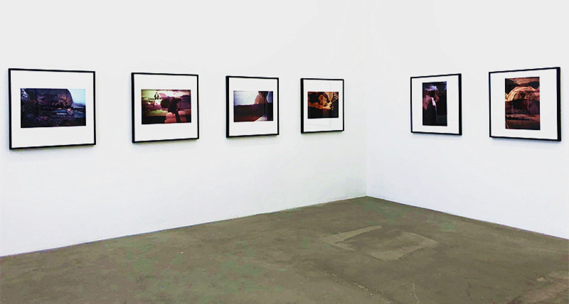
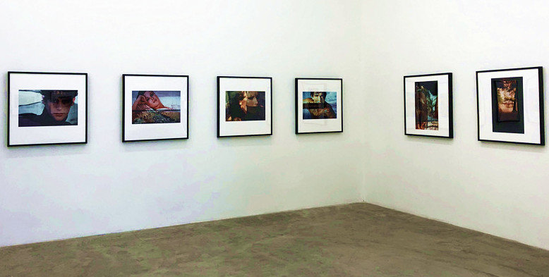
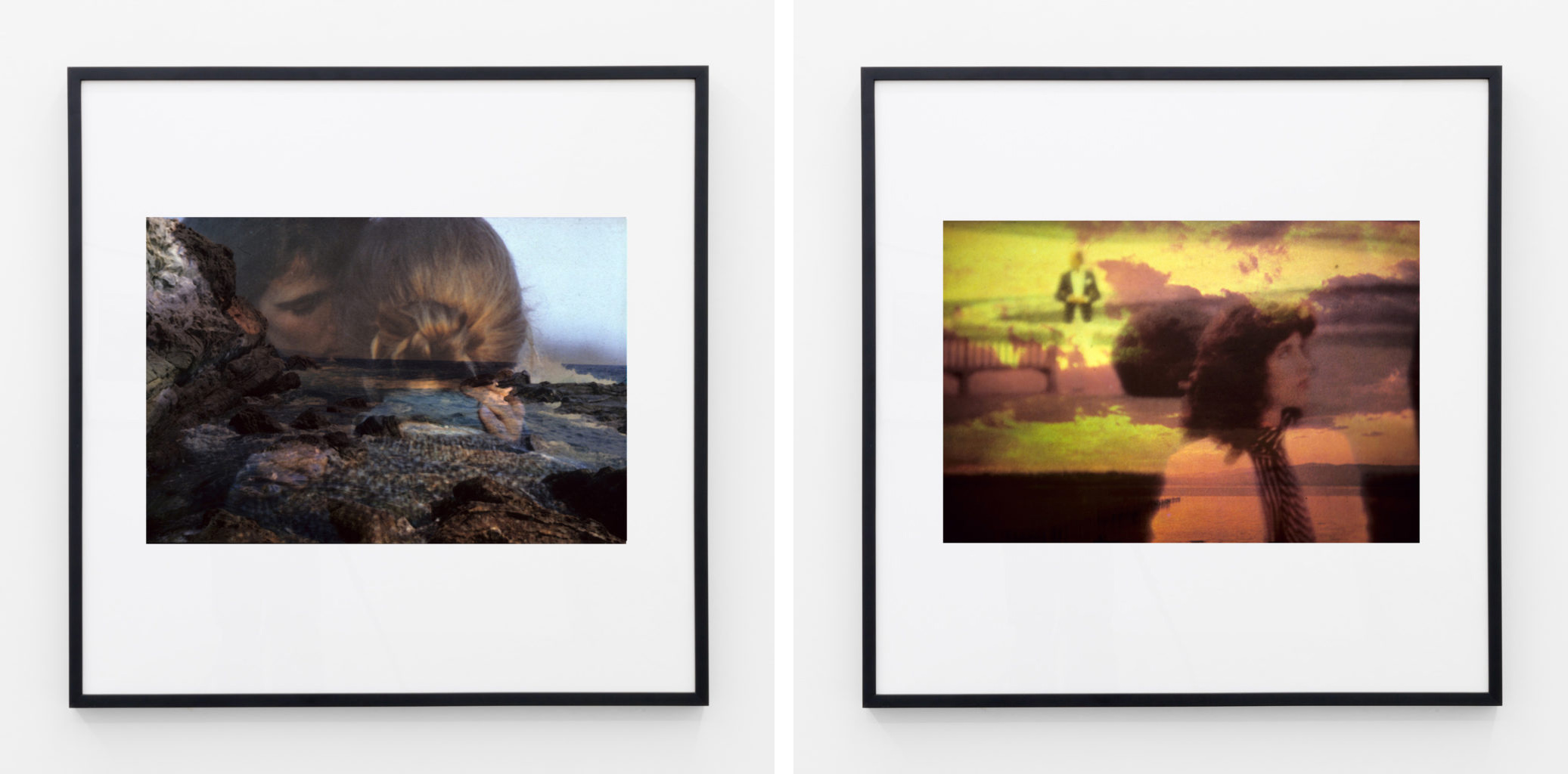
    Vikky Alexander, a Canadian Artist whose work has been exhibited globally and gained significant recognition, is well known for her style of combining photography and other media to create larger scale installations, or to create multi-layered images that speak for her narrative. Her photographic series, Between Dreaming and Living, is her second solo exhibition in the Cooper Cole Gallery. The entire series consist 12 photographs that are divided into two sets of six, and diagonally displayed on the walls of the main floor. In this way, the whole installation view becomes immediately visible to all visitors as they enter the gallery from various angles.

    Installation view of Vikky Alexander, Between Dreaming and Living, full view of the series, Cooper Cole Gallery, 2018. Photo: Sophie Wang

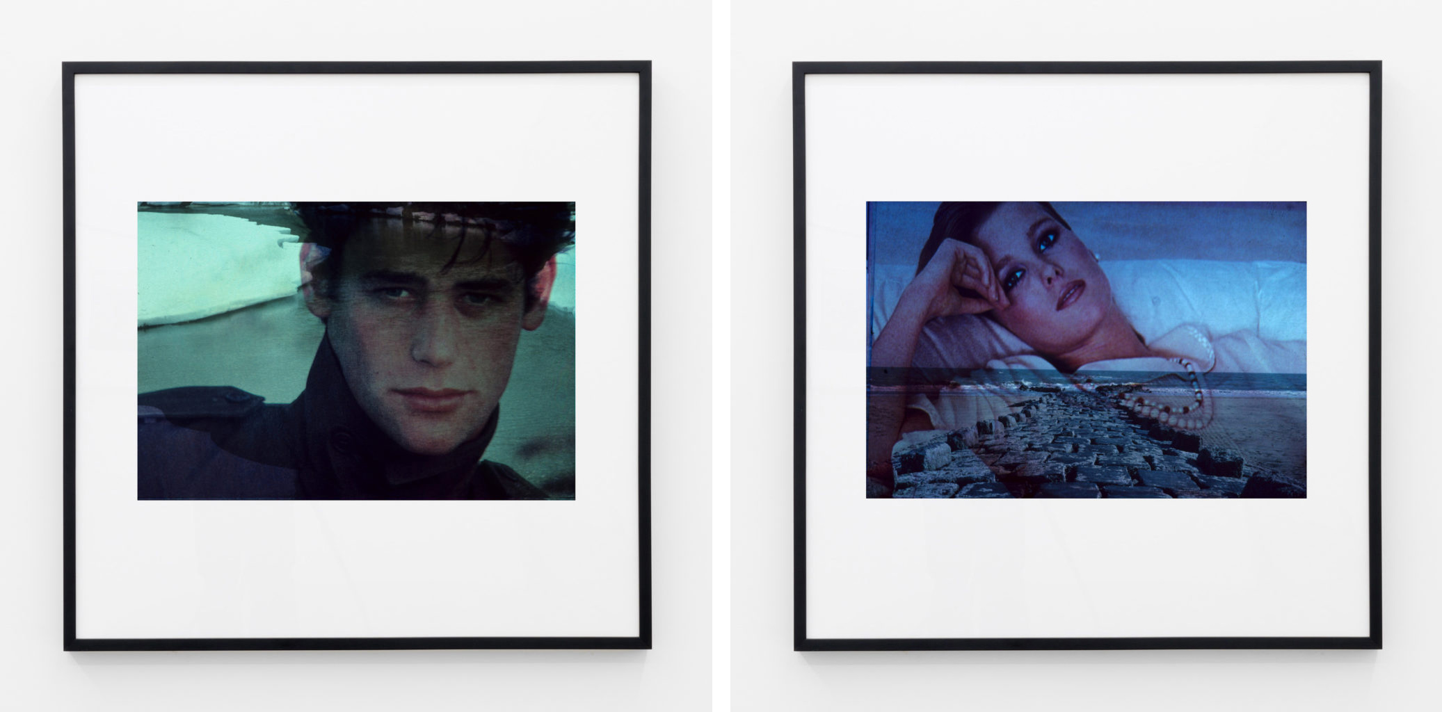
    In this series, Alexander mixed two subjects: natural landscapes and human figures into one image. The two subjects co-exist as one image layered over another one, which allow viewers to see the photos as a unity, or to shift their attention from one subject to another. Even though the photos depict the moments of stillness in nature and human figures, they encourage the dynamic interaction between audiences and the artwork. The multi-layered images also create a sense of mystery and ambiguity.

    Vikky Alexander, Between Dreaming & Living #1, (left) and #2 (right) both 1985/2008, Cibachrome print, Edition of 3, 2 AP, 20″ x 24″. Courtesy of Cooper Cole Gallery

    Vikky Alexander, Between Dreaming & Living #9, (left) and #10 (right) both 1985/2008, Cibachrome print, Edition of 3, 2 AP, 20″ x 24″. Courtesy of Cooper Cole Gallery

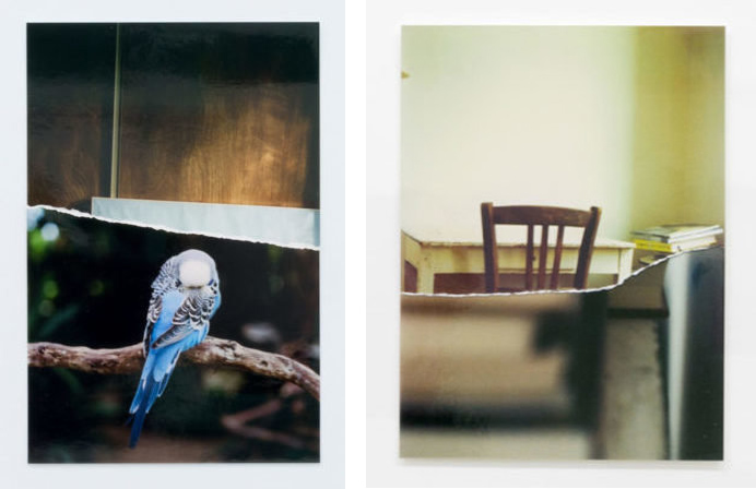
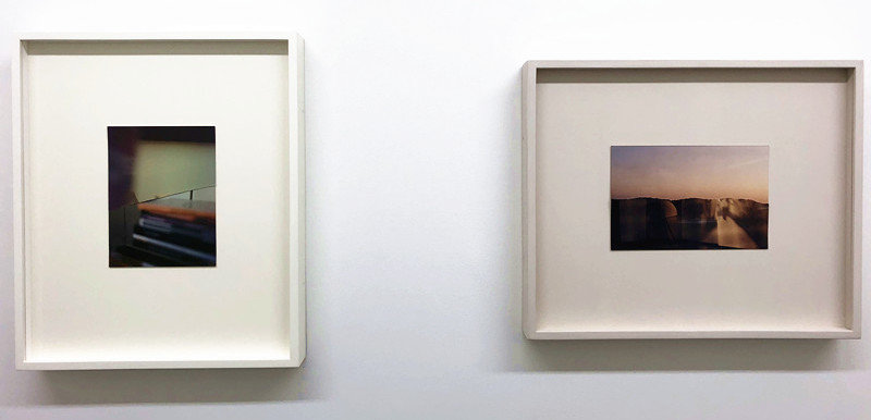
    The lower level of the gallery displays Scott Treleaven’s photography series Meson. The photographs are all 4″ x 6”. Each of them is a collage of two disparate photographs, yet they have shared similarities in terms of materiality and colour tones. For example, the upper part of the photo collage that used a parrot as the main subject, depicts wood boards, which corresponds to the tree branch in the lower image, from its material to colouration. The similar association can also be found in other photographs. By doing this, the series successfully illustrate the shifting between two different aspects of viewing the real world. In the process of making the art, the photographs were physically teared apart, and the marks of each piece being detached from their original images are obvious through the white paper lines in the middle of the visual field. Treleaven adapted “Chance” in his collage, that excluded himself from the narrative to certain extend, and encouraged viewers to draw their own conclusion.

    Scott Treleaven, Untitled (reversed canvas/sleeping blue parakeet), 2018 (left) & Untitled (chair and white table/books, close up), 2017 (right); both unique photo collage from 35mm, negative prints, archival tape, 7″ X 4″. Courtesy of Cooper Cole Gallery

    Scott Treleavan, Untitled (yellow purple sunlight/books), 2017 (left) & Untitled (purple orange sky/Venice foyer), 2017 (right); both both unique photo collage from 35mm, negative prints, archival tape, 7″ X 4″. Photo: Sophie Wang

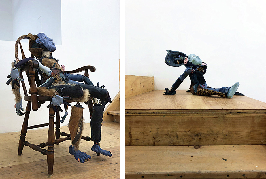
    Besides these two major exhibitions, a preshow of Tau Lewis’s new work series is displayed on the second floor. Lewis’s sculptures are all hand made with the materials that are easily accessible in her daily life. As a Jamaican-Canadian artist, her work is meant to represent her identity and explore the political controversies arise in this multicultural society. The sculptures depict the living human figures in a powerful way that reminds us of traditional African art, creating a strong visual image that captures the viewer’s attention. It is definitely a show that is worth looking forward to.

    Sculptures by Tau Lewis. Photo: Sophie Wang

    Sophie Wang

    *Exhibition information: Vikky Alexander, Between Dreaming and Living & Scott Treleaven, Meson as well as pre-show of Tau Lewis, March 2 – 31, 2018, Cooper Cole Gallery, 1134 Dupont Street, Toronto. Gallery hours: Wed – Fri: 1 – 6 p.m., Sat: 11 a.m. – 6 p.m.

  • Water Advisory! at loop

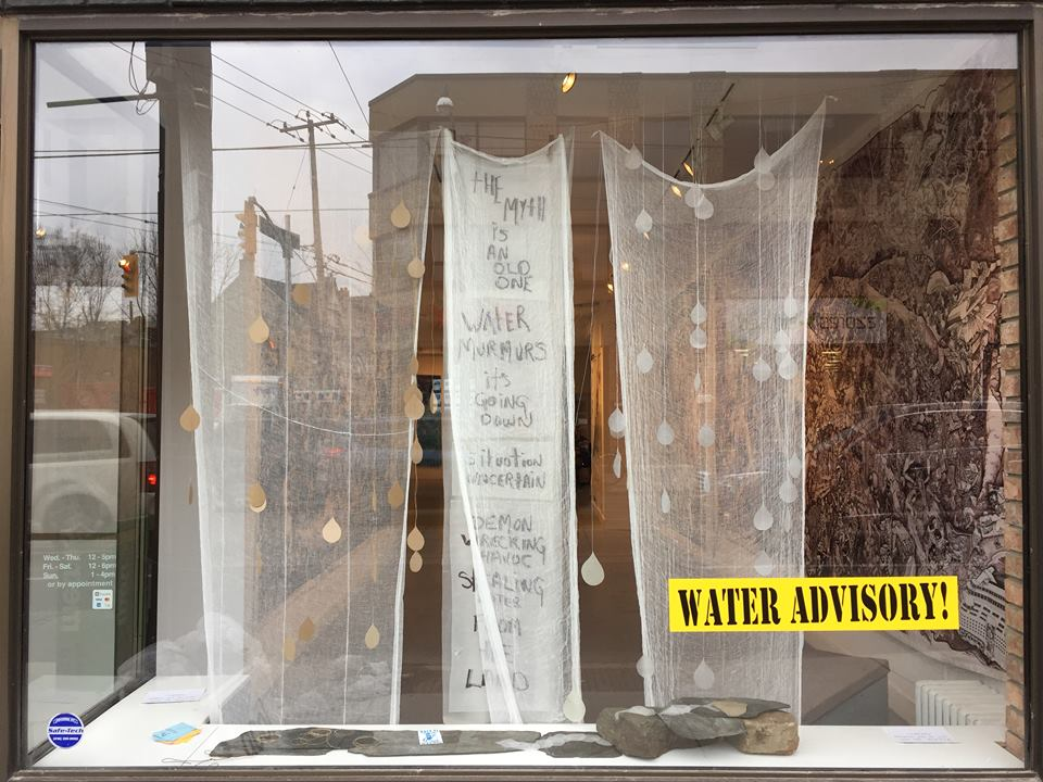
    Dive right into the artwork on display at loop Gallery because it has a powerful message that the public needs to soak up!

    Combining artistic practices with social activism, the artworks gain cultural significance and meaning to become more than aesthetic objects, but additionally objects of protest and awareness. The exhibition, while beautiful in nature, is equally a call to action for audiences to help support initiatives that protect local watersheds. The presenting partner, The Wellington Water Watchers is a not-for-profit organization that is committed to such causes and their promotional materials, as well as petition sheets, are prominently displayed in the centre of the gallery. The co-curators of the exhibition are: Idle No More co-founder Crystal Sinclair and Rochelle Rubinstein, who is an artist and environmental activist.

    The exhibition is broken down into two distinct collections within the gallery space. The first is works by the Beehive Design Collective and the second is a collection of mixed media banners.

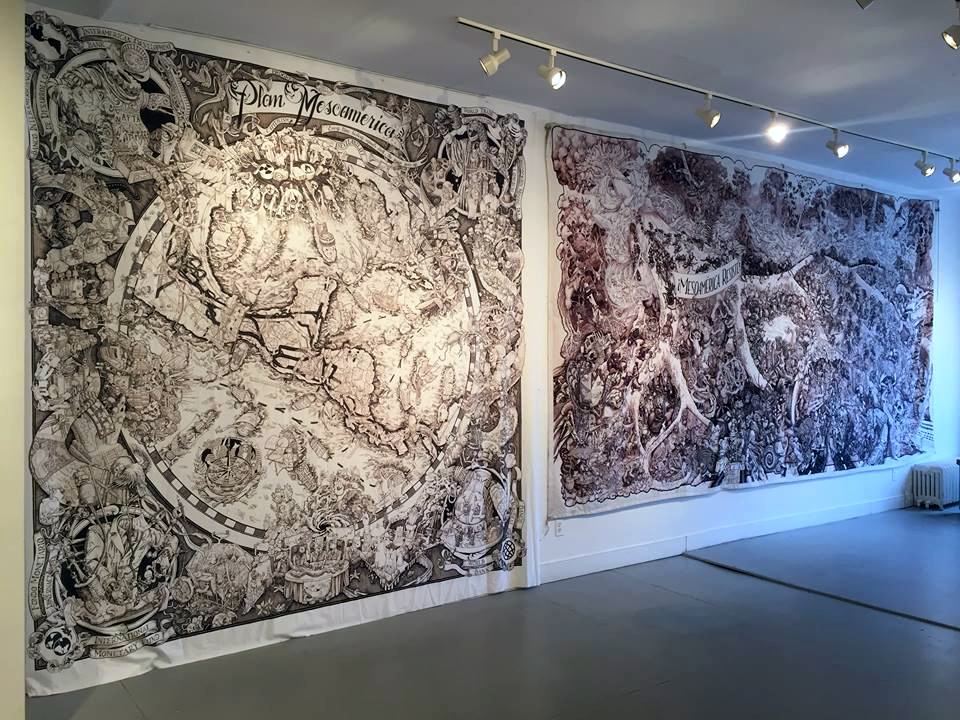
    Mesoamérica Resiste by the Beehive Design Collective

    The works by the Beehive Design Collective stand out for their large-scale, incredibly dense and well-executed monochromatic graphic style. These work require extensive study, making them an extreme rich resource for teaching aids and to demonstrate visual allegories of complex histories.

    First, the series “Mesoamérica Resiste” is comprised of two pieces that expand to fill the entire wall when entering the space. The work uses representational imagery, as well as symbolism and pop iconography to map out and retell the many stories and struggles of colonial and contemporary Mesoamerica. Designed as a circular map, the four corners outside the circle each contain a prominent entity, such as the World Bank and International Monetary Fund, which played a crucial role in the colonization and industrialization of the lands. The aggressive industrial and capitalism machines, in their many forms, are dominate figures throughout the print. The Kool-Aid man becomes a signifier for the exploitation of the Sugar Trade, while depictions of anthropomorphized insects engaging in various acts, represent the civilians and original inhabitants, and are show to constantly face opposition from unnatural techno-militant entities.

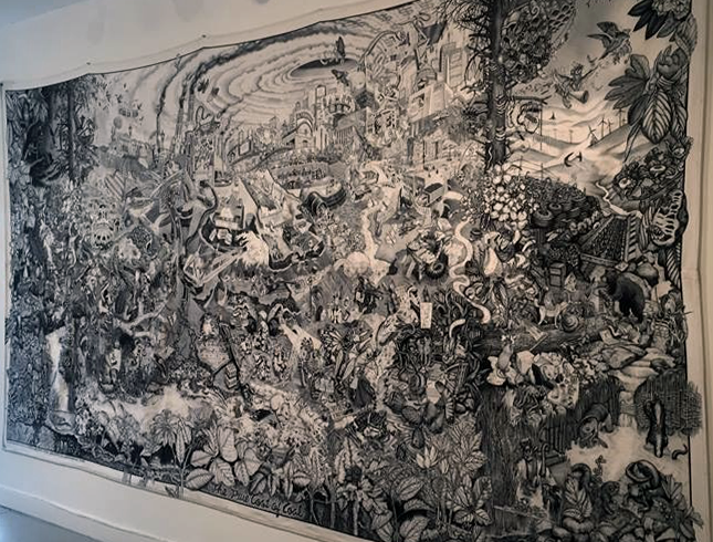
    The True Cost of Coal (2010) by the Beehive Design Collective

    The other, separate print in the show by the Beehive Design Collective is titled “The True Cost of Coal.” The work is another allegorical, historic account of the dramas that plague the Appalachians specifically, but have a direct effect on all of North America and beyond. The work is broken into vertical quadrants that begin with depictions of Ancestral life, followed by Industrialization, the central section is dedicated to the current events of mountaintop removal and climate change, then a portion depicts resistance to these atrocities and last is a hopeful future where regeneration has occurred. These series of panels are essential to a visual trick hidden within the work. If you were to follow the instructions from the Beehive Design Collective, you can actually fold the print to create a secondary image of a fully intact mountaintop, much like the visual trick popularized by the back covers of Mad Magazine publications.

    The series of mixed media banners were created by a series of artists, including: Crystal Sinclair, Tannis Nielson, Claudia Wong, Sally Pang, Erika James, Carol Cheong, Paul Morin, Sarit Cantor, and more.

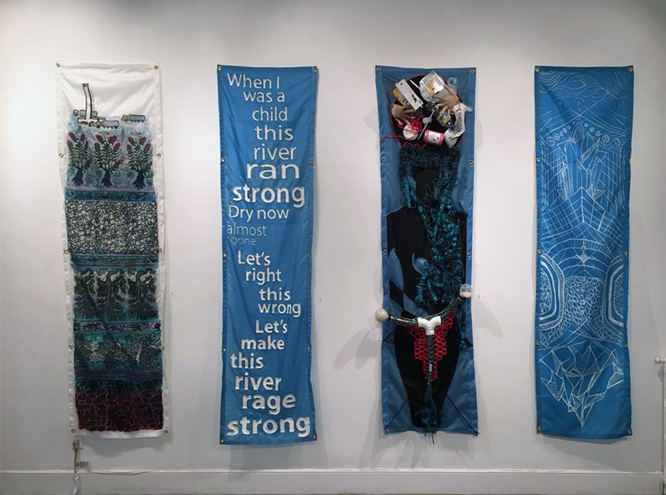
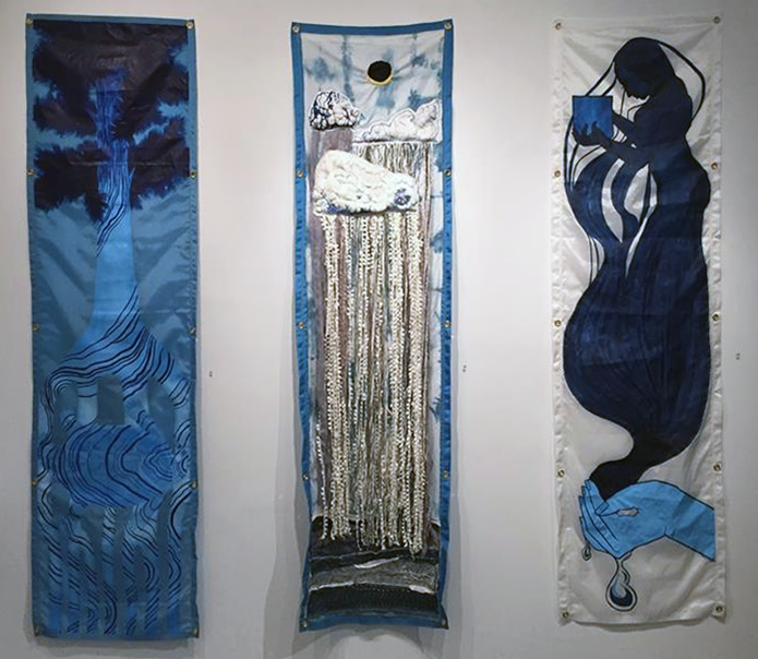
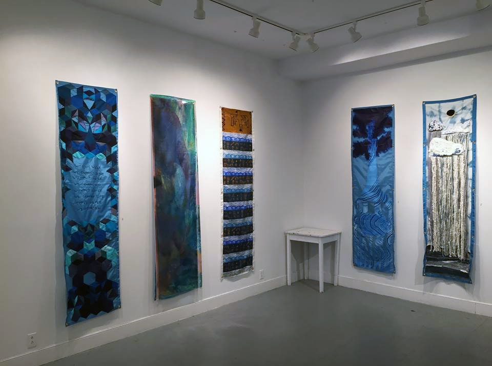
    The collection shares the aesthetics of protest signage and quite cleverly exploits the materiality of the iconic blue, water-resistant tarps to create visual poetry or play-on-words for “Water Resistance”.

    Each banner has its own individual style and approach. Some of the works rely on words to explicitly or poetically express their meaning, while others use visual language to demonstrate the pollution of the body, the destruction of the land or the loss of control over our natural resources like water. Exploration of different materials produced stunning results and pulls audiences in to further explore surfaces, while still unpacking the larger call to action for environmental and social activism.

    Overall, the show is a wonderful learning opportunity for anyone interested in the praxis between the visual arts and environmental activism! Each body of work was riddled with advanced artistic techniques, further advanced by strong conceptual frameworks and lastly, placed within a contemporary and relevant context of ethical partnerships providing audiences with real and impactful steps towards making a difference right next to the artworks in the gallery, just in time for Canada’s National Water Week from March 20th to 27th and World Water Day on March 22nd, 2018.

    Text and photo: Nathan Flint

    *Exhibition information: March 3 – 25, 2018, loop Gallery, 1273 Dundas Street West, Toronto. Gallery hours: Wed – Thurs, 12 – 5 pm, Fri – Sat, 12 – 6 pm, Sun, 1 – 4 pm.

  • Tyler Los-Jones: a slow light / Division Gallery

    In order to explore a slow light, one must explore the concept of “being lost”. Whether walking through a city or a forest, there always is a fear of being lost. Being forgotten; losing your way; wandering a strange place. While legitimate, this fear of unfamiliarity dissipates through wayfinding. Being a skilled wayfinder means never feeling lost – or rather, appreciating being lost. Without the fear, being lost becomes a courageous exploration into new terrain. Tyler Los-Jones’ exhibition a slow light is precisely this: documentation of courage and change.

    Installation view of Tyler Los-Jones, a slow light, March 2018 at Division Gallery. Photo: Sunny Kim

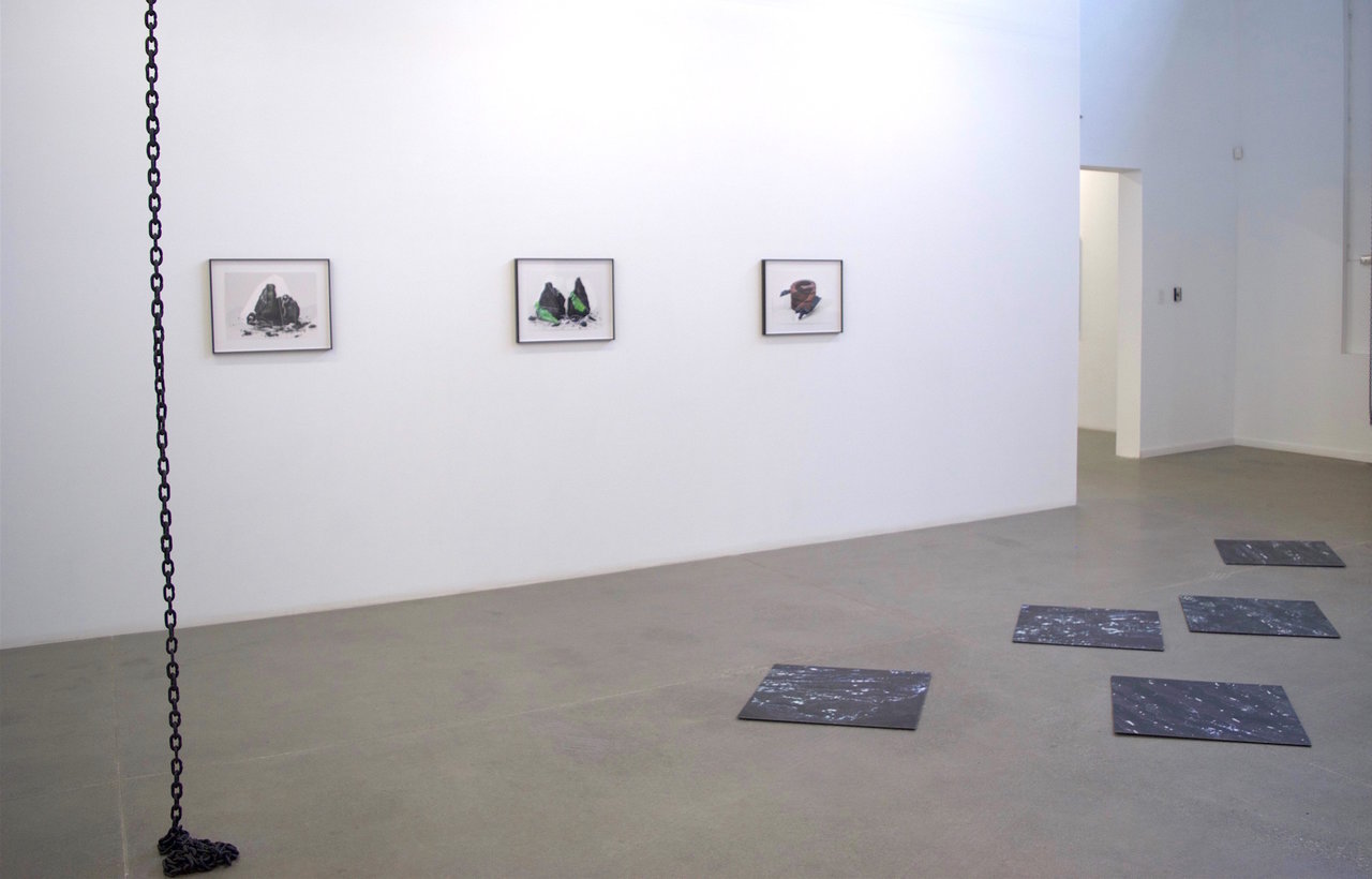
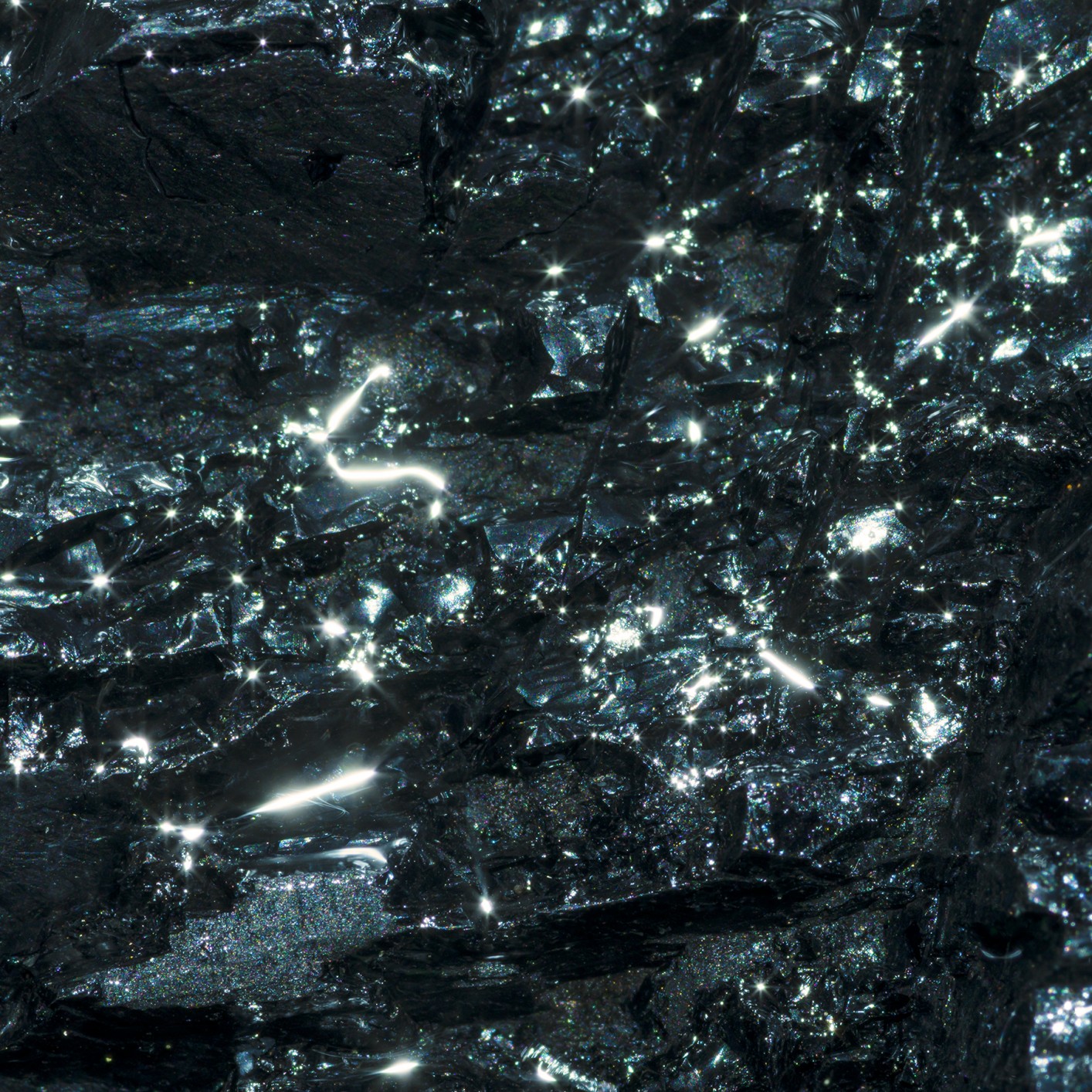
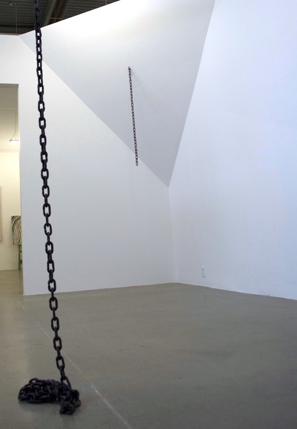
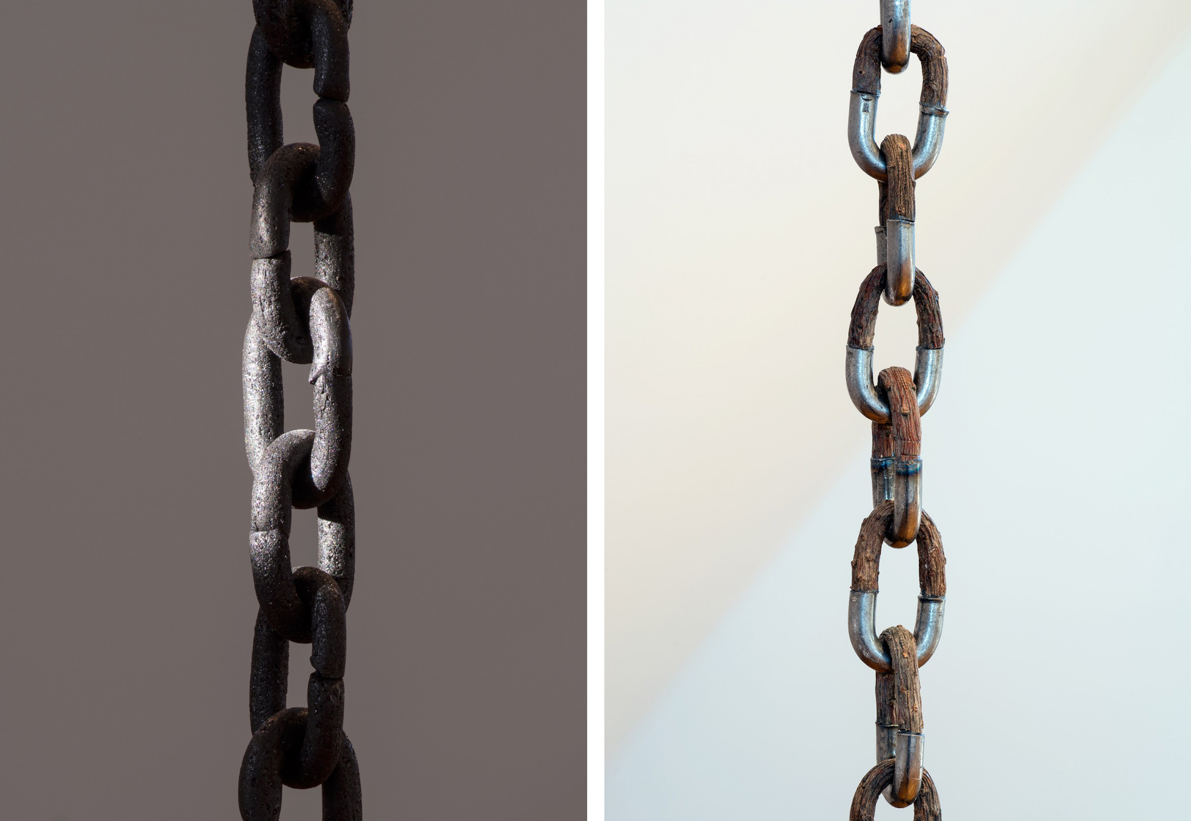
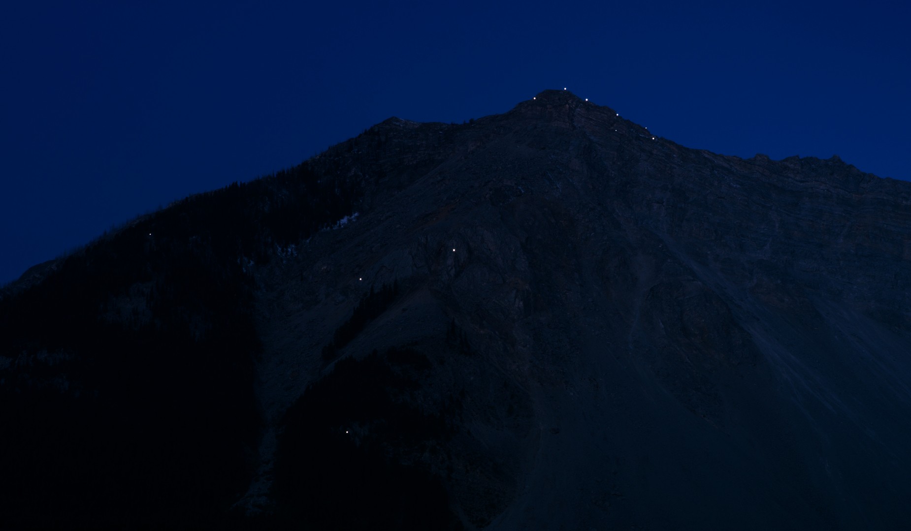
    a slow light recreates the terrain of a small Alberta community from which these works/orientation markers were taken from. On the floor glistens “Medusa’s ferns”: five square photographs of the community’s geologic formations. Ahead of these panels, two chains hang off the ceiling. One of the chains is connected to the main ceiling and stretches over 27 feet long, densely sitting its last few inches on the gallery ground. The other chain hangs off a temporary diagonal wall. Upon closer look it becomes apparent that both chain is made up of half-wood and half-metal, alluding to trees, mines, gravity, and their relationship to one another. The verticality of these two chains intermingle with the panels on the bottom and act as navigational tools in order to recreate the landscape of Crowsnest Pass. a slow light re-situates and transports its viewers.

    Tyler Los-Jones, Medusa’s ferns no.5, 2017, archival inkjet print mounted on Sintra, 24″ x 24″. Courtesy of Division Gallery

    Installation view with Tyler Los-Jones, Wayfinding and Sun Tunnels – after Nancy Holt, 2017, coal dust and epoxy putty (front chain) and 1978 – After the Burmis Tree. 2017, Limber pine branches, chain and adhesive (back chain). Photo: Sunny Kim

    Details of the chains. Courtesy of Division Gallery

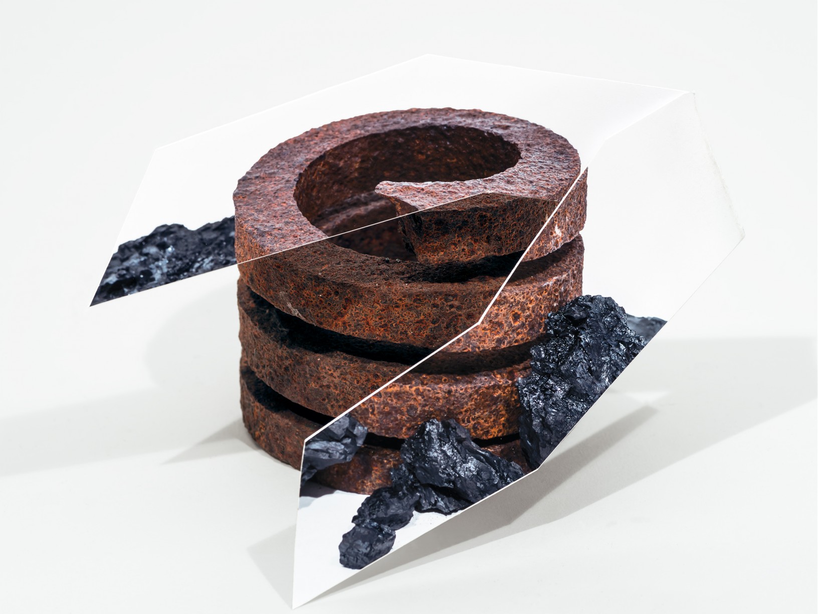
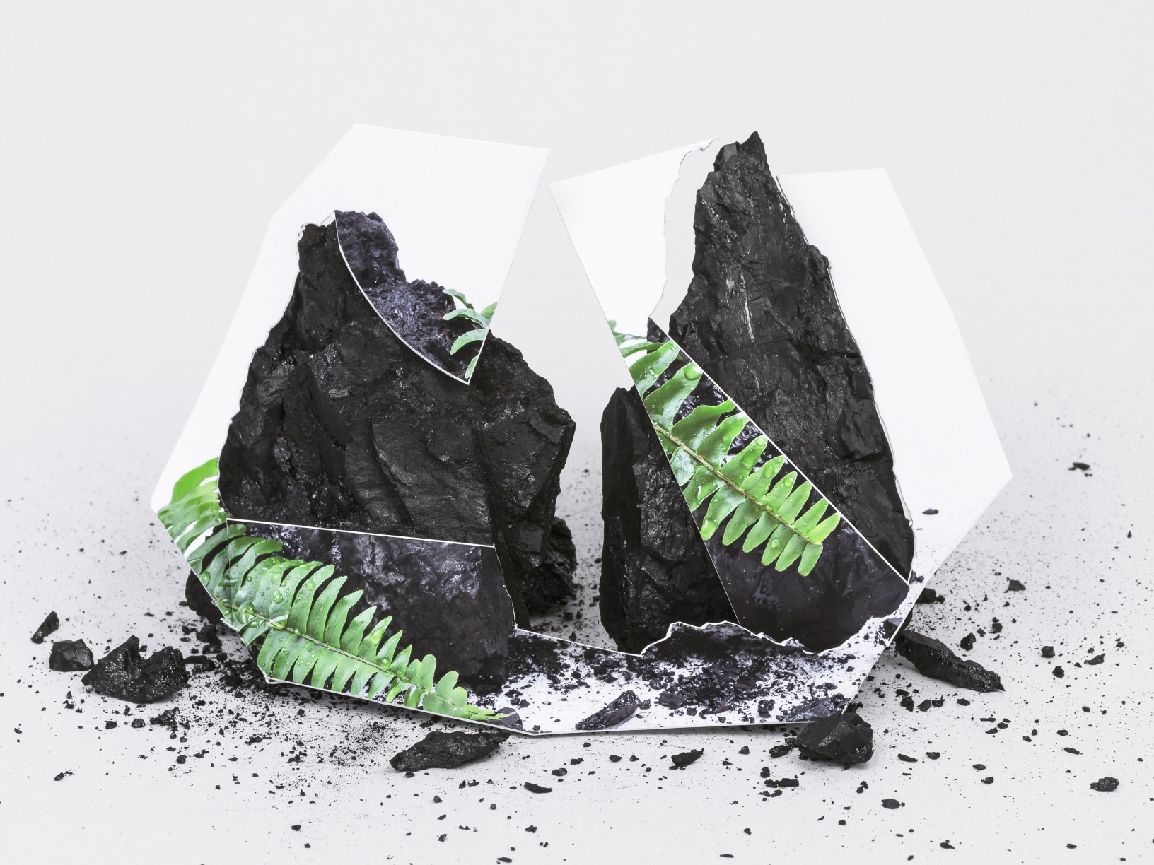
    Most interesting, however, are the small photographs on the wall. Fascinatingly composed and edited, they signify the changing of not only the land, but also its role in the community over the years. The completed photographs intentionally highlight its creation process. Geologic forms are initially photographed with an accompanying object – such as chains or leaves. These images are printed and cut into geometric shapes, which are then placed against the original geologic forms and photographed; this time without the accompanying objects. “Sediments and Sunlight no. 8” shows a vestige of a green plant in its printed shapes. I trace the details of the cut image against the details of the formations and confirm that the plant was, at one point, present on the set. Now they only exist in pieces and as memories, disappearing through the community’s morphing material history.

    Tyler Los-Jones, Sediments and Sunlight no.9, 2017, archival inkjet print. 12″ x 16″. Courtesy of Division Gallery

    Tyler Los-Jones, Sediments and Sunlight no.8, 2017, archival inkjet print, 12″ x 16″. Courtesy of Division Gallery

    This exhibition is an evidence of the extensive research Los-Jones conducted in his investigation of this Canadian community. By transporting these wayfinder markers to the gallery space, Los-Jones provides us with the navigational tools with which we can fearlessly explore our own personal terra incognita.

    Tyler Los-Jones, Watching falling – the constellation of Turtle Mountain, 2017, archival inkjet print. 28″ x 48″. Courtesy of Division Gallery

    Sunny Kim

    *Exhibition information: March 3 – 30, 2018, Division Gallery, 45 Ernest Avenue, Toronto. Gallery hours: Tue – Sat, 10 – 6 pm.

  • Keita Morimoto at Nicholas Metivier Gallery

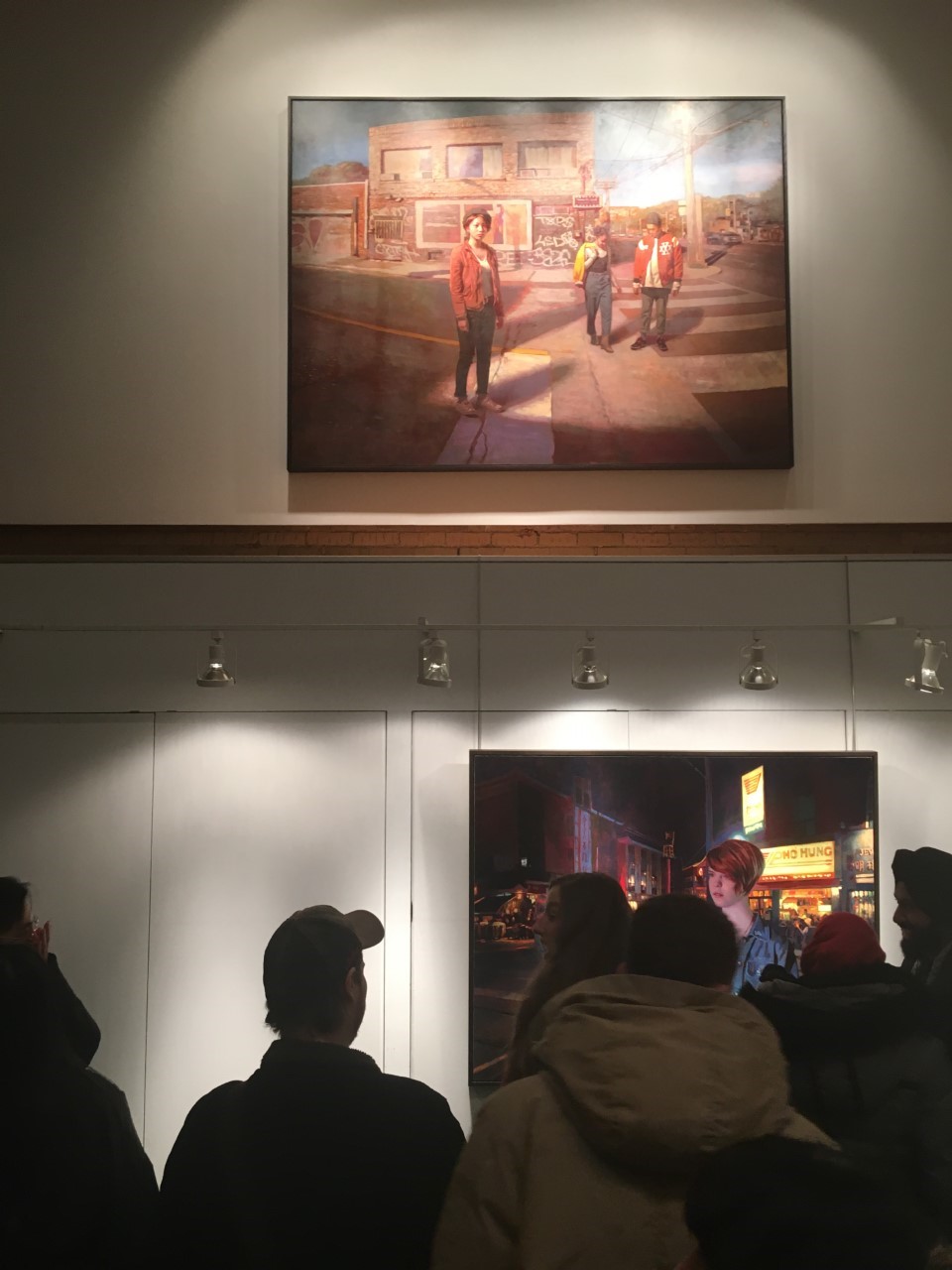
    Light Passage exhibits a number of Keita Morimoto’s captivating paintings which use light to create a sense of atmosphere and emotion. The artist’s use of Toronto as inspiration is inviting to the local viewer, while his placement of anonymous figures alter that familiarity. Morimoto’s intimate relationship with Toronto breeds a feeling of nostalgia through his diligent representation of the city. His use of light injects drama into the canvases, a technique he learned from studying the Old Masters.

    Installation view of Keita Morimoto, Light Passage with Crossing, (2017, acrylic and oil on linen, 72 x 96 in) at Nicholas Metivier Gallery. Photo: Carolyn Peralta.

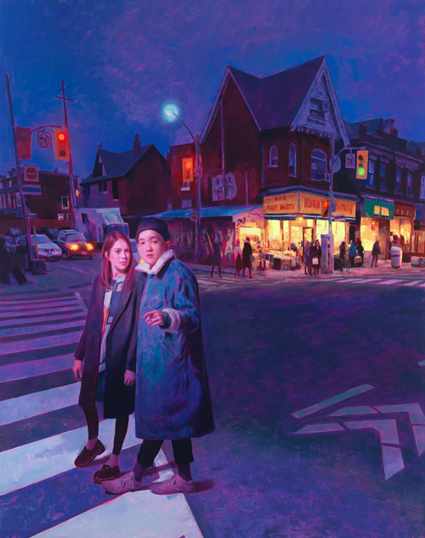
    Morimoto produces canvases that reflect the gaze of Torontonians across the city, so the locations of his paintings feel familiar. In “Fruit Market,” a recognizable intersection is captured with a couple in the foreground. It is as if the artist has captured a particular moment; and at the same time showed us how  spaces can be altered with the presence of people.

    Keita Morimoto, Fruit Market, 2017, oil on linen, 60 1/4″ x 48″. Courtesy of Nicholas Metivier Gallery

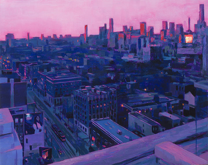
    A beautiful small size painting challenges the perception of vast cityscapes. “Viewpoint” showcases the artist’s ability to emanate grandeur on a small scale canvas while demonstrating a sophisticated rendering of light. Overlooking the city, the pink glow of the sky suggests a sunrise along the horizon beyond the depth of the metropolitan core.

    Keita Morimoto, Viewpoint, 2017, acrylic and oil on panel, 16 x 20 in. Courtesy of Nicholas Metivier Gallery

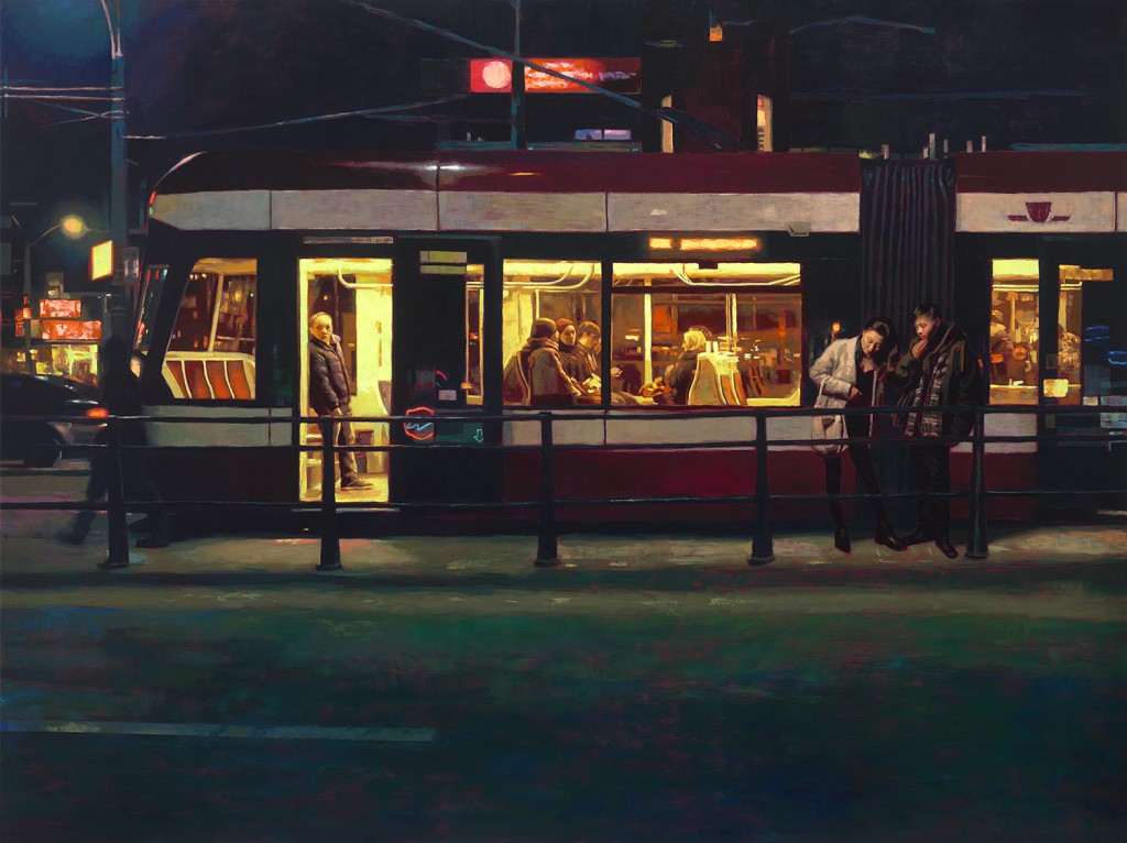
    Morimoto’s night scenes are also intriguing as he uses the glow of light in the nighttime to generate drama on the canvas. As demonstrated in “Arrival,” the illumination of the streetcar entices the viewer to peer into the passenger train, while the figures in the foreground lose focus in the darkness of the night. This harmonious contrast between light and dark is found in several of Morimoto’s paintings, and adds suspense and depth to his works.

    Keita Morimoto, Arrival, 2017, acrylic and oil on linen, 72 x 96 in. Courtesy of Nicholas Metivier Gallery

    The beautiful paintings in Light Passage generate a fond recollection of past memories, creating a sense of nostalgia.

    Carolyn Peralta

    *Exhibition information: February 8 – March 3, 2018,  Nicholas Metivier Gallery, 451 King Street West, Toronto. Gallery hours: Tue – Sat, 10 am – 6 pm.

  • Walking The Artist Project

    The theme for my visit to the Artist Project turned out to be time. I arrived to the exhibition at about six in the evening with opening party buzz already evident. The wall to the left of the entrance featured the work of Artist Project artists in a competition presented by SWATCH. The installation was based on interpretations of the theme TIME FLIES, or “Tempus Fugit,” as we say in Latin. For myself, it signalled the setting of my mental clock to move through the show with enough efficiency to make a late home dinner.

    Installation view of the wall: TIME FLIES, detail

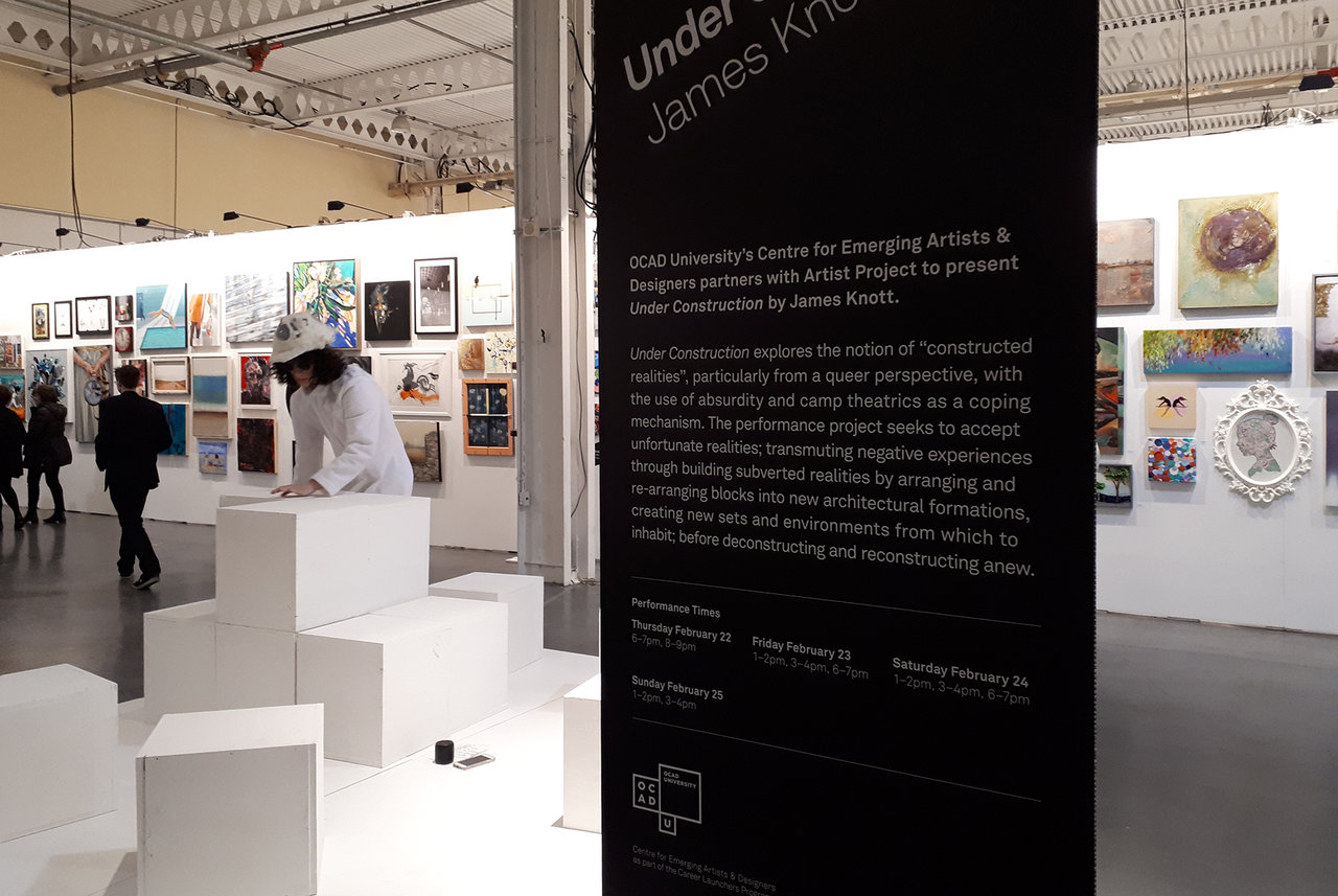
    Adjacent to the “wall of time” James Knott, clad in jumpsuit and hardhat, was busy shuffling and reshuffling cubes, all white except for Knott’s bushy black hair, dark sunglasses, and smeared red lipstick. “Under Construction” partnered OCAD University’s Centre for Emerging Artists and Designers with the Artist Project and is part of the Career Launchers Program. Knott’s queer perspective “constructed realities” project describes itself as a camp theatre of the absurd, acting as a coping mechanism “to accept unfortunate realities; transmuting negative experiences through building subverted realities by arranging and re-arranging blocks into new architectural formations, creating new sets and environments from which to inhabit; before deconstructing and reconstructing anew.” I was reminded of Sisyphus of Greek mythology, who was compelled to roll an immense boulder up a hill, only to watch it roll back down, repeating the action forever.

    James Knott

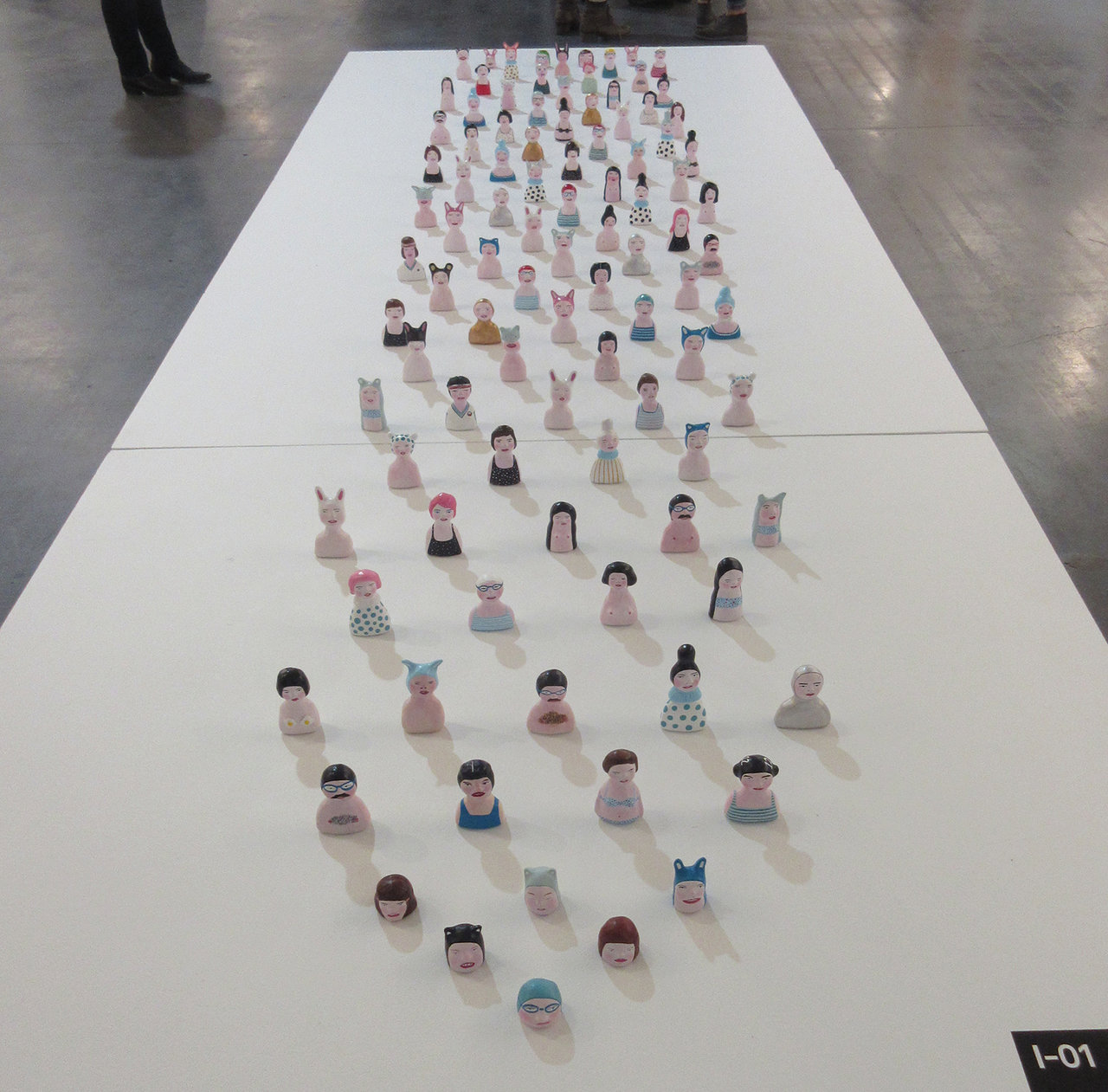
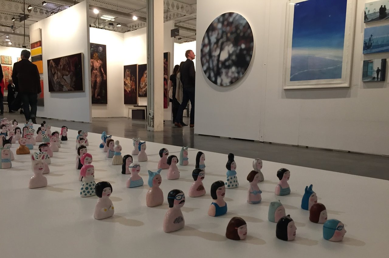
    Isabella Di Sclafani’s display of 100 clay sculptures were laid out neatly in arrow formation, a bit like an army phalanx. I didn’t see the artist, but Di Sclarani’s statement indicated that she wanted people to view them as original art pieces. I saw no reason to doubt her. In her exhibition of the 100 she has fulfilled an ambition to display her large group in a large space. She admits to being fascinated by people’s response to her clay people, but hates it when they refer to them as “whimsical, quirky,” or “cute.” She contends that these characterizations, as she says, “trivialize and diminish the power of my art.” Sadly, the purview of the artist doesn’t extend beyond the work itself. As a viewer I’m powerless to stifle my own responses. Regarding Di Sclafini’s figures, I wouldn’t say “cute” necessarily, but could say that they were not entirely without charm.

    Isabella Di Sclafani’s installation

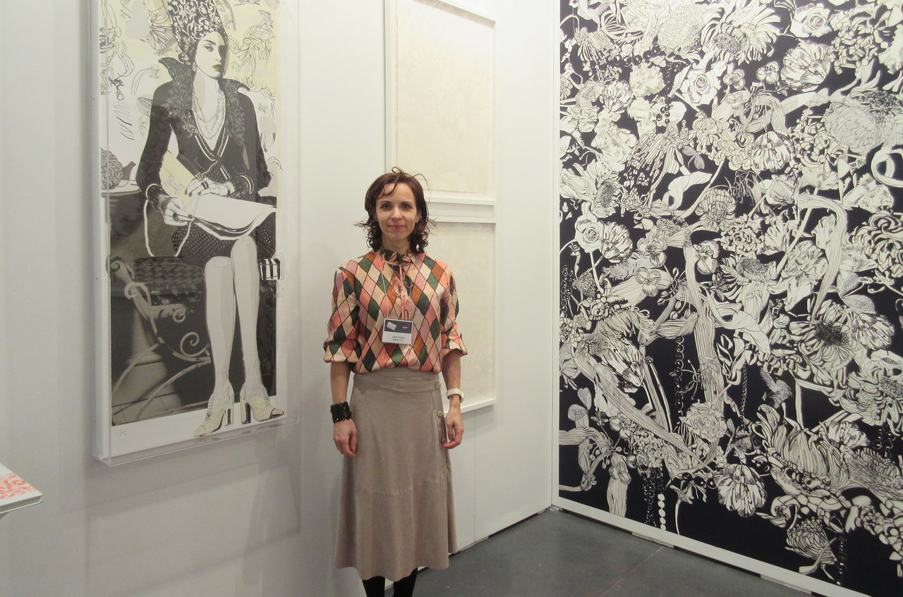
    Tina Tahir travelled from Berlin to come to the fair. Her intention was to at some point show at a Brooklyn art fair, and coming to Toronto was a way of testing the waters. Her MFA studies at the The School of the Art Institute of Chicago and University of Illinois in Chicago, as well as University of New Mexico, has given her more than a passing familiarity to this side of the art pond. Tahir’s specialties are limited edition wallpapers, murals, and temporal installations, features that gave her booth at the fair a singularly unique flair. Her Artist Project temporal carpet exuded a sense of luxury – a patterned composition made up of spices, fluorescent pigments, crystals, and gold dust.

    Tina Tahir

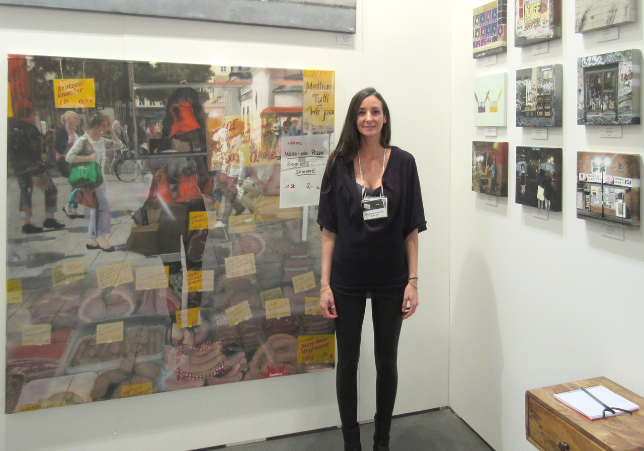
    At first glance the paintings of Catherine McMillan appeared to have a photography base. Although McMillan uses the camera as inspiration, her works are entirely painted with airbrush and meticulously-cut stencils. The artist is from the Toronto area, but has been based in Seattle for the past year, as a result of her husband’s work with MicroSoft. My attention was drawn to a Kensington Market scene, a subject for which she seems to have a particular fondness. McMillan’s largest work here was from a market in Berlin, a multi-layered composition densely packed with detail, remarkable in its obsessive adherence to her preferred technique. As her business card reads, Catherine McMillan has clearly earned the handle, Stencil Artist.

    Catherine McMillan

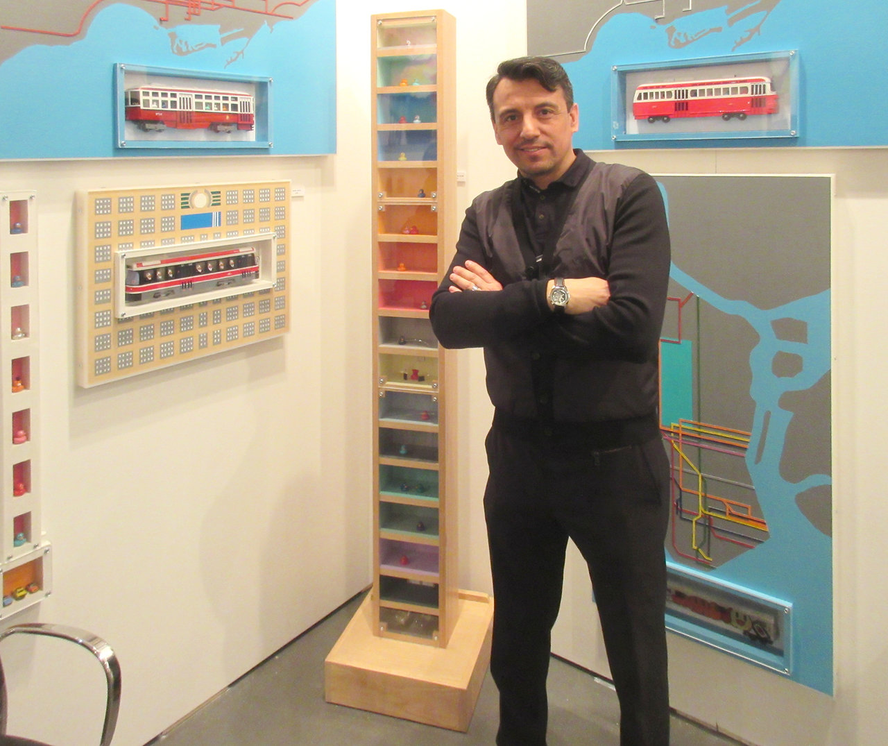
    The playful wood constructions of Antonio Caballero caught my eye. Originally from Chile, Caballero has been a resident of Canada for about eleven years. Precise, colourful, and orderly might describe these well-crafted sculptural works, not to mention, fun. Their inspiration grew out of a desire to see how people lived, travelled, and moved. Ergo the artist’s fascination with streetcars and TTC routes. His narrow, totemic condo tower with windowed units reminded me of old CD storage shelves.

    Antonio Caballero

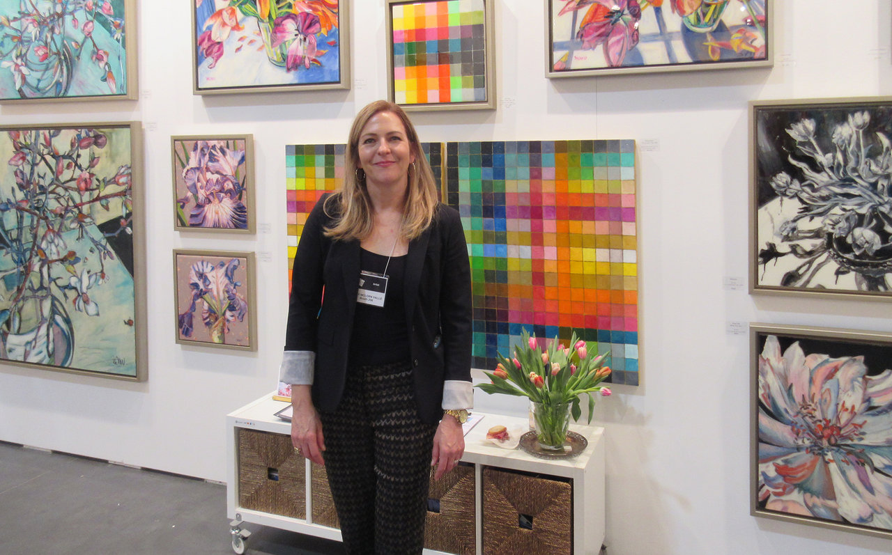
    Although Mary McLorn Valle shows her work from her studio, she is a regular exhibitor at the Artist Project. The artist recently had a solo exhibition at Gallery 1313, where she showcased her blend of geometric colour grids with her flower realism. As an artist with a formal dichotomy, she is certainly not alone. As Andy Warhol once famously said, “Art is about liking things.” McLorn Valle likes both flowers and colour.

    Mary McLorn Valle

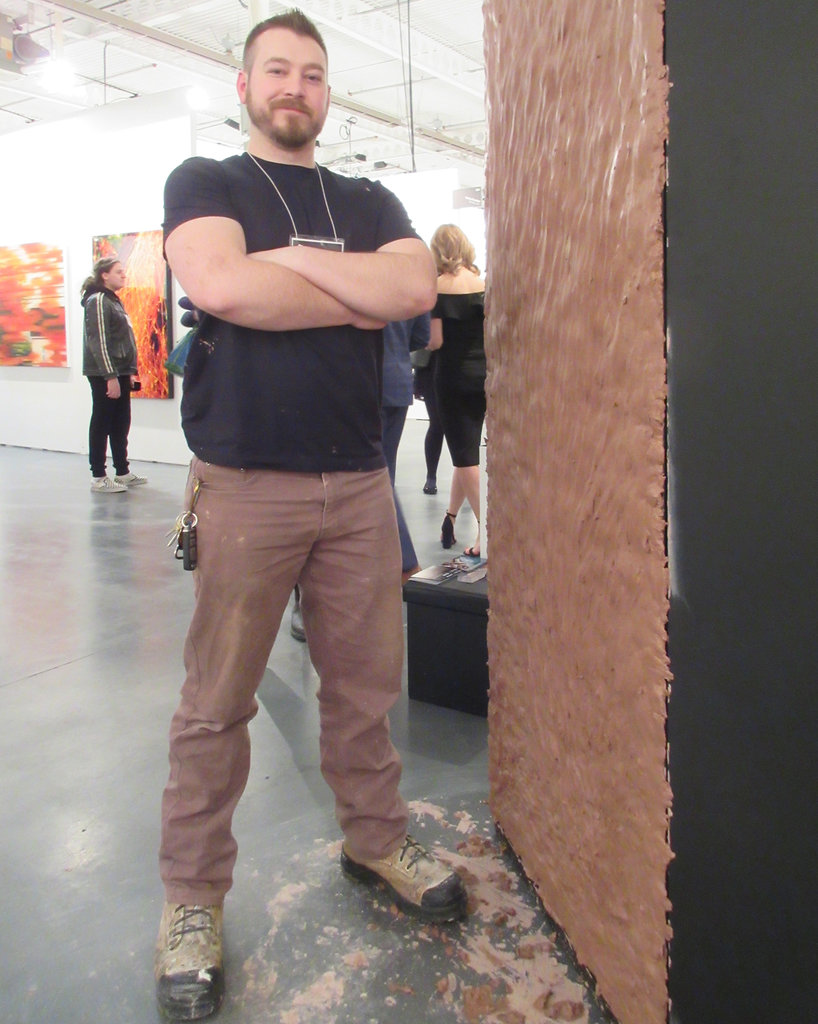
    Chicago-born Ryan Pechnick came to OCAD U to further his studies. He liked it here and stayed, now working at a bronze foundry. He dubs himself as a Metamodernist, an aesthetic practice blending art with a panoply of fields, such as history, philosophy, science, and religion. His Artist Project piece consisted of caking clay on the mirrored face of a slate-coloured monolith. Throughout the course of the exhibition, the wet clay dries, cracks, and falls to the floor a bit at a time, exposing the glassy surface. If there is a spiritual lesson here, it might be that we are all made of clay, or the dust of the earth, as it says in the Genesis account. Only through the cracks of the clay can we see ourselves as we really are. It’s how the light gets in.

    Ryan Pechnick

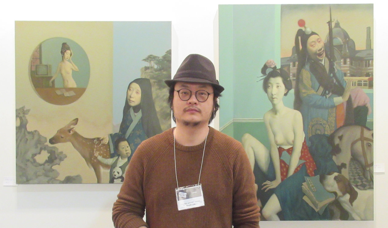
    Jeffrey Chong Wang’s talent lies in his masterful excavation of historical painting styles, particularly the classic Florentine period. He sees himself in the various figures that populate his canvases. Like the characters in a drama, they are not only an exploration of the history of art, but reflects his own cultural upbringing, feelings, and experiences. The canvas becomes a stage, allowing himself to perform many roles. I was familiar with Wang’s work through Engine Gallery. As it turns out, the artist has an exhibition opening at Gallery House on Dundas Street West this coming Thursday.

    Jeffrey Chong Wang

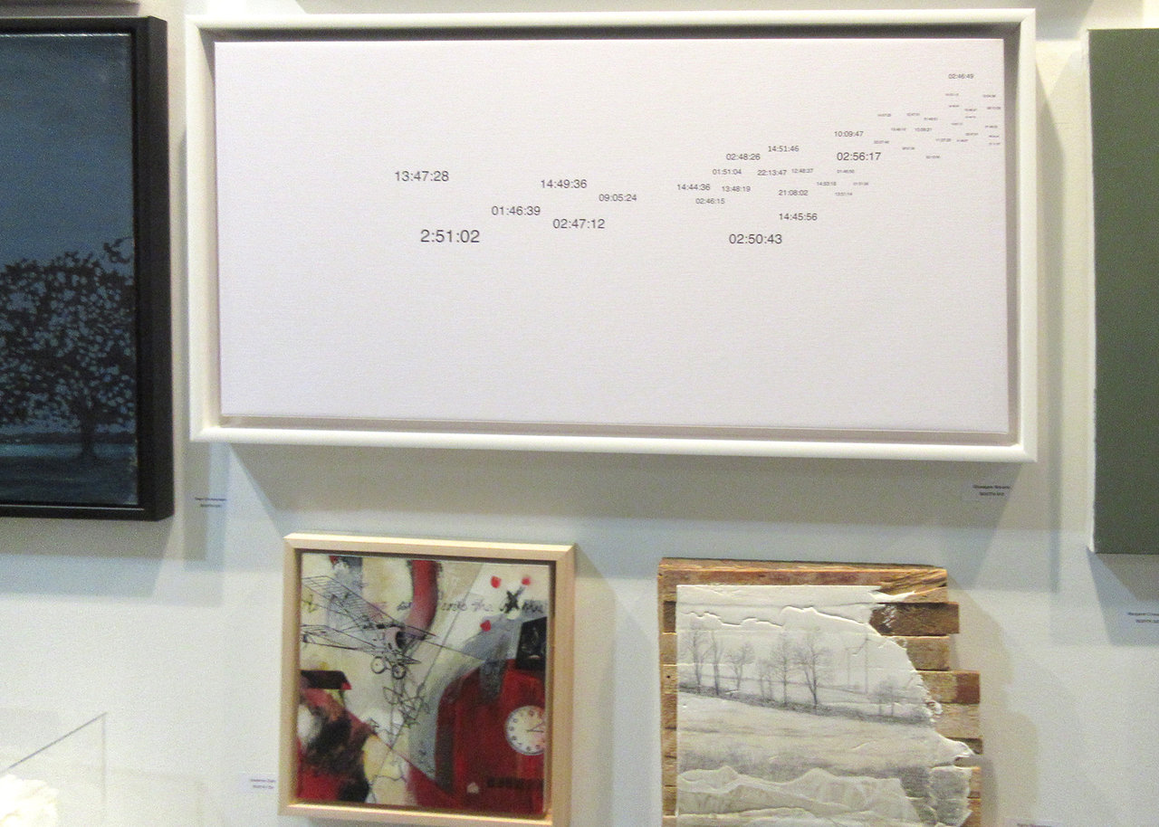
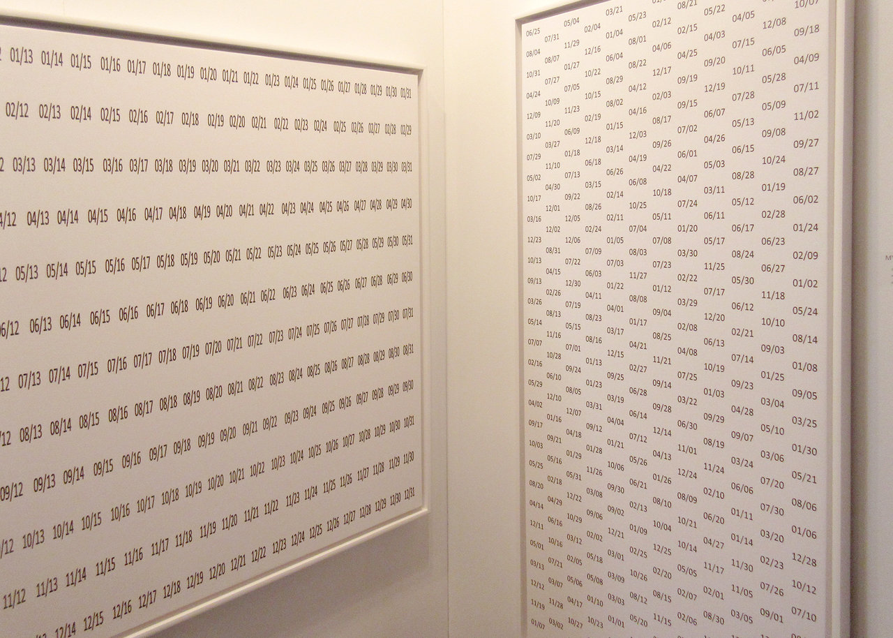
    Formerly a mathematician, and now retired, Giuseppe Morano is making art that reflects his interest in numbers. The artist has a work in the Time Flies Artist Competition near the entrance of the exhibition. He took the competition title literally by modelling his work on Vincent van Gogh’s “Wheatfield with Crows,” considered to be the Dutch artist’s last painting, and one of his greatest. Morano precisely mimicked the wing positions of each crow in van Gogh’s paintings with the hands of a clock, printing the exact time that the wing alignments signify. In Morano’s black numbers on white canvas, not only does time fly, it speeds as the crow flies. If “Wheatfield with Crows” was indeed van Gogh’s last painting, we can picture the crows taking flight at the sound of the fatal gunshot.

    Work by Giuseppe Morano

    Text and photo: Steve Rockwell

    *Exhibition information: February 23 – 25, 2018, Better Living Center, 195 Princes’ Boulevard, Exhibition Place, Toronto. Hours: Friday: 11 – 10, Saturday: 11 – 8, Sunday: 11 – 6 p.m.


  • The Artist Project 2018

    Installation view with Isabella Di Sclafani’s installation

    February 23 – 25, 2018
    Better Living Center
    195 Princes’ Boulevard, Exhibition Place, Toronto

    Every year, one of Toronto’s greatest contemporary art fairs is undoubtedly The Artist Project. The 2018 edition is no exception, in terms of brilliances and artistic merit that the fair has become renowned for. Held inside the CNE fairgrounds, the Better Living Center manages to contain within it a more tremendous and culturally significant amount of established and raw talent than can be appreciated within a single visit.

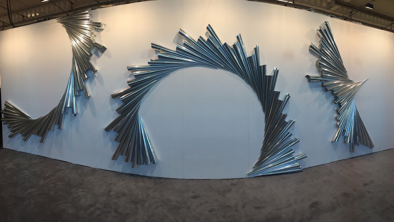
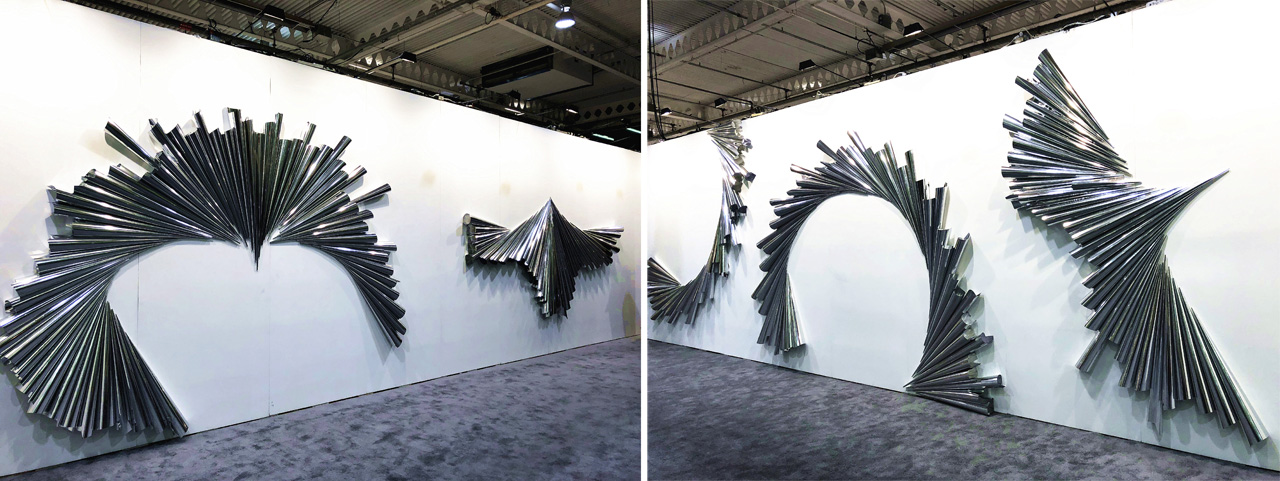
    Upon entering the exhibition, the work Shine On by Nathalie Sanche greets the visitors. A series of silver, rolled foils assembled as decorative, geometric designs welcome the visitors with their luminous and captivating image into the space and guides them past the initial reception.

    Nathalie Sanche, Shine On (2018)

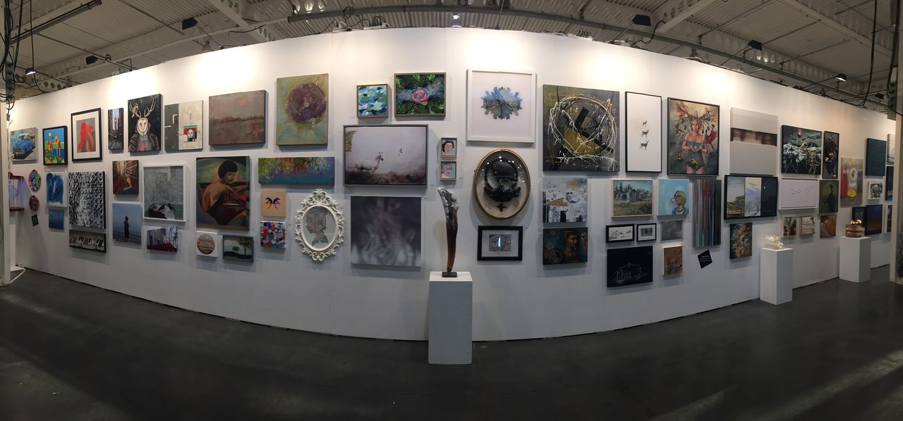
    Next, audiences are led to an array of work submitted to the Artist Project’s sponsored competition. The dedicated wall was filled with submissions from nearly, if not all, of the participating artists in the fair. The theme, inspired by the Swiss matchmaking company Swatch, was the colloquial interpretation of “Time Flies”. Artists from the fair responded to the theme, in a variety of ways, to compete, in accompaniment of the voting participants, for prizes and recognition. The salon-style assemblage of work proved as an introductory taste of the full exhibition taking place further within the venue. Themes emerged from the vast spectrum of work, such as the trending social media hashtag “Time’s Up”, as well as symbolic or metaphorical representations of the expression.

    Time Flies Competition, Sponsored by Swatch

    One of the initial booths that established itself as a cohesive and powerful body of work was Dania Elcharbini’s, a striking collection of greyscale and gold. Deeper exploration into the paintings revealed that the artist had created these beautiful portraits and figurative compositions with the intent to inject unnatural and inhuman textures into otherwise familiar forms. Closer proximity to the work revealed these hidden ripples, roughness and patterns that from afar would be easily missed. The series managed to seduce audiences from a variety of backgrounds, hijacking the social values and aesthetics of gold.

    Artist Dalia Elcharbini

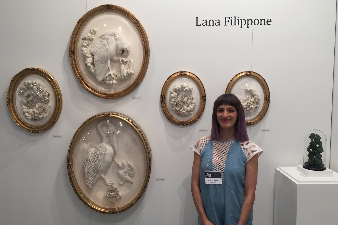
    Another artist whom enthralled audiences was Lana Filippone. Her work was exhibited in the Salon National de Beaux Arts within the L’oeuvre in Paris, as recently as December 2016. Her porcelain pieces are heavily inspired by ancient alchemy. Animals, flowers, body parts and organs retrieved their ancient symbolism and mythologies to compose vignettes of allegorical scenes describing the artist’s personal and critical views on modern life. The works themselves held their own autonomy, only a brief conversation with the artist unveiled their true meaning.

    Artist Lana Filippone

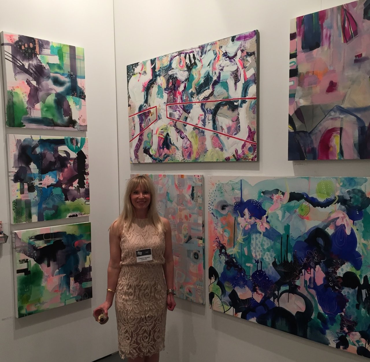
    Synnove Seidman provided delightful and positive contributions to the general ideology of the fair. She described her work as “the balm on the society of life” which she elaborated to mean that by rendering, aestheticizing and disseminating joy, she was contributing to the healing process which is the modern world so desperately needs.

    Artist Synnove Seidman

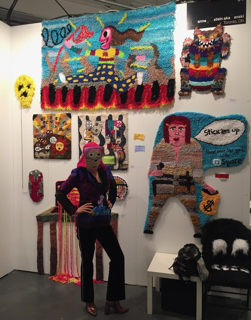
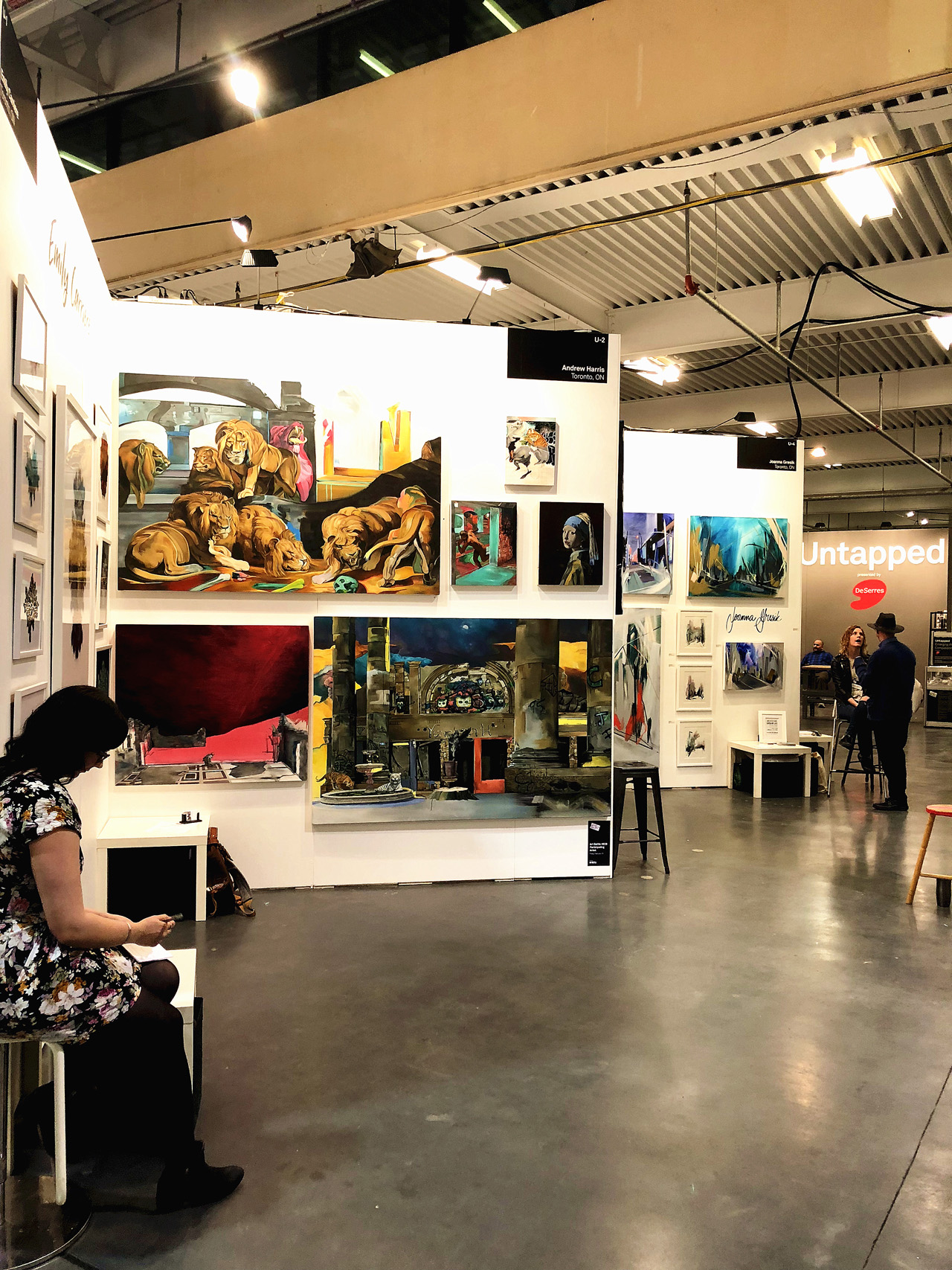
    As a part of the Untapped section of the fair, Anna Stein aka anski stands out with her wall-based rug works. Originally from Nova Scotia, the artist appropriated the tradition, folk medium of rug-hooking to embrace the post-internet age and render cartoons, memes and similar punk aesthetics in the otherwise, regularly conservative medium.

    Artist Anna Stein aka anski

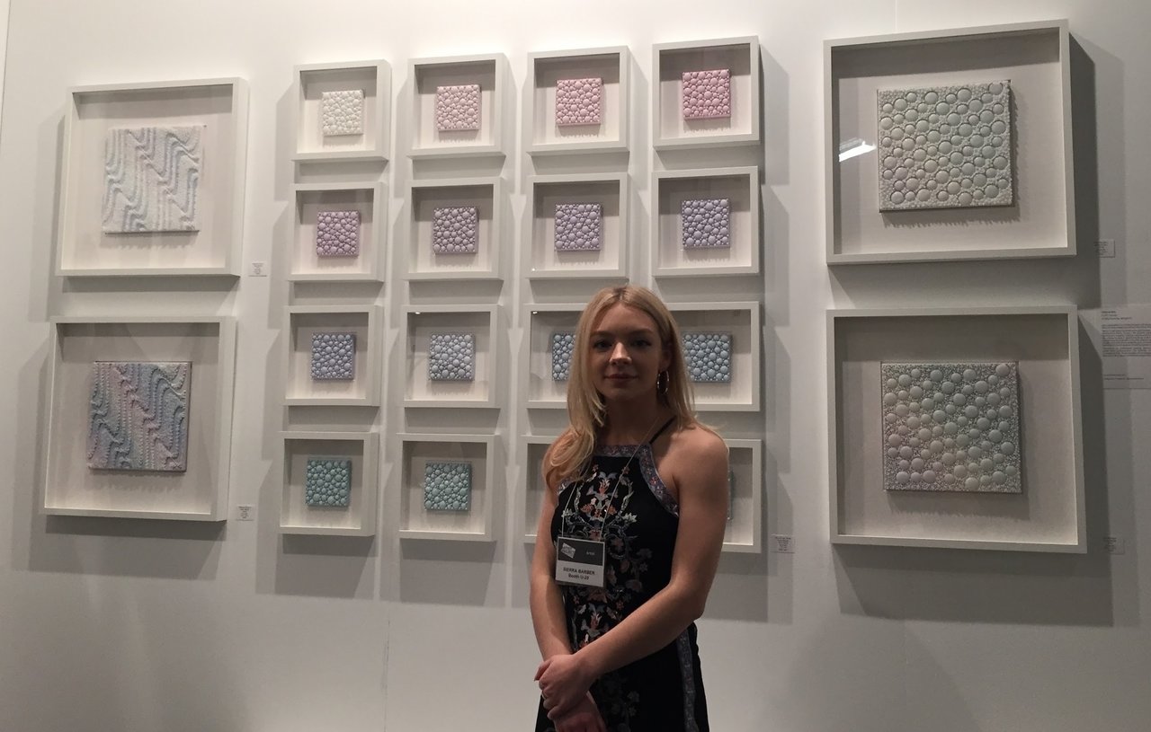
    Another talented participant in the Untapped section, Sierra Barber uses encaustic medium to compose her series of textured and layered works. She described her work as “perfect for Spring” which resonated true, since the work resonated with the traditionally pastel palette of Easter and the Spring Equinox.

    Artist Sierra Barber

    And there are so many more artists with interesting work, it is impossible to see them all.

    Artist Loraine Mohar

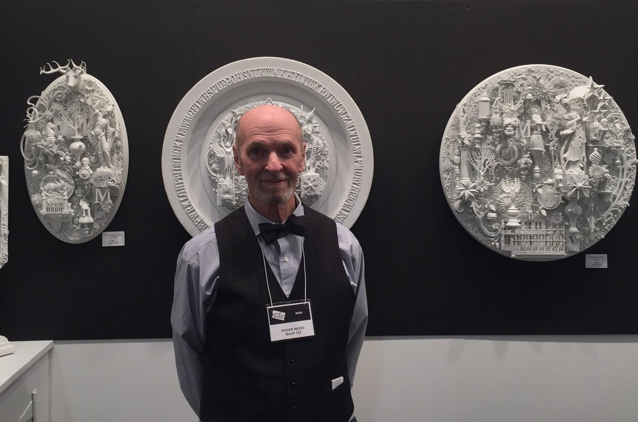
    Artist Roger Wood

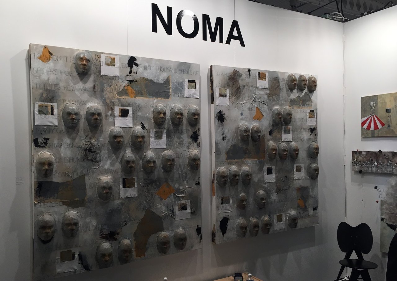
    NOMA Bliss

    Work by Hugo Cantin

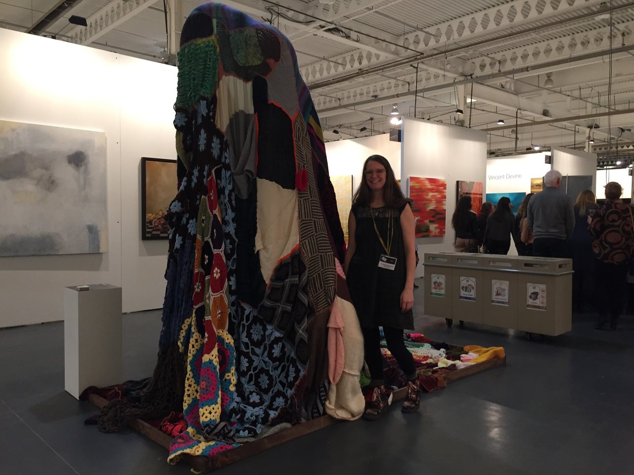
    Artist Claire Bartleman with her textile

    Work by Sandra MacGillivray

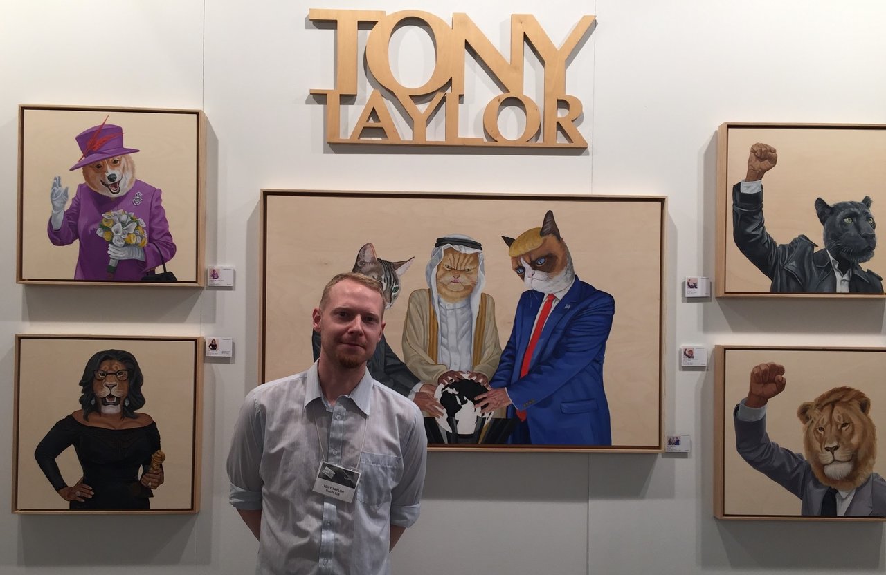
    Artist Tony Taylor

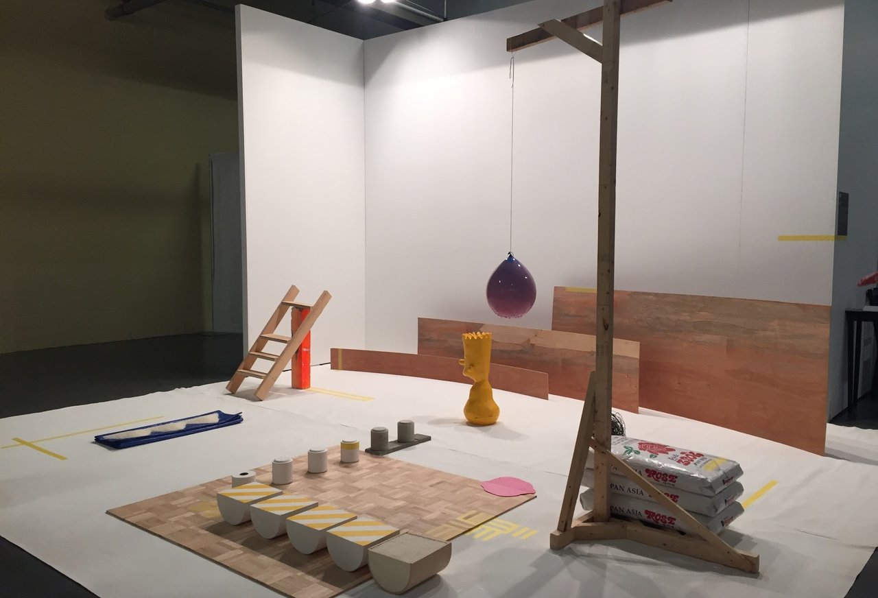
    Sangmin Lee’s Undressing Bart

    The Informa Canada team has managed to put together a wonderful fair in 2018.

    Text and photo: Nathan Flint

    A photo journal by Sophie Wang:

    The Entrance Project by Nathalie Sanche, Shine On

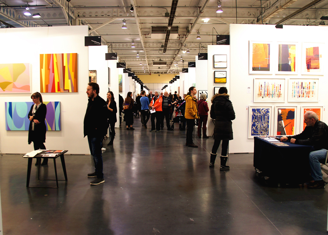
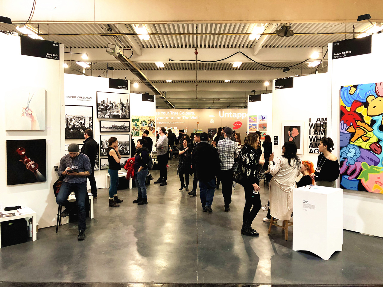
    Installation view with visitors

    Carlos Delgado

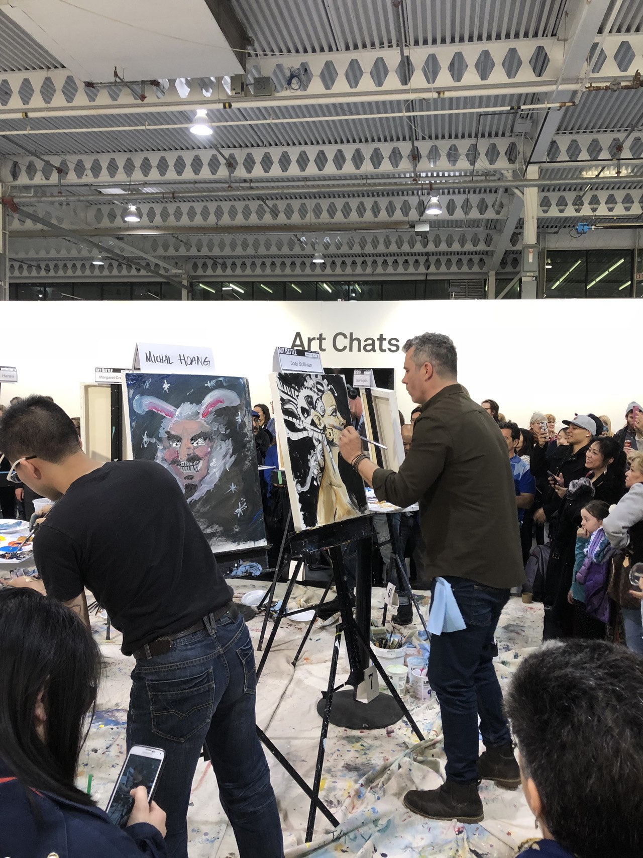
    Work by Joel Sullivan

    Art Battle #638, Friday, February 23

    Ramona Nordal

    The Untapped Emerging Artist Section

    The Untapped area

    *Exhibition information: February 23 – 25, 2018, Better Living Center, 195 Princes’ Boulevard, Exhibition Place, Toronto. Hours: Friday: 11 – 10, Saturday: 11 – 8, Sunday: 11 – 6 p.m.

  • Not Too High, Not That Low / Division Gallery

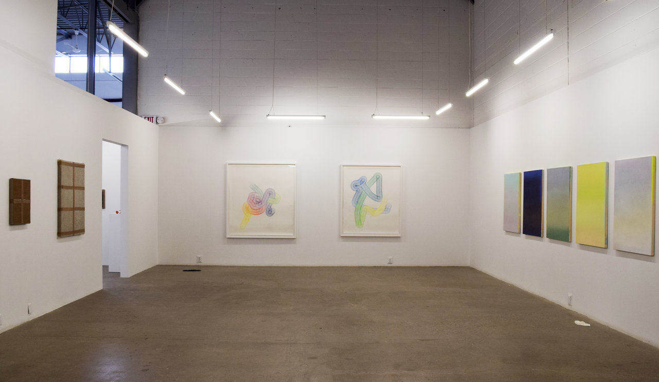
    Not Too High, Not That Low is a group exhibition that employs a myriad of materials and subject matter to explore the potential effects of manipulating surface. Rather than use textures and mediums as an artistic tool that ultimately contributes to a larger theme, these artists focus on the medium as the subject itself. Surface, explained here as having a dualistic – even antagonistic – purpose, can act “as both a container for illusionistic space and an obstruction that rejects the appearance of depth.” With this strategy, the works also allude to societal concepts of consumerism and socio-economic class differences as well as aesthetics that embrace “mobility, repetition, and the construction of composition.” By implementing synthetic, readymade materials, the exhibition presents an interesting challenge to normative forms of art.

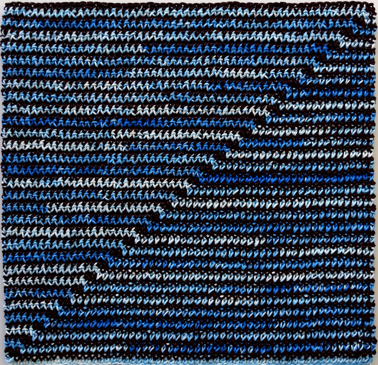
    While weaving and painting have been historically established techniques, Angela Teng seamlessly combines the two into a distinctive entity in of its own. Instead of textiles, she utilizes pre-prepared acrylic that emulate woolen textures. It is intended to juxtapose hard-edge painting (an abstractive technique that uses highly contrasting colors) and textile work, which have been commonly associated with masculine and feminine roles.

    Angela Teng, Diagonal (blue, white and violet), crocheted acrylic paint on aluminum panel, 20 x 20 in

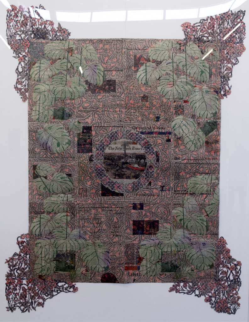
    Similarly, Myriam Dion hybridizes collage and weaving to explore the intrinsically human elements of the often-theatrical mass media. With the growing accusations towards “fake news” media outlets and stories, she critically depicts the credibility of these sources despite the surrounding abstractions that shroud the absurdity or unfeasibility of the news.

    Myriam Dion, Tapisserie aux Mille-Fleurs, A moment of Beauty in a Land of Misery, newspaper cut with X-acto knife and collage, 63 ¾ x 85 in

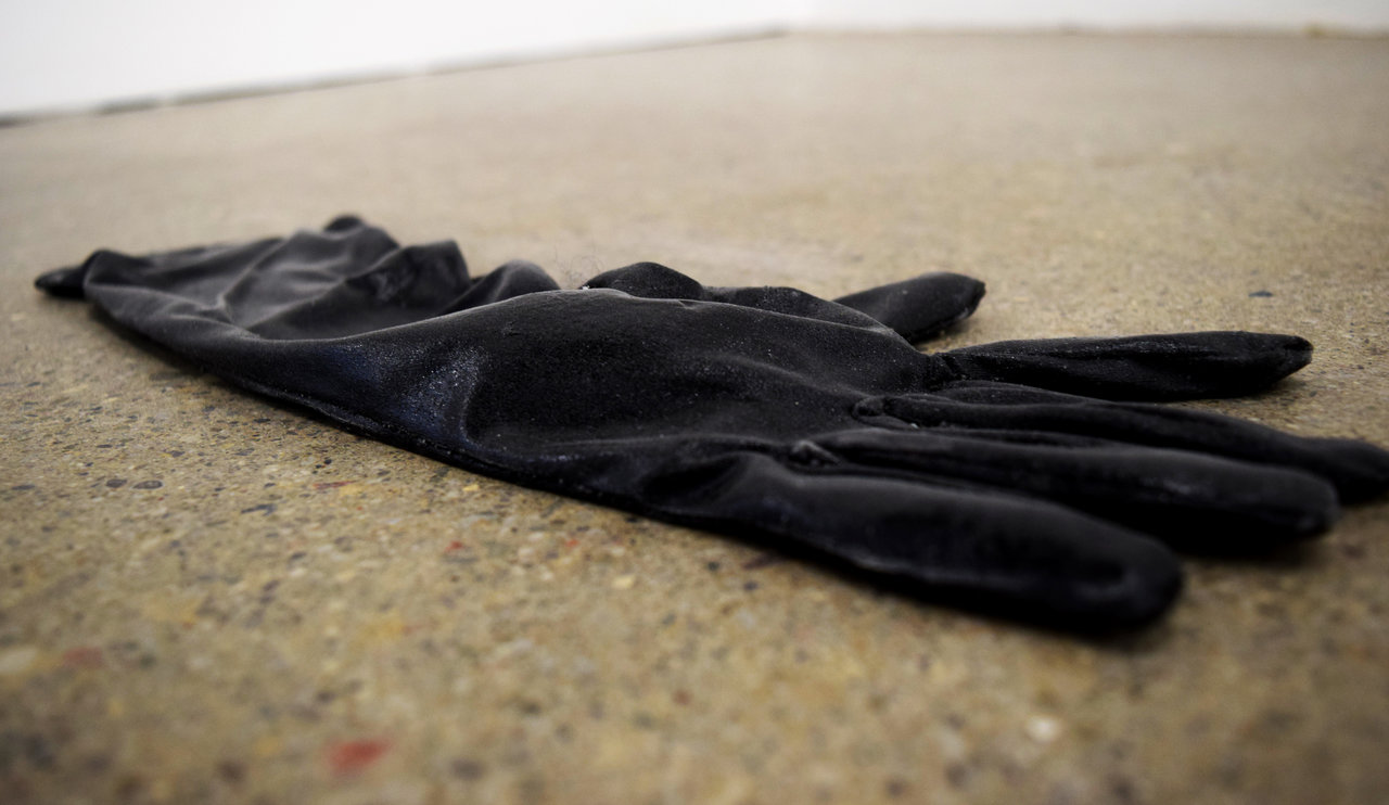
    Brittany Shepherd scatters fabricated polyurethane gloves throughout the space to explore the various implications of these objects in different social contexts. Using black and white wax, it can be portrayed as both a high-society eveningwear or a worker’s cleaning implements.

    Brittany Shepherd, Phantom Limb (Black Right Hand), polyurethane,15 x 3.5 x 1 in

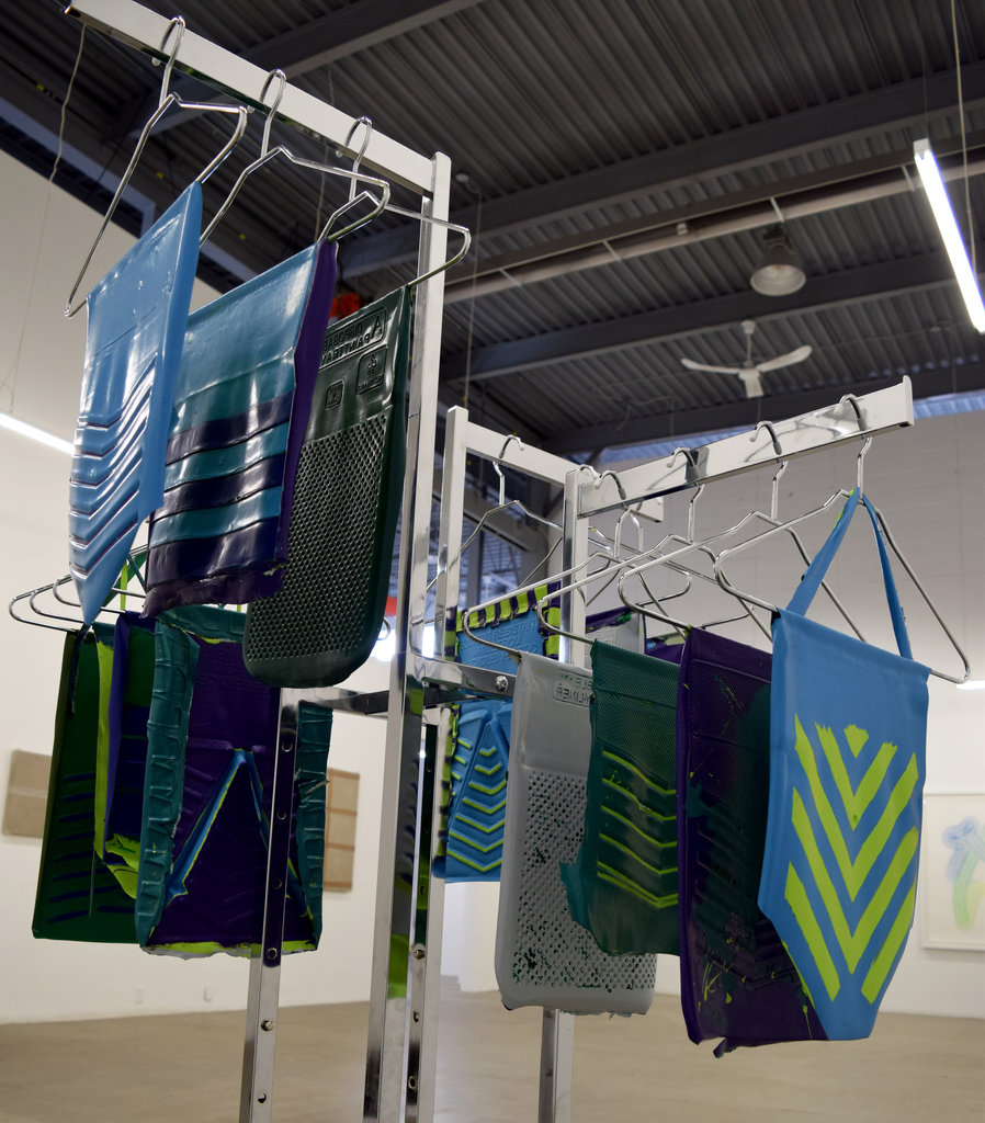
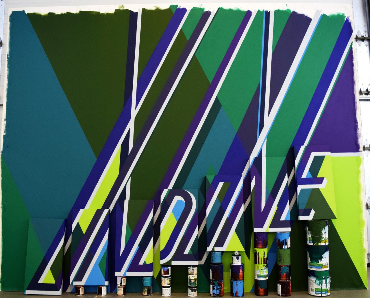
    Eleanor King uses paints trays as moulds to portray bathing suits; taking a tool used for studio work and transforming it to produce a commercial item with flexible social value.

    Eleanor King, Bathing Suit installation, latex paint and chrome hanger, sizes vary

    Eleanor King, (she’s come) Undone, latex paint, canvas, wood panels, paint cans, 119i x 18.5 x 97 in

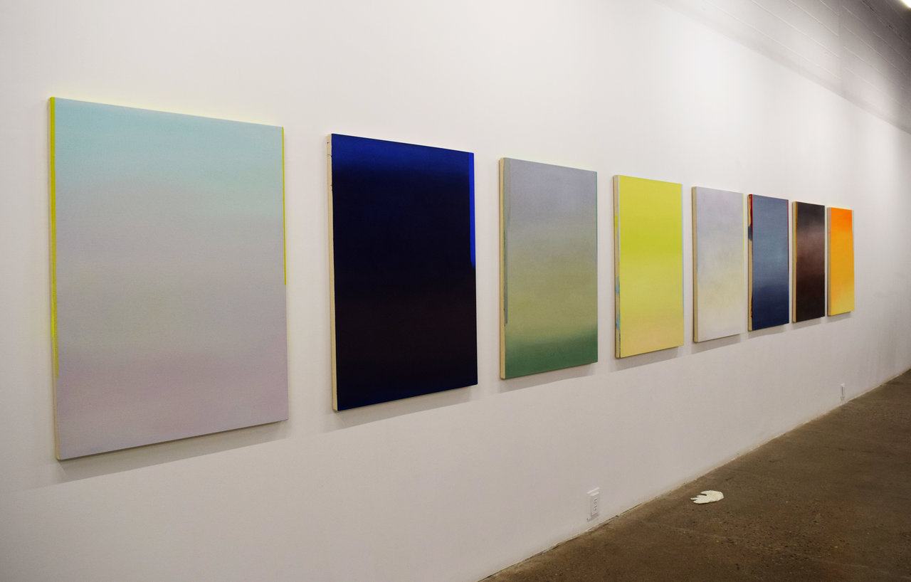
    Wanda Koop explores the unique aesthetic effects of watercolor and acrylic paints. While appearing soft and faded like a watercolor piece, her technique actually used the thick, solid acrylic medium to simulate this appearance, making sure to leave subtle signatures that allude to its actual quality. Her collection conveys both a misty visage, yet with a lingering radiance, to mimic the presence of light.

    Wanda Koop, (left to right) Still Silver, Still-blue, Still Soft-Blue, Still-Yellow, Still-Amber, Still-Crimson, Still-Gold, Still Ice Green, acrylic on canvas, each 30 x 40 in

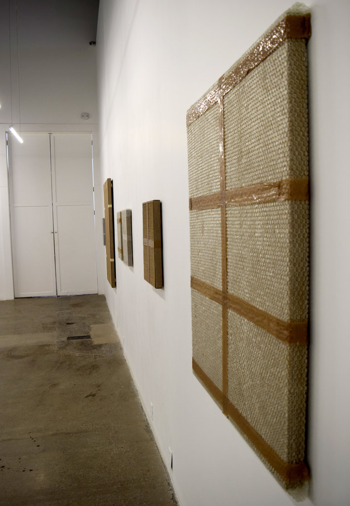
    Tammi Campbell borders on the line between abstraction and realism, readymade and handicraft, illusion and real. Moreover, she further demonstrates the versatility of acrylic as a medium and its capabilities beyond traditional approaches to painting. Although seeming to be simply industrial materials (tape, cardboard, bubble wrap, etc.) assorted onto a canvas, Campbell fashioned these elements out of acrylic paint, emphasizing their unique physical –particularly textual – qualities. Compositionally, they appear as nondescript readymade arranged into abstracted patterns, however the elaborate consideration to persuasively depict these mundane materials adds an additional layer of complexity.

    Tammi Campbell, Assorted works beginning with Monochrome with Bubble Wrap and Tan Packing, acrylic on linen, sizes vary

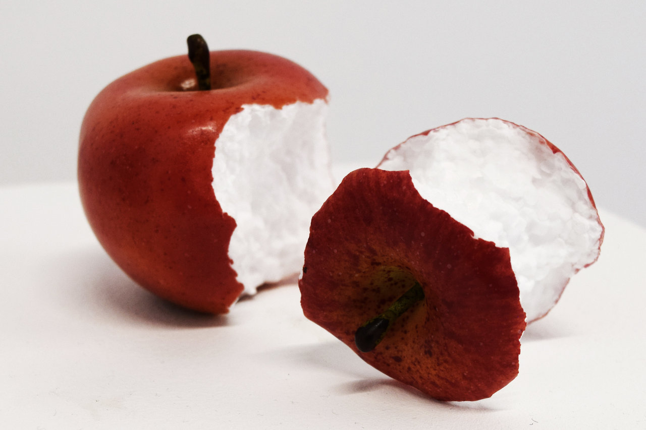
    Bea Fremderman strives towards bridging organic and inorganic objects. The fruits appear as realistic when examining their exterior, noting the careful intricacy in the natural texturing and appearance of the peel. Meanwhile, the fruit’s core made of Styrofoam contradicts its outer aesthetic, adopting synthetic characteristics to the natural outlook.

    Bea Fremderman, Apples, styrofoam and vinyl, 4 x 8 x 6 in

    This exhibition is inherently exploratory, with an array of considerations to spaces, mediums, textures, techniques, and societal themes that can complement or deject each other. The seven artists featured in Not Too High, Not That Low present intriguing and insightful views about how art can manifest outside of restrictive, solidified practices that are otherwise taken as granted.

    Text and photo: Simon Termine

    *Exhibition information: January 25 – February 24, 2018, Division Gallery, 45 Ernest Avenue, Toronto. Gallery hours: Tue – Sat, 10 – 6 pm.

  • Eunha Kim & Kristen Fahrig at loop

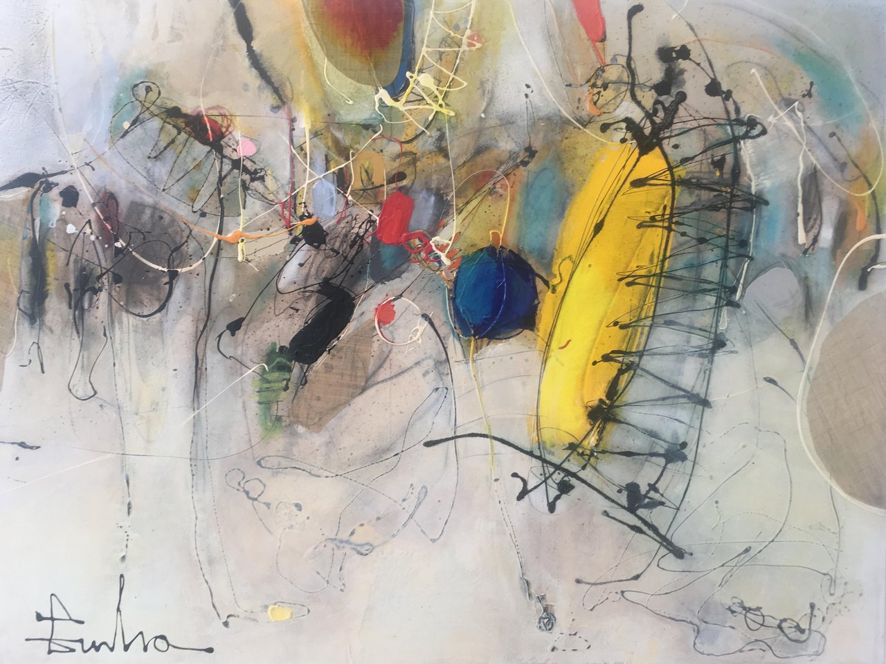
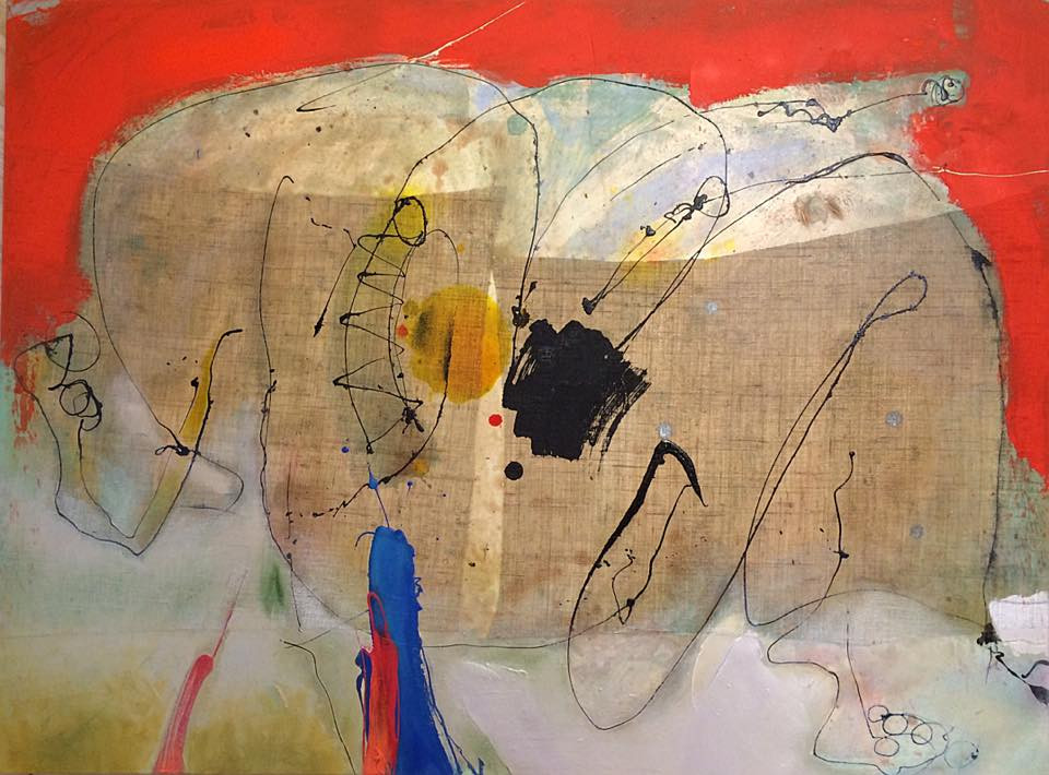
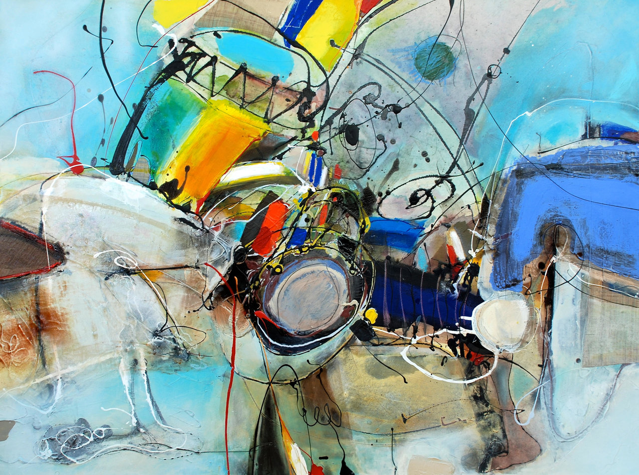
    The Toronto based Korean artist Eunha Kim has left her original country at a very young age. She lived on her own as an international student since high school. She said that the time she spent studying in London was very lonely and she was very homesick. One day, when she visited a farm on her trip back in Korea, she watched the traditional dancing ceremony called Nong-Ak, a form of folk dance, a rural ritual, which often performed by the farmers to celebrate their harvest after a year-long of hard work. She was instantly touched by the raw energy of the dancers. The movements, music, and customs have greatly inspired her. The accidental discovery of Nong-Ak brought her happiness, and it reminded her that life can be enjoyable. Upon returning to London, she started recreating these moments of joy in her artwork. She dripped paint freely on canvas in order to mirror the motions of dance; the head spans in particular. She used Korean traditional colors to portray the sound of music and motions. Her works are expressive and full of energy.

    Eunha Kim, Cheerful, mixed media, 40” x 30″

    Kim said at the opening reception, that in this exhibition “Happiness” is her favorite work. One interesting element of this painting is the attached brown fabric, a traditional Korean fabric that is used to dress deceased people. When asked for the reason behind this, Kim said, “We should remind ourselves that everyone’s final destination is death, so we should live our life with joy, and then leave it with happiness.”

    Eunha Kim, Happiness, mixed media, 40” x 30”

    Kim’s work can be easily misinterpreted as any abstract painting. However, it is not hard to find Korean elements in the details. In “Syncopated Motions” one can easily identify the drums, ribbon-hats and the choice of traditional Korean colors. She combines these symbolic elements with her unique way of depicting the motions and movements of Nong-AK on her canvases, in order to share her wonderful experience with the viewers.

    Eunha Kim, Syncopated Motions, mixed media, 40” x 30”

    Kristen Fahrig’s sculptures compliment, yet, at the same time juxtapose Kim’s joyful images. Unfortunately, no one could talk to Fahrig at the opening reception as she past away in November, 2017. She left far too early, and in her the Queen West community lost an activist, an artist who cared about people, education and made sure that their environment didn’t miss the artistic touch, as she filled playgrounds and squares with her sculptures and projects.

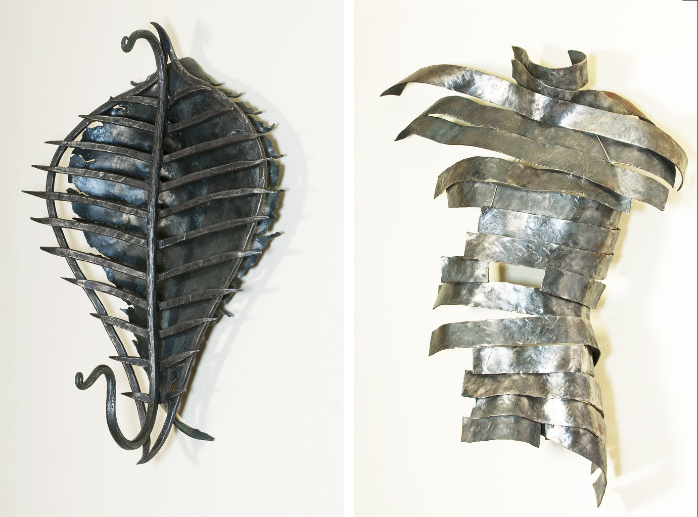
    Her posthumous exhibition, Body Imprints, is symbolic in many ways. The metal sculptures depict the bare minimum of the human body: a skeletal part or a simple outline. “Backbone Shield” with its steel spikes represent a strong armor and the bones that it might support; combining functional metal work with the human body. Some other works are even more stylized, “Dis-armed” reminds us of muscles and sinews “hugging” and supporting the body while “Filigree Torso” focuses on the decorative beauty of it.

    Kristen Fahrig, Backbone Shield, 2007, forged steel, 21.5” x 14.5” x 10” (left) & Dis-armed, 2008, forged steel, 39” x 25” x 12” (right)

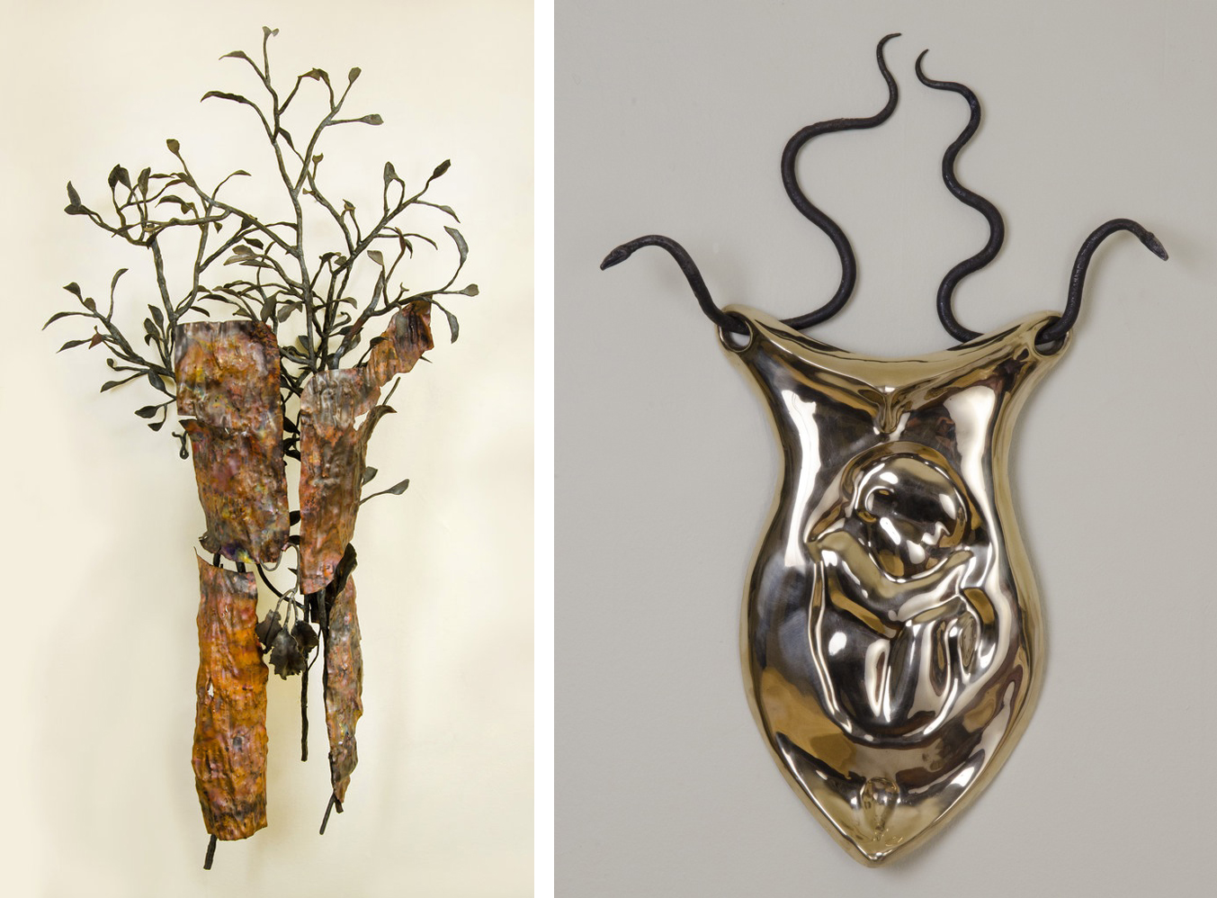
    All the sculptures are non-figurative. As Fahrig wrote, they are “about the skin, the shell that surrounds the body. It’s also about the imprints that the body makes, for example in sand or in long grass. The body is the negative space into which we can project ourselves and feel our connection with the earth.” Her latest work, “Bark Man” depicts a fractural human form entwined with a growing tree, crating a poetic symbiosis, as the two different life-forms live together in harmony.

    Kristen Fahrig, Bark Man, 2017, forged copper and steel, 64” x 33” x 24” (left) & Liquid Life, 2012, hand cast bronze and forged steel, 29” x 19.5” x 3.5” (right)

    However different are the artworks of Kim and Fahrig, they share the most important thing on Earth: the love of life.

    Summer Sun

    Images are courtesy of loop Gallery

    *Exhibition information: Eunha Kim, Joy of life & Kristen Fahrig, Body Imprints, February 3 – 25, 2018,  loop gallery, 1273 Dundas Street West, Toronto, (three doors west of Dovercourt). Gallery hours: Wed – Sat 12 – 5, Sun 1 – 4 p.m.


  • Figures of Sleep

    Figures of Sleep is one of the coziest – and one of the hardest to photograph – exhibitions. Both University of Toronto Art Centre and Justina M. Barnicke Gallery are dimmed down, with soft lighting warming up each artwork. It is a massive exhibition featuring nineteen international and national artists, including Rebecca Belmore, On Kawara, Ron Mueck, and Tehching Hsieh.

    Installation view of Figures of Sleep with Ron Mueck, Untitled (front) and John Sasaki, A Rest (back)

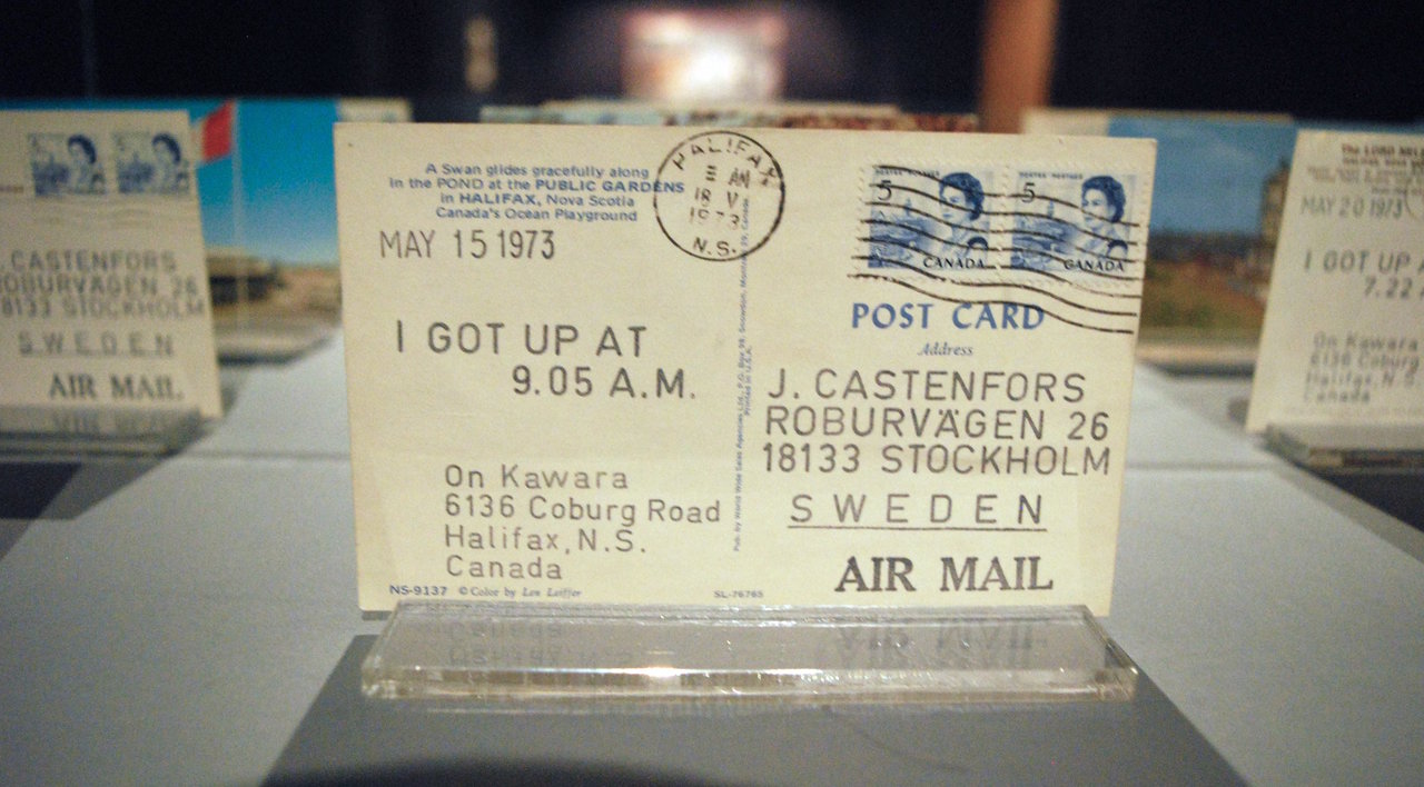
    In this comfortable and sleepy environment, curator Sarah Robayo Sheridan contemplates the role of sleep in the personal, social, and political. With postcards, On Kawara records the time he awoke everyday in “I Got Up, 14-31 May 1973.” These records of his habits are sent back to himself as he travels.

    On Kawara, I Got Up, at 9.05 A.M., May 15 1973

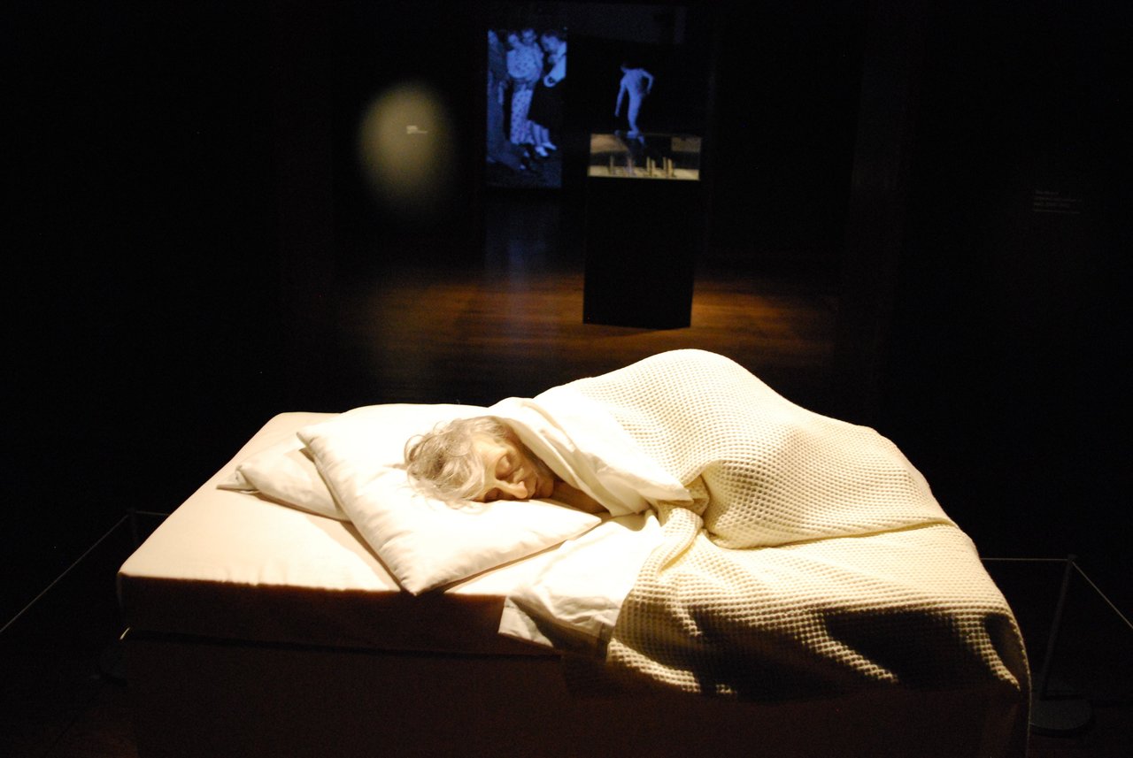
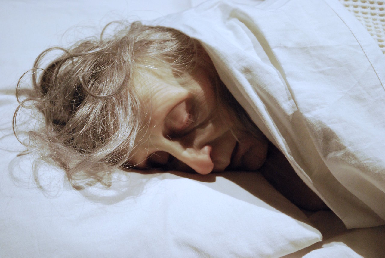
    Beside Kawara’s work is one of Ron Mueck’s famous hyperrealist sculptures. “Untitled (old woman in bed)” is realistic to the point of creepy and visceral. The old woman is very small, sleeping on an elevated bed in a fetal position. Facing away from the entrance, only her face is visible. Disheveled, aged, and exhausted, the woman sleeps with a lightness that makes it uncomfortable to stare for too long because she might just open her eyes. Heightened by her smallness and her oldness, we are reminded of the vulnerability that sleep forces us into.

    Ron Mueck, Untitled (old woman in bed). 2000-2002. Collection of the National Gallery of Canada

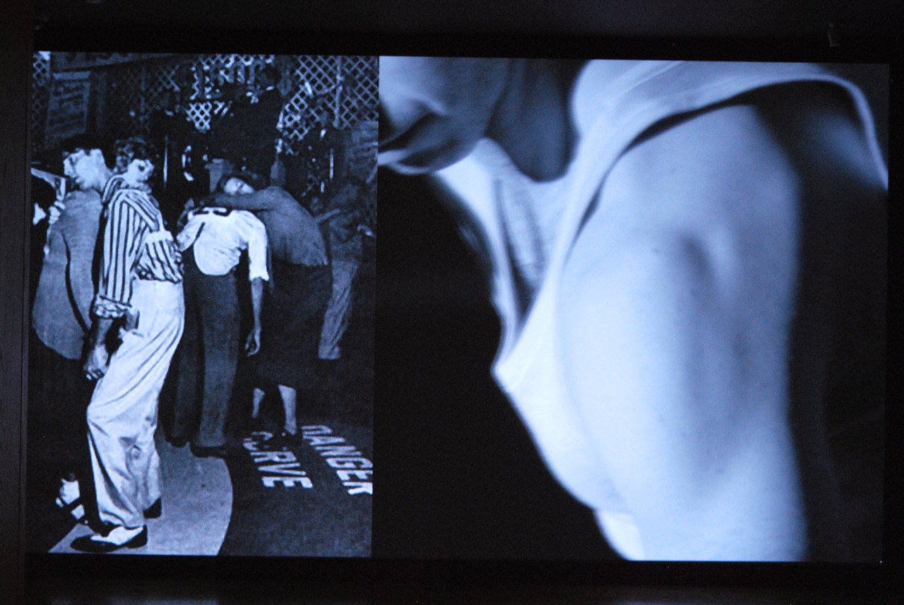
    More bodies are showcased opposite Mueck’s work. Jon Sasaki’s “A Rest” is a video installation juxtaposing old black and white photographs with a video of a lone dancer. The dancer on the right imitates the poses in the photograph, except without a partner. Over and over again the dancer attempts to push his body to recreate the poses that only possible by lumping over and holding onto someone. The awakened body desperately attempts to recreate the sleeping body to no avail.

    John Sasaki, A Rest, 2016, video. Courtesy of the artist and Clint Roenisch Gallery, Toronto

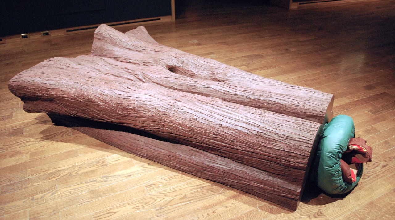
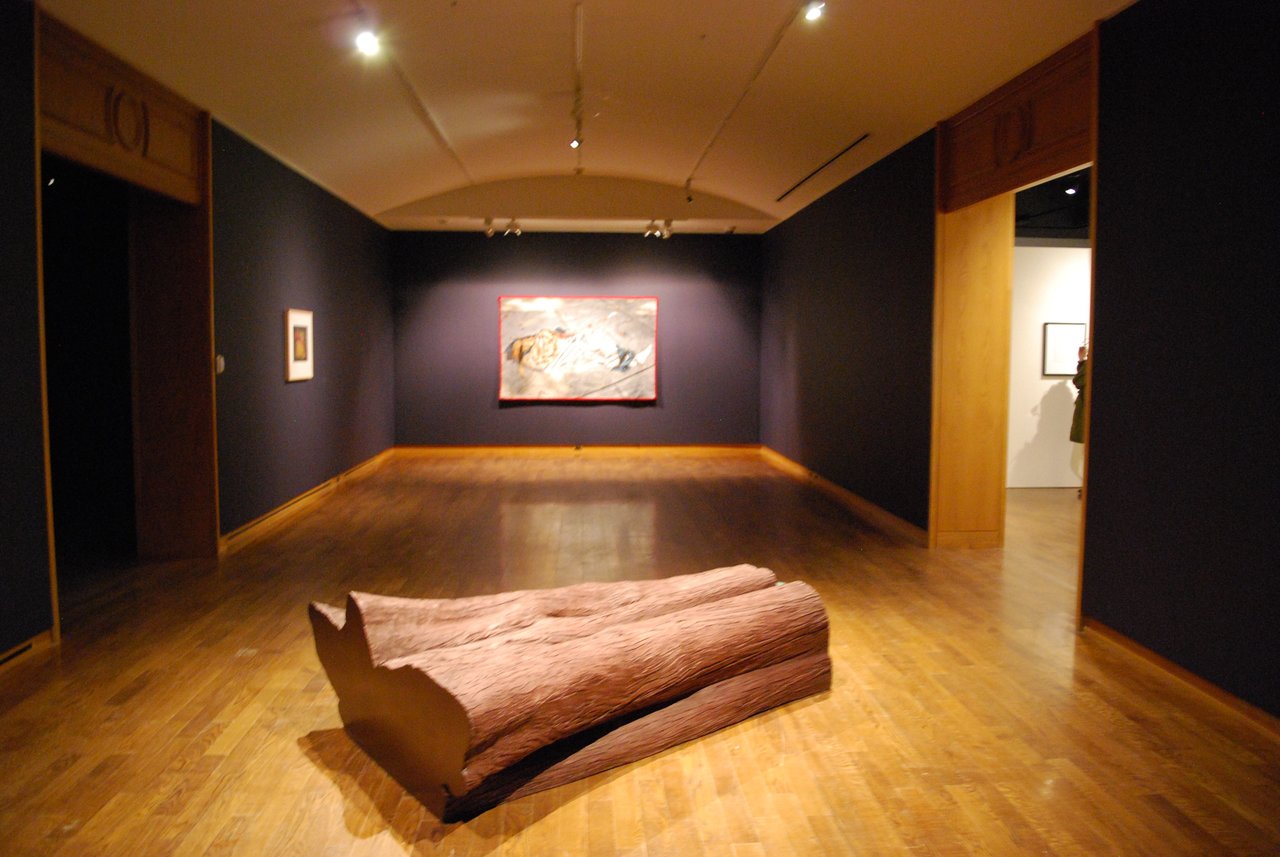
    Beyond, a massive log of wood greets visitors. It sits on the floor, occupying space. On one end is a smooth plastic cross-section and on the other is a rolled up sleeping bag stuffed into the log. Liz Magor’s “Burrow” exists in ambiguity. It reminisces the outdoors, but the sleeper is missing. A sense of risk lurks behind and the safety of the outdoor sleeper is questioned.

    Liz Magor, Burrow, 1999. Collection of the Vancouver Art Gallery

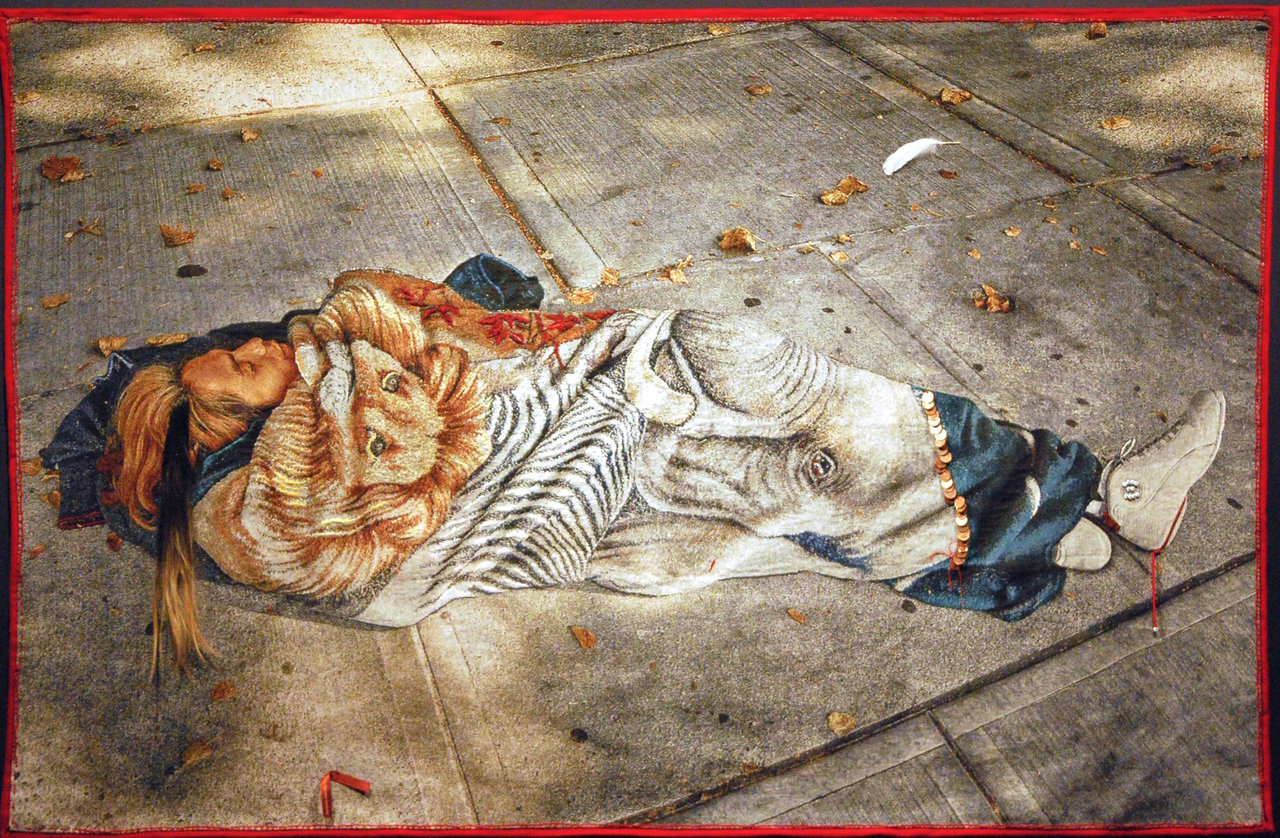
    From here the space transitions smoothly to Rebecca Belmore’s “Dream Catcher.” Hung at the end of the main space, this textile piece is positioned as the exhibition’s central piece. The fabric displays a person sleeping on a sidewalk, which, unfortunately, is a familiar sight. Wrapped in a bright animal-patterned blanket, the sleeper seems to be in a deep slumber. As Sheridan says, there is a “telescoping effect as the poignant details become visible.” Sewn into the digitally-produced tapestry are small highlights such as a strand of hair, feather, pennies, and a small ribbon with the words “indigenous genocide”. As part of a private collection, “Dream Catcher” usually sits on a bed. This effect of homelessness permanently situated on a bed is particularly interesting. Fusing the public sphere with the private sphere, Belmore addresses the complex sociopolitical issues of being homeless and being indigenous.

    Rebecca Belmore, Dream Catcher, 2014. Collection of John Cook, Ottawa

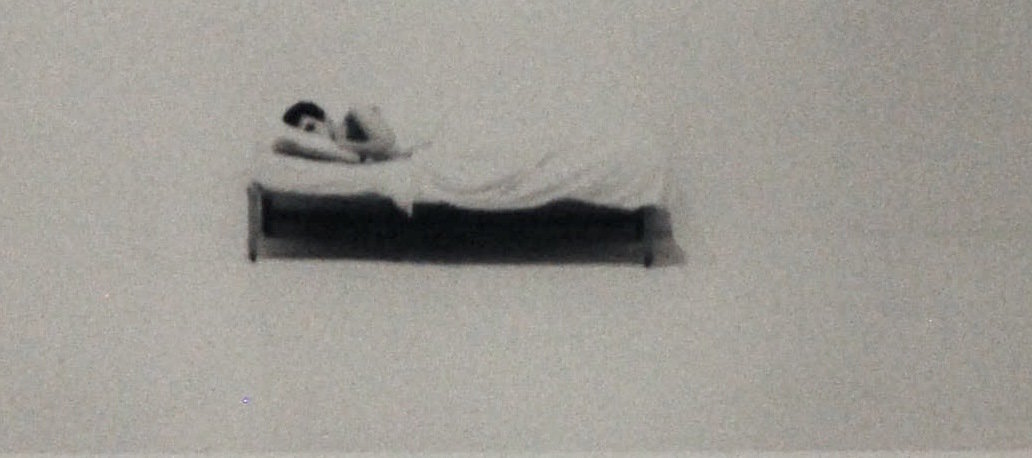
    A piece that also addresses complex issues in sleep is the documentation of Chris Burden’s performance, “Bed Piece”. In 1972, Burden spent 22 days in a bed in a gallery. During a time when performance art was yet to be widely recognized, Burden perseveres and alludes to the inability to get out of bed. The loneliness and immobility stemming from issues such as illness or depression is embodied in his performance piece.

     Chris Burden, Bed Piece, 1972. Courtesy of Ronald Feldman Gallery, New York

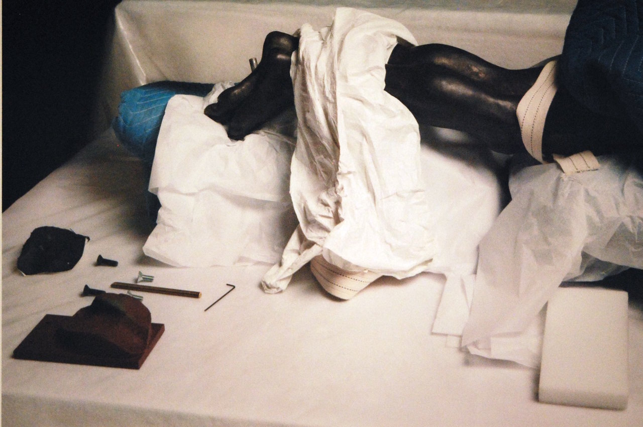
    Figures of Sleep is justified in its sizable exhibition. The discourse of sleep is varied and endless: from Chris Curreri’s “Corpus” – which connects archive with sleep by looking at ‘sleeping’ artworks in storages – to Tehching Hsieh’s “Time Clock Piece” – which pushes the limits of sleeplessness by standing in front a camera and clocking in every hour for one whole year.

    Chris Curreri, Corpus, 2015. Courtesy of the artist and Daniel Faria Gallery, Toronto

    Installation view of Figures of Sleep with Liz Magor, Burrow (front)

    This show’s contemplation of what sleep means for individuals as our society comes to a time where exhaustion is a medal to be worn in the race of productivity and capitalism. It is hard to tell whether this will change anytime soon, but Figures of Sleep reminds us of the importance of rest without the shallowness of today’s self-care messages.

    Text and photo: Sunny Kim

    *Exhibition information: January 17 – March 3, 2018, Art Museum University of Toronto, Justina M. Barnicke Gallery, 7 Hart House Circle, Toronto. Gallery hours: Mon – Fri, 12 – 5; Sat, 1 –5 pm.

  • The Artist Project 2018

    The Artist Project, 2017, Kevin Holliday’s Installation piece Rub. Photo: Phil Anderson

    February 23 – 25, 2018
    Better Living Center
    195 Princes’ Boulevard, Exhibition Place, Toronto
    Exhibition hours: Early Access Preview: February 23, Thursday 5 – 10 pm; Opening Night Party: Thursday: 7 – 10, Friday: 11 – 10, Saturday: 11 – 8, Sunday: 11 – 6 p.m.

    From seasoned collectors and first-time art buyers, to gallery dealers and interior designers, visitors can explore and discover works of art from over 250 top contemporary artists from Canada and abroad. This is a unique opportunity to meet and buy art directly from artists at Toronto’s most celebrated contemporary art fair.

    The Artist Project celebrates its 11th year with another exciting show from February 23 to 25, 2017 at the Better Living Center, Exhibition Place, Toronto.

    Opening Night Party: Thursday, February 22, 2018 / 7 – 10 pm.

    Celebrate the launch of our 11th show and be among the first to see 5,000+ works of art from over 250 top contemporary artists.

    Art Battle #638
    Art Battle Canada and Artist Project team up!
    On the evening of Friday, February 23 from 7 – 10 pm, AB#638 will be held on the show floor.

    There will also be Art Chats, Seminar Series and other interesting programs.

    For more information please check http://www.theartistproject.com/.

  • Interview with Nicole Collins

    Nicole Collins, 2017. Photo: Michael Davidson

    Interview with Nicole Collins (NC) by Emese Krunák-Hajagos (EKH)

    Nicole Collins has two exhibitions on at the same time, One Shot at General Hardware and Furthest Boundless at Koffler Gallery.

    EKH: For One Shot at General Hardware you wrote, “The final marks are black (for bile, melancholy), the very first time I used black on a painting, an indicator of an obsession that has played out over the ensuing 24 years and found its’ zenith in Furthest Boundless.” What came first: the theme of death or the color of black?

    NC: First I’d like to note the power of collaboration in creating exhibitions. The ability to bring out work from 1994 and hang it next to absolutely recent paintings is one of the real pleasures of working with Niki Dracos at General Hardware, who brings her fresh and insightful eye to the studio and sees things that are invisible to me. Mona Filip, Curator of the Koffler Gallery, my ‘sister in darkness’, gave me the location, vision and support to create a space for a deeper contemplation of this, our deepest question.

    Yours is an almost impossible question to answer…

    The theme of death could be argued to be the basis of all art, in that the life force drives us to make something, a painting, a song, a play, and each of these comes to an “ending”. Certainly, in my experience, death has been present since the age of 18 months when my 3 year old brother died, followed, too soon, by the passing of my father, my uncle, my younger brother and, much later, my mother. Alongside joy and creativity, loss and grief have been a constant presence, strange gifts that make each day feel crucial and very precious. In Humores, 1994, each of the four bodily “humours” (from Medieval medicine beliefs) were assigned a colour, culminating in “black bile”. The colour black, besides being the “absence” of, and contrast to light, can also be created by carefully layering all of the primary colours until they combine into a rich chromatic darkness. This colour that contains ALL colour has fascinated me, and its reference to darkness, the absence of light, has always struck me as comforting, a blanket of darkness in which to rest.
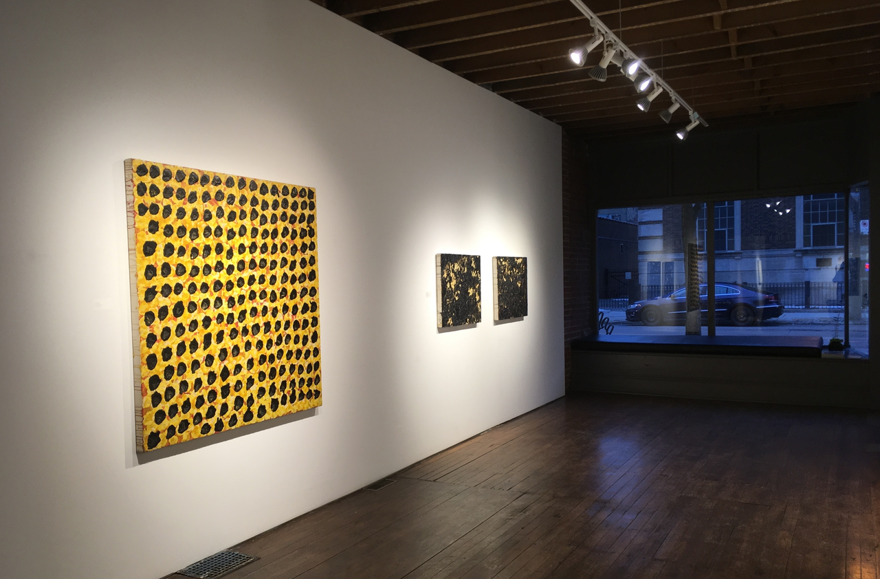
    Installation view of Nicole Collins, One Shot with Humores, 1994, 54 x 54 in, at General Hardware Contemporary, 2018. Photo courtesy of the artist

    EKH: You mention two concepts of Ancient Greek philosophy, Aphelion and Apeiron, that inspired you. How are these ideas embedded into your work?

    NC: I am very interested in both Greek Philosophy and Theatre, especially the vivid translations by poet and scholar Anne Carson. Another part of my research and process involves “dictionary diving”, using many different hard copy and digital dictionaries, dipping in, seeking the meaning of one word and wandering in the vicinity, leading to unexpected discoveries. In a series of “dives” I found both apeiron, a term used by the philosopher Anaximander to describe the boundless substance of origin for all life, and aphelion, the point on the orbit of a celestial body that is furthest from the sun, and therefore the darkest. When Mona Filip (curator at the Koffler Gallery) approached me to do an exhibition, I saw an opportunity to realize a much larger scale and ambitious installation than had previously been possible. As the work in Furthest Boundless evolved, I somehow conflated these two to create a space for open contemplation of that which we experience as an ending. As the video and sound cycle in and out of synch, reflecting into the blackness of the wall of wax and netting, circling back upon themselves, a possibility of continuation reveals itself. It’s all speculation of course. I’m in no hurry, but I am very interested in what happens to our consciousness after this body fails.
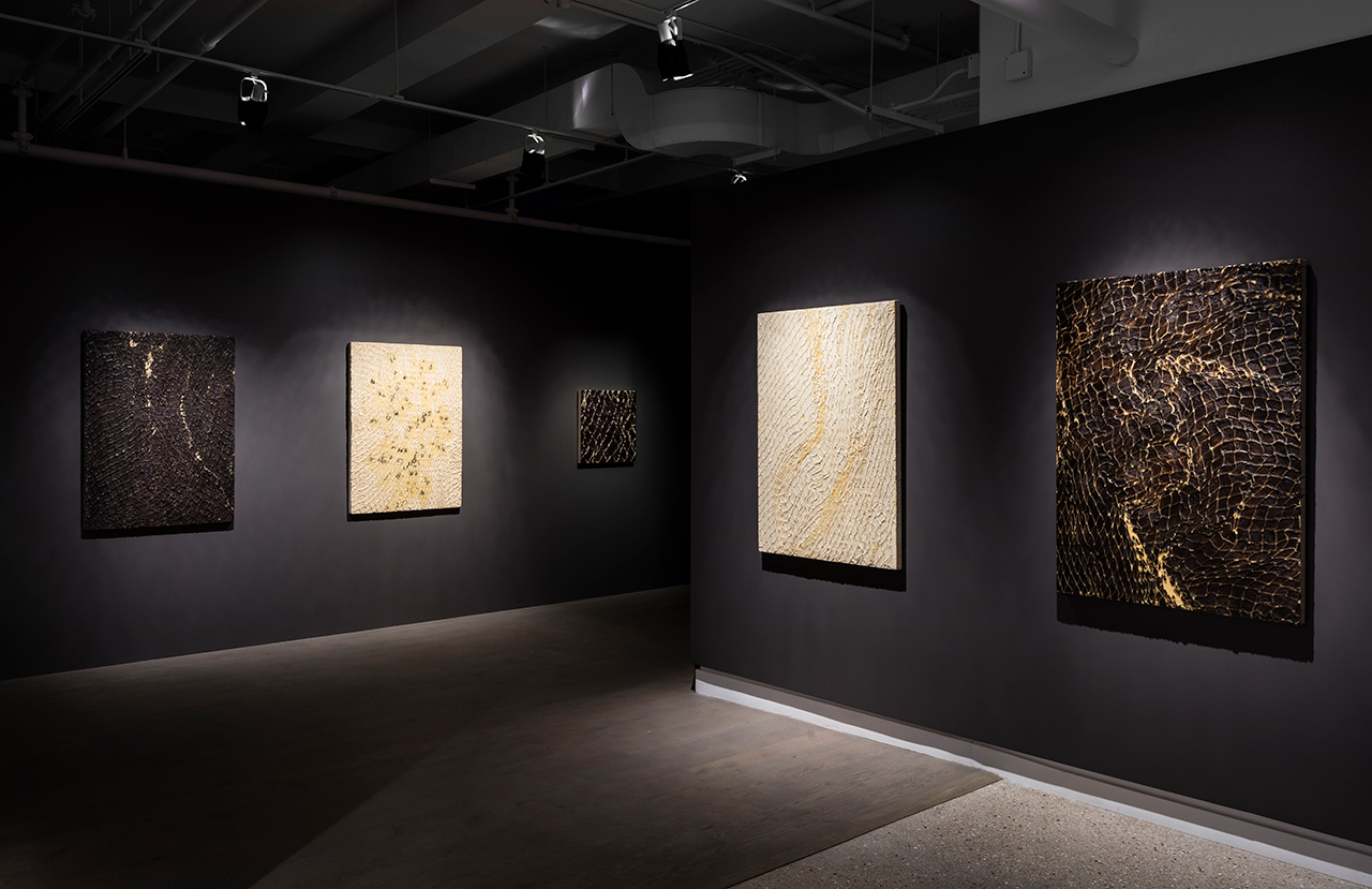
    Nicole Collins, Furthest Boundless, Koffler Gallery installation detail, 2018. Photo: Toni Hafkenscheid

    EKH: The installation at Koffler salutes and embraces death. Anxiety related to facing death and the unknown that follows is deeply rooted in the human mind. It forces us to ask the most difficult questions about the meaning of life and explore our greatest fears. Why did you choose death as the theme for this installation?

    NC: I feel that death chose me a long time ago. As a child I was unable to attend the funerals, and there was little to no guidance around dealing with grief, so for the most part it was just ignored and life went on. Ironically, despite all these losses, I am not especially good at dealing with death (of friends and acquaintances). However, I accept that some kind of transition will come to us all. It wasn’t until my Mother passed in 2009, leaving me as the last of my immediate family, that I felt free and able to explore the repressed grief that had accumulated, and more than ever, every day I try to do something meaningful and life-affirming.
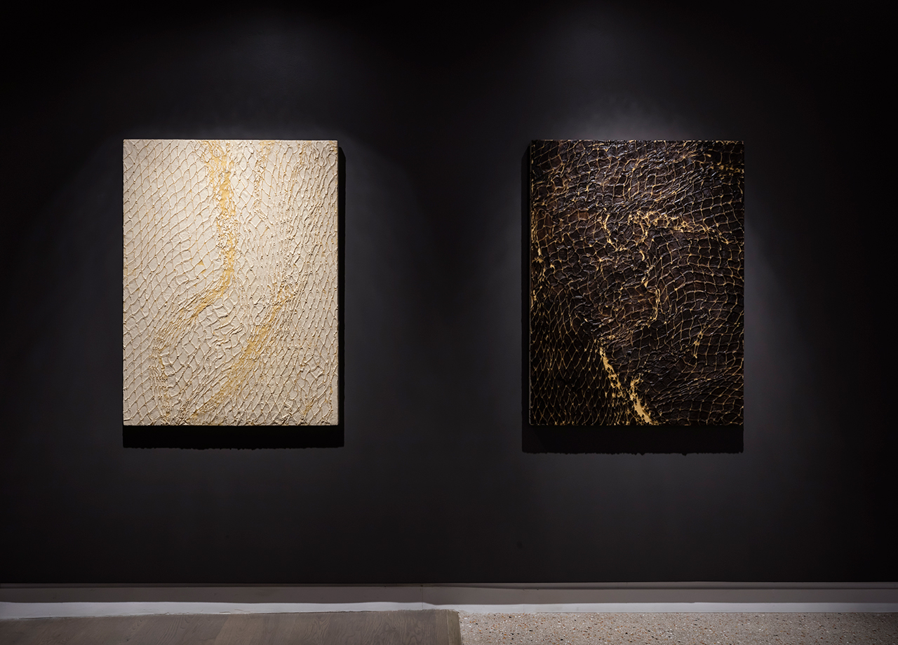
    Nicole Collins, Furthest Boundless, Koffler Gallery installation detail, 2018. Photo: Toni Hafkenscheid

    EKH: The texture of the mainly black paintings reminds me of wet soil stuck on shovels beside freshly dug graves. Where is this motif coming from and how do you recreate it in the surface of your paintings?

    NC: There is no re-creation in these works, but there is a lot of collaboration with the materials. In the Apeiron, I have hand-tied all of the nets and ropes, stitched together the ripped and broken fragments of burlap and coated all of them in the wax and charcoal encaustic paint that gives them their colour, texture and form. There is a meditative and ritualistic quality to this making that I could never hand over to a studio assistant, no matter how long it might take to realize the work (in this case about 2 years). Wax, when applied in specific ways, has an innate tendency towards texture, which seems to me, to reflect a material memory. The microcrystalline wax is a petrochemical by-product and brings the ancient earth with it; the charcoal is burnt wood, and shows traces of its previous life as bark and bough.

    In the framed paintings, the texture comes from the application of hot, pigment-soaked wax and the process of embedding woven and netted fibres, layering, and then removing them, leaving behind the image of what was there, a “present absence”.
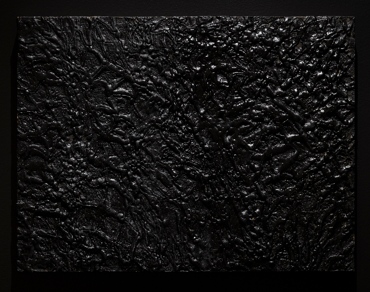
    Nicole Collins, Furthest Boundless, Calcine, 2015, Koffler Gallery installation detail, 2018. Photo: Toni Hafkenscheid

    EKH: Entering the back room in the dark there is a large woven nest – very dramatic. It felt like seeing the spirits of the dead trying to escape through the holes or hanging onto it for a few more moments saying farewell to this world. Please tell us more about the imagery of this wall and of your artistic method in creating it.

    NC: Well, I absolutely love this reading of the work. Apeiron, for me is both material and location. It is something outside of time as we perceive it. Someone referred to the ropes and rocks as holding the net up, rather than holding it in place. I did not plan that tension, but it certainly presented itself once the tying off took place. It’s worth noting that I do not have a 30-foot wall in my studio, and could only ever look at the work in components until the week of installation. Mona Filip, the curator, and Corinne Carlson, the lead installer, brought the whole thing home with pitch perfect design, environment, sound and lighting.
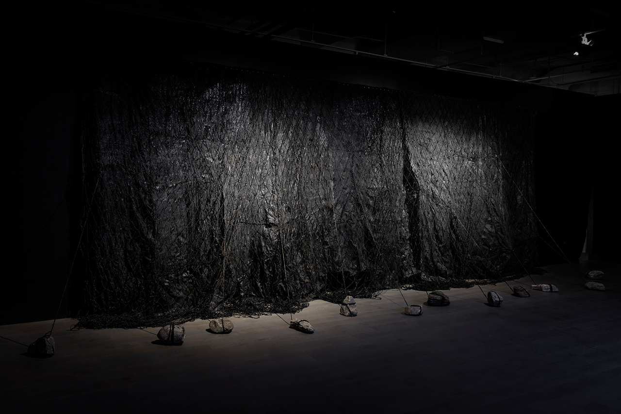
    Nicole Collins, Furthest Boundless, Apeiron, Koffler Gallery installation detail, 2018. Photo: Toni Hafkenscheid

    EKH: The introduction at Koffler says that “Driven by an impulse to repair, Collins’ visceral paintings attempt to suture, layer and preserve the damaged”. How did you approach this in the show?

    NC: The often futile act of reparation has always been with me, in large part because of the many illnesses experienced in my family, but also influenced by my Memère. During the Depression in rural New Brunswick she raised 8 children (of 16 pregnancies, child mortality being very high), made all their clothes, all curtains, bedding and carpets from salvaged scraps, ran a farm, a kitchen that fed many outside of her own family, and lived to 84 years. She taught me how to make pastry, how to crochet and sew a little. I think of her while I’m whip-stitching or basting torn and broken fragments of burlap or tying jute into nets in the studio.
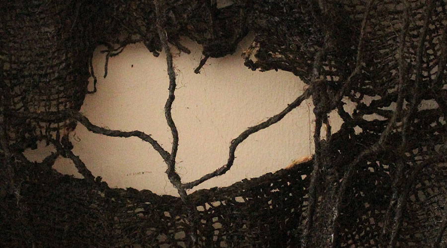
    Nicole Collins, Apeiron (detail, work in progress), 2017. Photo courtesy of the artist.

    EKH: Loss and grief have an overwhelming presence in this exhibition. The added video and sound-effects somehow lift the dark veil of the underworld and bring a more ethereal dimension to it. Please tell us how you decided on and incorporated them into the installation. Did you intend to modify the vision of death with them?

    NC: The video (Aphelion) and sound (Signal) are two of the 3 elements that make up Furthest Boundless (the third being Apeiron). I have written a short piece that is included in the Koffler Digital Publication, L’Esprit de L’Escalier, also the name of a wonderful sound piece by CCC that is currently featured in the stairwells of Artscape Young Place (http://www.koffler.digital/lesprit/). Entitled 11:11, it describes the day that inspired this brief video of the material transition realized in the process of cremation.
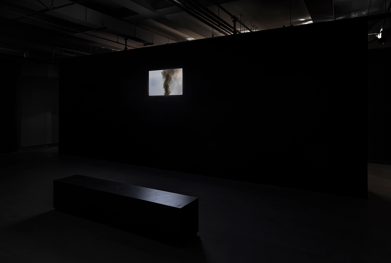
    Nicole Collins, Furthest Boundless with the video (Aphelion), Koffler Gallery installation detail, 2018. Photo: Toni Hafkenscheid

    The sound is composed of a very slowed down and abstracted version of Shape Note Singing (see www.fasola.org). I have practiced Shape Note since 2008, when I discovered it in my research, while completing my Masters of Visual Studies (broadly defined) at University of Toronto. An instructional method for congregational, harmonic singing, dating from the early 1800’s in New England and then migrating to the Southern States, Shape Note is sung in 4 parts, acapella, in a social setting. It is highly democratic, participatory rather than performative. The sound consists of powerful chords, and features lyrics that do not shy away from mortality, being written, as many songs were, during harsher times. The first verse of one of my favourite tunes goes as follows:

    “And am I born to die?
    To lay this body down?
    And must my trembling spirit fly
    Into a world unknown?” – Idumea 47b, from The Sacred Harp, 1991 Denson edition
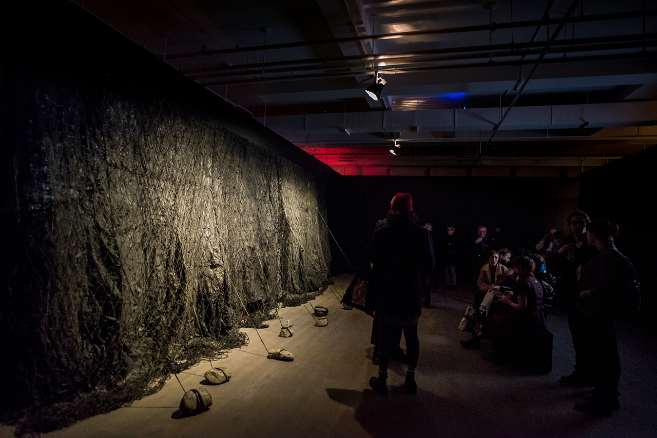
    Nicole Collins, Furthest Boundless, Koffler Gallery opening reception, 2018. Dahlia Katz Photography
    On Sunday February 25 there will be a talk about the relationship between the practice and the artwork, including a singing by the Toronto Shape Note Singers at the Koffler Gallery inside Furthest Boundless. All are welcome to participate or observe.

    *Exhibition information: Nicole Collins, One Shot, January 20 – February 24, 2018, General Hardware Contemporary, 1520 Queen Street West, Toronto. Gallery hours: Wed – Sat, 12 – 6 pm & Nicole Collins, Furthest Boundless, January 18 – March 18, 2018, Koffler Gallery, Artscape Youngplace, 180 Shaw Street, Toronto. Gallery hours: Tues – Fri 12 – 6 pm, Sat & Sun 11 am – 5 pm.