Author: artoronto

  • AB / EX at Canadian Sculpture Gallery

    The title of the group show AB / EX stands for Abstract Expressionism. This is the first “all abstract” exhibition at the Canadian Sculpture Gallery. Regardless of media, the gallery always showcases both abstract & figurative work to equally represent its members. Following the previous totally figurative show the gallery decided to make this show an all abstract exhibition. The members were delighted and you could feel their joy in the works they created and viewers— there were many of them at the gallery’s Opening Reception, against all odds—equally enjoyed the pieces.

    AB / EX Opening reception on October 24, 2020 at the Canadian Sculpture Centre. Photo: Peter Virun

    When you think about sculpture, even abstract sculpture, you first consider the material, then shape, maybe movement, but not light. There were two artists who encapsulated light in their sculptures in very different ways. Barbara Fletcher created a marvellous illusion in her cast acrylic and mirror pieces. The crystal shaped compositions reflect the light or are darkened by it, depending on the angle of the light. The green and blue colors further enrich the visuals.

    Barbara Fletcher, A Complimentary Couple (L) & Optical Illusion Perfected (R), both cast acrylic, mirror. Photo: Emese Krunak-Hajagos

    Sergey Ragozin takes us into a different world, to a far away galaxy. The work is a manmade structure, an edgy cube built of metal wires. Some tubes and finer wires create an inner structure that might be some kind of machinery or a place for some strange species. What makes it mesmerizing is how the ambient light reaches inside and gives movement to an otherwise rigid construction.

    Sergey Ragozin, Galaxy Station, mixed-media. Photo: Emese Krunak-Hajagos

    Abstract artworks always focus the viewer’s attention on the beauty of the materials. The beautiful color of Mary Ellen Farrow’s alabaster sculpture, Faith, is further emphasized by the white sphere in the middle, creating a sensitive balance. The veins of the stone  accentuate the intricate curving shape of Dina Torrans’ statuette. Wayfarer by John Clinton works like a magnet as visitors tend to get closer and closer to it in order to enjoy the amazing pattern of the reclaimed plywood.

    Mary Ellen Farrow, Faith, alabaster (L) & Dina Torrans, Enso, Danby imperial marble, granite (R). Courtesy of Canadian Sculpture Centre

    John Clinton, Wayfarer, reclaimed plywood. Photo: Emese Krunak-Hajagos

    Peter Alexander Por’s almost figurative creations stand with grace. The artist put together seemingly unrelated machinery parts that we would never imagine together and the outcome is very playful. The complicated ornamentation of the positive and negative shapes Gord Smith created become more enchanting with the rich golden light the copper reflects.

    Peter Alexander Por, Robert’s Message (L) and Lovejoy (R), both mixed metals. Photo: Emese Krunak-Hajagos

    Gord Smith, Optic Screen Horizontal, copper. Photo: Emese Krunak-Hajagos

    Andy Berg combines different materials in Onocleas Sensibilis. The dark, tree-trunk-like columns hold a very beautiful fern leaf giving us a feeling of nature’s triumph. Irene Sirko and Tom Ashbourne work the stone until it shines with inner beauty. The trees seem to sing as they still reach toward the sky in Yeon-Tak Chang wood sculptures. In Judy Raymar Ivkoff’s Interactions two very different materials are combined with a strong line dividing them, so they both keep their characters. In Edward Falkenberg’s work the wood, stone, metal and plastic embrace to create a unique piece.

    Andy Berg, Onocleas Sensibilis, stoneware, porcelain, glazes, oil paint. Photo: Emese Krunak-Hajagos

    Irene Sirko, A Matter of Degree, serpentine (L) & Tom Ashbourne, Elation, purple wonderstone, granite (R). Courtesy of Canadian Sculpture Centre

    Yeon-Tak Chang, Treescape, maple wood (L) and Origin, willow wood (R). Courtesy of Canadian Sculpture Centre

    Edward Falkenberg, (L-R) Shore, wood, rock, paint; The Plaza At Midnight, wood, copper, slate; Temperature Rising, wood, plastic. Courtesy of Canadian Sculpture Centre

    Emese Krunak-Hajagos

    *Exhibition information: October 24 – November 22, 2020, Canadian Sculpture Centre, 19 Mill Street, Distillery District. Gallery hours: Mon – Sat, 11 am – 5 pm; Sun, 12 – 5 pm.

  • Art Toronto 2020 Pop-Up @ SBG

    Sadly, there’s no big convention centre show for Art Toronto this year (although there is an on-line version). But there’s still a chance to see some work in person. The Stephen Bulger Gallery has collaborated with four out-of-town galleries to mount a pop-up show, providing each exhibitor with an art fair type booth within the larger space.

    With five galleries each showing several artists, I can only describe a fraction of what’s on display; my notes here comprise just a small sampling.

    Upon arrival, I was met by Max Dean’s strange, repurposed animatronic figures; they continued to surprise and ambush me at various spots around the show. 

    Art Toronto pop-up show at the Stephen Bulger Gallery with Max Dean’s animatronic figures. Photo courtesy: Stephen Bulger Gallery

    My first booth stop was at the TrépanierBaer gallery from Calgary. In the centre of the space hung the ephemeral, almost invisible sculpture Dynamo by Sarah Stevenson. A delicate interweaving of wire and thread, it floats like a computer-generated hologram.

    Sarah Stevenson, Dynamo (Sculpture and Drawing), 2020, thread, wire and lead, 24×13.5×13.5 inches; ink and graphite on paper, 23.5×19.75 inches. Photo courtesy: TrépanierBaer

    On the back wall were four panels by Stéphane La Rue. At first glance, they appeared as identical, metallic squares, but I soon realized that the edges were all different. As I got closer, I saw that these are carefully crafted wood and aluminum sculptures. The surfaces are sanded by hand. As I moved around the space, the light caught the horizontal and vertical lines which have a subtle waviness akin to painted brush-marks.  

    Stéphane La Rue, Open End, 2020, aluminum and wood, 66 x 66 x 283.3 cm . Photo: Mikael Sandblom

    Around the corner, I found the Pierre-François Ouellette Art Contemporain from Montreal, which presented a show curated around the theme of manipulated nature. I was fascinated by Marie-Jeanne Musiol’s black and white photographs that were generated not with a camera but with plant materials, photographic paper and just a bit of high voltage. These ‘plant auras’ look like eerie nebula or strange deep-water lifeforms.  Next to these hung a drawing by Ed Pien. Invasive Species is an abstract drawing that does not depict, but rather was inspired by plants and insects observed in the artist’s garden.

    Marie-Jeanne Musiol, Nébuleuses végétales no 4 (Vigne), 2018, electromagnetic capture on silver gelatin negative, archival pigment print, 32 1/8 x 24 1/8 x ¾ inches. Photo courtesy: Pierre-François Ouellette Art Contemporain

    Ed Pien, Invasive Species: Hanging Garden, 2020, Ink on 9-panelled paper, 35 ¼” x 27 “. Photo courtesy: Pierre-François Ouellette Art Contemporain

    The next booth belonged to WAAP:  Wil Aballe Art Projects from Vancouver. WAAP mounted a show that addressed the question “what’s next?” The art world, (along with rest of the world!) is in a state of flux. How does art respond to the pandemic, environmental crisis and social inequities? Here was a survey of responses ranging from contemplative abstraction to political protest art.

    WAAP Pop-Up Booth. Photo courtesy: Stephen Bulger Gallery

    Kate Metten represents the contemplative end of the curatorial axis with her The Thinking Eye paintings that play with our sense of perception of surface and depth.

    Kate Metten, The Thinking Eye 3, 2019, oil on canvas, 24 x 20 inches. Photo courtesy: WAAP

    Julia Rose Sutherland confronts us with sharp political messages Refund the Communities, Defund the Police, and Fuck the Police. Dedicated to Rodney Levi, an indigenous man shot by the RCMP, these stark words have been rendered in carefully woven porcupine quillwork, a decorative craft that pre-dates colonialism.

    Julia Rose Sutherland Rest in Peace, Rodney Levi, 2020, Gawiei / Porcupine quillwork (Embroidery) on paper, 12 x 16 inches each of 3 parts. Photo courtesy: WAAP

    Next was the Michael Gibson Gallery from London, Ontario. In addition to several fascinating Greg Curnoe pieces, I was taken by the work of Hans Wendt and Jonathan Forrest. Hung side by side, paintings by these two artists at first appeared to be ‘typical’ colour field paintings. As I got closer, Wendt’s work looked like torn pieces of coloured paper; closer still and I realized this was an illusion.  They are tromp-l’oeil paintings meticulously executed in watercolour. Forrest’s painting also benefits from close inspection. Thin bands of bright colour protrude from the surface. These relief elements provide a clue to the artist’s process: the paint has been applied with a squeegee. The undulating shimmering effect on the surface is due to variations in the thickness of the paint caused by shifts in pressure and the raised linear elements are where the paint has spilled around the edges. Although very different, both their methods are gutsy: neither one allows for do-overs. You can’t cover anything up in water colour, and there’s only one chance to get it right with the squeegee technique!

    Installation view of Michael Gibson Gallery’s booth with Hans Wendt, Res Tres, 2020, watercolour on paper, 52 1/2 x 37 1/4 inches (L) and Jonathan Forrest, Into The Blue, 2020, acrylic on canvas, 66 x 48 inches (R). Photo: Mikael Sandblom

    I moved on to Stephen Bulger’s exhibition: an impressive presentation of historical and contemporary photography. I will only mention two that made a special impression on me. First was Adam Magyar’s Urban Flow 316, Hong Kong, a long, horizontal photo of a walking crowd. The background is blurred into long horizontal stripes and some elements are oddly distorted. Magyar creates his own equipment to generate his images. In this case, he has repurposed a flat-bed scanner into a ‘slit-scan’ device. What you see is what has passed through a one pixel wide camera frame.

    Adam Magyar, Urban Flow 316, Hong Kong, 2007 (above) and detail. Photo courtesy: Stephen Bulger Gallery

    Joseph Hartman was represented by a beautiful photograph of rounded granite shoals along the Georgian Bay shore. I recalled recently seeing very similar landscapes in John Hartman’s new paintings. I learned that the painter and photographer are related. The painter (John) is the father of the photographer (Joseph) and they share a love for the same landscape!

    Joseph Hartman, Outer Shoals and Head Islands, Georgian Bay, ON, 2018, chromogenic print mounted to Stonehenge on Aluminum Composite Panel. Photo courtesy: Stephen Bulger Gallery

    As I finished my tour, I once again ran into Max Dean mannequins. I should warn you that one of them can speak and they now know how to take pictures!

    Mikael Sandblom

    *Exhibition information: October 28 – N0vember 7. 2020, Stephen Bulger Gallery, 1356 Dundas Street West, Toronto. Gallery hours: 12 – 6 pm.
    Art Toronto 2020 Pop-Up @ SBG. Galleries: Michel Gibson, London, ON; Pierre-François Ouellette Art Contemporain, Montreal; Stephen Bulger Gallery, Toronto; TrépanierBaer Gallery, Calgary, WAAP., Vancouver.

  • Art Parkdale Fair International @ Gallery 1313

    With the unprecedented circumstances of the COVID-pandemic, transitioning to viewing art online has been abrupt and experimental. Galleries must be more flexible and open-minded than ever, finding new variations and hybrid forms of displaying art in order to foster connections between artists, galleries, and the public. In light of new circumstances, Gallery 1313 combines online and in-person viewing in Art Parkdale Fair International.

    Gallery 1313 relies on taking advantage of the time that galleries have to keep their doors open, allowing for online viewers of the art to come into the gallery and experience the works in their physical forms, or vice versa. This show features sculpture, photo based works, painting, mixed media, and drawing. The works are not done justice in their online form. The scale and materials which result in texture and depth are lost in photographs. The pieces that did not stand out to me online, grasped and held my attention in their physical forms. From this experience, I would advise the viewers to come into the gallery to view the artworks in order to appreciate them fully.

    William Tyler, Self Study

    Kaspian Kondrat, Obliteration, oil on canvas, 20″ x 24″

    The show features Toronto-based artists and is ‘international’ as Toronto is a global city. The artworks span a wide range of topics including, but not limited to: community, physiological changes of the natural world, urban landscapes and the environment, Toronto’s constant flux, Canada’s efforts to sponsor refugees, and the essential contributions of frontline workers.

    Connection Earth Collaborative (Ashlynn Doljac), The Pulse, 2018, acrylic on canvas, 56″ x 22″

    Eva Lewarne, Make Good

    Anne Winter’s The amaWal Cube is a grid composed of miniature cardboard boxes made from wood blocks connected to strips of metal and wood. The work resembles both an electronic grid and a city scape. The composition feels cluttered and overwhelming, with the artist stating that there is an “underlying perception of an ominous order that is unsettling”.

    Anne Winter, The amaWal Cube, mixed media, 30″x 30″

    The Beginning by Murat Yukselir immediately asserts its place in the room. The sculpture has a strong presence, with a non-descript female leaning backwards while touching her abdomen with one of her hands tenderly, giving the impression that she is a mother. Ripples originate from that spot. Yukselir reminds the viewer, “we are hurled into the world and we become waves. We grow, cross paths with others, and eventually disappear into the collective human experience.”

    Murat Yukselir, The beginning, cast resin, mixed media, 56.5″ x 21.5″ x 12″

    During this time of isolation, Alison Kruse states that she paints with the passing of time and magical thinking in mind. For the viewer, Sunday Stroll gives a sense of refreshment, of the lush green and the crisp scent of nature that cannot be fully replicated within one’s living space.

    Alison Kruse, Sunday Stroll,

    Mikael Sandblom encourages viewers to support organizations that aid refugees and those living in countries weighed down by war and famine. Sandblom’s aluminum paneled work, Departures, catches the light as the viewer walks past, mixing open sky with man-made structures. According to the artist, the work focuses on the destruction and displacement of people living in Syria and addressing the state of D. P. camps through the lens of the COVID-19 pandemic.

    Mikael Sandblom, Departures. 2018, mixed media on two aluminum panels, 50″ x 20″

    Gallery 1313’s fair is an eclectic group of works, with vibrant colors and eye-catching materials which overwhelm the viewer with sights. Every work demands attention, each featuring a different topic for the guests to deliberate.

    Olivia Musselwhite

    Images are courtesy of Gallery 1313

    *Exhibition information: October 29 – November 8. 2020, Gallery 1313, 1313 Queen St W, Toronto. Gallery hours: Wed – Sat 1 – 5 pm, Sun 1 – 4 pm. Also online at http://g1313.org/8468/art-parkdale-fair-international-oct-29-nov-8-2/

  • Art Toronto 2020

    A new vision for Art Toronto this fall 

    October 28 – November 8, 2020

    This year, Art Toronto will truly be Canada’s art fair. Looking beyond the Metro Toronto Convention Centre, Art Toronto 2020 expands its virtual and physical footprint, featuring virtual exhibitions, curated collections, talks, tours and more; complemented by in-person programming in galleries across Canada.

    Join us October 28 through November 8 in celebrating visual culture at a national level. We look forward to welcoming you.

    Pre-Register for Art Toronto 2020

    Virtual Preview
    ArtTO’s Virtual Preview, a benefit for the Art Gallery of Ontario, offers guests exclusive access to view and purchase works at the fair before it opens to the public.⁠

    Find out more and buy tickets

    Canada’s art fair is pleased to announce a comprehensive schedule of programs including virtual panel discussions where listeners will hear from influential art world figures on important and trending topics, as well as artist talks, studio visits, tours and more. Those who are keen to experience exhibitions and programs in-person are invited to participate in safe, socially distanced events in galleries across the country. For more information please visit https://www.arttoronto.ca/en/home.html

    Bradley Ertaskiran Gallery, Montreal

    Please also check our interview with Mia Nielsen, Director Art Toronto https://www.artoronto.ca/?p=46002

  • Elisabeth Belliveau at Gallery 44

    Belliveau’s still life installations are an eclectic combination of found objects, sculptures, 3D prints, and lenticular prints. My favorite surprises among the objects found in this exhibit include: flowers displayed in a yoghurt tub, a dried orange slice, seashells, 3D printed models of fruits including a pure white lemon, and a single bronze nut.

    Installation view of Alone in the House, Still Life with Clarice Lispector,Gallery 44

    While walking through this exhibit I asked myself, what is it about Belliveau’s pieces that make them so aesthetically pleasing despite being made up of ordinary natural and synthetic objects? My conclusion was that Belliveau’s found objects are of both high and low materials, made up of natural and man-made materials which become art because they are chosen and placed, which brings agency to the kinds of items that are thrown away; the kinds of objects that are forgotten. Belliveau explained in her artist talk that her still lifes are highly influenced by her time in Japan where she learned Ikebana, the art of flower arranging and Sampuru, the practice of making fake food. Belliveau’s training in these disciplines clearly comes through in her work, as with graceful precision and meticulous choice, Belliveau gives objects a strong presence through their placement.

    Installation view with Still-life Itoshima (top) & Still-life with Fallen Fruits (bottom) from Table #1

    In her artist talk, Belliveau also commented about working on the project during quarantine. She explained that being confined to her living space brought to her attention her limited access to objects; that she had to use items inside versus outside of her home. She recalled that on some days the only things that came through her door were take-out boxes, which have been integrated into the installations. For instance, Belliveau’s mobile installation, Prairie-studio practice for self-isolation, hangs collected objects from the ceiling with strings, including sanded down take-out containers, which gives the work liveliness and movement. Belliveau said that the mobiles acted as a form of company, as she shared her space with a sole house plant. It is then fitting, as she mentions, that this exhibition is titled Alone in the House. The works are a culmination and memorialization of the items that gave her company during a time of isolation. 

    Prairie-studio practice for self-isolation. Photo: Olivia Musselwhite

    Belliveau explained that her time lapses collaborate with time, enabling the observance of living things that perform in front of the lens. It seems that Belliveau treats time as an independent entity, one that she leaves to its own devices and artistic choices. The time lapses are projected onto the walls of the gallery, demanding attention from the viewer with their monumental size. A section in the time lapse, Gift features the decay of flowers inside a yoghurt container which allows the viewer to see the flowers’ last dance before wilting completely.

    Gift (When I say I love you, I am loving me in you), 2020, lenticular print (above) and screen-shot (bottom)

    This exhibit is highly reliant on one being in the presence of the objects. The lenticular still life prints are only fully understood by the viewer who walks around them. Lenticular prints have the unique quality of being made up of multi-layered stills, so when one moves past the work the visible layer changes, allowing one to transition through the stills as the viewing angle changes.

    Latitude

    The effervescent quality of the prints enables the viewer to see across a span of time and one can even become caught between moments. If the viewer were to stop at a certain point when walking the path of Thistle/Bungalow, they can see both the life and death of the natural forms at the same time. The photo below was taken when I was in one of these transcendent moments.

    Thistle/Bungalow, (Amiskwaciwâskahikan/Edmonton), 2020, lenticular print. Photo: Olivia Musselwhite

    Belliveau’s inspiration is drawn from the writings of Clarice Lispector. According to the exhibition catalogue, Lispector writes in an interior monologue that follows a natural stream of consciousness and “in Lispector’s stories, time does not exist as a linear chronology, but as an almost tangible, flexible material that inconsistently folds in and out of itself”. Belliveau’s lenticular prints exhibit the same qualities as Lispector’s writings, with time no longer being linear, but easily manipulated by the viewer whose back and forth movements in the physical space also moves them back and forth in time.

    Still life with Pretzel (After Clara Peeters), 2020, lenticular print

    Alone in the House, Still Life with Clarice Lispector is rich with details to contemplate as the viewer finds another point of interest with each new look. Belliveau talked about her works and how they are connected to the domestic sphere and the practice of food preparation which has long been considered women’s work. Belliveau revisits these aspects through her distinctive still lifes and goes beyond traditional still lifes through her chosen mediums.

    Olivia Musselwhite

    Images are courtesy of the artist

    *Exhibition information: Elisabeth Belliveau, Alone in the House, Still Life with Clarice Lispector. The exhibition is part of Scotiabank CONTACT Photography Festival, September 11 – October 25, 2020, Gallery 44 | Centre for Contemporary Photography, 401 Richmond Street West, Toronto. Gallery hours: Tue – Sat, 12 – 5 pm.

  • Gavin Lynch’s Mixed Greens at Angell Gallery

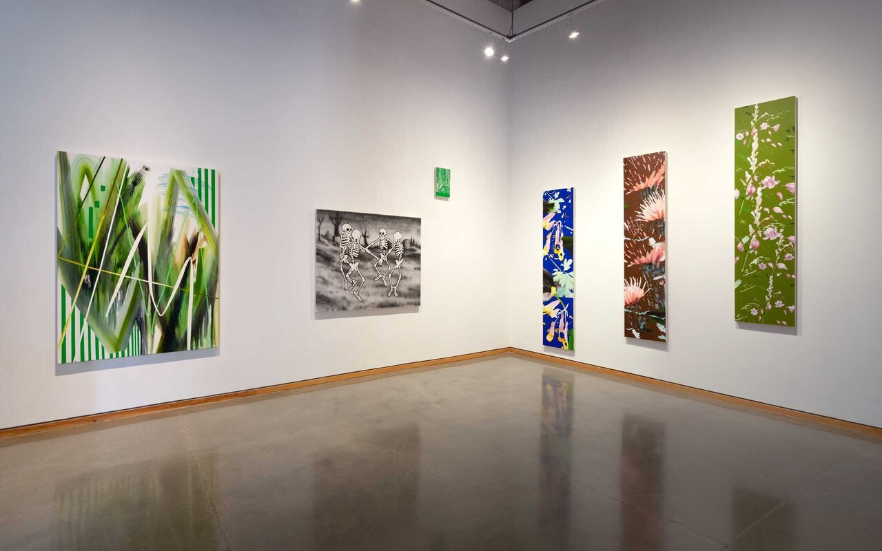
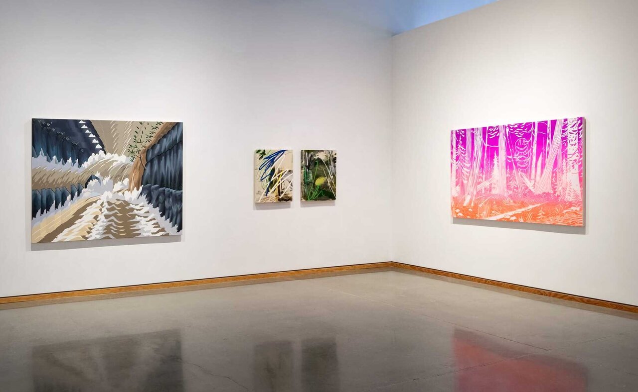
    The front and back spaces of the Angell Gallery are currently showcasing the latest works by Gavin Lynch. Lynch was born in Northern BC, educated at Emily Carr and the University of Ottawa, and now lives across the river in Wakefield, Quebec. In the last decade or so Lynch’s subject matter has mainly been landscape, more specifically ‘depictions’ of forests, though Lynch’s paintings are not traditional depictions of the forest. At first glance they seem like straightforward scenes, but quickly the viewer notices that their pictorial elements are rendered as flat abstracted surfaces, creating the overall effect of a collage.

    Installation view of Gavin Lynch, Mixed Greens. Photo: Alex Fischer

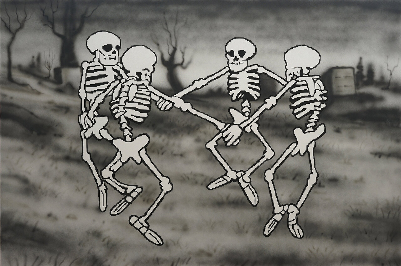
    Specifically on display in this show is a more diverse set of images, hence the choice of the term ‘mixed’ in the title one assumes. They are ‘green’ in the sense that paintings are still loosely based on nature – images of wild flowers and abstractions that allude to landscape. But nature is not the defining influence of these works. In a black and white painting titled The Skeleton Dance, for example, we are treated to a composition based on Henri Matisse’s cut-outs of dancers.

    The Skeleton Dance, 2020, acrylic and airbrush on canvas, 48″ x 72″

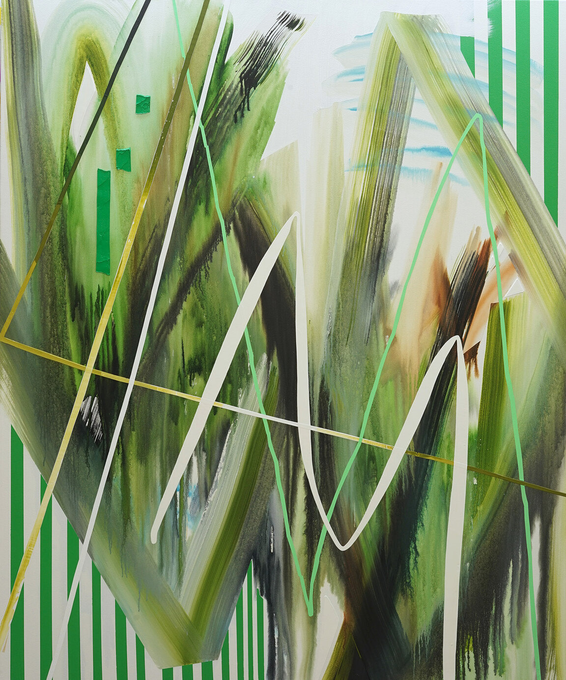
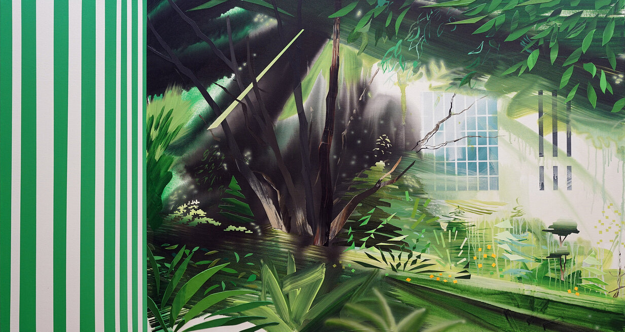
    Similarly two abstractions – Nouveau Paysage and Pavillion – incorprate Buren inspired green stripes. There is a certain irony in this choice given that Daniel Buren’s ubiquitous stripes were a sort of declaration of the end of painting.

    Nouveau Paysage, 2020, acrylic and oil on canvas, 72″ x 60″

    Pavillion, 2020, acrylic, watercolour, and airbrush on canvas, 35″ x 65″

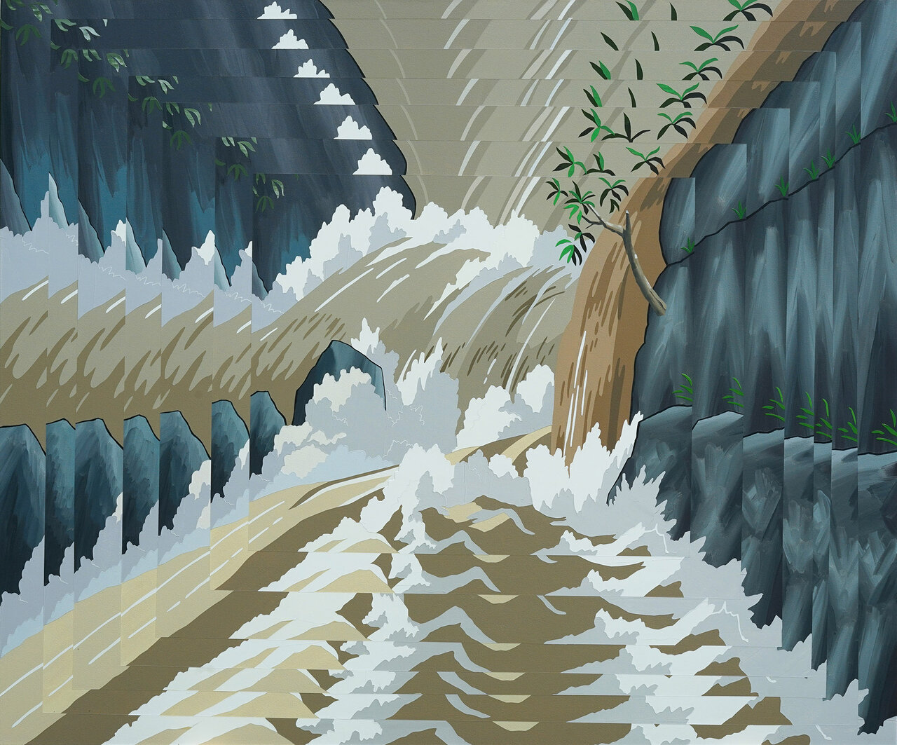
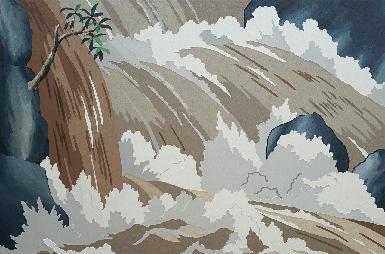
    Two other paintings – Reanimating the Falls and Leaving Emishi (Ashitaka’s Falls) – that depict a waterfall, are nonetheless not derived from nature. They are based on images from a film by the Japanese animation studio Ghibli, directed by Hayao Miyazaki. This conflating of the real and simulation is by all accounts a deliberate strategy of Lynch’s. The idea was made famous by the French social theorist Jean Baudrillard, whose term ‘simulacra’ (i.e., simulated versions of reality) Lynch uses to describe his work. Moreover, Lynch seems to embrace Baudrillard’s notion of hyperreality. The hyperreal describes that which is more real – more alluring – than banal reality. Indeed, our postmodern condition is characterized by our inability to separate the two domains – they merge into one. Ghibli studio’s creation exactly illustrates this idea. The studio’s reimagining of a land inhabited by an historical tribe called the Emishi inspired a company to build a physical version of one of their villages in the Mie Prefecture in Uga Valley, Japan.  Here history and fantasy are conflated.

    Reanimating the Falls, 2020, acrylic on canvas, 60″ x 72″

    Leaving Emishi (Ashitaka’s Falls), 2020, acrylic on canvas, 24″ x 36″

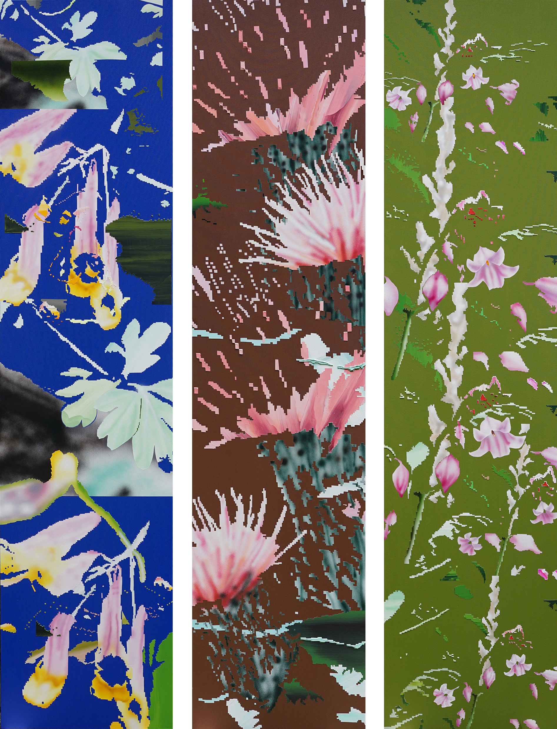
    On one wall hang three vertical scroll-like paintings which are ostensibly depictions of endangered Canadian wildflowers. At least that is what their titles suggest – Dogbane, Pale Corydalis and Pitcher’s Thistle. But the subject matter turns out to be largely incidental. Lynch has taken images of these flowers and manipulated them with computer software. It is these manipulated images that are the starting point for the paintings themselves. Lynch tells the catalogue essay writer Bill Clarke: “So, the resulting paintings appear…glitchy.”

    Pale Corydalis (left) Pitcher’s Thistle (center) and Dogbane (right), all three 2020, acrylic and airbrush on canvas, 92″ x 22″

    Terms like ‘glitchy’, ‘pixelated’ and ‘low res’ of course get their meanings through the ubiquitous screens by which our world is now mediated. And indeed, Lynch’s work might plausibly be described as screen-based in this sense. The screen has become the ultimate vehicle, Baudrillardian hyperreality. What we see on the screen and what we see in the physical world is becoming more and more difficult to distinguish. Lynch exploits this fact.

    The result is a techno-aesthetics. Lynch celebrates the world not as it appears to us on the screen, but the world of the screen. The screen-flatness of his imagery is made explicit by his use of paint on canvas – that old-time technology. That is why, I am guessing, he often uses impasto – to accentuate the materiality of the paint in contrast to the cool flatness of screen imagery.

    Installation view of Gavin Lynch, Mixed Greens. Photo: Alex Fischer

    These paintings are sophisticated in their composition, execution and the thinking behind them. And the passages of paint are exquisite at times. But I wonder what in the end Lynch is expressing by them. In some of his landscapes there are moments when the viewer is drawn in to the scene, where the scale of the land is made palpable for example. Yet, ultimately the viewer is pulled back to the flat surface that epitomises Lynch’s aesthetic. The screen flattens our world figuratively as well. That is, it makes our experiences mediated by it alike in some qualitative sense. What they are about falls away. All that remains is the allure of their superficial appearances. Everything reduces to spectacle. For Baudrillard ascendance of hyperreality is apocalyptic – he never shied away from hyperbole. It spells the disappearance of the subject, where we become instead nodes in an endless exchange of signs and nothing more. I sense none of this darkness in Lynch’s embrace of the notion, however.

    Hugh Alcock

    Images are courtesy of Angell Gallery

    *Exhibition information: September 24 – October 24, 2020, Angell Gallery, 1444 Dupont Ave, Unit 15, Toronto. Gallery hours: Open by appointment only

  • Reclaiming identities in BMO 1st ART! Exhibition

    Transitions, migrations and individualities. The theme of reclaiming identities appears forefront in this year’s BMO 1st ART! Exhibition. Drawing on personal histories and perspectives using a wide range of media, BMO’s 1st ART! brings together pieces seeking to situate identities within society’s ever-changing narratives.

    Ontario winner Tian Cao, OCAD University, 2020 Surfing the Internet, Unity 3D Game Project

    While the exhibition has moved to virtual format this year through BMO’s partnership with the Art Museum at the University of Toronto, the impact of the exhibition is not diminished. Its accessibility, in fact, lends further to its effect reaching an audience that would otherwise forgo the need to engage with art in normal conditions. At a time when calls for social justice are ever more paramount, this year’s works act as a battle cry, asserting differences, subverting stereotypes, and reinforcing identities.

    Alberta winner Jasmine MacGregor, Alberta University of the Arts, Anishinaabekwe (ojibway woman), video, 2 minutes 4 seconds

    Among the exhibition’s most impactful works were National Winner Simone Elizabeth Saunders’ hand-tufted portrait It Matters. Using textile to embody Black culture, Saunders creates a powerful portrait of a Black individual imbued in colour, asserting the importance of Black life. Saunders’ work creates a double entendre for the act of weaving. In her discussion of the work, the artist contends that the act of intertwining individual threads to create a piece represents the journey of life itself, with each life experience contributing to the narrative it ultimately creates. One can view that the intricate threads that made It Matters explore the individual experiences which informed the life it powerfully represents. Saunders successfully conveys the urgent need to confront racial injustice, inviting its viewers to contemplate their own participation to racial discrimination.

    National winner Simone Elizabeth Saunders, Alberta University of the Arts, It Matters, hand-tufted and punch needled textile, 32 × 23 × 0.75 inches

    The influence and subversion of Hieronymous Bosch is not to be missed in Rey Francis Dominic B. Tatad’s Chosen Land. This year’s Saskatchewan winner sees heavy influence in the early Netherlandish painter’s complex imagery and use of vibrant colour, yet whereas Bosch overlaid his works with fantastic religious figures, Tatad diffused his with socio-political overtones akin to his Filipino identity, ultimately overthrowing the Western hegemony underpinning his work. In itself, the significance of religious and political Filipino narratives existing within a style informed by Western influences represents an encapsulation of Filipino history mired with centuries of colonial abuse. Tatad’s Chosen Land is masterful and electrifying for its ability to confront Filipino history while subverting Western artistic influences.

    Saskatchewan winner Rey Francis Dominic B. Tatad, University of Regina, Chosen Land, pencil crayon on paper, 22 × 30 inches

    The rest of the entries evoke equally powerful magnitudes. Quebec winner Mikael Lepage uses a white shirt in his dynamic piece, Dénué, in order to confront biases that fuel social structure and class differences. Manitoba winner Gabriel Roberts portrays the vulnerability and fear of coming out in A Closet Painted Blue.

    Quebec winner Mikael Lepage, Université du Québec à Montréal, Dénué,oil on canvas, 48 × 36 in

    Manitoba winner Gabriel Roberts, University of Manitoba, A Closet Painted Blue, cyanotype on paper, linen, denim, cushions, leather, digital prints, chair, overall 100 × 100 × 16 in

    The 2020 BMO 1st ART! Exhibition arrives strong with its selection of works rousing its viewers to examine their own participation in the present revolution.

    Maria Mendoza Camba

    Images are courtesy of BMO 1st ART

    *Exhibition information: BMO 1st ART! Virtual Exhibition, hosted by BMO and Art Museum at the University of Toronto, September 15 – October 16, 2020. For more information please visit https://1start.bmo.com/home.html

  • Interview with Mia Nielsen, Director of Art Toronto

    Interview with Mia Nielsen (MN), Director of Art Toronto by Phil Anderson (PA)

    Mia Nielsen. Photo: Franco Deleo

    PA: It must have been difficult to engage in a re-invention of the art fair. What was your biggest challenge?

    MN: We settled on the new direction for the fair in the spring, creating a hybrid event where the whole program will be online with the addition of in-person exhibition viewing and socially distanced events across the country. This format allowed us connect communities across the country and create a unique experience for an international fair. To support the show, we have an incredible program of over 80 virtual and in-person event, so managing the depth and breadth of the program is the biggest challenge, it’s way more programming than we have had in the past. But it’s really a wonderful challenge, because it’s allowed us to work with new partners and institutions including the CAG in Vancouver, the Esker in Calgary, PHI and MAC in Montreal, the National Gallery in Ottawa and many others. So exciting to see it all come together so beautifully.

    PA: How does the hybrid virtual Art Toronto compare to other international art fairs that have gone virtual this year?

    MN: Most international fairs that have gone ahead this year have been exclusively online. With exhibitors across the globe, it’s hard to find opportunities for connection outside the virtual space. One of the exciting aspects of Art Toronto is that it’s a regional fair with a national identity. With over 60% of our galleries based in Vancouver, Calgary, Toronto and Montreal, we had a unique opportunity to galvanize the national arts community and connect the experience of the fair to the gallery locations to provide in-person exhibition viewing and events.

    Corkin Gallery, Toronto

    Bradley Ertaskiran Gallery, Montreal

    PA: Was there an opportunity to share with other art fair directors’ ideas on how to engage the public in these strange times?

    MN: Yes! One of the benefits of lockdown was the time to connect with colleagues and learn about how other shows are going ahead. It was great to get to know Elizabeth Dee of The Independent in NYC, we chatted a few times over FaceTime and she started a group chat where fair directors share strategies and challenges. Chicago is taking an interesting approach – rather than doing a virtual fair, they’re promoting a gallery hop weekend in their hometown over the scheduled 2020 fair dates.

    PA: How accessible is the hybrid virtual art fair? Is there a charge to stream it? Is there a cap on attendance?

    MN: The online fair is completely accessible! There is no cap for attendance and aside from the Preview benefit for the AGO on the 28th (tickets are $30 for a first look at the fair and a host of incredible programs) there is no charge to attend the online fair or the in-gallery events across the country.

    PA: Are there noticeable advantages to having a virtual fair? For example, making it easier for galleries to participate without the expenses of shipping and employees working the fair?

    MN: Indeed, shipping and installing exhibitions for a centralized fair is challenging, expensive and time consuming. Not to mention travel arrangements for visiting galleries or for local galleries having to be onsite at the fair and keep the gallery open at the same time. For exhibitors, this hybrid fair model offers a lot of flexibility.

    PA: Are there other features that have been added to the virtual fair? Can you tell us about some of them?

    MN: We have a number of new features this year. For instance, with have partnered with AGAC to list works from the fair on their app Collecting, using AR, it can picture an artwork to scale on your wall, a way to test out the concept and find the piece that will be a perfect fit for your wall. In addition, we’re hosting artist studio visits with Canadian artists living outside of Toronto such as Curtis Talwst Santiago (Frankfurt) and the Kinngait studios in Cape Dorset. In addition, we commissioned artist Jenn E Norton to create a virtual artwork, an AR sculpture that can be downloaded from Facebook or Instagram, so audiences can ‘install’ and share it with audiences online.

    Curtis ‘Talwst’ Santiago in his studio, constructing one of his small artworks. (CBC Arts. November 4, 2015)

    PA: Will the Art Toronto be more international this year because of the virtual nature of the fair and how many galleries are participating this year?

    MN: We have almost 100 galleries this year, so close in number to what we’ve had in the past. There are some international galleries this year, like Chicago’s Monique Meloche (joining us for the first time), but most have a connection to Canada (in her case she is Canadian and represents fellow Canadian Brendan Fernandes who will be part of our Preview programming, in addition to some of the most important artists working in the US today) as well as Donald Ellis Gallery, with incredible First Nations art and artifacts, much from west coast nations. But as Canada’s art fair, we’re dedicated to connecting audiences to the incredible scene we have right here at home. That goes for national audiences connecting with the exhibitors across the country, as well as providing an entry point for international audiences to learn about art in Canada

    Jake Troyli, Don’t Forget to Pack a Lunch! Monique Meloche Gallery, Chicago. Image courtesy of the gallery

    Portrait Mask of Dzila’Qons, Haida Gwaii, British Columbia,
    Donald Ellis Gallery. Image courtesy of the gallery

    PA: Do you think that the hybrid virtual art fair will have an impact on future art fairs after the pandemic?

    MN: Yes, I think online strategies will be an important element for art fairs in a post-pandemic world. More changes could come too, we’re exploring ways to evolve the fair model to reach communities across Canada and beyond when we return to the Metro Toronto Convention Centre. Stay tuned to see how it evolves!

    PA: What will you miss the most from the ability of having an actual physical fair?

    MN: I love exhibitions, so having everyone in one place is one of the greatest pleasures for me. The serendipity of running into old friends, meeting new people, all while taking in great art – it’s such a special experience. That said, there are loads of things I’m really excited about this year – the virtual studio visits, conversations and events, the new galleries that are bringing some incredible work! It’s going to be a different way to experience the fair and I’m sure after this edition, there will be some things that I’ll miss when we return to a centralized exhibition.

    Art Toronto 2019. Photo: Xiaotong Cao

    *Exhibition information: October 28 – November 8, 2020, virtual and in-person installations and programming across the country. For more information please visit https://www.arttoronto.ca/en/home.html

  • Reinhard Reitzenstein at the Olga Korper Gallery

    Reinhard Reitzenstein’s exhibition FML (Forests May Lie) at the Olga Korper Gallery, built upon decades of experience as a Canadian artist including over 100 solo exhibitions, presents his most recent commentary on the natural environment and its clash with civilization. Reitzenstein incorporates various media including cast bronze, wood installation, ink on paper, and photography to expose the vulnerability and industry of trees as a continuum in his life-long investigation into environmental degradation in ecosystems.

    Reinhard Reitzenstein, Panoptic: I Looked At Clouds, 2020, laminated giclee print, edition of 3

    Featuring artwork from 2014 to 2020, Forests May Lie focuses on resiliency in nature and the impact of human activities on the environment. There is a deep transcendence in Reitzenstein’s photographs and ink on paper pieces which invite the viewer to reexamine our place in the natural world, specifically how human activity has succeeded in altering and reshaping our fragile symbiotic relationship with trees. Reitzenstein’s work illustrates the mechanisms with which trees not only stabilize and rejuvenate our environment but also our senses and our evolution as a species.  

    Reinhard Reitzenstein, Panoptic: This Is Celeste, 2020. Laminated giclee print, edition of 3.

    Reitzenstein’s cast bronze and ink on paper artwork characterize trees as living organisms engaging and changing with their environment – the earth, atmosphere and bodies of water – not simply another feature on the landscape. Reitzenstein’s work resonates with the viewer because it represents a desire for manifest continuity and preservation of the environment within which both the natural and man-made world can thrive in perpetuity.

    Clockwise from top left: Reinhard Reitzenstein, White Pine (pinus strobus), 2015, Torrey Pine (pinus torriana), 2015. both pigma ink on arches paper and What Should I Call This Piece?, 2019, cast bronze, unique

    Reitzenstein’s work integrates the social, political, environmental and cultural elements in order to experience the landscape and allow that experience to affect us on a physical, mental and spiritual level. Shirley Madill, the Chief Curator of the Art Gallery of Hamilton writes that Reitzenstein “works with specific places in mind emphasizing the encounter with the landscape in a bodily manner.”  

    Reinhard Reitzenstein, Never Odd Or Even, 2020, cast bronze, unique

    Reitzenstein’s work continues to explore ways of collaboration between nature, technology, science and culture and he does this by using various media, working alongside composers and artists alike. Since the early 1970s Reitzenstein has been prolific as a Canadian contemporary artist producing “indoor installation and sculpture using cast, spun and welded metals, wood, glass, photography, digitally processed images, large scale drawings, outdoor tree-based installations and sound art” (Olga Korper Gallery). 

    Reinhard Reitzenstein, We All Felt That, 2020, suspended maple, wool felt, steel (top) and detail

    Keren Sedmina

    Images courtesy of the artist and Olga Korper Gallery.

    *Exhibition information: Reinhard Reitzenstein, FML (Forests May Lie), September 12 – October 10, 2020, Olga Korper Gallery, 17 Morrow Ave, Toronto. Gallery hours: Tue – Sat 10 am – 6 pm or by appointment.

  • Graham Gillmore At General Hardware Contemporary

    Waking up, there’s a fleeting moment when the dream world is receding but still vivid: the moment just before logic is re-asserted and the internal monologue of wakefulness fully engages. Graham Gillmore’s recent paintings remind me of that peculiar half-conscious state of mind. A state of confusion but also of unlimited potential. As in an evanescing dream, the shapes and text fragments in Gillmore’s paintings invite interpretation and rebuff it at the same time. They remain enigmatic; evocative and elusive.

    On first impression, the show is hedonistically colourful. As good as the catalogue photos are, they cannot capture the layered translucence and gloss of these surfaces. The colour, composition and paint handling alone would make for a beautiful show. But Gillmore is not content to leave us with pleasant, anodyne pictures. He makes things much more complicated.

    Installation view of Graham Gillmore, The End of Eloquence

    Gilmore’s use of text is the confounding ingredient here. Or rather it’s the text in combination with the painterly surfaces. The work won’t slot easily into any particular category. We know how to respond to conceptual, text-based work. We also know how to look at abstract art. But Gilmore does not fit neatly into either of these boxes. This is what makes the show perplexing – and engaging.

    The painting Babe recounts the history of its making; how the image was built from diaphanous membranes of colour. Gillmore uses oil paint in combination with commercial varnishes to create translucent glazes which he brushes and pours across the surface. The bright blue and green areas are windows in the red glaze that expose these initial, brighter layers behind. We can read the action that resulted in the artwork.

    Another trace of action is the incised word ‘Babe,’ in the lower right corner. This word is more prominent than it appears in the photo as it’s been carved into the surface with a power tool. The text is in a half cursive, half printed handwriting. The little comma after the word tells us that it’s the beginning of a message – but one we won’t get to see.  

    Graham Gillmore, Babe (A Love Letter), 2020, oil on panel, 54” x 48” x 2”

    Absurdistan is a painting where the text is more prominent. It’s comprised of two attached panels with bright stripes of colour. On the left panel, the stripes are vertical and on right they tilt away at a slight angle. While wet, the paint has been disturbed to create ghostly organic shapes. Into the bright, slick surfaces, letters have been carved. It’s a rag-tag collection, a mixture of upper and lower cases in various sizes. It could be read as ABSURdISTAn but also A SU I B Rd STANn. To me the painting suggests that in the face of absurdity, you can still find beauty, and humour.

    Graham Gillmore, Absurdistan, 2020 diptych, oil on panel, 60” x 80” x 3”

    I was surprised to see that the dark areas apparent in the strokes of the letters are not paint, but holes where the router tool has cut all the way through the surface of the panel. Gillmore uses a synthetic plastic material to paint on. It is impervious to his paints and solvents and because it is bright white all the way through, his router marks automatically look bright and clean.

    Graham Gillmore, Absurdistan, detail

    The End of Eloquence is a tall, vertical painting. A dark glaze covers much of the surface but leaves open areas to brighter layers behind. I find myself interpreting imagery in this piece: rainbows and a cloud. Or are we looking through dark curtains to a brighter space? A cup with overflowing foam? None of these visual interpretations stick for long. The visual elements of light, dark and modeling invite interpretation but never resolve into anything definite.

    The text that has been inscribed appears in three different styles. The scrolled ‘The End’ looks like the closing scene of an old movie. The ‘OF’ is simple and minimal while the ‘ELOQUENCE’ word looks like printed handwriting. It’s as though three different voices are speaking.  

    Graham Gillmore The End of Eloquence, 2020 oil on panel, 72” x 48” x 2”

    TheEnd of Eloquenceis also the title of the exhibition. Eloquence is the clear and persuasive use of language. Eloquence is the logical expression of a particular point of view. So, what would the end of this mean? Ambiguity? Confusion? Irrationality? I think the End of Eloquence provides a glimpse back into the dream world, unfettered by the limitations of waking logic, an escape from workaday pedantic thinking.

    General Hardware Contemporary have extensive photographic documentation of the show at their website, but to really get the full impact of these paintings, it is well worth a visit in person.

    Installation view of Graham Gillmore, The End of Eloquence

    Mikael Sandblom

    Photo credit: LF Documentation or @lfdocumentation

    *Exhibition information: Graham Gillmore, The End of Eloquence, September 17 – November 17, 2020, General Hardware Contemporary, Front Gallery, 1520 Queen Street West, Toronto. Gallery hours: Wed – Sat, 12 – 6 pm.

  • LOOK HERE! at Canadian Sculpture Centre

    In the current exhibition at the Sculptors Society of Canada you are invited to experience the essence of contemporary portraiture by thirteen artists. The show addresses the diversity in human beings with a variety of materials and techniques.

    Installation view of LOOK HERE!

    Marlene Kawalez focuses on the relationship between the inner self and the environment around us. Time Traveller is a very interesting piece, that looks human from the front but more like a machine or a storage space from the back. Through the unzipped back we can see coins, old watches and other objects that may recall memories – lost and found. W.W. Hung’s sculpture is very eye catching with its unique depiction of a figure in abstract surroundings. It is hard to know whether he is running or jumping. He radiates energy and strong emotions. As the artists stated “I make sculptures that convey the vulnerability, as well as the tenacity, of the human psyche.”

    David & Marlene Kawalez with Secret of Secrets (left), and Time Traveller (right), both raku fired clay, mixed media (above) and Time Traveller, detail 

    W.W. Hung, Shards, polymer, stainless steel, nylon thread

    We can’t help but fabricate stories when looking at the sculptures of Gordon Becker and John Clinton. What is Becker’s Seer looking at and what does he actually see? Could it be as ordinary as a second pair of glasses?! Clinton has an amazing talent in depicting characters. Both Travis and Gus invite a narrative. Travis loves summer walks and beer (he has such a belly) and Gus is a sports fan for sure, as his T-shirt shows. Clinton wrote that he is “obsessed with the back-story that is conveyed through a gesture, a nuance, or a look.”

    Gordon Becker, The Seer, (left) and Dance of Generations (right), both hand-carved wood, mixed-media

    John Clinton, Travis (left) and Gus (right), both bronze

    Eamon considers himself a communicator above all. His sculpture, Reflection has a deep understanding of life and the marks it leaves on our faces. The meaning is ambiguous; it is not easy to figure out what reflects what. It is a face carved into stone and stone is not a mirror. Is the figure finding or loosing himself in it? This artwork has some ancient meaning hiding in it, something magical and mystical, inviting the viewers’ contemplation. J. A. Fligel also addresses human feelings but his sculptures are more playful, showing the beauty of life through various cultures.

     Eamon, Reflection, Brazilian soapstone

    J.A.Fligel, Dancer, bronze

    Saulius Jaskus believes that “the human form has a deeper significance for the psychological and symbolic message.” Mary Ellen Farrows’s Serenity radiates peacefulness. Peter Shoebridge wrote about his artistic intention that “through form and the eye’s curiosity and the mind’s imagination as it is drawn around a piece can we engage with someone not there and feel a presence.”

    Saulius Jaskus with Joseph’s Dream (left), Head of Youth(right), and Juan Daydreaming (front), all three terra cotta, pigment

    Mary Ellen Farrow, Serenity, Italian alabaster

    Peter Shoebridge, Orbit (left), Dreamer (right), both acrylic reinforced hydrocal, mixed-media

    The remaining four artists all use bronze as their medium but in very different ways, even when their themes seem similar. Karen Stoskopf Harding Galaxiana, that she calls a pure imagination, is a semi-abstract dream portrait of a goddess. Holly Atkinson creates faces that remind us of African masks but they are much more contemporary and full of irony. The female figures of Camie Geary-Martin are slim, ethereal and always in movement. It is really interesting and smart how Marc André Jacques Fortier’s sculptures are installed in Old Montreal (the pieces in the exhibition are maquettes). As the artist described: “The English Snob is looking at Notre-Dame Church (symbolizing the French) while his English Pug (deeply attracted) is staring 210 feet away, at the French Poodle. The French Snob is looking at the Bank of Montreal (symbolizing the English) while her French Poodle (deeply attracted) is staring 210 feet away, at the English Pug.”

    Karen Stoskopf Harding with Galaxiana, bronze

    Holly Atkinson, Material Girl (left) and Creative Mind (right), both bronze

    Camie Geary-Martin, Woman Looking Left, bronze

    The English Pug, Le carlin Anglais and The French Poodle, Le caniche Français, bronze, maquettes for 10ft sculptures installed in Old Montreal

    The exhibition had two Opening Receptions, both well attended.

    Images are courtesy of Canadian Sculpture Gallery

    Exhibition information: LOOK HERE! / Group show, Augustus 8 – October 12, 2020, Canadian Sculpture Centre, 19 Mill Street, Distillery District. Gallery hours: Mon – Sat, 11 am – 5 pm; Sun, 12 – 5 pm.

  • Ben Walmsley Channels Tom Thomson at Birch Contemporary

    Ben Walmsley captures the pleasure of landscape painting at his POLYCHROME 2020 exhibition at Birch Contemporary. All is not as it seems, however. The seemingly rapid execution of a selection of Tom Thomson oil sketches, upon closer examination, reveal a methodical, patiently laborious process. That a rigorous analysis of Thomson’s work has gone into Walmsley’s exhibition is evidenced by the colour bar below each work, much the way a bar in musical notation measures segments of time to specific beats and particular value. In this respect, the exhibition is a performance of a suite of visual études. Yet, how could something so obviously studied have been made to look spontaneous?

    POLYCHROME I, 2020, mixed media on wood, 14 x 14 in.

    Aside from breaking down the colours of each Thomson sketch into eight discrete hues, the artist has separated the application of textured impasto of the ground from its colouration. That is, texture has been rendered in white plaster as underpainting, upon which pigmentation has subsequently been added. In other words, Walmsley had the painterliness baked in even before the first lick of paint. With the exhibition title POLYCHROME, Walmsley points to the historical practice of colouring sculpture with paint. From this perspective, the artist’s version of “The Jack Pine” was essentially complete before it was ever painted.

    POLYCHROME X, 2020, mixed media on wood, 14 x 14 in.

    How do these Walmsley paintings hold up to the Thomson originals? Since the intent of the artist was not to make a slavish copy of the subject, the question may not be a fair one. With a one to one comparison between them, of course the Walmsley doesn’t measure up. Attempt at equivalency may not be the point. His approach has been, rather to “score” each Thomson sketch before “playing” them. With this, the distinction between a Walmsley and a Thomson is unambiguous. A buyer at the POLYCHROME exhibition clearly buys a Walmsley, not a Thomson. Furthermore, with the works being separated by a century, the obvious cultural differences between the respective times become fundamental to the discussion. A contemporary artist can’t duplicate what Thomson and the Group of Seven accomplished. To provincial admirers of an academically-painted landscape, a Thomson painting was radical. Group of Seven exhibitions actually aroused critical and public outrage in their time. To the general public today, artistic transgressions, were they to occur, don’t garner much interest. 
    POLYCHROME XIV, 2020, mixed media on wood, 14 x 14 in.

    Technically, Walmsley’s POLYCHROMEs fall under the category of Appropriation Art. There is an implication in the term that something is being stolen without an owner’s permission. In ways that I have already discussed, the label doesn’t quite apply here in the strictest sense. Walmsley has taken pains to formalize the painting of his Thomson’s in the direction of a match between an original and his version of it. From painting to painting, the artist seems to have hung up his brush after lobbing his colours across the white sculpted court in eight distinct sets. I enjoyed the show.

    POLYCHROME IV, 2020, mixed media on wood, 14 x 14 in.

    Steve Rockwell

    Images are courtesy of Birch Contemporary, photo: Toni Hafkenscheid

    *Exhibition information: Ben Walmsley, POLYCHROME 2020, September 10 – October 17, 2020, Birch Contemporary, Birch Contemporary, 129 Tecumseth Street, Toronto. Gallery hours: Wed – Fri 10 am – 6 pm, Sat 11 am – 5 pm.