Author: artoronto

  • Phil Bergerson at Stephen Bulger Gallery

    Phil Bergerson’s Search for Meaning

    One of Canada’s most accomplished photographers is having a retrospective exhibition at the Stephen Bulger Gallery. Phil Bergerson originally studied with the intention of becoming a school teacher, but on the eve of graduating he quit. Unsure what he really wanted to do in life he chanced upon a history of photography book. At this moment of epiphany, he explains, he realised that he was destined to become an artist whose medium would be photography, even though he didn’t know the first thing about the discipline. He enrolled in photographic arts at Ryerson College, followed by studies in painting and printmaking at York University.
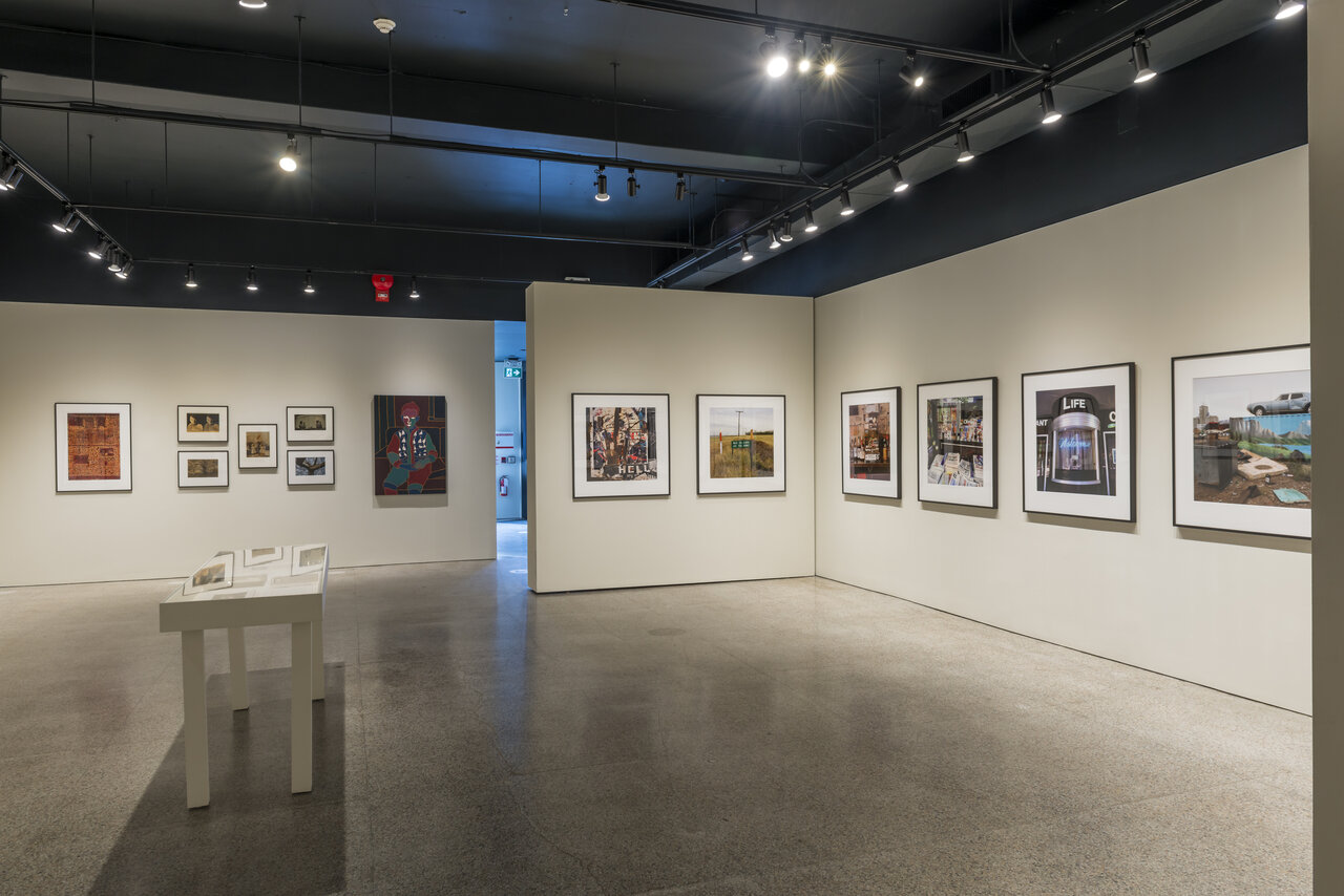
    Installation view of Phil Bergerson, Search for Meaning. Copyright Scott Proborsa

    Bergerson’s career can be crudely divided into two periods. As a professor of photography at Ryerson (1975-2005) his work was mainly focused on experimenting with the medium of photography itself, e.g., exploring the relationship between photography and painting. As well, it appears he was influenced by Warhol’s pop art and its reference to consumerism. Bergerson took photos of displays in department stores. These photos became elements in larger repeated grid-based compositions that are reminiscent of Warhol’s prints of Campbell soup cans especially.

    Untitled (Living Gloves), Toronto, ON, 1979, printed in 2018, pigment print on archival paper, 31 ¾ x 21 inch, Edition of 8

    Bergerson’s grid compositions then took up the theme of anonymous body parts, including faces and male genitalia. But the works of this earlier period take up a small fraction of the exhibition space. Most of the show is dedicated to the work of his second period.

    Untitled (Faces), Toronto, Ontario, 1986, printed in 2020, pigment print on archival paper, 18 ⅞ x 22 ½ inch, Edition of 8

    By the turn of the century Bergerson felt a need to reevaluate his artistic priorities, to start over afresh. He decided to pick up the camera and simply shoot what he saw around him, and see where this would lead him. His breakthrough came when he visited a fair in London, Ontario. There he photographed a prize winning duck – the so-called ‘best duck’. The irony is immediate to anyone, since the bird appears to be unwell, desperate for a proper meal. This led to another epiphany. he suddenly grasped the potential for ‘irony, metaphor and pathos’, as he puts it, in photography. His interest then shifted from experiments with the medium of photography to content, that is, more precisely what his chosen subject communicated to the viewer, its meaning. Gone were the complex compositions, to be replaced with straightforward single-shot documentations of particular scenes.
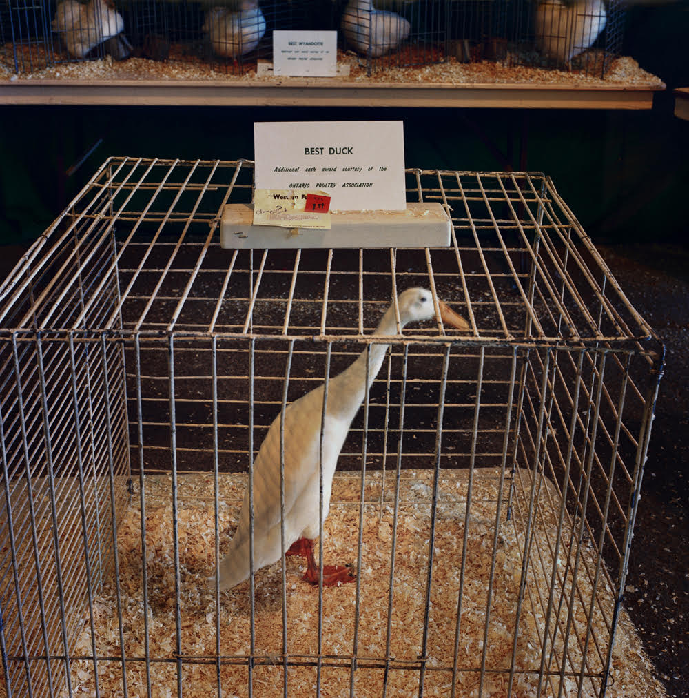
    Untitled (Best Duck), London, Ontario, 1989, printed in 2019, pigment print on archival paper mounted to archival board, 15 ¾ x 15 ½ inch, Edition of 15

    How to turn this abstract concept into concrete reality? Bergerson hit upon the idea of touring the length and breadth of the United States. He followed his nose in the sense that he had no clear idea of what he was looking for, but he would know it once he’d stumbled on it. What he discovered in the numerous small towns and cities he visited were the traces of the American psyche, namely the cultural flotsam of this vast complex country. His subject matter was not the people themselves but public displays – statues, newspaper stalls, shop window displays, religious proclamations by the roadside and so on. He has clearly been captivated by this species of Americana, making many excursions to the country over the decades.

    Greenwich Village, New York, July 2001, printed in 2020, pigment print on archival paper mounted to archival board, 29 x 29 inch, Edition of 10

    He describes his practice figuratively as “sifting through the remains of some exotic extinct civilization…photographically picking up shards…” He sees himself as playing the role of the archaeologist. This involves looking in the hope of seeing something, that is, of coming across an image that says something about that civilization. He has been charmed by Americans’ proclivity to speak their minds. In this they differ from Canadians according to Bergerson.

    Orangeburg, South Carolina, 2006, printed in 2016 chromogenic print mounted to archival board, 29 x 29 inch, Edition of 10

    What strikes me about his subject matter is how exogenous it is – wholly disconnected from the country in which he lives. Almost his entire oeuvre is dedicated to the study of another culture. This is something he doesn’t directly address. Rather he sees himself, as a Canadian, as an outsider observing America. It is a pity, I feel, that he doesn’t turn his considerable talent towards his own culture. Of course, given the size and proximity of the United States, and its enormous cultural influence, it is not surprising that Bergerson, like so many others, is seduced by it. Like a moth he is drawn towards the brightest light. As well, his is without doubt an intrinsically fascinating project, namely to explore a culture as an outsider.

    Martinsville, Indiana, 2006, printed in 2016, chromogenic print mounted to archival board, 29 x 29 inch, Edition of 10

    These works are sophisticated and beautiful. Fortunately he has not taken the easy route of emphasizing the dysfunctionality and violence of American society. He offers a far more nuanced and sympathetic understanding of the country. Indeed, a strength of his work is that it reveals a deep sense of humanity, a philanthropy. It is as well humorous and tender.

    Hugh Alcock

    Images are courtesy of Stephen Bulger Gallery

    *Exhibition information: Phil Bergerson: A Retrospetive, In Search of Meaning, an online exhibition, November 14, 2020 – March 27, 2021, Stephen Bulger Gallery, 1356 Dundas St. W., Toronto.
  • Interview with Rebecca Travis & Anna Gaby-Trotz / StreetARToronto

    Interview with Sales & Archive Manager Rebecca Travis (RT) and Technical Director Anna Gaby-Trotz (AG-T) of Open Studio by Olivia Mariko Hsuen-Ferris (OMH-F).

    The interview took place in January 2021 on the occasion of Open Studio’s 50th anniversary in 2020 and their recent project with StreetARToronto.

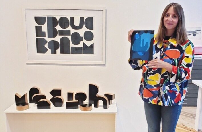
    Open Studio’s Sales and Archive Manager, Rebecca Travis, holding a subscription print by Sameer Farooq and standing in front of Tom Lecuyer’s Feature Wall installation, Shape Garden 2019. Photo: Laura Bydlowska

    OMH-F: Congratulations to all at Open Studio on this milestone anniversary of 50 years supporting printmaking in Toronto! I know your recent partnership with StreetARToronto is in celebration of this anniversary, what else did you have in the works for this occasion?

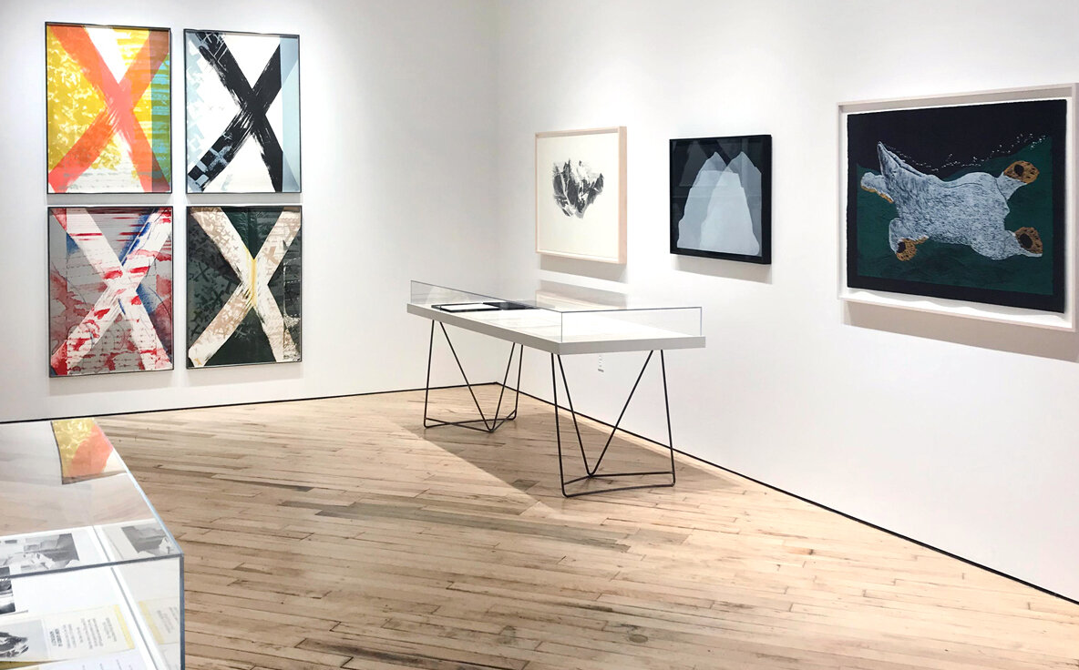
    RT: Thank you! Our 50th anniversary was in 2020 and obviously it was not quite the year we had anticipated. Our main aim was to push printmaking in different directions and acknowledge Open Studio’s past while celebrating the future. We opened the anniversary year with an archive exhibition, which showed prints by some of the artists who have worked at the studio over the years including Rita Letendre, Michael Snow, Tim Pitsiulak, General Idea, and Vera Frenkel, amongst many others.

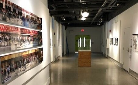
    Installation view of the Archive Exhibition, PRESS RECORD: Prints from the Open Studio Archive, January 10 – February 8, 2020, with works by (L-R): Vera Frenkel, Gordon Smith, Sameer Farooq, Tim Pitsiulak and Micah Lexier (vitrine).

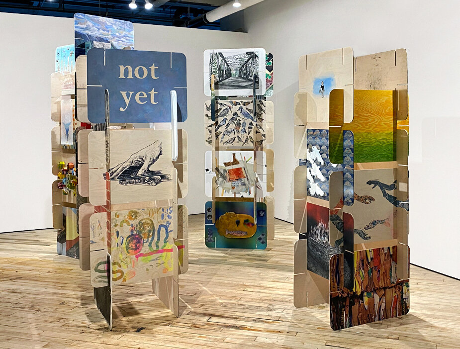
    Our current exhibition Murmuration celebrates Open Studio’s current community and takes print to a sculptural realm with artists printing onto wooden boards that are slotted together to create three-dimensional structures. We have also just opened another public art exhibition in collaboration with Lake Effect Projects, which sees prints by four artists enlarged to billboard scale at the Jack Layton Ferry Terminal, and continues into the summer. In the fall of 2020 we hosted our first ever online fundraiser called Future Proof, which celebrated Open Studio’s golden anniversary, and helped us in securing our future too.

    Installation view of Murmuration, an Open Studio group exhibition celebrating 50 years, November 20, 2020 – March 6, 2021

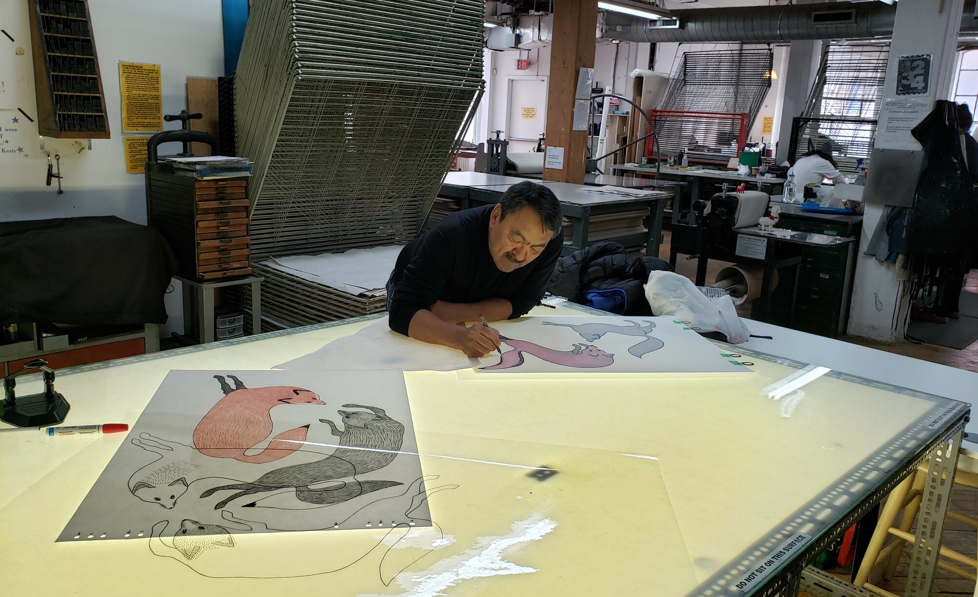
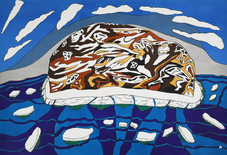
    AG-T: Yes, we had lots of events planned for our 50th celebration. One of the big events in the studio was hosting our annual Inuit Artist Creative Residency in partnership with The West Baffin Eskimo Cooperative and Dorset Fine Arts. In February 2020, artist Quvianaqtuk Pudlat worked with collaborative printers Nick Shick and Jessica Palmer to create two beautiful screen prints.

    Quvianaqtuk Pudlat preparing drawings to screenprint at Open Studio

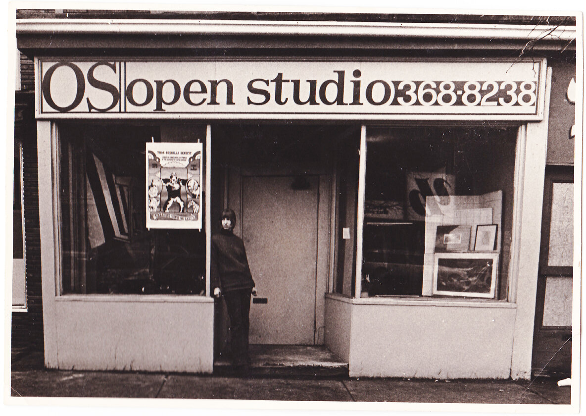
    OMH-F: In your partnership with StreetARToronto, I noticed that one traffic signal control box is located by Queen and Peter (today in front of Peter Pan Bistro and facing a MEC!) near Open Studio’s original address at 310 Queen St. 50 years ago. How else do the locations of the sixteen works connect with the long legacy of Open Studio?

    RT: The locations map a route connecting to sites of artist-run activity past and present, using Open Studio’s original location as a starting point. A lot has changed geographically for Toronto’s art scene in the 50 years Open Studio has existed.

    AG-T: One of the things this route marks is the migration of artists and Artist Run Centres out of the downtown core. As rents went up, these people and places were pushed further West into the Junction. It really highlights the significance of Open Studio being able to stay in downtown Toronto and offer artists access to such an amazing studio and gallery space.

    Open Studio Co-Founder Barbara Hall standing in the doorway of Open Studio’s first location, 310 Queen Street West, c.1971

    OMH-F: With such a large-scale and permanent public project with the City of Toronto (StreetARToronto), what kind of criteria did you use to curate the featured artists and their works?

    RT: We juried for the twelve Open Studio artist designs with the city’s leads on the StreetART project, Jason Campbell and Catherine Campbell, and an artist with connections to Open Studio. As a jury, we took into consideration the city’s mandate for diversity, visual boldness, and the adaptability of the design to the traffic box structure. We also considered how the box designs might deter graffiti and their connection to narratives around Toronto. When working out where different artist designs would be positioned in terms of the boxes available to us, consideration was taken for how the design would relate or provide apt juxtaposition to their site.

    AG-T: The jury also looked at representing artists from many different stages of their artistic practice. This is what makes Open Studio so incredible to work in. Artists at the beginning of their careers can work beside artists who have really established practices. We also took into consideration highlighting the various print techniques that we have at Open Studio.

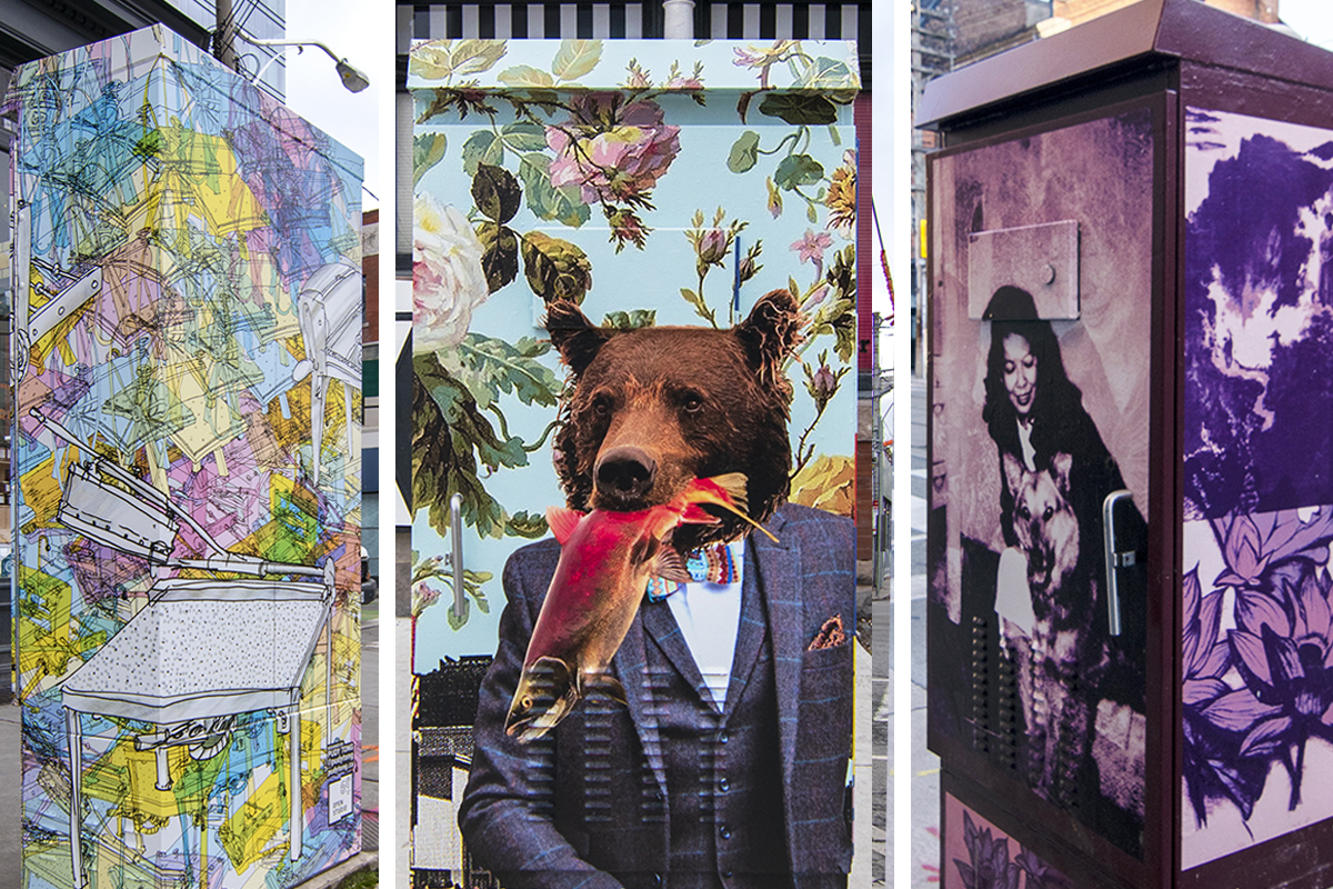
    Detail of traffic signal control cabinets by (L – R): Pudy Tong, Meggan Winsley and Brenda Joy Lem

    OMH-F: On your website, you mention the printmaking connection between the North and South in reference to the four artists from WBEC Studios in Kinngait, Nunavut, featured in the StreetARToronto partnership. Could you speak to this connection as well as Open Studio’s connection with WBEC Studios?

    AG-T: Open Studio has had a creative partnership with WBEC for over 30 years. Over the last five years we have reignited an Inuit Artist Creative Residency with Tim Pitsiulak being our inaugural artist. The residency was so successful that we were able to invite Quvianaqtuk Pudlat to join us in 2020. We are planning a virtual residency with Ooloosie Saila in 2021, and hope to have her join us in Toronto as soon as it’s safe to do so. I’ve also been fortunate enough to travel to Kinngait three times, and am working with WBEC to set up a sustainable etching program for the artists in Kinngait.

    RT: Three of the four artists from Cape Dorset involved in the StreetART project, including Ooloosie Saila, were also included in a curated exhibition called Where She Lives that was due to take place in our galleries just as the pandemic hit. The show ended up taking place online, but it was great to be able to also include a piece by each of the artists in the StreetART project so that the work could be encountered in a much more physical way.

    Ooloosie Saila Silaksiaq, Beautiful Day, 2019, lithograph, Edition of 50, 30” x 44”

    OMH-F: I love this idea of taking the private realm of printmaking to the outer realm of the public. What is the significance of this outward shift?

    RT: Open Studio has so many amazing artists that work within its walls, but printmaking is very labour intensive and so much of what happens in the studio is usually hidden from public view. We have two gallery spaces, but they only allow for a certain amount of engagement, and our audience are usually intentional visitors who already know our space. One of the aims of the 50th anniversary programming was to put printmaking front and centre in unexpected ways. The StreetART project allows for encounters with printmaking in unusual contexts within the wider urban environment. Hopefully it means more people will connect with printmaking, Open Studio, and the artists who have work in the project.

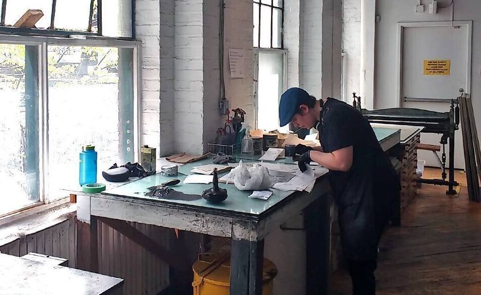
    Open Studio’s Technical Director, Anna Gaby-Trotz, working in the studio. Photo: Laura Bydlowska

    OMH-F: The City of Toronto’s plan to invest in street art is a creative solution to a municipal gripe with vandalism as well as an investment in the local art community. In addition to being the channel to a symbiotic relationship, what does the medium of the traffic signal control box mean to Open Studio or to the genre of printmaking?

    RT: The boxes presented a challenge in terms of a three-dimensional object as opposed to the traditional supports of paper or textile. They also required the translation of an analogue medium into a digital wrap, which retained a sense of its hand-created mark-making, but with the durability of a public art piece.

    AG-T: I think it also takes some of the preciousness out of the medium. Through the translation of print into the large-scale wraps, there is a shift that takes place. These pieces become a part of the urban landscape in a way that a print on paper or a gallery wall cannot. It opens up space for chance encounters with art—waiting for a street car, or walking out for groceries.

    Eric Euler’s box at Queen Street West and Shaw Street. Image from the artist’s Instagram

    OMH-F: As we usher in the City of Toronto’s new ten-year Public Art Strategy, I was wondering if you see anything unique in Toronto’s approach to public art compared with other cities?

    RT: It’s great to see the city formally commit to give focus to public art. Projects like StreetARToronto are already making public art a lot more accessible by becoming part of the ongoing urban fabric, as opposed to just one-off large-scale projects connected to new developments. There’s also some great programming happening in the Don Valley River Park and at The Bentway. The city has a lot of its current public art mapped now, which is great—there’s a lot of them already here when you know where to look. This new ten-year strategy will hopefully continue to add a more diverse array of voices to the art in place across the city.

    Beth Stuart, Reube (V. Stepanova and M. Vionnet), 2019, public mural commission, Don River Valley Park, Toronto

    OMH-F: As lockdowns continue in increasing intensities, Open Studio’s partnership with StreetARToronto is a lovely solitary activity where people can get out and get active with safety. Was this something you considered when curating the works or a happy consequence of the time?

    RT: The fact that so many galleries have had to close their doors at this time certainly gives new importance to having art outside in the public realm, which isn’t bound by the same restrictions, but the timing of the pandemic was definitely not expected. We’ll take it as a silver lining of the project’s timing—I think we all need a few of those! We hope that people will enjoy the project and follow the route to see all the boxes. There is an online map to follow and we hope that it will give people a chance to both get fresh air and engage with the project at the same time.

    AG-T: Yes, definitely the silver lining. The lockdown happened just as the project had been juried. There were a few moments when we weren’t sure it would happen—there was a lot of uncertainty of what The City would be offering. I’m really happy that The City of Toronto has continued to support artists and the staff who create the space for artists to work and live in Toronto. This was such a vital project for our artists at this time. I had several people say working on this project was a real light for them during a very challenging time!

    Images are courtesy of Open Studio

    *Exhibition information: StreetARToronto Partnership, December 1, 2020 – January 1, 2025. Various locations in the city, please view the online map.

  • Hi Libido @ Gallery 1313

    Ha! And you thought you were lonely before the pandemic hit? This may be the most unconventional Valentine’s Day yet and Gallery 1313’s annual Sex Show appears once again to lift spirits while simultaneously addressing contemporary issues on sex and intimacy. Gallery 1313 explains that the pandemic has had a large impact on dating, hook-ups, and long-term relationships, which have been strained further than ever. The show is eclectic, with Gallery 1313 prefacing that Hi Libido takes on subjects ranging from sexual politics, to humorous pieces, to scientific works, to bondage, and to just about everything in a range of mediums including photography, painting, drawing, and more.

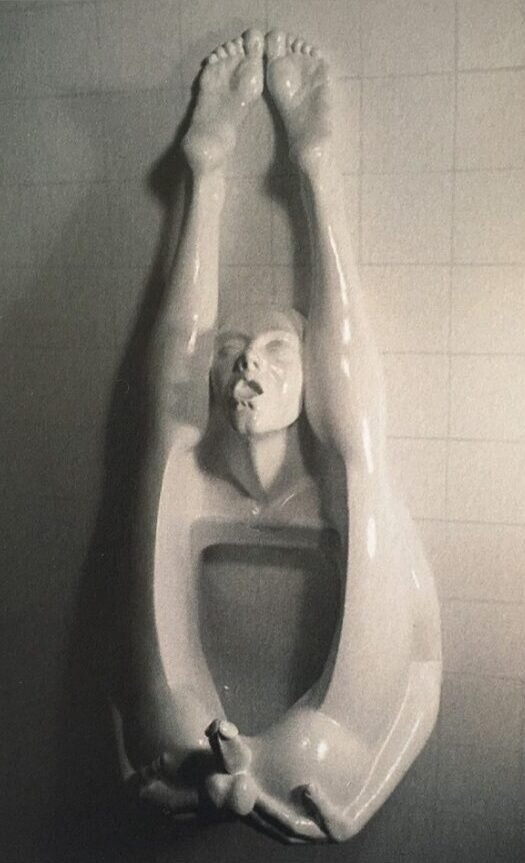
    Craig Mahood’s Functional Bathroom Erotica is an operating urinal shaped like a man with his legs over his head, his face in a blissful expression. When I first saw this work, I immediately thought of Marcel Duchamp’s famous work Fountain, 1917 which is a urinal positioned alternately so that it no longer has its original use and then given a signature and a name. Mahood’s urinal has additional sculpted elements and is fully functional, which is the opposite of Duchamp’s work, but both artists seem to be using the concept of the readymade where ordinary objects are selected and modified, becoming art. Mahood reveals, “I have always enjoyed taking mundane functional objects that are easily taken for granted and giving them a new life”.

    Craig Mahood, Functional Bathroom Erotica

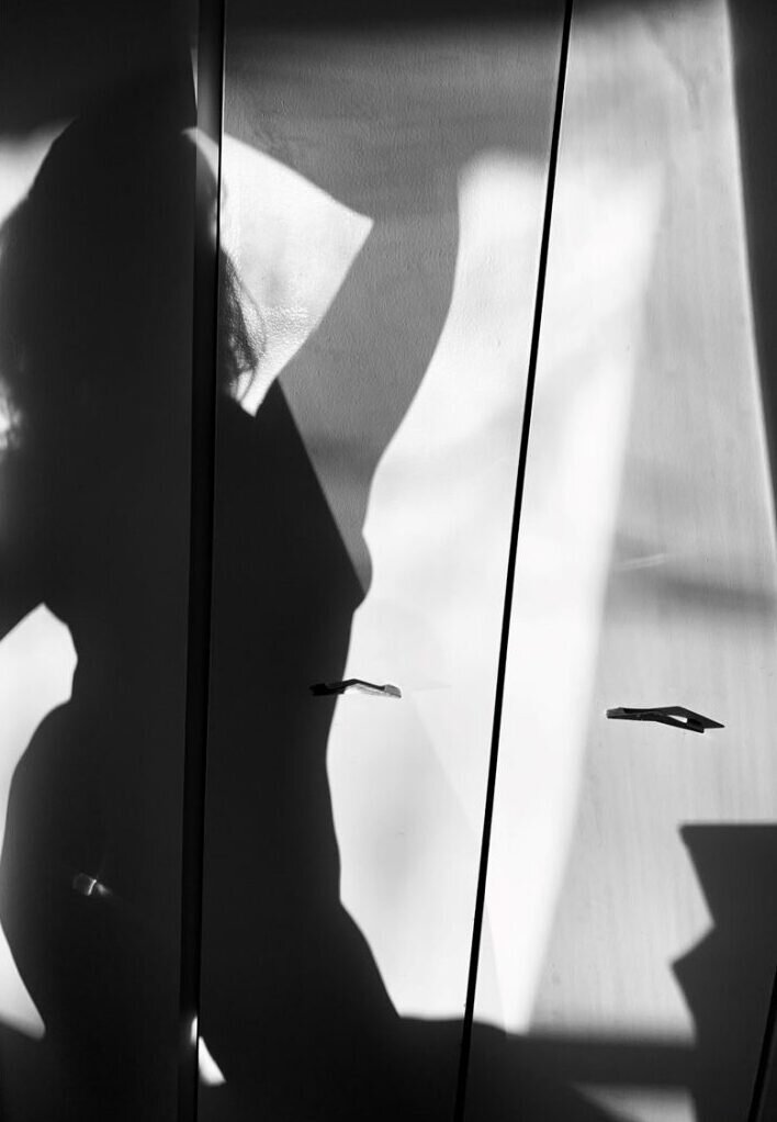
    When describing the works Come Over and What Can You Do To Me, the artist, Kristen Stephen, points out that lust can intensify the sexual experience. In her black and white silhouette photographs she captures shadows of the female body where the viewer can imagine possible scenarios. When viewing these photographs, I thought of the shadow and how it is an anonymous state, not showing the details of someone’s face. This format could easily cater to the gaze and the objectification of women, giving the work more layers.

    Kristen Stephen, Come Over, black and white photograph., 8″ x 10″

    Diana Rosa’s artworks immediately catch the eye with her bold style and vibrant colors. Rosa writes that she “employed a Naïve Folk-Art style to explore questions of identity, love, relationship and environment in our society”. Fruit Connection’s merging of bodies and symbolic use of fruits creates a visually stimulating piece. It is important to remember that the painting goes further than what is represented physically, she tells us “I think of my drawings as portraits of a soul, not an actual person–pulling from the universal level instead of our clouded worldly view”.

    Diana Rosa, Fruit Connection, acrylic on canvas, 32″ x 32″

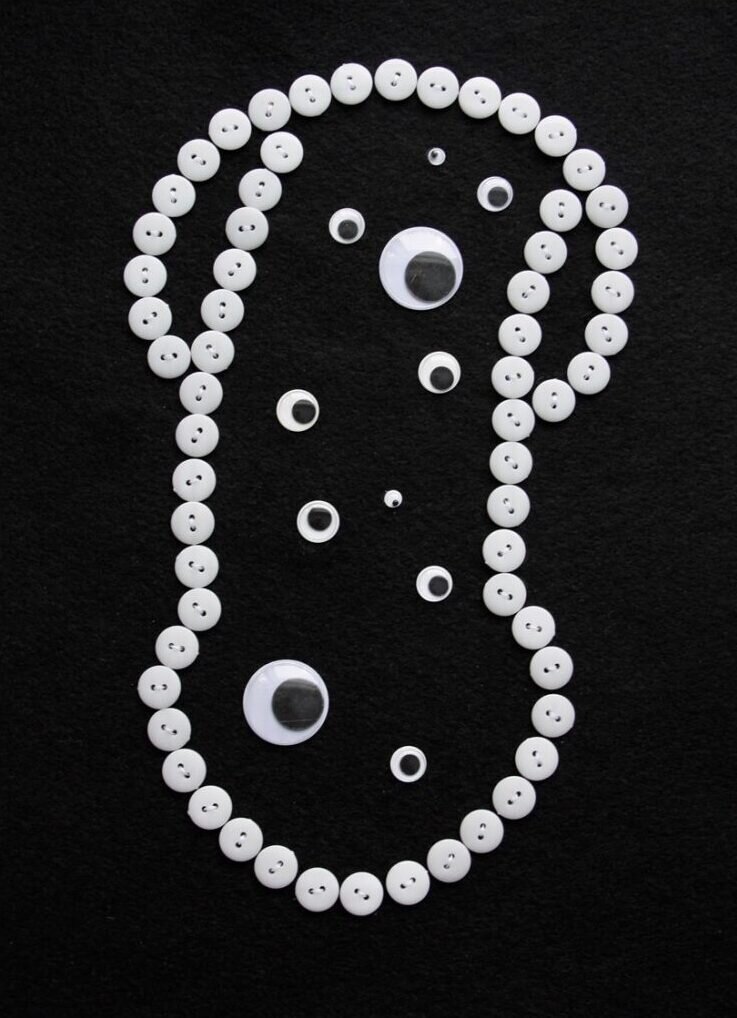
    Phillip Hare’s phallic mixed media works are on the lighter side of the art in this show. The forms are made of buttons, which are fitting as they are the trinkets that hold together and open up clothing, with the outline filled with googly eyes that look back at you with wide eyes. Hare explains that the work was inspired when the British Columbia CDC recommended using glory holes to reduce COVID transmission in July 2020. At first, the suggestion is laughable but given another moment’s thought, you can’t deny it makes sense.

    Philip Hare, Glory Hole II, 2021, mixed media, 10” x 12”

    The next surprise is a photograph of a giant set of shiny, plushie handcuffs. Naomi Brenneck says, “I use humor and exaggeration in many of my pieces to soften the sometimes-jarring concept and make it an enjoyable object to look at”. By making an ordinary object comically large, one’s attention to it changes and, as the artist confirms, she uses this approach in art in order to promote sexual education and positivity, LGBTQ+ rights, and mental health issues.

    Naomi Brenneck, Stuffed Handcuffs

    This show left me wanting one thing – more photos. One is provided for each work but for me this was not enough to be able to fully drink in the details, making me pull my eyebrows together and crane my neck towards the screen.

    Gallery 1313 stated that they hoped the show would cause a smile or a chuckle – and in this way Hi Libido is successful. The online exhibition’s range of artists and themes makes this show intriguing and surprising, leaving one feeling amused while also opening up discourse on broader topics and issues.

    Olivia Musselwhite

    Images are courtesy of Gallery 1313 and the artists

    *Exhibition information: Hi Libido, online group exhibition, February 3 – March 2021, celebrating Valentine’s Day, Gallery 1313.

  • KUDOS VII at the Canadian Sculpture Centre

    The Canadian Sculpture Centre started the New Year with the launching of their KUDOS VII exhibition on January 23. The show was primarily organized as an expression of gratitude to the patrons, volunteers and artists of the Sculptors Society of Canada and celebrates the generous support, dedication, and commitment of the SSC’s executive board, volunteers and the Greenrock Charitable Trust during these challenging times. Hence the title ‘kudos’ — which according to the Oxford Dictionary — is the Greek term for ‘praise’.

    Continuing their longstanding KUDOS series, the Canadian Sculpture Centre brings this latest group exhibition showcasing the work of the Sculptors Society’s membership. The content is not defined by any overarching theme, but rather celebrates the multi-faceted interests and talents that the individual artists possess.

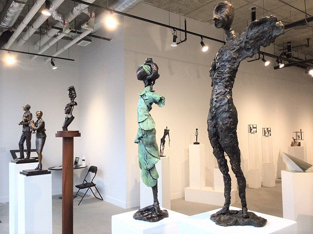
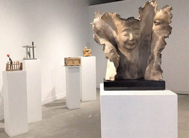
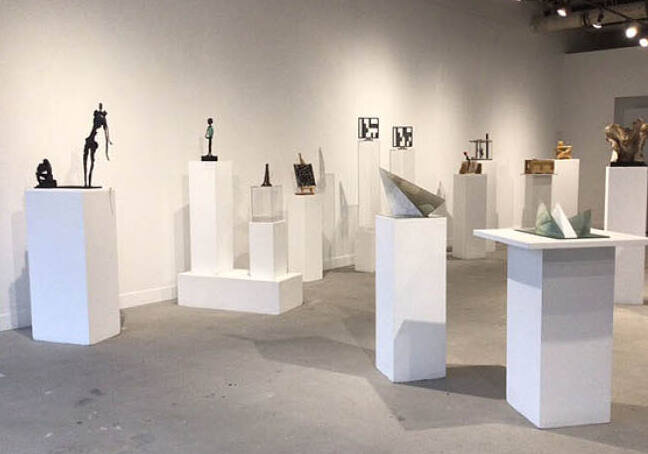
    Installation view with works by (L-R): Marc André J. Fortier, Karen Stoskopf Harding and Camie Geary-Martin (2 sculptures)

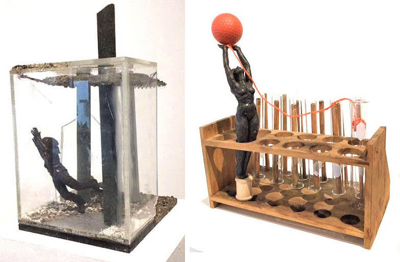
    Everyone is complaining about difficult times now as we are still in lockdown because of COVID-19. For art lovers, like myself, it is a nightmare since all the museums and galleries are closed. Accepting the challenge of this hardship, some of the artists addressed the pandemic and its outcomes directly. I found Janine Lindgren’s pieces especially expressive of our feelings. Stop the Spread depicts two aspects of this pandemic: the effort of trying to stop it and waiting for a vaccine. A woman captured and tiptoeing in a laboratory tube holder reaches out to catch the virus, embodied as a red balloon flying tethered with a red cord to a laboratory flask that contains contaminated blood. A heroic intention indeed. There are many more glass tubes in the holder that also suggest more testing — and our hope for a vaccine.

    Janine Lindgren, Quarantine Struggle (left) and Stop the Spread (right), both bronze, mixed-media

    Lindgren’s Quarantine Struggle is a very dramatic composition. It depicts the lockdown literally as a woman is caged in a glass container, completely isolated from the outside world. She desperately tries to break free from her chokingly small and boring surroundings — but it seems that the walls won’t yield. I think we have all had similar feelings throughout this year of COVID-19 lockdowns. This work successfully depicts the conflict between the natural world outside and the unnatural world inside the cage.

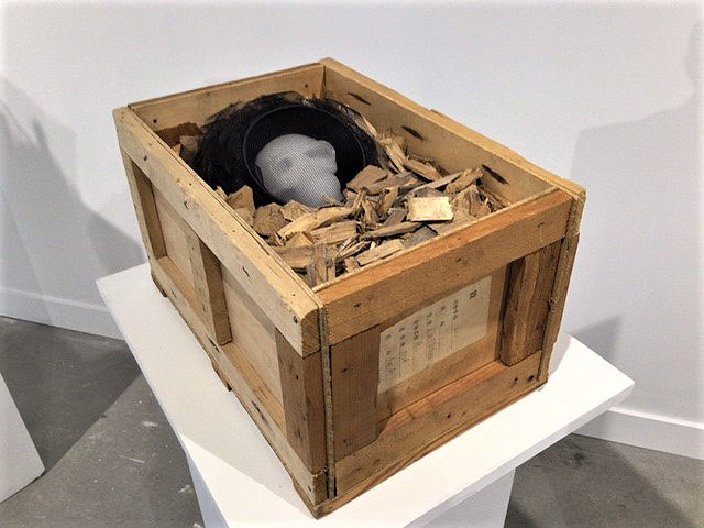
    Judi Michelle Young’s Soul by Track was originally created as one segment in a visual narration of Canada’s “iron road” family, a sad part of the past. But looking at the skull one can’t help but associate it with the many deaths from COVID-19 and remember that in Italy, for example, they had to bury the dead in mass graves. Their families won’t even have a grave to go to and remember their loved ones.

    Judi Michelle Young, Soul by Tracks, mixed-media (anodized aluminum veil, waxed skull, cedar wood)

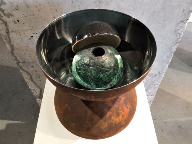
    Peter Wirün’s, A Black Hole Analysis Imager, was intended to reimagine “black holes” — that very interesting phenomenon that is mainly unknown. The artist’s ‘novel idea’ is that the Big Bang created parallel universes. Recent research suggests that “black matter” is actually much larger than the “light matter” we know more about. However, looking into that bottomless hole, one associates it with the “dark” days we have been experiencing for far too long a time; the fear of the unknown.

    Peter Wirün, A Black Hole Analysis Imager, stainless steel, rust paint, ceramic

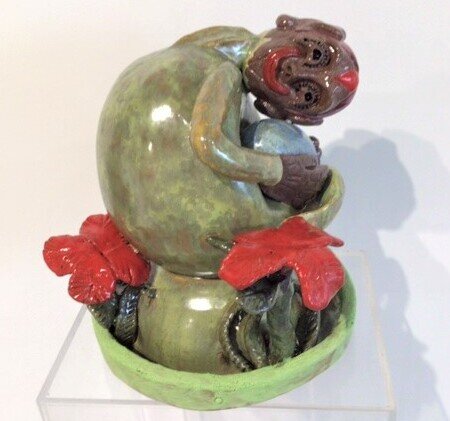
    Whenever humans face hard times, hope is always there; as Gerhard Richter pointed out, “Art is the highest form of hope.” César Forero’s work, The Red Clover and The World illustrates Richter’s quote perfectly. A small figure hugs a gigantic red clover. As the artist explained: “4-leaf clovers generally symbolize ‘luck’; my ‘red’ — represents love & awareness — an optimistic view in difficult times.”

    César Forero, The Red Clover and The World, ceramic

    Marlene Kawalez in her work, Together, shows that no matter what challenges we face, we maintain our connection to loved ones. Even when family members seem to be separated by dividers, they still find support and happiness in their bond to each other.

    Installation view with Marlene Kawalez, Together, fired clay (front right)

    Installation view with works by Won Lee (left) and Barbara Fletcher (right)

    It is very unfortunate that we can’t visit the gallery to enjoy this exhibition in person. Sculpture is a 3D artform where spacing plays an important part. But even if we can’t walk around them, the exhibited pieces still deserve our attention, so please check them out online.

    Emese Krunák-Hajagos

    Images are courtesy of the Canadian Sculpture Centre

    *Exhibition information: KUDOS VII, January 23 – February 27, 2021, Canadian Sculpture Centre, 19 Mill Street, The Distillery District. An online group show featuring: John Clinton • Barbara Fletcher • César Forero • Marc André J. Fortier • Camie Geary-Martin • Karen Stoskopf Harding • Saulius Jaskus • Marlene Kawalez • Won Lee • Janine Lindgren • J. Mac • Bastien Martel • Dina Torrans • Peter Wirün • Judi Michelle Young

  • Four Works from Open Studio x StreetARToronto

    Keith Haring once said, “Art is nothing if you don’t reach every segment of the people.” Now more than ever, street arts’ innate accessibility and inclusivity is incredibly valuable.

    Open Studio Contemporary Printmaking and the City of Toronto’s StreetARToronto (START) Program have collaborated to celebrate Open Studio’s 50th anniversary. This project aims to bring printmaking outside of the gallery and into the public sphere, namely sites of past and present artistic centres in Toronto. Featuring sixteen artworks, by twelve artists from Open Studio and four from WBEC Studios in Kinngait, these analogue prints have been vinyl wrapped and installed on traffic signal control cabinets at different intersections throughout the city, from Queen Street West to the Junction.

    Open Studio’s aim to bring printmaking to a wider audience is even more impactful in unprecedented times such as these. Art lovers missing their habitual gallery visits due to COVID-19 are encouraged to seek out these boxes, either intentionally or by chance.

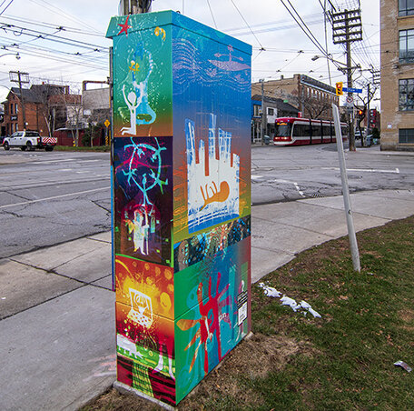
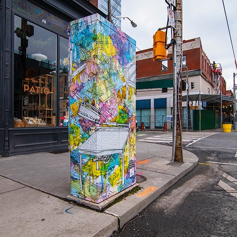
    At home with Toronto’s already vivid street art scene, these prints fit naturally with the eclectic, mismatch aesthetic of the city. The first artwork in the list, by Pudy Tong, stands at Queen St West and Peter St, amidst of closed boutiques and empty restaurants.

    Pudy Tong’s work at Queen Street West and Peter Street. Courtesy of Openstudio.ca

    This dynamic, complex piece brings energy to this now-quiet location. Its vibrant, playful hues and frenetic lines first seem abstracted, but upon looking closer you can see overlapping images of the printing process, in different colours and varying opacity. The box is colored in pink, yellow, and blue, so the different levels of transparency enable the colours to combine into new shades.

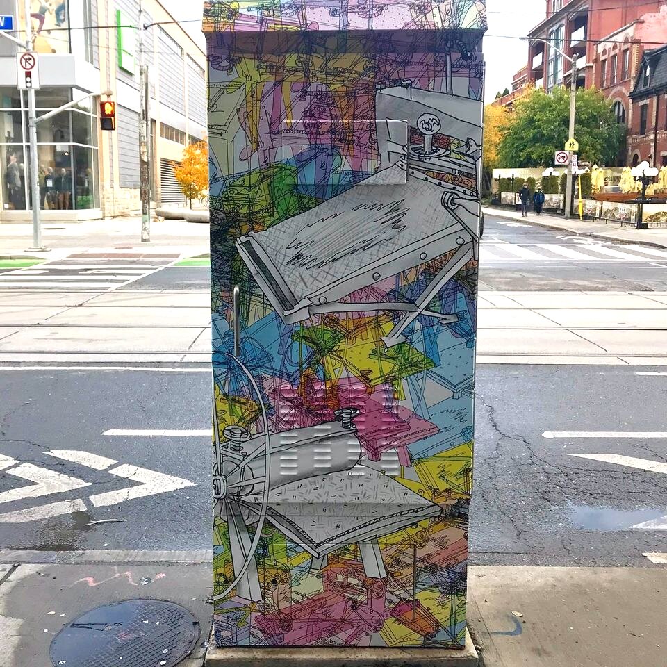
    The other side of Pudy Tong’s work at Queen Street West and Peter Street. Courtesy of Openstudio.ca

    These printed motifs overlap to form masses of indiscernible shapes. Groups of prints with matching bright colours clump together, while two larger, monochrome printers in the foreground, depicting printing instruments, capture the attention of the viewer.

    Another box is decorated by Brenda Joy Lem. On the front and back, there are two portraits, a woman on the side that is facing the sidewalk, and a man on the side looking at the street. On the other sides and under the woman’s portrait, there are repeating lotus motifs, and several photographic scenes. Lem’s work highlights the important history of working-class Chinese Canadians.

    Front side of Brenda Joy Lem’s piece at Queen Street West and Augusta Avenue. Photo: Bronwen Cox

    Most parts of the images are monochromatic, in varying shades of muted purple, but the man’s figure and his surroundings are coloured in bright, attention-demanding red pigment.

    Other side of Lem’s piece at Queen Street West and Augusta Avenue. Photo: Bronwen Cox

    These prints originated from Lem’s solo exhibition Homage to the Heart, in which many of her works were inspired by her family history. These portraits depict her aunt and her uncle. The portraits are intimate, and both figures’ warm, welcoming smiles give a feeling of intimacy and comfort.

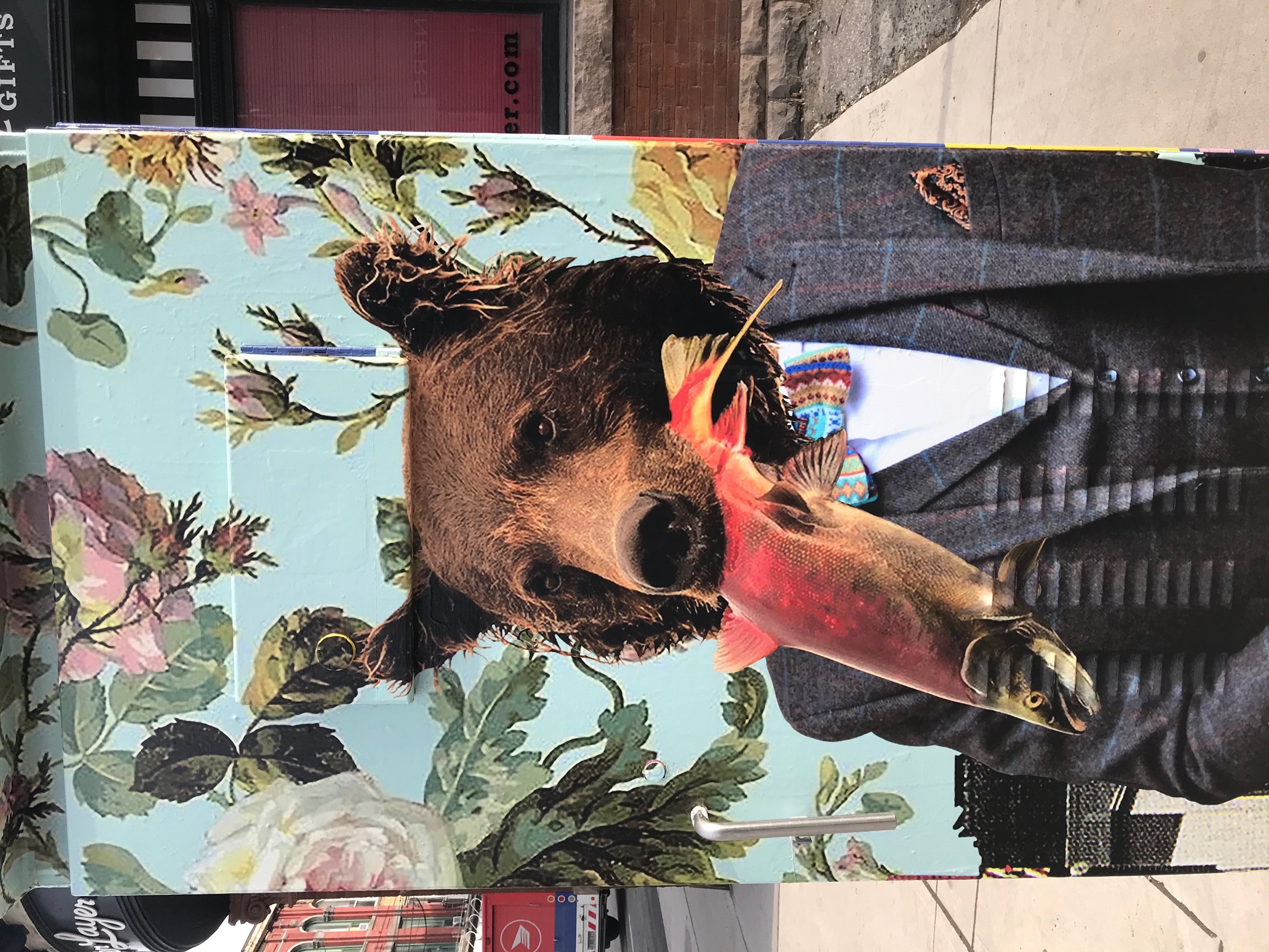
    Meggan Winsley’s work depicts a startling anthropomorphic figure: a creature with a bear’s head, wearing a three-piece suit and holding a dead fish in its mouth. This bear-human sports a colorful bowtie with geometric patterns. Beast and human overlap and can no longer be separated. The pink salmon might be food for both. The bear can be a long-forgotten totem animal for this well dressed male, who might no longer remember the basic instincts of his origin. The background is a pale blue-green, with a pattern of roses and other flowers. Here, Winsley brings whimsical nature to the heart of downtown Toronto.

    Meggan Winsley’s piece at Queen Street West and Portland Street. Photo: Bronwen Cox

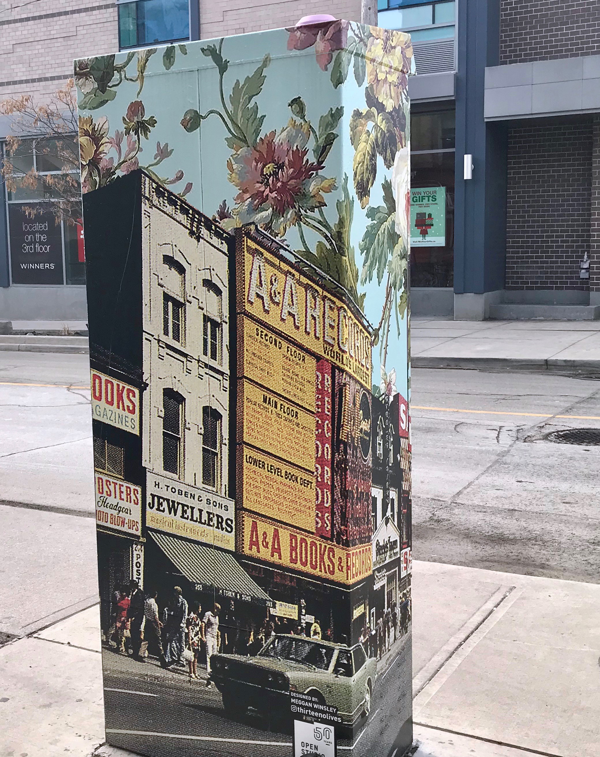
    On the other side of the box, against the same floral background, there is a print of an old photograph, a street scene with a jewelry and a book and record store. The street is busy and full of people, as an old car drives by. The picture depicts one of the main locations of the former Canadian record company, A&A records, which used to be located near Yonge and Dundas. Fusing mythical and historical Winsley’s piece is a unique addition to the project.

    The reverse side of Winsley’s box at Queen Street West and Portland Street. Photo: Bronwen Cox

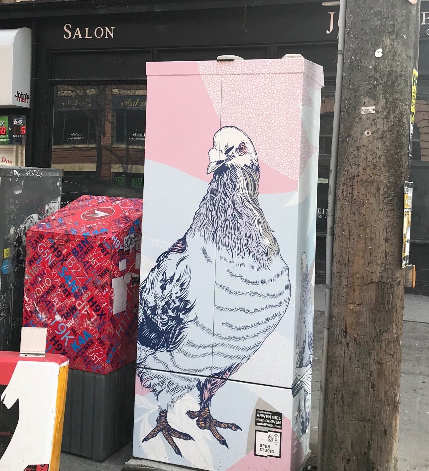
    Another animal-themed box stands just a few blocks south of Winsley’s. Arwen Giel’s contribution to the project brings pastel pigeons to King West. These stylized, larger-than-life birds rest on a background of pale pink, light blue, white, and grey, forming a pattern of leaves, dots, and solid colors.

    Arwen Giel, at King Street West and Portland Street. Photo: Bronwen Cox

    Much of Giel’s work focuses on city life, plants and animals, and these pigeons fit into both categories. Based on Giel’s previous drawings, these birds are both wild and urban, a quintessential Toronto species.

    The another side of Arwen Giel’s work, at King Street West and Portland Street. Photo: Bronwen Cox

    These are just four pieces from this extensive project. If you live close to any of these locations or the other sixteen, I’d definitely recommend donning a facial covering and going for a walk to see one or many of these fantastic works.

    *Exhibition information: Open Studio x StreetARToronto Partnership, Group Exhibition, A Celebration of 50 Years of Print and Artist-Run Centres in Toronto, December 1, 2020 – January 1, 2025, various places in Toronto from Queen Street West to the Junctions; please visit their website for the exact locations.

  • Portraits in COVID Times at the Harbourfront Centre

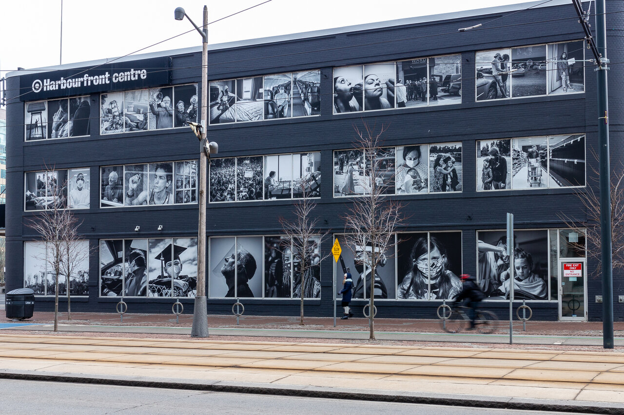
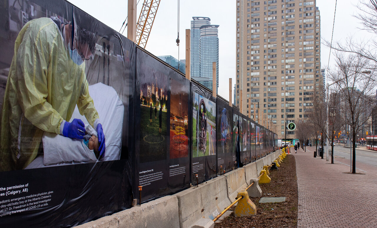
    I saw Portraits in COVID Times: Documenting a Nation in Change at the Harbourfront Centre on an eerily quiet afternoon in downtown Toronto. Yet, the empty streets—more barren than usual—only heightened my awareness of the impact of COVID-19. Portraits in COVID Times features fifty-nine large-scale photographs spread between two sites on Queens Quay West, a fraction of the over 5,000 submissions from “citizen photographers and professionals alike.” This exhibition was organized by the team behind Canada COVID Portrait.

    Street view of Portraits in COVID Times: Documenting a Nation in Change at the Harbourfront Centre by Brian Medina. Photo: Olivia Mariko Hsuen-Ferris

    The photographs date from March to October 2020, documenting the physical and emotional changes in the lives of people from across Canada. The black and white images on the Harbourfront Centre façade are presented on windows outlined in white rims, creating a frame-like effect. On the grey afternoon I visited the Harbourfront Centre, these black and white images against a charcoal-coloured building gave the illusion of being inside a world of black and white. The choice to exhibit these thirty images in black and white was an effective one, capturing a sense of historic monumentality despite the intensely contemporary nature of the content. These COVID portraits masquerade as archival documents by capturing the sensibility of famous photographs of the past.

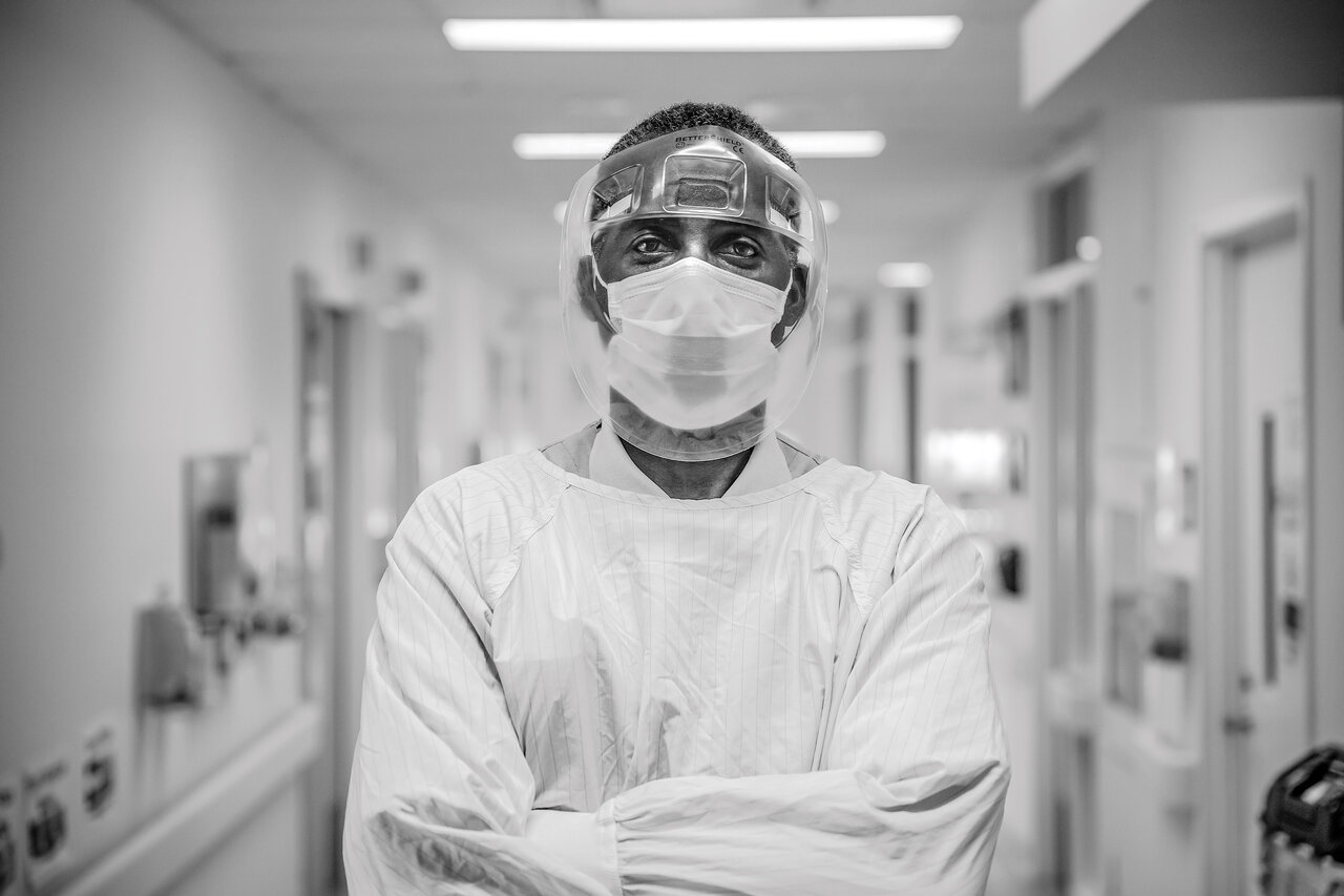
    Gage Fletcher for Trillium Health Partners (Mississauga, ON)

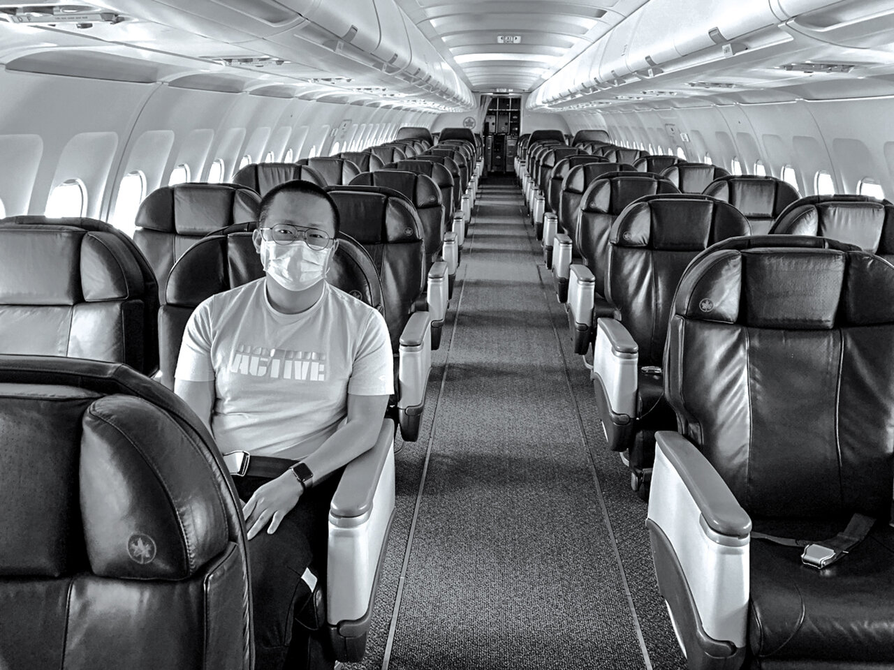
    The bizarre yet familiar photographs feel comfortable in their recognizability: a masked girl in a bodysuit jetés outdoors, a couple bangs pots on their doorstep, a health-care worker stands heroically in PPE. From the dynamic gravity of a Black Lives Matter vigil to the chaotic delight of using a kiddie pool in the living room, these images capture the large and small changes to our lives in 2020. One of my favourites is the humorous oddity of Allan Yong sitting alone on an empty plane, the only passenger on a flight from Toronto to Ottawa. A once-in-a-lifetime trip, Yong flies in a 58-seat jet normally reserved for the likes of the Toronto Raptors or the Toronto Maple Leafs.

    Allan Yong (Ottawa, ON)

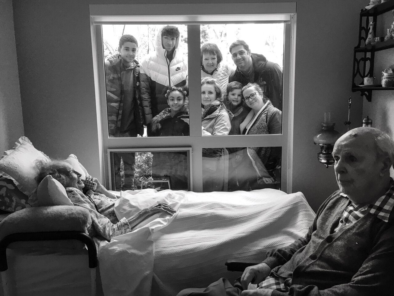
    One of the most emotionally cutting images is by Sharon Robertson in Vancouver BC. This photograph captures the small joy of a visit between an elderly couple and their family. The family looks with mixed happiness through a window from the outside, while inside, an elderly woman grins on the phone and an elderly man gazes wistfully out of frame. This scene is bittersweet in itself but the caption is heart wrenching: “The couple passed away five hours apart on April 6 after being diagnosed with COVID-19.”

    Sharon Robertson (Vancouver, BC)

    The rest of the exhibition is located a few blocks west, lining the sidewalk at Queens Quay W and Rees St. Here the rest of the photos are in colour against a black backdrop, lined one by one along a temporary wall. Each image has a caption below it and the action of stopping to read each one recalls the ritualistic viewing of art works in a gallery many of us haven’t practiced for a year. Pieces of the exhibition are tearing off and flap gently in the wind—an accidental consequence of a Toronto winter no doubt—serving as an unintended reminder that this isn’t mounted inside a gallery because it can’t be.

    The second site of Portraits in Covid Times at 318 Queens Quay W. Photo: Olivia Mariko Hsuen-Ferris

    Reverend John Pentland in Calgary, Alberta stands in front of pews with photos of community members on March 22, 2020 by Leah Hennel (Calgary, AB).

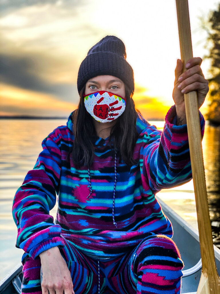
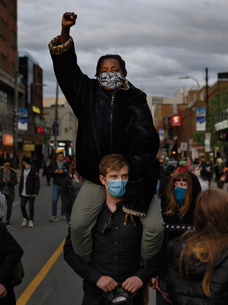
    The colour photography of the second site heightened my contemporaneous awareness, but the range of joy and gravity in the subject matter remains. Tara Barnes’ image of “Sarain Fox in resistance on unceded Algonquin territory, Golden Lake on May 5” truly belongs at the second site in its effective use of colour to convey the message. This image next to Darren Calabrese’s image of protestors at a June 3 march against anti-Black racism and police brutality in Halifax, Nova Scotia serve as potent reminders of what was done and all that is to come in racial justice work.

    Sarain Fox portrayed by Tara Barnes (Toronto, ON)


    Protestors at a June 3 march against anti-Black racism by Darren Calabrese (Halifax, NS)

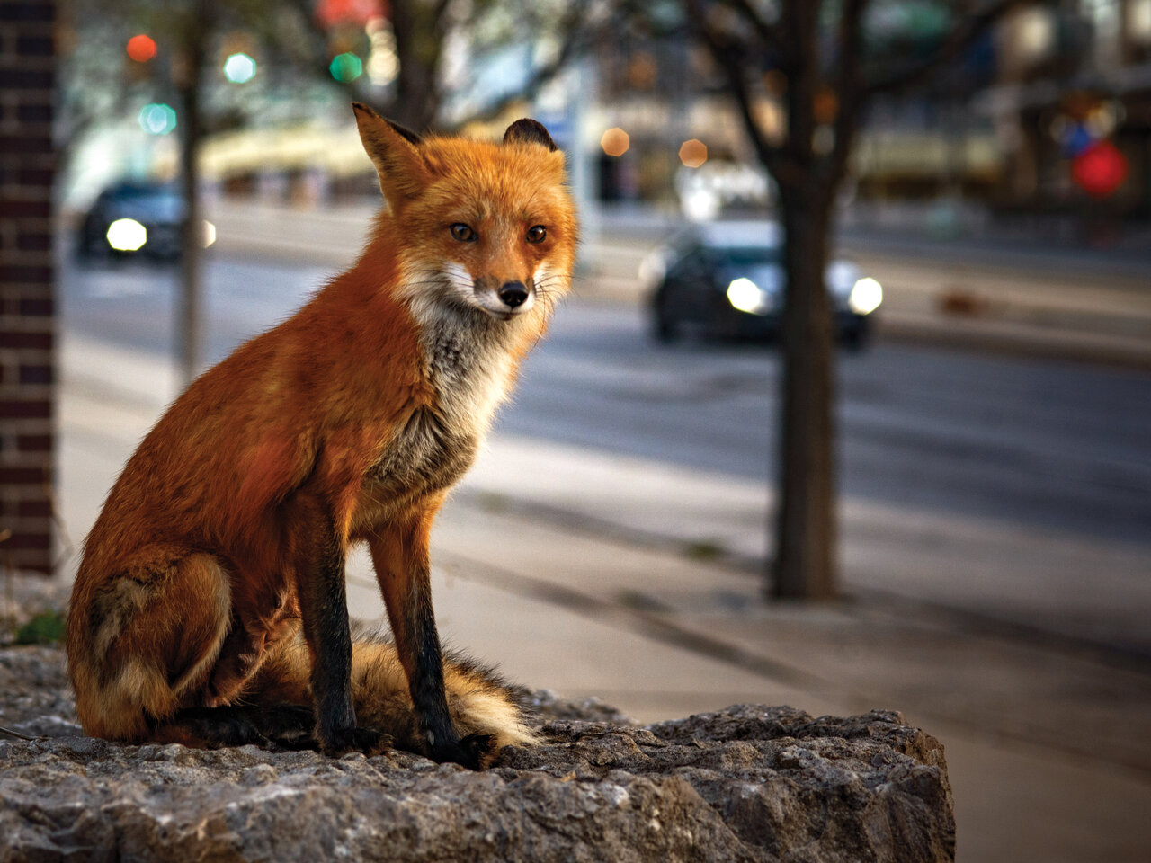
    Daniel Neuhaus’ May 3 portrait of a fox near CityPlace in downtown Toronto stands out due to both the brilliant red fur and the message captioned below it: “…I am already feeling nostalgia for that brief moment in the history of our city when the animals ruled the streets.” With the fear and uncertainty of the early pandemic, the small joys were brighter by contrast. Portraits in COVID Times itself evokes a sort of nostalgia for 2020, in spite of the collective pain the world suffered. The euphoria of seeing animals run about or of hearing the loving cheers of an unknown neighbour is one of those feelings singular to lockdown and accessible now only by memory.

    Daniel Neuhaus (Toronto, ON)

    Portraits in COVID Times is a perfect time capsule, ready to be buried and discovered by the later generations who will marvel at our unfathomable world. This exhibition, and the photos on the Canada COVID Portrait website and Instagram, capture exactly what it felt like to be a Canadian during this time. The unbelievable grief, hope, frustration, humour, triumph, and loneliness; it’s all there along Queens Quay. These photos capture our national truths, and for that reason we will look at them years from now, with tears in our eyes and goosebumps all over, and we will remember all we lost and gained.

    Olivia Mariko Hsuen-Ferris

    *Exhibition information: November 9, 2020 – May 1, 2021, Harbourfront Centre, 235 Queens Quay West, Toronto. Rees Street Parking Lot, 318 Queens Quay West, Toronto.
    Featured image: Patrons at the Bow Valley Ranche Restaurant in Calgary, Alberta enjoy a Covid-safe dining experience in pop-up garden globes on August 5, 2020, captured by Leah Hennel

    Images are courtesy of Canada COVID Portraits

    More photographs from Canada COVID Portrait can be viewed on their Instagram (@canadacovidportrait) and website (canadacovidportrait.ca).

  • Erika DeFreitas: An Exploration in Meditation and Reflection

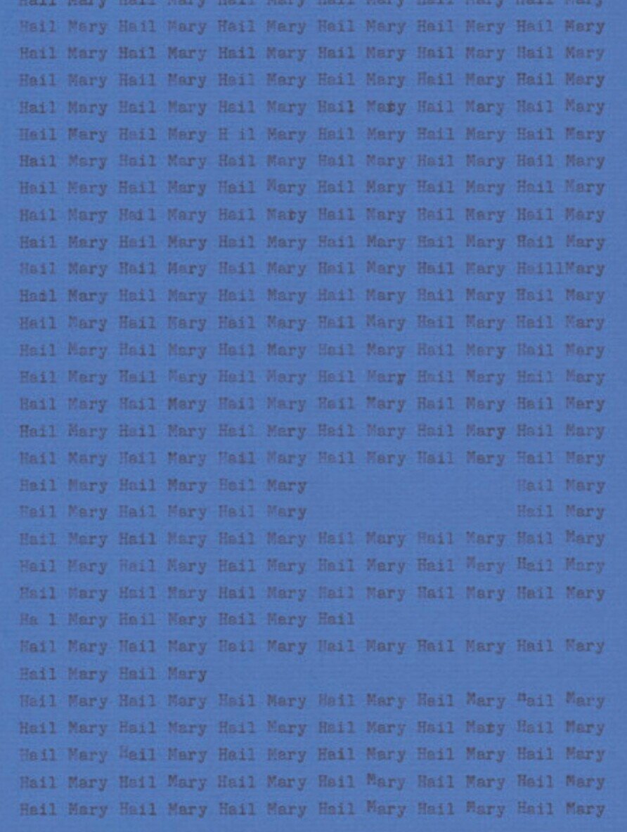
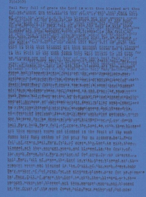
    With the exhibition I initially wanted to go through each of the contributions of tofeelclose, treating them as a collective response. I kept finding myself thinking back and reflecting upon Erika DeFreitas’ work, and so I started to look for her in the thinness of the night (meditations), envisioning the faded cobalt paper and the tactile quality of its grain. Or the sensation of using a typewriter when I was a kid compared to now, having devices without physical keys to push and lift, though still functioning as sensitive to pressure below the flat screen. The work is composed of individual pieces of text, beginning the same way as the Hail Mary prayer. The words and layers upon layers of the ‘Hail Mary’ also brought back memories of the rite of confession and the verdict of which prayers to recite as penance for their sins. That series of utterance lays before you now, neatly typed and scanned on your screen.

    So, I find myself asking, what does it mean to be close? To have faith while being separate from the congregation or the institution? This can apply for religious practices in the age of COVID-19, but also applies as a commentary on longing for something to believe in, yet being surrounded by believers that keep you at a distance. Or a faith that keeps you at a distance. Those acts of prayer and penance affirm that there is a gap to bridge, to the parties you are praying to in addition to the level of goodness you need to attain. DeFreitas marks this sentiment of repetition, a striving to close the chasm in search of a touch, or security, or the boundless love that is promised. Separate from the institutional aspect, what does it mean to be close to those you have lost? How do we maintain those ties, if not through remembrance or communicating to connect?

    In the video work, she looms in the resemblance should it be so anxious, DeFreitas captures the subject in relation to light. Gradually, the woman opens her mouth, bit by bit, having the amorphous spot of light move closer and closer. Eventually, her mouth manages to hold the light inside, prompting the response of moving a hand over it, perhaps with the intent to safeguard it within. Of course, the light escapes, onto the figure and upon the hand, shifting its placement as it moves: it is not to keep. Towards the end of the video the woman closes her mouth once more, letting the light rest upon her hands with a certain satisfaction. rather than having it settle within.

    As for the display of as it is, or even, perhaps a recitation and emigration, we stay transfixed on the motions of a pair of hands and the flickering of light as it travels through patches of grass. The hands try to follow the movements, working their way toward holding that ball of light within their palms. Closing them like a clam only to find that it remains on the outside, on the surface once more. The hands hold the light before you, presenting it as a gift: “look what I’ve found”, and as viewer I take delight, imagining the warmth of the sun in my own hands and the experience of fresh grass in the summer. These attempts to capture something ethereal, can feel like praying or playing, both fulfilled in some way.

    The final video, something else is happening, differs in its incorporation of audio, including the sounds of birds and captioning comments to offer a guided narrative to follow. We read about the witness of light and its journey from the celestial sky to earth. The video documents an experience of the sun, what it offers, and how it changes our way of being. It captures the fear it elicits, yet also recollects the spectacle of beauty and warmth that comes from it.

    Between these videos are more scans of the typed ‘Hail Mary’, not including all lines of the prayer but enough to identify it. Eventually the layers grow denser as the lines pile on, and the words seem typed in bold letters, consisting solely of capitals. The words become lost along the way, a recital that shifts or becomes detached from its initial intent. It becomes more difficult to discern which line is written and the names are harder to identify as capitals aren’t readily used. Keys are held, taking up nearly a whole line for the letter ‘l’ or ‘r’, emphasizing words through repetitive taps of the selection. That repetition in the form of taps, or lines, or the prayer as a whole, weaves its way throughout the project.

    These acts of meditation in the form of typed prayers and videos with moving light communicate the acts of reflection, with the understanding that consciousness is free flowing in these activities. They aren’t moderated by format or cohesion for a third party to read, it is legible for the participant only – and that is enough. DeFreitas shares these intimate displays of privacy and how it is affected by the light, while also functioning parallel to the relationship with the Christian intercessor, the Virgin Mary. DeFreitas’ thoughtful display grants us an opportunity to be privy to the world as the artist understands it: the glimpses into their streams of consciousness, the meditative act of prayer, the idea of opening yourself up to a greater entity. 

    Overall, the project proves to be a very rich experience prompting personal reflection and the desire to meditate. As we search for artwork to safely engage with, tofeelclose is a platform to visit during this time. There are currently 11 projects being hosted, it is worth suggesting to visit one a day so as not to take the creativity for granted. Soak it in, reflect and digest their work.

    Rashana Youtzy

    Images are courtesy of the artist

  • Tau Lewis at Cooper Cole

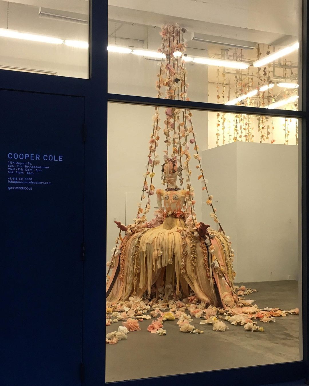
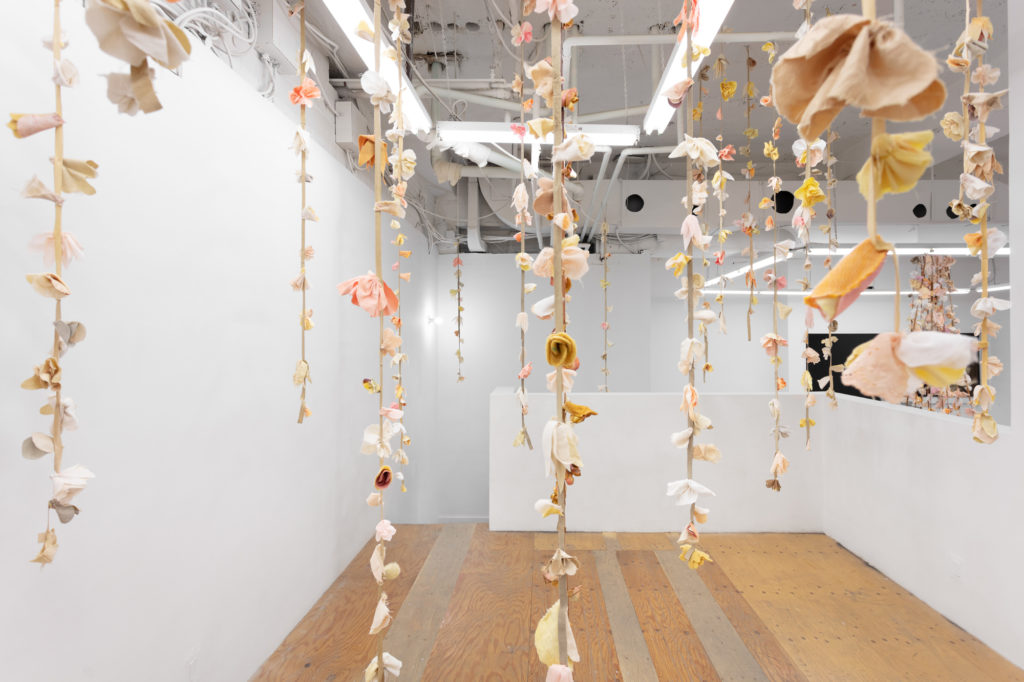
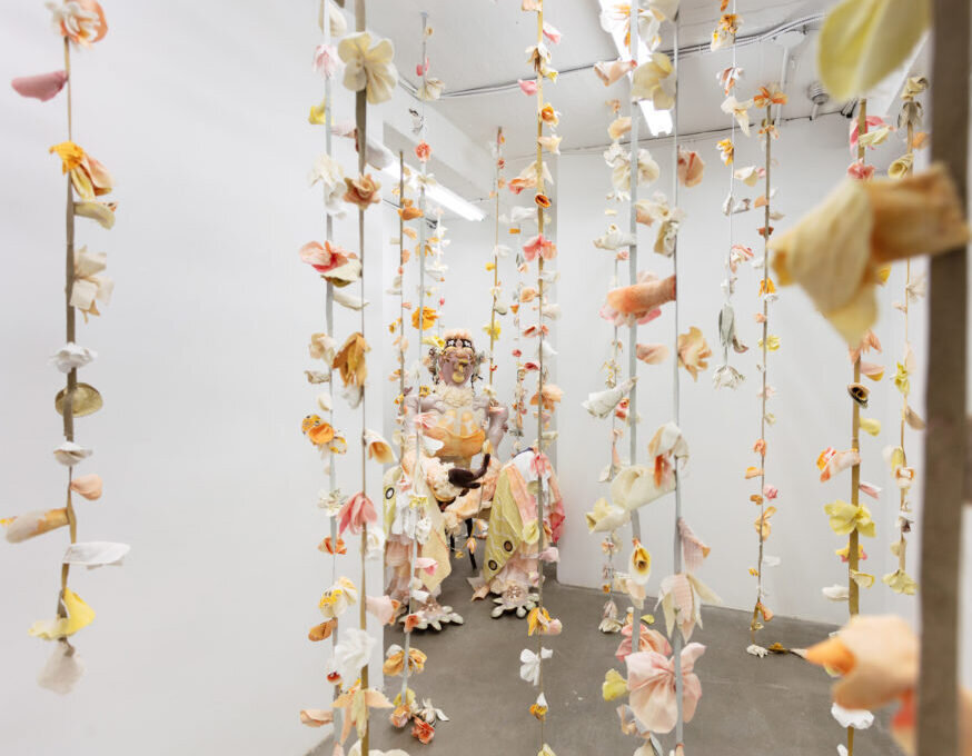
    Tau Lewis’ solo exhibition at Cooper Cole, Triumphant Alliance of the Ubiquitous Blossoms of Incarnate Souls, explores a paradisiacal world both timeless and tethered to this one. Lewis generates the realm of the T.A.U.B.I.S. at Cooper Cole “to explore desires for abundance, safety, deep roots, and justice.” Sectioned around three figures, Lewis has hand-stitched and hand-dyed upcycled materials into unforgettable textile sculptures. Though in-person viewing was cut short by Toronto’s lockdown restrictions, in its final week, the realm of T.A.U.B.I.S. was accessible by gazing through the well-lit windows of Cooper Cole.

    Triumphant Alliance of the Ubiquitous Blossoms of Incarnate Souls view from the Cooper Cole Gallery window at night

    The quantity of physical and emotional labour put into this work can be detected in the intimacy and care evident in every detail. Lewis began collecting and dying fabrics approximately one year before the exhibition, some materials having been gathered and held onto from much earlier. The result is an environment that appears to be in constant transformation yet also seems to have existed forever. In conversation with Cooper Cole, Lewis shares her connection with upcycled materials, “I feel like I’m a treasure hunter… That’s been a part of my life since childhood.” In her artwork, Lewis uses second-hand clothes, textile waste, gathered shells, and even sacrifices personal jewelry all in the name of sharing the love and lives of the items’ previous owners.

    For Lewis, the process of creation is healing in itself. In her studio, she doesn’t abandon life but instead takes a departure from it. In the gallery, Lewis hopes viewers can take their departures as well, departures that are well-needed in such a new and wearisome time as this. With such love for the process, Lewis finds it difficult to name her pieces and watch them exit the studio. Her sometimes long titles are products of her labouring love and need to share sentiments that a single word cannot express.

    Tau Lewis, T.A.U.B.I.S., 2020

    The whole of Lewis’ oeuvre connects in ways known only to her in a non-linear exploration of a bigger story. Triumphant Alliance of the Ubiquitous Blossoms of Incarnate Souls showcases the first time the artist’s clarification of these relationships for her audience, done largely through the exhibition text, allowing the viewers to fully enter her conceived world of abundance and safety.

    “Mutable and devoid of gender, they transmute into blossoms. Every blossom embodies a soul who is alive and listening. T.A.U.B.I.S. blossoms grow year-round, uni-wide, even in most harsh weather and on most hostile planets. The T.A.U.B.I.S communicate and collect intel through these blossoms.” – Tau Lewis

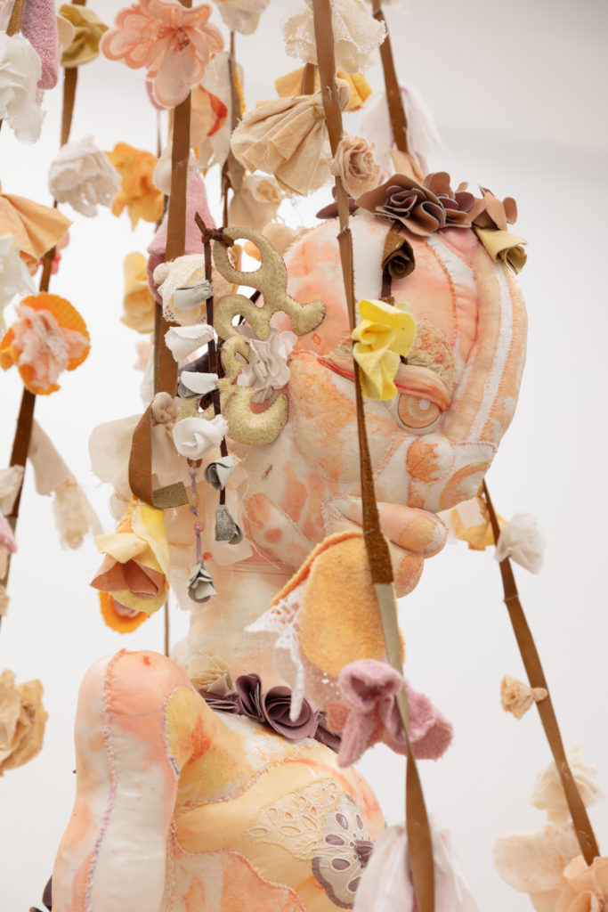
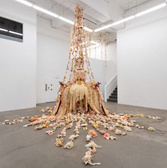
    The T.A.U.B.I.S. figures embody the essence of genderless fairy godmothers; they are the unconditional providers of motherly love and comfort. By Lewis, Symphony embodies this fairy godmother spirit best of all. With energetic lines and powerful stillness, Symphony stands visible from the street, displaying a delicate colour palette of pastel pinks and yellows. Lines of blossoms—souls cascade down from above and tether the figure to both the earth and the cosmos. Symphony exudes the safety of a “motherly overlord.”

    Tau Lewis, Symphony, 2020 (bottom) & detail (top)

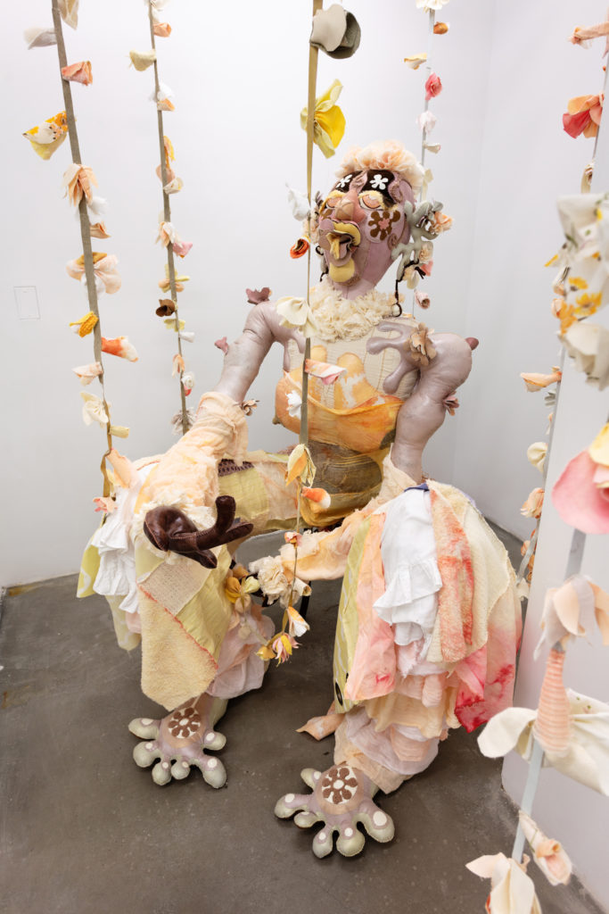
    Past a forest-like gathering of blossoming souls, Delight sits in the corner. This figure exudes wisdom appearing to be in an engaging conversation with the blossoms that surround them. Delight, like the rest, is the product of intimate labour and a representation of a community of ancestors well-understood if never seen. Lewis’ transformation of recycled materials tells a story rooted in the past and reflects the artist’s inwardness.

    Tau Lewis, Delight, 2020 (bottom) & detail (top)

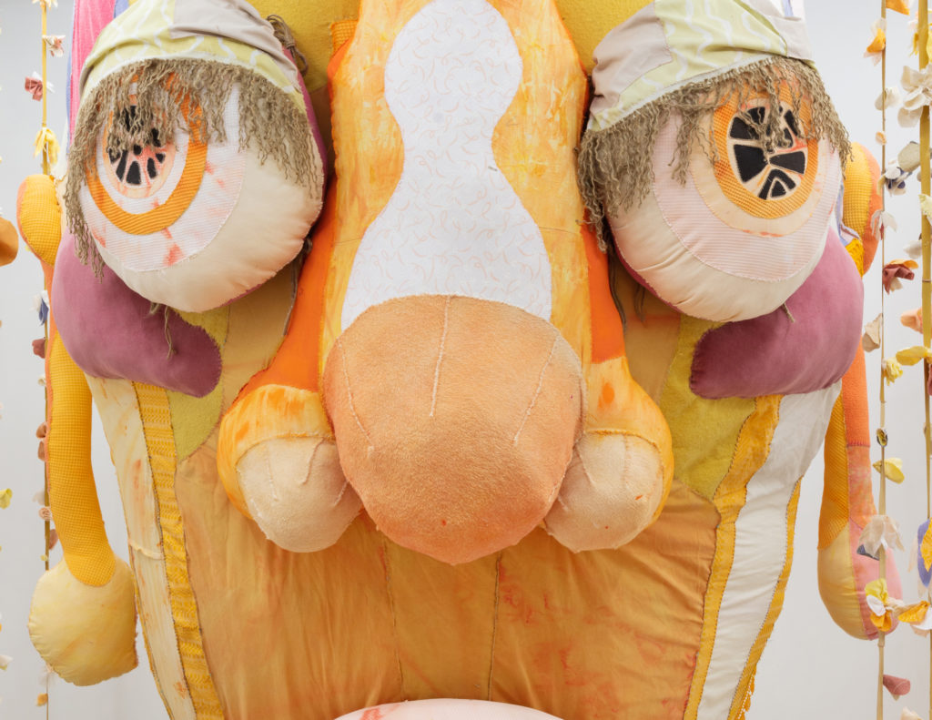
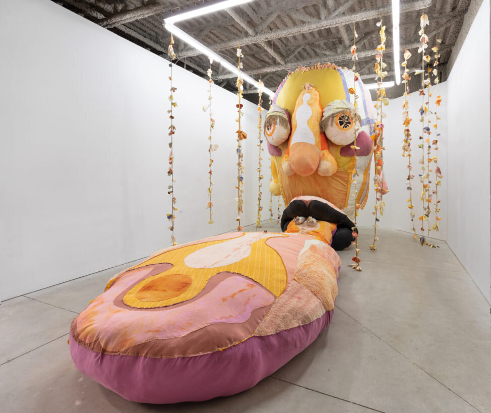
    Another “motherly overlord,” Opus (The Ovule) is a towering head with bright discerning eyes and a tongue extended forward. A head so large in scale can’t help but impose a sense of endless and eternal wisdom. Indeed, in the realm of the T.A.U.B.I.S. the Ovule is an essential but vulnerable source of knowledge and power. Lewis began work on this figure in 2017 in Kingston, Ontario, collecting textiles but limited by the few objects accessible to her there. “Opus slept for a couple of years,” says Lewis, and here the figure finally emerges in this 2020 exhibition.

    Tau Lewis, Opus (The Ovule), 2020 (bottom) & detail (top)

    In a world where justice and goodness are at times hard to locate, the T.A.U.B.I.S. provide us with an unmatched system of comfort. While science fiction plays a large role in her works, Lewis takes care to point out that science fiction is often about examining the present from new perspectives despite the genre’s futuristic connotations. In this way, the realm of the T.A.U.B.I.S. gives us the opportunity to both depart from our world and locate the often-elusive love within it.

    Olivia Mariko Hsuen-Ferris

    Images are courtesy of Cooper Cole Gallery

    *Exhibition information: Tau Lewis, Triumphant Alliance of the Ubiquitous Blossoms of Incarnate Souls, October 17 – November 28, 2020, Cooper Cole, 1134 Dupont Street, Toronto. Exhibition images and text remain on the Cooper Cole website for viewing. Artist talk: In Conversation with Tau Lewis | Cooper Cole
  • Travis Shilling: Colorado at Ingram Gallery

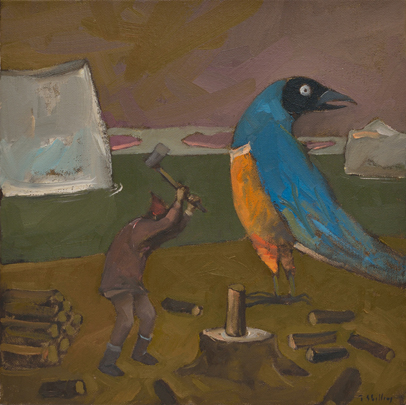
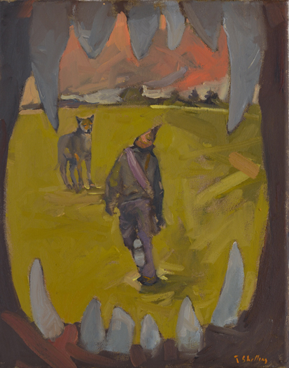
    I saw Tyrannosaurus Clan at Ingram Gallery earlier this year which makes this my second time seeing Travis Shilling’s work. I can say that my experience was as rich and impactful as the first time. According to Ingram Gallery, “with Shilling’s bold and entrancing style, the collection repeatedly manages to articulate the indescribable while celebrating all forms of life and spirit”. Shilling’s paintings have an otherworldly presence, with rich colors that float on top of each other in thick layers to create paintings that live and breathe.

    Not Dark Yet, 2020, oil on canvas, 12 x 12 inches

    According to Ingram Gallery, the exhibition is called Colorado which is Shilling’s middle name. Travis Shilling is an Indigenous artist from Rama, Ontario. Shilling is a storyteller, with each of his paintings telling a narrative for the viewer to uncover in the paintings’ details. Reoccurring throughout the works is a non-descript, male figure who lives within the worlds of the paintings. He primarily navigates the world alone, which is broken up by moments of interaction between other people and between spirits.

    When viewing this show, the titles are an essential and enriching aspect of the paintings, giving new layers to the images presented. By paying attention to the words chosen for each painting shifted my perception of them, creating a new lens to see the works through.

    In the Middle of the Day I Called Your Name, 2020. oil on canvas, 14 x 11 inches

    It is important to note that all of the works are painted in a small scale. Most of the pieces are uniform in size, and when viewed in the gallery space, this insinuates that the paintings are all connected. They are snapshots of moments that are not completely separate from each other. According to Ingram Gallery, these paintings were created this year during the lockdown months of the pandemic and instead of working within his studio Shilling was painting from within his home.

    You Told Me To Jump So I Jumped (2020), depicts the male figure precariously standing at a cliff’s edge who is being guided by an eagle, which is similar in his size. The man’s outspread arms mimic that of the eagle that flies at eye level with him. The brushstrokes capture a moment of time, the viewer imagining the wind that whooshes around them. The scene shows an intimate moment of absolute trust between the man and the eagle, which is further confirmed in the work’s title which comes from the man’s point of view.

    You Told Me to Jump So I Jumped, 2020, oil on canvas, 12 x 12 inches

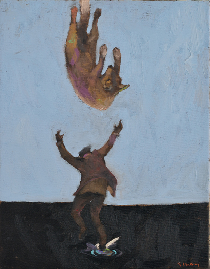
    Also capturing a highly dynamic moment of time is, The Story of You and I Falling Into the Cold Water (2020). A wolf calmly falls from the sky on its back. The arch of the wolf’s spine is cupped by the man’s outstretched arms whose feet have just touched the black water below. However it happened that the wolf and the man met, they are sharing the same experience together.

    The Story of You and I Falling Into That Cold Water, 2020, oil on canvas, 14 x 11 inches

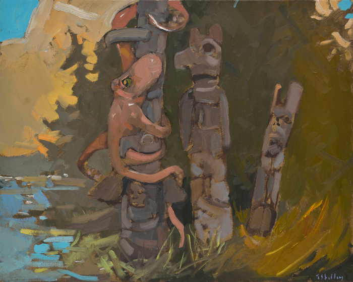
    I Can’t Leave You Behind (2020), depicts a giant, red octopus that wraps its tentacles around a Totem pole in a tight embrace. The octopus seems to look towards the viewer with a worried look on its face. The title adds further emotion to the piece, suggesting that the creature cannot face a separation from the Totem. Octopi are extremely intelligent and familial creatures which makes the octopus a strategic choice when depicting a scene that holds love and affection.

    I Can’t Leave You Behind, 2020, oil on canvas, 6 x 20 inches

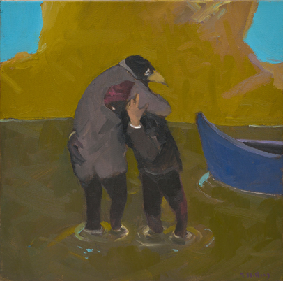
    In Six Feet Apart Is Too Far Apart (2020), the man and a spirit with the body of a human and the head of a bird are in a tight and affectionate embrace. They hold each other close, with the man’s head underneath the arm of the spirit. They stand ankle deep in water, and the composition insinuates the story that the man has gotten out of his canoe, present on the right of the scene, to meet and embrace the spirit. Both of the figures look exhausted and weighted by a sadness and seeming to exhale at each other’s touch. This year has been one of loneliness for many individuals and the title brings the pandemic into the viewer’s mind, with the warning phrase ‘stay six feet apart’ to enforce social distancing that is highly familiar to us.

    Six Feet Apart Is Too Far Apart, 2020, oil on canvas, 12 x 12 inches

    Frog, Eagle, Owl and Bear Show Up To Pose For the Totem Pole Carver (2020), is a larger painting featuring several of the spirits that are present in the smaller paintings. The man uses a tool to carve into the trunk of a tree with the spirits surrounding and perching on the soon-to-be Totem. The scene is playful, as if the man and the spirits are in a life drawing session, or in this case it would be a life carving session. The spirits are forming a one-of-a-kind company and become the inspiration for the Totem, making this activity a collaborative project.

    Frog, Eagle, Owl and Bear Show Up To Pose For the Totem Pole Carver, 2020, oil on canvas, 16 x 20 inches

    Ingram Gallery chose the words: “affectionate, otherworldly, comic and breathtaking”, which I think describes this exhibit eloquently. Shilling’s style of painting creates movement on flat surfaces, giving life to his narratives. The spiritual and the secular mingle on the canvases, sitting in between the seen and the unseen, with stories that are compelling and emotional.

    Olivia Musselwhite

    Images are courtesy of Ingram Gallery

    *Exhibition information: Travis Shilling, Colorado, November 7 – December 5, 2020, Ingram Gallery, 24 Hazleton Lane, Toronto. The gallery is currently closed because of COVID 19.
  • Stefan Berg: Counterpoint at United Contemporary

    “I believe all painting is about looking” says Stefan Berg. His show at United Contemporary finds poetry in the ordinary and discovers vivid visual experiences in commonplace subjects. At first glance, his paintings and linocuts may appear to be straight-forward depictions of gardens, architecture and interiors. But slow down. Give them time, and they’ll reveal their complexity.  

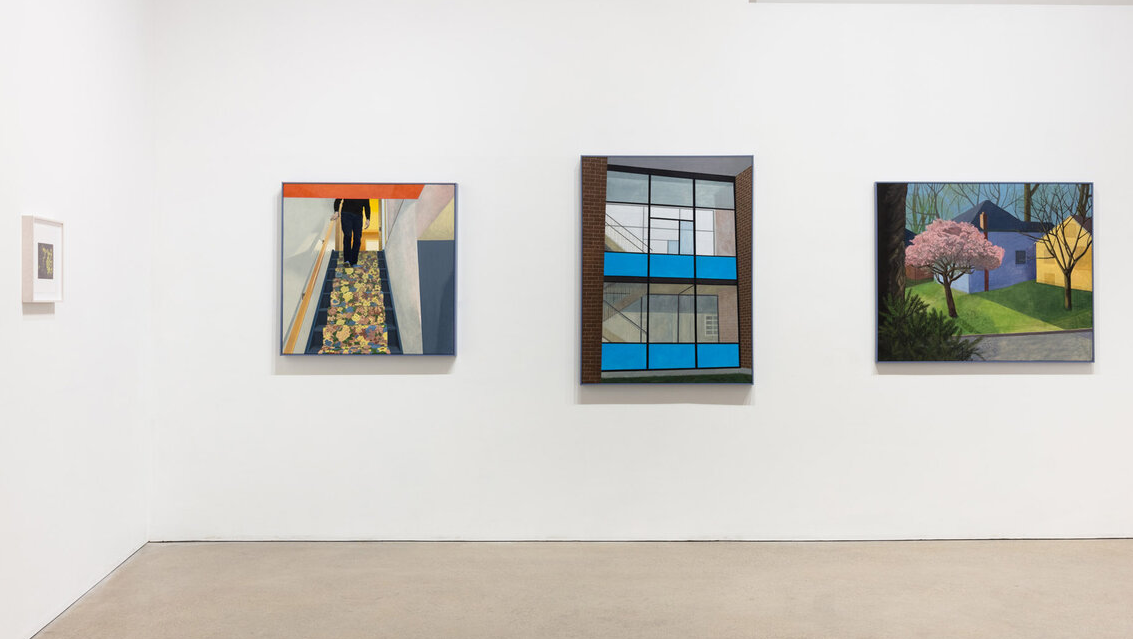
    Installation view of Stefan Berg, Counterpoint at United Contemporary

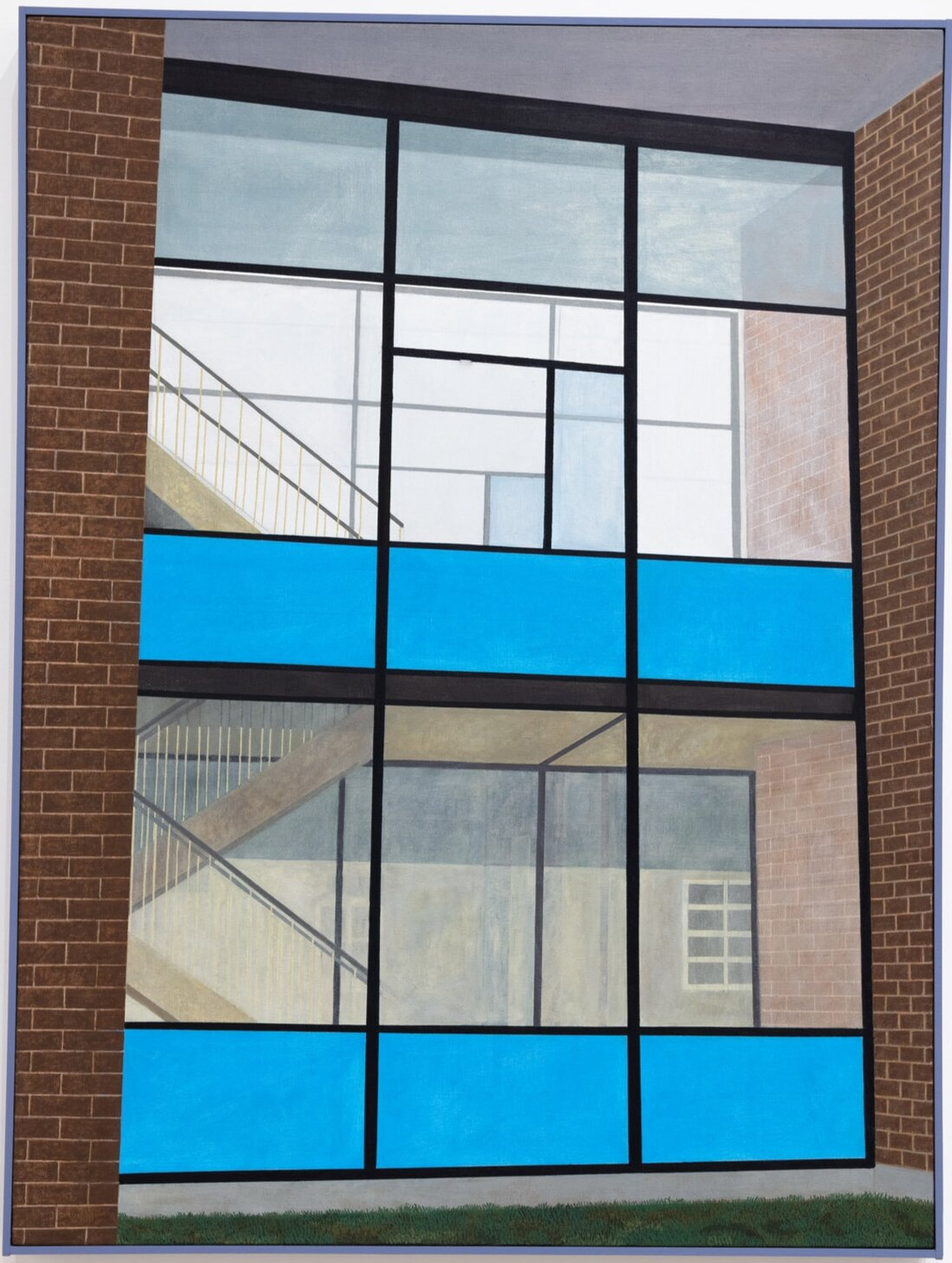
    In Old Folks, Berg creates a dramatic image from a prosaic subject. The painting depicts a glassed-in staircase of a nondescript institutional building. It’s the kind of generic architecture to which we’ve grown inured and inattentive. If anything, Berg says of this image, it makes most people think of their high school.

    Old Folks, 2020, oil on canvas, 36” x 48”

    The painting presents this structure as something monumental. The composition is framed by strong vertical elements at the edges. Two bright blue bands in the curtain wall span the middle. The slight perspective puts everything slightly off kilter. Up close, the centre of the image becomes an abstract arrangement of rectangles and the picture seems to flatten itself on the surface. What initially appeared as unmodulated areas of colour reveal themselves to be subtly textured. There are lightly rendered intimations of other windows. Are they reflections? Or are we seeing through to buildings behind? Stepping back again, the softly scumbled shadows and surfaces create depth as we look through the two layers of glass surfaces. Berg says he “wanted to attempt atmospheric perspective in a short depth of field.” The painting helps us see this ordinary place with new eyes. Berg shares his discovery of complex interplay of light and reflection from a place we might otherwise walk by and never notice.   

    In Bay Street we continue to follow the visual discoveries of the artist. The vantage point is the south facing view from the top of the Manulife Centre at Bloor and Bay Streets with the lake in the far distance. The horizon line is near the top of the painting, so the visual focus is on the local buildings and street below.   

    Bay Street, 2019, oil on canvas, 36” x 60”

    It’s through the variance in detail that we follow Berg’s exploration of the view. Remote buildings recede as simple rectangles in atmospheric haze. A few neighbouring structures have much more detail. Windows and other features are clearly and carefully rendered. Berg feels that the disparate degree of detail and finish leads to “a drifting sense of focus” allowing us to see the aspects of the scene that interest him.

    Bay Street (Detail), 2019, oil on canvas, 36” x 60”

    Berg has alternated between drawing and painting throughout the creation of the painting. In many places, he’s left graphite lines visible as he’s constructed geometries and perspective. Not only does this give us a ‘behind the scenes’ glimpse of the artist at work, but it also helps us see how we re-construct the image as we look at it; how we participate in the creation of the illusion. We can see flat lines and colours on canvas as well as buildings modeled in light.

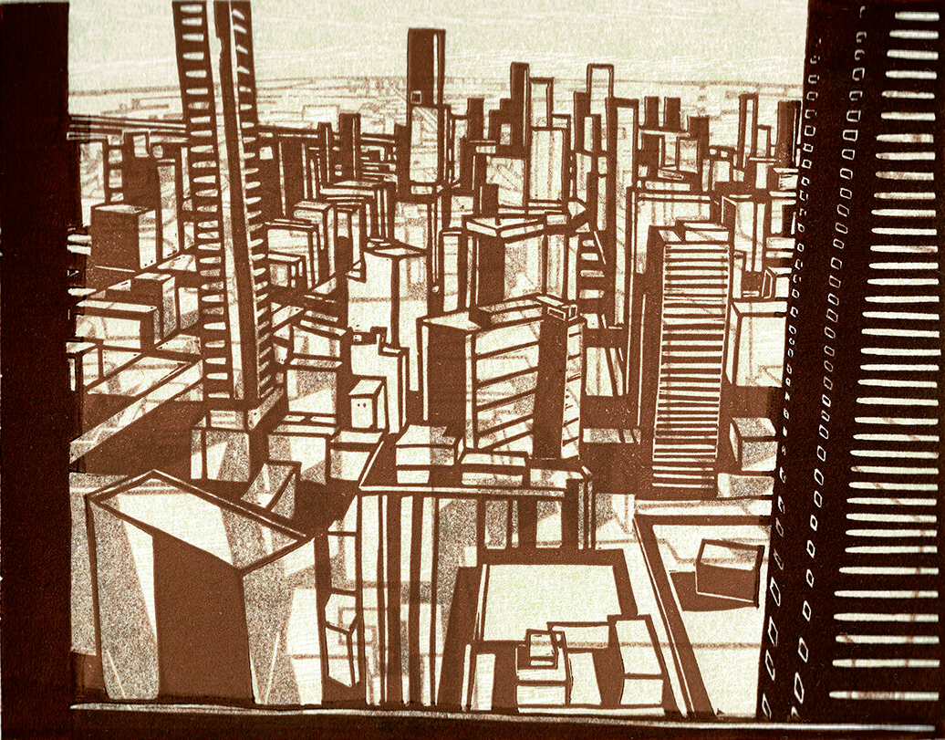
    The show also includes a smaller Bay Street image, a linocut which is looser and more impressionistic. The view is similar but not identical to the one in the larger painting. There is a faint hint of a different cityscape behind the main image which gives the piece a dynamic, shifting quality. In fact, the print is built up from four layers of ink of various darkness which results in a shimmering, atmospheric depth. For Berg, painting and printmaking are complementary activities. He says “Printmaking has influenced the way I construct paintings in the studio when I am not working on-site, whereas observational painting has consistently provided content for my printmaking.”

    Bay Street, linocut, 2020, 7” x 5.5”. Edition of 3

    In Sunday Morning Berg focuses our attention on interior architecture. Once again, the subject itself is unassuming: a figure descending a staircase, and yet the result is engaging in several ways. First, there’s a dynamic tension between flatness and depth. The reddish ceiling and slate coloured wall on the right pull and flatten the composition up to the surface while the staircase and room behind pull back and create depth. Next, Berg explores the complexity of light in this space. Illumination from the window above creates an intricate interplay of shadows and reflections, particularly on the railing wall. And finally, the flower-patterned carpet stands in sharp contrast to the surrounding surfaces and adds an aura of domestic geniality.

    Sunday Morning, 2020, oil on canvas, 36” x 36”


    The work of Stefan Berg illustrates that artists do not need dramatic subjects to make compelling art. His images focus our attention on what was already there, all around us, but we had not noticed. Berg finds his images by looking carefully at the world. Colours, shapes, shifting light, and subtle reflections are his subjects. His work shares these visual discoveries with the rest of us.

    Mikael Sandblom

    Images are courtesy of United Contemporary

    *Exhibition information: October 28 – November 28, 2020, United Contemporary Gallery, 1444 Dupont Street, Unit 22, Toronto. The gallery is currently closed because of COVID 19. Photo documentation of the current exhibition is available on their website. All inquiries about available artwork may be addressed to burke@unitedcontemporary.com or chelsea@unitedcontemporary.com. Circumstances permitting, private appointments may be arranged.
  • After the Long Dream at Lonsdale Gallery

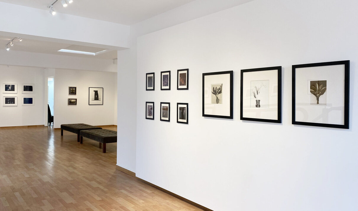
    Upstairs at Lonsdale Gallery, in a spacious and light-filled room, are displayed the photographic work of ten artists who hail from various corners of the globe. They are Jennifer Crane, Sandra C. Davis, Kristin Diemer, Neil Folberg, Osheen Harruthoonyan, Jeannie Hutchins, Kit Martin, Senga Peckham, Rachel Scheinfeldt and Amanda Tinker. The curator, Simone Rojas-Pick, explains that the inspiration for the idea of the show derives from the feelings we have experienced emerging from lockdown after the first wave of the pandemic. She likens the experience to that of having recently woken up from a long dream, after which everything is perceived afresh. The mundane suddenly seems magical. The pieces she has selected for the show hint at this feeling.

    Installation view with Kristin Diemer’s Transformation series, 2017, each silver gelatin, mordancage unique print, ed. 1/1, 22 x 19 inches (R)

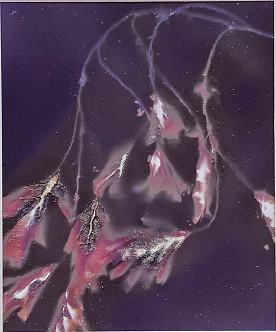
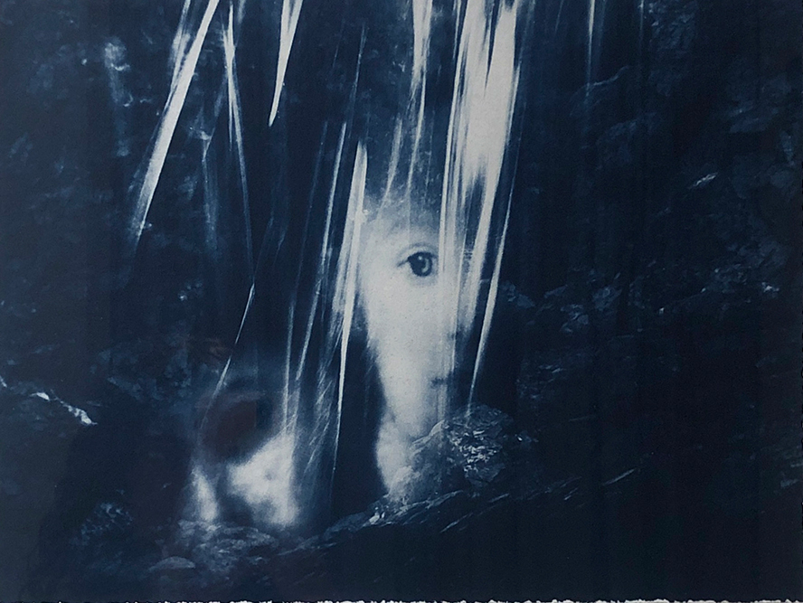
    None of the many photographs on display could be called functional, namely straightforward recordings of the environment or events. Rather the emphasis is on photographic methods, especially on printing processes, as well as digital manipulation of imagery. For example, Peckham places seaweed on light sensitive paper, which is then exposed to sunlight. The UV light reacts with the base-chemicals in the paper, fixing them. Then a chemical wash is applied to the paper which produces various colours in the print, while washing away the base-chemicals that lay under the seaweed unexposed and therefore unfixed. The results are beautiful ghostly images. This process is known as lumen printing.

    Senga Peckham, Tidal Wash #6, 2018, giclee print of unfixed lumen, ed. 1/2, 10 x 8 inches

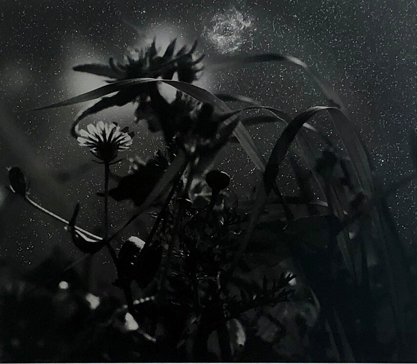
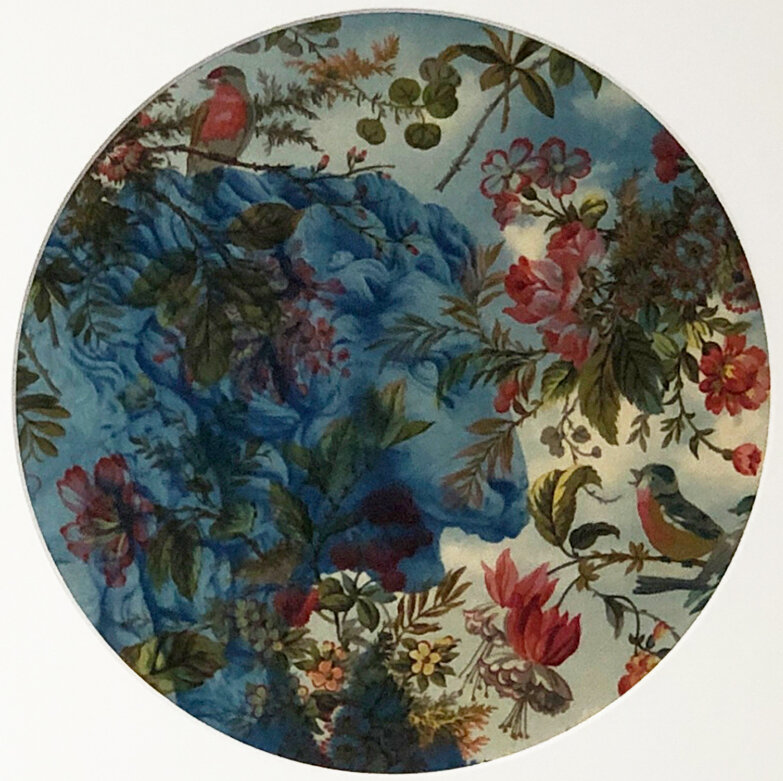
    Another printing technique used by several artists is cyanotype. A mixture of chemicals is brushed onto the surface of paper or fabric. Then either a negative or some opaque objects, e.g., flowers, are placed on the now light-sensistive surface. The paper turns blue in the uncovered areas when it is subsequently exposed to sunlight. The print is finally washed in water to fix it. All the artists selected either use some such printing technique or manipulate photographic images using digital software. In the latter case, for example, Folberg – a former student of Ansel Adams – digitally inserts an image of the night celestial sky behind a standard landscape, which enables the viewer to see the scene as if ‘standing at the edge of an infinite universe’, as Rojas-Pick puts it.

    Neil Folberg, Rosette Nebula, 2001, archival pigment print on Baryta Paper, ed. 3/49, 19 x 20 inches

    The one thing, therefore, that unites this otherwise diverse group of artists is their preoccupation with the processes of making an image using photographic technologies, both old and new. Their practices all stand in the grey area that intersects photography and painting, where ‘painting’ is used very broadly here to refer to any technique of image making that involves the direct intervention of the artist, rather than involving an automated mechanical process. Each of these artists’ practices use a combination of painting and photography in this sense.

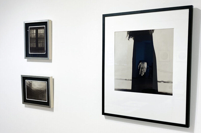
    Installation view with Jennifer Crane, View From My Window (Home and away), 2019, both palladium print, ed. 1/3 (L) & Osheen Harruthoonyan, Hand 2009, toned silver gelatin print, ed. of 5, 32 x 27 inches (R)

    As Susan Sontag notes, in her essay Photographic Evangel, there is a tension in the idea of photography being shown in a gallery, i.e., as art. Traditionally the role of the photographer, as Sontag explains, is ‘recessive in much of serious picture-taking and virtually irrelevant in all the ordinary uses’. The photographer – understood as someone who uses photographic technology to make images – is not an auteur in the same way as a painter is. The photographer’s mark is more anonymous. What the artists in this show are doing effectively is to push back against the notion that photography-based art is not creative in the way that painting is.

    Sandra C. Davis, Continental Lion, 2019, cyanotype on printed cotton, ed. 2/8, 16 x 16 inches

    At times some of these artists are painting with the light and chemistry of photography. For example, Davis and Hutchins (based in Philadelphia and Maine respectively) use a technique known as gum bichromate printing. This process involves combining a gum with standard paint, e.g., gouache, and a light sensitive chemical fixative. Using one colour at a time they then expose the paper, with a negative image on top, to sunlight.  The exposed areas are fixed, retaining the chosen colour. Davis does this four to six times for each print, while Hutchins does this technique over cyanotype prints. The results in both cases are beautiful subtlely coloured prints, which merit being called paintings.

    Jeannie Hutchins, Sisters (Blue Series), 2018, gum bichromate over cyanotype, ed. 1/5, 17 x 22 inches

    It is interesting to note that the subjects of nearly all the photographs in the show are secondary. That’s to say, they are primarily concerned with formal qualities rather than content. In this sense they are for the most part abstract or quasi-abstract works. This helps to explain their dream-like quality on which Rojas-Pick focuses. There is in all of them a sense of mood over narrative. They are, one might say, studies in the aesthetic possibilities of the techniques. It would be intriguing to see such experimental techniques applied to more narrative works. At any rate, this is a fabulous collection of photographic works, artfully curated and arranged. It is well worth going to see.

    Hugh Alcock

    Images are courtesy of Lonsdale Gallery

    *Exhibition information: Awaken After a Long Dream, October 15 – December 15, 2020, Lonsdale Gallery 2nd floor, 410 Spadina Rd, Toronto. Gallery hours: Tue – Sat 10am – 5pm or by appointment
  • Spectra, Gallery 44 members at CONTACT

    Spectra, Gallery 44 members at Artscape Youngplace and at Gallery 1313

    While the pandemic’s impact echoes across daily life, art continues to transform reality. Members of Gallery 44 Centre for Contemporary Photography present Spectra, a 3-part multi-technique photography exhibition contemplating the ingredients and meaning of place as a site for connection. Sharing in a strange and remarkable global shift, this show comes at a pivotal moment. Spectra’s timely questions regard the meaning of presence—a presence expanded, compromised, and reinvented. While the exhibition draws no finite conclusions, nor reaches a straightforward consensus on the definition of location, the collective works accurately portray a distance and tenderness at the core of globalization’s unfathomable nature. How does the meaning of place dart from atomized traces of digitalized light to the visceral grainy feeling of summiting a mountain? How does one reconcile and connect with the vast potential of presence?

    Installation view of Spectra 3 at Artscape Youngplace with work by Gustavo Jabbaz (left wall). Photo: Gustavo Jabbaz

    These questions present themselves in the photographs, but also reflect in the exhibition’s realization. Working remotely with over 40 artists individually impacted by the pandemic proved a rewarding challenge for Spectra coordinators Eliza Moore, Gustavo Jabbaz, and Atia Pokorny. Moore described reorganizing the postponed exhibition as a relatively daunting task. The coordinators were charged with putting together puzzle pieces from dozens of artists forced to find alternative printers and framers due to Covid-related business closures. “The upside is that we all learned new skills to connect with others,” says Moore. It is clear that the unexpected obstacles due to the pandemic actually work toward the exhibition’s overall theme, attempting to decipher the ways in which today’s definitions of place and presence stretch and remould life itself. Spectra is evidence that despite current difficulties, untravelled potentials continue to become visible. The coordinators send immense gratitude to Gallery 1313 and Artscape Youngplace for hosting.

    Spectra coordinators (L-R) Eliza Moore, Atia Pokorny and Gustavo Jabbaz. Photo: Ivan Rupeš

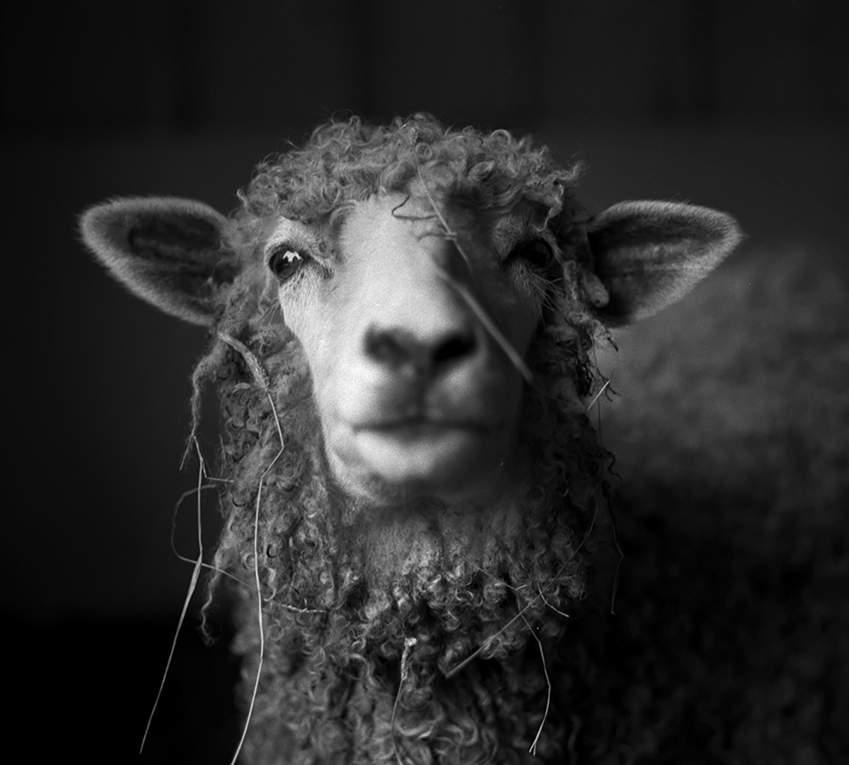
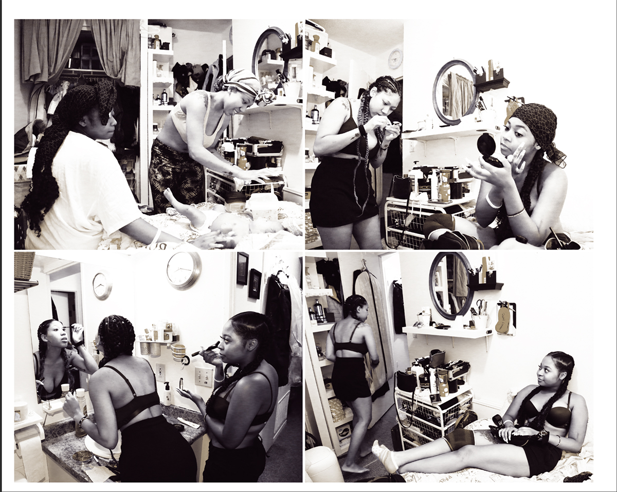
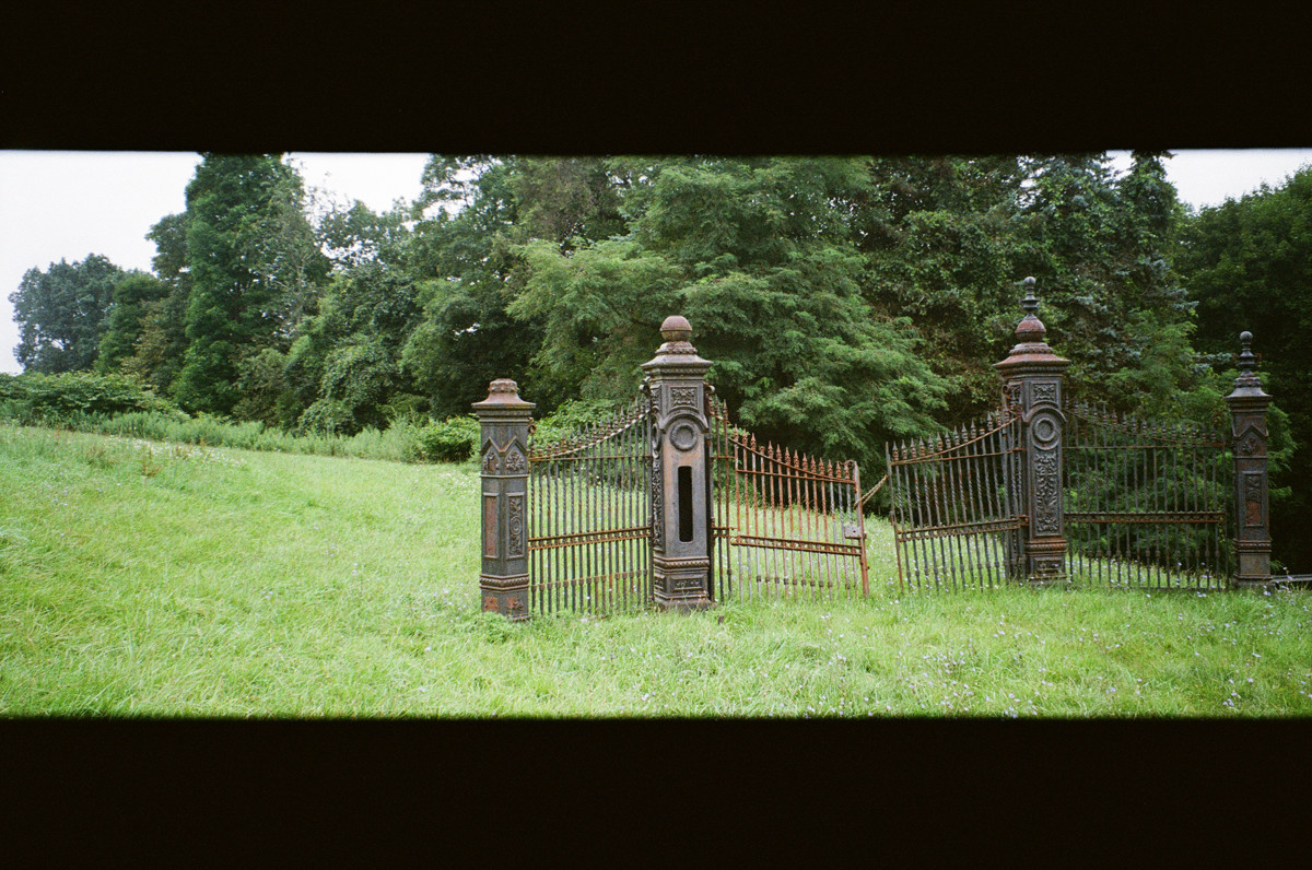
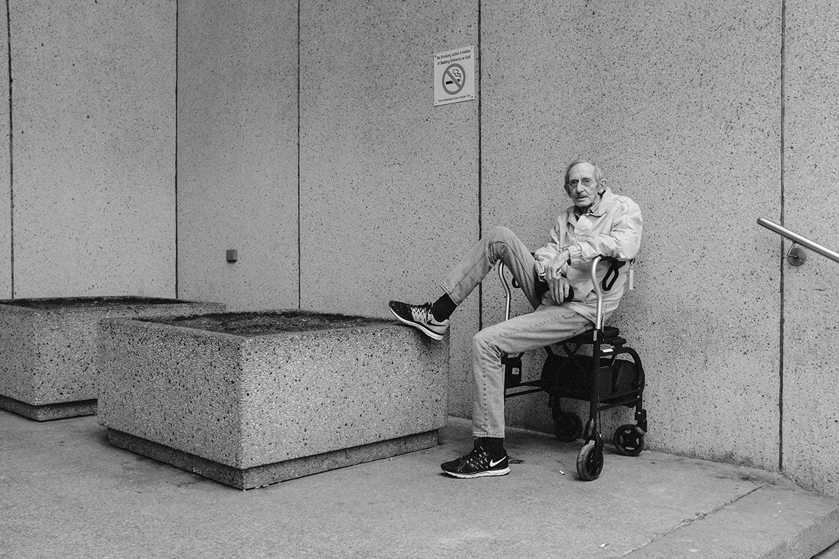
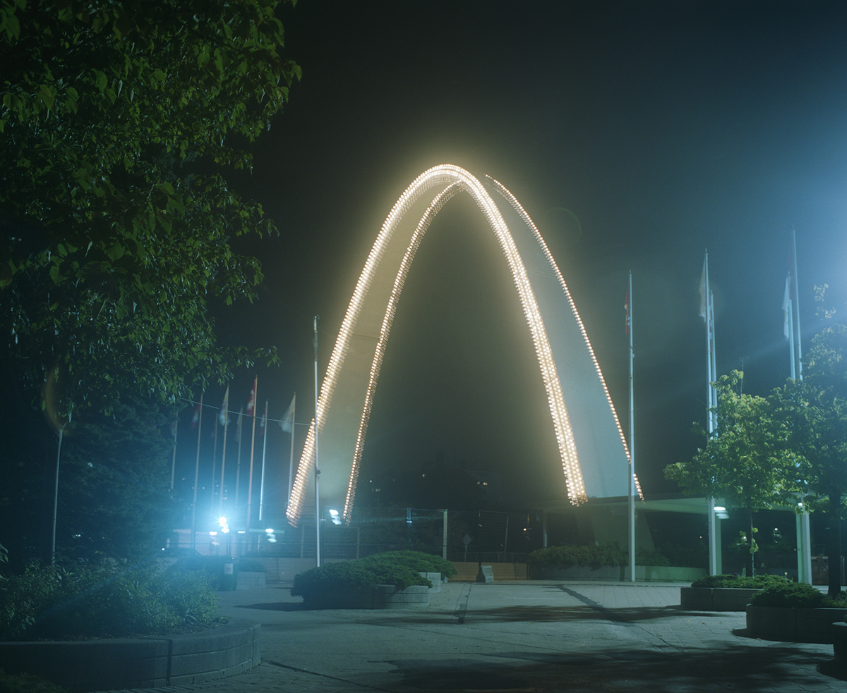
    Spectra 3 centres around ways of living ascribed to setting through portrayals of freedom, privilege, confinement, intimacy, and celebration. Place seems to dictate the mood of each photo, suggesting that physical location connects deeply to the psyche. Despite less half the images containing human subjects, these works invite some celebration of humanhood. Nearly every photo offers some evidence of human agency within an otherwise naturally-existing landscape: signage, gates, pets, run-down sleeping spots—a span of sacrifice, play, and resourcefulness. Fred Lum is a standout photographer in this group. The exposure and composition of his images are reminiscent of Helmut Newton’s softer portraits. Surprisingly, a humanlike emotional quality permeates from the eyes of his sheep subjects. Gloria Caballero’s work also catches attention, especially the monochrome quadtych of women getting ready. This intimate shot shows the comfort with home and with the people allowed in such spaces. Caballero’s photographs contemplate a popular artistic interest in the public versus the private.

    Fred Lum, Georgia, 2018, Selenium toned, Gelatin Silver, 9”x 9”

    Gloria Caballero, Performers at Home, 2019, digital print, 11″x13″ 

    Danielle Goshay, A Stubborn Orb Weaver, 2019, adhesive vinyl, 11″x17″

    Spectra 1 displays an intense diversity to be valued and jarred by. Adjacent micro- and macroscopic scenes ask for both subjectivity and objectivity, evoking an interesting pressure. To move from the lucidity of landscape photography to the personalization of abstract light beams and heavy contrast portraits, the viewer is taken to the innards of perception as much as various tangible physical locations. In this collection, the sky melds with the land and the human body imitates and folds into the natural world. Spectra 1 displays the largest colour range of each group and perhaps the most disparate relationship between artists. This effect produces a time travel feeling, as if the viewer spins a wheel to see where they land and what size creature they end up as when they arrive. One notable artist in this selection is Ammar Bowaihl, especially in reference to Nike (2020). The stature of his subject projects absolute comfort with staking claim to place, encapsulating both childlike bravery and a timeless wisdom. In contrast, Arman Bahreini’s foggy amusement park pictures give spotlight to a seemingly forgone past, stirring a type of deserted nostalgia. Something about this overall group of photos sets the faculties off-kilter, through the door leading nowhere in Sylvia Galbraith’s work, or in the wild eyes of strange sculptures in Joachim Oepkes’s pieces. Ammar Bowaihl, Nike, 2020, digital print, 36×24″

    Ammar Bowaihl, Nike, 2020, digital print, 36″x24″

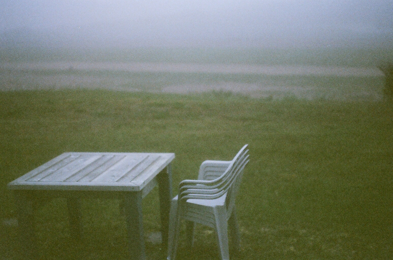
    Arman Bahreini, Dufferin Gate, 2019, archival inkjet print, 11″x14″

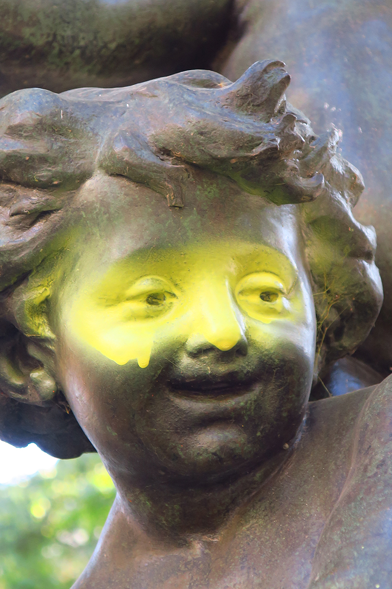
    Joachim Oepkes, Hello 1, 2019, screenshot from a video installation

    In particular, Spectra 2 thematically relates most to our new current reality. Curator Jessica Thalmann drew inspiration from Italo Calvino’s Invisible Cities (1972), an anti-novel offering expansive renditions of metropolis: based in concepts such as memory and desire. For Calvino, cities can be infinite, intertwining, conceptual, and secret. Such malleable city forms may be more pertinent to the contemporary atomized landscape than when the book was originally published, and Thalmann clearly sees this parallel. “I was interested in how the works in the show meditate on the ways we see, embody and remember the places around us, often making visible what cannot literally be seen in the urban and natural landscape,” she explains. While human presence is not the central focus of this collection, there appears a familiar soothing resonance. The exposure and framing of Lilianne Schneider’s Caral Invisible (2020) series recalls some of the settings in Judy Dater’s entrancing self-portraits from the early 80s. In some of Schneider’s pictures, an anthropomorphic quality presents itself in the land. Grace Wang’s pieces are also notable. Wang’s least content-rich photo, Daydreamers (2020), does not require human subjects to ponder the simplicity and memory connected to seascapes. Its humble nature exemplifies how obscure photography can function like a painting in its impressionistic composition.

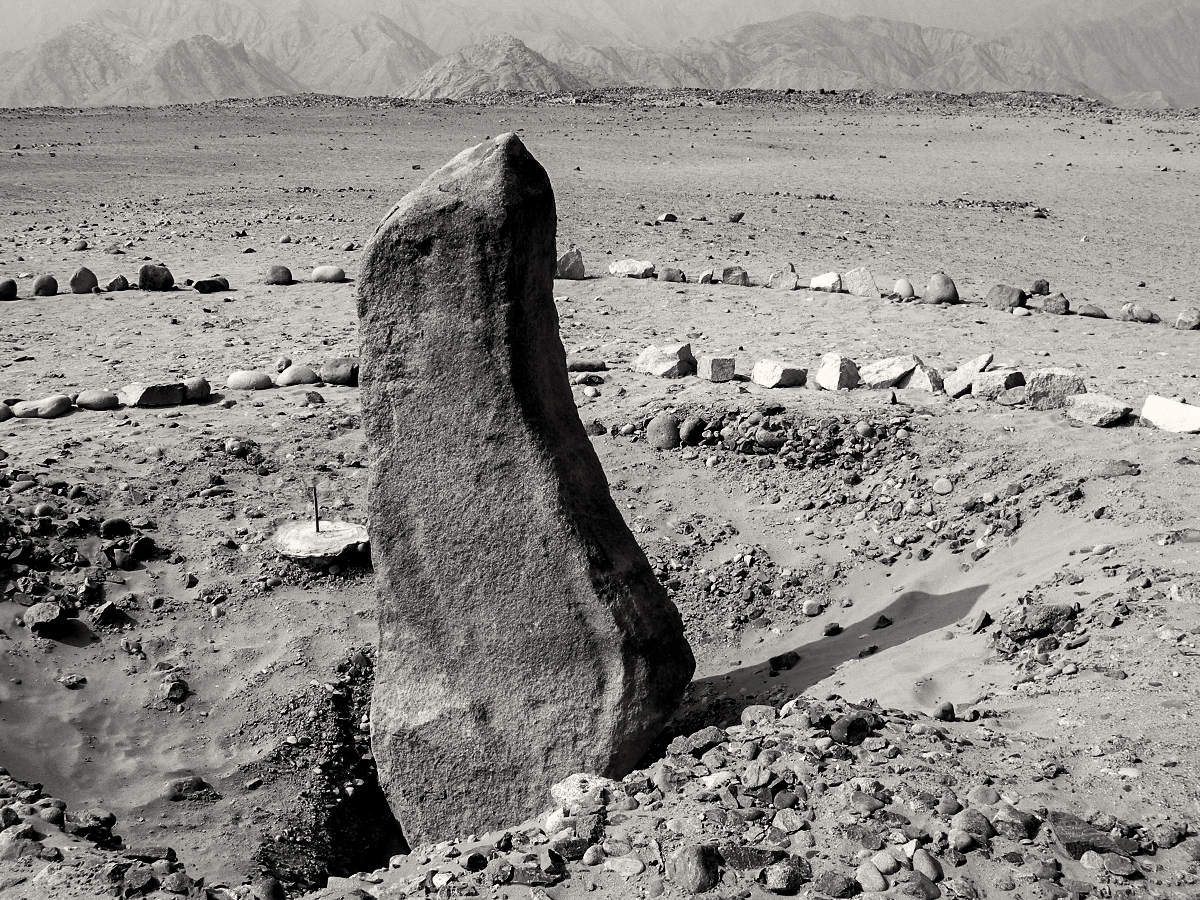
    Lilianne Schneider, Caral Invisible #2, 2020, digital print on archival paper, 21″x16”

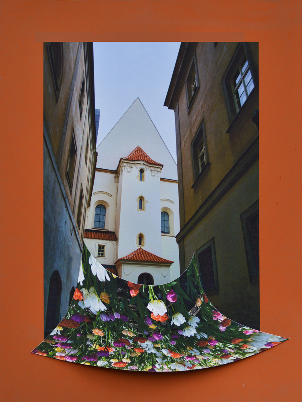
    Atia Pokorny, Chimera/ Praha x Toronto 1, 2020, 3-D collage, inkjet prints on archival paper, 15″x20″

    Grace Wang, Daydreamers, 2020, archival ink on Enhanced Matte paper, 6″x9″

    Cayden Johnson

    Images are courtesy of Spectra

    *Exhibition information: three consecutive exhibitions in two locations, part of Scotiabank CONTACT 2020 Photography Festival
    Spectra 3, November 2 – November 21, 2020, Artscape Youngplace, Hallway Gallery 2nd floor, 180 Shaw Street, Toronto. Gallery hours: Tue – Fri 9am – 5pm. https://www.spectracontactphotography.com/spectra-3-gallery
    Spectra 1, Gallery 1313, November 11 – November 22, 2020, 1313 Queen Street West, Toronto, Opening Reception:  Thursday, November 12, 6 – 9pm. Gallery hours: Wed – Sat 1 – 5pm, Sun 1 – 4pm.
    Private showings during the exhibit, book a time with the artist.
    https://www.spectracontactphotography.com/spectra-1-gallery
    Spectra 2, Visible or Invisible Cities, November 25 – December 6, 2020, Gallery 1313, 1313 Queen Street West, Toronto. The gallery is currently closed. Private showings during the exhibit, book a time with the artist. https://www.spectracontactphotography.com/spectra-2-gallery