Author: artoronto

  • The ‘Untapped’ at the Artists Project

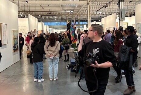
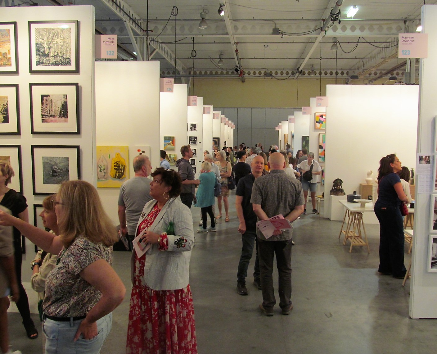
    After a few years of struggling during the COVID pandemic the Artists Project is back with vengeance. Pulsating with vibrant art, the venue seems very welcoming this year. And being a large show the visitor is easily overwhelmed, as I was. One is disoriented by seductive artworks beckoning you from every angle. So, I chose to focus my attention on the so-called ‘untapped’ artists located at the centre rear of the hall.

    Each of the 20 artists in this section of the project is described as emerging. In other words, they are at an early stage in their careers. A modest space is provided to each of them for free. They were selected among many submissions, and so are the chosen few, so to speak. Most have followed the now traditional career path of formal studies in art, but not all have. Free of the considerable cost of renting a booth, these artists have been given room to exhibit with less concern about sales. As a result, over all they tend to show works with an emphasis on content rather than visual allure. In that sense, the section is a bit of a calm harbour in an otherwise choppy sea. Below I look at five of these talented artists.

    One of the first booths in the section the visitor encounters is that of Chelsea Brant. Brant hails from Port Dover on the shore of Lake Erie. She studied at the universities of Guelph and Saskatchewan. The theme of her work, close-ups of plants and flowers, is often a kiss of death in terms of artistic content; which is to say, it usually announces to the viewer that these are simply pretty pictures. But Brant escapes this trap entirely. These works, in relatively muted colours, are visually elegant, quietly drawing the viewer in. They are formally sophisticated pictures, but are nonetheless beautiful. ‘Poetic’ is the best way of describing her work.
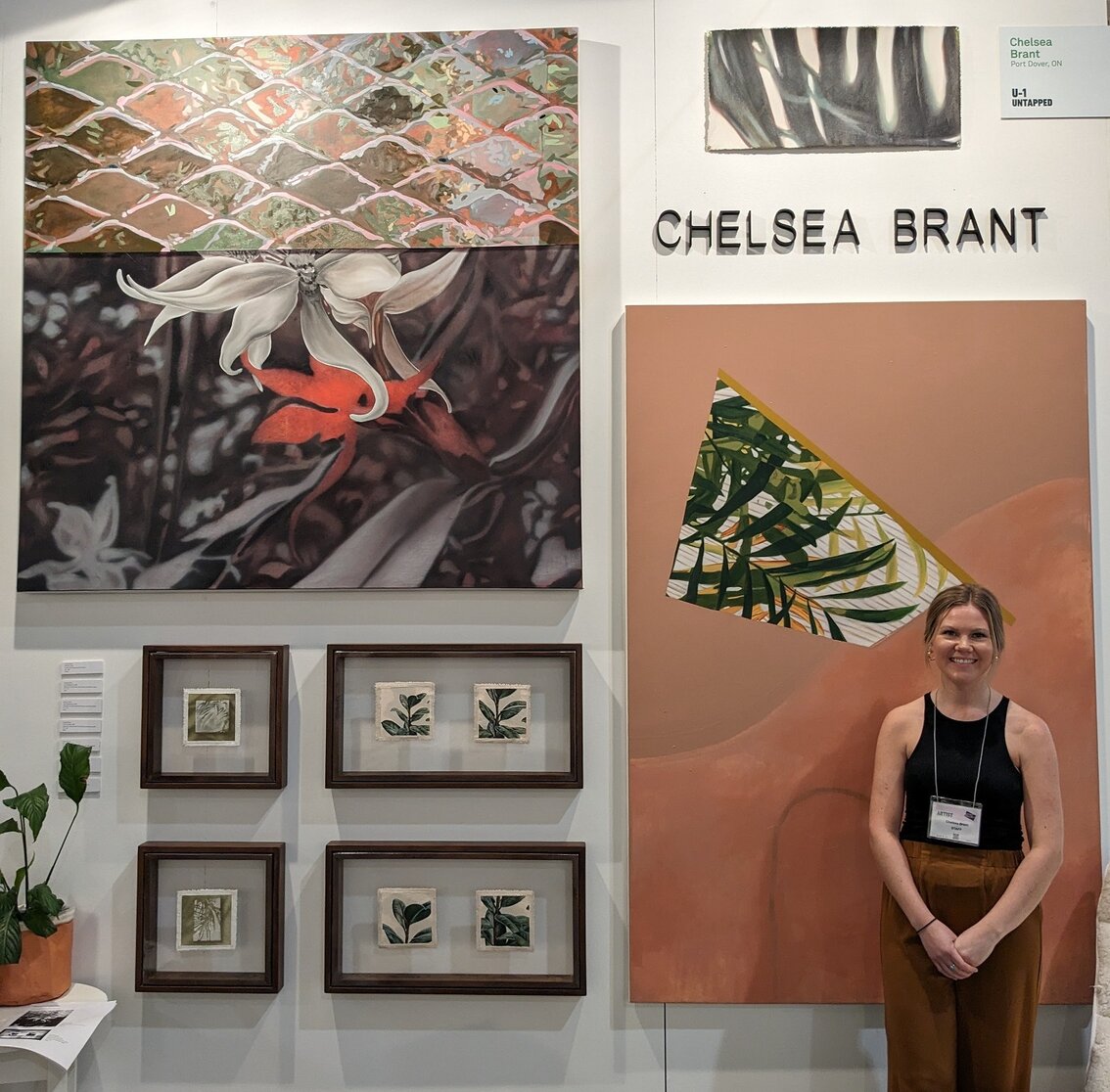
    Chelsea Brant in front of her work

    Next door to her is the work of Montreal based Marielle Saucier. She is a self-described textile artisan. Her work is a reminder of how traditional crafts are not limited decoration. Originally a student of music and psychology, Saucier then studied at the Institute of Crafts and the Centre for Contemporary Textiles of Montreal. Her work focuses on the theme of the tension between order and freedom. This tension is essentially expressed visually in  terms of straight lines and curves respectively. The artworks on display here are canvases embroidered – sometimes including beads – that feature amorphous shapes. There is a wonderful quiet lyricism to all the pieces.
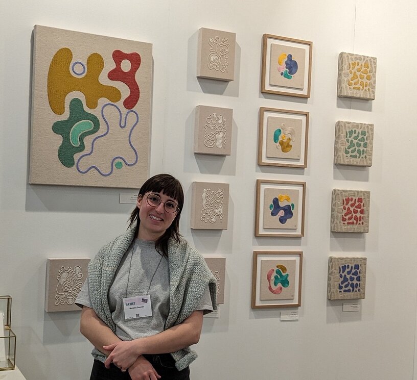
    Marielle Saucier in her booth

    The work of Toronto multidisciplinary artist Ehiko Odeh is located next to Saucier’s. Odeh studied fine art at OCADU, with a minor in creative writing. In this show her focus is on advertisements featuring hair products for Africans. She was born in Lagos, Nigeria, hence her interest in African advertising in particular. These paintings are ‘Warholesque’ in style, that is, a riff on pop art roughly echoing Warhol’s Campbell soup series. One work consists of two columns of ten small square paintings of such adverts. They are playful, energetic and loosely painted, suggesting an interest in recording style and language, rather than wanting to copy them faithfully.

    Ehiko Odeh with her advertisements

    In another aisle are the textiles of Sarah Zanchetta. She is a graduate of OCAD University and has a master of visual studies from the University of Toronto. The theme of her textile work is a little idiosyncratic, namely, poisonous plants. Her interest is in our increasingly limited connections to nature. I guess that our inability to recognize the poisonous plants that grow all around us is emblematic of this loss of connection with nature. Indeed, her whole approach to the subject is itself idiosyncratic. We see a beautiful display of embroidered images of deadly nightshade. As well, she has theatrically installed velvet gloved hands holding up off-white cloths stained by poisonous plants. ‘Imaginative and delicious’ is the best way to describe this work.
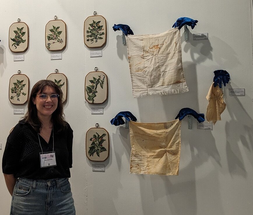
    Sarah Zanchetta among her textiles

    At the end of the same aisle is located four small sculptures by Heather Rule. Rule is a self-taught artist from Toronto. She is a living embodiment of the fact that one doesn’t need a formal education in art to be a great artist. This work is stunning in its understated way. The base of each of the four sculptures is a ceramic vase-like figure with elongated gesturing hands. Placed on the top of each ceramic figure is a paper bag form. We have a raven’s head, two masklike heads with carefully cut-out features, and a block head with a hand holding a cigarette. Overall, they are wonderfully playful. The gesturing of the ceramic hands plays off beautifully against the paper forms ontop. One of the most difficult things to do in art is to make work that is just right in the balance of its elements, both formally and in content. Rule has done this brilliantly here.
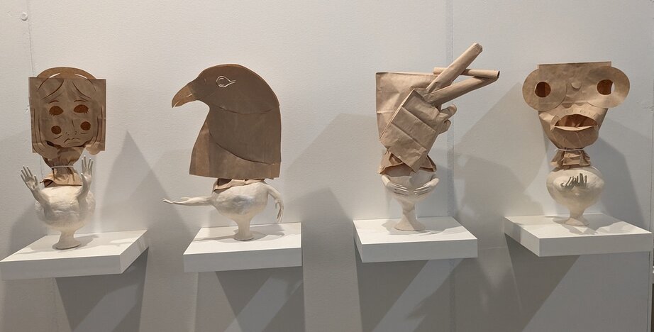
    Sculptures by Heather Rule

    Text and photo: Hugh Alcock

    *Artist Project, April 11 – 14, 2024, Better Living Centre, Exhibition Place, 195 Princes’ Blvd, Toronto. Hours: April 11, 12 & 13, 12 – 8 pm, April 14, 12 – 6 pm.
  • Artist Project 2024 / Opening Night Preview

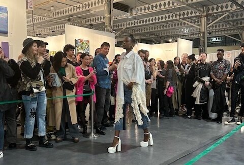
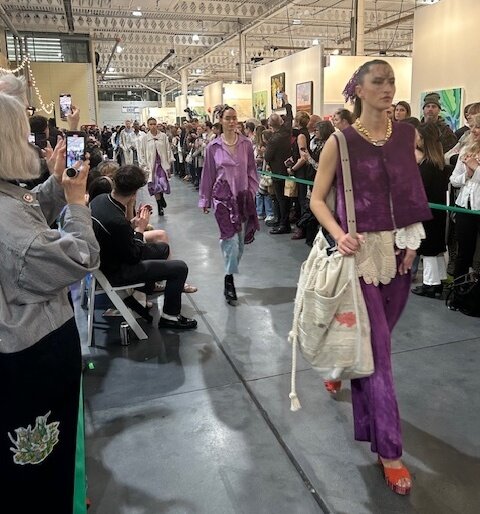
    The 2024 was perhaps the rainiest Artist Project opening, at least in my recollection. Nevertheless, by the time the Fashion Art Toronto runway fashion show got going, the booth aisles seemed as packed as ever. On the subject of wearable art, Artist Maria Qamar of Hatecopy collaborated with local Henna artist Rimsha to create custom Henna designs. Some signature Qamar work as a full-length jacket of sort, I took to be inhabited by the artist herself, making the way through the fair.

    Just a few of the special installations included Jess Lincoln’s immersive large-scale “Alcoves,” Olivia Mae Sinclair’s textile “It Takes Two” books, Nimea Ariana’s “Journey into the Unknown” by means of five wall-to-floor scrolls, and the soft refrigeration of Shannyn Reid’s “As It Seams.”

    Text: Steve Rockwell, Photo: Roy Bernardi

    This was perhaps the rainiest Artist Project yet – the rain pelted heavily, the skies were miserably gray – but that did not hinder the excitement for one of Toronto’s most eclectic and vibrant showcases of independent artists and creatives. As I entered the doors of the Better Living Centre, I was met with the powerful, thumping bass from one of the guest DJ sets. People eagerly peeked into the exhibition as they waited to scan their tickets while artists happily greeted the visitors already inside, engaging in insightful conversations about their practice and contemporary art.

    As Artist Project returns for 2024, the event brings back select artists from the previous year, showcasing both new and old artworks, a wide range of new artists working with various mediums, as well as new awe-inducing events including Pixel Heller’s performance and two runway shows, courtesy of Fashion Art Toronto (FAT).

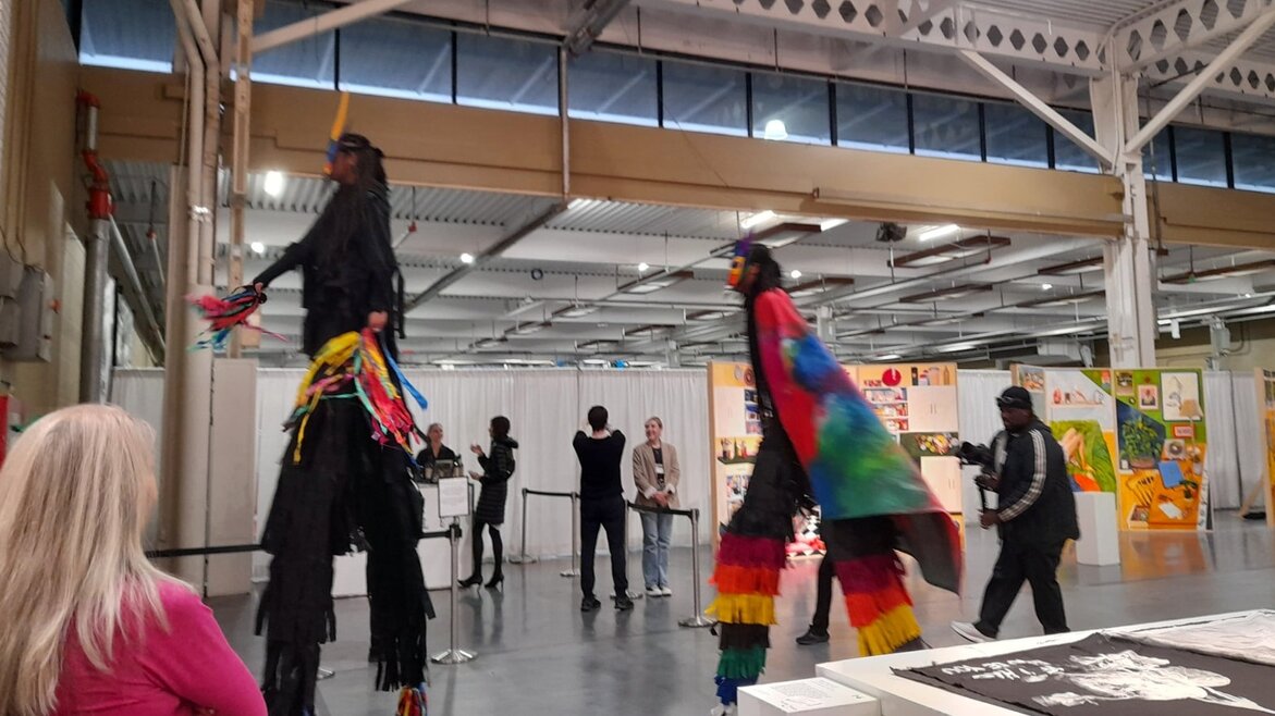
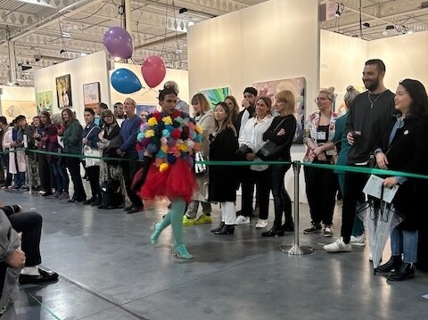
    The opening night strongly kicked off with Pixel Heller’s performance, featuring two stilt walkers dressed as Moko Jumbie masquerade characters, pay homage to the artist’s cultural heritage and her community’s resilience. Visitors bustled to get a closer view of the bright, multi-coloured capes and intricate masks adorned by the performers. As visitors followed along the performers’ towering, confident gait through the exhibition space, they’d also, in turn, accepted Heller’s invite to celebrate diasporic representation in art, historically dominated by western colonial narratives, as well as embrace communities bridged by dynamic art and creativity.

    Pixel Heller’s performance

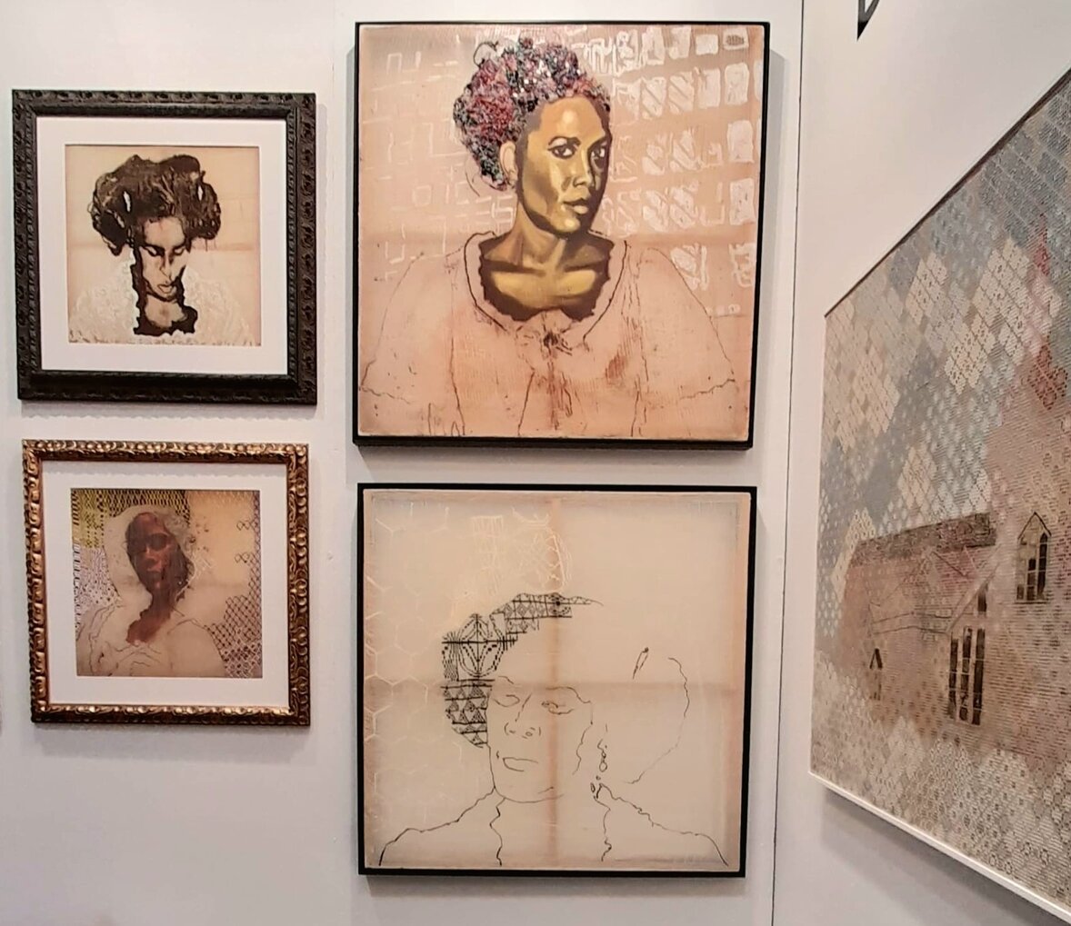
    In this year’s project, Dionne Simpson returns with her “Under Construction” series, featuring two large scale pieces worked on for over ten years. Here, Dionne meticulously experiments with canvas, paint, jewelry, and Letrasets to create works that fuse poetic text, fine art painting, and texture play – intimate yet indirect symbolizations of her identity, memories, and personal experiences. For instance, the first work of “Under Construction” explores the childhood cruelties Dionne once faced, being called Medusa by class peers due to her “wild, untamed” hair. As Dionne spends a long amount of time developing an artwork, she regards them as her “babies,” though work that is more vulnerable feels like a part of her. Through her work, one gets a tender vision into both Dionne’s world and her perception of ours.

    Dionne Simpson’s booth

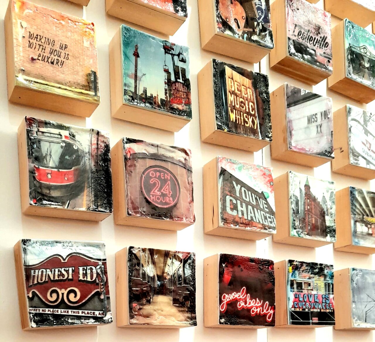
    Returning to Artist Project as well is Ph1 Studios. Run by couple Melissa and Petro Espina, their works revolve around an encaustic and photo transfer methodology to create nostalgic replications of Canadian urban landscapes. The photographs, taken during the couple’s “photo walks,” unintentionally preserve parts of the city as it evolves, mapping routes through the city’s past. The smaller wood panels capturing Honest Ed’s storefront, once a notable Toronto landmark, take me back to my childhood – shopping with my mother, walking past the hallways with vintage photographs, and looking at handmade signs promoting their weekly bargains. Subsequently, their photographs of graffiti and street art help preserve an art form that is not intended for archival purposes. “Waking Up With You is a Luxury,” for example, photographs the titular text, graffitied onto a brick wall. Unsatisfied with the original photo, the artists wanted to return to the area and retake the photo the next day; however, the text had already been covered up. The photographs, though simple at first glance, are like visual diaries of the couple’s journey through different cities and an ode to urban landscapes simultaneously nostalgic, relatable, and immediate.

    Works by Ph1 Studios

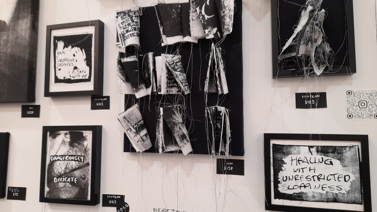
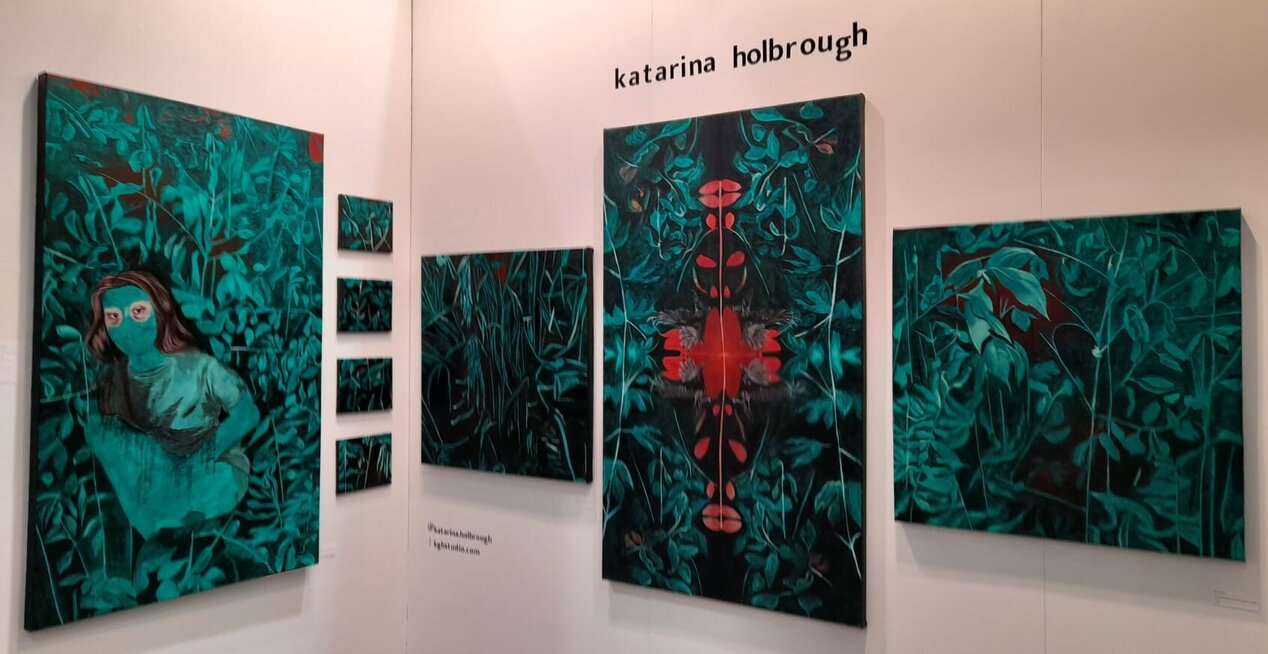
    Artist Project also saw the works of OCADU alumni, including Olivia Mae Sinclair and Katarina Holbrough. Olivia reuses scrap fabrics, screen-print, and hand-sewing to craft poetry books that offer glimpses into the complexities of being a young, contemporary woman artist. The edges of the books remain unrefined, the stitching is crude yet confident, while signs in the artist’s booth encourage visitors to touch and flip through the works displayed. Here, Olivia seeks to make intuitive work that defies the conventions of prestigious art, aiming to make art more accessible. Katarina, coming from a curatorial and painting background, is focused on subtle abstractions of the figure and landscapes, creating dreamy representations of realism.

    Olivia Mae Sinclair

    Katarina Holbrough

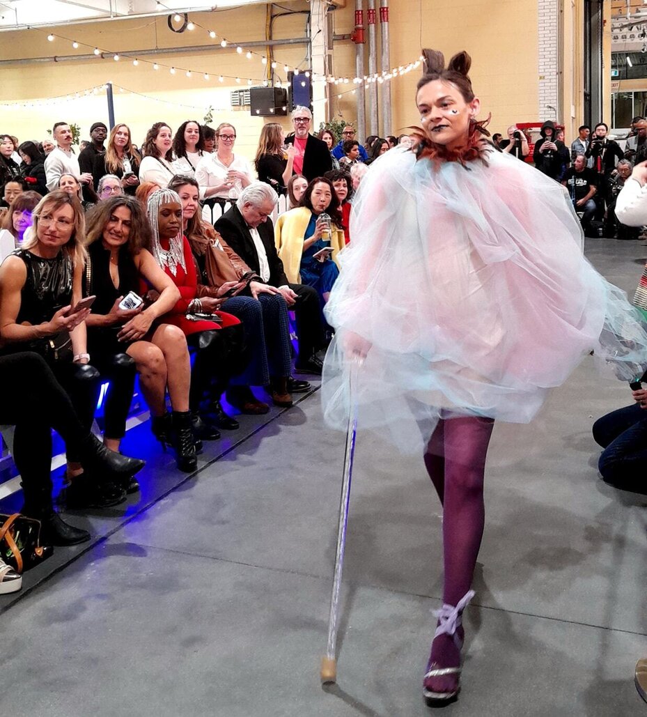
    As the night came to a close, Fashion Art Toronto hosted two runway events featuring the work of independent designers Ashes and House of Etoile. The models of Ashes walked in plain yet stunning crochet and linen sets. Amid the staggering rise of fast fashion and microtrends, which sees clothes unethically mass-produced and discarded, Ashes honors the merit and timelessness of handcrafted fashion using domestic materials.

    Performance by Ashes

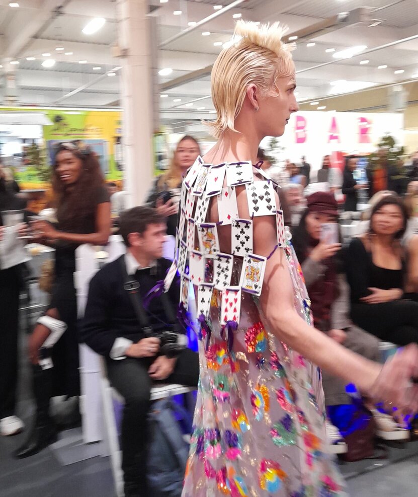
    Reciprocally, House of Etoile showcased a line of maximalist couture garments. The designs of Prada Lola Faraji were experimental and whimsical, evoking contemporary reimaginations of Alice in Wonderland. During Etoile’s show, a model began plucking cards off of his bolero, constructed of playing cards, and tossed them into the crowd. Undoubtedly, Etoile encapsulated viewers by both the uniqueness of the collection and the energy from the models.

    House of Etoile’s performance

    Overall, Artist Project is an unmissable venture into the widely-varied practices of independent artists, offering meaningful, firsthand interactions with artists and a chance for viewers to explore areas of art that they otherwise would not.

    Text and photo: Tiffany Duong

    Artist Project 2024, Opening night preview, April 11, 2024, 6 – 10 pm, Better Living Centre, Exhibition Place, 195 Princes’ Blvd, Toronto.

  • Artist Project 2024

    Artist Project, 2023. Photo: Phil Anderson

    April 11 – 14, 2024
    Better Living Centre, Exhibition Place
    195 Princes’ Blvd, Toronto
    Hours: April 11, Opening night preview, 6 – 10 pm, April 12 & 13, 12 – 8 pm, April 14, 12 – 6 pm.
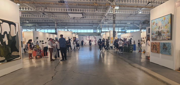
    Discover and connect with over 250 independent artists at Artist Project in Toronto from April 11-14, 2024. Experience a stimulating environment designed to ignite enriching conversations and foster a personal connection with art. Explore thousands of artworks, large scale installations, enjoy curator led art tours and take home that special work that truly resonates with you.

    Artist Project 2023. Photo: Lex Barrie

    For more information please click here

  • Greater Toronto Art 2024 / Preview at MOCA 

    This ambitious exhibition is the second edition of a triennial exhibit that offers artists with a connection to the Greater Toronto Area an opportunity to display their work from March 23rd to July 28th, 2024. The exhibit is on all the three floors of the museum. Kate Wong (MOCA Curator), one of the three curators, told me about the challenges of this exhibition, such as the enormity of it coupled with all the logistics of the project. This was evident as art works were still getting installed during the preview. The show is a collaboration of the three curators Kate Wong, Ebony L. Haynes and Toleen Touq. The three curators navigated through proposals for commissioned works from artists, followed by studio visits to come up with the final art pieces.

    Curator, Kate Wong

    At the media preview we were introduced to the project by MOCA’s Director, Kathleen Bartels who took us through the process of putting it together with MOCA’s involvement and, of course, thanking the sponsors, including BMO, that helped make it possible. The curators were then introduced and they took us through the exhibition and introduced us to some of the attending artists.

    MOCA’s Director, Kathleen Bartels

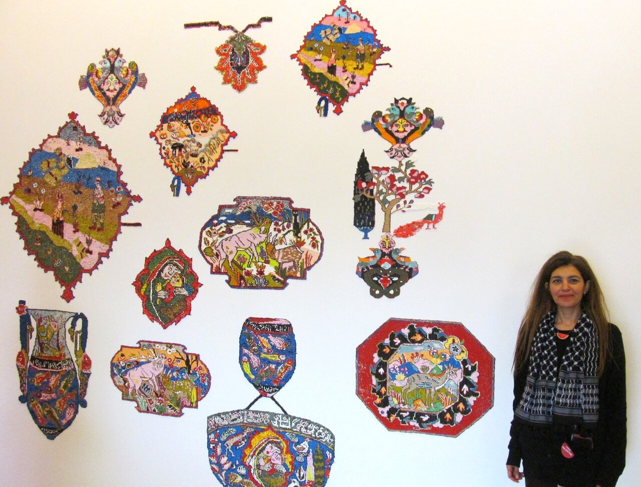
    A show of this size and scope has many different parts and so, just like the GTA itself, is hard to define. There are gems and a few works that are more challenging to connect with. Near the entrance on the first floor there is the work by Sukaina Kubba, titled “Enclave, Exclave” (hand drawn PLA Filament). Her works are connected with memory and this installation was inspired by a Persian carpet that was in her family’s home in Baghdad, Iraq. As her statement reads: she “finds beauty in isolation and not only welcomes but prioritizes the power that lies in details.”  Visitors are aided by way of QR codes to link to more information on their phones.

    Sukaina Kubba with her installation Enclave, Exclave, hand drawn PLA Filament

    One of the installations that impressed me was Catherine Telford Keogh’s “Carriers (Gravity Fed)”, 2024. This work was commissioned by MOCA and supported by Canada Council funding. Keogh found the conveyor rollers in a demolished factory near Montreal and stored them in her studio until she saw that her work would be well suited in the MOCA site, with its history as an automotive parts factory. In her work she addresses consumerism and environmental issues. There are containers on the conveyor belt that have capsulized consumer objects and another one with industrial waste turned into sludge. She enjoys exploring industrial sites and even volunteered in a factory as part of her research.

    Catherine Telford Keogh in front of her installation Carriers (Gravity Fed), 2024 (left) and detail of Carriers (right)

    Artist Jes Fan has done research on soya production in the GTA and has several sculptures commissioned for GTA24 using soya sheets hanging from sculptures of steel and glass.

    Jas Fan, Interface 1 and 2, resin, steel, glass & soyaderm

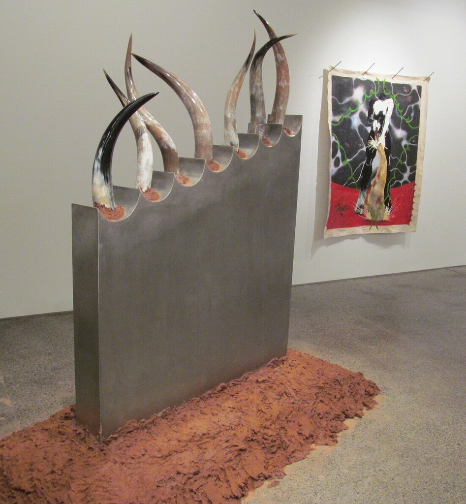
    Oreka James has a sculpture with cow horns and steel (Tempus), as well as a painting (Night Angel). These are commissioned works which explore “lessons on animism” with cultural references from Japan and West Africa.

    Installation view with Oreka James, Tempus, I Have lived and So Will Tell, 2024, steel, cow horns and earth (left) and Night Angel, oil and acrylic on canvas (right)

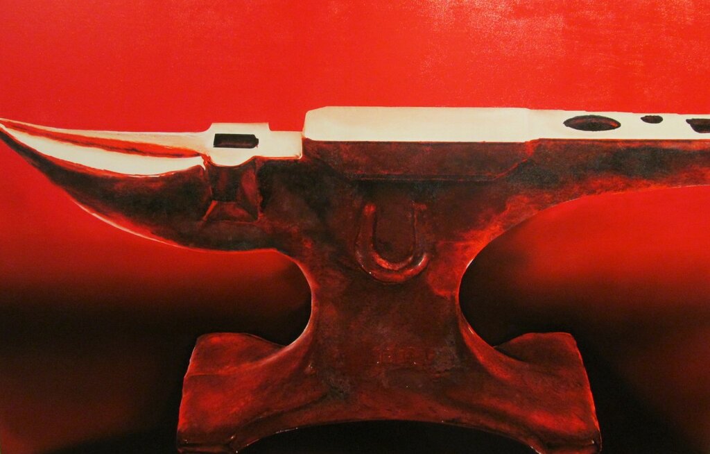
    The artist Michael Thompson, has a personal connection to the automotive sector, as shown in his painting “Red Hot (anvil)” so it is fitting that the work is displayed in an old automotive factory that has been transformed into an art institution.

    Michael Thompson, Red hot, acrylic on canvas

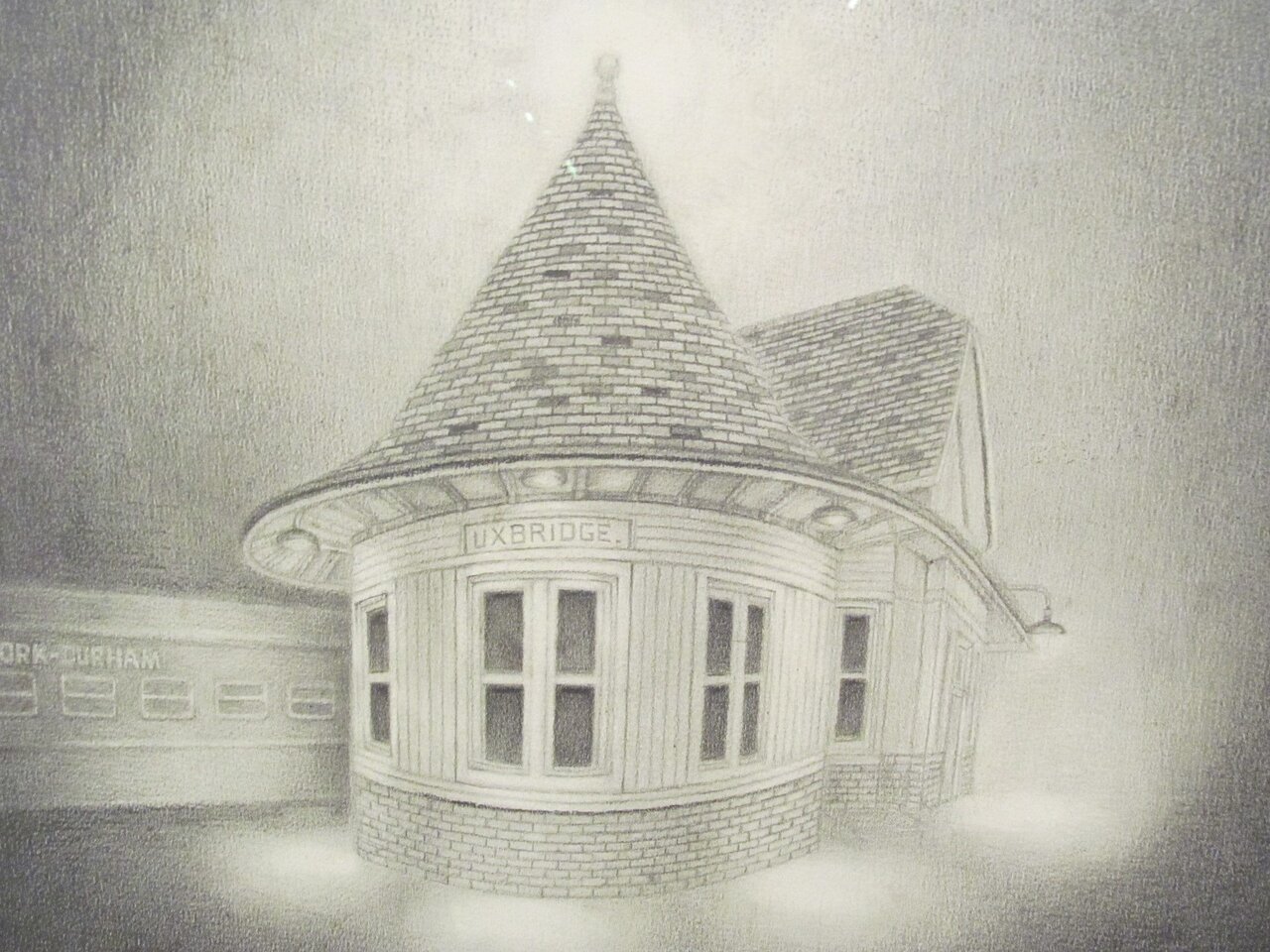
    Artist G.B. Jones has done 3 graphite drawings of buildings in the GTA region including The Cotton Factory in Hamilton, The Uxbridge Train Station in Durham and The Old Angel Inn in Niagara on The Lake. Jones “explores the psychogeography of place” with her works.

    G.B. Jones, Uxbridge Train Station, graphite on paper

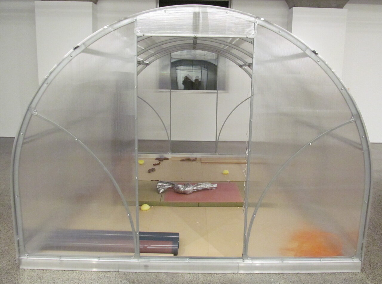
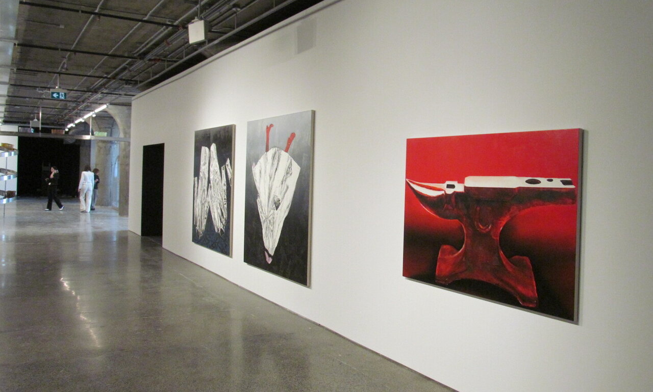
    Just as in GTA21 many artists have been commissioned to create works specifically for GTA24. This allowed them to create works keeping in mind MOCA’s challenging layout with its massive structural supports. These are not necessarily a negative feature but define the space with a sense of its industrial history.

    Installation view of GTA24 at MOCA

    Every medium seems to be covered in the exhibit with many video works, paintings, photo-based works, a sound installation in the stairwell and even graphite drawings. GTA24 also has offsite screenings at the Paradise Theatre and some performances that visitors can attend. In May there will be a launch of a GTA24 publication by Copenhagen Design House.

    Lotus L. Kang, Receiver Transmitter, (Butterfly)

    GTA24 offers the public many insights into contemporary art practises from artists across the GTA and the curators have done a good job in encompassing the diverse nature of the region. Visitors now get an opportunity to see and experience the GTA in many ways through the creative works of some 25 artists. Besides the commissioned works there are also works dating from 1963 included in the show. Visitors should be prepared to spend some time looking at the many pieces and are bound to find their own favourites.

    Installation view of GTA24 at MOCA

    Text and photo: Phil Anderson

    *Exhibition information: GTA24, March 23 – July 28, 2024, Museum of Contemporary Art, 158 Sterling Rd, Toronto. Museum hours: Wed – Thu & Sat – Sun 11 am – 6 pm; Fri 11 am – 9 pm.

  • Greater Toronto Art 2024 at MOCA

    Greater Toronto Art 2024 / Triennial Exhibition

    March 22 – July 28, 2024

    Greater Toronto Art 2024 (GTA24) is the second edition of MOCA Toronto’s recurring triennial exhibition, which was conceived in 2021 to look more closely and consistently at artistic practices with a connection to the Greater Toronto Area (GTA). Featuring a constellation of twenty-five intergenerational artists, duos, and collectives, GTA24 looks back as much as it looks forward. The exhibition presents work made between the 1960s and the present, allowing the comingling of art created in different decades to provide new ways of understanding the current moment and imagining the future.

    Across the museum’s three floors—and in an energetic series of live programmes and screenings—the exhibition features fifteen newly commissioned presentations, performances, and events, furthering MOCA’s commitment to supporting artists in the development of new work and ideas. Thinking through the formation and designation of the Greater Toronto Area, GTA24 considers the arbitrary lines drawn to create maps, the ambiguities of an ever-widening geographic designation, and the precarity that arises for those displaced by rapid growth and expansion. These conditions create a state of otherness, and GTA24 reflects on the artistic strategies of working with, on, and against dominant cultural forms. Within this context, the exhibition emphasizes the crucial roles artistic language plays in developing more sustainable and caring ways of living together, and in building solidarity.

    For more information please click here.

    Museum of Contemporary Art, 158 Sterling Ave, Toronto. Museum hours: Wed – Thu & Sat – Sun 11 am – 6 pm; Fri 11 am – 9 pm.

  • New Members / Canadian Sculpture Centre

    As the Sculptors Society of Canada celebrates its 95th anniversary, the Canadian Sculpture Centre is forced to move once again. With relocation plans unknown, the gallery hosts its last exhibition at 18 Gristmill Lane in the Distillery District, “New Members”, highlighting emerging Canadian sculptors whilst honouring the Canadian Sculptors Society’s longevity and resilience.

    The exhibition features the works of three sculptors from different parts of Canada, all of whom work with raw, natural materials – embracing prehistoric modes of artmaking while adopting crafted and handmade elements. Amid such turbulent times, where Artificial Intelligence attempts to generate art and mass-production is ever more dominant, this exhibit fittingly inspects the relationship between nature alongside the man and machine-made.

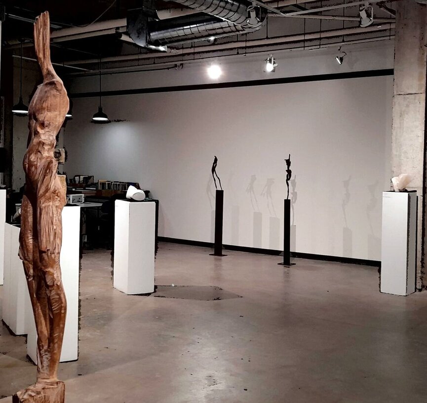
    Installation view with Soheyl Bastami’s #2 – From Against the Wind Series (left)

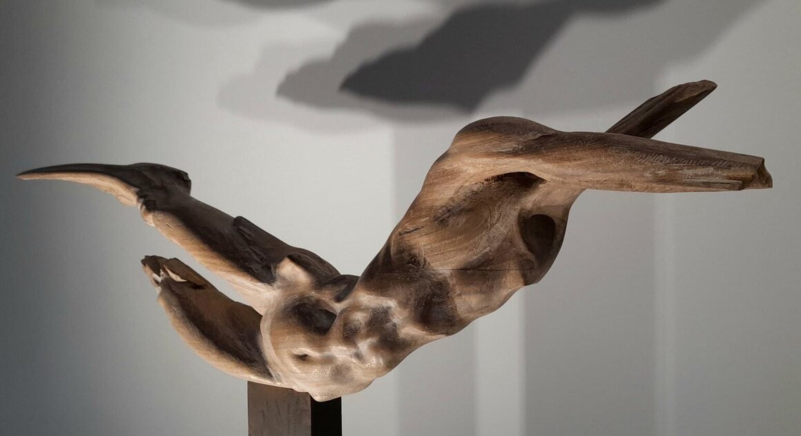
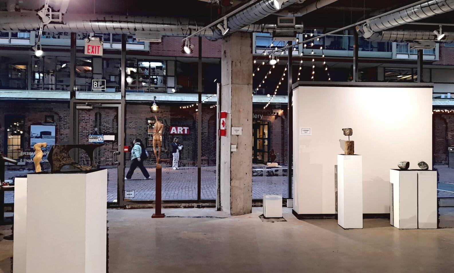
    Before even entering the gallery, I am greeted with Toronto-based artist Soheyl Bastami’s “#1 – From Against the Wind Series,” standing in the gallery window. Facing the historic road of the Distillery District, Bastami’s wooden figure showcases curiosity, pursuit, and survival as human instincts. While the identifying features of the body are bluntly whittled away, representing the mercilessness of nature, Bastami meticulously preserves the soft curves of the human form. Posed in an outstretched manner, the figure seems to embrace nature, however brute, while wanting more – yearning for knowledge and a deeper connection to it.

    Soheyl Bastami, #1 – From Against the Wind Series, wood, steel

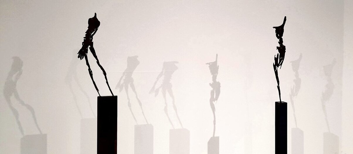
    Figurative sculptures are a prominent element of Bastami’s recent work. With a background in graphic design, Bastami introduces a new and painterly way of deconstructing the human form in sculpture. For instance, the figure in “#2 – From Against the Wind Series,” is chiselled from a wooden plinth. With confident mark-making, Bastami challenges the initial refinement of the plinth. Although the figure is headless, I feel that I am caught in its gaze and even have a conversation with it. The figures of “#3” and “#5” from “Against the Wind Series” are delicate in comparison, resembling anatomical sketches or underpaintings. Bastami represents the power of the nature through the fragility of the figures, with broken away body-parts, and by embracing the rust and erosion of metal. Standing opposite to one another in the gallery space, the shadows these figures cast on the wall serve to animate them, breathing even more life into the work.

    Soheyl Bastami, #5 and #3 From Against the Wind Series, steel

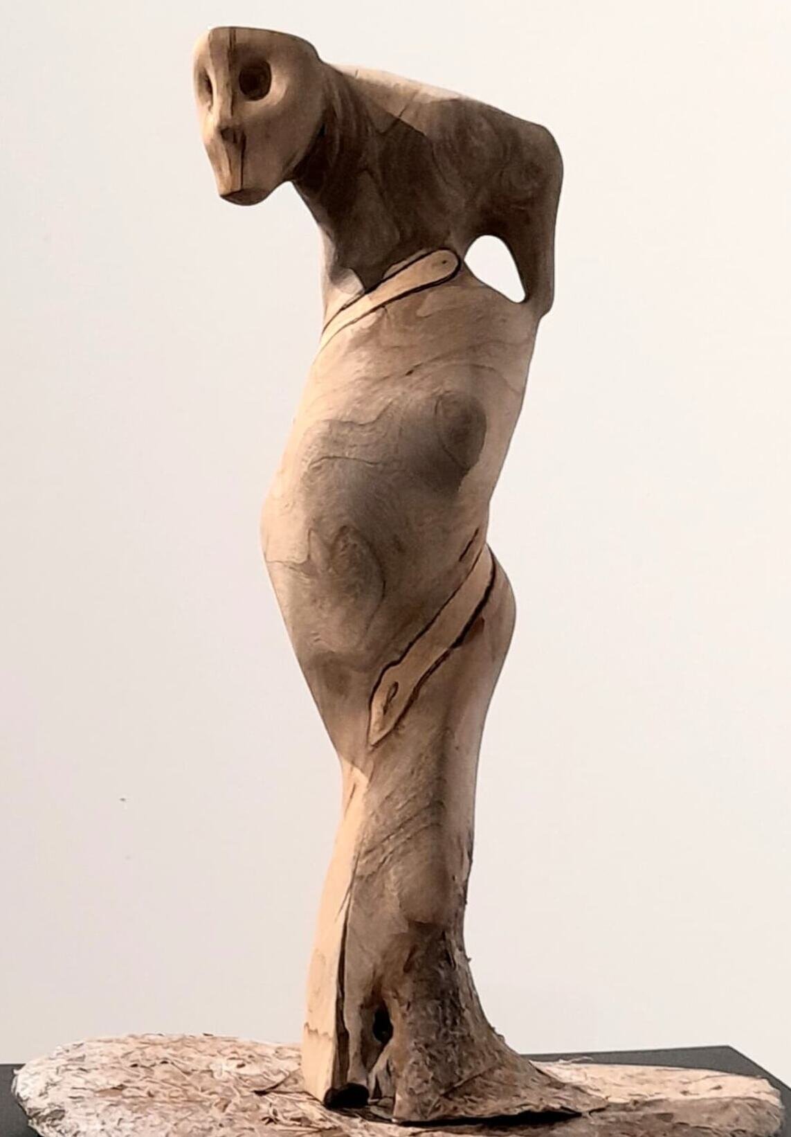
    While Bastami’s figures seem to question the extent of human desire and exploration, Ottawa artist Dong Han is driven by ancient craftsmanship, seeking to determine the boundaries between man-made and natural artefacts. Here, Han accentuates the “warmth, safety, and vitality” of materials found in nature through rounded shapes and figures made of wood and bronze, mediums that Han refers to as “hard and cold.” Reducing the human face and body to its slightest implications, Han’s work bears similarity to prehistoric cave paintings and Paleolithic art. “Figure,” is a small wooden sculpture of a sexually ambiguous figure with no definite characteristics – yet, it remains undoubtedly human. Living up to its namesake, “Figure” could be everyone and no one, all at once – inviting viewers to create their own narratives.

    Dong Han, Figure

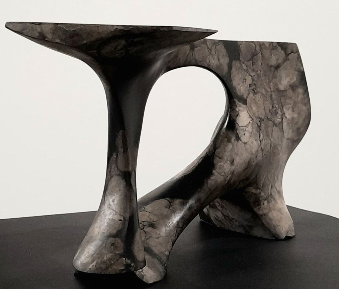
    Alternatively, in “Imprint” the artist reinterprets forms found in nature, resembling both a human limb and a tree branch or log. In these works, Han experiments with chemicals to transform the surface of bronze, producing abstract, watercolour-like paintings of landscapes. Through this process, Han generates visually stunning textures that, though chemically altered, feel inherent to the stone medium – engaging viewers to question the differences between natural and human creations.

    Dong Han, Imprint, bronze

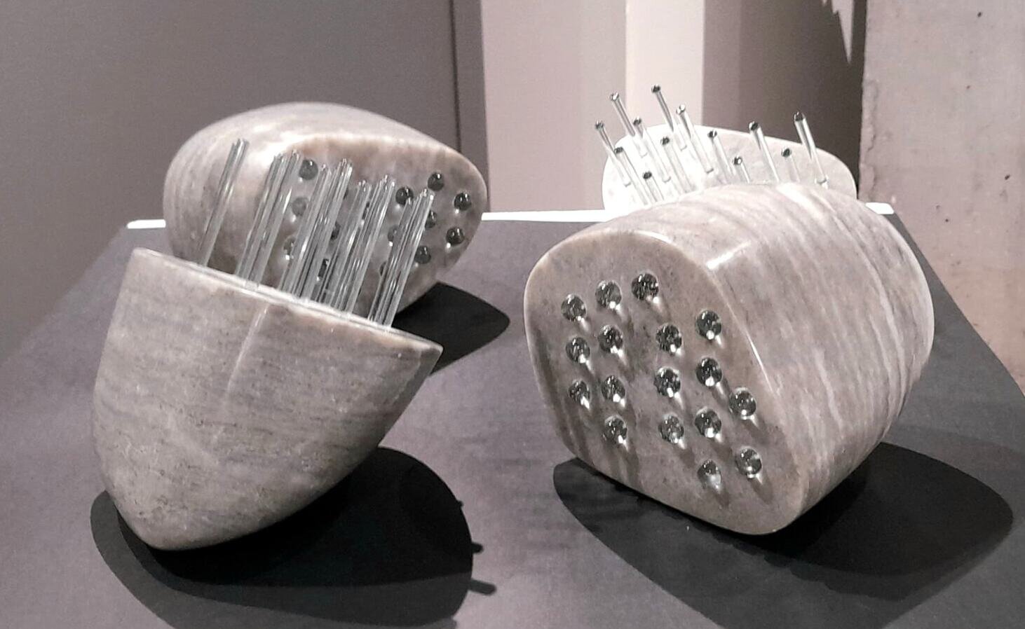
    Likewise, Montreal artist Michel Dufresne examines the changes that occur to stone within its natural environment and through the creation of art. Dufresne compares the strength of stone in contrast to the fragility of glass, creating forms that highlight the natural beauty of these materials. The glass rods and beads of “Comme la terre” remain transparent and semi-reflective, encapsulating the man-made, whereas the crystals in the alabaster glisten under the gallery light.

    Michel Dufresne, Comme la terre, alabaster, glass

    Subsequently, “Rapprochement” and “Jonction” give the illusion of multitude. Although they are carved from one stone, Dufresne creates a mirage assemblage of several stones that, despite seemingly veering on the edge of collapse, never will fall – furthering the feeling of stability of the stone.

    Michel Dufresne, Rapprochement, marble (in front)

    Thoroughly investigating various facets of the human experience, ancient modes of creation, and how it all intertwines with the natural realm, the exhibit ultimately provokes reflection on our own interactions with history, art, and the environment. The “New Members” show offers an exciting array of new Canadian artists and an experience, sure to spark dialogues about the past, present, and future of contemporary sculpture.

    Installation view with Gristmill Lane in the Distillery District

    Text and photo: Tiffany Duong

    *Exhibition information: New Members, March 2 – April 5, 2024, Canadian Sculpture Centre, 18 Gristmill Lane in the Distillery District, Toronto. Gallery hours: Tue – Sat 11 am – 6 pm, Sun 12 – 5 pm.

  • Also a Good Place to Sulk at Zalucky Contemporary

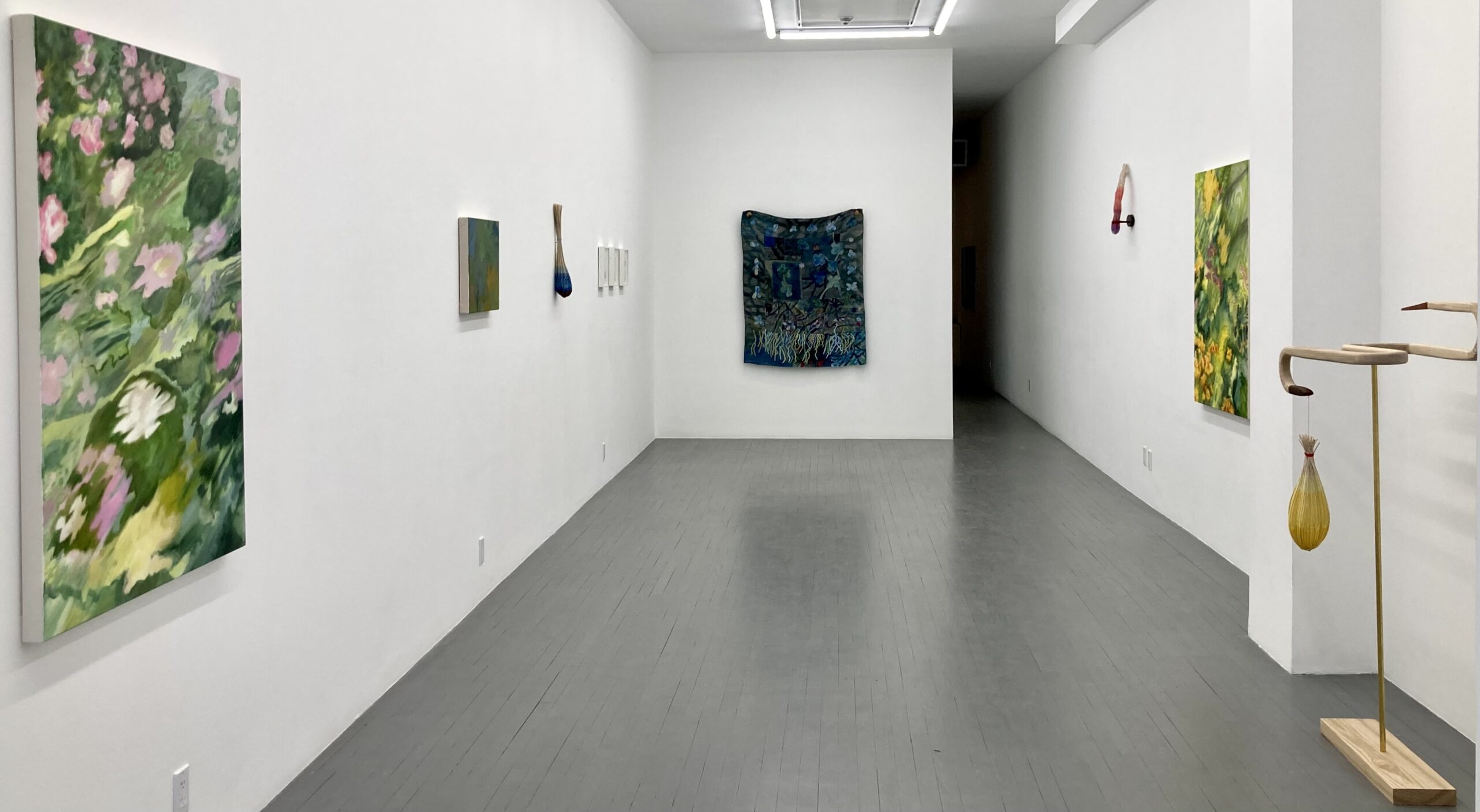
    Also a Good Place to Sulk at Zalucky Contemporary contemplates the role of the garden (and nature) as a site of respite. The exhibition was curated by Anaïs Castro, featuring artists Béatrice Côté, Bronson Smillie, Kristi Chen, and Laurel Rennie.

    Installation view of Also a Good Place to Sulk at Zalucky Contemporary

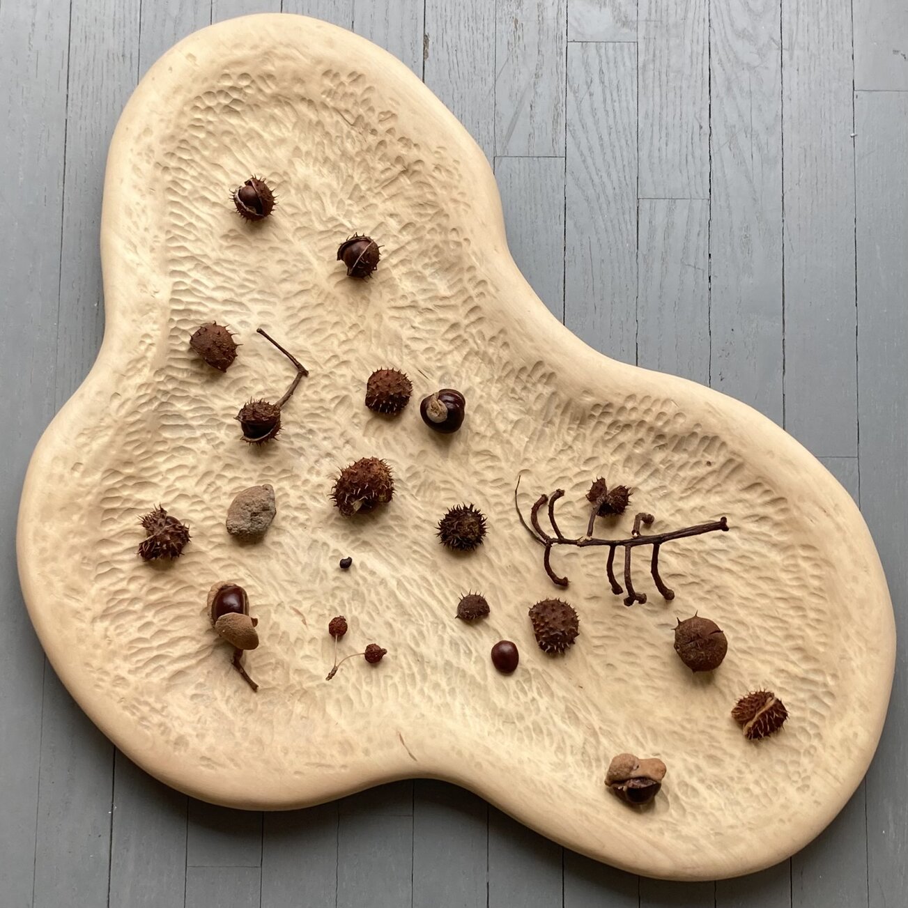
    Immediately upon entry there appears to be a shallow bowl filled with remnants that remind me of lychee, rambutan, and longan. I imagined the mild taste of the longan’s flesh and the sensation of tearing it from the pit. Upon closer inspection I realize they are chestnuts. Laurel Rennie’s “Muster” is a tableau, the stage carved out of basswood, with soft indents like the texture of the shells. The depth of the outward flecks holds viewers focus at the center of the organic shape. Movement and organic shapes are present throughout the exhibition, straying away from harsh forms and opting for natural materials.

    Laurel Rennie, Muster, 2023, carved basswood, milk paint and chestnut oil, linseed oil, beeswax, 31 x 19 x 1.5 inches

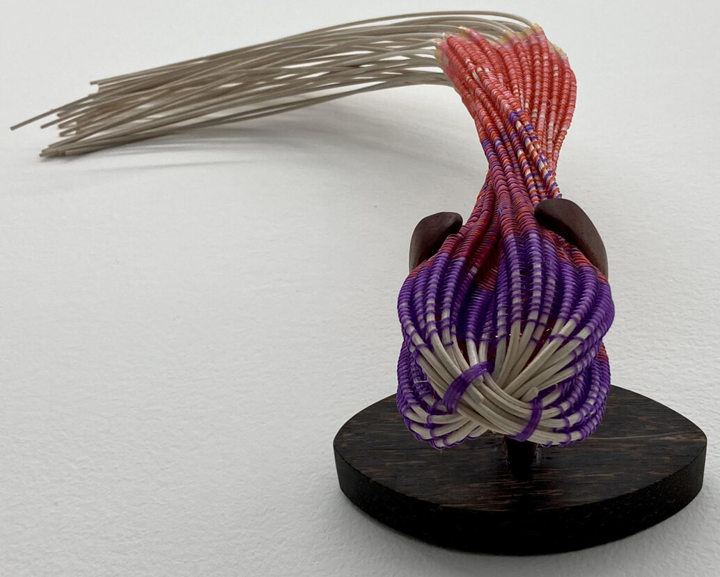
    Produce is a common subject matter throughout the works in Also a Good Place to Sulk, inherently linked to gardens through growth and harvest. Kristi Chen’s contributions are a reimagining of various fruits, recreated with rattan reeds, palmwood, and paduk wood, adorned with crystal beading. The “Invasive Blueberry” is realized as a teardrop, a gradient of blues enveloping the underbelly of the fruit. Meanwhile, “Dragonfruit” is a pleasure to explore from different angles. Facing it directly, “Dragonfruit” appears as a creature swooping downwards. Viewed directly from below one can see a face, with a snout formed by the crossing of rattan reeds. The wooden clasp holding the piece in place suggests ears framing the head of the beast.

    (Viewed from below) Kristie Chen, Dragonfruit, 2024, crystal beading, thread, round rattan reed, palmwood, paduk wood, 23 x 6 x 3 inches

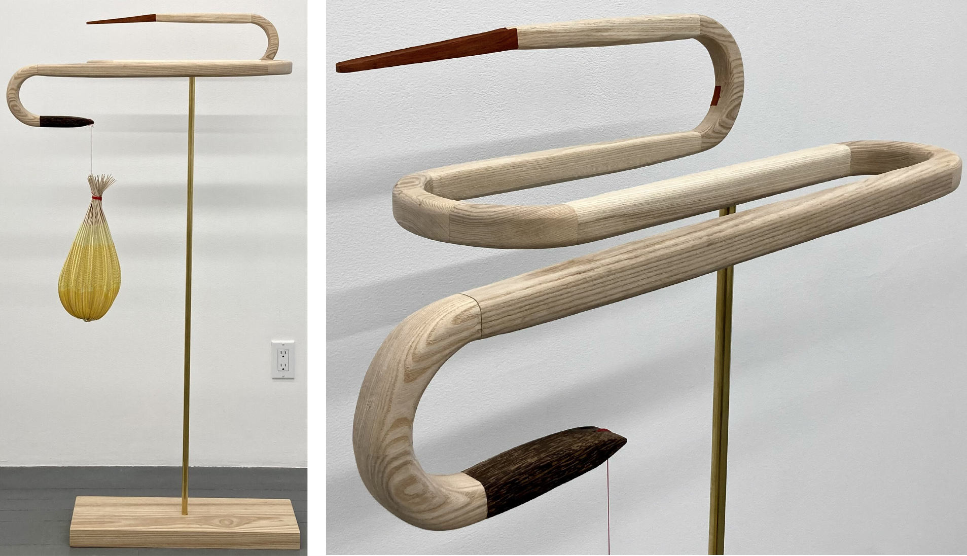
    Animal energy is also present in “The Snake and the Pomelo”, with the serpentine quality inherent in the curvature of the wood rising above the brass rod. The pomelo hangs from the edge of the snake’s tail, with connotations of citrus from the canary, cadmium, and citrine beading coiling around the bottom.

    Kristi Chen, The Snake and the Pomelo, 2024, Ash wood, Paduk wood, Palmwood, crystal beading thread, round rattan, metal rod, 65 x 40 x 14 inches (left) and detail (right)

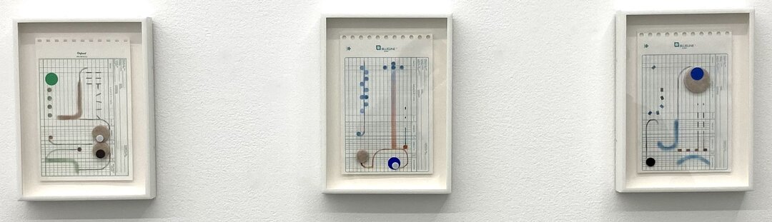
    The winding figure accompanied by circular motifs is also evident in Bronson Smillie’s felt drawings. The series features felt stickers, circles and soft lines in a muted palette, composed on ledger sheets. The colours prompt imagery of ponds, reeds, root systems, and flowering branches. Utilizing the bureaucratic sheets in this way is a playful subversion, as if the artist wants us to consider a balance with nature even in administrative settings.

    Bronson Smillie, Felt Drawing #1-3, 2022, drawing and felt on paper, each 10.75 x 7.75 inches framed

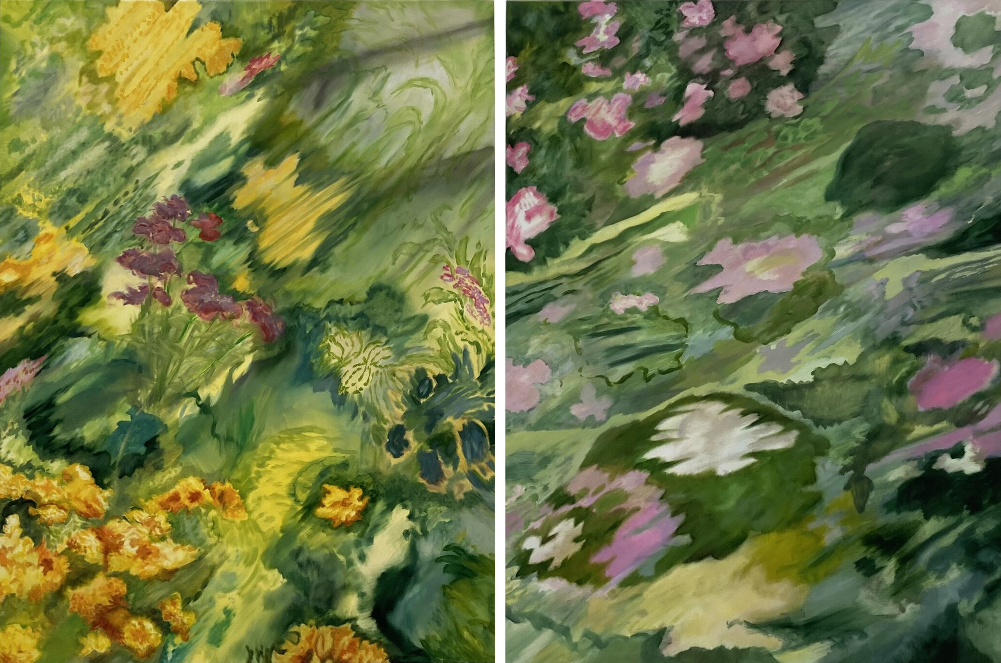
    On the topic of nature in inhospitable settings, Béatrice Côté’s contributions reflect upon greenery in urban spaces. Côté’s series of paintings lack a sharpness in the subjects though the presence of flora is clear. The blur is constant, as if urging our eyes and ourselves to focus and concentrate. This is a parallel to living in cities and trying to grasp exactly what we’re missing—our bodies yearning for something artifice cannot provide. “Fleurs Soleil” and “Fleurs Babar” feature the sweeping visual of flowers in motion, as if the viewer is spinning and can see a meadow in the periphery.

    Béatrice Côté, Fleurs Soleil, 2023, oil on canvas, 48 x 36 inches (left) and Fleurs Babar, 2023, oil on canvas, 46 x 36 in (right)

    The idea of being enveloped and immersed in a floral visual is observable in Laurel Rennie’s “Night Roots”. The textile piece is an assemblage of naturally dyed fibers and fabric patches formed into a quilt. “Night Roots” appears as an alternative tree. On the surface of the work, towards the bottom, are a variety of roots full of vitality. At the top is a frame of flowers, dyed and sewn onto the fabric of the piece. “Night Roots” captures the confusing immersion into the subconscious world, one where the primordial desire to be attuned to nature is well known. Rennie’s work is an example of dreams being realized in the material world.

    Laurel Rennie, Night Roots, 2023, Cotton, linen, wool, and hemp fabric, chestnut dye, blackberry stains, logwood, cotton embroidery floss, carved poplar, 53 x 43 in

    Considering the technical acts of carving wood, dyeing fabrics, assembling reeds, the artists in Also a Good Place to Sulk engage with nature in a meditative way. Castro’s curation is a gentle reminder that we cannot reap the same day we sew; life takes time. We continue to search for the natural world despite existing in urban spaces shrouded with pollution and industrial infrastructure. Verdant pockets of life find their way into our consciousness, whether they are fleeting visions in our periphery like Côté’s works, or a wistful moment browsing produce in our favourite market.

    Text and photo: Rashana Youtzy

    *Exhibition information: Also a Good Place to Sulk / Group Show, February 22 – March 23, 2024, Zalucky Contemporary, 3044 Dundas Street W. Toronto. Gallery hours: Thursday to Saturday, 12 – 5 pm or by appointment.

  • Steve Rockwell at Station Independent Projects

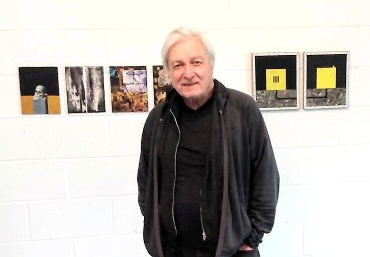
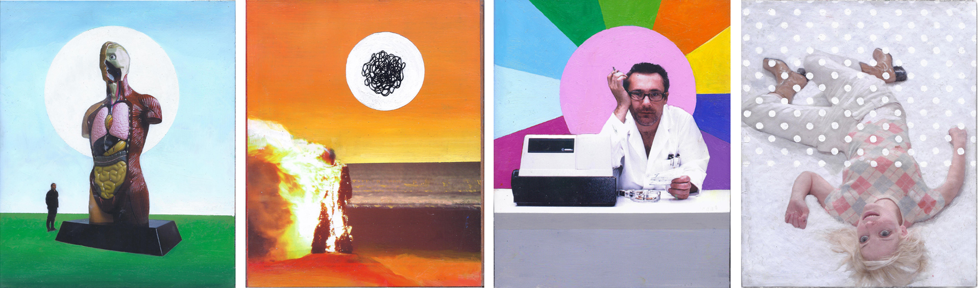
    For over two decades artist, Steve Rockwell, has published dArt Magazine. His intimate involvement in the magazine – both editing and writing for it – has informed his works currently on display at Station Independent Projects, an exciting new gallery on Geary Avenue, that has its origins in Lower East Side, NYC. The show has been given the title ‘DArt Magazine Curated Content’ because all the works on exhibit derive their content from the pages of the magazine itself. More exactly, every image is lifted from the magazine, and is incorporated in a collage, or is altered by being painted over somehow.

    Steve Rockwell in front of his works. Photo: Leah Oates

    As described above, it might appear that Rockwell has baldly appropriated images of various artworks. Things are not so straightforward. It seems to me, at least, that Rockwell’s immersion in the artworld is so total that almost all the imagery, that appear in his magazine anyway, bears some relation to his life. In this sense the content has a personal dimension to it. Rockwell himself remarked that he aimed to disappear behind the works – art as self-effacement. But listening to him relating the connections he has to what is on display, the opposite might be asserted, namely that he reveals himself through the works. He makes the images his own in this regard.

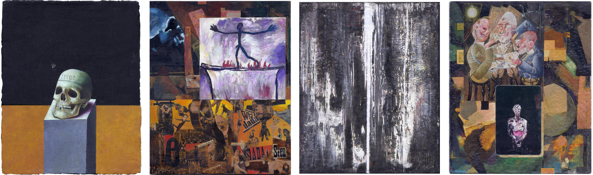
    (L-R) Dead Idiot, Pencke’s Passage, Richter Scale, Card Players

    There is no sense, then, in which he is plagiarising or wilfully pilfering images. As well, the creative way in which he uses the images allays this worry. One is reminded of how T.S. Eliot was once accused of almost wanton appropriation in his poem The Waste Land no less, given that he quoted so many poets in this work. Yet, of course, Eliot demonstrated how merely using others’ works in no way indicates a lack of creativity on the part of the author. Ditto with Rockwell. He is thoroughly conversant with the ideas behind the images he deals with, aided by his dazzling knowledge of art history. Indeed, there is a poeticism to Rockwell’s work – something quite refreshing given that art today is often flatly literal, even moralistic in tenor. The way he deviates from any straightforward reading of the images he uses could be aptly characterised as metaphorical.

    (L-R) Hirst’s Anatomy, Burning Man, The Pharmacist, Miami Flurry

    The principal works on display consist of a series of eight suites of four pieces. Each suite (or ‘stanza’ one might say) is grouped together on the wall, and is loosely connected by a theme, e.g., food, medicine or water. All the pieces are consistent in size, measuring 8.5 inches by 7 inches. That happens to be the same size as the dArt Magazine. This fact reflects Rockwell’s penchant for setting himself rules concerning the production of his work. The idea that art ought to be done according to a set of rules likely seems anathema to artistic creativity. But, here it is important to note the distinction between self-imposed private rules, like those set by Rockwell, and those rules set by others that most often shape our conventional social behaviour. The latter type are often constraining, but the former type of rules can in fact be liberating – they are a creation of the artist after all. They allow the artist to focus on those elements that he is interested in. The result in Rockwell’s case, is that his works show a high degree of freedom within the bounds he has set himself.

    (L-R) As the World Grinds, Pulp Ladle, The dArt Burger, The Bunny Show

    Rules very often are manifest in games, broadly construed. Games epitomise rule-following activity as such. And these have been an ongoing theme of Rockwell’s work over the years. He has on several occasions in the past devised his own games that result in an exhibitable artwork. One example is his work titled ‘Gallery Space’ (1988) – not shown here. Inspired by Sol Le Witt and his conceptual exploration of fundamental forms, Rockwell planned a grid-like sculpture. After canvassing the participation of galleries in Toronto, he sent a form to the director of each. On it he requested the director to choose an available square on the eight by eight grid and, as well, to indicate whether the main door is located on the north, east, south or west wall. After gathering all this infomation he set about constructing a six feet by six feet sculptural model, showing the name of each gallery in its chosen grid and a hole made in the respective wall. As with Sol Le Witt’s work, Rockwell’s sculpture is in essence the embodiment of an idea, where its physical details ‘take care of themselves’ in virtue of the rules he devises.

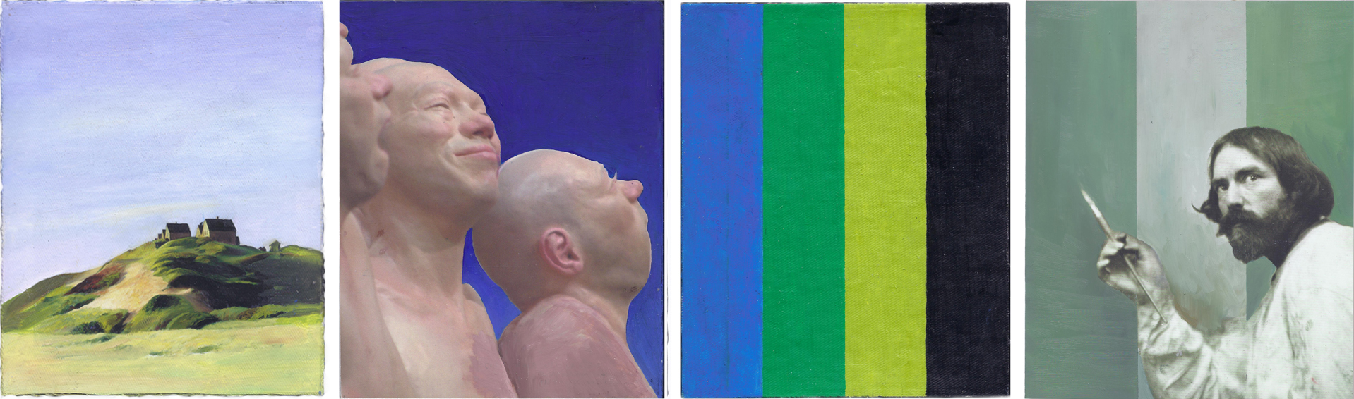
    As evidenced by the example cited above, rules demand an inventiveness and humour in their construction. And these qualities are amply betrayed in the works in this show. For instance, in the final piece of his third suite, an image of the artist Augustus Johns is placed on a background consisting of three vertical stripes. It looks as though Johns, holding a small sable brush, has absurdly just completed a wall-sized abstraction. In the first piece in this suite Rockwell has cheekily taken a reproduction of a small painting by Edward Hopper and extended the sky and foreground to fit his chosen vertical format.

    (L-R) Hopper’s Corn Hill, Stipl Squint, Jaan’s Divide, Johns Paint Tip

    Although these pieces at times touch on darker subjects, they certainly cannot be called saturnine, say. Rather, over all they are playful, reflecting Rockwell’s mercurial and lively intellect. They are a celebration of art and life. You don’t want to miss this one.

    Hugh Alcock

    Images are courtesy of the artist

    *Exhibition information: Steve Rockwell, DArt Magazine Curated Content, March 1 – 16, 2024, Station Independent Projects, 220 Geary Avenue, #2B, Toronto. Gallery hours: Thurs – Sun 1 – 6 pm.

  • “Back to the Grimoire” at Propeller Art Gallery

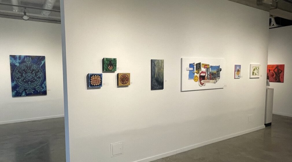
    “Back to the Grimoire” is an exploration of occultism, culture, and spirituality by emerging artists who seek to challenge conventions of the monotheistic. Curated by Lex Barrie and exhibiting at Propeller Art Gallery, an artist-run centre on Abell St. just south of Queen Street West, “Grimoire” questions the depths of unconventionality and what it means to exist outside of social acceptance, whilst offering insight into the perspectives of local, up-and-coming talent. Although works that explore outsider identities are not new, “Grimoire” is refreshing in its focus on emerging artists-creators who are still outsiders within the art world – and its intertwinement with occultism, which has been historically demonized and misunderstood.

    Installation view of Back to the Grimoire

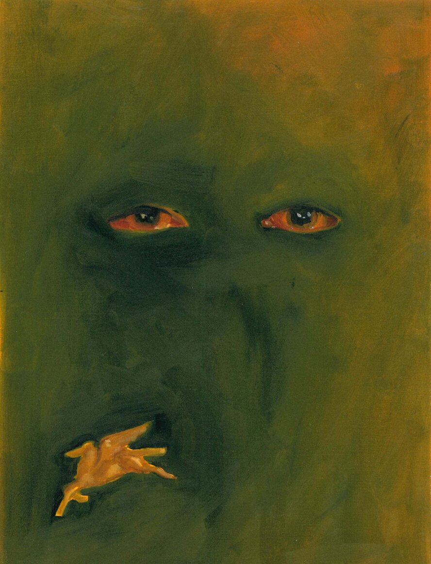
    Upon entering the gallery, I am met with the ethereality of Kenneth St. Onge’s “Mandala Inner Realms,” a large acrylic emulsion piece facing the front entrance. Self-described as a depiction of “hidden worlds and mystical realms where dreams are made and born” (St. Onge), the piece resembles moon phases yet represents a rather abstract though hopeful idea of the human unknown. Compared to the demonic imagery and deviousness wrongfully attributed to occultism, “Mandala Inner Realms” shimmers elegantly beneath the gallery light, welcoming visitors to challenge their own preconceptions and indulge in the narratives once and otherwise unfamiliar. However, as “Mandala Inner Realms” draws me in, I lock gazes with the watery eyes of Danielle Vincent’s “What else is left in the world,” which encompasses the emotional experiences of exploring the unknown: fearful, vulnerable, yet willing. Here, Vincent’s work echoes the doubts visitors may have with pursuing these narratives but recognizes the innate human strength to push through, while St. Onge’s work reminds us of the possibilities hidden within the unknown.

    Kenneth St. Onge, Mandala Inner Realms, acrylic emulsion, 30 x 30 inches

    Danielle Vincent, What else is left in the world, oil on canvas paper, 12 x 9 inches

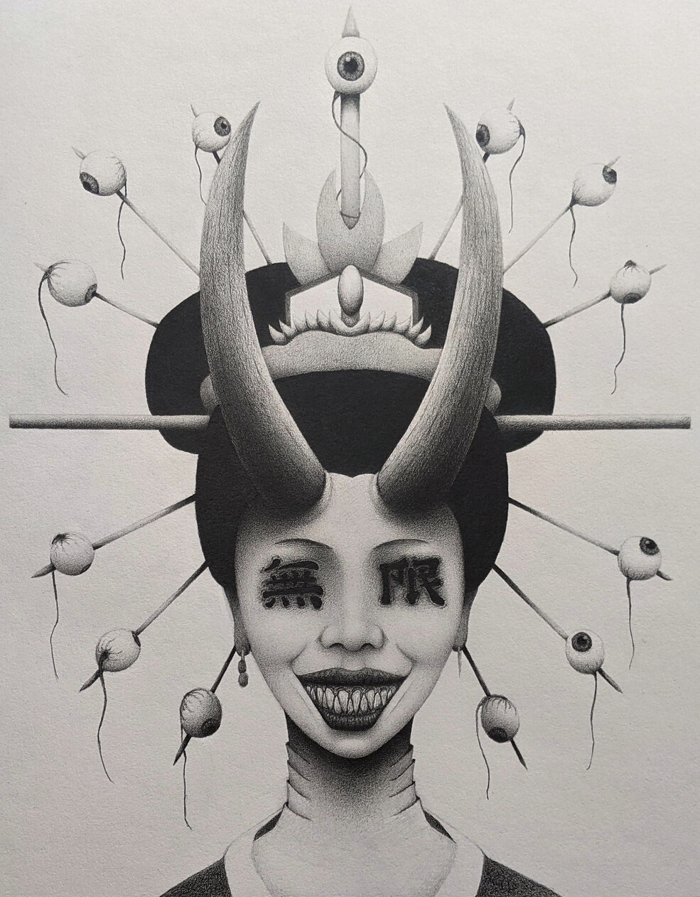
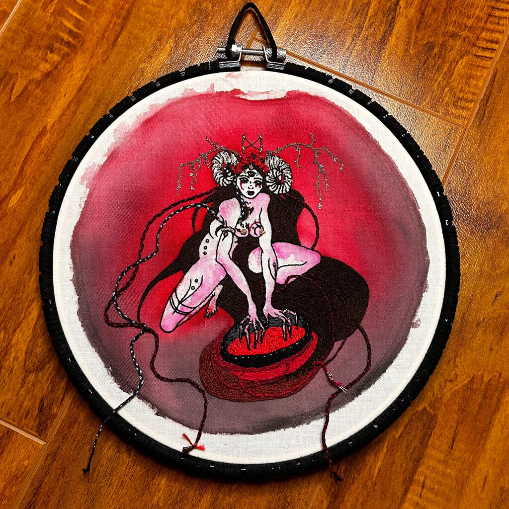
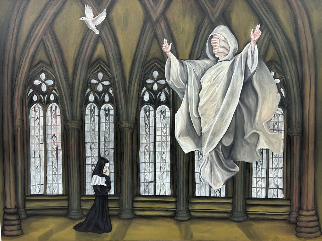
    Ultimately, venturing into the unknown is at the core of “Grimoire.” From a religious standpoint, the exhibition seeks to emphasize the cultures and spiritualities that deviated from monotheism and were forcibly erased by society as a result. As such, there are discernable reimaginations of gods and deities within prominent female figures. The woman of Stacy Athena May’s graphite drawings, “She Who Sees Boundlessly (Into that Which Lies Beyond)” and “Strange Aeons,” acts as a transitional almighty being that differs from the patriarchal nature of traditional doctrine. Nicola Jacobson’s embroidery pieces, “Sainte-Horse” and “Priestess of the Ram,” further explore these hypocrisies through their medium. While needlework once represented the domestic nature of womanhood, Jacobson reclaims embroidery’s artistic merit to overcome the roles once predetermined for women within society and religion. Likewise, “Desire” by Riley McGinley sees the artist reinterpreting her own Catholic influences to create what she describes as her own “God-like figure,” bringing acceptance to ideas of spirituality that are not dictated by tradition.

    Stacy Athena May, She Who Sees Boundlessly (Into that Which Lies Beyond), graphite on paper, 14 x 11 inches

    Nicola Jacobson, Priestess of the Ram, hand embroidery on cotton muslin, watercolour paint, wooden hoop painted in acrylic with synthetic suede cord, 10 x 8.5 x 0.5 inches

    Riley McGinley, Desire, oil on canvas, 36 x 48 x 1.5 inches

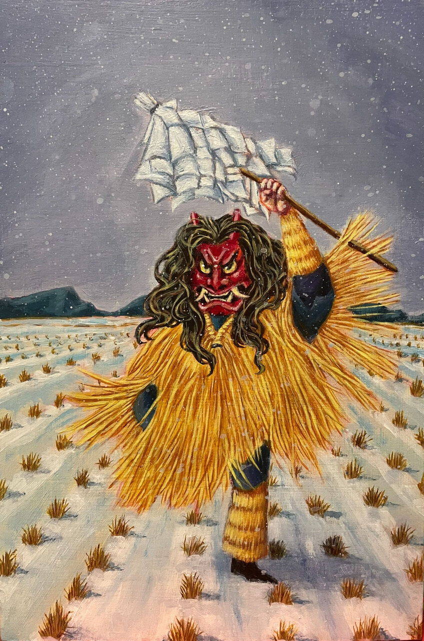
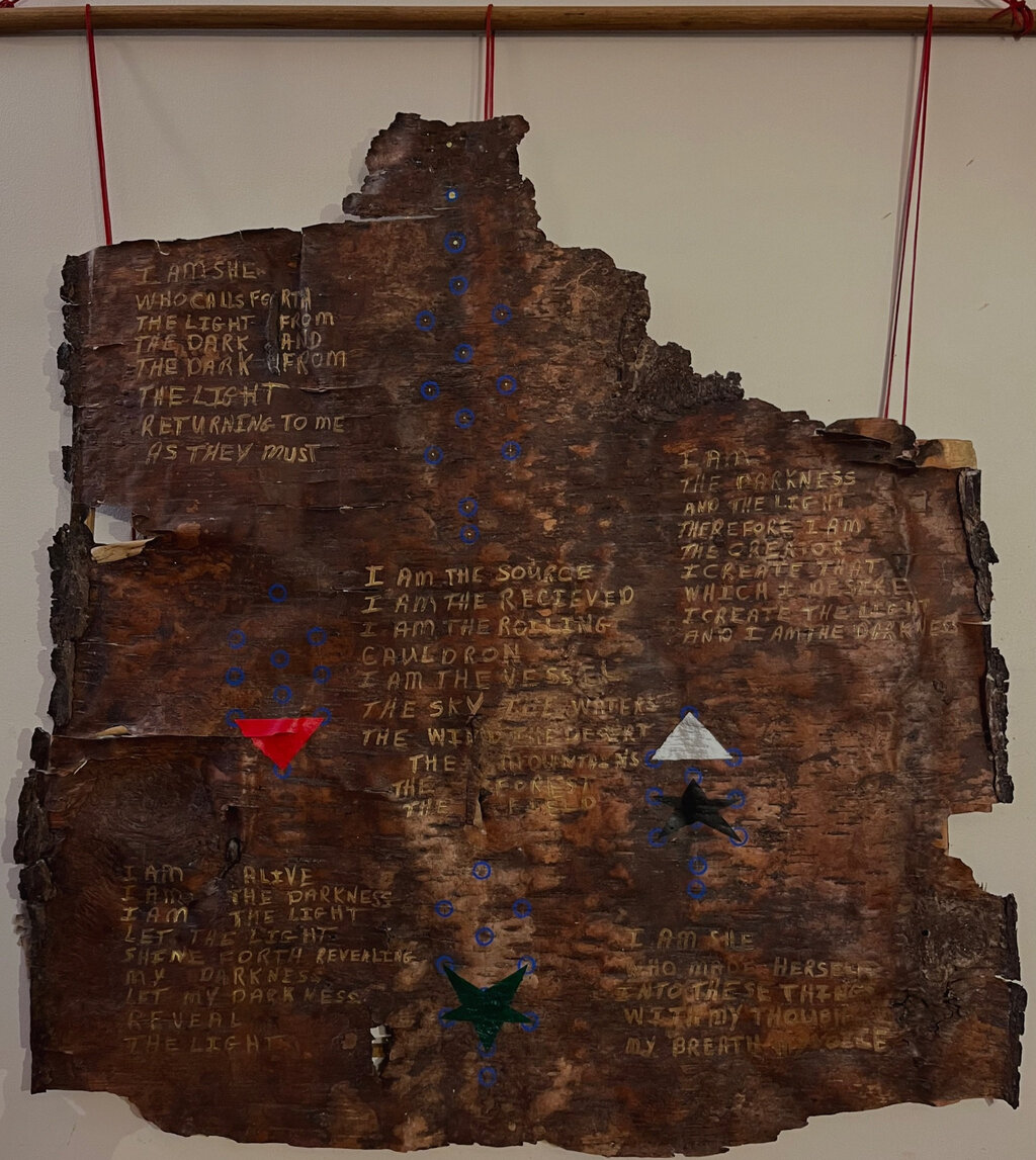
    Other artists utilize their cultural precedents to resist the dominance of Western belief systems and the colonialism it associates with. Dijana Bogdanovic’s three mosaics – “Fire Serpent,” “The Sun,” and “Hummingbird”- acknowledge the ancestry of occultism and mystique in their culture by representing drawings from ancient Mexico. “Thangka God of Fortune” by Sherry Tu and Carin Katagiri Mahon’s “The Namahage” are rooted in Tibetan and Japanese culture, respectively. Tu centers her work around a prominent figure of traditional Buddhist artwork and honors the similarities between a thangka (Tibetan Buddhist painting) and Chinese scroll paintings. “The Namahage” is a Japanese spirit within folklore that defies the conventions of beautiful god-like figures often depicted in religious European art. Andrew LaRocque’s “Invokation” paints Qaballah and witchcraft motifs from their indigenous heritage onto birch bark to defy both colonial narratives and the canvas – offering alternatives to the dominating factors of spirituality and art.

    and Carin Katagiri Mahon, The Namahage, acrylic on wood panel, 12 x 8 x 7/8 inches

    Andrew LaRocque, Invokation, mixed media, 58 x 48 inches

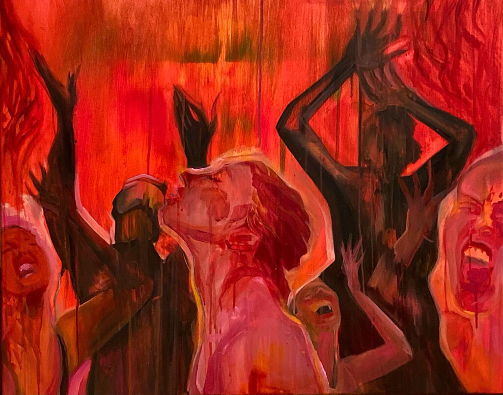
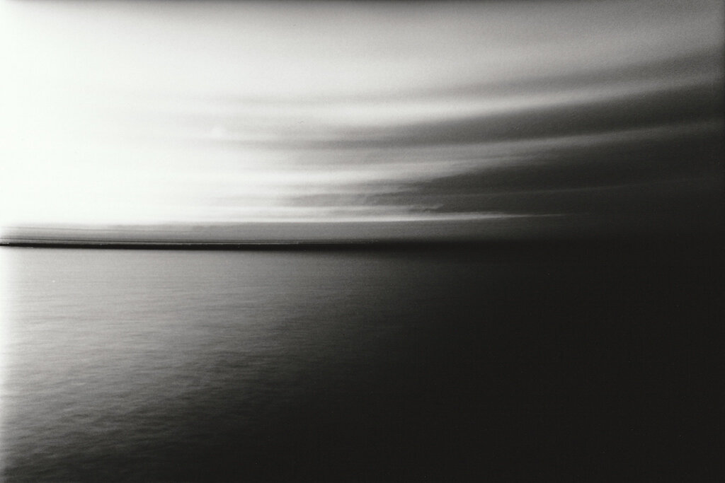
    While the first half of the gallery sees interrogations of the past, dissections of the contemporary, and queries about what the future holds for narratives previously obscured, the second half pushes for acceptance and change. Azzara Nincevic’s “cleanse” boldly portrays a journey of self-acceptance inspired by the Old Testament tale of Seraphim burning away Isaiah’s belief of being unworthy. Between the dancing shadows and the peace of our central figure, embracing the fire as a force of purity, anguished faces represent the conflict of self-confrontation necessary for new growth. José María Mancia’s black and white photographic works, “tenebris” and “umbra,” capture the breaking of dawn in a liminal way. Using the camera, Mancia preserves a period of transition while stripping it of colour to transform a mundane and common experience into something new.

    Azzara Nincevic, cleanse, acrylic and oil on canvas, 24 x 30 inches

    José María Mancía, tenebris, silver halide print, 11 x 14 inches

    On the surface, “Grimoire” simply intends to “encourage tellings of the unconventional” (Barrie), but a closer inspection reveals conventions to be challenged – bigger questions about outsider identity and what it means to exist in unaccommodating conditions. Propeller’s devotion to art accessibility, removing the prestige from “white cube” galleries with its smaller, dual-wall setting and artist-run ethos, is very fitting for an exhibition that attempts to pave the way for unheard narratives to be shared.

    Tiffany Duong

    Images are courtesy of Propeller Art Gallery.

    *Exhibition information: Back to the Grimoire, The Emerging Artists of the Occult / Group show, February 14 – March 3, 2024, 30 Abell St, Toronto. Gallery hours: Wed – Sat, 1 – 5:30pm, Sun 12 – 4pm.

  • Hugh Alcock: Listen! at Gallery 1313

    The title of the show is “Listen!”. That’s listen with and exclamation mark. It’s what you say when you’re asking others to focus. Listen! In this case is not so much about hearing as it is a call to pay attention.

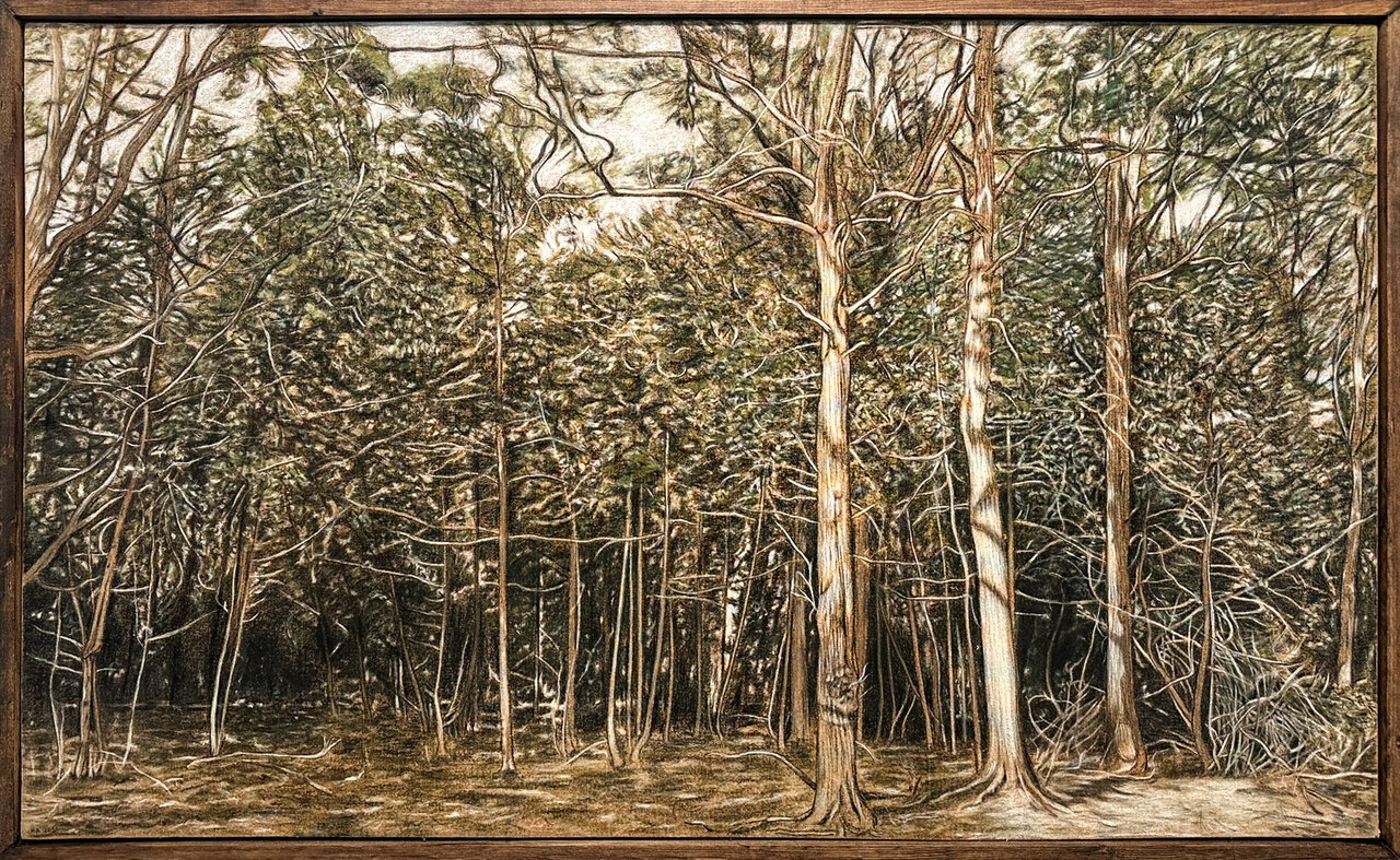
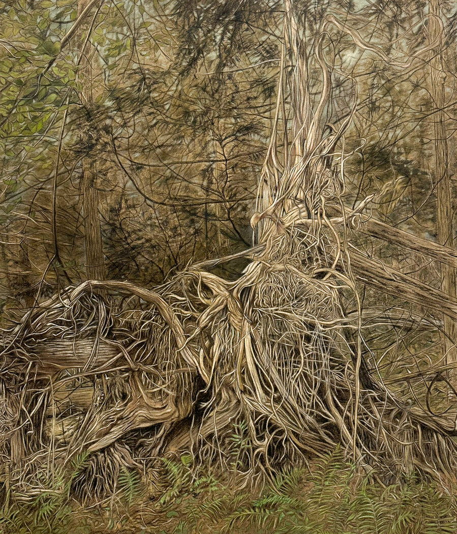
    Paying attention is at the core of Hugh Alcock’s work. He produces large intricately detailed drawings of trees and forests. They are full of carefully recorded organic minutia. The forest is the subject of these images but it’s the geometric detail that is Alcock’s true focus. In these drawings, we follow the artist’s observations of the precise bend of each curving line within each forking branch. We watch as he outlines each burl and crevice in the textured bark. With marks of charcoal and chalk, the artist is showing us what he sees.

    That these pictures are drawings is significant. Unlike painting, which is primarily concerned with areas of colour, the act of drawing is focused on lines, shapes, and edges. Through the visible markings and scrapes we observe the artist seeing and constructing the image. We see not only the representation of a scene but the representation of observation, the traces of another person perceiving what we now are looking at.

    Burnham Beeches, 2021, pastel and charcoal on canvas, 60” x 36”

    Alcock’s drawings are based on photographs he’s taken while walking in the woods. The images have been collected over many years and in many different places. Locations include urban forests in Toronto, the Bruce Peninsula, the Beaver Valley as well as photos from Alcock’s native England. He favours dense scenes. His settings place us in locations where we cannot see far into the bush. If the sky is visible at all, it can only be glimpsed here and there. From this large inventory of images, Alcock selects scenes he finds particularly interesting to act as the basis of his drawings.

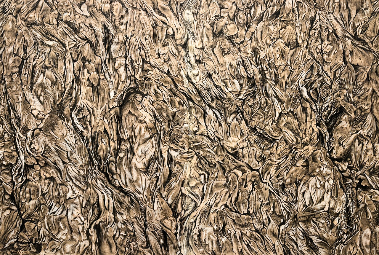
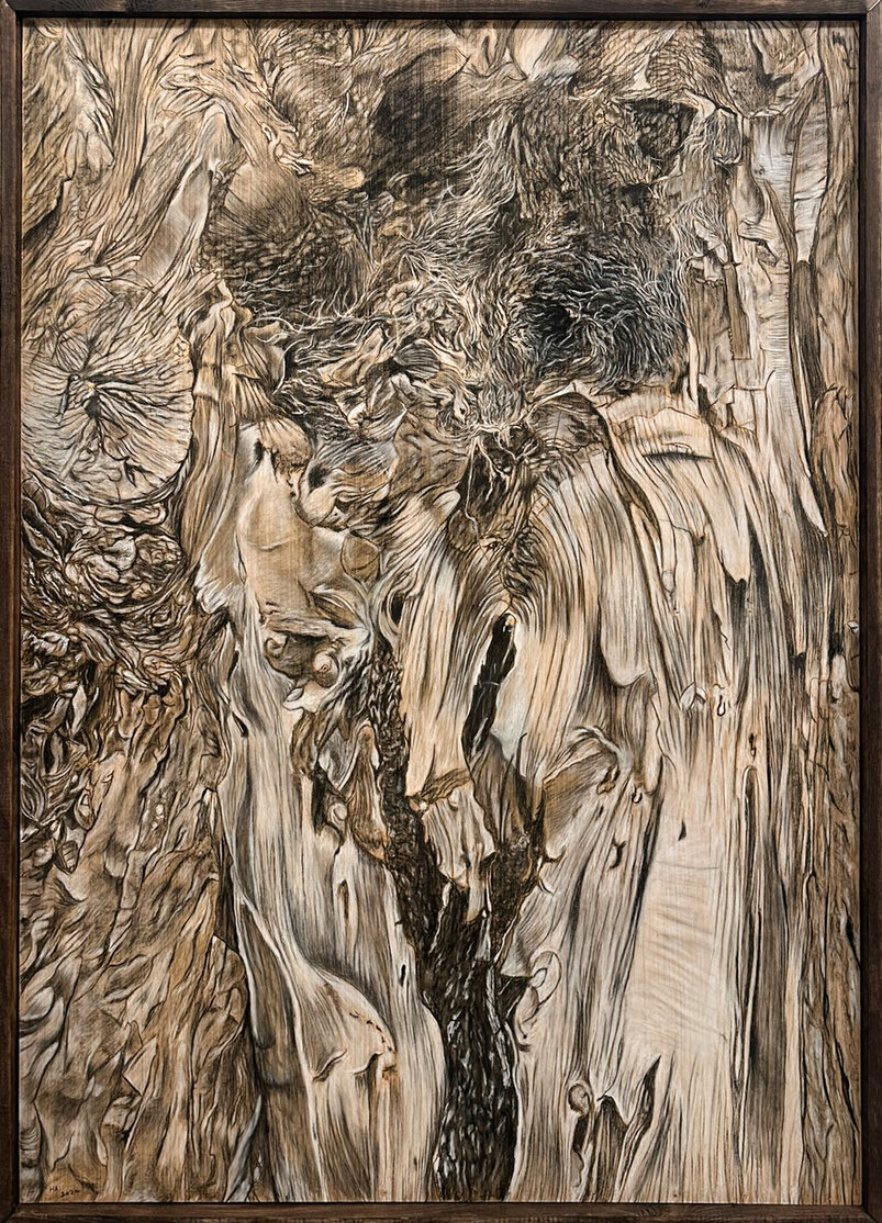
    Listening, 2023, charcoal and pastel on wood panel, 48” x 72”

    Years ago, when Alcock first began this series of tree drawings, they were done on paper but as the works have grown in scale, he has sought sturdier surfaces. His recent drawings are executed on canvas and wooden panels. The canvas has been primed with a sepia toned medium, while the wooden panels have been left untreated. In both the canvas and the board drawings, the substrate is clearly visible and sets the colour tone across the entire surface. The charcoal and pastel marks comprise a restrained palette of black, white, and subtle greens through which the warm glow of the background is always visible.

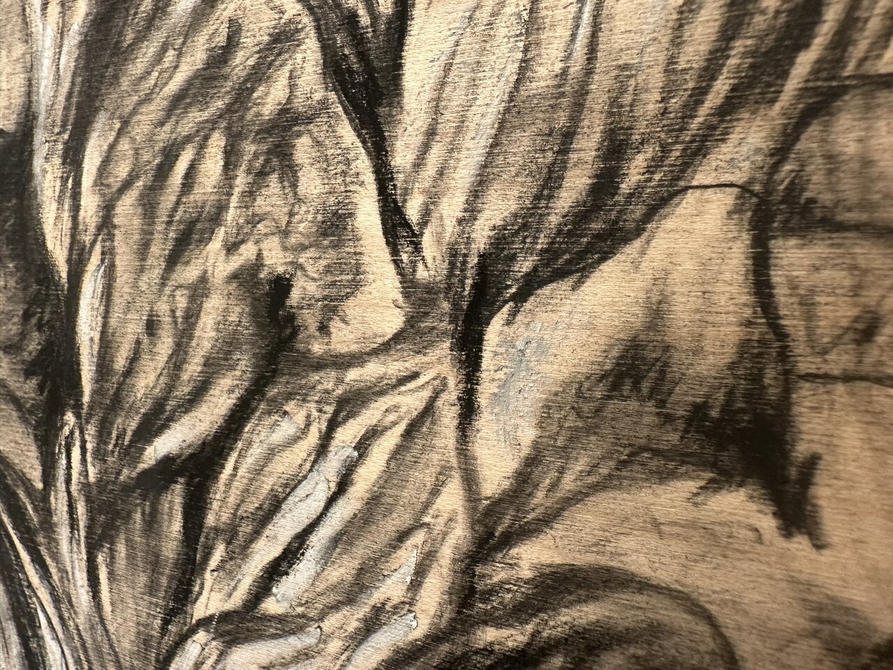
    ‘Listening’ is a large drawing of tree bark in which the background surface is particularly evident. In this drawing, views of the trunk of a tree from all sides have been combined to create a continuous unwrapped, up-close, field of bark texture. In this piece, the markings of black charcoal and white chalk are a little sparser. From across the room the effect is of roiling organic forms. Up-close the illusion flattens out and we see the scumbled traces of black charcoal and white chalk over the gently swirling pattern of wood grain. The subtle colour shifts in ‘Listening’ are due to variations in the wood veneer. From afar, the image seems to consist of various shades of brown and orange but move in closer and we discover that the only applied materials are black charcoal and white chalk.

    Listening, detail

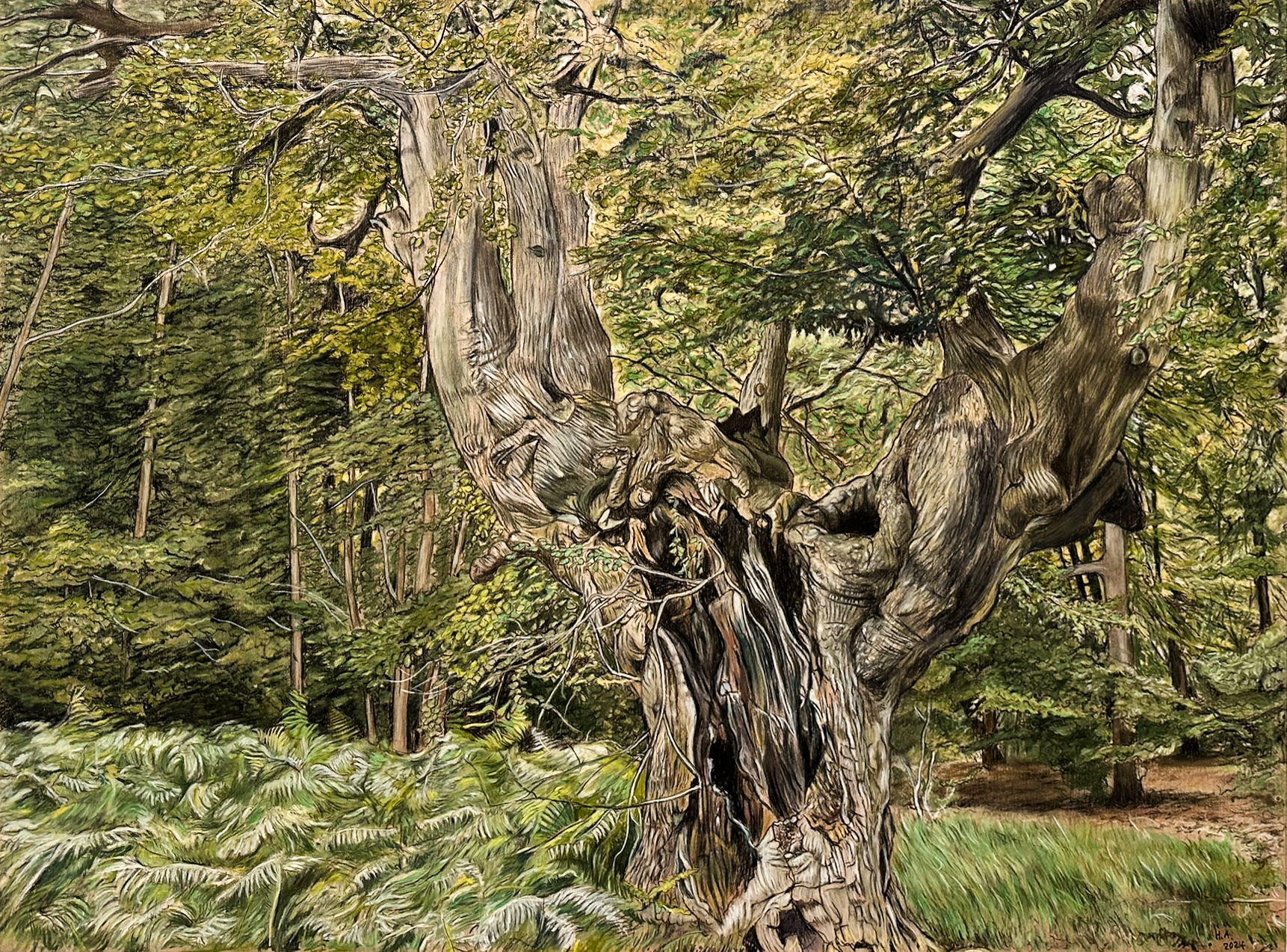
    ‘Dotard, Burnham Beeches’ is a smaller drawing and with a much thicker covering of pastel chalk. Here there is a density of foliage and an undulating sea of ferns. Dominating the foreground is the tortured hulk of an ancient tree. It bears the full history of growth, accident, injury, and decay as well as the resilience of life. This tree is not from Canada, it exists in a nature preserve in England west of London. It may be hundreds of years old. Oddly, it is unlikely to find a tree of this age near Toronto.

    Dotard, Burnham Beeches, 2024, pastel and charcoal on wood panel, 24” x 32”

    In his pursuit of subject matter and hunting for old growth forests, Alcock has discovered that there are almost no untouched woodland areas in Southern Ontario. Except in places that are too steep or otherwise inaccessible to logging, none of the forests around here have escaped the axe. In the last two hundred years, every local forested area has been cut down at some point. Even a place seemingly as pristine and protected as Algonquin park is not immune to logging. We are told that logging in the park is done with a light touch: only one percent is harvested each year. But by this measure, no part of the park has trees older than one hundred years. The forests that we typically see are not only artificially young, but also artificially uniform in terms of tree demographics. An untouched forest would be populated by trees of ages several hundred years apart. It’s ironic that old trees have survived better in the shadows of Heathrow’s flight paths than they have in the seemingly pristine landscape of Ontario forests!

    Aftermath, Beaver Valley, 2023, pastel and charcoal on canvas, 60” x 52”

    Alcock describes his approach as poetic or lyrical. He finds a connection with the naturalism in the poetry of Seamus Heaney and bases the titles of several drawings on Heaney’s work. He would like the work to encourage viewers to “open up their senses to the natural world – sight, hearing, smell and touch.”

    Oracle, 2024, charcoal and pastel on wood panel, 56” x 40”

    Alcock’s close study of nature is a slow and meditative process. The traces of his activity of observation communicate to the viewer something more than a simple image. It’s not a tree. It’s not an image of a tree. It is the record of someone looking very carefully at a tree. And if we pay attention, and if we follow the artist’s focus, perhaps we’ll start to hear the rustling of leaves, smell the earth and moss, feel a cool damp breeze.  

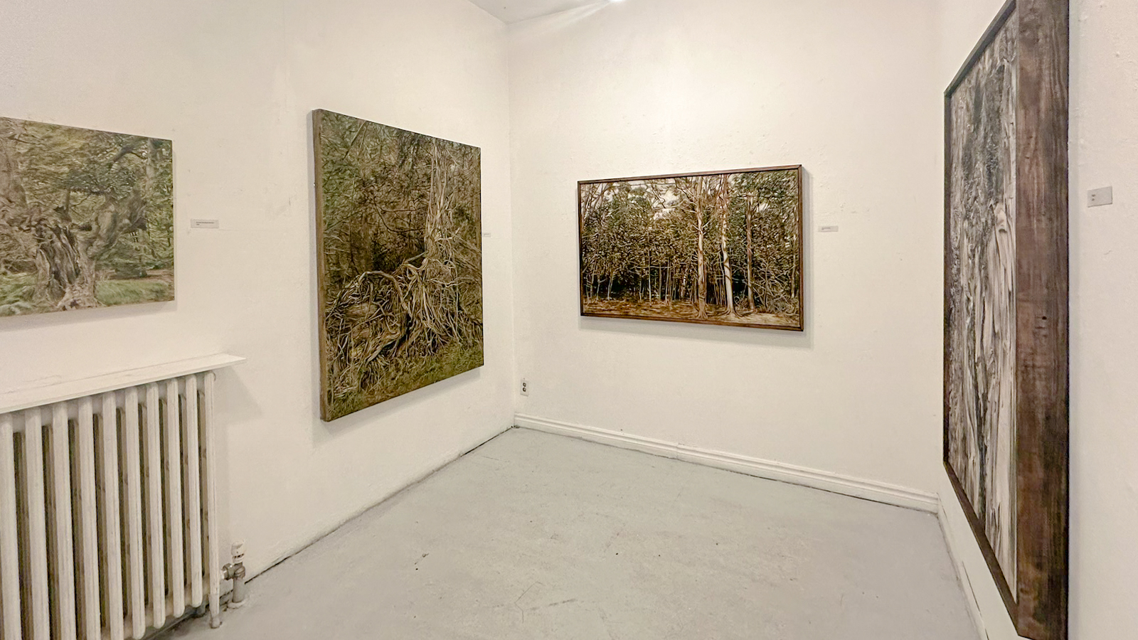
    Installation View

    Text and photo: Mikael Sandblom

    *Exhibition information: Hugh Alcock, Listen!, February 14 – 25, 2024, Gallery 1313, 1313 Queen St. West, Toronto. Gallery hours: Wed – Sat 1 – 5 pm, Sun 1 – 4 pm.
  • A Sex Show, 2024 at Gallery 1313

    Outside the door of Gallery 1313 I read a cautionary sign warning me that there is mature content inside the gallery and that I might find the work offensive. These days that is quite the grocery list. I have been to A Sex Show at the Gallery before and found it entertaining but not offensive. Entering the room, I am gobsmacked by a large black sculptural work “Suckle” by artist Anna Golding. It is a work created during her studies at Guelph University Art Program I am told by the curator & gallery director, Phil Anderson. There are many other works in the two galleries that are equally compelling. Some works are a little more graphic but mostly everything is tasteful and well executed.

    Installation view with Suckle by Anna Golding, free hand spray paint on plywood, 8 x 8 ft

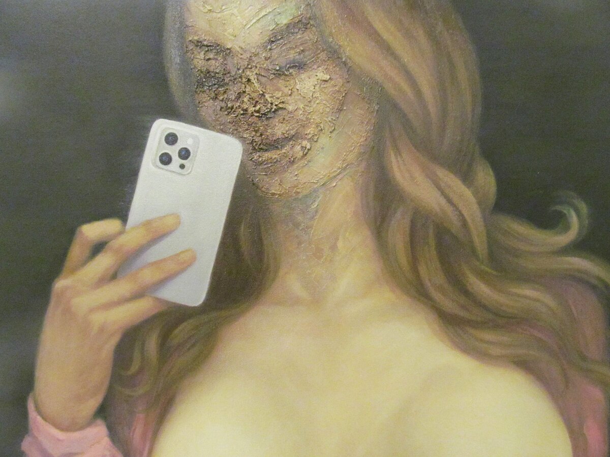
    Raffi Anderian’s “Selfie” is a 40 x 29 inches oil on panel that “explores a modern take on the classical figure with an emphasis on exhibitionism and empowerment.” Anderian is an editorial illustrator by day and has worked at the Toronto Star and other publications.

    Raffi Anderian, Selfie, oil on panel, 40 x 29 inches, detail

    Ken Vincent’s “Aphrodite Unbound (Torse Antique)” is an oil on linen work that fuses the classical elements with a suggestion of bondage. “Cane Marks (Blue Bliss)”, an oil on canvas by Christine Hirtescu, is well done and looks painful.

    Ken Vincent, Aphrodite Unbound (Torse Antique), oil on linen, 18 x 24 inches

    Christine Hirtescu, Cane Marks (Blue Bliss), oil on canvas, 18 x 24 inches

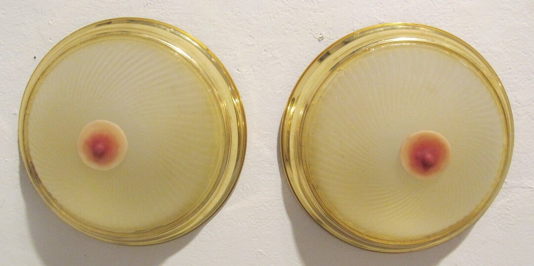
    Gina Daloisio’s “Boob Lights”, a mixed media work, lightens up things, though they don’t actually give off any light. These fixtures have nipples made of silicone. There are several more amusing moments in this eclectic exhibition, such as the 5 photographs of penises from Miska Peachka’s “Misster Dress up” series, that have been outfitted in various costumes. I am told by the curator that the artist actually has a book with about 50 of these individual penises…. dressed up.

    Gina Daloisio, Boob Lights, mixed media

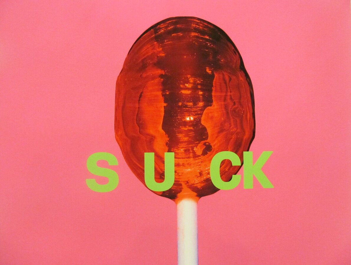
    Another artist has a series of take-offs on pop culture with a little S & M themed reference. Tommy Feiler’s giclee print, “Suck” is hard to miss with its colourful lollipop standing erect… a good pop piece, such as is “Tease” by Queen Rebel Empire, a glossy resin painting with tassels and the caption NO VACANCY.

    Tommy Feiler, Suck, giclee print, 37 x 37 inches

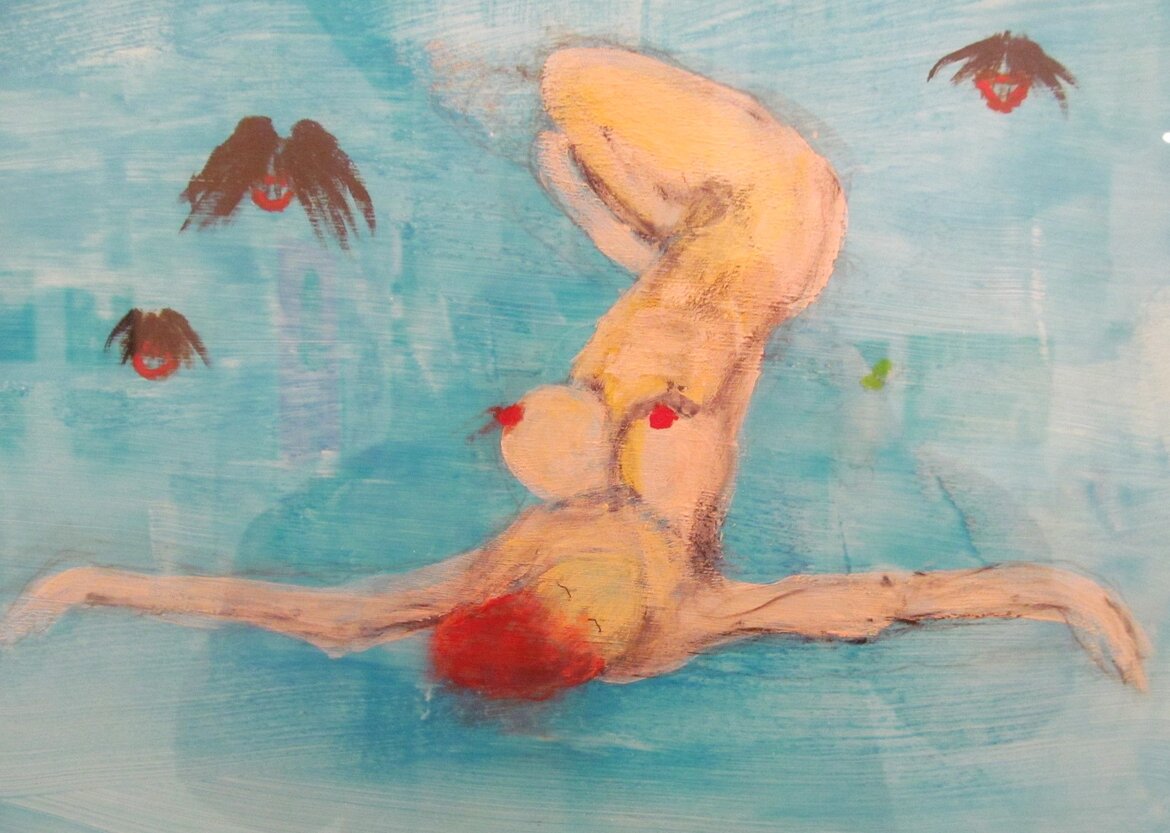
    I liked “The Sleeper” by Courtney McKay Fairweather an acrylic on canvas work with a female figure lying back in a blue sea.

    Courtney McKay Fairweather, The Sleeper, acrylic on canvas, 20 x 16 inches

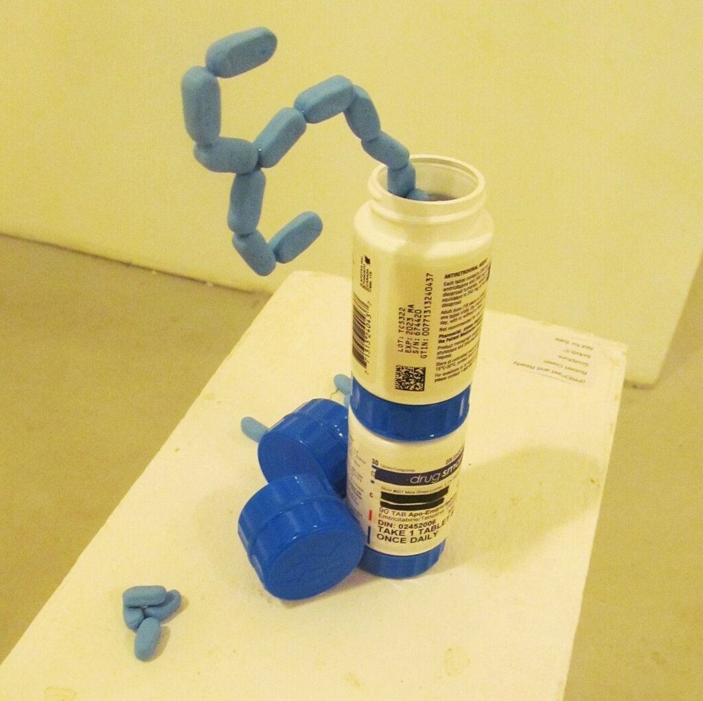
    Mahsa Hosseini, an Iranian Canadian artist, explored cultural norms with her gold framed sculptural work made of iron, “Iron Hymen” with blood on the floor, that addresses the loss of virginity after marriage in Iran. Robert Owen’s “(PROP)ed and Ready” sculpture addresses meds used to treat HIV.

    Robert Owen, (PREP)ed and Ready, sculpture, 5 x 4.9 x 5 inches

    “La Performance Des Filles” by Alsa St. Rose is another painting with a female figure in the throws of orgasm. I was told that this is her first exhibition. Another work in the Process Gallery is “For the Summer” by Michelle Phu that caught my eye. Back in the main gallery is the colourful work of Mariia Charute, a Ukrainian artist, titled “Lady Luck”.  

    Alsa St. Rose, La Performance Des Filles, acrylic on canvas, 24 x 36 inches

    Michelle Phu, For the Summer, acrylic on canvas, 40 x 30 inches

    Mariia Charute, Lady Luck, acrylic on canvas panel, 30 x 30 inches

    There is a lot of engaging works to see in this curated group show. It is an annual exhibition that takes a few risks and gives artists a rare opportunity to express their thoughts about sex. Surprisingly, there are few other galleries that are open to this subject matter.

    Ashley Rowe Flick

    Images are courtesy of Gallery 1313.

    *Exhibition information: A Sex Show / Group exhibition, February 14 – 25, 2024, Gallery 1313, 1313 Queen St. West, Toronto. Gallery hours: Wed – Sat 1 – 5 pm, Sun 1 – 4 pm.
  • Brian Boigon at Christie Contemporary

    At first glance, Brian Boigon’s work can be quite puzzling. It will require a deep dive into interconnected ideas before you can make sense of the individual pieces. So, get ready to play detective or archaeologist as you try to piece things together. But don’t worry, the effort will pay off. As you work to decipher what’s on display, you’ll discover a universe full of ideas. In Boigon’s exhibition “ER1 2 3 4” at Christie Contemporary, you’ll encounter fragmented documentation and a mix of artifacts hinting at a larger, elusive narrative.

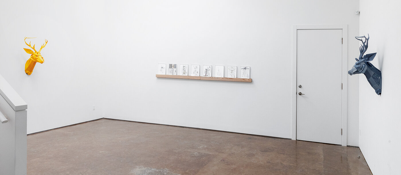
    Installation view of ER1 2 3 4 at Christie Contemporary

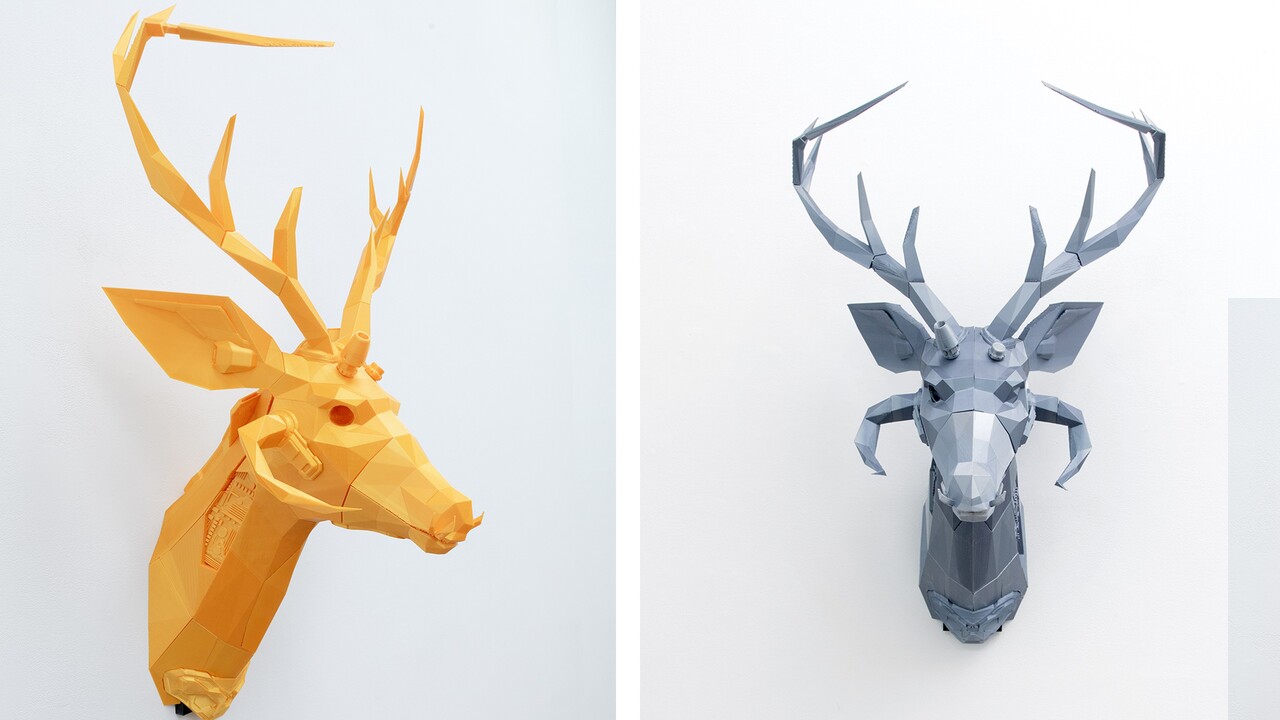
    Two stag heads, one orange and one grey, face off across an austere white room. Mounted like hunting trophies, they are 3D printed in a faceted, low-poly style indicative of an artificial or simulated reality. They appear to have technical enhancements such as extra horns, parts that look like data connectors, as well as exposed mechanics or controls.
    Stag I (left) and Stag II (right), both 3D printed sculpture

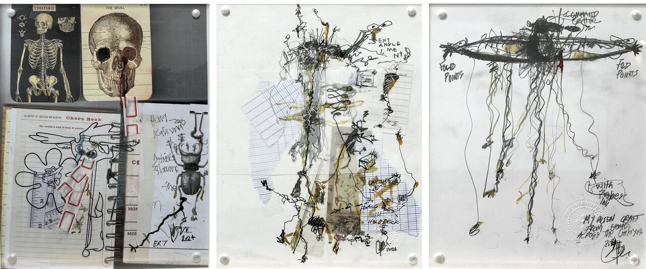
    On the wall between these figures, is a series of works on paper displayed in acrylic blocks. These are frenetically sketched pen and ink drawings with some collaged elements and a few words of text. They are rendered in intertwisted, flowing lines drawn with a pen that rarely seems to lift from the paper.

    Installation view (above) & (L-R) ER2, ER3, ER8 each collage and ink on paper

    To provide context, it’s important to understand that this exhibition, as well as Boigon’s other recent projects, are conceptually situated within a unifying fiction he refers to as the Interopera, a sprawling science fiction saga involving aliens, quantum entanglement, folding space-time and other esoteric concepts.

    You could take the name Interopera to be an amalgam of a ‘space opera’, an elaborate science fiction narrative, and the word ‘interoperable’, which describes something that can work with many disparate systems. Interopera suggests a narrative structure that transgresses conventional boundaries between disciplines.

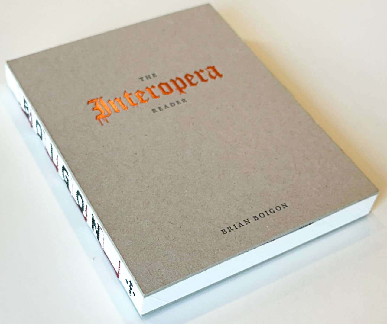
    The Interopera Reader

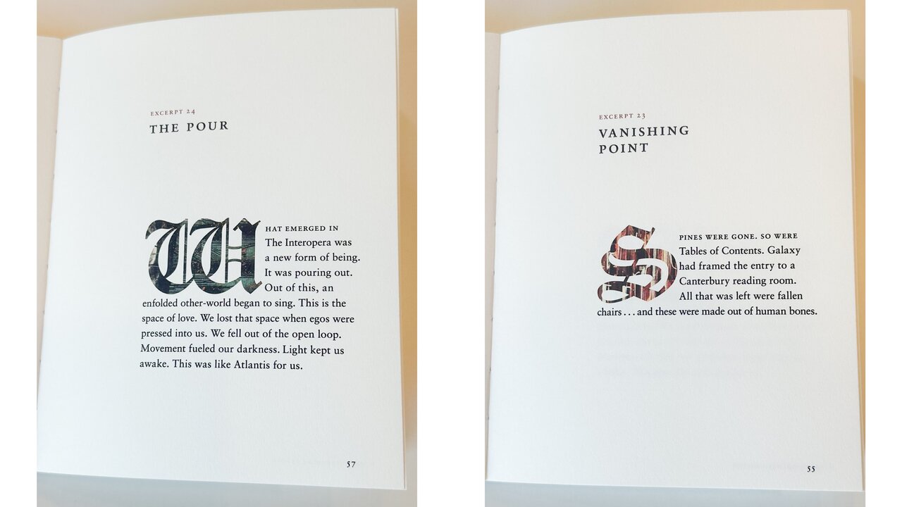
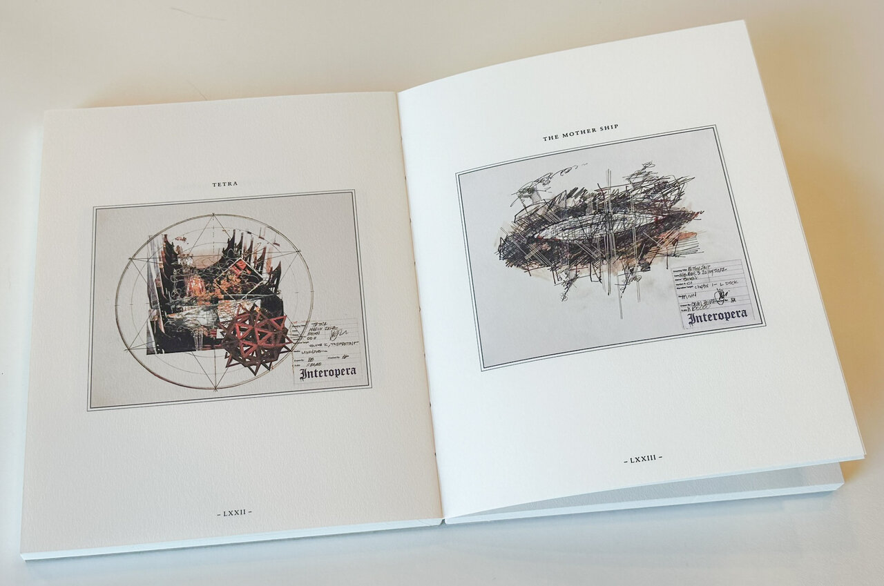
    Seeking clarity, you might reach for the Interopera Reader – a book on display and for sale at the gallery. It’s a beautiful, tactile piece, an artwork in itself, with a unique binding and cover. The book contains a set of text ‘excerpts’ and a folio of drawings. Each short text begins with an elaborate illuminated gothic letter. Through the colourful interior of each drop-cap figure you can glimpse a small part of a drawing. The constricted view, a mere glimpse of a larger diagram, is analogous to the fragment of narrative that the excerpts provide. In your role as an archeologist, you’ll have to fit the pieces together and fill in what’s missing.

    Excerpt Pages from the Interopera

    Returning to the work now that you have a bit more context, you surmise that the heads on the wall are characters in the Interopera narrative. They’re a kind of hybrid life form caught in a state of entanglement, “everything and nothing at the same time.”

    The drawings now take on new meaning as sketches of the events, creatures, and machines of the Interopera. Perhaps they are the snarled records produced by a firsthand witness. Are these knotted, dense entanglements of ink and hastily written words attempts at describing things beyond our current comprehension? Or are they the plans and design documents of alien minds?

    Boigon’s work draws heavily on the strange world of quantum mechanics. As scientific discoveries continue to unfold, the true nature of the universe is revealed to be more bizarre, and further from what our intuition tells us. The environment our human senses perceive is only a rough approximation of our surroundings. Our intuitive model of reality has served us well in our evolutionary past, but we must accept that it is incomplete and contingent. From a human perspective, the true nature of the universe contradicts our senses. It’s not in our nature to understand this stuff. As the physicist Richard Feynman puts it “If you think you understand quantum mechanics, you don’t understand quantum mechanics.”  

    Folio pages from the Interopera Reader

    The arts have often been influenced by the fields of science and philosophy. Think of psychology and surrealism, relativity and cubism, deconstruction and deconstructivist architecture. The conceptual cross-over does not necessarily involve a rigorous adherence to scientific sources but rather acts as a conceptual framework for new creative endeavors. Boigon embraces current science and extrapolates forward to a distant imagined future. He also reaches back to stories of the mythological past. He mashes these ideas up to develop his unique universe which in turn informs his particular creations. 

    For those of us with creative ambitions, there are two significant lessons here. Firstly, there’s immense value in venturing beyond one’s disciplinary boundaries for inspiration. The fusion of ideas from diverse fields often yields greater creative potential than remaining within the historical precedents of familiar territory. Secondly, there’s the value of embracing mystery. Delving into Boigon’s crafted universe and grappling with its enigmatic aspects will spark the viewer’s own imagination, providing fertile ground for creative exploration. As a viewer, you’re invited to collaboratively construct an imagined realm in tandem with the artworks on display.

    Boigon’s work does not readily resolve to a didactic message. It remains mysterious and may well leave you with a sense of intellectual vertigo. You, acting as the archeologist, don’t have all the pieces. You have fragments and excerpts and are left to interpolate your own meaning. You’ll have to work at it – but there’s fun and freedom in that. In the Interopera, the effort, your effort to make sense of it, is the message.

    Mikael Sandblom

    Images are courtesy of Christie Contemporary.

    *Exhibition information: Brian Boigon, ER1 2 3 4, January 20 – February 17, 2024, Christie Contemporary, 64 Miller Street, Toronto. Gallery hours: Wednesday – Saturday 11 – 5 pm.