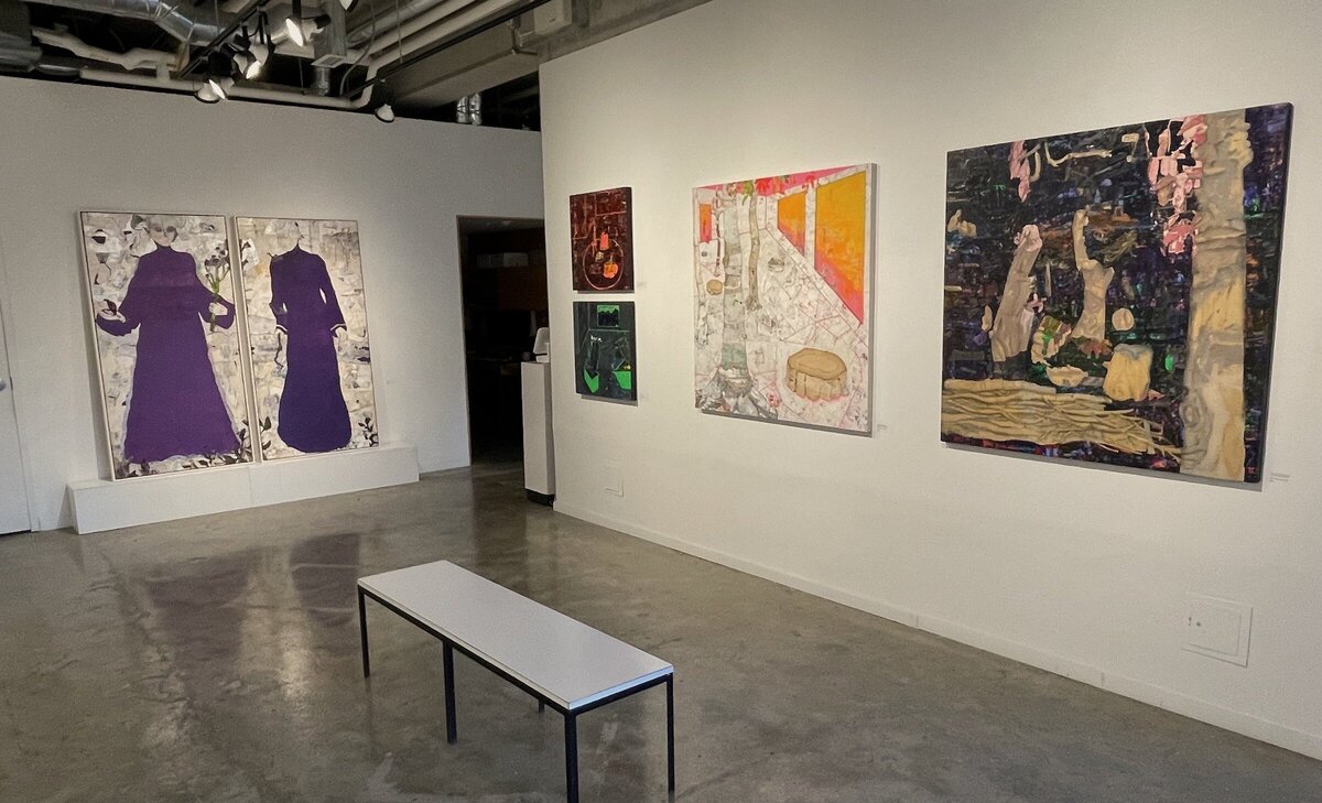
This exhibition by one of Canada’s prominent contemporary artists is clever and thoughtful while at the same time attractive. Massey has reinvented and retooled the past by taking engravings, steel cut etchings, by A. H. Payne, found in a leather-bound book from the mid 19th century in an antique shop. Massey made the prints his own through using computer manipulation. He added paint to give them a contemporary appearance in order to comment on the present political climate in the USA.
Installation view of John Massey, Red, White & Blue. Courtesy of Clint Roenisch Gallery
The title refers to the colours of the American flag. These colours, when applied to the prints, draw political parallels between the past and the present USA; while also making the prints more vibrant. The original prints depicted a culture where white males were dominant in the culture and their activities were celebrated. An example of this is the “Wolves” where two wolves – one red and one blue – are seen with a male hunter holding a rifle in hand, dressed in a camouflage outfit of red, white and blue.
John Massey, Wolves, 2019, hand-painted archival print on Canson Rag Photographique, 24 x 35 inches. Courtesy of Clint Roenisch Gallery
Originally beautifully framed, in milled maple with water gilded 22kt gold and printed on Japanese paper, these etchings were done reflecting a different time. The depictions in the engravings are of mostly white men and they represent the 19th century. Massey, after the 2016 US election, saw these prints relevant of what was happening politically in the USA now: the embracing of past values and a loss of liberalism. Gregory Burke has written a wonderful essay which better captures the essence of this exhibition and the context of Massey’s work in the attractive hard bound book that accompanies the show.
John Massey, The Smoking Room, 2019, hand-painted archival print on Canson Rag Photographique, 25 x 35 inches. Courtesy of Clint Roenisch Gallery
Massey, who has been exhibiting since 1979, has been known for “developing a visual language that embodies conceptual content”. This exhibition is indeed a good example of this description. Massey has exhibited nationally and internationally and now teaches at the University of Toronto, John. H. Daniels Faculty of Architecture. His father was an architect and his grandfather the first Canadian born, Governor General, Vincent Massey. John Massey also taught experimental art in the 80’s at OCADU. Many of his past works, including some video pieces, referenced himself and sometimes included himself in the actual video work.
John Massey at the opening reception. Photo: Phil Anderson
The 15 painted, archival prints transfer the engravings into the present. Two of my favourite works were the “Wolves” and “Jack” mounted on the south wall of the gallery. The etching, Jack, has a bearded older male with a model ship. The original black and white print seems very dire but after it is painted it becomes somewhat comical.
John Massey, Jack, 2018, hand-painted archival print on Canson Rag Photographique, 37 x 30 inches. Courtesy of Clint Roenisch Gallery
Massey drops in contemporary objects at times to bring the prints into the present and enrich them wit a new meaning. I found myself oddly reconnecting with the past while being attracted to the works themselves.
Massey hasn’t exhibited in a while (since at Diaz Gallery in 2016) and given the attendance at the reception people were anxious to see his new work. This exhibit took a year in the planning. Indeed, I look forward to more exhibitions of Massey’s ingenious works as they have us talking about art and the changes in our world.
Visitors at the opening reception. Photo: Phil Anderson
Phil Anderson
*Exhibition information: John Massey, Red, White & Blue, February 1 – March 16, 2024, Clint Roenisch Gallery, 190 St. Helens Street, Toronto. Gallery hours: Wed – Sat 12 – 5 pm.
Garrett Lockhart’s “Wrinkle” exhibition at the Hunt Gallery on St. Clair Avenue West is an offering of paperback-sized objects that carry the look and feel of fastidious graphite drawings. The seven by five inches cotton and denim works over board are, in fact, inkjet transfers that wash onto the fabric imperfectly. This careful sifting and arranging of print magazine images evoke a memory of lived presence – a migration of the effluence of luxury amid closely-cropped photos of models and interiors.
Garrett Lockhart, Deceit, 2024, inkjet transfer on linen over board, 5 x 7 inches
Although the artist’s sources to his subjects span the decades from the 80s into the near present, the citing of Andy Warhol’s “Interview” magazine in particular is significant. Lockhart’s “Wrinkle” can be read as a grainy homage to Warhol’s Factory, which at its giddy peak was an avantgarde laboratory, a chaotic jumble of the rich and famous with artists and musicians – the celebrities of the day. In Warhol’s transfer, his silkscreen subjects migrated from canvas to celluloid, turning them into “superstars.”
Garrett Lockhart, Fire Escape, 2023, inkjet transfer on cotton over board, 5 x 7 inches
Lockhart’s catalogue of exhibition images, on the other hand, can be read as an art director story board replete with character closeups, sets and locations. His “Profile (Right)” and “Profile (Left)” are actor test shots, much as Warhol’s screen tests became standard fare for his film works. It’s the viewer, however, in the “Wrinkle” exhibition that splices and edits their own narrative from the sparsely-placed “frames.” That the works mime the pocketbook format rather than a film cell, cues us for a story rooted in pulp fiction. To the gallery consumer they are an affordable “prêt-à-porter.”
Garrett Lockhart, Profile (Right), 2023, inkjet transfer on linen over board 5 x 7 inches
In a wider sense, the aesthetic impulse of the artist is the poetic distillation the material presence of selected objects. Lockhart has mounted an impressive bouquet of solo and group exhibitions worldwide in just the past few years, that include, not only Toronto, but Vancouver, Chicago, Brooklyn, The Netherlands, and London, England. A single work in his 2021 “Sleeper Cell” show in Montréal contained blank keys, aluminum house numbers, deadstock glass beads from Queen Street, found plastic jewel, hardware store tag, and wire, salvaged wood, rope, twine, found steel pulley and a sailboat cleat. Each fragment of a Lockhart work is a trace clue to its origin. In a group exhibition, meaning and import sifts from their permutation with participating artists.
While a formal singularity sets Lockhart’s “Wrinkle” exhibition apart, it’s best to view the artist’s full oeuvre as patches and swaths cut from a single bolt of cloth. Here at Hunt Gallery, however, your steam iron is not required. The linearity of the presentation makes its reading smooth and wrinkle-free.
Steve Rockwell
Images are courtesy of Hunt Gallery.
*Exhibition information: Garrett Lockhart, Wrinkle, January 19 – February 17, 2024, Hunt Gallery, 1278 St. Clair Avenue West, Unit 8, Toronto. Gallery hours: Thursday – Saturday 12 – 6pm.
Interview with Tom Wilson Tehohahake (TWT) on the occasion of his exhibition: Mohawk Warriors, Hunters & Chiefs by Phil Anderson (PA)
Tom Wilson Tehohahake is a musician, artist and writer with an exhibition of some wonderful paintings, sculptures and installations currently on display at the Cultural Goods Gallery, curated by David Liss. The opening reception was also the launch of Tom Wilson’s book Mohawk Warriors, Hunters & Chiefs. The book includes colour reproductions of Tom’s paintings plus essays by Tom and a statement by David Liss, the curator of the show. Tom Wilson Tehohahake is known by many as a musician in bands and winner of a Juno Award. This exhibit and book will give you more insight into this Warrior’s journey.
PA: First, congratulations on the new book and the exhibition.
Installation view
PA: As your media release states, you have been making art since 1997. How has the discovery that you were Indigenous, adopted with roots as a Mohawk from Kahnawake, changed your art and your artistic focus? Is the messaging different?
TWT: My daughter came to me twenty years ago and told me I had to stop painting the way I was because it was culturally inappropriate. That was seven years after I started painting and ten years before I discovered I was Mohawk. She told me that I was taking Indigenous images and using them to my ow benefit. I told her that I was simply painting what came to me. Simple shapes, coloured and detailed.
Tom Wilson Tehohahake, Mohawk Handsome, 2018, oil on board, 60 in x 60 in
I know that the images I put on the canvas then and now is ‘blood memory’. The colours of my ancestors, the joy, the love, the trauma of people who had been forced to lose their language, their culture and their land at the hands of a colonial system that wanted them dead.
I paint to show that we are still here, alive and thriving. I paint with the full acceptance of my identity. Now, everyday I paint to decolonize this world and to inspire my people to grow strong, and live with honour. That’s my job. The art I create, the books I write and the music I make are all examples of one survivor’s determination.
Tom Wilson Tehohahake, Will not be destroyed, 2023, oil on board, 60 in x 120 in
PA:Are there examples of your early work in the book? Did you exhibit your early work?
TWT: My early work are triumphs over adversity. I started painting to help me to stop drinking. I wanted to do something productive rather than destructive. I painted obsessively in those days back in 1997 and I believe that it led me down the right path. I’ll be 25 years clean and sober on December 12th.
None of those paintings appear in this publication and I don’t even know where they are today. I gave them away to charities that came to my door looking for donations for women’s shelters and cancer clinics. Some of those early paintings appeared in an exhibit at the Spin Gallery in 2000. A show I shared with Michael Stipe from the band REM, Daniel Lanois and the late Long John Baldry.
I love those early paintings. My innocence allowed me the ability to create work that I could never replicate now. Why would I even try? Back then I was a warrior without a cause. Now I am a fully formed Mohawk Man and my art reflects that.
Tom Wilson Tehohahake’s book Mohawk Warriors, Hunters & Chiefs
The book covers my work from 2015 to 2024. Its colours, shapes and details are as fresh and alive as my Mohawk identity. These paintings and sculptures are statements coming from a man who has been reborn. They are bold and unapologetic. There’s a freedom in the older work that I have no hope of getting back. My hands back then were held by the ancestors who were guiding me. Now I am finally and fully in control with my blood still guiding me.
Tom Wilson Tehohahake, Ghosts by the pool, 2018, oil on board, 52 in x 72 in
PA: In your fifties, you discovered you were adopted and a Mohawk. It must have been a shock. Or did you feel that something was missing from your identity?
TWT: Something was always missing. My identity was a secret kept from me by the people I loved and trusted the most. I am severely damaged as a result. Call me what you like, a Sixty’s Scoop kid is what I am. Now I work hard everyday to honour my Mohawk family. I am putting on an Indian costume. I’m taking off the colonial costume that was forced upon me when I was too young and unaware to know that I was wearing it.
PA: How does your life as a musician influence your art practise?
TWT: Not at all. The same creative energy goes into the books I write, the music I make and the art I create. Everything is the same in my world.
Tom Wilson Tehohahake, Painted Guitar, 2024, oil on guitar
PA: How have you reconnected with your Mohawk ancestry and the Kahnawake community?
TWT: I work in the Indigenous world for the Indigenous world. I join my community, my sisters, my brothers, cousins as survivors of this country’s greatest sin. Canada’s attempted to kill the Indigenous people of this land. Turtle Island is one of the ugliest and most inhumane acts in the history of mankind. I reconnect with my people by going to war everyday.
PA: You have also played a role in advocacy for Indigenous communities. Can you explain the importance of doing that work and how it impacts you?
TWT: I am never too old to fight for my people but mostly I create art. I have joined my fellow Mohawk brothers and sisters to stand on and defend land from developers and politicians. I’ve been accused, arrested and charged by the crown for my actions. It was worth it.
I started the first Indigenous scholarship at MacMaster University for any Indigenous student in Ontario who wants to study there to become a lawyer or doctor, engineer or researcher because every student who wants to further their education is a win against colonialism. I intend to use my appointment to The Order of Canada to continue my work standing up for Indigenous communities across Turtle Island.
Tom Wilson Tehohahake, The Long Road Home, 2023, oil on board, 71 in x 48 in
PA: Have you learned the language of your ancestors?
TWT: No
PA: What message do you hope to convey with your book and art exhibition?
TWT: My message is for all of us to open our hearts and show everyone who we meet: love, respect, patience and understanding. We will save this world and make it a better place for our children, grandchildren and seven generations to come.
Fading Memories of Home, 2021, Multi-Media Installation including carved desks, plywood cut-out figures, video and soundtrack Edition 2
I hope my art will open the doors of possibilities for the next person to walk through. I want to bring the Mohawk culture into the light. I want people to say “I can do that”, because that’s what art should be and it is what artists should set out to do.
If I don’t tell my story nobody else will.
Images are courtesy of Cultural Goods Gallery. Photo: George Pimentel
*Exhibition information: Tom Wilson Tehohahake, Mohawk Warriors, Hunters & Chiefs, February 2 – 16, 2024, Cultural Goods Gallery, 1444 Dupont Street Unit 15, Toronto. Gallery hours: Tuesday – Saturday 11am – 5 pm.
As part of this year’s TO Design Festival the online Partial Gallery has exhibited a selection of artworks at Gallery 1313 – images of which can be found on its website. The show features the work of 28 artists in all. Founded in 2016, the gallery has built up an extensive catalogue of artworks – running into the thousands – that can either be bought or rented. I would describe the gallery as having a collection of images, as opposed to artworks, to underline the distinction, which, as I explain below, is important.
Installation view of Partial Gallery, Art Intelligence: The Near Future of Art in Canada, Photo: Phil Anderson
While ostensibly the show aims to highlight some of the artworks that can be bought or rented from the website, the gallery advertises the show as a forum for the discussion of the influence of AI on art in Canada. As they put it in their publicity: ‘A series of programming will explore the dynamic interplay between the artist journey, art collecting, and technological innovation’. To that end, in conjunction with the exhibition itself, Partial has hosted a series of discussions on this and related topics, which were held at Gallery 1313.
Dr Chris Kim, co-founder of Partial Gallery, speaks at the panel, Tech and the Near Future of Art on Wednesday, January 24, 2024, 6:30pm. Photo: Phil Anderson
The artworks on display are not, as one might expect from the advertised theme of the show, generated using artificial intelligence. They are mostly, rather, old fashioned hand-made works, so to speak. The online gallery itself uses an AI tool, with the acronym PAAS (Partial’s AI-assisted Art Sommelier), for selecting art from its catalogue according to the visitor’s preferences. I find the use of the term ‘sommelier’ ironic given that the luxury vintage wine market is as large as the international art market, in terms of sales in auctions at least. When you think about it, art and wine, as commodities have much in common. I’ll let you do that rather than me spelling it out.
Patrick Skals: Another Day in Paradise
Anyhow, what is clear is that here art is seen as just that, namely a commodity. To the extent that artworks are thought of as luxury items, the traditional approach of art dealers is to showcase what ‘is judged’ as the best or most deserving of attention. Exclusivity is key. That is not the case with Partial. Instead, the gallery offers a platform for very many artists. It is a democratic model in this sense. Indeed, in a brochure, pitching to artists, the gallery declares: ‘We understand that opportunities arise when there are no limitations to exclusivity’. The result, of course, is that there is a vast range in the quality of the artworks on offer on their site – the good, the bad and the ugly. As a rule the work is very affordable. Over all, it seems like a very good resource for art as a mass market. There is no shortage of people seriously making art in their homes and studios that will never get the opportunity to be represented by an exclusive gallery. Likewise, there are perhaps many people who would buy art when it is affordable. So kudos to Partial.
Jenny Zhang: Paper life
A peculiar feature of art is that it is made by individuals and yet the resultant work most often struggles to be distinctive, other than in a trivial sense, where the artist has developed a recognizable style but viewers, on reflection, can’t help thinking that it reminds them of something they have seen before. At Partial almost all the art reminds one of something else in this way. That brings me to Partial’s event, where those gathered discussed the influence, good and bad, of AI on art. The discussion soon turned to the image-generating tools developed through machine learning technology, e.g., Midjourney. Everyone recognized the derivative nature of their creations given that they attain their ability to generate images by building up a vast storage of preexisting, human created imagery, basically scraped off the internet. As has been reported recently, these tools raise a serious ethical issue regarding intellectual property rights. If they rely on what amounts to plagiarism, many voiced their concern that its creations amount to theft, since no permission has ever been granted to, or even sought by, their developers to use other people’s imagery in this way.
Nick Zhurid, Freedom
There is an irony, I want to suggest, in the fact that this iteration of AI image generators – or some updated version of them – will likely be capable of making images that are indistinguishable from the sort of images to be found on Partial’s website. Now this may sound as if I am essentially dismissing the artworks in the gallery’s catalogue as irredeemably derivative, but my point is more subtle than that.
Diane Fine: Birds of a Feather
Speficially, AI is on the cusp of being capable of producing images that are more or less indistinguishable from human made ones, i.e., traditional artworks. One might say they will pass the visual version of the Turing test. As such, they are able to imitate artworks rather than making them. What is the difference? It is difficult to say. However, it strikes me that context is important here. Making art entails being immersed in the world – being among people, reacting emotionally to this or that element of one’s environment and so on. It is a quintessentially human endeavor, a way of coping with the world.
Mina Nowzari: The Embrace
Machines can do none of this. All they are capable of doing is imitating the end product of these contextual conditions, namely, the artwork. But, crucially, context is largely ignored by the art market to the extent that it treats artworks as commodities. Gallerists and curators try to showcase the context, that is, highlight the artist’s motives, thinking etc. But at a venue like Partial such context-building is difficult to achieve, though some attempts are made. Sheer numbers prohibit it. Most visitors to the site are effectively treated like shoppers, and presented with images that might catch their eye. Inevitably this becomes the overriding context for the production of the artworks themselves. They are made with selling in mind. Could one imagine, hypothetically of course, an artist like Paul Cézanne doing what he did in such an environment, where he made his works to sell in venues like Partial Gallery? I, for one, cannot. Such a commodified environment would be anathema to his very being. Insofar as artists make their wares to sell at places like Partial, they should take heed of the danger of AI. It is coming to replace you.
Hugh Alcock
Images are courtesy of Partial Gallery
*Exhibition information: Partial Gallery, Art Intelligence: The Near Future of Art in Canada, January 17 – 28, 2024.Gallery 1313, 1313 Queen Street West, Toronto. Gallery hours: Wed – Sat 1 – 5pm, Sun 1 – 4 pm.
A long arrangement of mylar boxes glitters below dangling lights, some held by monkeys. Spilling across the middle of the Museum of Contemporary Art’s second floor, these boxes – or the stream – divide the room into two embankments. Their placement mimics the nature of a river: flowing across the concrete floor and pushing up against the pillared shores, some boxes are stacked, rising the water levels like waves. Then, the inlet deviates to the side and enters a new part of the room, trickling off.
With over four decades of experience, Liz Magor is an important figure in contemporary Canadian Art. Based in Vancouver, she has taught at OCADU and the Emily Carr University of Art and Design. Greatly interested in ontology (the very nature of being), the objects of our day-to-day lives are questioned, reconceptualized, and re-presented by her art. Liz Magor’s work showcases the many possibilities sculpture can have as a narrative form. “The Separation” is a powerful narrative, inspiring dialogue about the material world.
Liz Magor, The Separation, 2023. Installation view, MOCA Toronto. Courtesy the artist, Andrew Kreps, Catriona Jeffreys, and Collection of Francois R. Roy. Photo: Laura Findlay
Despite the ease with which the stream moves, there are layers of tension permeating the installation: Magor fixes rough against refined; luxe against cheap; custom-made against mass-produced; impermanence against permanence; ebb against flow. A prime example is the boxes themselves: made from mylar, this flexible yet durable material shimmers whimsically in the light, but its message of consumption and excess undercuts the allure. One box is alight with disco confetti, yet there is little to celebrate when the eye falls on a moulded bird lying lifelessly on a bed of cheerful tissue paper. The plastic imagery, shiny and playful, is countered by the mortal undertones of lifeless animals. Contradictions like these can be found abundantly in this exhibition.
Liz Magor, The Stream, 2023, mylar boxes and found material. Installation view of The Separation at MOCA Toronto. Photo: Elin MacRae
Each box contains an array of seemingly random items: found objects, past their expected life-cycles, have been reanimated and repurposed, erasing the “out of sight, out of mind” mentality associated with our thrown-away trappings. One box features take-away cups, their fluorescent straws poking out from the mylar as though breaking a fourth wall. Another box has glitter-y wrapping paper cushioning the corpse of an iridescent pigeon. Some boxes have stacked cups and animal figurines. All items about which one would not think twice once discarded have returned in this exhibition to force the viewer to look again and ponder. Which of these items were found, which were created? The cast items, facsimiles of everyday utility, catch the viewer’s eye in a double-take: is that real? Is it trash, or a cast? If it is a cast, does that make it any less the object it replicates? Ontological questions like these fuel Liz Magor’s art: she wants viewers to look and then re-look.
Liz Magor, The Stream, 2023, mylar boxes and various found materials. Installation view, MOCA Toronto. Courtesy the artist, Catriona Jeffreys, Vancouver. Photo: Laura Findlay
The imagery of deceased birds brings to mind photographer Chris Jordan’s “Midway: Message from the Gyre,” which captures decaying albatrosses with stomachs full of plastic. Perhaps in conversation with one another, both artists’ works encourage dialogue about the true impact of plastic waste and materialism. Additionally, something as ubiquitous as birds makes their narration accessible to all: just like with takeout cups and Tupperware, birds are a part of the everyday, so much so that we rarely cast them a second thought. But here, Magor is forcing that second thought – even a third or fourth.
The course of the stream is interrupted by three smaller installations, known as boulders. Juxtaposed with the fast movement of the shimmering mylar boxes, these boulders act as a standstill, a moment of rest from the flow of the art. “Float,” the largest boulder situated at the beginning of the current, acts as a calm before the cascading mylar pours over the floor and against the other boulders. Two tables, one balancing upside down atop the other, frame a goose painted an iridescent pearl. Its restful placement on the pelts of another animal feels deliberate, careful. The lower level of the table is busy with stacks of plastic cups, seashells, Tupperware, and metal tins, precious objects to a scavenger. Another boulder, “Stall,” sets a stiff, near-taxidermized giraffe on a worktable, sewn together with care. The touches of spilled coffee and strewn-about work pieces suggest a recent departure, as though our worker was just here. The last boulder, “Drift,” similar to its counterparts, features a stuffed animal, its chasmic and bloodied eye sockets a jarring break from the glisten and dance of the stream beside it. What looks like bloodied cotton sits in a pile next to the stitched underbelly of the animal, as though its innards have been slopped out and left to observe alongside the art. It is tensions like these that elevate the dynamism of the installation.
Liz Magor, Drift, 2021, silicon rubber, polyester, work-bench, coffee table. Installation view of The Separation at MOCA Toronto. Photo: Elin MacRae.
Looking up, it becomes clear the installation’s lighting is just as in-conversation with the stream as the boulders. Warm and seductive lights illuminate and flatter the boxes the way one would experience at the mall, shopping for the latest trends. Three monkeys dangle from the ceiling fixtures, holding and pointing their own lights as if to say: “Look here! Look at this one! And this one!” To this author, Liz Magor’s wry humour is emerging: we are the monkeys, shining a glamorous light on consumerism and material waste. Yet again, the artist finds another avenue to create tension by posing death against the levity of her wit.
Liz Magor, The Separation, 2023, Installation view, MOCA Toronto. Courtesy the artist, Andrew Kreps, Catriona Jeffreys, and Collection of Francois R. Roy. Photo: Laura Findlay
Consider this exhibition’s title: “The Separation,” and the implicit question about what separation truly is. A plain interpretation could be the separation of the MOCA’s second floor by the stream and boulders; a more subtle one might suggest the separation between us and our thrown-away objects. How might one react or feel when their discarded leavings come back to face them once again? When “out of sight, out of mind” no longer applies to plastic and material waste, what then? In a time of changing values and shifting fates, Liz Magor invites you to look and re-look at your familiar and the life you may bring to the everyday things which are otherwise taken for granted.
By Elin MacRae
*Exhibition information: Liz Magor: The Separation, September 7, 2023 – February 4, 2024, MOCA, 158 Sterling Ave, Toronto. Museum hours: Wed – Thu & Sat – Sun 11 am – 6 pm; Fri 11 am – 9 pm.
Paul Petro in his current gallery at 980 Queen Street W, Toronto. Photo: Phil Anderson
Interview with Paul Petro (PP) on the occasion of celebrating 30 years of Paul Petro Contemporary Art with Phil Anderson (PA) /Part I
PA: First of all, congratulations Paul on this milestone. Can you tell us about your beginnings as an artist and curator in Toronto?
PP: Thank you. As a native of Toronto, and with an artistic bent from early on, the city enabled a process of discovery that offered lots of ways to satisfy one’s curiosity. So did the countryside. My earliest reference for the sensation of being ‘bent’ dates back to a moment up north when my great-aunt lifted down a piece of driftwood from the kitchen wall in her cottage and extended it towards my four-year-old eyes, exclaiming, “look Paul, a great blue heron!”. The moment was thrilling and is etched in my mind. The idea of seeing something in something felt transformational, particularly in the context of summers spent swimming and exploring the natural world. Thus began a journey of seeing things. Decades later, it is the same cottage that I inhabit and call my own, driftwood and all. In a synchronous moment in 2000 (as I discover in this moment of writing), a survey of paintings by Southern Ontario artist Gary Evans, a longstanding artist with the gallery, was given the title Seeing Things. There is something about being returned to one’s childhood again and again that becomes indelible over time. Ask my closest friends. They have all heard this story before.
Stuart Reid, Nell Tenhaaf: Gary Evans, Seeing Things, book cover, 2000
My high school and university years were filled with sensate experience. At St Michael’s College School I privileged the liberal arts, taking as many courses in literature as was allowed, adding courses in music (the clarinet), art and live theatre. On my own time I picked up the guitar. During my university years at Glendon College (1977-1981) where I pursued an honours BA in English Literature, I managed to spend an eye-opening spring and summer backpacking through Europe, taking the Magic Bus from London to Athens, island hopping in the Mediterranean for a month and then ferrying from Corfu to Brindisi, Eurail pass in hand, to follow summer up the continent, through the museums of Italy, Austria, Switzerland, Germany, Belgium, and France, and then back to England (and a birthday party) before returning home. Another summer, a friend and I explored Eastern Canada, driving to New Brunswick, ferrying across to PEI and then cycling around the perimeter of the island. I was also discovering Toronto’s independent live theatre, music, dance and art scenes in earnest, particularly along Queen St West. By the spring of 1981 I had graduated and took over a friend’s loft for the summer in a warehouse at Bathurst and Richmond, before settling into a shared house on Beverley at Queen, and started living in the scene that I had entered. It was during this time that I began to identify as an artist and had mounted a group exhibition in my live/work space, with works by artist friends in the building.
PA: How did you get involved in InterAccess, an artist-run centre, in its early days? How do you think this affected the way you worked as a gallerist later with your own space?
PP: A few blocks west from the loft was the Artculture Resource Centre, or ARC, a multi purpose artist-run centre with an active interest in new technologies. Meetings were taking place there about a new videotex technology called Telidon that was being developed in Canada and was sketching a future filled with information providers (IPs), telebanking and teleshopping, in a rapidly changing televisual landscape. We were learning about field-trial access to the equipment then becoming available and these conversations led to one of the computer terminals, a Norpak IPS2, being installed at Trinity Square Video in August of 1981 so that experimental training workshops could be run on it, providing artists with a device for exploring, creating and storing (on 8-inch floppy disks) computer graphics and text sequences that could augment video production or become interactive works of art in their own right, prompting conversations around this advancing technological structure and its social and psychological implications. I would later receive a grant from the newly-formed Integrated Media section within Media Arts at the Canada Council to pursue work in this area.
Paul Petro, My Media My Self, 1984, videotex still
As artist interest grew it was determined that a basis was there for forming a separate non-profit artist-run centre to provide access and training. I became one of the founding directors and an early general manager of what was then called Toronto Community Videotex, incorporated in March 1983. In 1995 the organization had expanded to include exhibition opportunities in addition to access and training for artists working in electronic media and by 1997 undertook a name change to become InterAccess.
I began producing work and independently curating exhibitions in this eventually short-lived pre-internet medium (it never got the traction that the Canadian Government and Bell Canada had hoped for) which led to curating several online and standalone groups exhibitions at the ARC and A Space in particular, and making interactive videotex works such as My Media My Self (1984) and the award-winning video Canadian Artists and Telidon (1984) while extending my computer graphic work into photography, with identity-driven Pop-inflected works such as His‘n Hers (1984) and Human Enterprise (1985). It was also a period of escalating discussions that included conferences such as Artists Talk About Technology (1984) in Halifax, sponsored by the Association of National Non-Profit Artist Run Centres (ANNPAC) which questioned technological progress, accelerated information dissemination and the human/machine interface at large and in the art-making process, with a host of panels and artist presentations including ones by Sara Diamond and Nell Tenhaaf. The Centre for Culture and Technology through the Faculty of Information at the University of Toronto conducted ongoing Monday night seminars that I was introduced to by Derrick de Kerchove. The seminars offered discussion groups and guest speaker engagements in the spirit of their founder, Marshall McLuhan, who had passed away in 1980, and who (as I paraphrase Norman White here) thought of artists as immunity systems in a world of rapid technological advancement.
Paul Petro, Remember Tomorrow, A Telidon Story, installation view, InterAccess, September 2023
Further into the 1980s I was living in Kensington Market and had a studio at 263A Queen St West where I had begun to push my work in additional directions with a variety of printmaking and curatorial projects focused on exploring the digital/analogue divide. I also joined the Electronic Arts Committee at A Space for the rest of the 1980s and helped facilitate guest lectures, panels, and the curation of exhibitions including The Phase Show (1989) with Doug Back, Hu Hohn and Norman White. At one point in 1986 I found myself named the Toronto spokesperson for the Independent Artists Union (IAU) and attended many meetings, including one at Robert Wiens’s studio in the Chocolate Factory, where we connected the idea of having a living culture with artists having a living wage. Our visibility included marching in the annual Labour Day Parade. All in all, it was an incredibly energizing and formative period of working through ideas in the artist-run sector and led to many involvements that remain ongoing to this day.
Marching in the Labour Day Parade, September 2015 with artists (L-R): Carole Conde, Kim Tomczak, Stan Dennison, Stephen Andrews, John Greyson, Jim Miller, Karl Beveridge, Lisa Steele, Paul Petro, Michelle Gay.
Also in 1986, while between grants, I was told about a job opening at Evelyn Aimis Fine Art, a commercial Yorkville gallery, and was hired and then spent seven years experiencing the art world from that perspective, exhibiting at international art fairs and expediting programming with a roster of Canadian and international artists, while introducing curatorial projects into the mix, such as the group exhibition Body Is A Loaded Word (1987), all the while maintaining my studio practice.
By late 1993 I had left this gallery position and had begun functioning independently once again which led to a stint of programming at 100 Yonge St, in the first of three spaces that would eventually lead to my current gallery at Queen and Ossington, and to a fortieth anniversary origin story exhibition at InterAccess this past September. My early work was included in this group exhibition, Remember the Future – A Telidon Story, much of which hadn’t been seen since a group exhibition at A Space in 1986.
Paul Petro, My Media My Self, installation, A Space, 1986. Photo Cheryl O’Brien (left) and Paul Petro, Human Enterprise and My Media My Self, InterAccess, September, 2023 (right)
Turning 65 this year also brought about a planetary alignment of sorts, not to mention a certain clarity to things anniversary-wise, and that precipitated yet another tote bag being brought into the world: 30 + 40 = 65.
Paul Petro with the tote bag. Photo: Jayne Wilkinson
PA: In the 90’s you operated a gallery at 100 Yonge Street. What kind of programming did you have in that space?
PP: I was friendly with the owners of the building and they generously offered me a window vitrine space on the main floor that opened onto the high-ceilinged granite-clad entrance hall. It had been a challenge to rent (no frontage on Yonge) and I saw it for its guerrilla-programming potential, offering site-specific possibilities for artists by being so embedded in the central business district. Bryan Gee designed the logo banner for 100 Yonge St (he also designed my gallery logo) and announcements would be widely faxed to a list of organizations and individuals. The neighbourhood had hallowed vibes going for it too because Robin Collyer and Shirley Wiitasalo, and General Idea amongst others, had once had studios on the street, and the Silver Rail was further up Yonge, with Sorel Etrog upstairs from there.
Robin Collyer, Value Village, Drugstore, June 1996 at 100 Yonge St
The space was behind a forty-eight-foot-long curtain-wall of glass, fifteen feet high and with a good wall set back four feet from the glass. It came with grey industrial carpeting and a nicely sequenced series of pot lights that I augmented with directional light bulb extension rods. There was a glass door on the far right and a second door in the wall that opened into a drop-ceilinged anteroom and then 2,000 square feet of roughed in and raw windowless space. After several exhibitions on the front wall, I eventually expanded into and programmed the interior spaces. Overall, I was there from late 1994 to early 1997, before opening my next location.
Max Streicher, Stalker. Photo: Max Streicher
In the exhibition Stalker (April, 1995) Max Streicher took his cue from the junior execs roaming the corridors of Bay Street looking for the deals by installing several inflatable hunters and dogs. In Weather Report(December 1996 – January 1997) Peter Bowyer fabricated galvanized steel chairs and tables which echoed the seating of the food court one floor below. I remember Ron Giii showing up at the opening with a box of Hawaiian sprinkle donuts and sitting himself down at one of the tables. Robin Collyer’s Value Village, Drugstore (June 1996) reflected yet another layer of transient on-the-shelf consumer choices so concentrated in the area. And in the exhibition White Pine (November 1996) an environmental work by Robert Wiens brought focus to the threat of clear-cutting old growth forests in Temagami. He installed his first work of the White Pine series, in oil on a 42 x 256 inches length of paper. There was an air of collegial pronouncement as painters including Ric Evans, Jaan Poldaas and Shirley Wiitasalo turned up at the opening, in part to see if the sculptor could indeed paint as well.
Peter Bowyer, Weather Report, galaxies steel and charcoal on paper, December 1996 – January 1997
Group exhibitions included On the Surface of Things (May 1995) with Stephen Andrews, Sheila Butler, Cathy Daley and Tom Dean, Titles and Other Tigers(May 1996) with Millie Chen, Sarinder Dhaliwal and Louise Noguchi, and Sac de Hockey (January 1996), a large and freewheeling exhibition with a host of hockey-playing artists who would regularly rent ice-time together. I proposed a collaborative wall mural on the front wall and devised a locker room for the ‘team’ in a small dropped-ceiling anteroom that preceded the raw space further within. Artists included Carlo Cesta, FASTWÜRMS, Eric Glavin and Lisa Neighbour. I had arranged for a donation of hockey sticks that were handed off to the artists pre-Christmas so that over the holidays the sticks could be worked on and then installed in a locker-room formation along with framed photos of the artists, each taken with the Stanley Cup trophy housed in the nearby Hockey Hall of Fame. In the deeper spaces of the site each artist installed a larger hockey-inspired work. Goalie pads made out of baked bread by James Carl were one of the standouts. We silent-auctioned the hockey sticks on the night of the opening. Hockey player Ken Dryden, who had donated a limited edition print of Paul Henderson scoring the winning goal for Team Canada in 1972, joined us that evening, along with Kaye and Paul Beeston, and my father, whose Toronto Lyndhurst Motors hockey sweater I wore that night. The Lyndhurst Motors represented Canada in 1954 in the first amateur hockey world series to include Russia (we lost to Russia in the final game). Funds raised at the opening were donated to Moss Park Arena at Queen and Sherbourne to purchase hockey helmets for kids in the neighbourhood.
Sac de Hockey exhibition at 100 Yonge St.
It became a tradition for us to move the opening reception up the street to the Silver Rail at Yonge and Shuter. It was across from Massey Hall and had the distinction of being the first bar and cocktail lounge in Toronto to receive a permit from the LLBO, in 1947, to legally serve alcohol. It also held a personal connection in that it was my maternal grandfather who had fabricated and installed the silver rail in the place. 100 Yonge was the setting for a great number of exhibitions by artists that I continued to work with in following years. Some, like Stephen Andrews and Gary Evanscontinue working with the gallery to this day. It was the same with Michael Morris until his passing in January of this year. Others, including Sheila Butler, Cathy Daley, Rae Johnson, Suzy Lake, Sylvia Safdie and Julie Voyce forged temporary relations with the gallery. Statistically we went on to represent more women artists than most other galleries. Suzy Lake, for one, was with the gallery eighteen years. Other artists like Robin Collyer, John Heward, Gretchen Sankey and Jeannie Thib made guest appearances. In later years, Tom Dean and Robert Wiens circled back. A lot can happen in thirty years.
Stephen Andrews, et-cetera, installation view, 2023. Courtesy of Paul Petro Contemporary Art
Gary Evans, Light Moves, installation view, 2022. Courtesy of Paul Petro Contemporary Art
Tom Dean, Mercy, installation view, 2013, Courtesy of Paul Petro Contemporary Art
PA: When you opened your first gallery on Queen St. West near Duncan it must have been an interesting time to be running a gallery. Can you describe it?
PP: It was an interesting time and an interesting block. I had a studio just east of Duncan at 263A, across the street from the Queen Mother Café. This is where I was also administering to the needs of 100 Yonge which was more or less a standalone space and open by appointment when I wasn’t present. I did have a desk at 100 Yonge. It’s the same desk that is in the work on paper room in my current gallery. Randy and Berenicci were at 257A. David Ramsden lived at the corner, over Price Roman. I had taken over Philip Monk and Shelagh Alexander’s old place. Colin Campbell and John Scott had been previous inhabitants. Lynn Fernie used to live next door, and so on. Cold City Gallery was around the corner. So was Art Metropole. And the Art Gallery of Ontario and OCAD were just up the street.
A block west of the studio was John St, and just north of Queen and John was 179 John St, home to several galleries including the Isaacs Gallery, Jane Corkin Gallery and Klonarides. By 1995 Av had moved out of his high-ceilinged basement location. I had opened 100 Yonge with a series of three monumental landscape paintings by Rae Johnson who had previously shown them at Carmen Lamanna’s Gallery. After Carmen died in 1991 Rae and I had formed a connection. I remember we were standing outside in the mist of a water sculpture by John Dixon in front of Garnet Press Gallery during the opening of Dreaming of You, a farewell to Robert Flack memorial group exhibition. I had a work in the show. I asked Rae about driving up to Flesherton to look at what she was up to, which led to the decision to show some work at 100 Yonge in 1994, curate a show of her paintings at Hart House in 1995, and have a show in Av’s old space. We agreed to show Bambino Miracolo (June 1995) the monumental works Rae had produced in OCAD’s Florence studio. I remember asking Av about the alarm system in the space and he replied, with a glint in his eye, not to worry about it. Nobody wants to steal contemporary Canadian art.
Following Rae’s show I had my first solo exhibition with Cathy Daley in the same space at 179 John, Selected Works (October 1995). We showed her lambent large-scale floating black figures, small triptych works on paper and Dans la nuit, a series of small blue paintings on paper mounted on linen. I had introduced Cathy to my paper conservator and dear friend, Beatrice Stock, who had successfully mounted my large black and white Photostats on linen years earlier, and she helped Cathy out. I had previously seen the large black figures in a show at Cold City and they had held my interest. In the late 1980s I had made my first purchases of contemporary art at Cold City, a shift from trading with friends or receiving as gifts. I bought a small Cathy Daley painting on paper of stockings on a clothesline and a large pastel on black paper by Ron Giii, Mathematicus, from The Dictator’s Opera(1985). We were all lined up to get into their holiday exhibition. I was at the door and Alan Schwartz was next in line. We all made a bee-line for works. Back then everything seemed to be in the same neighbourhood, the M5V. There was even an M5V Magazine published by Eldon Garnet and Impulse which lasted three issues, Summer 1991 to Spring 1992. The art community was small and bracingly informed back then.
Ron Giii, Mathematicus, from The Dictator’s Opera
As my programming at 100 Yonge St was evolving, I started considering the exhibition possibilities in the space of my studio. I can recall gallerist Fela Grunwald being in the studio and predicting that if I’m not careful I might just open a gallery one day. I already knew that I wasn’t interested in joining the curatorial department of a public institution and relinquishing control of my programming schedule. I also knew it would be a lot of work reducing my studio into a smaller space.
The building block where Paul Petro Contemporary Art was located at Queen St W and Duncan, left to Subway, 2022. Photo: Paul Petro
One advantage that I had at the time was that my landlord, who owned the three adjacent walk-ups, also owned a warehouse around the corner at 176 John St, across from 179. He found me a space on the top floor, much smaller than my studio but manageable enough for the scale of work I was making. I took the space and, with some ingenuity, set up my printing table and moved all of my works and materials, shelving and racks, making the most of a smaller space. Meanwhile, back at my larger studio, I had learned that the upper floors of the building next door at 265A were becoming available. When I had originally taken my studio at 263A I had rented the second floor out to friends and had kept the third floor as a studio. I decided to relinquish my third-floor space and make the move next door, creating storage in the front rooms and reception in the exposed brick back area of the second floor. There was a walkout to the rear roof from there. Stairs from reception led to an open third floor which worked well as a sizeable exhibition space, complete with a walk-through to a small work on paper room at the back that could house my two sets of print drawers. It was a short enough move (perfect for the human chain we formed on moving day). A continuous coat of frost grey floor enamel on all floors and stairs, and white-painted walls, bannisters, moldings and salvaged track lighting clarified the space and brought the gallery qualities into focus. When Rae Johnson first came over, she declared the new space a sculpture. Her exhibition Winter Paintings (March 1997) would open shortly after.
Rae Johnson: Winter Angel, oil and graphite on canvas, 51 x 51 inches
My last exhibition at 100 Yonge St was Exquisite ChromaZone (February 1997), featuring formative and current work by the original ChromaZone members, Andy Fabo, Oliver Girling, Sybil Goldstein, Rae Johnson, H.P. Marti and Tony Wilson. The anteroom space of the exhibition included a chronology of original exhibition posters, catalogues and ephemera from the ChromaZone period in Toronto (1981-1984), and photographs of the people and events of the time. The front wall of the site had four exquisite corpse drawings on 96 x 48 inches sheets of paper. The four works were collaborations by Andy, Oliver, Sybil and Rae, and were each installed in the front window space with a layer of brown kraft paper covering them. We had an unveiling at the opening reception. The works wound up in the collection of the Art Gallery of Mississauga where Stuart Reid was then the curator. I’d love to have included an image of the installation but as of this writing my photo-documentation is still in file folders and boxes, undisturbed since that time. Scanning all of these images is an eventuality. So much of broader life was pre digital at the time.
Paul Petro in his gallery. Photo: Phil Anderson
*Paul Petro Contemporary Art, 980 Queen Street W, Toronto. Gallery hours: Wed – Sat, 11 – 5 p.m.
Soaking Wet and On Fire is an exhibition revealing a combination of both past and present, cultural identity, femininity, diaspora, embarking us on a transformative journey from ceramic art to a single painting by Natalka Husar. For the first time in 40 years, Husar has opened her doors to the public to witness her earlier ceramic work from the late 1970s, including a large painting that took 4 years to complete. Down to every possible detail from clothing to food and letters, Husar is sharing her deep-rooted connection to her origins in Ukraine, her mother’s life stories and Husar’s experience with grief after losing her mother.
Installation view of Natalka Husar, Soaking Wet and On Fire with Losing Mama (in the middle). Courtesy of the Gardiner Museum.
In addition to this remarkable exhibition, Natalka Husar has graced us with a one-of-a-kind panel talk on November 22nd. In this program, Natalka Husar, featuring book contributors, Janice Kulyk Keefer, and Sarah Milroy, shared their stories and how they met and what inspired them to write this publication with Husar. Soaking Wet and On Fire, is a book dedicated to the exhibition Soaking Wet and On Fire: Ceramic and Painting by Natalka Husar, organized by the Gardiner Museum.
(L-R): Writers, Janice Kulyk Keefer and Sarah Milroy with artist Natalka Husar. Photo: Polyna Alekseev
Husar’s monumental painting, Losing Mama explore objects of food through pots and pans, symbolizing her diasporic experiences that emerged in the least expected ways when growing up, and how it followed her around in her earlier work. Themes of family and culture were first explored by Husar in her ceramic work which influenced her later in her career.
TV Dinner, 1977, ceramic with dyed burlap over wood, (top left), Breakfast January 7, 1977, ceramic with dyed burlap over wood (bottom left), and Sometimes I feel like that at the banquet, 1977, ceramic with grass cloth over wood (middle right). Courtesy of the Gardiner Museum.
To Husar, clay was easier to work with to achieve the results she wanted, it gave her a chance to explore the diversity in everyday subjects and objects until she got it right. During her panel talk, Husar said that even though she always knew she was an artist, she constantly found herself foreign to the media she used. When she was asked by the audience why she chose ceramics, she simply replied, “I didn’t know how to paint”. Painting was self-taught, and it was not an easy task to keep up with at some times, especially when she took a job as a flight attendant. She started to get familiar with the arts community around 1984.
Closeted Youth, 1977, ceramic with dyed burlap over wood. Courtesy of the Gardiner Museum.
Husar revealed that her mother was an exceptional seamstress which inspired Husar to explore a bigger range of materials and techniques later in her practice. She said that practicing additional skills, like sewing and tapestry helped her to connect with her mother after her passing during the pandemic emergency lockdowns. After a long period of taking care of her mother, followed by a devastating loss, Husar still found some humour in her by jokily saying “she took her last flight just in time” taking off at the age of a 100. Husar expressed that sentiment through works such as Closeted Youth where in addition to food and mail, clothing was another way of thinking of her diasporic identity, exploring the ways we find ourselves by what we wear or not. Memories and cultural identity also remain strong by practicing her mother’s craft in sewing and mending and honoring it in Losing Mama, there is an embroidered section in the centre bottom.
In Ukrainian culture, the practice of embroidery has been a long-time tradition that patched and healed generations who were taught that the art of sewing and mending is a practice of self-care and good character.
Natalka Husar, Losing Mama, 2019-2023, acrylic, lenticular post card, thread and notions on linen and canvas. Courtesy of the Gardiner Museum.
Janice Kulyk Keefer opened the panel talk on November 22nd by introducing a piece that inspired her to be a part of this project called: Sex and the Single Ukrainian Girl (1977), referring to it as “a classic example of Cinderella after midnight” when she explored the feminine culture of Eastern Europe. As a writer with a Ukrainian background herself, Keefer expressed that it was an important task for her to take, not only for her writing but as well as self-discovery of cultural identity and desire for belonging. She also shared her travels to Ukraine with Husar back in 2006, a nation in the midst of political crisis, was not only challenging but a daring task in order to successfully publish Husar’s book. The authors shared documented photos and notes which revealed exceptional teamwork in unexpected places and deep connections to craft, culture, and homeland.
Sex and the Single Ukrainian Girl, 1977, ceramic with fabric over wood. Courtesy of the Gardiner Museum.
In the exhibition, with dense mixed media work, we are witnessing the story and imagination of Natalka Husar. Viewing the painting, Losing mama, alongside her ceramics just keeps highlighting how important her early work is to her most recent piece. Just like her early practices in ceramics move towards paintings, one of them is mounted on a wall, the painting moved toward sculpture through assemblage, amplifying both her skills in sculpture and her career as a painter. In Husar’s own words – when referring to the variety of materials used to express the subject matter and concept behind her earliest work to her latest piece – “If used unexpectedly, words cannot describe the work.”
Husar is giving her audience an x-ray looks into her process work and behind the scenes of her mixed media painting Losing Mama. Photo: Polyna Alekseev
Polyna Alexseev
*Exhibition information: Natalka Husar, Soaking Wet and On Fire, September 9, 2023 – January 7, 2023, The Gardiner Museum on the 1st floor Lobby, 111 Queens Park, Toronto. Museum hours: Mon – Fri 10 am – 6 pm, Wed 10 am – 9 pm, Sat – Sun 10 am–5 pm.
This is artist Brett Eduardz’s first commercial show. The paintings on display sit nicely in Zalucky Contemporary’s gorgeous gallery space. A serene place that’s conducive to contemplation. It is a welcome respite from the hubbub just outside in the busy Junction district of the city.
Installation view
Eduardz offers up ten medium-sized images produced by pouring gouache paint on raw canvas. The result is a series of quiet, alluring paintings. I’m a sucker for beautiful works like these, so I’m easily pulled in. They are a siren call in paint. Tie me to the mast. The reference to classicism is not wholly inapt here. Eduardz gives the paintings titles that allude to another world, or the very edges of this one, that include words like ‘phantom’, ‘spirit’ and ‘twilight’. Indeed, several of the images intimate an eerie landscape that one could imagine Odysseus travelling through.
Brett Eduardz, Within The Limits Of The Fable, 2023, Gouache on canvas, 18 x 24 inches
Given the stochastic nature of the painting process employed by Eduardz, the titles he gives them can merely be suggestive. Still, at times, these abstractions are reminiscent of, say, JMW Turner’s late ethereal landscapes, e.g., Norham Castle, Sunrise. But, more obviously, they bear a marked resemblance to the works of Helen Frankenthaler, who also used the technique of pouring paint onto a horizontal canvas. Indeed, his work is best described as being in the shadow of Frankenthaler’s. By this I mean that Eduardz is his own artist, not trying to imitate Frankenthaler, but, all the same, the association with her work seems unavoidable.
Brett Eduardz, At Gleaners Gate, 2023, Gouache on canvas, 60 x 48 inches
A notable aspect of this exhibition is that it is not accompanied by an artist’s statement, just with a short introduction on the gallery’s website. That is a relief in the sense that very often such writings verge on triteness, or are vague to the point of being meaningless. But, given that this is Eduardz’s introduction to the public, and so there are no previous shows to provide the viewer with a narrative, this lack of writing is a little frustrating. I take it, therefore, that the artist wants the work to speak for itself.
All serious painting, by its nature, has content – is about something. The content of good abstract painting is necessarily subtle, where the work tends towards nothingness in virtue of this subtlety. Abstract painter John Zurier – one of the greatest alive today – notes of his own works that they ‘are nothing, yet something is there – I can’t put my finger on it, but I can feel it’. Granted that Zurier’s work is far more minimalistic than Eduardz’s, but still one can ask how does one feel looking at Eduardz’s paintings?
His paintings lend themselves to interpretation in the manner of a Rorschach test, especially given the randomness of many of the marks. For instance, when I look at his The Spirit Casts a Thousand Eyes, I see the dark blots at the bottom as two sleeping figures. But that is only one aspect of his work. Whatever feelings this painting elicits in me are of course hard to put into words. Ironically, abstract painting is like poetry in this regard (where conversely representational painting is like prose in writing). Haiku poet Yosa Buson once described haiku as using ordinary language to be excluded from the ordinary. Our words quite generally have everyday uses. The poet, however, aims to use words not to describe things literally, but rather to free language from its ordinary uses. Likewise, good abstract painting aims to free such formal qualities as colour and space from their ordinary expressions and interpretations.
Brett Eduardz, The Spirit Casts A Thousand Eyes, 2023, Gouache on canvas, 48 x 36 inches
Returning to Odysseus’s encounter with the sirens, there is a danger in the beauty of the sirens’ calls. That is not to say beauty always has a sting in its tail. Rather, at its best a beautiful painting has the power to captivate the viewer, bewitch her. Am I captivated by Eduardz’s paintings? I’ve already said I find them beautiful, but their beauty is no guarantee of bewitchment.
Brett Eduardz, Pour Un Instant, 2023, Gouache on canvas, 36 x 36 inches
While echoing the work of Frankenthaler, I do think that at times Eduardz is very much his own artist, who is developing a promising technique. I see this in his Pour un Instant, for example. The transition from thin stain to rich blends of colour is indeed captivating. His FKA the Way is positively radiant. Interestingly, rotating this composition also produces appealing results, reflecting, no doubt, the fact that it was executed horizontally.
Brett Eduardz, FKA The Way, 2023, Gouache on canvas, 60 x 48 inches
The paintings do sustain my interest, captivating me to some degree. But without more of a context it is difficult to determine what it is that draws me to them. It is much like going to a strange new land – where, looking about, its unfamiliarity stops one from seeing the things around in any depth. One needs to find one’s way, get used to the sights, before it’s possible to appreciate anything properly. The same holds with respect to Eduardz’s paintings. Whether the technique he is developing leads to anything in this sense is still to be determined. So far so good. He’s clearly got some hard work ahead of him.
Installation view
Hugh Alcock
Images are courtesy of Zalucky Contemporary
*Exhibition information: Brett Eduardz, Within the Limits of the Fable, October 5 – December 23, 2023, Zalucky Contemporary, 3044 Dundas Street West, Toronto. Gallery hours: Thursday – Saturday 12 – 5 pm.
Celebrating 20 years anniversary of Spacing magazine with an exhibition & launch of Issue 65
Some twenty years ago in the spring an artist told me she and her friends were working on a new magazine about urban issues. I was excited about the prospect but somewhat familiar with the fragile nature of publishing, so I felt somewhat cautionary. Now twenty years later cofounder, publisher and creative director Matthew Blackett stood giving a big thank to all the supporters of the magazine and the many editors and contributors that kept it going, like Senior editors Shawn Micallef, John Lorine, Dale Duncan, Todd Harrison and Dylan Reid; who were there in attendance to celebrate the anniversary. Blackett thanked journalist John Lorinc for his writing and bringing Spacing into the journalistic sphere. He also gave a big shout to the Spacing Store which helped save the magazine when it had some financial troubles.
The launch was well attended by urban thinkers, the curious and of course the many readers and contributors over the last twenty years.
Blackett also told me about the work of photographer and blogger Sam Javanrouh who had contributed work on several covers of Spacing.
Co founder, publisher and creative director, Matthew Blackett (left) with photographer Sam Javanrouh (right)
Toronto Mayor Olivia Chow came to address the crowd and remind us how important a magazine like Spacing is to the city and to express her personal joy in opening each issue. Mayor Chow, who is also an artist, spoke with passion about the city, its culture and the role the magazine had in covering the urban issues important to us all.
Toronto Mayor Olivia Chow is addressing the guests at the exhibition opening
As well as the launch of the 65th issue of Spacing and the Big Book of Spacing there is an exhibition spread throughout in the Urban Space Gallery, at 401 Richmond, of art works and images that were published in different issues of Spacing Magazine.
Mathew Borrett’s print, A Future Toronto? was a highlight for me.
Mathew Borrett’s print, A Future Toronto?, 30 x 60 inches
I enjoyed other works such as Robert Chandlers, Implied, among others.
Robert Chandlers, Implied, 2017, acrylic on canvas, 40 x 30 inches
Indeed, visitors can wander through the Urban Space Gallery and see many other works till January 27, 2024.
A big congratulations to all the contributors and artists that helped make Spacing such an important “space to talk about issues” of importance to Toronto and we can look forward to many more issues of Spacing that will help us know more about our city.
Text and photo: Phil Anderson
*Exhibition information: December 2, 2023 – January 27, 2024, Urban Space Gallery, 401 Richmond Street West, Toronto. Gallery hours: Tue -Sat 10 am – 6 pm.
The theme of repetition, time, and disruptions in rhythm are consistent throughout the exhibition the hole fits the worm, but only as it moves, at the plumb gallery. The exhibition consists of works by Toronto-based artists Ellen Bleiwas and Emily DiCarlo, curated by and in collaboration with Justine Kohleal. The show explores how we relate to time within and outside of capitalist systems, considering productivity and its counterpart of doing nothing.
Installation view of the hole fits the worm, but only as it moves, 2023
Upon viewing Ellen Bleiwas’ bed series Got Up (2021-2022), I immediately thought of Ling Ma’s novel Severance: “To live in a city is to take part in and to propagate its impossible systems. To wake up. To go to work in the morning. It is also to take pleasure in those systems because, otherwise, who could repeat the same routines, year in, year out?”. I contemplated the way in which routine factors into our existence and the constancy of submitting ourselves to the day. While there may be changes to the details, every day of our lives commences with our wake. Bleiwas successfully captures the sentiment of repetition and waking to repeat in Got Up. Each photograph holds a bed as the subject, adorned with pillows, duvets, and sheets. The linens are strewn about as if someone had just stirred and risen from rest. The consecutive days are documented with the date printed on the wall external to the photograph. Upon closer examination, there are days in which the bed changes, or there is an absence of documentation and instead a grey block is provided in lieu. The grey blocks and differences in bedroom subject matter give variety to the days of rest, a different site to which we return. Converse from sites of rest are sites of labour, though the two may blur. DiCarlo manages to combine the visuals of both in The Propagation of Uncertainty (2020).
Ellen Bleiwas, Got Up, detail view, 2021-2022
Travelling down the hallway towards a speaker (unfortunately missing the window for the announcements for DiCarlo’s Talking Clock Choir [2022]) I met three televisions and a pair of headphones from DiCarlo’s The Propagation of Uncertainty. The video begins with an introduction to the space of an archive, the National Research Council of Canada, with a pulsating hum and the face of a clock. There is a note stating ‘CALIBRATION IN PROCESS’ visible among the glimpses at different forms of equipment: binders, office phones, cabinets with a medley of wires, and stereo systems. In the auditory background is a voice stating “NRC / Eastern Standard Time” followed by the changing hours, minutes, and seconds repeating as time moves forward. The sound is ongoing featuring an automated recording of a woman’s voice in French, marking the official languages. There is a stream of automated recordings in waves, fostering the experience of being overwhelmed. As the video continues there is a woman lying supine, her breathing visible as she rests still. Her figure gradually shifts from the leftmost screen, then settling, then moves across the remaining two screens, pausing mid-thigh until the video restarts. The inundation of sounds and visuals associated with information collection and retention emphasizes the overstimulation that comes with undertaking work. There is so much to know, and so much we do not know to know.
Emily DiCarlo, The Propagation of Uncertainty, 2020
Towards the back of the gallery is Bleiwas’, DiCarlo’s, and Kohleal’s Prompt (2023-ongoing), a rolodex holding (presumably) tasks to complete yet they cannot be accessed. This is a mirror to the reality of knowing that there is always more to do, though exactly what is to be done is not always clear, despite expectations. The deluge of information and labour can leave one inert as time passes, in a loop of attempting to recharge to ready again.
Ellen Bleiwas, Emily DiCarlo, and Justine Kohleal, Prompt, 2023-ongoing
The idea of productivity and the need for rest can be felt in the surrounding works as well, such as DiCarlo’s Circular T: A Collection of Uncertainties (2020). There are twenty-two carmine binders tucked in a shelf diagonally above the plinth displaying a screen, headphones, and folder. The audio is a voice reading a transmission report text aloud, findings from examinations to improve employee productivity and harnessing energy reserves. The work brings up the question: is rest a disruption to the rhythm of labour, or is it the inverse? Is labour not the syncopation to the rhythm of rest, of life? Though it may be clear that optimal productivity is not worth more in contrast to an optimal life, living under capitalism means it is not a choice we can make as we have to survive. The notion of striving to do more than survive can be recognized in Prompt, comprised of business cards with statements to encourage patrons to take time and reflect upon doing nothing. The ten sets of cards vary with their texts, each carrying the sentiment that doing nothing is a worthwhile and necessary use of time. The cards accompany the rolodex seated on a plinth, and are a fitting segue to or from Throat (2023), a close-up view of a revolving door on an LED matrix display. The echo of “listen / a slow revolving door breathes” from the cards plays out in the mind’s eye.
Ellen Bleiwas, Emily DiCarlo, and Justine Kohleal, Throat, 2023
Making time to recalibrate and catch your breath is critical and imperative for one’s health. Taking pause is at the foundation of Bleiwas’ Peel (2020-2021), a spiraling mound of rust, clay, and burnt orange. The work consists of multiple clementine peels, undone in a singular piece often in the shape of an ’s’. The gesture of peeling a clementine in one motion can be imagined, a purposeful slow act prior to enjoying a nutrient-rich treat. Fruit takes time to grow, so why not take time to enjoy? Within the inner layer of the rinds are printed dates, reflecting daily consumption and reminding viewers to do the same to nourish their body.
Ellen Bleiwas, Peel, detail view, 2020-2021
On that same note of taking care of the self is Bleiwas’ Rip (2020-2022), moving towards hygiene as opposed to nutritional nourishment. Rip is a fleet of unused toilet paper sheets, serving as a material sample from each day with the date noted accordingly. Though they appear uniform, the distinct perforations and thickness can be recognized upon closer view. The differences in toilet paper reflects the fact that the way we address our needs shifts based on what is available and what one can afford. At a time when toilet paper was a scarce commodity, how can one be loyal to a brand— and why would they? Capitalism rewards loyalty through marketed pride, points, and bonus items, but when that loyalty does not exist the market variety is salient. Rip showcases such a variety, identifiable by the ridges, waves, and concentric circles. The correlation between how we care for ourselves based on what can be afforded or obtained is readily apparent, in this work and throughout the hole fits the worm, but only as it moves.
While we (the worms) can adapt to the hole, or our environment broadly, this exhibition pushes inner reflection towards how we respond to our surroundings and our existence. Though not easily done, why are we adapting to our infrastructure and capitalist systems? Should the infrastructure and systems not be accessible and supportive for us, not for our suffering but to thrive?
Text and photo: Rashana Youtzy
*Exhibition information: the hole fits the worm, but only as it moves, November 3 – December 3, 2023, the plumb gallery, 1655 Dufferin Street, Toronto. Gallery hours: Sat & Sun 2 – 5 pm or by appointment.
On the walls at Propeller Art Gallery are 20 mixed-media artworks by Tracy Thomson—her story of hope and continuum within her world of regeneration and reconstruction. She “has no desire to create images of what already exists but instead, creates new worlds that transcend reality as we know it”. Even as each piece connects to this theme, each one has its own significance, illustrating the concept of a hopeful future.
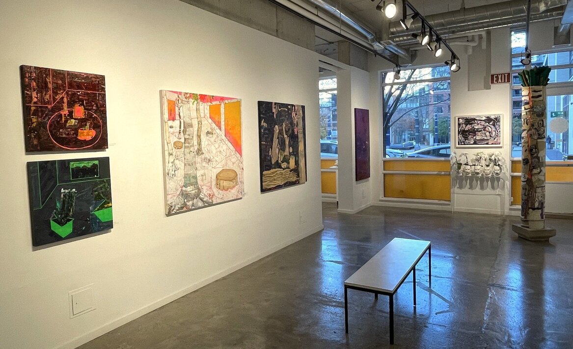
Installation view of Tracy Thomson, Hope Springs Eternal
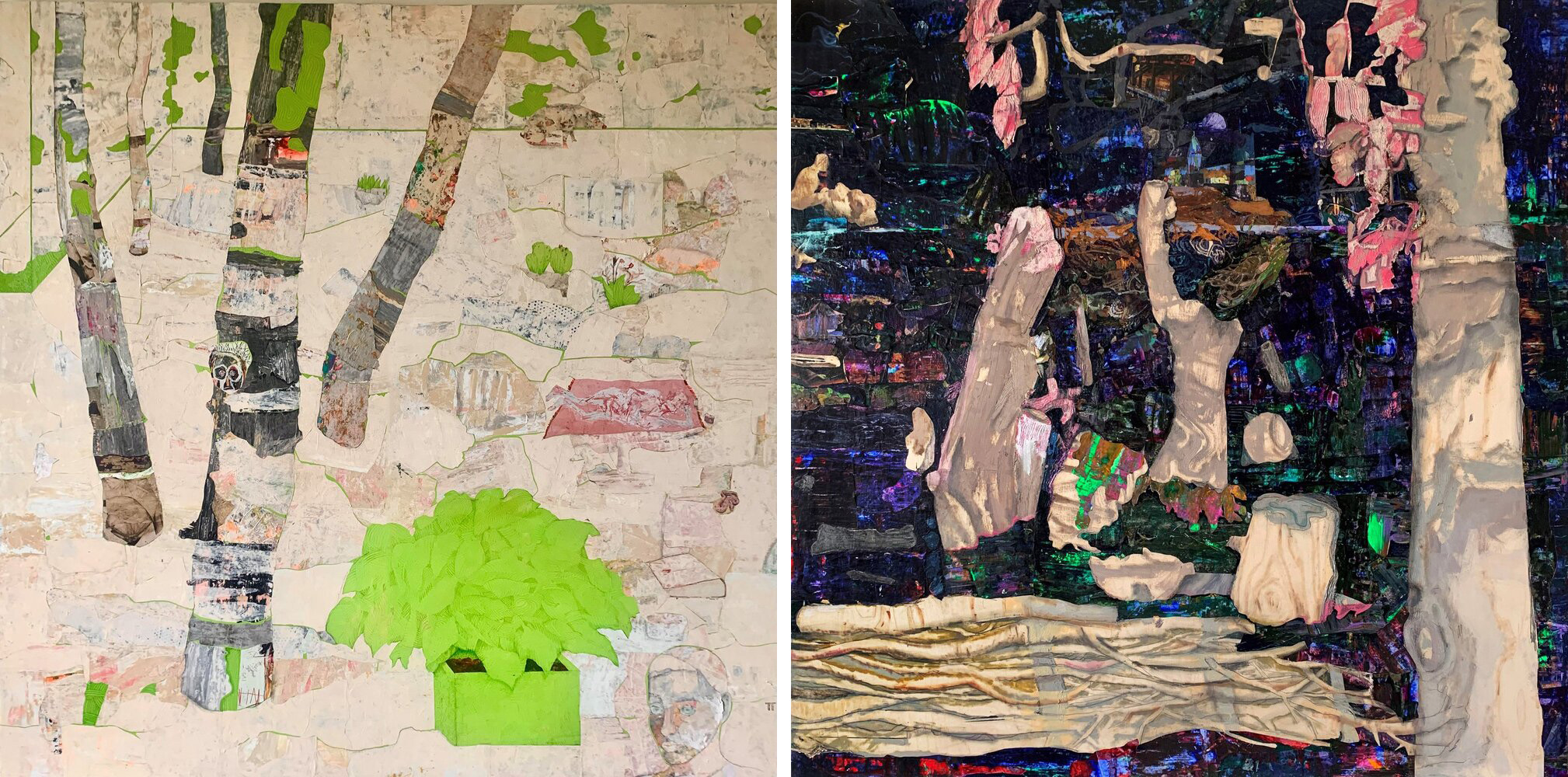
Interior and exterior co-mingle here, as though time has eroded the barriers of man-made vs nature made, into one compatible environment. Organic life and beings are regenerated into something “other”. In “Of Sand And Stone”, new amalgamated life forms and mosses sprout throughout the arid landscape, seeping into the dry mud wall. A figure lies upon a beach blanket with transistor radio and a nice cool drink, again traversing time with a welcome injection of pop culture.
“If You See The Pink Tree (You’ve Gone Too Far)” is another good example of her sense of irony. This piece relates to driving too far and missing the next left turn. You’ve gone so far in fact; you find yourself in a different realm altogether. Where floating tree stumps and signs of life fight to reassemble and once again tether themselves to the earth. A planted flag reads “Point Of No Return”, a clear message of Thomson’s fear of our negligence in protecting our planet from demise.
(L-R) Tracy Thomson, Of Sand And Stone, mixed media on wood panel, 60 x 60 inches & If You See The Pink Tree (You’ve Gone Too Far), mixed media on wood panel, 48 x 48 inches
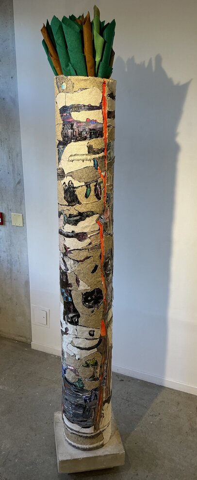
The tree trunk from “Of Sand And Stone” steps out of the two dimensional composition and becomes three dimensional in “Family Tree.” It is a one-of-a-kind family tree, really just a trunk covered by the mainly abstract motifs of Thomson’s paintings. Very strange indeed, as there are no branches coming out of the trunk, only fabric tubes inserted into the cylinder’s opening at the top; a true embodiment of Thomson’s fear of degeneration.
Tracy Thomson, Family Tree, mixed media on construction tube, 96 x 13 inches
Thomson wishes for a world into which we can adapt and move forward safely and thoughtfully into the future. As she says: “We’re always hopeful, right? No matter what happens, we humans can always find hope hiding somewhere and it is this hope that creates change, so that we can be prepared for what may transpire in the future.”
(L-R) Tracy Thomson, They Dreamt Of Trees and Future Projections, both mixed media on wood panel, 12 x 12 inches
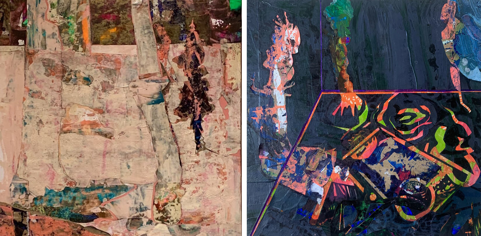
Her process is one of happenstance. Images appear of their own volition and when they do, the element of surprise is a driving force. She states that “whatever appears is meant to be there for whatever reason and I’m careful not to edit these things out, even if they don’t quite make sense at the time, that’s like life.” She considers her involvement in the creative process, similar to “just another brush or tool, I’m there to facilitate the work, not control it.”
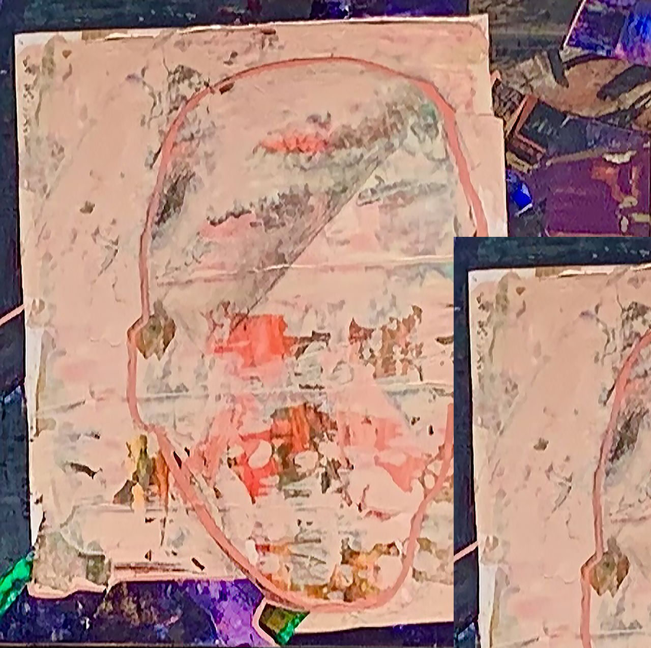
For example, for “Bone Of My Bone, Flesh Of My Flesh”, she had no intention of creating a portrait and when it began taking shape, she identified it as her great- great Uncle, Tom Thomson. As she explains, “I don’t pre-plan these things but when they happen, they’re a bit of magic!”
Tracy Thomson, Bone Of My Bone, Flesh Of My Flesh, mixed media on wood panel, 12 x 12 inches
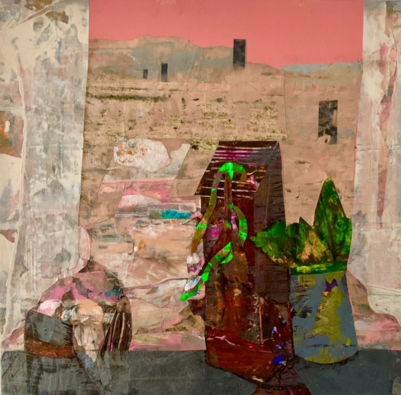
“White Curtain” is an example of her future world constructs. She told me, “This is like something in the desert, and these (containers) are representative of energy stations where we can plug ourselves in…These thoughts of the future can at times be unsettling. I find humour combats the unease.” In this piece she keeps the traditional landscape of a desert, however, it is a reconstructed futuristic view which is up for interpretation, so the viewer can decide what to see in the future.
Tracy Thomson, White Curtain, mixed media on wood panel, 12 x 12 inches
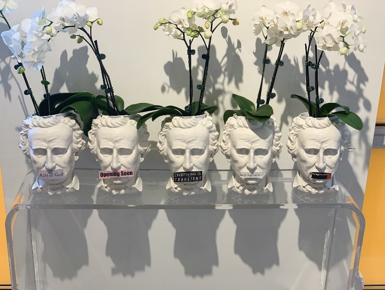
Also in this show, are 5 white orchids growing out of five white ceramic heads. Placed all in a line, like sentinels, standing guard for peace. The white Orchid symbolizes hope and innocence. Called “Talking Heads” for the word headlines attached to the mouth of each head.
Tracy Thomson, Talking Heads (L-R) Everything Is Transient, Fragments, Acts of God, Opening Soon and Long Dead Artists, each hand-painted ceramic pot, 20 x 6 inches
Thomson summarizes her artist talk with, “I am so consumed by all the natural disasters everywhere, all the eco-stuff that is so prevalent right now. That really does scare me.
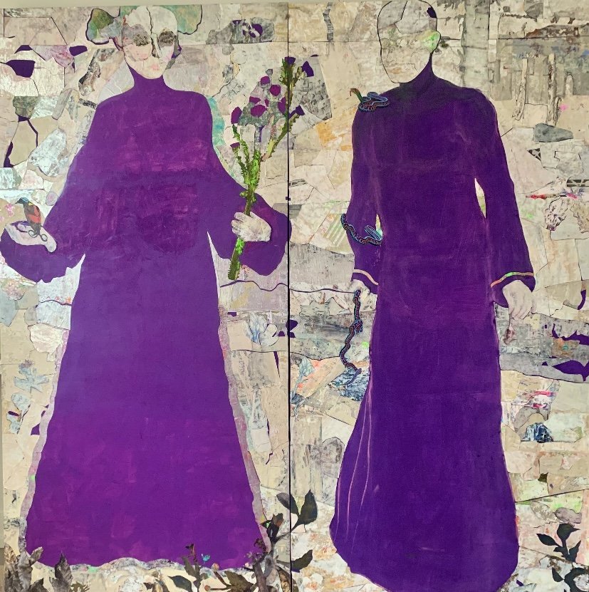
When listening to Thomson explaining her vision and how she arrived at each piece of work, I realize the true scope of her search for eternal hope. She is searching not only for a way to cope with the impact of the world’s treacherous waves of conflict, but also to instill in the viewer a sense of acceptance of being, and to find trust in the natural order and optimism in the face of uncertainty. In her powerful diptych “Ever After”, an Indonesian Bird of Paradise sits placidly in the female figures hand. While a snake uncoils the arm of the male figure, a mouse in the other hand. “The enchanted mysteries of what may lie ahead. The uncertain treachery of such places. This is what fuels me”.
Tracy Thomson, Ever After, mixed media on two wood panels, 72 x 36 inches
It is a show utterly worth seeing especially if you enjoy meaningful art with strong imagery.
Installation view of Tracy Thomson, Hope Springs Eternal
Cassandra Johnson
Images are courtesy of Propeller Art Gallery.
*Exhibition information: Tracy Thomson, Hope Springs Eternal, November 15 – December 3, 2023, Propeller Art Gallery, 30 Abell St, Toronto. Gallery hours: Wed – Sat, 1 – 5:30pm, Sun 12 – 4pm.
The venue for this show is both untypical for art and relatively off the beaten track. It takes place on the York University’s Glendon Campus, located where Bayview and Lawrence Avenues meet. There, among the lecture halls sits the Canadian Language Museum, in a tranquil setting. The museum’s modest sized exhibiting space doesn’t normally feature artworks. But as director, Elaine Gold, explained to me, when they learned of the artists’ works and their theme, they were delighted to host them. It was a natural fit with the museum’s overall mission, namely, to highlight the many languages of Canada.
Installation view of Anthem at the Canadian Language Museum with work by (L-R) Mark Bovey, Davida Kidd an Yael Brotman
The theme of the show is Canadian identity. The participating artists were invited ‘to interrogate the meaning of the anthem’s lyrics and their relation to national and individual identity, as well as to reflect on the lands upon which they personally live, work and learn’, as their catalogue explains. The fifteen participants are Derek Besant (curator), Mark Bovey, Yael Brotman, Sean and Case Caulfield, Sue Colberg, René Derouin, Karen Dugas, Alexandra Haeseker, Libby Hague, Liz Ingram & Bernd Hildebrandt, Walter Jule, Jo Ann Lanneville, Jewel Shaw and Tracy L. Templeton. Almost all are printmakers and many are associated with the University of Alberta, either as former students or faculty. They are all very accomplished, and have exhibited extensively nationally and internationally. And this is reflected in the high quality of the work on display.
L-R: Alexandra Haeseker, Derek Besant, CLM Director Elaine Gold, Mark Bovey, Libby Hague, Jo Ann Lanneville, Yael Brotman
The works are generally in book form, and this facilitates their transportation since it is essentially a travelling show. The group has shown their work recently in Alexandria, Egypt, and after this venue – alas, the only one in Canada – it travels to Japan. Because many of the works are books, in most cases only a portion of their contents can be displayed. It is always so tempting, wandering among them, to pick one of them up and sift through its pages. But, of course, that is not possible. There are too many works to cover in this review, but here are a few highlights.
Carefully laid out under a picture are three book casings, one of which is open, revealing a hand-made book containing translations of songs and poems that are recited and heard as an audio. Yael Brotman’s piece is titled Songs We Carry, Poems We Hold. Wearing a glove provided the viewer is able in this instance to browse its delicate pages. These performers are young adults who originated from another country, and so they recite poems and sing songs from their original culture in that language, e.g., Arabic and Korean. Brotman describes these young people as ‘walking the fertile line of hyphenated identities’. Indeed, it is a reminder of the various forms of diglossia found in Canada, that is, the practice of speaking one language or dialect at home and another outside of it. That is a very common experience in this country. As well, Brotman points to a concomitant cultural diglossia in this sense, where people are part of distinctive cultures at home and in the public sphere.
Yael Brotman, Songs We Carry, Poems We Hold, 2020, etching, inkjet & stencil on Kurotani paper, wood cabinetry, audio element, 37.5 x 37.5 inches
Another issue inevitably brought up in any discussion of Canadian identity is the influence of geography, especially in terms of humanistic geography, that is, the study of the relationship between culture and geography – how they influence one another. Tracy L. Templeton, for instance, talks of topophilia, namely a love of place we develop interacting with our environment. Her work Prairie is part of an investigation of how her intimate interactions with the southern landscape of Saskatchewan, where she grew up, have influenced her. The work consists of a concertina book, partially laid out on a table for this show, that features a beautifully printed horizontal landscape. This issue is also broached by The Caulfields’ and Colberg’s book work titled Watercircle featuring wonderful black and white prints accompanied by poetry, that is inspired, again, by the Saskatchewan landscape – this time the North Saskatchewan River (Treaty 6 territory, as they note).
Tracy L. Templeton, Prairie, 2020, Digital, gold leaf, book board, foil, 82 x 40 inches
Installation view with The Caulfields’ and Colberg’s book, Watercircle, 2020, linocut and letterpress on rag paper with silk book cover, 111 x 18.25 x 3/8 inches (in front)
Another topic of this show, again almost inevitably, is the Arctic region of Canada. Talking about his contribution – a set of prints titled Arctic Turns – curator Derek Besant, remarks that while growing up ‘the concept of Canada was this land that bordered oceans on three sides…that measured out its geolographical psyche.’ And this geography, he adds, ‘remained an imagined touchstone of identity that was mostly defined by the Northern reaches as what Canada represented to me’.
Alexandra Haeseker, Fallen Leaves, 2020, UV latex ink on Mayfair, 192 x 15 x 24 inches (top) & Derek Besant, Arctic Turns, 2020, UV latex ink on Mayfair 192 x 15 x 24 inches (bottom)
It is this vast largely inaccessible region of the country that Toronto-based printmaker Libby Haguegot the chance to visit recently. Greatly impressed by her experience, she ended up reading about the adventures of nineteenth century British Arctic explorer Captain William Parry. An account of his encounters with the indigenous people there, and the misunderstandings between them, is the subject of her work titled The Heart in Conflict with Itself. It is a story that, she tells us, ‘represents the best and the worst inclinations of human beings’. She aptly ends by noting: ‘Canada’s multicultural challenge is to find sufficient common ground to hold together while encouraging the immigration and diversity that is our strength’.
Libby Hague, The Heart in Conflict with Itself, 2020, woodcut installation, 102 x 78 inches
All told this is an impressive unmissable show. It is a pity that it is the only scheduled venue in Canada. We should thank the Canadian Language Museum for their foresight. It would make a wonderful exhibition at the AGO or the ROM. To my mind it is an indictment of such Canadian institutions that that is not the case.
Installation view of Anthem at the Canadian Language Museum
Huge Alcock
Images are courtesy of the Canadian Language Museum
*Exhibition information: Anthem: Expressions of Canadian Identity, October 5 – December 7, 2023, Canadian Language Museum, York University, Glendon Gallery, 2275 Bayview Ave, Toronto. Museum hours: Tue – Thurs, 11am – 4pm.