Author: artoronto

  • Mikael Sandblom at Gallery 1313

    Notionally the theme of this show is sky and water. This is a recurrent theme in Sandblom’s work. It stems in part from a fascination with looking at water and sky in nature. Sandblom is an avid sailor, and so has been confronted with these elemental phenomena for a great deal of his life. I say ‘notionally’ because over the years he has come to appreciate the ephemeral nature of these elements, which has led him to ask how it is exactly that we perceive them. So the show is more about perception than it is about sky and water. These two subjects are ideal in terms of understanding the nature of perception – how we make sense of the sense data constantly bombarding us.

    Installation view of Mikael Sandblom, Clouds and Waves at Gallery 1313

    Sandblom’s works are computer generated, that is, designed on the computer. These designs are then printed, or woven using a modern version of the Jacquard loom. As well, he paints over sections of the prints. In addition, on occasions he places plexiglass with patterns in front of the prints or weaves. These devices are used by Sandblom to emphasise the materiality of the layered surfaces, effectively enticing viewers to come up close. In doing so they see the images dissolve before their eyes. This reflects a strategy of attempting to mirror the way we perceive such ephemeral phenomena as clouds and waves in real time, that is, how we try to grasp what we see only to find it slip away.

    But Sandblom doesn’t want just to observe that, unlike a camera, we are incapable of capturing a mental image of waves on water, for instance. His larger point, one might say, is that there is nothing for us to capture. More precisely, the quicksilver nature of waves shows the limitation of our brain’s capacity to record reality in the way a camera does. In general, even before a relatively static scene, the detailed grasp of our overall field of vision is limited to a very small area equivalent to that of a thumbnail at arm’s length. All the other apparent details we ‘see’ in addition at the periphery radiating outward are, as Sandblom describes it, ‘hallucinated’ in the sense that we presume they are there when they simply are not.

    Steer Your Way, 2024, Acrylic, UV printed graphics on aluminum. Coated with Golden MSA Varnish with UVLS

    This fact about our perceiving, Sandblom maintains, generalises. When we perceive the world we are effectively making stuff up. It is understood that here we are concerned with visual perception, of course, as necessarily the subject of his artworks. In other words, perceiving is a constant process of interpreting and reinterpreting the things around us – thus assuming that an object in the distant, say, is a dog, but reinterpreting it as a pile of clothing as we approach it. And it could change again! Accordingly, Sandblom remarks: “Perceiving creates the world. By looking carefully, we discover that we often unnecessarily narrow our experience of what is possible. At the same time, we make the mistake of believing that the world we conjure with our minds is complete, solid, and permanent. What we see is not all there is.”

    We find here in his thinking a nod to idealism, namely the view that the world is the product of our minds, or our ‘brains’ as he would prefer to put it. It might be better to say that the world as we perceive it is created by us, rather than the world as such. Quibbling aside, taken at face value this view inspires Sandblom’s art. He sees an inventiveness in our perception that parallels artistic invention. The devices he uses in his artworks are designed to reveal how insubstantial or provisional our perceptions are on inspection.

    Shore patterns, 2022, Jacquard Tapestry, UV printed aluminum and Plexiglas construction

    Following this thought clouds are reinterpretable in an infinity of ways. Thus Sandblom is inspired to represent clouds as floating worlds of architectural details – stairs, windows, walls, doors, or just cubes and planes, that bloom into a scene that is reminiscent of the paintings of the futurists who exulted over the triumph of the machine, or again those of the cubists with their madcap attempt to represent an object at every angle all at once. These cloud pictures have a wonderful explosive energy.

    My allusion to futurism is not incidental here. Behind all the conceptual analysis that informs his art, Sandblom’s works betray a strong aesthetic bias, one that is not unlike that of the futurists such as Umberto Boccioni. These are works that are clearly mediated by machine. He shares with the futurists a preoccupation with expressing, perhaps per impossibile, dynamic forms on a static picture plane.

    Toy Box, 2024, Acrylic, UV printed graphics on aluminum. Coated with Golden MSA Varnish with UVLS

    The predominantly cold blue palette, emblematic of the elements of air and water, is punctured by the heat of uncontrolled, uncontrolable movement. There is something primordially delightful about Sandblom’s pictures. The most successful of his cloud-based pictures are those that are spatially ambiguous, where background and foreground are hard to distinguish from one another, e.g., in his “Toy Box”. His series of horizontal compositions based on the theme of waves is less frenetic, almost calming by comparison. I have personally had the privilege of witnessing the development of Sandblom’s work over decades. It is only getting better. These sophisticated beautiful artworks are worthy of anyone’s attention.

    Horizon, 2022, Jacquard Tapestry, UV printed aluminum and Plexiglas construction.

    Hugh Acock

    Images are courtesy of the artist.

    *Exhibition information: Mikael Sandblom, Clouds and Waves, October 10 – 20, 2024, Gallery 1313, 1313 Queen Street West, Toronto. Gallery hours: Wed – Sat 1 – 5 pm, Sun 1 – 4 pm.

  • Nuit Blanche 2024

    Nuit Blanche, 2024 / Text and Photo: Elin MacRae

    We Remembered You, Too

    Harbour Square Park West is aglow with alternating fuchsia, red, turquoise, and purple, bathing the looming willow trees in jewel-tones. Music plays throughout the park, casting an atmospheric calm with its ambience. The deck leading to The Sundial Folly is blocked off, only accessible to those who have waited in line. When it is my turn, I ascend the wooden stairs and walk around the bend, finally setting my eyes on the massive concrete sculpture. Transformed by Dr. Syrus Marcus Ware, The Sundial Folly is no longer a blank globe, but rather a planet of possibilities. A projector lights up the sculpture with scenes switching rapidly: a nebulous swirl of galaxies transitions into a deep underwater seabed with the text “We are roots and rivers, not rulers.” There are startling contrasts of colour, their vibrancy and allure opening the viewers’ minds to immerse themselves fully in the experience.

    This exhibit is part of the And the spaces between us smiled exhibition, which celebrates uniting difference and distance, of turning to one another, and shared world building. We Remembered You, Too aims to encourage contemplation about memory and identity: it is a pathway through the memory of the Earth, Toronto, and us. This immersive experience transforms a known space into a new one, its effects penetrating deep in the creative and collective mind.

    LUMI

    This interactive installation, which is another chapter to the And the spaces between us smiled exhibition (curated by Dr. Syrus Marucs Ware), truly drives home the overarching theme: strangers sit together on these luminous and bouncy balls and bridge the distance between them through interaction and socializing. Instead of looking at the art, viewers are actively participating in it, uniting and showcasing the piece’s purpose. These interconnected-balls stretch along the Simcoe Wavedeck, weaving among its hills and undulations. Here, I witness participants bounce up and down; some sit quietly; and others take up as much space as they can on the cushy art. This is what makes the exhibition come alive.  

    The installation fosters connections between strangers and, similar to We Remembered You, Too, celebrates the bridging of difference and the diminishing distance between us. 

     Photo journal by Adrian Oosterman

    Anique Jordan, I’ve Come to Find This Place, 61 Dockside Drive, Sherbourne common

    Emilija Skarnulyte, Riparia, Canada Malting Silos, 9 Eirann Way

    Caroline Fusilier, Amphipoda Songs, 416 Queen Quay West, Spadina Wave Deck

    Sarah Keenlyside & E.K., 7222 Miles, 470R Lakeshore Blvd. West, City Place

    Patricial Marcoccia & Mazair Ghaderi, Garden Lights: A Holographic Eden, The Well, 486 Front Street West

    Various Artists, Light Speed: Bridging Distance, Aga Khan Museum, 77 Wynford Drive

  • Caroline Larsen at General Hardware


    It’s so much more than landscapes and flowers. In Caroline Larsen’s show A Traveler’s Garden at General Hardware Contemporary, you’ll encounter vibrant gardens — florid and full of life — but that’s merely the pretext. What these paintings are about, is not so much the subject matter, but rather the process, craft, and creative experimentation within the discipline of painting. The real spectacle isn’t the garden; it’s how she builds it.

    At first glance, Larsen’s work might not register as paintings at all. You could be deceived into thinking they’re made from fabric. Take “Still Life with Shells” for example. The surface is thickly textured, with colour applied in linear bands that suggest embroidery. From a distance, you’d be forgiven for mistaking it as a tapestry, some kind of intricately woven textile rather than paint on canvas.

    Caroline Larsen, Still Life with Shells, 2018 Oil on canvas, 31 x 27 inches. Courtesy of General Hardware Contemporary

    It is only upon closer inspection that the actual process is revealed. All these linear elements are in fact made up of paint — thick oil paint. It’s been applied in strands using a cake decorating bag and nozzle. The background surface around the centre is built up of a field of thin lines terminated in little swirls. Looking even closer, you’ll see that the lines are not monochrome. The painting bag has been packed with two colours — exiting the nozzle like striped toothpaste. The process is taken to the edge of the canvas and in some cases a little bit past it. Delicate tendrils of paint are left hanging, protected only by the frame around the edge.

    You’ll have to supress the urge to touch the surface. The thick oil paint looks like it could still be wet. Apparently, these paintings can take months to dry. Even though this piece is from 2018, it looks like the paint is freshly applied.

    Caroline Larsen, Still Life with Shells, detail. Photo: Mikael Sandblom

    The painting’s focal point is a bouquet of flowers, rendered with lines of paint laid down in meticulous, linear patterns. The palette is notably restrained — composed of a fixed set of pigments. Various gradations and hues are achieved by laying down a pattern of unblended colours next to each other. 

    The effect is a play of perception. From a distance, these patterns resolve into a seemingly rich range of hues, as the eye mixes the unblended colors into subtle tonal shifts. But step closer, and what seemed like unified shades dissolve into a patchwork of distinct pigments. Consider the greens in the leaves. What appears from afar as a complex variety of hues — cool shadows, bright highlights — unravels up close into thin streaks of yellow, blue, and green, teasing the eye with a kind of chromatic alchemy.

    Caroline Larsen, Still Life with Shells, detail. Photo: Mikael Sandblom

    When engaging with representational artwork, there’s a threshold — a moment determined by your proximity to the surface — where the illusion of the depicted image dissolves, and you’re left with the raw materiality of the surface, the material and the marks laid down by the artist.

    It’s when you’re within this perceptual horizon that you’re engaging with the physical craft of painting. Pay close attention and you can follow the process of the artist step by step. You become a witness to the work being created.

    Caroline Larsen, Falling Water, 2024, oil on canvas, 44 x 44 inches. Courtesy of General Hardware Contemporary

    Recently Larsen has been introducing more variations in her technique. “Falling Water” is a painting from this year. The image is of the famous Frank Lloyd Wright building, seen from that iconic angle downstream from the waterfall. Hung at the far end of the gallery, you approach the painting at some distance. As you get closer, the image begins to atomize. The perspective breaks down and colours and texture become the dominant elements. You become aware of the paint and in this case, the variety of application. The waterfall is painted in loose thick strokes while the foliage is made up of small dots of colour. The wet rocks next to the stream are rendered with white outlines.

    Caroline Larsen, Falling Water, detail. Photo: Mikael Sandblom

    The building itself has been ‘constructed’ on the canvas. The cantilevered balconies are built up in thick lines of oil paint. The stonework on the vertical element of the building has been applied with a patterned nozzle as individual blocks of paint and the bright red mullions have been extruded in thick relief.

    Caroline Larsen, Falling Water, detail. Photo: Mikael Sandblom

    In “Falling Water” Larsen has used both acrylic and oil paints. The foliage dots were painted first. Acrylic’s faster drying time allows Larsen to layer these areas relatively quickly. The fact that acrylics dry flatter than oil also provides a contrast to the architecture at the centre of the painting. This building is in Pennsylvania and is surrounded by temperate forest, familiar to us here in Ontario. The vibrant pigments in the painting, even if inspired by fall colours, must be a partial invention of the artist. So again, the image is merely a structure for the true content of the painting which is pattern, colour and texture.

    Painting is a medium that seems perennially capable of reinvention, always finding new ways to assert its relevance. Caroline Larsen’s work exemplifies this capacity for renewal. Rooted firmly in the tradition of paint on canvas, her subject matter — gardens and flowers — draws from a long history of representation. Yet Larsen’s approach to the material transforms the familiar into something strikingly fresh.

    What she does with paint is both a nod to tradition and a leap away from it. By applying pigment in ways that evoke craft techniques — embroidery, weaving — she pushes the limits of what paint can do while staying within the framework of its historical conventions. It’s a dialogue with the past, but one that speaks with a distinctly contemporary voice, proving once again that painting, for all its history, is far from exhausted.

    Mikael Sandblom

    *Exhibition information: Caroline Larsen, A Traveler’s Garden, September 14 – October 12, 2024, 1520 Queen Street West, Toronto. Gallery hours: Wed – Sat 12 – 5 pm.

  • José María Mancía at Gallery 1313

    How do we form relationships with illness? What do people consider beautiful, and why? José María Mancía asks these questions using his camera lens. His show, the pain of old wounds, at Gallery 1313 in the Cell Gallery, focuses on how we – the viewers and the artist as well – react to pain and how we relate to the narrative in these images.

    I became captivated by these out-of-focus images. I could feel the pain in these photographs – from the sterile-white frames and the familiar blur of blue hospital gowns – they make me feel uncomfortable.

    Installation view of the pain of old wounds. Photo: Victoria Filippo

    Mancía is addressing what makes an artwork radiate pain and what makes it beautiful, and how these two can exist in the same image. the pain of old wounds is a cathartic experience. By blurring the details and the identity of the people in them, something ambiguous is created. However, in spite of the blurred images, viewers can create their own narrative and recognize their own emotional reactions. Mancía uses these out-of-focus images cleverly, manipulating the viewers’ sense of reality about what is being portrayed.

    Works such as “the pain of old wounds (VI)” embodies this idea. We can make out the figure of a woman sitting in a chair holding a cup and looking at a hospital bed. Though disoriented, we can still sense her emotion, but whether she is feeling loss, pain, or sadness remains unknown. The remnant of her emotion is greater than the details that can be seen.

    the pain of old wounds (VI), inkjet print on archival substance, 17 x 22 inches

    The same woman seems to appear in “the pain of old wounds (VIII)”, only now we can make out more of her surroundings: there is a figure sitting on a hospital bed directly across from her, staring into space while the woman from (VI) is looking at the camera. Both women are in a painful and vulnerable situation, we also experienced in real life. Is pain and vulnerability subjective or objective? Can it be measured by an onlooker?

    the pain of old wounds (VIII), inkjet print on archival substance, 17 x 22 inches

    While we do not know exactly why the little girl in “the pain of old wounds (IV)” is wearing a bib and sitting in a hospital bed, we can still understand and feel her fear. What is interesting in this composition is how the colours stand out against the sterile blue and white hospital background; this rainbow-coloured bib almost seems a beacon of hope. A reminder that life does not always have to be painful.

    the pain of old wounds (IV), inkjet print on archival substance, 17 x 22 inches

    Art is not completely subjective, but rather, exists in a reality between subjectivity and objectivity. Mancía writes that he has trouble photographing hardship or suffering, however, he reminds himself that photography can be a neutral experience as well. In this series the artist wants to remind the viewer that there is a special beauty even in suffering. The image “the pain of old wounds (III)” depicts a man sitting, shirtless, in a wheelchair. I assumed this was a man in a vulnerable state, in the midst of suffering. However, after spending more time with this image, I felt a sense of admiration for his ability to openly reveal his vulnerability in the midst of a painful experience. He was able to survive despite it. Though I felt challenged by this fragile, yet defiant portrayal, I was also moved by it.

    the pain of old wounds (III), inkjet print on archival substance, 17 x 22 inches

    Looking at each image in this small, quiet room reminds me of what it is like to be in the many painful moments of life, like after a surgery or even the pain of a simple flesh wound — everything between birth and death. However, we can always focus on the beauty of life and survive. We should not be afraid of these photographs’ “hurtful” subject matter, but rather approach it in the way we approach life: with all five senses, and a heart filled with compassion.

    Victoria Filippo

    Images are courtesy of the artist.

    *Exhibition information: José María Mancía, the pain of old wounds, September 25 – October 6, 2024, Gallery 1313, Cell Gallery, 1313 Queen St. West, Toronto. Gallery hours: Wed – Sat 1 – 5 pm, Sun 1 – 4 pm.

  • Pedie Wolfond at Lonsdale Gallery

    Pedie Wolfond has preserved the most positive aspects of the Colour Field movement throughout a lengthy career. While the paint-soaked colour fields of Mark Rothko, arguably the movements most celebrated exponent, grew progressively darker by the 1960s. By contrast, rather than Rothko’s palette of “tragedy, ecstasy and doom” a radiant optimism exudes Wolfond’s most recent canvasses. A joy of paint and life infuse works like “Ascendance, Magic Memories, and Ocean Breeze.”

    Ascendance, 2020, acrylic on raw canvas, 84.5 x 68 inches

    In the 1960s, Colour Field artists such as Jack Bush and Julius Olitski were part of a shift away from the gestures of violence and angst of Jackson Pollock, adopting a “calmer” language – something akin to a colour gestalt. Riding on this wave, Wolfond’s washes of thin colour on unprimed canvas began to achieve a nuanced play that propelled the viewer toward the contemplative reflective. By the 1970s, the artist had mastered her technique of mixing acrylic paints with water and clear medium to personalize the pigmentation with new expressive potential. The pearly texture of canvas was retained to imbue its colouration with shimmering translucence and depth.

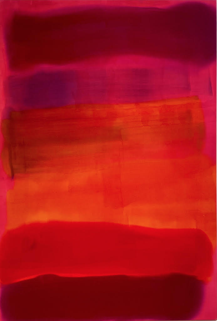
    Passion, 2024, acrylic on raw canvas, 70.5 x 47.5 inches

    Particularly magnetic are Wolfond’s red works. As Gary Michael Dault observed, “Red, especially the red that Wolfond sluices and veils into her big, absorbing canvases, burns with an optical intensity from which there can be little escape, an intensity that cannot be softened, subdued, avoided or deferred.” Wolfond’s 2024 “Passion” inlays Rothko ecstasy without its sense of impending doom. Her “Carnival in Rio” (2011) pulsates with life. The painting is less viewed than entered.

    Carnival in Rio, 2011, acrylic on raw canvas, 104 x 87 inches

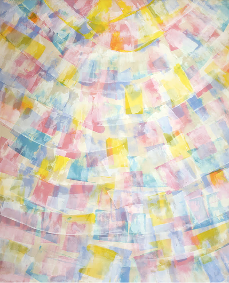
    “The Song of Summer” (2000) features multiple layers of Wolfond’s signature soft, floating tiles – an airy dissolve of warm and cool. Entirely abstract, the painting tugs at the viewer for morsels of figuration in a way that the reading of Rorschach inkblots raids a subject’s psyche for personally emotive plot lines. In that respect “The Song of Summer” is not only a tool for self-reflection, but a possible psychological balm. It’s here that we arrive at the fundamental positivity of Wolfond’s art. While her red “Passion” painting may have suggested a blazing end of a day, “The Song of Summer” left the door open for a dawn to the next.

    Song of Summer, 2000, acrylic on raw canvas, 72.5 x 98 inches

    Steve Rockwell

    Images are courtesy of Lonsdale Gallery.

    *Exhibition information: Pedie Wolfond, A Journey Through Time, September 7 – October 18, 2024, Lonsdale Gallery, 410 Spadina Road, Toronto. Gallery hours: Wed – Sat 11 am – 5 pm.

  • Toronto Biennial of Art 2024

    Toronto Biennial of Art, 2022, Catalogue launch

    Precarious Joys, the third edition of the Toronto Biennial of Art (the Biennial/TBA), features 55+ exhibition and programming artists from diverse geographies and generations, working across various disciplines. From September 21 to December 1, 2024, TBA offers 10 weeks of free contemporary art at 11 unique locations across Toronto.

    The exhibition, Precarious Joys, explores the emotional climate of our times, acknowledging vulnerability and grief while emphasizing the importance of passion and beauty in driving social change. In making this exhibition, co-curators Dominique Fontaine and Miguel A. López, have been engaged in conversations and active listening traversing national and international landscapes and numerous artists’ studios. The exhibited works address the various layers that define life in Toronto while reflecting broader social and political structures. Organized around open dialogues and poetic connections, these works together create sparks that ignite a fire amidst the fragility of existence. In addition to curated artworks, there is an expansive selection of free arts events and learning programs.

    In addition to curated artworks, there is an expansive selection of free arts events and learning programs.

  • Gestures of Remembering at United Contemporary

    How can we sufficiently remember memories that are not our own, that we have inherited? How can we embrace cultural history holistically? Emma Nishimura and Linda Sormin seek to address these questions in Gestures of Remembering at United Contemporary. The exhibition includes Nishimura’s intricate explorations of how internment camps have marked the Japanese community. While Sormin contemplates familial history, as affected by organic cultural development, colonization, and the individual experience. Gestures of Remembering also reflects upon the artists’ return to sources that previously inspired them and how they’ve changed their practice through experimentation in media.

    Exhibition view of Gestures of Remembering at United Contemporary. Photo: Rashana Youtzy

    I was captivated by the miniature dresses in frames along the wall. Each of the dresses has a unique design, carefully stitched together out of paper. The paper contains black and white archival images or text. The sewn paper works are Nishimura’s effort to understand the effect of internment camps on the Japanese community. The dresses are a return to the motif that inspired Nishimura in graduate school, borne from the patterns created by her grandmother. Works such as those in “Shikata ga nai: It cannot be helped” (2024) are delicate and can fit in one’s palm. The surface of each varies: trees, a home, a crowd of faces.

    Nishimura’s Grandmother’s Dresses (above) and Emma Nishimura, Shikata ga nai: It cannot be helped, 2024, photo etching with gampi with thread, framed, 19 x 33.75 inches (below). Photo: Rashana Youtzy

    They represent the fundamental components of a community— environment, shelter, people. Nishimura’s memorializing of these moments and people are careful remembrances of culture. Remembrance is also found in the texts featured in the works, transcriptions of interviews about experiences in internment camps and how they have affected the community.

    Emma Nishimura, Federick Avenue, 2024, photo etching on gampi with thread, framed in natural wood, 14 x 17 inches (left) and Seeking Solace, 2023, photogravure etching with thread, framed, 14 x 15 inches (right). Images are courtesy of United Contemporary

    Nishimura focuses on what goes unsaid, memories unknown, lost, or have not been shared, though inherited either way. These placeholders are evident in the space in the furoshiki-wrapped bundles (method of packing small goods in Japan). Within the back gallery are more bundles, tucked under a barrier and upon a plinth. One can recognize varying faces, hands folded together, and glimpses of landscapes in monochrome within “An Archive of Rememory” (2016-2024). Those same bundles are the subject of “Generations of an Archive I”, a large photograph showcasing slightly shifting angles of the furoshiki. This presents a fragmented sort of visibility — a distortion of what is known— but also presents a different way of knowing. As a result, like the memories or the experiences discussed, we are privy to alternative perspectives that add another layer to how they are remembered.

    Emma Nishimura, Generations of an Archive I, 2022, photo etching on hahnemuhle paper, framed in bleached maple, 30 x 40 inches. Photo: Rashana Youtzy

    The interconnection between generations in a culture takes on a more literal representation in Sormin’s works. Throughout the gallery are various sculptures in the form of webs, scrolls, and multimedia works. The web sculptures are polychrome with layers upon layers of glaze.

    Installation view with Linda Sormin’s works. Photo: Rashana Youtzy

    Works such as “Sup-sohn (complexity)” (2019) are tantalizing, what would it be like to hold them in one’s hands to experience their tactile form? What would it be like to carry them outside and hear the wind blow through their gaps? The back gallery contains more sculptures, placed upon crates rather than plinths. These substitutes in display recognize the transient nature of constantly shifting and evolving, both as an artist and as a culture.

    Linda Sormin, Sup-sohn (complexity), 2019, glazed ceramics, found shards, epoxy, gold leaf, 12 x 14 x 12 inches. Photo: Rashana Youtzy

    The crescendo of Sormin’s work is “Origin Myths”, spanning an entire wall and consisting of paper, ceramics, paint, and filament. In one section there is a shattered French bust, the fragments scattered within the lower right portion of the expansive work. Hidden among the shards is a tiger, a formidable foe though not exempt from extinction. Can culture recover from being endangered? Among the splatters of colour are more sculptural details such as a mauve breast with a gold nipple, orange tracks of filament prints, and a 3-D printed bust of the artist. The careful insertions of these objects prompts one to reflect on their inclusion: to be nurtured and grow in another land, accessing privilege others are deprived of; the artifice one feels in engaging with their ‘motherland’ though living elsewhere; inserting oneself into the cultural fabric to better understand who they are. Both Nishimura and Sormin recognize the difficulty in knowing two worlds, recognizing the gaps in understanding due to the inability to exist in both simultaneously. This does not necessarily reflect a shallow understanding, solely that there will be tethers and connections, but not a solid whole.

    Linda Sormin, Origin Myths, 2024, hand-cut watercolour and graphite, resin, ceramic and acrylic shards. 56 x 265 inches (above) and details (below). Photo: Rashana Youtzy

    Nishimura’s and Sormin’s reckoning with cultural history have created a space for dialogue beyond suffering as the focal point. Their priorities are clear in making space for experiences, adapting to persist, and creating anew with what has been inherited. Further, both artists have grown technically, expanding in their painting, paper works, and sculpture processes. Gestures of Remembering is an attestation of their embrace of new modes of creating, recognizing the amalgamation of the self, and the legacies within cultural communities.

    On the note about making space, recognizing the community, and opportunities for growth, Gestures of Remembering is a fitting exhibition for United Contemporary to break in their new location. When discussing the move with gallery director Melanie Trojkovic, she shared that United is thrilled with the space and opportunities to grow. The location is three times the size of their previous gallery, presenting better storage and more opportunities for programming. The Tecumseth location is also in closer proximity to downtown, which has meant greater foot traffic and integration within the community. United’s move has also brought a new energy to the former Birch Contemporary space, with the team enthusiastically embracing the move into their dream location and new chapter in their evolution.

    The entrance of United Contemporary at 129 Tecumseth Street

    Rashana Youtzy

    *Exhibition information: Gestures of Remembering, August 22 – September 28, 2024, United Contemporary, 129 Tecumseth Street, Toronto. Gallery hours: Wed – Sat 11 am – 6 pm.

  • In Your Face at the Canadian Sculpture Centre

    Shortly following celebrating its 95th anniversary, the Canadian Sculpture Centre has a new exhibition called In Your Face, a striking array of sculptural works that encompasses the human spirit through both representational and abstract approaches. In accordance with its name, the exhibition demands our attention, encouraging us to observe, reflect and challenge our understanding of human existence.

    Installation view of In Your Face. Photo: Tiffany Duong

    The subtle facial expressions and gestures of Brett Davis’ bronze busts capture body language as an expression of emotions and a mode of communication. “Roman Head” depicts a man who looks directly at the viewer with a concerned gaze. “Pondering” shows a man who is contemplatively turned away, being “immersed in one thing and pondering a thought about another” (Davis). Although the figures are based around two different time periods—the Ancient Roman era and present-day modernity—their expressions transcend the constraints of time and place.

    Brett Davis, Pondering, bronze

    Daniel Yu’s abstract works further dissect emotions through their direct relation to action and decision. “Principal Fundamental III – Three Ages of Man” displays three weaving, rectangular forms, bending towards and being bonded to one another. As the figures stagger against each other, Yu visualizes conflicting thoughts and emotions resulting in negative behaviour and futile action.

    Daniel Yu, Principle Fundamental III – Three Ages of Man, African Wonderstone

    The title of J. Mac’s “Joan II” is a reference to Joan of Arc. Mac reflects on the patriarchal demands for women throughout history. The artist’s repurposing of the mannequin is symbolic. Mac highlights the strength required of women to fulfill their destinies both in the past and present day. Rope is usually interpreted as being used for restrict, but the artist uses rope as armor, glued to the mannequin like a knight’s headdress. Additionally, the figure’s confident pose suggests that she values herself despite the patriarchy’s desire to reduce her to an object.

    J. Mac, Joan II, mixed-media

    Art Dilella’s hyper-realistic silicone busts, “Anon II” and “Someone For Consideration,” respond to the technological achievements in our time. Dilella fuses the realism of early Western art practices with modern technologies and materials to manipulate reality, inviting viewers to question their perception. Paying excruciating detail to the imperfections of the human body—the silicone flesh is hand-painted with moles, freckles, and pores—each strand of hair has been carefully applied to the figures’ eyebrows, hair, and lashes. Dilella breathes absolute life into these figures who are, in truth, quite distant from reality, having been drawn from the artist’s imagination.

    Art Dilella, Anon 2, silicone, hair, mixed-media

    Marlene Kawalez’s portraits focus on the relationship between humans and the environment. Through the use of raku clay, a natural medium sourced directly from the earth, the artist emphasizes how humans are inseparable from the environment. The unpainted figure of “Silent Warrior” shows the random marks of the firing of the kiln. The burns on her shoulders, nape, and face show where the sun hits the body, whereas her serene expression seems to embrace the environment, regardless of its occasional harshness.

    Marlene Kawalez, Silent Warrior, raku clay

    The diverse faces and artistic approaches showcased in In Your Face engage us in a dialogue about what we know and think we know about humans: their nature, thoughts, emotions and interactions.

    Tiffany Duong

    Images are courtesy of the Canadian Sculpture Centre.

    *Exhibition information: In Your Face, August 10 – September 26, 2024, Canadian Sculpture Centre, 95 Moatfield Drive, 5th Floor, North York. Gallery hours: Tue – Fri 12 – 5 pm.

  • Interview with David Sheppard

    Interview with David Sheppard (DS) on publishing his new book Gasping, Inhaling and Other States of Being: The Art of Dave Sheppard by Phil Anderson (PA)

    David Sheppard. Photo: David Brown

    DS: The book is something that I had wanted to do for a long time. With life and work distractions I hadn’t been as active with my art as I would have liked to be. My work situation changed so I decided to use the time to finally put the book together and consider an encapsulation of my artwork (and life) up to this point.

    I also feel that it is important for artists to put things out physically. Websites and social media change and die. Books – much like paintings and drawings – live a life beyond you and keep being rediscovered over and over again. 

    The book covers of Gasping, Inhaling and Other States of Being: The Art of Dave Sheppard, Gasping to Let the Blood Take it Through, (detail), 2008, oil on canvas, 32″ x 36″ (front cover); The Aquarium (detail), 2011, oil on canvas (back cover)

    DS: The artwork goes back 24 years so technology and record keeping had changed greatly over the years. Thankfully, I always was a bit obsessive about documenting my artwork before it sold and found a new home. This meant that I did have most of the oldest work as slides and colour copies that I had to scan and create a new high res digital file. 

    The Pressures of being Brilliant, 2001, Lithography, 9″ x 13″

    DS: Neglected. Unless you count making, promoting and distributing a self-published book an art practice. When things quiet down I hope to make some new artworks which are typically paintings and drawings for local shows.

    DS: Personal experience filtered through a surrealist lens is probably the best description. Themes of psychological and emotional conditions as expressed through the body and anamorphic metaphors. 

    Study of An Affection, 2010, watercolour, 10″ x 20″

    DS: My second semester of my fourth year is when I started to do the sort of work I have done since. The only real change is I focused on printmaking while in college and self-taught myself how to paint after graduating. I still make print works whenever possible.

    The Black Moor, 2017, Drypoint Intaglio, 5″ x 7″

    DS: I’ve learned to never expect anything when working in the arts. The best I can hope for is someone discovers my art because of the book rather than someone who is already a fan, friend or family (whom I have always been very grateful for their support). Putting myself into venues that have never shown my art and hopefully finding a new audience.

    DS: It seems to me that anyone who takes interest in the visual arts (and arts in general) is ultimately searching for the same thing; kindred spirits, emotional and intellectual connections and empathy.

    Blood in the Snow, 2011, oil on canvas, 28″ x 34″

    DS: I do have another book scheduled to come out in the Fall. It is of another completely different body of artwork and will be through a publisher this time.

    DS: The book is available in hardcover and softcover through Amazon. It is also available locally in Toronto at these fine merchants: Nerdgasm, 1652 Queen St. West, Eyesore Cinema, 1176 Bloor St. West, Northern Contemporary, 420 Roncesvalles, West End Comics, 1716 Queen St. West, The Negative Zone, 2247 Dundas St. West, The Beguiling, 319 College St., Sonic Boom, 215 Spadina Ave, Neurotica Records, 567 College St.

  • The Empty Church at Christopher Cutts Gallery

    Walking in from the sun-mottled courtyard to an exhibition about loss and heartache changed the state of my mind into a sombre reflection. Snuffed-out candles, vacant pews, and unanswered prayers make up the exhibition titled The Empty Church. This haunting show curated by Rawish Talpur at Christopher Cutts Gallery focuses on loss.

    Installation view of The Empty Church at Christopher Cutts Gallery

    The installation created by Christy Langer consists of a series of paintings arranged in a vertical line, accompanied by a sculpture on each side. Each painting depicts cream-coloured birds. On the top is “Sebastian” with a waterfowl then it is being attacked by two praying mantes in “Martyr” (in the middle) and then in “The Merry” (on the bottom) the birds are consumed by a fox with remnants of other small birds as indicated by their skulls.

    Christy Langer, Sebastian (top), Martyr (middle), The Merry (bottom), each 2009, oil on canvas, 18 x 18 inches; sculptures: Bundles (left) and Bundles II (right)

    The motif of the small birds is also maintained in the highly realistic sculptures installed alongside the paintings, “Bundles” and “Bundles II.” They highlight the subjects, already easily identifiable in the paintings against the dark merlot—nearly black—background. The arrangement of the works suggests a cross, adding a hint of Christianity through the stigmata on the birds. The white bird symbolically suggests peace, though they are of a different species than the traditional dove. The works encapsulate the notion of pain on display, manifestations of violence, and looming loss— a fitting start to the exhibition.

    Christy Langer, Bundles, 2009, resin, string, horseshoe nail, oil paint, 6 x 6 x 2.75 inches (left) and Bundles II, 2009, resin, string, horseshoe nail, oil paint, 6 x 3.5 x 2 inches (right)

    Working with highly realistic forms, “Bounty”is a gripping display of a walleye, lacerated at its stomach to reveal a sprawl of gold eggs in a pool of blood. Langer’s dedication is evident in the details, in the luster of the golden eggs and in showing the dramatic, cruel end of the fish in its arched pose.

    Christy Langer, Bounty, 2010, silicone, oil paint, glass, beads, urethane, 2.5 x 20 x 8.5 inches

    “Misuse of Youth” (2007) by Carlos & Jason Sanchez is also a dramatic piece. It depicts two uniformed soldiers somewhere in a desert in a shallow trench in the dirt. One of them is lying on his back, seemingly seriously hurt, unable to move, possibly dying. He desperately holds onto the vest of the other soldier, begging for help. Judging by the facial expression of this soldier, the chance of rescuing his comrade is very slight. “Misuse of Youth” reflects on war, violence, and whether or not photography can capture the magnitude of truth and hurt it aims to document. The scale of work captures the attention of the audience easily as the figures are nearly life-sized.

    Carlos & Jason Sanchez, Misuse of Youth, 2007, inkjet print, 58.5 x 87 inches

    “Death of the Child” by Rae Johnson is an outstanding work in this exhibition. The unsettling painting features swaths of colour emanating from writhing bodies. The layers of limbs, faces and light create a confrontational and violent display. This work was influenced by a rape and the murder of a girl, and the distortions and violations truly express this cruel, physically and emotionally unnerving experience.

    Rae Johnson, Death of the Child, 1985, oil on canvas, 78 x 89 inches

    In Sherri Hay’s “Game Three” there are crowds of people: an audience watching men fighting in an enclosed, stone-labyrinth kind of area, on a spotlighted platform. The composition depicts voyeurism, people watching and even enjoying looking at people fighting and getting hurt, from a safe distance.

    Sherri Hay, Game Three, 2006, charcoal on mat board, 29.75 x 39.5 inches

    “The Empty Church” (1994) by Gordon Rayner features two dogs fighting in front of an altar. The altar is dedicated to the child Jesus, with divine rays radiating from his head. The Jesus figure is placed in a wooden shrine surrounded with a floral arch. The fight between the dogs adds an element of chaos to the devotional space by way of the splatters of blood and the fallen candles. Rayner’s depiction is of a violent sort of prayer, marking the transformation from supplication to desperation.

    Gordan Rayner, The Empty Church, 1994, acrylic on canvas, 71 x 54 inches

    Displays of possible death are the focal points of Janieta Eyre’s works in the “Rehearsal” series (1993-1994). The photographs feature women in lifeless positions on the ground, limbs extending outwards. These contemplations on death consider the mortality of the self and the question ‘What if it ends here?’ At any moment our lives could end and there’s no way to predict whether it will happen in the kitchen, just as we finish a drink, or while restrained in an unfamiliar room.

    Janieta Eyre. Rehearsal, 1993-1994, C-print, 13 x 15 inches

    With loss comes loneliness and isolation as depicted in “Ishinomaki Okawa Elementary School” (2015) by Daisuke Takeya. The work depicts a bright sky moving from cobalt to powder blue. In the lower right corner of the painting are buildings situated in front of green hills. There is a highway establishing perspective in the lower left corner, with the road going past the buildings into the greenery. While it is beautiful, the isolation indicated by the lack of people is clear. Were those buildings left behind as a testament to the community? Will anyone return?

    Daisuke Takeya, Ishinomaki Okawa Elementary School, 2015, oil on canvas, 36 x 46 inches

    Not all questions are answered, though they make for a meaningful gallery visit. Similarly, not all loss can be translated into something soft and palatable. The works in The Empty Church are mesmerizing though not comfortable. We are not put at ease. Talpur’s curation strikes a careful balance between showing pain in a beautiful way as well as its true horror.

    Text and photo: Rashana Youtzy

    Featured image: Rae Johnson, The Dawn, 1985, acrylic on canvas, 62 x 79 inches

    *Exhibition information: The Empty Church / group show, July 20 – August 10, 2024; August 27 – August 30, 2024, Christopher Cutts Gallery, 21 Morrow Avenue, Toronto. Gallery hours: Tue – Sat 10 am – 6 pm.

  • June Clark and Terence Gower at The Power Plant

    Organized by The Power Plant, June Clark’s Witness brings together four pieces of work from the 1990s to now, with many of them being previously unseen. Terence Gower’s Embassy features four multi-part installations representing over a decade of work based on his research into the diplomatic architecture of the United States.
    Clark is a Toronto-based artist who has developed a unique practice spanning photo-based work, text, collage, installation, and sculptural assemblages. In this very personal exhibition, Clark explores how history and memory have shaped her work and outlined her identity.

    June Clark, Harlem Quilt, 1997, photo-transfers on fabric, lights, wire, dimensions variable

    In 1996-1997 Clark created the Harlem Quilt, one of the most eye-catching pieces of her show. In a darkened room, with a single bench in the middle, visitors are surrounded by hundreds of images, printed on fabrics, from Clark’s hometown. It represents her journey from her homeland after being away for 26 years and then returning. She had a camera attached to her waist in Harlem and took hundreds of spontaneous photographs of people in various street scenes, between 110th and 168th Streets. All images then were individually selected and transferred onto swatches of multi-colored and textured clothing and bed linen, that were purchased at a Harlem Salvation Army Store. These pieces encapsulate the lives of people in Harlem, Clark’s hometown, even though that she moved away. Past memories and present moments are depicted right beside each other; beautifully representing a journey that has come full-circle. Clark explores her memories and the emotions of her past with a whole new perspective.

    June Clark, 1997, photo-transfers on fabric, lights, wire, dimensions variable (detail)

    Clark’s “Family Secrets” from 1992 presents 18 cigar boxes containing objects evoking the memory of various individuals who were connected to Clark at a certain time, playing different roles. The artist uses found objects, unremarkable items, like clothespins, spools, nails, and more, but in her hands they become special as they remind her of those she holds dear. I connected most to the cigar box holding three small books. When I was younger and went away with a friend, we both bought small books of a series we enjoyed. These boxes also turn the viewers’ attention to the importance of small objects, gifts and keep-sakes, as even the least impressive-looking one can hold priceless memories.

    June Clark, Family secrets, 1992, 18 cigar boxes and mixed media

    The installation, titled, “Keepers”, involves numerous chairs covered with fabrics organized in a circle. It reminds us of the elder’s circle, that can be found in many cultures. This is an important, spirited place where history has been kept alive, stories have been told and decisions made. In the absence of people, the textiles still tell their stories.

    June Clark, Keepers, 2003 – 2023, mixed media

    Terence Gower’s Embassy employs a range of media that investigates postwar material and intellectual histories in connection to art and architecture. Gower’s expansive artistic collection, including archival documents, sculptures, videos, and works on paper, are the product of his expansive research. Both explore various kinds of art forms while addressing different topics.

    Installation view of Terence Gower, Embassy, 2024

    Terence Gower “Baghdad Screen” was created in 2012 and is the centerpiece of the Baghdad Case Study, a study of Jose Luis Sert’s 1960 US embassy complex in Baghdad. It was created in a different period in the history of US Foreign Building Operations. In the 1960s the embassy’s place was designed with an open concept, involving cultural context in a transparent building. This sculptural piece was based on the roof of the ambassador’s residence. As the artist statement explains, it is “evocative of both geometric decorative detail and the multi-dome spanning system of the caravanserai and bazaar.”

    Installation view of Terence Gower, Embassy, with Baghdad Screen, 2012, red cedar-veneered plywood, brass 6.2 x 1.7 x 0.8 m

    “Havana Case Study” is based on research in Havana and in the US National Archives. In 1953 a State Department inspector’s report recommended the removal of the new US embassy’s balcony, because of its “Mussolini-style” could be associated with US imperialism.

    Terence Gower, (Havana) Modules, 2016–2018, two steel and wicker sculptures

    In “Havana Case Study” we can also see 6 collages that explore the project further, coming from two separate research profiles. By using these documents and photographs from the architect’s files, the State Department archives, trade journals, and material samples, viewers can explore the development of design in the architecture of US embassies. Another aspect of this case study is an interactive section where viewers are invited and encouraged to sift through and examine documents, many of them from extravagant propaganda campaigns by both the Cuban and US governments, and how everything, including the architecture, changed after the Cuban revolution.

    Terence Gower, Havana Case Study, 2016–2024.

    Both June Clark and Terence Gower explore both social and personal history. The two exhibitions are drastically different while both explore the themes of our past and how we have grown as nations and individuals. The Power Plant in Toronto chooses artists who can complement one another according to themes but can target different audiences. Throughout its thirty-five years, the gallery has produced over one hundred influential and award-winning exhibitions and publications.

    Cassandra Johnson

    Images are courtesy of The Power Plant Contemporary Art Gallery.

    *Exhibition information: June Clark, Witness & Terence Gower, Embassy, May 2 – August 11, 2024, The Power Plant, 231 Queens Quay West, Toronto. Gallery hours: Wed – Sun 11 am – 6 pm, Thu 11 am – 8 pm.

  • Canadian Stories at Gallery 1313

    Canadian Stories is a curious group exhibition of a dozen talented artists, each of them depicting a slice of Canadiana. The curator, Phil Anderson, chose work from an open call for submissions as well as asking artists from previous exhibitions hoping that they might have work that would fit this theme. It is a difficult task to put together an exhibition with such a variety of voices and to represent a nation with such a rich diversity as Canada. It is a very engaging show that made me want to see more.

    Installation view of Canadian Stories

    There are, of course, landscapes showing the appeal of Canadian scenery. In Joanne Shenfeld’s “Canadian Dream” we can see a chair on a cottage patio looking out over peaceful water. Margaret Kittel Canale has two photos  printed on metal that depict abstract trees: “Colors in the Forest” and “Abstract Waters.”

    Joanne Shenfeld, Canadian Dream I, mixed media

     Margaret Kittel Canale, Abstract Waters, photo printed on metal

    Bill Ward’s photos depict the Badlands in Alberta. Christine Marshall Smith’s two photographs, “Ethereal Remains” and “Ghostly Presence,” remind us of the relics from our past in a quietly solemn and beautiful way.

    Bill Ward, Badlands in Alberta, black and white photograph

    Christine Marshall Smith, Ghostly Presence, photograph

    In their piece, Phil Taylor and Tim Gorewich show a Toronto cityscape of the CBC Headquarters on Wellington with Kids in the Hall in the background as well as a TTC view of the Yonge subway line.

    Photographic work by Phil Taylor and Tim Gorewich

    Environmental artist Kate Greenway participates with a landscape, “Toronto Waterfront” showing the Toronto skyline as seen from the Toronto Islands. It looks at first sight like a traditional painting but up close you notice that the skyline and the lake are made from recycled materials.

    Kate Greenway. Toronto Waterfront, mixed media

    Whitby artist and OCAD U grad Edmund Prior’s large painting, “Daytripper,” portrays a group of tourists canoeing in Algonquin Park. Hamed Morovati, a Canadian Iranian, describes the immigrant experience in his two abstract paintings. Anshul Sharman, another OCAD U student, has created a beautiful painting of the interior of his apartment during the COVID isolation entitled “Quarantine Nights.” Its darkness expresses the loneliness of those times.

    Edmund Prior, Daytripper, oil on canvas

    Anshul Sharman, Quarantine Nights, oil on canvas

    A brighter series of portraits, includes Olympic Gold Medal swimmer Summer Mcintosh by architect and painter Mark Sterling, were refreshing among the land – and cityscapes. Sterling likes to acknowledge heroes through his portraiture.

    Mark Sterling, Summer Mcintosh, watercolour on paper

    Kuba Bryzgalski has several portraits in the exhibition of CBC personalities such as Stuart McLean, Randy Bachman and Tom Power. Bryzgalski, a skilled painter, and avid fan of CBC, really misses Stuart McLean (CBC radio’s The Vinyl Café), who was a legendary story teller, known for weaving stories with humour and sentiment.

    Kuba Bryzgalski, Stuart McLean, oil on canvas

    Barrie resident and painter Linda Laforge provided the show with three great works: a portrait of Buffy Saint Marie, a current portrait of David Suzuki and one titled “Pipeline to Nowhere” with Justin Trudeau riding a gushing oil pipeline. Laforge’s work addresses her concern about environmental issues.

    Linda Laforge, Pipeline to Nowhere, oil on wood

    In the Cell Gallery there is Canadian Korean artist Tai Kim’s solo show, Look Within (Daily Reflections) depicting wonderful Ontario and Toronto scenes as well as work that reflects her Korean roots. What could be more Canadian?

    Tai Kim, High Park, oil on board

    The Canadian Stories exhibit — even without addressing issues of residential indigenous schools, wildfires or the homeless in our cities — still reminds viewers like myself, of what makes us somewhat unique and resilient in a changing world. This group show touched on the surface of Canadian life and perhaps there will be other shows in the future to complete the picture.

    Ashley Rowe Flick   

    Images are courtesy of Gallery 1313.

    *Exhibition information: Canadian Stories / group show, July 17 – August 4, 2024, Gallery 1313, 1313 Queen St. West, Toronto. Gallery hours: Wed – Sat 1 – 5 pm, Sun 1 – 4 pm.