Author: artoronto

  • The Sex Show at Gallery 1313

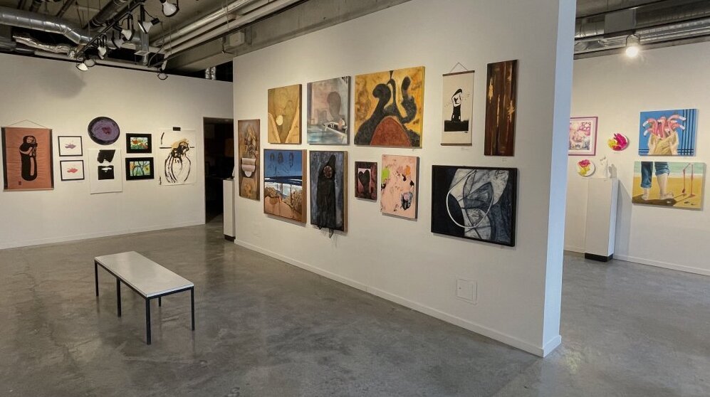
    February has rolled around and it’s time for the The Sex Show at Gallery 1313 – a tradition that now spans decades. Call it the Saint Valentine special. As gallery director Phil Anderson often remarks, the show is a clebration of sex. As usual there were many submissions, around 27 artists represented this year. Its popularity, given the theme, is unsurprising. It is especially popular among younger artists, who are naturally more preoccupied with the subject that their older peers. Although, of course, older artists are represented as well.
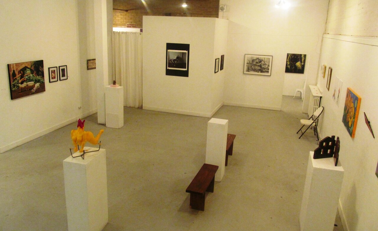
    Installation view of The Sex Show at Gallery 1313

    We live in a society that is, comparatively speaking, relaxed about sex. Still, few of the images and sculptures on display could be called graphic, let alone pornographic. On the whole the material is restrained. There is a fair measure of eroticism, e.g., Amanda Claire’s painting titled “Striptease” featuring a hand delicately holding up ‘a piece of lingerie’, or Brad McDermott’s deftly rendered charcoal drawing of two naked men laying together, titled “Beach House”.
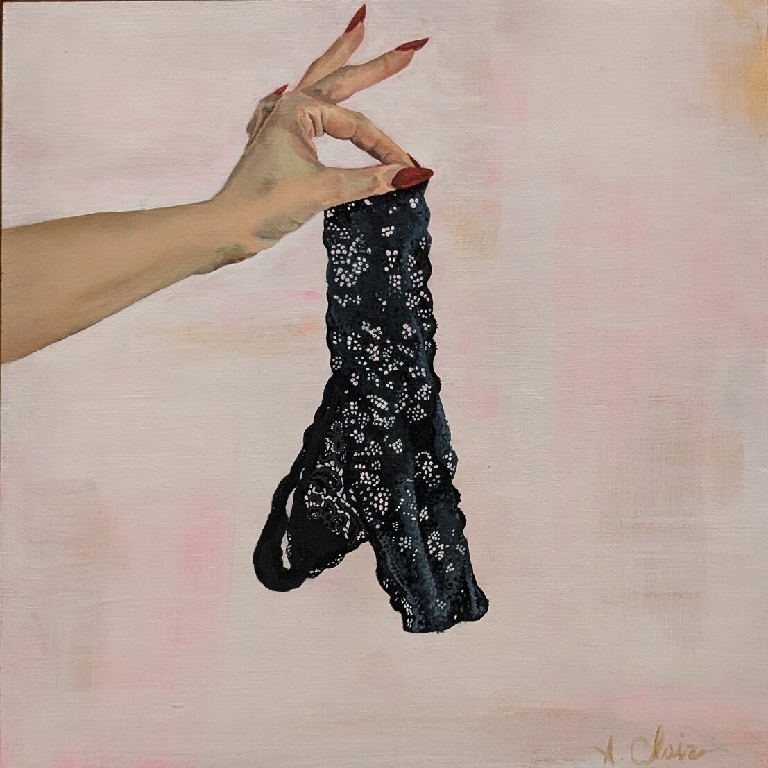
    Amanda Claire, Striptease, acrylic on panel

    Brad McDermott, Beach House, charcoal on paper, 27.5 x 37.5 inches

    Some pieces are playful, even humorous. One image that stands out in particular is Joe Cata’s “Connor & Plant”. A naked young man stands, facing the camera, holding a strategically placed potted plant. Its strength is in large part due to its sheer simplicity. More overtly playful are Viz Saraby’s two delightful companion photographs titled “THRUST” and “Vibrator”. In these images, blurred by motion, the artist brandishes a safety cone! So much is suggested with minimal and the most unexpected props.

    Joe Cata, Connor & Plant, 35mm print on Inkjet, 12 x 12 inches
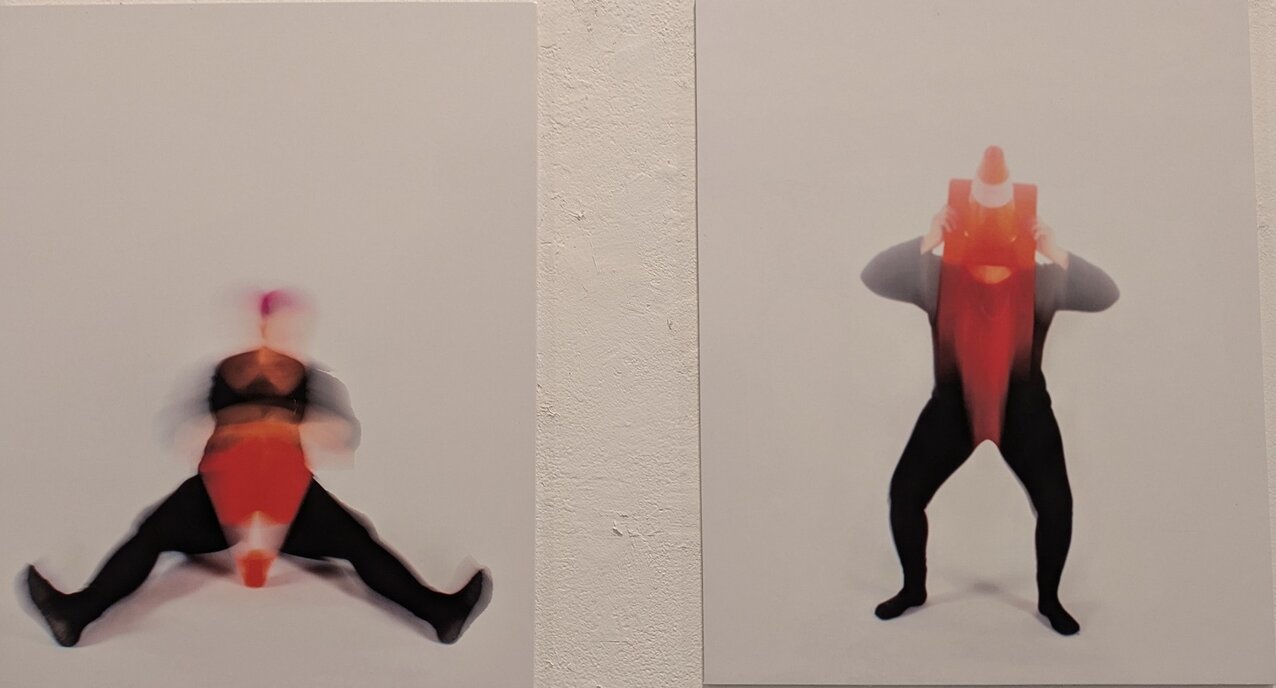
    Viz Saraby, Vibrator (left) and THRUST (right), both digital photograph, 12 x 12 inches

    On the topic of props, these are central features in Kaya Comeau’s two photographs titled “Flesh & Silicone #17” and “Flesh & Silicone #21”. In the former, a semi clad woman sits nonchalantly on a bed, surrounded by various sex toys. Their arrangement is reminiscent of that of weapons and drugs that the police occasionally publish after a raid. Indeed, the image has a slightly menacing air, as if these pleasure tools could be mistaken for instruments of torture. The equally unsettling second image shows a woman seated behind a contraption with a silicone penis at the end. There is something eerily impersonal about these toys, heightened by the women’s detached demeanours. They illustrate the power of sexual pleasure by showing the lengths people go to find ways to obtain this pleasure.

    Kaya Comeau, Flesh & Silicone #17 (left) and Flesh & Silicone #21 (right) both photographs

    Sexual pleasure is banal. It is so commonplace that it is seen as unremarkable. But in the animal kingdom we humans seem to have an oversized appetite for such pleasure. Indeed, we even talk about it as being addictive no less. The lengths to which people heighten this pleasure is demonstrated in Sophia Poland Noetzel’s photograph titled “Shibari”. The title names the Japanese art of binding the body in various ways, especially during sex – what we call in common parlance ‘bondage’. A woman dressed in underwear, a tee shirt and socks is lightly strapped to a folding chair. Her neck arches backwards so that her head is hidden from view.

    On one level this is a literal depiction of mildly kinky sex, but since art is vulnerable to the metaphorical, let me go there. The absence of a sexual partner in this image is disturbing. Is she struggling to escape after a burglary? Of course not. But, the image suggests to me the story of Odysseus, voluntarily strapped to the mast of his ship in order to stop him from making a dash to the deadly sirens on the shore, whose songs, he knows, will overwhelm him with their charm. Likewise, the woman’s pose in Noetzel’s picture suggests her own struggle to contain the draw of sexual pleasure, to regain herself. Because, as is commonly remarked, sex involves losing oneself in a crucial sense – becoming headless, figuratively speaking. Sex is dangerous.

    Sophia Poland Noetzel, Shibari, photo based print, 22 x 25 inches

    Much of the art on display is conceived from the personal perspective, that is, telling one’s story. But of course sex is a universal theme, that in a less secular society than ours is often filtered through a religious point of view. A few of the works do take this point of view. John Nobrega, for instance, plays on the familiar trope of the not-so-chaste nun in his two small paintings.
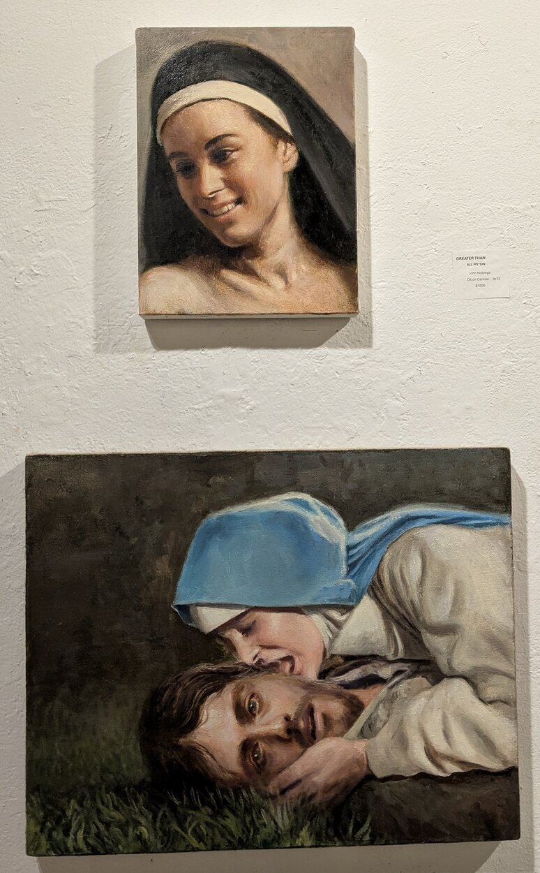
    John Nobrega, Greater Than All My Sin, oil on linen, 9 x 12 inches (top) and How Sweet and Awful Is This Place, oil on canvas,16  x 20 inches (bottom)

    On the other hand, Sandra Franke has chosen to take a more cosmic perspective on sex, leaving the world of flesh to enter the ethereal world of abstraction. Franke’s painting, titled “Sex is the Pivot of All Love” reminds us that to many sex is sacred. It is important to be reminded of this in our secular society, which tends to reduce sex to a bodily function circumscribed by sensual pleasure.

    Sandra Franke, Sex Is the Pivot of All Love, mixed media, 24 x 36 inches

    Finally, another more subtle treatment of the subject is offered by Shannon Wallace. Hanging quietly in a corner is her delectable collage titled “I’m so in”, which features images mined from historical archives of beads, shells and other artefacts that are combined to suggest penetration in some way. The subtlety lies in the fact that none of the imagery is literal, but rather is wonderfully suggestive. Again, it is a decidedly secular perspective, and if I lament anything about this show it is the predominance of it.

    Shannon Wallace, I’m so in, Collage/Marker, 9 x 12 inches

    What religion, and classical mythology in particular, offer is a means of communicating the universal stories that touch on the theme of sex that point to the heart of being human – our moral weaknesses, the limits of our autonomy, love and tragedy, as well as its direct relation to our ability to survive at all. Nonetheless, this show offers a rich selection of artworks that do indeed celebrate sex.

    Hugh Alcock

    Images are courtesy of Gallery 1313.  

    *Exhibition information: The Sex Show, February 5 – 16, 2025, Gallery 1313, 1313 Queen Street West, Toronto. Gallery hours: Wed – Sat 1 – 5 pm, Sun 1 – 4 pm.

  • Eldred Allen at Stephen Bulger Gallery

    Stephen Bulger Gallery presents Scenes From Labrador, a solo exhibition that invites us into the vast and intimate world of Eldred Allen, an Inuk photographer whose work reflects the heartbeat of the land he calls home. His captivating images offer a rare glimpse into Labrador’s wild beauty and cultural richness. This exhibition marks a significant milestone in Allen’s journey as an artist, as it is his first solo show beyond the borders of Newfoundland and Labrador, extending his narrative into new territories.

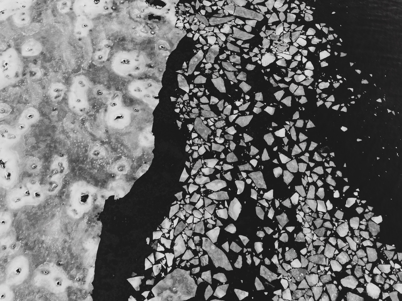
    Eldred Allen, Mine, May 2, 2020, pigment print on archival paper, 30 x 40 inches © Eldred / courtesy of Stephen Bulger Gallery

    For Allen, photography was not initially an art form but a practical tool. In 2018, driven by the needs of his business, he purchased his first camera. What began as a simple means to support his work with drones soon became an unexpected journey of discovery and self-expression. “I didn’t know anything about cameras or photography at the time,” Allen recalls, yet with his camera in hand, he immersed himself in the craft, teaching himself the intricacies of light, composition, and exposure. His passion grew quickly—what was once a tool became a means of telling the story of his life, of his family, and of his land. Through this self-taught exploration, Allen found not only an eye for photography but a deeper connection to his environment and culture as well.

    Eldred Allen, Framed, 2021, pigment print on archival paper, 24 x 18 inches © Eldred / courtesy of Stephen Bulger Gallery

    The works featured in Scenes From Labrador are as varied as the landscape they capture. From sweeping aerial views, where the land stretches endlessly beneath the eye of a drone, to the grounded intimacy of black-and-white portraits of his community, Allen’s photography is filled with the breadth of his world. Each photograph, whether of a tranquil snowmobile ride through the vast Northern terrain or a quiet family moment, carries the weight of personal significance. “A lot of times it’s instinctual,” he shares as he outlines his approach. “I might see a certain composition or light that is really interesting… and it just catches my eye for whatever reason.” His images become vessels for memory, places where the mundane is transformed into something extraordinary—a snapshot of life, love, and heritage.

    Eldred Allen, Tickle, August 23, 2024, pigment print on archival paper, 37½ x 50 inches © Eldred / courtesy of Stephen Bulger Gallery.

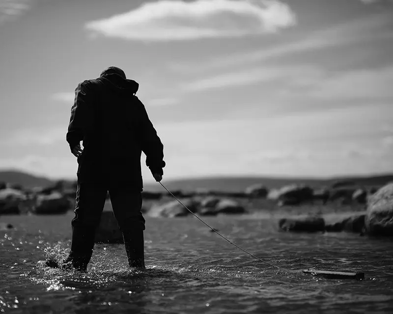
    It is in these quiet moments of daily existence, captured through his lens, that Allen’s true artistic voice emerges. His photography does not only reflect the beauty of Labrador’s landscapes; it honours its people and culture. Documenting the traditions of Inuit life and capturing the landscapes that define the region’s identity has become the heartbeat of his practice. Allen’s work also invites us into the intimate world of his family, connecting us to the deeply personal nature of his work. He said, “It’s me documenting our way of life—fishing, going around on snowmobiles, Inuit culture.”

    Eldred Allen, Childhood, June 26, 2021, pigment print on archival paper flush mounted to Sintra, © Eldred / courtesy of Stephen Bulger Gallery

    The exhibition itself is a celebration of not just Allen’s technical skill but also his deep-rooted connection to his community. As a self-taught photographer, his journey is one of constant evolution. “I’m still learning,” he humbly admits. Yet, it is precisely this ongoing learning, this commitment to continual growth, that makes his work so profoundly moving. It speaks of a place and a people—of landscapes that stretch from the icy waters of the sea to the endless sky above—and yet it also speaks of something deeper: a commitment to preserving those memories, ensuring that the stories of his culture and his family are not lost to time.

    Eldred Allen, Broken Road, 2021, pigment print on archival paper. 37½ x 50 inches © Eldred / courtesy of Stephen Bulger Gallery

    Indeed, Allen’s photography is a window into more than just a physical place. It is a window into the soul of Labrador, into the shared experiences of a community bound by land and heritage. His images are not just photographs—they are stories. They are legacies. His work reflects the landscape of Labrador, but it also the internal terrain of a man in dialogue with the world around him, constantly seeking to understand, to document, and to share. As he explains, “What I enjoy is sharing the images that I create, but I also want people from where I’m from to see them as beautiful as well” Through his lens, he reminds us of the profound beauty in our own backyards, the untold stories hidden in the ordinary, and the power of art to reignite wonder.

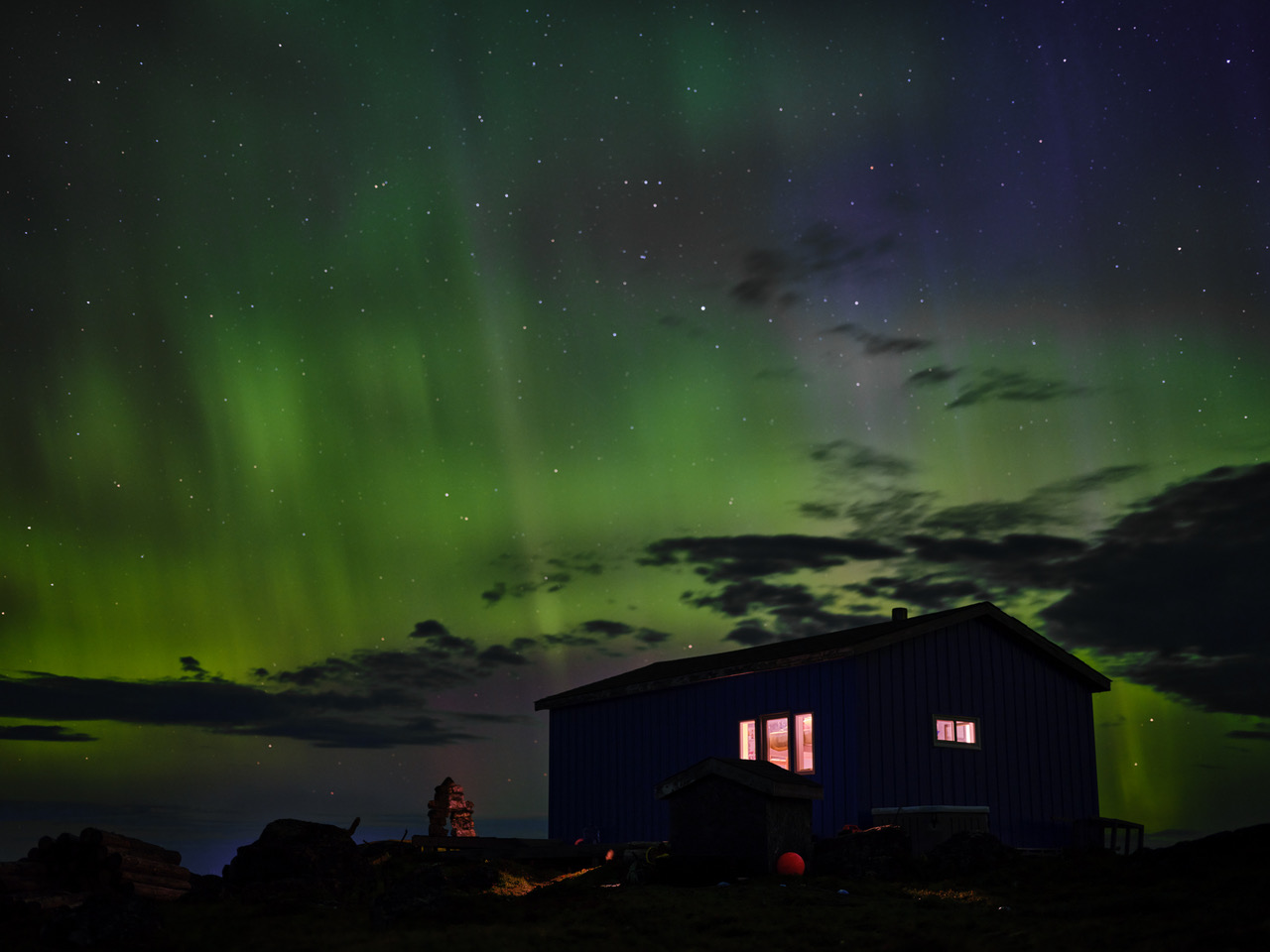
    Eldred Allen, Star Gazing, August 7, 2022, pigment print on archival paper, 28½ x 38 inches © Eldred / courtesy of Stephen Bulger Gallery

    Allen’s Scenes From Labrador challenges us to reconsider our perceptions of the North, to notice the details we often overlook, and to engage with the world through a new lens. It is a call to pause and reflect, to feel something more deeply about the landscapes that shape us. His work teaches us that photography is not just about capturing what we see—it is about capturing what we feel, what we experience, and what we hold dear. For Allen, photography has become a tool not just for recording the world, but for helping others see it as he does—with wonder, with reverence, and with love.

    Yehyun Lee

    *Exhibition information: Eldred Allen, Scenes From Labrador, January 11 – February 22, 2025, Stephen Bulger Gallery, 1356 Dundas Street West, Toronto. Gallery hours: Gallery hours: Tue – Sat 11am – 6 pm.
  • Courtney and Virginia at Insomnia Restaurant

    John Courtney and Jasmine Virginia at Insomnia Restaurant & Lounge

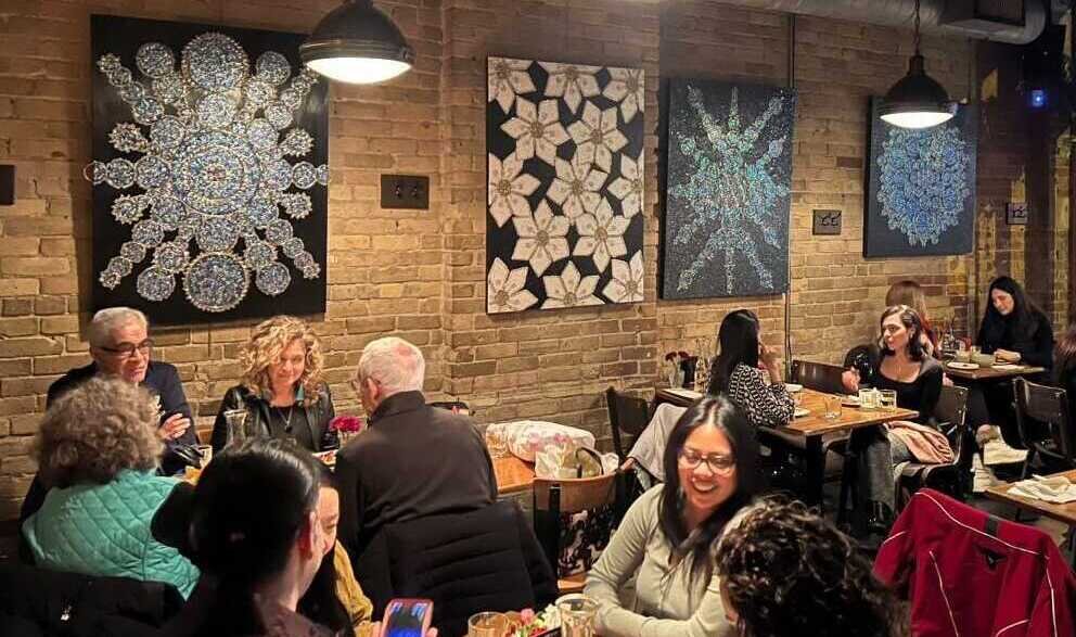
    Art galleries are not the only places to showcase art. There are other beautiful walls that welcome artists to present their work. This year Insomnia Restaurant & Lounge, a long-established restaurant in the Annex, paired their innovative fine dining with an immaculate art event. The restaurant has officially launched its Artist Series, an ongoing celebration of artistry and connection that invites patrons to explore unique works from a variety of talented artists year-round.

    As the restaurant’s walls transform into canvas, guests are invited to immerse themselves in the artwork. The series features rotating exhibits, with artwork displayed on the front, side, and back walls of the restaurant. Guests are welcome to meet the artists during opening and closing parties, get to know about their creative journeys, and purchase artwork anytime during the exhibit.

    Opening night of Jasmine Virginia’s show, February 3, 2025. Photo: Nusrat Papia

    Co-curator Patricia Borsato works with the Artist Series Team at Insomnia, where artists are welcome to introduce their work to the community. For those artists who may be shy or hesitant to discuss their work, or who may be searching for viewers, Insomnia Restaurant is a fantastic place to provide them with a platform. Patricia Borsato is thrilled to have two artists, John Courtney and Jasmine Virginia, showcase their canvases as part of the Artist Series, which aims to unite the community and foster creativity.

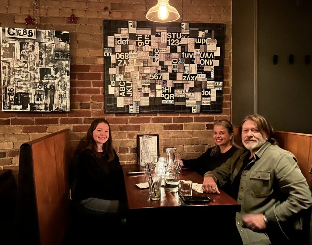
    Jasmine Virginia at her opening party (second left) with her brother (left) and her parents (right) on February 3, 2025

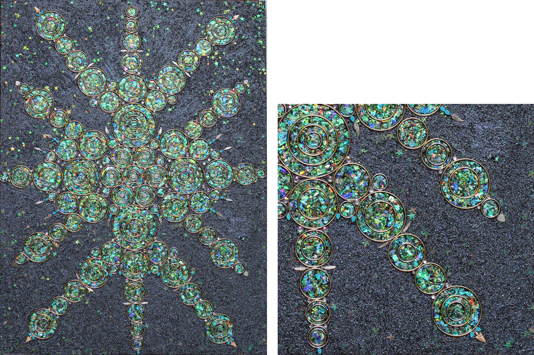
    When community meets art, a profound connection is formed. Jasmine Virginia, through all her canvases perfectly embodies that attachment with spectators at the show. At the fabulous opening night, February 3, 2025, Jasmine Virginia, an Oakville-based artist presented her light filled pieces. Most of the paintings feature black backgrounds with semi precious stones, crystal and antique jewelry, creating iridescent accents that convey the massage of light emerging from darkness. In “Cosmic Cross”, the metal wings and metal bangles embedded with crystal stars, are intended to represent the soul beyond the universe, unearthed from reality and transporting us on a cosmic journey.

    Jasmine Virginia, Cosmic Cross, mixed media, 36 x 48 inches (left) and detail (right). Courtesy of Insomnia Restaurant

    Adjacent to the piece is “Float on Peace”, with white flowers symbolizing peace in the dark, guiding us on a spiritual journey toward enlightenment. Attending the opening day proved to be a great opportunity to discover more artistic treasures, as Jasmine Virginia showcased additional pieces alongside her featured works, treating guests to a richer and more diverse collection. She believes that her art communicates individually with each viewer, conveying unique messages through the language of her five enormous paintings on display. For her, showcasing her artwork in the Insomnia Restaurant is an exciting new experience. She hopes to inspire people to perceive their own light as well as the light of the environment around them. She views this an opportunity to encourage viewers to reflect on life amid the bustle of daily routines

    Jasmine Virginia, Float on Peace, mixed media, 36 x 48 inches (left) and detail (right). Photo: Nusrat Papia

    John Courtney (right front) with his wife and daughter. Courtesy of Insomnia Restaurant

    In contrast, John Courtney’s artwork takes viewers on a journey through time and memory. His handmade, unique pieces reflect on his deeply personal artistic journey, drawing from his life experiences, challenges, and triumphs. By incorporating elements of pop culture, technology, architecture, fashion, art, politics, and music, Courtney creates abstract art that does not have any specific outcome in mind but develops out of his exploration of mixed media, inviting viewers to contemplate their own relationship with the world around them. The pieces C81 and C86 involve certain combinations of letters and numbers are pleasing to the eye and roll off the tongue effortlessly. Music magazine the NME released 3 cassettes in the 80’s, aptly named C81, C83 and C86. Each featured a different emerging genre and highlighted the bands associated with that sound and scene.

    John Courtney, C86 (left), and C81 (right), both acrylic and mixed media on canvas, 24 x 36 inches. Courtesy of Insomnia Restaurant

    The vibrant world of John Courtney’s art, where bold colors and thought-provoking themes come alive, awaits discovery. “Bar Code” and “Big Country” are energetic pieces that explore the intersections of music, consumerism, and everyday life. The striking acrylic and mixed media work “Bar Code” poses a poignant question: “Are you the consumer or being consumed?” Meanwhile, “Decoded” invites contemplation with its intricate grids and dots. This captivating collection awaits at the restaurant. The artist closing party on February 16, 2025 is a great opportunity to meet John Courtney in person.

    John Courtney, Bar Code (left) and Decoded (right), both acrylic, mixed media and paper collage on canvas, 36 x 36 inches. Courtesy of Insomnia Restaurant

    At Insomnia Restaurant, savoring delicious food while surrounded by eye-catching art from diverse artists creates an unforgettable experience. Jasmine Virginia’s radiant pieces invite contemplation on life and light, while John Courtney’s take us back to the past. With a new rotation of artists every five weeks, Insomnia Restaurant offers a unique opportunity to discover and connect with diverse artistic styles, allowing you to find the one that resonates most with you. As patrons enjoy their meals, they’re encouraged to ponder the connections between art, life, and their surroundings.

    Don’t miss this opportunity to merge flavors and art! Reserve a seat and indulge in the intersection of taste, creativity, and self-reflection. Who knows which piece you will fall in love with and want to take home?

    Nusrat Papia

    *Exhibition information: John Courtney, December 16 – February 16, 2025 and Jasmine Virginia, February 3 – March 30, 2025, Insomnia Restaurant & Lounge, 563 Bloor Street West Toronto. Hours: 10 am – 2 am.

  • Heart, Mind, Love at Propeller Art Gallery

    I was fascinated upon entering Heart, Mind, Love, a compelling group exhibition at Propeller Art Gallery that brings together 98 works by 80 artists. This thoughtfully curated exhibition allows viewers to explore the dynamic relationship between emotion and intellect, and offering a reflection on love through diverse artistic expressions. Drawing inspiration from global perspectives, the exhibition highlights the contrast between Western distinctions of heart and mind, Eastern philosophies of their unity, and Indigenous teachings on their profound interconnectedness. Ultimately, Heart, Mind, Love serves as a reminder that love is not merely felt or understood—it is experienced in the spaces between, where emotion and intellect converge to shape the way we connect with ourselves, each other, and the world around us.

    Installation view of Heart, Mind, Love at Propeller Art Gallery

    Upon encountering Lisa Johnson’s “Mother and Child” series, I was immediately drawn into a dialogue between the personal and the universal. The abstract influences in the work allow for an emotional depth that transcends the literal, pulling me into a space where the bond between mother and child is not depicted in traditional forms but instead through dynamic brush strokes and a striking contrast of black and yellow. The dominant use of black paint creates a sense of weight, a sort of grounding force, while the yellow ink, highlighting the heads of the mother and child, feels almost ethereal. It’s as though the love shared between them is radiant, yet it exists within a space defined by the heaviness of life’s responsibilities. This work is not just a reflection of Johnson’s personal experience but also a window into the heart of anyone who has ever grappled with the tension between creative self-expression and the constant presence of responsibility.

    Lisa Johnson, Mother and Child, #7, 1996, ink on paper, 44 x 30 inches (left) and detail (right)

    What struck me from afar was the captivating use of the Fibonacci sequence, or the golden ratio, in David Switzer’s “Sonnet 24, mine eyes hath played the painter”. At first glance, the mathematical precision of the golden ratio in the composition feels almost meditative, a perfect marriage of structure and emotion. I’m immediately drawn to this balance, where the rigidity of mathematics and the fluidity of poetry seem to intersect. The Fibonacci sequence, a universal symbol of harmony in nature, becomes a powerful visual metaphor for Shakespeare’s sonnet, which discusses the way love can be both vast and meticulously composed in an ever-evolving cycle that is bound yet infinite. The presence of the sonnet text as a graphic element adds a layer of depth, urging me to not just read the words but to see them, to feel them in the piece. In that sense, visual poetry emerges as a reminder that Shakespeare’s words are not confined to the page. Switzer’s melding of mathematics and poetry does more than just illustrate Shakespeare’s words—it makes them come alive.

    David Switzer, Sonnet 24, mine eyes hath played the painter, graphite, ink, acrylic inks, inkjet, on archival paper, 13 x 18 inches

    I found Christine Hoeldke’s “Are Those Really Madame Bovary’s Slippers?”, fascinating because its composition merges intimacy, obsession, and the subtle complexity of human desire through Emma Bovary’s character. The sculpture itself exudes an almost haunting beauty, with every detail meticulously rendered. Each ribbon, stitch, and colour thoughtfully chosen to evoke a sense of longing that is present in the novel itself. As someone who holds a deep appreciation for Flaubert’s Madame Bovary (1856), I was especially drawn to the symbolism embedded in this piece. The slippers, intimately associated with Bovary’s tragic yearnings, serve as more than just objects; they become a vessel for the desires and fantasies of those who encounter them. The details in the stitching are remarkable; they speak to the delicate nature of desire itself: fragile, yet complex. These small touches elevate the sculpture from merely a representation of an object into an experience of longing. Confined in the frame, it’s as if the slippers themselves have absorbed the passion, disappointment, and emotional turmoil of those who once touched them—something I felt deeply as I observed them. The slippers truly stand as both a symbol of absence and presence.

    Christine Hoeldke, Are those really Madame Bovary’s slippers?, mixed media, sewing, designing, painting on tai chi shoes, 12 x 8 inches (right) and detail (left)

    MaryLou Hurley’s Miss Delphine was utterly mesmerizing. The sculpture’s exquisite craftsmanship and the depth it seemed to convey, were very intriguing. I stood in front of it for what felt like an eternity, absorbed by the details and the emotional tension embodied in the figure. The combination of materials was very intricate—particularly the use of fine China to adorn the corset and balaclava. What struck me most about Miss Delphine, though, was her pose. Her hand raised in a clear stop gesture while her head was turned away. There’s something incredibly powerful about this simple yet potent movement. At first glance, it might seem like a defensive posture, one of refusal or rejection. But as I lingered, I began to interpret it as something more complex: a quiet yet forceful declaration of agency, a refusal to be consumed or controlled by the gaze of others. It speaks to the internal struggle between the demands of being seen and the desire to protect one’s autonomy.

    MaryLou Hurley, Miss Delphine, mixed media mosaic sculpture, 26 x 20 inches (left) and details

    Samantha Hurley’s Curves is a striking piece with its quiet serenity in the delicate portrayal of a nude woman. The figure, lying calmly with her face turned away, invites the viewer into a space of stillness, where the demands of the outside world fade into the background. Her body, soft and fluid, rests against the stark contrast of the linen fabric, drawing attention to the natural grace of her form. There’s something so peaceful in the way she lies there, as if her body, at rest, is an embodiment of tranquillity. For me, it evoked the essence of womanhood in its purest, most unguarded, form. Yet there is an undeniable tension that Hurley builds into this image, especially when I consider the context of the piece. The backdrop, The Apotheosis of Hercules by François Lemoyne, brings a divine, almost mythological addition to the scene. The juxtaposition between the ordinary, human form of the woman and the monumental, almost otherworldly quality of Hercules, feels significant. It’s as if Hurley is making a statement about how we, as a society, view women and beauty: the woman in the print is unadorned, vulnerable, and still, while the mythological context suggests something grander and more unattainable.

    Samantha Hurley, Curves, fine art print, 16 x 33 inches (left) and detail (right)

    Heart, Mind, Love at Propeller Art Gallery is a profound exploration of the intersection between emotion and intellect, presenting a diverse collection of works that challenge and expand the viewer’s understanding of love, identity, and connection. Through a range of artistic expressions each piece contributes to a broader dialogue about the complexities of human experience. The exhibition ultimately reinforces the idea that love is not confined to sentiment or reason alone, but is found in the balance between the two.

    Kaya Meziane

    Images are courtesy of Propeller Art Gallery

    *Exhibition information: Heart, Mind, Love / Group exhibition, January 22 – February 9, 2025, Propeller Art Gallery, 30 Abell St, Toronto. Gallery hours: Wed – Sat, 1 – 5:30pm, Sun 12 – 4pm.
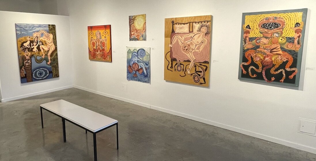
  • Barbara Klunder at Paul Petro

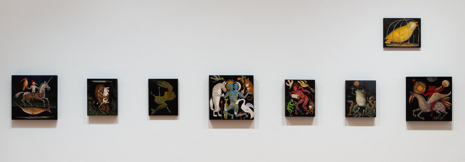
    Fables, folklore, and fairy tales have been used by the earliest humans to make sense of the world, to understand right from wrong, to see good conquer evil, to impart lessons on virtue, or give warnings about the consequences of immorality. The survival of these stories in today’s society through hundreds if not thousands of variations, confirms our longstanding and ongoing search for our own happy ending. Multidisciplinary Toronto artist Barbara Klunder is no exception.

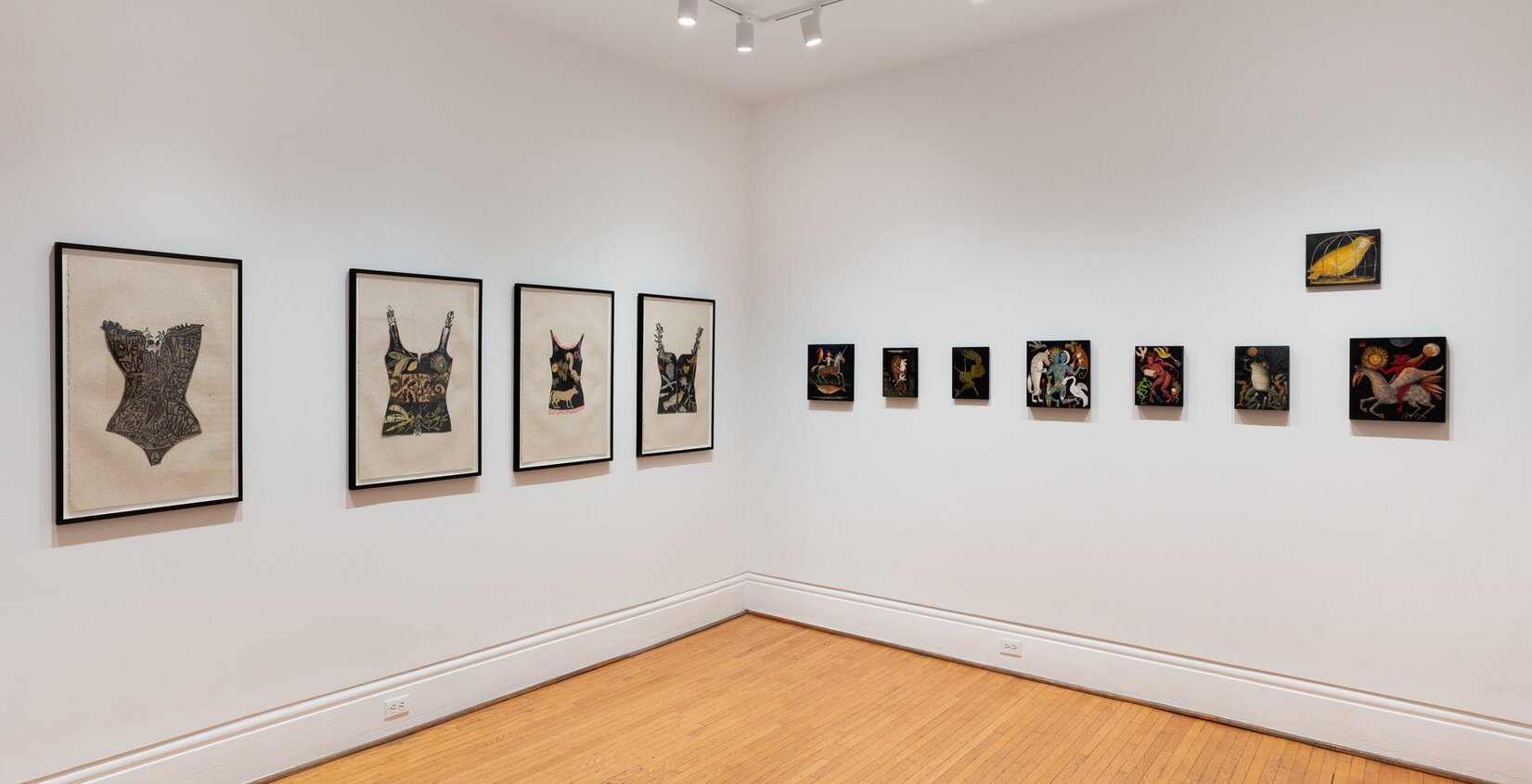
    In the intimate upstairs space at the Paul Petro Contemporary Art, Fables and Tattoos showcases Barbara Klunder’s artworks in different mediums exploring these various themes. Though small in their quantity, the work is formidable nonetheless in its messaging. With a background in graphic design and illustration, Klunder effortlessly tells perplexing stories of tragedy, beauty, and resilience.

    Installation view of Barbara Klunder, Fables and Tattoos, 2025

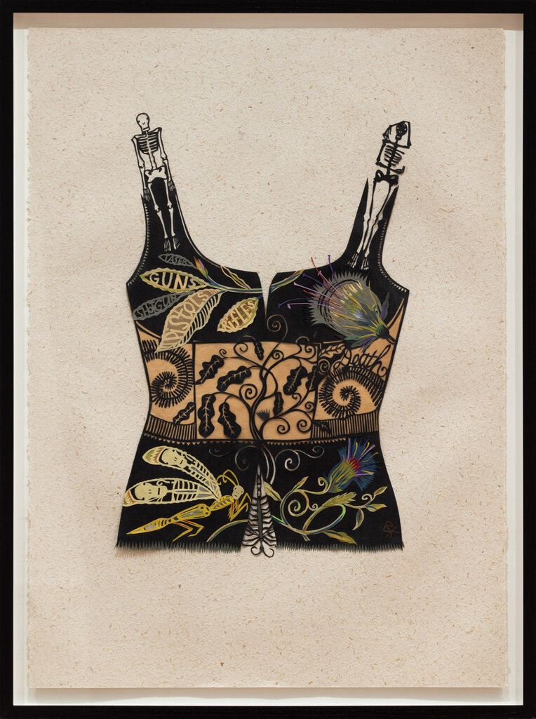
    First debuted in 2013 at David Kaye Gallery, Toronto, BulletProof Vests is a collection of colourful papercut collages, made using hand-crafted washi paper. Packed with intricate detail and symbolism, Vests reflects on gun culture and violence that, Klunder suggests, affects not just humans, but creatures of all kinds. A plethora of exotic plants and vines weave amid skulls, birds, fish, insects, and other animals in each of the papercut vests. Looking closer, you will see seamlessly embedded within and in between the animals and plants, words of warning and activism. For instance, in Shotguns, the words “laser”, “guns”, “rifles” become part of the leaves of a plant, whereas phrases like “violence is hate”, “an idea can’t be killed” decorate the vest titled Play Music, Not War.
    Barbara Klunder, Shotguns from BulletProof Vests, 2013, paper-cut and collage, 29 ½ x 21 ¼ inches

    The choice to use paper—a flimsy, fragile material—to create representations of bullet proof vests—stable and tough—harks back to the basic good-versus-evil in fables. Beauty, nature, and our voices can serve as protection in the fight against violence and death. While the pieces are packed with meticulous detail and colour, it never seems convoluted; everything has its place and adds to the composition overall, a testament to Klunder’s eye for design.

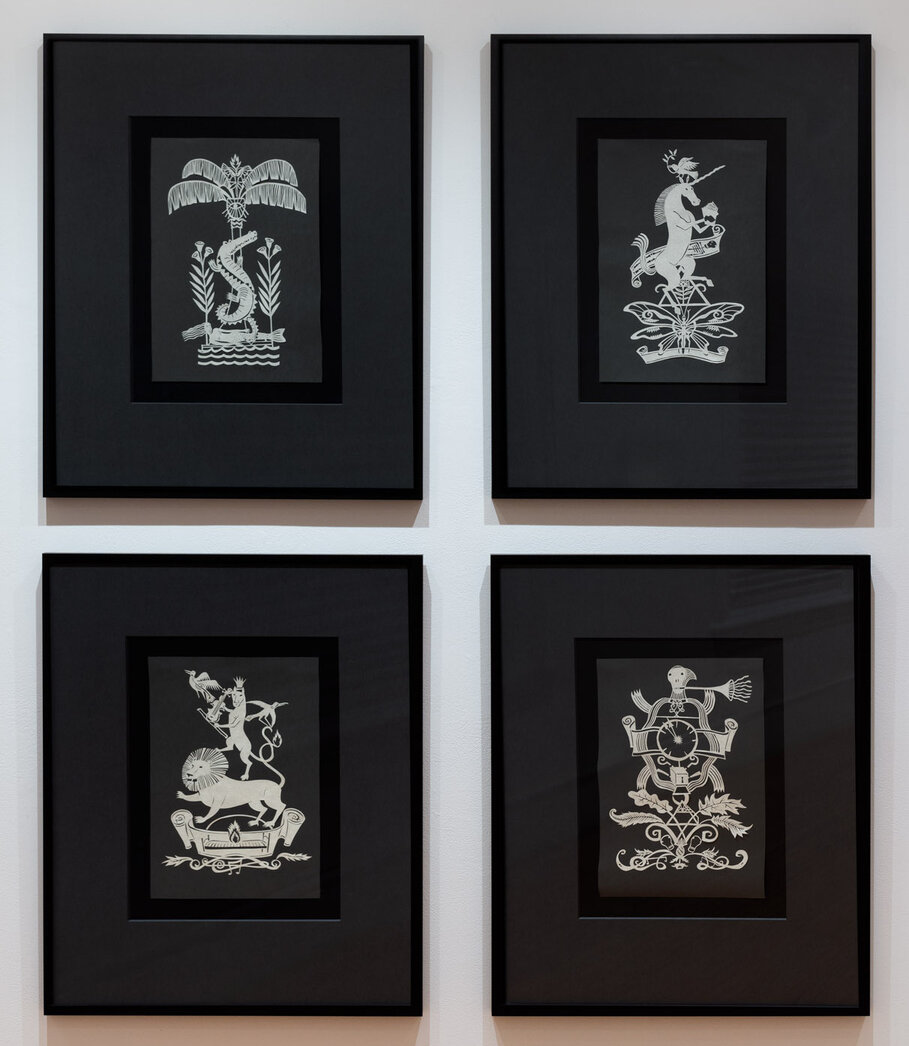
    Her skill with design and illustration really comes out full force in the other papercut collection of tattoo designs. Inspired by the imagery in Canadian poet Gwendolyn MacEwan’s writings, Klunder created four papercuts of nature scenes, recalling the historical purpose of tattoos as a way to brandish your loyalties to outsiders and enemies. These artworks are symmetrical and balanced, akin to medieval coats of arms, but otherwise, very modern in line and form.

    Installation view of Barbara Klunder, Fables and Tattoos, 2025,

    Medieval fables and folklore are more specifically referenced in the new collection of small gouache on wood paintings. In the artist’s statement, Klunder mentions Hieronymus Bosch as inspiration. He was a Renaissance painter, also using wood as a canvas, whose works are highly imaginative, complicated, bustling scenes rich in symbolism and allegory. The connection between the art of Bosch and Klunder’s art is quite obvious, though Klunder’s works aren’t just a rehashing of medieval paintings or fables. Instead, she combines different elements from familiar stories into one image, revealing something new about them, and bringing these historical folktales into the 21st century.

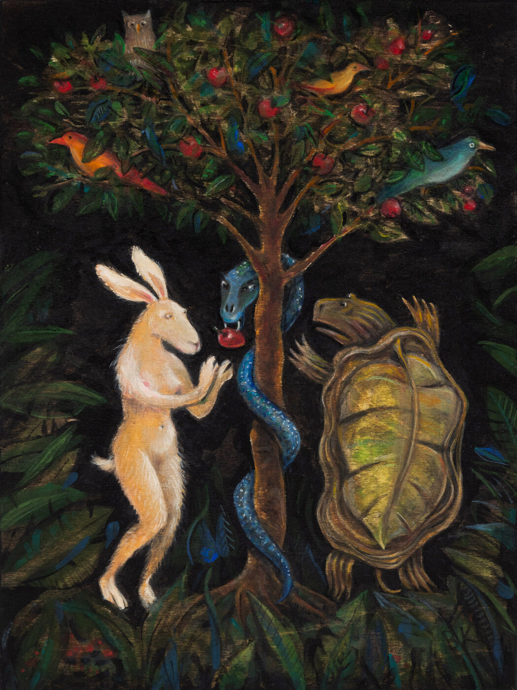
    In one of the paintings, the figures of Adam and Eve are replaced by the Tortoise and the Hare, a fable about a race between characters of unequal abilities, where trickery instead of perseverance and grit, was used to prevail and gain power over the stronger opponent. Klunder’s interpretation suggests the inequality between Adam and Eve, between man and woman, and the manipulation of Eve to commit the original sin.

    Barbara Klunder, Adam & Eve / Tortoise & Hare, 2024, gouache on wood, 12 x 9 inches

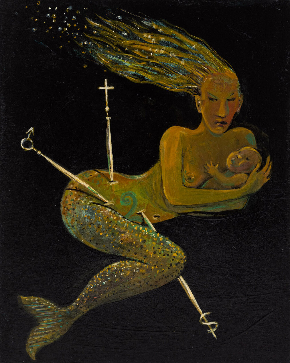
    In another piece, the Little Mermaid cradles an infant in her arms, while three swords pierce her body. Each pommel on the hilt of swords displays a symbol: there’s Mars symbol of the male gender, a crucifix, and a serpent. The three swords is a reference to the tarot deck in which the Three of Swords represents pain, sorrow, and betrayal. One can discern that this painting is about the hurtful aspects of motherhood that come from the patriarchy and religion, and also how humans hurt the environment and its creatures.

    Barbara Klunder, The Little Mermaid / 3 of Swords, 2024, gouache on wood, 10 x 8 inches

    In her gouache paintings, instead of an expansive and fantastical backdrop like Bosch, Klunder opts for a more simplistic and dark background, drawing attention to the various characters and symbols. The darkness adds an element of surrealism and a tinge of foreboding.

    Installation view of Barbara Klunder, Fables and Tattoos, 2025

    You could spend hours scrutinizing each painting or papercut in this exhibition, extrapolating many meanings and contradictions, and still feel like there is something more to find. Klunder doesn’t use art just for personal expression, but to tell stories, and furthermore, to expose the stories we, as a society, tell ourselves.

    Rebekah Barona

    Images are courtesy of Paul Petro Contemporary Art.

    *Exhibition information: Barbara Klunder, Fables and Tattoos, January 17 – February 22, 2025, Paul Petro Contemporary Art, 980 Queen Street W, Toronto. Gallery hours: Wed – Sat, 11 am – 5 pm.

  • Light Years: The Phil Lind Gift at the AGO

    The late Phil Lind (1943-2023) leaves behind a legacy in business, philanthropy, and art, all of which have contributed to a revitalization of Canadian culture. The AGO showcases Lind’s innovative legacy as a significant figure in the media business and art world through Light Years: The Phil Lind Gift. In all, the exhibition allows Canadians to explore the intersection of Lind’s passions in technology, politics and art through his collection. The exhibition showcases 37 pieces from the Phil Lind Gift, along with various artworks previously donated to the AGO by the former board trustee. This exhibition displays a variety of mediums, from the photographs of the Vancouver School and General Idea to the paintings and sculptures of Philip Guston, Thomas Demand, Ai Weiwei, Antony Gormley, Laurie Simmons, and Wolfgang Tillmans. Light Years: The Phil Lind Gift engages with the question of where man exists in the reality of our merging digital and physical worlds, serving as a reflection of Lind’s career, art collection and life.

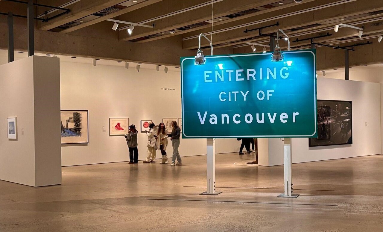
    Installation view with Ron Terada, City of Vancouver,2002, 3m reflective highway vinyl, extruded aluminum, industrial lights, galvanized steel, and wood (right). Photo: Antonella Pecora Ruiz

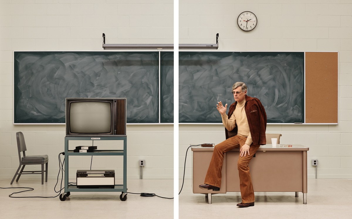
    Lind began collecting due to his personal and familiar connection to British Columbia. An homage to Lind’s connection to BC is made through the imposing Ron Terada sculpture “City of Vancouver” which has been placed at the heart of this exhibition. Moreover, some of Lind’s first acquisitions were those of the Vancouver School artists such as Stan Douglas, Ron Terada, Rodney Graham, and Jeff Wall. The convergence of media and art is first explored in Rodney Graham’s “Media Studies ’77” (2016). This work captures the passage of time by including obsolete technology in a setting reminiscent of the past. Graham himself is disguised as a 70s-era professor, a period that aligns closely with the technological evolution Lind experienced throughout his career at Rogers and in television. Graham’s reflection on the past emphasizes the technological advancements that have influenced the shift in artistic mediums. An example that Lind, a long-time collector, would likely recognize is the way photographs from the Vancouver School are now displayed in their signature and modern lightboxes.

    Rodney Graham, Media Studies ’77, 2016. Two painted aluminum lightboxes with transmounted chromogenic transparencies, each panel: 232.2 × 182 × 17.8 cm; installed: 232.2 × 376 × 17.8 cm. Art Gallery of Ontario, Gift of the Estate of Philip B. Lind, 2024. 2024/48. © Estate of Rodney Graham. Image courtesy Lisson Gallery.

    Similarly, Jeff Wall’s photographs reflect the history of technology. The works in Lind’s collection showcase a combination of modern and ancient societal elements. “Basin in Rome 1” (2004) focuses on capturing an ancient Roman water basin and part of a car in the same scene.

    Jeff Wall, Basin in Rome I, 2004, photography, transparency in lightbox, 16 5/8 x 16 5/8 x 5 3/8 inches.

    “Steves Farm, Stevenson” (1980) depicts rows of modern housing next to a dilapidated farm where goats roam freely.

    Jeff Wall, Steves Farm, Steveston, 1980. Photography, transparency in lightbox, 22 7/8 × 90 inches.

    Both artists raise important questions about man’s and nature’s place in the modern world through their inclusion of undeveloped greenspaces and outdated technology which has guided us toward development.

    The political commentary of William Eggleston, Thomas Demand, Philip Guston, and William Kentridge offers insights into crucial global issues that have shaped the liberal world we live in. Eggleston’s photograph “Untitled (Sumner, Mississippi, Cassidy Bayou in Background)”, taken around 1970, features two men— one black and one white— with the former shadowing the latter. This tableau-like scene highlights its historical context, taking place shortly after the repeal of Jim Crow laws in the state. However, upon reflecting on Eggleston’s portrayal, we are compelled to confront the ongoing challenges of racism and anti-Black violence that persist today and require further development to eliminate.

    William Eggleston, Untitled (Sumner, Mississippi, Cassidy Bayou in Background), 1971, printed 1999, dye transfer print, image: 14 1/2 x 21 7/8 in.

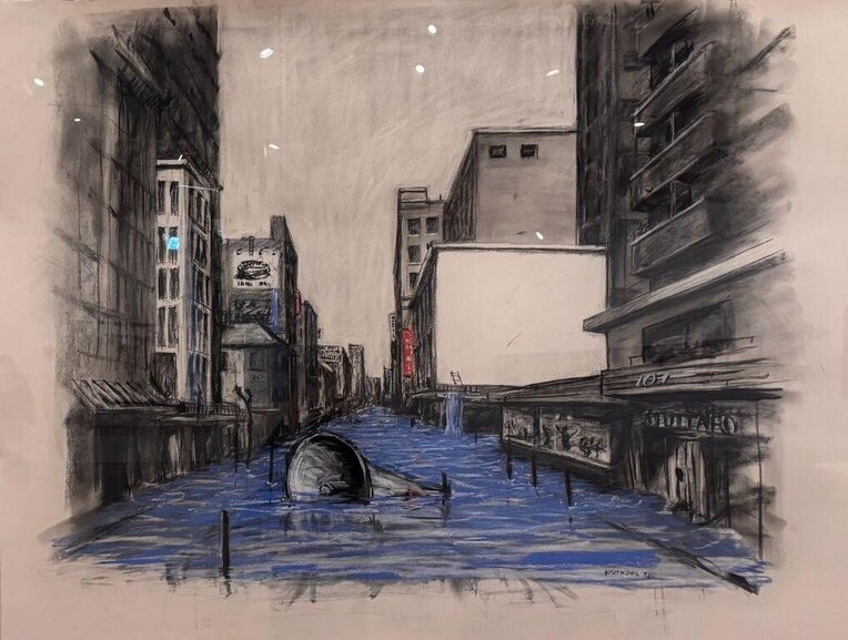
    William Kentridge’s “Drawing for Another Country (Flooded Streets)” (1994) provides commentary on apartheid South Africa. Kentridge made this charcoal and pastel drawing shortly after the end of apartheid, a system of racial segregation which lasted from 1948 to 1994. The artwork features a city street partially submerged, with an immersed slave bell which has been used to control enslaved Africans in the Cape Colony. However, its deteriorated condition signifies the impact which the spread of modern values, such as equality, has had in shaping today’s world. The drawing’s commentary is elevated by Kentridge’s signature style of smudges and erasures, reflecting a sense of restlessness and the need for revision. Both works attest to the fact that revolutions and protests are means for development and that they continue into the present time, making for another perspective on the question Lind’s collection explores.

    William Kentridge, Drawing for Another Country (Flooded Streets), 1994, charcoal and pastel on paper.

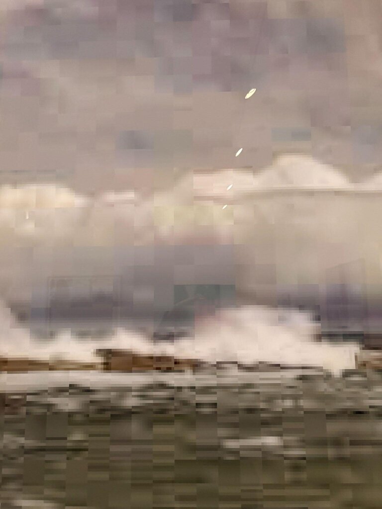
    Lastly, Thomas Ruff’s chromogenic print, “jpeg gs02” (2007) attracted the most attention; many gathered around it, trying to understand the pixelated appearance of the shore landscape. To create such works, Ruff finds low-resolution images on the internet, seeking to comment on those digital images that animate our everyday lives. In observing Ruff’s “jpeg gs02”, Phil Lind’s meticulous artistic collector’s vision becomes clear, as each of his acquisitions convey both individual and shared perspectives exploring the relationship between the digital and physical worlds that construct the modern day. Light Years: The Phil Lind Gift highlights how Phil Lind’s life, interests, and career have significantly influenced this exploration.

    Thomas Ruff, jpeg jpeg gs02, 2007, chromogenic print with Diasec.

    Antonella Pecora Ruiz

    *Exhibition information: Light Years: The Phil Lind Gift, November 5, 2024 – November 2, 2025, Art Gallery of Ontario, 317 Dundas Street West, Toronto. Museum hours: Tue, Thurs 10: 30 am – 5 pm, Wed – Fri 10:30 am – 9 pm, Sat, Sun 10:30 am – 5:30 pm

  • Ceal Floyer: ‘Til I Get It Right at MOCA

    Conceptual artist Ceal Floyer is known for taking everyday situations and familiar objects, and reconfiguring them to achieve a sense of the absurd, alter our perceptions, or more simply, elicit a profound emotional response as is the case for her sound installation ‘Til I Get It Right.

    First shown at dOCUMENTA (13), Germany in 2012, the piece is currently in the Museum of Contemporary Art as part of their ongoing South Stairwell Sound Series. The sound installation itself is surprisingly straightforward. Floyer takes a short clip from a famous country song by Tammy Wynette from 1972 with the lyrics: “So I’ll just keep on falling in love ‘til I get it right”, and edits out the phrase “falling in love”, allowing the listener to insert their own feelings, anxieties, and meaning onto the phrase. Set to loop indefinitely like a record player needle stuck in a faulty groove of a vinyl, the installation is burrowed within a stairwell of the MOCA, a place of transition and movement. As visitors walk through, in between destinations, the sound echoes through the space; an earworm, a repeated mantra that sticks with you even long after you’ve left. Floyer’s simple rephrasing of a song lyrics invites listeners into a personal introspection on failure, yet persistence.

    Rebekah Barona

    *Exhibition information: Ceal Floyer, ‘Til I Get it Right, September 8, 2024 – February 23, 2025, Museum of Contemporary Art, 158 Sterling Rd, Toronto. Museum hours: Wed – Thu & Sat – Sun 11 am – 6 pm; Fri 11 am – 9 pm.

  • Rae Johnson at Christopher Cutts

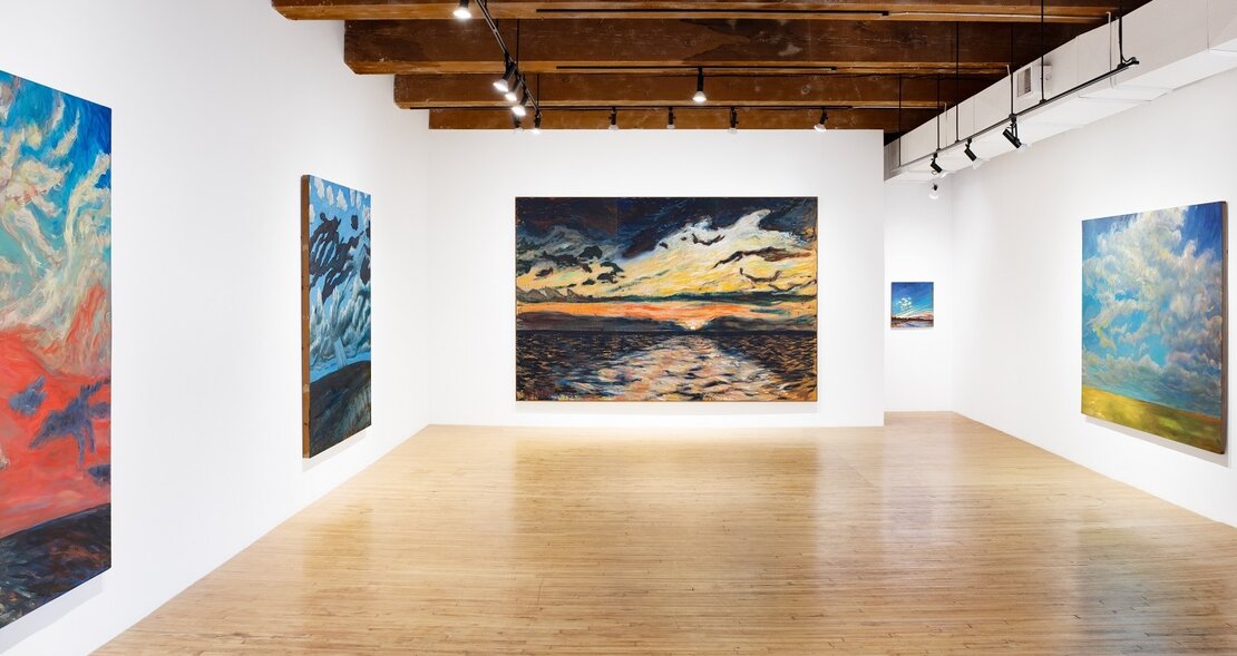
    The current display at Christopher Cutts Gallery is the second part of a show of the late painter Rae Johnson’s work. The first instalment, titled Angels and Monsters, featured her early figurative work. Staged in the middle of the COVID pandemic viewings were limited to by appointment. Johnson was very ill at the time, and died barely a month after the show closed. That was close to five years ago now. So in a real sense this is only nominally the second part of a show. But the hiatus is fitting, given that this gap in time reflects the radical shift in themes that separates her later nature-based work from that done earlier in her career.   

    Installation view of Of Light and Darkness: Water, Land and Sky Paintings 1988-2008 at Christopher Cutts Gallery

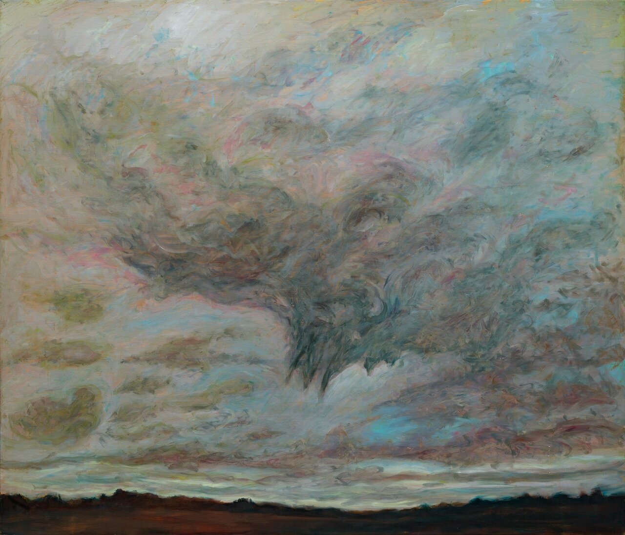
    The contrast is stark. Her early urban-based work features denizens of artificially lit interiors, especially bars and domestic rooms. These later paintings feature elemental landscapes with nary a soul in sight. There is, naturally, a continuity in her signature style across these bodies of work. But the change was radical enough that at the time she worried that the public would reject her new landscapes. After all, she was enjoying much success. But her worries were allayed. As is evidenced in the selection of landscapes on display here, her new paintings were, superficially at least, anodyne in comparison to her often disturbing quasi-punk urban-based work.

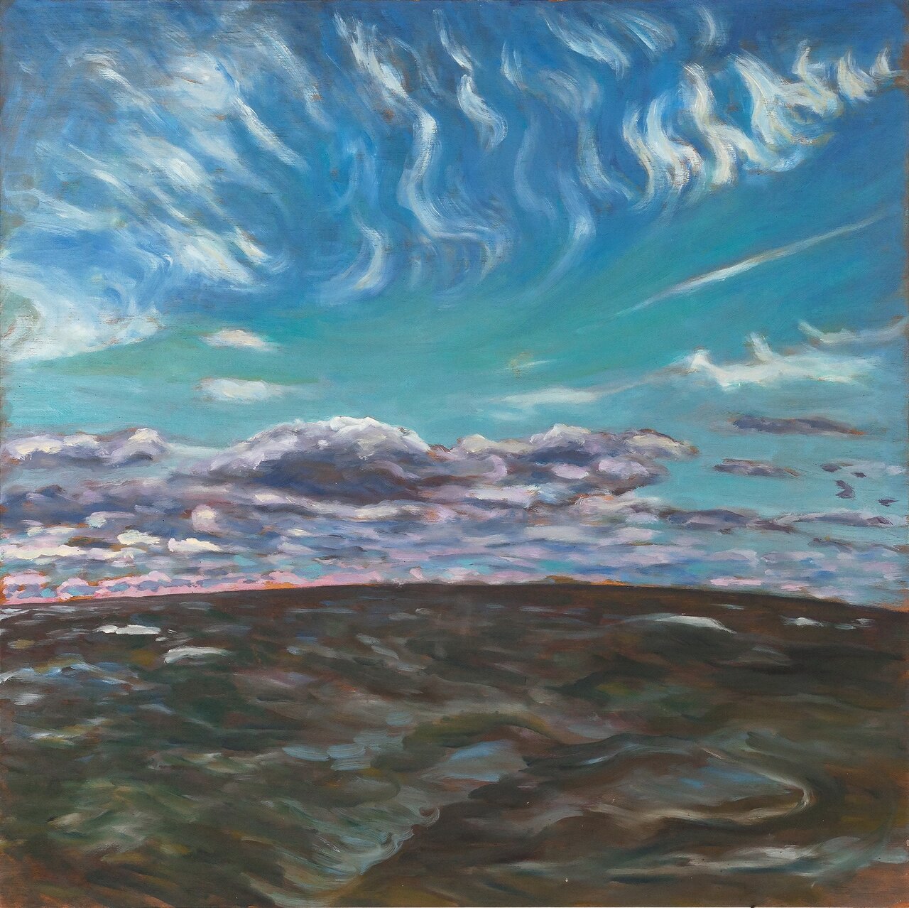
    Lake Winnipeg, 1995, oil on board, 24 x 24 , inches

    But, just as there is a dichotomous tension in her earlier work, so there is in her ‘nature paintings’, as she preferred to call her landscapes. Hence the show’s title Of Light and Darkness. An abiding preoccupation in her work is the blurring between the physical and the psychical. Influenced by the writings of Carl Jung, Johnson came to feel that the difference between these two metaphysical categories is largely illusory. They are aspects of a single reality. And indeed, looking at these paintings one gets the sense that they each represent an interior psychic landscape projected onto an outside world. One might describe her work as ‘spiritual’, and in general it is imbued with a religiosity.

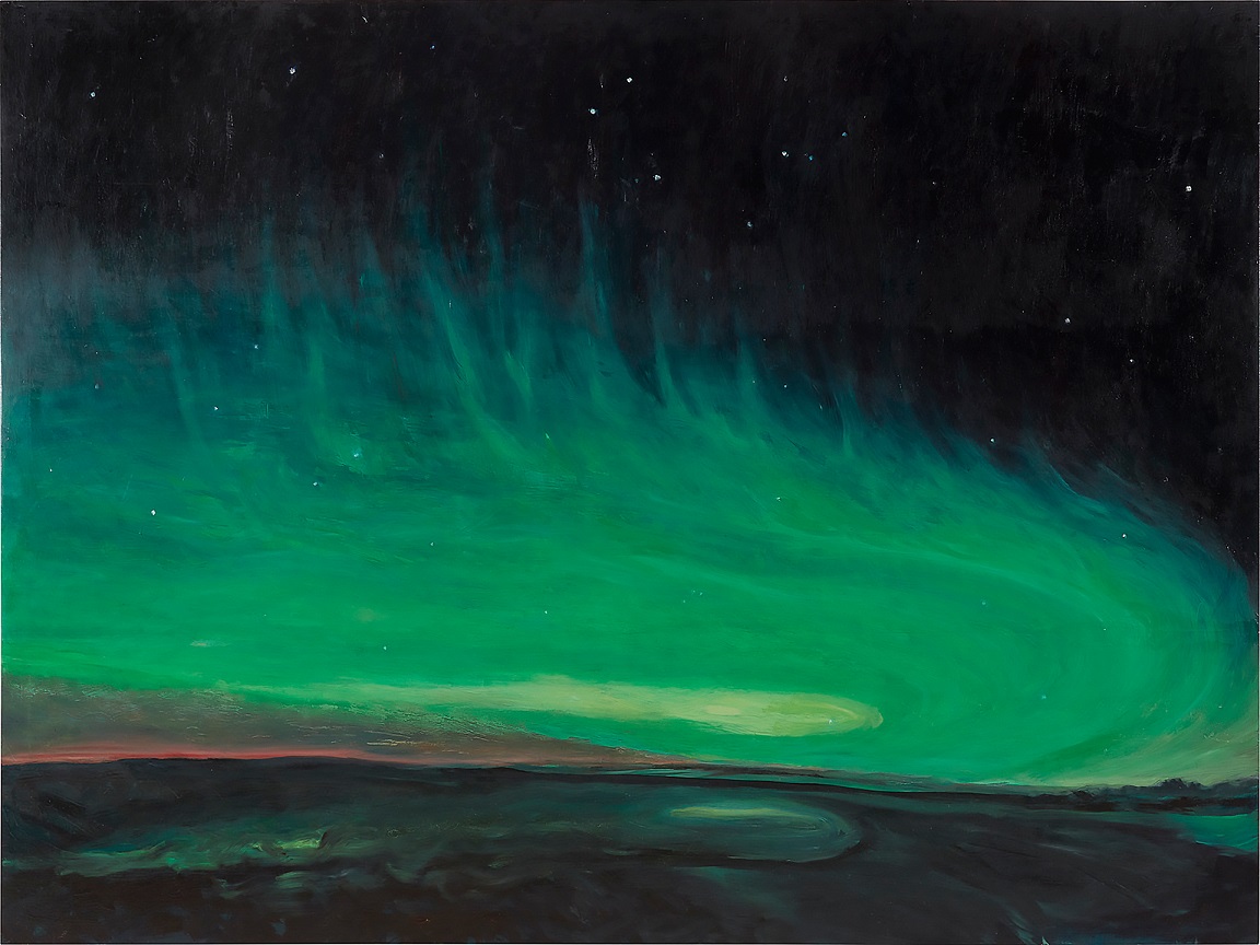
    Aurora Green Swoop, 2009, oil on board, 76 x 96 inches

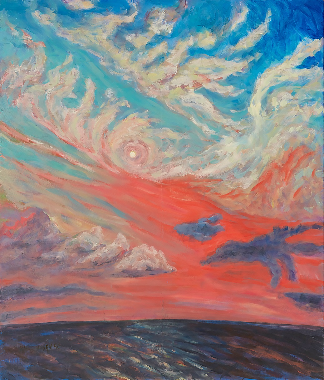
    Ironically, while her landscapes betray an inner psychical world, they are based on close observation of nature. Crucially, however, it is the light that interested her the most. She wrote: ‘They are observations of the cycle of light and darkness, the movement of the wind and the elements over the sky, earth, and water’. Indeed, rarely did she depict details in nature. In these paintings trees are most often rendered as dark clumps on the distant horizon. Her focus, rather, is on the timeless qualities of nature that belong to the elements. She compared her paintings with musical compositions, and saw them as such primarily as expressions of emotion, i.e., her feelings. Her incessant study of nature – sometimes daily paintings of her pond or Lake Winnipeg – are in essence études using the visual notes of natural light and colour, from which she composed these larger paintings.   

    Firebird, Lake Winnipeg, 1998, oil on panel, 84 x 72 inches

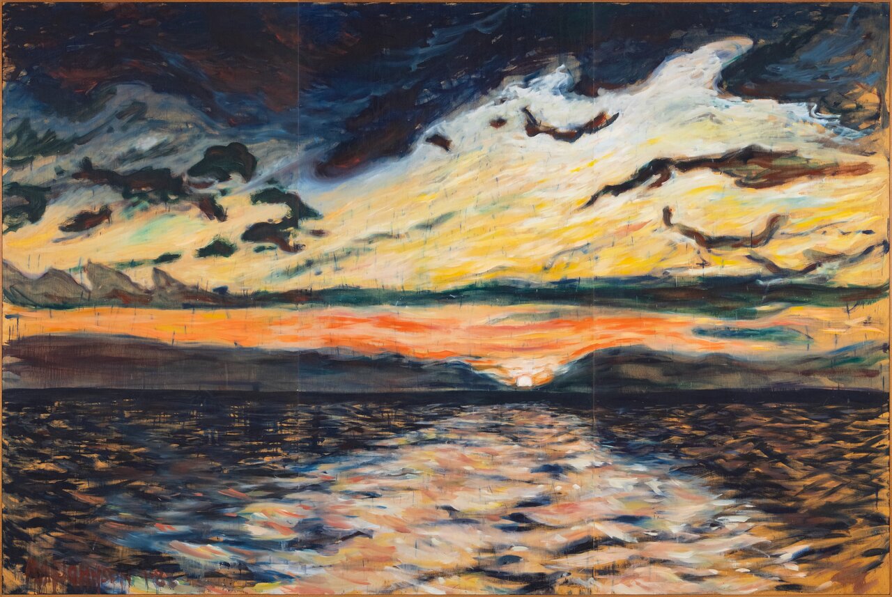
    Many of the paintings on display are large indeed, measuring up to twelve feet in length. Her bold signature at times spans nearly two feet, but remains inconspicuous because of the work’s sheer size. The scale reflects the physicality of her work. She describes how she would climb a ladder to reach, and on occasion attach large painter’s brushes to sticks in order to be able to stand back and see the whole painting while working on it. And always there is an urgency in her brushstrokes, as if there was too little time for her to capture what she wanted to express. Heraclitean at heart, Johnson saw the world as in constant flux; hence her fascination with nature in its elemental forms – sky, and water and land, which are both treated as a dappled screen, brushed by everchanging winds, and upon which light filtered by clouds flickers. Hers was an almost crazed desire to capture these ephemeral phenomena, fix them in static paint. It is this desire that betrays the feeling of urgency in her brushwork. The scale accentuates this feeling, makes it real.

    Sunset, Lake Winnipeg, 1988, oil on wood, 96 x 144 inches

    The skies, which are predominant in these landscapes, are populated with fantastical cloud formations – sometimes reminiscent of a spider’s web, and at other times of a battleship. All seem dream-born, and yet still plausible somehow. It is as if she is depicting the gods shapeshifting in the guise of clouds – there as the menacing clouds in her “Selkirk Tornadoes”, Jupiter sits, ready to smite. It reveals Johnson’s awe of nature, its sublimity. She saw through the physical phenomena in nature to its eternal, dare one say divine, underpinnings. And the nature she depicts is both redemptive and cruel. Its darker side is also evident in these landscapes, all of which links to our inner psychical worlds.

    Selkirk Tornadoes, 2007, oil on board, 72 x 84 inches

    What is still so refreshing about Johnson’s work is its honesty, its sheer immediacy. There is not a hint of intellectual conceit in her work. She once described how she was inside her painting while working on it. That is the right metaphor. One could imagine her still momentarily residing there, behind those vaporous clouds.

    Hugh Alcock

    Images are courtesy of Christopher Cutts Gallery.

    *Exhibition information: Rae Johnson, Of Light and Darkness: Water, Land and Sky Paintings 1988-2008, January 11 – 25, 2025, Christopher Cutts Gallery, 21 Morrow Ave, Toronto. Gallery hours: Tue – Sat 10 am – 6 pm.

  • Hannah Doucet: Exiting the Castle at Gallery 44

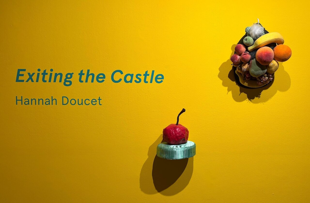
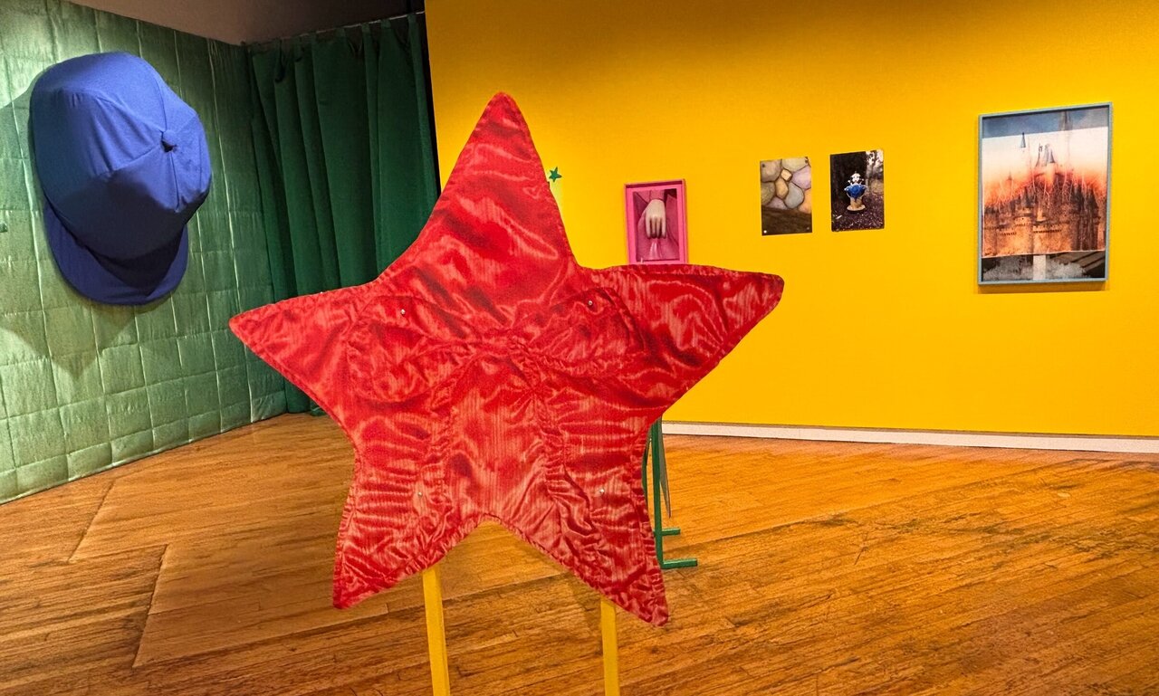
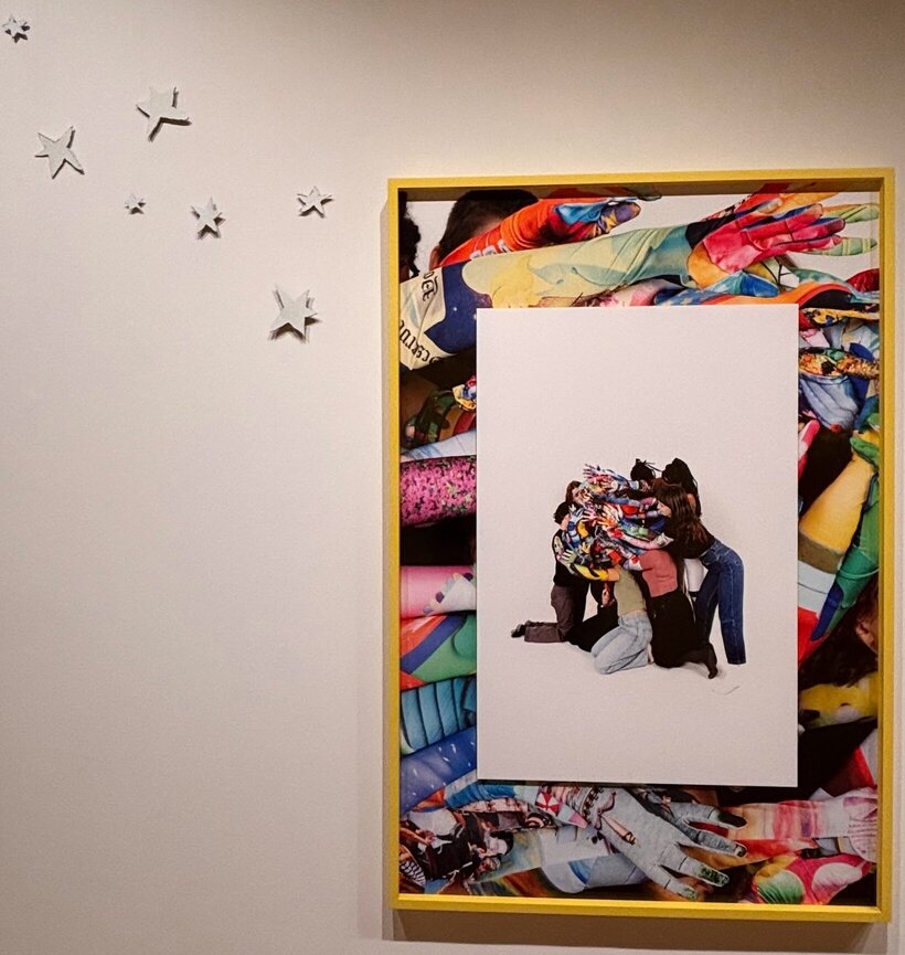
    Upon entering Hannah Doucet’s Exiting the Castle at Gallery 44, one becomes filled with a longing nostalgia for one’s childhood playrooms. A sprawling pile of colourful rubber wands and sparkling fruit, set against a glowing yellow wall, creates a striking first impression. Above are silver stars reminiscent of the ones your parents may have stuck to your ceiling so you could go to bed and not face the monster beneath it. Large plastic stars rise from the ground, each wrapped in photos of layered, vibrant fabric. Similarly, the gloves reaching out from the wall depict images of cartoons, flowers, and toys – symbols of innocence. The finishing touch is a comically large blue baseball hat hanging off a pastel green wall, accompanied by some more sparkly fruit. The scene created by Doucet evokes the pure joy, hopefulness and carefree spirit of childhood.

    Artistically speaking, the exhibition showcases Doucet’s unique approach to mixed media, highlighting the medium preferred by the artist as a balance between craft and photography. Every detail collaborates with the other, bringing Doucet’s fantasy world to Gallery 44. I found Doucet’s choice to use oversized fruits and colourfully printed gloves to be a way of transforming one’s physical body into that of a child, both in size and in spirit. Evidently, Doucet has meticulously created a “constructed fantasy” of her own.

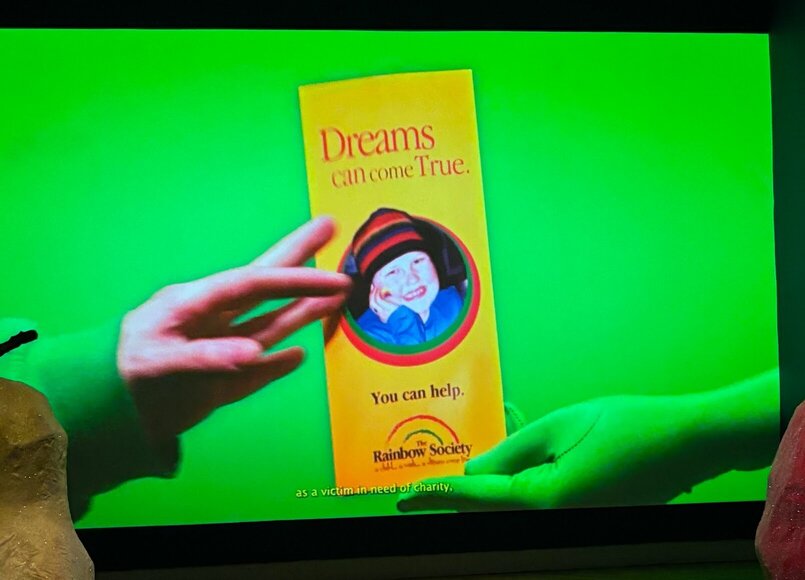
    Along the wall, there are arbitrarily framed stills from the artist’s film, “Wishmaking™”– the missing puzzle piece of context amidst this playroom. The film stills presented in Exiting the Castle illustrate Doucet’s return to the Give Kids The World Village, a non-profit organization that provides week-long wish vacations for critically ill children and their families. As a part of her exploration of using personal narrative in her art, Doucet reflects on her experience of having received a wish trip to Disney World and her stay at Give Kids The World Village when she was ten, following two years of treatment for lymphoma. Notably, she points out that half of the children who qualify for this experience wish to visit one of the many theme parks of Central Florida – a familiar and common wish that Doucet exposes to be much like her exhibition, a constructed fantasy.

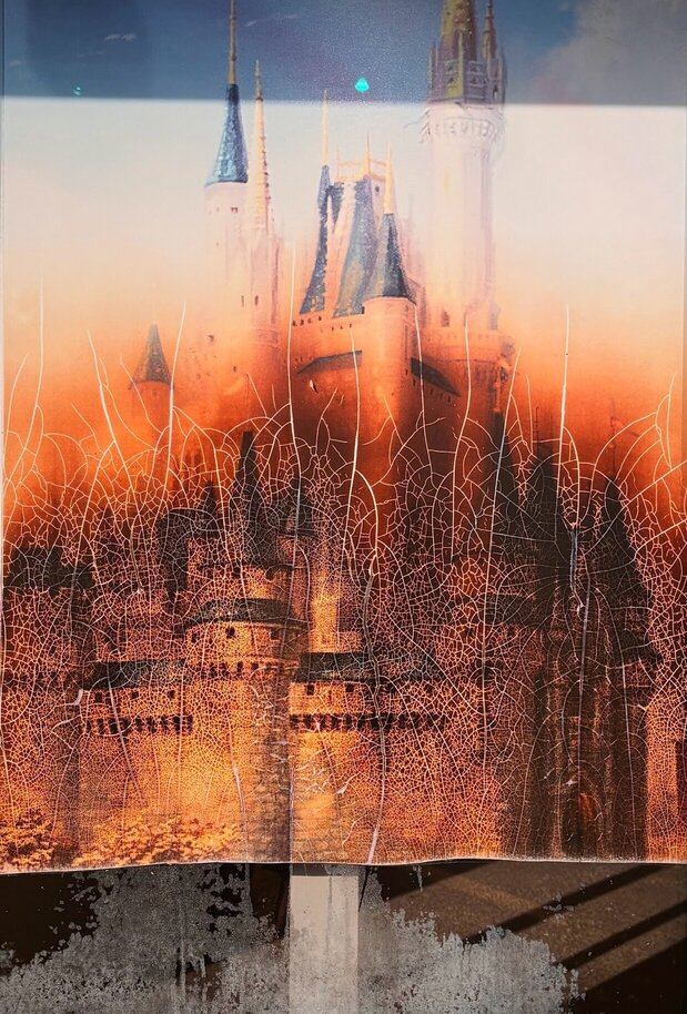
    Upon closer examination, some of these photographs reveal off-putting aspects in notably enchanting figures and locations. The images now seem out of place in the playroom, as the structures photographed, which date back to the early ’90s, have lost their charm over time and with the context that Doucet’s “Wishmaking™” provides. For instance, a poster displayed in a Florida storefront appears out of place in the “whimsical” exhibition, as it bluntly showcases a fractured poster of a castle reminiscent of Cinderella’s Castle in Disney World.

    Similarly, Doucet fractures the reality behind these seemingly charitable and magical appearances, revealing corporate greed and the loopholes within wish-making charities that steer ill children towards choosing wishes for trips to amusement parks that further fund these multi-billion-dollar businesses. This point is highlighted at the end of her film, when she exposes Disney’s intentions by referring to an advertisement for the “Disney Wish” cruise and the company’s donations to the “Make-A-Wish” Foundation, which seems to ensure a return on their investment.

    Hannah Doucet’s Exiting the Castle is powerful in its appearance as the artist creates a contrast between the enchanting imagery of childhood with unsettling aspects that reveal deeper truths about corporate greed and the commercialization of these wishes – the adult world.

    Text and photo: Antonella Pecora Ruiz

    *Exhibition information: Hannah Doucet, Exiting the Castle, November 22, 2024 – February 1, 2025, Gallery 44, Centre for Contemporary Photography, 401 Richmond St W. Suite 120, Toronto. Gallery hours: Tue – Fri, 11 am – 5 pm, Sat, 12 – 5 pm.

  • Living Instant at Propeller Art Gallery

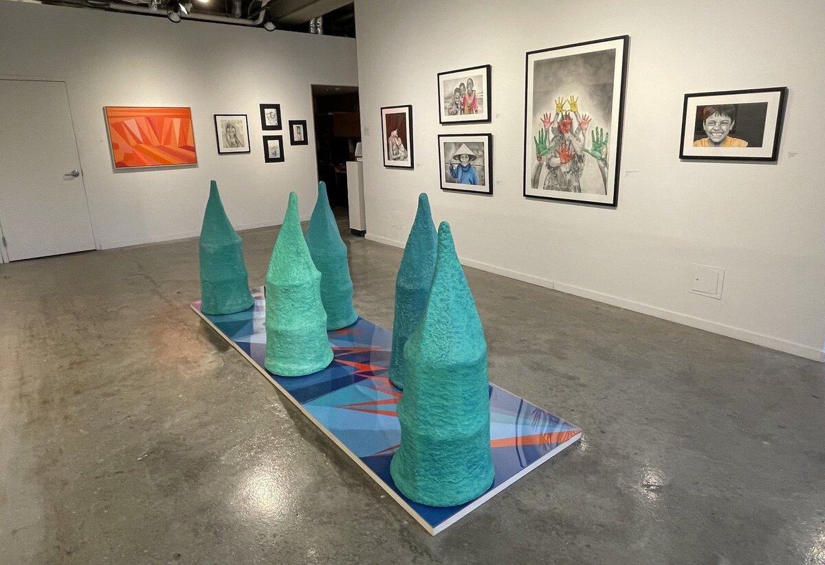
    Living Instant at Propeller Art Gallery / Collection of work by Propeller’s Emerging Members

    In this exhibition I was pleased to explore a collection of work by Propeller’s emerging members, Sandamali Angunaela, Paige Bowen, Francis Pitsadiotis, and Firouzeh Saremi Far. This collection resonates with life’s rhythms, where the patter of rain mirrors subway cadences, and the texture of skin reflects fallen leaves. Living Instant connects themes of landscape and humanity. We are able to see Bowen and Far juxtapose calm and passion, while Pitsadiotis and Angunaela explore boldness and vulnerability. These works distill the world’s essence with heartfelt immediacy. This evocative collection truly encapsulates the world in its entirety, embracing its immediacy and vibrancy without hesitation.

    Installation view of Living Instant at Propeller Art Gallery

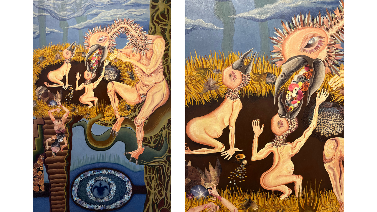
    “Evil and Full of Love” by Francis Pitsadiotis captivates me with its striking contrast of blue and orange/yellow colours, creating a visual tension that mirrors the complexity of its theme. The hybridized forms of nude human bodies and birds—a mother feeding her two children—evoke primal connections between sexuality, care, and nature. I am deeply drawn to the artist’s exploration of cycles and the “middled” state, where the body transcends traditional binaries and exists as both giver and receiver. This concept of being “middled” challenges the idea of fixed roles, presenting the body as transitional and interconnected. The piece suggests that life is not a series of oppositional states but a continuous process of becoming, where the body embodies multiplicity. This approach resonates with the way nature itself operates, with cycles of giving and receiving intertwined in every aspect of life. Furthermore, the hybridized bird-human forms powerfully convey this notion, as the mother simultaneously provides for her young and exists as part of a larger ecosystem of care and dependency. Lastly, there seems to be a third child that is rejected, a subtle element that adds another layer to the narrative. This rejection creates a tension that reflects the title “Evil and Full of Love”. The duality in the title suggests a paradox—how something nurturing and loving can simultaneously carry the weight of exclusion or cruelty. The rejected child might symbolize the darker aspects of care and connection: the inevitable sacrifices within cycles of giving, or the inability to nurture everything equally.

    Francis Pitsadiotis, Evil and Full of Love, magazine collage and oil on canvas, 70 x 40 inches (left) and detail (right)

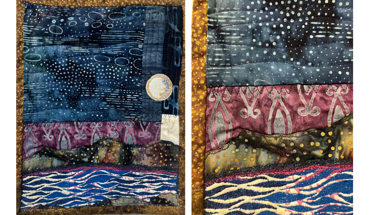
    What really drew me to Paige Bowen’s “Moonlit Lake” was her beautiful and powerful colour palette. The soft, muted tones of pink, blue, yellow, and green blend effortlessly, evoking the quiet, tranquil feeling of a moonlit lake. These colours work together to create a sombre yet calming atmosphere that feels both intimate and reflective. I was particularly struck by the way Bowen used geometric shapes to construct the quilt, that felt like a refreshing departure from more traditional quilt patterns. This unique approach to form adds a distinct visual interest to the piece, and it’s something I haven’t seen in other works. The freemotion stitching further enhances the tactile quality of the fabric, creating delicate patterns that seem to flow naturally across the surface. These patterns add layers of texture and depth, giving the piece an organic feel, almost as if the moonlit lake is coming to life. I found myself drawn into this quiet, meditative space, as the fabric and stitching spoke to me in a personal way, creating a sense of peace and stillness that resonated deeply for me.

    Paige Bowen, Moonlit Lake, quilted fabric with freemotion stitching, 10 x 7 inches (left) and detail (right)

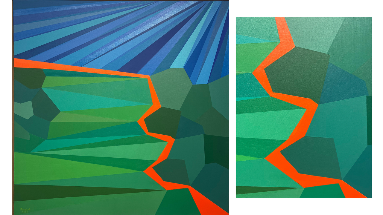
    I really liked “Quiet Tenacity” by Firouzeh Saremi Far because of its simplicity. It paradoxically holds a depth that I could easily get lost in. The use of straight lines and geometric angles creates a clean, organized structure I found visually pleasing. The three primary colours—green, blue, and orange—work beautifully together, with the contrast between the blue and green being particularly striking and vibrant. I love how Far uses different shades of green and blue to add depth and dimension, giving the scene a sense of richness despite its minimalistic design. Even though the composition itself is relatively simple, I could immediately connect with its calmness. It feels like a quiet moment captured on canvas where I found comfort.

    Firouzeh Saremi Far, Quiet Tenacity, acrylic on canvas, 36 x 36 inches (left) and detail (right)

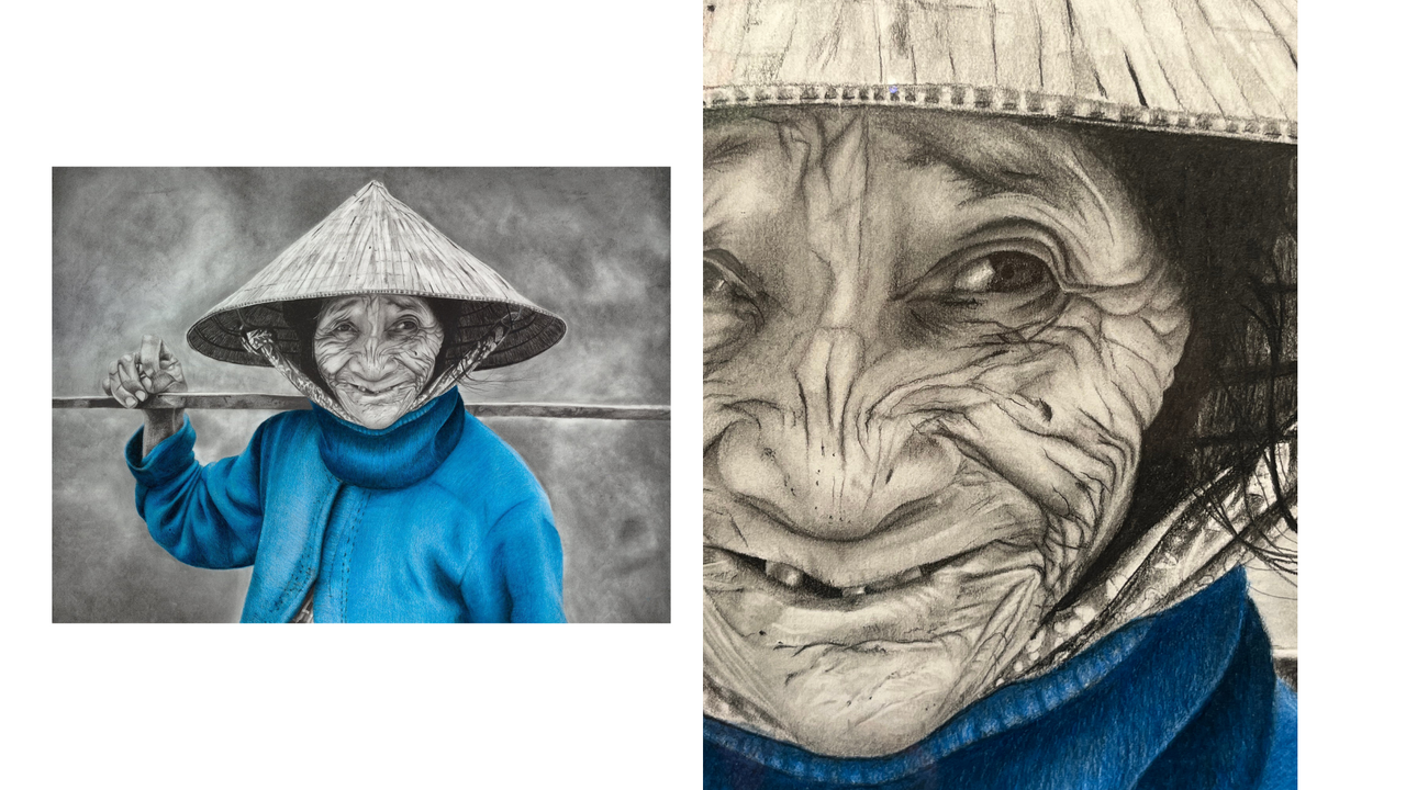
    What truly captivated me in Sandamali Angunaela’s “Day by Day” is the intricate detail in the portrait, particularly the shading and line work on the face. The skilful use of pencil to capture the depth and texture of the skin adds a richness to the piece that makes it feel lifelike. I found the figure’s expression to be particularly striking, as it conveys a sense of quiet hope and resilience, allowing for a profound emotional connection. The choice to leave the figure’s sweater as the only coloured element, painted in blue, seemed very significant to me. I can’t help but wonder if it suggests some form of cultural or personal symbolism, adding layers of meaning to the otherwise monochromatic portrait. Angunaela’s artist statement adds further context, as it speaks to the unbelievable resilience of the subjects she captures with such grace, dignity, and love. The artist’s intention to portray real people with real lives, drawing from her travels and found photography, is evident in this piece. Through her work, she beautifully encapsulates the raw emotions of her subjects, unhindered by expectations or circumstances. It is the attention to detail in this piece that truly brings the artwork together.

    Sandamali Angunaela, Day by Day, pencil on paper, 16.5 x 23 inches (left) and detail (right)

    Living Instant at Propeller Art Gallery presents a captivating and diverse collection of its emerging members’ work, with each artist bringing their own unique perspective to the exhibition. Through the intricate pieces and abstract forms, the artists seamlessly bring together themes of humanity, vulnerability, resilience, and connection with nature. The exhibition invites viewers to pause and reflect on the complexities of life, offering both solace and contemplation.

    Installation view of Living Instant at Propeller Art Gallery

    Kaya Meziane

    Images are courtesy of Propeller Art Gallery.

    *Exhibition information: Living Instant / Group show, January 8 – 19, 2025, Propeller Art Gallery, 30 Abell St, Toronto. Gallery hours: Wed – Sat, 1 – 5:30pm, Sun 12 – 4pm.

  • Interview with Harold Klunder at Clint Roenisch Gallery

    Interview with Harold Klunder (HK) by Antonella Pecora Ruiz (APR)

    This interview with Harold Klunder and his daughter Elizabeth (EK) provides insight into the beginning of his artistic ambitions, creative process and his exhibition, Then and Now, at the Clint Roenisch Gallery.

    HK: My mother was supportive; I would have to say that. She understood that I was different than my brothers who worked at Stelco in Hamilton, as I did, for half a year. I knew it wasn’t what I wanted to do. My mom certainly realized that I had other abilities—even though I grew up on a farm, and loved working with my dad as a kid—I knew what I wanted to do. Someone who was teaching in Ontario said, ‘Oh, you should look into night classes.’ So then I took a night class, and that was the beginning of being very serious about painting, drawing and art.

    HK: Well, we did have painting as a class and museum studies. But I was already interested in painting by looking at books. So, I learned about painters of the past. Even to this day, I learn about a different artist every week; having collected a substantial amount of art books over the course of my life and I look at them daily. But at that time, I just started looking at paintings and become more and more interested in the whole idea of doing it myself.

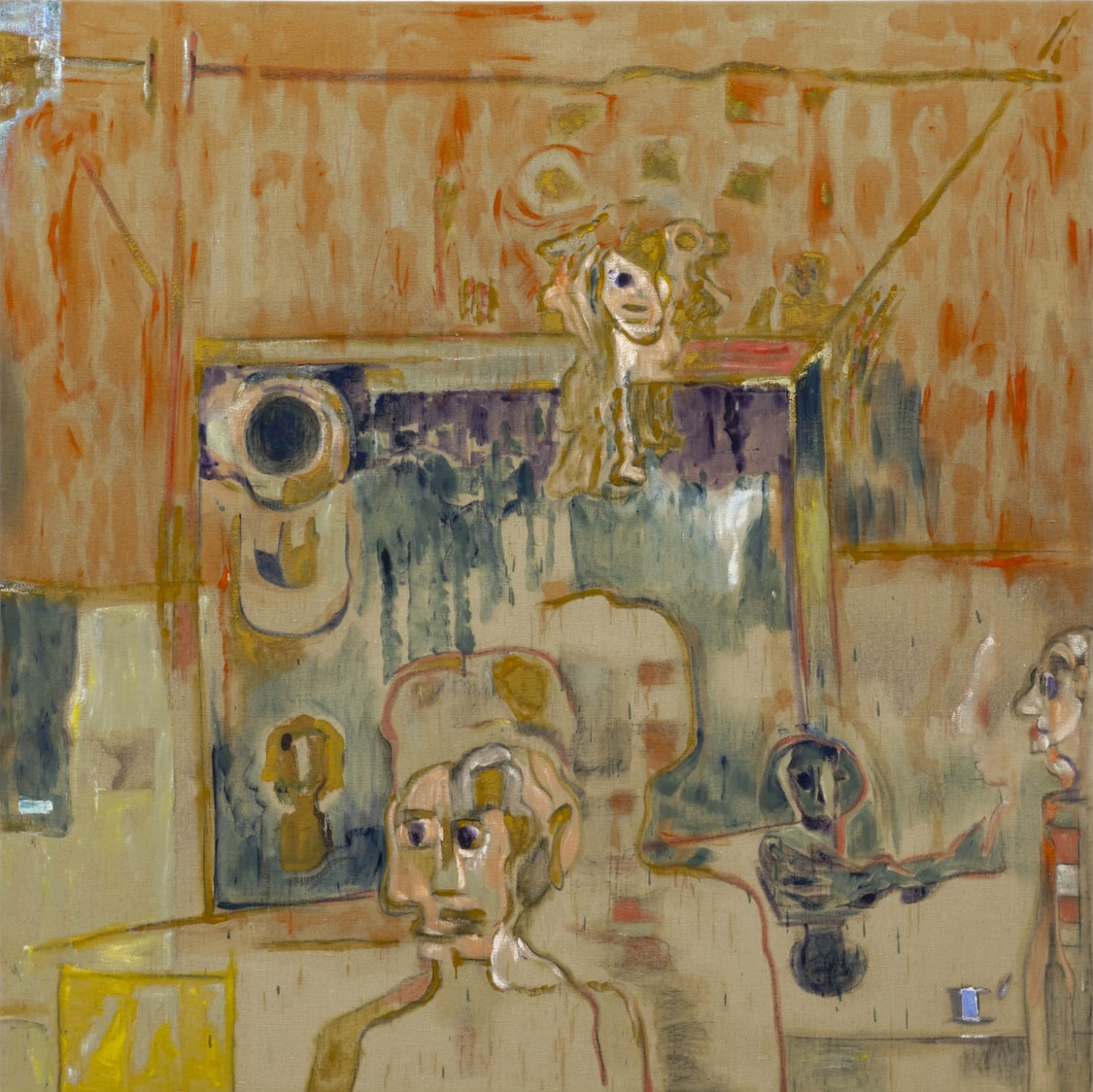
    Harold Klunder, Untitled, 1962, oil on canvas, 18 x 14.25 inches

    EK: You were painting in the shed that was attached to your parents’ house before you took any official art classes—that work is, in some ways, very similar to your current work. Like, it was always leaning in the direction of abstraction.

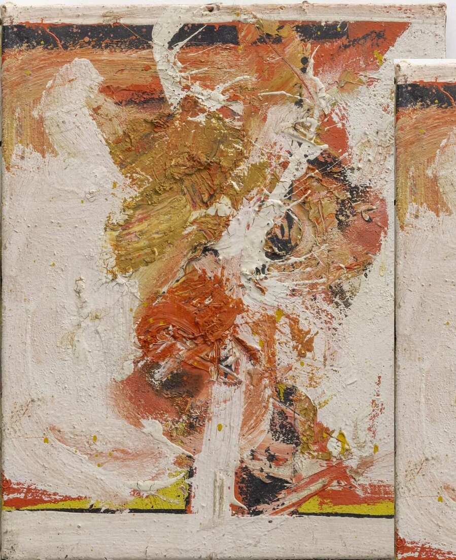
    HK: I don’t think of myself as an abstract painter. That’s an oversimplification in my mind because I have an active interest in all painting, and it’s not necessarily abstract. Some people might naively think, ‘Oh, this is abstract art,’ but there is usually some kind of sense of faces. I think when people are looking at the work and looking at it long enough, then it’s more than abstract painting; it’s full of life in a way. Abstraction is a simplistic-sounding term to me.

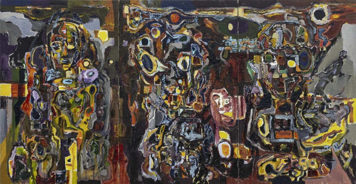
    Harold Klunder, July 1, July 2, July 3, 2001–2010, oil on canvas, 44 x 84 inches (triptych)

    EK: Yesterday, when I asked him if he thinks his work is abstract, he said maybe it’s more a kind of inner realism. ‘Inner realism’ like what you feel inside and what you’re thinking about, and it comes out in a combination. It’s a strange representation of yourself in a way.

    HK: I think that’s what art is; it’s just how you see the world, right? I think that’s what I’m considering as inner realism.

    HK: Yeah, colour is a big factor in all my work, and it always has been. But even when you use colour, you have to kind of frame the colour in some way, so the drawing is sort of, to some degree, framing the works anyway. And colour is very emotive, you know. You can say a lot by combinations of colours. I’m moved by the potential of what that colour will do to what I’ve already done on the canvas.

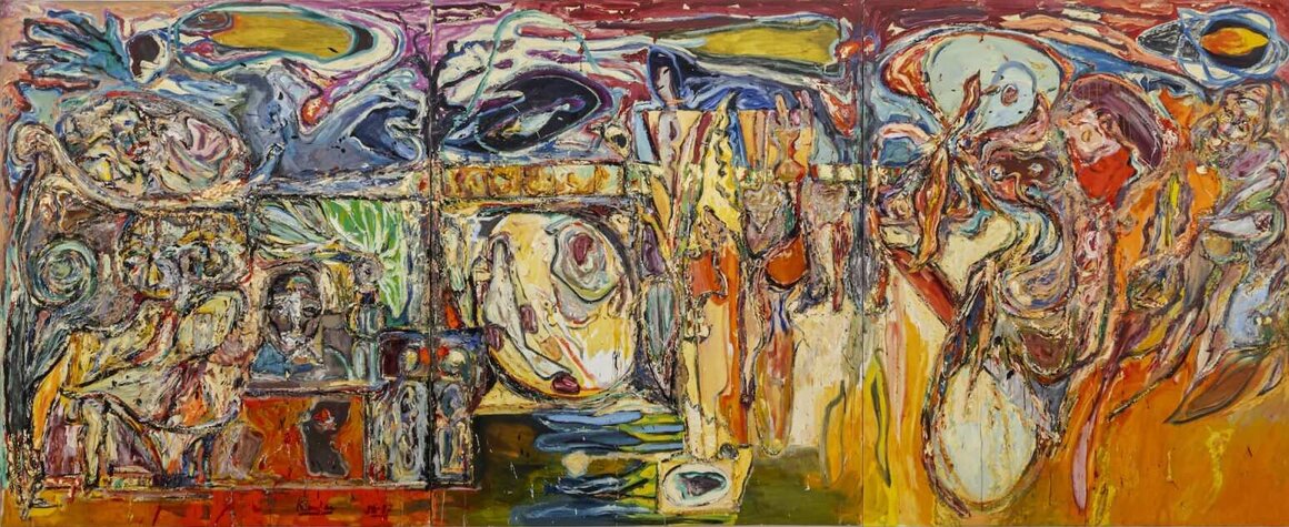
    Harold Klunder, Future, Present, Past (Self-Portrait #2), 1985–1987, oil on canvas, 96 x 235 inches (triptych)

    EK: It’s changing the energy of that certain part of the painting, to make it feel lighter or darker, louder or quieter. You’re bringing something forward and still letting other things go into the painting sometimes. It seems like you are interested in a combination of things and how they can create harmony.

    HK: Music is a big aspect. I listen to music all the time. I listen to the radio to the classic station, but it’s a full range, really. I definitely like Pavarotti.

    Harold Klunder, Music #IV, 2015–2017, oil on canvas, 84 x 84 inches

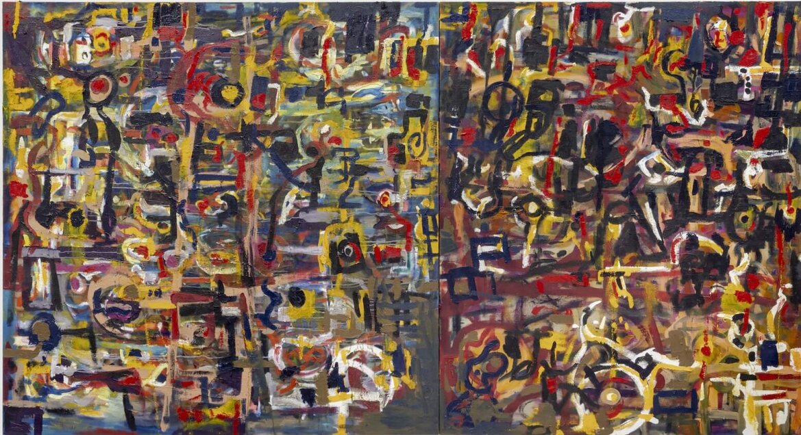
    EK: The first painting on the right when you go into the exhibition is called “Nessun Dorma”. It’s named after that song my parents played when me and my sister would go to sleep. Then also other types of music he really likes such as Jimi Hendrix, Bob Dylan, Neil Young.

    Harold Klunder, Nessum Dorma, 2021–2024, oil on canvas, 72 x 132 inches (diptych)

    HK: Dutch painters are particularly interesting because I left Holland when I was very young, and somehow that’s stuck in my mind, partly because of my mom. She had some understanding of Van Gogh. She felt he was misunderstood and he was actually challenged in his own ways because he was a futurist in his era. So, it’s interesting.

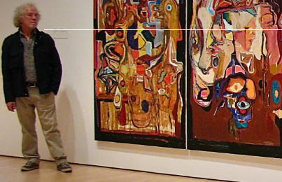
    HK: In a funny way, the show reminded me of what my work actually looks like, because creating them is just an ongoing process. Then, all of a sudden, I’m seeing a whole room full of my work. I am trying to put those pieces all together in my brain, thinking, ‘What is it? What is actually happening?’ I was really blown away by the really large painting that’s on the main wall in the back of the gallery (“Future, Present, Past”). When I walked into Clint Roenisch Gallery, at first, and saw how he hung the show—I had nothing to do with that —I thought that he’s brilliant at doing that.

    Installation view of Harold Klunder, Then and Now at Clint Roenisch Gallery

    EK: The works that are featured at the Clint Roenisch Gallery right now literally span over 60 years, from the first one he made when he was very young (“Untitled,” 1962) and the one that he just finished; it’s been just under 62 years. The viewers can witness his artistic evolution, even if some works look different from others. I think artworks look different at different times.

    APR: This has been a really interesting conversation, thank you! I hope that viewers will come out with a richer understanding of Harold Klunder’s career; having contemplated the wonderful idea of ‘inner realism’ that creates the narrative of each of his unique paintings.

    Images are courtesy of Clint Roenisch Gallery.

    *Exhibition information: Harold Klunder, Then and Now, November 21 – January 11, 2024, Clint Roenisch Gallery, 190 St. Helens Street, Toronto. Gallery hours: Wed – Sat 12 – 5 pm.

  • Art Battle Toronto, 2024

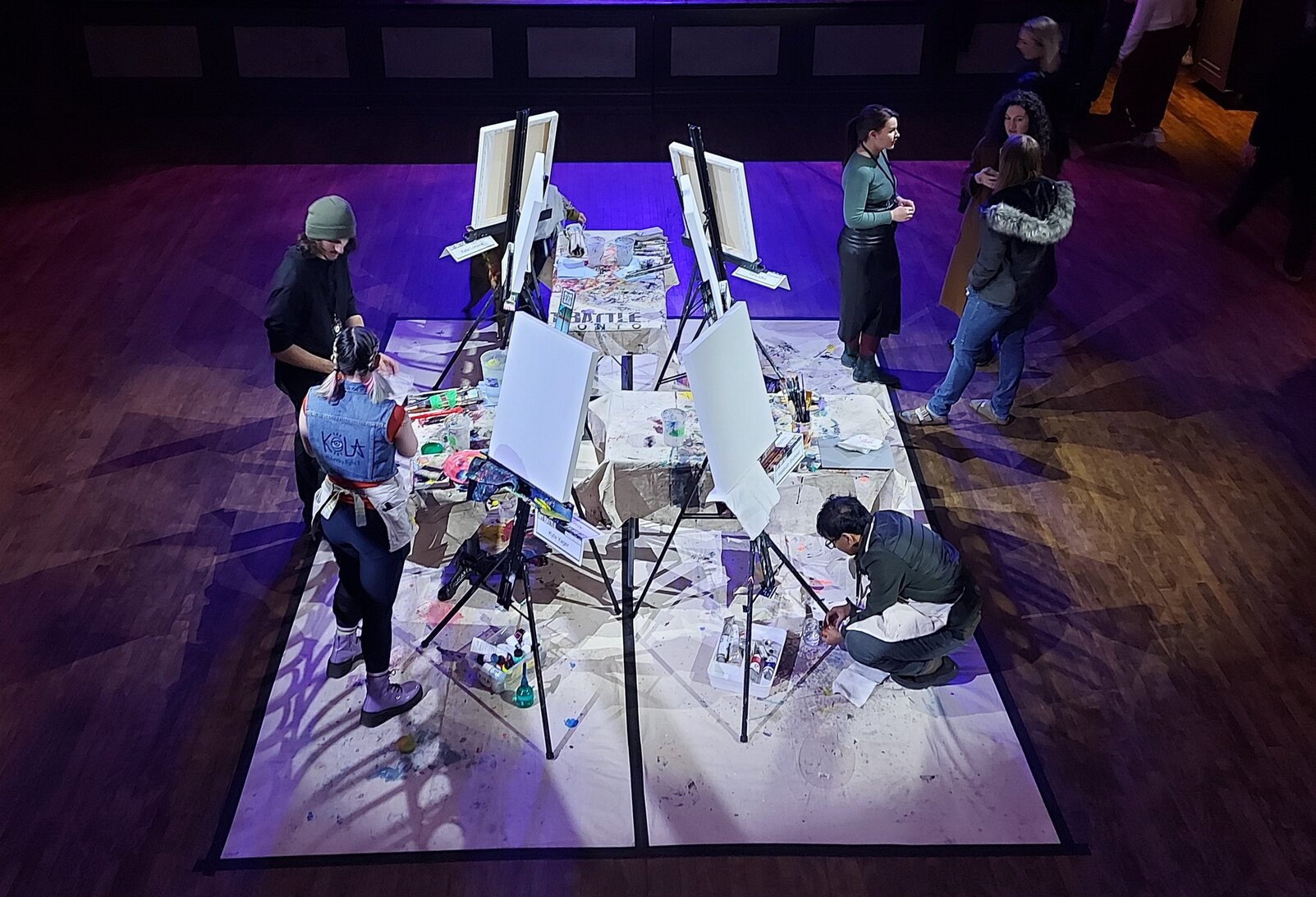
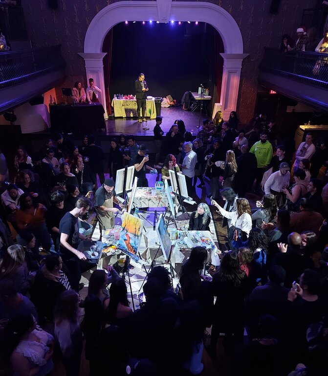
    On December 17th, Toronto hosted the year-end Art Battle at The Great Hall, with 12 artists and three rounds of battles. I found this event, which has been happening since 2001, very exhilarating as a first-time attendee. Encountering a live art tournament was exciting. The participants painted their canvases in just 20 intense minutes, using various techniques and the viewers participated by voting for the artists. It was hard to choose just one.

    The name Art Battle gives the idea of a war, which is a perfect depiction of this event. Inside the hall, it was arranged as a modern-day colosseum, with spectators seated in rows and were able to stand a few feet away and also could to swirl around the artist at their performance time. Using paint and brush like swords, these artistic gladiators clashed in a battle of creativity.

    Getting ready

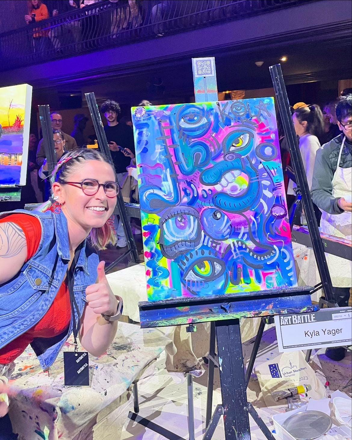
    As the competition began, the artists furiously painted, their brushes dancing across canvases. There were lights, music, crowds, and the 12 artist competitors were divided into two groups. From each group, two artists were selected by online voting for the final battle. It was a wonder to see how the artists showed their creativity in the middle of the cheerful cacophony. I had the opportunity to talk with one of the them, Kyla Yager, who was getting ready for her first round. It was very interesting to know that she channels her ADHD and mental health journey into intuitive painting. She enjoys the cheering and music, and it gives her energetic feelings while she paintings. Despite not making it into the final round, her divergent painting showed an intuitive flow of vibrant color, emotion, and abstraction.

    Kyla Yager with her painting, All eyes on me. Courtesy of the artist

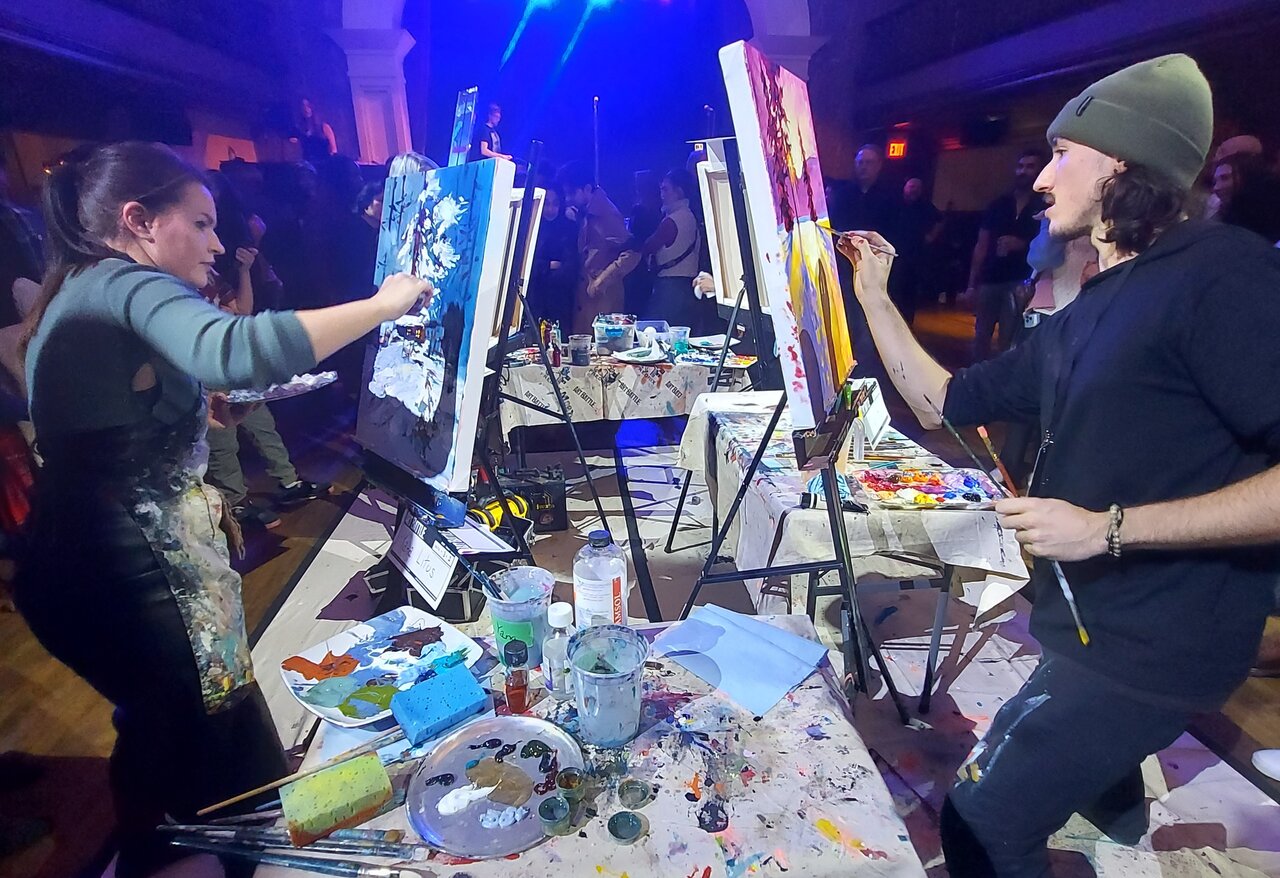
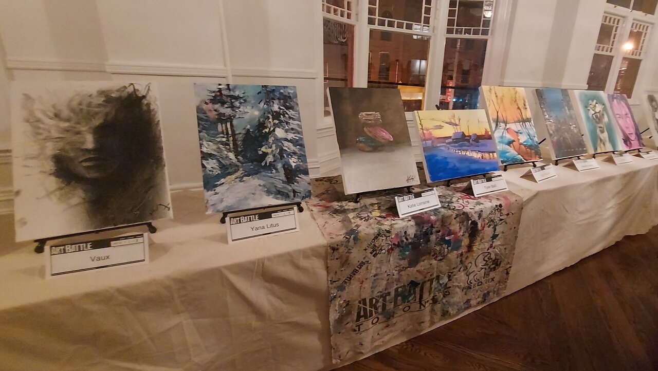
    Tyler Ball, another artist, made it to the final round with his two landscape paintings: “Frosty Sunset”, and another one that depicted twinkling sunlight with golden hues. It was hard to choose between Tyler Ball and Yana Litus. Yana also painted a serene winter scene featuring a snow-covered pine tree and house.

    Yana Litus (left) and Tyler Ball (right)

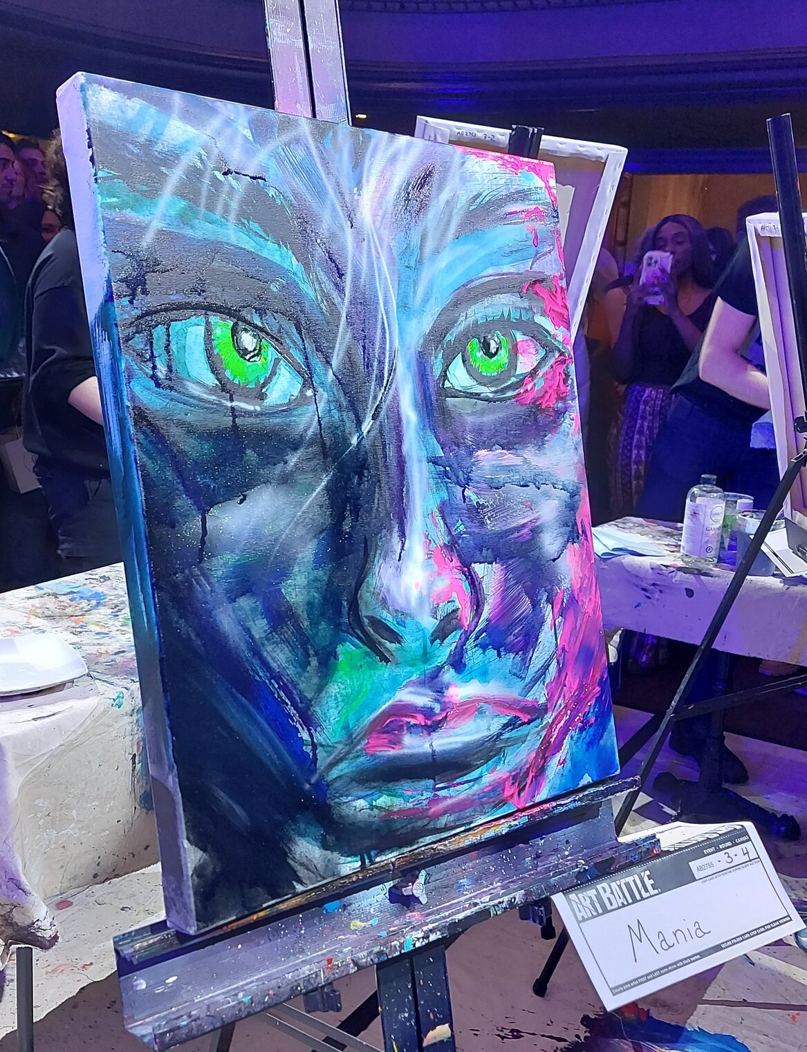
    Walking around the artists, merely feet away from them, made me so enthusiastic, and it was great to see their energy. In the second round, Mania showed her creativity by using an airbrush, and got selected to go to the final round.

    Artwork by Mania with air brush on her final round

    Time ticked away as the tension mounted. Each round is 20 minutes, with the MC’s countdown echoing through the hall like a drumbeat, urging the artists to finish on time. After the time is up, the artworks are displayed, and the audience votes for their favorites.

    The competition goes on

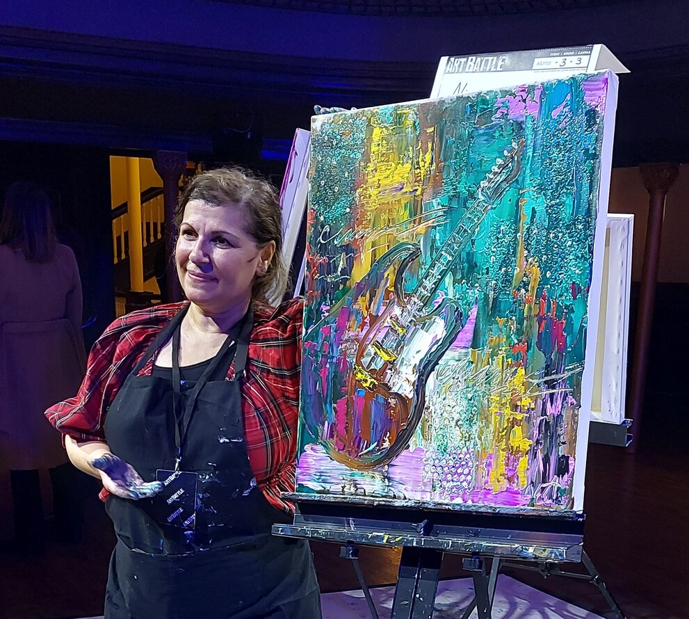
    This month’s winner, Nisreen Askar, shared her experience in an overjoyed and happy speech. She said that in her first round, she painted a rainy city view. After looking at the other competitors, she decided to change direction and painted a guitar. She told us that it was challenging for her to decide what to paint in her final battle, and she chose to paint something youthful. She saw that the audience was young, felt the battle, and put all the vibrant colors together to show that enthusiasm.

    Event Champion Nisreen Asker

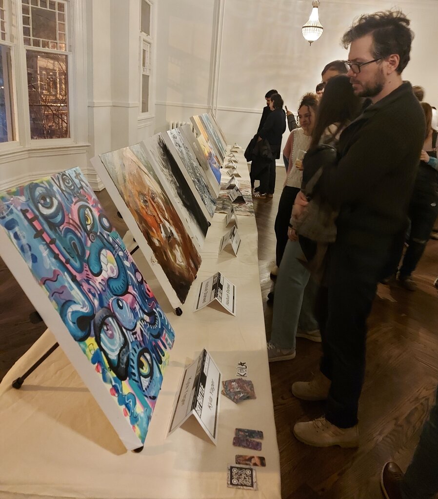
    Joining in the battle is a great opportunity for young artists to gain publicity, get noticed, attract new clients and sell their artwork. In the hall, there were paintings on display to buy and take home on the same day. The silent auction unfolded like a high-stakes game, with bidders furiously tapping away on their phones, adding an extra layer of excitement to the already electric atmosphere.

    Paintings from the battle

    Throughout the event, the atmosphere was vibrant, with music pulsating through the speakers, and the energy of the crowd propelling the artists forward. As I left, I couldn’t help but feel inspired by the creativity that filled the room. Art Battle Toronto is more than just a competition – it’s an immersive experience that brings people together, sparks imagination, and celebrates the beauty of art. And the excitement doesn’t end there – mark your calendars for January 11th, 2025, when Art Battle Toronto returns for another thrilling round of artistic competition!

    Text and photo: Nusrat Papia