Author: artoronto

  • David Spriggs: The Nature of Power at Neubacher Shor

    Over the past fifteen years, David Spriggs has developed a signature style of layering images on transparencies, creating hybrid spaces that bend the traditional constructs of painting and sculpture. This method involves airbrushing two-dimensional images onto multiple sheets of transparent film, which are then hung together in horizontal cuts to form a three dimensional object.  Four of these distinct works are currently on display at Neubacher Shor as part of The Nature of Power, a solo show of Spriggs work that spans nearly a decade of the artist’s production.

    Installation view. Photo: Mitch Billinkoff

    “Retinal II” is the most recent work on display in the exhibition. Aspects of vision and their relation to power are highly important in Spriggs transparency works. Despite the fragmentary nature of the medium, the work manages to convey a sense of depth and the impression of physical presence despite lacking a real physicality.

    David Spriggs, “Retinal II”, 2013. Acrylic on layered transparent plastic film, 31.5 x 20.5 x 15.25 inches. Photo: Courtesy of Neubacher Shor Contemporary

    “Ideologies” reveals a similar, if not cosmic, sense of volume. The spectral forms appear as a frozen moment in time and space. Elements of the Italian Futurists and Cubism are undoubtedly present here and elsewhere in the exhibit. Concepts of speed and movement (Futurism) and the hybridity of a space that breaks the laws of what restricts a two and three-dimensional form (Cubism) are particularly present.

    David Spriggs, “Ideologies”, 2008. White acrylic paint on transparent film, display case, metal stand springs, lighting, 75 x 48.5 x 22.5 inches. Photo: Courtesy of Neubacher Shor Contemporary

    The crown jewel of the show, however, and the work that provides a perfect summation of Spriggs explored themes and influences is “The Paradox of Power“. This monumental work, measuring eight feet high and ten feet wide has the presence of a standalone exhibition, as it did when it was originally exhibited as part of Spriggs graduate thesis at Art Mur in 2007. Here, the cloud-like bull shares a connection with the Futurist ideal of simultaneous multiple representation from a variety of angles. Traditionally a symbol of power and virility, here the bull has not only been fragmented but flipped upside down and rendered immobile. Additionally, it has been separated in half by opposing binary colours of red and blue – furthering the paradox of power.

    David Spriggs, ” The Paradox of Power”, installation, 2007, Red and blue acrylic on layered transparent film sheets, display case, springs, lighting, 04 x 124 x 36 inches. Photo: Mitch Billinkoff

    David Spriggs, ” The Paradox of Power”, installation, 2007, Red and blue acrylic on layered transparent film sheets, display case, springs, lighting, 04 x 124 x 36 inches. From left to right: side view, front view, side view. Photo: Mitch Billinkoff

    The Nature of Power offers an insightful view into the past decade of David Spriggs artistic production during which he has explored themes of power, energy and optics. “The Paradox of Power“, the centerpiece of the show, is worth making the trip on its own. The work is both ambitious in its technique and scale and can only be truly appreciated in person. Though the exhibition doesn’t contain any new works from the artist, if you haven’t seen these works up close before I highly recommend paying a visit to Neubacher Shor Contemporary.

    Mitch Billinkoff

    *Exhibition Information: February 6 – March 7, 2015, Neubacher Shor Contemporary, 5 Brock Avenue, Toronto. Gallery hours: Wed – Sat 12 – 5 p.m.

  • Being / Krista Arnold & Chen Cao

    Artists, Chen Cao (left) and Krista Arnold (right). Photo: Courtesy of Project Gallery.

    Project Gallery’s current exhibition Being is an exploration of the body and the soul featuring two young artists, Krista Arnold and Chen Cao. Both artists explore similar topics in their artistic practices, and believe in the importance of spirituality. Arnold’s work is featured in the front of the ample gallery space, while Cao’s paintings are displayed beautifully in the back.

     Krista Arnold, “Backdrop“, oil on canvas, 40” x 60”, 2014. Photo: Courtesy of the artist.

    Krista Arnold’s work is a series of reflections on body and soul as separate entities that are at the same time connected, and meet at the line that separates life and death. Arnold was inspired by her trips to Israel and India, where she noticed how impotant the spiritual buildings were for people who lived there. Those temples and synagogues are more than simple physical buildings since they are elevated to a spiritual place when worshippers reach out to transcendent powers. Arnold’s got interested in the relationship of the physical and the spiritual and their interactions. The spiritual bodies of her figures closely move in harmony with their physical bodies, connected to each other by only a touch or a gaze. We notice their relation to each other, yet realize that they are still separated.

     Krista Arnold, “Stand“, oil on canvas, 36” x 48”, 2014. Photo: Courtesy of the artist.

    Arnold allows herself to be inspired by mandalas, Islamic architecture and the Notre-Dame cathedral to create an extra layer of pattern over some of her pieces. The paintings are vibrant, but the colors aren’t as important to her as the intensity they bring; the vibrancy is used to emphasize and to differentiate movements of energy. Arnold enforces the idea of the unity of body and soul, the fact that we all possess these physical and spiritual aspects which, in a way, makes us all similar.

    Chen Cao’s work also allows us to connect to one another through his attempts to universalize certain issues of spirituality. For Cao, spirituality is connected to his painting technique. His definition of “technique” is more of a way of transpiring a message than a method of actually painting it. His canvases in this show are mostly filled with portraits of people he knows personally. The most striking works are his two largest pieces, “Gathering of Light” and “Disability”. Cao is inspired by eastern philosophy of Buddhist and Daoist origin. Leonardo da Vinci’s “The Last Supper” also influenced him, but mainly the composition. The story behind his painting is very different, it is the “universalization of holiness”. 

     Chen Cao, “Gathering of Light“, oil on canvas, 75” x 35”, 2015. Photo: Courtesy of the artist.

    “Disability” is about suffering. Through this dual-self-portrait Cao depicts two different identities. One of the figures represents Cao on the surface, who has a tough time expressing himself through words, not an easy feat. The other figure is Cao on an unconscious (non-physical) level, who seems to be more at ease. I think the sense of discomfort that the viewer feels in this piece is what makes it appealing.

    Chen Cao, “Disability“, oil on canvas, 72” x 48”, 2014. Photo: Courtesy of the artist.

    We all have these two parts of ourselves: physical and spiritual – and this exhibit creates a potential platform to talk about it, if one chooses to. If the chance comes up, I highly recommend talking with these two artists if spirituality, the body and the soul are topics that interest you because they have very interesting perspectives. Furthermore, it was a relief to be in the presence of art that holds intricate meaning and meet artists who have something to say.

    Joséphine Mwanvua

    *Exhibition information: February 19 – March 4, 2015, Project Gallery, 1109 Queen Street East, Toronto. Gallery hours: Tue – Fri, 2 – 8; Sat – Sun, 12 – 6 p.m.

  • Junko Mizuno: Ambrosial Affair at Narwhal

    Junko Mizuno, “Pomegranate”, 2015, acrylic & ink on paper, 17” x 14”. Photo: Courtesy of Narwhal

    Junko Mizuno’s art has always been about powerful women — in the form of witches, mermaids, goddesses among others — who like to live their lives for themselves and who want to please only themselves. Her characters also carry a lot of sexual energy, which to me symbolizes sexual liberation. She creates cute, yet sensual and gothic pieces of work.

     Junko Mizuno, “Coffee”, 2015,  acrylic on canvas, 16” x 20”. Photo: Courtesy of Narwhal

    In this series, Ambrosial Affair, Mizuno depicts goddesses and monsters who are hysterically or devilishly obsessing over food. This is the second installment of a three-part series by the Japanese, San Francisco-based illustrator, comic artist, and toy designer. The first installment was entitled Venus Cake.

     Junko Mizuno, “Noodles”, 2015, acrylic & ink on paper, 14” x 17”. Photo: Courtesy of Narwhal

    Many of the pieces have gold paint that shines like glitter, adding allure to the paintings. The emotions of the characters make every piece fun and playful. Although the gallery’s definition of the exhibition labeled Mizuno’s art as being a series of food fetishes, she says that she simply adores drawing women and food, and has always loved to since childhood. It has been her dream to have a show where she pairs her two favorite subjects together to create some fantastic art.

    Junko Mizuno’s paintings are on display at Narwhal, including her sketches which can be found at the back of the gallery space. Some of her prints are available at Magic Pony.

    Josephine Mwanvua

    *Exhibition information: February 21 – March 14, 2015, Narwhal, 2104 Dundas Street West, Toronto. Gallery hours: Wed – Sat, 12 – 6 p.m.

  • The Artist Project 2015

    Opening Night Party: Thursday, February 19, 2015 / 7 – 10 p.m.
    Better Living Centre

    This weekend be sure to make your way to Exhibition Place to take in the contemporary art fair The Artist Project. Running in its eighth successful year, The Artist Project  is showcasing over 250 top contemporary artists from all over Canada and abroad.

    The fair pulsates with curators, designers, art enthusiasts and the like. The chic and excited crowd can be described as ‘come one come all’ and can be found mingling with artists and with one another. The event is a really social gathering and an excellent opportunity to take in a great mix of art.

    Visitors with Jessica Massard’s installation, “Possibly, Maybe” (detail), 2013

    Marta Franco’s booth

    Todd Monk’s work

    Eric Robitaille’s booth

    Artist, Dominique Fung with a visitor

    Hoda Zarbaf , “Vaginal Rapture”

    While we personally found the art to be hit or miss we still had an enjoyable evening that we wished could have lasted longer! The show is quite heavy in abstraction although that is not to take away from a few delightful surprises.

    Photography by Dani Cooperman

    Paintings by Claire Desjardins

    Work by Paul Brandejs

    Shannon Scanlan’s booth

    Paper Bag Beers

    Raymond Waters, “Invisible”

    The artists all were unanimously excited about the upcoming weekend. One particular artist whose work we really enjoyed was that of  Antonio Caballero. His quirky but thoughtful pieces with miniature ducks had us pleasantly bemused and we found ourselves sad to leave the artist and his adorable ducks for the 10 p.m. close.

    Work by Antonio Caballero

    There’s a great deal of sponsorship for the event such as Steam Whistle and Barefoot wine, which provide complimentary drinks for the evening. Consider The Artist Project to be somewhat of a trade show for the arts. It is an excellent way to get out and mingle with the creative minds that are forging new ground in the art world.

    Text: Carter Brown and Kate Pendergast. Photo: Elena Iourtaeva.

    *Exhibition information: February 19 – 22, 2015, Better Living Centre, 195 Princes’ Boulevard, Exhibition Place. Exhibition hours: Friday: 12 – 8, Saturday: 11 – 8, Sunday: 11 – 6 p.m.

  • Felix Kalmenson: A year in revenue at Pari Nadimi

    Artist, Felix Kalmenson (left0 with Pari Nadimi Gallery’s director, Pari Nadimi at the Opening Reception of  A Year in Revenue, a solo exhibition by Felix Kalmenson at Pari Nadimi Gallery, February 5, 2015. Artworks: Felix Kalmenson, “From the Ground Up”, Lauan plywood underlayment, latex paint and hardware; Felix Kalmenson, “Celebration”, 2015, spackle, styrofoam, baking tray, TV mount and hardware.

    Nadimi Gallery is exhibiting a video installation by artist Felix Kalmenson entitled A Year in Revenue. The title of the exhibition as a play on words sets a tone for the exhibition itself – which dances between light mockery and an investigative view of  late capitalist financial structures. These structures have been going through a process of massive restructuring as algorithms have replaced floor traders and the stock exchange, as we have come to know it, is being replaced with a more streamlined technology.

    Felix Kalmenson,  “A Year in Revenue: From Sunrise to Sunset”, 2015, multi-screen multi-channel video, TV’s, mounts, blu-Ray players, zip ties and hardware

    Felix Kalmenson,  “A Year in Revenue: From Sunrise to Sunset”, 2015, multi-screen multi-channel video, TV’s, mounts, blu-Ray players, zip ties and hardware

    The space is mainly dominated by two walls opposite of one another, each displaying a multi view – approximately 36 video cells per 7 screens – of assorted NYSE companies ringing in the ‘bell’ marking the opening of the stock market floor. Each commencement is organized into a rough chronological order. Four podiums are arranged around the floor space whereby the visitor is encouraged to step up and gain perspective of the video installation and the space itself.

    Installation view of Felix Kalmenson,  A Year in Revenue, 2015, with visitors

    Kalmenson points out that the podiums he constructed borrow various architectural elements from the actual podiums found on the stock market floor. By picking and choosing elements from the stock market podiums and adding other elements, such as air vacs, that do not serve a function, he is challenging the financial structure’s power through his physical disassembly.

    Felix Kalmenson,  “A Year in Revenue: From Sunrise to Sunset”, 2015, multi-screen multi-channel video, TV’s, mounts, blu-Ray players, zip ties and hardware. Photo: Courtesy of Pari Nadimi Gallery

    The exhibition space only fully functions with viewer participation. One podium has a tablet propped up on a corner with a livestream of the iconic wall street ‘bull.’ This display is appropriately titled ‘uncaged’ – in reference to the recently removed protective fencing for the Occupy movement. Why this massive steel structure was constructed for the protests, is still a curiosity. As it serves no real practical purpose, you are left to wonder if it is safeguarding an ideology in a futile way. If you listen closely, you can hear the wind howling on Wall street.

    Felix Kalmenson, “pit sections”, 2015, rubber, wood, air grille, steel, wire, fire retardant fabric, zip ties and hardware.

    Another one of the four podiums has an algorithmic trading application on a mounted cell phone. The amusing aspect of the space is how inviting it is, considering how specialized and closed this particular financial realm. The podiums beg to be stepped up onto; the tablet and their sleek applications want to be prodded and viewed. The space is like an archeological library for the financial structures of recent past. It is an interactive catalogue, a look at a financial market dystopia that has been pulled apart and magnified. It is a market whose built environment is being handed over to a more automated world. The unidentifiable computer ‘buzzing’ that rings through the exhibition space the whole time is still ringing in your ears minutes after leaving.

    Text and photo: Kate Pendergast

    *Exhibition information: February 5 – March 28, 2015, Pari Nadimi Gallery. 254 Niagara Street, Toronto. Gallery hours: Wed – Sat 12 – 5 p.m.

  • The Artist Project 2015

    The Artist Project 2014. Photo: Margaret Irving

    February 19 – 22, 2015
    Better Living Centre
    195 Princes’ Boulevard, Exhibition Place
    Exhibition hours: Thursday: 7 – 10 p.m. Opening Night Party
    Friday: 12 – 8, Saturday: 11 – 8, Sunday: 11 – 6 p.m. 

    From seasoned collectors and first-time art buyers, to gallery dealers and interior designers, visitors can explore and discover works of art from over 250 top contemporary artists from Canada and abroad. This is a unique opportunity to meet and buy art directly from artists at Toronto’s most celebrated contemporary art fair.

    The Artist Project celebrates its 8th year with another exciting show from February 19 to 22, 2015 at the Better Living Centre, Exhibition Place, Toronto.

    Opening Night Party: Thursday, February 19, 2015 / 7 – 10 p.m.

    Celebrate the launch of our 8th show and be among the first to see 5,000+ works of art from over 250 top contemporary artists. Music by DJ Vinny Grüvhunter and DJ J-Lah, special installation by Bruno Billio and art performances by Alex Beriault and Artist in a Box.

    Art Battle #228

    Art Battle Canada and Artist Project team up!
    On the evening of Friday, February 20 from 6-8PM, AB#228 will be held on the show floor.

    There will be Art Chats, Art Tours and other programs.

    For more information pleace check http://www.theartistproject.com.

  • everywhere is anywhere is anything is everything

    Entrance to Douglas Coupland’s show at the ROM

    David Liss, MOCCA artistic director and curator, discusses Douglas Coupland’s artworks at the members’ preview of the show

    Much has been written about the importance of Douglas Coupland’s show everywhere is anywhere is anything is everything, so large an exhibition that it had to be split between two venues in Toronto: the MOCCA and the ROM. A mesmerizing collection of thought-provoking and stunningly beautiful artworks, the show is a must-see both as a tour-de-force in contemporary Canadian art and as a means to explore the politics of display in a museum.

     Installation view of the ROM portion of the Douglas Coupland’s show

    Douglas Coupland, “Brick Wall” (2013) at MOCCA

    Visitors at the MOCCA

    While seeing the Coupland show in a single venue would certainly constitute a unique and powerful experience – just imagine a space filled with all these works, similarly to how some of Coupland’s installations are filled with objects, – the choice to split the exhibition between two iconic Toronto venues adds a dimension fitting to the overarching theme of the show, which focuses on the inner workings of modernity and its North American and, in particular, Canadian institutions.

     Douglas Coupland, “Pop Heads” (2012), ROM

     Douglas Coupland, “Towers” (2014) at MOCCA

     Douglas Coupland, “The National Pantry” (detail, 2014) at the MOCCA

    The strong aesthetic consistency of the artworks in the show virtualizes the distances between the two venues, rendering them complementary to each other. Although the show itself is not disjointed by the physical separation, the little differences between the ROM and the MOCCA become all the more apparent and are of great interest for they are revelatory of the character of each institution.

     Visitor in front of Douglas Coupland’s “Word Clouds” and “Tokyo Harbour” at the ROM

     Douglas Coupland, “Dreamcatcher Blanket” (detail, 2003) at the MOCCA

     Douglas Coupland, “FLQ Hutch” (right, 2013) at the MOCCA

    A most striking difference is in the labels. The ROM supplements the exhibition with prominent and detailed explanations concerning series of works or specific sections of the exhibition, highlighting relevant biographic information or quoting the artist. The MOCCA, by contrast, mostly provides only summary archival information regarding title, date and materials used, with occasionally a phrase regarding the assembly process for a particular work, without giving any interpretative account or biographical background. Either approach is justifiable, with the former grounding the artworks in factual information – historical or biographical, – and the latter granting the viewer greater freedom of interpretation of what the installations are evoking. The two venues can be visited in either order, with lay visitors who first went to the MOCCA being able to validate their impressions at the ROM, or visitors first guided by the ROM’s interpretation being able to critically reevaluate that assessment at the MOCCA.

    A ROM museum surveillance camera blends into the custom wallpaper “Aubusson” (2010-2013) designed by Douglas Coupland.

    Douglas Coupland, “The World” (detail, 2013-2014) at the ROM

    Installation view, ROM

    While it may be tempting to link the choice of supplying the viewer with more factual data to a more traditional outlook, the ROM does in fact embrace modernity, with tablets distributed throughout the space offering additional resources to visitors and with artworks benefiting from the futuristic architecture of the Crystal, in contrast to the more austere setting at the MOCCA. The ROM even playfully integrates its surveillance cameras into the exhibition, reminding the viewer of surveillance cameras part of “The World” installation. Together, the two venues put each other’s modes of display in perspective, opening a discussion regarding the contemporary museum experience and permitting a more engaged approach to the show as a whole.

    Visitors at the MOCCA

    Douglas Coupland, “345 Modern House” (detail, 2014) at the MOCCA

    Visitor at the ROM (photography encouraged)

    A concern with the museum experience is most apparent in activities directed at the social media. The show stands out for its catchy “photography encouraged” notice, which came as a surprise to some ROM workers used to the old-fashioned prohibition of photography in temporary expositions. In fact, the ROM institutionalized this imperative with a meticulous hoarding of visitors’ photographs, similarly to how Douglas Coupland himself hoarded objects for his installations. The entire collection of images posted under the #CouplandTO hashtag can be seen in a dedicated online gallery http://gallery.couplandto.ca/. The MOCCA offers an even more creative counterpart with the “Growing up Utopian Family Photo Album” project soliciting childhood photographs from the public to make a photo album that will be presented to Douglas Coupland at the end of the exhibition. What to know more? Come down to the MOCCA! There is still time to contribute to either initiative.

    Installation view of “The Ice Storm” (2014) at the MOCCA

    Detail of the Archives section at the ROM

    Pop-up gift shop at the MOCCA

    Text and photo: Elena Iourtaeva

    *Exhibition information: MOCCA: January 31 – April 19, 2015, 952 Queen Street West, Toronto. Gallery hours: Tue – Sun: 11 a.m. – 6 p.m. ROM: January 31 – April 26, 2015, 100 Queen’s Park, Toronto. Gallery hours: Mon – Thur & Sat – Sun: 10 a.m. – 5:30 p.m., Fri: 10 a.m – 8:30 p.m.

  • Douglas Coupland is Everywhere

    Douglas Coupland’s retrospective Anywhere is Everywhere is Anything is Everything presents an extensive collection of the artist’s Pop-Art inflected artworks. Roughly produced within the passed-decade, the exhibition showcases Coupland’s uncanny readymades, constructions, and mixed-media imagery that speak directly to contemporary audiences. Split between two locations in the downtown core, the MOCCA and the ROM, this engaging project will attract a vast majority of visitors from casual onlookers to more art-conscious viewers.

    Douglas Coupland. Photo: Thomas Dozol

    Coupland is a celebrated Canadian artist and novelist, having singlehandedly coined the term Generation X in his novel of the same name. His interests have always centered on thematic preoccupations of pop culture, postmodernity and the human condition. His visual works reject any notion of traditional art-making practices, favouring the use of mass-produced media (Lego pieces, googley eyes, printmaking, etc.) in order to construct his peculiar brand of imagery. Coupland’s practice borrows from previous art-historical figureheads, mainly Andy Warhol’s idolization of mass culture, and updates it for a 21st century tech-savvy audience.

    Douglas Coupland, “Towers”, 2014, Lego, 198.1 x 299.7 x 299.7 cm overall, 50 components. Courtesy of the Artist and Daniel Faria Gallery. Photo: Rachel Topham, Vancouver Art Gallery

    Themes run rampant throughout the exhibition’s two locations, but are anchored by their distinct visual style and preoccupation with contemporary culture. The MoCCA primarily fixates its selection on his rethinking of the Canadian identity by subverting traditional Canadian iconography in an uncanny method. This is evident in his Styrofoam CN Tower replica that had been severed and placed on its side with the word “sorry” written in gum on the support beneath. Coupland constructs cityscapes of the future through brightly coloured Lego pieces while also critiquing the homogeneity of the suburban Canadian landscape through a repetitive installation of carbon-copy Lego homes. Rows of inexpensive store bought goods line a wall like a grocery store shelf, supporting the notion of the multi-cultural Canadian identity as being evident through the omnipresence of imported commodities.

    Douglas Coupland, “345 Modern House”, 2014, Lego, resin, 100components. Courtesy of the Artist and Daniel Faria Gallery. Photo: Rachel Topham, Vancouver Art Gallery

    Douglas Coupland, “The National Pantry”, 2014 (detail, left), wood, shelves, readymade objects, various dimension, Courtesy of the Artist and Daniel Faria Gallerys; “The Brick Wall”, 2005/2014 (exhibition copy, right), assemblage with pieces from the following toys and various untraceable construction sets. Photo: Rachel Topham, Vancouver Art Gallery

    Douglas Coupland, “Canada Picture No. 9 (flour)”, 2001, ink jet print, 91.4 x 127 cm. Collection of J.B. Sugar (left); “Harris No. 11, Green Mountain”, 2011, acrylic on linen,104.2 x 121.8 cm. Collection of TD Bank Group.Photo: Trevor Mills, Vancouver Art Gallery (right)

    The ROM’s selection of artworks focuses strictly on how the continuing advancements in technology have changed the way society perceives the world, and how individuals are identified by their ubiquitous online presence. It is encouraged that visitors use their camera on their mobile device in order to decode the somewhat cryptic imagery displayed within the exhibition. What are revealed are images of world-events that have had a hand in shaping society, including the disasters of 9/11. A monumental wall of witty phrases and contemporary colloquialisms acts as the main attraction within the show, where a series of brightly coloured panels asks us to question our reliance on, and participation within social media.

    Douglas Coupland, “Liquid Video Game Pop Head”, 2010, acrylic and epoxy on pigment print. Collection of Heather Reisman and Gerry Schwartz. Photo: Trevor Mills, Vancouver Art Gallery

    Douglas Coupland, “Slogans for the 21st Century”, 2011–2014 (detail), 148 pigment prints on watercolour paper, laminated onto aluminum, 55.9 x 43.2 cm. Courtesy of the Artist and Daniel Faria Gallery

    Throughout the two unified exhibitions, Coupland’s artworks critically analyze what it means to be human in a postmodern society, while also displaying a sense of wit and playfulness that is both engaging and memorable.

    David Saric

    *Exhibition information: MOCCA: January 31 – April 19, 2015, 952 Queen Street West, Toronto. Gallery hours: Tue – Sun: 11 a.m. – 6 p.m. ROM: January 31 – April 26, 2015, 100 Queen’s Park, Toronto. Gallery hours: Mon – Thur & Sat – Sun: 10 a.m. – 5:30 p.m., Fri: 10 a.m – 8:30 p.m.

  • Jean Michel Basquiat: Now is the Time

    Earlier this month the Art Gallery of Ontario revealed its major retrospective collection of Jean Michel Basquiat’s work, Now is the Time. The city has hummed with anticipation to see what the AGO has made of this enormous undertaking, and it has resulted in some interesting and mixed opinions.

    Installation view. Photo: Elena Iourtaeva

    To clarify, there is no doubt that Toronto has welcomed this Basquiat exhibition with open arms, as it is clear that the city has been craving a daring show which pushes buttons and pulls people into thought-provoking conversations. The question, however, is: has the AGO been able to appropriately curate Basquiat’s work in a way which buttresses his passion for social justice and issues facing Black Americans, or have they simply made a passable attempt at grazing over the inequity and power structures which he references?

    Jean-Michel Basquiat, Obnoxious Liberals, 1982. Acrylic, oilstick, and spray paint on canvas, 172.72 x 259.08 cm. The Eli and Edythe L. Broad Collection © Estate of Jean-Michel Basquiat (2014. Licensed by Artestar, New York

    It is clear that the curators of this show were well aware of the challenges of traversing Basquiat’s work. At the press preview guest curator Dieter Buchhart revealed his vision for Now is the Time. As he said, the exhibit is rooted in an effort to bridge the ethos of Manhattan and the tribulations of a black artist in a 1980’s metropolis, to a present-day Toronto. Various community advisors partnered with the gallery to spark a dialogue surrounding municipal issues, including groups such as UNITY – a nonprofit breakdancing organization focused on youth empowerment.

    Jean-Michel Basquiat, Untitled,1981.Acrylic and oilstick on canvas, 244.48 x 182.88 cm. The Eli and Edythe L. Broad Collection. Photography credit: Douglas M. Parker Studio, Los Angeles © Estate of Jean-Michel Basquiat (2014). Licensed by Artestar, New York

    A perhaps daunting task, considering the complex and often racialized subject matter that is evoked in Basquiat’s work. Some, including Aubrey Jax, of BlogTO believe this community collaboration to be a cheap attempt at diminishing the inherent irony of displaying artwork which so vividly challenges social and racial hierarchies within an affluent and predominantly white institution.

    It’s bittersweet to think that Basquiat’s work is so accessible and provoking due to the fact that it still hits that same nerve. Almost thirty years later his visceral paintings still scream at you as you walk by them. They still push us to feel uncomfortable, as they draw parallels between the police brutality against young black males in New York in the 80’s to the riots and unwarranted police violence in the United States of the present day.

    Jean-Michel Basquiat, Untitled, 1982, Acrylic and oil on linen, 193 x 239 cm. Museum Boijmans Van Beuningen, Rotterdam. Photogapher: Studio Tromp, Rotterdam. © The Estate of Jean-Michel Basquiat. Licensed by Artestar, New York

    At first, Basquiat’s work seems dizzying, haphazard almost. However, upon closer inspection his violent scrawls and paint strokes unravel to reveal depth and insight. The work ties together various themes, such as underground street culture, racism, social hierarchies, the prevalence of black artists, as well as jazz, sports, and graffiti. He was able to effortlessly incorporate language into his artwork, as he is notorious for writing lists, enigmatic sections of poetry, and my favorite: crossed out words, which apparently were crossed out to entice further attention.

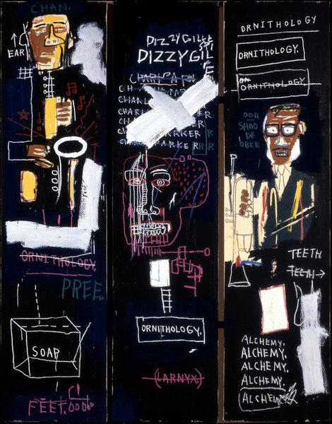
    Jean-Michel Basquiat, Horn Players, 1983, Acrylic and oilstick on three canvas panels mounted on wood supports, 243.8 x 190.5 cm. The Broad Art Foundation. Photography credit: Douglas M. Parker Studio, Los Angeles © The Estate of Jean-Michel Basquiat. Licensed by Artestar, New York

    I believe that Basquiat’s works were in fact complemented by poems, experts of rap songs, and sound clips from community members, as the curators made a genuine attempt at temporally continuing the dialogue into present day Toronto.

     Jean-Michel Basquiat, Untitled, 1981, Acrylic, oil, paper collage and spray paint on canvas, 205.74 x 175.9 cm. The Broad Art Foundation. Photography credit: Douglas M. Parker Studio, Los Angeles. © The Estate of Jean-Michel Basquiat. Licensed by Artestar, New York

    One particular thing that stood out to me is that the curators did not touch the subject of Basquiat’s early death. While they did draw attention to personal intimacies in his artwork such as a car accident at the age of seven, and the death of his close friend and fellow tagger, Michael Stewart, they decided to forgo a narrative about Basquiat’s drug use and untimely death. Perhaps this decision was made in respect to his family, particularly his sisters who worked with the gallery to relay commentary on his life as an artist. This was however, an interesting choice considering the notoriety that he gained in decades that preceded his overdose, as made clear by his ongoing legacy in literature, music, and art.

    Jean-Michel Basquiat appears on the cover of the New York Times Magazine, February 10, 1985 © 2015 Lizzie Himmel

    Regardless or whether or not the AGO has done Basquiat justice, it is clear that his work still carries the same seduction and lure that taps into an intrinsic desire for understanding, and is absolutely a must to see.

    Ella Gorevalov

    *Exhibition information: February 7 – May 10, 2015, Art Gallery of Ontario, 317 Dundas Street West, Toronto. Gallery hours: Tue & Thur – Sun: 10  – 5:30, Wed 10 – 8:30 p.m.; Extended Friday hours (5:30 – 8:30 p.m.): February 20 and 27, 2015.

  • Interview with Pari Nadimi

    Interview with Pari Nadimi, director of Pari Nadimi Gallery (P.N) by Emese Krunák-Hajagos (E.K-H)

    Artist, Felix Kalmenson (left0 with Pari Nadimi Gallery’s director, Pari Nadimi at the Opening Reception of  A Year in Revenue, a solo exhibition by Felix Kalmenson at Pari Nadimi Gallery, February 5, 2015. Artworks: Felix Kalmenson, “From the Ground Up”, Lauan plywood underlayment, latex paint and hardware; Felix Kalmenson, “Celebration”, 2015, spackle, styrofoam, baking tray, TV mount and hardware.

    E.K-H: What made you gravitate toward the art world and eventually open your own gallery? Why did you choose Toronto in 1998?

    P.N: I have been in art world since I was 18. I grew up in the museums’ environment starting as an intern (as an art history student) and ultimately working as a curator. I studied art history and archaeology at the University of Rome “La Sapienza” and taught at the same university for a few years. But, my real interest and passion has always been for contemporary art. I can’t say opening an art gallery was my dream, but working with artists, writers, film makers etc. has always interested me. I wish I had lived at the beginning of the 20th century and had been part of the intellectual life in Montparnasse. Perhaps, opening a gallery was an impulse to revive some elements of that dream. I made a conscious decision to make my living by representing artists, particularly cutting edge artists I strongly believed in, and selling their work no matter how difficult it might be. Opening a gallery in Toronto seemed obvious since I was living in Toronto.

    Jesse Colin Jackson, Radiant City, 2014, installation view at Pari Nadimi Gallery

    E.K-H: Your mission statement says that the gallery “has established a national and international reputation for its commitment to showing significant artists whose work is ambitious, challenging and intellectually motivated.” Does this still characterize the main goals of your gallery?

    P.N: Absolutely, this is still the main line of the gallery and will never change as they are the kind of artists I am interested in and get excited about. If the art is not progressive, challenging and intellectually motivated, then it is not for our gallery.

    I don’t choose artists from the market — quite the opposite — we influence the market according our artists’ creativity and progressive artistic ideas. I choose artists whose creativity is not only ahead of the market but also ahead of our time. So, we don’t follow the market, the market follows us. There is no doubt, this is much more challenging for a gallery but I like the challenge — so do the artists we represent. These artists are not artisans, they make art that provokes thoughts, engages the mind and stimulates passion. The gallery’s commitment is to foster these artists who are profoundly ambitious and fearless about using any medium and concept to realize their progressive ideas. These are the kind of artists who force art critics, curators and collectors to get out of their comfort zone and pay attention to the art that is the product of innovative minds, not to mention their ability to skilfully engage the general public. Their work is not about eye pleasing (in some cases it might be on the surface) but an endless discovery process of removing layers upon layers and ultimately building a profound relationship with the viewer.

    Jennifer Stillwell, “Neutral Center 1”, 2013, hand-hammered stainless steel sheet, stickers, h 2′ x w 8′ x d 1′

    E.K-H: How do you make decisions about who to represent or show at the gallery? Please describe your curatorial process, in particular, how you choose your exhibition themes and artists?

    P.N: This is a question I am often asked. Such decisions come after long research and learning about artists and their work. Keeping a close eye on the national & international art market and press is part of my job; you can’t run a gallery without being aware of what is happening in the art world globally. I am particularly lucky that I speak six languages, which helps me develop awareness of the global art market much faster. I am also interested in the global art market & press because most of our Canadian artists have been extensively exhibiting internationally and we have well known international artists on the gallery’s roster. Curatorial development is like the art making process itself, it evolves continuously. We plan our exhibitions a year or two in advance and that requires constant conversation and meetings. The best part of my job is working closely with the artists in creating exhibitions. All of the exhibitions are the result of the long process of thinking, meeting, and discussions with the artists.

    Jeremy Bailey, “Important Self Portrait”, 2013, C print, 58″ x 42″

    E.K-H: All of your artists are unique and highly professional but there the similarities end as they are very different in style. I remember Matilda Aslizadeh’s poetical dying Still Life, Jeremy Bailey’s humorous Important Portraits, and Lucy and Jorge Orta’s work among others. As you look back over the years, is there an artist’s career you’ve watched grow with particular affection?

    P.N: I think that is one of the interesting parts of the challenge. Most of the artists in the gallery’s stable are multidisciplinary artists who use different styles and mediums, but if you look closely at their work you can see the threads of dialogue among them, regardless of their style and medium. There is more than one artist whose career I have watched growing with affection, just to mention a few Rhonda Weppler + Trevor Mahovsky, Matilda Aslizadeh, Jennifer Stillwell  and Jeremy Bailey who were just out of school when they joined the gallery.

    Matilda Aslizadeh, Portrait/Landscape, 2009, installation view, Pari Nadimi Gallery

    E.K-H: Your exhibitions represent all artistic mediums, but it seems that photography has dominance. Is it intentional?

    P.N: The gallery’s artists are primarily multidisciplinary artists. They work with all kinds of media and formats. In some cases they use photography itself as a medium to make the work. Most of the photographic works shown at the gallery are not straight photography but are part of an installation, process, sculptural stage work, seconds of video or performance art — so I would hesitate to call them photography in any restricted way.

    Tori Foster (in collaboration with Jesse Colin Jackson), Eight Streetcar Shelters (Day), “Spadina Avenue”, 2011, Chromogenic print, 24″ X 96″

    E.K-H: How did you build up your list of contacts and clients after opening the gallery? Who do you deal with as collectors? How much of an influence do buyers and collectors have on you when creating an exhibition?

    P.N: This is the business part of running a gallery and that is like any other business. You need to have entrepreneurial skill to build up clientele. Our clients include national and international art museums, corporate and private collectors. Actually, we influence collectors and not the other way. When they start collecting an artist’s work, they learn more about that artist’s work, and they become part of the gallery’s team — not in terms of influencing the exhibitions — but part of the conversation and the excitement. I have had a few experiences in which collectors attempted to dictate exhibitions, but were immediately rejected.

    George Legrady, “Gate – Jerusalem”, 2013, lenticular, 31.5″ x 47.5″

    E.K-H: How does your gallery separate itself from other contemporary spaces in Toronto? What has been your greatest success thus far as a gallery owner?

    P.N: Every contemporary space has its own direction, criteria and eventually uniqueness. I think that Pari Nadimi Gallery is quite unique particularly in representing, alongside the Canadian artists, well known international artists and presenting cutting edge exhibitions. You know, success is relative in our business. We can feel success one day and not so much of it the next. Most of us in the art world were successful for many years and then faced the economic downturn for a number years that even forced some galleries to shut down.

    Rhonda Weppler + Trevor Mahovsky, August 1988, 2009, installation view at Pari Nadimi Gallery

    E.K-H: Art fairs have certainly been proliferating and growing in influence. How has your experience of art fairs been and how important do you think it is to have a presence at these fairs?

    P.N: Participating in the international art fairs is definitely vital and it is becoming more and more important. After years of buying domestic art, new collectors coming out of emerging markets such as China, India, and the Middle East are now feeling confident about buying western art. We have been participating at these fairs around the world for many years and the experience has been great, though I have to admit that art fairs, though necessary, are exhausting and expensive.

    David Rokeby, “San Marco Flow”, 2005, video still, 2 channel video, exhibited at Pari Nadimi Gallery

    E.K-H: In 2004 you moved to a new space with 7500 square feet to “mount increasingly ambitious, museum-quality exhibitions” and you just recently renovated it. What are some of the challenges you face looking towards the future of the gallery? What are your future plans?

    P.N: The gallery business is changing with internet and high technology like any other business and we need to keep up with these fast moving changes. Online presence has become indispensable though this doesn’t translate to the elimination of the physical location. You need to have both and work on both sides, continually updating your online presence. Keeping up requires serious devotion. In terms of the future, we plan to participate in more international art fairs outside Canada; to increase our online presence and to open a branch in New York where we will meet our international clients who often go there. We are also planning to partner with some European galleries to reinforce our presence in Europe. This is a plan we had started earlier but postponed due the economic crisis in Europe.

  • Worn: Shaping Black Feminine Identity at the ROM

    Karin Jones, Worn: Shaping Black Feminine Identity, synthetic hair and cotton bolls, 2015.

    Worn: Shaping Black Feminine Identity is an exhibit at the Royal Ontario Museum by Vancouver-based artist Karin Jones. It is the first installation of the ROM’s Of Africa series: a three-year project that explores African and diasporic themes, histories, and artists. The goal of the project is to reconstruct the current representations of African culture and of its diaspora, by enabling fresh dialogue of the future of Africa while acknowledging the past.

    Karin Jones, Worn: Shaping Black Feminine Identity, synthetic hair and cotton bolls, 2015.

    The installation is of a Victorian mourning dress fashioned out of synthetic hair used in several African braiding styles. On the floor are cotton bolls and synthetic hair bolls laying around to give allusion to the figure above, being born out of cross-cultural “forces”. Karin Jones outlines several different ideas behind the design of her dress: one purpose is to shed light on the hard labours of Africans throughout their contributions to the development of the British Empire. Another purpose — the one that was most obvious to me when I first lay eyes on the installation — is to bring forth the fact that the silhouettes of African women inspired the shape of the Victorian bustle dress, with possibly the most notable figure being Sarah Baartman. Baartman was a South African woman who was put on display as part of freak show exhibitions across Europe due to her physique, and whose body parts were exhibited in Paris’ Museum of Man after her death. Jones might have chosen to specifically create a mourning dress because, although it’s important to recognize these parts of history that are actually dismissed in academia, they are terrible facts that have played roles in Africa’s story of colonialism, and blunt acts of racism.

    Karin Jones, Worn: Shaping Black Feminine Identity, synthetic hair and cotton bolls, 2015.

    As a black female myself who has had a long history wearing synthetic braids, and who is also familiar with the reasoning behind this particular piece of 19th century fashion, I admire Karin Jones for pairing two historically powerful and dominant symbols together to convey her message. It is a simple, easily understandable one with heavy depth that allows us to remember a part of the story of our ancestry. 

    Karin Jones, Worn: Shaping Black Feminine Identity, synthetic hair and cotton bolls, 2015.

    Karin Jones chose to use this African-style of braiding technique because she wanted the audience to acknowledge braiding as a decorative art craft, just as much as any European decorative art. The amount of patience, love and care one must have to braid and the skill that needs to be developed certainly makes this an artistic craft. There are so many different styles; it’s a huge part of African culture and its diaspora, so I completely agree with the artist that it should be regarded as so.

    Text and photo: Joséphine Mwanvua

    *Exhibition information: February 3 – November 1, 2015, Royal Ontario Museum, 100 Queens Park, Toronto. Gallery hours: Mon – Thurs & Sat – Sun, 10 a.m. – 5:30 p.m. Fri 10 a.m. – 8:30 p.m.

  • It’s Nice to Meet You Suzy Lake

    Suzy Lake’s retrospective show of photo-based works at the Art Gallery of Ontario entitled Introducing Suzy Lake is quite the introduction. The head wall text begins with a quote from Lake stating “I don’t try to say what my identity is. I’m not some heroine recounting my life. I use myself as a model because I need a constant, a vulnerable subject as a reference point.” This statement is truly telling of her process as an artist whose themes involve constructed identities and in this endeavour it is important to retain a real referent amidst a series of false identities.

    Suzy Lake, Miss Chatelaine, 1973, gelatin silver print, 50.5 x 40.7 cm, printed 1996. Purchased with fund donated by AGO members, 1998. Art Gallery of Ontario, Toronto.  © 2014 Suzy Lake.

    It is hard to approach this exhibit without being reminded of Cindy Sherman’s work especially because of her recent retrospective at the MOMA. Even so, Lake’s work departs from Sherman in its wide breadth of concepts and her translations of those concepts. While Sherman explores identity in a fairly homogenous style Lake’s work has changed throughout her years as an artist. For example, Lake’s 1975 work “14 Over 28” she has exposed a rephotographed school portrait, but only used two-thirds of the photographic paper. On the remaining portion Lake drew her 28 year old self to demonstrate how different identities can exist within us simultaneously. While her 2008-2014 piece called “Extended Breathing Series” is a minimalist performance where Lake laid within a scanner and performed life-affirming actions: blinking, breathing and crying. These works create an uncanny tension between activity and stillness. These works created years apart retain their individual integrity without relaying on one another for validation. Each piece in this exhibit has compelling conceptual work as well as successful images to explore her concepts.

    Suzy Lake, 14 Over 28, 1975, gelatin silver print, graphite, 96.5 x 71 cm. Private Collection, Toronto. © 2014 Suzy Lake.

    Suzy Lake, Extended Breathing While Highlights Travel, 2009-2010, color transparency, lightbox, 101.6 x 152.4 cm. Purchase, funds donated by Donna G. Billes and Diana Billes, 2014. Art Gallery of Ontario, Toronto. © 2014 Suzy Lake.

    While the first half of the exhibit consists of a multitude of photographs ranging in time and concept, the final half is a single series entitled “Are You Talking to Me?”. This series, consisting of 88 large scale self-portraits, was created in 1979. The series was inspired by Robert De Niro’s famous scene in the film “Taxi Driver” (1976). Lake created the portraits by repeating the question “are you talking to me?” over and over again creating a dialogue between herself and the viewer. To curate this series, the walls of a large clean room bear only the rhythmic narrative of varying expressions of anxiety. Each work has been specifically manipulated by the artist, some photos are in colour, others in black and white, while others are torqued by heating and stretching the negatives. The sheer length and amount of expressive portraits creates an eery space for contemplation. While reflecting upon the identity of Lake and