Author: artoronto

  • The New Gods

    Artists Alejandro Garcia Contreras and Josée Pedneault with The New Gods (Christmas Bows). Photo: Katie Lawson

    Typology Projects, a non-profit organization on the third floor of Artscape Youngplace, gives home to Scotiabank CONTACT Photography Festival Featured Exhibition, The New Gods. In the light filled room a collection of large scale photographs, porcelain figurines and small paintings are displayed. They emerged from a collaboration between Montreal based photographer Josée Pedneault and Alejandro Garcia Contreras, a Mexican artist. What makes these photographs outstanding is their theme. They capture a rather unusual interpretation of the Via Crucis, or Stations of the Cross, a religious tradition leading up to Christ’s death on Good Friday. Garcia Contreras discovered this unique and unholy performance in the isolated village of Carrillo Puerto, a small community in the mountains of southern Mexico consisting mostly of farmers. This bizarre and unconventional way of celebration emerged without any kind of external influence, as the tourism, arts and culture industries are nonexistent in the area.

    Josée Pedneault and Alejandro Garcia Contreras, The New Gods series, 2013, Archival Inkjet Print, 40″ x 30″. Courtesy of Typology Projects

    Josée Pedneault and Alejandro Garcia Contreras, The New Gods (Religious Pair in Blue), 2013, Archival Inkjet Print, 40″ x 30″. Courtesy of Typology Projects

    According to Garcia Contreras, this drastic shift from tradition started a few decades ago when one villager decided to present a rather strange costume. In the following years, members of the community would attempt to produce and wear more unique costumes in what developed into an informal competition of sorts. Throughout the passing years, the elaborate and carnivalesque costumes started to reflect the changing social realities as well, from the inclusion of satirical political masks to an exterminator costume to call attention to the rise in mosquito-borne diseases. The two artists asked community members wearing those eclectic costumes to step aside from the festivities, then staged and photographed them.

    Josée Pedneault and Alejandro Garcia Contreras, The New Gods (Newspaper Man), 2013, Archival Inkjet Print, 40″ x 32″. Courtesy of Typology Projects

    Garcia Contreras said that besides the performative value of these costumes he is particularly interested in their psychological projection, as they all express elements of the inner self. While creating a bizarre mixture of local and popular culture with religious beliefs, the costumes are simultaneously evoking a dissonance between the traditional and the personal interpretation of Stations of the Cross. They all have an individual touch in representing the designer’s ideas, and they are often absurd or funny. The costumes also show the community’s resourcefulness with the use of humble or recycled materials. A good example for it the one that has been constructed entirely out of last season’s Christmas bows. An object from a recent costume is also displayed in the exhibition – a helmet put together from multi-coloured plastic straws.

    Josée Pedneault and Alejandro Garcia Contreras, The New Gods (Christmas Bows), 2013, Archival Inkjet Print, 40″ x 30″. Courtesy of Typology Projects

    Josée Pedneault and Alejandro Garcia Contreras, The New Gods (Green soldier), 2013, Archival Inkjet Print, 40″ x 32″. Courtesy of Typology Projects

    The disposability of materials used for the costums is in direct contrast to the permanence and preciousness of the porcelain figurines crafted by Garcia Contreras. They also make references to the church, to patron saint statues or to small devotional objects.

    Alejandro Garcia Contreras, Raising the Cross, 2015, Porcelain and Sculpted Glass, 23 x 16 x 16 cm. Courtesy of Typology Projects

    Installation view with Alejandro Garcia Contreras, (left to right): Jack Parsons, King of Rockets 2015; Disney’s Greed, 2015; The Thief, 2013, Porcelain and Sculpted Glass, various sizes. Photo: Katie Lawson

    The two artists initially met through a residency of Pedneault in Mexico in 2009. As a cross-cultural collaboration, the work benefits from the different contextualization of the event by Pedneault and Garcia Contreras. Without Garcia Contreras Pedneault wouldn’t have the opportunity to witness this remarkable celebration. Similarly, without Pedneault’s photographic capabilities, who shot all the photographs with a medium format camera, Garcia Contreras wouldn’t be able to document this curiosity. The way they emphasize the unusual materials with their lush textures and depict the figures in front of their chosen backgrounds, gives these photographs their artistic strengths. Through Pedneault’s and Garcia Contreras’ work Realism meets Surrealism, producing a stunning exhibition.

    Katie Lawson

    *Exhibition information: The New Gods by Alejandro Garcia Contreras and Josée Pedneault, May 7 – June 14, 2015, TYPOLOGY Projects, Artscape Youngplace, 180 Shaw Street #302, Toronto. Gallery hours: Fri – Sun, 12 – 5 pm or by appointment.

  • Rise and Fall by Nicholas Pye

    The titles of the photos in the Rise and Fall exhibition by Nicholas Pye at Birch Contemporary are well-considered and thoughtful enough to be a narrative work independent of the images themselves. They comprise a lexicon in the way that the settings of the work, the chateaus, estates, and country houses provide a background and foil against which Pye variously situates and flexes his body.

    Nicholas Pye, Silken Web, Archival Pigment Print, 2014, 60″ x 40″, 36″ x 24″, Edition of 5 + 2 AP. Courtesy the artist and Birch Contemporary

    Whether nude or clothed, Pye favours bare feet in his photos. The removal of shoes permit a return to a state of innocence, where play is unfettered by the rigidities of the wide-awake world. In a twilight, dream-state, all is permitted, the rules having been unbuttoned and loosed. In Pye’s world, the imagination is boundless and surreal – quite beyond the real, as the word surreal suggests.

    Nicholas Pye, The Fleeting I, 2014, Archival Pigment Print, 60″ x 40″, Edition of 5 + 2 AP, 36″ x 24″, Edition of 5 + 2 AP. Courtesy the artist and Birch Contemporary

    While the imagination may roam free, in “Fleeting I and II” Pye implies that our expectation and its fulfillment is not necessarily assured. Both fact and fancy share a dark side. We might peer on tippy-toe, stetching our necks expectantly into light’s flicker through a window, only to have our hopes dashed, as the shadowed butting-of-the-head against the wall suggests in one of the two images. While show’s title, Rise and Fall, brings to mind the cycles and rhythms of nature, such as the ebb and flow of tides, and the rising and setting of the sun, it’s also a hint at human limits. We may heave our breasts in hope, only to experience a dissolution into despair with their inevitable exhalation. The truism, what goes up must come down, merely points to the natural order of things. Is there an escape from this cycle? The short answer, as implied by the title of the works “Nepenthe” and “Soporific Form”, is drugs.

    Nicholas Pye, Nepenthe, 2014, Archival Pigment Print, 60″ x 40″, Edition of 5 + 2 AP, 36″ x 24″, Edition of 5 + 2 AP. Courtesy the artist and Birch Contemporary

    To the ancients, nepenthe was the anti-depressant drug or drink of its time, the allaying of their sorrow and trouble. Pye’s “Nepenthe” image is evocative of both a snake and a ladder. The window brightness at the top of the stairs is negatively countered by a sifting into the darkness at the bottom. In “Soporific Form”, the image of a winding staircase before a window twists and bifurcates the implied reality of what we view. This seeming metamorphosis of the visual is what we might expect, while in a narcotic, sleep state.

    Nicholas Pye, Soporific form, 2014, Archival Pigment Print, 40″ x 60″, Edition of 5 + 2 AP, 24″ x 36″, Edition of 5 + 2 AP Courtesy the artist and Birch Contemporary

    “Hushed, at a Standstill” has Pye stretched out on a six-legged table piled with books. His hand is placed over his heart, as if deceased, perhaps a casualty of a Swiftian Battle of the Books. The middle legs of the table appear to cleave his flaccid body neatly at mid-section, centring all the compositional elements of the photo, including the three six-pained windows. Has Pye been a drowning victim in a river of words, his head here submerged in the rising tide of tomes? The scene, is faintly evocative of Peter Greenaway’s The Cook, the Theif, the Wife, and Her Lover, less the violence and sadism of the film. The association, however, of “Hushed, at a Standstill” with autopsy is unavoidable, a transition from standstill, to still life, to inevitable lifelessness.

    Nicolas Pye, Hushed, at a Standstill, 2014, Archival Pigment Print, 40″ x 60″, Edition of 5 + 2 AP, 24″ x 36″, Edition of 5 + 2 AP. Courtesy the artist and Birch Contemporary

    If there is a division in this group of works between the Rise and Fall works, the Rise pieces cast a utopian glow. In “Halcyon”, Pye forms his naked body into a bud, suggesting the springtime of an idyllic, perhaps mythic age of bliss. The gesture suggests a planting of the seed of hope for a future blossoming. “Silken Web” is more overtly paradisiacal, presenting Pye as a naked Adam, either falling into a dream-state or awaking from it, bringing to mind Michaelangelo’s Creation of Adam with the delicately latticed window above the figure as a freshly minted earth. More pragmatic in tenor is “Pastoral Expectation”, seating Pye at a desk as an architect of hope, for perhaps a post modern arcadia, with the grimy products of the industrial age having been scraped clean.

    Nicholas Pye, Pastoral Expectation, 2014, Archival Pigment Print, 40″ x 40″, Edition of 5 + 2 AP, 24″ x 24″, Edition of 5 + 2 AP. Courtesy the artist and Birch Contemporary

    Steve Rockwell

    *Exhibition information: April 30 – May 30, 2015, Birch Contemporary, 129 Tecumseth Street, Toronto. Gallery hours: Wed – Fri, 10am – 6pm; Sat, 11am – 5pm.

    **Rise and Fall by Nicholas Pye is a Featured Exhibition of Scotiabank CONTACT Photography Festival, 2015

  • Jimmy Limit: Surplus / Clint Roenisch Gallery

    Solitude greets me upon entering the large exhibition space of Clint Roenisch Gallery. Jimmy Limit’s show Surplus, part of Scotiabank CONTACT Photography Festival, aims to represent excesses and extras but, in addition to being photographed, the objects come to life.

    Installation view, Jimmy Limit: Surplus, Clint Roenisch Gallery, 2015. Image: Courtesy of Clint Roenisch Gallery

    A wall painted of the color of sunshine surrounds a still life of oranges and ceramics. It is the orange color of the hot Mediterranean summer afternoons Bonnard used to paint. It radiates heat and happiness. It is hard to decide whether the color is flowing out of the photograph onto the wall through the frame, or the other way around. If I bought this still life, I would want the wall installed with it too. Despite it’s playful and serendipitous appearance, there is nothing unplanned in this digital image. Limit has a studio now and all the objects in his work are painstakingly arranged down to the tiniest detail, shot and reshot many times, and then manipulated as far as the latest technology allows.

    Jimmy Limit, Fruit and Ceramic Arrangement 4 (Abundance, Anxiety, Balance, Citrus, Collapse, Desire, Digestion, Distribution, Everyday, Excess, Growth, Longevity, Precarity, Saturation, Storage, Surplus, Time, Uncertainty, Yellow) actual size, 2014, inkjet print on cotton rag paper, 25” x 36.5”, edition of 3 (detail). Image: Courtesy of Clint Roenisch Gallery

    Jimmy Limit, Fruit and Ceramic Arrangement 4 (Abundance, Anxiety, Balance, Citrus, Collapse, Desire, Digestion, Distribution, Everyday, Excess, Growth, Longevity, Precarity, Saturation, Storage, Surplus, Time, Uncertainty, Yellow) actual size, 2014, inkjet print on cotton rag paper, 25” x 36.5”, edition of 3. Image: Courtesy of Clint Roenisch Gallery

    Surplus is a continuation of the 2013 exhibit Show Room (Clint Roenisch Gallery) and is somewhat similar in philosophy but also very different in its presentation. Show Room mainly involved photographs of objects from hardware stores combined with fruits and plants from Chinatown. Depicted in front of uniform backgrounds of strong colors, they mimicked commercial photographs. They looked pristine and perfect—too beautiful for their own good. Those characteristics gave them a presence that was clearly more than commercial. Limit said in his discussion with Christopher Schreck in Paper Journal, that he really didn’t understand the function of the ready-made construction or technical equipment, he just “interrupted their life cycle” by photographing them and then returning them to the store. He arranged items and took “point-and-shoot” images that all had a similar cell-phone-aesthetic. Limit tried to avoid all personal aspects and just wanted to “document” the objects like a “technician” would. However “an unintended aesthetic quality that oftentimes the photographer doesn’t even realise is there.” It was and it is always there in Limit’s photographs. While this aesthetic was accidental in Show Room, it is intentional in Surplus.

    Installation view, Jimmy Limit: Surplus, Clint Roenisch Gallery, 2015. Image: Courtesy of Clint Roenisch Gallery

    There are objects, fruits and plants beautifully photographed in Surplus too, but what makes this show striking is the presentation of it. It is more than just a show, it is an assemblage that truly becomes an art form of its own. Even though most of the photographs are representational, the exhibition has a surreal touch to it. Half of the largest wall, painted purple, seems almost empty. A worm-like spiral tube makes a decorative arch on the right side followed by two, diagonally placed ceramic pieces, one of them a glazed mask. In the left corner of the purple wall, in a purple frame, there is a purple image, a self portrait. In contrast to the strong colors of the still lifes, it is very light, like breath on a frosted window. It is barely a face, more like a mere suggestion of it, like a passing ghost caught in a mirror—very mystical.

    Jimmy Limit, Self Portrait in Memory Foam Purple (Absorption, Ambiguity, Anxiety, Archaeology, Commodity, Digestion, Digital, Foam, Future, Growth, History, Luxury, Memory, Precarity, Redundancy, Saturation, Surplus, Uncertainty) actual size, 2014, inkjet print on cotton rag paper, 21” x 16.5”, edition of 3. Image: Courtesy of Clint Roenisch Gallery

    Installation view, Jimmy Limit: Surplus, Clint Roenisch Gallery, 2015. Image: Courtesy of Clint Roenisch Gallery

    The floor of the gallery is strewn with stands and benches holding ceramics and citrus fruits at different stages of decomposition. The exhibition might seem surreal, absurd or humorous at certain points, but it is always controlled—the accidental aesthetic becomes intended here.

    Jimmy Limit, Stand for Photographing Fruit and Vegetables, 2015, mixed media, 39” x 19” x 8”, unique (detail). Image: Courtesy of Clint Roenisch Gallery

    Suddenly I hear footsteps, and turn back to see Clint Roenisch photographing some packaging on the floor with his cellphone, demonstrating Limit’s photographic method from his self-published book, Jimmy Limit: Spring/Summer 2012. Walking back to the main gallery, Roenisch pinpoints yet another layer of the show. The colors of the background wall continue on the boxes that hold ceramics and fruits, and bring them into the larger composition.

    Installation view, Jimmy Limit: Surplus, Clint Roenisch Gallery, 2015. Image: Courtesy of Clint Roenisch Gallery

    Any exhibition can be approached in many different ways. More and more people are viewing shows online—Clint Roenisch’s site is a very good one for that purpose with lots of images from many angles—so the documentation becomes a representation of the show. Coincidentally, Limit shoots all those installations for Roenisch, including this one. As Limit said, “seeing photo documentation of some sculptures often leads me to this idea that the real work is a photograph more than it is the sculpture… I am more drawn to a photo of something than the actual thing itself.” Hence the color scale on the left side of each painted wall is there to encourage viewers to photograph them, using the scale as reference. So they use their cellphones and photograph the photographs to create another photograph. That brings up the intriguing question: which one is the “real” photograph?

    Emese Krunák-Hajagos

    *All the quotations are from In Conversation: Jimmy Limit and Christopher Schreck, Paper Journal, April 25, 2013.

    **Exhibition information: April 30 – June 6, 2015, Clint Roenich Gallery, 190 Saint  Helens Avenue, Toronto. Gallery hours: Wed – Sat, 12 – 6 pm.

    ***Note: Jimmy Limit won the Gattuso Prize of $5,000 for “the caliber and concept of the work, the curatorial vision, and the overall impact and presentation of the exhibition.”

  • Elizabeth Zvonar: The Challenge of Abstraction

    The Challenge of Abstraction is Elizabeth Zvonar’s second solo exhibition at Daniel Faria Gallery. She continues to work with similar themes of fragmented body parts executed through collage and sculpture. Zvonar attempts to identify a line between ritual and abstraction through advertisements found in old magazines, repeating images, and playfulness of materials. What could be the challenge of abstraction that she is referring to? To abstract is to draw something away from it’s whole image, to make it non-representational. Zvonar changes the context of each image she chose to place in the gallery, by taking snippets from different sources.

    Installation view of Elizabeth Zvonar: The Challenge of Abstraction with Doubleheader (silk, 58” x 38”) at Daniel Faria Gallery, 2015

    The majority of Zvonar’s work are digitally blown up collages. A couple of them are printed on silk, and hung from the ceiling on brass hexagonal bars. They are floating in the air like sculptural pieces, to be observed in multiple angles. “Doubleheader” is one of these pieces, depicting a collaged dark landscape with a red fire for a face on a horizontally mirrored head. The other large silk piece is a collage of a contemporary young woman standing in front of a Renaissance or Baroque painting of a man intimately holding a woman in bed. The woman in the painting is naked and exposed. The young contemporary woman’s head would cover the section of the painting that shows the private parts of the painted beauty. However she is faceless and the image of the painted couple’s portrait is repeated in the empty shape of her head. In the foreground, a phallic shape plastered over the young woman’s body and her T-shirt reads, I Mate. The composition is an interesting layering trick, and a form of disembodiment, separating the body from the mind.

    Installation view of Elizabeth Zvonar: The Challenge of Abstraction, 2015, silk, 62″ x 36″ at Daniel Faria Gallery, 2015

    “We Play to our Wishes Not To Their Rules” is a large mounted collage that holds a narrative of old age, birth, sex, and luxury. A feminine hand, lustfully holds dripping red raspberries pouring into a mouth, inside a golden goblet, as a duck head on a cane bites her marital finger. Raspberries symbolize childbirth and pregnancies, and they bleed as they lie in the hand of the woman. More menacing animal cane heads of dogs and birds are repeated, the ones you’d expect an elderly rich man to possess for more than just walking. The bottom is framed by a pair of feminine hands covered in gold, crossing each other. Luxury, sex, and angriness conveys a conflicting image that plays with power and gender. Another large photography, “Join the Resistance”, contains a repeating image of stone fists, suggesting a victorious punch to the sky. They exist as a powerful backdrop to the foreground of a collaged marble statue of a decapitated female figure crouching down. Her wavy hair frames her bare breasts, while an exaggerated vintage hand with a glamourous ring on the index finger, shows off her independence.

    Elizabeth Zvonar, We Play to Our Wishes Not To Their Rules, 2015, Photo Rag Ultra Smooth, matte laminate, mounted on dibond, U-channel subframe. From Elizabeth Zvonar: The Challenge of Abstraction at Daniel Faria Gallery, 2015

    Divided body parts are cluttered throughout the gallery, creating a physical presence of a collage. A 20” x 39” cut out of red supple female lips hang on the wall as a piece of sex. Incense sticks accompany the statues. The spiritual background of incense give the concrete moulds more life. The incense is placed on the tips of toes of shoes and feet, and tips of a hand, that look like they could have been moulds produced from Zvonar’s own body. A suggestion of smell and touch, the alternative sensors, produce a symbolic presence. The three dimensional moulded sculptures become a physical copy of the artist in pieces, while the cut up collages are a copy of fragments of her mind.

    Elizabeth Zvonar, Boot, 2015, concrete, insence, 7” x 4” x 4″. From Elizabeth Zvonar: The Challenge of Abstraction at Daniel Faria Gallery, 2015

    Elizabeth Zvonar, It’s the gaps that change the sequence, 2015, Concrete knee cast & Matte Kodak Ultra Endura mounted on dibond, 9” x 6” each. From Elizabeth Zvonar: The Challenge of Abstraction at Daniel Faria Gallery, 2015

    The play between the invisible and physical world is very prevalent in Zvonar’s images. The  challenge of abstraction, is trying to take pieces of an image, and to create something new out of it, while erasing the connotations associated with it. Every object is associated with a culture, a moment, or a specific purpose. Each piece becomes the gist of a feeling, a summarization. We live in a world of excess of images, tied to multiple meanings. Zvonar uses the symbols as a vocabulary for something metaphysical and new. The challenge is to take the images, and arrange them in a way to let the subconscious mind speak.

    Tetyana Herych
    Images are courtesy of Danial Faria Gallery

    *Exhibition information: May 2 – June 6, 2015, Daniel Faria Gallery, 188 St Helens Avenue, Toronto. Gallery hours: Tue–Fri 11 am –6 pm; Sat, 10 am – 6 pm.

  • The Art of Canadian Composite Photograph: 1870 – 1930

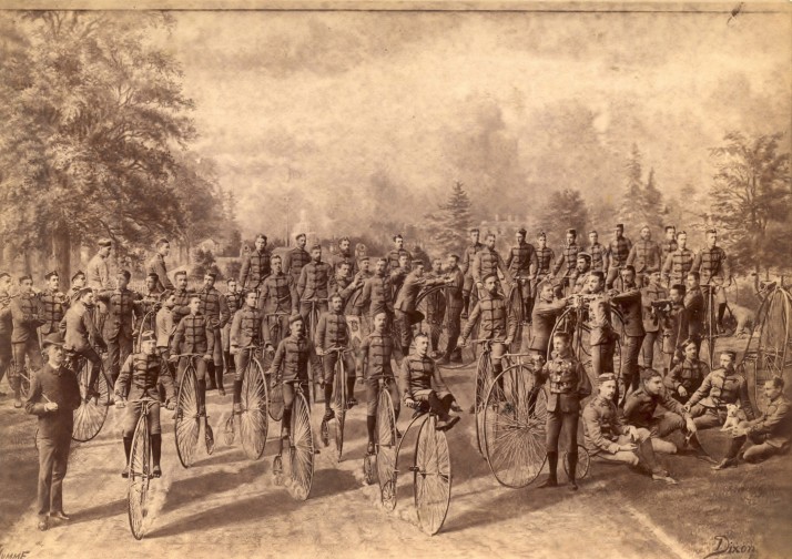
    S. J. Dixon, The Wanderers Bicycle Club of Toronto, 1884, From the Cycling Photographica collection of Lorne Shields, Thornhill, Ontario. Image: Courtesy of Campbell House Museum

    Since its conception, photography has proven to be both an interestingly unique artistic medium, renowned for its pictorial accuracy and wide accessibility, and a powerful tool for economic, political, and journalistic ventures. In our present day, images are constantly surrounding us, communicating messages and telling stories through a single still – “a picture tells a thousand words.”  With the invention of Photoshop and digital cameras, photography has become a much more malleable practice that lets us easily manipulate the story, one that we often take for granted. When cameras still relied on delicate film and cumbersome equipment, it was difficult, if not near impossible, to capture more complex images. There could be absolutely no movement, the scene had to be fairly small, the lighting and models had to be very specifically oriented, and even then it was still possible for the image to be ruined. Early photographers and entrepreneurs therefore developed methods to circumvent these limitations, one of the most popular being the composite image.

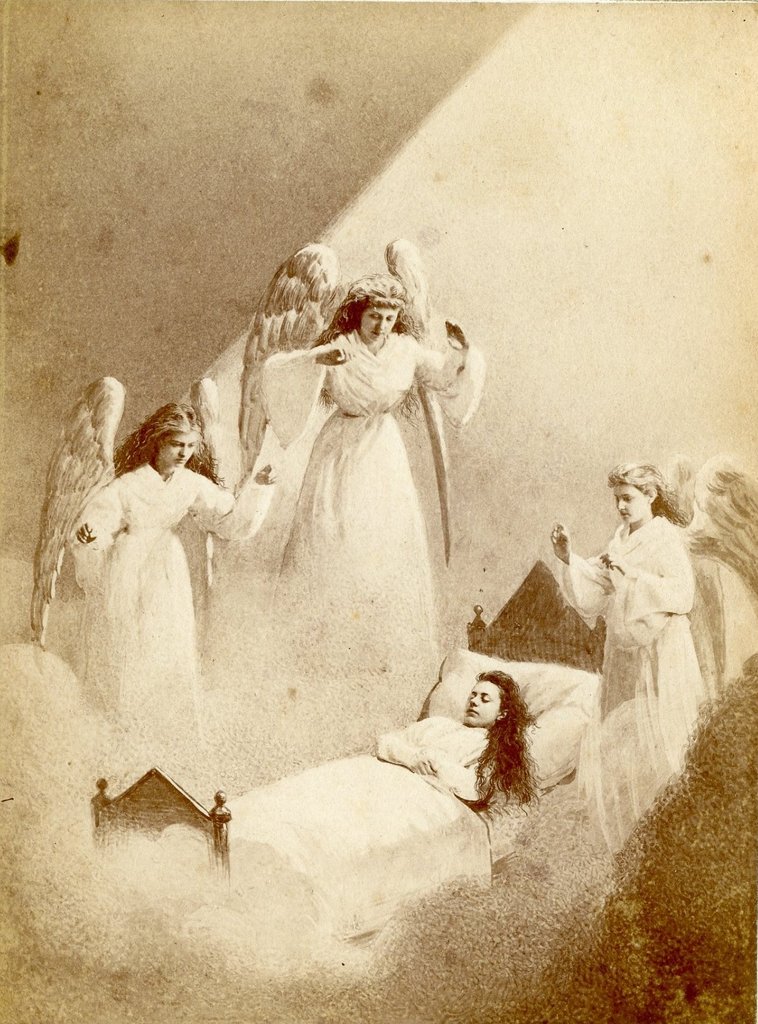
    Eckerson and Bell-Smith (active 1874, Hamilton, Ontario, Dreaming of Angels, c. 1874, Cabinet card. Collection of Robert G. Wilson. Image: Courtesy of Campbell House Museum

    Composite photography was an incredibly laborious and complex process. First, the photographer shot portraits of all the models separately and the film processed. Next, the figures would be cut out and placed onto a new background, which were either hand painted or photographed themselves.  Once the entire image was arranged, another photo was taken. If done correctly, the result would appear as a single coherent image with no visible outlines or disparities, though it was incredibly difficult to achieve. The tactic of the composite image was particularly successful for larger, more crowded scenes where movement was constant and conditions were generally uncontrollable. This made it particularly useful for advertisers and politicians who wanted to represent the popularity of their product or platform in a single still.

    James Notman, Group of Five Men and a Dog Playing Cards, 1882, From the collection of Robert Wilson, Photographic Historical Society of Canada. Image: Courtesy of Campbell House Museum
     
    The exhibition at the Campbell House Museum demonstrates this phenomenon as it was first introduced in Canadian photography. During this period, photographers like Sandham, Eckerson, Bell-Smith, and Notman (who started his own venture that specialised in composite imaging) worked alongside companies and politicians, as well as independent clientele, to capture scenes that would otherwise been too complex or momentary for their current technologies.
     
    William Notman (1826-1891) and Henry Sandham (1842-1910, Montréal, Québec, Big John and Party Shooting Rapids, 1878, Albumen print. Collection of Robert G. Wilson. Image: Courtesy of Campbell House Museum

    Notman’s “Big John and Party Shooting Rapids” (1878), for example, depicts a team of rowers tackling the Niagara Falls’ rapids. Not only was this too fleeting to properly document in the actual moment, but it was far too dangerous and impossible to re-enact. Through this technique, they were able to skillfully create a scene that no one could even conceive, subsequently becoming one of the most iconic images of that period. Even looking at it today with all of our new innovations, you can still sense the resonating impact of its heyday. Likewise, the accompanying images of the Montreal Carnival, Canadian landscapes, provincial legislatures, and even the Union and Confederate leaders maintain the aura of fascination and agency that would have undoubtedly mystified audiences at the time. To have all of these surviving remnants assembled into one place is truly a uniquely wonderful experience.

    Simon Termine

    *Exhibition information: More Real than Reality. The Art of Canadian Composite Photograph: 1870 – 1930,  May 1 – 31, 2015, Campbell House Museum, 160 Queen Street West, Toronto. Gallery hours: Tue – Fri, 9:30 am – 4:30 pm; Sat – Sun, 12 – 4:30 pm.

  • Makeshift at Gallery 44

    This year’s major focus of CONTACT is abstraction and composition in the photographic medium. This theme is at the heart of CONTACT’s flagship show at  MOCCA. The exhibition, Part Picture + Past Picture, features works by contemporary and classical photographers where abstract characteristics are central. Makeshift at Gallery 44, also a Primary Exhibition for the festival, offers an extension of such explorations through works by Maegan Hill-Carroll, Brea Souders and Ève K. Tremblay.

     Works by Maegan Hill-Carroll

    One of the major issues in abstract photography is that it is always a photograph of something real, even if manipulated to the extreme – otherwise if solely created on a computer, it is digital art. Therefore, abstract photography can never be entirely non-representational. It is, however, at times perceived and discussed as such. Abstract photography presents a unique set of questions. What happens to the initial objects after the reality around them is cropped by the lens, translated in-camera, transposed during post-processing and finally recorded on paper? To what extent do recognizable elements in an image still act as the same objects as at the moment of being captured? Is it really necessary to know what the photograph is about in order to grasp its artistic merits?

    Works by Brea Souders

    Artworks presented in Makeshift feature easily recognizable everyday objects alongside highly specialized ones, which a viewer would be able to identify only with the help of the artist’s statement. For instance, curator Noa Bronstein explains that Ève K. Tremblay photographed items left by the sculpting process in the studio of her father, Alain-Marie Tremblay. Without that information, the gorgeous photographs would be aesthetic enigmas impossible to solve. And yet, even with that information, the enigma remains and grows. While gazing upon Ève K. Tremblay’s photographs, a viewer might experience a sublime feeling of getting closer to the mystery of creation. To what extent is that feeling connected to the reality of the studio? Does the interplay of shadows reveal something about Alain-Marie Tremblay’s artistic agency? Or perhaps we are assigning these images significance because we were told about the loaded nature of what we see. Perhaps the sublime feeling is generated by the aesthetic qualities of the photograph and reinforced by the intellectual superstructure.

    Works by Ève K. Tremblay

    Whether or not the viewer is ready to decide on some answers, or even consider these questions productive, Makeshift is a delightful display of masterful compositional and coloristic balance.

    Text and photo: Elena Iourtaeva

    *Exhibition information: Makeshift / Maegan Hill-Carroll, Brea Souders, Ève K Tremblay, May 2 – 30, 2015, Gallery 44 Centre For Contemporary Photography, 401 Richmond Street West, Unit 120, Toronto. Gallery hours: Tue–Sat, 11 – 5 p.m.

  • Heidi Leverty: Surplus in transit / Walnut Contemporary

    Installation view. Photo: Elena Iourtaeva

    Walnut Contemporary presents SURPLUS in transit, an Open Exhibition of Scotiabank CONTACT Photography Festival featuring the work of Toronto artist, Heidi Leverty. The exhibition is engaging, approachable, and enjoyable for all types of art lovers.

    Heidi Leverty, Plastic 36B, 2012. Image: Courtesy of Walnut Contemporary

    Walnut Contemporary is a commercial gallery that aims to inspire a conversation around the topic of environmental sustainability by displaying SURPLUS in transit. Besides the interesting theme we admire the aesthetic beauty and decorative aspects of Heidi Leverty’s photographs. Curator, Ibérina Raquel Vilhena, achieves balance between the power and the beauty of this art. SUPRLUS in transit comments on the excess produced by our community’s torrid love affair with mass production.

    Curator, Gallery director, Ibérina Raquel Vilhena with Heidi Leverty’s work. Photo: Elena Iourtaeva

    Vilhena instigates inquiry by placing bins and blocks of recycled materials beside Leverty’s photographs of the same bits and pieces. They are attractively arranged and maintain the beauty seen in the photographs but also serve to ground the shots. We cannot ignore that what we see in Leverty’s photographs is in fact real refuse of an overwhelming quantity. As I move from photograph to photograph, I am embarking on the most aesthetically pleasing minor guilt trip possible, reminded of my own undeletable environmental footstep.

    Installation view with Plastic 18. Photo: Emily Kovacs

    Prior to imagining this series of photographs, Leverty traveled to a recycle centre with the innocuous plan of recycling some of her husband’s old sheets of paper. Standing over top of bins of castoffs, she would discover a love for the textures of the refuse surplus materials and would come to draw inspiration from objects many would view as unrepentantly ordinary and without purpose.

     Heidi Leverty, My Wall-E lights. Image: Courtesy of Walnut Contemporary

    A moment in the life-cycle of the disposed of disposable is captured in Leverty’s photographs. These ordinary and every-day objects, when amassed in giant recycle centre bins, create pleasing geometric lines and shapes with abstract and sculptural beauty.

    Heidi Leverty, Paper 36. Image: Courtesy of Walnut Contemporary

    In one of my favourite pieces, “Tincarnation 28”, Leverty photographs flattened misprinted Coke cans. These containers were bound to be considered garbage by consumers eventually, but the misprint prevented them from ever seeing a drop of Coke. These cans were born as garbage, refuse without usefulness. This photo documents the essence of mass-production’s wastefulness. 

     Heidi Leverty, Tincarnation 28. Image: Courtesy of Walnut Contemporary

    Leverty’s photographs give purpose to what no longer has a purpose, exposing the simple beauty of a mundane object as it makes its way through the recycling system. 

    Emily Kovacs

    *Exhibition information: May 1 – 30, 2015, Walnut Contemporary Gallery, 201 Niagara Street West, Toronto. Gallery hours: Wed – Sat, 1 – 6 p.m.

  • The Lodz Ghetto Photographs of Henryck Ross

    Henryck Ross began as a professional photographer for the Polish Press, capturing the world around him as it gradually devolved into the chaos of war.  The year was 1940; the Second World War had just begun as the Soviet Union and the Germans annexed Poland within weeks, forcing the French and the British to respond militarily. The war ensued with its massive casualties and unparalleled destruction on both sides, overshadowing the absolute horror that was the persecution, degradation, and systematic elimination of European Jews at the hands of the Nazis. Among all of the Germans’ occupied territories, Poland – with the highest Jewish population of approximately 3,000,000 – faced the worst. A myriad of tactics were employed to handle the “Jewish Question,” ranging from forced emigration to outright execution. One of the solutions was to concentrate the target population, particularly in large urban centers, within a contained section of the city thereby dubbed a “ghetto.” Lodz alone had over 160,000 inhabitants from across Europe, all forced to live in horrifying conditions.

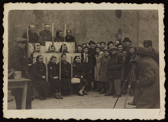
    Henryck Ross, Henryck Ross photographing for identification cards, Jewish Administration, Department of Statistics, Lodz ghetto, 1940, Art Gallery of Ontario, Gift from Archive of Modern Conflict, 2007. © 2014 Art Gallery of Ontario

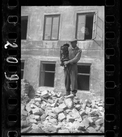
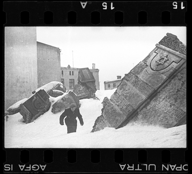
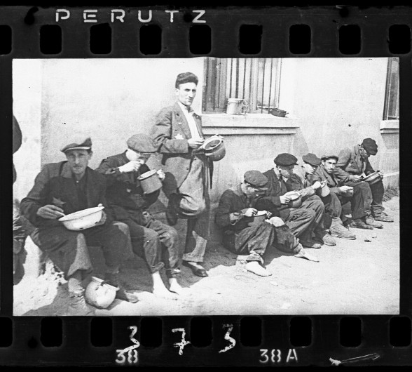
    Ross was relocated to the ghetto and, because of his expertise, he was quickly enlisted by the Statistics Department of the Judenrӓte – a council of Jewish elders established to preserve order yet was nothing more than a puppet government for the Nazis. Ross’ job was to firstly photograph the Jewish inhabitants for identification papers, and secondly document administrations, factories, and citizens as propaganda for the regime. His work was heavily restricted to only certain subject matter and anything that deviated from his overseers’ orders was grounds for execution. Therefore, many of his photographs in the exhibition consist of happy citizens in soup kitchens or diligent laborers in textile and leather workshops. Despite the threat of death however, he was keen on telling the true story of the Lodz ghetto, not the false portrayal that satisfied quotas or consciences. Taking every measure to conserve on the department-provided film, he then wandered the confined neighbourhood to capture the sights of his everyday life: streets lined with the cold and homeless, destroyed synagogues (most notably the one on Wolborska Street whose Torah had survived the pillaging), fecal workers who very often suffered from severe illness, and denizens digging holes scrounging for food. Ross constantly risked his life and had doubts that he would even survive through the ordeal, so as a contingency he collected his prints – both from his own work and from his work for the Judenrӓte – and buried them at 12 Jagielnoska Street in the hopes that they would be rediscovered by their liberators. After the liberation Ross recognized that only half of his 6,000 negatives survived.

    Henryk Ross, Lodz ghetto: Man who saved the Torah from the rubble of the synagogue on Wolborska street (destroyed by Germans 1939), 1940, Art Gallery of Ontario, Gift from Archive of Modern Conflict, 2007. © 2014 Art Gallery of Ontario

    Henryk Ross, Lodz ghetto: The ruins of the synagogue on Wolborska street, demolished by the Germans, 1940, Art Gallery of Ontario, Gift from Archive of Modern Conflict, 2007. © 2014 Art Gallery of Ontario

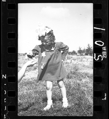
    The range of work that Ross provides is truly telling of those times. On the one hand, it shows the Nazis’ efforts in addressing their racial prejudices as well as the idea they strived for, which took the form of an industrial powerhouse that maximized efficiency and minimized cost. Their propaganda was a means of demonstrating to the German people, the government, and themselves that theirs was a noble and progressive goal. On the other hand, you have the gruesome reality that their efforts manifested that completely juxtaposes their ideal solution. Having both perspectives simultaneously is truly an immersive experience as Ross seems to tell vivid narrative of his, and many others’, experiences. What was most moving, I find, was the assortment of individualised portraits and candid moments of several of the Jewish inhabitants taken shortly after their relocation. There were scenes of smiling and playing children, women enjoying their gardens, and men in suits in professional poses. It seemed like a brief instance of calm separate from the painful life around them – an enduring moment of dignity and joy, even though for many it would sadly be one of their last.

    Henryck Ross, Lodz ghetto resident – young child, 1941 – 42,  Art Gallery of Ontario, Gift from Archive of Modern Conflict, 2007. © 2014 Art Gallery of Ontario

    Henryk Ross, Lodz ghetto: “Soup for lunch” (Group of men alongside building eating from pails), 1940-44, Art Gallery of Ontario Gift from Archive of Modern Conflict, 2007 © 2014 Art Gallery of Ontario

    Simon Termine

    *Exhibition information: Memory Unearthed: The Lodz Ghetto Photographs of Henryck Ross, January 31 – June 14, 2015, Art Gallery of Ontario, 317 Dundas Street West, Toronto. Gallery hours: Tue – Sun, 10 –5:30, Wed, 10 – 8:30 p.m.

  • Tim Roda’s Narrative

    Exhibition Narrative at the Angell Gallery showcases photographs by Jakub Dolejs, Yael Eban, Andrew B. Myers, Tim Roda and Oli Sorenson. This exhibit basks in photography’s ability to mimetically detail a narrative. The most intriguing work in the exhibition is produced by the artist, Tim Roda. In his series “Hidden Father”, Roda mimics the 19th century photographic portraits of young children. Due to the long exposure times of early photography, children needed to remain still for extended periods of time while being photographed. For the children to maintain their still position, photographers often included a “hidden” mother. The “hidden” mother would be covered with a black cloth and the child would be placed on her lap or in front of her, so that she would be able to hold the child in place without disrupting the photograph. The photographs produced are eery, to say the least, it is almost as though a black apparition has taken hold of the child.

    Tim Roda, Hidden Father 4, 2015, Silver Gelatin Print, Edition of 3, 15″ x 10″. Image: Courtesy of Angell Gallery

    Tim Roda’s photographs subvert the historical narrative of the “hidden” mother to that of the “hidden” father, but by virtue of their “hiddeness” their gender is intrinsically ambiguous. Similarly, Roda subverts the narrative of parent and child, in the 19th century photographs the veiled adult is an unseen authority, which controls the child.

    Tim Roda, Hidden Father 3, 2015, Silver Gelatin Print, Edition of 3, 15″ x 10″. Image: Courtesy of Angell Gallery

    However, within Roda’s photographs the child is placed in an ambiguous narrative that places the child as protagonist. In one photograph, a young child sits atop a filing cabinet, with his “hidden” father standing to the side. The inquisitive child appears beyond the control of the veiled mass, leaving the child as the sole actor within the work. The walls of the Angell Gallery are currently housing some unusual and thought-provoking pieces that provide an engaging experience.

    Mia Guttmann

    *Exhibition information: Exhibition Narrative by Jakub Dolejs, Yael Eban, Andrew B. Myers, Tim Roda, Oli Sorenson,  May 1 – 30, 2015, Angell Gallery, 12 Ossington Avenue, Toronto. Gallery hours: Wed – Sat, 12 – 5 p.m.

  • Scotiabank Photography Award: Mark Ruwedel

    Mark Ruwedel, Chocolate Mountains, A Ceremonial Trail. The Ice Age, 2001. Courtesy of the artist, Gallery Luisotti and Art 45

    Covering a vast terrain of bucolic vistas, deserted landscapes, and urban streets, Mark Ruwedel’s career survey at the Ryerson Image Centre presents an extensive and varied display of the acclaimed photographer’s work. The collection showcases previously completed projects alongside ones that are still in progress, giving the exhibition a considerable scope that expands beyond the gallery space.

    Mark Ruwedel, Westward: Railroad Cuts. Westward the Course of Empire., 1995 – 2005. Courtesy of the artist, Gallery Luisotti and Art 45

    The substantial presence of landscape portraits, panoramas, and diptychs captured throughout the Western regions of Canada and the United States emphasizes Ruwedel’s most thoroughly explored subject matter, nature. From arborous hidden trails, to desolate sites containing bomb craters, these contemplative images create an expansive world to explore. Guided by the artist’s distinct eye for composition, these primarily black-and-white photographs visually manifest Ruwedel’s passion for discovering and capturing interesting and evocative environments.

    Mark Ruwedel, Splitting, 2013. Courtesy of the artist, Gallery Luisotti and Art 45

    The photographer’s most immediate reference point is Robert Smithson, through their similar entropic preoccupations with nature and the human body. While humans are mostly omitted from the photographs displayed within the exhibition, our irreversible physical presence and its effect on nature are hinted at in other ways, such as man-made nature trails or the appearance of litter and other inorganic ephemera. Furthermore, Ruwedel’s study of urban facades explicitly references Ed Ruscha’s series of photographs capturing boulevard strips and other similar Californian landscapes, extending his thematic concerns beyond the picturesque into more familiar locations.

    Mark Ruwedel, Panamint Valley: An Ancient Rock Alignment, 2000, gelatin silver print mounted on archival board with graphite lettering., Courtesy of the artist, Gallery Luisotti and Art 45

    This thorough survey will captivate admirers of Ruwedel and landscape-themed photography, while also providing curious onlookers a chance to explore new and exciting destinations through the photogpraher’s interesting and curious lens.

    David Saric

    *Exhibition information: April 29 – June 28, 2015, Ryerson Image Centre, 33 Gould Street Toronto. Gallery hours: Tue – Fri, 11 – 6, Wed, 11 – 8, Sat – Sun, 12 – 5 p.m.

  • Interview with Csilla Csiki and Peter A. Por / Articsok Gallery

    Csilla Csiki and Peter A. Por in front of Frank Rodick’s photographs, May 2015

    Interview with Csilla Csiki (Cs.Cs) and Peter A. Por (P.A.P), owners of Articsók Gallery by Emese Krunák-Hajagos (E.K-H)

    E. K-H: How did you meet and what made you decide to open a gallery together? I know Peter is an established sculptor, but artists don’t usually open galleries.

    Cs. Cs: We met ten years ago ‘by chance’. We were both new graduates in the field of art as mature students. We shared similar cultural backgrounds and had a keen interest in pursuing a career in art. We both started collecting paintings and sculptures, and this connected us to the art community and to artists whose work we admired and appreciated.

    In 2013 many great galleries in Toronto closed down and I thought that it created a vacuum. We had a foundation we relied on, since we were already connected to the art world, Peter as an artist, I as an agent and both of us as collectors. It was my idea to open a gallery and Peter went along with the plan. Some people supported us but most of our friends questioned our sanity, saying “you are f…… nuts.” But we followed our passion. Opening a gallery was like a love story for us.

     Northern Suite / Solo exhibition by Oleg Lipchenko, Opening Reception, Saturday, September 7, 2013. Photo: Shannon Litt

    E.K-H: What does the name of the gallery, Articsók, mean and how did you come up with it?

    P.A.P: We wanted a name that would be catchy, unusual and memorable.

    Cs.CS: We were looking for a name that was meaningful for us and at the same time playful. The first part “art” is obvious to all, showing that our business is art. The second half “csók” comes from our mother tongue, Hungarian, and it means a passionate kiss—a kiss that lovers exchange. The name shows our passionate love for art. Artichoke is also a vegetable. So Articsók comes from a pun, a play on words. Peter often speaks, and even titles his work, in “pun-language” combining English, French and Hungarian words.

    Peter Alexander Por, Doubleextra Virgin, 2007, mixed media, 10 x 10 x 6 inches. From the Metamorphosis exhibition, February 8 – March 8, 2014. Photo: Courtesy of Articsók Gallery

    E.K-H: Please tell us more about yourself and your background.

    Cs.Cs: I am an ethnic Hungarian from Romania, a culturally rich country with many different nationalities. Art was always part of my life and has surrounded me since my early years. Art, in its many forms: as historical architecture, as sculptures in public places, and as paintings in churches and museums, enriched my life and built up my “visual taste.” As far as I can remember I started to compare and contrast what I saw — you could say that art educated me. Art had an everlasting spell on me.

    The “class” system still exists in Europe. In high school I fully understood why Van Gogh covered his face with charcoal and dressed in poor clothes when he painted The Potato Eaters. It is not easy to overcome boundaries and people are often singled out because of the color of their skin or their gender. I wanted to find a better place for my children. I arrived in Canada via Italy in the early 1980’s and continued to pursue my fascination for art, by earning a degree in Fine Art History from the University of Toronto, and then completing my studies at La Sorbonne, Paris in 2001.

    Andrew Pawlowski, The Rider of the Apocalypse 2 (Pest), 2012, mixed media, 22 x 40 x 2 inches. From the Metamorphosis exhibition, February 8 – March 8, 2014. Photo: Leanne Simaan

    P.A.P: I left Budapest with my family in the uprising in 1956 for Chicago where I completed my degree in Architecture, and ended up in Toronto in 1969 because of the Vietnam War. Working in the architectural / construction field did not offer a creative outlet and I started exhibiting my sculptures in 1971. In the recession of the early 1990’s I decided to pursue a degree in Sculpture at York University. Since then I’ve had numerous solo shows, participated in many group exhibitions and I am also a member of the Sculptors Society of Canada.

    E.K-H: Why did you choose this location, 1697 St. Clair West?

    Cs.Cs: The location chose us. Peter owns this building; he developed the architectural design for the gallery and executed all of it with his own hands. He is a man of many talents.

    P.A.P: There were no galleries around here and, as often happens after a gallery moves into a neighbourhood, the area slowly evolves into a cultural destination. The gallery attracts people from all over the city and as the neighbourhood started to change, more and more locals became aware of what we had to offer.

    Jae-hong Ahn, The Buglers, 2014, oil on canvas, 54.5 x 60 cm. From the exhibition Jae-hong Ahn: Replaced Windows, November 13 – December 13, 2014. Photo: Courtesy of Articsók Gallery

    E.K-H: Your current exhibition and some others are group shows. Do you choose the theme and then select the artists, or the other way around?  

    Cs.Cs: The answer is “both.” There are exhibitions with preconceived ideas regarding their themes. Ubuntu, for example, was a tribute to Nelson Mandela and included local artists in addition to our group of artists who expressed an interest in the subject. Another example was our Metamorphosis show that we built around three of our artists: David Cumming, Andrew Pawlowski, and Peter A. Por who specialize in creating art from found objects. The works of artists in our current exhibition Inspirazione Divino, however, were selected based on the convergence of their style, subject matter and their impeccable technical ability.

    Installation view of the Group Show: UBUNTU, May 1 – June 14, 2014. Photo: Courtesy of Articsók Gallery

    E.K-H: You have an interesting variety of artists with different backgrounds, styles and artistic mediums. How do you make decisions about who to represent or show at the gallery? Do you keep a close eye on the market and press, or go largely by intuition?

    Cs.Cs: For at least the last 15 years, independently from each other, we have closely followed the art world in Toronto by attending exhibitions and art fairs throughout the city. In that pursuit we met artists, cultivated our interest in contemporary art in general, as well as in its innovative and progressive aspects. We familiarized ourselves with various styles and artistic mediums. So we do our research but at the end it is our trained eye and intuition that we rely on when choosing our artists. We have to fall in love with the artwork and deeply believe in the artists to commit ourselves to represent them.

    Frank Rodick, Three Studies for a Mouth (Explorations in statecraft, love, and the passing of woes), 2010, digital chromogenic print on metallic paper, 10.1 x 18.4 cm. From the exhibition Everything Will Be Forgotten by Frank Rodick, April 30 – May 31, 2015, as part of Scotiabank Contact Photography Festival. Photo: Courtesy of the artist and Articsók Gallery

    E.K-H: How does your gallery separate itself from other contemporary spaces in Toronto? What has been your greatest success thus far as gallery owners?

    P.A.P: In my view our gallery is a large, bright, inviting and memorable space. We have received many compliments on the ambiance of the gallery. I also think that we stand out due to the quality of the work we represent. A number of our artists have been awarded major international grants and fellowships. We are very proud of their accomplishments and admire their effort.

    The opening of Inspirazione Divino was the most successful since many visitors are returning to further engage with the canvases.

    E.K-H: You just opened two years ago but when I was there on March 19th for the opening of your show, Inspirazione Divino, the gallery was packed to capacity or more. What is the secret of making a gallery this successful in such a short time?

    P.A.P: The ‘secret’ is our commitment to, and our dedicated support of, our gifted artists from many cultural backgrounds.

    Cs.Cs: I think the current show, Inspirazione Divino tells a lot about us. It means Divine Inspiration and we, with our European background believe in the immense power of creativity. I have always looked upon artists as having an extraordinary gift or talent that must be admired by others who don’t have it. The four artists, Joseph Cach, Ashley Johnson, Mahmoud Meraji and Marcelo Suaznabar, are very gifted. Their works are heavy with narratives that have a strong message. I still think that art has a social responsibility in addressing the problems of our time. I spent hours and hours looking at this exhibit. I almost lost myself in Joseph’s large painting, Presence of Light. Joseph went through several dramatic life-changing experiences which triggered him to paint a celestial light that shines through a wave of clouds. You can feel a presence of a higher power and its cleansing energy.

     Joseph Cach, Presence of Light, oil on canvas, 48 x 40 inches. From the Group Exhibition:  Ispirazione Divino, March 19 –  April 25, 2015. Photo: Courtesy of Articsók Gallery

    E.K-H: It seems to me that you changed the work on the walls. Ashley Johnson’s paintings dominate the show now. I call his work “magic realism” with its mixed images of animals and humans; showing the human in the beast and the beast in human. Why did you change the show?

    P.A.P: I don’t really know. We had a number of his paintings in storage and one morning when I woke up and walked through the gallery I just felt the urge. He had a lecture in the gallery on Saturday (March 28) about losing identity, and the merging of the human and animal worlds. He was really nervous at the beginning but quickly loosened up. The gallery was packed and it was a very profound and interesting talk. Everyone enjoyed it and didn’t want to leave, asking Ashley for more and more. I think his paintings just get deeper in my mind, unconsciously, maybe. I am an artist, not a man of words. I just felt like hanging his paintings and looking at them. I will change it back to the original show before opening the doors tomorrow.

    Cs.Cs: Suaznabar’s work also has that magic in them but is more on the playful side. Ashley’s canvases are more dramatic, more disturbing. Meraji depicts his divine characters in peace. I think the success of this show comes mainly from the quality of artwork; those different narratives and styles complement each other. Of course, we also used all the exposure that media and social media could provide us with to advertise the show.

    Ashley Johnson, Xenotransplant, 2011, acrylic on canvas, 67 x 172 inches. From the Group Exhibition:  Ispirazione Divino, March 19 – April 25, 2015. Photo: Courtesy of Articsók Gallery

    E.K-H: How did you build up your list of contacts and clients after opening the gallery? Are you satisfied with your sales as dealers?

    P.A.P: We take an eclectic approach. Not all our sales happen in the gallery. We are pursuing opportunities in the corporate world and making incremental progress, nationally and internationally, in our number of sales.

    Cs.Cs: When we opened the gallery we re-connected with the many like-minded people we met during the last ten years, people with whom we share common values. We both have a keen interest in human rights issues—race, class, gender, prejudice, religious equality, among others—and our mandate is to use art to represent those issues. Like our artists many of our clients are from different ethnic backgrounds. They are interested in art that has a strong expression as well as various artistic styles and mediums. We have many new clients from the neighbourhood as well. We want them to walk away with a piece they love, that is meaningful to them and which they enjoy looking at it for the rest of their lives. We also have a European trained master restoration specialist and that brings some people to the gallery too.

    Establishing a gallery with excellent exhibitions that also sell well is a time-consuming procedure that requires patience, perseverance, hard work and dedication to art. I think we bring all those qualities. We love what we do.

  • Chris Curreri: So Be It

    A bright sun is shining through the windows of the Gardiner Museum’s ground floor space and it is immediately sucked into the black pile of a clay sculpture. What a contrast it makes. Situated just beyond the ticketing kiosk, is a small exhibition, titled So Be It, consisting of nine photographs and a sizeable sculpture “That, There, It.”

    Installation view with That, There, It, 2015, black clay, 1.2 x 2.4 meters. Photo: Courtesy of The Gardiner Museum
    Even though the contrast between the space and the sculpture is intriguing, it is not the best setting for the photographs. Whereas the sculpture absorbs the light like a black hole, the photographs – covered with glass for protection – end up reflecting it. None of the photographs are titled or numbered, nor are they in any particular order other than what the curatorial aesthetics dictated. For the convenience of this article, I have numbered them starting from the left to the right. Number one from the left has the most connection to the sculpture, displaying a similar but smaller pile of discarded clay objects. I find the relationship between number five and number seven the most interesting. Number five is of a machine that collects and compacts scrap clay into a wet, messy mass that has an organ-like squishiness. In number seven, it comes out perfect: smooth, dense, and sinewy. It has the most satisfying sense of mass, and a perfect balance of disturbing and pleasing. Number seven acts as a form of relief to number five.

    Chris Curreri, Untitled (Clay Portfolio), 2013, gelatin silver print, 7 3/4 x 5 3/4 in., from a portfolio of 21 images. Photo: Courtesy of The Gardiner Museum

    Some other photographs carry a similar sense of mass and density as well. Number eight contains beautifully composed organic loops that remind us of flesh, while number nine is a pile of bags containing amorphous chunks of clay that aesthetically hint at body parts. Similarities between clay and flesh can be pondered further here.

    Chris Curreri, Untitled (Clay Portfolio), 2013, gelatin silver print, 7 3/4 x 5 3/4 in., from a portfolio of 21 images. Photo: Courtesy of The Gardiner Museum

    While the photographs have motion, spontaneity, and organic movement, the sculpture seems dead. The presentation is reminiscent of a funeral. It’s positioned on a low, rectangular table and visitors surround it as if to give respect – I can almost hear a hymn. It is grim, composed of mangled pieces of discarded vases and cups that look like body parts. This sinewy illusion comes from Curreri’s glazing technique. Even though it is completely dry and hard, the sculpture maintains a fresh wetness. It looks pliable. The different levels of elevation also participate in the downward motion of the sculpture while at the same time keeping it from sinking into itself. However the surrounding environment sinks into the sculpture, since it consumes all the light.

    Chris Curreri, That, There, It, 2015, black clay, detail.  Photo: Courtesy of The Gardiner Museum

    The sculpture also lacks the qualities of some of the photographs. It is rather resolved and self-aware, while the photographs are more adventurous – even experimental. “That, There, It” is made up of countless pieces that are numbered, like a puzzle. But despite the illusion of freshness, this work is precise and only holds together the way the artist planned.

    Chris Curreri, That, There, It, 2015, black clay, 1.2 x 2.4 meters.  Photo: Courtesy of The Gardiner Museum

    So Be It is a refreshing approach to ceramics. The imperfections that appear through the procedure are celebrated here to the extreme and made permanent as well. These objects become treasured pieces instead of unusable and failed by-products.

    Sunny Kim

    *Exhibition information: May 1 – 31, 2015, The Gardiner Museum, 111 Queen’s Park, Toronto. Gallery hours: Mon – Thu, 10 – 6, Fri, 10 – 9, Sat – Sun, 10 – 5 p.m.