Author: artoronto

  • Adios Amigos – Farewell to 101 / Yumart is moving

    A small space beside a yoga studio at Adelaide and Spadina, Yumart is nonetheless brightly lit and not crowded. Coincidentally or intentionally, most works are on smaller scales, which accommodates the space. However, it makes sense that Yumart is now moving to a bigger space – 401 Richmond St West, B-20 – since it’s been successful and is ready for new challenges.

    Yumart Gallery director, Yvonne Whelan

    What’s interesting is Yumart’s decision to group certain paintings together, whether done by the same artist or not. This type of curation, combined with the numbering of the paintings, establishes a smooth visual flow that will begin and end at the door.

    After the ceremonial cutting of the brie cheese, I start my visual adventure. A lot of the works in Adios Amigos – Farewell to 101 are dynamic abstract paintings that are spontaneous and kinetic. Robert Chandler’s “Lost House” is a small red square painting that, even though there are so many perfect lines, looks unstable. The white rectangle made up of thin lines in the center constantly moves the painting, shaking away the balance from the solid colours and composition of the background. A perfect mix of painterly strokes with solid colour blocks and lines. 

    Robert Chandler, Lost House, 2008, acrylic on canvas, 20″ x 20″

    While Joe Rosenblatt’s works are individually interesting as well, more interesting is the relationship between these two drawings, 6 years apart. Both “Forest Birds” and “Snake” depict the same thing: birds. Yet, it’s apparent that a lot has changed within the years. Even the style of the signature has changed, with the 2009 version being quite fast and carefree, and the 2003 signature looking neurotic and unsure. In 2009, the birds have colour, they fly around joyfully, and the paper is flawlessly crisp. In 2003, the birds are erratic and violent, attacking and eating the snake. The paper looks rather unkempt as well. The shaky and unstable movements of the hand in 2003 has turned swift and smooth. It’s almost as if within 6 years, Rosenblatt has found peace of mind and comfort. 

    Joe Rosenblatt, Forest Birds, 2009, ink on paper, 8 1/4″ x 11 1/2″

    Across Rosenblatt are Deirdre Tara Whelan’s works, which feature red circles on a solid blue background with other white and blue mark-making. “Parapet” and “Glowrs” both have great potential. However, some aspects from respective paintings could amalgamate to make one great one. This is because some of the marks come off as after-thought, such as the painterly dark blue and white lines. The strong sinuous red marks with the dynamic blue background and painted-over textures in “Parapet” compliment the minimalist yet kinetic composition of “Glowrs”. 

    Deirdre Tara Whelan, Parapet, 2014, acrylic on canvas, 24″ x 18″

    At the end of the flow of paintings are two comic book style illustrations by a.k.a. yum. They’re from a project wherein two artists both created drawings based on shared themes. Amongst the themes were “Mars Bar” and “Space Cowboy”. Featured in the show are “Liberty or Death” and “In the Nick of Time”. They are striking, graphic, and rough. The arrangement of different textures are quite amazing, especially where the solid blocks of marker – not so solid that you could still see the overlaps – are juxtaposed with points and dialogue blocks. It’s a good way to end this visual adventure.

    a.k.a yum, Liberty or Death, 2014, ink on paper, 14″ x 11″ (left) and In the Nick of Time, 2014, ink on paper, 14″ x 11″ (right)

    With a bigger space and better location Yumart gallery will be able to bring in more audiences and more works, but hopefully the atmosphere will stay the same. The inviting, bright, and comfortable place where you’re welcome to stay as long as you want to – just what a commercial gallery should strive for.

    Text and photo: Sunny Kim

    *Exhibition information: July 30 – August 8, 2015, 101 Spadina Avenue, Suite 210, Toronto. Hours: Wed – Sat 12 – 6 p.m. Yumart will reopen in its new location, 401 Richmond Street West, B-20 on September 12, 2015.

  • Interview with multimedia artist Zeesy Powers

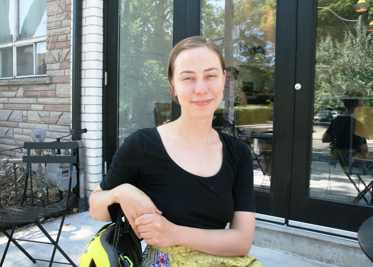
    Zeesy Powers. Photo: Phil Anderson

    Interview with multimedia artist Zeesy Powers (Z.P) by Phil Anderson (P.A)

    P.A: Zeesy you are a multimedia artist. Did you start out as a multimedia artist? Can you give us some of your history on how you became a multimedia artist.

    Z.P: I was fortunate to have been encouraged my whole life to create things and experiment, and to have had the resources and time to do so. I was always interested in performing, and after some less-than-inspiring experiences as a child actor I decided that the art world was a much more flexible place to be and put my energy in to. I was also fortunate to grow up just as video equipment and computers were becoming far more accessible, to the point where today they are tools that are as accessible as paint (maybe more so). In my late teens and early twenties I started combining video and performance with animation because I liked crating complicated productions where I could do most of the work myself.

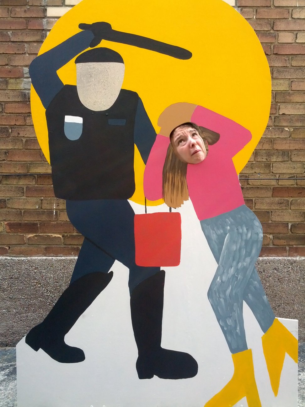
    Zeesy Powers/Yuula Benivolski, Queen Street Riot

    P.A: Is there a multimedia artist who you would say has influenced you or impacted the work you do?

    Z.P: Growing up, I really liked Kara Walker, Jamie Levy, and Tom Green.

    P.A: Do different projects just come up and then you decide on the media you approach it with?

    Z.P: Pretty much. Sometimes it’s the other way around. If I really want to make a painting, then I decide to do a project where I paint.

    P.A: Is there one art discipline closer to your heart? Or are they all equal?

    Z.P: I mostly like to work with watercolour and oil paint, animation and video that’s heavy on post-production, dance, strange voluntary situations and text. I work in other disciplines and media, usually based on what’s best in the context, or what I’m interested in doing at that time.

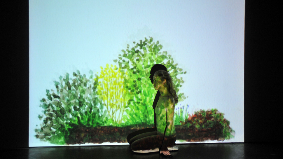
    Zeesy Powers, The Ghost, 2010, TPW Gallery

    P.A: Some of your performance works ask participants to interact with you or allow you into their lives, like 3 Minute Girlfriend and I Will Tell You Exactly What I Think Of You. Were you surprised on how participants reacted to those performances? Can you tell us a little about the your experience?

    Z.P: Always surprised. Those projects are set up to see how people react to the situation itself. What do you think a girlfriend is all about? What kind of person wants to hear what I think of them? The answer is never simple, and usually surprising. The people who participate in I Will Tell You Exactly What I Think Of You usually fall into a few broad categories: people who want to be on stage and receive attention, introverts who see it as a chance to hear what a stranger thinks of them on first sight, and people who are looking for some kind of guidance. It’s a very demanding performance, one that requires me to put all of my prejudices and obsessions out on the table, often on record. It’s scary for the participants, because they are the essential material I use to put these monologues together, and it’s difficult for many people to separate my dumb opinions from who they are as a person. I never pick out anyone from the audience, it’s a completely voluntary choice they make whether or not to come up, and eight years in I am still surprised at how eager people are to participate. Interestingly, when I ask people if there’s anything else they’d like me to speak about, some ask for “the bad stuff”, and they are surprised to hear I’ve already said it. I think most of us have a much harsher opinion of ourselves than other people do. I’ve heard as gossip that people who know I don’t like them will say they already know what I think of them, which is mostly true. Even if those people would show up on stage, they’d still probably get a more nuanced response than they imagine.

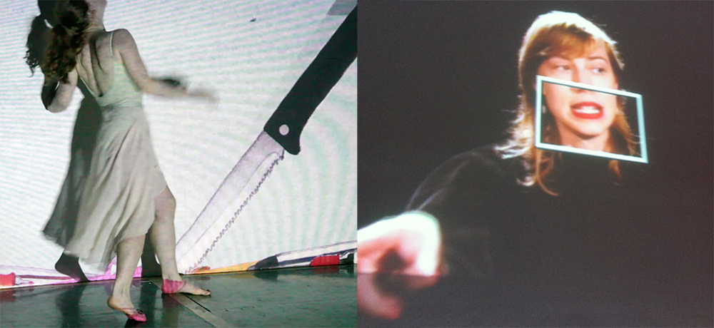
    Zeesy Powers, I Will Tell You Exactly What I Think Of You, 2014 – 2015

    P.A: What direction would you say your performance work is going in?

    Z.P: I always feel pulled in different directions. The way things are going now it seems like I’m working more with developing pieces for other performers (this is sometimes called direction or choreography, depending on the field) and in going back to more web- text- and video-based work where interaction happens across time and distance.

    P.A: Do some of your projects overlap or influence each other in different media? A good example for this is the $10 portraits where you offered to tell people what you really thought of them for $5.

    Z.P: Of course, always.

    Power Ball, 2014. Photo: Phil Anderson

    P.A: Do you feel that many people lack interaction and intimacy?

    Z.P: I don’t know about that. I think people suffer more from highly divergent expectations.

    P.A: What would be your ideal art project?

    Z.P: One where I get paid a lot of money to make something people will see. So, I guess, a mass-market television series or Hollywood movie.

    P.A: Can you tell us about some of your upcoming projects?

    Z.P: I have a short show with Yuula Benivolski called TRIGGER WARNING opening Wednesday, July 29 at Trinity Square Video as part of their Testing Grounds program. I’ll be showing a whole bunch of new work in very rough experimental form alongside Yuula’s incredible and scary Panic Room Karaoke. On August 15 I’ll be at TSV again as part of their Commission Program showing something much more polished. Then this fall I’ll be in residence at the Toronto Public Library, working on a new performance at the Oakwood Branch for a performance in December. In between these things, I’m still writing stories.

    *Note: Zeesy Powers has a Themed Commision Work for Trinty Square Video, running August 19 – September 26, 2015, (401 Richmond Street West, hours: 12 – 6 p.m.), and a video performance, titled Hands at BIG ON BLOOR, a street festival, August 22 – 23, 2015.

  • Volumes – Summer Launch Party @ Hart House

    The tent at Hart House Quad, a century old courtyard behind the Justina M. Barnicke Gallery

    July 29, 2015, 5 – 8 pm
    Hart House Quad / Blackwood Gallery, in collaboration with the Justina M. Barnicke Gallery/UTAC

    If ever the artworld and the music world were to come to an amicable truce, it was at the July 29th celebration of Volumes, a book and music project with a mission to merge the two often separate spheres–a mission that was aptly reflected in its launch. Hosted by the Blackwood Gallery, in collaboration with the Justina M. Barnicke Gallery/University of Toronto Art Centre, the event saw members of Toronto’s art scene chatting, clinking wine glasses, and snacking on summer fare amidst an impressive experimental soundscape live-spun by project contributors Martin Arnold, Mitchell Akiyama, and Marc Couroux. Set under a tent with chandeliers in the Hart House Quad—a century-old interior courtyard behind the Justina M. Barnicke Gallery—the evening radiated relaxed garden party elegance and conviviality, with children flitting to collect fallen roses as sound reverberated off the courtyard’s stone walls. 

    Blackwood Gallery Director/Curator, Christine Shaw, chats with publication editor, Christof Migone

    Toronto-based composer Marc Couroux

    The evening’s guests, including Christof Migone, composer Martin Arnold, artist Marc Couroux, curator Sarah Robayo Sheridan, and others

    The event marked the publication of Volumes, a long-term multi-disciplinary project initiated by Art Gallery of Alberta Executive Director/Chief Curator, Catherine Crowston, and Justina M.Barnicke Executive Director/Chief Curator, Barbara Fischer, and edited by composer Martin Arnold and former Blackwood Gallery Curator, Christof Migone. The result of a decade-long institutional collaboration, the project was published by the Blackwood Gallery, in partnership with the Art Gallery of Alberta, the Justina M. Barnicke Gallery, the MacKenzie Art Gallery, and the SBC Gallery of Contemporary Art. It manifests in three parts: as a monograph, a 10-inch vinyl LP, and an accordion-fold printed gallery—with digital MP3 and PDF surrogates to be found online. As Arnold describes in the introduction to the volume, it brings together images, sound, and ideas into a remarkably wide-ranging assemblage. 

    The 10-inch vinyl LP

    Selected works from Volumes and installation views from the five exhibitions from which the publication emerged. Clockwise from top left: Nikki Forest, My Heart the Rock Star, 2002, from Video Heros; Ian Murray, Keeping on Top of the Top Song, 1973, from Re-Play; Shannon Oksanen & Scott Livingston, Vanishing Point, 2001, exhibition not specified; Holly Ward, folklore, 2000-01, from Re-Play (top and bottom right); Sylvia Matas, In Every Direction, 2011, from Volume: Hear Here; Illingworth Kerr, Turkey in the Straw, 1929, from Come A Singing!; and Come A Singing: Canadian Folk-Songs, illustrated by Arthur Lismer, 1947, in Come A Singing!

    The accordion-fold image gallery

    The publication emerged from five exhibitions, held at ten institutions between 2003 and 2013. It began with Soundtracks: Re-Play, an umbrella project consisting of three Blackwood-initiated exhibitions — Come a Singing!, See hear!, and Re-Play — that toured various aural-visual works by artists such as A.Y Jackson, Prudence Heward, Illingworth Kerr, Michael Snow, Stan Douglas, Althea Thauberger, Instant Coffee, Benny Nemerofsky Ramsay, and many others throughout Canada in 2003 and 2004. Next came Video Heroes, a 2004 exhibition at the SBC Gallery which explored the relatively recent history and conceptual possibilities of the music video as an artistic genre. Finally, in 2013, the series ended with a re-visitation of the premises of Soundtracks in a new exhibition, Volume: Hear Here, held concurrently at the Blackwood and Justina M. Barnicke Galleries. Speaking at the publication’s launch — alongside Barbara Fischer and Blackwood Director/Curator, Christine Shaw — Christof Migone described the loose collective mandate of these five exhibitions as an attempt to bring music into the fold of visual art discourses and institutions. The exhibitions tackled this broad objective in several ways, variously tying art to music to Canadian nation-building; exhibiting experimental Canadian image/sound art; showcasing music or sound art by otherwise visually-focused artists; exploring new forms of popular visual-musical media; and/or providing conditions for the creation of sound events. 

    Former Blackwood Gallery Curator and publication editor, Christof Migone (left), and Justina M. Barnicke Gallery Curator, Barbara Fischer (right), address the evening’s guests

    As this broad set of practices and the project’s collaborators make clear—both within the volume’s texts and in remarks made at the event  Migone’s folding-in of art and music is not an easy or straightforward enterprise. Indeed, as Barbara Fischer noted in her remarks of the evening— quoting the observation of experimental Icelandic musician, Bjork — music occupies an outsider status relative to the artworld (of course, with her characteristic aplomb, Bjork — and Fischer — used much stronger language than this). According to the project’s contributors and supporters, it was this outsider status the ten-year project hoped to correct, or at least initiate dialogue on. Surely, if the lighthearted evening —  and its celebrated published work — proved anything, it was that such a dialogue is possible, even welcome.

    Text and photo: Catherine MacArthur Falls

    *More information about the publication can be found on the Blackwood Gallery’s website: www.blackwoodgallery.ca. The book ($50 + tax) can be ordered by sending an email including the title, number of copies, and your mailing address to www.blackwood.gallery@utoronto.ca.

  • Interview with David Liss, Artistic Director of MOCCA

    David Liss, Artistic Director and Curator, MOCCA in front of their new location at 158 Sterling Road. Photo: Phil Anderson

    Interview with David Liss (D.L), Artistic Director and Curator, Museum of Contemporary Canadian Art (MOCCA) by Phil Anderson (P.A)

    PA: You have to be extremely excited and relieved at the same time after meeting with so many developers and property owners in search of a new home for MOCCA. I gather you must feel the long search has paid off. Please describe the events leading up to your new location.

    DL: You have no idea how excited and relieved I am! 4 ½ years looking for permanent museum space in the Toronto property market has been “challenging” to say the least. So I’m glad to be out of the real estate business and looking forward to getting back into the art world; planning the new space and envisioning the exhibitions and programs. And given the building, the location, opportunities for potential expansion in the future, and a great development partner in Castlepoint Numa, I think the search has paid off very well.

    The best way to describe the events leading up to securing the new location, is that we’ve spent a lot of time immersed in the property market. I’ve met with more real estate developers and property owners than I have with artists these past 4 years.

    David Liss, Artistic Director and Curator, MOCCA in front of their new location at 158 Sterling Road. Photo: Phil Anderson

    P.A: MOCCA certainly impacted Queen St. West and the art scene there. With many galleries creating a new home in the Bloordale area how do you feel MOCCA will contribute to this change? There are galleries moving to Dupont and Dufferin as well.

    D.L: I think we’ve learned quite a bit about ourselves and our role, and the role of art museums in general, within the cultural ‘ecology’ of Toronto from our time on Queen West. Part of this has been circumstantial: most art museums are born out of either private philanthropy or government initiative. Despite crucial sustaining support, encouragement and guidance from the City, MOCCA began its life as neither. In other words, we did not start as a fully formed organization with a full staff compliment and a state-of-the-art facility built to match a vision. MOCCA has evolved more as a ‘grass roots’ organization, meaning it has become what it has become through the participation and enthusiasm of artists and audiences – the community – and sheer hard work and dedication of staff and Board, enthusiastic partnerships with other organizations, as well as a passionate Membership base. As we’ll be more than doubling the size of our facility – and our budget on Sterling – I think that re-locating to the Bloordale/Junction area during a time of a seismic geographical shift in the Toronto art world means that we’ll be evolving alongside the art scene, similar to when we moved to Queen St. from North York. I think MOCCA has an opportunity to be a real anchor for the art community. Seems really exciting to me!

    David Liss, Artistic Director and Curator, MOCCA at the side entrance of their new location. Photo: Phil Anderson

    P.A: Having a 20 year lease with an option for another 20 years in the new space in the old Tower Automotive Building must also give MOCCA a solid future home. MOCCA is now an independent charity separate from the City of Toronto with a Board of Directors instead of advisors (since August 2012). How has this allowed MOCCA to change in the way it operates?

    D.L: The City, and in particular the Culture Division, have been hugely supportive of MOCCA from the start and we wouldn’t have survived at all or be where we are today without their support. But even when I started at MOCCA, it was made clear to me that the plan was to become an independent organization. The City committed to supporting MOCCA to the point that they, and MOCCA felt that it was time to “leave the nest”. And the City will continue to be supportive. Canada’s largest “world class” city finally has a permanent contemporary art museum as most, if not all great cities in the civilized world have. What’s not to be supportive of? But one thing we’ll have to consider is that the City won’t necessarily be there as a safety net. So we won’t be able to borrow Dad’s car and credit cards. We’ve moved out of the house. And that’s as scary as it is exhilarating. But we’re ready for that.

    P.A: How do you see the programming changing in the new space? There is obviously more space to exhibit with 5400 square metres.

    D.L: I’d like to think – and many have told me over the years – that MOCCA has a very distinct identity and spirit and hopefully we can hold on to that. I believe that identity and spirit are largely derived from the artistic programming and the engagement of audiences. It’s my hope that we can evolve to the next level as an institution and still retain the spirit and identity that have defined us thus far. On a more ‘pragmatic’ level, the scale and nature of the new facility should allow us to better serve artists and audiences – to do things on Sterling that we couldn’t do given limitations around the scale and physical plant of the building on Queen. Educational programming for one thing, and more opportunities for social engagement around the programs. But one hugely important practical difference is that we’ll be able to have the new MOCCA be open year round. Because of our 2 gallery spaces on Queen being on one floor, we always had to close to the public for 2 or 3 weeks at a time to change exhibitions. In fact, MOCCA on Queen was closed for about a ¼ of the year. 

    Interior of MOCCA’s new place at 158 Sterling Road. Courtesy of the Museum of Contemporary Canadian Art

    P.A: Do you see MOCCA increasing its art collection in the future when it is settled in its new home? I believe there are about 400 works in the current collection and I believe you have said you wanted MOCCA to increase its collection.

    D.L: We are a museum and thus there is the expectation that we’d feature our collection prominently and build upon our collecting activities. We did inherit the collection from the Art Gallery of North York, and have only added a few new pieces since our inception as MOCCA, and because we’ve been building the organization from scratch, we didn’t have an opportunity to this point to activate the collection in ways we would have liked to. But yes, we are excited to expand our collection. With our new larger and more dynamic space there will be more opportunity to collect and exhibit works from our permanent collection.

    P.A: There is a lot of fundraising to be done before you move in late 2016 or 2017. Is there any government support and are you confident that the private sector will contribute?

    D.L: Yes indeed, there is fundraising to be done. We have been sowing some seeds the past couple of years in preparation for securing a facility but it’s a little premature for me to say who will commit but we’ve been having ‘conversations’ that’ll get a little more ‘real’ in the very near future. Maybe I’m a little biased here but it seems to me that government agencies and philanthropically-minded citizens from the private sector will see a contemporary art museum in Toronto as a very exciting and important opportunity; culturally, socially, educationally and economically.

    P.A: What kinds of programming will be done in the interim before MOCCA moves into its new space?

    D.L: While our big focus necessarily will be on the new facility and accompanying programs – opening less than 2 years from now – we’re still committed to doing what we do: engaging people in art. I don’t want to spoil any surprises here but we will be announcing some programs for the Fall shortly and we have our curator Su-Ying Lee developing programs for 2016. We definitely won’t be going totally dark. Even without a white cube there’s still fun to be had.

    Interior of MOCCA’s new place at 158 Sterling Road. Courtesy of the Museum of Contemporary Canadian Art

    P.A: Toronto is a developing city and changing at a fast pace. If the condo development hadn’t presented itself at the Queen and Shaw space do you think MOCCA would be moving anyway to expand its presence?

    D.L: We knew all along going into Queen St. that we had a 10-year lease and so from the start it was our intention to build the organization, establish viability and an identity, try some things out and have as much fun as possible, so the sale of the building and our imminent departure come as no surprise. As great as the geographic location of Queen and Shaw is, that piece of property would be difficult for us to develop in ways that serve our vision. No regrets!

    P.A: Castlepoint, the developer, had a number of different plans for the Tower property and it almost became a condo project. That changed thanks to the Nestle factory’ s objections. How do view this irony?

    D.L: Well, it works for MOCCA so I guess I can only be amused by the irony. Ha, ha! But I’m also aware of the realities of the global shift to urbanization, in Toronto, Canada and elsewhere, and the positives and negatives that result. What makes Toronto the great city that it is, is people – residents and visitors – so I can’t view the fact of people wanting to live here as a bad thing, and if people want to live here they need housing. I just wish the new architecture was a little more interesting; had a bit more distinctive character.

    P.A: What other development is happening in the building and will it compliment MOCCA’s presence?

    D.L: At this point I’m not sure who, if anyone has signed on. As Tower Automotive is a heritage building I know that the developer is very focussed on restoring it and getting MOCCA in there as the ‘signature’ tenant. The building is on a 7-acre site and the developer has some really exciting plans for the property over the next 10 years. We’ve had some discussion with them about the larger vision and it’s my understanding that they want to attract ‘creative industries’. As a public and open-minded institution we hope to attract a diverse range of people to the area and to our venue so really, any kind of business operation will benefit MOCCA. All I do know at this point is that it won’t be condos and it won’t be a ‘big box’ mall.

    David Liss, Artistic Director and Curator, MOCCA in their new location. Photo: Phil Anderson

    P.A: You have seen a lot of changes since moving from the North York Gallery location and before then coming from Montreal. How do you feel about the way things have happened and MOCCA’s role in the city’s cultural community?

    D.L: Phil, how much space do you have available for me to answer that question? Ha, ha! I’ll try and keep it brief and to the point.

    I moved to Toronto because I saw an opportunity to bring a contemporary art museum to Canada’s largest city. I’ll admit that it’s been a little more difficult and complex than I anticipated. Toronto and the Toronto art world is a very competitive environment. There are so many great cultural institutions and venues in this city all competing for attention, support and audience. It’s what makes Toronto a culturally rich place. But it also makes it difficult to start an institution, literally from scratch. On the other hand, in a relatively short period of time I think MOCCA has developed an important role within that ecology so I do have to say that I’m pleased by how things have evolved. As an art fan that travels to other cities around the country and the world, I’m good with ‘the more the merrier’. The reason I, and thousands of people visit places like New York and London is because those cities have so much to offer culturally and artistically. I think MOCCA has found a viable place in the art community here through distinctive character, spirit, participation and contribution. And now Toronto has a contemporary art museum – with a brief but interesting history and a very exciting and optimistic future. Toronto deserves this. So I feel pretty good about the way things have evolved – with MOCCA and the cultural landscape of the G.T.A. We have an amazing art scene here.

  • Nicholas Crombach: Trapped / Angell Gallery

    Ideas centered on humankind’s peculiar fascination and relationship with the animal kingdom inspires the figurative artworks on display in Nicholas Crombach’s recent solo exhibition titled Trapped. Crombach’s upbringing in a rural landscape and his experiences living on a local dairy farm have nurtured his interest in exploring the often paradoxical co-existence between humans and other creatures. The artist uses his impressive dexterity with his chosen media to create jarring sculptures and images infused with a psychological presence and a thematic heftiness. A nude half-bust female figure, which is cleverly placed within the front window of the gallery, immediately confronts potential gallery attendees, and the general metropolitan public at large, before entering the exhibition space. Her cheerless gaze suggests a sense of dejection and emotional defeat, and offers a curious entry-point into the show.

    Nicholas Crombach, Woman Wearing Wilting Laurels, 2014, resin, paint, steel, 26″ x 18″ x 12″. Courtesy of Angell Gallery

    A flattened and folded bear, sculpted in clay and then cast in resin, is mounted on a wall in a manner that recalls the centuries-old tradition of taxidermy, while its mouth is filled with a bouquet of flowers that further emphasizes its decorative properties. Crombach presents a potent criticism of the immorality of trophy hunting and taxidermic practices, where an animal’s vitality is overshadowed by its aesthetic presence on a mantle, manifesting the idea of humankind’s emotional disconnect with other species. Suddenly, the somnolence of the bust-figure becomes juxtaposed with the psychological vacancy of the bear, creating an interesting narrative between the works presented in the gallery.

    Nicholas Crombach, Still Life, 2015, resin, paint, wood, found vase, 66″ x 62″ x 10″. Courtesy of Angell Gallery

    Melancholy is a shared emotional state between the other sculptures within the exhibition. An almost life-size elderly male figure, clad in a pair of long johns and touting a toy bow and arrow, is stripped of any sense of wisdom and fortitude. His hunting apparatuses are replaced with harmless children’s playthings; his physical appearance vulnerable in its revealing state, while his physiognomy reveals a sense of strain and uneasiness, altogether resembling a defenseless victim to a dominant predator.

    Nicholas Crombach, Man with Child’s Bow and Arrows, 2013,resin, paint, steel, 60″ x 24″ x 24″. Courtesy of Angell Gallery

    Nicholas Crombach, Predator, Prey & Victim, 2015, resin, paint, rabbit pelt, 26″ x 26″ x 12″. Courtesy of Angell Gallery

    The exhibition creates a discourse around the interactivity and co-existence between humans and other earthly beings. Whether he is questioning the ethics of embalmed animal carcasses as decoration, or simply visualizing universal feelings of fear and despondence, Crombach’s somber artworks remain interesting aesthetic objects as well. Trapped requires a viewer’s careful contemplation and interpretation in order for this mixed media offering to thematically resonate beyond its rather expansive premise.

    Installation view. Courtesy of Angell Gallery

    David Saric

    *Exhibition information: July 14 – August 15, 2015, Angell Gallery, 12 Ossington Avenue, Toronto. Gallery hours: Wed – Sat, 12 – 5 p.m.

  • “Can-Do” at Canadian Sculpture Centre

    Opening Reception: July 9, 2015 / 6:30 p.m.
    Canadian Sculpture Centre

    The exhibition’s theme is Can-Do – celebrating the spirit of human achievement. Curated by Richard McNeill.

    Edward Falkenberg is giving an Artist Talk

    Marlene Kawalez, Demise, clay, wood, stone

    Camie Geary-Martin, (from left to right) Woman Looking Left and Man with Raised Hand, both bronze

    Peter Shoebridge, Daphne, bronze

    J.Mac, Hoops (left) and Spin (right), 2015, sisal, fibreglasss

    Dina Torrans giving Artist Talk in front of her  copper sculpture, Heirloom (second from left)

    Edward Falkenberg, Table, wood (in front) and  Judy Raymer Ivkoff, Integrated Forces,walnut wood & Forest Series 18, wood (left); Tyzo David, Toccalino, Cascade & In the Wind, both welded steel (right)

    Photo: David Ross

    *Exhibition information: June 11 – July 3, 2015,  Canadian Sculpture Centre, 500 Church Street. Gallery hours: Tue – Fri: 12 – 6, Sat: 11 – 4 p.m.

  • Gary Evans & André Ethier at Paul Petro

    Beguiled initially by its charming and unassuming facade, I peer into the cool, sunlit space of Paul Petro Contemporary Art Gallery only to find myself spiralling down the proverbial rabbit hole, and thudding into the psychedelic realm conceived by artists Gary Evans and André Ethier. In this duo exhibition, the ordinary meets the fantastical. Traditional landscape, still life, and portraiture are reimagined into new subjective realities, inspiring feelings of euphoria in the onlooker.

    Gary Evans’ exhibit Ghost Host consumes the lower level of the gallery, where three large-scale oil paintings are set against an array of some twenty paper collages. These two contrasting media work simultaneously to challenge one’s perception by means of rearranging fragments of vibrantly colored and textured images. On Evans’ work “At the Mouth of the Woods” super-heightened and contrasting patches of colors are applied to the canvas in a combination of short-quick and long-languid lines to produce a surreal impression of a wooded area. The seemingly nonsensical arrangement of the work indicates movement and instability. Upon first glance, I perceive the work to be highly active. After several moments, I notice I have become caught within the picture’s perpetual cyclical structure, not unlike a fly trapped in a spider’s web. It is clear that for all of the flux within the picture, there is an equal and opposite stillness. Time feels as if to have slowed down enormously and I am eternally in the present. The experience is one of static vibration, chaotic harmony.

    Gary Evans, At the Mouth of the Woods, 2014, oil on canvas, 72″ x 96″. Photo: Vanessa Zeoli

    Evans’ collages demonstrate a similar duality. There is a distinct sense of flux in the way fragmented magazine clippings interact with one another. Vividly hued clothing articles with varying textures converge on a 2D surface. My senses are heightened as I take in these highly tactile and sharply contoured compositions floating in the centre of the page, positive that at any moment the wind will pick up leaving last season’s autumn collection to blow away in the breeze. And yet no matter how many times the gallery door swoops open and shut, the constructions remain stable and still. Much like his paintings, Evans’ collages prove to be highly structured entities in which all parts rely on each other. Two distinct and seemingly incompatible feelings—energy and equilibrium—are experienced simultaneously making for a rather psychologically compelling show.

    Gary Evans, both Untitled, 2015, paper collage, 12 1/4″ x 19 1/4″. Photo: Vanessa Zeoli

    Installation view of Gary Evans’ works (from left to right) Emblem #1, 2015, paper collage, 15″ x 11 1/4″, Untitled, 2015, paper collage, 15″ x 11 1/4″, Lodger, 2015, paper collage, 15″ x 11 1/4″, Driver #1, 2015, paper collage, 14″ x 11″, Note, 2015, paper collage, 15″ x 11 1/4″, Driver #3, 2015, paper collage, 14″ x 11″. Photo: Vanessa Zeoli

    I proceed up a narrow staircase and into the exhibit New Grapes by indie rock singer turned painter, André Ethier. The small works of oil on masonite are distinctly less strategic than the works of his counterpart, appearing to have been completed in a brisk manner. Lacking a strong perceived sense of depth, his paints take on the characteristics of homemade egg tempera, achieving a translucent, streaky texture with a high gloss finish. Ethier’s lively style is met by common subject matter. Still life pictures of rounded women lazing against blossom adorned furniture, resemble the bohemian odalisques of Delacroix and Matisse. Bountiful garden scenes and portraits of a recurring bearded man account for some of the collection’s other subject matter.

     Installation view of André Ethier’s works (from left to right) Untitled, 2015, oil on masonite, 16″ x 12″, Untitled, 2015, oil on masonite, 14″ x 11″, Untitled, 2015, oil on masonite, 20″ x 16″, Untitled, 2015, oil on masonite, 16″ x 12″, Untitled, 2015, oil on masonite, 16″ x 12″. Photo: Vanessa Zeoli

    André Ethier, Untitled (left), 2015, oil on masonite, 12″ x 9″, Untitled (right), 2015, oil on masonite, 20″ x 16″. Photo: Vanessa Zeoli

    One work stands out in particular, seeming inconsistent among the rest of the collection. In the “Untitled” 2015 painting, hipster meets Beetlejuice as the obscure motif of the same bearded man—perhaps self-referential on Ethier’s part—is repeated in an irregular manner against a far-out backdrop complete with cannabis leaves. The energy the work exudes is one of weightlessness and delirium, just what one would expect from an unconventional peacenik who frequents Kensington Market and who almost always has a copy of Kerouac’s ‘On the Road’ in tow.

    André Ethier, Untitled, 2015, oil on masonite, 16″ x 12″. Courtesy of Paul Petro Contemporary Art

    Evans and Ethier’s collections are bold and offer the spectator a unique opportunity to confront one’s perception of reality. I highly recommend stopping by the gallery at Queen West to see this exhibit before it closes in a few weeks time. It will be a trip unlike any other.

    Vanessa Zeoli

    *Exhibition information: July 17 – August 15, 2015, Paul Petro Contemporary Art, 980 Queen St West, Toronto. Gallery hours: Wed – Sat, 11 – 5 p.m.

  • J.J. Lee: Chinoiserie & Robyn Thomas: Paper Works at loop

    The space at Loop Gallery is currently shared by two solo exhibitions which showcase new works by two Toronto-based artists – J.J. Lee and Robyn Thomas.

    Installation view with (from left to right) JJ Lee, Koi, Goldfish, Hummingbird, Lucky Cardinal, 2015, each mixed media on canvas, 20″ diameter

    Lee’s show occupies the north end of the gallery with works on paper and a number of small circular canvases. Chinoiserie consists of new paintings and drawings which playfully consider Western imitations of Chinese motifs. More specifically, the title of the exhibition makes reference to the 18th century European wave of Orientalism which followed an increase in the importation of Chinese porcelain. The round canvas makes a literal reference to the imported plates, while the types of scenes depicted by Lee further echo the blue and white scenes which were commonly found on these porcelain objects. On both the round canvas works and the works on paper, Lee mixes these scenes with a ‘Chinese take-out’ aesthetic. Across a number of the works, red text can be found in a pseudo-Oriental font: ‘Lucky,’ ‘Thank You,’ or ‘Enjoy”. In the description offered by Loop, Lee explores what is identified as a ‘chop suey’ culture through the diverse exchanges between East and West.

    JJ Lee, Enjoy, 2015, mixed media on paper, 60″ x 60″

    Of the two works on paper which hang on the east wall, “Blue Fantasy” sticks out as a stylistic outlier. This work is the result of a collaboration between Lee and her daughter Mei Lee Ogden who is now eight years old. While Lee has previously exhibited an entire show with work that was created with her daughter, she continues to include her in ongoing work as a means of tracing her daughter’s improvement alongside her own individual artistic development. None of the works have been presented or treated in a precious manner, haphazardly stapled to the wall as the paper buckles. But the visibility of the torn edge of the paper in the work “Enjoy”, for example, is reminiscent of the disposability of the Chinese take out container which is so central to the work.

    JJ Lee, Enjoy (left) and Blue Fantasy (right), 2015, both mixed media on paper, 60″ x 60″

    Continuing to move through Loop, the south gallery is home to the work of Robyn Thomas with the exhibition Paper Works. Thomas, who is showing at Loop for the first time, presents four works which have been made with the pages of books or magazines, woven together using traditional loom techniques.

    Robyn Thomas, Wallpaper, 2015, woven pages of 2000/2001 Wallpaper Magazine, twine, staples, wood, 55″ x 55″ x 6″

    For Thomas, the concern appears to be a formal exploration of the treatment of paper as a fibre. The texts which Thomas has used are referenced through each work’s title: “The Bible”, “Dictionary”, “Wallpaper Magazine”, and “The Brothers Grimm”. Depending on the text, the artist has chosen to treat the paper differently. For instance, while the edges of the pages of “The Brothers Grimm” has been dipped in black ink, “The Bible” pages have been treated with gold glitter as a direct reference to gold edging that can be found on many editions of the Bible. Through the process of weaving, the text itself becomes obscured and near impossible to read, demanding an intimate reading from the viewer. Upon closer inspection, a scattering of legible text emerges. Stephanie D’Amico, the Administrative Director of Loop, shared with me that each time she passes “Dictionary”, the entry for ‘guilt trip’, which lies near the edge of the work, draws her eye. The way that Thomas has transformed these books complicates our understanding of textual documents as stable or unchanging records.

    Robyn Thomas, Dictionary (close up), 2015, woven pages of Canadian Oxford Dictionary, twine, staples, wood, 58″ x 50″ x 5″

    Robyn Thomas, The Brothers Grimm (close up) , 2015, woven pages of the complete collection of the Brothers Grimm, twine, staples, wood, 59″ x 51″ x 5″

    While the two exhibitions do function independently as solo shows, there is an interesting dialogue created between the two within the space. Lee and Thomas demonstrate a particular interest in the cultural texts which surround us, and engage with appropriation and questions of authenticity. In both cases, cultural or textual material has been divorced from its original context and given a new meaning.

    Text and photo: Katie Lawson

    *Exhibition information: July 18 – August 9, 2015,  loop gallery, 1273 Dundas Street West, Toronto, (three doors west of Dovercourt). Gallery hours: Wed – Sat 12 – 5, Sun 1 – 4 p.m.

  • RKG Fourth Anniversary

    “The openness and the unpredictability are our gallery’s vital signs. We have embraced from the beginning the outsider within”. This statement from the exhibition’s press release rings true upon entering Robert Kananaj Gallery (RKG). Situated in a large warehouse-like building on St Helens Avenue, near Lansdowne station, RKG welcomes visitors for their fourth year anniversary.

    RKG co-directors Roberta and Robert Kananaj

    The show features Ibrahim Abusitta, Silvia Argiolas, Bruce Eves, Michael Davey, Oscar Figueroa, and Lula Motra among others; as well as Jacob Hughes in a month-long residency, where he completed a spectacular 100 x 20 foot mural re-imagining of Vittorio Carpaccio’s 1502 painting of  “St. George and the Dragon” on the side of the building, on top of  Istvan Kantor’s mural (“Everything is Under Control”). Artists will continue to build upon previous murals as time passes.

    Jacob Hughes, St. George and the Dragon

    The gallery is one of those places that overwhelms and confuses you when you enter. It’s hard to differentiate what is a piece for the show and what is just a chair and a table. Between the information table and the hors d’oeuvres is a piece of camera equipment, sitting on a table ever-so-inconspicuously. Until someone told me it was part of the exhibition, I was passing by it with no thought other than to get to the cheese board. There is also a long black piece of cloth running along the wall and the floor that I am still not sure if it’s part of Motra’s installation or just part of the gallery’s decoration.

    Installation view with Bruce Eves’ work on the right side

    Once you walk deeper into the gallery it becomes easier to differentiate. Every artist seem to have their own little nook that they took over: Davey on the right, Abusitta on the left, and Eves and Motra in the back. Davey presents a sculpture collection called “Mammalian/Reptilian”. While each piece is not specifically titled, there’s a similarity among them. There is violence, hybrid creatures, and organic movements. One piece is of a masked man, sitting on another man, sitting inside a mouth of a fish, all enveloped in an odd sinewy, blood vessel-like tubes. While the rider has three pairs of arms all grabbing at the vessels that attack and cover his face, the bottom one has no arms, and is simply blindfolded. The positioning of the sculptures is interesting, as they contain so much detail that can be missed if one is not squatting down on the floor, spinning around the pieces.

    Michael Davey, Mammalian/Reptilian

    One great thing about this exhibition is that every artist is drastically different from one another. Near Davey is Abusitta’s multi-media work, “Formal Informal Dialogue”, which is an exhibition in itself. It looks like an artist’s work station. There is a table with a tablet on it, a little shelf with knick knacks, and a bunch of small pieces of art works hung on the wall. As Abusitta said, “Many of the objects were created in studio with no intent other than to create something. It is only after being informed of an upcoming exhibition that the objects found their purpose.” In a rather refreshing manner, Abusitta presents a piece of his everyday artistic life in which the everyday work environment has naturally adapted into an art work. The cinder block under the table perhaps best captures its essence: the word ‘flexible’ is written on the front, and the same word is written backwards in the back. It can become anything it wants or needs it to be.

    Ibrahim Abusitta, Formal Informal Dialogue

    Similarly, most works presented by Eves are quite personal, but perhaps the most personal is his recent self-portrait. Three years ago his blood pressure was dangerously high, to a point where he was in risk of a heart attack. Nine of his blood pressure readings over the course of two months are presented in a colorful manner. Although the colors of the numbers are random, Eves’s highest and arguably most dangerous reading happens to contain only yellow and red numbers, as if there was an intuitive sense of alarm. The initially innocuous set of numbers sheds light on Eves’s former health, while he walks around the gallery, now in perfect health.

    Bruce Eves, Self-portrait

    During the whole visit, no matter where you walk around in the gallery, there is a face that follows you. A masked and disfigured face, full of attitude. This diva stands in a small painting in a corner by the staircase, and constantly makes you walk back to have a ‘conversation’ with her. While the painting is untitled, it is part of Argiolas’ series “Buttane Triste”, which translates to “Sad Bitches”. She wears a fancy bikini, standing in front of a burst of what seems like nightclub lights. However, it’s not so much sadness, as it is disdain and dismissal. It is the kind of dismissal that makes you want approval. So I keep coming back, and she keeps on ‘rejecting’.

    From Silvia Argiolas’ series Buttane Triste (Sad Bitches)

    There is so much more to see in this exhibition than what is mentioned above. You could spend some time here away from the heat of the summer and if you need a break relax on the new bench in front of the gallery.

    Guest with Nicole Clouson’s installation

    Text and photo: Sunny Kim

    *Exhibition information: July 16 – August 29, 2015, Robert Kananaj Gallery, 172 St Helens Avenue, Toronto. Gallery hours: Tue – Sat 11 a.m. – 6 p.m.

  • Ed Niedzielski

    Artists define their ‘need and want’ through the action of painting, which in some mysterious way, relieves and soothes that desire, …temporarily. Then it begins again, like breathing, …or the systole and diastole of a heart beating. Ed Niedzielski embeds his emotions in his abstract works, which manifests his state of mind, …or mindlessness, …finding a zone for Zen.

    Ed Niedzielski, Venting my dream, 2015, acrylic on woven canvas, 54 x 72 inches

    A central concept in Niedzielski’s work is his ‘handle’, “Peace XOX”, which relates to love, imbued with the sense of optimism that makes us want to live. The desire to be happy is complicated because we are often searching in vain for that elusive condition. On an Existential level, we are unable to locate experience and our means of describing it through language is woefully inadequate. Yet, the impossibility of ever finding it does not negate the will to search and utter our love. Niedzielski is relentless in his quest to express the peace he hopes to find in his work. One painting is titled “The Point of This”, indicating the obfuscation that lies before our apprehension. The question is: how to ‘see’ through to the unseen other. Niedzielski’s abstractions are attempts to plumb the mystery.

    XOX, the sign for hugs and kisses, is used obsessively in his work, yet his process explodes the prosaic into an abstract language that awakens our primordial urge to comprehend. These paintings are very disciplined lines of ‘text’, which offer the illusion of transcription since the artist has severed the letters and spliced them in myriad combinations. The lines run either horizontally or vertically, thus referencing Occidental and Oriental modes of reading. Colours in these very formal text pieces are usually rich darks set against gold, emphasizing value much like the medieval Madonna paintings.

    Ed Niedzielski, Love Conquers All, 2014, acrylic on canvas w-paper, 54 x 48 inches

    Text has been utilized as a design element since the Russian Constructivists, with artists like Jasper Johns elevating the practice in Modernist painting, partially satirizing histrionic Abstract Expressionist existential angst before the ‘void’. John’s Dadaistic use of language devolved into Pop art, with diverse artists like Roy Lichtenstein and General Idea, using letters in their own contexts. Niedzielski’s usage has more affinity with Johns. Indeed, one of his works uses the XOX motif in an American flag, referencing him directly. 

    Ed Niedzielski, Call me sweet heart, 2015, acrylic on woven canvas, 54 x 72 inches

    Although Niedzielski’s work is abstract, some of his paintings remind one of Keith Haring’s pieces. Both artists have explored exhibition spaces outside the gallery system. Haring is famous for his subway graffiti transgressions and Niedzielski has explored putting text onto street hoardings, engaging the public in a dialogue. Many of his paintings have various wriggling shapes bound together in a colourful manner that echoes Haring’s comical figures in their all-over configuration.

    Ed Niedzielski, My Blue is Over Your Orange, 2015, acrylic 54 x 72 inches

    Some modernist artists questioned the supports and materials they were painting on. In Europe, the movement called ‘Arte Informel’ exposed the work of artists like Antoni Tapies and Alberto Burri, synchronous with the advent of Abstract Expressionism in the US. Their works explored non-traditional materials like hessian, clay and furniture. Niedzielski also uses non-traditional materials and weaves small strips of canvas to create surfaces. The holes that become visible between the ‘warp and weft’ activate a sculptural zone that intersects with the painted shapes. He applies his paint with a palette knife exclusively, building up every line and shape to express a textural identity, sometimes smooth, …sometimes rough, …but always tactile. The Minimalist, Robert Ryman, had a similar attitude for applying paint to his surface, concerned with registering the object without illusion. Sometimes he painted on the reverse side of his canvasses. Niedzielski’s work is less austere and more joyful, but he is just as concerned with treating the support sculpturally, painting on every surface. 

    Ed Niedzielski, Slumber Party, 2014, acrylic on canvas, 96 x 72 inches

    The energy in his colours and shapes also bring to mind military camouflage techniques. The eye does not rest long enough to find the shape but is continuously urged on. The mind is lulled into a state of contentedness, satiated by a meal of colour. Niedzielski’s goal is to enchant the viewer with his mantra of XOX served in a colourful buffet. In a sense, he is a soldier, dedicated to serving up the abstract belief that there is meaning beyond us in an untouchable reality. We breathe his works in, with the hope that they will enlighten at a primordial level. Abstraction steps apart from figuration in order to reach another reality. Sometimes the work is merely decorative but when successful, it allows us the opportunity to inhabit a state of happiness or content, as if we have arrived at an inner truth.

    Ashley Johnson

    *Exhibition information: Ed Niedzielski: Can Love Change Your Life?, July 30 – August 22, 2015; Opening reception: Thursday, July 30, 2015 / 6 – 9 p.m. Articsók Gallery, 1697 St. Clair Avenue West, Toronto. Gallery hours: Wed – Sat, 12 – 6 p.m.

  • Aimia / AGO Photography Prize 2015 – the winner

    The winner of The 2015 Aimia | AGO Photography Prize was awarded to American artist Dave Jordano at a special event held this evening at the Art Gallery of Ontario (AGO). Selected entirely by public vote, Jordano receives C$50,000 in addition to a six-week, fully funded residency in Canada.

    Four extraordinary international artists was shortlisted for the 2015 Aimia / AGO Photography Prize, Canada’s most significant prize for photography. Co-presented by Aimia, a Canadian based global leader in data-driven marketing and loyalty analytics company, and the Art Gallery of Ontario (AGO), the Prize awards C$50,000 to one winner, who is chosen by public vote. The four finalists will each be awarded a six-week artist residency in Canada and will present their work in an exhibition opening September 9, 2015, at the AGO. Voting began in person at the AGO upon the exhibition’s opening and on the Prize’s website on September 15, 2015 and continued till November 30, 2015. The winner, was announced on December 1, 2015.

    The 2015 winner is:

    Dave Jordano, Lynn, Heidelberg Street, Eastside, Detroit, 2010. Courtesy the artist.

    • Dave Jordano (USA)

    Dave Jordano (1948, Detroit, Michigan) received a BFA in photography from the College for Creative Studies in 1974. As an emerging fine art photographer, he was awarded an honorable mention in the Houston Center for Photography’s Long Term Fellowship Project in 2003, and he received the Curator’s Choice Award the following year. In 2006, 2008 and 2013 he was a three-time top twenty finalist in Photolucida’s “Critical Mass” national book award in Portland, Oregon. In 2012 and 2014 he was a finalist in LensCulture’s International Exposure Awards. He was also selected for inclusion in One Hundred Portfolios, a compilation featuring the work of 100 leading photographers from around the world and sponsored by Wright State University, Dayton, OH. A major exhibition of his work from his “Articles of Faith” project was held at the Chicago Cultural Center in 2009.

    The 2015 finalists were: 

    Annette Kelm, Untitled, 2013. c-print. 65 x 80 cm. Courtesy the artist.

    • Annette Kelm (Germany)

    Annette Kelm (1975, Stuttgart, Germany) lives and works in Berlin. Her work has been presented in solo and group exhibitions at international institutions, including Kölnischer Kunstverein, Cologne (2014); MoMA, New York (2013); Presentation House Gallery, Vancouver (2012); Städel Museum, Frankfurt am Main (2012); KW – Institute for Contemporary Art, Berlin (2009); Kunsthalle Zurich (2009); and Witte de With, Rotterdam (2008). Her art works are in important art collections such as Guggenheim Museum and MoMa, New York; Centre Pompidou, Paris; Kulturstiftung des Bundes, Germany; Tate Modern, London; and Lenbachhaus, Munich. Annette Kelm participated in the 12th Istanbul Biennial in 2012 and in the 54th Venice Biennale in 2011.

    Owen Kydd, Cherry, 2015, Video on square digital display with media player. Courtesy the artist

    • Owen Kydd (Canada)

    Owen Kydd (Calgary, Canada) attained a bachelor’s degree in film and art from Simon Fraser University in Vancouver and a master’s degree from UCLA in Los Angeles. Kydd has exhibited work at the Vancouver Art Gallery, the Oakville Galleries, Los Angeles County Museum of Art, the Art Gallery of Western Australia, FOAM Museum Amsterdam, and the Daegue Photo Biennale in Korea, among others.

    Hito Steyerl, How Not to be Seen: A Fucking Didactic Educational .MOV File (still), 2013. HD video, single screen in architectural environment. Image Courtesy of the artist and Andrew Kreps Gallery, New York.

    • Hito Steyerl (Germany)

    Hito Steyerl (1966, Germany) lives and works in Berlin. Steyerl’s prolific filmmaking and writing occupies a discursive position between the fields of art, philosophy and politics, constituting a deep exploration of late capitalism’s social, cultural and financial imaginaries. Her films and lectures have increasingly addressed the presentational context of art, while her writing has circulated widely through publication in both academic and art journals, often online. Steyerl has had solo exhibitions all over the world, among them Artists Space, New York; Institute of Modern Art, Brisbane, Australia (2015); Van Abbemuseum, Eidenhoven, The Netherlands; ICA, London, UK; Künstlerhaus Stuttgart, Germany (2014); Museum of Contemporary Art Chicago (2013); the Art Institute of Chicago; E-flux, New York City, USA (2012); Chisenhale Gallery, London, UK (2010); Neuer Berliner Kunstverein, Berlin, Germany (2009); and Moderna Museet, Stockholm, Sweden (2008).

    A jury of three experts selected the four finalists from a long list of 27 artists who each showed extraordinary potential.

    For more information please check 2015 Aimia | AGO Photography Prize.

  • Iris Hӓussler: Ask the Frog / Daniel Faria Gallery

    There is a great sense of ambiguity to life, despite our best efforts to predict how it will develop or understand why it unfolded a particular way. Such is the nature of reality and time, and it is our folly to pursue these endeavors in order to alleviate the confusion and fear that comes from not knowing. We will approach fortune-tellers with crystal balls, Tarot card readers, or, through Iris Hӓussler, a frog. This wax being stands atop its pedestal willing to provide answers to any questions that are posed. Simply ask and from its hands, select its response. However, like the other mystics we turn to for clairvoyance, its answers are as vague as the future we try to foretell, though this does not mean they are wrong. The significance of these one-word revelations (which are written in German) may not necessarily apply to your immediate dilemmas, but they may unfold over time and in various forms.

    Hӓussler’s Ask the Frog explores this very idea of the general shroud of ambiguity that surrounds our reality. As aforementioned, the frog welcomes the audience with relief to their most grievous uncertainties. Yet these are simply singular words that have multiple definitions and connotations, not to mention the inevitable subjectivity of personal experiences that will affect their interpretation. Furthermore, not all of its answers may be positive and encouraging; on the contrary, many foretell anger and sadness. The fact remains that the frog’s responses is a means of trying to find clarity in our future and present, and the ambiguity and unspecific meanings of its replies mirror the reality we asked it to simplify. 

    The exhibition continues into a series of sculptures: bed sheets and curtains partially encased in solid blocks of wax. The grey and orange fabrics create flowing patterns in the white prisms, similar to the appearance of marble. Concurrently, the remainder of the soft material protrudes from the firm encasing. In some instances, they drape freely downwards towards the floor. In other cases, they ascend up to the ceiling and along the walls, almost like columns. Two of the wax blocks placed on the floor while others rest on pedestals to give a sense of their floating ominously above the ground. They remain distant from the walls, entering the viewers’ space for a more complete presence as opposed to being confined like paintings or photographs with only one possible perspective. The sculptures become immersed with the audience rather than separated, which allows the audience to appreciate them from every angle and to freely walk among them in wonderment. The bright, warm lighting is absorbed by the wax to emit a soft glow while the fabrics become vibrant as it peers through the weaves.

    It is a luminous and uncanny scene to behold, as if it were the ruins of an ancient temple – that falling cloth now becoming hardened into the sharply-defined geometric prisms that would support the entire structure. In doing so, the fabric surrenders its original functionality and characteristics to that of the wax. What was once free and unbound, pleasant and tactile, is now restrained within a languid prison of ambiguity with only faint remnants of what it once was.

    Text and photo: Simon Termine

    *Exhibition information: June 11 – July 25, 2015,  Daniel Faria Gallery, 188 St Helens Avenue, Toronto. Gallery hours: Tue–Fri 11 am –6 pm; Sat, 10 am – 6 pm.