Author: artoronto

  • Rebecca Belmore: KWE at Justina M. Barnicke Gallery

    Art is often described as a catalyst for change, but creating art with a predisposed agenda can lead to artworks that appears forced or cliché. In the case of Rebecca Belmore’s KWE exhibit, the show lacks the nuances and subtlety necessary to be described as “poetic political intervention” as the catalogue claims.

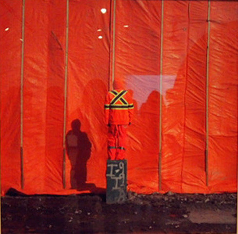
    Rebecca Belmore, artist, 2014. Photograph by Scott Benesiinaabandan. Photo: Summer Sun.

    Perhaps, the most successful piece in the show is Belmore’s artist, photographed by Scott Benesiinaabandan. The photograph portrays a somewhat anonymous labourer who stands upon an electric box with an orange construction tarp as a backdrop. The labourer, who the viewer can assume is the artist, Belmore, is wearing an orange uniform that has an “X” on the back. While this photograph appears simple, it deals with the deep issue of the marginalization of the individual in society such as, the artists, the labourer or First Nations people. The most astonishing aspect of this image, however, is the composition and how easily the photo can be reduced into rectangles, lines and colour. There is nothing convoluted or precocious about this photo; it is a statement – simple and clear.

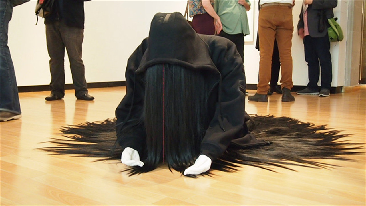
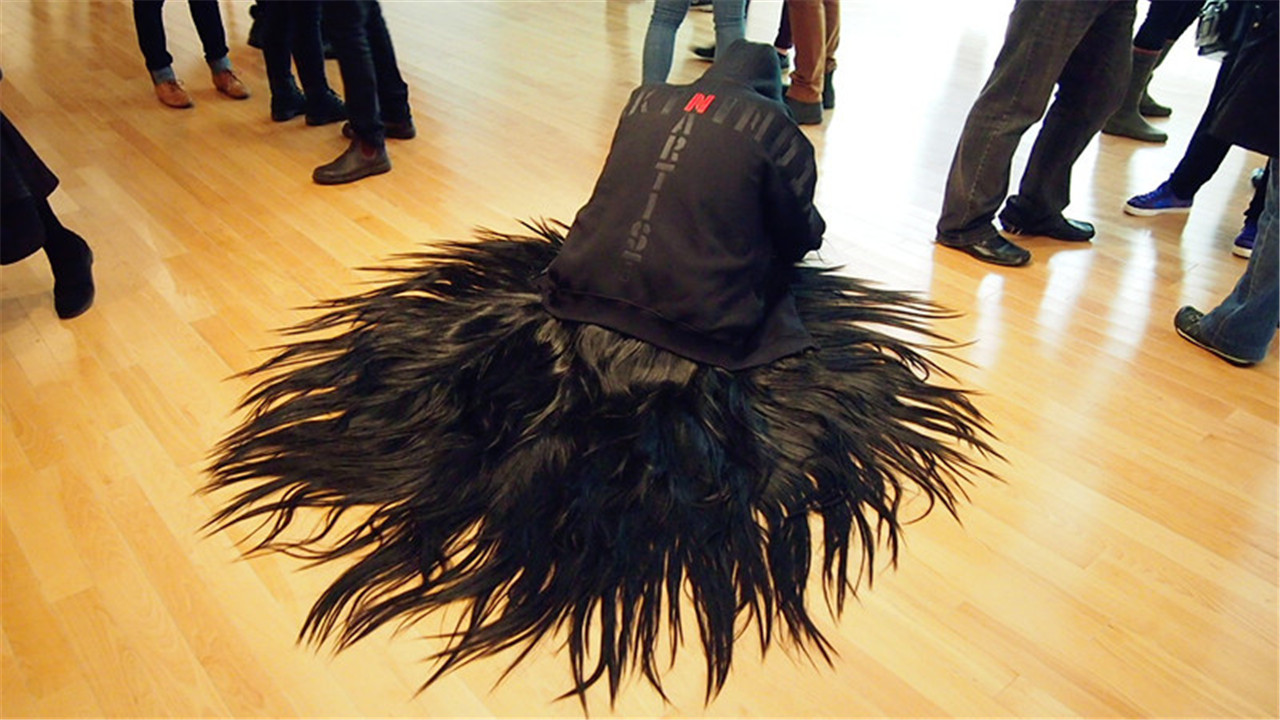
     Rebecca Belmore, Mixed Blessing, 2011. Front (top) and back (bottom) view. Photo: Summer Sun.

    While artist is clear and allows the viewer to pick up subtle hints, Mixed Blessing is perhaps too literal. The sculpture depicts an individual clad in a black hoody, crouching on the ground. The person’s face is obscured by thick black hair which pools around the body like a halo. The back of the hoody has two statements that intersect. Horizontally it reads “Fuckin Indian”, and vertically it reads “Fuckin Artist.” The two statements are joined by the red “N” they share in “Fuckin.” The sculpture is angst ridden and so wrapped up in self-pity that it is hard to comprehend the true and serious intentions of the work.

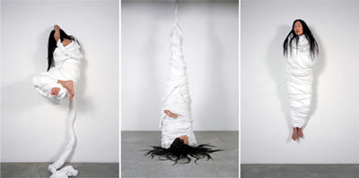
    Rebecca Belmore, Untitled #1, #2, #3, 2004.

    Untitled #1, #2 and #3 all have a similar issue. Each photograph is of a woman suspended off a white wall wrapped in white sheets. The pieces are beautifully positioned, creating awkward and intriguing forms. However, the symbolism and concept of constraining the body to represent outer constraints on the individual is simply cliché no matter how well executed by the artist.

    Rebecca Belmore, Ayum-ee-aawach Oomama-mowan: Speaking to their Mother, 1991. Photo: Summer Sun.

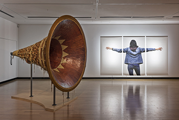
    The piece Ayum-ee-aawach Oomama-mowan: Speaking to their Mother is majestic in its construction and intention, but the work is unsuited to the space. The piece was created as a response to the “Oka Crisis,” when a land dispute erupted between First Nations and the Canadian Government. The Mohawk Nations were attempting to defend their ceremonial and burial grounds from being converted into a golf course. Belmore created a giant megaphone of birch bark and wood, and the speaker’s voice is meant to reverberate throughout the land, reminding Aboriginals of their heritage and connection to the land. The seven feet long and at the mouth six feet wide megaphone seem to be out of its element within the walls of the gallery. Speaking to their Mother had been ripped of its roots to be put on display within the formal and cramped setting.

    Installation view. Courtesy of Justina M. Barnicke Gallery.

    Creating artwork that addresses taboo, political, religious or cultural issues has many challenges, one of which is relaying the intended message in an impactful way that does not fall into the trap of being cliché.  Only some pieces in KWE successfully combined ethics and aesthetics while others lacked this quality. This disjunction creates an exhibit that is more confusing than poetic.

    Mia Guttmann

    *Exhibition information: May 15 – August 9, 2014,  Justina M. Barnicke Gallery, 7 Hart House Circle, Toronto. Gallery hours: Mon – Fri, 12 – 5; Sat, 1 –5 p.m.

  • Interview with Attila Richard Lukacs

    Attila Richard Lukacs is a Canadian-born, internationally acclaimed painter. He became famous in the 1980s with his large scale canvases of skinheads. He has an amazing, rich oeuvre with hundreds of paintings but has also lived the tormented life of a 21st century artist.

    Attila Richard Lukacs, June 26, 2014, Mocca. Photo: Elena Iourtaeva

    Interview with Attila Richard Lukacs (A.R.L) by Emese Krunák-Hajagos (E.K-H)

    E.K-H: In the group-show, Over the Rainbow: Seduction and Identity, organized from the collection of Salah Bachir and Jacob Yerex at the Museum of Contemporary Canadian Art, your paintings stand out for their strength and painterly value. Where and when did you meet Salah Bashir and how did his collection of your work become so great?

    A.R.L: I met Salah in Berlin in 1988 or 1989. Michael Morris brought him to my studio and introduced us. Salah bought his first painting 1-800-MIKE from the show that was at 49th Parallel, NYC and later at the Power Plant, Toronto. Salah acquired — throughout my career — sometimes an entire body of work, by commissioning, and through secondary market. He bought what he loved.

    Attila Richard Lukacs, 1-800-MIKE, dyptych, 1989. Oil, gold leave and mixed media on canvas. From the Collection of Salah Bachir and Jacob Yerex.

    E.K-H: The Power Plant show in 1989 was my first exposure to your work. I found it an extremely strong, “mature” show.  Tell us more about those years.

    A.R.L: I started that body of work when I moved to Berlin in the fall of 1986. My friend Michael Morris helped me to get a studio in Kunstlerhaus Bethanien on Marieneplatz. I was an artist in residence there for a year and a half. I started that cycle of paintings immediately. Those paintings were exhibited in Bethanien’s Gallery that used to be a hospital chapel and they fitted that place very well. That was also the time when I started to paint the monkeys — they came into the vocabulary at the same time as the skinheads. I guess I did those painting in a year — year and a half — it was very fast. After that they came to the Power Plant.

    E.K-H: Were you “at the right place at the right time” in Berlin?

    A.R.L: At that time in Berlin there weren’t many galleries, it wasn’t like it is today. But it certainly was “the right place at the right time” for me.  I was itching to get out of Canada and I knew there was something out there more exciting than the Calgary suburb I grew up or the hippy-like student community in Emily Carr College of Art and Design. I just wanted to move — get away from it all.  Berlin was an exciting city — and it was the sexuality there too, the codified skinheads of the world. Those codes and symbols that existed there became part of my paintings like white laces, red laces, white braces, red braces, and tattoos. They became part of the paintings because they were part of the sex scene. It was understood that it was only for the weekend and the guys might hop into a taxi to get home, to not get beaten up on the U-bahn.

    Attila Richard Lukacs, Coo coo ka-choo, Mr. Robinson, 1999. From the Collection of Salah Bachir and Jacob Yerex. Photo: Toni Hafkensheid.

    E.K-H: I can understand why you painted those skinheads in life size. They seem to be present in the room. Did you use models for them?

    A.R.L: I started to use Polaroid. It was immediate and I could see from it what I was going to paint. It was really useful since I was taking references from art history like Caravaggio, Degas or David. I posed the models according to those historical references. There were various costume changes: with boots, without boots and gradually undressing them. Micha, my boyfriend, owned a gay bar and one evening he said “I found a model for you” and I loved Alex. He was definitely my muse. The other references came from pornographic magazines I found in the bookshops of Berlin. They were dirty, very dirty, scatological, heavy on fetishes, very hard core and they were fascinating. I wasn’t directly using the paintings or the photographs but taking some part of them and collaging them into my paintings.

    Attila Richard Lukacs, After Goya, 2000, 12 polaroid prints 31 cm x 40.5 cm each. Courtesy the artist.

    It was a year and a half I worked on those paintings and they were big, I was working on scaffolding, and the scaffolding became part of the paintings. I also had those proscenium arch windows in my studio that are in many of my paintings as part of a stage or backdrop against which a drama is set. Caravaggio also used that arch. I still use that motif in Vancouver now. The architecture and the museums were great in Berlin and the city, the buildings, the streets, the history there and the gay history all influenced my work.

    Attila Richard Lukacs, The lazy kunstler, and the well travelled monkey, 1995. Oil on canvas. From the Collection of Salah Bachir.

    That was the birth of the techno generation in Germany and I was right there in Berlin when the love parade started. I found that world as exciting as the paintings I was doing at that time. They co-existed well. My friends were brilliant and they created a great techno empire and we became rich and were shopping at Armani and Gucci. But at some point the techno house came crashing down on us and a lot of people had to leave. Those people — the expats from Canada and my “NY sisters” — all arrived in Berlin at the same time and about 10 years later we all departed at the same time. Good things happened to us there, and they’re still my friends.

    E.K-H: You moved to New York in 1996. What was your experience there?

    A.R.L: I didn’t use New York as well as I should have. NY is very expensive, so I had to do what I could to survive. My overhead was very high. I had a gallery I worked with, Phyllis Kind. I did a couple of exhibitions with her and I was also showing at Diane Farris in Vancouver and here in Toronto too. I was doing a residency with the Boston Museum School of Fine Art, flying up there Friday mornings and back to NY Friday afternoons. I had so much going on but I didn’t really network that well. I think, in the end, I didn’t make all the connections I should have and my work suffered from the stress of what I had to produce, what I knew would bring revenue. Attempting to do that weakened my confidence. I still did some great work there like the Arbour Vitae series (2000). It was a total abstraction. It left the figure behind and it was really freeing. There was an expectation of painting figures, not only other’s expectations but mine too. Many of those figurative paintings that I painted with enthusiasm were not treated well because of their themes. I was not happy about the direction my painting was going and I was battling with that feeling. I painted the Garden series in 1999 and Salah Bachir bought some of them. I saw myself going further, but people were asking about the skinheads with those boots even though they were there in the Garden series. I never really persuaded that issue in a proper way.

    Attila Richard Lukacs, Arbour Vitae C, 2000. Mixed media on canvas. From the Collection of Salah Bachir.

    Because of that and my substance abuse I became depressed. There was no energy in my work since I didn’t have any energy to put into it. I did some good work but theoretically not every painting was a good painting. I wish I had held some back and not put out so much, but I was trying to support too many luxury habits. It all snowballed and that was the tipping point where I put my foot on the edge of the abyss and from there I was slipping down fast. I know I’ve seen hell and evil. It almost drove me mad.

    Also at that time, the meat packing district in NY was getting hip, more expensive, and my studio rent was going up too much, so I had to move and I recognized that it was time to leave NY.

    Attila Richard Lukacs, A Boy Floating on a Leaf, From the Garden series, 1999. Oil on canvas. From the Collection of Salah Bachir.

    E.K-H: You’ve mentioned that in Hawaii the rain helped you to create some paintings. Did the nature there aid in your recovery?

    A.R.L: I always had a love for nature, even as a child, and there were often trees, butterflies or flowers in my paintings.

    I needed to go to the complete opposite of NY and that was in Maui, Hawaii. I was lucky that I could dream up that destination because of the love and support of my parents. The spirits of Maui were so much healthier and helped me to heal. There was that energy from nature that connects us all in a web. It was the total opposite of the darkness that I went through. I wasn’t even sure I had any soul left. But I grabbed it back bit by bit in Hawaii. It was lovely to listen to the wind and see the spirits.

    E.K-H: Then around 2003, back in Vancouver, came an abstract period with black and white and grey. There is a Hungarian saying: further from the word – meaning getting gradually further from naming things but at the same time getting closer to the core of them. Is it true for that series or the landscapes that followed?

    A.R-L: I actually think that is exactly what it was. Even those paintings in Berlin weren’t figurative when I started to paint them. They were canvases and I was just putting down backgrounds for them and amazing things happened that way. Unexpected things. Experimental chances that became a beautiful way of painting. Before those abstract paintings and grisailles around 2011, I did some large paintings. They were my reaction to the American invasion of Iraq and the propaganda that surrounded it. Those canvases were heavy with possible narratives.

    Attila Richard Lukacs, Seven Devils Dead, 2008. Oil on canvas, 80 x 162 inches. Courtesy of the artist.

    In those abstract works that followed them, I just focused on all kinds of gestures and movements that one makes toward creating a surface or just let the paint flow down on the canvas. It was cathartic just to paint the surface instead of working on a composition for 3-4 months. I wanted to paint a gesture or abstract without thinking about painting between the lines.

    Attila Richard Lukacs, Silver Garden, 2011. Oil and enamel on canvas. From the Collection of Salah Bachir.

    E.K-H: Do you think about bringing the figures back?

    A.R.L: The figures are coming back in different ways. I still think that most of my paintings today are figurative, even when the figure is completely absent. There are also compositions where I use the figure but broken down so there’s just a hand or feet or a bum or a lotus made of ten penises. I also painted three portraits of my friend Fred and also because I wanted to do a life size etching of him.

    Attila Richard Lukacs, Composition with Proscenium – Cadmium Orange #1, 2013. Oil, enamel and bitumen on canvas, 60 x 48 inches. Courtesy of the artist.

    The landscapes are my main focus now and they come from the garden. It’s a garden of my imagination and of painting. I have always been inspired by the Indian miniature paintings. I find their use of colour and composition contemporary. It is also true to the renaissance landscapes.

    Attila Richard Lukacs, The Wind in Shahibaug, 2012. Bitumen, polyurethane, traffic paint, oil and enamel on canvas, 33.5 x 66 inches.  Courtesy of the artist.

    E.K-H: Do you still work a lot?

    A.R.L: I work every day except Sunday. I need discipline to take Sunday off and do my chores or do nothing.

    E.K-H: What are your plans? That “coffer” is always packed and waiting for you in Berlin – are you thinking about returning there?

    A.R.L: I would like to go back to Berlin but I would only go for 3 or 4 years, get a studio there and do a body of work. Perhaps it would establish a back-and-forth dialogue between Vancouver and Berlin, but it will take a couple of years.

  • Michael Awad and The Vastness of Totality

    Walking through the cavernous halls of the Royal Ontario Museum can be intimidating. Gazing at the map, you anxiously come to terms with the fact that you will never be able to experience everything the museum has to offer in one day. Michael Awad’s The Entire City Project: The Royal Ontario Museum is a valiant attempt to capture the vastness of the museum. However it ultimately leaves viewers with the same insatiable feeling of leaving it without having seen everything.

    Michael Awad, The Royal Ontario Museum, Toronto, 2014, Courtesy of the artist and Nicholas Metivier Gallery

    The photographic installation is composed of continuous strands of panoramas that capture every inch of the ROM. When seen from afar, the panoramas appear pattern like, and reduce the subjects to mere form and color, which is ironically minimalistic for the exhibits intentions. When the viewer gets closer attempting to “take it all in” – the photos become overwhelming.

    The exhibit is endearing in concept, however, representing the totality of a space, such as the ROM, is not necessarily quantifiable. One can capture the ROM in a single photograph, or twenty. Merely taking a panorama of every single room is not enough to assist the artist in successfully capturing the entirety of the museum. Further, there is so much information and visual stimulation in every photograph that the viewer is ultimately shown nothing.

    Michael Awad, The Royal Ontario Museum, Toronto (detail), 2014, Courtesy of the artist and Nicholas Metivier Gallery

    In attempting to photograph what Awad describes as the “the totality of the environment,” he focuses only on the mere physical square footage of the museum. Seeing the entirety of a space does not necessarily help you to understand it. This project shows us the flesh of the ROM (which is undoubtedly meaty); however, it goes far from scraping the bone. It leaves patrons with the familiar anxious voice, whispering: Can I see it all?

    Mia Guttmann

    *Exhibiton information: The Entire City Project: The Royal Ontario Museum by Michael Awad, May 3 – September 28, 2014,  Royal Ontario Museum, 100 Queen’s Park. Gallery hours: Mon – Sun, 10 –5:30; Fri, 10 – 8:30 p.m.

  • Virgine Bocaert: Body and Soul

    Istallation view. Photo: Carter Brown.

    Virgine Bocaert’s exhibition at the Thompson Landry gallery is nothing short of breathtaking. The artist, currently based in Montreal but originally from France, focused on the female figure in her third solo exhibition. She wished to show in her work what women feel inside but show it through the body.

    Artist Virgine Bocaert. Photo: Carter Brown.

    Bocaert said that in a way this exhibition could be autobiographic. The pieces are a combination of photography and painting, which gave liberty to the artist to create a new life for each medium.The artist said that she even likes when accidents happen during the process of transferring photographs on the canvas with the paint she adds.

    Virgine Bocaert, Délicatesse du moment, mixed media on board, 40″ X 60″. Courtesy of Thompson Landry Gallery.

    At first Bocaert did not painted faces for her female figures because she did not want them to have an identity, which is true for many of her paintings in the exhibition. However, after working a lot on photography she learned that faces have so much to say – so she decided to include faces for a few of her figures. In the few faces she did create, for instance in the painting entitled Amour, the viewer recognizes that  faces indeed communicate ideas. This large canvas, distinct amongst the rest of the exhibition, shows the face of a woman with an emphasis on her eyes. I found myself completely absorbed as this woman in the painting and I stared back at each other; there is meaning and emotion behind those eyes that seem to be able to speak a lot more than her mouth, which is concealed by a flower.

    Virgine Bocaert, Amour, mixed media on board, 60″ X 48″. Courtesy of Thompson Landry Gallery

    The artist’s background in fashion is apparent in many of her paintings that show the garments her figures wear. Their light and airy dresses match the ethereal atmosphere present in her whole exhibition. The artist says she likes the effect and touch of fabrics; fashion is something that resides within her and it comes out through her painting.

    Virgine Bocaert, Instinct fragile, mixed media on board, 30″ X 30″. Courtesy of Thompson Landry Gallery.

    As a female viewer I felt an intimate connection with the paintings; it is incredible how Bocaert communicates the delicacy and grace that is present within a woma’s body. The paintings include this idea of fragility of women but there is also a quiet power that exists in these mysterious figures.

    Installation view. Photo: Carter Brown

    Bocaert’s paintings are definitely relatable to everyone who loves the beauty of women and the artist wonderfully captures it in her exquisite work. Each piece is so commanding on its own but to appreciate them all side by side in the gallery is absolutely fascinating.

    Carter Brown

    *Exhibition information: July 10 – 27, 2014, Thompson Landry Gallery, The Distillery District, 6 Trinity Street, Toronto. Gallery hours: Tue – Sat: 11 – 6, Sunday: 12 – 5 p.m.

  • Two exhibitions at Paul Petro Contemporary Art

    Maura Doyle, New Age Beaver, 2010

    Opening Reception: Friday July 11, 2014 / 7 – 11 p.m.
    Paul Petro Contemporary Art

    The exhibition Second Time Around at Paul Petro Contemporary Art engages works by Maura Doyle, Gretchen Sankey and Carol Wainio in a playful and sometimes nostalgic dialogue about the unattainable innocence and the environmental toll of human activity.

    Protruding from the walls, like paintings coming to life, the fantastic spaces of Gretchen Sankey’s sculptures evoke childhood dreamscapes with their colorful presence and mesmerize the viewer with their masterfully crafted details.

     Gretchen Sankey, Untitled, 2014 (detail).

    A young visitor next to Gretchen Sankey’s Mountain Slide, 2014

    Carol Wainio’s dramatic paintings engage the viewer with symbolic imagery of wondering children and naively drawn silhouettes of birds, overshadowed by the iconic “oil derrick”.

    Carol Wainio, Nature of Things (Archive), 2014

    Maura Doyle’s ceramics shift the discourse onto the infancy of civilization. Intrigued by the shapes of primitive pots, which she characterizes as one of the earliest human inventions and an ancient springboard for experimentation, she adopted historical pottery-making techniques. The painterly quality of the surface of these artworks is a result of open firing. Each one of these objects mimics contemporary items, and yet their shapes echo ancient aesthetics. If you did not get a chance to see these precious objects at YYZ gallery in May and June, it is definitely worth visiting.

    Visitors in front of Maura Doyle’s Toronto 2010.

    Artist Maura Doyle.

     Maura Doyle, Paper coffee cup (#1); Spray bottle.

    Furthermore, on the second floor, the exhibition is complemented by a solo show of new abstract paintings by Julie Beugin, And the green streets though parallel run far from each other. The poetic  title is actually coming from a poem, John Ashbery’s Rain in The Tennis Court Oath, 1962.

    Julie Beugin, Stairs, 2014.

    Installation view of Julie Beugin, And the green streets though parallel run far from each other.

    “While this exhibition continues themes in my past work of mergers between landscape and architecture, in this new work I dissolve details of each into ephemeral fragments, building ambiguous and suggestive spaces. Seen together, these small paintings act as interconnected, puzzling glimpses.” says the Canadian artist who currently lives in Berlin about  her recent work. The mostly abstract compositions are suggestive at some points, there might be a train or streetcar at the top of the stairs. Other times the colored fields  give an impression of a landscape or a park or they are simply remind us of natural shapes or architectural motifs.
     
    Text and photo: Elena Iourtaeva
     
    * Exhibition information: Maura Doyle, Gretchen Sankey, Carol Wainio: Second Time Around and Julie Beugin: And the green streets though parallel run far from each other, July 11 – August 9, 2014, Paul Petro Contemporary Art, 980 Queen St West Toronto. Gallery hours: Wed – Sat 11 – 5 p.m.
  • The Larry Dickison Project with a.k.a. yum / Book Launch

    Larry Dickison, Gentlemen Prefer Eggs

    Monday, July 21, 2014 / 6:30 to 8:00 p.m.
    BOOK LAUNCH at Yumart Gallery
    101 Spadina Avenue, 2nd floor

    yumart is pleased to present  The Larry Dickison Project with a.k.a. yum

    “It was about a year or two after I met Larry in Cameron House that we discovered through random conversation that we were both illustrators of a ‘science fiction’ bent…that we had in fact both been commissioned several times to do illustrations for ‘On Spec – The Magazine of Speculative Fiction’.

    From there, we decided to bring our portfolios to the bar to see what each others’ work was like. It was obvious immediately that our illustrations, so totally different in style and subject matter, were complimentary in quite wonderful ways: I use a lot of female figures, Larry uses a lot of gender-unknown yet masculine creatures,  and we both use a lot of texture and contrast.

    ‘Well, we must do something together – a joint project’ was the consensus of all our friends at the bar. But what? We decided to come up with quirky titles, phrases, word snaps, and then go off and create an original individual illustration to fit our perception of what the title could mean – how it could be portrayed – what little witticisms and sly plays on words that we could come up with (so there would be two very different works for each word snap).

    Y.M. Whelan, Ground Zero

    Interestingly enough, Larry chose a horizontal format, and I chose vertical. Once again; different yet complimentary.

    We are still working on the project – I don’t know if it will ever end – but at this point, we decided to do something with what we have already – after all, it’s been over five years since we began…

    Hence ‘The Larry Dickison Project with a.k.a. yum’ self-published under the yumart imprint – the first of hopefully many more such publications to come.” ( from the Foreword by Y.M. Whelan)

    We look forward to seeing you at what promises to be an exciting event!

    The first publication from yumart press, the 48 page limited edition book retails for $30.00 plus HST, and can be ordered via email info@yumart.ca or purchased at the gallery. Gallery hours: Wed – Sat, 12 – 6 p.m.

  • Gordon Parks: Portraits at BAND

    Nearly three months ago, Toronto’s Contact Photography Festival commenced, announcing identity as its thematic focus. Fortunately some of Contact’s exhibitions are ongoing into the depths of the summer months. Specifically, BAND (Black Artists’ Networks in Dialogue) Gallery’s captivating exhibition Gordon Park. BAND’s inaugural exhibition successfully probes the festival’s central theme through its methodical exploration of one of the most celebrated figures of 20th century photography.

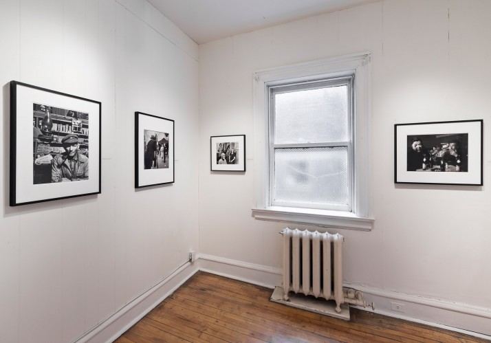
    Installation view of, Gordon Parks: Portraits, © Toni Hafkenscheid

    BAND’s new space in a converted Victorian apartment houses forty-two of Parks’ portraits spanning over the three decades (1940- 1970) of his long and revolutionary career. Utilizing the apartment’s preexisting room divisions, the photographs on display are organized thematically in various rooms to feature Parks’ thematic and stylistic range as a photographer.

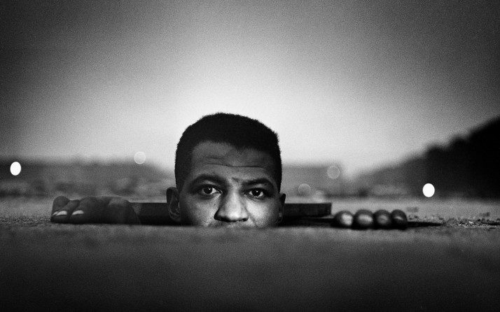
    Gordon Parks, Emerging Man, Harlem, New York, 1952, Copyright The Gordon Parks Foundation. Courtesy The Gordon Parks Foundation.

    It is both quite appropriate and ironic that Parks’ work is showcased for its exploration of identity since he was an artistic chameleon. Scholars proclaim that labeling Parks as a photographer is limiting; as he was also a poet, composer, author, filmmaker, and painter. Even as a photographer he explored various genres ranging from fashion to social documentary photography. However, rather than grappling with Parks’ dynamic creative persona, the portraits in this exhibition demonstrate the ways in which Parks’ many artistic identities influenced his photographic style and interests.

    As an African American man living during one of the darkest periods of American history, Parks employed photography in order to highlight the reality of racism to all Americans. Parks’ social documentary work for LIFE magazine can be likened to the photographs produced by American sociologist and photographer Lewis Hine, who also employed his camera as a “weapon” to promote social reform for child labour legislation. Parks’ photographs expose injustice and impoverishment. Observers of his works are left to wonder how he captured these images during a period when he himself was a victim of such racism. Yet, his photographs of ugly racist discourse also reflect a particular delicate and intimate beauty, which stimulates awe and compassion without trivializing the subject matter.

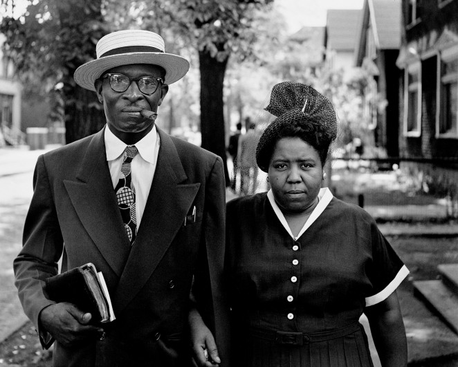
    Gordon Parks, Husband and Wife on Sunday Morning, Fort Scott, Kansas, 1949, Copyright The Gordon Parks Foundation. Courtesy The Gordon Parks Foundation.

    Parks also photographed celebrities. Interestingly, he managed to capture the ‘known’ fortunate figures with the same respect and intimacy echoed in his LIFE photography. This is evident particularly in his portrait of Ingrid Bergman, taken in 1950, during a period of tremendous turmoil in the actress’ life following the discovery of her affair with director Roberto Rossellini. Here Parks’ brilliant capacity for symbolism as a poet shines through as he captures Bergman in a moment of vulnerability, as the clocked figures in the background gaze menacingly in her direction, as though the source of psychological torment.

    His multifaceted artistic talents are again evident in his photograph of Ethel Shariff, the leader of the women’s corps of the Black Muslims and daughter of Elijah Muhammad.  The photograph is aesthetically astounding, due to its geometric repetition and triangular composition. Aside from its aesthetic merits, the configuration also articulated the rigid systematic order and unity inherent to the Muslim brotherhood as well as Shariff’s role at the apex of the ‘pyramid’ of such a system.

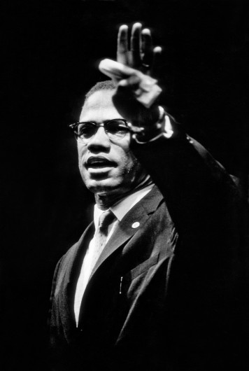
    Gordon Parks, Malcolm X at Rally, Chicago, Illinois, 1963, Copyright The Gordon Parks Foundation. Courtesy The Gordon Parks Foundation.

    While the exhibit utilizes limited wall text, it is a rather fitting choice, as it enables the visitor to engage with the photographs in a more organic manner. Wall text is limited to a brief introduction at the exhibition’s beginning and the wall labels that accompany each photograph.  This permits the viewer to construct his or her own narrative of Parks’ work. The gallery trusts the visitors to think through the photographs’ themes independently, creating an engaging, cognitive experience. This is an approach with Parks himself employed as a photographer. In the documentary Half Past Autumn, which plays in the final exhibition room, Parks explains how he uses photography as a medium, keeping with the advice of his mentor and leader of the famous Farm Security Association (of which Park was its first black member) Roy Stryker. According to Parks, Stryker taught him that photography, as a medium for social change, could be misused if utilized to simply take a photograph of a bigot and label it as such. Instead a photograph’s power as a social weapon was attributed to its ability to reveal the root of bigotry and discrimination itself.

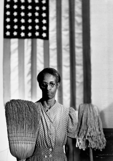
    Gordon Parks, American Gothic, Washington, D.C., 1942, Copyright The Gordon Parks Foundation. Courtesy The Gordon Parks Foundation

    The staff at BAND are incredibly friendly and willing to offer their extensive knowledge on Parks’ work, and are eager to provide additional information. The documentary film at the conclusion of the exhibit is a much-appreciated inclusion, as it offers more information and perhaps answers to some of the questions that result from viewing the photographs. The exhibition celebrates Parks’ achievements as a dynamic photographer with an incredible range in subject; from those who experienced severe marginalization and cruelty to those who were celebrated and acclaimed in the canon of great 20th century icons. His work explores the lived experiences of a multitude of individuals, exposing their realties, identities, and humanizing them. BAND’s exhibition further implores the visitor to reflect on the complex identity of the photographer himself and the dimension this brings to the works. Hopefully, the exhibit further allows the visitor to engage with their own concept of identity. 

    Melina Rymberg

    *Exhibition information: April 25 – September 28, 2014, BAND Gallery, 1 Lansdowne Ave 2nd Fl. Gallery hours: Wed – Fri 11 – 6, Sat 12 – 6, Sun 1 –5 p.m.

  • Summer Emerging Artists Exhibition / Opening Reception

    Opening Reception: July 10, 2014 / 7 – 10 p.m.
    Gallery 1313

    This annual exhibit gives emerging artists a chance to exhibit new works while trying to further their art practise and career. The curator, Gallery 1313 Director Phil Anderson, had the arduous task of selecting work from the 75-80 online submissions. The quality of work was taken into account while at the same time trying to offer visitors a wide range of works to view in terms of art practise and media. Installing an exhibit with such an eclectic mix of work wasn’t an easy task either.

    This curated group exhibition of 32 artists had a bustling reception with artists, friends and art enthusiasts. Visitors seemed to be very engaged in checking out the display of works that could have been made by possible future art stars. The eclectic exhibit had a variety of different works using different medias. In the middle of the Gallery, artist Kathleen Wicks, had her installation Anatomy of a Mattress which attracted a lot of attention. The work contained the deconstructed bed which was turned into a sculpture. There were video works by Amanda Arantes and Kim Lee Kho and felt textile works by Jennifer Tsuchida. Artist Amita Sen Gutga had realist landscape paintings while painter Moshe Sakal had abstract works. Indeed there was representation of many styles and art practises.

    Video Artist Amanda Arantes

    Textile work by Jennifer Tsuchida

    Textile Artist Jennifer Tsuchida

    Photographers Brian Deignan and Jen Yeaman had their work displayed with painters Shantel Miller and Keight Maclean and ceramic artist Heidi Mackenzie. The artists intermingled along with their art works. Izaak Saureblue’s work, Marat, used paint on rough timber pieces while artist Bryan Bermudez used printmaking in his works. With such a diverse mix of work there seemed to be something for everyone in terms of taste and appreciation.

    Artists Keight Maclean and friend

    Ceramic artist Heidi Mackenzie (right) with visitors

    Artist Bryan Bermudez

    A major challenge for emerging artists, regardless of age, or art practise is to establish themselves as recognized artists and pass through the emerging phase. Gallery 1313 tries to support this process for artists by acting as an incubator for emerging artists. The gallery takes no commission on sales of art works trying to encourage collectors to purchase and add to their collections. The collectors get to talk directly to the artists receiving more insight into their art process. The panel discussion to take place on July 16 will hopefully help with some answers to the question of What Is Emerging and also give emerging artists some answers on how to move on as their art practise blossoms and their career develops.

    Visitor in front of Amanda Arantes’ video

    Text: Melina Bigler
    Photo: Phuong Nguyen

    *Exhibition information:  July 9 – 20, 2014, Gallery 1313, 1313 Queen Street West. Gallery hours: Wed – Sun 1 – 6 p.m.


  • Reach out for OUTREACH / Please Donate!

    OUTREACH is an award-winning education program designed specifically for under-served youth, using photography as a medium of creative self-expression.

    Photography has been called the most democratic art form — but not everyone has access to the medium.

    Gallery 44’s OUTREACH program breaks down existing barriers to the arts, offering black & white photography workshops to up to 50 youth every year.

    Help us reach out to youth through OUTREACH—a vital program that brings photography to youth in our community.

    Our needs and how you can help:

    In order to offer 40 workshops (5 groups, 8 workshops each), we need to raise $5,000 for materials. Material fees are $125-$150 per workshop which covers the costs of photographic paper, film, processing, chemistry, snacks and transit tokens. We actively fundraise and receive support from foundations and corporations in order to cover other costs of the program, including instructor fees, facilities and classroom space rental. But we still need your help—individual contributions are essential to this program.

    Please note: we will issue charitable tax receipts for any donation above $50, minus the cost of your selected perk.

    Our Charitable Registration #119247310RR0001.

    Donate here: http://igg.me/at/reachout2014

    Our darkroom is the last publicly accessible wet darkroom in Toronto. Listening to youth participants describe the magic of witnessing their first photograph appear in the developing trays is a testament to the power of analogue photography in a digitally saturated world. Gallery 44 has offered accessible facilities to artists since 1979, and sees a renewed growth and interest in traditional photographic techniques among a new generation of artists.

    “Outreach presented me with the opportunity to explore photography on a deeper level. Since my experience with Gallery 44, I walked out searching for similar outreach programs in the city. I am now a walking testament of a photographer that has learned the skills and techniques of photography through Outreach initiatives. I went from being a student to a mentor. I recently had my work exhibited in the Scotiabank Contact Photography Festival, and I am looking forward to showing more work at the Cultural Hotspot exhibit this June titled From Scarborough With Love.” Outreach is the start of discovering your potential, and is committed to seeing you succeed. —Ebti Nabag, artist and 2011 OUTREACH participant Read Ebti’s Story here: www.gallery44.org/blog/ENabag

    This is our fourth year of the Reach out for OUTREACH giving campaign, and this year, we are moving from Canada Helps to indiegogo in order to activate our strong social networks, and connect as many individuals as possible to spread the word about what Gallery 44 does.

    Help us reach our goal by contributing to Reach out for OUTREACH!

    In exchange for your support—take a piece of OUTREACH artwork home with you.

    Our exciting Art Perks include:

    •2014 Zine “Connect,” handmade by the 2014 OUTREACH participants

    •A digital print from the exhibition, 5 x 7 or 8 x 10, you choose the image.

    •A unique archival silver gelatin print, printed by an artist in our darkroom, framed and ready for your home gallery.

    If we don’t reach our entire funding goal, the program will be scaled back, with a smaller number of participants and fewer workshops. But we don’t want to have to do that, so please give generously, share generously, and help truly democratize this democratic form!

    Remember, Indiegogo charges a 5% higher fee if we don’t reach our funding goal — so please please help us reach our goal!

    Can’t contribute? There are lots of ways to help!

    •Share this campaign! This helps us reach a wider audience and helps spread the word about this vital program.

    igg.me/at/reachout2014

    •Change your profile picture on social media and include the hashtag #reachoutreach

    •Analogue film fan? Tag photos of you and your friends shooting film and working in the darkroom #reachoutreach and we will share them.

  • Toronto Outdoor Art Exhibition 2014

    July 4, 5 & 6, 2014 
    Nathan Phillips Square
    Hours: Fri – Sat 10:30 – 7:30, Sun 10:30 – 6:30 p.m.

    Once again it is time to check out the Toronto Outdoor Art Exhibition. The three hundred and fifty artists seem to all be happy about the great weather. This year’s exhibition is a little tighter partly due to construction at Nathan Phillips Square. Every year is seems to get a little smaller and I talked to the new Executive Director, Mark Temple, about this. It seems that the City wants reign in the TOAE keeping them off the grass (so to speak) and not allowing as many artists as they used to on the perimeter sides of the two towers of City Hall. One side was always relegated to student participants but there were fewer student booths this year and as Mark Temple said fewer had applied.

    Artist, Harry Enchin

    Painter, Thelia Sanders Shelton

    Artist, Susan Gale

    Although it has not been officially announced yet, in 2015 TOAE  will move to Queen’s Park and will happen earlier in June 12, 13 & 14, because the Pan Am Games will be using the square as a cultural hub. Mark Temple said that it had been suggested that earlier dates might work better and that they will likely accommodate more participating artists at Queen’s Park, perhaps over four hundred. At one time TOAE boosted having 500 participant artists. One artist I talked with said that fewer artists could mean more sales, having less competition. TOAE is slated to return to Nathan Phillips Square in 2016 but it will perhaps depend on how things work out at Queen’sPark.

    Executive Director of TOAE, Mark Temple

    Artists I talked to seemed apprehensive about the move worried it might not attract as large a crowd being a little removed from the core downtown. Others worried about the grass since if it did rain it would not be as good as the concrete of the square. Queen’s Park does offer more shade but then it might be harder to view the art works as well. We will have to find out next year how everyone feels about the move. I remember when the dates of TOAE changed due to the garbage strike and it happened in September and that change didn’t fair so well.

    Artist, Tara Sameshima

    Painter, Matthew Tarini

    Photographer, Stephen Cooper

    Acting Mayor, Norm Kelly got into the act during a media scrum with an artist and a bird puppet. There was some discussion about how the photo op should play out. The artist suggested they walk around TOAE but try to avoid the quacks in the side walk. Norm Kelly suggested they walk around in search of some guy named Art as isn’t art supposed to be at TOAE. I left before finding out how all this went. Perhaps just as well. 

    Acting Mayor, Norm Kelly with bird puppet and artist

    ARTNOW added some curated performance, installations and sculptures for visitors. A few people seemed quite pleased with the sculptures on site.

    The Lines by Mark Prier

    All the artists were pleased with this year’s good weather, good crowds and some sales. Judges, Lee Petrie and Gary Michael Dault made their rounds to the booths. There are prizes valued at a total of $25.000 awarded to different categories.  I talked with several happy Montreal artists who were thrilled to be in this year’s exhibit.

    Judges, Lee Petrie and Gary Michael Dault

    Montreal Artist, Pascal Normand

    The public, I saw, seemed quite engaged and talking to the artists about their work. The artists in turn were happy to share stories about their art works and art practise. With promises of continuing good weather everyone seemed to be in a good mood and TOAE will have continued success as artists keep to help make Toronto a unique place to celebrate the arts.

    Text and photo: Phil Anderson

  • Toronto Outdoor Art Exhibition

    July 4, 5 & 6, 2014
    Nathan Phillips Square
    Hours: Fri – Sat 10:30 – 7:30, Sun 10:30 – 6:30 p.m.

    The Toronto Outdoor Art Exhibition [TOAE] is a juried showcase featuring contemporary fine art and craft that takes place annually on Nathan Phillips Square, every July.

    As the largest juried outdoor art exhibition in Canada, TOAE offers a fresh-air alternative to conventional art shows and galleries. An estimated 100,000 visitors attend the exhibition every year looking at the work of over 350 artists. The Toronto Outdoor Art Exhibition prides itself on creating an environment which gives artists the chance to interact directly with the public in an informal setting – removing the barriers to access, and dispelling the formality of a traditional gallery or art fair experience. Side by side, established artists, undiscovered talents and innovative students sell their work directly to the public and make lasting connections with art dealers and collectors.

    For  more information please go to http://www.torontooutdoorart.org

  • Late Blooms in the Garden of Modernism

    When It’s Post, Modernism Always Rings Twice

    The evidence that formalism has returned is amply displayed on gallery walls these days. Much of it is in the form of abstraction, or as Jerry Saltz put it in his New York Magazine article Zombies on the Wall: Why Does So Much New Abstraction Look the Same? “Modest Abstraction, Neo-Modernism, M.F.A. Abstraction, and Crapstraction,” Admittedly, he quite likes some of it, but the terms serve as fingers to trigger the yawns. Like guests arriving at a post modernist party, the formalists have been gathering in the vestibule for quite some time now, and with the soirée in high gear, an argument will inevitably erupt over what modernism and post modernism are by definition.

    How about the proposition that modernism, or least a full-rounded consideration of it, never actually left us? More difficult to dispute, however, is the demise of the formalist abstraction as narrowly defined by Clement Greenberg, a favouring of compositional elements such as line, value, colour, and texture over content.

    A distinct moment of modernism’s passing was observed by Rosalind Krauss in 1966. Lane Relyea’s essay All Over At Once from Critical Mess, Art Criticism on the State of Their Practice (2006), has Krauss referring to “the unraveling of modernism” and it having to do with “paintings no longer capable of finishing within their frames.” She was struck by Frank Stella’s Wolfboro series and Kenneth Noland’s diamond-shaped paintings, and especially by the degree to which both artists prioritized the series over and above any one painting in particular.

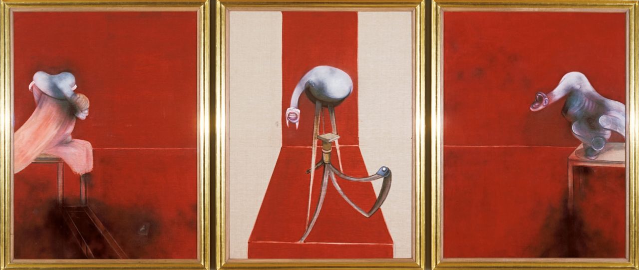
    With a Francis Bacon painting, the frame is the very thing that allows the pictorial elements to sustain their intensity. Bacon was all about containment, further stuffing his figures into boxes and cages. As with a bottle of Coke, it’s the cap that stays the effervescence. What needs to be consumed from a painting by Bacon is all-inclusive, packed and tabbed within the wrapper, no outside paperwork required. Bacon’s paintings at the Art Gallery of Ontario show Francis Bacon and Henry Moore were simply electric, the battery of coiled sense and emotion having nicely maintained their charge over the years. The show could have been titled Skin and Bones, with Moore supplying the weathered femur and pelvis, and Bacon the bag of raw nerves.

    Francis Bacon, Second Version of Triptych, 1944, 1988, oil and alkyds on canvas, each panel 198 x 147.5 cm. Tate Modern, London © Estate of Francis Bacon / SODRAC (2013)

    I’m not alone in suggesting that modernism has persisted. In his 1981 essay Against Post Modernism: Reconsidering Ortega, Peter Halley made the claim that modernism was not outdated, only badly formulated to begin with. He blamed critics for universally buying into Greenberg’s definition of modernism, which did not consider the full range of 20th century art. Within Greenberg’s theory, dada and surrealism are expunged. Here, even analytic cubism posed a problem and had to labeled “counter-revolution.” Bacon’s work, by virtue of its figuration is retrograde and consequently orphaned. For Benjamin Buchloh, European neo-expressionism, since it signified a return to representation, were labeled as “cyphers of regression.” The box of modernism as defined by Greenberg shatters as we attempt to cram the art of the past century into it.

    Stan Douglas, Midcentury Studio: Cache, 1948, 2010, digital fiber print mounted on Dibond aluminum, image: 45.7 x 61 cm, paper: 73.7 x 86.4 cm

    Why not see modernism as a seeded garden, and abstraction as a blossoming into abstract-expressionism and colour field? The post modernism that took root in the 60s, could better be termed post formalism. A great deal of the art of the past half century is the flourished outgrowth of Duchamp’s brand of modernism. Rather than post or past, the subsequent influence of his art, viewed in this way, is a logical continuum – still modernism.

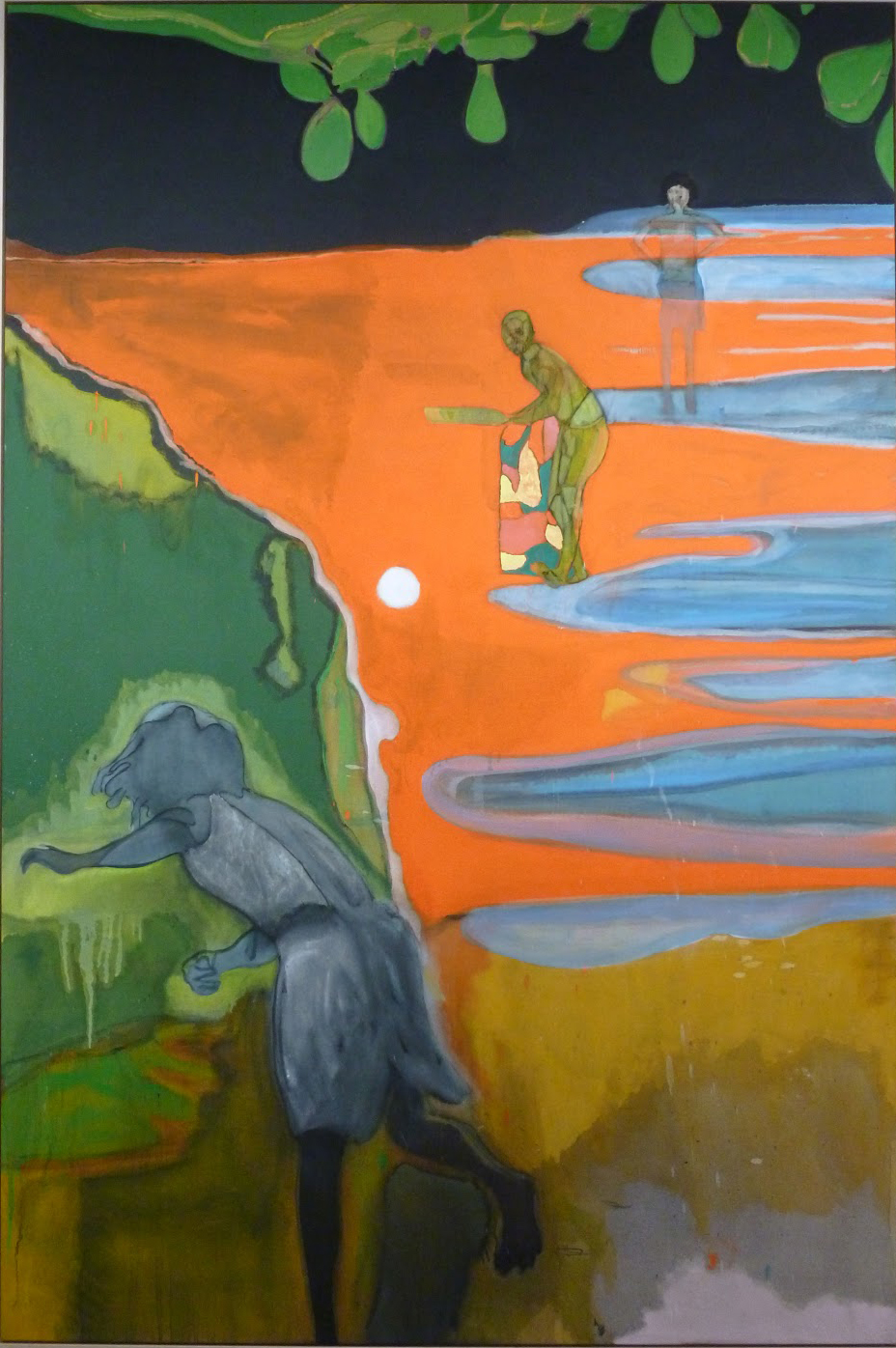
    A contemporary artist that has successfully exploited the breadth and potential of modernist painting to suit his own expressive ends, is Peter Doig. With licks from Matisse, Munch, and even Daumier, the artist sponges across the colour fields of Rothko as if the canvas were a ballpark – modernism at one end and contemporary art at the other. By playing both ends simultaneously, Doig gleefully runs up the painterly score at his pleasure. As with Bacon, little outside reference is needed to “get” the work. Doig’s pictorial intelligence is that of an athlete, the meat of the event being on the playing field of the canvas, not in the Sunday morning colour commentary.

    Peter Doig, Cricket Painting (Paragrand), (detail), 2006–2012, oil on canvas, 118.25 x 78.75 in. (300.4 x 200 cm)

    The Stan Douglas exhibition at the Ryerson Image Centre in Toronto was prologued by a wall text, in which the artist stated: “It is not always necessary for the viewer of my work to be aware of every source and reference. If a work cannot be understood on any level by just experiencing and having everyday knowledge of television and film, then the work is not successful.” If the statement is not exactly a disclaimer, they are words that soothe and comfort to allay contextual anxiety. To quote Relyea again on Krauss, “a pivotal moment marking the transition from modernism to the more expanded field of postmodernism,” was the moment that access to the artworks required “a long chain of explanation.” Regarding the burden imposed on both artist and viewer, Relyea quotes Hal Foster, “As one moves from project to project, one must learn the discursive breadth as well as the historical depth of many different representations – like an archaeologist who enters a new culture with each new exhibition.”

    Stan Douglas, Corrupt Files 2010_3024, 2013, Color inkjet mounted on Dibond aluminum, image: 195.6 x 151.2 cm, paper: 223.5 x 176.6 cm

    With his 2010 Midcentury Studio series of photos, Douglas has pushed to the limit mediation, reference, and control over the image itself. With the elaborate staging of props, actors, and image production machinery, he achieves a faux realism, a simulated moment with the look of the actual, but a deception, nevertheless. This hyper management of the pictorial surface carries the aura of painting, enlisting the panoply of formalist principles. Each Midcentury Studio photo becomes, in effect, a found image, flotsam in the cultural sea of the artist’s own making.

    If the buckling of modernism into post modernism took place in the 60s, then the current return of formalism may signal the folding point of post modernism into, if not merely a reassessment of modernism, then perhaps something new altogether. I read the 2013 Corrupt Files works by Douglas as tokens of the rupture in the reign of post modernism, the collapse of the image under the weight of a surfeit of information and reference.

    Steve Rockwell