Author: artoronto

  • The Four Horseman of the Apocalypse / Barns

    Opening reception: August 1, 2013, 6 – 9 p.m.
    De Luca Fine Art | Gallery

    Installation view. Photo: Walter Willems

    On the hot Thursday afternoon, ignoring the heat, a crowd gathered in De Luca Gallery for the Opening Reception of two  exhibitions. The two shows are very different in style. THE FOUR HORSEMEN OF THE APOCALYPSE in the main gallery  four multi-disciplinary artists, Janet Bellotto, Barb Hunt, Faith La Rocque and Camilla Singh works are on display.

    Photo: Alice Tallman

    “They are indomitable and tenacious artists with wondrous minds, on a mission to leave an impact that will have us mortals trembling” predicts the press release. Indeed the exhibit is very interesting with installations, photo based works, video, sculpture and graphic works showing side by side. De Luca showed most of the artists before, so it is a little bit like a summer group show but a unique one.

    Artists Janet Bellotto,  Faith La Rocque and Camilla Singh. Photo: Alice Tallman

    Water flows through Janet Bellotto’s work: oceans and waves, submersion and reflections, in-between states that are fluid and aqueous. The artist’s body flows slowly in water among jellyfish in the video The slow decline. Her other, photo based pieces take us inside of our dreams and visions (The Force Within).

    Janet Bellotto, The Slow Decline, digital video, duration 7:10 min., edition 1 of 3 dimensions variable, 2013. Courtesy of De Luca Gallery

    Artist Janet Bellotto with her works The Force Within and Transcribing the Impermeable Wall. Photo: Alice Tallman

    Barb Hunt creates larger than life metal dresses for the iron maiden. Her drawing Study for Leaf Dress brings organic element into the monumental composition where a dress design becomes a life-tree at the same time.

    Barb Hunt, Study for Leaf Dress, drawing. Courtesy of De Luca Gallery

    Faith La Rocque with her large installation of heavy looking sacks aims to “establishes active environments that allow for critical awareness, sensory experience and physiological engagement.”

    Artist Faith La Rocque and her installation. Photo: Alice Tallman

    Singh started a band called MORTIFIED in 2012 with Jenn Goodwin.  Using references such as heavy metal music, military drumming, choreographic approaches to the drum kits and the sonic possibilities of pom poms creates sonic experiences through movement with an emphasis on rhythm.

    Artsist Camilla Singh with her work Uh yeah it matters. (Vic Firth Signature Sticks – Flo Mounier, Cryptopsy), bronze, 16 x 6 inches, 2013. Photo: Alice Tallman

    Her graphical series of writing reminds us of Arabic art where the depiction of the human body is forbidden so everything is said through worlds and beautiful calligraphy. There  are not easy to decipher the English words here but their decorative beauty enriches their verbal meaning.

    Camilla Singh, Secret VIII, graphite on paper, 26 x 34 inches, 2011. Courtesy of De Luca Gallery.

    The other exhibition BARNS in the low level of the gallery displays the Hungarian born Jonathan Bolyki’s landscapes from rural Ontario. The artist started to paint again only two years ago and the amount and quality of work he created in this short time is amazing.

    Artist Jonathan Bolyki. Photo: Alice Tallman

    Bolyki paints “fantastic” landscapes. Under immense skies, the clouds are just passing by or a scary storm is fast approaching. The subject is a Barn, usually abandoned as to remind us of time passing by and nature claiming things back. The sky is mostly empty, often a vast white surface guiding our focus to the dark building, creating a dramatic effect. Bolyki was interviewed by Omni TV at the Opening Reception.

    The guest, trying to escape the heat, enjoyed a good discussion and some refreshment in the garden behind the gallery.

    The shows are open August 1 -31, 2013, at De Luca Fine Art | Gallery, 217 Avenue Road. Gallery hours: Wednesday – Saturday, 12 – 6 p.m.

  • New Erotica

    Group show of 5 Women Artists: Rhianna Paul, Tasha Paulus, Aimie Botelho, Rachel Thomas, and Kirsten LeBlanc 

    With heart and a spirit of acceptance these five artists, all of which recently graduated from York University’s BFA program, presented artwork that both celebrates and promotes the multiplicity of the female body. The artworks themselves were diverse in their use of media including plaster, wood and brass sculpture, readymades, using breasts as a “brush”, etc. The artworks were not cohesive, nor did they adhere to addressing the same themes related to the female body. However, this was not a shortcoming. It was quite the contrary. By presenting these young artists work together they, firstly, challenge what we, the masses, accept as beautiful, and sexy (ex: Tasha Paulus); challenging the constructs of power and social constructions of the female such as the housewife, or the woman as the weaker vessel (ex: Rhianna Paul); promoting the female body as dominant over the forces that seek to dominant her (trauma, memory, bodily threats) (ex: Rachel Thomas and Aimie Bothello); and finally, challenging how we use the female body, not for sex, but rather to use the female body, literally, as an instrument of creativity (ex:Kristen LeBlanc). Overall, I do not agree that “New Erotica” is the best title for this exhibit. Although the artworks can all, individually, be read through the lens of sexuality, their work also addresses a handful of themes that need to be acknowledged and appreciated. Collectively, these ladies put forth a message that uplifts and empowers the modern-day woman, even in moments of weakness and vulnerability.

    Artist Tasha Paulus with model featured in her series of photographs,  Feminan Caro Crudum (Raw Female  Flesh), 2013, photographic print

     Tasha Paulus’s Fetish?!, 2013, photographic collage and Rachel Thomas They Rarely Ask About the Scar, 2013, oil painting

    Artist Rhianna Paul and Slab, 2013, sculpture

    Rhianna Paul’s Sewing Machine, 2013, sculpture

    Artist Rachel Thomas and Delicates, 2013, sculpture

    Owner and Founder of Urban Gallery, Calvin Hambrook  with Rachel Thomas’s Delicates, 2013, sculpture

    From Left to Right: Aimie Botelho, Tongs and Hammer, 2013, sculpture. Aimie Botelho, Bear Trap, 2013, sculpture, and Kirsten LeBlanc, Red Lady, 2013, sculpture

    Artist Kirsten LeBlanc with Red Lady, 2013, acrylic painting, and Fusion, 2013, acrylic painting

    Text and photo by Leanne Simaan

    *Note: The show is open: August 9 – 19, 2013 at Urban Gallery, 400 Queen St. E.

  • An Artist/Curator Talk: Movement Never Lies

    St. Helena Olive Tree, Extinct 1884-1977, 2003 © SOFT TURNS, 2010.

    An Artist/Curator Talk: MOVEMENT NEVER LIES
    An installation of video works by SOFT TURNS
    Saturday, August 17, 2013, 2 – 4 p.m.
    O’BORN CONTEMPORARY
    131 Ossington Avenue

    Movement does, in fact, lie.

    Shadows indicate displacement where there is none and time can be visually manipulated to produce fictitious motion that hovers just above the threshold of perception. In a more topographic sense, the migration of flora and fauna over history’s span is often adopted as a veritable record of biology’s development, but is ultimately misleading. Family histories are inflated with anecdotal travelogia and indigenous plant species turn up in the least suspected places. The intercessor between place and time is movement. And yet…though the two constants (or variables, rather?) of place and time are nearly always associated with each other, they really are separate entities. Changing the place your body is located does not necessarily mean altering the spectrum of time in which you exist. Analogously, spasms in time’s continuum, or the dissolution of one’s understanding of how time is passing, need not necessarily indicate that movement in space has occurred.

    Temporary states of existence and physical volume–both chronological and spatial–inform Soft Turns’ stop motion animations. In conversation, the four selected videos (“A Passage“, 2010; “St. Helena Olive Tree, Extinct 1884-1977, 2003-2010;  “Behind the High Grass“, 2011; “Just Add Water“, 2007),  presented here as Movement Never Lies construe transitory states of being as a regard on movement and its chameleon-like nature.

    Soft Turns (Sarah Jane Gorlitz and Wojciech Olejnik) have been collaborating on stop-motion and video installation since 2006.

    Installation continues through August 21st, 2013. Gallery hours: Tuesday – Saturday, 11 – 6 p.m.

  • Jesus Mora: Retrospective / Opening Reception

    Jesus Mora: Retrospective
    Saturday, August 10 – Sunday, August 11, 2013
    Opening Reception: Saturday, August 10, 2013, 5 – 8 p.m.
    Artscape Wychwood Barn Gallery
    601 Christie Street

    Installation view. Photo:  Margaret Irving Portraits & Artistry

    “RETROSPECTIVE” is an exhibition of artwork that was produced over 13 years by the artist Jesus Mora.

    Installation view. Photo:  Margaret Irving Portraits & Artistry

    Different stages of his career shows the evolution of his artwork up to what is now recognized as his own language. “It was not easy to choose what pieces of work to show, it is always a challenge and I think that is needed courage to show my earlier work” says Mora.

    Artist Jesus Mora with visitors. Photo:  Margaret Irving Portraits & Artistry

    Mora is well known for his interest in Mexican culture. He said in an interview, “I’m not just fascinated by Mayan culture but rather all indigenous cultures especially those in Mexico. All my work has that influence from ancient cultures and nature, insects, or plants or other organic forms.”

     Photo:  Margaret Irving Portraits & Artistry

    Jesus Mora, Paper mache masks. Photo:  Margaret Irving Portraits & Artistry

    Over 100 works were presented in “Retrospective”; Acrylics, watercolours, mixed media, oils, paper mache, t- shirts.

    Jesus Mora, Oruga.

    Installation view. Photo:  Margaret Irving Portraits & Artistry

    The crowd could enjoy the art show as they listened and watched Musician Rosy Cervantes and her band “La Sana Rabia” playing Mexican Jazz.

    Sergio Faluotico, percussions, Chris Birkett, guitar and voice Rosy Cervantes, guitar and voice. Saturday, August 10, 10:30 a.m. Photo:  Margaret Irving Portraits & Artistry

    The two days show with lots of music provided a wonderful summer entertainment for art lovers.

  • Gabor Szilasi: The Eloquence of the Everyday

    Gabor Szilasi, the iconic Canadian Photographer, who influenced a few generations of photographers as an artist and as a teacher, has a wonderful show at the Ryerson Image Centre. The exhibition covers his oeuvre from the 1950s when he lived in Hungary, the rural Quebec series after he fled to Canada; his work in Montreal as well as his portraits.

    David Harris, Guest Curator (left), and artist Gabor Szilasi (right) during the press preview, June 18, 2013. Photo: Jennifer Park. Courtesy of the Ryerson Image Centre

    Szilasi is a wonderful storyteller, and I was lucky enough to look at his photographs and listen to the accompanying stories at the press preview. The exhibition is organized around the most important locations in Szilasi’s life: Budapest, rural Quebec and Montreal.

    Gabor Szilasi, Gresham Building, looking towards Roosevelt tér, 5th District, Budapest, 1956. Collection of the artist. © Gabor Szilasi, 2009

    Szilasi was born in Budapest. As a young man he was interested in art and wanted to be a painter. He was advised by a family friend to try photography since it didn’t require as much background knowledge. So he bought his first camera and started his photographic experiments, just for the fun of it. His first subjects included panoramic views of the city, buildings and the people who occupied them, his friends and strangers among them. In the Gresham Building, looking towards Roosevelt square (1956) the light and shadow capture a very artistic view with a somewhat dramatic feeling. Szilasi’s most famous work from that time called Motorcyclists at Lake Balaton (1954) was an “accident” created by the camera’s sudden exposure. The artist was on vacation, lying in the sand with his camera as it went off and just captured the couple driving out of the picture and because of the low viewpoint it chopped off the top of their heads. Unfortunately this composition became symbolic of the Hungarian Uprising against the Soviet occupation in October, 1956, when thousands of people died, I, a young child at that time, still remember the blood running on the street like rain. Szilasi captured some events of those terrible days, meetings, line ups for food and people fighting. Like many others, his family left Hungary and came to Canada in 1957.

    Gabor Szilasi, Motorcyclists at Lake Balaton, 1954. Collection of the artist. © Gabor Szilasi, 2009

    In 1980 Szilasi went back to Hungary and trough the following years nine other trips followed. His photographs from that time are mostly portraits of old friends he left behind. The interiors are heavy with memories look as if time stopped there with the old armoire, the chiming clock standing in the same place and the walls covered with books and artwork. Szilasi said that he knew even as a child about the process of memory and where memory is held. All of his photographs involve both the mind and the heart and each image has a history. His friend Adele sits in an overcrowded room in Budapest where every possible surface from floor to ceiling is covered with books and magazines. She sits there, her tired face showing the ravages of a hard life of a Hungarian intellectual, chain-smoking. Shortly after that photograph was taken, she fell asleep smoking, causing a fire. When she woke she tried to save all those books until she no longer could make it out and died among them.

    Leaving the narrow streets and dark interiors of Budapest behind in 1956 and coming to Canada, Szilasi was surprised by all the open spaces of Northern Quebec. David Harris, the curator of the exhibition, called Szilasi’s photographs “environmental portraits.” It is especially true of the rural Quebec series.  Working for the Office du Film du Quebec as a documentary photographer  he travelled a lot and met people of all callings from poor farmers and physical labourers to the famous and rich.

    Left: Gabor Szilasi, Luc Simard, Édouard Guay, and Joseph Lajoie, standing beside stock car, Saint-Urbain, Charlevoix, September–October 1970. Right: Gabor Szilasi, Réjeanne and Gaétan Garon in front of the Bellevue Restaurant, Saint-Joseph-de-Beauce, Beauce, June 1973. Both Collection of the artist. © Gabor Szilasi, 2009

    Szilasi took many images in Coudres, Charlevoix among them the portrait of the still beautiful, doll-like old lady Mme Alexis (Marie) Tremblay in her bedroom, Ile aux Coudres, Charlevoix (1970). She is posing for the photograph wearing lace a collar, a pristine white apron and a hat that was in fashion long ago. The mirror behind her reflects her back, creating a three-dimensional view of her body. There is a portrait in this portrait as well, showing Mme Tremblay at a young age. Looking at the old and young version of the lady at the same time makes us feel nostalgic about time passing by. The small room suggest a life lived in limited, close-quarters, but madam stands her ground with pride and the black and white image is filled with psychological complexity. Szilasi said he loved the landscape and the villages because they grew organically and he didn’t make single images but clusters of them to document their traditions and religions in contrast to the plain and austere decorative sites of modern cities. Coudres, Charlevoix was the place where he started to shooting color photographs depicting the simple muted colors of country interiors (André and Marie-Rose Houde’s kitchen, Lotbinière, January 1979).

    Gabor Szilasi, Mme Alexis (Marie) Tremblay in her bedroom, Île aux Coudres, Charlevoix, September–October 1970. Collection of the artist. © Gabor Szilasi, 2009

    Montreal, the city where he lives, gives Szilasi endless inspiration. From the beginning of the 1960s he has documented many of the city’s old features and their new faces through the changes of time, technology and architectural styles. You still can find the old church and some buildings unchanged on St. Paul Street, but the whole atmosphere is changed. It is no longer a gloomy market area but the heart of old Montreal’s downtown (View along St. Paul Street with Bonsecours Market, Montreal, 1961).

    Gabor Szilasi, View along St. Paul Street with Bonsecours Market, Montreal, November 1961. Collection of the artist. ©Gabor Szilasi, 2009

    Impressed by the graphic quality of signs, Szilasi started to collect, as well, as photograph them. He found it ironic that these American designed electric and neon commercial signs spreaded all over the buildings in Montreal but their language remained mostly French. He started to use a panoramic camera in the 1980’s to capture all the variety of urban spaces and used color to enhance their richness.

    Gabor Szilasi, Classy [now destroyed], St. Hubert Street, Montreal, Summer 1985. Collection of the artist. © Gabor Szilasi, 2009

    Portraits were always an important part of Szilasi’s oeuvre, and reveal a picture diary of his personal life, friendships and professional relationships with other artists like Guido Molinari. In some of his compositions he combines a black and white portrait, like of his daughter, Andrea with a color image of her room, creating a psychological analysis and giving a deeper understanding of the person.

    Gabor Szilasi, Guido Molinari and Judith Terry, opening at Galerie Sherbrooke, Montreal, January 1969. Collection of the artist. © Gabor Szilasi, 2009

    The last in this exhibit is covered by portraits of individuals from different layers of society, including  his wife Doreen, some friends and neighbours. What makes these photographs unique is the viewpoint of the artist. Szilasi was sitting very close to the models throughout the shots and that made them feel uncomfortable. Literally seeing every detail and all their facial expressions, including the smallest spasm of a nerve, the artist was able to see “through” the surface and picture their real selves. Strangely this close-up approach makes them all serious. Not a single person smiles.

    Gabor Szilasi, Linda Dornan in her apartment, Montreal, December 1979. Collection of the artist. © Gabor Szilasi, 2009

    Szilasi developed all the images himself using the old, traditional method staying away from digital technology. It seems to make them more detailed, richer in tone and deeper, even in black and white.

    Emese Krunák-Hajagos

    *Note: The show is open June 19 – August 25, 2013 at Ryerson Image Centre, University Gallery, located at 33 Gould Street, Toronto. Gallery hours: Tuesday, Thursday & Friday 11 – 6, Wednesday 11 – 8, Saturday & Sunday 12 – 5 p.m.

  • Francis Muscat: When Tree Falls

    The Opening Reception on August 1, 2013. Photo: Celeste Ringrose

    When Tree Falls, currently showing at Pentimento Gallery in Toronto, is the first work I’ve seen by artist Francis Muscat, but certainly not his first show. The invitation image Fuck U is a smooth carved wooden head with a splintered Mohawk, so I expected the work to be both skilled and ‘edgy.’ I was not disappointed.

    Francis Muscat, Fuck U, 2012, Wood, steel 95” x 10” x 8” (left) and Loss, 2012, Wood, steel, silk thread 57” x 10” x 9”  (right). Courtesy of the artist and Pentimento Gallery

    I was really surprised that visitors were allowed to touch the sculptures and feel the difference between the  smooth texture that the artist created and the original wood as it was found. Such a treat!

    Francis Muscat, Loss #2, 2o12, Wood, steel, silk thread 57” x 10” x 9” (left). Courtesy of the artist and Pentimento Gallery. A visitor petting Loss #2 (right). Photo: Celeste Ringrose

    In this show, inspired by the trees a beaver brought down near his home, Muscat has taken the rough remainders and given them new meaning.

    Artist Francis Muscat. Photo: Celeste Ringrose

    Some sculptures incorporate delicate figurative carving while others include glasswork—a familiar medium for this artist. The motif of ‘home’ is strong whether it is ‘pick-up-sticks’ of glass arranged in a house shape (Small House series, 2010) or a curving column of stacked wood and glass (Volcanic Passion #2, 2o12).

    Francis Muscat, Volcanic Passion #2, 2o12. Wood Glass, 62 x 10 x 10 inches. Courtesy of the artist and Pentimento Gallery.

    I found this show contemplative, and an interesting juxtaposition of whimsy and strength. There’s one piece Greg 2 that looks like the darkened wood has been flattened cartoon-like into spikey dark hair tipped with silvery-green and then merged with a clear glass silhouette of a man’s head that’s driven through the wood. I see the duality and more in the multiple shadows that falls against the wall.

    Francis Muscat, Greg 2, 2013, Wood, Glass, 23 x 10 x 9 inches. Photo: Celeste Ringrose

    There’s a lot to think about in this work… and the thinking is a pleasure.

    Julie McNeill

    *Note: The show is on display: July 25 – August 18, 2013 at Pentimento Gallery, 1164 Queen Street East. Gallery hours: Wednesday – Sunday 12 – 6 p.m.

  • Call for Submissions / Project Gallery

    CALL FOR SUBMISSIONS / Cut and Paste Exhibit at Project Gallery

    Exhibition: August 22  – 28, 2013

    Deadline: August 15th

    Seeking submissions in any and all media for a contemporary art exhibition at Project Gallery called Cut and Paste. Accepting submissions in any media including but not limited to visual art, video, sculpture, installation, performance, music etc.

    The show will feature works that embody the aesthetic of collage and related compositional elements; works that conceptually deal with assemblage, pastiche and the appropriation of different styles of design. Works are not limited to physical ‘cut and paste,’ rather the show aims to embrace the critical understanding that may be born out of the juxtaposition, manipulation and compilation of various isolated forms. The show will center on questions such as: What is the value aesthetically and otherwise of recontextualizing visual components in a transformative way? What is the effect of purposefully combining seemingly unrelated elements into one work? How do such elements unite to create alternate or contrasting understandings and discourses?

    If you wish to submit, please include:

    • Up to 5 Photos or up to 2 videosof your work
      • Titled: FULLNAME_TITLE_SIZE_MEDIUM_DATE
      • A brief artist bio/statement – up to 200 words
      • Contact information – including phone number and website/blog

    Please send your submissions or inquiries to: submissions@projectgallerytoronto.com  by August 15, 2013

    Exhibiting at Project Gallery means that your work will be professionally photographed, you will have the opportunity for a promotional artist video interview and your work will have the potential to be rented commercially.

  • Art Responsibly by Toronto Youth

    From St. Barnabas Catholic School

    August – until the end of 2013
    Pattison Onestop
    posters on subway platforms

    Pattison Onestop in partnership with Arts for Children and Youth (AFCY) present Art Responsibly, a series of hand-painted subway posters created by children and youth from Toronto’s priority neighbourhoods, on select subway platforms across Toronto. Art Responsibly posters share these youths’ thoughts and feelings about “being responsible by being artful.”

    The young participants reused expired subway posters provided by Pattison, completely painting over the old advertising to create original new artworks under the guidance of a professional artist and an emerging AFCY youth artist at AFCY’s free outreach community-based visual arts workshops.  Art Responsibly is an innovative AFCY initiative that intersects the notions of community arts education, arts advocacy, media literacy, civic engagement and leadership.

    “As creative public springboards, the posters will be used by youth to visually convey social messages and ideas that are important to them. Their hope is also to prompt public inquiry, reflection and action. This poster project represents more chances for youth to mobilize and to use their creativity, knowledge and art making to inspire and inform members of the public, and to take leadership aimed at affecting and advancing Toronto’s art scene,” explains Julie Frost, AFCY’s Artistic and Executive Director.

    “We are pleased to be able to support the artistic and cultural growth of our city’s youth. Art Responsibly uses art as a catalyst and inspiration for change, and encourages a society in which imagination is valued,” said Sharon Switzer, Arts Programmer and Curator, Pattison Onestop.

    The unique subway poster artworks were created at 6 locations around Toronto, and have been located on subway platforms in close proximity where they were made. Locations include: Art Gallery of Ontario’s Free After Three program (St. Patrick Station), Covenant House Toronto (College Station), Our Lady of Victory Catholic School (Eglinton West Station), St. Barnabas Catholic School (Kennedy Station), St. Dorothy Catholic School (Wilson Station) and Rockcliffe Middle School (Runnymede Station).

    Pattison Onestop will continue to strategically add and place the Art Responsibly posters across the network of subway platforms until the end of 2013, insuring this important programme can be viewed by as many subway commuters as possible. The public is invited to respond to the artful subway posters via Twitter @AFCYtoronto

  • Jon Knowles: I’m Only in it for the Manet

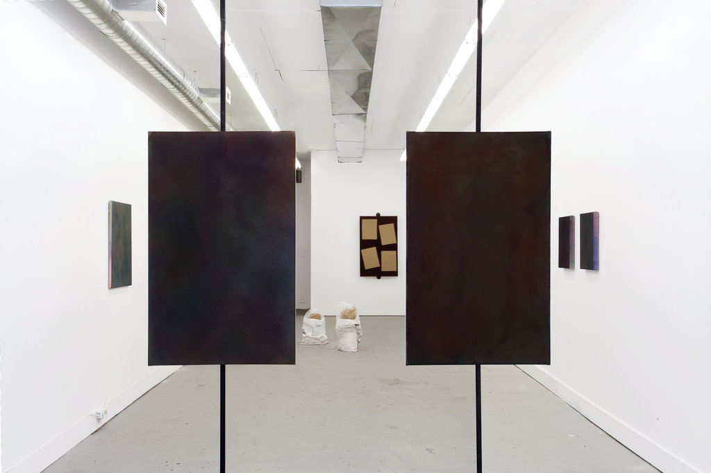
    Installation view with in the foreground (left): Jon Knowles, “Roman & Williams #1”, diluted acrylic polymer on raw canvas (30″x48″), steel gasoline pipe & components, 2013, (right): Jon Knowles, “Roman & Williams #2”, diluted acrylic polymer on gessoed canvas (30″x48″), steel gasoline pipe & components, 2013. Photo: Jimmy Limit.

    “This exhibition is about painting and art’s subsumption into the capitalist city,” says the accompanying text to the current Jon Knowles exhibition at G Gallery. The show’s bold thesis and provocative title, I’m only in it for the Manet, easily had the art writer’s attention, piquing a number of questions. How are paintings going to express the hold of capitalism on precisely themselves? And does the “Manet” of the title refer to cold money or art, or possibly both?

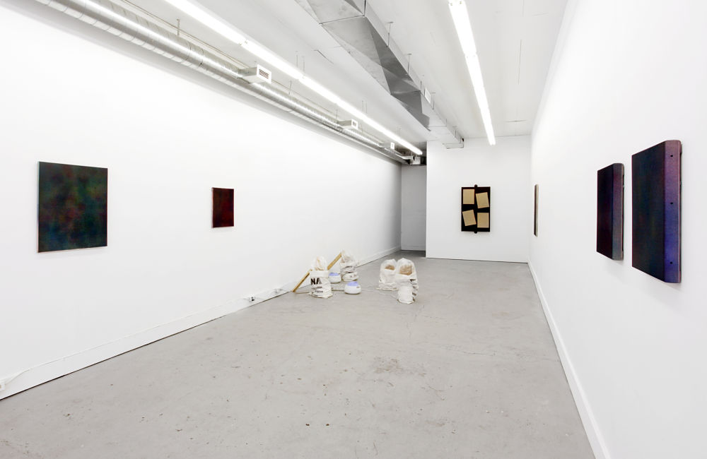
    I enter the gallery with these questions in mind and come face to face with a pair of medium-sized monochromatic black paintings. Approaching closer, however, tints of red, green, and purple emerge out of the black surface. About half a dozen similar near-black paintings adorn the rest of the gallery walls. The surfaces of these pseudo-monochromatic paintings have a fluid and mobile quality. The hints of colour seem to float and glow amid the blackness, giving the paintings a softness that evokes the abstract canvases of Rothko and Frankenthaler.

    Jon Knowles, “Untitled #22”, diluted acrylic polymer on raw canvas, 30″x43″, 2013. Photo: Jimmy Limit.

    But Knowles is not exactly driven by the lofty, fuzzy notions of transcendence, intuition, and introspection of the Abstract Expressionist tradition. His paintings partake in a discursive, conceptual framework, and are rooted no so much in the imagination or the transcendental, but in the concrete material realm. The paintings can be read as a Marxist reflection on the relations of production and the material conditions of creative activity. In artist Yuki Higashino’s text commissioned to accompany the exhibition, he writes, “…if you’re an artist, art making is labour, with all its implied monetary value, exploitation and daily drudgery.” In a irreverent refusal to romanticize the artist and art-making, he concludes, “…it is imperative for artists to insist on the absence of enjoyment in their production process.”

    Installation view. Photo: Jimmy Limit

    And hence the repetition of monochromes. Knowles exposes the subsumption of art into capitalism not through visual representation, but through the very doing of art-making itself. The practical need to produce, not some inspired urge to express, is the propelling force behind these creations. The monochromes were executed by spaying the canvas with hundreds of layers of acrylic polymer in primary colours – yellow, red, and blue, repeated over and over again until the canvas approximated black. The repetitive process comments on the daily drudgery of artistic production within a market society, while the systematic approach reflects the restraints on creative activity imposed by the economic relations overarching all social production. The messy ties between art and commerce are an old topic, but it nevertheless conjures a flood of ambivalence over the ethics of artistic production and the social role of the artist. The romanticized artist is often asked to resist, to challenge, and to revolutionize, but should we not also talk about the less glamorous hustle of everyday survival?

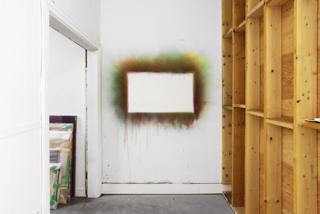
    Jon Knowles, “Untitled #23 (painting in-situ at G Gallery after painting in-situ at Galerie Laroche/Joncas July 2012)”, diluted acrylic polymer on gallery wall, dimensions variable, 2013. Photo: Jimmy Limit.

    Knowles’ work conceptually attempts to collapse a long history of painting into its essentially material grounds, where art-making – or art work –  is just a node in the social relations of production. The show dismantles the fetishization of art-creation, but it is unclear if we are just left at a dead-end with some monochrome paintings for company. Is the negation of enjoyable art-making simply a pessimistic commentary on the submission of Art at the feet of advanced capitalism, leaving us with nowhere to go? Or does Knowles’ critique open up alternative possibilities for working artists within existing social structures? His future projects will perhaps shed light on new ways to bring enjoyment back into art production.

    Amy Luo

    *Note: The show is open July 5 – August 10, 2013 at G Gallery, 134 Ossington Street. Gallery Hours: Thursday – Saturday, 12 – 5 p.m.

  • Terry Gambarotto / Kardionic

    Terry Gambarotto, Four Chambers #1, digital c print, 50″ x 50″, 2011. Courtesy of Pentimento Gallery

    Faced with Gambarotto’s Four Chambers #1 upon entering the space, a visually captivating (due to size and brilliant color) print, I was excited for what I expected: the plurality of representations of the human heart. However, the artwork proved to be visually monotonous. Although the project was stated to explore “various scientific and cultural expressions of the human heart,” it was not readable. The titles and the concept for the works seem to be mildly inspired by ideas of unity in Eastern and Western spiritual practices but there were no indications, other than the titles, that the works were displaying anything but microscopic shots of the human heart.

    Terry Gambarotto, Still shot from Kardionic, 2013, Recording of Audiovisual Performance NXNE, 2013. Running Time: 14m 3os

    Yet, Kardionic, the recorded performance, was a clear break from the static and the scientific digital c-prints. The video connects the audience to a visually and audibly entrancing experience. The performance, which will be taking place, live, on August 23rd at Toronto Image Works, is created by “an ensemble of three musicians provides both the improvised soundtrack and the control data that drives the animation.”

    Terry Gambarotto, Chamber in Unity #2 (2013) Digital C-print mounted on dibond, 52″ x 32″. Courtesy of Pentimento Gallery

    Terry Gambarotto and  curator Shea Chang at the Opening Reception, July 18, 2013  in front of Chamber in Unity #1 (2013) Digital C-print mounted on dibond, 52″ x 32″

    Although I found Gambarotto’s spiritual and emotional inspiration to be undetectable, I would have to agree with Shea Chang when she stated, on opening night, that it is refreshing to take a closer look at a collection of abstract photographic works.

    Terry Gambarotto,   Red Corpuscles (2013) Digital C-print mounted on dibond, 52″ x 32″. Courtesy of Pentimento Gallery

    Terry Gambarotto,   Tricupspid Valve (2013) Digital C-print mounted on dibond, 52″ x 32″. Courtesy of Pentimento Gallery

    Terry Gambarotto, Four Chambers #3, 2013, Digital C-print mounted on dibond, 52″ x 32″

    I enjoyed being challenged by the works, to take time to not only appreciate the formal beauty of the prints, but also to think about the narrative that Gambarotto was attempting to communicate to his audience about the depths of our hearts, and not simply the scientific/cold exploration of this organ, but the emotional/spiritual connotations of the heart. Although I believe that he did not successfully accomplish the latter, I am hopeful that the live performance on August 23rd will make the connection between his work, and his concept/inspiration palpable.

    Text and photo: Leanne Simaan

    *Note: The show is open till August 31, 2013.  Live performance August 23, 2013, 7:30 – 9:30 p.m., at Toronto Image Works Gallery, 80 Spadina Avenue. Gallery Hours: Mon – Fri 8:30 – 7, Sat 11 – 3 p.m.

  • Vivian Maier: Out of the Shadows / Lecture & Book Signing

    Coney Island, New York (Couple Kissing at Beach), circa 1951-55 © Vivian Maier / Courtesy of the Jeffrey Goldstein Collection / www.VivianMaierPhotography.com and Stephen Bulger Gallery

    Lecture & Book Signing: Thursday, July 25, 2013, 6 p.m.
    Stephen Bulger Gallery
    1026 Queen Street West

    Lecture by Richard Cahan, author of “Out of the Shadows” (co-authored by Michael Williams, CityFiles Press, 2012). RSVP as seating is limited.

    The Book Signing will happen through the Opening Reception on Thursday, July 25, 2013, 5 – 9 p.m.

    This is the first Canadian exhibition of photographs by Vivian Maier (1926 – 2009). “Out of the Shadows” features a selection of Maier’s photographs from the 1950s through the 1970s, which was a highly creative period in her life.

    In addition to Maier’s characteristic street portraiture, this exhibit will feature a prolific catalog of images that show an artist with relentless curiosity that worked in a vast range of subjects and styles. Maier’s unique ability to brilliantly capture the zeitgeist is particularly apparent in shots of Chicago’s famous Maxwell Street and in protest scenes taken during the social unrest of 1968.

    Maier’s work was discovered in 2007 when boxes of 20,000 black and white negatives, colour slides, undeveloped film and vintage prints were discovered in a storage locker and sold at auction in Chicago. Jeffrey Goldstein eventually acquired his collection from two of the original buyers. Since its discovery, Maier’s work has been exhibited all over the world.

    Born in New York, Maier was raised in France until returning to New York City in 1951, where she began seriously taking photographs, often shooting a full roll of film a day. She moved to Chicago in 1956, and spent the next 40 years as a nanny, dying at the age of 83 in 2009 before her work was exhibited.

    Exhibition Dates: July 25 – September 14, 2013. Gallery hours: Tue – Sat 11 a.m. – 6 p.m.

  • Interview with Jen Stark

    Interview with Jen Stark (J.S) by Shellie Zhang (S.Z)

    Jen Stark, Cosmic Complex, 36.75″ x 22.5″ x 22.5″, Acid-free hand-cut paper, foam board, glue, wood, acrylic paint , 2013. Courtesy of the artist.

    Recognized by their mesmerizing spirals, loud colours, and op-art attributes, Jen Stark’s paper sculptures draw inspiration from an array of natural phenomenons within mathematics, nature, and cosmic space. Her current solo exhibition at the COOPER COLE Gallery demonstrates a continuation of her studies in optical illusions, colour gradations, and paper’s transformative qualities. Through an amalgamation of the visual qualities found in mandalas, topography, botany, and light, Stark’s work seems to uncover the underlying pulse of the universe. By visually mimicking the elements of time, nature, and space, Stark’s sculptural works stand as a testament to unity and oneness within the world. The entrancing installations create an alluring atmosphere between the surreal, fantastical, and psychedelic, ultimately welcoming viewers escape into the technicoloured realm of Stark’s vivid imagination.

    Jen Stark, Glow, 48″ x 48″ x 1”, Aluminum, powder coat paint, acrylic paint, 2013. Courtesy of the Artist.

    S.Z: Your intricate colour schemes have the ability to appear random and instinctual, while also giving the impression that each hue is meticulously planned out well in advance. In doing so, your work retains a highly psychedelic and hypnotic quality which delves into your audience’s consciousness. Can you talk about your processes with colour and how you managed to find a balance for your work to remain mathematic yet organic?

    J.S: My process with color comes from the interest of color in nature and how color is such an attention-grabber….to caution poison in mushrooms, or to reveal a delicious fruit that will spread it’s seed. I love how certain colors look next to each other and attract the viewer’s attention. The exact color schemes are not typically planned out. I usually spontaneously pick colors that I think will look great next to each other and build from there. They balance of mathematics and organic shapes emulates patterns in nature. I love the similarity between microscopic and macroscopic shapes and how even though they are extremely different in size, there is still an underlying shape that seems to construct itself throughout.

    Jen Stark, Dimension, 25″ x 25″ x 50″, PVC, acrylic paint, UV varnish, monofilament , 2013. Courtesy of the artist

    S.Z: Although you use 2-dimentional materials, your work reaches a sculptural status which allows it to leap off its surfaces and planes to distort perception. Cosmic Complex seems to rise from the gallery floors and Vortextural is a fantastic title that encapsulates your ability to immerse viewers in a kaleidoscopic dream. You’ve also done larger scale projects such as your mural for the Ft. Lauderdale Museum of Art. Do you prefer working on large surrealistic interventions or more intimate wormholes?

    J.S: I prefer showing my artwork however I can, although I’m a bit more drawn to the sculptures/wormholes in the walls. They just seem to pull the viewer in and leave them mystified. I love them all though.

    S.Z: Many of the works in this exhibition possess a pulse-like vibration that leaves viewers in a trance. In particular, Dimension had me captivated for what felt like hours. I’ve read that you are very much inspired by the patterns within nature. Could you elaborate on how repetition and movement play a part in your creative and thinking processes?

    J.S: Yes. I have a love for all kinds of optical illusions and things that seem to distort reality in a subtle way. When viewing “Dimension” from one angle, you see a rainbow gradient but once the viewer moves around it, the design suddenly shifts, and they’re looking at an optical black and white pattern. Repetition and movement play a huge role in my creative process. The repetition is similar to how the layers of a plant unfurl and reveal the future layers inside, waiting to grow out. I also love having a tedious process attached to my work, and feeling like I’m piecing it all together to create something amazing.

    Jen Stark, Vortextural, 42″ X 35″ X 30″, Installation of hand-cut acid-free paper, foam board, glue, 2013. Courtesy of the artist.

    S.Z: What were some of the challenges in transferring such a fragile set of works and installing them in COOPER COLE’s gallery space?

    J.S: Packing and shipping is a huge challenge of transporting these works. I typically have someone make my most complicated crates for me, and I create the rest. Crating is typically pretty expensive if you get it done professionally, but I like knowing I’m able to do it myself and I’ve learned so much about wood-working & building things because of it. Sheets of foam really help to hold the pieces in place and ensure they don’t move during shipping in the creates. The 2 most complicated pieces to install in COOPER COLE Gallery were the hole-in-the-wall “Vortextural” and “Dimension” — the ring-shaped wormhole that hangs in the air. “Vortextural” took about 3 days to build/install and “Dimension” took about a full day. The rest of the pieces were pretty simple and hung in screws in the wall.

    Installation shot, COOPER COLE Gallery, Courtesy of COOPER COLE.

    S.Z: I believe that this is your first solo exhibition in Canada. Your works have been especially well received in California and Miami. Could you talk a bit about joining Toronto’s art scene and what you hope to accomplish?

    J.S: Yes, this was my first solo show in Toronto. I began working with COOPER COLE Gallery a few years ago. They’ve been a great gallery to work with and I am excited about our future plans. I think Toronto has a great growing art scene and I’m happy to be a part of it. In the future I’d love to do more public art sculptures & large-scale murals as well as exhibit my work in more museums.

    Artist Jen Stark with COOPER COLE Gallery Director Simon John Cooper Cole. Photo by Shellie Zhang.

    *Note: The show is on display till August 10, 2013 at COOPER COLE Gallery, 1161 Dundas Street West. Gallery hours: Tuesday & Wednesday: 1 – 6 p.m. Thursday & Friday: 1 – 7 p.m. Saturday: 11 a.m. – 7 p.m.