Author: artoronto

  • Now We See It! – A Bus Tour of Public Art in downtown Toronto

    Fence on the Loose, 2012 by Vito Acconci Studio. Photo courtesy Maiko Yagi.

    Sunday, April 27, 2014 / 2 – 4:30 pm
    Tickets: $40
    Reserve your seat on our luxury passenger coach, equipped with powder room and wheelchair access.
    Send an email to: kimful@akimbo.ca by April 16, 2014.

    Have you noticed that there are increasing numbers of public art installations in Toronto? Heard about them but don’t know where they are? Driven by them but had no time to stop? Walked by and want to know more? Take our unique and fun bus tour, guided by art expert Betty Ann Jordan and art world insiders, and discover a critical mass of new inspiring works in Toronto’s downtown core. Venture into the heart of emerging neighborhoods as we travel by comfortable coach, exiting at some locations to see works up close. Witness Toronto’s evolving urban core and the energization of its public spaces through the lens of an impressive array of public art, all of it enhanced by Betty Ann’s insightful interpretations and behind-the-scenes stories.

    The bus departs from the Gladstone Hotel (1215 Queen Street West, Toronto) at 2 p.m. SHARP and returns to the hotel at 4:30 p.m. Please arrive at 1:30 to receive your Snack Pack and find your seat.

    TheGrand Tour includes works by: Vito Acconci, Jennifer Marman + Daniel Borins, Nestor Kruger and Carlo Cesta at West Harbour City; Douglas Coupland, Pierre Poussin, Mark Di Suvero, Katharine Harvey, Maha Mustafa, John McEwan, Francisco Gazitua and Adrian Göllner at Concord City Place; Troika at Corus Quay; Fastwurms, Olaf Breuning and Francisco Gazitua in Liberty Village; and a few surprises along the route.

  • Interview with Sadko Hadzihasanovic

    Interview with Sadko Hadzihasanovic (S.H.) by Gagan Sandhu (G.S.)

    Planet Gypsy
    March 28 – April 26, 2014
    Paul Petro Contemporary Art

    Artist Sadko Hadzihasanovic at the opening reception on March 28. Photo: Duke Ringrose

    G.S.: When you came to Canada in 1993 your artistic presence became very visible from the first show because of your unique style: using wallpapers and other textile like material as background for your realistic, painted figures. Lately we are seeing more drawings even etchings? Are you changing your style?

    S.H.: When I first came to Canada in 1993 my work became visible because I was commenting on pop culture with the fresh eye of an outsider. Using different techniques and materials I have tried to experiment with painting beyond what we know as traditional oil on canvas.

    Even as a young artist I was interested in making my paintings look fresh and immediate and I think that continues in this exhibition at Paul Petro Contemporary Art. It is not the changing of style but rather the changing of the surface on which I paint that gives my work that element of freshness. I used Masonite boards and oil paint to achieve the non finito concept for ‘’paintings resembling drawings’’.

    Sadko Hadzihasanovic, Look at me, 2012, oil on gesso on masonite, 24 x 30 inches. Courtesy of the artist. 

    G.S.: You travel a lot and divide your time between Serbia and Canada. How has travel influenced your practice? Do you have an equally successful carrier in your homeland too? How is the art life there?

    S.H.: By the time the War began in Former Yugoslavia I had already established myself as an artist and had a successful career with over 10 years of practicing art. My work was exhibited and became a part of all major museum collections. When Yugoslavia separated my work ended up being scattered in the collections of different countries; Bosnia, Serbia, Croatia, Slovenia…  When I moved to Canada I worked very hard to prove myself here. When I established myself in Toronto I figured that I needed to re-establish my career in the newly formed countries of my former Yugoslavian Art Scene.

    Travelling became an integral part of my career and in the past ten years I’ve had traveling shows in the Balkans but also in Western Europe. I’ve also been fortunate enough to reside in art residencies in Barcelona, Paris, Cuba and Serbia and from these travels I have collected materials for many of my new works. Because of those experiences my inspiration switched from the Center (popular north American culture and urban life) to Periphery (outer edges of society) .

    Sadko Hadzihasanovic, Pieta, Detail, 2014, oil on masonite, 24 x 30 inches. Courtesy of the artist. 

    G.S.: What message would you like to send through this body of work?

    S.H.: My body of work is not a political statement, rather a visual memory and feeling I experienced while interacting with the people in their own community. I believe that this new body of paintings portraying the Romani people will continue the work I began in Cuba, and will provide a new perspective on people who have been marginalized throughout Europe for centuries.

    Sadko Hadzihasanovic, Red Motorcycle, 2014, oil on gesso on masonite, 24 x 30 inches. Courtesy of the artist. 

    G.S.: Your work plays with non finito, wavering between unfinished lines and resolved images, like a subject’s detailed Crocs shoes. How do you know the piece is finished?

    S.H.: I am just following my instinct. You never really know if a painting is finished but you feel that it is. And I go by that feeling.

    Sadko Hadzihasanovic, Two Friends, 2013, watercolour, 11 x 14, inches. Courtesy of the artist. 

    G.S.: What are your biggest challenges to creating art and how do you deal with them?

    S.H.: The biggest challenge in being an artist is to keep the same passion and desire to work consistent after thirty-five years of practicing art. I always try to channel the excitement and enthusiasm I had when I bought my very first watercolor set at fourteen years old. Ever since that moment painting became completely incorporated into my everyday life and those challenges have kept me motivated throughout my career. 

    Artist Sadko Hadzihasanovic with visitors at the opening reception on March 28. Photo: Duke Ringrose

    G.S.: What are your plans? What can we look forward to?

    S.H.: My work (presently on display at Paul Petro) will be presented in a solo show at Georgian College Gallery, Barrie, in October 2014. The same show will travel to Serbia to be exhibited in the Cultural Center in Belgrade in 2015.

    *exhibition information: March 28 – April 26, 2014, Paul Petro Contemporary Art, 980 Queen Street West, Toronto. Gallery hours: Wed – Sat 11 – 5 p.m.

  • Aisha Simpson / Fictions and Figments

    “Cultural identity […] is a matter of ‘becoming’ as well as of ‘being’. It belongs to the future as much as to the past”  – Stuart Hall, “Cultural Identity and Cinematic Representation.”

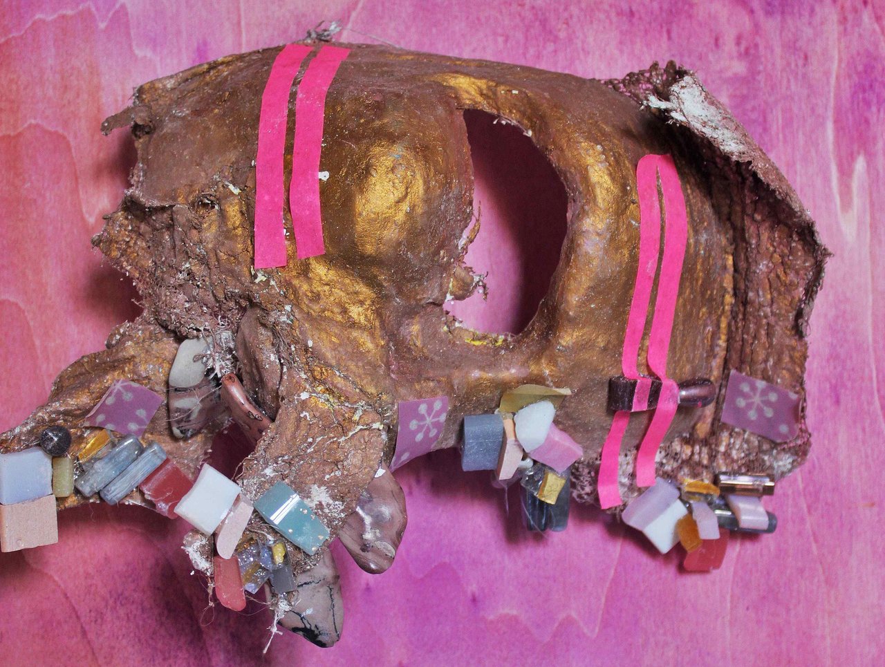
    Aisha Z. Simpson, Cipher, Paper Machè, Watercolor, Acrylic, Tape, Mosiacs, Stones, Beads, 11 x 11 inches. Coutesy of the artist.

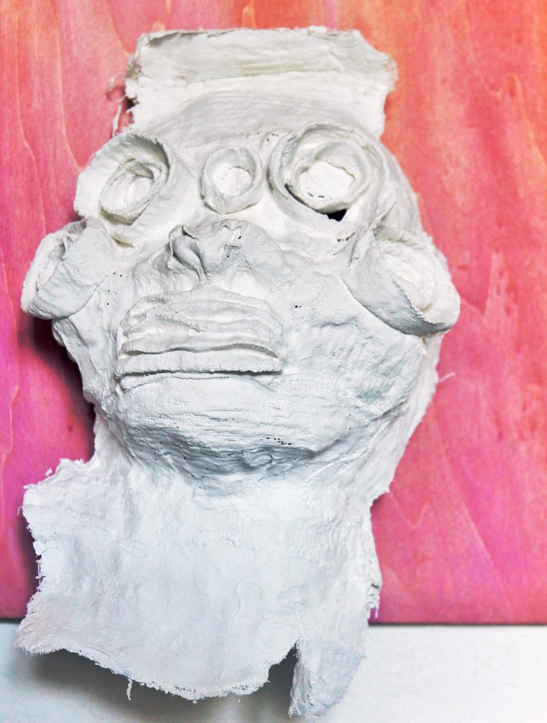
    It isn’t difficult to see why Aisha Simpson would feel drawn to work with masks during her residency in Florence in 2012. The city percolates in its own history, with masks become the literal face of the population, embodying a shared experience and the interface of present and past. Masks stand in for ideas, figures, and archetypes; they relay historical knowledge to the present and unite current mores with the shared experience of the past, forming a powerful locus for the articulation of a population’s sense of self.

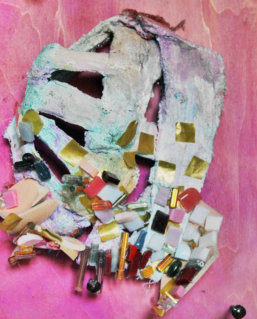
    Aisha Z. Simpson, Inception, Paper Machè, Watercolor, Acrylic, Tape, Mosiacs, Stones, Beads, Ceramics, 6 x 8 inches. Courtesy of the artist.

    Masks have figured prominently in art history, too, informing the avant garde of what came to be Modernism as it is usually ascribed, and underlying acts which we celebrate and decry today as appropriation. However, the material and psychic space between the seizure and appropriation of primarily African masks by European Modernists and the organic and continuous generation of new masks and new meanings in Florence is pointed and poignant. As Stuart Hall astutely observes, “everything which is historical… undergo[es] constant transformation,” but European Modernism’s appropriation of African masks transfixed them in history as objects of the ‘primitive’ past only, and not as living emblems of culture.

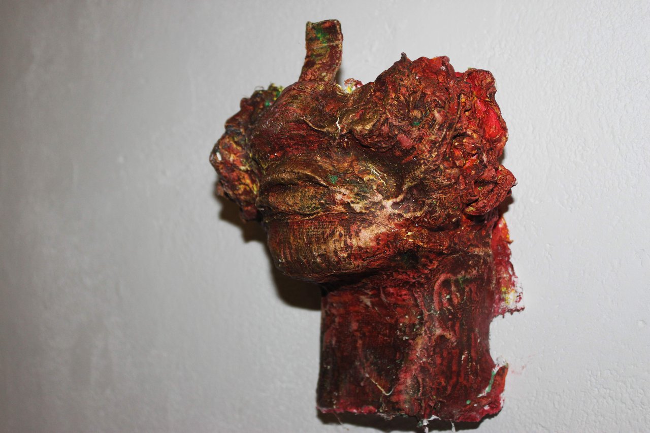
    Aisha Z. Simpson, Bambara Inland, West Africa, Paper Machè, Watercolor, Acrylic, 6 x 8 inches. Courtesy of the artist.

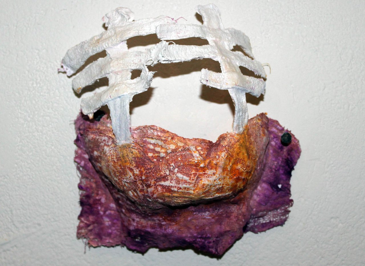
    With her series Fictions and Figments, Simpson produced masks that posit a continuous history, masks that aren’t treated as relics or artifacts, but as authentically imagined expressions of ongoing cultural contingency. Drawing from examples from various pre-colonial peoples and locales of Africa, her masks are not contemporized or updated so much as extrapolated, implying hypothetical histories where the politics and cultures of the African continent were not crudely written by bloodthirsty Western imperialism, but flourished in egalitarian exchange. The masks enact a kind of Afrofuturism in the vein of theorist Kodwo Eshun, which aims to reorient  the “intercultural vectors of Black Atlantic temporality towards the proleptic as much as the retrospective.” (Kodwo Eshun, “Further Considerations of Afrofuturism.”)

    Aisha Z. Simpson, Lagoon Regions Coast ofWest Africa, Paper Machè, Watercolor, Acrylic, 6 x 8 inches. Courtesy of the artist.

    The invocation of Paul Gilroy’s notion of the Black Atlantic is especially appropriate given the materials employed in the masks’ creation. Using Florentine ceramics, Venetian beads, mosaics from Ravena and working out of a local mask workshop, Simpson’s practice hinges neither on appropriation or conservation, but becomes the site of genuine transnational exchange. She develops a hybridity that rests on the value of both parts, and not the imposition of one by the other.

    Mark Dery begins his tremendous essay “Black to the Future” with a provocative question: “Can a community whose past has been deliberately rubbed out, and whose energies have subsequently been consumed by the search for legible traces of its history, imagine possible futures?” (Mark Dery,“Black to the Future: Interviews with Samuel R. Delany, Greg Tate, and Tricia Rose.”)

    Aisha Z. Simpson, Zero, Paper Machè, 11 x 11 inches. Courtesy of the artist.

    Though Simpson’s masks remember a history that didn’t transpire and imply a future that won’t actually exist, they suggest alternate stories and speak to the futures that might have been—and might still be—possible.

    Ben Bruneau

    *Exhibition information: March 20 – April 10, 2014, Bolyki Fine Art Gallery, 678 Sheppard Avenue East. Gallery hours: Tue – Sun 12 – 6 p.m.
  • Misled by Nature: Contemporary Art and the Baroque

    Large rotting Wookies, a frosted ice cave and a gorgeous candelabra greet the visitors in Mocca’s warehouse-like interior. These three, rather shocking, monumental installations are very impressive but somewhat challenging.

    The intention of the curators was to explore the themes that have come to define the art of the Baroque in the seventeenth century: dramatic, theatrical, and opulent. The title of the exhibition, Misled by Nature, goes back to Johann Joachim Winckelmann (1755). He criticized Gian Lorenzo Bernini’s method of depicting his models in motion in order to capture their unique character as being misguided by nature. The art historian, Michael Snodin (2009) described the Baroque as distortions and extravagancies. Other critics of the era accused the Baroque of stirring the viewers with sensual delights. This exhibition’s goal is to examine how contemporary artists have incorporated these themes into their work. Not an easy task.

    Installation view. Courtesy of Mocca

    New York based Montreal artist David Altmejd’s installation, Holes, 2008, occupies almost the entire room. Two hairy giants (the critic Jerry Saltz called them Wookies), at different stages of decay, recline on a huge plinth’s mirrored surface. Their bodies are torn up; their organs and entrails displayed around them among trees and flowers, making it a a horror movie landscape. Foxtails grow beside kidneys while beautiful crystals reflect bloody intestines. There are thousands and thousands of details to look at, almost too much to stomach. It looks like a morbid diorama from a museum of nightmares. The installation calls for a narrative, a grand récit. It’s easy to connect this to the Baroque theme of Vanitas or Memento Mori, the warning that all will die. In the “double-decker” tombs, to quote Erwin Panofsky’s phrase, a carved stone bier at the top level displays the sculpture of a person as he was before death or soon after, and then as a rotting cadaver at the bottom level, often shrouded and sometimes complete with worms and other flesh-eating wildlife.
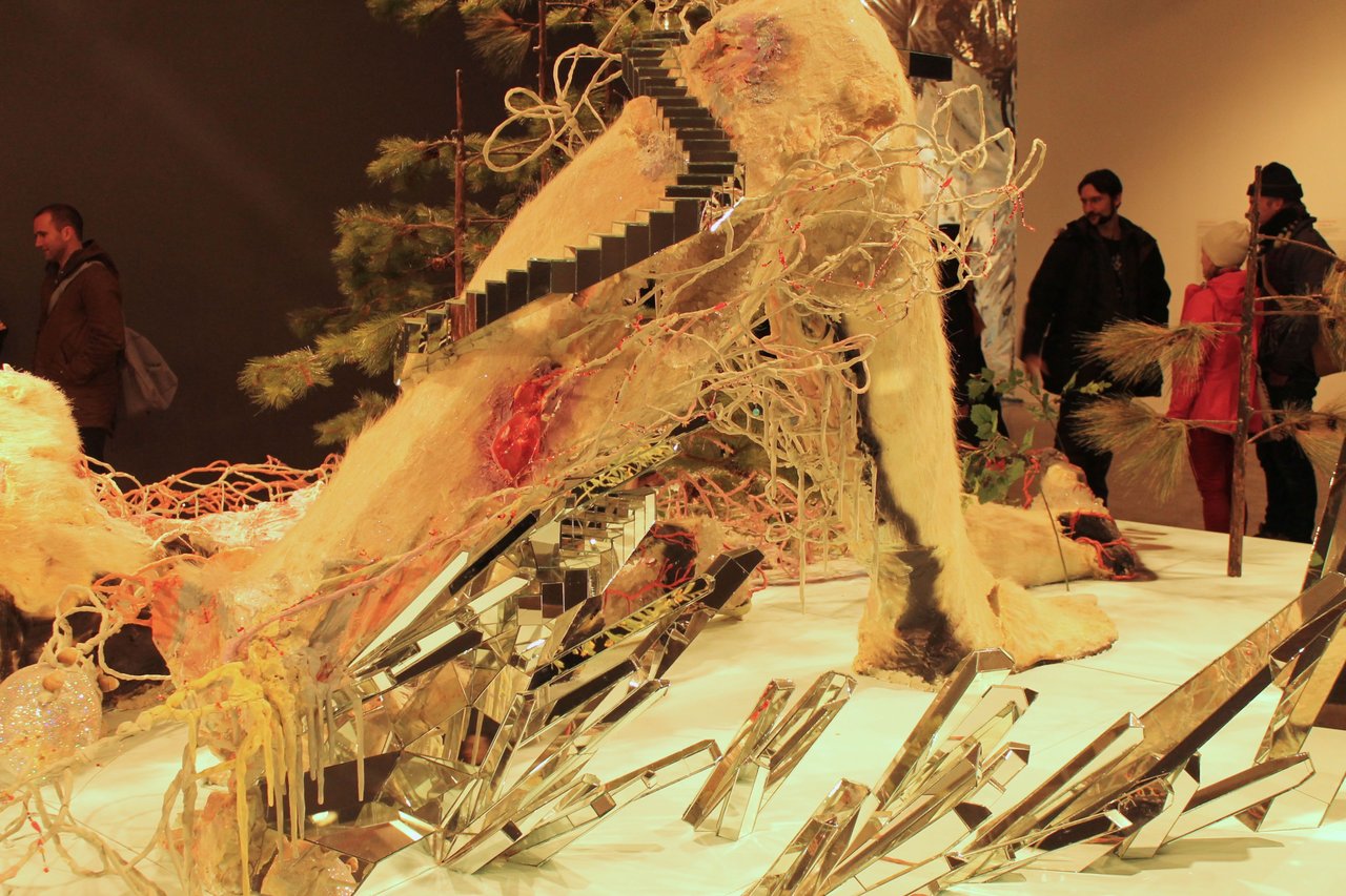
    David Altmejd, The Holes, 2008, wood, mirror, glue, plaster, foam, metal wire, epoxy clay, epoxy resin, paint, horse hair, synthetic branches, synthetic flowers, pine cones, glass beads, quartz, quail eggs, glitter, and snail shells, 291.5 x 883.9 x 518.2 cm, detail, National Gallery of Canada.

    David Altmejd, The Holes, 2008, wood, mirror, glue, plaster, foam, metal wire, epoxy clay, epoxy resin, paint, horse hair, synthetic branches, synthetic flowers, pine cones, glass beads, quartz, quail eggs, glitter, and snail shells, 291.5 x 883.9 x 518.2 cm, detail, National Gallery of Canada.

    Altmejd certainly seems obsessed with the macabre, but on his own terms. “I think about decay not in a negative way, but in the sense of creating a space for things to start growing,” he explains in W magazine, Beyond tomorrow, 2007. Indeed, there are growing things in Holes, trees, flowers, natural vegetation – all fake – while taxidermied squirrels are happily drinking from a crystal pond. Amazing little staircases made of mirrors, climb the legs of the giants and occupy parts of their cadavers, reflecting everything.  Still, looking at the whole installation with all those bloody body parts is overwhelming. Any shock or horror a viewer might experience is exactly what Altmejd is going for, that’s why he uses a kind of “context of contrasts,” making the beautiful stand out more juxtaposed against the ugly. But this decay is not simply ugly. It has some strange, cruel beauty as well. Here death is no longer a fearful punishment but a new beginning where all that remains of the body is cherished. The decomposing flesh becomes a symbol for the regeneration of nature and, in some ways, part of the future. The result is something horrifying but also seducing.
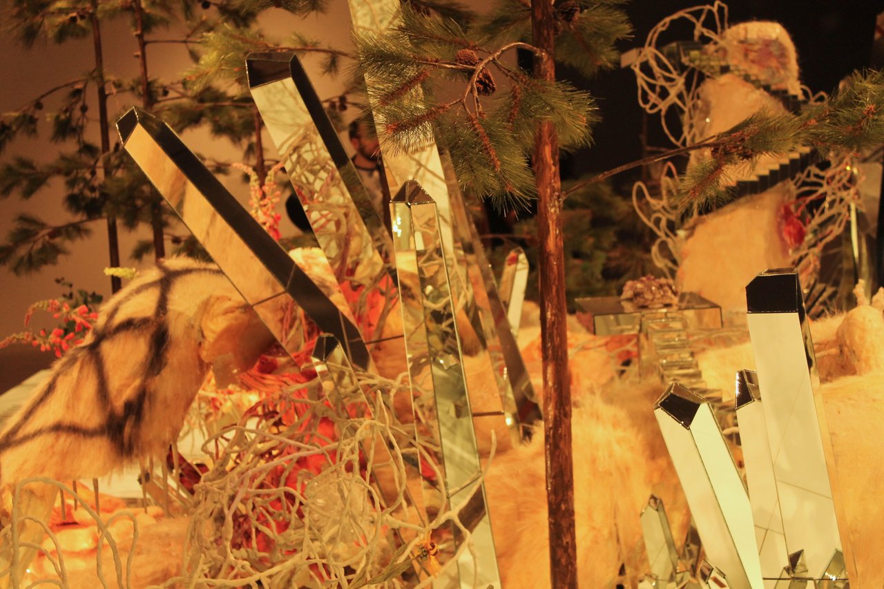
    David Altmejd, The Holes, 2008, wood, mirror, glue, plaster, foam, metal wire, epoxy clay, epoxy resin, paint, horse hair, synthetic branches, synthetic flowers, pine cones, glass beads, quartz, quail eggs, glitter, and snail shells, 291.5 x 883.9 x 518.2 cm, detail, National Gallery of Canada.

    Tricia Middleton’s installation, Embracing oblivion and ruin is the only way to live now, 2012, doesn’t have any humans or other creatures in it, so at least we are saved from looking at what happened to them. The title tells us that it is a ruin and Baroque art depicted ruins, but not this kind for sure.  At first sight everything looks jolly: the pale blue and pink construction created from pieces of material that could be felt, the building material of Mongol yurt.  Inside it seems to be an igloo made of ice blocks. Somehow that doesn’t match, so let’s have a closer look. The whole thing is covered with wax. It looks melted and frozen at the same time. There are roses, little porcelain figurines, mugs and soda cans, all covered with wax. The checkered floor must be the remains of a previous building. The gallery’s walls are covered with metallic sheets that might shelter us from outside dangers like radiation, or is it the other way around? What is this building we are standing in? Is it an igloo or a cave? Is it a place where survivors of the catastrophe find some shelter? I start to have a bad feeling. Soda cans are a 20th Century product, so the last melting and freezing must have happened not very long ago and it could happen again. I can’t help but listen to my gut, suggesting that I get out of here.
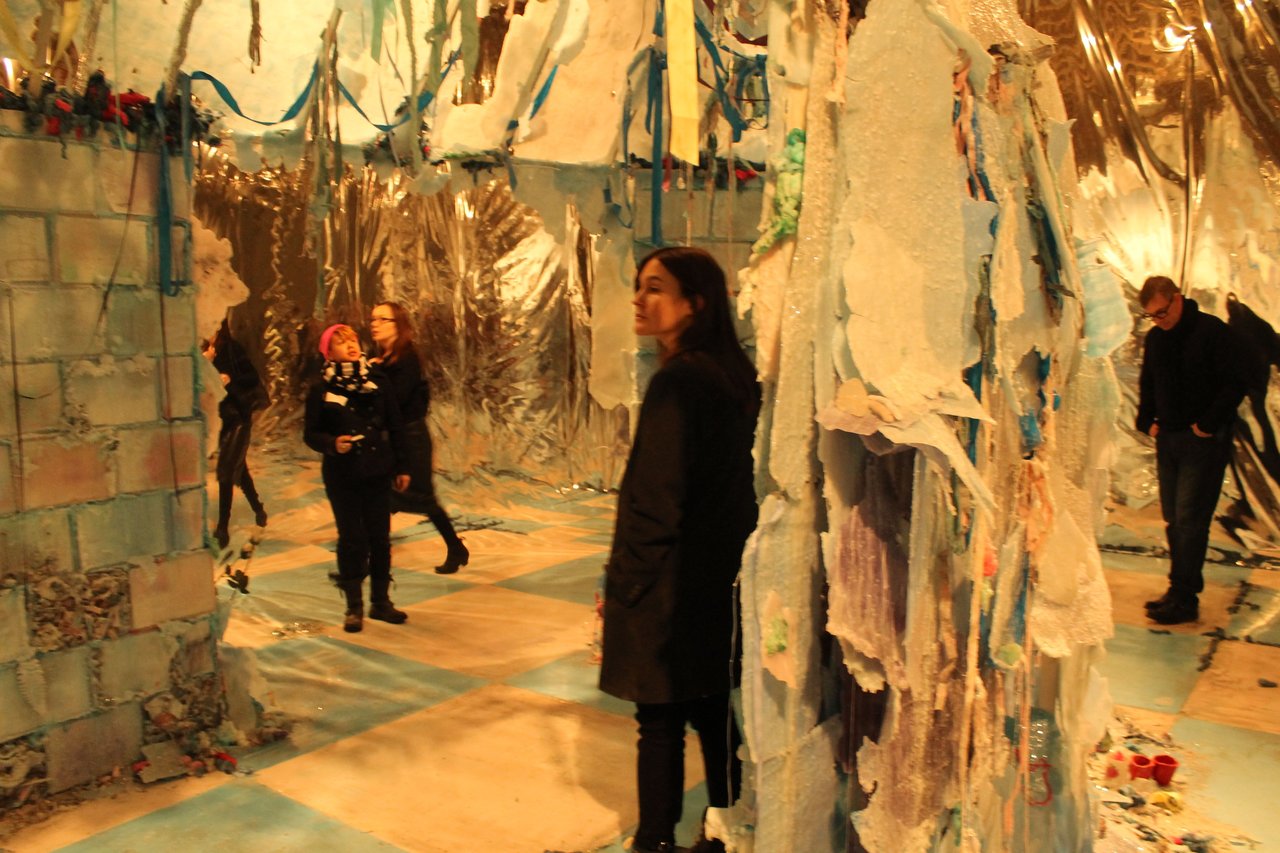
    Tricia Middleton, Embracing oblivion and ruin is the only way to live now, 2013 – 14. Mixed media installation.

    In her Artist Talk at the opening of the exhibition, Middleton mentioned among her inspirations the destructive and regenerative cycles of life present in nature such as: decay, bacteria, accretion and decomposition. Her method involve rebuilding and repurposing, as she said, she was “cannibalizing” elements of her installation Dark Souls, 2009 for her current work.

    Tricia Middleton, Embracing oblivion and ruin is the only way to live now, 2013 – 14. Mixed media installation.

    Danger and beauty go hand in hand here. Philosopher Edmund Burke (1757) defined the sublime as the mingling of terror and pleasure inspired, for example, by the sight of storms and ruins. The term fits Middleton’s work perfectly.

    Lee Bul’s intricate, mirage-like installation, After Bruno Taut (Negative Capability), 2008, hanging from the ceiling, over a mirrored floor, looks like a luxurious, boat-shaped candelabra at first. It reminds us of Versailles’ Hall of Mirrors, with its many beautiful candeliers, but the comparison to the Baroque ends there. After a closer look, we recognize that the piece is not a chandelier but more like a castle floating in the air. It all goes back to Bul’s 2007 series, Sternbau , inspired by visionary German architect Bruno Taut’s proposals for a crystalline city in the Alps, which date from 1917. In both Taut’s original sketches (The Cathedral Star, 1919) and Bul’s drawings, chandelier-like, dark, hanging shapes sprawl outwards, seemingly out of control.  “Human beings are always fated to dream of (utopia) and to plan it,” suggested Bul in her 2007 interview with Grazia Quaroni. “And yet we are also fated to be disappointed by the inevitable realization that it’s unreachable. Still we dream. I am fascinated by those failures, as well as the dreams that the dreamers knew could never materialize.”

    Lee Bul, After Bruno Taut (Negative Capability), 2008, crystal, glass, and acrylic beads on stainless steel armature with aluminum and copper mesh, with chains made of PVC, steel, and aluminum, 274.3 x 296.4 x 213.4 cm, National Gallery of Canada.

    This sculptural installation is splendid. It is very large and appears even bigger with multiplied details in the reflections of the mirror covered floor. The visual richness is further enhanced by the sparkling light of the thousands of glass and metal beads that it’s made of. This gorgeous, dazzling star-like construction suggests another kind of world, where shimmering modernist buildings float in the cosmos.

    Lee Bul, After Bruno Taut (Negative Capability), 2008, crystal, glass, and acrylic beads on stainless steel armature with aluminum and copper mesh, with chains made of PVC, steel, and aluminum, 274.3 x 296.4 x 213.4 cm, National Gallery of Canada.

    Walking around again and having a second look at the installations still doesn’t convince me of their connection to the Baroque. But Baroque or no Baroque, it is an interesting show.

    Emese Krunák-Hajagos
    Photo: Alice Tallman

    *Exhibiton information: Misled by Nature: Contemporary Art and the Baroque. February 8 – April 6, 2014, Museum of Contemporary Canadian Art, 952 Queen Street West. Gallery hours: Tue – Sun: 11 – 6 p.m.

  • Get on The Performance Bus!

    Tired of those stuffy wine and cheese receptions? Fashion yourself a different kind of snacker? Then you need to ride Snack Bus, the brain candy of Toronto artist Micah Lexier. With newly minted Snack Money—issued by the bank of AGYU, designed by Toronto’s beloved Julie Voyce, and printed by the legendary Paper Pusher—you can purchase the equivalent of five Canadian dollars worth of your suppressed, mouth-watering, guilty pleasure and ride with pride! In fact, not only will you be given this money to spend with no strings attached, you will have the opportunity to taste and tell all about your sneaky snacks with other riders on The Performance Bus while travelling to Camilla Singh: Uniforms of Non-Uniform Work gala opening at AGYU on Wednesday, April 2, 6 – 9 p.m. (Where, alas, there will be wine and cheese…)

    Camilla Singh, Monogram for Uniforms (Filthy By Nature), 2013. Courtesy of De Luca Fine Art, Toronto.

    Fashion’s spring collection has arrived at the AGYU. Guest designer Camilla Singh’s new line of work-wear inaugurates her fashion label Filthy by Nature and proves that it is more fashionable than ever to be out there. The artist-curator-organizer-performer now adds fashion designer to her impressive list of credits in this one-off collection of “uniforms” designed specifically for Canadian curators. Despite the niche market for these unique “uniforms,” AGYU keeps accessibility fashionable too. The spring collection’s debut runs until June 16, 2014, and admission to everything is free. Everyone is welcome.

    Uniforms for Non-Uniform Work is comprised of six “uniforms” for six specific Canadian curators (to be revealed at the gala reception!). Each is situated within a series of mini installations embedded within the overall design of the exhibition in order to spatially manifest ideas related to each curator’s unique practice. Through the use of sculptural objects and “props” that are set in relation to the “uniforms,” or the creation of custom-designed support systems which literally hold them up, Singh furthermore stages the behind-the-scenes “management” (from interns to institutions, etc.) on which all curatorial work depends. Taken as a whole, Uniforms for Non-Uniform Work implicitly acknowledges the embedded role of curating in exhibition-making and of art making in curatorial practice. Oh, and, of course, the importance of fashion to both….

    The free Snack Bus departs the HASTY MARKET (300 Simcoe Street – the corner of Simcoe and Elm Street, one block north of AGO) at 6:15 pm sharp, en route to the AGYU and returns downtown at 9 pm. Please show up at 5:30 to receive your Snack Money and purchase your goods.

    *Exhibition information: April 2 – June 16, 2014, The AGYU, located in the Accolade East Building, 4700 Keele Street, Toronto. Gallery hours: Mon – Fri, 10 a.m. – 4 p.m.; Wed, 10 a.m. – 8 p.m.; Sun 12 – 5 p.m.

  • Francis Bacon and Henry Moore: Terror and Beauty

    April 5 – July 20, 2014
    Art Gallery of Ontario

    In Francis Bacon and Henry Moore: Terror and Beauty, the Art Gallery of Ontario brings together two giants of 20th-century British art in a major exhibition that features more than 130 artworks, including paintings, sculptures, drawings, photographs and archival materials.

    Francis Bacon and Henry Moore: Terror and Beauty draws on the artists’ experiences during times of conflict and violence, including the London Blitz of the Second World War, to examine how confinement and angst fostered their extraordinary creativity and unique visions. It also demonstrates how the two artists reflected differently upon torment.

    Francis Bacon, Study for Portrait II (after the Life  Mask of William Blake), 1953, Tate © The Estate of Francis Bacon. All Rights Reserved, DACS/SODRAC (2014)

    Henry Moore,Reclining Figure, 1951, plaster cast. L: 228.5 cm. Art Gallery of Ontario, Toronto. Courtesy Craig Boyko, AGO © The Henry Moore Foundation.  All Rights Reserved, DACS/SODRAC (2013)

    Curated for the AGO by Dan Adler, associate professor of art history at York University, Francis Bacon and Henry Moore: Terror and Beauty is the first Canadian exhibition of Bacon’s work and includes rarely seen Moore pieces, from both the AGO collection and elsewhere. Moore’s works are a cornerstone of the AGO collection, and pairing them with those by Francis Bacon sets them in a new light. The exhibition also presents more than 30 archival photographs by acclaimed German-born British photographer Bill Brandt. Loans for the exhibition have also been secured from several institutions, including MoMA, Tate Britain and the Museum of Contemporary Art, Chicago.

    The exhibition was originally curated by Richard Calvocoressi CBE, Director of the Henry Moore Foundation and Martin Harrison, editor of the catalogue raisonné on Francis Bacon.

    *Exhibition information: April 5 – July 20, 2014, Art Gallery of Ontario at 317 Dundas Street West, Toronto. Gallery Hours: Tue 10 – 5:30, Wed 10 – 8:30, Thu – Sun 10 – 5:30 p.m.

  • Artist Workshop with Phil Anderson

    April 9, 2014 / 7 – 9 p.m.
    Gallery 1313
    1313 Queen Street East

    Once again Phil Anderson Gallery 1313’s Executive Director conducting a two hour workshop on art practises with  information on setting up your exhibition, marketing, promotions, approaching other galleries and pricing your work.

    Phil Anderson has been the Executive Director at Gallery 1313 since January 1998 and during this time he has curated many exhibitions at the Gallery. He is a founding member and former chair of the Parkdale Village Arts Collective (1994) and a board member/treasurer of ARCCO the Artist Run Centres and Collectives of Ontario. Phil is also an artist and photographer who has been exhibiting his photo based art since 1984.

    It is free to members in good standing but is also open to CARFAC Members and other artists so you do need to register in advance at http://g1313.org/3239/artist-workshop-april-9-2014/.

    Direct any questions to Phil: director@g1313.org

  • Maryse Goudreau: Memory is a Weapon

    Maryse Goudreau, Conversations, 7 x 5 cm ink jet print, 2012-2013. Courtesy of Gallery 44.

    March 8 – April 19, 2014
    Gallery 44 Vitrines

    The exhibit presents tidy boxes of trauma, undistinguishable at first. At a closer look it juxtaposes immaculate framing with charged archival material of the past. Yet, this past is not neutral. Just as the title of the show suggests, the archives are an armed indictment of issues that ripple around us today.  In Cyanotype de mandoline trouvé sur ebay, the lone seamen turn away from the viewer and face the sea on a port, all awash in blue layer. The piece is melancholic; it plays on the fiction of the sea wives waiting for their husbands to return. Only this time, there is no coming back.

    Maryse Goudreau, Charge, 92 x 110 cm inkjet print, 2012-2013. Courtesy of Gallery 44.

    The inkjet print, Charge, is a grainy snapshot of the dense lines over a boating ship. The show places a dark transparent screen above the print, so the landscape is seeped in red. An explicit reference to blood is made. Here the primal lifeline of the human body and the cruelty it can inflict on other beings come together.

    A glance at the curatorial statement cements what is already coiling off of the work; it is reclaiming the forgotten past of the 1920s Quebec hunting of beluga whales. Presented in a Toronto gallery, it becomes larger than that. It is a nostalgic history tinged with mourning the loss of a way of life. The decline of Eastern fishing communities is the death of a Canadian ideology. The writing clues us into Goudreau’s awareness of current government moves that block chemical pollution research and the shutting down of Oceanography libraries.

    Maryse Goudreau, Aliter, 7 x 5 cm ink jet print, 2012-2013. Courtesy of Gallery 44.

    In Aliter the miniature littered bodies of beluga whales are disturbing in their quiet. The artist’s subtle, but deft hand pulls attention to an issue that has not been long looked at. The cruelty seems senseless, yet the injustice lies among the communal families as they go about their life.

    Maryse Goudreau, Manifestation for the memory of wharfs, Rivière-Ouelle Wharf, 40 x 53 cm, ink jet on museum fiber mounted on cotton, 2012, edition 1 of 3. Courtesy of Gallery 44.

    In Manifestation for the memory of wharfs, a wet collodion process for the portraits is surprisingly apt. The sepia print at once seems to be drowning into the abyss of memory and burned, as the edges curl into disintegration. Goudreau’s photo manipulation of the past and staged re-presentation of events, invoke the very instable nature of memory that allows it to be moved around to suit the agenda of others.  

    Gagan Sandhu

    *Exhibition information: March 8 – April 19, 2014 at Gallery 44 Vitrines, 120-401 Richmond St W. Gallery hours: Tues – Sat 11 – 5 p.m.

  • Concrete Contemporary

    Interview with Stephen Ranger (S.R.), Vice President of Development of Waddingtons Auctions by Phil Anderson (P.A.)

    Concrete Contemporary was started by Stephen Ranger and this years sale had 120 lots with a diverse group of artists works.

    Stephen Ranger founder of Concrete Contemporary. Photo: Steve Stober

    P.A.: What was the inspiration or idea behind starting Concrete Contemporary ?

    S.R.: Concrete Contemporary was formed because we perceived a need in the marketplace for a secondary market for contemporary Canadian art. The idea behind it is actually quite simple. A strong secondary market encourages sales at the primary level and vice versa. Our thinking was also guided by the reality that virtually every other important cultural centre in the world has a thriving contemporary market at both primary and secondary levels, but not so in Canada. Respect for artists, commitment to client education and development, and highly professional presentation of the work are the cornerstones we have built the auctions around.

    P.A.: What do you think collectors and buyers are looking for when they seek out contemporary art ? Are they looking for an investment or is a more compulsive purchase?

    S.R.: Collectors and buyers have a huge range of motivations. Some just want something pretty for over the sofa, while others are more scholarly and cerebral in their approach. As any gallerist will tell you, true ‘collectors’, in the more traditional sense are very few and far between. Our approach is to make the auctions accessible to as wide a public as possible, while keeping the quality of work we offer extremely high. The basic criteria for the sale is that we will offer work by artists at all stages of their careers who have a history of exhibitions in both the private and public sphere. While we do include some young and emerging artists, we realize there are many who will not be well served by having work at auction at this stage of their careers.

    Lot 42: Jeremy Smith, Early Morning, Kitchener. Est. $25000-30000. Realised: $24000

    P.A.: Do you think Canadian collectors are getting more art savvy?

    S.R.: Canadian collectors are like most collectors, passionate and savvy. No one likes to feel they have overpaid for work, yet many are very willing to go over estimate to purchase something that is meaningful to their collection. Some collectors have expressed to me how great it was to see early work by artists that they currently collect; how it rounds out their collection. Galleries tend to be focused on what an artist is doing now and not necessarily on what has come before, so in this sense, the auctions present an opportunity for many collectors to explore the back catalogue of an artist.

    P.A.: Are Canadian contemporary artists starting to become more collectable internationally?

    S.R.: The answer to this question is that relatively few Canadian artists have international markets, but this is beginning to change. That being said, most markets around the world are regional. Think how few Canadians collect Australian contemporary work, or even Latin American art. We shouldn’t view our successes abroad, or what is perceived as lack of success, through the lens of the market for global superstars like Damien Hirst, who have effectively established themselves as brands like Prada and Gucci. Where I see change coming is in the international embrace of artists like Brian Jungen, Jeff Wall and David Altmejd whose work rarely if ever comes to auction in Canada. The profile gained by artists like Shary Boyle and Rebecca Belmore through international biennales can’t be undersold either. The more our dealers put their artists out there and bring them to international fairs, the more overall success we will see.

    Lot 92: Micah Lexier, City of Night by John Rechy, 1989. Est. $8000-10000. Realised: $9000

    P.A.: Are you ever surprised by what sells and what doesn’t sell?

    S.R.: I am often surprised by what doesn’t sell, mostly because we choose work very carefully for the Concrete Contemporary auction. What it tells me is that this is a nascent market that needs nurturing, that we have to reach out more with our marketing, client education and development. Like all auction houses, when we take a work to sell, we have to be thinking about who the potential buyers are. In the contemporary market in Canada, the cast of characters is not huge, so it’s even more of a challenge. The thing is, and one of the things we are good at, is to make it easy for potential clients to find us and to bid – and what that comes down to today is having a really strong web and social media presence.

    P.A.: How do you go about selecting works for the auction?

    S.R.: We select work based on the idea I outlined earlier: artists with exhibition history in the private and public sphere. We will also offer work by younger artists if we think we have a market for it, which although it might sound highly subjective (which it is) is reasonable criteria. Our goal is to present the best work by the best artists that we can assemble, which is why we do this auction only once a year so far. We end up rejecting a lot of what we get offered for sale, mostly not for qualitative reasons but because we don’t see a market yet at auction for a certain artist, or a particular body of work. It’s not just about name recognition, it is about being realistic about what is possible. At the same time, we are prepared to present more work that may be deemed ‘challenging’, than anyone else in this country.

    P.A.: Do you find Canadian buyers to be traditionally more cautious in their purchases?

    S.R.: Canadian buyers are not as cautious as one might think, it’s just that there are fewer of us. I think contemporary Canadian art is a huge bargain in financial terms. When one can buy a work by an artist who is collected by leading galleries across the country, in many major corporate and private collections and still pay under $5000, then you know you are in a buyer’s market. We have come a long way from the time when only the Group of Seven sold at auction. Canadian modernism and abstraction is commanding strong prices at auction and it is only a matter of time and energy on our part for contemporary to do the same.

    Lot 34: Kim Dorland, There Aint No Cure For Love #2. Est. $12000-15000. Realised: $14400

    P.A.: Have you thought of taking the auction to New York or Chicago perhaps where there are more buyers?

    S.R.: We have no plans right now to take Concrete Contemporary out of the country, but it is certainly foreseeable to be able to showcase works in Montreal and in Vancouver in the near future.

    P.A.: Is Concrete Contemporary growing according to your expectations?

    S.R.: Yes, Concrete is growing. This year we sold more work than the previous year, and certainly more than the first year. However, the percentage of lots sold remains around the same at 60-65%. This is augmented by the number of works we sell after the auction. As I have said before, this is a market that must be nurtured, it didn’t exist in any real way before we started three years ago. Are we happy with the direction we are going? Absolutely. Is there more work to do? Of course. That’s the fun and challenge of this, we get to put together amazing auctions and make a market where there wasn’t one.

    P.A.: Are there any changes for the Concrete Contemporary auction for next year?

    S.R.: We see being able to add a second auction this fall season, probably a smaller sale. We also are going to move the first 2015 auction from March to April.

  • Call for Submissions / Project Gallery

    SALON SHOW

    Exhibition: April 3 – 13, 2014
    Opening Reception: Thursday, April 3, 2014 / 6 – 10 p.m.
    Deadline: March 31st, 2014

    Project Gallery is pleased to announce we will be hosting a large-scale salonstyle art exhibit from April 3rd – April 13th 2014. This 10-day exhibit will showcase a dynamic roster of over 25 artists working with diverse subject matter, media and styles. We invite artists to submit artworks of any media and style up to 24”x24” in size.

    Each participating artist will exhibit up to 6 works each and contribute a small 50$ hanging and admin fee for the 10 day exhibit. Project Gallery will accept a 25% commission, and transact any sales of consigned artwork during the exhibition period. Please ensure all work is ready to hang before drop-offs on April 1st & 2nd. There will be an opening reception for the exhibition from 6 – 10 p.m. on Thursday April 3rd 2014.

    * Plinths and shelves available for displaying sculptural work
    * Printing services available

    If you wish to SUBMIT, please include:

    • Up to 10 Images of your work
    o Titled: FULLNAME_TITLE_SIZE_MEDIUM_DATE
    • A brief artist bio/statement – up to 150 words
    • Contact information – including phone number and website/blog to: submissions@projectgallerytoronto.com by March 31st, 2014 (quoting ‘SALON’ in the email subject)


    Artists accepted to this exhibit will contribute a nominal 50$ hanging/exhibition fee, with 25% commission going to the gallery. Fees go towards operating and maintenance costs of the gallery, exhibition promotions, hanging and printed materials, photography/videography, reception bar/food and SOP permits. Exhibition fees can be flexibly offset by commission negotiations.

  • Cybèle Young: Ten Birds

    March 3 – April 11, 2014
    PATTISON Onestop screens
    in Toronto residential networks and in shopping centres

    PATTISON and Kids Can Press are pleased to announce that Cybèle Young’s Governor General’s Award-winning children’s picture book, Ten Birds, and its recently published companion, Ten Birds Meet a Monster, will be featured on PATTISON Onestop digital screens across Canada as part of PATTISON’s ongoing Art in Transit programme. These beautifully layered stories will be revealed sequentially page by page in a series of spots on PATTISON Onestop screens in Ontario residential networks and in shopping centres across the country from March 3 to April 11, 2014. 

    Written and illustrated by Cybèle Young, Ten Birds is a witty story that highlights ingenuity, common sense and the inadequacies of labels in a rich alternative world through intricate chiaroscuro pen-and-ink drawings. Young plays with shapes, shadows and sounds in the playful companion, Ten Birds Meet a Monster, drawing attention to the value of adventures and discoveries, teamwork and problem solving in this inventive counting book.

  • Sketching the Line

    March 3 – April 13, 2014
    PATTISON Onestop’s
    digital screens in Toronto subway stations

    PATTISON presents Sketching the Line, an international exhibition of 78 sketches drawn by 13 artists from around the globe, featuring brief impressions of fellow commuters that document place, time and movement while simultaneously revealing a myriad of personal moments. Sketching the Line is part of PATTISON’s ongoing Art in Transit programme.

    Sketches of Toronto, New York, Berlin, and UK commuters will appear from March 3 to April 13, 2014, on PATTISON Onestop’s digital screens in Toronto subway stations, the Edmonton LRT, and the Calgary Airport.

    The 13 artists included in Sketching the Line have been sketching, often on their daily commutes, some for many for years, keeping their drawing and observational skills sharp. They embrace the challenge that the ephemeral nature of their subjects impose, have an interest in the awkwardness of an environment created by forced proximity and shared need, and seem to share a respect for, and fascination with their fellow commuters.

    Participants include architects, artists, art instructors, character designers, curators, and illustrators. Canadian contributors are Bobby Chiu and Kei Acedera of Imaginism Studios, and multimedia artist Nicole Little, all based in Toronto.

    The New York City sketches are provided by Richard Alomar, founder of Urban Field Studio; Greg Betza, founding member of Studio 1482; Jason Das, President of Urban Sketchers; artist Sharon Frost; Stephen Gardner who has painted more than 200 book covers; Anna Rich with more than 20 children’s book illustrations to her credit.

    The Berlin sketches are provided by Oona Leganovic, a founding member of Urban Sketchers Berlin; Irish artist and educator Conor Coady; architect and illustrator Rolf Schröter. The UK commuters are captured by Steve Wilkin, a Yorkshire-based illustrator and educator whose work has garnered international recognition.