Author: artoronto

  • Walking Art Toronto 2014

    There was already a crowd upon entering the foyer of TIAF in the early Friday afternoon. Schoolbuses deposited students from OCAD U and other universities, people lined up for tickets. TIAF, in its 15th year, became really popular – an art event not to miss.

    Photo: Brinae Bain

    On the top of the escalator the installation titled Pavillion of Blind greats the visitors with its confusing visuality. At first sight, it looks like a Home Depot store room, but when its multisensory machinery kicks in and it starts moving and producing many different visions, you can gasp the artists’ intentions.

    The print for MOCCA’s benefit has a very strong, surrealistic tone.

    Mocca Benefit Edition: Valérie Blass, No regarde pas II, 2014, 13 x 19 inches, digital print on matte paper, edition of 25 unique prints. Courtesy of the Artist and Parisian Laundry, Montreal

    At the front we can see the work of RBC Canadian Painting Competition winners. Then we see this urban forest of about 100 booths of art galleries and organizations, overwhelming even at first sight. Just looking at them makes you dizzy. It is always a hard decision what method to follow, go straight to the end in a vertical way or criss-cross horizontally. I start horizontally in the right side corner then go straight in the first lane. My policy is not to look at the sign of the gallery but at the art work only. Something very strong with burning red catches my eyes on the right side and I think, “vow, isn’t it a bit too much” and I keep walking but somehow after three more booths, I turn back. There is something intriguing about that painting. It turns out to be Steve Driscoll’s Seared by the Sun and I am not surprised to learn that is already sold. As I turn into the booth there is Jamie Angell of Angell Gallery, standing in front of Kim Dorland’s large painting, Bedroom #3, depicting the artist’s wife on their bed. Kim Dorland, one of Toronto’s most interesting  painters, currently has a show on at Angell Gallery, running untill November 8th. Angell has a unique taste and is a risk taker; noone really knew Dorland when Angell took him as a gallery artist and now he is one of the best sellers. Gavin Lynch and Rafael Ochoa, Angell’s newest artists are also doing well on the fair.  

    Angell Gallery with Steve Driscoll, Seared by the Sun. Photo: Brinae Bain

    Jamie Angell of Angell Gallery, with Kim Dorland’s large painting, Bedroom #3. Photo: Brinae Bain

    I leave Angell’s booth on the other side and – there goes my methodical walking plan – so I just walk and look and enjoy the art works.

    MA2 Gallery, Tokyo, Japan. Photo: Elena Iourtaeva

    Nicholas Di Genova’s installation, LE Gallery, Toronto. Photo: Elena Iourtaeva

    Works by Attila Richard Lukacs and Angela Grossmann, Winsor Gallery, Vancouver. Photo: Elena Iourtaeva

    Lonsdale Gallery, Toronto. Photo: Elena Iourtaeva

    Pari Nadimi Gallery’s booth is unusual too, showing works that are not typically displayed at fairs, like some dirty boots, a video piece by David Rokeby, Machine for Taking Time. The two lenticular images by George Legrady seems to be different from each angle you view them, so you can enjoy at least eight different pictures. In the center of the gallery there is a funny little group by Sarah Farndon, that is very popular. Pari Nadimi Gallery is also celebrating its 15th anniversary in its newly renovated large space on Niagara Street.

    Pari Nadimi of the Pari Nadimi Gallery with work of Trevor Mahovsky (left) and Rhonda Weppler (right). Photo: Brinae Bain

    Exhibition view with Sarah Farndon’s work, Pari Nadimi Gallery. Photo: Brinae Bain

    Two exhibitors share a very colorful booth: Laura Ortiz Vega of Antena Estudio from Mexico city and Noah Antieau of Red Truck Gallery from New Orleans. It is the fifth year at TIAF for Ortiz Vega, who really likes Toronto and  who is quite satisfied with the sales at this fair. For Antieau, this is the first year here. The two of them met a year ago in Chicago and connected right away beceause of their love for folk art, so they decided to share a booth at TIAF.

    Laura Ortiz Vega of Antena Estudio with her work. Photo: Brinae Bain

    Noah Antieau of Red Truck Gallery. Photo: Brinae Bain

    I try to put some order back into my wandering and get to the NEXT section when I run into Paul Petro. His gallery was one of the first I started to visit when I came to Toronto many years ago. Paul Petro Contemporary Art has a large place in TIAF and it is intricately planned. The display starts with Molinari’s painting on the back and continues with more geometric compositions, while on the side Carol Wainio’s large, fairy tale like painting covers the whole side wall. Its greyish tones complimented by Tom Dean’s Peaceable Kingdom, an idealistic depiction of peace between animals.

    Paul Petro of Paul Petro Contemporary Art in front of Carol Wainio’s painting. Photo: Brinae Bain

    Peaceable Kingdom by artist Tom Dean at the Paul Petro Contemporary Art Gallery. Photo: Brinae Bain

    Back to NEXT, I walk through the small booths of emerging galleries that occupy this section, Neubacher Shor Contemporary and Robert Kananaj from Toronto, Gurevich Fine Art from Winnipeg among them.

    Robert Kananaj of  Robert Kananaj Gallery. Photo: Brinae Bain

    Mitch Billinkoff of Gurevich Fine Art with Elder Brothers by Buffy Sainte-Marie. Photo: Brinae Bain

    Break Room by Thrush Holmes. Photo: Elena Iourtaeva

    I love photography so Stephen Bulger Gallery is always on my list. Bulger, besides being an excellent dealer, is also an amazing, charismatic teacher when it comes to photography. It is not a surprise that his booth is always crowded with people listening to his presentations. When asking him why all the displayed pieces are historical, he said, that luckily this year there is another art fair, Feature, when he can show the contemporary photographs of his collection. He, himself, rotated between the two places and was explaining images at TIAF on Friday, while doing the same at Feature on Saturday.

    Stephen Bulger Gallery. Photo: Brinae Bain

    Christopher Cutts Gallery, Toronto. Photo: Elena Iourtaeva

    Sandra Ainsley Gallery, Toronto. Photo: Elena Iourtaeva

    Bruno Dahl Gallery, Ebeltoft, Denmark. Photo: Elena Iourtaeva

    Halcyon Art International, Pudong, Shanghai, China. Photo: Elena Iourtaeva

    The talks and presentations were also well attended.

    Bryne McLaughlin of Canadian Art Magazine, that celebrates its 30th anniversary, gave an energetic presentation in GENERATION(S) TALK. Photo: Brinae Bain

    Lecture on Collecting with collectors: David Angelo, Beverly Creed, Alan Schwartz, Moderated by Christiane Fischer, CEO of AXA Americas. Photo: Brinae Bain

    Text: Emese Krunak-Hajagos. Photo: Brinae Bain and Elena Iourtaeva

    Featured image by Elena Iourtaeva

  • Feature: Contemporary Art Fair 2014

    October 23 – 26, 2014
    Joey & Toby Tanenbaum Opera Centre
    227 Front Street East, Toronto, ON

    Coming directly from Art Toronto, Feature seemed to immediately offer a disparate experience of art viewing. Set in the old factory mills of the Tanenbaum Opera Centre, Feature presents its exhibitors and guests with a quaint atmosphere for experiencing the contemporary work of the galleries’ artists.

    Exhibition View, Galerie Trois Points

    Loretta, of Galerie Division, praised Feature for offering a space that allowed them to feature lesser-known artists without a monetary pressure. Anne Roger, of gallery antoine ertaskiran, said that her gallery has come to Toronto for the last three years, this year abandoning Art Toronto for the more focused Feature. It can definitely be said that Feature offers a more concentrated experience. When visiting the booth of the Stephen Bulger Gallery, Stephen Bulger was discussing the work of Gilbert Garcin as if providing a history lesson on the artist’s work. Most galleries only displayed the work of two or three artists, which allowed viewers to more intimately experience the art.

    Exhibition View, Galerie Division

    Anne Roger of gallery antoine ertaskiran with guests

    Stephen Bulger of Stephen Bulger Gallery with the work of Gilbert Garcin

    Stephen Bulger of Stephen Bulger Gallery is discussing the work of Alison Rositer with guests

    Every gallerist I spoke to had positive things to say about the fair and the selected galleries that were represented. With the positive feedback, and the first-hand view of the show, I will definitively say that Feature offers a successful analog to Art Toronto; one that is nearly filled with as much character as the St. Lawrence neighborhood in which it resides.

    Sarah Pepin of Galerie René Blouin and a guest discussing the work of Anthony Burnham

    Georgia Scherman of Georgia Scherman Projects with the work of Spring Hurlbut

    The AntiChamber by Caroline Cloutier from Galerie Nicolas Robert

    Galerie Graff

    Exhibition View, Galerie Donald Brown

    Text and photo: Brinae Bain

  • Kim Dorland: I Hate Poetry but I Love TV

    I Hate Poetry but I Love TV
    (or, K.D. @ 4–oh/4–reel)

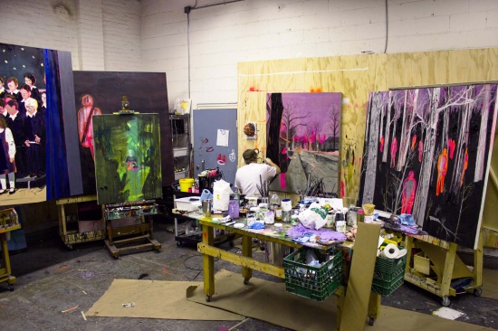
    The callow seeming title of this, Kim Dorland’s eighth solo exhibition with Angell Gallery, is a bluff. In his Toronto studio in August, Kim told me that he likes both poetry and TV. Its false braggadocio rings with second-wave nostalgia for the receding prior nostalgia of an early incarnation of the artist who habitually slipped into the indications of a former adolescent cockiness. Today he nestles the intimate, ephemeral now-ness of time as he watches his children and family (and self) live through instances that occur and vanish in a flicker. 

    Kim Dorland in his studio. Courtesy of Angell Gallery.

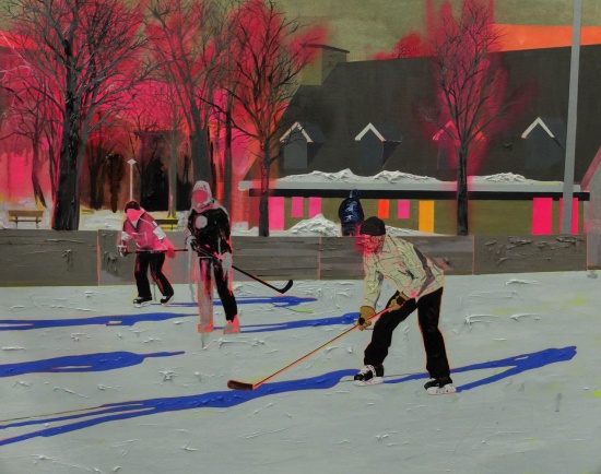
    Yet, while the title is not literally true, it is otherwise apropos. Dorland chooses not to paint with poetic embroidery or temerity. His imagery is prosaically undisguised; his vocabulary reflexively automatic, journalistic, matter-of-fact; his palette ALLCAPS attention-grabbing, vivid, even lurid; and his mark making emphatic with punctuation as much as description. That punctuation inflects…no, directs the amassments of colour on his canvases and it crucially articulates the stories that emerge from his pictures. Dorland’s claimed affinity to television speaks to the day-by-day mesmerisation of far and near exotica (and the commonplace) denatured and re-naturalized by the keyed-up glow of the household screen.

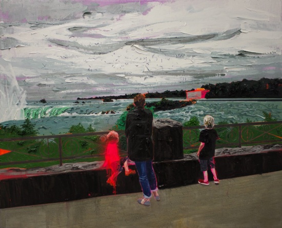
    Kim Dorland, Niagara Falls, 2014, 48″ x 60″, oil and acrylic on linen over wood panel. Courtesy of Angell Gallery.

    Home plays a bit role in these latest paintings, all from 2014, insofar as it is only one of many settings for family life, its events, activities and passages. Because, it seems, the artist’s observations of his family might occur anywhere or anytime. His profoundly immersive, psychic recognition of the simultaneous presence, difference and absence of those closest to heart powerfully relocates and envelopes the benchmark portraits of his self-possession (versus their self-possession) in an array of locations. So, even when he is away from home, it feels local and proximate to a specific moment. An image snatched during an evening run, High Park, connotes what Dorland acknowledges as “a melancholic year [as an artist] that doesn’t reflect [his] point of view with respect to his family or his responsibilities”—a not uncommon refrain from a forty-year-old man.

    Kim Dorland, Vernissage, 2014, 48″ x 60″, oil and acrylic on linen over wood panel. Courtesy of Angell Gallery. 

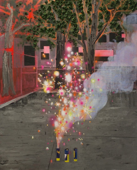
    Digital photography is an essential tool and reference for Dorland’s ongoing image archive of daily life passing into the subjects for his paintings. It naturally fits such a prolific and prodigiously gifted artist. Pictorial prowess and facility such as Dorland’s allows for the gradual, uncontrived seeping of meaning into one’s work. For all its outrageous stylizations and exaggerations of colour and form, Dorland’s paintings remain essentially objective. Therefore he does not prefigure or predestine his attitude to their content. By constant return to themes and real views, not only does he gauge the changes of his subjects, but also notices his variances in perceptive and emotional state. Sometimes key incidents shimmer in through placid and routine surroundings, such as a hazy and distant police car parked in the centre of the aforementioned High Park. Similarly, the efflorescent sparkle and fuming of Fireworks almost completely occlude a pair of humble witnesses meekly standing against the back fence of the concrete yard, Dorland’s sons, Seymour, eight, and Thomson, five.

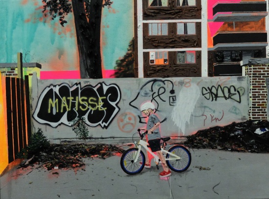
    Kim Dorland, Dead End, 2014, 30″ x 40″, oil and acrylic on linen over wood panel. Courtesy of Angell Gallery. 

    Kim Dorland, Fireworks, 2014, 60″ x 48″, oil and acrylic on linen over wood panel. Courtesy of Angell Gallery. 

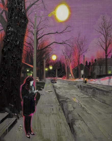
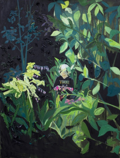
    The compositional reference to cell phone images gains consonant ordinariness in that such devices are ubiquitous, possessed by his subjects too. His wife, Lori, is plausibly aglow as she looks to her screen in the winter evening of After the Party.  Crystalline flares and a voltaic underpainting refer to how Dorland recorded the scene. In Bleeding Heart, the small screen isolates and rebalances the image, deepening and thickening a garden around Seymour into jungle, where he sits oblivious to its ominous foliage, inspecting a blossom gently with his fingertips, not absorbed in a video game as it might initially appear.

    Kim Dorland, After the Party, 2014, 60″ x 48″, oil and acrylic on linen over wood panel. Courtesy of Angell Gallery. 

    Kim Dorland, Bleeding Heart, 2014, 48″ x 36″, oil and acrylic on linen over wood panel. Courtesy of Angell Gallery. 

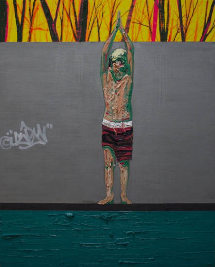
    March Break and Don’t Give Up are two of Dorland’s most effectively pared-down paintings, each with an abstracted, horizontal banding that yields classic, stacked, rectangular order. The elegant simplicity of each is a feat of artistic restraint, nerve and hard-won experience. In March Break, Seymour stretches upward in preparation for a dive into a pool, with concentration, determination, perhaps some trepidation. His taut body and arms are mimicked above by the upright trunks and limbs of bare trees, and contrasted by an unbelievably limber and confident graffiti tag on the grey wall behind. His face, as is standard for Dorland’s figurative treatments, is a slathered impasto of relief-map planes in oil paint which still conveys a specific portraiture. This technique conveys the vertical musculature of his son’s body and also the horizontal surface plane and concealed depth of the water, of which the human body is largely composed. Don’t Give Up, by contrast, is utterly unpopulated. It depicts the fenced-in tennis courts found in Toronto’s Trinity Bellwoods Park. The chain-link has been meticulously stenciled and sprayed, an extruded screen through which appear side-by-side court lines, posts and nets, at once substance and mirage. The foreground is a clover-pocked lawn. Above the fence line, an orange sky churns with latent energy. A bedraggled message, woven into the fence links with ribbon, is the tattered remnant of youthful spontaneity, long since departed. Each painting renders depth ambiguously, treated in distinct zones of colour and technique that are monolithic and gradated at the same time, conjuring the mists or mystery of the imminent future.

    Kim Dorland, March Break, 2014, 60″ x 48″, oil and acrylic on linen over wood panel. Courtesy of Angell Gallery. 

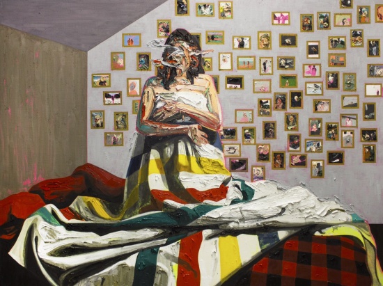
     The crowning painting of a glorious show is a portrait of his muse and most frequent subject, Lori. She poses in Bay Blanket #3, as so often, in the nude, however wrapped in a recognizable wool blanket of the Hudson’s Bay Company that she clasps to her breasts and resplendently spreads down her kneeling figure and across the top of the couple’s bed. The painterly treatment of the blanket makes a transition from the thickly-painted flesh and defacement into impasto folds of heavy cloth, especially so around Lori’s torso and gently easing out to reveal some of the textile weave of the canvas on which the paint is brushed, with the signature green/red/yellow/black stripes running up and down or forward and back according to the blanket’s crumpled tumble. The bed is strewn with other rustic red/black patterns of quilting and tossed red pillows beneath her. On the wall behind Lori is a galaxy of framed family photographs, hung with a celebratory disregard for regulated order. Dorland renders each of these photos, so similar to, perhaps identical with, the sources for so many of his paintings, with tender attention to its individual distinction, its specific reference and instance in the artist’s life. He can’t help himself. He strives to keep up with evanescent life by constantly resetting and starting over.

    Kim Dorland, Bay Blanket #3, 2014, 72″ x 96″, oil and acrylic on linen over wood panel. Courtesy of Angell Gallery. 

    Ben Portis
    September, 2014

    Note: Ben Portis above essay is a curatorial response to Dorland’s recent work produced in conjunction with his exhibition, originally written in September, 2014 and published on Angell Gallery’s website. We thank Ben Portis an Angell Gallery for their courtesy of letting us to publish it.

    *Exhibition information: October 4 – November 8, 2014, Angell Gallery, 12 Ossington Avenue, Toronto. Gallery hours: Wed – Sat, 12 – 5 p.m.

  • Art Toronto 2014

    Toronto International Art Fair
    Metro Toronto Convention Centre
    October 24 – 27, 2014 

    On this Media Preview day October 23 the Toronto International Fair was full of busy last minute touches for preparations for the evening gala and benefit for the AGO. Other media were present – journalist Betty Ann Jordan , Kevin Sweet of CBC Radio Canada and others previewing and getting stories about the fair. The place was pretty empty accept for a few frantic workers and artists. Linel Rebenchuk, Vice President of Informa Canada  himself was also checking last minute preparations. This would be the last Fair for Mr. Rebenchuk, the founder of Art Toronto, since he will be stepping down from his position as Vice President and Executive Director of Art Toronto (the Toronto International Art Fair), effective December 31, 2014.

    Linel Rebenchuk, Vice President of Informa Canada 

    Canadian Art Editor Richard Rhodes at work

    Turning 15 and with over 100 participating galleries the fair is receiving some competition from the Feature Contemporary Art Fair at the Joey and Toby Tanenbaum Opera Centre but they are somewhat different in the way they operate. Montreal organizers the AGAC of the Feature Contemporary curate their exhibition only accepting a few galleries (23 ) and each gallery can only present 3 artists. It might be slightly less commercial but I believe dealers at both fairs are looking at sales and some galleries are choosing to be in both such as Stephen Bulger Gallery, while others were not accepted by Feature and were accepted by TIAF. It seems like a good thing that Toronto can support more art fairs. Earlier this year the LOVE Art Fair also attracted art buyers and it looks like the Toronto art market is on the rise.  The most weathered of them, TIAF, has been around for 15 years and has survived some recessionary times. Time will be the test. 

    The TIAF, as well as having international, national and local galleries also has supported contemporary art works ironically titled Feature Exhibition and Feature Projects (5). BGL’s Canada de Fantaisie/Canada Fancy is a carousel using metal security fences hung from a large post. It inspires playful participation while giving thought to the use of security fences by the BLG Collective. The choice to have them represent Canada at the 2015 Biennale seems like a good one.

    BLG Collective

    Closer to the entrance of the fair Jennifer Marman’s and Daniel Borins’ massive work Pavilion of the Blind stands with its sensors triggering programmed blinds. Marman and Borin have used their colour palette from previous works in this creation. The work also references HG Wells short story, The Country of the Blind. 

    Jennifer Marman and Daniel Borins, Pavilion of the Blind

    Artists, Jennifer Marman and Daniel Borins

    The VSVSVS art group have an installation NAP STATION which is yet another Feature Project. Visitors can climb a staircase and enter one of three cubicles where they can rest. With such a large amount of work at the fair to see some tired visitors may indeed find this comforting. A clever and practical installation. 

    VSVSVS art group installation, NAP STATION

    Amalie Atkins installation, Three Minute Miracle, reproduces a prairie experience with tent and film projection. There art two other installations or Feature Projects, Xiaojing Yan’s Cloud Cell and Greg Curnoe triptych painting Three Pieces (1965) by the Michael Gibson Gallery.

    I checked out the not for profit galleries Open Studio, Red Head and Propellor Gallery booths and then headed over to the Next section of emerging galleries that display more challenging works. I chatted with the front man for the Dopamine Collective, Sean Stewart  from Owen Sound. He was tweaking the booth. Further along an Edmonton Gallery with a roster of artists from around the country, was getting a video work going. Director David Candler highlighted some of the works in their booth at dc3 Art Projects of Edmonton.

    Astrid Ho, Print Sales Manager of Open Studio

    Teri Donovan, I feel pretty, Red Head Gallery

    Propeller Gallery

    Sean Stewart  from Dopamine Collective, Owen Sound

    Director David Candler at dc3 Art Projects of Edmonton

    Mia Nielsen, curator for the Drake Hotel was telling me about their collection of 120 works at the boutique hotel,  the Devonshire in Prince Edward County. The Drake had a booth of artists work at this years fair. 

    Mia Nielsen, curator for the Drake Hotel

    Artsy were there from NY with two local persons one an artist and the other an Artsy rep. Artsy is a digital resource art centre that displays many art fairs and also showcases artists such as the once at this years fair with his exposure prints. 

    Artist Thrush Holmes spent his summers building frames for housing projects and replicated this with a display of his work in the midst of house frame assembled just for the fair including his art works and even a potty. 

    Installation by Thrush Holmes

    The Nicholas Metivier Gallery had a impressive display of works by John Scott , Shelley Adler, Ed Burtinsky and others. Claudia Deutsch of Los Angeles Gallery, Art Space Ware House had a successful time at the Love Art Fair and decided to come back to Toronto with artists work that was in demand. She was encouraged by what she saw as a healthy Toronto art market. Maria Graham of Halifax’s Studio 21 Fine Art was happy to be back at TIAF as well. Pierre–Francois Oullette of Pierre–Francois Ouellette Art Contemporain said it was his 13th year at TIAF and was looking forward to the crowds of art going public. 

    Claudia Deutsch of Los Angeles Gallery

    Joanna Wojewoda, Exhibitor, Vision Neil Folberg Gallery, Jerusalem

    Pierre–Francois Oullette of Pierre–Francois Ouellette Art Contemporain

    I was fortunate in my visit to TIAF though limited I had access without the crowds. TIAF has been stood the test of time and has again proved itself to be the premier art fair in Canada paving the way for others to follow. 

    Text and photo: Phil Anderson

  • Feature Art Fair

     
    October 23 -26, 2014
    Joey & Toby Tanenbaum Opera Centre Toronto
    227 Front Street East, Toronto
    Hours: Thurs Noon – 6, Fri, 11 – 8, Sat 11 – 7, Sun 11 – 5 p.m.
     
    23 Galleries
    60 Artists
    4 Canadian Cities

    For its first edition, Feature will welcome 23 leading contemporary art galleries selected by an advisory committee of influential Canadian experts. Presented from October 23 to 26, this new art fair dedicated exclusively to cutting edge contemporary art will bring together artists whose practices are outstanding for their ability to innovate, challenge and inspire.

    With an audacious exhibition design and with each gallery presenting a maximum of three artists, Feature will provide visitors with a fresh and exciting perspective on contemporary art. The innovative layout of the fair will generate a dynamic presentation space and will foster dialogue between the artworks on display, thus creating an intimate and unique viewer experience.

    From Murray Whyte’s article at the Toronto Star (October 24, 2014), Feature Art Fair, a shot across Art Toronto’s bow: “ When asked if she sees Feature as competitive, Susannah Rosenstock, the fair’s director says, ‘I think we have different goals. Every art fair is exclusive to a certain degree. I think it’s really just an indication that the market for art here has matured and grown, and that’s good for everyone. Anything that helps people get excited about art here is a good thing.’ … Stephen Bulger, the Toronto photography dealer, is participating in both fairs and sees the benefits of each. ‘Art Toronto has done a really great job of introducing Toronto to the idea of art fairs,’ he said. ‘Once you get to a certain size, how much bigger can you get? That’s why this works. Having two respectable fairs is the sign of a sophisticated market.”

    For more information please go to http://www.featureartfair.com/

  • The Moon Room

    Installation view of Moon Room; first room with works from Alicia Nauta, Goodnight, Moon (background), Eunice Luk, It’s Only Five after Ten (right), and Naomi Yasui, Untitled (foreground).

    Upon entering The Moon Room, one notices the living room inspired setting of the space, and a peak of the black walls of the neighbouring room. Both spaces are divided by a massive, whimsical mural, which happens to be the centerpiece of the entire exhibit. The mural is a perspective rendering of a living room, with a big window that looks out onto the moon and the starry night sky. You are engulfed in this made-up space, immediately following along the narrative, and when you step beyond the painted window, you have entered space and experiencing the moon through several perspectives. Kristin Weckworth, the curator for Narwhal, got the idea for Moon Room after having watched a documentary titled Room 237 (a film exploring conspiracies within Stanley Kubrick’s film The Shining). Drawing inspiration from one of the explored conspiracies and relating it to humanity’s ancient and scientific theories of the moon, Weckworth brought together a group of artists she thought could make an interesting and harmonious constellation.

    Alicia Nauta, Goodnight, Moon, 2014 acrylic on wall.

    The, mural, entitled Goodnight, Moon, acts as the medium between the rooms. It does its job perfectly because it speaks loud and clear to the viewer, making it the first thing to be noticed. It communicates its message very well, because it is very easy to pick up on the concept of both rooms, being that the first room has white walls just like in the mural, and the second space has black walls, just like the dark sky outside of the window. Alicia Nauta, a printmaker, who created the piece, loves working with analog images and makes a lot of Xerox collages. This piece was originally a collage as well and is based on a popular 1940’s children’s book of the same title. Aside from its ominous presence, the piece also holds a certain strangeness to it because the perspective of the room does not correlate with the actual perspective of the gallery space. This causes the viewer to become a bit more aware of their relationship to the space.

    Adrienne Kammerer, The Infernal Eternal, 2014, graphite on paper, 23.5 x 32.5 inches, framed.

    One of the art pieces in the second room is Adrienne Kammerer’s The Infernal Eternal: a large landscape graphite rendering with a sci-fi inspired theme.  Kammerer loves listening to sci-fi audio books while drawing, and she let her imagination guide her when creating this piece. For this work in particular, she wanted to produce a large landscape unusual for her because she typically makes small portrait style drawings. Kammerer’s beautiful scenery is an open-ended story left for interpretation. To me, it is the last-man standing on a post-apocalyptic moon, a few years after humanity had decided to inhibit it.

    Text and photo: Josephine Mwanvua

    *Exhibition Information: October 18 – November 15, 2014, Narwhal, 2104 Dundas Street West, Toronto. Gallery hours: Wed – Sat, 12 – 6 p.m.

  • SATO

    The SATO exhibition holds its name from the peculiar nature of its location, or rather, locations: San Antonio and Toronto. While works by a group of Toronto artists (Steve Driscoll, Inez, Christian McLeod, Steve Rockwell, Scott Silverthorn) opened in San Antonio, Texas on October 11, 2014 at the 107 Gallery in the Lonestar ArtsDistrict, the Lullwood Group artist collective from San Antonio presents Toronto with a body of work unified formally – pieces in each series are 12”x12” – and thematically: a meditation on the idea that artworks may produce a “quiet and intimate conversation” with the viewer. The series by Joseph Duarte, Joe Harjo, Julie Ledet and Connie Swann are set in booths with always one or two transparent walls, which permit for these pieces to interact with each other and with works by Esteban Delgado and Clay McClure, situated in the hallway, through an overall discreet pattern, while also confronting the viewer individually in each enclosed location. The exchange show was organized by Steve Rockwell, publisher and editor of dArt International magazine, which is well distributed in Texas as well. Rockwell, who is also a Toronto artist, has discussed the works by the Lullwood Group for us.

    Guests at the opening reception on October 16, 2014.

    The gaze in Joe Harjo’s series of self-portraits mesmerizes the viewer, while slight variations between each photograph produce an eerie sense of an unfolding action, almost cinematic in its flow, a feeling which is shattered upon closer examination of the images. Those staged facial expressions imitate and ridicule the turn-of-the-century documentation of indigenous peoples by Edward S. Curtis, who imposed costumes, poses and expressions onto his subjects. Harjo decries that the lasting influence of photographs created exactly 100 years ago can still be felt in contemporary culture, and seeks to dispel these stereotypes.

    Joe Harjo, Self-portraits

    Powerful presence is similarly striking in the other, more abstract works in the exhibition. The sculptural aesthetics of Joseph Duarte’s wooden compositions is reinforced by the tactile quality of the material. Perfectly symmetrical, these patterns are based on the details of the artist’s grandmother’s quilt. Duarte, a U.S. marine of eight years and veteran of the Iraqi war, has transformed these tender, domestic patterns into rough, angular objects.

    Joseph Duarte’s wooden compositions

    Transformation is also the basis of the practice of Esteban Delgado, who had previously produced a number of angular installations of cut geometric vinyl shapes which he placed in windows and on walls in various cities in South Texas, a project supported by an Andy Warhol Foundation grant. Delgado’s series made for the SATO exhibition is a continuation of these explorations. The smooth art objects present to the viewer a study of the energy of angular compositions in the upper part, with hints at street fronts in the lower part of the series.

    Works by Esteban Delgado

    Connie Swann’s works, inspired by an unlikely encounter of the intersection of Piety Street and Desire Street in New Orleans, explore the dissonant characteristics of paint in their texture, gesture and color. Although the series gives an impression of unity at first sight, as much in terms of the overall disposition of the paintings as in the individual compositions, a close examination reveals the tension between paint on wet versus more controlled, thick brushstrokes. In front of Swann’s series are the works by Julie Ledet, products of a ritualistic act which resulted in a transformation of mundane objects, cheesecloths, into “ghostly”, “shroud-life” objects. The uncanny shapes hold in them the memory of the performative action, each telling a story of its own.

    Connie Swann’s paintings

    Works by Julie Ledet

    The story revealed in Clay McClure’s collage can be read in two stages: at first, the image is anonymous, monochromatic, almost erased, with only the overall features being clear – that we are in front of a boy and his mother, their facial features obliterated; then, as the viewer gets closer, details become visible, namely that the image is composed of utility and medical bills. The scene unfolding before our eyes is that of a family going to a food bank, anonymized by society, dragged into the spiral of poverty by these unforgiving markers of financial hardship.

     Clay McClure: 16 Tons, Food Bank.

    Quiet in their overall aesthetics, the artworks reveal their secrets, bridging the themes of transformation, dissonance and history, as the viewer approaches the works and examines them from an intimate distance, dictated in part by the size of the works and in part by their materiality.

    Toronto artist Christian McLeod (left) at the opening reception on October 16, 2014.

    Text and photo: Elena Iourtaeva

    *Exhibition information:  October 16 – November 6, 2014, office/exhibition space of PSR Realty 672 Dupont Street #101 (at Christie Street), Toronto.

  • ART TORONTO, 2014

    Art Toronto, 2013. Photo: Aliya Bhatia

    October 24 – 27, 2014
    METRO TORONTO CONVENTION CENTRE
    North Building, Exhibit Hall A & B
    255 Front Street West

    Hours: Friday & Saturday – Noon to 8 p.m., Sunday & Monday – Noon to 6 p.m.

    Founded in 2000, Art Toronto: Toronto International Art Fair is Canada’s only modern and contemporary fine art fair, providing unique access to the Canadian art market. An annual fall event, Art Toronto serves as the galvanizing vehicle for the nation’s art world. Considered the country’s must-attend event for art collectors and industry professionals, Art Toronto is the place for galleries wishing to attract a new sophisticated market of collectors, and professionals, and the place to network with a diverse and well connected group of fellow participants. Building on its successful platform as an exceptionally well serviced, user friendly fair, Art Toronto presents more than 100 select galleries, complemented with special projects, exhibits, a full VIP program and dynamic cultural offerings.

    For programming and more information please go http://arttoronto.ca/.

  • Susana Reisman: Rough–cut slab

    6”×1”×36” Rough-cut slab, 28 × 20 inch archival pigment print, 2013

    The theme of ‘wood culture’ and a rather multifarious display of their functions circulate in Susana Reisman’s photographic exhibition, Standardizing Nature: Trees, Wood, Lumber.  The eclectic photo series display through the transition of tree to lumber, an order by which nature is transformed to the composite wood. The wood in some of the photographs is neither standardized nor naturalized, but a peculiar representation of the idea.

    The surface of the rugged slab is partially painted white with an unpainted section in the size and form of a standardized lumber. This piece of wood leans against a backdrop of a white wall, which visually emphasizes on the unpainted surface of what it looks to be a common piece of lumber. Reisman standardizes the wood by de-naturalizing its visual form through painting part of it, while not painting the rest, creating two different shapes in one.

    Although it is a rough slab, the first thing we notice is the unpainted shape of a standardized lumber. Through this piece, Reisman distinctively expresses how we recognize the conventional matter in a material rather than in the natural form.

    Eun Byul Jo

    *Exhibition information: Standardizing Nature: Trees, Wood, Lumber, September 12 – October 18, 2014, Gallery 44 | Centre for Contemporary Photography, 401 Richmond Street West, Toronto. Gallery hours: Tue – Sat 11 – 5 p.m.

  • #Fall4Ravines / Call for Submissions

    Call for Submissions: Photography Exhibition
    Love the Ravines coalition (Friends of the Greenbelt Foundation, Patagonia Toronto, Gallery 1313 and partners)
    #Fall4Ravines

    Friends of the Greenbelt Foundation, Patagonia Toronto and members of the Love the Ravines coalition are seeking entries for a curated exhibition of photography illustrating the city’s unique ravines in the context of a rapidly urbanizing and expanding Toronto.

    The exhibition will hang from November 6 to December 5, 2014 at Patagonia Toronto (500 King St. West), viewable during store hours. A reception will be held on December 3, 2014 at 5 – 7 p.m. The show will be promoted through our media partner NOW Magazine, Gallery 1313, and extensively through social media and supporter networks.

    Entries are to be submitted using Instagram and tagged with #fall4ravines and #lovetheravines. Only submissions tagged with both hashtags will be accepted. All submissions will be uploaded onto www.lovetheravines.com.

    Deadline for submissions: October 29, 2014. Entries will be selected by a jury panel (Jason van Bruggen, Dot Dot Dash; Susan Drysdale, Drysdale & Co; Megan Torza, Partner DTAH) and curated by Phil Anderson (Executive Director, Gallery 1313). Accepted entrants will be notified by October 31, and are required to submit a high resolution (1500×1500) print of their photograph ready to hang on November 5.

    #LovetheRavines is a coalition of not for profits and businesses working to promote access to and enjoyment of Toronto’s ravines and protect them permanently through adding them to Ontario’s Greenbelt. The Greenbelt provides permanent protection to almost 2 million acres of farmland, forests and wetlands. For more information contact Felix Whitton at info@lovetheravines.com

  • Minimal Most Certainly Can

    To encounter minimalism is often, if not always, an exasperating experience. If we were to be honest, one might be tempted to say that minimalism borders being arrogant in its tightly pact simplicity. Minimalist art is not often thought of being synonymous with humor. Why Can’t Minimal counters the preconceived downfalls of minimalism.

    Walking through the gallery it is difficult to contain yourself. The pieces are akin to witty one liners. Considering the sculpture entitled Slab, Base for a Future Monument by Jon Sasaki the viewer is confronted with a slab of wet concrete on the gallery floor. Monuments, which have held an important place within the canon of art history, are within this presentation, debased to the simplest and least “artistic” state. It is the monument before artistry, craft or identity are impressed upon the medium. And yet, the thoughts upon monument art in the past and its evolution or extinction within contemporary art are still evoked.

    Slab, Base for a Future Monument by Jon Sasaki

    Similarly, the piece Not Quite There (no.2) by Liza Eurich which is a “failed drawing” that has been partially encased in concrete. The drawing is not quite there for a number of reasons, one being that the concrete has not fully consumed the failed drawing. Another reason for it incompletion is that the failed drawing has yet to be fully resolved by the artist. Even so, the work is there and in a sense complete in that it is a work of art boasted on a clean white wall of an established gallery. The self deprecating undertones residing in the fantasy of masking our failures in concrete is a dark humor most people can relate to on some level.

    Not Quite There (no.2) by Liza Eurich

    Why Can’t Minimal asks a fair question and the pieces exhibited answer unanimously. Minimalism most certainly can. This exhibition sheds the stigma that has fostered an apprehension towards minimalist art; leaving viewers saying “who knew minimalist art could be funny?”

     Mia Guttmann

    *Exhibition information: Why Can’t Minimal, September 2 – October 19, 2014, Justina M. Barnicke Gallery, Hart House at the University of Toronto, 7 Hart House Circle. Gallery hours: Mon – Sun 10 -5, Wed 12 – 8 p.m. / A panel discussion on the exhibit will be held on October 14th at 6 p.m. at the University of Toronto Art Centre, 15 King’s College Circle.

  • Duane Michals: An Exhibition

    The work of self-taught photographer Duane Michals is presented in a solo exhibition at the Stephen Bulger Gallery, the gallery’s first of his work. Titled, An Exhibition, the display spans nearly fifty years of the artist’s oeuvre. The photographs on display can be described as solemn; depicting not only dignified portraits but also narratives that speak to the transient nature of man: guilt, trepidation, and accomplishment.

    Willem de Kooning, 1985 © Duane Michals. Courtesy of DC Moore Gallery, New York and Stephen Bulger Gallery, Toronto

    The first section of the exhibition features portraits of famous artists Williem de Kooning, Andy Warhol, Giorgio de Chirico, and Joseph Cornell. I found the most interesting image of the set to be the portrait of de Kooning. Seated facing away from the camera, the viewer only recognizes the artist from his painting and Michals hand-scrawled label on the print itself. For a number of years, Michals worked as a commercial photographer; without a studio of his own, he often took portraits of people in their own settings, bringing the viewer into the private sphere. Not only do we see this in the de Kooning’s portrait, but in the photographs of Andy Warhol and his mother, Julia Warhola, as well. The diptych images focus on each of the figures, situated in what appears to be their living space. The top images clearly focuses on Julia Warhola, with a blurred smirking Warhol standing behind. In both images she embodies a rather stern gaze, one that Warhol reflects in the bottom image. The dual portrait places the viewer in the home of Andy Warhol, providing an intimate look into the life of the artist.

    Andy Warhol and his Mother Julia Warhola, 1958 © Duane Michals. Courtesy of DC Moore Gallery, New York and Stephen Bulger Gallery, Toronto

    Michals brings a new perspective to the photographic subject with his narratives, I Build A Pyramid (1978), The Fallen Angel (1968), and The Moments Before the Tragedy (1969). Each uses several photos, similar to film stills, to show a sequence of events that prompts the viewer to consider themes of morality, anticipation, and personal reflection. The Fallen Angel, my favorite piece in the exhibition, depicts two figures, a man and a woman, in a brightly window-lit bedroom. The man, wearing nothing but a set of angel wings, appears covetous as he forces himself on the resting woman. Unlike historical representations of the nightmare, such as the work by Henry Fuseli (1781), the subject of the work focuses more on the aggressor and his transformation rather than the female victim. The last two images of the set show the man, now dressed in a dark suit, looking regretful as the woman lays motionless on the bed. In the final image, he dashes out of the room.

    The Fallen Angel, 1968 © Duane Michals. Courtesy of DC Moore Gallery, New York and Stephen Bulger Gallery, Toronto

    The gelatin silver prints strongly contrast with the colorful, and some of Michals’s newest works, that hang across the gallery. Here, we find portraits of early twentieth-century figures covered with colorful geometric shapes. The Foto Deco Series (2012) are a set of antique celluloid photo buttons on which, Michals has painted basic geometric shapes with oil paint. Understanding these paintings in connection to his photographs can be difficult without first viewing his digital sequences The Cabinet of Curiosities (2010) and Archimboldo’s Music (2011).

    The Cabinet of Curiosities, 2010 © Duane Michals. Courtesy of DC Moore Gallery, New York and Stephen Bulger Gallery, Toronto

    The Cabinet of Curiosities presents the viewer with a deconstructed environment that breaks down physical objects into geometric representations. Michals’s abstracted environment would make little sense without viewing the progression from whole object to digital shape. The digital geometries found in the third pane provide a bridge between the photographic real and the abstractions found in Foto Deco.

    Foto Deco: Chamber Music, No. 1, 2012 © Duane Michals. Courtesy of DC Moore Gallery, New York and Stephen Bulger Gallery, Toronto

    The work of Duane Michals has been exhibited in many galleries around the world, and is a crucial part to several prestigious permanent collections. It is quite an exciting case that some of his most popular work is available for viewing at the Stephen Bulger Gallery. An Exhibition is an experience that allows you to see a revolutionary photographer, and some of his greatest work.

    First Holy Communion, 2013 © Duane Michals. Courtesy of DC Moore Gallery, New York and Stephen Bulger Gallery, Toronto

    Brinae Bain

    *Exhibition Information:  September 2o – October 18, 2014, Stephen Bulger Gallery, 1026 Queen Street West, Toronto. Gallery hours: Tue – Sat 11 – 6 p.m.