Author: artoronto

  • Misled by Nature / Speaker Series

    MOCCA launches the Winter 2014 season with the monumental exhibition Misled by Nature: Contemporary Art and the Baroque, a special presentation of our award-winning NGC@MOCCA program, and in the Media/Retail Space The Nightwatchers, a solo exhibition by Toronto-based artist Keita Morimoto.

    David Altmejd, The Holes (detail), 2008. National Gallery of Canada, Ottawa. © David Altmejd, Courtesy Andrea Rosen Gallery, New York. Photo © NGC

    NGC@MOCCA Special Presentation / Misled by Nature: Contemporary Art and the Baroque

    David Altmejd/ Mark Bradford/ Lee Bul/ Bharti Kher/ Tricia Middleton/ Yinka Shonibare, MBE

    Curated by Catherine Crowston, Josée Drouin-Brisebois, and Jonathan Shaughnessy.
    Organized by the National Gallery of Canada and the Art Gallery of Alberta, in collaboration with MOCCA.

    Misled by Nature: Contemporary Art and the Baroque showcases a selection of works by contemporary artists that draw upon aspects of the historical Baroque: material excess, accumulation, bravado, theatricality and the construction of immersive, emotive environments. This presence of what could be called the ‘neo-baroque’ has, in recent time, been a recurring facet of contemporary art in Canada and around the world. 

    KEYNOTE LECTURE:
    presented in partnership with OCAD University
    SURROUNDING BEAUTY:
    Thoughts on aesthetic experience, with reference to the Baroque
    Friday, February 28 / 7 – 8 pm
    Peter Schjeldahl, Chief Art Critic, New Yorker Magazine
    Presented at OCAD University Auditorium, Room 190, 100 McCaul Street

    LECTURE
    Saturday, March 1 / 1 – 2 pm
    Speakers:
    Michael Atkinson, Professor, Faculty of Kinesiology and Physical Education, U of T
    The Second Skin: Pleasures of the Tattooed Flesh
    Rachel Anne Farquharson, writer and curator
    Curiouser and Curiouser: the Anxiety of the Flat
    Presented at MOCCA

    LECTURE
    Saturday March 8 / 1 – 2 pm
    Speakers:
    Erik Anderson, Chair and Associate Professor of Philosophy at Drew University
    Cheesy Goodness
    Kevin Melchionne, artist and researcher
    Infinite Warehouse: Art in the Age of Amazon
    Presented at MOCCA

    Exhibition dates: February 8 – April 6, 2014, Museum Of Contemporary Canadian Art, 952 Queen Street West. Gallery hours: Tue – Sun: 11 – 6 p.m.

  • Katzman Contemporary Opens in New Location

    Guests with Jeannie Thib, Catch.

    JEANNIE THIB: Imprint
    Opening Reception: Saturday, February 1, 2014, 3 – 6 p.m.
    Katzman Contemporary
    86 Miller Street

    Saturday, February 1st, 2014 marked the opening of the new location of Katzman Contemporary. Katzman Contemporary is the new iteration of the former Katzman Kamen Gallery and the original Leo Kamen Gallery.  With a critical directorial vision, refined mandate, and new location, Katzman Contemporary is growing and expanding from its original ethos and roster of artists to include new visions and international exchanges.

    Marnie Fleming gave opening remarks, briefly punctuated by the cries of Marianne Katzman’s infant daughter, Isabelle. Her husband Dario Del Degan was on dad duty and comforted her.  Marnie congratulated Marianne Katzman on the opening of her newly purchased and completely renovated space at 86 Miller Street in the Junction Triangle. This area is becoming a new art hub north of Bloor Street in Toronto.

    Gallery owner Marianne Katzman with Double by Jeannie Thib

    Fleming spoke warmly of her friend Jeannie Thib, the late artist whose work was highlighted as the inaugural exhibition of the gallery. The opening was an opportunity for Marianne Katzman to celebrate the art work of the late artist Jeannie Thib with several of her pieces on display alongside the work of other artists who were her friends from all over the world.  Thib’s work features laser cut acrylic, plether, veneered wood and water-jet cut aluminum. 

    Cluster by Jeannie Thib

    Equivalents (Metropolitan Museum) by Jeannie Thib

    The exhibition also included work by four new, young artists who are not on the regular gallery roster: Randy Grskovic, Shelly Miller, Meghan Price and Pete Smith.

     Artist and curator Randy Grskovic with his triple Tribute to Jeannie Thib. Each piece shows appreciation “for the physical artist herself, appreciation for nature and for art.” The negatives for the black and white chromogenic prints were sourced as found negatives purchased on the internet. The double image photographs were embellished with copper leaf.

    Montreal-based artist Shelly Smith used empty metallic cosmetic containers to reflect light in geometric patterns in her response to Thib’s cutout style of art which let light through in her work Jali Study 1-5.

    Meghan Prices response to Thib’s work with delicate and intricately executed wire sculptures drew much praise from guests.

    Artist, critic and sometimes curator Pete Smith chose oil paint on canvas to express his impressions in BCC-512, BCC-512b, Friend 1 and Friend 2.

    Marianne Katzman spoke to me of her concept of her new gallery maintaining a core of about fifteen artists.  She is happy to work with them and wishes to showcase their work internationally. She spoke of changing things at the gallery and of it being an organic organism with a flow of new artists alongside the core group. She stated that ideas come from artists so does change.

    Visitors with Inlet by Jeannie Thib

    Text and photo: Margaret Irving

    *Exhition dates: February 1 – 18, 2014, Katzman Contemporary at 86 Miller Street. Gallery hours: Tue – Thurs 11 – 5, Fri 11 – 7, Sat 11 – 6 p.m

  • Black and White Ball IV.

    Tommy Cudmore, Rare Grey Eyed Albino Loveguins, blown glass

    Opening Reception and Black and White Ball IV.
    January 30, 2014, 7 – 11 p.m.
    Propeller Centre for the Visual Arts
    984 Queen Street West

    The Black and White Ball was inspired by Truman Capote’s event that was dubbed the party of the 20th century. He created an iconic evening with an exclusive invite list that reached fever pitch with celebrities and socialites begging to be on it.

    Artist Peter Shoebride

    Artist Heather Gentleman

    Propeller’s Black and White Ball exhibits work that are entirely black and white. The call was open to all media and this year we were thrilled to see works not only in 2D in in painting, drawing, photography and printmaking as well as a large selection of 3D work glass, clay, resin, fibre, papier mache, paper and video. In the jury process we were looking not only for a diversity of media but visual flow. 47 artists were selected.

    Artist Philip Hare

    Sculpture by W.W. Hung

    Artist Gary Macleod

    The South gallery was primarily figurative or flowed in lyrical, round shapes whilst the North gallery had more work with line. We also exhibited work that called for an interesting use of shadows through lighting.

    The opening rounded out the show with guests dressed primarily in black and white, some masked, some in costume, true to Capote’s vision.

    Text: Heather Gentleman. Photo: Rhys Male

    *Exhibition dates: January 29 – February 16, 2014 at Propeller Centre for the Visual Arts, 984 Queen Street West Gallery hours: Wed – Sat: 12 – 6, Sun: 12 – 5 p.m.

  • CounterIntelligence / project by Charles Stankievech

    Charles Stankievech is talking. January 23, 2014

    A glossary of topics regarding the intersection of art and military intelligence communities filled the ears of the audience, a full house, at Stankievech’s talk on January 23. Preparing his audience for what we were about to experience in the gallery, he poetically / eloquently described topics such as: the avant-garde, double agent, drone, encryption, etc. It quickly became evident that Stankievech has been laboring over this project in depth. His collection of objects displayed in the Justine M. Barnicke Gallery consists of historic examples spanning from 1930’s Spain to the NSA’s current control of encryption in the United States of America.

    Harun Faroki, Serious Fames IV: A Sun With No Shadow, 2010. Two-channel video, 8:00 min.

    Tamas St.Turba, Czechosolvakian Radio 1968, 1968-2014. Sculpture, 10.16×25.4 x 15.24cm. Produced by Charles Stankievech under instructions from the artist

    Yves Klein, Peintures: 10 Planches en Couleurs, 1954. Forty page book, unbound: authorized 2006-edition of 400 by Editions Dilecta, Paris. 19 x 24.5 cm.

    The project included works from contemporary artists such as Gordon Matta-Clark, Walid Raad, and Stankievech himself. They also featured historical military artefacts such as Encounter magazine (funded by the CIA to promote the anti-Stalinist left), Hizbollah’s “Special force” (a videogame with Jihad videos), and Eyal Weizman’s book “Hollow Land : Israel’s Architecture of Occupation”.

    Gordon Matta-Clark, Splitting, 1974, Black and white photograph, printed 2001, 40.6 x 50.5 cm

    Encounter Magazine, Vols 1-7, 1953-54, Magazines, 18.5 x 25.5 cm

      Salvador Dali, Total Camouflage for Total War, 1942, Essay and images by Dali in Esquire Magazine, vol.8, no.2, 25.4×35.56 cm

    Needless to say, the 98 objects displayed in the gallery were overwhelming. The project is rich with information, as well as opportunities for personal contemplation regarding how these objects reflect the way they served the community in which they were conceived, as well as how it affects us in the context of the gallery.

    Details of Bill Burns, Guard Tower Plans, Prison Cell Plans, and the Songs of Guantanamo Bay, 2010. Multiple (three vinyl records + three offset prints). 61x61cm

    Icelandic Spar, 6.5 x 6.5x7cm, Crystal with passage from Thomas Pynchon’s Against the Day, 2006

    Abbas Akhavan, Study for Blue Shield, 2011, Site-specific installation, 2×2.5m

    Moreover, since the historical artefacts are paired alongside artworks, I wonder, is Stankievech using the aforementioned themes to challenge the audience to question what he has presented us with? In essence, are we to question their relevancy in the gallery? Are they mask them as artwork for unstated intentions? Could we potentially mistake them as a “decoy” for a readymade? Are these artefacts and images, in appearance, misleading the audience? The project offers its viewer with many manners in which to examine the artefacts/artworks individually, as well as collectively.

    Text and photo: Leanne Simaan

    Exhibition dates: January 24- March 16, 2014 at Justina M. Barnicke Gallery, 7 Hart House Circle, Toronto. Gallery hours: Thur – Tue 12 – 5, Wed 12 – 8 p.m.

  • Katzman Contemporary  Opens at New Location

    Katzman Contemporary Opens at New Location

    Katzman Contemporary
    86 Miller Street

    Katzman Contemporary is the new iteration of the former Katzman Kamen Gallery and the original Leo Kamen Gallery. With a critical directorial vision, refined mandate, and new location, Katzman Contemporary is growing and expanding from its original ethos and roster of artists to include new visions and international exchanges.

    Jeannie Thib, Catch, 2004

    Katzman Contemporary first exhibition is JEANNIE THIB: Imprint
    Opening Reception: Saturday, February 1, 3 – 6 p.m., Remarks at 4:30 p.m.

    Jeannie Thib led an outstanding career. She was an integral part of the Katzman Contemporary roster, an inspiration and influence to the artistic community, and an irreplaceable friend to many. In the spirit of her remarkable artistic contributions, Thib’s career will be celebrated at the inaugural exhibition of Katzman Contemporary on February 1, 2014.

    Accompanying Thib’s work will be artistic responses by four contemporary artists, Randy Grskovic, Shelley Miller, Meghan Price, and Pete Smith, as a tribute to her artistic legacy.

    Imprint features seminal works from multiple eras of Thib’s career to offer a holistic instance of her practice and artistic ethos. Many of the included sculptural and wall works have not been shown in Toronto, and never together in this context.

    Exhition dates: February 1 – 18, 2014, Katzman Contemporary at 86 Miller Street. Gallery hours: Tue – Thurs 11 – 5, Fri 11 – 7, Sat 11 – 6 p.m.

  • Winter Opening 2014

    Winter Opening 2011. Photo: Mauricio Contreras-Parades 

    Friday, January 31, 2014 | 8 – 11 p.m.
    The Power Plant
    231 Queens Quay West

    Join us for the celebration of the Winter exhibition Mike Nelson: Amnesiac Hide.

    Party with the artist Mike Nelson on the evening before the show opens, featuring some of his most recent work.

    Mike Nelson, Quiver of Arrows, 2010. Mixed media. Courtesy 303 Gallery, New York

    Nelson is best-known for his labyrinthine architectural installations that unfold as narrative structures, where the viewer moves through rooms like a reader turns pages in a novel. These immersive environments are often seemingly abandoned, devoid of figures, yet imagining the unseen occupants of these intricate spaces is central to the viewer’s experience.

    Exhibition dates: February 1 – May 19, 2014 at The Power Plant, 231 Queens Quay West. Gallery hours: Tues–Sun 10 – 5, Thur 10 – 8 p.m.

  • Art Builds / Opening Reception

    Opening Reception: January 23, 2014, 7 – 10 p.m.
    Gallery 1313 

    ART BUILDS is a Group exhibition of art works inspired or  influenced by architecture. Exhibiting artists involve Evan Steenson, Andre Kan, Pat Rice,  Max Meyer, Ben Stansfield, Stefan A. Rose, Elizabeth Kennedy, Susan Kordalewski, Amelia Stea–MacLaurin, Chinmoyee Debrath, Alex Contini, Diana McNally, Robert Caspary, Mariane Bourcheix- Laporte (Vancouver), Heather Ahn, Liliana Monteiro among others. Curated by Phil Anderson.

    Pat Rice, Portrait of Commerce Building

    Susan Kordalewski with her series My Four Relationships

    The cold didn’t stop people from checking out Art Builds at Gallery 1313. The exhibition with 16 artists displays works that have been influenced or inspired by architecture. The artists took many different approaches and used a variety of media in creating the works. Some art works such as Pat Rice’s Portrait of Commerce Building might be more familiar to viewers. Others like Marianne Bourcheix – Laporte (based in Vancouver) used interventions with urban landscapes in her hour and a half video. Hamilton artist Susan Kordalewski’s four C photos of houses mounted on MDF board titled My Four Relationships had an impressive presence leaning against the gallery wall. Andre Kan’s colourful work with its city theme also demanded attention. Stefan Rose used words from poems creating context for his photographs of fortresses. Max Meyer’s panoramic photos were deceiving creating a new cityscape by morphing images. 

    Max Meyer, Panoramic View

    Parkdale local artist, Alex Contini s painting of the Toronto skyline with its construction cranes reminded us of the amount of building actually going on in this city. Diana McNally used digital prints to display her work such as the CGA Print of Toronto. She studied architecture and art history at McGill and the University of Toronto. 

    Artists Alex Contini

    OCADU student Chinmoyee Debnath’s paintings were of interiors of buildings and she was interested in the light and shadows created in empty spaces. Artists Evan Steenson and Ben Stansfield took a more abstract approach in their work. Steenson in black and white digital prints and Stansfield  in vibrabt colours.

    Artist Evan Steenson

    Artist Ben Stansfield

    Elizabeth Kennedy’s montage of images were drawings that were interwoven creating an impressive urban collage. Heather Ahn painting of University Avenue seemed to depict an endless urban vision while artist Amelia Stea MacLaurin’s intimate work on wood called Abbey was unique and attractive. Liliana Monteiro s colourful painting had colours that seemed to melt together. Robert Caspary’s photo looking out of a window onto the street was wonderfully simple in giving us yet another perspective. 

    Artists Max Meyer, Elizabeth Kennedy and Stefan Rose

    All the artists clearly had been drawn to local architecture in creating art works that showed their fascination with the buildings around them. Many artists at the opening shared their stories and their mutual love of architecture while visitors took in the exhibition and mingled with the artists in the comfort of the gallery buildings interior, immune to the cold winds outside.

    Text and photo: Phil Anderson

    *Exhibition dates: January 22 – February 2, 2014, Gallery 1313 at 1313 Queen Street West. Gallery hours: Wed – Sun 1 – 6 p.m.

  • Interior Design Show 2014

    Opening Night Party / Thursday, January 23, 7 – 11 p.m.
    METRO TORONTO CONVENTION CENTRE

    IDS played host to the biggest design party of the year. 5,500 industry movers and shakers converged on the IDS show floor for a night of local food, drinks and entertainment. Partygoers got a sneak preview of the show, as well as the opportunity to bid on a special auction, with proceeds benefitting the ONEXONE children’s foundation.

    The beverages, snacks and dj-ed music were fun, too.

    designboom is the section for new local designers

    International Guest of Honor Patrizia Moroso. She will speak on Fiday at 1 p.m.

    The newest and most innovative in international and Canadian products are annually presented by 300 exhibitors. Inspirational exhibits feature both emerging and established designers; and highlight international interior design, architecture and industrial design trends. The most influential architects and designers from around the world share their design philosophies and experiences within the international keynote speakers program.

    Camal Pirbhai / StudioLaBeaufe & Philip Brown / pab furniture

    Judit Gueth Design

    Simply White By Keren

    My favourite items were the beautiful fireplaces, bathtubs and  interesting chairs.

    I also loved many of the creative ceramics on display.

    QC Designs

    imm living

    There are so many beautiful and creative things to look at and imagine in your place or just for fun.  You will need a whole day or even more to fully enjoy the Show. It is great to escape from the brutal cold outside into this “Wonderland.”

    GE MONOGRAM

    Text and photo: Margaret Irving

    *The Interior Design Show is open: January 24 -26, 2014, METRO TORONTO CONVENTION CENTRE, North Building, Exhibit Hall A & B, 255 Front Street West. Hours: Friday 9 – 7, Saturday & Sunday 10 -7 p.m.

  • SORRY

    January 20 –  Febrary 28, 2014
    Pattison Onestop
    screening  throughout Toronto on Pattison Onestop’s digital subway platforms screens

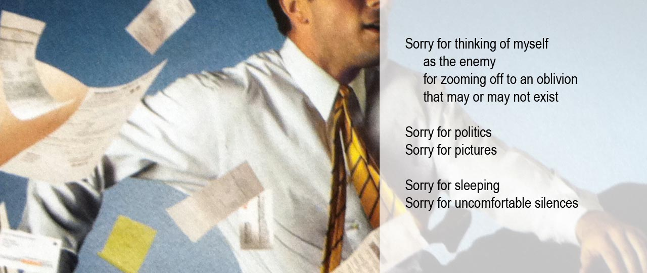
    Sorry, poetic apologies for almost everything surface on Pattison digital screens across Canada

    Art in Transit launches Sorry, Gary Duehr’s amusing yet powerful series of 20 collaged poems and images on multiple Pattison Onestop digital networks across Canada from January 20 – February 28, 2014.  Sorry is part of Pattison’s ongoing Art in Transit programme and launches the 2014 season, which will see 20 new arts and culture projects on Pattison screens.

    The artist surveyed the cultural landscape to identify current obsessions then transformed these into apologies as a way of exorcising the trend to apologize for behavior without making meaningful changes. Filled with comic remorse, these poetic apologies reveal anti-heroes who try to come clean for almost everything including modern art, the millennium, nostalgia, Las Vegas, happiness, politics, and even sleeping.

    “I’m happy, as an American, to apologize in advance for everything I possibly can. And I’m excited about reaching my broadest audience yet!” said Gary Duehr.

    Pattison’s Art in Transit programme is expanding its reach throughout 2014. Sorry will appear on multiple Pattison Onestop networks including the Toronto TTC subway screens, the new Edmonton Digital Transit Network in 10 key LRT stations, the Digital Office Network in Vancouver, Calgary, Edmonton, Toronto, Ottawa, and Halifax, as well as the Digital Mall Network in English-language shopping centres, reaching over three million daily commuters, shoppers and city-dwellers across the country.

    “I’m excited to launch Art in Transit’s 2014 programme with Sorry, a darkly humorous project for our darkest winter days, and am very pleased about our expanded reach across Canada.” said Sharon Switzer, Arts Programmer and Curator, Pattison Onestop.

    Gary Duehr has published seven books of poetry, five chapbooks and was the recipient of the National Endowment for the Arts, Poetry Fellowship in 2001. Gary Duehr lives in Boston, MA and currently manages the Bromfield Gallery in Boston’s South End.

    Art in Transit represents Pattison Onestop’s ongoing arts and culture programme, presenting thought-provoking projects that enhance our shared environment and transport commuters, shoppers and city-dwellers, if only momentarily, out of their daily routines.

  • Interior Design Show 2014


    January 24 -26, 2014
    METRO TORONTO CONVENTION CENTRE
    North Building, Exhibit Hall A & B
    255 Front Street West
    Hours: Friday 9 – 7, Saturday & Sunday 10 -7 p.m.

    The Interior Design Show/IDS is Canada’s design fair. Since its inception in 1998, close to 660,000 design professionals, consumers and media have attended. The newest and most innovative in international and Canadian products are annually presented by 300 exhibitors. Inspirational exhibits feature both emerging and established designers; and highlight international interior design, architecture and industrial design trends. The most influential architects and designers from around the world share their design philosophies and experiences within the international keynote speakers program.

    IDS is more than just a fair. It is the total design experience.

    Opening Night Party / Thursday, January 23, 7 – 11 p.m.
    IDS plays host to the biggest design party of the year. 5,500 industry movers and shakers will converge on the IDS show floor for a night of local food, drinks and entertainment. Partygoers will get a sneak preview of the show, as well as the opportunity to bid on a special auction, with proceeds benefitting the ONEXONE children’s foundation. Admittance is restricted to ages 19+.

    Friday / Professional Trade Day
    Azure Trade talk
    IDS is Canada’s top meeting place and offers an unparalleled ability to connect to ideas, to be inspired by new work, and to plug into current design trends. IDS14 brings you the design world’s best and brightest, including international design star Dror Benshetrit, who will challenge how we think about the world around us. Stay tuned for the complete IDS14 Azure Trade Talks lineup. All talks are CEU accredited.
    11 a.m./ Dr. Markus Miele & Dr. Reinhard Zinkann
    In conversation with Jeanne Beker, television personality
    1 p.m. / Patrizia Moroso – International Guest of Honour
    3 p.m. / Dennis Askins
    5 p.m. / Dror Benshetrit

    Saturday / Globe Style Saturday
    Globe Style Saturday at IDS14, presented by PARA Paints, will explore the real trends that are driving how design shapes our cities, neighbourhoods and homes. This powerhouse speaker series features three renowned designers that will help us understand how design works today. The inspiring line-up includes Rafael de Cárdenas, founder of Architecture at Large, creative director Minna Kemmel-Kutvonen of Marimekko, and one additional speaker to be announced at a later date.
    12 p.m. / Sami Ruotsalainen
    In conversation with Andrew Sardone, fashion editor of The Globe and Mail
    2 p.m. / Muriel Brandolini
    4 p.m / Rafael de Cárdenas
    In conversation with Amy Verner, style editor of The Globe and Mail

    Sunday / House & Home Sunday
    House & Home Sunday will feature Canadian design personalities up close and personal. The House & Home team will return with their special guests, who will speak on the Caesarstone Stage.
    12 p.m. / FRESH STYLE FOR CLASSIC ROOMS
    Lynda Reeves with Kelvin Browne (Director and CEO, The Gardiner Museum)
    1:30 p.m. / THE POWER OF DECORATING
    Suzanne Dimma in conversation with Mark Challen (House & Home)
    3 p.m. / TALKING DESIGN
    Sarah Richardson in conversation with Mark Challen (House & Home)

    For more information on schedule please check: http://www.interiordesignshow.com/Schedule/schedule

    For tickets please go to: https://www.microspec.com/tix123/etic.cfm?code=IDS2014

  • Christina Battle & Kristie MacDonald: What Was Will Be

    Kristie MacDonald, (Left to right) Tornado Views of Emporia Kansas, Morehead Kentucky Flash Flood, 22″ x 22″. Digital Print, 2013, Floating Down The Merrimac River Massachusetts, 22″ x 18″, Digital Print, Avalanche, Sigerfjord Norway, Morehead Kentucky Flash Flood (detail), 2013. C-print. Courtesy of the artist and Gallery 44

    Gallery 44 began its 2014 exhibition lineup through an in-depth analysis and reflection of the past. What Was Will Be unites the work of Kristie MacDonald and Christina Battle, two artists that utilize the potential of the archive to present us with media installations based on natural disasters. The exhibition brings together MacDonald’s series Mechanisms for Correcting the Past and Battle’s dearfield, colorado. In a disconcerting manner, these unearthed documents carry a prophetic quality, as if ignored signs from the past that have resurfaced in our current context of global climate change. After encountering the devastating effects of the polar vortex and recent ice storm, the environmental themes raised by What Was Will Be rings incredibly close for Torontonians.

    Kristie MacDonald, Machine for Correcting the Past, 2013. Found image, Projector, Electronics, Table. Courtesy of the artist and Gallery 44

    Mechanisms for Correcting the Past appropriates decontextualized images of dilapidated structures in order to explore the parameters of historical and fictitious narratives. MacDonald utilizes a compulsive desire to reverse the relationship between landscape and subject by rotating images of buildings to straighten its base while skewing the horizon line of the surrounding environment. The images that Macdonald has chosen all contain scenes that pertain to the aftermath of natural disasters. Reoccurring scenes of floods, wreckage, and splinted wooden houses are presented as contextual moments that form a collective experience. Much like Andrew Wright’s Tree Corrections or the practice of Jan Dibbets, MacDonald experiments with attributing aesthetic order to nature’s chaos. However, aside from presenting an example of nature’s power, unity, and resurging triumph, MacDonald’s work possesses a slightly sombre tone that demonstrates the fragility of existence and why nature must be treated with caution. Through the process of recollecting and re-presenting, MacDonald predicts the impending future in relation to our global climate. By straightening the structures within these old images, the artist comments on humankind’s natural inclination to focus on matters which directly concern us. As Mechanisms for Correcting the Past demonstrates, the industrial desire to strive forward while ignoring past mistakes is a pattern that can prove to be most disastrous.

     Christina Battle, dearfield, colorado, still from media installation and installation view, 2013. Courtesy of the artist and Gallery 44.

    In conjunction with MacDonald’s work, Christina Battle utilizes fragments of historical evidence in considering the ways that we formulate our understanding of history in a contemporary sphere. dearfield, colorado regales the tragic tale of the town for consideration. Founded in 1910 as an early African-American settlement, the town of Dearfield grew to a population of 700 inhabitants at its height in 1921. The word dear was chosen as the foundation for the town’s name due to the precious agricultural value of the land and the importance of community to the town’s settlers. Dearfield ultimately succumbed to the effects of drought during the Great Depression. By 1940 it was reduced to a population of 12 and is currently a ghost town. In dearfield, colorado, Battle pairs images of the town’s deserted and desolate buildings with quotes taken from first-hand accounts of dust storms. The constant hints at electricity refer to more than just the tension that filled the air, as more recent scientific evidence demonstrates that dust storms produce intense electrical fields. Battle choose to replicate this unique natural phenomenon by projecting the piece in a room covered with aluminum. As the video reflects off the surrounding walls and floor, metallic skies are mirrored in an artificial body of water, creating an eerily heavenly glow. In a sentimental style, dearfield, colorado pays homage to the town’s residents by granting their one wish for water and rain. Much like the Farm Administration Project’s efforts to humanize those most effected by the Depression, dearfield, colorado touches upon the importance of remembering history. As the dilapidated houses of the town are distorted on the surface of the aluminum, Battle illustrates how easily forgotten parts of history can dissipate within our industrialized world.

    Shellie Zhang

    * What Was Will Be runs till February 15th, 2014 at Gallery 44, 120-401 Richmond St W. Gallery hours: Tues – Sat 11 – 5 p.m.

  • Zev Farber: Errata (18 to 34)

    Upon entry, the ominous atmosphere of Farber’s Errata Sheet (Persistent Tinnitus and Imperfect Recall) filled the gallery space. Eerie enough to send shivers up your spine, Farber’s autobiographical exhibition features a multi-media presentation of a formative period in his life. Without prior knowledge of the details and conceptual ideas behind his trilogy of works, his engages his viewer with a mesmerizing, yet foreboding video projection and audio, as well as recognizable objects (tickets) paired with obscure and ambiguous/cryptic phrases like “but the damage was done.”

    Errata Sheet (Persistent Tinnitus and Imperfect Recall), 2014,  Film Comment,  Vol.36-50, Nov/Dec 1998- Sept/Oct 2013, 8 Sounds of Tinnitus, Courtesy of American Tinnitus Association; HD Video 4 min.46 sec.

    Upon piquing my curiosity, I wondered about the relationship between these ambiguous phrases and the repeating image of superimposed tickets. The relationship between image, archival material, sound, and text, as explained by gallery administrator Emilia Ziemba, found root in the themes of loss and memory, as well as the tension between destructive and creative impulses.

    Row I. The Following Errors Have Been Found (Sound 1998-2013), 2014,  61 Concert Tickets, LOOK Magazine, Vol.31, 1968 Keepsake Issue; 16 Framed Digital Prints, each 11 x 14 inches
    Row II. The Following Errors Have Been Found (Vision 1998-2013), 2014,  89 Movie Tickets, TV Guide, Vol.11, January 25-31, 1964; 16 Framed Digital Prints, each 11 x 14 inches

    The two rows of 16 framed digital prints (each print representing one year in his life, from ages 18 to 34) instantly caught my eye upon entering the gallery space. They feature a collection of tickets from 61 concerts and 89 movies that he attended over the period of 16 years. Each year is represented by an image of superimposed tickets and accompanying text. The Following Errors have been found (Sound 1998-2013)  features text taken from LOOK magazine in reference to the assassination of Robert Kennedy, while the The Following Errors have been found (Vision 1998-2013) includes text from an issue of TV Guide in reference to the assassination of John F. Kennedy.  Referencing two momentous occasions in American history, the notion of loss and broken bonds, is much more personal than it seems since the textual material was found in the home of a recently deceased friend of the artist. Moreover, the relationship between the text and the images brightly highlight loss, and memory.

    The Following Errors Have Been Found (Sound 1998-2013), 2014,  61 Concert Tickets, LOOK Magazine, Vol.31, 1968 Keepsake Issue; 16 Framed Digital Prints, each 11 x 14 inches. Note: the absence of an image indicates that Farber did not attend a film or concert over the course of that year.

    The Following Errors Have Been Found (Vision 1998-2013), 2014,  89 Movie Tickets, TV Guide, Vol.11, January 25-31, 1964; 16 Framed Digital Prints, each 11 x 14 inches

    The themes of loss, destructive/creative impulses become increasingly direct with Farber’s audio-visual piece, Errata Sheet (Persistent Tinnitus and Imperfect Recall). Taped in one shot, without any editing, we see errata sheets and images from Film Comment magazine as well as 8 sounds of tinnitus from the American Tinnitus Association.  His desire to enjoy expressions of creativity (150 films/concerts over the course of 16 years) has resulted in the development of a damaging physical condition, Tinnitus (Latin for “ringing”, and is defined by the Mayo Clinic as “noise or ringing in the ears”). Similar to the irreversible grammatical errors or typos in a publication, Farber will have to live with this uncomfortable and permanently damaging condition for the rest of his life. Furthermore, the exhibition title directly alludes to the destructive result of the well-intentioned desires. Although Farber’s trilogy of works may seem morbid and pessimistic, he vulnerably offers his audience the opportunity to appreciate and relate to his growth as a human being and as an artist by exhibiting his past, its consequences, and an uncertain future.

    Errata Sheet (Persistent Tinnitus and Imperfect Recall), 2014,  Film Comment,  Vol.36-50, Nov/Dec 1998- Sept/Oct 2013, 8 Sounds of Tinnitus, Courtesy of American Tinnitus Association; HD Video 4 min.46 sec.

    On the Closing Reception I (L.S.) asked a few questions from Zev Farber (Z.F.)

    L.S.:  The Red Head Gallery director, Emilia Ziemba, described you as being a private person. Would you consider this exhibition to be one of the most difficult to date because it required a personal and autobiographical, vulnerability?  

    Z.F.:  I really did. The two preceding installations were, one fictional, and the other autobiographical, so this one really challenged me to see how far I was willing to push, or rather, make public the autobiographical side of things, which is sort of an interesting challenge amongst other challenges that I am glad to set out for myself. So, absolutely.

    L.S.: What caused the shift from a fictional story about the disappearance of a family with If it Happened At All, It Happened This Way, and a non-fictional installation about forty years in the life of Greg McRoberts, to your autobiographical installation, Errata (18-34)?

    Z.F.:   The first installation was born out of my MFA thesis and it really gave me something to sink my teeth into that didn’t keep me inside my own space. It freed me up in terms of thinking about materials, thinking about process in terms of thinking about narrative and I really found that that was something I wanted further, and work with further. I am a bit of a process oriented thinker, so the idea of a trilogy helped. I like threes. I like triptychs. It worked together nicely. I knew this was coming and it was interesting to see how comfortable I would become with the content as it was developing

    L.S.:  What have been some of the challenges, emotional or technical, that you’ve encountered while working on Errata (18-34)?

    Z.F.:  Um…technical, absolutely. One of the elements that are different in this exhibition [in comparison to If it Happened At All, It Happened This Way, and Greg McRoberts] is that there is an element of the handmade, with the application of the collage elements went into these prints. I feel much more comfortable working at a remove where there is a digital barrier between the audience and the material. So in this case, I was throwing myself out there at the risk of the hand/mark-making. It is all working in terms of personal property and personal experience. That was the only risky element: the hand-made, the mark-making, of the collage itself, not layering digital. I think for an audience, maybe, it draws them a little bit closer to otherwise abstract images.

    L.S.:  The exhibition title Errata (18-34) hints at mistakes that cannot be rectified in text, as well as your medical condition, Tinnitus. The sounds of tinnitus in Errata Sheet (Persistent Tinnitus and Imperfect Recall) created an ominous atmosphere in the gallery space, which continued to haunt me after I left the space.  How is it to live with Tinnitus on a daily basis? Do you feel as if the atmosphere in the gallery faithfully embodies the condition’s effect on your life?

    Z.F.: Within the work, using tinnitus was sort of a strategy to evoke the idea of losing something. It’s the idea of a permanent loss. Living with Tinnitus on a daily basis, it’s a very unpredictable relationship because it comes and goes. For instance, it happened to me this morning and hasn’t happened since, and maybe it’ll come back in one ear, maybe in both ears. I deal with it on a very unpredictable basis. I assume that it will become a permanent resident in my head at some point, so, that’s my relationship to the Tinnitus itself, and then by manipulating these variations on how Tinnitus might sound like, this was my way of taking control of it to bring myself to come to grips with it. So taking it from this oppositional stand-point, bringing it a little bit closer, it’s actually physically close.
    I did actually struggle with the idea of how, if there was, how to weave it in and out of the installation because the audience themselves would find it aggressive, so again that was interesting question:  how aggressive do I want to be with the audience, or even with our gallery administrator. These were all considerations that I had to throw into the mix. It is interesting that you have to make these decisions on your own, and live with the results within a space.

    L.S.:  You don’t appear in any of the photographs; however, your property is on display. Why and how did you select these tickets to represent the past 16 years of your life?

    Z.F.:  It is because, for me, the one consistency between 18 and 34 was building my own cultural identity. So, for me that was film and music. I studied music in my undergrad and my one escape from the world was going through the film books and journals in Robarts Library at UofT. It has followed me to this point, even though there were no movies or concerts in 2013. So I have used that as the formation of that cultural identity, it was the most personal thing I could offer anybody. That, for me, was the most interesting and most universal thing, opposed to other things that have happened in my life like marriage, having a child, going throughout schooling, employment experiences. All these other universal things happen, but for me, this was the one consistency. I haven’t held onto anything else from the age of 18 except these tickets.

    L.S.:  That was my next question, since it seemed as if you were a sentimental collector-of-things, what are the other things you collect, if there are other things you collect?

    Z.F.:  I have a huge record collection and a huge collection of films. You see all of this come together through those types of collections. For me this is a way of indexing emotional experiences, locating them in specific time, places, dates. You can see fragments of addresses, and you know that it’s Toronto through things like Queen St. West, and other elements are really abstract, but you can also recognize the Cineplex Odeon logo. So it is all meant to be of a place, but not of a place, of a time, but not of a time.

    L.S.:  Emilia told me something interesting, that the text used in these images are commenting on the assassination of Robert and J.F. Kennedy that was previously property of a friend, who has recently passed away. Why use magazine excerpts commenting on the deaths of the Kennedys’ as the text in The Following Errors Have Been Found?

    Z.F.:  This person that had passed away, their partner gave me this collection he had and said, “Just do something with it, give it some life, turn it into something else.” So I focused on drawing on Robert Kennedy’s assassination and John Kennedy’s assassination and transforming these historic moments, big cultural moments and seeing if I could find my way into any of that, even though I had no access to it. But they [Zev’s friend and his partner] did. So it was a way for me to try and get closer to them through their own collection and archive and draw elements that I could, then, repurpose. And to be honest, these magazines were real collectors’ items, so I had to make the choice to destroy them, right?  They’re no longer collectable, they’ve been defaced.

    L.S.: Do you consider that your life, thus far, communicated through the exhibit as a cautionary tale?

    Z.F.:  I can agree that, tonally, there is definitely this ambience of not caution, but a dramatic tone. I tend to move towards the dramatic. And I guess I am surprised to see how that emerged even in this work. In my personal life, I think there is much more to celebrate than there is, in any way, to reflect on poorly, which I’m proud of. There are no regrets, but there are moments that, through this show, I was trying to address that are always going to be unsolvable, unfixable. That’s the idea behind the titling of the show, and some of the works, these errors can never be corrected. It was a way for me to think back on those moments and just address the reality of what they were, but in a really abstract way. I will agree with you, the tone is foreboding, but I don’t think I would ever tell anyone else, “don’t jump right in with your own two feet and live your life to its fullest”

    Text and photo: Leanne Simaan

    *Exhibition dates: January 8 – February 1, 2014 , The Red Head Gallery, 401 Richmond St.W , suite #115. Gallery hours: Wed – Sat 12 – 5 p.m.